EchoPulse – Trend Oscillator v1 [QuayLade]Harness the Pulse. Surf the Trend.
EchoPulse™ is a precision-crafted Trend Oscillator designed to visualize the cyclic rhythm of market movements while keeping you contextually aligned with Higher Timeframe Influence Zones. Whether you're a scalper, swing trader, or systematic strategist, EchoPulse brings clarity to trend dynamics by filtering out noise and spotlighting pivotal trade opportunities.
Core Features & Innovations:
Surge Markers (Counter-Trend Oscillation Bursts):
Identify statistically unsustainable counter-trend surges with high precision. These Aqua & Orange crosses mark potential exhaustion points during pullbacks, perfect for strategic pyramiding and re-entry setups.
Exhaustion Markers (Trend Fatigue Signals):
Spot early signs of trend fatigue with Green & Red Circles. These markers appear when the market's internal cyclic rhythm shows signs of a structural unwind, assisting in managing exits or preparing for trend reversals.
Synchronized Cyclic Lines (Short, Mid, Long):
Visualize the market’s multi-speed oscillations through dynamically flowing Cycle Lines that latch to extreme zones during strong trends. Their stickiness/persistence offers valuable clues into the trend’s strength or weakening momentum.
Higher Timeframe Influence Zone (Contextual Alignment):
A soft overlay reflecting the directional bias of the Higher Timeframe, ensuring you stay aligned with macro flows without adding visual clutter. Greenish for bullish bias, reddish for bearish, and transparent during indecisive phases.
Adaptive Volatility Intelligence (Noise Suppression):
EchoPulse™ dynamically adjusts its sensitivity based on current market volatility, making it effective across various instruments and timeframes — from scalping to positional trading.
Ideal For:
Trend Traders seeking pullback confirmation within trend continuations.
Swing & Position Traders needing clear alignment with higher timeframe structures.
Scalpers] who require real-time directional cues without lag.
Systematic Traders looking to integrate a dynamic, responsive trend oscillator.
Quick User Guide
Trend Bias Confirmation:
Use the HTF Influence Zone background colour to establish directional bias. Prioritize setups aligned with this macro trend.
Entry Triggers with Surge Markers:
Spot Surge Markers appearing against the HTF bias during pullbacks — a signal of possible exhaustion in counter-trend moves and a potential entry opportunity.
Monitor Cyclic Stickiness:
Persistent latching of Cycle Lines to extreme zones indicates a strong trend continuation. Unlatching and normalization could signal consolidation or a pause in trend momentum.
Exhaustion Markers & Reversals:
Exhaustion Markers highlight when a trend leg may be overextended. Combine them with Price Divergence or Key S/R Levels for stronger reversal signals.
Best Practices:
Use EchoPulse™ as a Trend Continuation and Exhaustion Timing Tool .
Combine with Price Action, Divergence Analysis, and Multi-Timeframe Confluence for high-probability setups.
Adjust chart timeframe based on your trading style — Intraday, Swing, or Positional.
Compliance & Acknowledgement Statement:
EchoPulse™ is an original indicator concept meticulously developed by QuayLade using proprietary techniques that visualize dynamic oscillations, adaptive latching behaviours, and multi-timeframe contextual alignment. While the indicator draws inspiration from universally known mathematical constructs such as Rate of Change (RoC) for assessing price momentum, its computational framework, signal derivations, and visualization structures are uniquely crafted and not direct derivatives of any standard or public domain indicators.
All methodologies implemented are original intellectual property, tailored to offer traders an innovative perspective on market rhythm, trend surges, and exhaustion zones. EchoPulse™ is fully committed to be compliant with TradingView’s Vendor Agreements and House Rules regarding originality, fair usage, and responsible adaptation of foundational market analysis concepts.
Script License & Usage Disclaimer:
The EchoPulse™– Trend Oscillator is a proprietary invite-only script. Unauthorized distribution, reverse engineering, or decompilation of this script is strictly prohibited.
This indicator is provided for informational and educational purposes only and does not constitute financial advice or a trading recommendation. Trading and investing involve substantial risks, and the creator assumes no responsibility for financial losses or damages resulting from its use.
By accessing this script, users agree to use it at their own discretion and understand that the author makes no guarantees regarding its performance or suitability for any specific trading objective.
Support & Assistance:
For any queries, feedback, or assistance with usage:
Contact @QuayLade via TradingView DM.
Documentation, usage guides, and walkthroughs will be provided progressively based on user feedback.
Gann Trend Oscillator

Ultimate Scalping Tool[BullByte]Overview
The Ultimate Scalping Tool is an open-source TradingView indicator built for scalpers and short-term traders released under the Mozilla Public License 2.0. It uses a custom Quantum Flux Candle (QFC) oscillator to combine multiple market forces into one visual signal. In plain terms, the script reads momentum, trend strength, volatility, and volume together and plots a special “candlestick” each bar (the QFC) that reflects the overall market bias. This unified view makes it easier to spot entries and exits: the tool labels signals as Strong Buy/Sell, Pullback (a brief retracement in a trend), Early Entry, or Exit Warning . It also provides color-coded alerts and a small dashboard of metrics. In practice, traders see green/red oscillator bars and symbols on the chart when conditions align, helping them scalp or trend-follow without reading multiple separate indicators.
Core Components
Quantum Flux Candle (QFC) Construction
The QFC is the heart of the indicator. Rather than using raw price, it creates a candlestick-like bar from the underlying oscillator values. Each QFC bar has an “open,” “high/low,” and “close” derived from calculated momentum and volatility inputs for that period . In effect, this turns the oscillator into intuitive candle patterns so traders can recognize momentum shifts visually. (For comparison, note that Heikin-Ashi candles “have a smoother look because take an average of the movement”. The QFC instead represents exact oscillator readings, so it reflects true momentum changes without hiding price action.) Colors of QFC bars change dynamically (e.g. green for bullish momentum, red for bearish) to highlight shifts. This is the first open-source QFC oscillator that dynamically weights four non-correlated indicators with moving thresholds, which makes it a unique indicator on its own.
Oscillator Normalization & Adaptive Weights
The script normalizes its oscillator to a fixed scale (for example, a 0–100 range much like the RSI) so that various inputs can be compared fairly. It then applies adaptive weighting: the relative influence of trend, momentum, volatility or volume signals is automatically adjusted based on current market conditions. For instance, in very volatile markets the script might weight volatility more heavily, or in a strong trend it might give extra weight to trend direction. Normalizing data and adjusting weights helps keep the QFC sensitive but stable (normalization ensures all inputs fit a common scale).
Trend/Momentum/Volume/Volatility Fusion
Unlike a typical single-factor oscillator, the QFC oscillator fuses four aspects at once. It may compute, for example, a trend indicator (such as an ADX or moving average slope), a momentum measure (like RSI or Rate-of-Change), a volume-based pressure (similar to MFI/OBV), and a volatility measure (like ATR) . These different values are combined into one composite oscillator. This “multi-dimensional” approach follows best practices of using non-correlated indicators (trend, momentum, volume, volatility) for confirmation. By encoding all these signals in one line, a high QFC reading means that trend, momentum, and volume are all aligned, whereas a neutral reading might mean mixed conditions. This gives traders a comprehensive picture of market strength.
Signal Classification
The script interprets the QFC oscillator to label trades. For example:
• Strong Buy/Sell : Triggered when the oscillator crosses a high-confidence threshold (e.g. breaks clearly above zero with strong slope), indicating a well-confirmed move. This is like seeing a big green/red QFC candle aligned with the trend.
• Pullbacks : Identified when the trend is up but momentum dips briefly. A Pullback Buy appears if the overall trend is bullish but the oscillator has a short retracement – a typical buying opportunity in an uptrend. (A pullback is “a brief decline or pause in a generally upward price trend”.)
• Early Buy/Sell : Marks an initial swing in the oscillator suggesting a possible new trend, before it is fully confirmed. It’s a hint of momentum building (an early-warning signal), not as strong as the confirmed “Strong” signal.
• Exit Warnings : Issued when momentum peaks or reverses. For instance, if the QFC bars reach a high and start turning red/green opposite, the indicator warns that the move may be ending. In other words, a Momentum Peak is the point of maximum strength after which weakness may follow.
These categories correspond to typical trading concepts: Pullback (temporary reversal in an uptrend), Early Buy (an initial bullish cross), Strong Buy (confirmed bullish momentum), and Momentum Peak (peak oscillator value suggesting exhaustion).
Filters (DI Reversal, Dynamic Thresholds, HTF EMA/ADX)
Extra filters help avoid bad trades. A DI Reversal filter uses the +DI/–DI lines (from the ADX system) to require that the trend direction confirms the signal . For example, it might ignore a buy signal if the +DI is still below –DI. Dynamic Thresholds adjust signal levels on-the-fly: rather than fixed “overbought” lines, they move with volatility so signals happen under appropriate market stress. An optional High-Timeframe EMA or ADX filter adds a check against a larger timeframe trend: for instance, only taking a trade if price is above the weekly EMA or if weekly ADX shows a strong trend. (Notably, the ADX is “a technical indicator used by traders to determine the strength of a price trend”, so requiring a high-timeframe ADX avoids trading against the bigger trend.)
Dashboard Metrics & Color Logic
The Dashboard in the Ultimate Scalping Tool (UST) serves as a centralized information hub, providing traders with real-time insights into market conditions, trend strength, momentum, volume pressure, and trade signals. It is highly customizable, allowing users to adjust its appearance and content based on their preferences.
1. Dashboard Layout & Customization
Short vs. Extended Mode : Users can toggle between a compact view (9 rows) and an extended view (13 rows) via the `Short Dashboard` input.
Text Size Options : The dashboard supports three text sizes— Tiny, Small, and Normal —adjustable via the `Dashboard Text Size` input.
Positioning : The dashboard is positioned in the top-right corner by default but can be moved if modified in the script.
2. Key Metrics Displayed
The dashboard presents critical trading metrics in a structured table format:
Trend (TF) : Indicates the current trend direction (Strong Bullish, Moderate Bullish, Sideways, Moderate Bearish, Strong Bearish) based on normalized trend strength (normTrend) .
Momentum (TF) : Displays momentum status (Strong Bullish/Bearish or Neutral) derived from the oscillator's position relative to dynamic thresholds.
Volume (CMF) : Shows buying/selling pressure levels (Very High Buying, High Selling, Neutral, etc.) based on the Chaikin Money Flow (CMF) indicator.
Basic & Advanced Signals:
Basic Signal : Provides simple trade signals (Strong Buy, Strong Sell, Pullback Buy, Pullback Sell, No Trade).
Advanced Signal : Offers nuanced signals (Early Buy/Sell, Momentum Peak, Weakening Momentum, etc.) with color-coded alerts.
RSI : Displays the Relative Strength Index (RSI) value, colored based on overbought (>70), oversold (<30), or neutral conditions.
HTF Filter : Indicates the higher timeframe trend status (Bullish, Bearish, Neutral) when using the Leading HTF Filter.
VWAP : Shows the V olume-Weighted Average Price and whether the current price is above (bullish) or below (bearish) it.
ADX : Displays the Average Directional Index (ADX) value, with color highlighting whether it is rising (green) or falling (red).
Market Mode : Shows the selected market type (Crypto, Stocks, Options, Forex, Custom).
Regime : Indicates volatility conditions (High, Low, Moderate) based on the **ATR ratio**.
3. Filters Status Panel
A secondary panel displays the status of active filters, helping traders quickly assess which conditions are influencing signals:
- DI Reversal Filter: On/Off (confirms reversals before generating signals).
- Dynamic Thresholds: On/Off (adjusts buy/sell thresholds based on volatility).
- Adaptive Weighting: On/Off (auto-adjusts oscillator weights for trend/momentum/volatility).
- Early Signal: On/Off (enables early momentum-based signals).
- Leading HTF Filter: On/Off (applies higher timeframe trend confirmation).
4. Visual Enhancements
Color-Coded Cells : Each metric is color-coded (green for bullish, red for bearish, gray for neutral) for quick interpretation.
Dynamic Background : The dashboard background adapts to market conditions (bullish/bearish/neutral) based on ADX and DI trends.
Customizable Reference Lines : Users can enable/disable fixed reference lines for the oscillator.
How It(QFC) Differs from Traditional Indicators
Quantum Flux Candle (QFC) Versus Heikin-Ashi
Heikin-Ashi candles smooth price by averaging (HA’s open/close use averages) so they show trend clearly but hide true price (the current HA bar’s close is not the real price). QFC candles are different: they are oscillator values, not price averages . A Heikin-Ashi chart “has a smoother look because it is essentially taking an average of the movement”, which can cause lag. The QFC instead shows the raw combined momentum each bar, allowing faster recognition of shifts. In short, HA is a smoothed price chart; QFC is a momentum-based chart.
Versus Standard Oscillators
Common oscillators like RSI or MACD use fixed formulas on price (or price+volume). For example, RSI “compares gains and losses and normalizes this value on a scale from 0 to 100”, reflecting pure price momentum. MFI is similar but adds volume. These indicators each show one dimension: momentum or volume. The Ultimate Scalping Tool’s QFC goes further by integrating trend strength and volatility too. In practice, this means a move that looks strong on RSI might be downplayed by low volume or weak trend in QFC. As one source notes, using multiple non-correlated indicators (trend, momentum, volume, volatility) provides a more complete market picture. The QFC’s multi-factor fusion is unique – it is effectively a multi-dimensional oscillator rather than a traditional single-input one.
Signal Style
Traditional oscillators often use crossovers (RSI crossing 50) or fixed zones (MACD above zero) for signals. The Ultimate Scalping Tool’s signals are custom-classified: it explicitly labels pullbacks, early entries, and strong moves. These terms go beyond a typical indicator’s generic “buy”/“sell.” In other words, it packages a strategy around the oscillator, which traders can backtest or observe without reading code.
Key Term Definitions
• Pullback : A short-term dip or consolidation in an uptrend. In this script, a Pullback Buy appears when price is generally rising but shows a brief retracement. (As defined by Investopedia, a pullback is “a brief decline or pause in a generally upward price trend”.)
• Early Buy/Sell : An initial or tentative entry signal. It means the oscillator first starts turning positive (or negative) before a full trend has developed. It’s an early indication that a trend might be starting.
• Strong Buy/Sell : A confident entry signal when multiple conditions align. This label is used when momentum is already strong and confirmed by trend/volume filters, offering a higher-probability trade.
• Momentum Peak : The point where bullish (or bearish) momentum reaches its maximum before weakening. When the oscillator value stops rising (or falling) and begins to reverse, the script flags it as a peak – signaling that the current move could be overextended.
What is the Flux MA?
The Flux MA (Moving Average) is an Exponential Moving Average (EMA) applied to a normalized oscillator, referred to as FM . Its purpose is to smooth out the fluctuations of the oscillator, providing a clearer picture of the underlying trend direction and strength. Think of it as a dynamic baseline that the oscillator moves above or below, helping you determine whether the market is trending bullish or bearish.
How it’s calculated (Flux MA):
1.The oscillator is normalized (scaled to a range, typically between 0 and 1, using a default scale factor of 100.0).
2.An EMA is applied to this normalized value (FM) over a user-defined period (default is 10 periods).
3.The result is rescaled back to the oscillator’s original range for plotting.
Why it matters : The Flux MA acts like a support or resistance level for the oscillator, making it easier to spot trend shifts.
Color of the Flux Candle
The Quantum Flux Candle visualizes the normalized oscillator (FM) as candlesticks, with colors that indicate specific market conditions based on the relationship between the FM and the Flux MA. Here’s what each color means:
• Green : The FM is above the Flux MA, signaling bullish momentum. This suggests the market is trending upward.
• Red : The FM is below the Flux MA, signaling bearish momentum. This suggests the market is trending downward.
• Yellow : Indicates strong buy conditions (e.g., a "Strong Buy" signal combined with a positive trend). This is a high-confidence signal to go long.
• Purple : Indicates strong sell conditions (e.g., a "Strong Sell" signal combined with a negative trend). This is a high-confidence signal to go short.
The candle mode shows the oscillator’s open, high, low, and close values for each period, similar to price candlesticks, but it’s the color that provides the quick visual cue for trading decisions.
How to Trade the Flux MA with Respect to the Candle
Trading with the Flux MA and Quantum Flux Candle involves using the MA as a trend indicator and the candle colors as entry and exit signals. Here’s a step-by-step guide:
1. Identify the Trend Direction
• Bullish Trend : The Flux Candle is green and positioned above the Flux MA. This indicates upward momentum.
• Bearish Trend : The Flux Candle is red and positioned below the Flux MA. This indicates downward momentum.
The Flux MA serves as the reference line—candles above it suggest buying pressure, while candles below it suggest selling pressure.
2. Interpret Candle Colors for Trade Signals
• Green Candle : General bullish momentum. Consider entering or holding a long position.
• Red Candle : General bearish momentum. Consider entering or holding a short position.
• Yellow Candle : A strong buy signal. This is an ideal time to enter a long trade.
• Purple Candle : A strong sell signal. This is an ideal time to enter a short trade.
3. Enter Trades Based on Crossovers and Colors
• Long Entry : Enter a buy position when the Flux Candle turns green and crosses above the Flux MA. If it turns yellow, this is an even stronger signal to go long.
• Short Entry : Enter a sell position when the Flux Candle turns red and crosses below the Flux MA. If it turns purple, this is an even stronger signal to go short.
4. Exit Trades
• Exit Long : Close your buy position when the Flux Candle turns red or crosses below the Flux MA, indicating the bullish trend may be reversing.
• Exit Short : Close your sell position when the Flux Candle turns green or crosses above the Flux MA, indicating the bearish trend may be reversing.
•You might also exit a long trade if the candle changes from yellow to green (weakening strong buy signal) or a short trade from purple to red (weakening strong sell signal).
5. Use Additional Confirmation
To avoid false signals, combine the Flux MA and candle signals with other indicators or dashboard metrics (e.g., trend strength, momentum, or volume pressure). For example:
•A yellow candle with a " Strong Bullish " trend and high buying volume is a robust long signal.
•A red candle with a " Moderate Bearish " trend and neutral momentum might need more confirmation before shorting.
Practical Example
Imagine you’re scalping a cryptocurrency:
• Long Trade : The Flux Candle turns yellow and is above the Flux MA, with the dashboard showing "Strong Buy" and high buying volume. You enter a long position. You exit when the candle turns red and dips below the Flux MA.
• Short Trade : The Flux Candle turns purple and crosses below the Flux MA, with a "Strong Sell" signal on the dashboard. You enter a short position. You exit when the candle turns green and crosses above the Flux MA.
Market Presets and Adaptation
This indicator is designed to work on any market with candlestick price data (stocks, crypto, forex, indices, etc.). To handle different behavior, it provides presets for major asset classes. Selecting a “Stocks,” “Crypto,” “Forex,” or “Options” preset automatically loads a set of parameter values optimized for that market . For example, a crypto preset might use a shorter lookback or higher sensitivity to account for crypto’s high volatility, while a stocks preset might use slightly longer smoothing since stocks often trend more slowly. In practice, this means the same core QFC logic applies across markets, but the thresholds and smoothing adjust so signals remain relevant for each asset type.
Usage Guidelines
• Recommended Timeframes : Optimized for 1 minute to 15 minute intraday charts. Can also be used on higher timeframes for short term swings.
• Market Types : Select “Crypto,” “Stocks,” “Forex,” or “Options” to auto tune periods, thresholds and weights. Use “Custom” to manually adjust all inputs.
• Interpreting Signals : Always confirm a signal by checking that trend, volume, and VWAP agree on the dashboard. A green “Strong Buy” arrow with green trend, green volume, and price > VWAP is highest probability.
• Adjusting Sensitivity : To reduce false signals in fast markets, enable DI Reversal Confirmation and Dynamic Thresholds. For more frequent entries in trending environments, enable Early Entry Trigger.
• Risk Management : This tool does not plot stop loss or take profit levels. Users should define their own risk parameters based on support/resistance or volatility bands.
Background Shading
To give you an at-a-glance sense of market regime without reading numbers, the indicator automatically tints the chart background in three modes—neutral, bullish and bearish—with two levels of intensity (light vs. dark):
Neutral (Gray)
When ADX is below 20 the market is considered “no trend” or too weak to trade. The background fills with a light gray (high transparency) so you know to sit on your hands.
Bullish (Green)
As soon as ADX rises above 20 and +DI exceeds –DI, the background turns a semi-transparent green, signaling an emerging uptrend. When ADX climbs above 30 (strong trend), the green becomes more opaque—reminding you that trend-following signals (Strong Buy, Pullback) carry extra weight.
Bearish (Red)
Similarly, if –DI exceeds +DI with ADX >20, you get a light red tint for a developing downtrend, and a darker, more solid red once ADX surpasses 30.
By dynamically varying both hue (green vs. red vs. gray) and opacity (light vs. dark), the background instantly communicates trend strength and direction—so you always know whether to favor breakout-style entries (in a strong trend) or stay flat during choppy, low-ADX conditions.
The setup shown in the above chart snapshot is BTCUSD 15 min chart : Binance for reference.
Disclaimer
No indicator guarantees profits. Backtest or paper trade this tool to understand its behavior in your market. Always use proper position sizing and stop loss orders.
Good luck!
- BullByte

Dual-Phase Trend Regime Oscillator (Zeiierman)█ Overview
Trend Regime: Dual-Phase Oscillator (Zeiierman) is a volatility-sensitive trend classification tool that dynamically switches between two oscillators, one optimized for low volatility, the other for high volatility.
By analyzing standard deviation-based volatility states and applying correlation-derived oscillators, this indicator reveals not only whether the market is trending but also what kind of trend regime it is in —Bullish or Bearish —and how that regime reacts to market volatility.
█ Its Uniqueness
Most trend indicators assume a static market environment; they don't adjust their logic when the underlying volatility shifts. That often leads to false signals in choppy conditions or late entries in trending phases.
Trend Regime: Dual-Phase Oscillator solves this by introducing volatility-aware adaptability. It switches between a slow, stable oscillator in calm markets and a fast, reactive oscillator in volatile ones, ensuring the right sensitivity at the right time.
█ How It Works
⚪ Volatility State Engine
Calculates returns-based volatility using standard deviation of price change
Smooths the current volatility with a moving average
Builds a volatility history window and performs median clustering to determine typical "Low" and "High" volatility zones
Dynamically assigns the chart to one of two internal volatility regimes: Low or High
⚪ Dual Oscillators
In Low Volatility, it uses a Slow Trend Oscillator (longer lookback, smoother)
In High Volatility, it switches to a Fast Trend Oscillator (shorter lookback, responsive)
Both oscillators use price-time correlation as a measure of directional strength
The output is normalized between 0 and 1, allowing for consistent interpretation
⚪ Trend Regime Classification
The active oscillator is compared to a neutral threshold (0.5)
If above: Bullish Regime, if below: Bearish Regime, else: Neutral
The background and markers update to reflect regime changes visually
Triangle markers highlight bullish/bearish regime shifts
█ How to Use
⚪ Identify Current Trend Regime
Use the background color and chart table to immediately recognize whether the market is trending up or down.
⚪ Trade Regime Shifts
Use triangle markers (▲ / ▼) to spot fresh regime entries, which are ideal for confirming breakouts within trends.
⚪ Pullback Trading
Look for pullbacks when the trend is in a stable condition and the slow oscillator remains consistently near the upper or lower threshold. Watch for moments when the fast oscillator retraces back toward the midline, or slightly above/below it — this often signals a potential pullback entry in the direction of the prevailing trend.
█ Settings Explained
Length (Slow Trend Oscillator) – Used in calm conditions. Longer = smoother signals
Length (Fast Trend Oscillator) – Used in volatile conditions. Shorter = more responsive
Volatility Refit Interval – Controls how often the system recalculates Low/High volatility levels
Current Volatility Period – Lookback used for immediate volatility measurement
Volatility Smoothing Length – Applies an SMA to the raw volatility to reduce noise
-----------------
Disclaimer
The content provided in my scripts, indicators, ideas, algorithms, and systems is for educational and informational purposes only. It does not constitute financial advice, investment recommendations, or a solicitation to buy or sell any financial instruments. I will not accept liability for any loss or damage, including without limitation any loss of profit, which may arise directly or indirectly from the use of or reliance on such information.
All investments involve risk, and the past performance of a security, industry, sector, market, financial product, trading strategy, backtest, or individual's trading does not guarantee future results or returns. Investors are fully responsible for any investment decisions they make. Such decisions should be based solely on an evaluation of their financial circumstances, investment objectives, risk tolerance, and liquidity needs.

Dynamic Price Oscillator (Zeiierman)█ Overview
The Dynamic Price Oscillator (DPO) by Zeiierman is designed to gauge the momentum and volatility of asset prices in trading markets. By integrating elements of traditional oscillators with volatility adjustments and Bollinger Bands, the DPO offers a unique approach to understanding market dynamics. This indicator is particularly useful for identifying overbought and oversold conditions, capturing price trends, and detecting potential reversal points.
█ How It Works
The DPO operates by calculating the difference between the current closing price and a moving average of the closing price, adjusted for volatility using the True Range method. This difference is then smoothed over a user-defined period to create the oscillator. Additionally, Bollinger Bands are applied to the oscillator itself, providing visual cues for volatility and potential breakout signals.
█ How to Use
⚪ Trend Confirmation
The DPO can serve as a confirmation tool for existing trends. Traders might look for the oscillator to maintain above or below its mean line to confirm bullish or bearish trends, respectively. A consistent direction in the oscillator's movement alongside price trend can provide additional confidence in the strength and sustainability of the trend.
⚪ Overbought/Oversold Conditions
With the application of Bollinger Bands directly on the oscillator, the DPO can highlight overbought or oversold conditions in a unique manner. When the oscillator moves outside the Bollinger Bands, it signifies an extreme condition.
⚪ Volatility Breakouts
The width of the Bollinger Bands on the oscillator reflects market volatility. Sudden expansions in the bands can indicate a breakout from a consolidation phase, which traders can use to enter trades in the direction of the breakout. Conversely, a contraction suggests a quieter market, which might be a signal for traders to wait or to look for range-bound strategies.
⚪ Momentum Trading
Momentum traders can use the DPO to spot moments when the market momentum is picking up. A sharp move of the oscillator towards either direction, especially when crossing the Bollinger Bands, can indicate the start of a strong price movement.
⚪ Mean Reversion
The DPO is also useful for mean reversion strategies, especially considering its volatility adjustment feature. When the oscillator touches or breaches the Bollinger Bands, it indicates a deviation from the normal price range. Traders might look for opportunities to enter trades anticipating a reversion to the mean.
⚪ Divergence Trading
Divergences between the oscillator and price action can be a powerful signal for reversals. For instance, if the price makes a new high but the oscillator fails to make a corresponding high, it may indicate weakening momentum and a potential reversal. Traders can use these divergence signals to initiate counter-trend moves.
█ Settings
Length: Determines the lookback period for the oscillator and Bollinger Bands calculation. Increasing this value smooths the oscillator and widens the Bollinger Bands, leading to fewer, more significant signals. Decreasing this value makes the oscillator more sensitive to recent price changes, offering more frequent signals but with increased noise.
Smoothing Factor: Adjusts the degree of smoothing applied to the oscillator's calculation. A higher smoothing factor reduces noise, offering clearer trend identification at the cost of signal timeliness. Conversely, a lower smoothing factor increases the oscillator's responsiveness to price movements, which may be useful for short-term trading but at the risk of false signals.
-----------------
Disclaimer
The information contained in my Scripts/Indicators/Ideas/Algos/Systems does not constitute financial advice or a solicitation to buy or sell any securities of any type. I will not accept liability for any loss or damage, including without limitation any loss of profit, which may arise directly or indirectly from the use of or reliance on such information.
All investments involve risk, and the past performance of a security, industry, sector, market, financial product, trading strategy, backtest, or individual's trading does not guarantee future results or returns. Investors are fully responsible for any investment decisions they make. Such decisions should be based solely on an evaluation of their financial circumstances, investment objectives, risk tolerance, and liquidity needs.
My Scripts/Indicators/Ideas/Algos/Systems are only for educational purposes!

Lune Oscillator Premium⬛️ Overview
Lune Oscillator is an advanced and innovative TradingView indicator designed to enhance your market analysis. Rather than merely improving visuals or merging traditional indicators, it introduces a series of unique features, each with its unique value proposition. This script stands out due to its originality, and the significant utility it brings to traders.
🟦 Features
Oscillator features an assortment of sophisticated tools aimed at refining your trading strategies:
🔹 Trend Oscillator: This feature integrates market trend and momentum analysis into one dynamic oscillator. It's designed to facilitate market trend and momentum analysis, and is invaluable to traders as it combines both trend and momentum analysis into one tool. For instance, if a ticker shows signs of slowing momentum after a recent rally, the Trend Oscillator could predict a potential trend reversal. The Trend Oscillator’s sensitivity and velocity settings can be tailored to suit your trading style and strategy. It is developed using a custom formula similar to WaveTrend but optimized for better detection of trend and momentum shifts.
🔹 Market Peak: Market Peak identifies potential market peaks and troughs using a percentile-based system. It's aimed at detecting overextensions in the Trend Oscillator, indicating potential market reversals. Compact and user-friendly, this feature signals potential trade exit points in case of an impending market reversal. Its sensitivity can be adjusted to react to either short-term or long-term market changes. By analyzing the market's average move, it detects overbought or oversold conditions when the percentage gets too extreme.
🔹 Money Pulse: The Money Pulse feature serves as a radar for money inflow or outflow, helping users detect nascent trends and reversals. It enables traders to spot early opportunities and reversals and align their strategies with institutional and large players. For example, a bullish Money Pulse during market consolidation could signal money influx and the beginning of an accumulation phase. The sensitivity of the Market Pulse can be adapted to short-term or long-term changes. This feature employs an improved version of the Money Flow concept.
🔹 Liquidity Pulse: Liquidity Pulse provides a unique perspective of asset liquidity by tracking market inflow and outflow volumes. It assists traders in understanding the market's liquidity sentiment, which is particularly useful for long-term trades and confluence. For instance, a bullish Liquidity Pulse could signal abundant liquidity, potentially driving up the price. The sensitivity setting can be adjusted for short-term or long-term liquidity changes. This feature utilizes an enhanced version of the On-Balance Volume concept.
🔹 Institutional Wave: This feature tracks the cumulative inflow and outflow for a specific ticker, helping traders monitor institutional money flows. It enables the analysis of a ticker's accumulation and distribution, assisting in detecting early trade entries and avoiding dumps. For example, a decrease in volume during consolidation after a price rally could indicate sell-off and potential price drop. The Institutional Wave's sensitivity can be adapted to either short-term or long-term changes. It operates on the Accumulation and Distribution concept.
🔹 Power Wave: The Power Wave evaluates market strength and momentum, indicating market power shifts. It helps traders understand the true power behind a market move. For instance, a decreasing Power Wave during a bullish move could indicate a weakening trend, suggesting a bearish strategy instead. The sensitivity of the Power Wave can be set for short-term or long-term market changes. The Power Wave calculates market strength by evaluating price change volatility.
🔹 Market Pressure: This feature detects shifts in buy and sell pressure, signaling potential turning points. It helps traders understand the power balance in the market. For example, a bullish Market Pressure shift during a short trade could suggest a momentum gain by bulls, indicating a trade exit. The Market Pressure's sensitivity can be adjusted for short-term or long-term changes. This feature uses volume data and moving averages to detect market pressure shifts, filtering out false and volatile signals.
🔹 Oscillator Copilot: Incorporating Smart Bias and Reversal Radar, the Oscillator Copilot helps identify market trends and potential reversals. It searches for confluence within multiple Oscillator features, providing a straightforward assistive tool. For example, a bullish Smart Bias signal during a long trade could suggest staying in the trade longer, while a bearish Reversal Radar signal could indicate the need to exit the trade.
🔹 Divergence Detection: This feature offers a sophisticated detection system for both regular and hidden market divergences, providing additional confluence and highlighting hard-to-detect divergences. For instance, a bullish Regular Divergence could signal a potential trade entry or exit depending on your overall market sentiment and bias. This feature uses fractals to effectively detect divergences in the market based on the Trend Oscillator.
🔹 Color Themes: Personalize your charting experience with various color themes. This feature enhances the visual appeal of your chart, offering easy setup and use. For example, use the “Ice” theme for a unique and colorful experience or the “Dark” theme for a more subdued look. Themes available include Default, Light, Dark, and Ice. This feature modifies the colors of your candles and features based on the selected theme.
These features and tools collectively offer a comprehensive solution for traders to understand and navigate the financial markets. It's important to remember that they are designed to assist in making informed trading decisions and should be used as part of a balanced trading strategy.
🟧 Usage
Lune Oscillator's features are designed to be both standalone tools and components of a larger, integrated trading strategy. It is important to understand each feature and experiment with different configurations to best suit your unique trading needs.
🔸 Example #1: The following demonstrates how the Oscillator Copilot can be an excellent trade assistant.
The Oscillator Copilot leverages multiple Lune Oscillator features, allowing traders to quickly assess overall market sentiment. It uses Smart Bias and Reversal Radar tools to deliver these insights. For instance, at point 1, a bullish Smart Bias (denoted by a green circle) represents a collective bullish sentiment from multiple components of Lune Oscillator, often leading to a price increase. Conversely, at point 2, we identify two bearish reversal signals from the Reversal Radar (highlighted by red triangles). This convergence of bearish signals from multiple components hints at a potential market reversal, often followed by a gradual price decline.
🔸 Example #2: This example shows how the Market Peak feature can aid in detecting potential market tops and bottoms.
Market Peak calculates how overbought or oversold a ticker is using a percentile system, offering insights into potential reversals. At points 1 and 2, we observe bearish Market Peaks suggesting overbought conditions and indicating a possible shift in trend. Subsequent to these peaks, we witness a price drop, mirroring the overbought market conditions. In contrast, at point 3, a bullish Market Peak suggests an oversold market, indicating a potential trend reversal and subsequent price increase.
🔸 Example #3: This is an example of how combining various features such as the Money Pulse, Liquidity Pulse, Institutional Wave, and Market Peak, can help make more informed trades.
Money Pulse and Liquidity Pulse provide insights into the money and liquidity flow in the market, respectively, while the Institutional Wave monitors the cumulative volume shifts and changes. Together with Market Peak, they offer a comprehensive view of the market's state.
At point 1, the positive Liquidity Wave (crossing above 0) suggests a bullish market volume. At point 2, a bullish Market Pressure indicates an increase in buying pressure, reinforcing the bullish sentiment. At point 3, a negative Liquidity Wave (crossing below 0) indicates a bearish sentiment, suggesting that market participants are exiting their positions. The concurrent Market Pressure hints at an increase in selling activity. Taking all these factors into account provides a strong indicator that the market sentiment has turned bearish.
🟥 Conclusion
Lune Oscillator aims to provide a suite of tools that bring unique value to traders. Each feature is designed to offer different, yet complementary, perspectives on the market, allowing users to piece together a more comprehensive understanding of their trading environment.
🔻 Access
You can see the Author's instructions below to get instant access to this indicator & our Premium Suite.
🔻 Disclaimer
Lune Oscillator is a tool for aiding in market analysis and is not a guarantee of future market performance or individual trading success. We strongly recommend that users combine our tool with their trading strategies and do their due diligence before making any trading decisions.
Remember, past performance is not indicative of future results. Please trade responsibly.

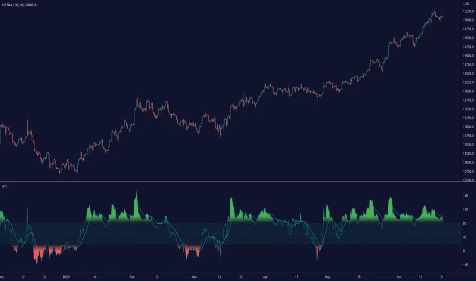
Relative Trend Index (RTI) by Zeiierman█ Overview
The Relative Trend Index (RTI) developed by Zeiierman is an innovative technical analysis tool designed to measure the strength and direction of the market trend. Unlike some traditional indicators, the RTI boasts a distinctive ability to adapt and respond to market volatility, while still minimizing the effects of minor, short-term market fluctuations.
The Relative Trend Index blends trend-following and mean-reverting characteristics, paired with a customizable and intuitive approach to trend strength, and its sensitivity to price action makes this indicator stand out.
█ Benefits of using this RTI instead of RSI
The Relative Strength Index (RSI) and the Relative Trend Index (RTI) are both powerful technical indicators, each with its own unique strengths.
However, there are key differences that make the RTI arguably more sophisticated and precise, especially when it comes to identifying trends and overbought/oversold (OB/OS) areas.
The RSI is a momentum oscillator that measures the speed and change of price movements and is typically used to identify overbought and oversold conditions in a market. However, its primary limitation lies in its tendency to produce false signals during extended trending periods.
On the other hand, the RTI is designed specifically to identify and adapt to market trends. Instead of solely focusing on price changes, the RTI measures the relative positioning of the current closing price within its recent range, providing a more comprehensive view of market conditions.
The RTI's adaptable nature is particularly valuable. The user-adjustable sensitivity percentage allows traders to fine-tune the indicator's responsiveness, making it more resilient to sudden market fluctuations and noise that could otherwise produce false signals. This feature is advantageous in various market conditions, from trending to choppy and sideways-moving markets.
Furthermore, the RTI's unique method of defining OB/OS zones takes into account the prevailing trend, which can provide a more precise reflection of the market's condition.
While the RSI is an invaluable tool in many traders' toolkits, the RTI's unique approach to trend identification, adaptability, and enhanced definition of OB/OS zones can provide traders with a more nuanced understanding of market conditions and potential trading opportunities. This makes the RTI an especially powerful tool for those seeking to ride long-term trends and avoid false signals.
█ Calculations
In summary, while simple enough, the math behind the RTI indicator is quite powerful. It combines the quantification of price volatility with the flexibility to adjust the trend sensitivity. It provides a normalized output that can be interpreted consistently across various trading scenarios.
The math behind the Relative Trend Index (RTI) indicator is rooted in some fundamental statistical concepts: Standard Deviation and Percentiles.
Standard Deviation: The Standard Deviation is a measure of dispersion or variability in a dataset. It quantifies the degree to which each data point deviates from the mean (or average) of the data set. In this script, the standard deviation is computed on the 'close' prices over a specified number of periods. This provides a measure of the volatility in the price over that period. The higher the standard deviation, the more volatile the price has been.
Percentiles: The percentile is a measure used in statistics indicating the value below which a given percentage of observations in a group falls. After calculating the upper and lower trends for the last 'length' periods and sorting these values, the script uses the 'Sensitivity ' parameter to extract percentiles from these sorted arrays. This is a powerful concept because it allows us to adjust the sensitivity of our signals. By choosing different percentiles (controlled through the 'Sensitivity' parameter), we can decide whether we want to react only to extreme events (high percentiles) or be more reactive and consider smaller deviations from the norm as significant (lower percentiles).
Finally, the script calculates the Relative Trend Index value, which is essentially a normalized measure indicating where the current price falls between the upper and lower trend values. This simple ratio is incredibly powerful as it provides a standardized measure that can be used across different securities and market conditions to identify potential trading signals.
Core Components
Trend Data Count: This parameter denotes the number of data points used in the RTI's calculation, determining the trend length. A higher count captures a more extended market view (long-term trend), providing smoother results that are more resistant to sudden market changes. In contrast, a lower count focuses on more recent data (short-term trend), yielding faster responses to market changes, albeit at the cost of increased susceptibility to market noise.
Trend Sensitivity Percentage: This parameter is employed to select the indices within the trend arrays used for upper and lower trend definitions. By adjusting this value, users can affect the sensitivity of the trend, with higher percentages leading to a less sensitive trend.
█ How to use
The RTI plots a line that revolves around a mid-point of 50. When the RTI is above 50, it implies that the market trend is bullish (upward), and when it's below 50, it indicates a bearish (downward) trend. Furthermore, the farther the RTI deviates from the 50 line, the stronger the trend is perceived to be.
Bullish
Bearish
The RTI includes user-defined Overbought and Oversold levels. These thresholds suggest potential trading opportunities when they are crossed, serving as a cue for traders to possibly buy or sell. This gives the RTI an additional use case as a mean-reversion tool, in addition to being a trend-following indicator.
In short
Trend Confirmation and Reversals: If the percentage trend value is consistently closer to the upper level, it can indicate a strong uptrend. Similarly, if it's closer to the lower level, a downtrend may be in play. If the percentage trend line begins to move away from one trend line towards the other, it could suggest a potential trend reversal.
Identifying Overbought and Oversold Conditions: When the percentage trend value reaches the upper trend line (signified by a value of 1), it suggests an overbought condition - i.e., the price has been pushed up, perhaps too far, and could be due for a pullback, or indicating a strong positive trend. Conversely, when the percentage trend value hits the lower trend line (a value of 0), it indicates an oversold condition - the price may have been driven down and could be set to rebound, or indicate a strong negative trend. Traders often use these overbought and oversold signals as contrarian indicators, considering them potential signs to sell (in overbought conditions) or buy (in oversold conditions). If the RTI line remains overbought or oversold for an extended period, it indicates a strong trend in that direction.
█ Settings
One key feature of the RTI is its configurability. It allows users to set the trend data length and trend sensitivity.
The trend data length represents the number of data points used in the trend calculation. A longer trend data length will reflect a more long-term trend, whereas a shorter trend data length will capture short-term movements.
Trend sensitivity refers to the threshold for determining what constitutes a significant trend. High sensitivity levels will deem fewer price movements as significant, hence making the trend less sensitive. Conversely, low sensitivity levels will deem more price movements as significant, hence making the trend more sensitive.
-----------------
Disclaimer
The information contained in my Scripts/Indicators/Ideas/Algos/Systems does not constitute financial advice or a solicitation to buy or sell any securities of any type. I will not accept liability for any loss or damage, including without limitation any loss of profit, which may arise directly or indirectly from the use of or reliance on such information.
All investments involve risk, and the past performance of a security, industry, sector, market, financial product, trading strategy, backtest, or individual's trading does not guarantee future results or returns. Investors are fully responsible for any investment decisions they make. Such decisions should be based solely on an evaluation of their financial circumstances, investment objectives, risk tolerance, and liquidity needs.
My Scripts/Indicators/Ideas/Algos/Systems are only for educational purposes!
SAR MACDSAR MACD is an idea of implementing Directional MACD with Parabolic SAR to exactly detect and confirm Trend. This p-SAR MACD consist of a HYBRID MACD which acts as MACD TREND oscillator, MACD Oscillator, PSAR Indicator combined with MA line. thus Fake MACD Signals can be eliminated using this SAR MACD. Sideways can be detected using Threshold Levels must be adjusted based on timeframe.
Indicators Hybrid model contains:
1.MACD (12,26,9) Standard with MA Crossovers
2.MACD Trend
3.Parabolic SAR with 0.02
4.Threshold level - indicates Sideways
How to use.
Histogram:
-> HIST MODE: normal MACD indicator
MA Line Color is based on PSAR Direction Blue-Up/ Pink -Down
A crossover upside with a Blue MA line denotes Up confirmation
A Crossover downwards with a red MA line denotes Down Confirmation
Additionally Histogram above zero line and below zero line are to be confirmed
-> MACD MODE: MACD Trend indicator
MA Line Color is based on PSAR Direction Blue-Up/ Pink -Down
A crossover upside with a Blue MA line denotes Up confirmation
A Crossover downwards with a red MA line denotes Down Confirmation
Additionally Histogram above zero line and below zero denotes long term Trend
-> Histogram Color: Indicates candles direction
Yellow indicates Unconfirmed Direction
Green Indicates up direction
Red Indicates Down Direction
Buy Condition:
MA Color - Blue
Histogram- Above Zero
Histogram/Candle -Green
MA Crossover is must
Sell Condition:
MA Color - Red
Histogram- Below Zero
Histogram/Candle -Red
MA Cross under is must
Warning: Must not be used as a standalone indicator. Use for confirmation of your Buy Sell Signals and Entry only.

Crypto Tipster v2 - Trend Oscillator---------------------
Crypto Tipster v2 - Trend Oscillator
Following on from the release of Crypto Tipster v2 toward the end of 2022, we've been working on a way to visually represent how our indicator works, so our members can utilize more tools and therefore make better informed trading decisions by setting up Crypto Tipster v2 more accurately to suit their individual trading needs.
Trend Oscillator is designed to work alongside Crypto Tipster v2 by providing an oscillating line graph between 0-100. This plot indicates the overall trend strength when all our Crypto Tipster algorithms combine and will help you understand the inherent movement behind the scenes within Crypto Tipster v2.
We have included options that have been previously unavailable within Crypto Tipster v2 - including:
- A variable threshold of trend strength before placing orders
- The ability to place orders when trend strength crosses the mid point of the oscillator (50)
- Placing orders when the trend oscillator detects a change in direction
As well as these options as listed above we've included a function to overlay a Moving Average onto the trend oscillator to help smooth out any potential whipsaw's and false moves. This is particularly helpful when combined with "placing orders on direction change" as listed. Numerous moving average options have been included which include (but are not limited to) SMA, EMA, WMA, VWMA, DEMA, TEMA, SMMA, Hull, ZEMA.. the list goes on!
We've been wanting to include several features like these and more within Crypto Tipster v2 for some time now, but have found it difficult to include these features without causing a certain amount of confusion over what they are, what they do, how they work and therefore what their benefits actually are - a few words and an input box just don't portray the message we need to get across when used solely within Crypto Tipster!
With "Trend Oscillator" we can now release all of these updates without concern of being mis-understood. The visual representation that this oscillator offers helpfully describes what we couldn't describe within Crypto Tipster v2 before.
This script is free to use for all, you don't even need to be a member of Crypto Tipster - however, those of you who are signed up with theCrypster will definately receive the biggest benefit from this script. Alerts are not available with our Trend Oscillator, as are "Buy", "Sell" or "Close" labels on the main chart.
We've got many more updates and add-ons planned for the coming weeks and months, stay tuned!
---------------------
We've tried to make Trend Oscillator as comprehensive and easy to understand as possible, we are however always in search of progression; we do really love to hear your feedback :)
For more information or for a 7-day free trial of Crypto Tipster v2 please visit the link in our signature!
Happy Trading Guys

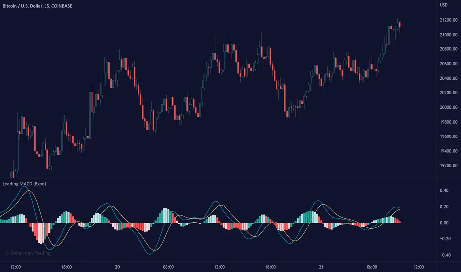
Leading MACD (Expo)Leading MACD (Expo) is designed to anticipate future price action, enabling traders to predict market movements ahead of time. The idea of a leading indicator is that traders can get in before the price move happens and ride the entire trend.
█ Moving average convergence divergence (MACD) is considered one of the most effective momentum and trend-following oscillators. However, the MACD is based on historical price action, making it a lagging indicator. A lagging indicator usually provides signals or insight once the price movement has passed or is in progress. That is why lagging indicators often are used to confirm a price trend or a move. On the other hand, the MACD histogram is more of a leading feature that can act as a sign of future trend changes.
█ The Leading MACD indicator takes all advantages of the traditional MACD and converts it into a fast-moving and leading oscillator that provides real-time insights about potential future price moves. As a result, it gives traders time to analyze a possible upcoming price move before it happens and be prepared for what's coming. However, the leading MACD should be combined with other forms of technical analysis to confirm potential entries and exits.
█ Leading vs. Lagging MACD
The leading MACD looks ahead and helps traders prepare for potential price moves. The traditional (lagging) MACD confirms price action that already has happened. A leading indicator reacts quicker to price changes, while a lagging indicator reacts slower. The different types of MACD have their own advantages and drawbacks, so make sure you understand the leading MACD and see if it fits in with your trading strategy.
█ HOW TO USE
Use the Leading MACD to get insights about potential price changes ahead of time. Get insights about whether a bullish or bearish move is strengthening or weakening. Other common ways are looking for divergences, finding trends, and measuring current momentum.
-----------------
Disclaimer
Copyright by Zeiierman.
The information contained in my Scripts/Indicators/Ideas/Algos/Systems does not constitute financial advice or a solicitation to buy or sell any securities of any type. I will not accept liability for any loss or damage, including without limitation any loss of profit, which may arise directly or indirectly from the use of or reliance on such information.
All investments involve risk, and the past performance of a security, industry, sector, market, financial product, trading strategy, backtest, or individual's trading does not guarantee future results or returns. Investors are fully responsible for any investment decisions they make. Such decisions should be based solely on an evaluation of their financial circumstances, investment objectives, risk tolerance, and liquidity needs.
My Scripts/Indicators/Ideas/Algos/Systems are only for educational purposes!
Trend Oscillator (Expo)Trend Oscillator (Expo) measures the overall trend strength and how strong the current price move/momentum is. The indicator is leading since it can signal a possible trend change that is yet to start. The color of the histogram and its value helps to gauge the strength and momentum of the trend.
The user can enable Bar Color that coloring the candlesticks based on the trend strength.
The user can choose between different trend calculations, such as smoothed trend, volume-weighted trend, a non-lagging trend, to mentions a few.
DIVERGENCES
All types of oscillators produce divergences and so does Trend Oscillator (Expo). Divergences occur when the oscillator deviates from the trending price action. Bullish divergence is then when the trending price makes a lower low but the oscillator makes a higher low. Bearish divergence is then when the trending price makes a higher high but the oscillator makes a lower high.
HOW TO USE
Identify the trend strength and direction
Identify current momentum
Identify potential trend reversals
Identify Overbought and Oversold areas
INDICATOR IN ACTION
1 min chart
I hope you find this indicator useful , and please comment or contact me if you like the script or have any questions/suggestions for future improvements. Thanks!
I will continually work on this indicator, so please share your experience and feedback as it will enable me to make even better improvements. Thanks to everyone that has already contacted me regarding my scripts. Your feedback is valuable for future developments!
-----------------
Disclaimer
Copyright by Zeiierman.
The information contained in my scripts/indicators/ideas does not constitute financial advice or a solicitation to buy or sell any securities of any type. I will not accept liability for any loss or damage, including without limitation any loss of profit, which may arise directly or indirectly from the use of or reliance on such information.
All investments involve risk, and the past performance of a security, industry, sector, market, financial product, trading strategy, or individual’s trading does not guarantee future results or returns. Investors are fully responsible for any investment decisions they make. Such decisions should be based solely on an evaluation of their financial circumstances, investment objectives, risk tolerance, and liquidity needs.
My scripts/indicators/strategies/ideas are only for educational purposes!
ACCESS THE INDICATOR
• Contact me on TradingView or use the links below

Bullish-Bearish OscillatorThis is my attemption to create oscillator that will show when the market is bullish and when its bearish . Fight between those two forces will be shown on the chart.
It is based on price action versus two moving averages.
* You can choose from 4 different MAs in settings: McGinley , SMA , EMA and VWAP .
* You can set up 2 Moving Averages (fast and slow)
* Amount of bars back from PriceAction versus MAs is calculated
ps. This script is invite-only for the members of our trading group (info in signature, group is free of charge).
WaveTrend Momentum (Zeiierman)█ Overview
WaveTrend Momentum (Zeiierman) reveals the underlying rhythm of market movement through positive and negative momentum waves that visualize both sides of trend behavior. This dual-wave structure makes it easy to see how impulses and retracements interact in real time, helping you distinguish between a normal pullback within strength and the early signs of a trend losing momentum.
The indicator layers its waves with higher-timeframe trend alignment and adaptive context filters, mapping when momentum expands, when it fades, and where a pullback is approaching exhaustion or renewed trend strength is likely to emerge.
⚪ Why This One Is Unique
Unlike conventional wave oscillators, this design uses dual, phase-managed wave construction with adaptive scaling across symbols and timeframes. At its core is a three-mode Trend Strength engine (Adaptive, Stability, Structure) that dynamically adjusts to market conditions, supported by higher-timeframe regime sourcing and a dedicated impulse-and-divergence framework.
█ Main features
⚪ WaveTrend Momentum Waves
The foundation of the indicator lies in its ability to build positive and negative momentum waves that visualize both sides of market movement. This dual-wave structure makes it easy to identify trend direction, impulses, retracements, and exhaustion in real time, showing how momentum evolves within broader market phases. The waves can be used directly to gauge trend strength and direction, helping traders stay aligned with prevailing momentum or recognize when a shift is forming.
⚪ Extreme Moves
Extreme Zones highlight points where momentum reaches statistically stretched conditions, areas where price action often pauses, rebalances, or reverses. These zones help traders anticipate potential exhaustion before it becomes visible on price, improving timing for entries, exits, and scaling decisions.
⚪ Impulse Moves
Impulse Markers identify bursts of directional momentum, moments when trend energy expands sharply. These points often align with breakouts, accelerations, or continuation signals, helping traders focus on active opportunities rather than noise or consolidation.
⚪ Trend Strength
The Trend Strength Line adapts dynamically to shifting market regimes. It can operate in three modes: Adaptive, Stability, and Structure, each offering a different sensitivity level to trend changes. This feature helps confirm whether the trend is building, stabilizing, or losing strength, and serves as a foundation for bias filtering or trade direction confirmation.
⚪ Higher-Timeframe Trend Alignment
Integrates a higher-timeframe trend reference directly into the analysis, giving each wave context. This alignment clarifies when local pullbacks occur in harmony or conflict with the broader trend, making it easier to distinguish temporary corrections from true reversals.
⚪ Divergence Engine
A fully integrated divergence detection system that automatically spots both regular and hidden divergences between price and momentum. By surfacing early signs of trend weakening or continuation potential, it gives traders a structured way to detect subtle momentum shifts before they manifest in price.
█ How to Use
⚪ Trend Trading
WaveTrend Momentum excels as a trend-following framework by combining wave direction, Trend Strength, and higher-timeframe alignment to reveal when momentum is expanding or contracting within the broader market phase.
Note: To get trend waves, consider increasing the Wave Transition value to above 40.
Bullish WaveTrend Trend: When the positive momentum waves are above the neutral midpoint, the market is trending upward. Minor downward retracements within this structure often resolve back into trend continuation once buying pressure reasserts itself, particularly when the higher-timeframe context confirms a bullish regime.
Bearish WaveTrend Trend: When the negative wave dominates and remains below the midpoint, downside momentum controls the market. Minor upward retracements within this structure often resolve back into trend continuation once selling pressure reasserts itself, particularly when the higher-timeframe context confirms a bearish regime.
Bullish Trend Strength Line: A Trend Strength Line positioned above the midline indicates a bullish trend. A rising line reflects growing momentum and persistent buying pressure. The steeper the slope, the stronger the current regime. As long as the line continues to rise alongside positive waves, the trend remains structurally intact.
Bearish Trend Strength Line: A Trend Strength Line positioned below the midline indicates a bearish trend. A declining line reflects increasing selling pressure and persistent downside momentum. The steeper the slope, the stronger the current bearish regime. As long as the line continues to fall alongside negative waves, the trend remains structurally intact.
⚪ Momentum Trading
Momentum trading focuses on capturing the energy and force behind price movement, identifying whether the market is accelerating, losing steam, or preparing for a reversal. Momentum shifts can reveal temporary exhaustion, trend-strength continuation, or breakout acceleration before price action fully confirms it.
The indicator includes several features designed to detect and visualize momentum:
Waves: The core element of the indicator. The size and slope of the waves reflect the strength of momentum. Expanding waves indicate strong directional pressure, while contracting waves suggest cooling or consolidation.
Extreme Zones: When waves reach or exceed the extreme levels, the market enters statistically stretched conditions, signaling potential exhaustion or reversal zones. However, these events can also occur during strong trends, indicating continued strength in that direction. Market context is essential to determine whether an extreme should be interpreted as a reversal signal or as confirmation of trend momentum.
Impulse Markers: Highlight sudden bursts of momentum, often associated with breakouts or continuation events. Like Extreme Zones, Impulse Markers can appear within both reversals and strong trending phases. Context from price structure and higher timeframes helps identify whether the impulse reflects a trend-strength expansion or the final surge before exhaustion.
You can use any of these features to identify:
Breakouts: When Impulse or Extreme Markers align with expanding waves.
Reversals: When momentum reaches extreme levels followed by a fade in strength, it signals potential exhaustion before a structural shift. However, strong trends can also produce temporary fades that quickly recover, so context is key to distinguishing between true reversals and brief pauses within the trend.
⚪ Pullback Trading
Pullbacks represent short pauses or retracements within a prevailing trend. The combination of the Wave, Impulse Markers, and the Trend Strength Line helps identify when a pullback is maturing and when continuation is likely to resume.
Bullish WaveTrend and Trend Strength Pullback
In an uptrend, a brief dip in the negative wave, paired with a bullish Trend Strength, typically signals a healthy pullback rather than a reversal. When the negative wave begins to turn upward again, it confirms momentum recovery and potential for continuation.
Bearish WaveTrend and Trend Strength Pullback
In a downtrend, a short-lived rise in the positive wave while Trend Strength remains negative usually signals a counter-trend rally within weakness. As the positive wave fades and the negative wave expands again, downside continuation becomes more probable.
⚪ Divergence Trading
Divergence trading focuses on identifying moments when price and momentum move out of sync, signaling a potential shift in market direction or a slowdown in trend strength. These divergences often appear before reversals, consolidations, or major transitions in structure, making them a valuable early warning tool for traders.
The integrated Divergence Engine automatically detects these imbalances between price action and momentum. When price continues to move in one direction but momentum begins to fade, it suggests that the underlying strength driving the move is weakening.
█ How It Works
⚪ Wave Construction
The momentum wave is derived from phase-managed price smoothers, then normalized and bounded to express both positive and negative momentum within a single coherent structure.
Calculation: Composite moving frameworks with phase management, nonlinear rescaling, and amplitude companding to stabilize wave height and maintain consistent sensitivity.
⚪ Extremes
An auxiliary equilibrium tracker measures deviations from a dynamic mean to identify statistically stretched conditions in which momentum may begin to rebalance.
Calculation: Robust deviation mapping of a smoothed equilibrium series with adaptive thresholds for regime-consistent extremes.
⚪ Trend Strength Core
A tri-mode core measures directional persistence and adapts dynamically to changing market regimes, with optional higher-timeframe sourcing for context.
Calculation: Return-aggregated momentum with envelope gating (Adaptive), stability-biased curvature tracking (Stability), and structure-driven range midpoint logic (Structure).
⚪ Range & Regime Filter
A volatility-adjusted filter produces a smoothed state line and internal bias zones, allowing the indicator to contextualize momentum behavior within current volatility conditions.
Calculation: Volatility-normalized range synthesis with slow/fast quantization modes and optional smoothing to mitigate market chop.
⚪ Impulse Detection
Detects short-term bursts of directional energy and marks them as impulse events. These impulses highlight when momentum rapidly expands, often signaling breakouts, accelerations, or the end of low-volatility phases.
Calculation: Nonlinear impulse-response mapping that emphasizes higher-order rate changes while filtering out micro-noise.
⚪ Divergence Engine (Regular & Hidden)
Compares price swings against the wave’s momentum structure to identify early disagreement between price and internal strength.
Calculation: Swing-logic comparators analyze price relative to normalized wave amplitude to detect momentum shifts and potential divergence setups.
-----------------
Disclaimer
The content provided in my scripts, indicators, ideas, algorithms, and systems is for educational and informational purposes only. It does not constitute financial advice, investment recommendations, or a solicitation to buy or sell any financial instruments. I will not accept liability for any loss or damage, including without limitation any loss of profit, which may arise directly or indirectly from the use of or reliance on such information.
All investments involve risk, and the past performance of a security, industry, sector, market, financial product, trading strategy, backtest, or individual's trading does not guarantee future results or returns. Investors are fully responsible for any investment decisions they make. Such decisions should be based solely on an evaluation of their financial circumstances, investment objectives, risk tolerance, and liquidity needs.
Paid script

TradeChartist TrendStalker - Market Bias Indicator™TradeChartist TrendStalker helps visualise the Market Bias through 3 different Plot types and also displays Trend Direction Identifier (Green, Red and Orange square blocks) that can be connected to ™TradeChartist Plug and Trade to generate Trade entries, Targets, StopLoss and create alerts based on performance on the chosen timeframe. The three plot types are as below.
1. Market Bias Strength Oscillator
Plots true strength of Market Bias - helps determine if Market is Bullish/Bearish overall for the asset on chart TF.
2. Market Bias Detector - Range Based
Displays TrendStalker plots stalking the Market Bias based on Range the Market is expecting to gain/lose from the asset on the Chart Timeframe. Change in Market Bias can be easily seen through the Convergence/Divergence of the TrendStalker plots.
3. Market Bias Detector - Price
Displays TrendStalker plots stalking the Market Bias based on Price for the asset on the Chart Timeframe. Change in Market Bias can be easily seen through the Convergence/Divergence of the TrendStalker plots.
Note: Trend Direction Identifier for Trade entries will be the same for Market Bias Detector plots, but differs from Market Bias Strength Oscillator.
Note: Trend Direction Identifier plots orange squares when its detecting a potential change in trend and its recommended to close some/most of the position or move Stop Loss to protect profit/reduce risk. Once the orange squares turn back into green/red squares, it signals safe re-entry.
Green squares - Bullish Trend
Red Squares - Bearish Trend
Orange Squares - Potential change in Market Bias
===================================================================================================================
TrendStalker Cool Extras
Option to paint Background Color
Option to enable Take Profit bar recommendation (Works only with Market Bias Strength Oscillator)
Option to paint Price Bars using Market Bias Strength
Alerts can be created for Long/Short Entry/Re-entry and Long/Short SOS signals (Orange squares). For all other alerts, ™TradeChartist Plug and Trade can be used.
BTC 1hr Chart with TrendStalker Extras
===================================================================================================================
BTC 1hr Chart with TrendStalker connected to ™TradeChartist Plug and Trade
===================================================================================================================
This is not a free to use indicator. Get in touch with me (PM me directly if you would like trial access to test the indicator)
Premium Scripts - Trial access and Information
Trial access offered on all Premium scripts.
PM me directly to request trial access to the scripts or for more information.
===================================================================================================================

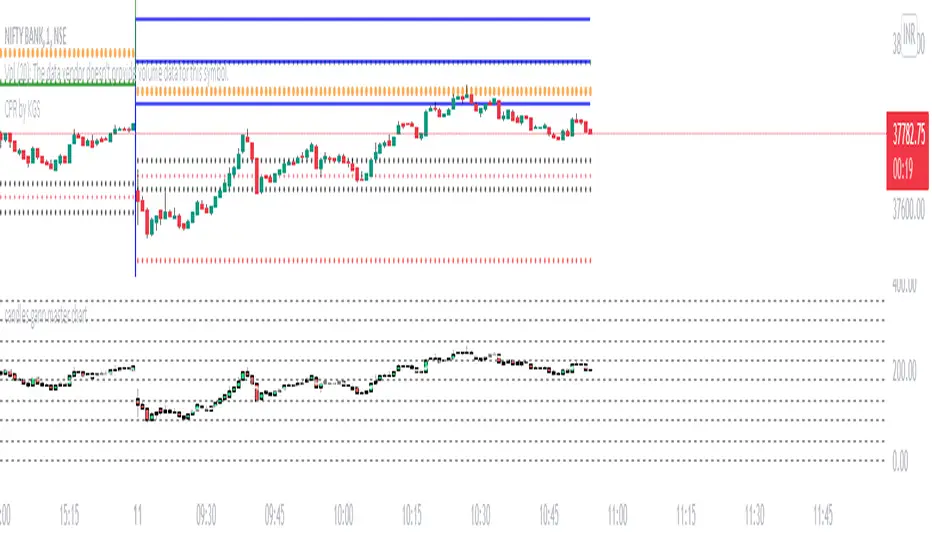
price Degree on gann master chartThis indicator calculates price degree on gann' s master chart. it will plot degree of open (red stepline), close(green stepline), high(white cross), low(red cross).
I request, only people who know how to use gann master chart and degrees of price use this. no one made this indicator till now. It is highly potential tool for gann gann fans.
happy trading!
comment if you like.
TradeChartist PowerTracer™TradeChartist PowerTracer is an exceptionally well designed and functional indicator, requiring minimal user input to trace the asset's Bull and Bear Power. The indicator makes it visually engaging with its various color schemes and intelligent positioning of the PowerTracer Bar, tracking not just the current trend, but also the developing trend using a visually easy to understand Power plots.
What does ™TradeChartist PowerTracer do?
1. Tracks Bull and Bear Power and plots the information visually on chart using one of the following 3 Power plot options based on high or low power detection sensitivity.
𝗣𝗼𝘄𝗲𝗿𝗧𝗿𝗮𝗰𝗲𝗿 - Plot of the Bull and Bear Power Oscillator, pivotal to this script that tracks the true Bull and Bear Power along with Bull/Bear oscillator reading, calculated dynamically using a unique and original formula. Values beyond 50 and -50 are quite rare, but theoretically, they can go beyond 80 and -80. 𝗣𝗼𝘄𝗲𝗿𝗧𝗿𝗮𝗰𝗲𝗿's highs and lows are also tracked and updated real-time using labels placed exactly at the Highs and Lows with their readings.
Bar-wise Power Holder - Absolute Bull and Bear power of each bar. It is plotted by calculating the difference between Bull and Bear Power or each bar. The values can swing between -100 and +100 even though values above 90 and below 90 are rare. The bar color on the chart will be painted using this value to visually display the Bull/Bear strength if "Paint Bars on Chart" is enabled from the indicator settings.
Bar-wise Power Fight - Plot of Maximum Bull and Bear Power of every bar that helps visualize the fight between Bulls and Bears in each bar.
2. Visually displays the Balance of Power between the Bulls and the Bears using Opponent Power Gain background fill when it is 50% or over. For example, if the current PowerTracer plot is a Bull zone, enabling this setting with Opponent Power Gain % set at 75, will paint the background when Bear Power increases beyond 75% using the Bear Power Intensity fill based on Color Scheme the user opts from the settings. This option can be enabled or disabled from settings and the Opponent Power gain % (minimum 50%) can also be adjusted to spot the change in price trend early on.
3. Uses an accompanying 𝗣𝗼𝘄𝗲𝗿𝗧𝗿𝗮𝗰𝗲𝗿 bar that helps spot the true bull and bear power using simple linear blocks, displaying the power level using power intensity colors based on the color scheme.
4. Paints price bars and PowerTracer background using Power intensity colors based on Color Scheme from the indicator settings, which helps spot the increase or decrease in Bull and Bear Power.
5. Inverts bar colors, background fill and PowerTracer bar color to help see price using the Opponent's Point of View.
What markets can this indicator be used on?
-- Forex
-- Stocks - works best with 4hr or above and prices calculated taking gaps into account.
-- Commodities
-- Cryptocurrencies
and almost any asset on Trading View
What time-frames can this indicator be used on?
This indicator can be used on all timeframes. If the asset has very little volume/volatility or is far low in comparative value against the base currency, power detection can be choppy, but with most assets, this won't be an issue.
Does this indicator repaint?
-- No. Real-time Power plots can change colors and values based on current bar close as values get calculated dynamically. Once the bar closes, plots and power intensity colors don't repaint.
-- This can be verified using Bar Replay to check if the plots and fills stay in the same bar in real time as the Bar Replay
Does the indicator send alerts when the power shifts from Bull to Bear or from Bear to Bull?
Yes. Users can get alerts when Power gets shifted using Trading View alerts. This can be done by choosing '™TradeChartist PowerTracer' and 'Powershift to Bulls' or 'Powershift to Bears' under Trading View Alert condition and by using 'Once per bar close' as user needs to wait for candle close for Power shift confirmation.
Example Charts
In this split screen chart of Bitcoin, it can be seen how the 30m chart on left is Bearish and 5m chart on right is Bullish based on Power changes. The trend can be spotted on PowerTracer by spotting the Opponent's background fill that started showing when Opponent's power gained by over 75%. This is a good example using the script for scalping/swing trading using 2 timeframes. Note that the chart on the left shows Price bars and PowerTracer bar with inverted colors to show Opponent's point of view.
In this 15m chart of GBP-USD, 100% Power gain for Entries and Exits is used. This is a more conservative approach and is suited for less aggressive traders based on complete change of trend.
In this 2hr chart of Ethereum, all 3 Power plots are used to identify the trend using low sensitivity using 100% Power Gain entries and this shows how a trade can be held longer to maximise gains using entries with Power shift confirmations.
===================================================================================================================
This is not a free to use indicator. Get in touch with me (PM me directly if you would like trial access to test the indicator)
Premium Scripts - Trial access and Information
Trial access offered on all Premium scripts.
PM me directly to request trial access to the scripts or for more information.
===================================================================================================================

Gann Trend OscillatorDeveloped by Robert Krausz, the Gann Trend Oscillator is a trend-following indicator used to determine the financial instruments long-term price direction.

Parametric Oscillator (Zeiierman)█ Overview
The Parametric Oscillator (Zeiierman) transforms price movement into a structure-aware momentum field, a flowing wave of oscillator-candles wrapped around a smooth Quick Price Action line. Instead of reading raw closes, it constructs a multi-lane view from open, high, low, and close data to capture how price pressure expands, contracts, and shifts through time. These relationships are then projected into a bounded oscillator domain, creating a dynamic visualization of momentum and market balance.
The oscillator-candles flip green or red to signal shifts in buying or selling strength, while the Quick Line tracks underlying momentum on a 0–100 scale. Together, they reveal where pressure is forming, how quickly it’s changing, and whether that change is sustainable, helping traders spot momentum swings, stretched zones, and directional bias across any timeframe.
⚪ What Makes It Unique
The oscillator’s uniqueness lies in how it constructs and interprets price structure. It builds four independent lanes of open, high, low, and close to measure wave relationships and capture micro-drift, wick aggression, and full price behavior rather than relying solely on closing data.
Beneath the surface, the oscillator runs on a balanced motion function that translates market volatility into a clear rhythm of momentum and structure. Each change in color and gradient reflects the balance between acceleration and stability, revealing the underlying pulse of market behavior.
█ Main features
⚪ Parametric Oscillator
The Parametric Oscillator turns market movement into a visual map of buying and selling pressure. Its oscillator-candles reveal how momentum builds, compresses, and releases, showing the balance between strength and exhaustion in real time. As candles shift color and gradient, traders can instantly read acceleration, fading energy, or volatility spikes, allowing for quick interpretation of trend health and potential reversals.
The display captures both immediate bursts of momentum and the underlying trend’s persistence, giving a continuous view of how pressure evolves across market phases. It can be used to spot areas of buildup before breakouts, early signs of compression before expansion, and the transition points where control shifts from buyers to sellers.
⚪ Quick Price Action
The Quick Price Action line provides a smooth, real-time read of market momentum that often shifts before price itself reacts. Acting as a leading momentum gauge, it highlights subtle changes in strength and direction, helping traders anticipate moves rather than chase them.
When the line begins to turn, it frequently does so well ahead of price, signaling acceleration, exhaustion, or an early phase of reversal. A rise toward higher levels reflects building bullish pressure, while a downturn from elevated zones shows fading strength or emerging sell bias.
It adapts smoothly across symbols and timeframes, the Quick Price Action line gives traders a consistent, early warning system and a clear visual cue of when momentum is starting to shift and where the next meaningful move may form.
█ How to Use
⚪ Trend Following
The Momentum Candle Line helps define the underlying directional bias by measuring the strength and persistence of momentum. When momentum holds above or below the midline (50), it reflects whether buyers or sellers maintain control of the trend. Watching how the candles form relative to that level helps identify continuation or potential shifts in direction.
Maintain a bullish bias when the Momentum Candles stay above 50 and candles form higher lows.
Maintain a bearish bias when they stay below 50 and candles form lower highs.
⚪ Detect Leading Momentum
The Quick Price Line helps identify leading momentum moves that often precede price action. These can signal the start of a new move in that direction or the early stages of a reversal.
When the Quick Line peaks above 80, it indicates strong positive momentum.
When it peaks below 30, it signals strong negative momentum.
By observing how the momentum candles behave around these levels, traders can determine whether the move is likely a continuation or a reversal.
⚪ Fading Price Moves
Momentum drives price to new highs and lows, but when that momentum fades, reversals often follow. The Quick Price Line or the Parametric Oscillator candles can reveal weakening momentum before price reacts, giving traders an early signal. When the Quick Line peaks and then begins to fade, it indicates that momentum is losing strength. This can precede a pause, a range, or a full reversal in price. Likewise, if the Parametric Oscillator starts to fade while price continues to move, it suggests that momentum is weakening and a reversal or pullback may be approaching.
█ How It Works
⚪ Dual-Lane Displacement
Price is decomposed into trend and fast components across the open, high, low, and close. These relationships form four signed streams that describe body drive and wick aggression.
Calculation: Builds relative spreads between the trend and fast components, creating a multi-dimensional price-flow state.
⚪ Parametric Mapping
Each data stream is passed through a parametric transform (defaulting to a momentum-sensitive map) and assembled into synthetic OHLC in oscillator space.
Calculation: Applies a state transform over the data, aggregates into oscillator OHLC, and exponentially smooths for stability.
⚪ Quick Price Action
A companion line extracts recent trend displacement, normalizes it in a rolling window around the local mid, and passes it through a smoothing process controlled by Price Trend (softness). This yields a stable 0–100 scale that reacts quickly yet remains consistent across assets and timeframes.
Calculation: Windowed normalization around a dynamic midpoint with adjustable softness to balance responsiveness and stability.
-----------------
Disclaimer
The content provided in my scripts, indicators, ideas, algorithms, and systems is for educational and informational purposes only. It does not constitute financial advice, investment recommendations, or a solicitation to buy or sell any financial instruments. I will not accept liability for any loss or damage, including without limitation any loss of profit, which may arise directly or indirectly from the use of or reliance on such information.
All investments involve risk, and the past performance of a security, industry, sector, market, financial product, trading strategy, backtest, or individual's trading does not guarantee future results or returns. Investors are fully responsible for any investment decisions they make. Such decisions should be based solely on an evaluation of their financial circumstances, investment objectives, risk tolerance, and liquidity needs.

BOSS EMA Trend MeterTHE BEST FOREX, BINARY OPTIONS, AND CRYPTO INDICATORS FOR TRADINGVIEW.COM
Bullish Uptrend
To determine bullish uptrend there must beat least 2 green squares on all three trend meters. This is a great predictor that a uptrend is imminent.
Bearish Downtrend
To determine bearish downtrend there must beat least 2 red squares on all three trend meters. This is a great predictor that a downtrend is imminent.
For best results use with Boss Bull/Bear Stochastic RSI
If you get a buy signal on Boss Bull/Bear Stochastic RSI and trend meter has a minimum of 2 green squares then this is a great buy/long entry.
If you get a sell signal on Boss Bull/Bear Stochastic RSI and trend meter has a minimum of 2 red squares then this is a great sell/short entry
Available at bosscripts.com
Website bosscripts.com
