Customized Double Bollinger Bands [wjdtks255]This indicator combines two Bollinger Bands to visualize both short-term and extreme volatility zones on the same chart.
While a standard Bollinger Band shows how far price deviates from its mean,
this customized version displays two standard deviation ranges, allowing traders to distinguish between mild and extreme volatility conditions.
Band 1 (StdDev 0.5) captures short-term fluctuations near the price average,
while Band 2 (StdDev 3.0) highlights overbought or oversold conditions at market extremes.
When the distance between the two bands widens, volatility is increasing;
when it narrows, the market is stabilizing or preparing for a breakout.
ㆍPrice breaking above Band 2 → Potential overbought or strong bullish trend
ㆍPrice falling below Band 2 → Possible oversold or bearish continuation
ㆍBands tightening → Volatility compression, potential reversal zone
This indicator is designed primarily for volatility visualization rather than directional prediction.
For higher accuracy, use it alongside RSI, MACD, or trend-based indicators.
Developed by wjdtks255
Volatility

VWAP – Pivot Pairs (SECONDS‑BASED RESET)VWAP – Pivot Pairs (SECONDS-BASED RESET) is a Pine Script v6 indicator for TradingView that combines pivot-based breakout detection with resettable VWAP (Volume Weighted Average Price) calculations over user-defined rolling time periods in seconds.It identifies high and low swing pivots via breakout logic, then calculates two VWAP lines per anchor:One using high/low as the price source,
One using close as the price source.
These form "pivot pairs" that reset automatically at the start of each custom-duration period (e.g., every 300 seconds), starting from a user-defined UTC time of day (default: 09:30 UTC).Visuals include:Colored VWAP lines (high pair: red, low pair: green),
Semi-transparent fill zones between each pair,
Optional toggles to show/hide high or low pairs.
Use CasesUse Case
Description
Intraday Scalping (1–15 min charts)
Use 60–300 second resets to capture micro-trends within larger sessions. VWAP pairs act as dynamic support/resistance after breakouts.
High-Frequency / Algo Validation
Backtest strategies on tick/second charts where traditional session resets fail. Align resets with exchange micro-sessions or volatility windows.
Opening Range Breakout (ORB) Enhancement
Set period_seconds = 1800 (30 min) and start time = 09:30 UTC → VWAP builds only on first 30 mins post-open, then floats. Pairs show deviation from ORB mean.
Range-Bound Market Analysis
In choppy markets, VWAP pairs converge near fair value. Divergence signals potential breakout. Fill color intensity shows conviction.
Multi-Timeframe Confluence
Overlay on 1-second chart with 300s reset → matches 5-minute structure. Use close-based VWAP for entries, high/low-based for stops.
Key Features SummaryFeature
Function
period_seconds
Rolling window length in seconds (e.g., 300 = 5 min)
period_start_time
UTC time-of-day anchor (default: 09:30)
new_period logic
Triggers full reset of pivots + VWAP on exact second boundary
breakingHigher / breakingLower
Detects confirmed breakouts (not just close above high)
Dual VWAP per anchor
ta.vwap(high) and ta.vwap(close) for range-aware mean
Fill zones
Visual value area between high/close VWAPs
Toggle visibility
Independently show/hide high or low pivot pairs
How It Works – Step-by-StepTime Engine Converts user inputs → milliseconds
Calculates current period start time using integer division from epoch
Detects exact bar when new period begins (new_period = true)
On New Period Resets both high/low anchors to current bar’s h and l
Forces VWAP recalculation from this bar forward
Breakout Detection Only triggers on strong candles (rising/falling, non-doji)
Requires open/close beyond prior pivot → avoids wicks-only breaks
VWAP Accumulation ta.vwap(source, reset_condition) restarts when anchor resets
Two sources per side → shows where volume clustered (at highs vs closes)
Plotting Four lines + two fills
Clean, customizable, overlay-friendly
Pro TipsUse on Heikin Ashi for smoother breakout signals.
Combine with volume profile to validate VWAP clusters.
For crypto, set period_start_time = 0 (00:00 UTC) for clean 4-hour resets.
Add alerts on new_period or breakingHigher for automation.
In short: This is a precision VWAP tool for time-boxed, pivot-driven mean reversion and breakout trading, ideal for scalpers, day traders, and algo developers needing sub-session granularity.

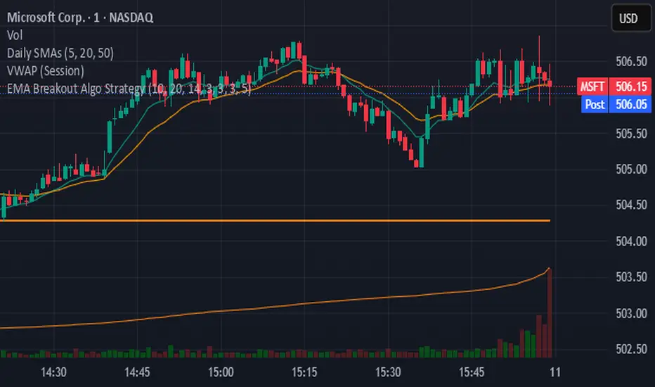
EMA Breakout Algo StrategyA volatility‑based breakout strategy using EMA alignment and ATR filters for risk‑managed entries and exits.
Market Emotion Cycle DetectorThis indicator estimates emotional phases in price behavior by measuring how far price deviates from its dynamic mean.
It uses an adaptive Z-Score normalization with volatility-aware scaling and optional higher-timeframe blending.
Each candle is color-coded according to its deviation level, creating a clear visual map of market sentiment, from extreme panic (MAX FEAR) to euphoric exhaustion (MAX EUPHORIA).
The tool helps identify accumulation and distribution phases inside cyclical or mean-reverting markets.
🧩 Core Logic
Z-Score of EMA-smoothed price: measures standardized distance from the mean.
ATR regime scaling: adjusts sensitivity across volatility environments.
Optional higher-TF fusion: smooths sentiment transitions without lookahead.
Phase classification: seven discrete emotion zones (MAX FEAR → MAX EUPHORIA).
Non-repainting signals: phase changes confirmed on bar close only.
⚙️ Setup Instructions
To allow full color rendering by the Emotion Candles:
Open Chart Settings → Symbol → Candles
• Uncheck “Color bars based on previous close”
• Clear all Body, Wick, and Border colors
On the chart, right-click any overlay element (coin label, MTX, indicator tag …)
• Choose Hide from the ⋮ menu to keep the view clean
Ensure background contrast makes emotion colors visible.
🎯 Usage Notes
Designed for contextual sentiment analysis, not automated entries.
Works best when combined with independent trend or structure confirmation.
Webhook-ready alerts are available for LONG / SHORT / FLAT transitions.
Default parameters are calibrated for daily and 4-hour charts; shorter TFs may require reduced lookback.
📘 Classification Reference
MAX FEAR:
Capitulation & panic; potential deep-value accumulation zones
FEAR:
Negative bias but stabilizing volatility
CONCERN:
Early recovery interest; risk-reward starts improving
NEUTRAL:
Balanced sentiment, transition zone
MILD GREED:
Optimism emerges, trend continuation possible
GREED:
Late-stage rally; profit-taking often begins
MAX EUPHORIA:
Emotional climax, exhaustion and distribution signals
This publication is an original implementation of an adaptive sentiment model - not a mash-up or derivative of existing indicators.
Created by geokat

Squeeze + Short/Long (Futures) - WS🧠 Overview
The Squeeze + Short/Long (Futures) indicator combines Bollinger Bands, Keltner Channels, and momentum breakout logic to identify market compression phases (squeezes) followed by strong volatility expansion.
Ideal for crypto, futures, and FX traders who seek early breakout confirmation.
📊 Momentum Visualization
🟩 Green bars: positive momentum (bullish)
🟥 Red bars: negative momentum (bearish)
⚙️ Signals
LONG signal (green triangle) → squeeze just released + bullish momentum.
SHORT signal (red triangle) → squeeze just released + bearish momentum.
Gray background → Squeeze ON (low volatility / compression).
Includes a cooldown mechanism to prevent multiple false triggers.
💡 Trading Idea
1️⃣ Wait for a gray background (market compression).
2️⃣ When white dots and a triangle appear → volatility is expanding.
3️⃣ Trade in the direction of momentum (green for longs, red for shorts).
4️⃣ Use ATR or price structure for stops and targets.
⚙️ Recommended Settings
Market BB Len KC Len BB Mult KC Mult Momentum Len
Crypto (15m–1h) 20 20 2.0 1.5 12
Futures / FX (1h–4h) 20 20 2.0 1.5 20
🔔 Alerts
LONG Squeeze → breakout upward confirmed
SHORT Squeeze → breakout downward confirmed
Enable alerts in TradingView’s Alert Manager once added to the chart.
🧾 Credits
Created with ❤️ by WS Trading Tools
Built in Pine Script v6
Based on the classic TTM Squeeze logic with custom momentum and configurable cooldown.
© 2025 GuidoT | WS Trading Tools

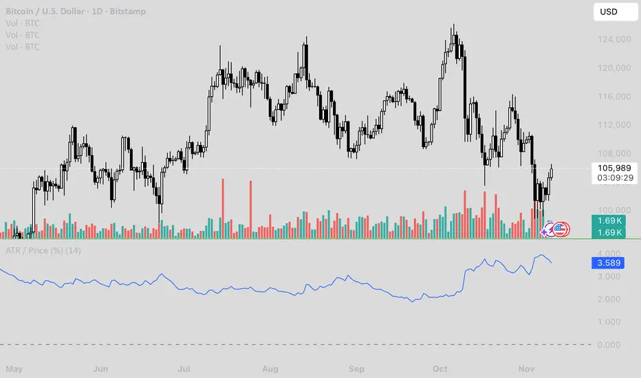
ATR / Price RatioDescription:
This indicator plots the ratio of the Average True Range (ATR) to the current price, showing volatility as a percentage of price rather than in absolute terms. It helps compare volatility across assets and timeframes by normalizing for price level.
A higher ATR/Price ratio means the market is moving a larger percentage of its value each bar (high relative volatility). A lower ratio indicates tighter, quieter price action (low relative volatility).
Traders can use this ratio to:
• Compare volatility between instruments
• Identify shifts into high or low volatility regimes
• Adjust position sizing and stop distances relative to risk
Contango/Backwardation Monitor
This is an indicator to display the spread difference between two products. I designed it around VX1! and VX2! but any other two products can be chosen. It is a simple subtraction of VX2-VX1. I will go through the options first and what they do followed by what contango/backwardation is in my own words. You will need the data package for VX futures for the default version to work.
INPUTS
-Apply Smoothing: choose to apply smoothing or not.
-Smoothing Method: choose between SMA,EMA,WMA, etc.
-Line Width: Width of line if line is chosen style(can be changed in style section)
-Threshold 1-5: This is the level at which the line will change colors(defaults are for VX)
-Color 1-5: The color the line will change to when crossing threshold.
Towards Backwardation: Background color change when line is slanted down
Towards Contango: Background color change when line is slanted up
Bars to Confirm Trend: This is my method to cut down on background color changes. It is how many bars consecutive going back needed to change color.
STYLE
-All colors and whatnot can be changed here(threshold colors can be changed here or on the input page).
T1 Line-T5 line: These are simple horizontal lines that can be used to denote threshold areas or whatever you want.
Contango/Backwardation-These terms are used mostly with futures to define the calendar spread between two contracts. Contango is when that spread is is getting longer and backwardation is when that spread is closing. In terms of VIX futures, Contango would imply that volatility is stabilizing and the S and P will likely gain. Backwardation, woudl eb the opposite.
The most simple way to read this indicator with default settings- If the line is up, red, and the background is red, then you can assume S and P prices are going down. And if the opposite is true, then prices are likely going up.
Please feel free to ask any questions and I will do my best to answer them.

Order-Flow Proxy (VWAP Deviation Zones)Order-Flow Proxy (VWAP Deviation Zones) helps traders visualize when market price moves unusually far away from its Volume-Weighted Average Price (VWAP) — a key fair-value level used by institutional participants.
When price stretches too far above or below VWAP, it often signals temporary imbalance between buying and selling pressure.
This tool highlights those moments using simple color zones and an optional statistical Z-Score filter for deeper precision.
In short: it’s a clean, minimal mean-reversion indicator showing when price is statistically “too far” from fair value.
Red zone → Price extended above VWAP → possible buyer exhaustion or short setup.
Green zone → Price extended below VWAP → possible seller exhaustion or long setup.
VWAP line → Acts as a dynamic fair-value anchor.
Concept:
VWAP combines both price and traded volume to define where most transactions occurred.
Deviations from it — measured either by a fixed distance (1%) or by Z-Score — can reveal overvaluation or undervaluation zones used by professional traders for contrarian setups.
How to use:
Apply the indicator to any intraday chart (1m–1h recommended).
Watch for background color shifts — red or green.
Optionally enable the Z-Score filter to focus only on statistically extreme deviations.
Combine with volume spikes, liquidity sweeps, or your own order-flow tools for confirmation.
Tip:
Best used as a visual overlay for detecting stretched markets and potential reversals.

RED-E Gamma Range DetectorRED-E Gamma Range Detector
Overview
The RED-E Gamma Range Detector identifies key support and resistance zones based on recent price action and volume distribution, combined with a simple momentum ribbon to help traders visualize trend direction. It's designed to highlight potential areas where price may react, inspired by the concept of gamma exposure levels in options trading.
How It Works
1. Support & Resistance Zones (Green & Red Boxes)
RED-E analyzes the recent price range over a customizable lookback period
It identifies high-probability support levels (green boxes) below current price
It identifies high-probability resistance levels (red boxes) above current price
These zones represent areas where price has historically shown increased activity
2. Gamma Flip Level (Yellow Dashed Line)
The yellow line represents the approximate "gamma flip" - the midpoint of the recent range
Above this line: Price tends to be more stable with range-bound behavior
Below this line: Price tends to be more volatile with trending behavior
This level acts as a key pivot point for market structure
3. Momentum Ribbon (Green/Red Fill)
A simple visual indicator using 9 and 21 period EMAs
Green ribbon: 9 EMA is above 21 EMA (bullish momentum)
Red ribbon: 9 EMA is below 21 EMA (bearish momentum)
Ribbon width shows strength of trend (wider = stronger trend)
How to Use
For Range Trading:
Look for buy signals near green support zones when above gamma flip
Look for sell signals near red resistance zones when above gamma flip
Price tends to bounce between zones in stable conditions
For Trend Trading:
Watch for breakouts above resistance or below support zones
Use the momentum ribbon to confirm trend direction
Wider ribbon gaps indicate stronger directional moves
For Risk Management:
Use support/resistance zones for stop-loss placement
Recognize increased volatility potential below the gamma flip
Adjust position sizing based on your proximity to key zones
Settings
Lookback Period: Number of bars to analyze (default: 20)
Lower values = more responsive to recent price action
Higher values = more stable, longer-term levels
Best Practices
Works best on liquid instruments (major stocks, indices, forex pairs)
Combine with other technical analysis tools for confirmation
Most effective on 1H, 4H, and daily timeframes
Always use proper risk management and stop losses
Why "RED-E"?
RED-E stands for being Ready to identify critical gamma levels, support/resistance zones, and momentum shifts - keeping you prepared for market moves before they happen.
Educational Note
This indicator approximates gamma exposure concepts using price and volume analysis. It does not use actual options data. The term "gamma" refers to the rate of change in options delta and how market makers hedge their positions, which can create support/resistance at certain price levels.
Disclaimer
This indicator is for educational and informational purposes only. It does not guarantee profitable trades. Past performance is not indicative of future results. Always conduct your own analysis and manage risk appropriately. Trading involves substantial risk of loss.
Recommended Categories
Primary Category:
✅ Support and Resistance
Secondary Categories:
✅ Momentum
✅ Trend Analysis
✅ Volatility

FXGringo1.2FXGringo - Decision Points
This indicator identifies support and resistance zones based on reference points provided in the levels field, interpreting them as potential areas of price reaction. From these points, the script plots strength levels, allowing the trader to visualize regions where the price may encounter natural barriers to equilibrium between supply and demand.
Although the internal calculations do not directly reveal the complete methodology, its logic can be compared to concepts similar to gamma levels (GEX), insofar as it seeks to map zones where price movement tends to be more sensitive due to the concentration of positions or relevant market flows.
How the Indicator Works:
Input of External Points:
The user manually provides price points that represent potential support or resistance levels.
Strength Classification:
The indicator processes these points and plots each level based on criteria such as distance from the current price, frequency of occurrence in the history, and pre-calculated volatility variation. This generates a visual and quantitative hierarchy among the provided levels.
Context Analysis:
Based on the interaction between price and these levels, the script identifies and plots zones of greater relevance—where the price tends to react, consolidate, or reverse.
Confluence Analysis:
Observe how the external levels align with peaks, troughs, and volume zones. The overlap of strong levels often indicates areas of great institutional interest.
Risk Management:
Use the identified levels to plan entry and exit points and stop-loss or take-profit placement, based on the relative strength of the levels.
Modern Conceptual Basis: The methodology, although proprietary, can be compared to how gamma levels reflect zones of greater price sensitivity relative to the market's aggregate exposure.
Conclusion:
This indicator acts as an advanced tool for interpreting support and resistance levels, using external data to build a dynamic map of market interest zones. Its operation can be seen as an analogy to gamma levels (GEX), identifying regions where the price tends to react more significantly due to liquidity concentration or position imbalance. This approach provides the trader with a refined view of the areas of influence of large players, assisting in making decisions with greater precision and confidence.

ATR Daily (Classic vs Robust, NY-Fix, Spike Control)📘 What this indicator does
This tool provides an advanced view of daily market volatility by comparing two versions of the Average True Range (ATR):
• Classic ATR — standard Wilder smoothing
• Robust ATR — uses median-based filtering and spike-control logic to reduce distortion from abnormal candles
Both values are calculated using daily data aligned to the New York trading session, so volatility resets at the same moment each institutional trading day begins. This keeps readings consistent across crypto, forex and stocks, even on intraday charts.
⚙️ How it works (in simple terms)
The script evaluates each True Range (TR) value relative to a median-based threshold:
• Abnormally large ranges are either clamped to a limit or excluded from updating ATR
• A hard cap prevents single spikes from inflating the entire indicator
• The result is a smoother and more realistic representation of daily volatility
This allows ATR to reflect typical market behaviour instead of rare one-off events.
📊 What appears on the chart
• Two daily ATR lines (Classic and Robust)
• Histogram showing the percentage of daily range already completed
• Red bars when price exceeds 100% of daily ATR
• A data table with volatility metrics
• Background highlights on days with extreme values
💡 How traders can use it
• Identify when a market has already completed most of its typical daily move
• Compare Classic vs Robust ATR to spot news-driven distortion
• Use Robust ATR for more stable stop-loss and take-profit logic
• Track volatility expansion or contraction across sessions
⚙️ Key settings
Setting Purpose
ATR period Standard smoothing length (default 14)
Robust mode Clamp, Freeze or Off
MAD multiplier Sensitivity to outliers
Cap × median(TR) Maximum allowed spike size
Base for passed ATR Which ATR is used to measure daily %
Freeze weekends Keeps ATR unchanged on Sat/Sun
🧩 Unique concept
Unlike typical ATR indicators, this one combines robust statistics (median + MAD) with session-based fixation. ATR values update only once per New York session, creating stable volatility measurements that match institutional timing.
🔒 Source code
The script is published with protected source code to preserve its statistical structure and prevent unauthorized modification.
🧭 Summary
ATR Daily (Classic vs Robust, NY-Fix) provides a clearer and more reliable view of daily volatility.
It helps determine whether the market is still in the early phase of its daily range or already exhausted.

Average Candle Body (24h Rolling)This indicator calculates the average size of candle bodies (|Close – Open|) over the last 24 hours, regardless of your current chart timeframe.
Unlike ATR or ADR, which measure total range (High – Low) or day-to-day volatility, this tool focuses purely on the real body size of candles — a more accurate representation of in-session price momentum and liquidity activity.
🔍 How it works
The script automatically determines how many candles represent the last 24 hours based on your current timeframe (e.g. 288 candles on a 5-minute chart).
It then computes a Simple Moving Average (SMA) of the absolute candle body size across that rolling 24-hour window.
Optionally, the script also plots the current candle body size as a grey histogram for quick comparison.
⚙️ Use cases
Gauge intraday volatility based on average body movement rather than wicks.
Build dynamic stop-loss models (e.g., Stop = 1.2 × AverageBodySize).
Detect periods of compression or expansion in price action.
Filter or confirm setups (e.g., only trade when candle bodies exceed their 24 h average).
📈 Displayed elements
Orange line: average candle body size (rolling 24 hours)
Grey histogram: current candle body size for each bar
Works automatically across all timeframes and assets (crypto, forex, indices, etc.)
💡 Pro tip
This indicator pairs exceptionally well with:
EMA-based momentum systems (e.g. EMA 8/21 crosses)
Session-based reversal or sweep strategies (Asia-London transitions)
VWAP or liquidity-based frameworks where candle compression matters
📘 How to Interpret
When the orange line (24h average candle body) is rising, it indicates that average body sizes are expanding — signaling increasing intraday momentum and participation. This often aligns with periods of higher volatility, stronger trends, or major session opens (London/New York).
When the orange line is falling, it shows contracting body sizes, meaning the market is entering consolidation, reduced volatility, or indecision. Such periods often precede major breakouts or reversals.
Use this reading to:
Avoid false breakouts during low-body periods.
Tighten or widen stops based on real-time market compression or expansion.
Confirm reversals: a shrinking average body after a strong impulse can signal momentum exhaustion.

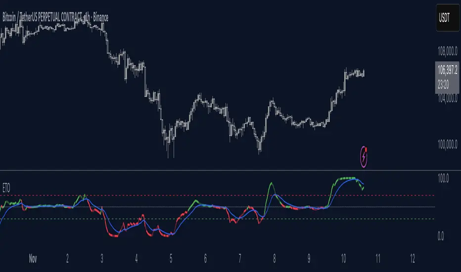
Elastic Trend OscillatorThe Elastic Trend Oscillator (ETO) is a volatility-adaptive momentum indicator that measures price displacement from a trend baseline while accounting for market volatility conditions. Unlike traditional oscillators that use fixed scaling, ETO dynamically adjusts its sensitivity based on current volatility levels relative to recent market conditions, providing context-aware momentum readings across different market regimes.
What Makes This Indicator Different
Volatility-Adaptive Scaling:
The core innovation of ETO is its dynamic volatility adjustment mechanism. The indicator calculates an ATR percentile rank over a lookback period and uses this to scale the momentum readings. When volatility is elevated, the indicator becomes less sensitive to price moves, recognizing that larger displacements are normal in volatile conditions. Conversely, in low volatility environments, smaller price moves are given more weight. This prevents false signals during volatility expansions and maintains sensitivity during quiet periods.
Low Volatility Compression:
During periods of extremely low volatility, the oscillator naturally compresses toward the midline and exhibits minimal movement. This midline-hugging behavior serves as a visual indicator that the market lacks directional energy and momentum readings are unreliable. Unlike indicators that continue oscillating during quiet periods and potentially generate false signals, ETO's compression around the midline is supposed to identify low-conviction environments where trend-following strategies underperform. When you see the oscillator stuck near 50 with little movement, recognize this as a consolidation phase where ranges dominate and breakout setups may be developing.
Trend Slope Analysis with Dynamic Thresholds:
The indicator monitors both the trend direction (EMA slope) and the rate of slope change. Dynamic thresholds based on ATR identify when trend acceleration is slowing. The oscillator becomes semi-transparent when slope deceleration exceeds the threshold, warning of potential trend exhaustion before actual reversals occur.
Relatively Linear Transformation:
Unlike many oscillators that use non-linear transformations, ETO applies a more linear scaling of the ATR-normalized displacement. This preserves the proportional relationship between price moves and oscillator readings, making divergences and momentum shifts more intuitive to interpret.
How to Use the Indicator
Trend Direction:
Green oscillator = Bullish trend (price above EMA with positive slope)
Red oscillator = Bearish trend (price below EMA with negative slope)
Oscillator compressed near 50 with minimal movement = Low volatility, consolidation phase. These phases often precede volatility expansions and significant directional moves, making them more ideal for monitoring breakout setups rather than taking positions.
Momentum Quality:
Solid color = Strong, accelerating trend
Semi-transparent = Decelerating trend, potential exhaustion, potential consolidation ahead
The transparency change acts as an early warning before actual trend reversals or consolidations.
Trading Signals:
Crossovers: When the oscillator crosses the signal line to the other side of momentum while oversold/overbought, it suggests potential reversals (better in combination with transparency loss).
Overbought/Oversold: Levels above 70 indicate overbought conditions; below 30 indicate oversold. These are not reversal signals themselves but identify extended moves where momentum may be extreme.
Midline: Oscillator above 50 indicates price is above the trend baseline with positive displacement. Below 50 indicates negative displacement.
Divergences: Like with other momentum indicators compare oscillator highs/lows with price highs/lows.
Settings
EMA Length: Controls the trend baseline period. Lower values make the indicator more responsive to short-term price changes; higher values focus on longer-term trends. This directly affects how quickly the oscillator responds to trend changes.
ATR Length: Determines the period for volatility measurement. This affects both the normalization of price displacement and the momentum confirmation filter. Lower values make volatility measurements more reactive; higher values provide smoother volatility assessment.
Oscillator Smoothing: Applies EMA smoothing to the raw oscillator values. A value of 1 shows unsmoothed, more volatile readings. Higher values produce smoother oscillations with less noise but more lag.
Signal Line Length: The EMA period for the signal line. Lower values create more frequent crossovers; higher values generate fewer but potentially more significant crossovers. This acts as a moving average of the oscillator itself.
Slope Change Sensitivity: Multiplier that sets how much slope deceleration triggers the transparency effect. Lower values make the indicator more sensitive to trend exhaustion, showing transparency earlier. Higher values require more pronounced deceleration before visual warning.
Overbought Level: Defines the upper extreme threshold.
Oversold Level: Defines the lower extreme threshold.
Best Practices
Use on any timeframe, but adjust EMA and ATR lengths according to your trading style (shorter for shorter term trades, longer for longer term trading like swing trading)
Combine with price action — the indicator identifies momentum conditions, not specific entry/exit points.
In strongly trending markets, the oscillator may remain in overbought/oversold territory for extended periods—this is normal and indicates persistent momentum rather than imminent reversal.
This indicator does not provide investment or trading advice. All trading decisions should be made based on your own analysis and risk management.
Expected Move for Futures (Daily Fixed ATR Levels)I noticed there are plenty of indicators for Expected Move in Options. I am creating something similar, tracking the Average True Range of the past 7 days (day by day) to get a fixed amount of where price might be expected to move within ATR.

Supertrend Dual-Zone Channel V2**Supertrend Dual-Zone Channel V2**
Advanced Supertrend with Dual-Zone Visualization, Breakout Counter, and Dynamic Labels
A powerful upgrade to the classic Supertrend indicator that displays two distinct zones:
• Bullish Channel (green): Active when price is above the Supertrend line
• Bearish Channel (red): Active when price is below the Supertrend line
Key Features
• Dual-Zone Fill System: Clearly separates bullish and bearish regimes with semi-transparent channel fills for instant trend context.
• Reverse Tracking Lines: Shows the opposite-direction Supertrend band (faint green/red lines) to highlight potential reversal zones.
• Automatic Breakout Counter: Counts consecutive breaks into the opposite tracking band.
- Green labels below bars: Bullish breakouts (price closes above bearish tracking line while in uptrend)
- Red labels above bars: Bearish breakouts (price closes below bullish tracking line while in downtrend)
• Clean Label Management: Uses arrays to store labels with tooltips showing breakout sequence number.
• Mid-Channel Reference: Invisible midline based on (high + low)/2 for internal fill logic (not plotted).
How to Use
• Strong Trend Confirmation: Price staying within its colored channel = healthy trend.
• Pullback Entries: Look for price touching the faint reverse tracking line without breaking it.
• Breakout Signals: Labeled breakouts (1st, 2nd, 3rd...) often precede trend exhaustion or acceleration.
• Works on all timeframes and assets.
Inputs
• Factor (default: 3.0) – Sensitivity of the Supertrend bands
• ATR Period (default: 10) – Lookback period for volatility calculation
Visuals
• Thick green/red line: Current active Supertrend
• Faint opposite-color line: Reverse tracking band
• Light green/red fills: Bullish/Bearish zones
• Numbered labels: Sequential breakout counter
Fully optimized with max_lines_count=500 and max_labels_count=500.
Clean, lightweight, and highly readable on chart.
Version 2 – Improved labeling, better zone separation, and smarter counter reset on trend change.
Perfect for trend-following, pullback trading, and spotting potential reversals.
Happy trading!
====================================================================================
**Supertrend 双区通道 V2**
高级超级趋势指标:双色通道可视化 + 突破计数器 + 动态标签
经典 Supertrend 的强力升级版,通过 **双区通道** 直观区分多空状态:
• 多头通道(绿色):价格位于 Supertrend 上方时激活
• 空头通道(红色):价格位于 Supertrend 下方时激活
### 核心功能
• 双区填充系统:半透明通道填色,一眼分辨当前多空主导区域
• 反向轨道线:显示对立方向的 Supertrend 带(淡绿/淡红虚线),清晰标记潜在反转区域
• 自动突破计数器:统计价格连续突破反向轨道的行为
- 绿色标签(K线下方):多头突破(多头趋势中收盘突破空头轨道)
- 红色标签(K线上方):空头突破(空头趋势中收盘跌破多头轨道)
• 智能标签管理:使用数组存储标签,带工具提示显示突破序号
• 通道中轴:基于 (high + low)/2 的隐形中线,仅用于填充逻辑(不显示)
### 使用方法
• 趋势健康:价格始终停留在同色通道内 = 强势趋势
• 回调入场:价格触及淡色反向轨道但未突破 = 优质回调机会
• 突破信号:连续编号突破(第1次、第2次…),根据不同品种设定自定义的突破次数,btc通常五次突破后才会衰竭。
• 适用于所有周期、所有品种
### 输入参数
• 倍数(默认 3.0):控制 Supertrend 带的灵敏度
• ATR周期(默认 10):波动率计算周期
### 视觉元素
• 粗实线(绿/红):当前生效的 Supertrend 主线
• 细虚线(淡绿/淡红):反向轨道线
• 浅色填充:多头/空头通道区域
• 编号标签:突破序号(从0开始计数)
**V2 版升级**:优化标签逻辑、更好区域分隔、趋势切换时自动归零计数器。
祝交易顺利!

Momentum Squeeze Candle [Darwinian]# Momentum Squeeze Candle
Professional squeeze detection indicator with Wyckoff accumulation/distribution analysis and multi-method momentum signals.
## Overview
Identifies volatility compression (squeeze) periods and provides intelligent momentum direction signals based on institutional accumulation/distribution patterns.
## Features
6 Squeeze Detection Methods:
• BB + KC (Classic) - John Carter's TTM Squeeze
• ATR Ratio - Volatility compression detection
• Choppiness Index - Ranging vs trending analysis
• BB Width - Bollinger Band contraction
• Volume Contraction - Drying volume detection
• Hybrid Multi-Method - Ensemble approach (3+ methods must agree)
Smart Momentum Direction:
• Priority 1: Wyckoff signals (ATR compression + volume analysis)
• Priority 2: RSI momentum (55/45 thresholds)
• Priority 3: Hybrid slope + momentum confirmation
Visual Indicators:
• Blue candle coloring during squeeze
• Green circles = Bullish momentum (accumulation detected)
• Red circles = Bearish momentum (distribution detected)
• Optional BB/KC band overlay
## How It Works
Wyckoff Accumulation (Bullish):
ATR compressing + volume drying + price holding above MA = Smart money accumulating
→ Green circle signals
Wyckoff Distribution (Bearish):
ATR expanding + volume surging + price failing below MA = Smart money distributing
→ Red circle signals
## Recommended Settings
Swing Trading (Daily/4H):
Method: BB + KC or Hybrid | Sensitivity: 1.2-1.5
Day Trading (15m-1H):
Method: ATR Ratio or BB Width | Sensitivity: 0.8-1.0
Scalping (1m-5m):
Method: Volume Contraction | Sensitivity: 0.7-0.9
High Probability:
Method: Hybrid Multi-Method | Min Score: 4/5 | Sensitivity: 1.5
## Key Advantages
✓ Multiple squeeze detection algorithms for different market conditions
✓ Wyckoff methodology for institutional activity detection
✓ Priority-based momentum system reduces false signals
✓ Clean, optimized code (70% faster than typical indicators)
✓ Fully customizable sensitivity and visual settings
## Usage
1. Choose squeeze detection method based on your trading style
2. Watch for blue candles (squeeze active)
3. Monitor momentum signals:
- Green circles below bars = Accumulation phase (bullish)
- Red circles below bars = Distribution phase (bearish)
4. Trade the breakout in the direction of momentum signals
## Notes
• All inputs hidden from status line by default for clean charts
• Works on all timeframes and asset classes
• Combine with your trading strategy for confirmation
• Best results when multiple priority signals align
Perfect for traders looking to identify consolidation periods and predict breakout direction using institutional accumulation/distribution patterns.

FVG ATRFVG ATR — Fair Value Gap Size Measured in ATR Units
This Pine Script v6 indicator detects Fair Value Gaps and displays their size as a ratio of the Average True Range, providing traders with a normalized measurement of gap significance across different market conditions and timeframes.
Key Features
Automatic FVG Detection
The indicator identifies bullish and bearish Fair Value Gaps using the standard three-candle pattern. Bullish FVGs occur when the current low exceeds the high from two bars ago, while bearish FVGs occur when the current high falls below the low from two bars ago.
ATR Ratio Calculation
Each detected FVG is measured against the current Average True Range at the moment of detection. The ratio is displayed as a compact label next to the gap, showing values like "ATR: 0.75" or "ATR: 1.41". This normalization allows comparison of gap significance across volatile and calm market periods.
Minimal Visual Footprint
Labels are displayed directly on the chart without boxes or lines, using customizable text sizes from tiny to large. The default tiny size ensures the chart remains uncluttered while providing essential information at a glance.
Highly Customizable Display
All visual aspects are configurable through input parameters, including label position (top, middle, or bottom of gap), text size, text color, optional background, and horizontal offset from the detection candle.
Customizable Parameters
Detection Settings
Detect Bullish FVG: Enable or disable detection of bullish gaps. Default is enabled.
Detect Bearish FVG: Enable or disable detection of bearish gaps. Default is enabled.
Min Size (pips): Filter out small gaps below the specified threshold. One pip equals 10 ticks for most Forex pairs. Default is 10 pips.
ATR Calculation
ATR Period: Period length for Average True Range calculation. Default is 14, adjustable to match your trading strategy.
Label Settings
Label Position: Vertical placement of the text label relative to the FVG zone. Options are Top, Middle, or Bottom. Default is Middle.
Label Size: Text size from Tiny (smallest), Small, Normal, to Large. Default is Tiny for minimal chart clutter.
Text Color: Custom color for label text. Default is white for visibility on dark themes.
Show Background: Toggle to display labels with a colored background box or as transparent text only. Default is disabled for cleaner appearance.
Background Color: Custom color for label background when enabled. Default is semi-transparent gray.
Label Offset (bars): Horizontal distance in bars between the detection candle and the label. Set to 0 for labels directly on the candle, or increase for separation. Default is 0.
Recommended Use Cases
Multi-Timeframe Analysis
Compare FVG significance across different timeframes by observing ATR ratios. A 1.5 ATR gap on the 1-hour chart may indicate different significance than the same ratio on the daily chart.
Volatility-Adjusted Trading
Use ATR ratios to filter for only the most significant gaps. For example, only trade FVGs with ratios above 1.0 to focus on gaps larger than typical price movement.
Risk Management
Size positions based on gap magnitude relative to current volatility. Larger ATR ratios may warrant tighter stops or smaller position sizes.
Market Efficiency Analysis
Track how quickly and completely different-sized gaps get filled. Gaps with higher ATR ratios may take longer to fill or act as stronger support and resistance zones.
Technical Details
This indicator is written in Pine Script v6 and follows all recommended coding standards including strict 4-space indentation, lazy boolean evaluation, and proper type declarations. The script uses array-based storage to maintain up to 500 labels simultaneously.
The ATR ratio is calculated at the moment of FVG detection and remains fixed, never repainting. The calculation divides the FVG height (distance between gap boundaries) by the current ATR value using the specified period. Division by zero is protected with conditional logic.
Label positioning uses the xloc.bar_index and yloc.price system for precise placement. The horizontal offset parameter allows traders to adjust label spacing based on chart zoom level and personal preference. Text formatting uses str.tostring with two decimal places for clear ratio display.
Important Notes
The indicator never repaints as all FVG detections and ATR calculations are fixed upon bar confirmation. Labels persist on the chart until the maximum label count is reached, at which point the oldest labels are automatically removed by TradingView.
For optimal performance on charts with many FVGs, consider increasing the minimum pip size filter or using smaller label sizes. The tiny size option provides the smallest possible text for maximum chart clarity.
Installation and Usage
Copy the source code into the TradingView Pine Editor and add the indicator to your chart. The overlay parameter is set to true, allowing labels to display directly on price candles. Configure all parameters through the indicator settings panel to match your trading style and visual preferences.
100% Pine Script v6 indicator — No repaint — Open source

IPO AVWAP with LabelThis indicator calculates the IPO Anchored Volume-Weighted Average Price (AVWAP) from the first bar of the chart and plots it as a line. It highlights when the price crosses above, crosses below, or touches the IPO VWAP with visual shapes and provides alert conditions for each event. Perfect for traders looking to track the initial trading benchmark of a stock and identify key intraday or swing trading levels.
Features:
Plots the IPO AVWAP line on the chart
Shows labels at the last bar with IPO AVWAP value
Detects price crosses and touches with markers
Supports custom alerts for cross/touch events

McMillan Volatility Bands (MVB) – with Entry Logic// McMillan Volatility Bands (MVB) with signal + entry logic
// Author: ChatGPT for OneRyanAlexander
// Notes:
// - Bands are computed using percentage volatility (log returns), per the Black‑Scholes framing.
// - Inner band (default 3σ) and outer band (default 4σ) are configurable.
// - A setup occurs when price closes outside the outer band, then closes back within the inner band.
// The bar that re‑enters is the "signal bar." We then require price to trade beyond the signal bar's
// extreme by a user‑defined cushion (default 0.34 * signal bar range) to confirm entry.
// - Includes alertconditions for both setups and confirmed entries.

% Levels from previous Daily Close % Levels from Previous Close
This indicator plots up to three customizable percentage bands above and below the previous day's close, providing a clear visual reference for intraday price action relative to yesterday’s session.
Concept
Inspired by volatility studies (such as the SqueezeMetrics research showing that most SPX sessions close within ±1%), this tool helps traders visualize statistically relevant daily ranges.
The levels remain fixed for the entire day — they only update once a new daily session begins — allowing for consistent reference points throughout intraday trading.
Features
Up to three percentage levels (configurable in settings)
Static daily bands anchored to the previous close
Optional shaded zones between upper and lower levels
Optional midline showing the exact previous close
Works on any symbol and timeframe
Use cases
Identify high-probability daily range boundaries
Combine with VWAP or volume profile to locate confluence zones
Define structured intraday risk/reward targets
Analyze volatility expansion versus mean reversion
Note
Some CFD symbols may use a different daily session close compared to the underlying cash index.
For best accuracy, use the same session settings as the instrument you trade.

War Room – Combined HUD v3.4 (Cap T+1, RTH+ON H/L)War Room Combined HUD — Futures / Flow Command Panel
Purpose:
A high-performance multi-layer heads-up display (HUD) designed for intraday futures trading (optimized for NQ/ES). It merges market flow, volume delta, session structure, and directional bias models into a single at-a-glance command panel.
Core Features:
Score / Bias Engine: Aggregates VWAP positioning, delta slope, and CVD structure to produce a live bias score (–5 → +5 scale) and simplified bias label (SBear → SBull).
State Monitor: Detects alignment or conflict between intraday bias and real-time flow. Highlights counter-trend conditions (“Use magnets / half size”) vs. aligned continuation.
Trap Detection (Dual):
Trap Short (shorts trapped, squeeze-up risk)
Trap Long (longs trapped, flush-down risk)
Color-coded strength meter indicates WATCH / TRAPPED / SQUEEZE.
Session CVD Table: Displays cumulative volume delta (CVD) and block delta by region — Asia / London / New York / Global — with auto-classified modes: Initiative Buy, Initiative Sell, Absorption, Distribution, or Neutral.
Flow Dominance Gauge: Tracks Global vs. Local momentum; signals when session flow diverges from the global CVD vector.
Price Anchors: Displays ON (overnight) high/low, RTH (regular trading hours) high/low, and prior session reference points (POC, VAH, VAL, HVN, LVN).
Capitulation T+1 Forecast: Computes early warning probability for next-day capitulation or squeeze events using volatility stretch, CVD intensity, control %, and score extremes. Direction marked with ↑ / ↓ arrow.
Futures / Flow Lower HUD (Optional): A cadence-based flow log showing Time, Px, VWAP, Δ, CVD, Bias, and Trap for the most recent 15-minute blocks — a micro-tape of intraday flow behavior.
Usage:
Primary HUD (top panel) → Real-time decision layer (bias, traps, state, cap-forecast).
Lower HUD (optional) → Historical flow context and confirmation.
Designed for use on 1m–15m charts, tuned for New York RTH bias detection.
Visual Key:
🟩 Green → Bullish continuation or trapped shorts
🟥 Red → Bearish continuation or trapped longs
🟧 Orange → Countertrend / Watch zone
⚫ Gray/Black → Neutral or no signal

RSI ExtremesRSI Extremes — Educational Indicator (Pine v5)
Per-Tick Dual-RSI Extremes · Real-Time Visualization · Cooldown Logic
Overview
RSI Extremes is a real-time educational indicator built to show where the Relative Strength Index (RSI) reaches its most extreme levels during every tick of live price action.
Instead of using only the candle close, it continuously tracks both RSI(low) and RSI(high) to reveal how deeply each bar stretches into demand or supply extremes.
This tool is meant solely for study and visualization, helping you understand how RSI behaves intrabar when price wicks expand. It produces no signals, no alerts, and no trade suggestions — it’s a microscope for momentum pressure.
Core Idea
Standard RSI hides a lot of the wick-based stress in price because it calculates from close values only.
RSI Extremes solves this by splitting the measurement into two perspectives:
RSI of LOW (green) → shows how far momentum falls into potential demand exhaustion.
RSI of HIGH (red) → shows how far momentum extends into potential supply exhaustion.
Seeing both together exposes the full oscillation envelope — what RSI looks like between candle opens and closes, not just after the fact.
What Gets Plotted
RSI (Low) — green line representing intrabar downside pressure.
RSI (High) — red line representing intrabar upside pressure.
RSI Ghost (Smoothed) — gray line for soft context only.
Bands: 30 / 50 / 70 visual guides with a shaded 30–70 region.
Markers:
Enter marker when RSI(low) ≤ levelEnter (default 15).
Exit marker when RSI(high) ≥ levelExit (default 85).
Markers appear in real time as soon as a touch occurs and are locked per bar to avoid duplicates.
Inputs & Educational Purpose
Input Description Learning Focus
Source (for ghost smoother) Data used for the ghost RSI. Observe RSI smoothing lag.
RSI Length Period for both RSI(high) and RSI(low). Shorter = faster reaction; longer = smoother.
RSI-based MA Length (ghost) Smoothing for the ghost line. Compare sharp vs smoothed RSI rhythm.
levelEnter (touch or below) Default 15. Study how deep RSI(low) falls during market stress.
levelExit (touch or above) Default 85. Study how high RSI(high) rises during momentum bursts.
Rest period (bars) Cooldown after any event. Encourages post-event observation and prevents overlap.
Real-Time Behavior
Evaluates conditions per tick, not only at bar close.
Uses both real-time detection and bar-close backup for reliability.
Employs per-bar locks to prevent duplicate markers.
Integrates a cooldown so new markers only appear after the rest period.
The result is a clean, stable display of RSI stress points in live price motion — no flicker, no repaint.
How to Study with RSI Extremes
Watch how Enter markers form during sharp sell wicks — these highlight where intrabar RSI(low) dives into extreme territory.
Watch how Exit markers appear during aggressive tops — these show when RSI(high) surges beyond its upper boundary.
Compare both lines to the gray ghost: if the ghost is rising while Enter markers print, you’re seeing a temporary overshoot within strengthening momentum; if it’s falling while Exit markers print, you’re seeing supply exhaustion in weakening momentum.
Use cooldown spacing to examine how long markets take to recover or consolidate after an extreme tick.
Educational Value
Learn how RSI behaves inside a candle rather than only at its close.
Visualize how volatility affects the amplitude of RSI swings.
Understand that extremes don’t mean reversal — they measure intensity, not direction.
Build intuition for momentum saturation and liquidity hunts.
This indicator turns RSI into a real-time stress monitor rather than a delayed oscillator.
Category & Tags
Category: Indicator → Momentum (or Indicator → Educational / Research)
Tags: indicator, rsi, momentum, extremes, enter-exit, levelenter, levelexit, realtime, educational, research, visualization, pine-v5
Disclaimer
This indicator is intended exclusively for educational and research purposes.
It does not issue trade signals or financial advice.
All market activity carries risk; use this tool to learn, not to predict or execute trades.

Squeeze Go Momentum Pro [KingThies] █ OVERVIEW
The Squeeze Momentum Pro indicator identifies volatility compression phases and breakout opportunities by comparing Bollinger Bands to Keltner Channels. When price consolidates (squeeze), the bands contract inside the channels, signaling an imminent breakout. The momentum histogram shows directional bias, helping traders anticipate which way price will move when the squeeze releases.
This indicator displays in a separate panel below the price chart, providing clear visual signals without cluttering price action.
█ KEY FEATURES
Momentum Histogram
The histogram is the primary visual element, displaying momentum strength and direction with four distinct color states:
• Dark Green (#00C853) — Strong bullish momentum that is increasing. This signals strengthening upward pressure and potential continuation.
• Light Green (#26A69A) — Bullish momentum that is decreasing. Price remains in bullish territory but upward force is weakening.
• Dark Red (#D32F2F) — Strong bearish momentum that is increasing. This signals strengthening downward pressure and potential continuation.
• Light Red (#EF5350) — Bearish momentum that is decreasing. Price remains in bearish territory but downward force is weakening.
The color intensity provides immediate feedback on momentum strength and trend health.
Squeeze State Indicator
Colored dots on the zero line communicate the current volatility state:
• Orange Dots — Squeeze is ON. Bollinger Bands have contracted inside Keltner Channels, indicating consolidation and low volatility.
A breakout is building and traders should prepare for directional movement.
• Green Dots — Squeeze is OFF. Bollinger Bands have expanded outside Keltner Channels, indicating active momentum and higher volatility.
Price is moving with conviction in the current direction.
• Gray Dots — Neutral state. The bands are transitioning between squeeze states.
Release Triangles
Triangle shapes mark the exact bar when a squeeze releases, providing precise entry timing:
• Green Triangle Up — Bullish squeeze release. The squeeze has ended with positive momentum, suggesting a long setup opportunity.
• Red Triangle Down — Bearish squeeze release. The squeeze has ended with negative momentum, suggesting a short setup opportunity.
Information Panel
A compact dashboard in the top-right corner displays real-time trading intelligence:
• Squeeze Status — Current state: ON, OFF, or NEUTRAL with color coding
• Momentum Direction — Current bias: BULL or BEAR
• Momentum Value — Precise numerical reading of momentum strength
• Trading Signal — Actionable status: LONG SETUP, SHORT SETUP, WAIT, or MONITOR
Configurable Parameters
All calculation inputs are adjustable to match your trading style and timeframe:
• BB Length — Bollinger Bands period (default: 20)
• BB StdDev — Bollinger Bands standard deviation multiplier (default: 2.0)
• KC Length — Keltner Channels period (default: 20)
• KC ATR Multiplier — Keltner Channels range multiplier (default: 1.5)
• Momentum Length — Linear regression period for momentum calculation (default: 20)
Alert System
Four alert conditions notify you of critical trading opportunities:
• Bullish Squeeze Release — Squeeze has released with bullish momentum, indicating a potential long entry
• Bearish Squeeze Release — Squeeze has released with bearish momentum, indicating a potential short entry
• Squeeze Started — Volatility compression detected, prepare for upcoming breakout
• Squeeze Ended — Volatility expansion confirmed, breakout is active
█ TRADING METHODOLOGY
The indicator follows a clear four-step process for identifying and trading squeeze breakouts:
1 - Wait for Orange Dots . When orange dots appear on the zero line, a squeeze is building. This indicates price consolidation and declining volatility.
Do not enter trades during this phase. Instead, prepare by identifying key support and resistance levels and potential breakout directions.
2 - Watch for Release Triangle . When a triangle appears, the squeeze has released and a breakout is beginning. This is your entry signal.
The triangle color (green up or red down) combined with the histogram direction indicates the breakout direction.
3 - Confirm with Histogram Direction . Check the momentum histogram for directional confirmation:
• Green histogram + green triangle up = Go long. Bullish momentum supports upward breakout.
• Red histogram + red triangle down = Go short. Bearish momentum supports downward breakout.
4 - Monitor Momentum Intensity . Stay in the trade while histogram bars maintain their dark, intense color.
When colors lighten (dark green to light green, or dark red to light red), momentum is weakening and you should consider taking profits or tightening stops.
█ INTERPRETATION GUIDE
Squeeze Detection Logic
A squeeze occurs when Bollinger Bands contract inside Keltner Channels. This happens when:
• Standard deviation of price decreases (BB narrows)
• Price consolidates within a tight range
• Volatility compresses to unsustainable levels
The orange dots signal this condition, warning traders that explosive movement is imminent.
Squeeze Release Logic
A squeeze releases when Bollinger Bands expand outside Keltner Channels. This happens when:
• Price volatility increases sharply
• Price breaks out of consolidation
• Volume typically expands (check volume separately)
The green dots and release triangles signal this condition, indicating the direction and timing of the breakout.
Momentum Reading
The histogram uses linear regression to calculate momentum relative to the midpoint of the recent range:
• Above Zero : Price is trading above the range midpoint with bullish pressure
• Below Zero : Price is trading below the range midpoint with bearish pressure
• Increasing Bars : Momentum is strengthening in the current direction (darker color)
• Decreasing Bars : Momentum is weakening in the current direction (lighter color)
█ BEST PRACTICES
• Timeframe Selection — The indicator works on all timeframes but performs best on 15-minute to daily charts.
Lower timeframes may produce more false signals due to noise.
• Confluence Trading — Combine squeeze releases with support/resistance levels, trend lines, or other indicators for higher probability setups.
• Volume Confirmation — Check that squeeze releases occur with increasing volume. Low volume breakouts are more likely to fail.
• Multiple Timeframe Analysis — Check higher timeframes for overall trend direction. Trade squeeze releases that align with the larger trend.
• Parameter Adjustment — Increase BB and KC lengths for smoother signals on higher timeframes. Decrease for more sensitive signals on lower timeframes.
█ LIMITATIONS
• The indicator does not predict breakout direction before the squeeze releases. The momentum histogram provides bias but is not definitive until the breakout occurs.
• False breakouts can occur, particularly in choppy or low-volume market conditions. Always use proper risk management and stop losses.
• The indicator works best in trending markets. In deeply ranging markets with no clear direction, squeeze signals may be less reliable.
• Momentum calculations use linear regression which can lag during extremely fast price movements. Confirm signals with price action.
█ NOTES
This implementation uses linear regression for momentum calculation rather than simple moving averages, providing more responsive and accurate directional signals. The four-color histogram system gives traders nuanced feedback on momentum strength that binary color schemes cannot provide.
The indicator automatically adjusts to any symbol and timeframe without modification, making it suitable for stocks, forex, crypto, and futures markets.
█ CREDITS
Squeeze methodology inspired by John Carter's TTM Squeeze indicator. Momentum calculation and visual design optimized for modern trading workflows.
