Market insights

25.12.12 Nasdaq AnalysisWelcome to Acid Trade.
Hello everyone, as of December 12th, 2025, I will be analyzing the Nasdaq chart today.
This is Acid.
15 Minute Chart Analysis
Let’s first review yesterday’s results.
In the previous video, I mentioned that a long position should be taken once the resistance trendline and the 25,566 level were broken.
That breakout occurred at the white circle, and from that entry, the market climbed approximately 152 points, resulting in a $3,000 profit.
For the short-side opportunity, the entry occurred when the rising trendline after the market opened was broken.
This sell signal appeared at the blue circle and led to a 186-point decline, giving a $3,720 profit.
Therefore, the total profit for December 11th was $6,720.
Daily Chart Analysis
Looking at yesterday’s candle (December 11), the price tapped the daily 20-EMA and bounced back, leaving a long lower wick.
Nasdaq is currently trading inside a previous volume zone, with the downside open toward 25,120 and potentially 24,945 if momentum continues lower.
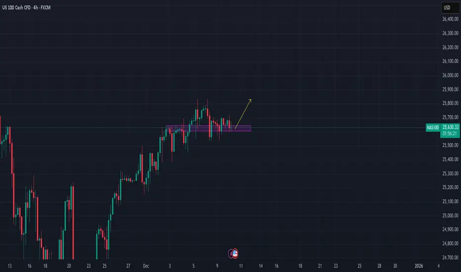
Today’s Strategy
Today, Nasdaq temporarily broke below the short-term rising trendline, but this happened due to a pre-market gap-down, creating the yellow-box gap zone.
Because the sell-off was not strong and price action remains sideways, the market is effectively consolidating.
At the moment, Nasdaq is forming a larger box range:
Top: 25,879 forming a double top
Bottom: 25,400 forming a double bottom
A breakout from either side will likely determine the next major trend direction.
Today’s trading strategy should focus on identifying that breakout level and reacting once confirmation appears.
Conclusion
Nasdaq is moving within a key range between 25,879 and 25,400, and a breakout will define the next major trend direction.
Watch for a confirmed break with supporting volume before taking a position.
Today’s session is all about timing the breakout and reacting quickly.

NAS100 Trade Set Up Dec 10 2025Price is testing 1h FVG so i i see internal 1m-5m IFVG/CISD from here i will target BSL/London highs

Nqz & nas100Price has a potential of slamming lower. Overall it will be good to see price pushing higher tapping into premium arrays and eventually go lower from next week. I will keep an eye on the previous daily high

NasdaqNASDAQ bounced from a strong demand zone, showing bullish momentum, as buyers step in, with key resistance levels ahead to watch for potential continuation.

NQ LongsStill in a bullish uptrend, Sweep of lows yesterday and momentum sustained towards the end of the day. Ideally, price should come to take Asia Lows and then move higher to take the most recent highs.
If we continue to move higher through London, I'll be watching previous highs as an area of interest for shorts In NY session.

$BTC - $DXY -$SPX - $NDX - $GOLD 10/12/2025 forecastAs explained,only NASDAQ:NDX should see a corrective day which got skipped on the previous day. Rest is neutral biased. Likely that CRYPTOCAP:BTC mimicks the NASDAQ:NDX price action.

Stop Loss Killers Completed – Bullish Expansion Ahead?After three consecutive Stop-Loss Killers (SLK1, SLK2, SLK3), the market appears to have flushed out remaining buyers and collected liquidity below key lows. This structure often signals the end of a manipulation phase and the beginning of a potential bullish expansion.
With the FOMC rate-cut announcement expected this evening, the market now has both structural and fundamental conditions for an upside move. If the sweep was indeed the final liquidity grab, a rally toward the upper target zone may follow next.

NAS100 Trade Set Up Dec 10 2025Price has swept PDH in Asia session then swept Asia lows in London now i will expect price to sweep London highs and/or tap into supply to then continue its bearish trend to PDL and demand

NSDQ100 wait-and-see mode ahead of tonight’s FOMCMarkets remained in wait-and-see mode ahead of tonight’s FOMC decision, keeping equity moves muted. The S&P 500 slipped -0.09%, with futures flat this morning, signalling no strong pre-Fed risk appetite for US equities, including tech.
Key Macro Drivers for NDX
US 10yr yields rose +2.4bps to a 3-month high, continuing the global bond selloff.
Higher yields remain a headwind for long-duration tech stocks, keeping upside in the NASDAQ capped.
Australia’s 10yr yield hit a late-2023 high, confirming that the global tightening in bond markets is still broad-based.
Elsewhere, Franco-German spreads tightened, offering limited relief for global risk sentiment.
Fed in Focus
Markets are pricing a ~90% probability of a 25bp Fed rate cut tonight, which would be the third consecutive cut since September.
Since the last meeting, unemployment has risen to 4.4%, reinforcing the case for near-term easing.
However, inflation concerns are creating deep policy divisions, meaning forward guidance for 2025 is likely to remain intentionally vague.
Powell is unlikely to clearly signal additional cuts, especially with succession uncertainty growing as Kevin Hassett is seen as a leading candidate to replace him.
Implications for NASDAQ 100
Near-term direction hinges on Powell’s tone, not the cut itself.
Dovish guidance → NDX upside via yields pullback.
Cautious / inflation-focused tone → further yield pressure and likely NDX consolidation or downside.
Until the press conference, NDX is likely to remain range-bound with headline-driven volatility tonight.
This communication is for informational purposes only and should not be viewed as any form of recommendation as to a particular course of action or as investment advice. It is not intended as an offer or solicitation for the purchase or sale of any financial instrument or as an official confirmation of any transaction. Opinions, estimates and assumptions expressed herein are made as of the date of this communication and are subject to change without notice. This communication has been prepared based upon information, including market prices, data and other information, believed to be reliable; however, Trade Nation does not warrant its completeness or accuracy. All market prices and market data contained in or attached to this communication are indicative and subject to change without notice.

Break and retestnice little break and retest before open, and if it goes good and staable set sl closer, close off some size and ride the wave.
ps.
Iv been gone from trading for a while, iv spent 9 years learning, I got profitable after 3 years. I got so good that everytime i deposited i consistanly won, 1k, 600, 5k and so on. but one day i stopped and lost interest, but now im back and ready to take on 2026 with a iron bid. Follow for the come back of the kid who made it out of the garage.
Nasdaq vs Silver RatioNasdaq vs Silver Ratio (Monthly Chart)
The Capital is rotating from riskier markets to hard assets
* The Nasdaq vs Silver Ratio is screaming the above statement strongly
* NASDAQ is in a bear trajectory against silver & expected to further fall 65% priced in SILVER
A further downfall in the ratio (Nasdaq vs Silver), indicating 3 possibilities:
1. Either Silver will rise further, with higher strength than the US stock markets
2. The US stock market will fall or crash
3. Both the above situations simultaneously

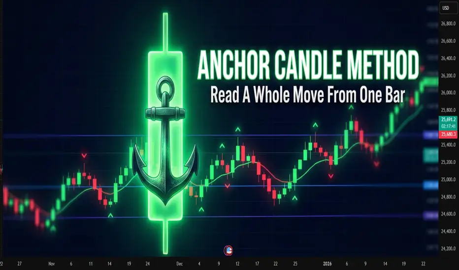
Anchor Candle MethodAnchor Candle Method: How To Read A Whole Move From One Bar
Many traders drown in lines, zones, patterns. One simple technique helps simplify the picture: working around a single “anchor candle", the reference candle of the pulse.
The idea is simple: the market often builds further movement around one dominant candle. If you mark up its levels correctly, a ready-made framework appears for reading the trend, pullbacks and false breakouts.
What is an anchor candle
Anchor candle is a wide range candle that starts or refreshes an impulse. It does at least one of these:
Breaks an important high or low
Starts a strong move after a tight range
Flips local structure from “choppy” to “trending”
Typical traits:
Range clearly larger than nearby candles
Close near one edge of the range (top in an up impulse, bottom in a down impulse)
Comes after compression, range or slow grind
You do not need a perfect definition in points or percent. Anchor candle is mostly a visual tool. The goal is to find the candle around which the rest of the move “organizes” itself.
How to find it on the chart
Step-by-step routine for one instrument and timeframe:
Mark the current short-term trend on higher timeframe (for example 1H if you trade 5–15M).
Drop to the working timeframe.
Find the last strong impulse in the direction of that trend.
Inside this impulse look for the widest candle that clearly stands out.
Check that it did something “important”: broke a range, cleared a local high/low, or started the leg.
If nothing stands out, skip. The method works best on clean impulses, not on flat, overlapping price.
Key levels inside one anchor candle
Once the candle is chosen, mark four levels:
High of the candle
Low of the candle
50% of the range (midline)
Close of the candle
Each level has a function.
High
For a bullish anchor, the high acts like a “ceiling” where late buyers often get trapped. When price trades above and then falls back inside, it often marks a failed breakout or liquidity grab.
Low
For a bullish anchor, the low works as structural invalidation. Deep close under the low tells that the original impulse was absorbed.
Midline (50%)
Midline splits “control”. For a bullish anchor:
Holding above 50% keeps control with buyers
Consistent closes below 50% shows that sellers start to dominate inside the same candle
Close
Close shows which side won the battle inside that bar. If later price keeps reacting near that close, it confirms that the market “remembers” this candle.
Basic trading scenarios around a bullish anchor
Assume an uptrend and a bullish anchor candle.
1. Trend continuation from the upper half
Pattern:
After the anchor candle, price pulls back into its upper half
Pullback holds above the midline
Volume or volatility dries up on the pullback, then fresh buying appears
Idea: buyers defend control above 50%. Entries often come:
On rejection from the midline
On break of a small local high inside the upper half
Stops usually go under the low of the anchor or under the last local swing inside it, depending on risk tolerance.
2. Failed breakout and reversal from the high
Pattern:
Price trades above the high of the anchor
Quickly falls back inside the range
Subsequent candles close inside or below the midline
This often reveals exhausted buyers. For counter-trend or early reversal trades, traders:
Wait for a clear close back inside the candle
Use the high of the anchor as invalidation for short setups
3. Full loss of control below the low
When price not only enters the lower half, but closes below the low and stays there, the market sends a clear message: the impulse is broken.
Traders use this in two ways:
Exit remaining longs that depended on this impulse
Start to plan shorts on retests of the low from below, now as resistance
Bearish anchor: same logic upside-down
For a bearish anchor candle in a downtrend:
Low becomes “trap” level for late sellers
High becomes invalidation
Upper half of the candle is “shorting zone”
Close and midline still help to judge who controls the bar
The structure is mirrored, the reading logic stays the same.
Practical routine you can repeat every day
A compact checklist many traders follow:
Define higher-timeframe bias
On working timeframe, find the latest clear impulse in that direction
Pick the anchor candle that represents this impulse
Mark high, low, midline, close
Note where price trades relative to these levels
Decide: trend continuation, failed breakout, or broken structure
This method does not remove uncertainty. It just compresses market noise into a small set of reference points.
Common mistakes with anchor candles
Choosing every bigger-than-average candle as anchor, even inside messy ranges
Ignoring higher timeframe bias and trading every signal both ways
Forcing trades on each touch of an anchor level without context
Keeping the same anchor for days when the market already formed a new impulse
Anchor candles age. Fresh impulses usually provide better structure than old ones.
A note about indicators
Many traders prefer to mark such candles and levels by hand, others rely on indicators that highlight wide range bars and draw levels automatically. Manual reading trains the eye, while automated tools often save time when many charts and timeframes are under review at once.
NQ is bullish.Let's see if NASDAQ is bullish. Interest rate decision is today (3pm NYT) so NASDAQ is particularly volatile today. If price can break and stay above 25867 then probably it will continue bullish. The volatility after the announcement might add fuel for it to push up further. It's a risk. Happy trading.

NQ 100 Direction and indicationsWaiting for another indication or reversal from NQ.
Key Levels need to be broken or rejected to tell direction. Generally it is looking like NQ is bearish. Just need to wait for the right time to enter. No trading NQ for the rest of the week due to holidays and lack of Gov data.

Chasing the last train: how late entries ruin good trendsChasing the last train: how late entries ruin good trends
The picture is familiar.
The asset has already made a strong move, candles line up in one direction, chats are full of profit screenshots.
Inside there is only one thought: "I am late".
The buy or sell button is pressed not from a plan, but from fear of missing out.
This is how a classic "last train" entry is born.
This text breaks down how to spot that moment and how to stop turning each impulse into an expensive ticket without a seat.
How the last train looks on a chart
This situation has clear signs.
Long sequence of candles in one direction with no healthy pullback.
Acceleration of price and volatility compared to previous swings.
Entry happens closer to a local high or low than to any level.
Stop is placed "somewhere below" or moved again and again.
The mind focuses on other people’s profit, not on the original plan.
In that state the trader reacts to what already happened instead of trading a prepared setup.
Why chasing the move hurts the account
The problem is not just "bad luck".
Poor risk-reward .
Entry sits near an extreme. Upside or downside left in the move is small, while a normal stop needs wide distance. In response there is a temptation to push the stop further just to stay in.
Large players often exit there .
For them the trend started earlier. Where retail opens first positions, they scale out or close a part of the move.
Strategy statistics get distorted .
A system can work well when entries come from levels and follow a plan. Once late emotional trades appear in the mix, the math changes even if the historical chart still looks nice.
How to notice that the hand reaches for the last train
Knowing your own triggers helps.
This symbol was not in the morning watchlist, attention appeared only after a sharp spike.
The decision comes from news or chat messages, not from calm chart work.
There is no clear invalidation level, the stop sits "somewhere here".
Many timeframes blink at once, the view jumps from 1 minute to 15 minutes and back.
Inner talk sounds like "everyone is already in, I am the only one outside".
If at least two of these points match, the trade is most likely not part of the core system.
Simple rules against FOMO
Work goes not with the emotion itself, but with the frame around trades.
No plan, no trade .
A position opens only if the scenario existed before the spike. Fresh "brilliant" ideas during the impulse are placed into the journal, not into the order book.
Move distance limit .
Decide in advance after what percentage move from a key zone the setup becomes invalid.
For example: "if price travels more than 3–4 percent away from the level without a retest, the scenario is cancelled, next entry only after a pause and new base".
Trade from zones, not from the middle of the impulse .
Plans are built around areas where a decision makes sense, not around the fastest part of a candle.
Time filter .
After a sharp move, add a small pause.
Five to fifteen minutes with no new orders, only observation and notes.
What to do when the move has already gone
The smart choice is not "grab at least something".
Better to:
save a screenshot of the move;
mark where the trend started to speed up;
write down whether this symbol was in the plan and why;
prepare a setup for a pullback or the next phase, where entry comes from a level, not from the middle of noise.
Then the missed move turns into material for the system instead of three revenge trades in a row.
A short checklist before pressing the button
Was this symbol in the plan before the run started.
Do I see the exact point where the idea breaks and is the stop parked there.
Is the loss size acceptable if this trade repeats many times.
Can I repeat the same entry one hundred times with the same rules.
If any line sounds weak, skipping this "train" often saves both money and nerves.
The market will send new ones. The task is not to jump into every car, but to board the ones that match the timetable of the trading plan.

NDX100 Analysis🔹 Rejection seen from the 0.786 Fibonacci retracement zone
🔹 Previous uptrend support line now acting as resistance
🔹 RSI showing early signs of exhaustion near key 60–70 zone
All these confluences hint at a possible pause or reversal unless we get a strong breakout with volume confirmation.

US100 Daily Chart AnalysisSimilar to DJI, US100 Showing:
🔹 Price testing channel resistance
🔹 Rejection seen from the 0.786 Fibonacci retracement zone
🔹 Previous uptrend support line now acting as resistance
🔹 RSI showing early signs of exhaustion near key 60–70 zone
🔹 Bearish divergence forming potential — caution advised
All these confluences hint at a possible pause or reversal unless we get a strong breakout with volume confirmation.
#US100 #NASDAQ100 #PriceAction #RSI #Fibonacci #ChartAnalysis #TradingView #ChartsDriven

NQ TOWARDS ALL TIME HIGHS Technical Analysis (Bullish Bias With Key Levels)
Nasdaq-100 futures (NQ) continue to show a bullish structure as long as price holds above the 25539 support zone. The market has been forming higher lows on the intraday timeframes, signaling continued buyer interest near liquidity pockets. Your bullish target at 25822 aligns with the current momentum, as price has been respecting trendline support and rotating upward from demand zones created during previous New York sessions. A clean break and hold above 25822 could open the door for an extension into the next liquidity cluster, allowing buyers to push toward psychological levels above 25900.
However, despite the bullish bias, the 25539 support remains the critical line in the sand. If this level fails, it would signal that the market has accepted lower pricing and that sellers have absorbed buy-side liquidity. A decisive break below 25539—especially accompanied by high volume—would likely trigger short-term momentum shorts targeting the imbalance zones created during the last leg up. This shift would invalidate the bullish structure and potentially initiate a deeper retracement toward the previous week’s value area. Until then, bulls remain in control, but the reaction at 25539 will determine whether the trend continues or flips.
Fundamental Analysis
From a macro perspective, NQ remains supported by strong fundamentals driven primarily by the performance of large-cap tech companies, resilient corporate earnings, and ongoing investor expectations for future rate cuts. The Federal Reserve’s tone has recently shifted more dovish, indicating that although inflation remains sticky, monetary easing is still on the table for the upcoming quarters. This keeps growth sectors—especially technology—attractive, as lower interest rates improve future earnings projections and strengthen valuation models for high-beta stocks.
At the same time, markets remain sensitive to macroeconomic data releases such as CPI, PCE, and labor-market readings. Any upside surprise in inflation or stronger-than-expected employment data could temporarily pressure NQ, as it may delay the Fed’s easing timeline. Additionally, geopolitical tensions and shifts in semiconductor policy remain potential sources of volatility. Overall, while short-term fluctuations are expected, the fundamental backdrop continues to favor higher prices for Nasdaq-focused assets, supporting your bullish outlook until key support levels fail.

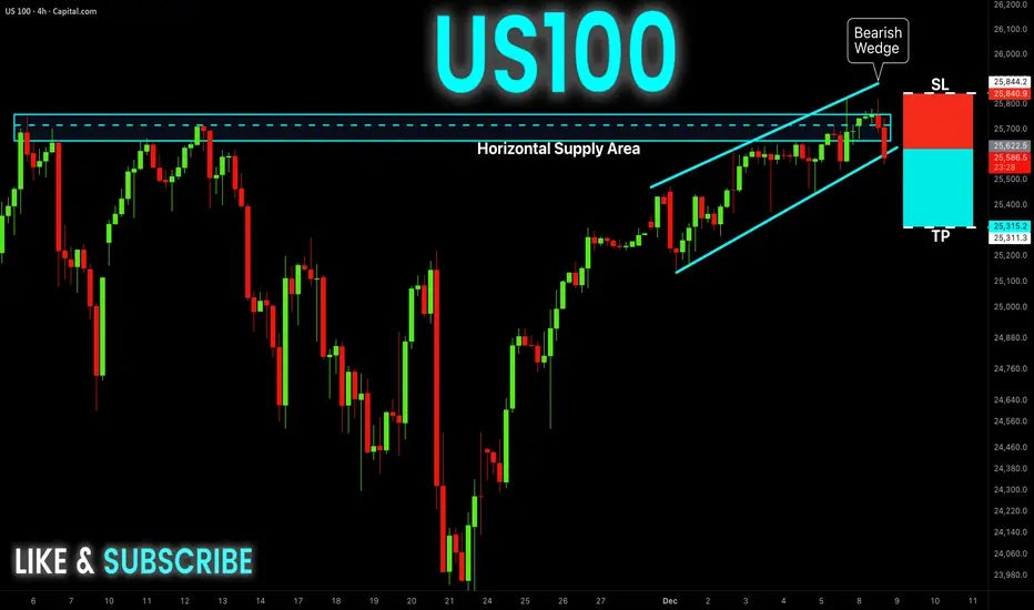
US100 Free Signal! Sell!
Hello,Traders!
US100 has rejected a major supply zone while breaking down from a bearish wedge, sweeping buy-side liquidity before shifting order-flow bearish. This SMC structure signals distribution at premium and a move toward discount levels below.
--------------------
Stop Loss: 25840
Take Profit: 25315
Entry: 25622
Time Frame: 4H
--------------------
Sell!
Comment and subscribe to help us grow!
Check out other forecasts below too!
Disclosure: I am part of Trade Nation's Influencer program and receive a monthly fee for using their TradingView charts in my analysis.
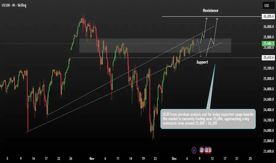
USNAS100 Consolidation Positive Holds Strong range momentumUS100 shows price action moving within a rising channel after recovering from previous lows. The market is currently trading near 25,686, approaching a key resistance zone around 25,800 – 26,205. This area has been marked as the upper boundary where price may face rejection or potentially break out.
Technically US Stocks closed out the trading week with slight gains on Friday as the latest flurry of economic data kept elevated expectation for federal reserve interest rate cut next week intact,
Remember if Price could hold above support and continue upward along the upper channel, targeting the major resistance at 26,205 Price may dip back into the support zone before attempting another move upward.
You may find more details in the chart,
Trade wisely best of luck buddies.
Ps; Support with like and comments for better analysis thanks for supporting.
NAS100 Trade Set Up Dec 8 2025Price has tapped into supply and has swept London/Asia highs so i will wait to see if price can sweep PDH first to then look for internal 1m-5m IFVG/CISD target LRLR and SSL

NASDAQ formed its 1st 4H Golden Cross in 7 months!Nasdaq (NDX) completed last Friday its first 4H Golden Cross formation in more than 7 months (since May 01). This is taking place while the index is inside a Channel Up, making a V-shaped recovery from the November 21 Low.
The last time all the above conditions were fulfilled was exactly during the May Golden Cross. With the 4H MA200 (orange trend-line) as its Support, the index eventually hit its previous All Time High (ATH).
As we've entered the Fed week, we can finally see this move to the ATH Resistance, so our short-term Target on Nasdaq remains 26200.
---
** Please LIKE 👍, FOLLOW ✅, SHARE 🙌 and COMMENT ✍ if you enjoy this idea! Also share your ideas and charts in the comments section below! This is best way to keep it relevant, support us, keep the content here free and allow the idea to reach as many people as possible. **
---
💸💸💸💸💸💸
👇 👇 👇 👇 👇 👇
