Macro Liquidity Model + Altcoin True Market Cap: CorrelationMacro Liquidity Model vs Altcoin Real Market Cap — CCI & MACD Confirmation
This model uses the formula:
FRED:M2SL / (CRYPTOCAP:TOTAL3 – CRYPTOCAP:USDT – CRYPTOCAP:USDC – CRYPTOCAP:DAI) × TVC:VIX
It shows the relationship between global liquidity (M2) market fear (VIX) and the true altcoin market capitalization (TOTAL3 excluding stablecoins).
This helps us understand which phase of the market we are currently in.
At the moment we are somewhere right near the bottom — if not already at the bottom. You can safely start accumulating any asset you prefer.
The CCI shows “overbought” conditions for M2, which actually means altcoins are oversold.
MACD hasn’t touched zero yet, which suggests there might still be a small dip left — which is also visible on the TOTAL3 – USDT – USDC – DAI chart.
If the next weekly candle closes bullish, there is a chance the market will continue rising until May, especially if the 2020 fractal repeats.
In general, May looks like the optimal time to start taking profits — and then we will see how the macro develops from there.
For additional clarity:
the upper chart represents global money (M2)
the lower chart represents altcoins
the higher the upper chart goes → the more money is OUT of the market
the lower it drops → the more money is FLOWING into the market
Trade ideas

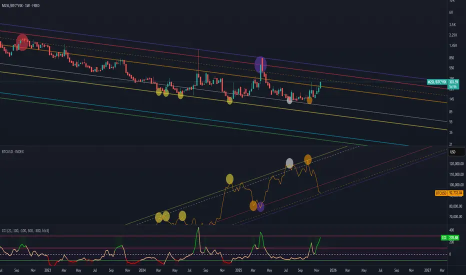
Liquidity (M2) to BTC.D, amplified by (VIX) FEARIt shows the ratio of global liquidity (M2) to Bitcoin’s market capitalization, amplified by market fear (VIX), relative to BTCUSD.
Thanks to this formula, we have an understanding of which phase of the market we are currently in.
In this case the CCI indicator shows:
overbought conditions — meaning money is outside the market and
oversold conditions — meaning there is too much money in the market and it’s time to sell
FRED:M2SL/CRYPTOCAP:BTC*TVC:VIX
For some reason the Bitcoin chart isn’t displaying with all the markings, so I’ll attach a screenshot below.
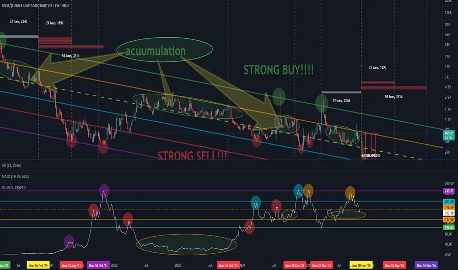
Altseason Indicator: Liquidity and Cycle CorrelationAltseason Indicator: Liquidity and Cycle Correlation
I’d like to share some observations reflecting the dynamics of the altseason.
This setup may perform differently on certain assets, but during testing on Solana (SOL) it showed quite interesting results — the project has been around long enough to clearly display cyclical behavior.
The formula is based on the relationship between global money supply (M2) and crypto market capitalization excluding stablecoins, BTC and ETH :(Total3 – USDT – USDC – DAI), combined with market risk sensitivity via the VIX index.
!Observation!
Periods of altcoin accumulation tend to coincide with moments when the “money” (liquidity) metric moves sideways — between the orange dashed and solid yellow lines (shown as ellipses on the chart).
On the coin’s chart, it’s clearly visible when liquidity starts flowing back into the asset — the colored circles mark the points where price bounced off the lower liquidity boundary.
When comparing the current cycle to 2020–2021, an interesting parallel appears:
The absolute market bottom occurred on March 10, 2020.
After 32 weeks, a steady recovery began.
After another 59 weeks, the cycle peak was reached.
What followed was a drop in confidence and a final “overinflation” toward the top of the previous cycle.
In the current cycle, we seem to be in a similar phase:
about 32 weeks after the recent bottom, a move toward new highs may be forming — just like in 2020.
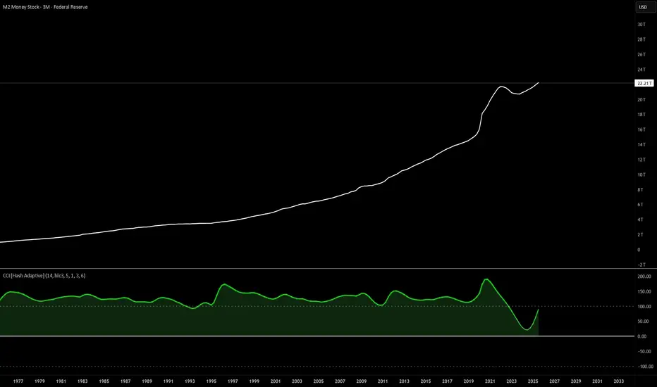
Don’t fight the printer: M2 stair-steps up, assets followM2 is the bluntest liquidity proxy we’ve got. That white line only really goes one way—and when it accelerates, risk assets don’t argue, they re-rate.
Check the CCI under the chart: triple-digit prints that are frankly absurd for a macro series. That’s the liquidity impulse screaming. When CCI rolls positive and stays there, you tend to get multiple expansion; when it rolled negative in ’22–’23, you got de-rating and chop.
Why it matters (mechanics in one breath):
more dollars chasing the same assets → higher nominal prices, lower real yields → fatter DCFs, easier credit → buybacks/issuance → persistent bid. It’s not about narratives; it’s about liquidity.
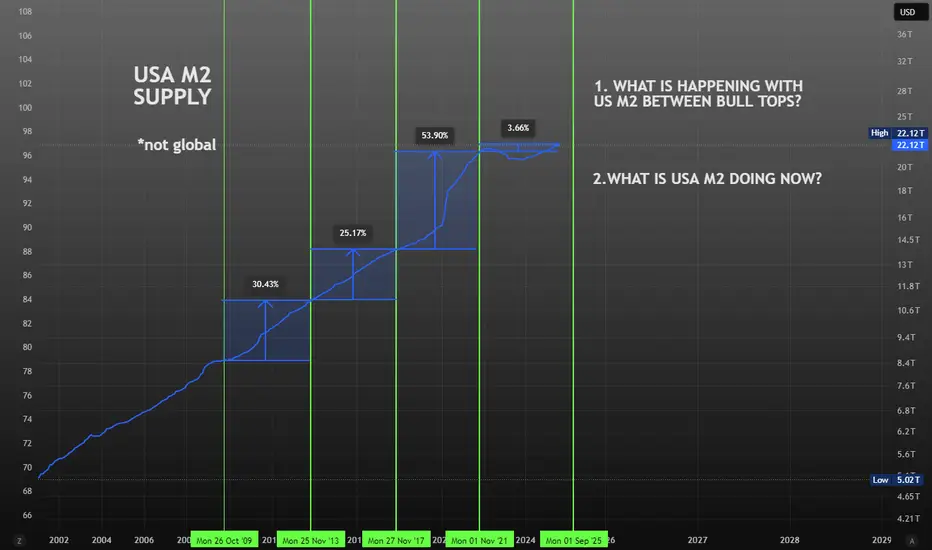
USA M2 Growth compared to BTC Bull TopsReview the growth of USA M2. Does it impact BTC's price in previous bulls? If so, what does that suggest for this cycle?
Global Liquidity: A Turning PointLooking at the state of global liquidity, I believe we're in a solid position for some longer trades. The chart reflects a potential inflection point, suggesting that liquidity could increase over the next six months. This aligns well with my base case that we may see a gradual rise in liquidity, supported by macroeconomic tailwinds.
From a strategy perspective, this appears to be a prime opportunity for longer-term spot positions in miners, Bitcoin, and metals. These assets are historically well-positioned to benefit from rising liquidity conditions, and current levels offer an attractive entry point for patient investors.
While short-term volatility is always a possibility, the broader trend signals that this could be a pivotal moment for accumulation in these sectors. Patience and conviction will be key in riding this next wave.

Forever new all time HighsThe Race to $25 Trillion: Why M2 Money Supply is My Key Market Indicator
In what seems like a relentless march, the US M2 money supply is closing in on the $25 trillion mark. While many focus on daily market noise, I believe this high-level metric is one of the most critical indicators for understanding the long-term picture for asset prices and currency risk.
The Logic is Simple:
If the economy is flooded with newly created US dollars, that capital has to go somewhere. Assuming the velocity of money (M2V) doesn't collapse, this liquidity injection naturally pushes up the prices of scarce assets like stocks, real estate, and cryptocurrencies.
The long-term risk of significant USD currency debasement and severe inflation keeps growing.
I'm not predicting hyperinflation tomorrow, but I am watching the train on the tracks. Direction is what matters most. This reminds me of how people view empires—they often focus on past strength and never expect a collapse until it's too late. The same is true for emerging powers, which are consistently underestimated. It's the direction of travel that matters most.
The key isn't to wait for a reason to panic, but to adjust your strategy to the changes as they happen.
Playing with the forecast tool I get this. I am not looking at it for anything other then pure amusement.
Disclaimer:
The information provided in this post is for educational and informational purposes only. It does not constitute financial advice, investment recommendations, or a solicitation to buy or sell any financial instruments. All investments involve risk, and the past performance of a security, market, or trading strategy does not guarantee future results. I am not a financial advisor. Please conduct your own thorough research and consult with a qualified financial professional before making any investment decisions. You are solely responsible for any investment decisions you make.

Rising M2 does not always equate markets going upHistory has shown us that using liquidity (m2) to anticipate stock market reaction is a dangerous game.
It can work, until it doesn't.
What always works is analyzing the price chart based on its own merits.

one of the most underrated charts : M2(money supply)When it comes to forex and macro trading, it's easy to get lost in charts, indicators, and economic calendars. But one of the most overlooked—and incredibly powerful—macro indicators is the M2 Money Supply. In this post, we’ll break down what M2 really is, why it matters, and how traders like you can use it to get an edge.
💰 What Is M2 Money Supply?
M2 represents the total amount of money in circulation in an economy, including:
M1 (physical cash + checking deposits)
Savings deposits
Money market securities
Time deposits (under $100,000)
In simple terms: M2 tracks how much money is sloshing around in the system.
🧠 Why Traders Should Care About M2
When M2 goes up significantly, it often signals that a central bank is easing monetary policy—i.e., printing more money, keeping interest rates low, or using QE (quantitative easing). Conversely, when M2 contracts or slows, it suggests tightening, and could signal reduced liquidity, higher rates, or a slower economy.
M2 = Macro Liquidity Meter
And liquidity drives markets—especially currencies.
⚙️ How to Use M2 in Your Trading Strategy
Here are 3 ways you can incorporate M2 into your macro trading toolkit:
1. Gauge Inflation & Currency Value
When a country expands its money supply rapidly (like the U.S. did during COVID), the purchasing power of its currency often declines, especially against currencies with tighter monetary policy.
✅ Watch for divergences: If M2 is growing fast in one country and flat in another, that’s a potential FX opportunity.
📉 Example: USD weakened sharply post-COVID when M2 surged.
2. Confirm Trends in Interest Rates
M2 often leads or confirms central bank policy.
Shrinking M2 → Tighter conditions → Rising rates → Currency bullish
Expanding M2 → Easier policy → Lower rates → Currency bearish
Use it alongside yield curve analysis and central bank projections.
3. Identify Risk-On/Risk-Off Regimes
A rising M2 usually supports risk assets like equities and EM currencies. Falling M2 can trigger liquidity squeezes, flight to safety, and stronger demand for USD or JPY.
Use M2 as a macro filter for your risk appetite.
Watch for turning points in M2 to anticipate market regime shifts.
🔎 How to Track M2 on @TradingView
Open a new chart and search for:
🔍 FRED:M2SL – U.S. M2 Money Stock (seasonally adjusted)
You can also compare this against:
DXY (US Dollar Index)
USDJPY, EURUSD, or other major FX pairs
U.S. 10-Year Yields (US10Y) or Fed Funds Rate (FEDFUNDS)
Add M2 as an overlay or sub-chart for macro context.
Use the "Compare" tool to visualize divergences with currency pairs.
📌 Final Thoughts
M2 might not give you minute-by-minute trade signals like an RSI or MACD, but it offers something far more powerful: macro context. When used with other indicators, it can help traders:
Anticipate currency trends
Understand shifts in monetary policy
Position for regime changes in risk appetite
Remember: the smartest traders aren’t just charting price—they’re charting liquidity. And M2 is the ultimate liquidity map.
put together by : @currencynerd

Gold Skyrockets Like It's 2011: Are We There Yet?Gold has been on a powerful run since breaking above the 2100 resistance level in March 2024. After just one year of relentless gains and a return of over 60%, it has become one of the top-performing assets. But the big question now is: how far can this rally go? To the moon?
It's difficult to predict how far prices can climb during these kinds of parabolic moves. In 2011, the final green monthly bar alone rose 17% from open to high. These FOMO-fueled surges often lead to euphoric tops followed by painful bear markets. So, are we there yet?
Since Richard Nixon ended the dollar's gold backing and introduced the modern fiat system, gold's status as a safe haven has become even more prominent. Whenever there are heightened risks, whether geopolitical, fiscal, or related to the fiat money system, investors tend to flock to gold. The 2011 rally was a clear example of this. After the 2008 financial crisis and the quantitative easing that followed, gold became the go-to asset for both preserving value and speculative opportunity.
A similar pattern has unfolded following the COVID-19 shock. The Federal Reserve returned to aggressive quantitative easing, while both the Trump and Biden administrations increased fiscal spending, including direct payments to households. This surge in money supply and concerns about fiat stability, along with rising government debt, helped trigger another major gold rally. With the added risk of a trade war, the rally has accelerated further, pushing gold beyond 3300 and creating a situation that closely mirrors 2011.
Looking at the money supply-to-gold ratio and the US federal debt-to-gold ratio, gold now appears to be testing trendline levels. Its recent surge has made metrics like M2 and federal debt seem relatively smaller, which may be a sign that the rally is approaching exhaustion.
Still, history shows that final euphoric moves can stretch even higher before a true top is formed. Rather than trying to predict the peak, it's often better to wait for signs of price stabilization. Gold typically offers a second opportunity, often forming two peaks with the second lower than the first, before entering a bear phase.
In 1980, gold fell more than 60% within two years. After the 2011 top, it declined nearly 40%. Even if the retreat expected to be milder this time, gold could still offer a 20% or greater downside opportunity once the top is in.
Smart money has already started to take profits gradually. Net managed money positions in the COT report have decreased by 40% since January, as we discussed in our earlier post:

Rising money supply DOESN'T always equate to stock markets riseRising money supply DOES NOT always equate to stock markets going up.
Includes Bitcoin & Crypto.
Using liquidity (m2) to anticipate stock market reaction is a dangerous game

Money and StocksDon't fall for the narrative that money supply will save stock markets (or bitcoin) from entering vicious bear runs.
Rising Money Supply Will NOT save stocks markets from a bear market

M2 Peaking as Reverse Repo Drains to ZeroThe reverse repo balance at the Fed represents trapped liquidity. When this balance comes down it means liquidity is released into the economy and markets. The M2 level lags the change in reverse repo by about 300 days. Because reverse repo changes have been steady for some time, it is possible to draw a trajectory for reverse repo going to zero, and then M2 peaking out. This would coincide with a potential topping process for SPX as shown in the lower pane of the chart.

Global Money Supply going up!This is the chart for the Global Money Supply.
It's clearly bouncing on the channel. BULLISH !!
Here's the formula to put in TradingView:
(FRED:M2SL+ECONOMICS:EUM2*FX:EURUSD+LSE:JPM2/FX:USDJPY+ECONOMICS:CNM2/FX:USDCNH)/1000000000000

M2 needs to move to historic trend to avoid massive risks.The United States has the capacity to bailout the retirement system for Boomers and Millennials if we do not blow the "dry powder" of American Exceptionalism on pumping up the economy and markets for political and 1%er gains.
America will be at peak Boomer dependence on Social Security & Medicare around 2030 and will not see a reduction of that dependence until more Boomers have crossed the Rainbow Bridge than Xers retiring. During the 2040s there will be a reprieve for the retirement system, but then in the 2050s the Millennials retire putting strain back on.
The United States needs a sustained period of 3%+ GDP growth, moderate to low energy prices and productivity gains driven by technology. America should probably also merge & standardize Medicare & Medicaid to eliminate waste and fraud (Trumpcare?), as well as, start putting about 20-25% of Social Security payroll taxes into the S&P 500, 600 & 400 indexes with the rest in special 3% rate UST in the "lockbox" that Al Gore talked about 25 years ago. That will require seed money in the form of $10-20 trillion of QE, aka, the dry powder we can't waste.

Top 5 M2 vs SPXThis shows the relationship between the top M2 of the top 5 financial areas and the price of SPX.

M2 Money Supply!!! THEY ARE NOT PRINTING MONEY FAST ENOUGH !!!
#recession #disinflation #moneysupply #yields #rates
But the 10 year rate of change is telling a more nuanced story...
10 year yields track money supply rate of change

Will the Global Money Supply break the trendline?When the Global Money Supply goes up, markets go up.
Will the money supply break down the trendline?
Hopefully, we get a nice bounce from here!

Nasdaq 100 (QQQ) due for a correction ?US M2 Money stock / Nasdaq 100 (QQQ)
has reached its March's 2000 low.
Bullish divergence on both the RSI and MACD.
The Nasdaq 100 seems due for a correction which
would imply a rebound on this ratio of M2/QQQ

M2 supply seasonality - sell in may & go away until OctoberUsing this formula:
(FRED:M2SL+ECONOMICS:EUM2+ECONOMICS:JPM2+ECONOMICS:CNM2+ECONOMICS:INM2+ECONOMICS:GBM2+ECONOMICS:CAM2)/100000000000000
This formula includes US, EU, GB, CAN, JP, In & CN M2 money supply.
You can clearly see M2 money supply seasonality changes, rounding consolidation from June1st & going up starting from October. Every time - for the last 5 years very clearly.
More global liquidity should drive the markets up.

Global money supply increasing! Same as during pandemic When the money supply started rising in 2020, the SPX started by crashing before going on one of its biggest bull runs.
Maybe the same thing is happening now. We crash now for another couple days or weeks before having one last explosion upwards.

The most important chart in your trading career.Merry Christmas to all, I hope you and yours are well.
My present to you this year is the one chart you should ALL be watching. SPX/GOLD
Risk On (Equities), Risk Off (Gold). It will save you a TON of time/headaches, if you follow this chart.
In this video I go over why you should use it. How your portfolio would have been managed the last 50yr, and at the end give a quick method for managing your ratio between Risk On/Off.
As always, good luck in your trading, have fun, and practice solid risk management.

Global money supply ready to popThis is the global money supply.
The pattern looks the same as 2018-2020. When it broke out, we got a nice bull run in all markets!
