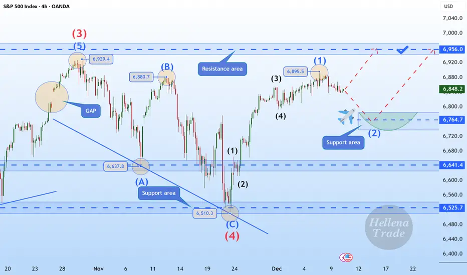
Hellena | SPX500 (4H): LONG to the area of 6956.Hello, colleagues!
I previously published a forecast for an upward movement, and I believe it is time to update the plan slightly. The direction of movement remains the same, but wave “1” has lengthened, which means that the correction in wave “2” may occur slightly higher than previously.
I expect a corrective movement to the support area of 6764, followed by a continuation of the upward movement and an update of the peak level of wave “3” of the higher order 6929 and reaching the area of 6956 at a minimum.
An extension of wave “1” is also possible, but then it will be necessary to slightly revise the wave markings again.
Manage your capital correctly and competently! Only enter trades based on reliable patterns!
S&P 500 Index
No trades
Trade ideas
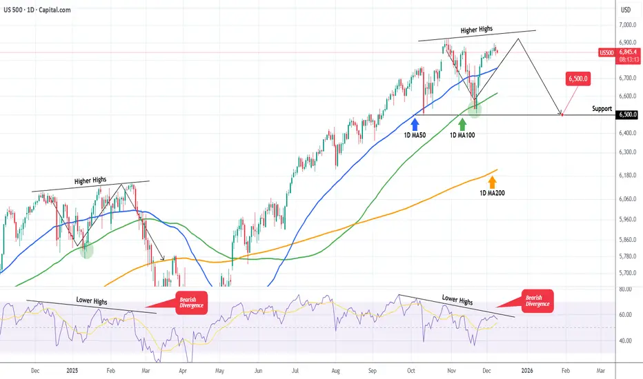
S&P500 The Bearish Divergence that may spoil the party.S&P500 (SPX) is extending a strong rally following the rebound on its 1D MA100 (green trend-line) almost 3 weeks ago. As we pointed out in a previous analysis, the price action of the past 2 months has been identical to the pattern after November 19 2024.
We are currently on the same 1D MA100 rebound towards the Higher Highs trend-line but the key development is that the 1D RSI on both fractals shows a huge Bearish Divergence, being on Lower Highs.
In February 2025 that led to the start of a strong correction in the stock markets. So as long as the 1D RSI Bearish Divergence holds, the S&P500 currently risks a technical correction towards at least the first Support level of 6500.
---
** Please LIKE 👍, FOLLOW ✅, SHARE 🙌 and COMMENT ✍ if you enjoy this idea! Also share your ideas and charts in the comments section below! This is best way to keep it relevant, support us, keep the content here free and allow the idea to reach as many people as possible. **
---
💸💸💸💸💸💸
👇 👇 👇 👇 👇 👇
S&P500 Points Toward 7,500—But the Path Won’t Be a Straight LineS&P500 remains structurally bullish on the higher timeframes, and the broader geometry continues to point toward the 7,500 area as a long-term magnet.
However, the market never moves in a straight line — corrective phases, pullbacks, and rotations are a natural part of the path toward higher levels.
For now, the bullish structure is intact, momentum is aligned, and the macro trend still supports a continuation to the upside.
I’ll update the intermediate reaction zones and key levels in the next chart.

S&P 500 Breakdown Alert — Rising Wedge Reversal in Play!Today I want to share an S&P 500 index( SP:SPX ) analysis, as this index plays a major role in guiding correlated markets—especially crypto, and particularly Bitcoin( BINANCE:BTCUSDT ).
The S&P 500 index entered the Potential Reversal Zone(PRZ) and resistance zone($6,902_$6,875), where it began to fall.
The S&P 500 index also failed to form new Higher Highs(HH) and Higher Lows(HL), which signals weakening bullish momentum over the past 7 trading sessions.
From a classical technical-analysis perspective, it appears that the S&P 500 index has broken below the lower line of its rising wedge pattern, which is considered a bearish reversal pattern. The index is currently in the process of completing a pullback/retest of the broken structure.
My expectation is that the S&P 500 index may decline at least toward $6,823, and if important support lines break, we could see a deeper correction toward the measured move (target) of the rising-wedge pattern.
What’s your outlook on the S&P 500 index and the U.S. stock market?
First Target: $6,823
Second Target: $6,803
Stop Los(SL): $6,889(Worst)
------------------------------------------------
We should also keep in mind that several important US economic indicators will be released this week, which could significantly impact market direction. So be extra cautious with your positions, especially during data releases:
JOLTS Job Openings➡️09 December
Federal Funds Rate➡️10 December
FOMC Statement➡️10 December
FOMC Press Conference➡️10 December
Unemployment Claims➡️11 December
------------------------------------------------
💡 Please respect each other's opinions and express agreement or disagreement politely.
📌S&P 500 Index Analyze (SPX500USD), 1-hour time frame.
🛑 Always set a Stop Loss(SL) for every position you open.
✅ This is just my idea; I’d love to see your thoughts too!
🔥 If you find it helpful, please BOOST this post and share it with your friends.

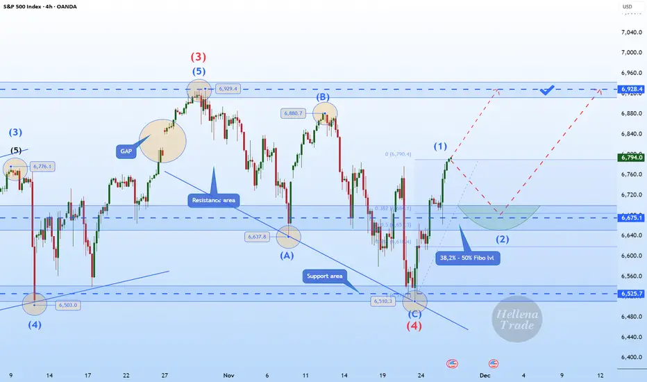
Hellena | SPX500 (4H): LONG to MAX of wave "3" of 6928.Colleagues, we continue the previous scenario of upward movement in the impulse “12345”.
I expect a small correction in the middle order wave “2” approximately to the area of 38.2%-50% Fibonacci levels (6675).
Then I expect a continuation of the upward movement to the maximum of the wave "3" of the higher order 6928.4.
It is possible that the first wave may be stretched, which may mean a correction-free movement to the target.
Fundamental Context.
Market sentiment remains cautiously bullish ahead of this week’s US data releases. Investors continue to price in a softer Fed policy path for 2026, which supports the equity market after the recent correction.
US Treasury yields remain under pressure, and the latest macro indicators — especially labor market cooling and weaker business activity components — reinforce expectations of an economic slowdown. This backdrop typically favors equity upside as markets look ahead to potential policy easing.
Manage your capital correctly and competently! Only enter trades based on reliable patterns!
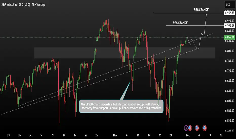
SP500 Consolidation bullish momentumSP500 showing price action between late September and early December the SP is trading around 6,855 after a strong upward move recent candles show bullish momentum pushing above a previously broken trendline.
The S&P 500 rose on Friday, pushing it close to its record high. A strong November rally, fuelled by investor optimism over potential Federal Reserve interest-rate cuts, has continued to lift stocks.
Technically, if the price maintains its bullish zone within the current range, we could expect further upward movement. The next major resistance zone is projected at 6902–6952.
You may find more details in the chart,
Trade wisely best of luck buddies.
Ps; Support with like and comments for better analysis thanks for supporting.
S&P 500: Last Bullish Push
On the medium-term horizon OANDA:SPX500USD AMEX:SPY CME_MINI:ES1! still looks like a clean impulse:
Wave 3 shows a classic extension
Wave 2 is a sharp zigzag
Wave 4 has the structure of a flat – a running flat on S&P, while Nasdaq 100 forms something closer to an EFL
Connecting waves 1–3 and 2–4 gives us an almost perfect trend channel, which strongly supports the impulsive interpretation. At the same time, the main volume cluster sits near the highs, which is typical for a distribution phase.
Before a proper medium-term reversal, I still expect one more leg up as a final blow-off 5th wave.
From a local-structure perspective , the last leg higher looks very much like a leading diagonal. My base case:
📉 first, a correction
📈 then continuation to new highs within wave 5
🔻 Invalidation: a break and confirmed close below 6600 would cancel the bullish scenario and suggest that the impulse is already complete.
🎯 Upside levels:
Primary target zone: 7100–7200
Extended target: up to 7400
Not financial advice – just my working roadmap as long as price action respects the channel and stays above 6600.

SPX500 | Bulls Target 6957 as Breadth Improves Beyond AISPX500 – Technical Overview
The S&P 500 has reached a new record high, notably without support from AI-related stocks.
Despite underwhelming earnings from Oracle and Broadcom, the broader market continued to rally—an encouraging sign that sector leadership may be broadening rather than relying solely on AI momentum.
Technical Analysis
SPX500 maintains a bullish momentum while trading above 6873–6888, with upside targets at:
→ 6918
→ 6957
→ 6991
A continuation toward 6957 is favored as long as price holds above 6888.
However, a 1H close below 6873 will signal a bearish correction, opening the path toward:
→ 6852
→ 6815
Further downside pressure may extend the move into the 6771 support zone if risk sentiment weakens.
Pivot Line: 6888
Resistance: 6918 · 6957 · 6991
Support: 6852 · 6815 · 6771

Support under 6800 likely holdsI don't think the market is acting bearish enough for a further move down under 6750 right now. We are most likely in a trading range for a while. Oil testing it's lows. BTC looks bearish. Gold looks bullish.

SPX Is going up...time to buySPX 500 is in a clear upwards channel and has broken the last bit of resistance (white trendline line shown) - this is a clear confirmation that the next target will be the next resistance zone to the upside shown above (this is a great buy trade opportunity) - buy the SPX 500 now

SPX500 | Bulls Push Higher but Key Reversal Zone NearsSPX500 – Technical Overview
The broad market index is approaching another record high, supported by a surprisingly market-friendly message from the Federal Reserve.
Powell’s acknowledgment of “significant downside risks” in the labor market immediately signaled to traders that additional rate cuts remain possible.
Although the rate cut itself was expected, the tone was less hawkish than feared, giving bulls confidence heading into year-end.
The 9–3 split vote also revealed internal disagreement within the Fed—two members preferred no cut, while one favored an aggressive 50 bps reduction—adding uncertainty to future policy direction.
Technical Analysis
SPX500 currently shows bullish momentum, with price expected to move toward 6873 and 6888.
However, this zone is likely to act as a reversal area, and a bearish reaction could follow from these resistance levels.
As long as price remains below 6888, bearish pressure can re-emerge.
If the market stays below 6852, downside continuation remains favored toward 6815.
Upside continuation only strengthens if the market breaks and holds above 6888, targeting the 6918 region.
Pivot Line: 6852
Resistance: 6873 · 6888 · 6918
Support: 6830 · 6815 · 6797

SPX: Fed will decide on SPX next move The inflation data, as posted through the PCE Price Index on Friday, was in the focus of markets during the previous week. This data came just a week before the FOMC meeting, scheduled for December 10th, increasing odds that Fed might cut interest rates by another 25 basis points. The PCE of 2,8% y/y in September was just a bit lower from anticipated 2,9%. In addition, Friday brought University of Michigan Consumer Sentiment for December, exposing decreased inflator expectations for both near and long term. The CME FedWatch Tool is now posting around 87% odds for a 25bps rate cut in December. On the other hand, analysts are noting that the market has already priced this cut, so the main current question is what is next for the US economy?
The S&P 500 continued its winning streak during the previous week. The index has closed the week at the level of 6.870, after previously reaching the weekly high at 6.893. The biggest weekly surprise came from Netflix, who agreed to buy Warner Bros.’ key studio and streaming assets, including HBO/HBO Max and major film-/TV-studio operations, in a deal valued at around $83 billion (equity value about $72 billion). The deal must clear regulatory review, and sources say the Trump administration views the merger “with heavy scepticism,” signalling a potentially difficult approval process under U.S. antitrust scrutiny.
Tech companies continue to dominate markets, however, Nvidia continues to struggle to gain momentum. The week ahead is promising to be a volatile one, considering the FOMC meeting, scheduled for Wednesday, December 10th. As analysts are noting, the market has already priced the 25bps rate cut. In case of any surprises on this side, a significant market correction might be triggered. In case of a rate cut, the markets might continue to price US equities at higher grounds.

SPX: looks awfully like February highThe pace and shape of SPX today look very much like the approach back in February. Back then the unexpected Tariff wars caused the correction. What will happen now, remains to be seen, but We just had a weekly MACD cross to the downside (not shown on the chart). This usually means the slowdown will start and, in a few days, or weeks we should expect a larger drawdown. Market might make a couple more highs as Weekly MACD creates some bearish divergence. A base touch back to 6k will be very healthy for SPX to reset the momentum and keep moving up again. I don't think a long bear market is likely in the near future. I also don't think the fractal will play out exactly. But it is time to get cautious.

SPX500 | Markets Position Ahead of JOLTS & Fed DecisionSPX500 – Technical Overview
S&P 500 futures edged higher ahead of the JOLTS job openings report, the final major labor indicator before the Federal Reserve decides on interest rates tomorrow.
Markets are pricing an 89% probability of a 25 bps rate cut, suggesting strong expectations for policy easing.
Nvidia is also in focus as traders monitor tech-sector momentum and its influence on index direction.
Technical Analysis
SPX500 holds bearish momentum for today while trading below the 6873–6888 zone.
A deeper bearish continuation is likely below 6852, with downside targets at 6815 and 6798.
On the upside, a 1H or 4H close above 6888 would invalidate the bearish setup and shift momentum toward the ATH levels at 6918, with extended potential toward 6990.
Key Levels
Pivot Line: 6860
Support: 6837 · 6818 · 6798
Resistance: 6873 · 6888 · 6918

S&P 500 Daily Chart Analysis For Week of Dec 5, 2025Technical Analysis and Outlook:
In the recent weekly trading session, the S&P 500 Index recorded significant gains, achieving our primary target at the Key Resistance level of 6,895. Presently, this market position indicates potential downward movement, with the primary target set at Mean Support at 6,816, and the possibility of further decline to Mean Support at 6,755.
Nevertheless, it is essential to acknowledge that, in light of the current market dynamics, there exists a considerable probability of a repeat retracement from the Key Resistance at 6,895, accompanied by a robust bounce from Mean Support at 6,816.

S&P 500 — Technical QE vs. Classic QEThe US Federal Reserve (FED) unveiled yesterday its final monetary policy decision of the year with an interest rate cut on the federal funds rate to 3.75%. Jerome Powell held a press conference and the FED updated its macroeconomic projections for 2026.
There is now a complete balance between the unemployment-rate objective and the inflation objective. Let us also keep in mind that the Quantitative Tightening (QT) program has been halted since Monday, December 1st, and that the FED stands ready to use the balance-sheet monetary tool to reduce any emerging tension in the interbank and money markets and to ensure that bond yields do not exert pressure on the State and on companies.
While the S&P 500 index is evolving at record levels and one must justify a valuation level at a historic high, would a “technical QE” from the FED during 2026 be sufficient to contain long-term interest rates and support the equity market?
It is essential to understand that a “technical QE” is not a classic Quantitative Easing (QE) program and that its impact on long-term interest rates remains limited. In that sense, a technical QE does provide short-term liquidity, but it does not constitute a structural liquidity support.
Concretely, a technical QE mainly aims at stabilizing the functioning of the money market: repo operations, temporary balance-sheet adjustments, targeted interventions in case of stress. This prevents short-term rates from suddenly spiking, but it does not mean that the FED is entering a large-scale easing cycle. Investors should therefore avoid overinterpreting the term “QE.” Here, the objective is operational, not macroeconomic.
Where a classic QE compresses the entire yield curve, stimulates credit and fuels a genuine cycle of risk appetite, a technical QE acts more like a “shock absorber” than an engine. It prevents a liquidity crisis, but it does not create a new structural momentum. For an equity market already at historical highs, the nuance is essential.
Should it be minimized for all that? Not really. In an environment where valuations are very high in the US market and where the slightest stress on rates can trigger sharp profit-taking, the simple ability of the FED to intervene surgically to calm markets can be enough to maintain a climate of confidence. A technical QE is not fuel for a new bullish leg, but it can prevent turbulences that could weaken US indices.
In summary, while a classic QE creates an expansionary environment, a technical QE mostly creates a stable one. And for an S&P 500 sitting at record highs, stability may already represent a meaningful form of support.
DISCLAIMER:
This content is intended for individuals who are familiar with financial markets and instruments and is for information purposes only. The presented idea (including market commentary, market data and observations) is not a work product of any research department of Swissquote or its affiliates. This material is intended to highlight market action and does not constitute investment, legal or tax advice. If you are a retail investor or lack experience in trading complex financial products, it is advisable to seek professional advice from licensed advisor before making any financial decisions.
This content is not intended to manipulate the market or encourage any specific financial behavior.
Swissquote makes no representation or warranty as to the quality, completeness, accuracy, comprehensiveness or non-infringement of such content. The views expressed are those of the consultant and are provided for educational purposes only. Any information provided relating to a product or market should not be construed as recommending an investment strategy or transaction. Past performance is not a guarantee of future results.
Swissquote and its employees and representatives shall in no event be held liable for any damages or losses arising directly or indirectly from decisions made on the basis of this content.
The use of any third-party brands or trademarks is for information only and does not imply endorsement by Swissquote, or that the trademark owner has authorised Swissquote to promote its products or services.
Swissquote is the marketing brand for the activities of Swissquote Bank Ltd (Switzerland) regulated by FINMA, Swissquote Capital Markets Limited regulated by CySEC (Cyprus), Swissquote Bank Europe SA (Luxembourg) regulated by the CSSF, Swissquote Ltd (UK) regulated by the FCA, Swissquote Financial Services (Malta) Ltd regulated by the Malta Financial Services Authority, Swissquote MEA Ltd. (UAE) regulated by the Dubai Financial Services Authority, Swissquote Pte Ltd (Singapore) regulated by the Monetary Authority of Singapore, Swissquote Asia Limited (Hong Kong) licensed by the Hong Kong Securities and Futures Commission (SFC) and Swissquote South Africa (Pty) Ltd supervised by the FSCA.
Products and services of Swissquote are only intended for those permitted to receive them under local law.
All investments carry a degree of risk. The risk of loss in trading or holding financial instruments can be substantial. The value of financial instruments, including but not limited to stocks, bonds, cryptocurrencies, and other assets, can fluctuate both upwards and downwards. There is a significant risk of financial loss when buying, selling, holding, staking, or investing in these instruments. SQBE makes no recommendations regarding any specific investment, transaction, or the use of any particular investment strategy.
CFDs are complex instruments and come with a high risk of losing money rapidly due to leverage. The vast majority of retail client accounts suffer capital losses when trading in CFDs. You should consider whether you understand how CFDs work and whether you can afford to take the high risk of losing your money.
Digital Assets are unregulated in most countries and consumer protection rules may not apply. As highly volatile speculative investments, Digital Assets are not suitable for investors without a high-risk tolerance. Make sure you understand each Digital Asset before you trade.
Cryptocurrencies are not considered legal tender in some jurisdictions and are subject to regulatory uncertainties.
The use of Internet-based systems can involve high risks, including, but not limited to, fraud, cyber-attacks, network and communication failures, as well as identity theft and phishing attacks related to crypto-assets.

S&P500 INDEX (US500): Bullish Move After Trap
I see a confirmed liquidity grab after a test of a major
intraday demand zone on US500.
An occurrence of a buying imbalance afterward
suggests a strong bullish pressure.
I expect a rise at least to 6875
❤️Please, support my work with like, thank you!❤️
I am part of Trade Nation's Influencer program and receive a monthly fee for using their TradingView charts in my analysis.

S&P 500 Index: Chart Analysis Ahead of Fed NewsS&P 500 Index: Chart Analysis Ahead of Fed News
On 2 December, we noted that the final month of the year is traditionally favourable for the S&P 500 index, as:
→ since around the 1950s, December has been positive in more than 70% of cases;
→ the average monthly gain is approximately +1.0%.
Today, with traders worldwide focused on the Federal Reserve’s interest rate decision and Chair Powell’s subsequent press conference, there is reason to highlight another statistic. According to media reports, in 20 out of 20 instances when equity markets were near record highs and the Fed cut rates, the S&P 500 rose over the following 12 months.
Given the current backdrop — proximity to all-time highs and expectations of rate cuts — it is possible that this could become the 21st such case.
An analysis of price action on the 4-hour chart of the S&P 500 suggests that the stock market is reflecting nervous anticipation of the news, as the index is trading at roughly the same levels as at the start of December.
Technical Analysis of the S&P 500 Chart
From the demand side:
→ the price has managed to hold firmly above the 6785 level (which may act as support going forward) and has broken above a previously formed descending channel (shown in red);
→ an ascending channel formed in early December, which can be interpreted as cautious optimism ahead of the news.
From the supply side:
→ the late-October record high may act as psychological resistance;
→ yesterday’s decline (indicated by the arrow) suggests that bears are ready to act more aggressively if given a catalyst.
Overall, taking the above into account, it is reasonable to suggest that the S&P 500 market is in a “calm before the storm” phase. Be prepared for volatility spikes later today, starting from 22:00 GMT+3.
This article represents the opinion of the Companies operating under the FXOpen brand only. It is not to be construed as an offer, solicitation, or recommendation with respect to products and services provided by the Companies operating under the FXOpen brand, nor is it to be considered financial advice.

SPX500 | Markets Brace for Powell as Breakout Levels TightenSPX500 – Technical Overview
Markets are entering high-alert mode as traders brace for the most divided
Federal Reserve meeting in years. Futures, bonds, and FX markets are tightening positioning ahead of the announcement, while earnings from NYSE:ORCL and NASDAQ:AVGO Broadcom
will test whether AI valuations can continue to stretch higher.
The futures market is pricing an 89% probability of a quarter-point rate cut to the 3.50–3.75% range, but also expects hawkish guidance, with only a 21% chance of a January cut.
The outcome will heavily depend on the updated dot plot and the communication strategy of
Jerome Powell, especially as uncertainty grows around who will lead the Fed in 2026.
Geopolitical risk is also rising: U.S. sanctions against Russian oil majors RUS:LKOH and RUS:ROSN may reshape the global oil market and energy flows over the coming year.
Technical Analysis
SPX500 is experiencing a bearish push ahead of the Fed decision, targeting 6815 as long as the price remains below 6852.
During the Fed announcement, prices may temporarily spike upward due to volatility and liquidity hunting, but the actual direction will depend entirely on Powell’s tone and guidance.
A shift to bullish momentum requires stability and a confirmed close above 6852, which would open the path toward a new all-time high around 6918.
Pivot Line: 6852
Support: 6815 · 6771
Resistance: 6888 · 6918

BUY SPX NOW...time to buy nowSPX 500 is in a clear upwards channel and has broken the last bit of resistance (white trendline line shown) - this is a clear confirmation that the next target will be the next resistance zone to the upside shown above (this is a great buy trade opportunity) - Time to buy SPX 500

SP500 Price consolidating in a bullish structureSP500 is currently consolidating in a bullish structure after successfully holding key support. This stabilization suggests that price may be preparing for another move to the upside.
Technically Wall Street’s main index is expected to remain relatively steady ahead of the closely watched Federal Reserve decision. The Fed is widely expected to deliver a rate cut, although uncertainty remains regarding the extent and pace of potential rate reductions going into 2026.
During the announcement, price may experience temporary volatility—especially upward spikes driven by liquidity grabs. However, the sustained direction will depend entirely on Powell’s tone and forward guidance.
If the market maintains its bullish structure following the Fed release, we could see the SP500 extend higher toward new highs in the 6,924.50 – 7,000.35 zone.
You may find more details in the chart,
Trade wisely best of luck buddies.
Ps; Support with like and comments for better analysis thanks for supporting.

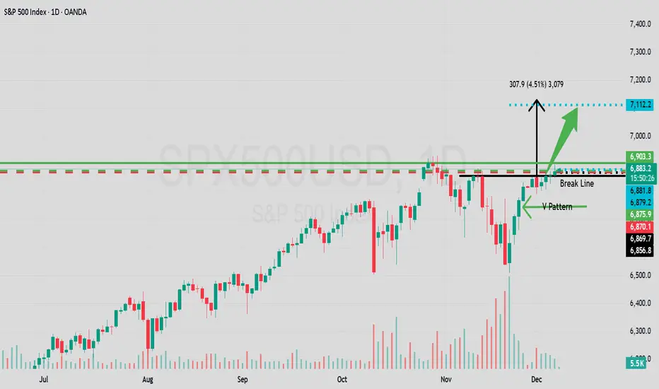
SPX/USD Daily Showing Another V Pattern To The Upside!Traders and fellow following trading friends!
Here it shows again no surprise. A V pattern to make SPX rise .
Price broke out above the break-line 6856.8
Set target price - 7112.2
Happy Santa Rally ! Go long and receive your Christmas gift from Santa Wall street $$$
Enjoy the free money and use it to buy your loved ones in your life some nice gifts :)
More on this later as she unfolds. Best of luck in all your trades.
FRIDAY SELL SIDE LIQUIDITY CLEARANCE!Sell side liquidity has been building since the beginning of this week, Monday, 1st December. My expectation is that the market shall end the week, firstly by moving higher, a Judas Swing, to sweep buy side liquidity at the Daily Level. Then reverse sharply and descend to take out the entire week's liquidity on the downside built up from Monday.
This would be such a beautiful execution. It makes so much sense to me for price to move this way. If not, hey, I am always happy to learn from any flawed analysis I make!
Good luck tomorrow!
