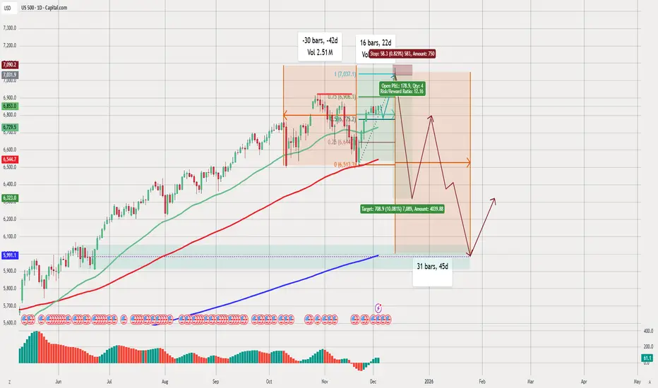
US500 DAILY BUY/SELLTechnical Analysis of the Chart (US500 – Daily Timeframe)
1. Overall Trend
The US500 (S&P 500) is in a strong long-term uptrend, as shown by:
Price trading above the 50-day (green), 100-day (red), and 200-day (blue) moving averages.
Higher highs and higher lows throughout most of the year.
2. Current Market Structure
Sideways / Consolidation Phase
The chart highlights a consolidation box where the price has been moving sideways.
Multiple wicks and uneven peaks indicate market indecision.
The drawn Fibonacci retracement suggests the market has been reacting around the 0.382 and 0.618 levels, which are typical reversal zones.
3. Short-Term Bearish Setup
The highlighted red zone (trade setup) suggests:
A potential short position with:
Entry near recent highs.
Stop-loss above resistance.
Target significantly lower (near the 0.618 – 0.65 Fibonacci region).
The RR (Risk/Reward) ratio is shown as 12:16, which indicates the idea of a large move downward.
Bearish Projection
The brown/red line drawn forward shows:
Expected drop in price.
A possible relief bounce.
Followed by a deeper fall reaching the lower support area.
This move is expected within ~31 bars (45 days).
4. Key Support Levels
Main support zone highlighted at approximately 5991 – 6230.
The 200-day moving average (blue) is far below current levels, meaning:
The market could decline significantly while still staying in a long-term uptrend.
5. Volume & Momentum Indicators
The volume bars show decreasing momentum, which often precedes a reversal.
The histogram at the bottom suggests:
Weakening bullish momentum.
Possible bearish momentum building.
6. Forecast Path (Illustrated in the Chart)
The drawing suggests:
Short-term:
Sharp decline from current resistance.
Mid-term:
A corrective bounce upward.
Another leg down forming a deeper low.
Long-term:
Strong recovery upwards after bottoming.
This is a classic A-B-C corrective pattern.
7. Overall Interpretation
The chart shows the idea that the market may be topping after a strong uptrend.
A correction of around 6–10% could occur before the next major rally.
The setup drawn is speculative but follows common technical structures:
Resistance rejection
Fibonacci retracement
Corrective wave pattern
Trade ideas
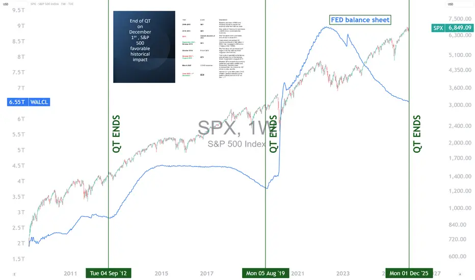
End of the Fed’s QT: What Impact on the S&P 500?The U.S. Federal Reserve (Fed) is expected to end its quantitative tightening (QT) program on December 1, 2025. This step marks the halt of the reduction of its balance sheet, after several years devoted to withdrawing liquidity from the financial system to fight post-COVID inflation. Historically, the end of a QT cycle has often coincided with an improvement in the S&P 500’s trend. However, while this development is generally a positive signal, it deserves a nuanced analysis in a context where the index is already trading at historically high valuation levels.
1) A look at history: a frequently favorable turning point
In previous episodes, notably in 2012 and 2019, the end of QT coincided with a stabilization, then a gradual acceleration of equity markets. The economic logic is intuitive: when the Fed stops reducing liquidity, pressure on financial conditions eases. Investors then anticipate a more predictable monetary environment, sometimes heralding a loosening cycle. This improvement in sentiment has often supported U.S. indices in the following months.
This is not a mechanical link, but an observed trend: the end of QT acts as a relief, removing a monetary tightening factor that weighed on valuation multiples.
2) Why remain cautious despite this signal?
The current context differs in several ways. First, by the end of 2025, the S&P 500 is showing valuation levels close to its records, driven by a handful of large technology stocks. This concentration means that part of the potential future upside is already priced in. Second, even if the Fed ends QT, this does not guarantee a rapid rate cut or a swift return to a highly accommodative monetary policy. The central bank may prefer to maintain a restrictive stance as long as inflation does not durably converge toward its target.
Finally, investors will have to deal with persistent uncertainties: slowing global growth, pressured margins in certain sectors, and geopolitical tensions that may create volatility.
3) Why keep an optimistic bias?
Despite these precautions, several factors justify measured optimism. Ending QT removes a significant headwind for equities. If inflation continues to normalize, the Fed will have greater flexibility, which could improve economic prospects and support corporate profits. In short, the end of QT is not a guarantee, but it represents a positive catalyst in a context where the risk of excessive market valuation is present.
DISCLAIMER:
This content is intended for individuals who are familiar with financial markets and instruments and is for information purposes only. The presented idea (including market commentary, market data and observations) is not a work product of any research department of Swissquote or its affiliates. This material is intended to highlight market action and does not constitute investment, legal or tax advice. If you are a retail investor or lack experience in trading complex financial products, it is advisable to seek professional advice from licensed advisor before making any financial decisions.
This content is not intended to manipulate the market or encourage any specific financial behavior.
Swissquote makes no representation or warranty as to the quality, completeness, accuracy, comprehensiveness or non-infringement of such content. The views expressed are those of the consultant and are provided for educational purposes only. Any information provided relating to a product or market should not be construed as recommending an investment strategy or transaction. Past performance is not a guarantee of future results.
Swissquote and its employees and representatives shall in no event be held liable for any damages or losses arising directly or indirectly from decisions made on the basis of this content.
The use of any third-party brands or trademarks is for information only and does not imply endorsement by Swissquote, or that the trademark owner has authorised Swissquote to promote its products or services.
Swissquote is the marketing brand for the activities of Swissquote Bank Ltd (Switzerland) regulated by FINMA, Swissquote Capital Markets Limited regulated by CySEC (Cyprus), Swissquote Bank Europe SA (Luxembourg) regulated by the CSSF, Swissquote Ltd (UK) regulated by the FCA, Swissquote Financial Services (Malta) Ltd regulated by the Malta Financial Services Authority, Swissquote MEA Ltd. (UAE) regulated by the Dubai Financial Services Authority, Swissquote Pte Ltd (Singapore) regulated by the Monetary Authority of Singapore, Swissquote Asia Limited (Hong Kong) licensed by the Hong Kong Securities and Futures Commission (SFC) and Swissquote South Africa (Pty) Ltd supervised by the FSCA.
Products and services of Swissquote are only intended for those permitted to receive them under local law.
All investments carry a degree of risk. The risk of loss in trading or holding financial instruments can be substantial. The value of financial instruments, including but not limited to stocks, bonds, cryptocurrencies, and other assets, can fluctuate both upwards and downwards. There is a significant risk of financial loss when buying, selling, holding, staking, or investing in these instruments. SQBE makes no recommendations regarding any specific investment, transaction, or the use of any particular investment strategy.
CFDs are complex instruments and come with a high risk of losing money rapidly due to leverage. The vast majority of retail client accounts suffer capital losses when trading in CFDs. You should consider whether you understand how CFDs work and whether you can afford to take the high risk of losing your money.
Digital Assets are unregulated in most countries and consumer protection rules may not apply. As highly volatile speculative investments, Digital Assets are not suitable for investors without a high-risk tolerance. Make sure you understand each Digital Asset before you trade.
Cryptocurrencies are not considered legal tender in some jurisdictions and are subject to regulatory uncertainties.
The use of Internet-based systems can involve high risks, including, but not limited to, fraud, cyber-attacks, network and communication failures, as well as identity theft and phishing attacks related to crypto-assets.
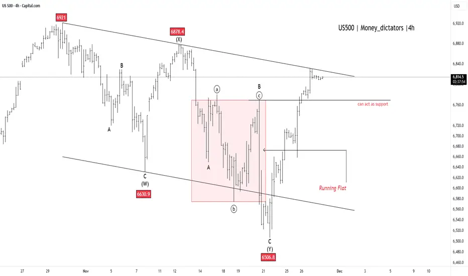
US500 - Breakout to New All-Time Highs!US500 suggests the market has put a definitive end to its recent downward movement, signaling that a major bullish trend is set to continue. This complex correction, which the chart labels as complete at the 6506.8 low, looks resolved. The index has since staged a powerful rebound and is currently pressing right up against the major upper trendline resistance, which defined the limits of the entire corrective phase.
A clear and sustained move above this key trendline will provide final confirmation that the correction is over and that a significant new upward wave has begun. The previous area of congestion around 6760 is now expected to act as strong support for the index, preventing any minor pullbacks from turning into a deeper decline. With the current price around 6,812.61 and the all-time high at 6,920.34 , the index is technically well-positioned to challenge and surpass this record high soon.
S&P500 Index Goes "Hanging Man" Due To Mixed Monthly ReturnsHanging man pattern is a single-candle bearish reversal signal that appears after an uptrend and warns that selling pressure is starting to emerge, even if the candle closes bullish.
For the S&P 500 November 2025 monthly candle, current data show a shallow pullback within an ongoing uptrend rather than a textbook hanging man, so any bearish implication is weak and unconfirmed.
What a hanging man is
A hanging man is a one-candle pattern that appears after a price advance and has a small real body near the top of the range, a long lower shadow (typically at least twice the body), and little or no upper shadow. It signals that sellers were strong intramonth (long lower wick) but buyers managed to push price back up by the close, creating a warning of potential trend exhaustion that must be confirmed by a subsequent bearish candle or downside break.
Key points for a valid hanging man on a higher timeframe such as a monthly chart are:
Clear prior uptrend into the candle.
Small body near the high, long lower shadow, minimal upper shadow.
Bearish confirmation the next bar (lower close or break of the low).
S&P 500 November 2025 monthly candle
Available November 2025 data show that the S&P 500 spent most of the month near recent highs after breaking above the 6,800 area, with the broader structure still strongly bullish into year-end 2025. While there was some downside volatility, the monthly action is better characterized as a modest pullback or consolidation after a strong advance than a classic hanging man with a pronounced long lower shadow and tiny body at the top of the range.
Several technical commentaries into late November and early December focus on resistance, overbought readings, and risk of correction, but they do not highlight a confirmed monthly hanging man or other completed exhaustion signal for 2025. One analysis even notes that a specific type of monthly exhaustion pattern is not yet in place for 2025, implying that the major trend remains intact despite short‑term risks.
Bearish technical perspectives from here
Even without a textbook monthly hanging man, there are credible bearish technical scenarios because the index is extended and pressing important resistance zones, meaning a confluence of resistance near high Fibonacci retracement levels, overbought momentum (elevated RSI), and key moving average and trendline tests as areas where a failure could trigger a correction.
Market breadth remains weak
In a short, in the year 2025 there're still no any new 52-week highs for major indices that count number of stocks above 200-Day average, like INDEX:MMTH , INDEX:NCTH , INDEX:R1TH , INDEX:S5TH and so on.
Potential bearish follow‑through in coming months generally centers on:
A failure to sustain above current resistance bands, leading to a pullback toward roughly the 5400 – 5000 region that aligns with prior supports and Fibonacci levels.
Rising volatility around macro catalysts such as inflation data and Federal Reserve policy decisions, which could accelerate downside if the index breaks below short‑term support and recent uptrend lines.
Overall, the S&P 500 remains in a longer‑term uptrend into late 2025, and any hanging‑man‑like monthly candle would be treated as an early warning, not a standalone sell signal; bears still need confirmation via a decisive break of support and a sequence of lower highs and lower lows on weekly and daily charts.

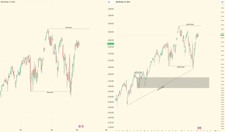
''iPhone vs Laptop Trading: The Truth Nobody Talks About''Alright, let’s get straight to it. I’ve been watching traders debate this forever — phone or laptop. Here’s my breakdown, from someone who actually trades multi-timeframe SMC setups, tracks liquidity, and executes in real-time.
⸻
1️⃣ Execution and Speed
• On a laptop, you’ve got full visibility: multiple monitors, larger charts, higher timeframe context, all indicators and order blocks at a glance.
• On iPhone? Limited view, smaller screen, harder to see context, and micro adjustments take longer.
• The reality: Speed matters. A 1-minute confirmation or lower-high break can happen fast. If you’re on a phone, you risk missing that critical move or entering late.
⸻
2️⃣ Multi-Timeframe Analysis
• Edge comes from analyzing multiple chart intervals to see the bigger picture and confirm setups.
• Laptop: Side-by-side charts, smooth workflow, all intervals visible at once.
• On the phone, switching between timeframes is clunky, slow, and mentally taxing. You’ll start guessing instead of confirming.
• Key takeaway: Serious traders of any style know: a laptop gives you the clarity, control, and precision that’s hard to achieve on a phone.
⸻
3️⃣ Precision of Orders
• Laptop: You can place precise limit entries, manage stop losses, and see where liquidity clusters are.
• Phone: Accidental taps, misclicks, or lag can cost you a trade. Especially when dealing with small spreads, tight stop losses, or micro entries.
• Lesson: Mistakes on micro orders aren’t small. They erode both capital and confidence.
⸻
4️⃣ Situational Use
• Phone trading isn’t useless. It’s fine for monitoring, tracking TPs, or checking alerts when you’re away from your desk.
• But if you’re entering, executing, or actively managing high-leverage trades — laptop wins hands down.
⸻
5️⃣ Psychology and Focus
• Laptop setups create a trading environment: focus, fewer distractions, full screen, proper charts.
• Phone trading often comes with notifications, background apps, and temptation to “glance and guess.”
• Your mindset matters as much as your setups. Treat trading like a full-time process, not a side hobby.
⸻
6️⃣ My Personal Take
• I’ve tested both. I’ll check charts on my phone sometimes — especially during quick monitoring sessions.
• But every serious execution, every multi-timeframe setup, every liquidity play — it happens on my laptop. That’s where precision, patience, and professionalism live.
⸻
🔥 Key Lessons
1. Phone = monitoring & alerts only.
2. Laptop = execution & analysis.
3. Edge isn’t just charts — it’s control, speed, and clarity.
4. You can’t shortcut this without costing yourself trades or your confidence.
⸻
💡 Visual Reference:
I posted screenshots to show the difference between iPhone and laptop trading setups. Laptop view is on the right side, showing full charts and multi-interval visibility. iPhone view is on the left side, compact and limited. This makes it clear why execution and workflow are easier on a laptop.
Bottom line: Don’t kid yourself. Your tools matter, but more importantly, how you use them separates amateurs from pros.
I’m curious — who’s still trying to trade full-time on a phone? Let’s see if they’re really ready to compete.
S&P 500 Roadmap: Correction Rally Ending—Another Drop Is ComingAs I expected in the previous idea , the S&P 500 index( SP:SPX ) moved toward the broken Support lines and completed its pullback, reaching its targets.
Given that the S&P 500 index nowadays shows a significant correlation with the cryptocurrency market and Bitcoin( BINANCE:BTCUSDT ), it’s wise to pay even more attention to this index, as it can help us gauge the crypto market trends.
The S&P 500 is approaching a Resistance zone($6,675_$6,637), and considering the momentum of last weekend’s decline, it appears that this recent upward movement is merely a correction. Therefore, we should expect another decline in the S&P 500.
Since the U.S. dollar index( TVC:DXY ) is also likely to maintain an upward trend, the rise in the dollar can lead to more capital flowing into safer assets, potentially impacting the S&P 500 negatively.
The S&P 500 is also influenced by the US 10-Year Government Bond Yield( TVC:US10 ). If the US 10-Year Government Bond Yield trends upwards , then riskier assets like cryptocurrencies might go down more, and this, in turn, could also impact the S&P 500.
Considering all the above, I expect that the S&P 500 will at least test its Support zone($6,580_$6,490) again and, if that Support zone($6,580_$6,490) is broken, we could anticipate further declines in the U.S. stock market and the S&P 500.
First Target: $6,526
Second Target: $6,413
Stop Los(SL): $6,731
💡 Please respect each other's opinions and express agreement or disagreement politely.
📌S&P 500 Index Analyze (SPX500USD), 4-hour time frame.
🛑 Always set a Stop Loss(SL) for every position you open.
✅ This is just my idea; I’d love to see your thoughts too!
🔥 If you find it helpful, please BOOST this post and share it with your friends.

Sell US500 – Clear Signs of Bearish Smart-Money Flow1. Bearish structure confirmed
The previous bullish Order Block has been completely broken with a sharp displacement and high volume.
When an OB fails this decisively, it signals a clear shift in market structure from bullish to bearish as buyers lose control.
2. New Bearish Order Block formed at the break of structure
After the breakdown, price retraced back into the zone above the break and created a new VNShark-OB:
Strong breakout volume → footprint of Smart Money stepping in
Wide Imbalance (IMB) → liquidity gap left unfilled
Initial reaction from the zone → sellers defending the area
This is a typical smart-money pattern before the next bearish leg.
3. Trade Plan – Two Sell Limits
Sell Limit 1
First touch of the new OB
50% position size
Sell Limit 2
Higher liquidity sweep
100% position size
Expectation: Smart Money may push price higher to hunt liquidity before sending it lower.
4. Risk Management & Notes
No chasing if price drops without a retest
Position size according to strict risk management
Avoid trading near major news releases
Setup becomes invalid if price closes above the entire OB zone
Do not hold trades over the weekend
Signature
Follow VNShark to understand how Smart Money leaves footprints — and how you can follow them with precision.

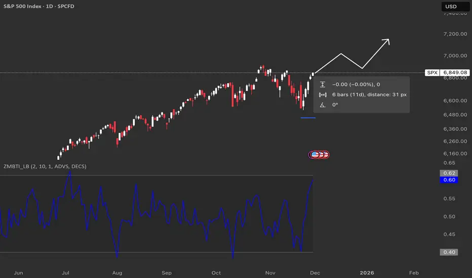
SPX : Potential Zweig Breadth ThrustThe Breadth Thrust Indicator is a technical indicator that looks at how many stocks advance vs. decline over 10 days.
When it snaps from around 0.40 to above about 0.615 in 10 trading days or less, that’s called a Zweig Breadth Thrust and has historically lined up with strong bull runs more often than not.
Historically it doesn’t happen often, but when it does, forward returns over the next several months have usually been positive, which is why traders get excited when the line on your chart surges like this.
Historically, once a full thrust has triggered, the index has often been higher 6–12 months later in the majority of cases.
Hindenburg Omen Is Flashing AgainThe Hindenburg Omen has triggered, and it’s lining up with what the market breadth data has been whispering for months. If you look at the bottom pane, you’ll see the percentage of stocks above their major moving averages has been sliding for about six months.
So even though the index has kept pushing to new highs, fewer stocks are moving with it. A small group of mega-caps is doing all the heavy lifting, while the broader market slowly weakens underneath.
Historically, that’s exactly the kind of environment where the Hindenburg Omen becomes relevant. It doesn’t promise a crash, but it flags when internal conditions have deteriorated enough to allow one. Several past signals have occurred before meaningful corrections.
Why This Matters Now
The next couple of weeks are important. CPI, PPI and labour data between now and 10 December will shape expectations heading into the FOMC meeting. If the Fed changes tone on monetary policy, liquidity, or the path of rates, it will feed directly into sector rotation and capital flows.
That’s why I’m not committing to any major trades right now. The signals are mixed, breadth is weakening, leadership is narrow and policy risk is rising. Capital preservation comes first until we get a clear direction from the data and the Fed.
Sometimes the smartest move is patience. Let the data confirm the story. The market isn’t going anywhere.

SP500 short-term consolidation renewed bullish strength.SP500 has rebounded strongly from the recent demand zone near 6,630–6,650, showing a clear shift in momentum toward the upside. Price has broken out of the short-term consolidation, indicating renewed bullish strength.
Technically Price previously traded inside an ascending channel but recently dipped out after the drop, bulls stepped in at the demand zone and pushed price upward aggressively the current move suggests the market may attempt to re-test the upper levels.
If price sustains above this level, it confirms strong bullish continuation 68,00 to 69,05 This is the upper resistance zone from the previous highs a break above this area may open the door toward a new bullish wave.
You may find more details in the chart,
Trade wisely best of Luck Buddies.
Ps; Support with like and comments for better analysis Thanks for Supporting.

The Culmination of the 2025 Bull Market: AI Mania Tipping PointThe Culmination of the 2025 Bull Market: AI Mania Tipping Point
A. Geometry of the 2-Week Chart
On the 2-Week chart, price has reached the upper boundary of the 1:20 parallel channel —
the same structural angle that has defined the entire post-2020 bull cycle.
This angle rises at 20 points per 2-week bar, and the market has touched it only at major cycle culminations:
Jan 3, 2022 — Major Top
Oct 10, 2022 — Capitulation Low
Oct 23, 2023 — Structural Low
Apr 7, 2024 — Angle Retest Low
Oct 27, 2025 — Structural Top
Each contact marked the exhaustion of one cycle and the birth of another.
Today, price is pressing against this ceiling with the weakest internal motion of any prior touch.
B. Speed & Acceleration on the 2-Week Chart
The internal motion confirms the structural peak.
⚡ Speed Has Rolled Over
Speed at the February 2025 top reached 159 Market Knots.
At the October 2025 top, Speed failed to exceed that reading.
Price made higher highs while Speed made lower highs.
Higher highs with lower speed = exhaustion.
The trend is rising, but the force behind it is hollow.
🔻 Acceleration Has Already Turned Negative
Acceleration always breaks first —
it is the earliest signal of structural weakness.
Acceleration turning negative on the 2-Week chart reveals something critical:
It can go much deeper negative.
The force of the trend is collapsing before price.
Acceleration turning negative on the 2-Week chart reveals something critical:
It can go much deeper negative — the force of the trend is collapsing before price.
📉 The Unified Signal
When both Speed and Acceleration deteriorate at the highs,
the market becomes structurally vulnerable.
C. The 2-Day Chart — Short-Term Angles Breaking
Inside the broader structure, the rise has been carried by two steep geometric angles:
The $4-per-degree angle
From the Oct 27, 2023 low
(1° = 4 points)
The $8-per-degree angle
From the Apr 7, 2025 low
(1° = 8 points, the steepest of the advance)
Both angles have now broken.
This confirms what the 2-Week structure already signaled:
the completion of a cycle.
D. 2-Day Motion (Market Knots) — Internal Force Collapsing
The 2-Day chart reveals what the price action hides:
the internal engine of the trend has failed while price still sits near the highs.
⚡ Speed has imploded
Price is still hovering near peak levels
But Speed has collapsed straight downward
This is one of the strongest exhaustion signatures the Market Knots System can print
When Speed collapses while price remains elevated, the trend is no longer supported —
it is hanging at the highs without the force that once carried it and dangerously no structure beneath .
🔻 Acceleration is deeply negative
Acceleration has plunged into the deepest negative zone since 2022
The internal force behind the advance is not just fading —
it has completely reversed
Acceleration is violently negative.
This creates a structurally fragile condition:
The trend’s internal force has shut down, and price is standing on hollow ground.
2. CONVERGENCE OF CYCLES — December as the Stress Point
This breakdown occurs precisely as multiple independent cycles converge into the same temporal window —
a natural stress point in the market’s architecture.
• The 2020 Cycle — Five Years Completed
The post-pandemic cycle that began in March 2020 now enters year five —
a common terminal phase in Gann-based cycle structures.
Five-year expansions often mark major growth culminations before a structural reset.
• The 2021/2022 High — A 3-Year Echo
The December 2021–January 2022 top forms a three-year resonance window.
Markets often return to the vibration of prior highs on a three-year cadence.
Once again, we arrive in the December–January window.
• The 7-Year Cycle (2520°) — The Echo of 2018
In 2018, the market peaked early in Q4 and panicked into December
as liquidity tightened and the long structural angle exhausted.
Seven years later, in 2025, price stands in the same geometric position:
touching the top of its structure, with motion collapsing and key angles broken.
Seven-year cycles often carry the potential for panics, sharp declines, and structural breaks
when the underlying geometry reaches full extension.
3. VALUATIONS — A Market Lifted by the Few
The 2025 advance has been extraordinarily narrow.
Nine companies now represent 37.64% of the S&P 500:
NVIDIA
Apple
Microsoft
Amazon
Alphabet (GOOGL + GOOG)
Broadcom
Meta
Tesla
This is not a broad-based advance.
It is an AI megacluster lifting the entire index.
Top S&P 500 YTD Performers (AI/Tech-Linked)
And the top S&P 500 YTD performers inside the index are also AI/Tech domiannt.
Western Digital (WDC) — +208.82%
Robinhood (HOOD) — +187.98%
Seagate (STX) — +175.16%
Micron (MU) — +146.40%
Palantir (PLTR) — +104.75% (Ranked #7 on official S&P list)
Lam Research (LRCX) — +97.49% (Ranked #8 on official S&P list)
AI Mania Is the Only Engine
The market’s strongest performers — both mega-cap and mid-cap — are uniformly driven by:
AI hardware
AI compute capacity
AI storage and memory
AI cloud infrastructure
AI-driven speculation flow
This is not organic economic breadth.
It is a narrow, leveraged bet on a single technological axis, carrying the S&P to its ceiling.
A Structural Imbalance
When nearly 40% of index weight — and nearly all performance — comes from one cluster,
the structure becomes top-heavy, like a building with all its weight on a single floor.
The index reached its 2025 peak
not through collective expansion,
but because a handful of megacap Tech/AI companies propelled it upward in stalling economy.
5. SYNTHESIS — A Moment of Completion
The 2025 bull market has reached its culmination.
A cycle viscously powered by a narrow AI concentration.
The market stands at the top of its orbit,
supported by a structure whose internal beams are already failing.
Historically, this alignment produces volatility as one cycle completes and the next takes form.
Multiple independent cycles — 5-year, 3-year, and 7-year — are converging into the December/January window
Our geometric measurements indicate a contraction of prices in December and into Q1 of next year. This will initiate a price decline back toward the 1:20 angle into 2026, followed by a resumption of higher prices into 2027.
Nana Hermes —
All Things Move by Measure.

Bulls don't get too comfortable....fundamentals still not goodHave been tracking the swings recently and macros and it's worth noting that the fundamentals of the economy are still weak. The upcoming rate reduction is already priced in, and it won't change the employment / defaults / private credit environment and inflation. Expect a dip very very soon and red across the board. The economy is being propped up with hot air and it's just not sustainable. All the macros are screaming red and people are ignoring until it's too late.
#SQQQ could be an interesting hedge, but would pull out now from any long positions as the AI bubble is showing big cracks and people are deciding to look the other way until they get wiped out.
SPX WEEK 48 — Strong Bounce Into Year-End! 2026 BULL RUN COMING?Strong week for the SP:SPX index. After two weeks of hesitation candles, price finally shifted back into strength and pushed decisively higher. This week’s candle not only reclaimed momentum but fully erased last week’s cooling-off behavior.
Price also moved well above the key mid-range levels that traders usually watch to define trend health. It’s now sitting firmly above the major risk zone and continues building distance away from it — a clear sign of strength. From the moment this week’s upside break triggered, the index has gained roughly 1.9%, and that kind of move typically translates into solid returns for options traders playing directional setups.
Major support zones sit lower around 5900, 5100, and the deeper structural support near 4000. As long as price holds above the upper layers of support, momentum remains intact.
On the higher-timeframe monthly chart, the trend has been active for eight straight months with no signs of exhaustion. Price is still far above the level where the monthly trend began, and even further above the long-term midline — showing how dominant the larger trend still is.
The 2-day chart continues to support the overall bullish structure, breaking above short-term levels and maintaining strength after multiple confirmations earlier in the week.
This week was a clean continuation of the broader uptrend — strong candle, strong momentum, and strong positioning above every major structural region.
Elite clarity. Elite precision. More coming soon.

More upside for SPX500USDHi traders,
Last week SPX500USD went up again just as I've said in my previous outlook.
Next week we could see a correction down and more upside for this pair.
Let's see what the market does and react.
Trade idea: Wait for a correction down. After a change in orderflow to bullish you could trade longs.
This shared post is only my point of view on what could be the next move in this pair based on my technical analysis.
But I react and trade on what I see in the chart, not what I've predicted or expect.
Don't be emotional, just trade your plan!
Eduwave

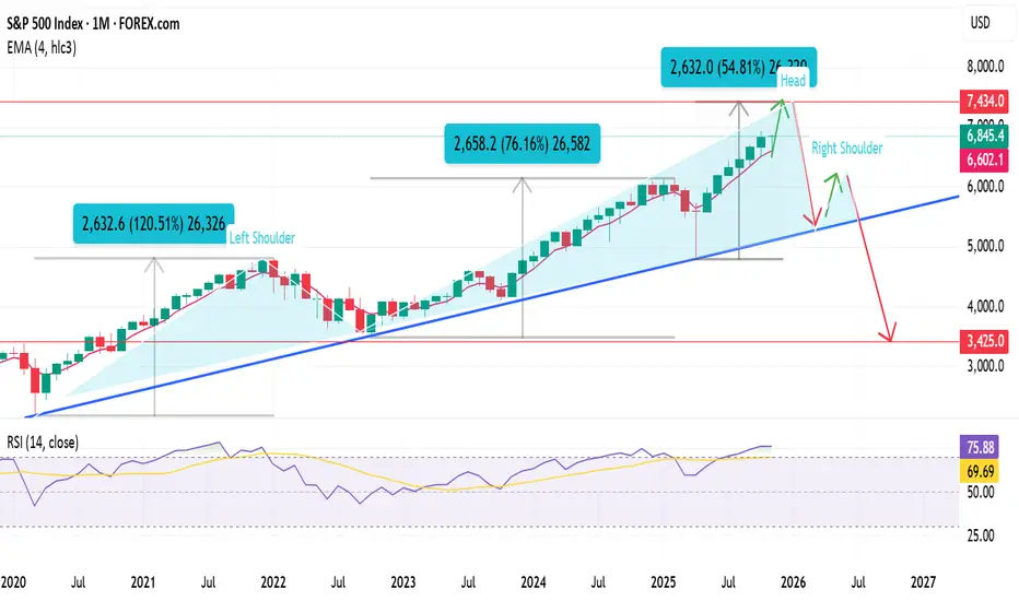
End of bull cycle targeting 7440 then bear market target 3400 In my view we're still in the bullish cycle started in 2020, my final target is 7440 area.
From that area I expect the beginning of the market bearish cycle.
On the monthly chart we can see an H&S pattern forming and a neckline supporting the bullish trend from 2020, I expect the break of the trendline in the next 3 months my target is 3420 area next autumn.
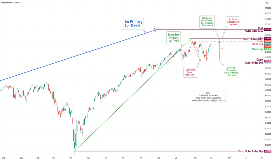
S&P 500 Daily Chart Analysis For Week of Nov 28, 2025Technical Analysis and Outlook:
In this abbreviated weekly trading session, influenced by a significant U.S. holiday and a cooling issue at the CyrusOne data centers at CME, the S&P 500 Index posted notable gains, reaching our primary target, the Mean Resistance at 6,849.
At present, this position suggests the potential for further upward movement, with primary targets established for a continuation of the robust trend toward Key Resistance at 6,895, followed by an extended target identified as the Outer Index Rally at 6,945.
Nevertheless, it is crucial to recognize that, given the prevailing market dynamics, there exists a considerable likelihood of an In-Force pullback from the aforementioned price targets.
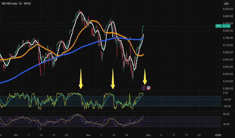
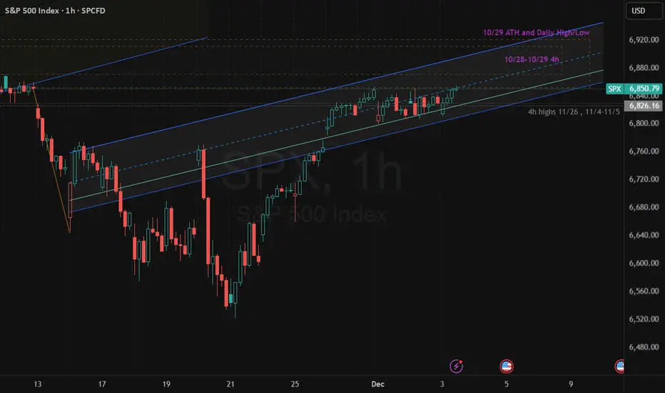
$SPX 1H – Bear Flag at Supply | Bearish- STRICT DAY TRADE IDEASTRICT DAY TRADE IDEA (Applies only for hourly chart for short term day trades within 1 to 2 days)
SP:SPX is sitting inside a rising 1H channel that continues to behave more like a bear flag than a bullish breakout setup. Price tapped only the bottom edge of the 10/29 ATH supply zone—not the core of the zone—showing early seller absorption.
We also tagged the mid-channel, which normally signals momentum weakening rather than expansion.
Check Bear-flag thesis from Nov 17 and Nov 21 and Dec 2
As long as SPX remains inside this structure, the bias stays bearish for day trading.
Break of 6,840 opens the door to a channel breakdown, with intraday targets at 6,810 → 6,780 → 6,740.
Upside invalidation is clean: bulls must break above 6,885–6,900 with strength and reclaim the ATH zone from inside, not just touch it.
Until that happens, rallies into channel mid or top = short opportunities.
Bearish Bias | Watch 6,840 | Bear Flag Until Proven Otherwise
#SPX #S&P500 SP:SPX SP:SPX CBOE:SPX #SP500 #BearFlag
BUY SPX NOW...time to buySPX500 is in a clear upwards channel and has broken the last bit of resistance (white trendline line shown) - this is a clear confirmation that the next target will be the next resistance zone to the upside shown above (this is a great buy trade opportunity) - Time to buy!
$SPX: Wave 4 consolidation on 1-hr chartSP:SPX : looks like it's in a small degree Wave 4 consolidation. Wave 3 exceeded 161.8% of Wave 1. If Wave 5 = Wave 1, Wave 5 can reach 6950 area. However, Wave 5 = 61.8% Wave 1 is also quite common, which would take us to 6900 area.

US 500 – Signs of Fatigue After a Strong Recovery?It’s been an edgy start to December for the US 500 index, a month which is historically one of the strongest. Part of the reason could be that the last 7 trading days of November saw a 5.3% rally from lows of 6508 (Nov 21st) to 6852 (Nov 28th) as markets reacted positively to more dovish commentary from Federal Reserve policymakers, which revived the possibility of a final Fed rate cut at their last meeting of the year on December 10th.
Now Fed speakers are in the blackout period before that meeting where they are banned from publicly discussing current policy and it suddenly feels like a long time to wait to hear the outcome of their deliberations, especially with the US 500 sitting a mere 2% from its record highs of 6925 set on October 30th.
Traders also must contend with a busy data schedule across this week, and it didn’t get off to the best start with yesterday’s US ISM Manufacturing PMI survey showing activity falling further into contraction territory (below 50), with sagging order books and higher prices being paid.
However, while manufacturing activity is important to the US economy, by far the biggest driver is services and the ISM Services PMI survey is due for release tomorrow at 1500 GMT. Last month’s reading sat comfortably in expansion territory (above 50) and US 500 traders will be looking to judge this new release against the previous month. Any disappointment could weigh on sentiment and vice versa.
The available updates on the US labour market could also be important as they could impact the Fed rate decision next week. The ADP monthly private sector payrolls is released tomorrow at 1315 GMT, with the Challenger job cuts due Thursday at 1230 GMT and weekly jobless claims due at 1330 GMT. The shock weaker Challenger job cuts reading last month initiated some extra US 500 volatility and it will be interesting to see if this happens again.
The technical backdrop is also potentially crucial going into such a critical period and the current assessment can be seen below.
Technical Update: Signs of Fatigue After Strong Recovery?
The US 500 index has staged an impressive recovery of more than 5.3% since the November 21st low, as recent price weakness once again found dip buyers. This pattern has been a consistent feature in US equities for some time. However, as the chart below highlights, the latest upside move in price has yet to achieve a close above the potential resistance defined by the October and November highs.
This may be seen by some as the latest buying failing to breach a previous price peak, thereby disrupting the pattern of higher highs and higher lows. In other words, a possible sign of slowing upside price momentum.
Of course, this does not necessarily signal the end of recent price strength. However, it may remain prudent to monitor both support and resistance levels closely, as doing so may help clarify whether the latest activity reflects a slowing of upside momentum that could lead to renewed weakness, or simply a pause in the advance before fresh price strength emerges.
Potential Resistance Levels:
As strong as the rally from the November 21st low appears, it currently remains capped below 6880, the November 12th session high. As the chart below highlights, this 6880 level represents the last recovery high and failure point, where selling pressure was sufficient to reverse the price advance back to the downside. Traders are therefore possibly viewing 6880 as the first potential resistance level to the current rally.
While not a guarantee of continued upside, closing breaks above 6880 may be interpreted as a sign of price strength resuming. If this proves to be the case, closes above 6880 could pave the way for attempts to challenge 6925, the October 30th session high, with possibilities for further gains should that level also give way on a closing basis.
Potential Support Levels:
If resistance at 6680 continues to hold, traders may begin to suspect that upside price momentum is slowing, which in turn could see renewed selling pressure. At the same time, attention may shift to 6751 as the first support. This level is equal to the Bollinger mid‑average.
While much will depend on future market sentiment and price trends, closing breaks below 6751 could open scope for further declines. Such moves, if seen, may lead to tests of 6722, the 38.2% Fibonacci retracement of the latest advance, and potentially even extend toward 6681, the deeper 50% retracement.
The material provided here has not been prepared accordance with legal requirements designed to promote the independence of investment research and as such is considered to be a marketing communication. Whilst it is not subject to any prohibition on dealing ahead of the dissemination of investment research, we will not seek to take any advantage before providing it to our clients.
Pepperstone doesn’t represent that the material provided here is accurate, current or complete, and therefore shouldn’t be relied upon as such. The information, whether from a third party or not, isn’t to be considered as a recommendation; or an offer to buy or sell; or the solicitation of an offer to buy or sell any security, financial product or instrument; or to participate in any particular trading strategy. It does not take into account readers’ financial situation or investment objectives. We advise any readers of this content to seek their own advice. Without the approval of Pepperstone, reproduction or redistribution of this information isn’t permitted.

Watch the banksKRE (regional banks) is looking like it's setting up a potential C wave down. If so, there's something wrong in that sector and it will drag the market down with it, especially IWM.
AAPL probably a false breakout here and I expect a large move down.

SPX | Testing the Upper Flag Line After AVWAP Shifts The index has steadied as broader sentiment firms, with markets leaning on softer inflation trends and a more patient Federal Reserve tone. That backdrop has helped risk appetite rotate back into equities after the recent pullback.
Technical Lens:
The chart shows SPX rebounding cleanly from the lower boundary of its broader bullish channel, which also aligns with the anchored VWAP drawn from the August 2025 swing low. That confluence provided a strong reaction zone. Price has since pushed through the anchored
VWAP set from the 29 October high, suggesting momentum is shifting back towards the upper side of the structure. The index now sits just beneath the upper boundary of the short-term bull flag, and this zone becomes an important area to monitor as it acts as the immediate ceiling.
Scenarios:
If the upper flag line gives way, the move could open room for continuation along the channel towards the next structural resistance zones.
If the flag line holds, the market may consolidate or retest the mid-channel levels, with the prior AVWAPs acting as nearby reference points.
Catalysts:
US GDP revisions, PCE inflation data and major tech earnings later this week may be the triggers that decide whether the index pushes through or pauses here.
Takeaway:
This upper flag boundary is the key inflection point for SPX, with the anchored VWAP shifts helping define the directional bias.
SPX - Hours Of Work To Buy 1 ShareHours of work needed to buy just one share of the S&P 500 just hit a new all-time high: 187 hours.
That’s:
150% more work than 2007
60% more than pre-COVID (2019)
10% more than “Liberation Day”
As I tell my kids:
Don’t look at the price tag.
Look at how many hours of your life — your blood, sweat, and effort — it takes to buy the thing.
Then decide if it’s actually worth it.
When the amount of work required keeps rising while what you get keeps shrinking, that’s not “innovation” or “AI magic.”
That’s over-speculation.
Buffett said it best:
Price is what you pay. VALUE is what you get.
Everyone screams about the price going up…
but nobody asks whether the VALUE justifies the hours of work required to own it.
That’s the truth — not the narratives.
THANK YOU for getting me to 5,000 followers! 🙏🔥
Let’s keep climbing.
If you enjoy the work:
👉 Boost
👉 Follow
👉 Drop a solid comment
Let’s push it to 6,000 and keep building a community grounded in truth, not hype.
