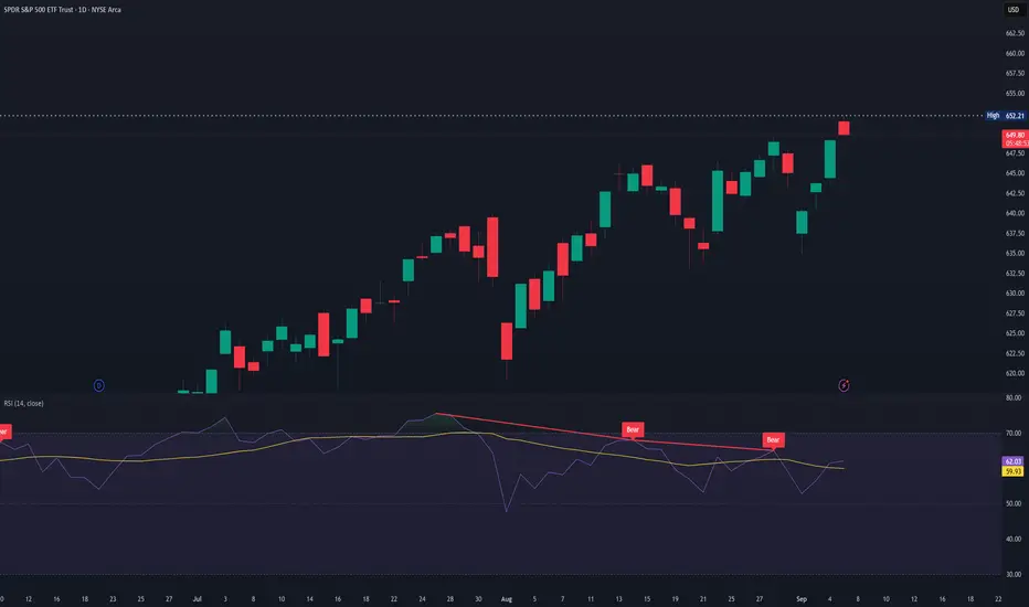
Elliot Waves Strategy ExplainedElliott Wave theory is not a forecasting tool. The moment it’s used that way, it becomes useless. It does not tell you where price will go. It describes how participation unfolds once direction is already present.
At its simplest, markets alternate between expansion and digestion. Impulse waves show commitment and follow-through. Corrective waves show hesitation, overlap, and redistribution. Everything else traders add on top is interpretation, not edge.
Most traders fail with Elliott Waves because they try to label the market instead of read it. Wave counts are adjusted after every pullback to protect bias. When a count needs defending, it has already lost its value for execution.
Wave completion does not mean reversal. Strong trends extend, truncate, or move into complex corrections without ever giving clean countertrend entries. Acting on a “finished” wave without a structural break is just early positioning dressed up as analysis.
The subjectivity of Elliott Waves is the warning label. If two valid counts exist, neither can justify risk on its own. Structure, location, and participation come first. The wave count only adds context to what price is already showing.
Used correctly, Elliott Waves help with expectations and trade management. They stop traders from chasing late impulses and from exiting too early during normal corrections. Used incorrectly, they create the illusion of control over an uncertain market.
Elliott Waves don’t give certainty. They give restraint. And restraint is far more valuable.
Indicators

Happy New Year 2026 TRADERSAs we close the chapter on 2025, it’s worth acknowledging what this year truly tested — not just strategies, but discipline, patience, and emotional control. The market offered moments of clarity and long stretches of uncertainty, sharp trends followed by brutal consolidations, and powerful macro moves that rewarded preparation while punishing impulse. Every win came from respecting structure, and every loss carried a lesson for those willing to learn from it.
To all traders who stayed committed to the process managing risk, protecting capital, and waiting for high-probability setups this year has strengthened you more than any single trade ever could. Progress in trading is built quietly, over time, through consistency and self-control.
As we step into 2026, may your decisions be calm, your risk disciplined, and your confidence grounded in experience rather than emotion. May you trade with clarity, adapt quickly, and continue evolving with the market. Wishing every trader health, resilience, and a year ahead filled with focus, growth, and sustainable profitability.
HAPPY NEW YEAR 2026

The Beginner's Blueprint to Custom Trading Indicators
Your First AI‑Assisted Indicator Doesn't Need to Be Perfect - It Just Needs to Be Yours
In the AI era, you don't have to be "a coder" to build tools that actually match how you see the market.
You just need:
A clear idea
Basic Pine Script concepts
AI to help with the heavy lifting, while you fine tune/debug it.
This post is about turning that first idea into a real indicator on your chart.
---
Step 1: Start With One Sharp Idea, Not Ten Vague Ones
Instead of:
"I want an indicator that tells me when to buy and sell."
try:
"I want a trend filter that only shows long signals when price is above a 200‑MA and volatility is not extreme."
The sharper your idea, the easier it is for both you and AI to build something useful.
---
Step 2: Break the Idea Into Building Blocks
Most indicators combine a few simple components:
Trend (moving averages, higher highs/lows)
Momentum (RSI, rate of change)
Volatility (ATR, bands)
Volume (OBV, volume filters)
Your job is to decide:
Which components matter for your idea
How they should interact (AND, OR, weights)
Then you can tell AI exactly what to code instead of saying "make me something cool".
---
Step 3: Talk to AI Like a Developer, Not a Customer
When you ask AI for Pine code, be specific:
"Overlay indicator on price chart"
"Inputs for fastMA, slowMA, ATR length, ATR multiplier"
"Plot trend filter as a colored background"
"Create longCondition and shortCondition booleans"
You can even sketch the structure:
indicator("My Trend Filter", overlay = true)
// 1. Inputs
// 2. Calculations
// 3. Conditions
// 4. Plots
AI will happily fill in the gaps.
---
Step 4: Understand Before You Trust
AI can write the code, but you are still responsible for:
Reading each block and asking, "What does this do?"
Checking signals on different timeframes and markets
Confirming the indicator behaves like your original idea
Think of AI as an ultra‑fast junior dev. You’re still the lead.

DOW THEORY – THE FOUNDATION OF TREND READINGDOW THEORY – THE FOUNDATION OF TREND READING
1. The Market Moves in Trends – Not Randomly
- Price does not move randomly. What looks like chaos is actually structured movement driven by collective behavior.
A trend exists when the market consistently creates:
+ Higher Highs & Higher Lows → Uptrend
+ Lower Highs & Lower Lows → Downtrend
As long as this structure remains intact, the trend remains valid regardless of news, opinions, or emotions.
2. Every Trend Has Three Levels of Movement
- Understanding timeframe hierarchy is critical.
Markets move in three simultaneous layers:
+ Primary Trend – the dominant direction (weeks to months)
+ Secondary Move – corrective phases against the main trend
+ Minor Swings short-term noise
Most traders lose money because they trade against the primary trend, reacting to minor swings and mistaking them for reversals.
3. The Three Phases of a Trend
A trend does not start or end suddenly. It evolves through three psychological phases:
1️⃣ Accumulation Phase
Smart money quietly builds positions
Price moves sideways, volatility is low
Public interest is minimal
2️⃣ Participation Phase
Trend becomes clear
Breakouts occur
Most trend-following profits are made here
3️⃣ Distribution Phase
Late buyers enter emotionally
Volatility increases
Smart money exits
Understanding these phases helps traders avoid buying tops and selling bottoms.
4. Structure Is the Only Valid Trend Confirmation
A trend is not confirmed by indicators alone.
A trend is confirmed when:
+ Price breaks structure in the trend direction
+ Pullbacks respect previous swing levels
+ Momentum continues after corrections
If structure is not broken, there is no reversal only a correction.
This is why predicting tops and bottoms is dangerous.
5. Volume Confirms Direction, Not Timing
Volume does not tell you when to enter — it tells you whether the move is real.
- Rising volume in the direction of the trend = confirmation
- Weak volume during pullbacks = healthy correction
- High volume against structure = warning sign
Price leads. Volume confirms.
6. A Trend Continues Until Proven Otherwise
This is the most ignored rule and the most important.
A trend does NOT end because:
- Price “already went too far”
- Indicators are overbought/oversold
- Social media says “top is in”
A trend ends only when structure breaks and fails to recover.
HOW TO APPLY THIS IN REAL TRADING
Simple, repeatable framework:
- Identify the dominant trend (HH/HL or LH/LL)
- Wait for a correction not a reversal
- Enter only after structure resumes in trend direction
- Place stop-loss where structure becomes invalid
- Hold until the market changes structure
No prediction. No guessing. Just reading what price is already telling you.
FINAL THOUGHT
Most traders don’t lose because they lack indicators.
They lose because they don’t understand trend behavior.
When you stop predicting and start reading structure,
the market becomes clear, calm, and repeatable.

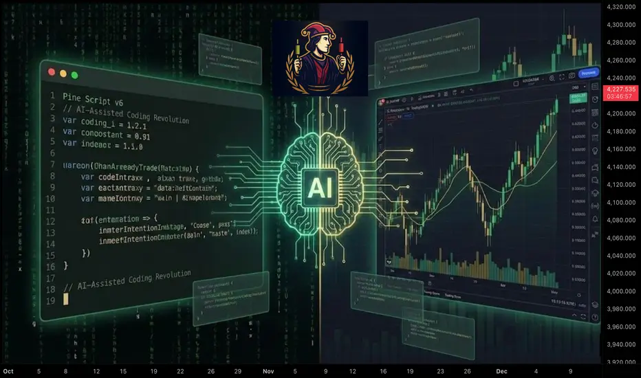
Pine Script v6: The AI-Assisted Coding RevolutionAI Isn't Replacing Pine Script Developers, It's Creating More of Them
For years, if you wanted custom tools on $TRADINGVIEW, you had two options:
Spend months learning to code, or
Settle for whatever public indicators were available
The era of AI assisted Pine Script changes that. You don't have to choose between "coder" and "trader" anymore, you can be both, with AI as your quiet co‑pilot.
Why Pine Script + AI Is a Big Deal
In the new AI trading era, edge comes from:
Being able to test ideas quickly
Turning those ideas into rules
Automating those rules in a language the platform understands
AI can't give you edge by itself. But it can remove almost all of the friction between the idea in your head and a working NYSE:PINE script on your chart.
Instead of:
Googling syntax
Copy‑pasting random snippets
Debugging mysterious errors at 2am
you can describe your logic in plain language and let AI handle the boilerplate, while you stay in control of the trading logic.
The Modern Pine Script Workflow (AI Edition)
Old workflow:
Learn programming basics from scratch
Read documentation line‑by‑line
Write every line of code yourself
Fix every typo and bug manually
New workflow:
Define the strategy in plain English
Ask AI to draft the first version in Pine Script v6
Review and understand what it wrote
Refine, test, and harden it on your charts
The difference isn't "AI does everything" it's AI accelerates everything . You move from "How do I code this?" to "Is this idea actually good?" much faster.
What AI Is Great At in Pine Script
Syntax and Structure - Getting the small details right:
`indicator()` declarations
`strategy()` settings
Inputs, colors, line styles
Common functions like `ta.sma`, `ta.rsi`, `ta.crossover`
Boilerplate Code - The parts that repeat across almost every script:
Input sections
Plotting logic
Alert conditions
Explaining Code Back to You - You can paste a snippet and ask:
"What does this variable do?"
"Why is this `if` statement here?"
"Can you rewrite this more clearly?"
This is how you learn Pine Script by doing , instead of from a dry textbook.
What AI Is NOT Good At (If You Rely on It Blindly)
Designing Your Edge - AI doesn't know your risk tolerance, timeframe, or style. You still have to define the actual trading idea.
Protecting You From Over‑Optimization Ask it to "improve" a strategy and it may add 20 inputs that look perfect on past data and fail live.
Understanding Market Context - It can code the rules, but it doesn't "feel" what a trend, rotation, or macro regime shift means to you.
Use AI as a smart assistant, not an oracle.
Core Pine Script Concepts You Still Need
Even in the AI era, a few fundamentals are non‑negotiable. Think of them as the alphabet you must know, even if AI writes the sentences:
1. Data Types
float // prices, indicator values
int // bar counts, lengths
bool // conditions (true/false)
string // labels, messages
color // styling
2. Series Logic
Every variable in Pine is a time series . You don't just have `close`, you have `close `, `close `, etc.
close // current bar close
close // previous bar close
high // high from 5 bars ago
3. Built‑In Indicator Functions
You don't need to reinvent moving averages and RSI:
ma = ta.sma(close, 20)
rsi = ta.rsi(close, 14)
longCondition = ta.crossover(close, ma)
If you understand what these do, AI can handle how to wire them together.
A Clean AI‑Assisted Workflow to Build Your Next Indicator
Write the idea in plain language
"I want a trend filter that only shows long signals when price is above a 200‑period MA and volatility is not extreme."
Ask AI for a first draft in Pine Script v6
Specify: overlay or separate pane, inputs you want, and what should be plotted.
Read every line
Use AI as a teacher: "Explain this variable", "Explain this block".
Test on multiple markets and timeframes
Does it behave the way you expect on CRYPTOCAP:FOREX , $CRYPTO, and stocks?
Does it break on higher timeframes or very illiquid symbols?
Iterate, don't chase perfection
Tweak one idea at a time.
Avoid adding endless inputs just to fix old trades.
The Bigger Picture: Coders, Traders, and the AI Era
The old split was:
"Coders" who could build things but didn't trade
"Traders" who had ideas but couldn't code them
In the AI era, that wall disappears. The trader who can:
Describe ideas clearly
Use AI to generate Pine code
Understand enough to test and refine
…gets a massive edge over both pure coders and pure discretionary traders.
You don't need to be perfect. You just need to be dangerous, one well‑tested script at a time.
Your Turn
If you could build one custom tool this month with AI's help, what would it be?
An entry signal? A dashboard? A risk overlay?
Drop your idea below and consider this your sign to finally turn it into code.
NYSE Sessions indacator 📌 NYSE Open–Close Session Map — by o0psi
This tool marks the exact candles where the New York Stock Exchange opens and closes, and automatically tracks the true session high and low.
Everything is locked to the exact bar where it happened — no drifting, no extended rays, no repainting.
🔹 Features
NYSE OPEN marker (9:30 EST)
NYSE CLOSE marker (16:00 EST)
Faint background highlight showing the full regular session
Real session high/low detection
High/low candles update live as the session forms
High/low markers stay attached to the exact candle that created them
Perfect for futures, indices, and equities traders
🔹 Why traders use this
The NYSE open and close create some of the most important liquidity events of the day.
This indicator makes them obvious — clean visuals, no clutter, no guessing.
🔹 Ideal for
SPY / ES / NQ scalpers
US30 / SPX traders
Liquidity + session-based traders
Intraday momentum and volatility setups
Anyone who uses NY open/close as key decision points
Made with precision by o0psi.
Enjoy the clean look — and drop a comment if you want a pre-market or extended-hours version.

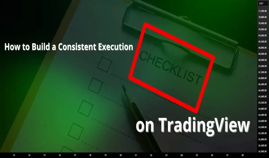
How to Build a Consistent Execution Checklist on TradingViewMost trading mistakes don’t come from bad strategy, they come from inconsistent execution.
An execution checklist removes guesswork and replaces it with structure.
When your actions follow a routine, your results stabilize.
TradingView gives you everything you need to build a checklist that stays visible, actionable, and tied directly to your chart.
1. Define Your Core Conditions
Before any trade, the bigger picture must be clear.
Start your checklist by answering three questions:
What is the higher-timeframe direction
Where is price relative to key levels
Is price approaching with strength or weakness
Use TradingView’s drawing tools to mark support, resistance, value zones, and session highs and lows.
Add a simple text note on the chart listing your core conditions so they are always visible.
If the market context fails this first screen, the trade is already invalid.
2. Build Confirmation Criteria
Once structure is confirmed, you move to evidence.
Mark confirmation areas directly on your chart:
Liquidity pools
Fair value zones or imbalances
Previous session highs and lows
Asian range or New York open
If your strategy uses indicators, document exact conditions:
Moving average position and slope
Volume behavior
VWAP location
Volatility expansion or contraction
Define rules that don’t change based on emotion.
Confirmation should prove your bias, not justify your urge to trade.
3. Validate Risk Before Execution
Every setup must survive a risk checkpoint before it’s allowed to go live.
Your checklist must answer:
Where is my invalidation level
How much capital am I risking
Does this violate any daily limits
Is the reward worth the risk
Use TradingView’s long or short position tool to visualize risk directly on the chart.
Save it as a template so your risk process stays uniform across all trades.
No trade is valid if risk isn’t clean.
4. Create a Pre-Execution Routine
A checklist only works if you actually follow it.
Add a short pre-trade process directly to your chart notes using checkboxes or bullet points:
Example execution checklist:
Market phase confirmed
Level identified
Confirmation present
Risk valid
Entry condition active
Walk through this list before clicking buy or sell.
If one item fails, the trade fails.
Over time, this routine removes emotional impulse completely.
5. Review and Refine Weekly
Your checklist isn’t static, it evolves.
Every week ask:
Where did I break my rules
What conditions led to losses
Which confirmations work best
What rules saved me from bad trades
Use TradingView’s trade replay and journaling features to review execution quality, not just profit.
Consistency improves when your system evolves with you.
Final Thought
A checklist doesn’t restrict your trading, it frees you from emotion.
When your process is clear, your confidence increases.
When your confidence increases, discipline follows.
Good traders make decisions.
Great traders execute procedures.
Stay Green!
AdvancedMA Toolkit: From Building Blocks to StrategyAdvancedMA Toolkit: From Building Blocks to Strategy Optimization
This idea explores the full ecosystem behind the
and — a complete environment
for building, testing, and optimizing moving average-based strategies.
We go beyond signals: this is about understanding market structure, parameter sensitivity, and adaptive risk management .
█ CORE PHILOSOPHY: Beyond Signals, Towards Understanding
The AdvancedMAToolkit is not a "magic indicator". It's a strategy development lab that helps you:
Build complex systems from modular MA blocks
Adapt to changing market regimes via dynamic periods
Simulate virtual trading with real-time statistics
Optimize parameters using Auto-RR and multi-objective logic
Find the best sets of strategy related options and risk/reward
Generate 2nd-layer high-conviction signals from main ones
The goal? Find robust configurations — not just high win rates.
█ THE 14 MOVING AVERAGES: When to Use Each
Each MA type has a unique personality. Here's a practical guide:
SMA — Simple Moving Average. Pure price average. Use for baseline trend in Pine Script strategies.
EMA — Exponential Moving Average. Responsive to recent price. Great for entries and momentum detection.
RMA — Relative Moving Average. Like EMA but smoother, including older data
for stable trends.
WMA — Weighted Moving Average. Weights recent bars more. Good for
momentum confirmation.
VWMA — Volume Weighted Moving Average. Volumes give accurate
market sentiment and trend representation.
DEMA — Double EMA. Effective in consolidated trends.
Used to confirm trading signals in volatile markets.
TEMA — Triple EMA. Reduced lag and noise filtering for scalping and
quick reversals.
HMA — Hull Moving Average. Smoothed EMA that reduces lag in strong trends,
responsive to price changes.
ZLEMA — Zero-Lag EMA. Minimizes delay for earlier signals on trend changes
(use cautiously in noisy markets).
FRAMA — Fractal Adaptive MA. Adapts dynamically to volatility for
adaptive smoothing.
SuperTrend — ATR-based trend filter with dynamic support/resistance.
Ideal for stop placement and trailing.
TMA — Triangular MA. Gives more weight to middle data points,
with added lag for smoother trends.
TRIMA — Weighted Triangular MA. Removes random price fluctuations
for cleaner signals.
T3 — Triple-smoothed EMA. Excellent for swing trading with minimal lag
and clean trend lines.
Pro Tip: Combine fast (HMA/ZLEMA) for entries + slow (T3/FRAMA) for trend confirmation.
█ RETEST SYSTEM: The Quality Gate
Instead of taking every crossover, wait for price to retest the MA zone :
Zone % : Distance from MA (e.g., 1.5% = tight zone)
Min Retests : 1 = quick, 3 = high conviction
Triggers : High/Low for entry, Close for exit
Higher retests = fewer signals, higher probability.
Retest Close-Up: Zone touch + min retests (2+ for conviction).
Zones highlight on touch (more intense color) – but signals only if min retests/trigger match (aside from other filters).
█ FILTER STACK: Multi-Layer Confirmation
Momentum Filter : Catches early trend changes (aggressive = more noise)
Fast MA : Entry timing (ZLEMA on price)
Medium MA : Confirmation (EMA on MA)
Slow MA : Trend direction (T3 on close)
Patterns : Inside Bar = consolidation, Engulfing = reversal
Use OR logic for more signals, AND for quality.
█ AUTO-RR & MULTI-OBJECTIVE OPTIMIZATION
The statistics table is your virtual backtester :
RR Base : Focus on risk/reward ratio
Multi-Objective : Balances 4 metrics (RR, Win Rate, DD, PF)
Calculation Methods : Simple, Weighted, Robust Median
Suggested RR : Auto-optimized for current config
How to read it:
→ Profit Factor > 1.5 + Drawdown < 15% = robust
→ Win Rate 60% with PF 1.8 > 70% with PF 1.2
Data Window Highlights: Dynamic Params & RR
Take a look at this little animation demo showing data window with animated ellipses on key metrics (dynamic period, SL/TP)
█ STRATEGY MODES: Match Your Style
OCO Mode : One trade at a time (traditional)
Hedging : Long + Short simultaneously
Pyramid : "Only in Drawdown" = averaging down
Aggressive : "All Signals" = max opportunities
█ DUAL SIGNAL SYSTEM: Main & Table Explained
Main Signals : Crossover + retest + filters → "UP" (Green) / "DN" (Red).
Table Signals : From stats engine → "T UP" (Green) / "T DN" (Red) for high-conviction.
Some key points for Table Signals :
Trade Management : OCO, pyramiding in drawdown, or all signals — full flexibility.
Auto-RR Optimization : 4 modes to auto-tune SL/TP
Dropdown menus : Allow manual parameters or to display/apply recommended ones.
Note:
The Auto-RR system is completely independent, it doesn't take the parameters from the “statistics section” for calculations, not even as initial values, they are based solely on actual price movements (how much profit/loss an order could have made).
Remember: The stats table doesn’t just analyze — it generates real, actionable 2nd-layer signals, for hedging, swing, or custom strategies.
Dual System in Action: Signal Styles & TP/SL Fade Demo
Watch signals evolve with color/line fades, table compact modes on/off, and live TP/SL levels.
█ PRACTICAL BLUEPRINTS
A. Conservative Swing Trader
→ HMA(150), Retest 2+, Slow MA filter, OCO + First Only
→ Focus: PF > 1.5, DD < 15%
B. Active Day Trader
→ ZLEMA(20), Retest off, Momentum + Fast MA, All Signals
→ Focus: Trade frequency + Win Rate stability
C. Quant Developer
→ Use library in custom strategy:
= AdvancedMAToolkit.trend_and_signals("FRAMA", close, 50, true, 2, 200)
Zone Signals & Suggested RR
See a demo of a scrolling chart in action with highlighted zones and auto-suggested RR in table.
█ POWER COMBOS: Pro Tips for Advanced Users
SuperTrend + 3x ZLEMA : Zero-lag trend filter – responsive, low-noise for perpetuals/DAX.
Trigger as Confirmation Filter : Use 'Open' for exits – confirms at next bar opens.
Chaining MA Outputs : Pass one MA as source to another function – efficient for multi-layer setups (avoid over-chaining for speed).
█ FUTURE ROADMAP (ENHANCEMENTS IDEAS)
Custom Metric Weights: Prioritize Return % while stabilizing other metrics.
Reversal Engine: Detect via zone breaks for trend reversals.
Dynamic Position Sizing: Auto-adjust from stats table.
Multi-timeframe Integration: Use security() for higher TF confirmation.
Additional MA Types:
VIDYA — Volatility Index Dynamic MA. Smooth in choppy markets, fast in trends.
KAMA — Kaufman's Adaptive MA. Efficiency ratio-based for volatility adaptation.
ALMA — Arnaud Legoux MA. Gaussian-weighted for minimal lag + smoothness.
Planned for v3.0 – share your ideas in comments!
█ FINAL NOTE
This is a tool for thinkers . The power lies in your ability to:
Understand parameter trade-offs
Backtest across regimes
Combine with volume/order flow
Manage risk properly
Past performance ≠ future results. Use wisely.
═════════════════════════════════════════════════════════
┌──────────────────────────────────────────┐
Deep Dive: Understanding Dual Signals in AdvancedMA Toolkit
└──────────────────────────────────────────┘
The AdvancedMAToolkit is a comprehensive strategy development lab designed to empower traders with modular tools for creating, testing, and refining moving average-based systems. It goes beyond simple indicators by providing a flexible framework that adapts to real market dynamics, encouraging experimentation while emphasizing the importance of visual confirmation on the chart. Let's dive into its core philosophy and practical applications.
CORE PHILOSOPHY: Beyond Signals, Towards Understanding
This toolkit isn't a "magic indicator" that promises effortless profits—it's a strategy development lab that helps you build and iterate on systems with intention. At its heart is the understanding that trading isn't about forcing patterns but recognizing natural market behaviors. The toolkit encourages a balanced approach: use its components to construct setups, but always keep your eyes on the chart to validate results. No automation can replace human intuition in perceiving shifts in market sentiment or anomalies.
Key ways the toolkit supports this:
Build complex systems from modular MA blocks
Adapt to changing market regimes via dynamic periods, where the period can adjust based on volatility or user-defined clamping (min/max limits to prevent extreme swings).
Simulate virtual trading with real-time statistics
Optimize parameters using Auto-RR and multi-objective logic, focusing on realistic Risk/Reward based on historical price movements rather than arbitrary assumptions.
Find the best sets of options and Risk/Reward, tailored to your trading style—whether conservative hedging or aggressive swing trading.
Generate 2nd-layer high-conviction signals from main ones, where filters refine raw outputs into actionable trades without overcomplicating the core logic.
Remember, the goal is to perceive market "personality" through these tools—price scales influence zone % (e.g., 1% on crypto perpetuals might be tight or loose depending on asset volatility), and experimenting with inversions (e.g., decay/restart logic in dynamic periods) can reveal hidden patterns, like turning regression lines into zig/zag for high-limit scenarios.
CORE COMPONENTS: The Building Blocks
Start with the foundational elements that form the toolkit's backbone. The modular MA rotator allows seamless switching between 14 types, each suited to different market conditions. For instance, HMA or ZLEMA excel in trending environments, while FRAMA or SuperTrend adapt to volatility spikes. The trend_and_signals function generates raw main signals based on crossovers, retests, and filters.
The dynamic period feature is key here: it adjusts MA lengths based on market regimes, with options for exponential growth/decay or clamping to avoid overextension. Inverting decay/restart logic might seem counterintuitive at first, but it can highlight non-linear behaviors—e.g., on DAX or crypto, where price frequency doesn't always form stable patterns, this inversion turns "noise" into insight, like perceiving manipulated liquidity grabs as deviations from natural trends.
Triggers add nuance: use high/low for zone touches (entry/exit on extremes) or open/close for bar confirmation (safer in volatile perpetuals). This flexibility lets you align with asset character—e.g., on high-frequency crypto, open triggers for zones reduce false breaks, while high/low works for directional bias.
PARAMETER TUNING: Finding the Sweet Spot
Tuning is where the toolkit shines, blending manual control with automated insights. Core parameters (e.g., Factor for dynamic period, regression line lookback) interact with stats section for holistic optimization. Start with dynamic period limits: set min/max clamping to bound adaptations – a high-pass/low-pass filter that cuts fast/slow ranges for targeted regime shifts.
The Auto-RR system (4 modes) tunes SL/TP independently, based solely on price movements—not initial stats params. "Suggested" mode displays optimized values (e.g., RR 1:2 for both sides) without applying them progressively – if you insert manually, results differ because it skips bar-by-bar historical recalculation, applying them in a 'static way' at each bar (no historical evolution). In "Auto-Apply" mode, it recalculates dynamically on every bar (e.g., bar 0: 1:2, bar 1: 1.3:2.1, bar 2: 1.2:2.3), ensuring full dataset evolution matches the display.
Experiment with high general periods (e.g., 5000+ lookback): regression lines turn into zig/zag ("clipped waves" like audio peaks beyond scale) – not errors, but insights into deviations or manipulations. Always cross-check with eyes on the chart: tweak % zones for asset scale (e.g., 1% tight on crypto perpetuals, loose on indices) if they feel mismatched (too expanded/contracted) – no auto-scaling yet (future idea?), but visual feedback guides adjustments. Switch MA types (e.g., VWMA for volume-weighted insights) if needed, at the end of the journey, the circle starts at MA and after gradual test of parameters combinations it turns back to MA, that in these cases remain the last tweak when all the rest is properly settled.
FILTERS & COMBINATIONS: Layering for Precision
Filters are the toolkit's secret weapon for refining signals without overwhelming the system. The fast filter (price-based) pairs well with momentum for quick momentum plays, while medium holds up in combos with fast + momentum. Slow adds stability but can over-filter if not lightened.
Key combos to test:
Fast + Momentum: Lightweight, ideal for high-frequency assets like crypto perpetuals – use for initial signal pruning.
Fast + Momentum + Patterns: Holds in volatile markets; patterns add robustness without excess lag.
All Filters (Fast + Medium + Slow + Patterns): Reduces signals drastically – use sparingly, as ❝too much is less❞ (over-filtering). On DAX, medium + slow might outperform full stack; on crypto, fast + momentum often suffices.
Standalone Patterns: Surprisingly effective alone for visual confirmation – experiment by disabling others.
Associate with dynamic period: lighter filters (fast/momentum) pair with aggressive dynamic settings; heavier (medium/slow) with clamped periods. The goal? Balance: too many filters choke opportunities, but strategic combos (e.g., fast + slow without medium) can surprise. Always monitor core signals as "raw" baseline – filters refine, but don't replace chart intuition.
Pro Tip for Power Users: SuperTrend is the star here (ATR-based levels for dynamic support/resistance). Pair it with ZLEMA in all 3 filters for low-lag setups – e.g., SuperTrend + 3x ZLEMA creates a "zero-lag trend filter" that's responsive without noise, perfect for perpetuals or DAX. Triggers enhance this: use 'Open' for exits to confirm if the next bar opens in the signal zone, acting as a built-in validation filter.
ADVANCED EXPERIMENTATION: Unlocking Hidden Dynamics
Push the toolkit further with targeted tweaks. Invert dynamic period decay/restart for non-standard insights: on high lookback, regression becomes zig/zag – intentional "volume up" to spot peaks/outliers, revealing liquidity grabs or manipulations as deviations from natural patterns.
Scale awareness is crucial: % zones vary by asset (1% tight on crypto, loose on indices like DAX) – no auto-scaling yet, but manual adjustment + chart eyes spot mismatches (zones too stretched/contracted = tweak % or MA type). Frequency/TF influence: high-frequency perpetuals favor fast triggers (open for zones), while lower TF need high/low for extremes.
Combine with volumetrics (future integration): use gravity centers from higher TF as retest zones – if prices bounce/break, it's a signal. Add volatility auto-correlations for "perceiving" present moves (vol real = money), vs technical as "past photo". This hybrid turns the toolkit into a full strategy lab.
For Quantum Developers: Chain MA outputs as source to another function call – e.g., use one MA result as input for a second trend_and_signals(). It's efficient (no major speed hit), but avoid over-chaining to keep performance crisp.
Experimentation Fade: Zig/Zag & Variant Entries
See a fade through preset changes, regression zig/zag, and entry variations on same chart.
INTEGRATION WITH REAL-TIME ANALYSIS: The Volumetric Bridge
While the toolkit excels in technical "past photos" (patterns, trends), pair it with volumetrics/order-flow for "present" edge. Find volumetric gravity centers on higher TF – use as additional retest: bounce = confirmation, break = reversal. Auto-correlate volatility to gauge market character – smooth for chop, fast for trends.
This synergy: toolkit for setup/optimization, volumetrics for execution. No gaps in order-flow = precise entries; toolkit's stats refine MM (OCO for hedging, pyramiding in drawdown for recovery). Result: perceive manipulations (liquidity grabs as "unnatural" deviations) and trade with conviction.
CONCLUSION: Empower Your Trading
The AdvancedMAToolkit is your lab for crafting strategies – experiment freely, but always verify on the chart. From core MA to filtered signals, it's designed for flexibility without forcing trades. Future volumetric integration will elevate it further. Share your setups in comments!
(For the Auto-RR: 4 modes tune SL/TP based on price alone – independent, forward-looking. Test on perpetuals for scale insights.)
══════════════════════════════════════════════════════════
🛡️ Essential Disclaimer & Final Note
This is a sophisticated analytical tool for education, research, and strategy development. The statistics are based on historical data and virtual trading. Past performance is not indicative of future results.
You must do the following:
Understand the logic behind every setting you change.
Thoroughly backtest across different market conditions (trending, ranging, volatile).
Practice sound risk management, including appropriate position sizing, before ever considering live trading.
The power of this tool is directly proportional to the understanding and discipline of the user. It is designed not to give you easy answers, but to help you ask better questions and find robust, personalized trading solutions.

Risk Management for Automated SystemsAutomation gives you speed, consistency, and emotionless execution, but it also has a dark side.
A bot can follow rules perfectly, but if the rules are risky, it will amplify the danger with mechanical precision.
That’s why risk management is the backbone of every successful automated strategy.
It doesn’t matter how good your code is — without proper risk control, even the smartest system can fail fast.
Below are five core pillars of risk management that every trader should build into their automation framework.
1. Know Your Maximum Drawdown
Every trading system, even the best one, goes through losing streaks.
What matters isn’t avoiding them, but controlling how deep they cut.
Setting a maximum drawdown limit defines the exact point where your bot pauses or shuts down.
Whether it’s 5%, 10%, or 20%, this boundary protects your capital and your mindset.
Why it matters:
Prevents “death spirals” during high volatility
Stops the system if market conditions change
Forces you to step back and evaluate logic
Protects the account from black swan trends
A bot that can’t stop itself, is a bot that will eventually blow up.
A bot that knows when to stop, survives.
2. Position Sizing Is Everything
You can have the best entry logic in the world, but if your position sizes are inconsistent or too large, the system becomes unstable.
Smart position sizing adapts to:
Account balance
Market volatility
Asset liquidity
A fixed-percentage model, such as risking 1–2% per trade, keeps performance steady even during rough periods.
It also allows your system to grow naturally without taking oversized risks.
Think of sizing as the volume knob of your bot — turn it too high, and you distort everything.
3. Avoid Correlated Exposure
Running several bots doesn’t automatically mean you are diversified.
Many traders make the mistake of running multiple strategies that all rely on the same market behavior.
For example:
Three momentum bots on BTC, ETH, and SOL are still highly correlated
Two trend systems may fail at the same time if the market suddenly ranges
Several “dip-buying” strategies will all get hit hard during a crash
True diversification means mixing:
Uncorrelated assets
Different signal types
Varying timeframes
Both trend and mean-reversion logic
The goal is for your bots to perform differently, not identically.
4. Review Your System’s Risk Profile
Markets change, and so should your risk model.
Volatility increases and decreases, spreads widen, volume dries up, and certain assets become more unpredictable.
Regular reviews ensure your system stays aligned with real conditions.
What to check:
Has drawdown increased over the last quarter?
Are trades becoming larger than planned due to volatility shifts?
Has your system entered a new market phase it wasn’t designed for?
Are win rates or profit factor weakening?
A quarterly or monthly audit reveals issues before they explode.
Risk management isn’t a one-time setup — it’s a continuous process.
A strategy tester can be very good tool to help you manage risk properly and evaluate risk.
Here is an example from one of our strategies.
5. Let Risk Management Be Automated Too
If your entries are automated but your risk controls aren’t, you’re only half-protected.
Risk management logic you can automate:
Stop-loss placement
Progressive stop tightening
Position scaling
Reducing size after a losing streak
Pausing after reaching a daily or weekly limit
Complete shutdown at max drawdown
This turns your bot into a self-regulating system that responds to both opportunity and danger.
The more risk rules you automate, the less emotional interference you’ll face — and the more consistent your results become.

Building a Trading System: From Idea to ExecutionEvery trader starts with an idea — a setup, a pattern, a theory that seems to work.
But until that idea becomes a structured system, it’s just intuition.
A trading system gives your ideas rules, logic, and repeatability.
That’s the difference between a trader who hopes, and a trader who executes.
Define the Core Idea
Every system begins with an observation.
Maybe you notice breakouts after volume spikes, or reversals after RSI divergence.
Whatever the logic, write it down.
A system has to be specific, if you can’t define it clearly, you can’t test it.
Set Your Entry and Exit Rules
Your system should answer three things precisely:
When to enter a trade
When to exit a trade
How much to risk
Ambiguity is the enemy.
Rules make your strategy repeatable, testable, and objective.
Backtest the Logic
Before going live, test your rules on past data.
You’re not looking for perfection, you’re looking for consistency.
If your logic survives bull, bear, and sideways markets, it’s valid.
Track win rate, drawdown, and profit factor — they’ll tell you what’s working.
Execute With Discipline
A system only works if you do.
Follow the rules exactly as tested, even when it feels uncomfortable.
Consistency turns probability into profit — emotions destroy both.
Application
Here we have a very good example from our trading signals where we executed one of our strategies for 10 days. The strategy was designed with detailed inputs, logic and executed with a precise setup in a trading bot.
Refine and Evolve
Once live, keep notes.
Track how the system performs under real conditions.
Make small, measured improvements based on data, not emotion.
A system should evolve, not change its identity.
Redefining and tuning is a part of the process, there is no strategy that lasts forever, everything needs to evolve and adjust!
Understanding Psychological LevelsDefinition:
In Trading, Psychological levels are often called round numbers or psy levels.
This is because the price ends in zeros and fives naturally attracting a trader’s attention.
Examples:
• Forex: 1.0000, 1.0500, 1.1000
• Stocks: $50, $100, $150, $200, $250
• Cryptocurrency: $10,000, $15,000, $20,000, $25,000
These levels are crucial as traders instinctively see targets in round numbers. (Or Incremental levels such as 5, 10, 15, 20, 25, 30 and so on...
This causes many buy, sell, and stop orders to cluster around the same price zones, creating self-reinforcing areas of interest in the market. Again, price sits at 113.2k – Psychological level is 115k.
___________________________________________________________________________________
Why Psychological Levels Matter in Trading
1) Human Bias:
Traders and investors often place orders at simple, rounded numbers. This makes their charts and order list “Clean.”
2) Institutional Targeting:
Large groups, whales or organizations use these levels to find liquidity or trigger stops. (Eg, BTC swept 125k before dumping)
3) Market Memory:
When a Psychological level reacts, traders remember it, and it often becomes relevant again in the future. (Turns into a prev liquidity sweep.)
5) Order Clustering:
Stop losses, take profits, and pending orders frequently build up around these areas. (As above, it builds liquidity.)
__________________________________________________________________________________
How to Identify Psychological Levels
Begin with marking clean, round (or quarterly) numbers on your chart. These are often major levels such as 4.0000, 5.0000, or 6.0000.
See the example below:
Then identify the midpoints/quarter points between them, like 4.5, 5.5, 6.5, 7.5, 8.5
See the example below:
For stronger assessments, look for psychological levels that align with other forms & tools of technical confluence—such as previous S & R, Supply/Demand, Highs & Lows, Fibonacci retracements, trendlines, or volume clusters.
See the example below:
When multiple forms of technical evidence converge near a round number, the level tends to have greater impact.
__________________________________________________________________________________
Trading Around Psychological Levels
When price approaches a psychological level, three common behaviors can occur:
1) Rejection:
Price touches the level and reverses quickly, suggesting strong defense by buyers or sellers. (Liquidity Sweep)
2) Break and Retest:
Price breaks through the level, then revisits it to confirm it as new support or resistance.
3) Compression or Grind:
Price consolidates near the level before a breakout as liquidity builds up.
Practical Application:
Enable alerts slightly before major psychological levels to observe reactions in real time (for example, 4.45 instead of 4.5 ). Wait for confirmation using price action such as a clear rejection wick, an engulfing candle, or a BOS (Break of Structure). Combine this analysis with liquidity or other forms of technical tools for a stronger assessment.
__________________________________________________________________________________
Trader Behavior at These Levels
Market reactions at psychological levels are largely directed by emotion and herd (Group) behavior. Fear of missing out can push price through a round number with momentum & speed while profit-taking can trigger short-term reversals & rejections. Stop hunts are also common, where smart money briefly pushes prices beyond a round level to collect liquidity before reversing. (From 4.0 up to 4.25 then down again)
Because many traders watch these same levels, reactions often repeat, reinforcing their significance.
__________________________________________________________________________________
Example: BTC/USD for $125k
When Bitcoin approaches $125k, many retail traders view it as a significant threshold. They might place short orders just below it or stop just above. Institutions recognize this and may intentionally push prices above $125k (sweeping $126k) to trigger those stops and fill large positions.
Once that liquidity is collected, price can reverse, and the $125k area may later serve as a new resistance zone.
This type of liquidity hunt and reversal pattern occurs frequently across all markets.
__________________________________________________________________________________
Practical Tips
1) Never trade purely based on a round number. Always wait for confirmation through structure or price action. (Retests, MSS, BOS, candle patterns etc)
2) Use alerts & alarms rather than fixed lines; prices often wick slightly above or below the exact level.
3) On higher timeframes, psychological levels often act as major turning zones. On lower timeframes, they tend to attract short-term reactions. (Lower the time frame, the more reactions = constant noise)
4) Combine psychological levels with liquidity, order flow, or volume analysis for a more complete view.
__________________________________________________________________________________
Summary
Psychological levels are where human reactions and liquidity meet. They represent areas of emotional and institutional/organizational interest rather than fixed points of reversal.
By understanding how traders behave around these zones and observing how price reacts to them, you can determine key movements with greater confidence.

Market Seasonality: Finding Statistical Edges in Price Patterns🟢 Overview
Market seasonality refers to recurring, quantifiable patterns in asset price movements that appear consistently across different time periods. Rather than mystical predictions, these patterns reflect systematic behavioral trends, institutional flows, and market structures that have persisted across years, and in some cases, centuries, of trading history.
🟢 How Seasonality Works
Seasonality analysis examines historical price data to identify months or periods when specific assets have historically shown strength or weakness. The approach replaces emotion-driven decision-making with probabilistic insights based on historical performance across complete market cycles, including bull markets, bear markets, and periods of consolidation. By quantifying these patterns, traders and investors can identify potential statistical edges in their execution timing.
🟢 Evidence Across Asset Classes
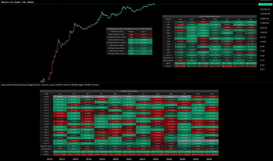
1. Bitcoin INDEX:BTCUSD
Since the development of futures markets and institutional participation, Bitcoin has demonstrated notable seasonal patterns with measurable statistical significance. September has averaged -1.92% returns, establishing it as the weakest month. In contrast, October has emerged as the strongest performer with average returns of +21.59% and a 90% positive occurrence. This level of consistency suggests a robust statistical edge rather than random variation.
Day-of-week patterns in modern Bitcoin are relatively tight, with differences ranging from 0.07% to 0.50%. Monday edges out as the optimal day for selling positions. However, these daily patterns offer considerably less statistical significance than the monthly seasonality effects, as the weekly variations have smoothed out compared to Bitcoin's earlier history.
2. Ethereum INDEX:ETHUSD
Ethereum displays even more pronounced seasonal variations with stronger directional bias. September has been particularly challenging, averaging -10.04% returns and showing negative performance in eight out of ten years, representing an 80% probability of decline. June also demonstrates weakness at -7.20% average returns. Conversely, May stands out as the strongest month with average returns of +34.97%, positive 70% of the time across the dataset. May has delivered positive returns in seven out of ten years, providing a statistically meaningful edge.
Day-of-week analysis reveals differences of 0.2% to 0.6%, with Wednesday edging out slightly for selling and Tuesday showing marginally better performance for buying. However, these daily variations lack statistical significance when compared to the dramatic monthly patterns, representing more noise than actionable alpha for systematic strategies.
3. S&P 500 SP:SPX
With over 50 years of data dating back to 1971, the S&P 500 demonstrates the famous "September Effect." September averages -0.90% returns and has been negative with notable consistency, establishing statistical significance through sheer sample size. November, capturing typical year-end institutional positioning, averages +1.73% with positive performance 70% of the time. April comes in second at +1.44% average returns. The persistence of these patterns across five decades provides robust evidence of systematic seasonal effects even in highly efficient markets.
Day-of-week effects in the S&P 500 are minimal, ranging from just 0.01% to 0.07%. Monday shows a slight negative drift at -0.01%, while Wednesday edges up 0.07%. These intraday variations fall well within normal variance and lack statistical significance for execution timing. For this index, monthly patterns provide the primary source of seasonal alpha.
4. Gold OANDA:XAUUSD
Perhaps most compelling is gold's seasonal data spanning nearly 200 years since 1832, offering an extraordinarily large sample size for statistical validation. January shows the strongest average returns at +0.99% and has been positive 80% of the time, representing a highly reliable statistical edge. June represents the weakest period at -0.18% average returns, with October also serving as a potential entry point at just 0.05% average returns. July comes in as the second-best month at +0.79%. The consistency of these patterns across multiple centuries, world events, and monetary system changes indicates deeply embedded structural inefficiencies in market dynamics.
Day-of-week patterns in gold are similarly minimal. Thursday edges out at 0.09% for optimal selling, while Sunday shows 0.01% for buying opportunities. Like the S&P 500, gold trades predominantly on monthly patterns rather than daily variations, with intraweek effects lacking statistical significance.
🟢 TL;DR
1. Bitcoin INDEX:BTCUSD : Accumulate during September weakness (-1.92%), sell into October strength (+21.59%). October has been positive 9 out of 10 years since 2015, representing a 90% positive occurrence. Day of week: Sunday dips for buying, Monday for selling.
2. Ethereum INDEX:ETHUSD : Summer pain is real. September (-10.04%) and June (-7.20%) are buying opportunities. May (+34.97%) is the monster month historically, positive 7 out of 10 years (70% positive frequency). Day of week: Tuesday buying, Wednesday selling, but minimal statistical significance.
3. S&P 500 SP:SPX : The September Effect demonstrates statistical significance (-0.90% average over 50+ years). November (+1.73%) captures the year-end rally with 70% positive occurrence. Day of week effects are negligible (0.01-0.07%) and lack statistical significance.
4. Gold OANDA:XAUUSD : January strength (+0.99%, 80% positive frequency) after June weakness (-0.18%). Nearly 200 years of data backing these patterns provides exceptional statistical validation. Day of week: Sunday buying, Thursday selling, but minimal differences.
🟢 Final thoughts
Ultimately, seasonality analysis does not guarantee future results, but it provides a framework for probabilistic decision-making with quantifiable statistical edges. Rather than attempting to time markets based on sentiment or short-term price movements, systematic traders and investors can align decisions with periods that have historically shown consistent strength or weakness with statistical significance. This approach is particularly valuable for planning entry and exit points, portfolio rebalancing, and managing position sizing within a rules-based framework.
Notably, while day-of-week patterns exist in some assets, monthly seasonality tends to provide more significant and statistically reliable edges across most markets. The data suggests that seasonal patterns persist even in highly efficient markets, driven by recurring institutional behaviors, tax considerations, and structural market dynamics that create exploitable inefficiencies.
Market seasonality should be viewed as one analytical tool within a comprehensive quantitative framework, not a guarantee of performance, but a method to incorporate historical probabilities and statistical edges into systematic investment decisions.
This isn't about perfect timing either. It's about leveraging statistical edges based on historical probabilities instead of emotion. You'll still be wrong sometimes, but less often when operating with decades of data and quantifiable patterns rather than sentiment alone.
👉 Try the Seasonality Heatmap indicator yourself on TradingView to explore these patterns across different assets and timeframes.
*This analysis is for educational purposes only and is not financial advice. Past performance does not guarantee future results. Always do your own research and consult with a qualified financial advisor before making investment decisions.
You See the Signals, So Why Are You Still Losing Money?The Crypto Conundrum: You See the Signals, So Why Are You Still Losing Money?
Every morning, thousands of traders boot up their rigs. Their screens light up with flashing RSI, MACD, and moving averages. Crypto Twitter is buzzing with analysts calling the next big move. All the information you could ever want is right at your fingertips. So why, by the end of the week, is your account balance smaller than when you started?
Let’s get one thing straight: the problem isn’t the indicators or the analysts. The problem is the "wetware"—the trader sitting in the chair.
You’re not losing because the signals are wrong. You’re losing because of how you react to them. Let's break down the real reasons your account is bleeding.
Reason #1: Psychology Trumps Logic. Every Single Time.
This is the #1 account killer. The market is an arena ruled by the twin demons of Fear and Greed. Your brilliant technical analysis is just a spectator.
FOMO (Fear Of Missing Out) – The Rocket Ship Trap
The Scene: Some altcoin, let's call it $WAGMI, has pumped 30% in an hour. Every indicator is screaming "overbought." Analysts are saying the news is already priced in. But all you see is a giant green candle. Your brain screams, "What if this thing 100x's? I gotta get in on this rocket ship!"
The Action: You ape in at the top.
The Result: The early buyers start taking profits, and the price nosedives. You're left holding the bag, wondering what went wrong and blaming "market manipulation."
The Mistake: You let an emotional impulse override every logical signal in front of you.
FUD (Fear, Uncertainty, and Doubt) – The Paper Hands Plague
The Scene: You entered a trade following your rules perfectly. The price bounced off a key support level, and the RSI showed a bullish divergence. But an hour later, the market dips slightly, and you're down 2%. A vague headline about crypto regulation in some far-off country flashes across your feed.
The Action: Panic. You slam the "close position" button to "cut your losses before it gets worse."
The Result: A few hours later, the price reverses and rips upward, hitting the exact target you originally set for a 15% gain.
The Mistake: You abandoned your own system because you got spooked by market "noise."
Reason #2: You Have No System. You Have a Gambling Habit.
An indicator signal isn't a magic bullet; it's just one piece of the puzzle.
"Indicator Soup"
The Scene: Your chart is a mess. You’ve got RSI, MACD, Stochastic, Bollinger Bands, and the Ichimoku Cloud all layered on top of each other. One says buy, another says sell, and a third is neutral.
The Action: You either freeze up from "paralysis by analysis" or, even worse, you cherry-pick the one signal that confirms what you wanted to do anyway.
The Result: A series of chaotic, random trades. Any profits are pure luck; the losses are inevitable.
The Mistake: Believing that more indicators equal more certainty. In reality, it just creates noise and confusion.
Ignoring the Stop-Loss: The Ultimate Sin
The Scene: You enter a long position based on a solid signal. But the price immediately starts moving against you. You told yourself you'd exit at a 5% loss, but as the price hits your stop level, you think, "It's gotta turn around any second now. I don't want to lock in a loss."
The Action: You delete your stop-loss, turning what was supposed to be a quick trade into a long-term "investment" you never wanted.
The Result: That 5% loss snowballs into a 20%, then 50% loss, tying up your capital and killing your account.
The Mistake: You violated the golden rule of trading: protect your capital. Hope is not a strategy.
Reason #3: You're Missing the Forest for the Trees
Indicators are useless without understanding the broader market context.
The Scene: The RSI on the 4-hour chart is deep in "oversold" territory—a classic buy signal.
The Action: You go long.
The Result: The price keeps tanking. Why? Because you failed to zoom out. On the daily chart, the asset is in a brutal, multi-month downtrend. A bullish signal in a bear market is often just a bull trap, a brief pause before the next leg down.
The Mistake: You analyzed a single timeframe in a vacuum, ignoring the primary trend.
So, What's the Fix? It's All About Strategy.
A real trading strategy isn't just "buy when the green line crosses the red one." It's a non-negotiable set of rules that dictates your every move. It must include:
Entry Trigger: Exactly what conditions must be met to open a position.
Example: The price must be above the 200-day EMA (confirming an uptrend), and MACD must have a bullish cross on the 4-hour chart.
Stop-Loss (Your Exit for a Loss): A pre-defined price point where you get out, no questions asked. This is your insurance policy against catastrophic loss.
Example: Place the stop-loss just below the most recent swing low.
Take-Profit (Your Exit for a Win): A pre-defined target where you lock in gains. Your potential profit should always be significantly larger than your potential loss (a good Risk/Reward Ratio is at least 2:1).
Example: If your stop-loss is 3% below your entry, your first take-profit target should be at least 6% above it.
A Simple, No-Nonsense Strategy Framework:
Concept: Trade with the trend, not against it.
Toolkit: The 200-day Exponential Moving Average (EMA) for the main trend, and basic support/resistance levels.
The Rules:
If the price is above the 200 EMA on the daily chart, you ONLY look for buys (longs).
Wait for the price to pull back to a key support level.
Enter a long position ONLY when you see a confirmation signal at that level (like a bullish engulfing candle).
Place your stop-loss below that support level. Place your take-profit at the next resistance level.
If the price is below the 200 EMA, you do the exact opposite and ONLY look for sells (shorts).
The Bottom Line
Indicators, charts, and expert analysis are just tools. In the hands of a disciplined craftsman, they can build wealth. In the hands of an emotional amateur, they’re just a way to smash your own thumb.
You lose money not because your tools are bad, but because you lack a plan, discipline, and risk management. Success in trading isn't about finding a holy grail indicator. It’s about the boring, repetitive work of following your rules, day in and day out.
The market doesn't pay you for being smart; it pays you for being disciplined. Period.

How Many Indicators Are Too Many?
I have been trading for around 5 years and in that time, I lost money and hope more often than I can count. A common coping strategy I use when in a time of loss is to strip all the "completely useless" indicators from my charts. And 6 months later, I have more than I had before.
Recently, I have actually started to earn small amounts of money from the markets consistently but my indicator problem persists. The picture above is an example of just some of the indicators I use. So now I ask the question,
-How many indicators are too many?
There really is not an answer despite what those on reddit might tell you. I seem to always have this fantasy that I will find the perfect chart set-up with all my indicators telling me just what I want to know. And of course TradingView has Pinscript which only makes my habit worse by allowing me to create exactly what I want.
As I was thinking about chart layouts this morning I came to a conclusion that my trading will always be evolving and the way in which I view the visual output of markets will change as well. There will most likely never be a chart set-up that I will use for the next 20 years. Even when I find my edge, the process of trading will still evolve. My "edge" will never be an indicator or a set of indicators .
So I wrote this to try and help those that are experiencing the same dilemma. Just know that you are not alone in your obsession with finding that perfect layout. Add 100 indicators to your chart and then delete them all when you feel they don't belong. You will never find that perfect indicator but but neither will you stop looking. It may seems like it is all a waste of time but I assure you that everything you experience in trading is worth it and progress does happen .
Safe Trading, Frank
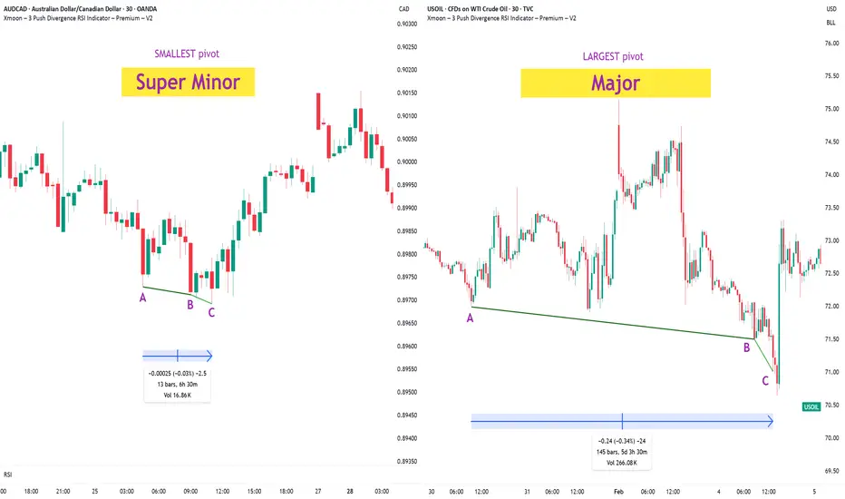
Xmoon Indicator Tutorial – Part 2 – Pivots🔻🔻🔻+ Persian translation below 🔻🔻🔻
🔹 What Is a Pivot?
In the Xmoon strategy, every high or low that forms on the chart is considered a pivot.
The number of candles between two highs or two lows defines the size of the pivot.
The more candles there are between them, the larger and more reliable the pivot becomes.
🔸 Types of Pivots in the Xmoon Indicator Settings
In the settings panel, you can choose which types of pivots the patterns should be based on.
There are 4 pivot types :
• Super Minor → the smallest pivot
• Minor
• Mid Major
• Major → the largest pivot
⏫ As you move from Super Minor to Major, the strength of the pivot increases — but the number of signals decreases.
⚖️ Choosing the Right Pivot = Your Trading Style
• Want more signals? → Use smaller pivots like Minor or Super Minor
• Prefer higher accuracy and lower risk? → Use larger pivots like Major or Mid Major
💡 Pro Tip: On higher timeframes, pivots perform better and help reduce risk.
✍️ Summary
If you're looking for frequent signals, trade on lower timeframes, and can handle higher volatility and pressure, then smaller pivots like Super Minor and Minor are a better choice.
But if you prefer quality over quantity, work on higher timeframes, and value clarity, peace of mind, and higher success rates, then larger pivots like Mid Major and Major are the way to go.
📣 If you have any questions or need guidance, feel free to ask us. We’d be happy to help.
🔻🔻🔻 Persian Section – بخش فارسی 🔻🔻🔻
🔹 پیوت چیست؟
در استراتژی ایکسمون، هر قله یا درهای که روی چارت شکل میگیرد، یک پیوت محسوب می شود
فاصله زمانی بین دو قله یا دو دره (یعنی تعداد کندلهایی که بینشان قرار دارد) اندازهی پیوت را مشخص میکند
هرچه تعداد کندل بین دو سقف یا کف بیشتر باشد، آن پیوت بزرگتر و معتبرتر است
🔸 انواع پیوت در تنظیمات اندیکاتور ایکسمون
در بخش تنظیمات، میتوانید مشخص کنید که الگوها بر اساس چه نوع پیوتهایی شناسایی شوند
ما ۴ نوع پیوت داریم
• سوپر مینور ← کوچکترین پیوت
• مینور
• میدماژور
• ماژور ← بزرگترین پیوت
⏫ هرچه از سوپرمینور به سمت ماژور برویم، قدرت پیوت بیشتر میشود، ولی تعداد سیگنالها کمتر می شود
⚖️ انتخاب پیوت مناسب = سبک معاملاتی شما
• به دنبال سیگنال زیاد هستید ← پیوت کوچک تر = مینور و سوپرمینور
• به دنبال دقت بیشتر و ریسک کمتر هستید← پیوت بزرگتر = ماژور و میدماژور
💡 نکته حرفهای: در تایمفریمهای بالا، پیوتها عملکرد بهتری دارند و به کنترل ریسک کمک میکنند
✍️ جمعبندی
اگر دنبال سیگنالهای زیاد هستید، در تایمفریمهای کوچکتر کار میکنید و میتونید نوسانات و فشار روانی بالاتر رو تحمل کنید، پیوتهای کوچکتر مثل سوپرمینور و مینور انتخاب مناسبتری هستند
اما اگر در تایم فریم های بزرگتر کار می کنید و کیفیت سیگنال، آرامش ذهنی و احتمال موفقیت برایتان مهمتر است، پیوتهای بزرگتر مثل میدماژور و ماژور انتخاب بهتری هستند
📣 اگر سوالی دارید یا نیاز به راهنمایی دارید، خوشحال میشویم از ما بپرسید
با کمال میل در خدمتتان هستیم
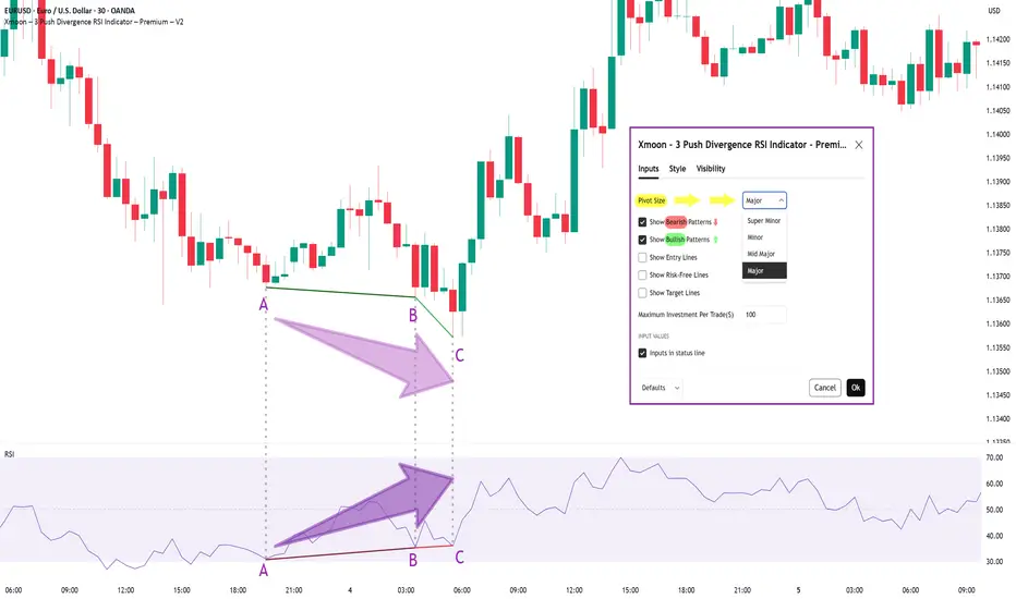
Xmoon Indicator Tutorial – Part 1 – Strategy🔻🔻🔻+ Persian version below🔻🔻🔻
📘 Xmoon Indicator Tutorial – Part 1
🎯 3Push Divergence RSI Strategy
🔥 The core of the Xmoon indicator
is built upon one of the most powerful strategies in technical analysis:
The advanced 3Push Divergence RSI pattern
🔁 A pattern that typically appears at key market turning points.
📉 When the price moves in the same direction three consecutive times on pivot points (e.g., making lower lows or higher highs), but the RSI shows the opposite behavior, it indicates a clear divergence !
💡 This divergence can act as a strong signal for a potential trend reversal.
🎯 The Xmoon Indicator is designed to detect this critical moment.
⚙️ Xmoon Indicator Settings Panel
The Xmoon settings panel offers the following options:
🔸 Pattern Type Selection: In the first and second lines, you can specify which type of pattern should be displayed: only bullish patterns or only bearish ones. You can also check both options.
🔸 Pivot Type Selection: From the dropdown menu, you can choose one of four pivot types:
“Super Minor”, “Minor”, “Mid-Major”, and “Major”, ordered from smallest to largest.
📌 Educational Note: The greater the distance (in candle count) between two lows or two highs, the larger the pivot is considered.
A Major Pivot is the largest among them.
✅ Larger Pivot = Higher Accuracy
❗ But naturally = Fewer Signals
📣 If you have any questions or need guidance, feel free to ask us. We’d be happy to help.
🔻🔻🔻بخش فارسی – Persian Section 🔻🔻🔻
📘 آموزش اندیکاتور ایکسمون - قسمت اول
🎯 استراتژی سهپوش واگرایی (3Push Divergence RSI)
🔥 هسته اصلی ایکسمون
بر پایه یکی از قویترین استراتژیهای تحلیل تکنیکال طراحی شده است
الگوی پیشرفته سهپوش واگرایی
🔁 الگویی که معمولاً در نقاط چرخش مهم بازار ظاهر میشود
📉 وقتی قیمت سه بار پشت سر هم روی نقاط پیوت ، در یک جهت حرکت میکند (مثلاً کفهای پایینتر یا سقفهای بالاتر میسازد) ، اما آر-اِس-آی خلاف آن را نشان میدهد، یعنی یک واگرایی آشکار رخ داده است
💡این واگرایی میتواند سیگنالی قوی برای برگشت روند باشد
🎯 اندیکاتور ایکسمون این لحظه را شناسایی میکند
⚙️ پنجره تنظیمات اندیکاتور ایکسمون
در بخش تنظیمات اندیکاتور ایکسمون، امکاناتی در اختیار شما قرار دارند
🔸 انتخاب نوع الگو: در خط اول و دوم میتوانید مشخص کنید چه نوع الگویی نمایش داده شود
فقط الگوهای صعودی یا فقط نزولی. همچنین می توانید تیک هر دو گزینه را بزنید
🔸 انتخاب نوع پیوتها: از پنجره کشویی بالا، می توانید یکی از ۴ نوع پیوت را انتخاب کنید
پیوت ها به ترتیب از کوچک به بزرگ عبارتند از: سوپر مینور ، مینور ، میدماژور و ماژور
📌 نکته آموزشی: هرچه فاصله بین دو کف یا دو سقف بیشتر باشد (یعنی تعداد کندلهای بین آنها زیادتر باشد)، آن پیوت، بزرگتر محسوب میشود
پیوت ماژور از بقیه بزرگ تر است
✅ پیوت بزرگتر = دقت بالاتر
❗ اما طبیعتاً = تعداد سیگنال کمتر
📣 اگر سوالی دارید یا نیاز به راهنمایی دارید، خوشحال میشویم از ما بپرسید
با کمال میل در خدمتتان هستیم
Mastering the Bollinger Bands- How to use it in trading?What is the Bollinger Bands
Bollinger Bands is a popular technical analysis tool developed by John Bollinger in the 1980s. It is designed to measure market volatility and provide signals for potential price reversals or trend continuations. The Bollinger Bands consist of three lines: a simple moving average in the middle, usually calculated over 20 periods, and two outer bands that are placed a set number of standard deviations above and below the moving average. These outer bands automatically adjust to market conditions, expanding and contracting based on price volatility. The indicator is widely used by traders to understand the relative highs and lows of a financial instrument in relation to recent price action.
What will be discussed?
- How does it work with the lower band and upper band?
- What does the narrowing mean?
- What does the widening mean?
- How to trade with the Bollingers Bands?
-------------------------
How does it work with the lower band and upper band?
The upper band and the lower band serve as dynamic levels of resistance and support. When the price of an asset touches or exceeds the upper band, it may be considered overbought, suggesting that a reversal or pullback could be near. Conversely, when the price approaches or breaks below the lower band, the asset may be viewed as oversold, indicating a potential rebound. These bands do not generate definitive buy or sell signals on their own but instead help traders assess market conditions. The interaction of price with the upper and lower bands often provides visual cues about the momentum and direction of the market, allowing for more informed decision-making.
-------------------------
What does the narrowing mean?
The narrowing of the Bollinger Bands occurs when the price becomes less volatile over time. This contraction indicates a period of consolidation or low market activity, where the price is trading in a tighter range. Narrowing bands are often interpreted as a signal that a significant price movement may be coming soon, as low volatility tends to precede high volatility. This phase is sometimes referred to as the "squeeze," and traders closely monitor it to anticipate breakout opportunities. The direction of the breakout, whether upward or downward, is not predicted by the narrowing itself but usually follows shortly after the bands have contracted.
-------------------------
What does the widening mean?
The widening of the Bollinger Bands reflects increasing market volatility. When the price starts to move rapidly either up or down, the bands spread further apart to accommodate this movement. This expansion typically confirms that a new trend is underway or that a breakout has occurred. The wider the bands become, the greater the degree of price fluctuation. During these times, traders may observe stronger momentum in the market, and the continuation of the move may be supported by the growing distance between the bands. However, extremely wide bands may also suggest that a reversal could be nearing, as the market can become overstretched in either direction.
-------------------------
How to trade with the Bollinger Bands?
Trading with Bollinger Bands involves using the bands to identify entry and exit points based on the behavior of price in relation to the upper and lower bands. One common approach is to buy when the price touches or breaks below the lower band and shows signs of bouncing back, and to sell when the price reaches or moves above the upper band and begins to retreat. Another strategy involves waiting for the bands to narrow significantly and then entering a trade in the direction of the breakout that follows. Traders often use Bollinger Bands in combination with other indicators such as RSI, MACD, or volume to confirm signals and reduce the risk of false breakouts. It is important to remember that Bollinger Bands are not predictive on their own but are most effective when used as part of a broader technical analysis framework.
-------------------------
Disclosure: I am part of Trade Nation's Influencer program and receive a monthly fee for using their TradingView charts in my analysis.
Thanks for your support.
- Make sure to follow me so you don't miss out on the next analysis!
- Drop a like and leave a comment!

How to Trade Smart Money Concepts (SMC)\ How to Trade Smart Money Concepts (SMC)\
\ This article explores the foundation, key tools, and practical insights of Smart Money Concepts — and why it’s worth your attention.\
In today's fast-changing financial landscape, Smart Money Concepts (SMC) has become a popular strategy among modern traders. But what is SMC exactly, and how can it improve your trading decisions? This article breaks it down in a simple, professional way for traders at all levels.
---
\ What Are Smart Money Concepts?\
SMC is a trading approach based on the belief that large institutions ("smart money") like banks and hedge funds control most of the market's movements. These institutions often move the market in ways that confuse or trap retail traders. The goal of SMC is to understand and follow the footsteps of these big players.
Instead of relying on simple patterns or indicators, SMC focuses on:
\ - Market structure\
\ - Supply and demand zones\
\ - Liquidity pools\
By aligning your trades with the behavior of smart money, you can position yourself more strategically in the market.
---
\ Key SMC Concepts Explained\
\ Order Blocks\
Order blocks are zones on the chart where large institutions have placed significant buy or sell orders. These zones often lead to strong price reactions and act as hidden support or resistance levels. Order blocks are considered more precise than traditional supply and demand areas.
Example: ()
\ Fair Value Gap (FVG)\
A Fair Value Gap occurs when price moves sharply in one direction, leaving a gap or imbalance in the price action. These areas often get filled later and can act as magnets for price.
In a bearish move, the FVG is the gap between the low of the previous candle and the high of the next one. In a bullish move, it's the reverse.
Example: ()
\ Timeframe Consideration\
If you can’t monitor charts during the day, avoid relying on 5–30 minute setups. Consider 4H or daily timeframes for clearer signals and more manageable trading decisions.
\ Liquidity\
Liquidity refers to price zones where lots of pending orders exist. These are usually at obvious highs, lows, or trendlines. Smart money often targets these areas to trigger stop-losses and generate movement.
One common tool to identify liquidity is a "pivot point," which is a candle with a lower low or higher high than its neighbors.
Example: ()
\ Break of Structure (BOS)\
BOS occurs when price breaks above or below a previous high or low, signaling a possible trend continuation.
Example: ()
\ Change of Character (ChoCH)\
ChoCH happens when the market changes direction. For example, if price breaks a higher low in an uptrend, it may signal a reversal.
Example: ()
Combined with BOS: ()
---
\ How SMC Compares to Wyckoff\
The idea of "smart money" isn't new. Richard D. Wyckoff, a pioneer in technical analysis, laid the foundation for understanding market cycles driven by institutions. His price cycle theory includes four phases:
\ 1. Accumulation\
Smart money buys while the public is unaware.
\ 2. Markup\
Price rises as smart money pushes the market.
\ 3. Distribution\
Smart money sells into public buying.
\ 4. Markdown\
Price falls as the cycle completes.
SMC borrows from this logic but focuses more on structure and liquidity zones. Still, the core idea is the same: understand what big players are doing, and follow them.
\ For deeper insights into Wyckoff, explore additional resources focused on accumulation/distribution cycles.\
---
\ Summary\
Smart Money Concepts give traders a deeper look into market mechanics. By focusing on order blocks, fair value gaps, liquidity, and structure breaks, SMC helps identify high-probability trade setups based on institutional behavior.
It may seem complex at first, but once you understand the basics, SMC can become a powerful tool in your trading strategy. Whether you’re new or experienced, aligning with smart money can improve your edge in the market.

Sharing the advanced Bollinger Bands strategyHere are the Bollinger Band trading tips: *
📌 If you break above the upper band and then drop back down through it, confirm a short signal!
📌 If you drop below the lower band and then move back up through it, confirm a long signal!
📌 If you continue to drop below the middle band, add to your short position; if you break above the middle band, add to your long position!
Pretty straightforward, right? This means you won’t be waiting for the middle band to signal before acting; you’ll be ahead of the game, capturing market turning points!
Let’s break it down with some examples:
1. When Bitcoin breaks above the upper Bollinger Band, it looks strong, but quickly drops back below:
➡️ That’s a “bull trap”—time to go short!
2. If Bitcoin crashes below the lower band and then pops back up:
➡️ Bears are running out of steam—time to go long and grab that rebound!
3. If the price keeps moving above the middle band:
➡️ Add to your long or short positions to ride the trend without being greedy or hesitant.
Why is this method powerful?
It combines “edge recognition + trend confirmation” for double protection:
1. Edge Recognition—spot the turning point and act early.
2. Trend Confirmation—wait for the middle band breakout and then confidently add positions!
You won’t be reacting after the fact; you’ll be ahead of the curve, increasing your positions in the trend’s middle and locking in profits at the end. This is the rhythm of professional traders and the core logic of systematic profits!
Who is this method for?
- You want precise entry and exit points.
- You’re tired of “chasing highs and cutting losses.”
- You want a clear, executable trading system.
- You want to go from “I see the chart but don’t act” to “I see the signal and take action.”
Follow for more. Make sure to like this if you found it useful.

Volume Speaks Louder: My Custom Volume Indicator for Futures
My Indicator Philosophy: Think Complex, Model Simple
In my first “Modeling 101” class as an undergrad, I learned a mantra that’s stuck with me ever since: “Think complex, but model simple.” In other words, you can imagine all the complexities of a system, but your actual model doesn’t have to be a giant non-convex, nonlinear neural network or LLM—sometimes a straightforward, rule-based approach is all you need.
With that principle in mind, and given my passion for trading, I set out to invent an indicator that was both unique and useful. I knew countless indicators already existed, each reflecting its creator’s priorities—but none captured my goal: seeing what traders themselves are thinking in real time . After all, news is one driver of the market, but you can’t control or predict news. What you can observe is how traders react—especially intraday—so I wanted a simple way to gauge that reaction.
Why intraday volume ? Most retail traders (myself included) focus on shorter timeframes. When they decide to jump into a trade, they’re thinking within the boundaries of a single trading day. They rarely carry yesterday’s logic into today—everything “resets” overnight. If I wanted to see what intraday traders were thinking, I needed something that also resets daily. Price alone didn’t do it, because price continuously moves and never truly “starts over” each morning. Volume, however, does reset at the close. And volume behaves like buying/selling pressure—except that raw volume numbers are always positive, so they don’t tell you who is winning: buyers or sellers?
To turn volume into a “signed” metric, I simply use the candle’s color as a sign function. In Pine Script, that looks like:
isGreenBar = close >= open
isRedBar = close < open
if (not na(priceAtStartHour))
summedVolume += isGreenBar ? volume : -volume
This way, green candles add volume and red candles subtract volume, giving me positive values when buying pressure dominates and negative values when selling pressure dominates. By summing those signed volumes throughout the day, I get a single metric—let’s call it SummedVolume—that truly reflects intraday sentiment.
Because I focus on futures markets (which have a session close at 18:00 ET), SummedVolume needs to reset exactly at session close. In Pine, that reset is as simple as:
if (isStartOfSession())
priceAtStartHour := close
summedVolume := 0.0
Once that bar (6 PM ET) appears, everything zeroes out and a fresh count begins.
SummedVolume isn’t just descriptive—it generates actionable signals. When SummedVolume rises above a user-defined Long Threshold, that suggests intraday buying pressure is strong enough to consider a long entry. Conversely, when SummedVolume falls below a Short Threshold, that points to below-the-surface selling pressure, flagging a potential short. You can fine-tune those thresholds however you like, but the core idea remains:
• Positive SummedVolume ⇒ net buying pressure (bullish)
• Negative SummedVolume ⇒ net selling pressure (bearish)
Why do I think it works: Retail/intraday traders think in discrete days. They reset their mindset at the close. Volume naturally resets at session close, so by signing volume with candle color, I capture whether intraday participants are predominantly buying or selling—right now.
Once again: “Think complex, model simple.” My Daily Volume Delta (DVD) indicator may look deceptively simple, but five years of backtesting have proven its edge. It’s a standalone gauge of intraday sentiment, and it can easily be combined with other signals—moving averages, volatility bands, whatever you like—to amplify your strategy. So if you want a fresh lens on intraday momentum, give SummedVolume a try.

Do You Know the Difference Between an Indicator and a Strategy?A lot of traders jump into Pine Script or apply a script on TradingView without understanding one key difference:
Indicators and Strategies are not the same — especially when it comes to real-time performance and backtesting.
---
What’s the Key Difference?
Indicators
Indicators are visual tools designed to help you analyze price action in real time . They do not track trade performance or simulate trades automatically.
You can use them to:
- Generate signals
- Stack confluences
- Set custom alerts
- Overlay custom visuals on charts
Best for: Chart analysis, signal confirmation, and manual or semi-automated alerts.
---
Strategies
Strategies are built for backtesting . They simulate how your trade logic would have performed historically, using `strategy.entry`, `strategy.exit`, and related functions.
They automatically calculate:
- Hypothetical P&L
- Win/loss ratio
- Drawdowns
Best for: Validating trade logic, optimizing entries and exits, performance tracking.
---
But Here’s the Catch
Many traders assume that once a strategy backtest looks good, it will behave exactly the same in live trading. This assumption can lead to poor decision-making.
❌ Why Forward Testing Isn't Perfect
When you set alerts based on a strategy, you're asking a backtest engine to behave like a live trading engine — and that’s not what it was designed for.
TradingView strategies:
- Only execute on candle close
- Do not simulate intrabar price action
- Do not account for slippage
- Do not reflect real-time market volatility
So:
- Your strategy alert may fire late compared to actual price movement
- Your SL/TP may be hit within a candle, but the strategy won’t know until close
- You may see better backtest results than what happens live
---
Takeaway
If you're using strategies with alerts, it’s critical to understand these constraints:
TradingView’s strategy engine is optimized for historical testing, not for real-time execution. It provides insight into the validity of your logic — but it’s not a replacement for a live execution engine.
Best Practice Recommendations:
- Always forward-test on a demo or paper account first
- Monitor how alerts perform in real-time
- Be ready to adjust parameters based on your asset and timeframe
If you need better responsiveness or real-time adaptability, consider using indicators to generate your alerts. Indicators react to price in real time and are often more suitable for live market conditions.
---
Final Note
Some strategies are built with these limitations in mind. They can still be useful in real-time trading as long as you're aware of how they work.
Transparency is key. Backtesting is a guide, not a guarantee.
Trade smart, stay informed.
Feel free to reach out if you have questions or insights to share!

About the Volume OBV indicator...
Hello, traders.
If you "Follow", you can always get new information quickly.
Please click "Boost" as well.
Have a nice day today.
-------------------------------------
I think TradingView is attractive because users can create charts as they want.
However, since the number of indicators that can be added to the chart is limited depending on the plan, you have to add indicators that fit your plan.
As a result, I ended up integrating multiple indicators into one indicator.
-
The HA-MS indicator in this chart is a public indicator.
If you search the Internet, you can find detailed explanations on how to interpret the OBV indicator.
I expressed it as follows to make this interpretation method more realistic.
The body color of the candlestick is indicated by the 4-stage OBV indicator.
The OBV indicator is distinguished in the same way as the Price Channel indicator.
You can interpret it like the Bollinger Band.
That is, if the middle line that divides 2 and 3 rises by more than 3, you can interpret that the buying force is increasing.
1: It means below the lower line of the Price Channel and is indicated in dark red.
If you enter this section, there is a high possibility of a sharp decline.
You should check the support and resistance points because it is likely to stop falling soon and rise to 2.
2: It means between the lower line and the middle line of the Price Channel and is indicated in red.
This section is likely to show a weak downward sideways movement.
Therefore, if it rises from 1->2, there is a possibility of a short rise. However, if it fails to rise to 3, it is likely to fall back to 1, so it is recommended to make short trades.
3: It means between the middle line and the upper line of the Price Channel and is displayed in green.
This section is likely to show a weak upward sideways movement.
If it rises from 2 -> 3 and shows a sideways movement, you should focus on finding a buying point.
4: It means above the upper line of the Price Channel and is displayed in dark green.
If it enters this section, there is a high possibility of a sharp rise.
Since it is likely to stop rising soon and fall to 3, you should check the support and resistance points.
-
What we should pay attention to is when it changes from 1 -> 2, 4 -> 3.
As explained above, 1 is a section located below the lower line of the Price Channel, so there is a high possibility of a sharp fall.
4 is a section located above the upper line of the Price Channel, so there is a high possibility of a sharp rise.
Therefore, you can proceed with an aggressive buy when it changes from 1 -> 2, and you can proceed with a sell when it changes from 4 -> 3.
In the case of futures, it can be used as reference information for entering and liquidating LONG and SHORT positions.
-
They say that the only things you need on a chart are price and trading volume.
However, it is not easy to interpret this in reality.
To compensate for this, we hid the colors of the existing candles and displayed them in 4 stages of OBV so that you can intuitively see which stage the current price is at.
-
Thank you for reading to the end.
I hope you have a successful transaction.
--------------------------------------------------

Chart Analysis and Trading Strategy (2)
Hello, traders.
If you "Follow", you can always get new information quickly.
Please also click "Boost".
Have a nice day today.
-------------------------------------
If you look at the candle that the finger is pointing to, you can see that it is a bearish candle with Open > Close.
If you look at this on a 30m chart, you can see that it moves as follows and forms lows and highs.
These candle movements come together to form a candle arrangement, and by looking at this, we ultimately set support and resistance points.
As your understanding of candles deepens, you will study charts in various ways.
The reason is that you may know it when you look at the chart, but you cannot when you trade.
That is, because the understanding of candles is not clear.
As you study the charts over and over again, you will learn that charts tend to converge to the median and average values.
You learn that they converge to the median and average values while studying various indicators, but you end up not knowing what you can learn from them.
What is important in the arrangement of candles is that the arrangement of the Open and Close bodies and the Low and High tails that make up the candles play an important role in setting support and resistance points.
I recommend that you understand this explanation through the Internet or a book.
The reason is that it is something that requires a lot of time investment to acquire.
-
The HA-MS indicator was created to quickly display support and resistance points as objective information.
Therefore, you can see that when the channel composed of the HA-Low indicator and the HA-High indicator is broken, a trend is formed, and if not, a sideways movement is shown.
The HA-Low, HA-High indicators are indicators created by combining the arrangement of candles and the RSI indicator on the Heikin-Ashi chart.
Therefore, the trading strategy is used to create a trading strategy depending on whether there is support near the HA-Low, HA-High indicators.
The other indicators, BW(0), BW(100), DOM(-60), and DOM(60), are used as support and resistance to create a detailed response strategy.
-
Based on this information, trading should be divided into trading in the sideways section and trading in the trend to create a trading strategy.
This trading time is created based on whether there is support in the HA-Low, HA-High indicators.
Since it is made of indicators, I think it provides objective information for chart interpretation with others, reducing the room for controversy.
This is the fundamental reason for using indicators.
It is because we can share objective information with each other.
-
In trading within the sideways section, information about the trend is not particularly necessary.
If you set the sideways section with your own indicator or support and resistance points, you can trade based on whether there is support at the end of that section.
-
However, when you leave the sideways section, information about the trend is necessary.
That is why we use the M-Signal indicator and Trend Cloud indicator on the 1D, 1W, and 1M charts as indicators for the trend.
For short-term information, you can use the M-Signal indicator and Trend Cloud indicator on the 1D chart.
If the Trend Cloud indicator is displayed in green and the price is maintained above the M-Signal indicator on the 1D chart, it can be interpreted that there is a high possibility of a turn to an uptrend.
If not, it can be interpreted that there is a high possibility of a downtrend.
The mid- to long-term trend can be identified by checking the arrangement status of the M-Signal indicator on the 1W chart and the M-Signal indicator on the 1M chart.
That is, if the M-Signal on the 1W chart > the M-Signal on the 1M chart, it can be interpreted that the mid- to long-term trend is maintaining an uptrend.
Therefore, in order to continue the uptrend from a long-term perspective, the price must be maintained above the M-Signal indicator on the 1M chart.
If not, it is recommended to make short trades if possible.
-
To better set the support and resistance points, look at the 1M chart > 1W chart > 1M chart in that order and draw a horizontal line on the indicators (HA-Low, HA-High, BW(0), BW(100), DOM(-60), DOM(60)) displayed on the chart and mark them on the chart.
Mark the support and resistance points on the chart as above.
This marks the support and resistance points with the low and high points.
-
It is not easy to start trading at the low or high points every time.
Therefore, as I mentioned earlier, it is important to create a detailed response strategy based on the median and average values.
For this, the StochRSI 50 indicator is displayed.
In addition, the Close of the Heikin-Ashi chart of the 1D chart, which can be usefully utilized when trading below the 1D chart, is added.
-------------------------------------------------
The information I mentioned above is ultimately information that can be obtained through chart analysis.
You can create a trading strategy by deciding whether to check it directly with your eyes and indicate support and resistance points, or to use an indicator that can be checked more quickly.
Chart analysis is about understanding the movement of the chart, and actual trading is conducted according to the trading strategy.
You may think that chart analysis is the trading strategy, but it is not.
No matter how well you analyze charts with your eyes, if you analyze charts when your psychological state is unstable due to subjective thoughts based on various information other than the chart, as I mentioned earlier, you may end up trading in the wrong direction.
To prevent this, it is necessary to use indicators so that subjective thoughts are not applied.
Even if you start trading at the support and resistance points created by the indicator, and it goes in the opposite direction and you suffer a loss, the influence will be weak.
The reason is that you created a trading strategy with the support and resistance points created by the indicator in advance.
Things to consider when starting a trade in a trading strategy are:
1. When to buy or how to buy
2. When to cut loss or how to cut loss
3. How to realize profit
For this reason, it is important to set support and resistance points through chart analysis.
-
It is better to do chart analysis briefly.
If you spend too much time analyzing charts, you may end up being trapped in your own subjective thoughts, so be careful.
I think you can tell whether you will do chart analysis in an analyst-like manner or in a chart analysis necessary for trading by looking at how the support and resistance points are marked on the chart.
The ideas of chart analysis often do not include things that need to be considered when starting a trade.
Therefore, in order to apply them to actual trading, you need to create a trading strategy through chart analysis.
The chart analysis for trading reduces the need for separate chart analysis because the information necessary for the trading strategy is displayed on the chart.
However, it may need to change depending on your investment style or the time frame chart you are actually trading on, but it can be advantageous for trading because the support and resistance points are marked.
To ensure this, you need to create an indicator and receive support and resistance points as objective information.
-
Thank you for reading to the end.
I hope you have a successful trade.
--------------------------------------------------
