You See the Signals, So Why Are You Still Losing Money?The Crypto Conundrum: You See the Signals, So Why Are You Still Losing Money?
Every morning, thousands of traders boot up their rigs. Their screens light up with flashing RSI, MACD, and moving averages. Crypto Twitter is buzzing with analysts calling the next big move. All the information you could ever want is right at your fingertips. So why, by the end of the week, is your account balance smaller than when you started?
Let’s get one thing straight: the problem isn’t the indicators or the analysts. The problem is the "wetware"—the trader sitting in the chair.
You’re not losing because the signals are wrong. You’re losing because of how you react to them. Let's break down the real reasons your account is bleeding.
Reason #1: Psychology Trumps Logic. Every Single Time.
This is the #1 account killer. The market is an arena ruled by the twin demons of Fear and Greed. Your brilliant technical analysis is just a spectator.
FOMO (Fear Of Missing Out) – The Rocket Ship Trap
The Scene: Some altcoin, let's call it $WAGMI, has pumped 30% in an hour. Every indicator is screaming "overbought." Analysts are saying the news is already priced in. But all you see is a giant green candle. Your brain screams, "What if this thing 100x's? I gotta get in on this rocket ship!"
The Action: You ape in at the top.
The Result: The early buyers start taking profits, and the price nosedives. You're left holding the bag, wondering what went wrong and blaming "market manipulation."
The Mistake: You let an emotional impulse override every logical signal in front of you.
FUD (Fear, Uncertainty, and Doubt) – The Paper Hands Plague
The Scene: You entered a trade following your rules perfectly. The price bounced off a key support level, and the RSI showed a bullish divergence. But an hour later, the market dips slightly, and you're down 2%. A vague headline about crypto regulation in some far-off country flashes across your feed.
The Action: Panic. You slam the "close position" button to "cut your losses before it gets worse."
The Result: A few hours later, the price reverses and rips upward, hitting the exact target you originally set for a 15% gain.
The Mistake: You abandoned your own system because you got spooked by market "noise."
Reason #2: You Have No System. You Have a Gambling Habit.
An indicator signal isn't a magic bullet; it's just one piece of the puzzle.
"Indicator Soup"
The Scene: Your chart is a mess. You’ve got RSI, MACD, Stochastic, Bollinger Bands, and the Ichimoku Cloud all layered on top of each other. One says buy, another says sell, and a third is neutral.
The Action: You either freeze up from "paralysis by analysis" or, even worse, you cherry-pick the one signal that confirms what you wanted to do anyway.
The Result: A series of chaotic, random trades. Any profits are pure luck; the losses are inevitable.
The Mistake: Believing that more indicators equal more certainty. In reality, it just creates noise and confusion.
Ignoring the Stop-Loss: The Ultimate Sin
The Scene: You enter a long position based on a solid signal. But the price immediately starts moving against you. You told yourself you'd exit at a 5% loss, but as the price hits your stop level, you think, "It's gotta turn around any second now. I don't want to lock in a loss."
The Action: You delete your stop-loss, turning what was supposed to be a quick trade into a long-term "investment" you never wanted.
The Result: That 5% loss snowballs into a 20%, then 50% loss, tying up your capital and killing your account.
The Mistake: You violated the golden rule of trading: protect your capital. Hope is not a strategy.
Reason #3: You're Missing the Forest for the Trees
Indicators are useless without understanding the broader market context.
The Scene: The RSI on the 4-hour chart is deep in "oversold" territory—a classic buy signal.
The Action: You go long.
The Result: The price keeps tanking. Why? Because you failed to zoom out. On the daily chart, the asset is in a brutal, multi-month downtrend. A bullish signal in a bear market is often just a bull trap, a brief pause before the next leg down.
The Mistake: You analyzed a single timeframe in a vacuum, ignoring the primary trend.
So, What's the Fix? It's All About Strategy.
A real trading strategy isn't just "buy when the green line crosses the red one." It's a non-negotiable set of rules that dictates your every move. It must include:
Entry Trigger: Exactly what conditions must be met to open a position.
Example: The price must be above the 200-day EMA (confirming an uptrend), and MACD must have a bullish cross on the 4-hour chart.
Stop-Loss (Your Exit for a Loss): A pre-defined price point where you get out, no questions asked. This is your insurance policy against catastrophic loss.
Example: Place the stop-loss just below the most recent swing low.
Take-Profit (Your Exit for a Win): A pre-defined target where you lock in gains. Your potential profit should always be significantly larger than your potential loss (a good Risk/Reward Ratio is at least 2:1).
Example: If your stop-loss is 3% below your entry, your first take-profit target should be at least 6% above it.
A Simple, No-Nonsense Strategy Framework:
Concept: Trade with the trend, not against it.
Toolkit: The 200-day Exponential Moving Average (EMA) for the main trend, and basic support/resistance levels.
The Rules:
If the price is above the 200 EMA on the daily chart, you ONLY look for buys (longs).
Wait for the price to pull back to a key support level.
Enter a long position ONLY when you see a confirmation signal at that level (like a bullish engulfing candle).
Place your stop-loss below that support level. Place your take-profit at the next resistance level.
If the price is below the 200 EMA, you do the exact opposite and ONLY look for sells (shorts).
The Bottom Line
Indicators, charts, and expert analysis are just tools. In the hands of a disciplined craftsman, they can build wealth. In the hands of an emotional amateur, they’re just a way to smash your own thumb.
You lose money not because your tools are bad, but because you lack a plan, discipline, and risk management. Success in trading isn't about finding a holy grail indicator. It’s about the boring, repetitive work of following your rules, day in and day out.
The market doesn't pay you for being smart; it pays you for being disciplined. Period.
Indicators

How Many Indicators Are Too Many?
I have been trading for around 5 years and in that time, I lost money and hope more often than I can count. A common coping strategy I use when in a time of loss is to strip all the "completely useless" indicators from my charts. And 6 months later, I have more than I had before.
Recently, I have actually started to earn small amounts of money from the markets consistently but my indicator problem persists. The picture above is an example of just some of the indicators I use. So now I ask the question,
-How many indicators are too many?
There really is not an answer despite what those on reddit might tell you. I seem to always have this fantasy that I will find the perfect chart set-up with all my indicators telling me just what I want to know. And of course TradingView has Pinscript which only makes my habit worse by allowing me to create exactly what I want.
As I was thinking about chart layouts this morning I came to a conclusion that my trading will always be evolving and the way in which I view the visual output of markets will change as well. There will most likely never be a chart set-up that I will use for the next 20 years. Even when I find my edge, the process of trading will still evolve. My "edge" will never be an indicator or a set of indicators .
So I wrote this to try and help those that are experiencing the same dilemma. Just know that you are not alone in your obsession with finding that perfect layout. Add 100 indicators to your chart and then delete them all when you feel they don't belong. You will never find that perfect indicator but but neither will you stop looking. It may seems like it is all a waste of time but I assure you that everything you experience in trading is worth it and progress does happen .
Safe Trading, Frank
Xmoon Indicator Tutorial – Part 2 – Pivots🔻🔻🔻+ Persian translation below 🔻🔻🔻
🔹 What Is a Pivot?
In the Xmoon strategy, every high or low that forms on the chart is considered a pivot.
The number of candles between two highs or two lows defines the size of the pivot.
The more candles there are between them, the larger and more reliable the pivot becomes.
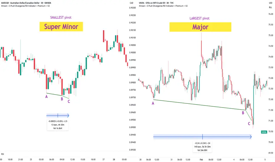
🔸 Types of Pivots in the Xmoon Indicator Settings
In the settings panel, you can choose which types of pivots the patterns should be based on.
There are 4 pivot types :
• Super Minor → the smallest pivot
• Minor
• Mid Major
• Major → the largest pivot
⏫ As you move from Super Minor to Major, the strength of the pivot increases — but the number of signals decreases.
⚖️ Choosing the Right Pivot = Your Trading Style
• Want more signals? → Use smaller pivots like Minor or Super Minor
• Prefer higher accuracy and lower risk? → Use larger pivots like Major or Mid Major
💡 Pro Tip: On higher timeframes, pivots perform better and help reduce risk.
✍️ Summary
If you're looking for frequent signals, trade on lower timeframes, and can handle higher volatility and pressure, then smaller pivots like Super Minor and Minor are a better choice.
But if you prefer quality over quantity, work on higher timeframes, and value clarity, peace of mind, and higher success rates, then larger pivots like Mid Major and Major are the way to go.
📣 If you have any questions or need guidance, feel free to ask us. We’d be happy to help.
🔻🔻🔻 Persian Section – بخش فارسی 🔻🔻🔻
🔹 پیوت چیست؟
در استراتژی ایکسمون، هر قله یا درهای که روی چارت شکل میگیرد، یک پیوت محسوب می شود
فاصله زمانی بین دو قله یا دو دره (یعنی تعداد کندلهایی که بینشان قرار دارد) اندازهی پیوت را مشخص میکند
هرچه تعداد کندل بین دو سقف یا کف بیشتر باشد، آن پیوت بزرگتر و معتبرتر است
🔸 انواع پیوت در تنظیمات اندیکاتور ایکسمون
در بخش تنظیمات، میتوانید مشخص کنید که الگوها بر اساس چه نوع پیوتهایی شناسایی شوند
ما ۴ نوع پیوت داریم
• سوپر مینور ← کوچکترین پیوت
• مینور
• میدماژور
• ماژور ← بزرگترین پیوت
⏫ هرچه از سوپرمینور به سمت ماژور برویم، قدرت پیوت بیشتر میشود، ولی تعداد سیگنالها کمتر می شود
⚖️ انتخاب پیوت مناسب = سبک معاملاتی شما
• به دنبال سیگنال زیاد هستید ← پیوت کوچک تر = مینور و سوپرمینور
• به دنبال دقت بیشتر و ریسک کمتر هستید← پیوت بزرگتر = ماژور و میدماژور
💡 نکته حرفهای: در تایمفریمهای بالا، پیوتها عملکرد بهتری دارند و به کنترل ریسک کمک میکنند
✍️ جمعبندی
اگر دنبال سیگنالهای زیاد هستید، در تایمفریمهای کوچکتر کار میکنید و میتونید نوسانات و فشار روانی بالاتر رو تحمل کنید، پیوتهای کوچکتر مثل سوپرمینور و مینور انتخاب مناسبتری هستند
اما اگر در تایم فریم های بزرگتر کار می کنید و کیفیت سیگنال، آرامش ذهنی و احتمال موفقیت برایتان مهمتر است، پیوتهای بزرگتر مثل میدماژور و ماژور انتخاب بهتری هستند
📣 اگر سوالی دارید یا نیاز به راهنمایی دارید، خوشحال میشویم از ما بپرسید
با کمال میل در خدمتتان هستیم
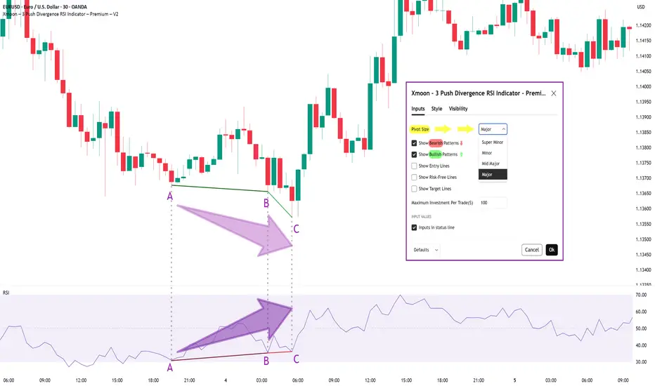
Xmoon Indicator Tutorial – Part 1 – Strategy🔻🔻🔻+ Persian version below🔻🔻🔻
📘 Xmoon Indicator Tutorial – Part 1
🎯 3Push Divergence RSI Strategy
🔥 The core of the Xmoon indicator
is built upon one of the most powerful strategies in technical analysis:
The advanced 3Push Divergence RSI pattern
🔁 A pattern that typically appears at key market turning points.
📉 When the price moves in the same direction three consecutive times on pivot points (e.g., making lower lows or higher highs), but the RSI shows the opposite behavior, it indicates a clear divergence !
💡 This divergence can act as a strong signal for a potential trend reversal.
🎯 The Xmoon Indicator is designed to detect this critical moment.
⚙️ Xmoon Indicator Settings Panel
The Xmoon settings panel offers the following options:
🔸 Pattern Type Selection: In the first and second lines, you can specify which type of pattern should be displayed: only bullish patterns or only bearish ones. You can also check both options.
🔸 Pivot Type Selection: From the dropdown menu, you can choose one of four pivot types:
“Super Minor”, “Minor”, “Mid-Major”, and “Major”, ordered from smallest to largest.
📌 Educational Note: The greater the distance (in candle count) between two lows or two highs, the larger the pivot is considered.
A Major Pivot is the largest among them.
✅ Larger Pivot = Higher Accuracy
❗ But naturally = Fewer Signals
📣 If you have any questions or need guidance, feel free to ask us. We’d be happy to help.
🔻🔻🔻بخش فارسی – Persian Section 🔻🔻🔻
📘 آموزش اندیکاتور ایکسمون - قسمت اول
🎯 استراتژی سهپوش واگرایی (3Push Divergence RSI)
🔥 هسته اصلی ایکسمون
بر پایه یکی از قویترین استراتژیهای تحلیل تکنیکال طراحی شده است
الگوی پیشرفته سهپوش واگرایی
🔁 الگویی که معمولاً در نقاط چرخش مهم بازار ظاهر میشود
📉 وقتی قیمت سه بار پشت سر هم روی نقاط پیوت ، در یک جهت حرکت میکند (مثلاً کفهای پایینتر یا سقفهای بالاتر میسازد) ، اما آر-اِس-آی خلاف آن را نشان میدهد، یعنی یک واگرایی آشکار رخ داده است
💡این واگرایی میتواند سیگنالی قوی برای برگشت روند باشد
🎯 اندیکاتور ایکسمون این لحظه را شناسایی میکند
⚙️ پنجره تنظیمات اندیکاتور ایکسمون
در بخش تنظیمات اندیکاتور ایکسمون، امکاناتی در اختیار شما قرار دارند
🔸 انتخاب نوع الگو: در خط اول و دوم میتوانید مشخص کنید چه نوع الگویی نمایش داده شود
فقط الگوهای صعودی یا فقط نزولی. همچنین می توانید تیک هر دو گزینه را بزنید
🔸 انتخاب نوع پیوتها: از پنجره کشویی بالا، می توانید یکی از ۴ نوع پیوت را انتخاب کنید
پیوت ها به ترتیب از کوچک به بزرگ عبارتند از: سوپر مینور ، مینور ، میدماژور و ماژور
📌 نکته آموزشی: هرچه فاصله بین دو کف یا دو سقف بیشتر باشد (یعنی تعداد کندلهای بین آنها زیادتر باشد)، آن پیوت، بزرگتر محسوب میشود
پیوت ماژور از بقیه بزرگ تر است
✅ پیوت بزرگتر = دقت بالاتر
❗ اما طبیعتاً = تعداد سیگنال کمتر
📣 اگر سوالی دارید یا نیاز به راهنمایی دارید، خوشحال میشویم از ما بپرسید
با کمال میل در خدمتتان هستیم
Mastering the Bollinger Bands- How to use it in trading?What is the Bollinger Bands
Bollinger Bands is a popular technical analysis tool developed by John Bollinger in the 1980s. It is designed to measure market volatility and provide signals for potential price reversals or trend continuations. The Bollinger Bands consist of three lines: a simple moving average in the middle, usually calculated over 20 periods, and two outer bands that are placed a set number of standard deviations above and below the moving average. These outer bands automatically adjust to market conditions, expanding and contracting based on price volatility. The indicator is widely used by traders to understand the relative highs and lows of a financial instrument in relation to recent price action.
What will be discussed?
- How does it work with the lower band and upper band?
- What does the narrowing mean?
- What does the widening mean?
- How to trade with the Bollingers Bands?
-------------------------
How does it work with the lower band and upper band?
The upper band and the lower band serve as dynamic levels of resistance and support. When the price of an asset touches or exceeds the upper band, it may be considered overbought, suggesting that a reversal or pullback could be near. Conversely, when the price approaches or breaks below the lower band, the asset may be viewed as oversold, indicating a potential rebound. These bands do not generate definitive buy or sell signals on their own but instead help traders assess market conditions. The interaction of price with the upper and lower bands often provides visual cues about the momentum and direction of the market, allowing for more informed decision-making.
-------------------------
What does the narrowing mean?
The narrowing of the Bollinger Bands occurs when the price becomes less volatile over time. This contraction indicates a period of consolidation or low market activity, where the price is trading in a tighter range. Narrowing bands are often interpreted as a signal that a significant price movement may be coming soon, as low volatility tends to precede high volatility. This phase is sometimes referred to as the "squeeze," and traders closely monitor it to anticipate breakout opportunities. The direction of the breakout, whether upward or downward, is not predicted by the narrowing itself but usually follows shortly after the bands have contracted.
-------------------------
What does the widening mean?
The widening of the Bollinger Bands reflects increasing market volatility. When the price starts to move rapidly either up or down, the bands spread further apart to accommodate this movement. This expansion typically confirms that a new trend is underway or that a breakout has occurred. The wider the bands become, the greater the degree of price fluctuation. During these times, traders may observe stronger momentum in the market, and the continuation of the move may be supported by the growing distance between the bands. However, extremely wide bands may also suggest that a reversal could be nearing, as the market can become overstretched in either direction.
-------------------------
How to trade with the Bollinger Bands?
Trading with Bollinger Bands involves using the bands to identify entry and exit points based on the behavior of price in relation to the upper and lower bands. One common approach is to buy when the price touches or breaks below the lower band and shows signs of bouncing back, and to sell when the price reaches or moves above the upper band and begins to retreat. Another strategy involves waiting for the bands to narrow significantly and then entering a trade in the direction of the breakout that follows. Traders often use Bollinger Bands in combination with other indicators such as RSI, MACD, or volume to confirm signals and reduce the risk of false breakouts. It is important to remember that Bollinger Bands are not predictive on their own but are most effective when used as part of a broader technical analysis framework.
-------------------------
Disclosure: I am part of Trade Nation's Influencer program and receive a monthly fee for using their TradingView charts in my analysis.
Thanks for your support.
- Make sure to follow me so you don't miss out on the next analysis!
- Drop a like and leave a comment!

How to Trade Smart Money Concepts (SMC)\ How to Trade Smart Money Concepts (SMC)\
\ This article explores the foundation, key tools, and practical insights of Smart Money Concepts — and why it’s worth your attention.\
In today's fast-changing financial landscape, Smart Money Concepts (SMC) has become a popular strategy among modern traders. But what is SMC exactly, and how can it improve your trading decisions? This article breaks it down in a simple, professional way for traders at all levels.
---
\ What Are Smart Money Concepts?\
SMC is a trading approach based on the belief that large institutions ("smart money") like banks and hedge funds control most of the market's movements. These institutions often move the market in ways that confuse or trap retail traders. The goal of SMC is to understand and follow the footsteps of these big players.
Instead of relying on simple patterns or indicators, SMC focuses on:
\ - Market structure\
\ - Supply and demand zones\
\ - Liquidity pools\
By aligning your trades with the behavior of smart money, you can position yourself more strategically in the market.
---
\ Key SMC Concepts Explained\
\ Order Blocks\
Order blocks are zones on the chart where large institutions have placed significant buy or sell orders. These zones often lead to strong price reactions and act as hidden support or resistance levels. Order blocks are considered more precise than traditional supply and demand areas.
Example: ()
\ Fair Value Gap (FVG)\
A Fair Value Gap occurs when price moves sharply in one direction, leaving a gap or imbalance in the price action. These areas often get filled later and can act as magnets for price.
In a bearish move, the FVG is the gap between the low of the previous candle and the high of the next one. In a bullish move, it's the reverse.
Example: ()
\ Timeframe Consideration\
If you can’t monitor charts during the day, avoid relying on 5–30 minute setups. Consider 4H or daily timeframes for clearer signals and more manageable trading decisions.
\ Liquidity\
Liquidity refers to price zones where lots of pending orders exist. These are usually at obvious highs, lows, or trendlines. Smart money often targets these areas to trigger stop-losses and generate movement.
One common tool to identify liquidity is a "pivot point," which is a candle with a lower low or higher high than its neighbors.
Example: ()
\ Break of Structure (BOS)\
BOS occurs when price breaks above or below a previous high or low, signaling a possible trend continuation.
Example: ()
\ Change of Character (ChoCH)\
ChoCH happens when the market changes direction. For example, if price breaks a higher low in an uptrend, it may signal a reversal.
Example: ()
Combined with BOS: ()
---
\ How SMC Compares to Wyckoff\
The idea of "smart money" isn't new. Richard D. Wyckoff, a pioneer in technical analysis, laid the foundation for understanding market cycles driven by institutions. His price cycle theory includes four phases:
\ 1. Accumulation\
Smart money buys while the public is unaware.
\ 2. Markup\
Price rises as smart money pushes the market.
\ 3. Distribution\
Smart money sells into public buying.
\ 4. Markdown\
Price falls as the cycle completes.
SMC borrows from this logic but focuses more on structure and liquidity zones. Still, the core idea is the same: understand what big players are doing, and follow them.
\ For deeper insights into Wyckoff, explore additional resources focused on accumulation/distribution cycles.\
---
\ Summary\
Smart Money Concepts give traders a deeper look into market mechanics. By focusing on order blocks, fair value gaps, liquidity, and structure breaks, SMC helps identify high-probability trade setups based on institutional behavior.
It may seem complex at first, but once you understand the basics, SMC can become a powerful tool in your trading strategy. Whether you’re new or experienced, aligning with smart money can improve your edge in the market.

Sharing the advanced Bollinger Bands strategyHere are the Bollinger Band trading tips: *
📌 If you break above the upper band and then drop back down through it, confirm a short signal!
📌 If you drop below the lower band and then move back up through it, confirm a long signal!
📌 If you continue to drop below the middle band, add to your short position; if you break above the middle band, add to your long position!
Pretty straightforward, right? This means you won’t be waiting for the middle band to signal before acting; you’ll be ahead of the game, capturing market turning points!
Let’s break it down with some examples:
1. When Bitcoin breaks above the upper Bollinger Band, it looks strong, but quickly drops back below:
➡️ That’s a “bull trap”—time to go short!
2. If Bitcoin crashes below the lower band and then pops back up:
➡️ Bears are running out of steam—time to go long and grab that rebound!
3. If the price keeps moving above the middle band:
➡️ Add to your long or short positions to ride the trend without being greedy or hesitant.
Why is this method powerful?
It combines “edge recognition + trend confirmation” for double protection:
1. Edge Recognition—spot the turning point and act early.
2. Trend Confirmation—wait for the middle band breakout and then confidently add positions!
You won’t be reacting after the fact; you’ll be ahead of the curve, increasing your positions in the trend’s middle and locking in profits at the end. This is the rhythm of professional traders and the core logic of systematic profits!
Who is this method for?
- You want precise entry and exit points.
- You’re tired of “chasing highs and cutting losses.”
- You want a clear, executable trading system.
- You want to go from “I see the chart but don’t act” to “I see the signal and take action.”
Follow for more. Make sure to like this if you found it useful.

Volume Speaks Louder: My Custom Volume Indicator for Futures
My Indicator Philosophy: Think Complex, Model Simple
In my first “Modeling 101” class as an undergrad, I learned a mantra that’s stuck with me ever since: “Think complex, but model simple.” In other words, you can imagine all the complexities of a system, but your actual model doesn’t have to be a giant non-convex, nonlinear neural network or LLM—sometimes a straightforward, rule-based approach is all you need.
With that principle in mind, and given my passion for trading, I set out to invent an indicator that was both unique and useful. I knew countless indicators already existed, each reflecting its creator’s priorities—but none captured my goal: seeing what traders themselves are thinking in real time . After all, news is one driver of the market, but you can’t control or predict news. What you can observe is how traders react—especially intraday—so I wanted a simple way to gauge that reaction.
Why intraday volume ? Most retail traders (myself included) focus on shorter timeframes. When they decide to jump into a trade, they’re thinking within the boundaries of a single trading day. They rarely carry yesterday’s logic into today—everything “resets” overnight. If I wanted to see what intraday traders were thinking, I needed something that also resets daily. Price alone didn’t do it, because price continuously moves and never truly “starts over” each morning. Volume, however, does reset at the close. And volume behaves like buying/selling pressure—except that raw volume numbers are always positive, so they don’t tell you who is winning: buyers or sellers?
To turn volume into a “signed” metric, I simply use the candle’s color as a sign function. In Pine Script, that looks like:
isGreenBar = close >= open
isRedBar = close < open
if (not na(priceAtStartHour))
summedVolume += isGreenBar ? volume : -volume
This way, green candles add volume and red candles subtract volume, giving me positive values when buying pressure dominates and negative values when selling pressure dominates. By summing those signed volumes throughout the day, I get a single metric—let’s call it SummedVolume—that truly reflects intraday sentiment.
Because I focus on futures markets (which have a session close at 18:00 ET), SummedVolume needs to reset exactly at session close. In Pine, that reset is as simple as:
if (isStartOfSession())
priceAtStartHour := close
summedVolume := 0.0
Once that bar (6 PM ET) appears, everything zeroes out and a fresh count begins.
SummedVolume isn’t just descriptive—it generates actionable signals. When SummedVolume rises above a user-defined Long Threshold, that suggests intraday buying pressure is strong enough to consider a long entry. Conversely, when SummedVolume falls below a Short Threshold, that points to below-the-surface selling pressure, flagging a potential short. You can fine-tune those thresholds however you like, but the core idea remains:
• Positive SummedVolume ⇒ net buying pressure (bullish)
• Negative SummedVolume ⇒ net selling pressure (bearish)
Why do I think it works: Retail/intraday traders think in discrete days. They reset their mindset at the close. Volume naturally resets at session close, so by signing volume with candle color, I capture whether intraday participants are predominantly buying or selling—right now.
Once again: “Think complex, model simple.” My Daily Volume Delta (DVD) indicator may look deceptively simple, but five years of backtesting have proven its edge. It’s a standalone gauge of intraday sentiment, and it can easily be combined with other signals—moving averages, volatility bands, whatever you like—to amplify your strategy. So if you want a fresh lens on intraday momentum, give SummedVolume a try.

Do You Know the Difference Between an Indicator and a Strategy?A lot of traders jump into Pine Script or apply a script on TradingView without understanding one key difference:
Indicators and Strategies are not the same — especially when it comes to real-time performance and backtesting.
---
What’s the Key Difference?
Indicators
Indicators are visual tools designed to help you analyze price action in real time . They do not track trade performance or simulate trades automatically.
You can use them to:
- Generate signals
- Stack confluences
- Set custom alerts
- Overlay custom visuals on charts
Best for: Chart analysis, signal confirmation, and manual or semi-automated alerts.
---
Strategies
Strategies are built for backtesting . They simulate how your trade logic would have performed historically, using `strategy.entry`, `strategy.exit`, and related functions.
They automatically calculate:
- Hypothetical P&L
- Win/loss ratio
- Drawdowns
Best for: Validating trade logic, optimizing entries and exits, performance tracking.
---
But Here’s the Catch
Many traders assume that once a strategy backtest looks good, it will behave exactly the same in live trading. This assumption can lead to poor decision-making.
❌ Why Forward Testing Isn't Perfect
When you set alerts based on a strategy, you're asking a backtest engine to behave like a live trading engine — and that’s not what it was designed for.
TradingView strategies:
- Only execute on candle close
- Do not simulate intrabar price action
- Do not account for slippage
- Do not reflect real-time market volatility
So:
- Your strategy alert may fire late compared to actual price movement
- Your SL/TP may be hit within a candle, but the strategy won’t know until close
- You may see better backtest results than what happens live
---
Takeaway
If you're using strategies with alerts, it’s critical to understand these constraints:
TradingView’s strategy engine is optimized for historical testing, not for real-time execution. It provides insight into the validity of your logic — but it’s not a replacement for a live execution engine.
Best Practice Recommendations:
- Always forward-test on a demo or paper account first
- Monitor how alerts perform in real-time
- Be ready to adjust parameters based on your asset and timeframe
If you need better responsiveness or real-time adaptability, consider using indicators to generate your alerts. Indicators react to price in real time and are often more suitable for live market conditions.
---
Final Note
Some strategies are built with these limitations in mind. They can still be useful in real-time trading as long as you're aware of how they work.
Transparency is key. Backtesting is a guide, not a guarantee.
Trade smart, stay informed.
Feel free to reach out if you have questions or insights to share!

About the Volume OBV indicator...
Hello, traders.
If you "Follow", you can always get new information quickly.
Please click "Boost" as well.
Have a nice day today.
-------------------------------------
I think TradingView is attractive because users can create charts as they want.
However, since the number of indicators that can be added to the chart is limited depending on the plan, you have to add indicators that fit your plan.
As a result, I ended up integrating multiple indicators into one indicator.
-
The HA-MS indicator in this chart is a public indicator.
If you search the Internet, you can find detailed explanations on how to interpret the OBV indicator.
I expressed it as follows to make this interpretation method more realistic.
The body color of the candlestick is indicated by the 4-stage OBV indicator.
The OBV indicator is distinguished in the same way as the Price Channel indicator.
You can interpret it like the Bollinger Band.
That is, if the middle line that divides 2 and 3 rises by more than 3, you can interpret that the buying force is increasing.
1: It means below the lower line of the Price Channel and is indicated in dark red.
If you enter this section, there is a high possibility of a sharp decline.
You should check the support and resistance points because it is likely to stop falling soon and rise to 2.
2: It means between the lower line and the middle line of the Price Channel and is indicated in red.
This section is likely to show a weak downward sideways movement.
Therefore, if it rises from 1->2, there is a possibility of a short rise. However, if it fails to rise to 3, it is likely to fall back to 1, so it is recommended to make short trades.
3: It means between the middle line and the upper line of the Price Channel and is displayed in green.
This section is likely to show a weak upward sideways movement.
If it rises from 2 -> 3 and shows a sideways movement, you should focus on finding a buying point.
4: It means above the upper line of the Price Channel and is displayed in dark green.
If it enters this section, there is a high possibility of a sharp rise.
Since it is likely to stop rising soon and fall to 3, you should check the support and resistance points.
-
What we should pay attention to is when it changes from 1 -> 2, 4 -> 3.
As explained above, 1 is a section located below the lower line of the Price Channel, so there is a high possibility of a sharp fall.
4 is a section located above the upper line of the Price Channel, so there is a high possibility of a sharp rise.
Therefore, you can proceed with an aggressive buy when it changes from 1 -> 2, and you can proceed with a sell when it changes from 4 -> 3.
In the case of futures, it can be used as reference information for entering and liquidating LONG and SHORT positions.
-
They say that the only things you need on a chart are price and trading volume.
However, it is not easy to interpret this in reality.
To compensate for this, we hid the colors of the existing candles and displayed them in 4 stages of OBV so that you can intuitively see which stage the current price is at.
-
Thank you for reading to the end.
I hope you have a successful transaction.
--------------------------------------------------

Chart Analysis and Trading Strategy (2)
Hello, traders.
If you "Follow", you can always get new information quickly.
Please also click "Boost".
Have a nice day today.
-------------------------------------
If you look at the candle that the finger is pointing to, you can see that it is a bearish candle with Open > Close.
If you look at this on a 30m chart, you can see that it moves as follows and forms lows and highs.
These candle movements come together to form a candle arrangement, and by looking at this, we ultimately set support and resistance points.
As your understanding of candles deepens, you will study charts in various ways.
The reason is that you may know it when you look at the chart, but you cannot when you trade.
That is, because the understanding of candles is not clear.
As you study the charts over and over again, you will learn that charts tend to converge to the median and average values.
You learn that they converge to the median and average values while studying various indicators, but you end up not knowing what you can learn from them.
What is important in the arrangement of candles is that the arrangement of the Open and Close bodies and the Low and High tails that make up the candles play an important role in setting support and resistance points.
I recommend that you understand this explanation through the Internet or a book.
The reason is that it is something that requires a lot of time investment to acquire.
-
The HA-MS indicator was created to quickly display support and resistance points as objective information.
Therefore, you can see that when the channel composed of the HA-Low indicator and the HA-High indicator is broken, a trend is formed, and if not, a sideways movement is shown.
The HA-Low, HA-High indicators are indicators created by combining the arrangement of candles and the RSI indicator on the Heikin-Ashi chart.
Therefore, the trading strategy is used to create a trading strategy depending on whether there is support near the HA-Low, HA-High indicators.
The other indicators, BW(0), BW(100), DOM(-60), and DOM(60), are used as support and resistance to create a detailed response strategy.
-
Based on this information, trading should be divided into trading in the sideways section and trading in the trend to create a trading strategy.
This trading time is created based on whether there is support in the HA-Low, HA-High indicators.
Since it is made of indicators, I think it provides objective information for chart interpretation with others, reducing the room for controversy.
This is the fundamental reason for using indicators.
It is because we can share objective information with each other.
-
In trading within the sideways section, information about the trend is not particularly necessary.
If you set the sideways section with your own indicator or support and resistance points, you can trade based on whether there is support at the end of that section.
-
However, when you leave the sideways section, information about the trend is necessary.
That is why we use the M-Signal indicator and Trend Cloud indicator on the 1D, 1W, and 1M charts as indicators for the trend.
For short-term information, you can use the M-Signal indicator and Trend Cloud indicator on the 1D chart.
If the Trend Cloud indicator is displayed in green and the price is maintained above the M-Signal indicator on the 1D chart, it can be interpreted that there is a high possibility of a turn to an uptrend.
If not, it can be interpreted that there is a high possibility of a downtrend.
The mid- to long-term trend can be identified by checking the arrangement status of the M-Signal indicator on the 1W chart and the M-Signal indicator on the 1M chart.
That is, if the M-Signal on the 1W chart > the M-Signal on the 1M chart, it can be interpreted that the mid- to long-term trend is maintaining an uptrend.
Therefore, in order to continue the uptrend from a long-term perspective, the price must be maintained above the M-Signal indicator on the 1M chart.
If not, it is recommended to make short trades if possible.
-
To better set the support and resistance points, look at the 1M chart > 1W chart > 1M chart in that order and draw a horizontal line on the indicators (HA-Low, HA-High, BW(0), BW(100), DOM(-60), DOM(60)) displayed on the chart and mark them on the chart.
Mark the support and resistance points on the chart as above.
This marks the support and resistance points with the low and high points.
-
It is not easy to start trading at the low or high points every time.
Therefore, as I mentioned earlier, it is important to create a detailed response strategy based on the median and average values.
For this, the StochRSI 50 indicator is displayed.
In addition, the Close of the Heikin-Ashi chart of the 1D chart, which can be usefully utilized when trading below the 1D chart, is added.
-------------------------------------------------
The information I mentioned above is ultimately information that can be obtained through chart analysis.
You can create a trading strategy by deciding whether to check it directly with your eyes and indicate support and resistance points, or to use an indicator that can be checked more quickly.
Chart analysis is about understanding the movement of the chart, and actual trading is conducted according to the trading strategy.
You may think that chart analysis is the trading strategy, but it is not.
No matter how well you analyze charts with your eyes, if you analyze charts when your psychological state is unstable due to subjective thoughts based on various information other than the chart, as I mentioned earlier, you may end up trading in the wrong direction.
To prevent this, it is necessary to use indicators so that subjective thoughts are not applied.
Even if you start trading at the support and resistance points created by the indicator, and it goes in the opposite direction and you suffer a loss, the influence will be weak.
The reason is that you created a trading strategy with the support and resistance points created by the indicator in advance.
Things to consider when starting a trade in a trading strategy are:
1. When to buy or how to buy
2. When to cut loss or how to cut loss
3. How to realize profit
For this reason, it is important to set support and resistance points through chart analysis.
-
It is better to do chart analysis briefly.
If you spend too much time analyzing charts, you may end up being trapped in your own subjective thoughts, so be careful.
I think you can tell whether you will do chart analysis in an analyst-like manner or in a chart analysis necessary for trading by looking at how the support and resistance points are marked on the chart.
The ideas of chart analysis often do not include things that need to be considered when starting a trade.
Therefore, in order to apply them to actual trading, you need to create a trading strategy through chart analysis.
The chart analysis for trading reduces the need for separate chart analysis because the information necessary for the trading strategy is displayed on the chart.
However, it may need to change depending on your investment style or the time frame chart you are actually trading on, but it can be advantageous for trading because the support and resistance points are marked.
To ensure this, you need to create an indicator and receive support and resistance points as objective information.
-
Thank you for reading to the end.
I hope you have a successful trade.
--------------------------------------------------

Bollinger Bands — Enhanced Classic Tool for Technical AnalysisBollinger Bands — Enhanced Classic Tool for Technical Analysis
Bollinger Bands are a classic technical analysis tool designed to identify short-term trends and gauge market volatility. We’ve upgraded their functionality to make them even more intuitive and precise for trading decisions.
What’s New in Our Bollinger Bands:
Color-Coded Trend Identification
The band color automatically shifts with short-term trend reversals. This allows traders to quickly spot trend direction and decide when to enter trades.
Band Width
Reflects current volatility levels and price momentum. Narrow bands signal consolidation (accumulation/distribution), while wide bands indicate high volatility and potential trend initiation.
Dynamic Support & Resistance Levels
The outer bands, calculated as standard deviations from the moving average, act as dynamic reference points for entry and exit levels.
Gradient Zones
The bands are divided into four gradient zones, highlighting optimal areas for position sizing. Buy near the lower zones, sell near the upper zones—simple yet effective.
How to Use Bollinger Bands in Trading:
1. Identify Short-Term Trends
Bullish Trend: Green bands signal a bullish market.
Bearish Trend: Red bands indicate bearish sentiment.
2. Assess Volatility & Choose Strategies
Wide Bands: High volatility, strong trend initiation. Consider breakout strategies.
Medium Bands: Range-bound markets. Trade bounces from band boundaries.
Narrow Bands: Consolidation (accumulation/distribution), often preceding strong price impulses.
Pro Tip: A sharp band contraction often precedes explosive price movements.
Volatility Assessment Examples
High Volatility + Trend:
Wide band expansion signals a strong bullish trend (green bands).
Medium Volatility + Range:
Moderate band width and frequent color shifts suggest choppy markets—ideal for boundary bounce trades.
Low Volatility + Breakouts:
A narrow band breakout (green bands) confirms a strong bullish impulse.
Trading Bounces from Band Boundaries
Prices tend to revert to the moving average (midline). This makes Bollinger Bands a powerful tool for swing traders:
Lower Band (Support): Oversold zone—consider long positions.
Upper Band (Resistance): Overbought zone—consider short positions.
Bounce trades work best in sideways markets or unclear trends. Avoid bounce strategies during band expansion (new trend formation).
Example Trades
Short on Upper Band Rejection:
Price stalls at the upper band in a bearish macro trend, offering a high-probability short entry.
Long on Lower Band Rebound:
Price bounces from the lower band in a bullish macro trend, confirming a long opportunity.
Additional Confirmation Tips
Combine Bollinger Bounce signals with:
Midas Multi-Indicator: Whale activity detection, trend ribbon reversals.
Oscillator Overextension: RSI, Stochastic, or MACD divergence.
Price Momentum: Volume spikes or candlestick patterns.
Refine entries by aligning band signals with broader market context and multi-timeframe analysis.

Understanding Parabolic SAR: A Guide to Trend ReversalsThe Parabolic SAR (Stop and Reverse) is a popular technical analysis tool that helps traders identify trend direction and potential reversal points. Developed by J. Welles Wilder, the Parabolic SAR is particularly useful in trending markets and provides straightforward buy and sell signals.
What is Parabolic SAR?
The Parabolic SAR is a series of dots plotted above or below the price on a chart:
- Dots Below the Price: Indicate an uptrend.
- Dots Above the Price: Indicate a downtrend.
The "SAR" stands for "Stop and Reverse," reflecting the tool's ability to signal when a trend might reverse direction.
How Parabolic SAR Works
The Parabolic SAR formula calculates the position of the dots based on:
- EP (Extreme Point): The highest high or lowest low in the current trend.
- AF (Acceleration Factor): A multiplier that increases over time to speed up the SAR's responsiveness.
As the trend progresses, the dots move closer to the price, acting as a trailing stop level. When the price crosses the dots, a reversal signal is generated.
Key Features of Parabolic SAR
1. Trend Direction:
- Dots below the price indicate a bullish trend.
- Dots above the price indicate a bearish trend.
2. Reversal Signals:
- When the price crosses above or below the SAR dots, it suggests a potential reversal.
3. Trailing Stop:
- The SAR level can be used as a trailing stop to protect profits in a trending market.
How to Use Parabolic SAR in Trading
1. Identifying Trends:
- Use the position of the SAR dots to confirm whether the market is in an uptrend or downtrend.
2. Spotting Reversals:
- A change in the position of the SAR dots (from below to above or vice versa) indicates a potential trend reversal.
3. Setting Stop-Loss Orders:
- Place stop-loss orders at the SAR level to minimize risk.
4. Combine with Other Indicators:
- Pair the Parabolic SAR with moving averages, RSI, or MACD to validate signals and reduce the likelihood of false reversals.
Strengths of Parabolic SAR
- Simplicity: Easy to interpret and apply.
- Clear Signals: Provides unambiguous buy and sell signals.
- Effective in Trending Markets: Works well in markets with sustained uptrends or downtrends.
Limitations of Parabolic SAR
- Ineffectiveness in Sideways Markets: Generates false signals in choppy or range-bound conditions.
- Fixed Parameters: The default settings (e.g., AF starts at 0.02 and increments by 0.02) may not suit all market conditions. Adjusting these parameters can improve accuracy.
Best Practices for Using Parabolic SAR
1. Avoid Flat Markets:
- Use Parabolic SAR only in trending markets to minimize false signals.
2. Adjust Parameters:
- Experiment with the acceleration factor to tailor the indicator to the specific asset or timeframe.
3. Combine with Other Tools:
- Use additional indicators or chart patterns to confirm Parabolic SAR signals.
Example of Parabolic SAR in Action
Imagine Bitcoin (BTC) is trading at $94,000 in an uptrend. The Parabolic SAR dots appear below the price, confirming the bullish trend. As BTC rises to $98,000, the dots gradually move closer to the price. If the price falls and crosses the SAR dots, the dots shift above the price, signaling a potential downtrend and a sell opportunity.
Conclusion
The Parabolic SAR is a powerful yet straightforward tool for identifying trends and potential reversals. While it excels in trending markets, traders should be cautious in sideways markets where it may produce false signals. Combine it with other indicators and sound risk management practices to enhance its effectiveness. Regular practice and adjustments to the settings can help traders maximize its potential.

HOW-TO use the Rainbow Indicator? (full guide)Below is a complete instruction on how to use the Rainbow Indicator along with examples. This indicator is an important facet of my decision-making system because it allows me to answer two important questions:
- At what price should I make a trade with the selected shares?
- In what volume?
Part 1: Darts Set
My concept of investing in stocks is buying great companies during a sell-off . Of course, this idea is not unique. One way or another, this was said by the luminaries of value investing – Benjamin Graham and Warren Buffett. However, the implementation of this concept may vary depending on the preferences of each investor.To find great companies, I use the Fundamental strength indicator , and to plan opening and closing positions I use the Rainbow indicator.
To begin your acquaintance with the Rainbow Indicator, I would like to invite you to take part in a mental experiment. Imagine two small rooms for a game of darts. Each room has a different target hanging in it. It can be anywhere: center, left, right, bottom, or top.
Target #1 from the first room looks like a small red circle.
Target #2 from the second room looks like a larger red circle.
You get a reward for hitting the target, calculated according to the following principle: the smaller the target in relation to the wall surface, the greater the reward you get.
You have 100 darts in your hand, that is 100 attempts to hit the target. For each attempt, you pay $10. So to play this unusual game of darts, you take with you $1,000. Now, the most important condition is that you play in absolute darkness . So you don't know exactly what part of the wall the target is hanging in, so all your years of darts practice don't matter here.
The question is: Which room will you choose?
This is where you begin to think. Since your skills and experience are almost completely untapped in this game, all of your attempts to hit a target will be random. This is a useful observation because it allows you to apply the theory of probability. The password is Jacob Bernoulli. This is the mathematician who derived the formula by which you can calculate the probability of a successful outcome for a limited number of attempts.
In our case, a successful outcome is a dart hitting the target as many times as necessary in order to, at least, not lose anything. In the case of Target #1, it is one hit or more. In the case of Target 2, it is 10 hits or more.
The probability of hitting Target #1 is 1/100 or 1% (since the target area occupies 1% of the wall area).
The probability of hitting Target #2 is 10/100 or 10% (since the target area occupies 10% of the wall area).
The number of attempts is equal to the number of darts - 100.
Now we have all the data to calculate.
So, Bernoulli's formula :
According to this formula:
- The probability of one or more hits on Target #1 is 63% (out of 100%).
- The probability of ten or more hits on Target #2 is 55% (out of 100%).
You may say, "I think we should go to the first room". However, take your time with this conclusion because it is interesting to calculate the probability of not hitting the target even once, i.e., losing $1,000.
We calculate using the same formula:
- The probability of not hitting Target #1 is 37% (out of 100%).
- The probability of not hitting Target #2 is 0.0027% (out of 100%).
If we calculate the ratio of the probability of a successful outcome to the probability of losing the whole amount, we get:
- For the first room = 1.7
- For the second room = 20370
You know, I like the second room better.
This mental experiment reflects my approach to investing in stocks. The first room is an example of a strategy where you try to find the perfect entry point - to buy at a price below which the stock will not fall. The second room reflects an approach where you're not chasing a specific price level, but thinking in price ranges. In both cases, you'll have plenty of attempts, but in the first room, the risk of losing everything is much greater than in the second room.
Now let me show you my target, which is a visual interpretation of the Rainbow Indicator.
It also hangs on the wall, in absolute darkness, and only becomes visible after I have used all the darts. Before the game starts, I announce the color where I want to go. The probability of hitting decreases from blue to green, and then to orange and red. That is, the smaller the color area, the less likely it is to successfully hit the selected color. However, the size of the reward also increases according to the same principle - the smaller the area of color, the greater the reward.
Throwing a dart is an attempt to close a position with a profit.
Hitting the selected color is a position closed with a profit.
Missing the selected color means the position is closed at a loss.
Now imagine that in the absolutely dark room where I am, I have a flashlight. Thanks to it, I have the opportunity to see in which part of the wall the target is located. This gives me a significant advantage because now I throw darts not blindly, but with a precise understanding of where I am aiming. Light shining on the wall increases the probability of a successful outcome, which can also be estimated using the Bernoulli formula.
Let's say I have 100 darts in my hands, that is, one hundred attempts to hit the chosen target. The probability of a dart hitting a red target (without the help of a flashlight) is 10%, and with the help of a flashlight, for example, 15%. That is, my ability to throw darts improves the probability of hitting the target by 5%. For hitting the red target, I get $100, and for each throw I pay $10. In this case, the probability of hitting the red target ten or more times is 94.49% (out of 100%) versus 55% (out of 100%) without a flashlight. In other words, under these game conditions and the assumptions made, if I try all 100 darts, the probability of recouping all my expenses will be 94.49% if I aim only at the red target.
In my decision-making system, such a "flashlight" is the Fundamental strength indicator, dynamics of cash flows, the P/E ratio and the absence of critical news. And the darts set (target and darts) is a metaphor for the Rainbow Indicator. However, please note that all probabilities of positive outcomes are assumptions and are provided only for the purpose of example and understanding of the approach I have chosen. Stocks of public companies are not a guaranteed income instrument, nor are any indicators associated with them.
Part 2: Margin of safety
The idea to create the Rainbow Indicator came to me thanks to the concept of "margin of safety" coined by the father of value investing, Benjamin Graham. According to his idea, it is reasonable to buy shares of a company only when the price offered by the market is lower than the "intrinsic value" calculated based on financial statements. The value of this difference is the "margin of safety". At the same time, the indicator does not copy Graham's idea but develops it relying on my own methodology.
So, according to Graham, the "margin of safety" is a good discount to the intrinsic value of the company. That is, if a company's stock is trading at prices that are well below the company's intrinsic value (on a per-share basis), it's a good opportunity to consider buying it. In this case, you will have a certain margin of safety in case the company is in financial distress and its stock price goes down. Accordingly, the greater the discount, the better.
When it comes to the intrinsic value of a company, there are many approaches to determining it - from calculating the Price-to-book value financial ratio to the discounted cash flow method. As for my approach, I don’t try to find the coveted intrinsic value/cost, but I try to understand how fundamentally strong the company in front of me is, and how many years it will take to pay off my investment in it.
To decide to buy shares, I use the following sequence of actions:
- Determining fundamental strength of a company and analysis of cash flows using the Fundamental Strength Indicator.
- Analysis of the recoupment period of investments using P/E ratio .
- Analysis of critical news .
- Analysis of the current price using Rainbow Indicator.
To decide to sell shares, I use:
- Analysis of the current price using Rainbow Indicator.
- Or The Rule of Replacement of Stocks in a Portfolio .
- Or Force majeure Position Closing Rule .
Thus, the Rainbow indicator is always used in tandem with other indicators and analysis methods when buying stocks. However, in the case of selling previously purchased shares, I can only use the Rainbow indicator or one of the rules that I will discuss below. Next, we will consider the methodology for calculating the Rainbow Indicator.
Indicator calculation methodology
The Rainbow indicator starts with a simple moving average of one year (this is the thick red line in the center). Hereinafter, a year will mean the last 252 trading days.
Applying a moving average of this length - is a good way to smooth out sharp price fluctuations which can happen during a year as much as possible, keeping the trend direction as much as possible. Thus, the moving average becomes for me the center of fluctuations of the imaginary pendulum of the market price.
Then the deviations are calculated from the center of fluctuations. To achieve this, a certain number of earnings per share is subtracted from and added to the moving average. This is the diluted EPS of the last year.
Deviations with a "-" sign from the Lower Rainbow of four colors:
- The Blue Spectrum of the Lower Rainbow begins with a deflection of -4 EPS and ends with a deflection of -8 EPS.
- The Green Spectrum of the Lower Rainbow begins with a deflection of -8 EPS and ends with a deflection of -16 EPS.
- The Orange Spectrum of the Lower Rainbow begins with a deflection of -16 EPS and ends with a deflection of -32 EPS.
- The Red Spectrum of the Lower Rainbow begins with a deflection of -32 EPS and goes to infinity.
The Lower Rainbow is used to determine the price ranges that can be considered for buying stocks. It is in the spectra of the Lower Rainbow that the very "margin of safety" according to my methodology is located. The Lower Rainbow has the boundaries between the spectra as a solid line . And only the Red Spectrum of the Lower Rainbow has only one boundary.
Deviations with a "+" sign from the Upper Rainbow of four similar colors:
- The Red Spectrum of the Upper Rainbow begins with a deflection of 0 EPS and ends with a deflection of +4 EPS.
- The Orange Spectrum of the Upper Rainbow begins with a deflection of +4 EPS and ends with a deflection of +8 EPS.
- The Green Spectrum top rainbow begins with a deflection of +8 EPS and ends with a deflection of +16 EPS.
- The Blue Spectrum of the Upper Rainbow begins with a deflection of +16 EPS and goes to infinity.
The Upper Rainbow is used to determine the price ranges that can be considered for selling stocks already purchased. The top rainbow has boundaries between the spectra in the form of crosses . And only the Blue Spectrum of the Upper Rainbow has only one boundary.
The presence of the Empty Area (the size of 4 EPS) above the Lower Rainbow creates some asymmetry between the two rainbows - the Lower Rainbow looks wider than the Upper Rainbow. This asymmetry is deliberate because the market tends to fall much faster and deeper than it grows . Therefore, a wider Lower Rainbow is conducive to buying stocks at a good discount during a period of massive "sell-offs".
The situation when the Lower Rainbow is below the center of fluctuations (the thick red line) and the Upper Rainbow is above the center of fluctuations is called an Obverse . It is only possible to buy a stock in an Obverse situation.
The situation when the Lower Rainbow is above the center of fluctuations and the Upper Rainbow is below the center of fluctuations is called Reverse . In this situation, the stock cannot be considered for purchase , according to my approach.
Selling a previously purchased stock is possible in both situations: Reverse and Obverse. After loading the indicator, you can see a hint next to the closing price - Reverse or Obverse now.
Because the size of the deviation from the center of fluctuation depends on the size of the diluted EPS, several important conclusions can be made:
- The increase in the width of both rainbows in the Obverse situation tells me about the growth of profits in the companies.
- The decrease in the width of both rainbows in the Obverse situation tells me about a decrease in profits in the companies.
- The increase in the width of both rainbows in the Reverse situation tells me about the growth of losses in the companies.
- The decrease in the width of both rainbows in the Reverse situation tells me about the decrease in losses in the companies.
- The higher the company's level of profit, the larger my "margin of safety" should be. This will provide the necessary margin of safety in the event of a transition to a cycle of declining financial results. The corresponding width of the Lower Rainbow will just create this "reserve".
- The growth in profit in the company (after buying its shares) will allow me to stay in the position longer due to the expansion of the Upper Rainbow.
- A decrease in profit in the company (after buying its shares) will allow me to close the position faster due to the narrowing of the Upper Rainbow.
So the Rainbow indicator shows me a price range that can be considered for purchase if all the necessary conditions are met. By being in this price range, my investment will have a certain margin of safety or "margin of safety." It will also tell me when to exit a stock position based on the company's earnings analysis.
Part 3: Crazy Mr. Market
The Fundamental strength of a company influences the long-term price performance of its shares. This is a thesis that I believe in and use in my work. A company that does not live in debt and quickly converts its goods or services into money will be appreciated by the market. This all sounds good, you say, but what should an investor do who needs to decide here and now? Moreover, one has to act in conditions of constant changes in market sentiment. Current talk about the company's excellent prospects can be replaced by a pessimistic view of it literally the next day. Therefore, the stock price chart of any companies, regardless of its fundamental strength, can resemble the chaotic drawings of preschool children.
Working with such uncertainty required me to develop my own attitude towards it. Benjamin Graham's idea of market madness was of invaluable help to me in this. Imagine that the market is your business partner, "Mr. Market". Every day, he comes to your office to check in and offer you a deal with shares of your mutual companies. Sometimes he wants to buy your share, sometimes he intends to sell his. And each time he offers a price at random, relying only on his intuition. When he is in a panic and afraid of everything, he wants to get rid of his shares. When he feels euphoria and blind faith in the future, he wants to buy your share. This is how crazy your partner is.
Why is he acting like this? According to Graham, this is how all investors behave who do not understand the real value/cost of what they own. They jump from side to side and do it with the regularity of a "maniac" every day. The smart investor's job is to understand the fundamental value of your business and just wait for the next visit from crazy Mr. Market. If he panics and offers to buy his stocks at a surprisingly low price, take them and wish him luck. If he begs you to sell him stocks and quotes an unusually high price, sell them and wish him luck. The Rainbow indicator is used to evaluate these two poles.
Now let's look at the conditions of opening and closing a position according to the indicator.
So, the Lower Rainbow has four differently colored spectra: blue, green, orange, and red. Each one highlights the desired range of prices acceptable for buying in an Obverse situation. The Blue Spectrum is upper regarding the Green Spectrum, and the Green Spectrum is lower regarding the Blue Spectrum, etc.
- If the current price is in the Blue Spectrum of the Lower Rainbow, that is a reason to consider that company for buying the first portion (*) of the stock.
- If the current price has fallen below (into the Green Spectrum of the Lower Rainbow), that is a reason to consider this company to buy a second portion of the stock.
- If the current price has fallen below (into the Orange Spectrum of the Lower Rainbow), it is a reason to consider this company to buy a third portion of the stock.
- If the current price has fallen below (into the Red Spectrum of the Lower Rainbow), that is a reason to consider that company to buy a fourth portion of the stock.
(*) The logic of the Rainbow Indicator implies that no more than 4 portions of one company's stock can be purchased. One portion refers to the number of shares you can consider buying at the current price (depending on your account size and personal diversification ratio - see information below).
The Upper Rainbow also has four differently colored spectra: blue, green, orange, and red. Each of them highlights the appropriate range of prices acceptable for closing an open position.
- If the current price is in the Red Spectrum of the Upper Rainbow, I close one portion of an open position bought in the Red Spectrum of the Lower Rainbow.
- If the current price is in the Orange Spectrum of the Upper Rainbow, I close one portion of an open position bought in the Orange Spectrum of the Lower Rainbow.
- If the current price is in the Green Spectrum of the Upper Rainbow, I close one portion of an open position bought in the Green Spectrum of the Lower Rainbow.
- If the current price is in the Blue Spectrum of the Upper Rainbow, I close one portion of an open position bought in the Blue Spectrum of the Lower Rainbow.
This position-closing logic applies to both the Obverse and Reverse situations. In both cases, the position is closed in portions in four steps. However, there are 3 exceptions to this rule when it is possible to close an entire position in whole rather than in parts:
1. If there is a Reverse situation and the current price is above the thick red line.
2.if I decide to invest in another company and I do not have enough free finances to purchase the required number of shares (Portfolio Replacement Rule).
3. If I learn of events that pose a real threat to the continued existence of the companies (for example, filing for bankruptcy), I can close the position earlier, without waiting for the price to fall into the corresponding Upper Rainbow spectrum (Force majeure Position Closing Rule).
So, the basic scenario of opening and closing a position assumes the gradual purchase of shares in 4 stages and their gradual sale in 4 stages. However, there is a situation where one of the stages is skipped in the case of buying shares and in the case of selling them. For example, because the Fundamental Strength Indicator and the P/E ratio became acceptable for me only at a certain stage (spectrum) or the moment was missed for a transaction due to technical reasons. In such cases, I buy or sell more than one portion of a stock in the spectrum I am in. The number of additional portions will depend on the number of missed spectra.
For example, if I have no position in the stock of the company in question, all conditions for buying the stock have been met, and the current price is in the Orange Spectrum of the Lower Rainbow, I can buy three portions of the stock at once (for the Blue, Green, and Orange Spectrum). I will sell these three portions in the corresponding Upper Rainbow spectra (orange, green, and blue). However, if, for some reason, the Orange Spectrum of the Upper Rainbow was missed, and the current price is in the Green Spectrum - I will sell two portions of the three (in the Green Spectrum). I will sell the last, third portion only when the price reaches the Blue Spectrum of the Upper Rainbow.
The table also contains additional information in the form of the current value of the company's market capitalization and P/E ratio. This allows me to use these two indicators within one indicator.
Returning to the madness of the market, I would like to mention that this is a reality that cannot be fought, but can be used to achieve results. To get a sense of this, I will give an example of one of the stereotypes of an investor who uses fundamental analysis in his work.His thinking might be: If I valued a company on its financial performance and bought it, then I should stay in the position long enough to justify my expenses of analysis. In this way, the investor deliberately deprives himself of flexibility in decision-making. He will be completely at a loss if the financial performance starts to deteriorate rapidly and the stock price starts to decline rapidly. It is surprising that the same condition will occur in the case of a rapid upward price movement. The investor will torment himself with the question "what to do?" because I just bought stocks of this company, expecting to hold them for the long term. It is at moments like these that I'm aware of the value of the Rainbow Indicator. If it is not a force majeure or a Reverse situation, I just wait until the price reaches the Upper Rainbow. Thus, I can close the position in a year, in a month or in a few weeks. I don't have a goal to hold an open position for a long time, but I do have a goal to constantly adhere to the chosen investment strategy.
Part 4: Diversification Ratio
If the price is in the Lower Rainbow range and all other criteria are met, it is a good time to ask yourself, "How many shares to buy?" To answer this question, I need to understand how many companies I plan to invest in. Here I adhere to the principle of diversification - that is, distributing investments between the shares of several companies. What is this for? To reduce the impact of any company on the portfolio as a whole. Remember the old saying: don't put all your eggs in one basket. Like baskets, stocks can fall and companies can file for bankruptcy and leave the exchange. In this regard, diversification is a way to avoid losing capital due to investing in only one company.
How do I determine the minimum number of companies for a portfolio? This amount depends on my attitude towards the capital that I will use to invest in stocks. If I accept the risk of losing 100% of my capital, then I can only invest in one company. It can be said that in this case there is no diversification. If I accept the risk of losing 50% of my capital, then I should invest in at least two companies, and so on. I just divide 100% by the percentage of capital that I can safely lose. The resulting number, rounded to the nearest whole number, is the minimum number of companies for my portfolio.
As for the maximum value, it is also easy to determine. To achieve this, you need to multiply the minimum number of companies by four (this is how many spectra the Lower or Upper Rainbow of the indicator contains). How many companies I end up with in my portfolio will depend on from this set of factors. However, this amount will always fluctuate between the minimum and maximum, calculated according to the principle described above.
I call the maximum possible number of companies in a portfolio the diversification coefficient. It is this coefficient that is involved in calculating the number of shares needed to be purchased in a particular spectrum of the Lower Rainbow. How does this work? Let's go to the indicator settings and fill in the necessary fields for the calculation.
+ Cash in - Cash out +/- Closed Profit/Loss + Dividends - Fees - Taxes
+Cash in - the number of finances deposited into my account
-Cash out - the number of finances withdrawn from my account
+/-Closed Profit/Loss - profit or loss on closed positions
+Dividends - dividends received on the account
-Fees - broker and exchange commission
-Taxes - taxes debited from the account
Diversification coefficient
The diversification coefficient determines how diversified I want my portfolio to be. For example, a diversification coefficient of 20 means that I plan to buy 20 share portions of different companies, but no more than 4 portions per company (based on the number of Lower Rainbow spectra).
The cost of purchased shares of this company (fees excluded)
Here, I specify the amount of already purchased shares of the company in question in the currency of my portfolio. For example, if at this point, I have purchased 1000 shares at $300 per share, and my portfolio is expressed in $, I enter - $300,000.
The cost of all purchased shares in the portfolio (fees excluded)
Here, I enter the amount of all purchased shares for all companies in the currency of my portfolio (without commissions spent on the purchase). This is necessary to determine the amount of available funds available to purchase shares.
After entering all the necessary data, I move on to the checkbox, by checking which I confirm that the company in question has successfully passed all preliminary stages of analysis (Fundamental strength indicator, P/E ratio, critical news). Without the check, the calculation is not performed. This is done intentionally because the use of the Rainbow Indicator for the purpose of purchasing shares is possible only after passing all the preliminary stages. Next, I click "Ok" and get the calculation in the form of a table on the left.
Market Capitalization
The value of a company's market capitalization, expressed in the currency of its stock price.
Price / EPS Diluted
Current value of the P/E ratio.
Free cash in portfolio
This is the amount of free cash available to purchase stocks. Please note that the price of the stock and the funds in your portfolio must be denominated in the same currency. On TradingView, you can choose which currency to display the stock price in.
Cash amount for one portion
The amount of cash needed to buy one portion of a stock. This depends on the diversification ratio entered. If you divide this value + Cash in - Cash out +/- Closed Profit/Loss + Dividends - Fees - Taxes by the diversification coefficient, you get Cash amount for one portion .
Potential portions amount
Number of portions, available for purchase at the current price. It can be a fractional number.
Cash amount to buy
The amount of cash needed to buy portions available for purchase at the current price.
Shares amount to buy
Number of shares in portions available for purchase at the current price.
Thus, the diversification ratio is a significant parameter of my stocks' investment strategy. It shows both the limit on the number of companies and the limit on the number of portions for the portfolio. It also participates in calculating the number of finances and shares to purchase at the current price level.
Changing the diversification coefficient is possible already during the process of investing in stocks. If my capital ( + Cash in - Cash out +/- Closed Profit/Loss + Dividends - Fees - Taxes ) has changed significantly (by more than Cash amount for one portion ), I always ask myself the same question: "What risk (as a percentage of capital) is acceptable for me now?" If the answer involves a change in the minimum number of companies in the portfolio, then the diversification ratio will also be recalculated. Therefore, the number of finances needed to purchase one portion will also change. We can say that the diversification ratio controls the distribution of finances among my investments.
Part 5: Prioritization and Exceptions to the Rainbow Indicator Rules
When analyzing a company and its stock price using the Fundamental Strength Indicator and the Rainbow Indicator, a situation may arise where all the conditions for buying are met in two or more companies. At the same time, Free cash in the portfolio does not allow me to purchase the required number of portions from different companies. In that case, I need to decide which companies I will give priority to.
To decide, I follow the following rules:
1. Priority is given to companies from the top-tier sector group (how these groups are defined is explained in this article ). That is, the first group prevails over the second, and the second over the third. These companies must also meet the purchase criteria described in Part 2.
2. If after applying the first rule, two or more companies have received priority, I look at the value of the Fundamental Strength Indicator. Priority is given to companies that have a fundamental strength of 8 points or higher. They must also be within two points of the leader in terms of fundamental strength. For example, if a leader has a fundamental strength of 12 points, then the range under consideration will be from 12 to 10 points.
3. If, after applying the second rule, two or more companies received priority, I look at which spectrum of the Lower Rainbow the current price of these companies is in. If a company's stock price is on the lower end of the spectrum, I give it priority.
4. If, after applying the third rule, two or more companies have received priority, I look at the P/E ratio. The Company with the lower P/E ratio gets priority.
After applying these four rules, I get the company with the highest priority. This is the company that wins the fight for my investment. To figure out the next priority to buy, I repeat this process over and over again to use up all the money I have allocated for investing in stocks.
The second part of the guide mentioned two rules that I use when deciding whether to close positions:
- The Rule for replacing shares in a portfolio.
- Force majeure position closure Rule.
They take priority over the Rainbow Indicator. This means that the position may be closed even if the Rainbow indicator does not signal this. Let's consider each rule separately.
Portfolio stock replacement Rule
Since company stocks are not an asset with a guaranteed return, I can get into a situation where the position is open for a long time without an acceptable financial result. That is, the price of the company's shares is not growing, and the Rainbow indicator does not signal the need to sell shares. In this case, I can replace the problematic companies with a new one. The criteria for a problem company are:
- 3 months have passed since the position was opened.
- Fundamental strength below 5 points.
- The width of both rainbows decreased during the period of holding the position.
To identify a new company that will take the place of the problematic one, I use the prioritization principle from this section. At the same time, I always consider this possibility as an option. The thing is that frequently replacing stocks in my portfolio is not a priority for me and is seen as a negative action. A new company would have to have really outstanding parameters for me to take advantage of this option.
Force majeure position closure Rule
If my portfolio contains stocks of a company that has critical news, then I can close the position without using the Rainbow Indicator. How to determine whether this news is critical or not is described in this article .
Part 6: Examples of using the indicator
Let’s consider the situation with NVIDIA Corporation stock (ticker - NVDA).
September 02, 2022:
Fundamental Strength Indicator - 11.46 (fundamentally strong company).
P/E - 39.58 (acceptable to me).
Current price - $136.47 (is in the Orange Spectrum of the Lower Rainbow).
Situation - Obverse.
There is no critical news for the company.
The basic conditions for buying this company's stock are met. The Rainbow Indicator settings are filled out as follows:
The table to the left of the Rainbow Indicator shows how many shares are possible to buy in the Orange Spectrum of Lower Rainbow at the current price = 10 shares. This corresponds to 2.73 portions.
To give you an example, I buy 10 shares of NVDA at $136.47 per share.
October 14, 2022:
NVDA's stock price has moved into the Red Spectrum of the Lower Rainbow.
The Fundamental Strength Indicator is 10.81 (fundamentally strong company).
P/E is 35.80 (an acceptable level for me).
Current price - $112.27 (is in the Red Spectrum of the Lower Rainbow).
Situation - Obverse.
There is no critical news for the company.
The basic conditions for buying this company's stock are still met. The Rainbow Indicator settings are populated as follows:
The table to the left of the Rainbow Indicator shows how many shares are possible to buy in the Lower Rainbow Red Spectrum at the current price (5 shares). This corresponds to 1.12 portions.
To give you an example, I buy 5 shares of NVDA at $112.27 per share. A total of 3.85 portions were purchased, which is the maximum possible number of portions at the current price level. The remainder in the form of 0.15 portions can be purchased only at a price level below $75 per share.
January 23, 2023:
The price of NVDA stock passes through the Red Spectrum of the Upper Rainbow and stops in the Orange Spectrum. As an example, I sell 5 shares bought in the Red Spectrum of the Lower Rainbow, for example at $180 per share (+60%). And also a third of the shares bought in the Orange Spectrum, 3 shares out of 10, for example at $190 a share (+39%). That leaves me with 7 shares.
January 27, 2023:
NVDA's stock price has continued to rise and has moved into the Green Spectrum of the Upper Rainbow. This is a reason to close some of the remaining 7 shares. I divide the 7 shares by 2 and round up to a whole number - that's 4 shares. For my example, I sell 4 shares at $199 a share (+46%). Now I am left with 3 shares of stock.
February 02, 2023:
The price of NVDA stock moves into the Blue Spectrum of the Upper Rainbow, and I close the remaining 3 shares, for example, at $216 per share (+58%). The entire position in NVDA stock is closed.
As you can see, the Fundamental Strength Indicator and the P/E ratio were not used in the process of closing the position. Decisions were made only based on the Rainbow Indicator.
As another example, let's look at the situation with the shares of Papa Johns International, Inc. (ticker PZZA).
November 01, 2017:
Fundamental Strength Indicator - 13.22 points (fundamentally strong company).
P/E - 21.64 (acceptable to me).
Current price - $62.26 (is in the Blue Spectrum of the Lower Rainbow).
Situation - Obverse.
There is no critical news for the company.
The basic conditions for buying shares of this company are met. The settings of the Rainbow Indicator are filled as follows:
The table to the left of the Rainbow Indicator shows how many shares are possible to buy in the Lower Rainbow Blue Spectrum at the current price - 8 shares. This corresponds to 1 portion.
To give you an example, I buy 8 shares of PZZA at a price of $62.26.
August 8, 2018:
PZZA's share price has moved into the Green Spectrum of the Lower Rainbow.
The Fundamental Strength Indicator is a 9.83 (fundamentally strong company).
P/E is 16.07 (an acceptable level for me).
Current price - $38.94 (is in the Green Spectrum of the Lower Rainbow).
Situation - Obverse.
There is no critical news for the company.
The basic conditions for buying shares of this company are still met. The Rainbow Indicator settings are populated as follows:
The table to the left of the Rainbow Indicator shows how many shares are possible to buy in the Lower Rainbow Green Spectrum at the current price - 12 shares. This corresponds to 0.93 portions.
To give you an example, I buy 12 shares of PZZA at a price of $38.94. A total of 1.93 portions were purchased.
October 31, 2018:
PZZA's stock price moves into the Upper Rainbow Red Spectrum and is $54.54 per share. Since I did not have any portions purchased in the Lower Rainbow Red Spectrum, there is no closing part of the position.
February 01, 2019:
After a significant decline, PZZA's stock price moves into the Orange Spectrum of the Lower Rainbow at $38.51 per share. However, I am not taking any action because the company's Fundamental Strength on this day is 5.02 (a fundamentally mediocre company).
March 27, 2019:
PZZA's stock price passes the green and Blue Spectrum of the Upper Rainbow. This allowed to close the previously purchased 12 shares, for example, at $50 a share (+28%) and 8 shares at $50.38 a share (-19%).
Closing the entire position at once was facilitated by a significant narrowing in both rainbows. As we now know, this indicates a decline in earnings at the company.
In conclusion of this instruction, I would like to remind you once again that any investment is associated with risk. Therefore, make sure that you understand all the nuances of the indicators before using them.
Mandatory requirements for using the indicator:
- Works only on a daily timeframe.
- The indicator is only applicable to shares of public companies.
- Quarterly income statements for the last year are required.
- An acceptable for your P/E ratio is required to consider the company's stock for purchase.
- The Rainbow Indicator only applies in tandem with the Fundamental Strength Indicator. To consider a company's stock for purchase, you need confirmation that the company is fundamentally strong.
What is the value of the Rainbow Indicator?
- Clearly demonstrates a company's profit and loss dynamics.
- Shows the price ranges that can be used to open and close a position.
- Considers the principle of gradual increase and decrease in a position.
- Allows calculating the number of shares to be purchased.
- Shows the current value of the P/E ratio.
- Shows the current capitalization of the company.
Risk disclaimer
When working with the Rainbow Indicator, keep in mind that the release of the Income statement (from which diluted EPS is derived) occurs some time after the end of the fiscal quarter. This means that the new relevant data for the calculation will only appear after the publication of the new statement. In this regard, there may be a significant change in the Rainbow Indicator after the publication of the new statement. The magnitude of this change will depend on both the content of the new statement and the number of days between the end of the financial quarter and the publication date of the statement. Before the publication date of the new statement, the latest actual data will be used for the calculations. Also, once again, please note that the Rainbow Indicator can only be used in tandem with the Fundamental Strength Indicator and the P/E ratio. Without these additional filters, the Rainbow Indicator loses its intended meaning.
The Rainbow Indicator allows you to determine the price ranges for opening and closing a position gradually, based on available data and the methodology I created. You can also use it to calculate the number of shares you can consider buying, considering the position you already have. However, this Indicator and/or its description and examples cannot be used as the sole reason for buying or selling stocks or for any other action or inaction related to stocks.

Transform Your Trading with WiseOwl - Free Edition! Take a look at Hedera's chart—and YES, this was spotted with WiseOwl Free Edition ! 🎯
🔍 What makes it powerful?
🔥 **Entry signals** that help time the market for you
🟢 **Bullish/Bearish backgrounds** for instant clarity
📊 **EMAs** to analyze trends like a pro
👉 Check out the WiseOwl Free Edition now and start spotting opportunities like this!

Open Interest ExplainedOpen interest (OI) is a critical concept in the world of trading, particularly in the futures and options markets. It represents the total number of outstanding contracts that have not been settled or closed. Understanding open interest can provide valuable insights into market sentiment, liquidity, and potential price movements. In this article, we will explore what open interest is, how it affects trading, and what traders should consider when analyzing it.
What is Open Interest?
Open interest is defined as the total number of outstanding derivative contracts—such as futures and options—that have not yet been settled. Each time a new contract is created (when a buyer and seller enter into a new agreement), the open interest increases. Conversely, when a contract is settled or closed, the open interest decreases.
For example, if a trader buys a futures contract, open interest increases by one. If another trader sells the same contract to close their position, open interest decreases by one.
Why is Open Interest Important?
Open interest provides insights into market activity and can indicate the strength of a price trend. Here are some key reasons why open interest is important for traders:
Market Sentiment:
Open interest can help traders gauge market sentiment. Rising open interest, especially alongside rising prices, suggests that new money is entering the market and that the bullish trend may continue. Conversely, increasing open interest with falling prices may indicate that bearish sentiment is growing.
Liquidity Indicator:
Higher open interest generally indicates greater market liquidity. This means that traders can enter and exit positions more easily, which is especially important for large institutional traders who need to manage large orders without significantly impacting the market price.
Potential Price Movements:
Analyzing open interest trends can help traders predict potential price movements. For instance:
- Increasing Open Interest + Rising Prices: This combination suggests that new bullish positions are being established, indicating a potential continuation of the uptrend.
-Increasing Open Interest + Falling Prices: This scenario may indicate that new bearish positions are being taken, suggesting a potential continuation of the downtrend.
-Decreasing Open Interest: A decline in open interest, particularly in conjunction with rising prices, may suggest that traders are closing their positions, which can signal a weakening trend.
How to Analyze Open Interest
When analyzing open interest, traders should consider several factors:
[ b]Contextual Analysis: Always consider open interest in conjunction with price movements. Relying solely on OI without considering price action can lead to misleading interpretations.
Volume Comparison: Compare open interest with trading volume. High volume alongside increasing open interest is generally a positive sign for a trend, while high volume with decreasing open interest may signal trend exhaustion.
Market Events: Be aware of upcoming economic reports, earnings announcements, or other events that may impact market sentiment and influence open interest.
Different Markets: Open interest can behave differently across various asset classes. For example, in commodity markets, high open interest might reflect hedging activity, while in equity options, it could indicate speculative interest.
Open interest is a valuable tool for traders to assess market sentiment, liquidity, and potential price movements. By analyzing it alongside price action and volume, traders can gain deeper insights into market trends and make more informed trading decisions. However, like any trading indicator, it works best when combined with other forms of analysis for a well-rounded strategy.

Activate the alarm function when touching the set indicator
Hello, traders.
If you "Follow", you can always get new information quickly.
Please click "Boost" as well.
Have a nice day today.
-------------------------------------
One of the good things about using TradingView charts is that you can use the alarm function.
This alarm function has a limit on the number depending on the plan you use, so please check it out.
I will take the time to explain the alarm function using my chart.
It is hard, boring, and tedious to just look at the chart until you meet the desired trading point or criteria.
If you do that, you may end up making a wrong trade or missing the trading period while doing something else.
If you create an alarm and change the Value section to the HA-MS_BW indicator, multiple indicators will be displayed.
The indicators currently activated on the chart are HA-Low, HA-High, BW, and M-Signal indicators on the 1D chart, so you can select BW or HA-Low, LH, LL and check if the alarm turns on when they cross.
When looking at the 15m chart, since it is moving sideways in the box section of the HA-Low indicator, if you set it to LH, LL indicator, the alarm will come when you touch the upper or lower point of the box.
Then, you can use it conveniently when you want to trade within the box section.
If you want to trade in a large trend, I think it would be good to set the alarm to turn on when you touch the 5EMA on the 1D chart.
Or, you can set the alarm to turn on when the OBV indicator breaks through the high (HH) or low (LL) line upward.
If you are a paid member of TradingView, I highly recommend using the alarm function.
-
Have a good time.
Thank you.
--------------------------------------------------
- Big picture
The real uptrend is expected to start after it rises above 29K.
The area expected to be touched in the next bull market is 81K-95K.
#BTCUSD 12M
1st: 44234.54
2nd: 61383.23
3rd: 89126.41
101875.70-106275.10 (overshooting)
4th: 134018.28
151166.97-157451.83 (overshooting)
5th: 178910.15
These are points where resistance is likely to occur in the future.
We need to check if these points can be broken upward.
We need to check the movement when this section is touched because I think a new trend can be created in the overshooting section.
#BTCUSD 1M
If the major uptrend continues until 2025, it is expected to start forming a pull back pattern after rising to around 57014.33.
1st: 43833.05
2nd: 32992.55
-----------------

The key to starting a trade is support and resistance points
Hello, traders.
If you "Follow", you can always get new information quickly.
Please also click "Boost".
Have a nice day today.
-------------------------------------
As you study candles, you will learn about trend reversal sections.
Therefore, rather than learning the shapes or patterns of candles, when you study them, you will be able to see the support and resistance points and sections made up of the selling area and trend reversal sections in a big picture.
Therefore, rather than trying to memorize the shapes or arrangements of candles, it is important to see whether support and resistance points and sections are formed when such shapes, arrangements, and patterns appear.
The same goes for other studies related to charts.
-
As you study candles, you will find that what you have studied appears in the sections where candles are gathered.
These areas are drawn as horizontal lines to indicate support and resistance points.
However, objective information is needed to conduct trading on the horizontal lines drawn like this.
Otherwise, even the support and resistance points you drew will likely become useless lines if you conduct barrack trading because you don't trust them.
Be careful because your psychological state will interfere with analyzing the chart.
-
The easiest way to obtain this objective information is the Heikin Ashi chart and the Renko chart.
The Heikin Ashi chart and the Renko chart help you check the trend because they show fewer fakes and sweeps.
(Heikin Ashi chart)
(Renko chart)
Among these, you can immediately see that the Renko chart is a bit easier to find support and resistance points.
-
You can think of the points near the end of the blocks on the Renko chart as having strong support and resistance points.
Therefore, among the horizontal lines drawn on the chart above, the 2800.0 and 4000.0 points are the end points of three blocks, so they can be seen as strong support and resistance points.
If you change the Renko chart to a regular candle chart, you can clearly see that it will form support and resistance points or sections.
However, since the Renko chart changes the price in blocks, it is difficult to trade at this point.
Therefore, the Heikin Ashi chart or Renko chart is good to use when analyzing the chart, but it is difficult to trade.
-
To compensate for this, we created a horizontal line at the price position using indicators (StochRSI, OBV, CCI, RSI) that have been used for a long time.
The horizontal line connected to the current candle position plays the role of the current support and resistance point.
And, since the longer the horizontal line, the stronger the support and resistance role, you can see that it plays the role of support and resistance even if it is not connected to the current candle.
-
The support and resistance points drawn on the Heikin Ashi chart or Renko chart are difficult to use for trading, but you can easily check the support and resistance section by looking at only the 1D chart.
However, in order to display support and resistance points with a general candle chart, support and resistance points must be displayed on the 1M, 1W, and 1D charts.
And, the order of charts with strong support and resistance is 1M > 1W > 1D charts.
-
When you look at the 1M, 1W, and 1D charts using the HA-MS indicator, horizontal lines like the above are displayed.
You can display them by changing the line type or line thickness to make them easier to see and then proceed with trading.
----------------------------------------------------------------
The above content corresponds to the method of finding support and resistance points included in general chart-related books.
Of course, it is different from the explanation in the chart-related book, but I explained how to use indicators to more clearly indicate support and resistance points.
-
Even if you trade with the support and resistance points above, it will not work well when you actually trade.
This is because you are not familiar with the most important trading strategy in trading.
In conclusion, the most important thing is to create a trading strategy, rather than finding the support and resistance points explained above, looking at the trend line, or looking at indicators.
However, it is very difficult to create a trading strategy that fits your investment style from the beginning.
So, you should practice creating a trading strategy that suits you while trading based on the information of the objective chart.
In order to trade, you need to decide on the following three things:
1. Investment period
2. Investment size
3. Trading method and profit realization method
The above three things must be determined.
No. 1 and 2 are determined according to your investment style.
Therefore, it is recommended not to change No. 1 and 2 after you start trading.
3. Based on the information of the actual chart, the buy section, sell section, and stop loss point are determined.
In addition, the profit realization method can be determined according to the investment period.
The profit realization method is:
1. How to get cash profit
2. How to increase the coin (token) corresponding to the profit
There are methods 1 and 2 above.
-
In order to create a trading strategy, it is important to display all the information you want on the chart before starting the transaction.
If you do not, and then display lines on the chart after starting the transaction, psychological factors will be added and displayed, so the possibility of not trusting the lines drawn after starting the transaction increases.
To prevent this, it does not matter if you use the indicator added to the HA-MS indicator.
The reason is because it is objective information.
You should increase profits or reduce losses by adjusting the investment ratio while conducting the transaction using this objective information.
-
Have a good time.
Thank you.
--------------------------------------------------

Chart Analysis: Establishing Trading Strategies
---------------------------------
Hello, traders.
If you "Follow", you can always get new information quickly.
Please click "Boost" as well.
Have a good day today.
-------------------------------------
When you start studying charts, the first thing you learn is about candles.
However, you start studying about the Open, Close, High, and Low of candles.
When you start studying about the Moving Average, you start to think that you understand the charts.
However, when you actually start trading with the Moving Average, you realize that nothing works properly.
So, you start studying other indicators.
-
The above is based on my experience. When you study various charts, you may think you know them, but when you actually start trading, you realize that they don't apply at all.
Where on earth did I go wrong?... What I learned after a long time is that I was wrong from the very beginning.
-
In other words, I realized that my subsequent chart studies were not done properly because I lacked understanding of candles.
When you start studying candles, you study candles of various shapes and patterns.
At this time, you should not be too obsessed with the names of candle shapes or patterns or the conditions that occur and try to memorize them.
It is important to read it repeatedly several times until you can grasp the concept of the arrangements formed by the combination of candle shapes or patterns, that is, the support and resistance points.
Eventually, when the candle shapes or patterns are combined, you can find the volume profile section formed around it, that is, the section where trading volume occurs.
By drawing and marking the support and resistance points you find in this way on 1M, 1W, and 1D charts, you can create a trading strategy on the charts you mainly trade.
That's all the experts in chart analysis say.
In the end, everything is about looking at the combination of candles that make up the chart, finding the corresponding support and resistance points, and trading according to your trading strategy.
A trading strategy is to create a response strategy at the corresponding support and resistance points based on the three things above:
1. Investment period
2. Investment size
3. Trading method and profit realization method
However, since most books do not include trading strategies, you will only learn about the timing of trading and closing of trading using various indicators.
Because of this, there are many cases where you cannot respond to the volatility that occurs after starting trading and end up losing money.
Even so, it is difficult to specifically define the contents of trading strategies.
This is because the investment period, investment size, and trading method are different depending on the individual's investment style.
Therefore, what I can tell you is that you need to set the buy, sell, and stop loss points according to the support and resistance points obtained through chart analysis and wait for a while.
Due to price volatility, you may not touch the buy, sell, and stop loss points or may move past them.
You should learn how to create a trading strategy by modifying the way you respond to these things according to your investment style.
-
One important thing here is that you should mark the support and resistance points in advance through chart analysis before starting trading.
Otherwise, if you start trading and then mark support and resistance points, psychological factors will come into play, which will likely lead to an unexpected transaction.
Don't forget this, and you should practice marking support and resistance points in advance before starting a transaction.
Also, you should avoid analyzing charts after listening to various articles, news, or community content.
The reason is that psychological factors can come into play.
-
I think trading is a response to the movement of prices that fluctuate in real time.
Therefore, waiting and determination are necessary.
If you wait too long or do not make a decision and pass it by, there is a high possibility that you will suffer losses or make little profit, so you need something to refer to when waiting or making a decision.
That is the support and resistance points I mentioned above.
-
However, support and resistance points alone do not solve everything.
Therefore, you should add trend lines and various indicators to ask for a method of responding to price fluctuations.
However, since the trend line is formed by a diagonal line, there is a lack of countermeasure strategies using the trend line.
Therefore, the trend line is used to literally find out what the current trend is.
-
Therefore, when it deviates from the trend line, the movement at the support and resistance points is checked and the corresponding response is made.
When trading with a chart consisting of the above two support and resistance points or only the trend line, there are often cases where the transaction cannot be properly conducted due to fakes or sweeps.
Therefore, in order to counter these fakes or sweeps, various indicators are added to the chart.
The most commonly used of these is the price moving average.
Even if you add the price moving average, you realize that it is a curve, just like the trend line, and is therefore not suitable for countermeasure strategies.
So, the price moving average is also used to check the trend, just like the trend line.
-
In that regard, the indicator I recommend is the StochRSI indicator.
The default settings for the StochRSI indicator are 14, 7, 3, 3 (RSI, Stoch, K, D).
The value of the Signal line (EMA) of the StochRSI indicator is 7.
If the StochRSI indicator rises in the oversold zone and maintains the state of StochRSI > StochRSI EMA, it is a buying period.
On the other hand, if the StochRSI indicator falls in the overbought zone and maintains the state of StochRSI < StochRSI EMA, it is a selling period.
However, you should trade depending on whether there is support or resistance at the support and resistance points formed at that location.
Even if there is movement in the StochRSI indicator, it is recommended not to trade if you do not have support and resistance points drawn on the 1M, 1W, and 1D charts.
The reason is that you may feel psychologically anxious, so there is a possibility that the trade will proceed incorrectly.
-
If you can trade with only what I mentioned above and make an average profit, it is because you have established a trading strategy according to your investment style.
-
We need objective information to establish a trading strategy according to your investment style.
We think that this is the only way to minimize the psychological factors that arise when starting a trade.
If you can add various indicators to the chart to obtain objective information and receive support and resistance point information according to them, you can create a trading strategy according to them at any time.
To do this, we used the StochRSI, OBV, CCI, and RSI indicators to display support and resistance points on the price candle part.
And, we added the StochRSI and BW indicators as auxiliary indicators.
The StochRSI indicator added as an auxiliary indicator is not the StochRSI indicator provided by default, but an indicator with a modified formula, so you can share the chart and use it or copy and paste the TS-BW UP indicator to your own chart and use it.
There is no problem using the basic StochRSI indicator.
However, there is a slight difference from what I said, so there may be a slight problem in understanding.
-
As above, since the support and resistance points of the 1M, 1W, and 1D charts are drawn on the chart to create a trading strategy, my chart is very confusing and not easy to understand when you first look at it.
And, since there are many indicators that I have not explained, it may be even more difficult to see the chart.
Therefore, to resolve the difficult parts, share the chart, hide the indicators added to the chart, and activate them one by one while looking at them, and you will be able to understand the chart.
If you share the chart, you can use it normally, so you can check the chart from various angles.
-
Have a good time.
Thank you.
--------------------------------------------------

Deep dive into Acceleration / Deceleration Indicator Hello, Skyrexians!
Last time we discussed how you can use the Awesome Oscillator to create profitable crypto trading strategies and which type of signals it generates. Today we will deep dive into Acceleration/Deceleration (AC) the next Bill Williams indicator, which can also enhance your cryptocurrency trading strategy. This indicator also can be valuable not only for manual trades, but also for developing your crypto trading algorithm, crypto algo trading platform, crypto trading bot, ai trading bot or grid bot.
The main thing is to understand what is the AC indicator and which signals it generate, which signals we shall use in crypto trading like top crypto traders. Let's go!
What is Acceleration / Deceleration?
The Acceleration/Deceleration Oscillator (AC) is a technical analysis indicator developed by Bill Williams, a notable trader and author known for his work in market psychology and trading systems. This indicator helps traders identify changes in market momentum and potential trend reversals.
How the Acceleration/Deceleration (AC) Indicator Works? The AC indicator is based on the idea that the momentum of the market (speed of price movement) often changes before the price itself changes. By identifying these shifts in momentum early, traders can anticipate potential trend changes.
The AC is derived from the Awesome Oscillator (AO), another indicator created by Bill Williams, which is the difference between a 34-period and a 5-period simple moving average of the median price (the average of high and low prices).
The AC is calculated by subtracting a 5-period simple moving average of the AO from the AO itself. Mathematically, it can be represented as:
AC = AO − SMA5(AO)
Where AO is Awesome Oscillator (calculated as the difference between the 34-period SMA and the 5-period SMA of the median price). SMA5(AO) is 5-period simple moving average of the AO. Now let's consider which types of signals AC can generate.

How Spotting Liquidity Can Help Your Trading StrategyUnderstanding where liquidity exists in the market can help enhance your trading success in a few ways:
1. It can help you understand where potential blocks of liquidation could occur. The market is often attracted to these block and will liquidate there.
2. It can help you confirm patterns that exist on you charts
3. It can help you spot new patterns which you may not have spotted previously.
Let's take a quick look at the "Liquidity Swings" indicator by LuxAlgo in this video.

How to make someone else's chart your ownHello, traders.
If you "Follow", you can always get new information quickly.
Please also click "Boost".
Have a nice day today.
-------------------------------------
Sometimes, people ask how to use indicators displayed on the chart.
You can add public indicators by clicking "Indicators" and searching for indicators.
However, since not all indicators are public, you can use private indicators by sharing published ideas.
I will take the time to explain how to share them.
-
In order to make someone else's chart your own, you need to share the chart from an idea published by someone else.
To do this, you must be a paid member of TradingView.
---------------------------------------
1. Click on the idea of someone else whose chart you want to share and click "Share" near the bottom of the chart.
2. In the next window, click "Make it mine".
You can do it as above.
----------------------------------------
However, the idea poster must have the layout of the chart "Sharing".
-
Since there is a limit to the number of indicators supported depending on the paid level, it is recommended to check your paid level to see if you can use all the indicators of the chart you want to share.
I briefly looked into how to make someone else's chart mine.
-
Have a good time.
Thank you.
--------------------------------------------------

Building Success In PineScript - The Ment Pressure SystemAfter more than two weeks of playing around with Pinescript, I've managed to put together some really cool tools for my followers/subscribers.
The idea of price pressure intrigued me, so I decided to create something based on it.
Ideally, I planned to build something that helped traders find and execute better trades. It is difficult to identify chop vs. trending in any market/interval. My goal was to create a small suite of tools to help traders identify better trade setups.
I still believe I have more work to do with these pressure tools, but I'm very happy with how they work.
I did learn some "tricks" with Pinescript related to how variables and processes work (of course, by trial and error).
Watching the code run in real-time has been fun (watching a 2 min ES chart).
I can't wait to see how my followers use these tools and develop new ways to deploy them efficiently.
What are your thoughts? Anything I can do to improve?
Get some.
#trading #research #investing #tradingalgos #tradingsignals #cycles #fibonacci #elliotwave #modelingsystems #stocks #bitcoin #btcusd #cryptos #spy #es #nq #gold
