FIB RETRACEMENT TOOLthis tool is highly accurate and recommended to use. do well to watch the video so as to note the key points before usuage.
Multiple Time Frame Analysis

How to Sit through Drawdown on GBPUSD (Part 2)Most traders don’t fail because they lack strategy.
They fail because they never slow down long enough to master one market.
In this video, I’m starting the only series I’m running in 2026: Mastering GBPUSD.
This is not about indicators or hype. It’s about rebuilding consistency by focusing on one pair, learning its rhythm, managing drawdown, and developing the discipline most traders avoid.
We cover
• Why mastering GBPUSD starts with a decision, not a strategy
• How to build trust in a market before increasing position size
• How to sit through normal drawdown without sabotaging your plan
• Practical ways to observe price, mark levels, and reduce overtrading
• Why alerts and walking away matter more than staring at charts
If you’ve traded before, had success, lost momentum, and you’re looking to get back into rhythm, this video is for you.
This series is about focus, patience, and self-mastery through one market.
Watch. Apply. Repeat.
Comment “GBPUSD only” if you’re committing to this journey, and subscribe so you don’t miss the next deep dive in the series.

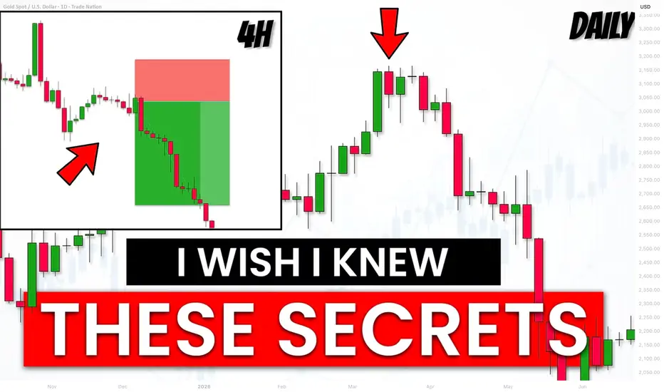
How to Trade Smart Money Concepts SMC with Top-Down Analysis
Today, I will show you how to trade SMC with Top-Down Analysis.
You will learn how to combine liquidity, structure mapping, mitigation and breaker blocks on different time frames for spotting accurate entries in Gold and Forex.
In this strategy, we will use 2 time frames: daily time frame and 4H.
To understand how to use them step by step, let's start with studying 2 price models.
Always start your analysis with a daily time frame.
You will need to identify liquidity supply and demand zones there.
After you see a test of a supply zone on a daily time frame, start analyzing a 4H time frame.
On a 4H, you will need to do structure mapping and make sure that the market is in an intraday bullish trend.
In this bullish trend, you will need to identify Order Block zone.
It will a liquidity demand zone based on the last Higher Low.
Your signal to sell will be its breakout and a 4H candle close below.
Depending on the price action, set your sell limit order on the broken order block zone (it will be either a breaker or mitigation block).
Your stop loss should be above the last Higher High and your take profit should be the next demand zone on a 4H.
Here is the example of such a price model on EURUSD.
The price reached a significant daily supply zone.
After its test, the price dropped, breaking a bullish order block zone.
Selling on its retest (entry was the lowest candle close within a broken OB zone), stop loss was above the highs and tp - the closest 4H demand zone.
Now, let's study the second price model.
If you see a test of a supply zone on a daily time frame, start analyzing a 4H time frame .
On a 4H, you will need to do structure mapping and make sure that the market is in an intraday bearish trend.
In this down trend, you will need to identify Order Block zone.
It will a liquidity supply zone based on the last Lower High.
Your signal to buy will be its breakout and a 4H candle close above.
Depending on a price action, set your buy limit order on the broken order block zone (it will be either a breaker or mitigation block).
Your stop loss should be below the last Lower Low and your take profit should be the next supply zone on a 4H.
Examine the following setup on EURNZD.
We see a test of a significant daily demand cluster.
The pair is bearish on a 4H time frame.
Our signal to buy will be a bullish breakout of an Order Block zone and a 4H candle close above that.
We will set a buy limit on its retest then (entry level will be the highest candle 4H close with OB zone).
TP will be the next 4H supply zone and SL will lie below LL.
2 simple price models that we studied in this video will help you to effectively trade liquidity supply and demand zones.
A combination of 2 time frames, basic structure mapping and change of character will provide an accurate entry signal for your trades.
❤️Please, support my work with like, thank you!❤️
I am part of Trade Nation's Influencer program and receive a monthly fee for using their TradingView charts in my analysis.


Smart Money Concepts SMC Detailed Learning Plan
If you want to learn Smart Money concepts, but you don't know what to start with, this article with help.
I will share with you 5-steps Smart Money Concepts learning plan. 5 important topics to study in SMC.
Topic 1:
Market Structure - the analysis of a behaviour of a price on a chart.
In the contest of Smart Money Concepts you should learn:
-SMC structure mapping
-Market trend identification, trend reversal & change
-SMC important events: BoS, CHoCH
Topic 2:
Liquidity Zones - learn to identify the areas on a price chart where liquidity concentrates.
Topic 3:
Imbalance - one of the most accurate signals of the presence of big players / smart money on the market.
Topic 4:
Order Block - the specific areas on a price chart where institutional traders / smart money are placing significant number of trading orders.
Top 5:
Top-Down Analysis - structured and consistent analysis of multiple time frames.
After you study Topic 1, 2, 3, 4, you should learn to apply these knowledge and techniques on multiple time frames, to make informed decisions, following long-term, mid-term, short-term analysis.
❤️Please, support my work with like, thank you!❤️
I am part of Trade Nation's Influencer program and receive a monthly fee for using their TradingView charts in my analysis.

how to trade asian session break outin this video, I break down a breakout trade using the Asian session high and low, with the objective of targeting liquidity during the London / New York session.
I walk through how price behaves around the Asian range, why liquidity sits above and below it, and how to time entries after a breakout rather than chasing price. This strategy focuses on patience, confirmation, and risk management instead of guessing direction.
This setup is commonly used in intraday trading and works best when combined with session timing and market structure.
Things to Look For
Clear Asian session range
Mark the Asian high and Asian low
Avoid messy or extremely wide ranges
Session timing
Best during London open or New York open
Look for increased volatility after Asia
Liquidity areas
Equal highs / equal lows
Previous day high or low near the Asian range
Obvious stop zones above or below the range
Breakout confirmation
Strong candle close outside the Asian high or low
Expansion in momentum (not a slow drift)
Market structure
Break and close in the direction of the breakout
Optional pullback or retest before entry
What to Do (Execution Plan)
Mark the Asian high and low
Wait for price to break and close outside the range
Confirm direction with structure or momentum
Enter on continuation or a clean retest
Target liquidity
Stops above highs or below lows
Previous session highs/lows
Set risk properly
Stop loss inside the range or below/above structure
Risk only what fits your plan
Avoid overtrading
One clean setup is enough
Common Mistakes to Avoid
Entering before the breakout
Trading during low-volume Asia
Ignoring news
Chasing large candles
Forcing trades when there’s no clear range

Chapter 7 — HOW-TO: MARAL Supports Traders in Live MarketsChapter 7 — How -TO : MARAL Supports Traders in Live Markets (v1.1.0)
Execution Discipline, Risk Control, and Greed Management (Educational Framework)
MARAL — Execution Workflow (Build v1.1.0 — Optional Modules) is a discretionary decision-support framework built in Pine Script for TradingView.
It standardizes live execution through a repeatable workflow:
Context → Qualification → Management → Action (EDC).
✅ No automation. No trade execution. No signal service. No performance guarantees.
MARAL is designed to reduce the biggest live-market problems: overtrading, greed, impulsive entries, timeframe conflict, and weak post-entry control.
7.1 Why Traders Fail Live (Even With “Correct” Concepts)
Many traders understand structure/liquidity ideas — yet still lose because execution breaks down:
Anticipation entries (entering before permission)
Timeframe conflict under pressure (HTF bias ignored by LTF noise)
Unclear invalidation (“Where exactly am I wrong?”)
Weak post-entry control (holding too long, panic exits, SL shifting)
Greed loops (overtrade after wins, revenge after losses)
MARAL is built to control decisions under stress by converting market information into clear states and actionable gates.
7.2 MARAL’s Live Execution Architecture (Boards + Optional Modules)
A) Context Board (Market Environment)
Answers: “Is this a trade-worthy environment?”
Summarizes direction, HTF bias (1H/4H/D), structure, momentum, volatility (ATR%), trend strength (ADX), scoring, liquidity context, plus optional layers such as session/LTF bias/participation.
B) Qualification Gate (Pre-Entry Permission)
Answers: “Do I have permission NOW?”
Blocks trades unless HTF/structure/momentum/regime/liquidity/alignment requirements are acceptable, then issues:
ENTRY PERMISSION: ENTER / WAIT / SKIP.
C) Management Desk (Post-Entry Control)
Answers: “How do I manage this trade without emotion?”
Monitors trade health, phase, obstacles, exit pressure, score trend, risk state, trade age, SL mode, and action state.
D) EDC — Execution Decision Core (Unified State Summary)
Answers: “What is the correct action right now?”
Compresses the entire workflow into:
SETUP → ENTRY PERMISSION → LIQUIDITY → TRADE STATUS → ACTION STATE.
Optional v1.1.0 Modules (Advanced Live Support)
ECI Panel (Execution Confidence Index)
Session Context (ACTIVE / TRANSITIONAL / DEAD)
LTF Execution Bias (15m & 5m) + LTF Exec quality
Divergence as Risk Modifier (context only; no entry trigger)
Post-Entry Stress (Manual Tracker)
Scalp Execution & Exit Panel (permission-locked)
7.3 How MARAL Controls Greed in Live Markets
Greed is not solved by motivation — it is solved by rules + visibility.
MARAL reduces greed through:
WAIT discipline (no permission = no trade)
Setup scoring + grade (filters “almost-good” entries)
Liquidity context & obstacles (prevents holding into walls)
Exit pressure + score trend (prevents emotional holding)
Post-entry stress tracking (controls behavior after entry)
Scalp permission lock (prevents fast-market overtrading)
The result is not “more trades.”
The result is better decisions and fewer mistakes.
7.4 Key Live-Market Features (How to Use MARAL Correctly)
1) Permission-First Execution (ENTER / WAIT / SKIP)
ENTER = minimum execution quality is met
WAIT = context is not confirmed (do not force entries)
SKIP = environment is unsuitable (chop/regime weakness/conflict)
2) Alignment Score + Grade (Quality Control)
Grades are execution quality labels, not predictions.
Higher grades generally reflect cleaner agreement across direction, momentum, HTF context, structure, and liquidity environment.
3) Liquidity Context + Obstacle Ahead (Risk Awareness)
Highlights sensitive zones (PDH/PDL and swing liquidity).
This helps avoid entering into traps or holding into “walls”.
4) MTF/LTF Diagnostics (Timeframe Discipline)
MTF Status: ALIGNED / MIXED / CONFLICT
LTF Exec (optional): SUPPORTIVE / WEAK / RISKY / AVOID
5) Management Desk (Post-Entry Control)
MARAL continues beyond entries:
Trade Status: VALID / RISKY / WEAK
Exit Pressure: LOW / RISING / HIGH
Action State: HOLD / TIGHT SL / SCALE OUT / EXIT
7.5 Core Filters (Copy-Safe Disclosure)
MARAL uses 6 core market filters + multiple execution intelligence layers (structure, displacement, scoring/grades, MTF/LTF diagnostics, and post-entry management).
7.6 Post-Entry Stress (Manual Tracker) — Deep Live Explanation
Why this module exists
Most traders lose control after entry (panic, greed, SL shifting, refusing to exit, adding emotionally).
Post-Entry Stress converts post-entry behavior into objective states:
✅ RISK STATE: LOW / MED / HIGH
✅ ACTION: HOLD / REDUCE / PROTECT / EXIT
This is not a signal engine. It is a discipline engine.
What you input (manual)
Tracking ON/OFF — enable only when you have a real position
Direction — Long or Short
Entry Price — your actual filled entry (not candle close)
Stop Loss (recommended) — your planned SL (manual or ATR-based)
What it monitors (conceptually)
MAE (ATR) — adverse excursion measured in ATR units (stress magnitude)
MFE (ATR) — favorable excursion measured in ATR units (progress magnitude)
Rejection pressure (wick aggression)
Volatility expansion
Opposing pressure (conditions flipping against your trade)
SL safety context (when SL is provided)
How to read it live
LOW → trade is behaving normally → HOLD
MED → stress building → REDUCE / PROTECT (rule-based)
HIGH → risk is dominant → PROTECT / EXIT
SL compromised → trade is compromised → EXIT
Professional rule:
If the stop is compromised, the trade is compromised.
7.7 MARAL v1.1.0 Feature Index — 56 User-Facing Features (Panels)
A) Context Board — 18 Features (Environment + Alignment)
1.DIRECTION — Bullish / Bearish / Neutral bias derived from the master scoring engine.
2.H1 CONTEXT — HTF1 bias state (ON/OFF; Bull/Bear/Neutral).
3.H4 CONTEXT — HTF2 bias state (ON/OFF; Bull/Bear/Neutral).
4.DAILY CONTEXT — Daily bias state (ON/OFF; Bull/Bear/Neutral).
5.STRUCTURE — Bull Struct / Bear Struct / Neutral Struct (swing structure mapping).
6.MOMENTUM — UF-RSI momentum state: BULL / BEAR / NEUTRAL.
7.VOLATILITY (ATR%) — ATR as % of price for stability/regime awareness.
8.TREND STRENGTH (ADX) — ADX-based trend quality reading.
9.LONG SCORE + Grade — Long alignment score + grade (A++/A+/A/B/No-Trade).
10.SHORT SCORE + Grade — Short alignment score + grade (A++/A+/A/B/No-Trade).
11.ALIGNMENT SCORE — master execution score used for live filtering.
12.LIQUIDITY CONTEXT — HIGH / NEUTRAL / LOW (event/near/eventless context).
13.PARTICIPATION (optional) — STRONG / NEUTRAL / WEAK (participation quality context).
14.MTF STATUS — ALIGNED / MIXED / CONFLICT (timeframe agreement diagnostic).
15.SESSION (optional) — ACTIVE / TRANSITIONAL / DEAD / OFF (session context).
16.15m BIAS (optional) — 15-minute execution bias state (Bull/Bear/Neutral).
17.5m BIAS (optional) — 5-minute execution bias state (Bull/Bear/Neutral).
18.LTF EXEC (optional) — SUPPORTIVE / WEAK / RISKY / AVOID (micro execution quality).
B) Qualification Gate — 8 Features (Permission to Execute)
19.SETUP — LONG / SHORT / WAIT based on qualified candidate conditions.
20.HTF CONTEXT — OK / WARN / BAD (direction compatibility check).
21.STRUCTURE — OK / WARN / BAD (structure confirmation strength).
22.MOMENTUM — OK / WARN / BAD (momentum confirmation + chop avoidance).
23.VOL/REGIME — OK / WARN / BAD (volatility + trend regime suitability).
24.LIQUIDITY — HIGH / NEUTRAL / LOW (execution safety context).
25.ALIGNMENT — score vs threshold (example: 78 / 65).
26.ENTRY PERMISSION — ENTER / WAIT / SKIP (final execution gate).
C) Management Desk — 11 Features (Post-Entry Control)
27.TRADE STATUS — VALID / RISKY / WEAK (idea health state).
28.MARKET PHASE — IMPULSE / PULLBACK / CONTINUATION / RANGE (phase awareness).
29.OBSTACLE AHEAD — YES / NO (PDH/PDL or swing proximity risk).
30.EXIT PRESSURE — HIGH / RISING / LOW (risk escalation logic).
31.MOMENTUM HEALTH — STRONG / WEAKENING / WEAK / NEUTRAL (post-entry momentum state)
32.SCORE TREND — IMPROVING / DETERIORATING / STABLE (quality drift).
33.RISK STATE — OVEREXTENDED / NORMAL (distance vs volatility).
34.TRADE AGE — FRESH / MID / LATE (time-in-trade awareness).
35.SL MODE — BE OK / TIGHT / NORMAL (stop behavior guidance).
36.ACTION STATE — HOLD / TIGHT SL / SCALE OUT / EXIT (rule-based action).
37.ACTIVE WINDOW — ON / OFF (management window after last setup).
D) EDC — Execution Decision Core — 5 Features (Unified Action)
38.EDC: SETUP — LONG / SHORT / WAIT.
39.EDC: ENTRY PERMISSION — ENTER / WAIT / SKIP.
40.EDC: LIQUIDITY — HIGH / NEUTRAL / LOW.
41.EDC: TRADE STATUS — VALID / RISKY / WEAK / —.
42.EDC: ACTION STATE — HOLD / TIGHT SL / SCALE OUT / EXIT / —.
E) ECI Panel (Optional) — 3 Features (Execution Confidence)
43.ECI SCORE + Grade — confidence context derived from alignment score (graded).
44.RISK MOD (optional) — POSITIVE / NEGATIVE / NEUTRAL (divergence-based modifier).
45.CAP NOTES — automatic constraints summary (why quality is capped).
F) Post-Entry Stress Panel (Optional Manual Tracker) — 6 Features
46.TRACKING — ON / OFF (manual tracker state).
47.DIRECTION — Long / Short (tracked position side).
48.MAE (ATR) — adverse excursion measured in ATR units (stress magnitude).
49.MFE (ATR) — favorable excursion measured in ATR units (progress magnitude).
50.RISK STATE — LOW / MED / HIGH (stress classification).
51.ACTION — HOLD / REDUCE / PROTECT / EXIT (stress-driven behavior).
G) Scalp Exec Panel (Optional; Permission-Locked) — 5 Features
52.SCALP ENTRY — PERMITTED / BLOCKED (strict permission lock).
53.ENTRY QUALITY — A / B / C (execution quality classification).
54.MGMT — HOLD / PROTECT / PARTIAL / EXIT (fast management instruction).
55.SL CONTEXT — VALID / AT-RISK / COMPROMISED / — (stop safety context).
56.PARTICIPATION — STRONG / NEUTRAL / WEAK / OFF (context-only quality).
7.8 Visual & On-Chart Execution Tools (Built-In)
Risk Planning (optional): Auto SL + TP1 + TP2 + TP3 (ATR-based)
PDH/PDL reference lines
Swing liquidity points (pivot highs/lows)
Optional state markers (LONG/SHORT)
Candle coloring by bias
7.9 Professional Clarity (What MARAL Is / Is Not)
MARAL supports traders by:
enforcing permission-based execution (ENTER / WAIT / SKIP)
reducing overtrading through gating + scoring
standardizing post-entry management via Trade Status + Action State
showing risk early (exit pressure, obstacles, deterioration)
enabling disciplined scalping via permission locks (optional)
MARAL does not:
predict the future
guarantee outcomes
execute trades
replace learning, discipline, or risk management
full maral panel togather for USD/GOLD
Permission first. Risk always. Discipline forever.
This script and the content in this chapter are provided strictly for educational and informational purposes.
Note : Discretionary decision-support only: MARAL is a chart-analysis workflow designed to help traders structure their decision process (context → qualification → management).
Not financial advice: Nothing here is investment advice, trading advice, or a recommendation to buy/sell any asset.No automation / no execution: The script does not place trades, execute orders, or provide any guaranteed “signal service.”No guarantees: Trading involves significant risk. Past performance does not predict future results. Any examples shown are for learning only.User responsibility: You are solely responsible for your own decisions, risk management, position sizing, and compliance with your local regulations and broker rules.
Use at your own risk. Trade responsibly.
#TradingView #PineScript #TradingEducation #Execution #TradingPsychology #RiskManagement #Discipline #NoTradeZone #Overtrading #GreedControl #TradeManagement #MarketStructure #Liquidity #SmartMoney #ICT #MTFAnalysis #PriceAction #ATR #ADX #RSI #Scalping #IntradayTrading #Forex #Crypto #Stocks

Unified Support And Resistance Theory: real mechanical levelsBefore we start:
Wave Auction Theory and many preceding posts concerning the levels are now considered legacy. It’s an absolutely working entity, but it’s just a ‘model’.
Volume & signed volume & volume delta would be used interchangeably;
Timeframe = ‘rolling’ amount of data we utilize, e.g. weekly, intra-week.
Resolution = aggregation frequency we use to represent that timeframe, e.g 30m.
E.g a daily (intra-day) timeframe on CME can be represented as 276 5min bars, 46 30min bars, 12 2h bars, or 1380 1min bars, etc. (Yes btw, that's your seasonal windows you heard from me).
Support and resistance levels are exclusively based on (aggregated) tick data, not on orderflow, not on liquidity. Liquidity and CVD based level are structural levels, they form ‘before’ market and limit orders meet, before ticks even emerge. For gaining this information mathematically, you need these 2 scripts: volume analysis & liquidity analysis .
Prerequisites:
Uniform / Sagitta grid , these grid levels would be later referred as anchors or seeds. We would be finding & using only the closest real levels to these anchors.
How levels get positioned & cleared aka consumed aka broken. The same logic would apply to other kinds of levels, not only price-based ones. The main rule stays the same: a level can be positioned with new bars ‘only’ on the same resolution it was located initially.
How to separate (aggregated) tick data into analytical units aka auctions (also briefly mentioned there )
(optional) knowing what Bias-Variance Tradeoff is.
I think USART is not a model, good chances are this is the endpoint source entity. It explains the deepest low-level nature of support & resistance levels, which is tightly linked with information theory. Ironically, the nature of support and resistances is much closer to DSP (Digital Signal Processing) then all this endless variety of custom time-domain filters. Let’s start.
3 Methods of discovering S&R levels
Mathematical method (the blueprint of reality): this is the most general way. Represented by what I called MBAD , QBAD , and PBAD .
- Performs best when market activity is typical or decreased
- Performs ok when market activity is increased
- Performs bad when market activity is extreme
Mechanical method (‘the’ objective reality): these are the real actual levels, this post is focused on them.
- Performs best when market activity is increased
- Performs ok when market activity is extreme
- Performs ok when market activity is typical or decreased
Representation/learning/intuitive/”by feel” method (what objective reality Wants to be): a quick & compressed grasp of reality. An experienced organic would just take a look at the data and ‘feel’ where the levels are. In code, it can be done with a proper clustering algorithm & a couple of other things. The idea is to match the way an organic brain does it. Another script and/or post would be made for this one.
- Performs best when market activity is extreme
- Performs ok when market activity is increased
- Performs bad when market activity is typical or decreased
Also, knowing the 2nd and 3rd method would save you if for some reason your quant math is unavailable atm. Like imagine you rely on MBAD for your objective trading signals, but need to trade / make a decision fast without TV nearby.
Mechanical (real) levels
Signal = information = change
In (aggregated) tick data, supports and resistances are simply locations of change events in (Price & Time & (signed) Volume) field. This is it, the most general and complete definition of what S&R levels really are, mechanically.
These change points carry & reveal & prove information. Imagine a counter example, you have a perfect straight diagonal line (not necessary price movement, any process) that goes on and on forever. There are no distinct points of interest to detect, no S&R levels there, because nothing changes, it just keeps going as it goes. Now once smth changes, e.g it reverses, now we have a point of interest at that reversal.
How to define changes in price, time, volume (necessary for final levels)
Given tick data (aggregated, say 5min chart) has 3 types of fields i.e Price, time, volume delta, we have 3 types of levels as well (we’ll need all the types, but won’t need every individual level).
Choose correct data resolutions first
The mechanical method requires 3 distinct resolutions for each type of level over the same timeframe.
Say our timeframe is intra-week aka inter-day, on CME, we need:
High resolution: last 230 30min bars, for price-based levels. High variance, low bias.
Medium resolution: last 60 2h bars, for time-based levels. Medium variance, medium bias.
Low resolution: last 20 6h bars, for volume-based levels. Low variance, high bias.
^^Me I like to display all 3 resolutions on the same chart
Price-based supports and resistances
^^ When the direction of price movement changes, so simply pivot highs and pivot lows, a couple of examples are marked. Note: when the first or the last datapoint in a triplet is NaN/na, 2 points are enough to detect a pivot high/low. E.g: na, 45, 67: 45 is pivot low; 76, 11, na: 11 is pivot low.
Notice that we use bar highs and lows, these points are recorded by price rule (highest and lowest print of a bar).
Time-based supports and resistances
^^ Basically open-close pairs between the bars: closing print of a bar & opening print of the next following bar. If the previous or next bar is na, like when a session starts/ends. We then use only one print. Study the screenshot pls. After it is clear if a level is becoming resistance or support, we can get rid of one of the prints and choose the final print representing the level: the lowest out of 2 for supports, the highest out of 2 for resistances. Only then levels are considered as formed.
Notice that we use close and open here, these points are recorded by time rule (earliest and latest prints of a bar).
Volume-based supports and resistances
^^ When (inferred or real, depending on asset class) volume delta switches from negative to positive, both bars (say the last with positive delta and the first with negative delta) would provide us 2 levels each: price of the largest sell tick and price of the largest buy tick. This info is unavailable in retail trading platforms, but good news we don’t need it for the assets where we prefer inferred volumes vs the real ones, so equities, bonds, FX. There. Both largest sell tick price and largest but tick price would collapse to bar midrange.
...
The process
Once we know how to locate the levels, we need to pick the ones we need:
Put/imagine the anchors on every finished analytical unit aka auction, and on currently on-going auction. In this post we’d separate market activity into auctions by trading sessions.
Always recall that each anchor has a predetermined lifespan (levels do Not exist 4ever if not-broken):
^^ in mechanical method we don’t use limit levels
After a level is formed (a session is finished):
- Basis lives for 1 more session
- Deviations live for 2 more sessions
- Extensions live for 3 more sessions
- We don’t use limit levels in mechanical method
Look when a new auction opens. We need to find supports below and resistances above.
Find the closest real levels (both positioned and not-positioned ones) to anchors, priority is always: price > time > volume. This way, each anchor would be represented and objectified by 1 or several nearby real mechanical levels. That’s what fibo traders are missing: instead of locating the real price-action based levels ‘nearby’ dem fibo levels, they use the fibo levels like the endpoint truth.
^^ levels for the next sessions
Final hard stop loss & take profit for each level is the level itself +- 1 volatility measure, which is ~ the auction range divided by 3.4641 (aka sqrt12)., of that auction that originated the level. I can explain more how to make it absolutely data-driven and real on request, but it's a negligible improvement.
Improved stop losses: if a level is already positioned (tested), it has a native soft invalidation point. If it’s hit, you can keep the final hard SL but try to exit at breakeven where you’ve entered. It doesn’t mean that the anchor level itself is broken, remember, we can represent each anchor with several real levels nearby.
Improved take-profits: in any doubts, in questionable context etc, 1:1 Risk:Reward is the rule. Because from info perspective, when price leaves the field of a level (remember +- 1 vola measure), it loses contact with it, now it’s outside of the influence area of that level, it means our position also loses the connection with the level from info perspective.
Otherwise, if there’re some supporting factors, you can keep the position, but remember, now you're doing long-n-hold or short-n-hold. One of the supporting factors can be when liquidity and volume imbalance are ‘both’ favoring the hold.
...
∞

'Two Charts, Same Pattern, Totally Different Market - Here's Why🔥 THE DEEPEST TRUTH MOST TRADERS NEVER LEARN: CONTEXT IS THE MARKET’S REAL LANGUAGE
If you stare at enough charts, you’ll start to see a pattern problem — and it’s destroying traders every single day. Everyone wants to react to what price looks like, instead of learning how price behaves.
Two charts can look exactly the same — same pattern, same shape, same pullback, same consolidation, same breakout — and still produce completely opposite outcomes.
Why?
Because context isn’t visual.
Context is structural.
Context is narrative.
Context is market psychology expressed through order flow.
A lot of traders are studying candles… but the candles aren’t the truth.
The phase is the truth.
The position inside the leg is the truth.
The liquidity story is the truth.
And if you don’t know the truth, the market punishes you.
⸻
🔥 THE DIFFERENCE BETWEEN WINNING AND LOSING IS NOT THE PATTERN — IT’S THE ENVIRONMENT
Let’s break it down clean:
A pullback inside a strengthened, impulsive uptrend is opportunity.
Smart money is reloading.
Volume supports the continuation.
Liquidity is building below swing lows.
The correction is healthy — supported by momentum, structure, and expansion.
But here’s the flip:
A pullback inside a weakened, distributive market is a death trap.
The leg is tired.
Momentum is fading.
Liquidity is drying out.
Smart money is offloading inventory — not accumulating.
To the naked eye, both pullbacks look the same.
To the trained eye, they couldn’t be more different.
This is why top-down analysis matters.
⸻
🔥 BREAKOUTS PROVE IT EVEN CLEARER
A breakout during a momentum phase is fuel.
It tells you price is expanding with force, not faking direction.
But a breakout inside distribution?
That’s manipulation.
That’s inducement.
That’s the market selling strength to buyers who don’t understand phase transitions.
From the outside, both breakouts look clean.
Both breakouts feel bullish.
Both breakouts trigger emotion.
But one breakout is confirming continuation —
The other breakout is preparing reversal.
And traders who don’t understand context end up buying the exact candle professional money is using to exit.
⸻
🔥 THIS IS WHY MOST TRADERS LOSE: THEY TRADE SHAPES, NOT STORIES
Most people can read candles.
Very few can read intention.
Most people see structure.
Very few understand order flow.
Most people memorize patterns.
Very few study phases, accumulation, distribution, inducements, and macro positioning.
And when you’re blind to context, price movement starts looking random — not because it is random, but because your process is incomplete.
⸻
🔥 TOP-DOWN ANALYSIS IS THE ANTIDOTE
When you move from 4H → 30M → 5M, the entire game changes.
You start seeing:
• What leg price is responding to
• Whether the move is correction or expansion
• Whether the premium/discount environment supports continuation or reversal
• Whether volume aligns with market direction
• Whether structural shifts have real intention
• Whether the pullback is healthy or distributive
• Whether you’re trading strength or exhaustion
This is not about finding entries.
This is about understanding story.
And when you understand the story, the market stops attacking you — it starts communicating with you.
That’s why I always say:
📌 Structure without context is noise.
📌 Patterns without narrative are traps.
📌 Entries without phase analysis are gambling.
⸻
🔥 SMART MONEY DOESN’T TRADE CANDLES — IT TRADES PHASES
Accumulation → Manipulation → Expansion → Distribution.
That cycle has existed forever — way before candlesticks, way before indicators, way before retail charts.
Jesse Livermore was teaching it 100 years ago without even using modern language:
Price doesn’t move because of patterns — price moves because of positioning.
And that’s the same message today, just spoken through volume, OBs, HTF narrative, inducements, liquidity sweeps, and structural transitions.
Context IS Smart Money Concepts.
Context IS the real edge.
Context IS the only reason price behaves the way it does.
⸻
🔥 FINAL MESSAGE FOR TRADERS: IF YOU CAN’T SEE CONTEXT, YOU’RE NOT SEEING THE MARKET
If trading feels confusing, unpredictable, inconsistent, emotional — it’s not because you’re bad at trading.
It’s because you’re trading charts instead of trading environments.
Two charts can be identical.
Only context tells you whether the pullback deserves your money —
or your patience.
Only context tells you whether the breakout deserves conviction —
or caution.
Only context tells you whether the structure deserves participation —
or avoidance.
Context tells the truth.
Everything else is noise.

How to trade every smart money concept: HTF tutorialI talk about trading HTF concepts inside of the smart money world not chasing minutia but paying attention to the larger levels

You're Early, Not Wrong*Trading Isn’t Hard Because of Entries.
It’s Hard Because Most Traders Don’t Wait for Alignment.
Most traders think trading is hard because:
• They can’t find the right entry
• They struggle to focus
• They’re distracted
• They don’t have enough time
• They think their strategy doesn’t work
Those are symptoms.
The real reason trading feels hard is because most traders don’t understand alignment.
⸻
📍 What Alignment Actually Means
Trading is not about being early.
It’s about being in sync.
Price moves cleanly only when:
• Higher-timeframe objectives are active
• Liquidity has been engineered and taken
• Price is delivered to fair value (premium/discount)
• Lower timeframes execute the higher timeframe plan
If even one piece is missing, the market feels random.
It’s not random — it’s misaligned.
⸻
📉 Why “Good Setups” Fail
Most losses don’t come from bad strategies.
They come from forcing execution before alignment.
Example:
• Liquidity gets swept
• Traders enter immediately
• Nearest order block fails
• Price goes deeper
Nothing broke.
Price was simply seeking better alignment on a higher controlling timeframe.
⸻
⏳ Patience Is Not Waiting for Price
Patience Is Waiting for Timeframes to Agree
This is the part no one wants to hear:
The market doesn’t pay you for being active.
It pays you for being in position at the right moment.
Alignment is rare.
That’s why consistency is rare.
⸻
🧩 Once You See Alignment, Trading Gets Quiet
When timeframes are aligned:
• You stop chasing
• You stop panicking when OBs fail
• You stop needing constant entries
• You stop overtrading
You start waiting with intent.
⸻
Final Thought
If trading feels hard right now, ask yourself:
Am I actually wrong… or am I just early?
There’s a difference.
🧠 The market is never confusing — it’s just ahead of you.
Let alignment catch up before you act.

Top-5 tips for Top-Down Multiple Time Frame Analysis Trading
I am trading multiple time frame analysis for many years. After reviewing trading ideas from various traders on Tradingview, I noticed that many traders are applying that incorrectly
In this article, I will share with you 5 essential tips , that will help you improve your multiple time frame analysis and top-down trading.
The Order of Analysis Matters
Multiple time frame analysis is also called top-down analysis for a reason. When you trade with that, you should strictly start your analysis with higher time frames and then dive lower, investigating shorter-term time frames.
Unfortunately, most of the traders do the opposite . They start from a lower time frame and finish on a higher one.
Above are 3 time frames of EURGBP pair: daily, 4h, 1h.
To execute multiple time frames analysis properly, start with a daily, then check a 4h and only then the hourly time frame.
Limit the Number of Time Frames
Executing multiple time frame analysis, many traders analyse a lot of time frames.
They may start from a weekly and finish on 5 minute time frame, going through 5-8 time frames.
Remember that is it completely wrong . For execution of a multiple time frame analysis, it is more than enough to analyse 3 or even 2 time frames. Adding more time frames will overwhelm your analysis and make it too complex.
Analyse Particular Time Frames
Your multiple time frame analysis should be consistent and rule-based. It means that you should strictly define the time frames that you analyse.
For example, for day trading, my main trading time frames are daily, 4h, 1h. I consistently analyse ONLY these trading time frames and I look for day trades only analysing this combination of time frames.
Higher is the time frame, stronger the signal it provides
Trading with multiple time frame analysis, very often you will encounter controversial signals: you may see a very bullish pattern on a daily and a very bearish confirmation on 30 minutes time frame.
Always remember that the higher time frames confirmations are always stronger , and their accuracy and probability is always higher.
Above there are 2 patterns:
a head and shoulders pattern on a daily time frame with a confirmed neckline breakout, and an inverted head and shoulders pattern on a 4h time frame with a confirmed neckline breakout.
2 patterns give 2 controversial signals:
the pattern on a daily is very bullish and the pattern on a 4h is very bearish.
The signal on a daily time frame will be always stronger ,
so it is reasonable to be on a bearish side here.
You can see that the price dropped after a retest of a neckline of a head and shoulders on a daily, completely neglecting a bullish pattern on a 4H.
Each Time Frame Should Have Its Purpose
You should analyse any particular time frame for a reason.
You should know exactly what you are looking for there and what is the purpose of your analysis.
For example, for day trading, I analyse 3 time frames.
On a daily, I analyse the market trend and key levels.
On a 4H time frame, I analyse candlesticks.
On an hourly time frame, I look for a price action pattern as a confirmation.
On GBPAUD on a daily, I see a test of a key horizontal resistance.
On a 4H time frame, the price formed a doji candle.
On an hourly, I spotted a double top, giving me a bearish confirmation.
These trading tips will increase the accuracy of your multiple time frame analysis. Study them carefully and adopt them in your trading.
❤️Please, support my work with like, thank you!❤️
I am part of Trade Nation's Influencer program and receive a monthly fee for using their TradingView charts in my analysis.
"The Liquidity Trap 90% of Traders Completely Miss"🔥 EVERY TRADER GETS TRAPPED HERE… EXCEPT THE ELITE
You watch the highs and lows, the support and resistance, the obvious levels…
And you think you’re safe.
You’re not.
The real move comes from liquidity inside the swing — the part most traders never notice.
1️⃣ External Liquidity is What Retail Chases… Not the Real Move
• Traders see obvious highs, obvious lows, support, resistance.
• They think: “Price will reverse here.”
• This is the illusion the market creates.
Here’s the truth:
External liquidity is bait, not the target.
It’s where most traders get trapped.
⸻
2️⃣ Internal Liquidity is Where the Smart Money Lives
Inside every swing — every leg up or down — exists hidden liquidity:
• Micro Order Blocks
• Lower highs / higher lows inside the leg
• Stop clusters designed to trigger retail exits
Most traders don’t look inside the leg. They only see the edges.
That’s the trap. That’s where your edge comes in.
Nugget: The move you want usually comes after the internal liquidity is cleared, not at the obvious high/low.
⸻
3️⃣ The Sequence Traders Must See (Stop Losing to the Trap)
Here’s the real SMC sequence, step by step:
A. External Sweep → The Bait
• Everyone watches it
• Everyone reacts
B. Internal Liquidity Run → The Real Target
• Hidden inside the leg
• Where stops, inducements, and OBs cluster
• The market clears this before the real move
C. Displacement → The Delivery
• After internal liquidity clears, price finally moves in the “true” direction
• This is when smart traders enter with confidence
Nugget: If you chase the sweep and ignore internal liquidity, you’re giving your edge to the market.
⸻
4️⃣ How to Spot Internal Liquidity Like a Pro
Look for these patterns inside the leg:
• Lower highs / higher lows forming in micro OBs
• Price clustering around imbalance areas
• Fake breaks that lure retail orders
• Zones where price pauses before real expansion
Golden Nugget: Price gives clues every time. The problem is, 90% of traders don’t see them.
⸻
5️⃣ Why Traders Lose Even When They’re “Right”
• You can have the right bias
• You can see the sweep
• You can even pick the “obvious OB”
But if you enter too early or in the wrong micro-structure, your stop gets taken, and the move happens without you.
This is why SMC isn’t about guessing.
It’s about understanding sequence, intention, and liquidity footprint.
⸻
6️⃣ Mindset Shift: Read Market Intention, Not Candles
Stop asking:
• “Did it break the high?”
• “Did it hit my level?”
Start asking:
• “Where is the internal liquidity being cleared?”
• “What is the smart money engineering?”
• “Where will the market take the stops before the real move?”
Nugget: Reading price action without seeing internal liquidity is like driving blind.
⸻
7️⃣ The SMC Edge You Must Internalize
• External liquidity = bait → observe
• Internal liquidity = real objective → anticipate
• Displacement = delivery → execute
When you see it unfold:
• Your entries become surgical
• Your stops make sense
• Your bias is confirmed before most traders even blink
You’re not reacting to the market.
You’re predicting its intentional sequence.
⸻
🔥 Final Takeaway (Save This)
The market isn’t random.
It’s designed to trap traders.
External liquidity tricks 90% of traders into early stops.
Internal liquidity reveals where the real move will come.
Learn to see it.
Respect it.
Trade it.
This is the real sauce of SMC trading.
Not flashy indicators. Not random setups.
Sequence, liquidity, inducement.
Pro Nugget: Once internal liquidity is in your sights, price becomes predictable.
The rest? Just execution.

''iPhone vs Laptop Trading: The Truth Nobody Talks About''Alright, let’s get straight to it. I’ve been watching traders debate this forever — phone or laptop. Here’s my breakdown, from someone who actually trades multi-timeframe SMC setups, tracks liquidity, and executes in real-time.
⸻
1️⃣ Execution and Speed
• On a laptop, you’ve got full visibility: multiple monitors, larger charts, higher timeframe context, all indicators and order blocks at a glance.
• On iPhone? Limited view, smaller screen, harder to see context, and micro adjustments take longer.
• The reality: Speed matters. A 1-minute confirmation or lower-high break can happen fast. If you’re on a phone, you risk missing that critical move or entering late.
⸻
2️⃣ Multi-Timeframe Analysis
• Edge comes from analyzing multiple chart intervals to see the bigger picture and confirm setups.
• Laptop: Side-by-side charts, smooth workflow, all intervals visible at once.
• On the phone, switching between timeframes is clunky, slow, and mentally taxing. You’ll start guessing instead of confirming.
• Key takeaway: Serious traders of any style know: a laptop gives you the clarity, control, and precision that’s hard to achieve on a phone.
⸻
3️⃣ Precision of Orders
• Laptop: You can place precise limit entries, manage stop losses, and see where liquidity clusters are.
• Phone: Accidental taps, misclicks, or lag can cost you a trade. Especially when dealing with small spreads, tight stop losses, or micro entries.
• Lesson: Mistakes on micro orders aren’t small. They erode both capital and confidence.
⸻
4️⃣ Situational Use
• Phone trading isn’t useless. It’s fine for monitoring, tracking TPs, or checking alerts when you’re away from your desk.
• But if you’re entering, executing, or actively managing high-leverage trades — laptop wins hands down.
⸻
5️⃣ Psychology and Focus
• Laptop setups create a trading environment: focus, fewer distractions, full screen, proper charts.
• Phone trading often comes with notifications, background apps, and temptation to “glance and guess.”
• Your mindset matters as much as your setups. Treat trading like a full-time process, not a side hobby.
⸻
6️⃣ My Personal Take
• I’ve tested both. I’ll check charts on my phone sometimes — especially during quick monitoring sessions.
• But every serious execution, every multi-timeframe setup, every liquidity play — it happens on my laptop. That’s where precision, patience, and professionalism live.
⸻
🔥 Key Lessons
1. Phone = monitoring & alerts only.
2. Laptop = execution & analysis.
3. Edge isn’t just charts — it’s control, speed, and clarity.
4. You can’t shortcut this without costing yourself trades or your confidence.
⸻
💡 Visual Reference:
I posted screenshots to show the difference between iPhone and laptop trading setups. Laptop view is on the right side, showing full charts and multi-interval visibility. iPhone view is on the left side, compact and limited. This makes it clear why execution and workflow are easier on a laptop.
Bottom line: Don’t kid yourself. Your tools matter, but more importantly, how you use them separates amateurs from pros.
I’m curious — who’s still trying to trade full-time on a phone? Let’s see if they’re really ready to compete.
Internal vs External Liquidity: The Skill Nobody Actually MasterMost traders think they understand liquidity…
They mark equal highs, equal lows, and call it a day.
But let me tell you something real:
Knowing liquidity exists is NOT the skill.
Knowing WHICH liquidity matters right now is the real edge.
That’s the difference between:
✔ catching continuations
✔ catching reversals
✔ avoiding trap entries
✔ timing precision entries
✔ and actually staying in profitable moves
Most traders lose because they don’t understand the hierarchy of liquidity.
Let me break this down the way nobody online does:
⸻
🔥 1. Internal Liquidity = Fuel for Continuation
This is the liquidity inside the active range.
It sits between swing points, inside consolidation, above minor highs, below short-term lows.
Internal liquidity gets taken when:
• Market is in trend
• Price is compressing
• Price is building inducement
• Algorithms are collecting “fuel” before delivery
When internal gets swept, DO NOT expect a reversal.
Expect a continuation into the next external pool.
This is why most traders get faked out:
They see a sweep and scream “reversal!”
But they’re reacting to internal liquidity — not the real turning point.
⸻
🔥🔥 2. External Liquidity = The Real Reversal Zones
External liquidity sits at the RANGE BOUNDARIES:
• The major swing high
• The major swing low
• The extreme points of the structure
These are the levels that actually SHIFT trend, cause deep pullbacks, or start major legs.
This is where smart money:
✔ Clears the crowd
✔ Triggers stops
✔ Closes positions
✔ Repositions
✔ Begins delivery in the opposite direction
External liquidity is the turning point.
Internal liquidity is just the build-up.
If you can’t distinguish the two, every reversal will feel random to you.
⸻
🔥🔥🔥 3. Here’s the Rule Nobody Teaches:
If price sweeps internal → expect continuation.
If price sweeps external → expect correction or reversal.
But here’s where MOST traders fail:
They don’t know which one they’re looking at.
If you think a reversal is starting but you’re still inside the range…
You’re not trading a reversal.
You’re trading hopium.
⸻
🔥🔥🔥🔥 4. How Smart Money Chooses Which Liquidity to Target First
This is where your real edge comes in.
Smart money asks ONE question:
“Which pool unlocks the next delivery path?”
If the next objective is above → they’ll sweep internal lows to build power.
If the next objective is below → they’ll sweep internal highs to induce buyers.
Smart money is always targeting what unlocks:
✨ the cleanest path
✨ the imbalanced leg
✨ the untouched zone
✨ the unmitigated order block
✨ the next HTF objective
You think the sweep is the entry.
They see the sweep as the setup.
⸻
🔥🔥🔥🔥🔥 5. Here’s the TRUTH:
Internal liquidity fuels the move.
External liquidity flips the move.
If you master this one skill, your whole trading shifts.
Your confidence shifts.
Your timing shifts.
Your strike rate shifts.
You stop chasing noise.
You stop guessing bottoms.
You stop guessing tops.
You start reading intention — not reacting to candles.
Most of the trading world knows liquidity.
Almost nobody knows when liquidity actually matters.
That’s the part the textbooks don’t teach.
That’s the part the YouTubers don’t show.
That’s why most traders stay confused for years.
Internal liquidity gets you in —
External liquidity gets you paid.
Master the difference and you’ll trade with precision most people only dream of.

"The Myth of Confirmation - What Retail Gets Wrong Every Day"🔥 THE TRUTH ABOUT MARKET “CONFIRMATION” (What Retail Never Realizes)
Most traders think confirmation comes from indicators, patterns, candle shapes, or repeating formations on lower timeframes.
This is the greatest misunderstanding in trading.
Confirmation does NOT come from the LTF.
Confirmation comes from alignment of the delivery cycle — and the LTF only expresses what the HTF already decided.
Retail thinks the 5M “creates” trend.
Institutions know the 5M merely reflects it.
Here’s the real breakdown institutions use:
⸻
1. Confirmation = Completion of a Phase, Not a Pattern
A market only confirms when a structural phase fully completes, meaning:
• Liquidity objective hit
• Internal structure reset
• Order flow aligned
• Efficient price or imbalance corrected
• Pullback cycle finished
• New impulsive leg prepared
This is confirmation.
Not a candle.
Not an indicator.
Not a shape on your chart.
⸻
2. LTF Structure Means NOTHING Without HTF Context
Retail loves reacting to:
• 5M BOS
• 1M pullback
• 15M FVG
• Candle patterns
• Trend lines
None of these matter if the HTF hasn’t finished its development cycle.
This is why traders lose:
They see “confirmation” while the HTF is still in a build-up, not a release phase.
⸻
3. The Market Confirms Twice — Retail Only Sees One
Institutional traders track two confirmations:
Macro Confirmation (HTF)
This tells the market what it wants to do next
— continuation or pullback.
Micro Confirmation (LTF)
This tells the market when it’s safe to execute
— trend shift + pullback + OB tap + displacement.
Retail only waits for micro confirmation.
They skip macro confirmation.
So they trade inside noise.
⸻
4. Candles Don’t Confirm — the Cycle Confirms
People over-read 5M candles, ignoring the fact that candles are only expressions of liquidity movement.
You can’t read intent from shape.
You read intent from position in the cycle.
The same candle means:
• continuation in one phase
• reversal in another
• manipulation in another
Only the cycle gives it meaning.
⸻
5. The Market Doesn’t Confirm For You — It Confirms ITSELF
This is the coldest truth most will never learn:
Price never confirms your bias.
Price only confirms where it is in the timeline.
If you don’t know the timeline,
you don’t know the confirmation.
TL;DR
(Beginner/Simple)
Confirmation = Cycle Completion + Alignment
NOT a candle pattern or indicator.
You don’t follow confirmation.
You follow timing.
The Deeper Logic Behind Price Delivery (Nobody Talks About This)Most traders think some pairs are slow and others are fast.
But that belief is the reason they stay confused, lose trades, and can’t read delivery.
The truth is deeper, and once you see it, you can’t unsee it.
This is the real explanation behind timing, alignment, and phase delivery — the part nobody teaches.
Most traders think some markets “move fast” and other markets “move slow.”
That’s a surface-level observation. It sounds true, but it completely misses the deeper mechanics behind why price behaves the way it does.
The truth is this:
Markets don’t move fast or slow — markets move according to timing.
Every pair follows the same structural blueprint.
The only difference is where each pair is within its delivery cycle.
Price is always doing one of two things:
1. Delivering a continuation leg (impulsive, clean, fast movement)
2. Building the pullback leg (corrective, choppy, slower movement)
When a pair is fully aligned on the higher timeframe — when the trend, liquidity objectives, and structural breaks are all synchronized — the continuation phase will always look fast. It’s clean, directional, and decisive because the cycle is ready to deliver.
When a pair is still developing inducements, collecting liquidity, or forming the structure it needs for the next leg, it will naturally look slow or indecisive. Not because the pair is slow, but because the cycle is incomplete.
This is why one pair may be exploding while another is barely moving:
they’re simply in different phases of the same universal process.
Price is never random.
Price is never “lazy” or “weak.”
Price is simply obeying its timing.
Higher timeframes reveal that timing.
They show you:
• Whether continuation is ready
• Whether the pullback is still developing
• Whether liquidity has been engineered
• Whether the dominant leg is prepared to deliver
• Whether the cycle is aligned or still maturing
Lower timeframes only express what the higher timeframe already decided.
So the idea that “some pairs move fast and some move slow” is a misunderstanding. No pair is naturally fast or slow — every pair delivers exactly the same way, just not at the same time.
Fast movement = HTF alignment + continuation phase
Slow movement = HTF development + liquidity engineering phase
Once you understand timing, you stop comparing pairs by their speed and start reading them by their position in the cycle.
That’s when trading stops being guesswork and starts becoming recognition.
Because the deeper truth is simple:
Price isn’t unpredictable — traders are just unaware of what time it is.
-Do you view the market by timing or by “speed”?
Let me know — I read every comment.
#NAS100 #Education #SMC #MarketTiming #PriceAction #SmartMoney #Forex #Indices
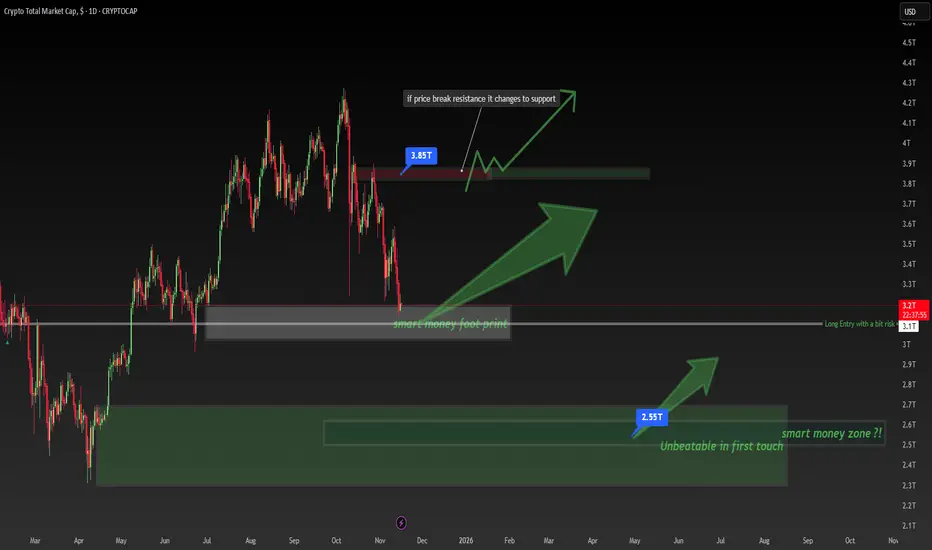
Crypto Total Market Cap Is at a BREAKING Point – Smart Money FooCrypto Total Market Cap Is at a BREAKING Point – Smart Money Footprint Explained!
🧠 Smart Money Footprint: The Level Most Retail Traders Ignore
The entire crypto market cap has dropped into a massive Smart Money footprint zone — a level where institutional players historically accumulate before major bullish legs.
At the same time, the $3.85T resistance above is the key battlefield.
👉 If price breaks this level, it flips into support, opening the door for a strong upside continuation.
What This Chart Teaches You 👇
✔ Support → Resistance → Support transitions
✔ How Smart Money leaves footprints at major accumulation zones
✔ Why price often reverses from areas retail traders overlook
✔ Market structure timing for long entries
Key Levels to Watch:
🔹 $3.1T – $3.2T → Smart Money accumulation block
🔹 $3.85T → Major resistance flip zone
🔹 Above this = bullish momentum can accelerate fast
Trade Idea (Educational Only, Not Financial Advice):
📈 Long bias as long as price holds within or above the Smart Money footprint.
🔥 Break & retest of $3.85T = high-probability continuation setup.
If this helped you, hit 👍 and save it — more Smart Money lessons coming!
Comment “SMC” if you want the next educational chart breakdown.
Follow @TradeWithMky for daily Smart Money insights.
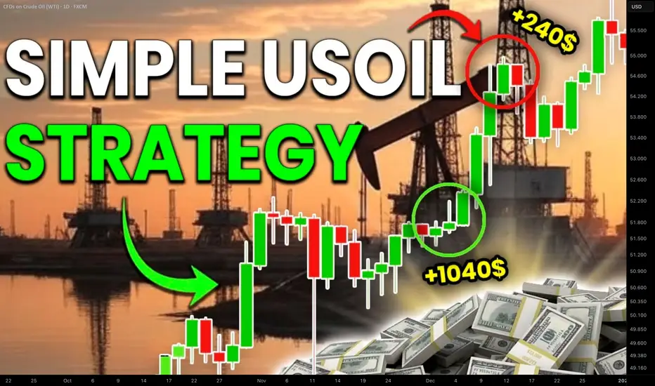
How to Trade Crude Oil with Smart Money Concepts SMC Explained
Smart Money Concepts is one of the most reliable techniques for trading WTI Crude Oil.
In this article, I will teach you a profitable SMC strategy for analysing and trading USOIL futures and CFD.
This simple strategy is based on an important event every SMC trader should know - a break of structure BoS.
In a bullish trend, the best break of structure will be based on a violation and a candle close above a current higher high.
It will signify a highly probable bullish continuation and provides a great opportunity to buy
Though you can spot a bullish break of structure on any time frame, the most reliable one is a daily.
After a formation of a new high, I suggest waiting for a short term intraday correctional movement.
With a high probability, the market will retest a recently broken structure and smart money will manipulate the market, pushing the price below that, making buyers close their positions.
Once the market starts retracing, analyze an hourly time frame. The price will need to establish an i ntraday minor bearish trend.
In this bearish trend, 2 trend lines should connect lower highs and lower lows composing an expanding, parallel or contracting channel - a bullish flag pattern.
Your best signal will be a breakout of a resistance line of the flag and a violation of the level of the last lower high - a bullish change of character of a liquidity grab.
It will confirm a completion of a correction.
Buy the market on a retest of the level of the last higher low, it will be your best entry.
Set your stop loss at least below a trend line and aim at the next strong daily resistance.
That will be a perfect model for trading break of structure on WTI Crude Oil.
We spotted such a setup in my trading academy on one of the live streams with my students.
WTI Crude Oil was trading in an uptrend on a daily time frame.
A bullish violation of the last Higher High and a candle close above that confirmed a Break of Structure BoS.
The price started a correctional movement then, and we spotted a bullish flag pattern on an hourly time frame.
The market completed a correction after grabbing a liquidity below a broken structure.
A bullish movement started then, and the price violated a resistance line of the flag and the level of the last lower high.
These 2 breakouts confirmed a completion of a correction and a resumption of a bullish trend.
We opened a buy position immediately on a retest of a broken level of the last lower high.
Stop loss was below a trend line, take profit was based on the closest key daily resistance.
And the price went straight to the target.
Break of Structure BoS will be useful for analysis, forecasting and trading WTI Crude Oil.
Combining that with top-down analysis and lower time frames confirmations will provide accurate signals and profitable trading setups.
Integrate a price model that I shared in your strategy, and good luck to you trading USOIL!
❤️Please, support my work with like, thank you!❤️
I am part of Trade Nation's Influencer program and receive a monthly fee for using their TradingView charts in my analysis.
How to Apply Quarter’s Theory on Cardano (ADA) | Crypto TAHow to Apply Quarter’s Theory on Cardano (ADA) | Crypto Technical Analysis
In this video, we break down how to draw and use Quarter’s Theory on Cardano (ADA) to understand market structure and price rotation in crypto.
You’ll learn how institutional traders use quarter levels to identify key turning points and why this method can help you see precision entries long before retail traders react.
Whether you’re trading spot or futures, this breakdown gives you a practical framework to read crypto price movement like a professional.
What You’ll Learn:
How to draw Quarter’s Theory levels on a crypto chart
Why market makers respect these levels across all timeframes
How to use quarter zones for entries, exits, and managing bias
Real example using ADA/USD
If you’re ready to stop guessing and start reading the market’s geometry, this is where to begin.
Tags: quarters theory, cardano analysis, crypto trading strategy, institutional trading concepts, market structure crypto

How to Trade with MACD in TradingViewMaster the MACD indicator using TradingView’s charting tools in this comprehensive tutorial from Optimus Futures.
The Moving Average Convergence Divergence (MACD) is a momentum and trend-following indicator that helps traders identify shifts in market direction and momentum strength. It measures the relationship between two exponential moving averages (EMAs) to reveal when momentum may be building or fading.
What You’ll Learn:
Understanding MACD as a tool that tracks the convergence and divergence of moving averages
How the MACD line is calculated as the difference between the 12-period and 26-period EMAs
How the Signal line acts as a 9-period EMA of the MACD line and serves as a trigger for potential buy or sell signals
How the Histogram visualizes the distance between the MACD line and Signal line to show momentum strength
Recognizing bullish and bearish crossovers between the MACD and Signal lines
How to interpret the Zero Line as a momentum baseline — above zero suggests an uptrend, below zero suggests a downtrend
Identifying bullish and bearish divergences between MACD and price to anticipate potential reversals
Why crossovers and divergences should be confirmed with price action and trend structure, not used in isolation
How to add MACD to a TradingView chart via the Indicators menu
Understanding the default settings (12, 26, 9) and how adjusting them changes responsiveness
Practical examples on the E-mini S&P 500 futures chart to illustrate MACD signals in real market conditions
Applying MACD across multiple timeframes — daily, weekly, or intraday — for higher-confidence confirmations
This tutorial will benefit futures traders, swing traders, and technical analysts who want to incorporate MACD into their trading process.
The concepts covered may help you identify trend changes, momentum shifts, and potential entry or exit points across different markets and timeframes.
Learn more about futures trading with TradingView:
optimusfutures.com
Disclaimer
There is a substantial risk of loss in futures trading. Past performance is not indicative of future results. Please trade only with risk capital. We are not responsible for any third-party links, comments, or content shared on TradingView. Any opinions, links, or messages posted by users on TradingView do not represent our views or recommendations. Please exercise your own judgment and due diligence when engaging with any external content or user commentary.
This video represents the opinion of Optimus Futures and is intended for educational purposes only.
Chart interpretations are presented solely to illustrate objective technical concepts and should not be viewed as predictive of future market behavior. In our opinion, charts are analytical tools — not forecasting instruments.

You Don’t Need a New Strategy—You Need a System (Here’s Proof)This week’s trade recap isn’t just about the winning setup — it’s about understanding why it worked and what that means for your long-term edge as a trader.
Most traders spend years chasing “the perfect strategy,” but strategy alone is just the product. Think of trading like business — McDonald’s and Burger King both sell burgers, but only one built a system that scales, duplicates, and dominates globally. The same applies to trading: your real edge isn’t the setup, it’s the structure behind it — your discipline, consistency, and process.
In this video, we break down:
The winning trade of the week and how the setup developed
Why edges are built through process, not predictions
How business thinking creates stronger traders
The mindset shift from “what to trade” to “how to operate”
Whether you’re trading forex, indices, or crypto, this session will help you think beyond entries and exits — and start building a business-level edge that lasts.
Tags: trading edge, trading psychology, weekly trade recap, trading mindset, how to build consistency in trading, forex strategy, trader discipline, trading process, profitable trading habits, business mindset for traders

Top-Down Analysis Strategy: How I Open and Manage TradesLearn how I use top-down analysis from senior to junior timeframes to find high-probability entry points and confidently follow through on trades.
On the weekly chart, I identify point A and the presumed point B — this is my idea. Then, gradually shifting through the timeframes, I need to confirm this idea. I get confirmation when volume appears on the chart.
On the daily chart, I note the formation of a new trading range, which arises as a result of the interaction of the price with the key level. I determine the POI in the form of a daily FVG — my idea is confirmed, and the price is ready to move towards point B.
I also note the daily SNR as a potential zone of interest. If the price reacts to the SNR, it will mean that I am working in a strong trend. If the reaction occurs on the FVG, the movement simply continues along the trend.
If you are interested in the topic of working in ranges, write in the comments — I will definitely cover it.
As a result of the daily SNR test, the price confirms the presence of volume through the formation of a 4-hour True SNR. You can open a position from it with a limit order with a target beyond point B and fix the risk/profit ratio at 1:2.
If you found this article interesting and my method useful, I would appreciate your support — please like, share, and help promote this article so that it reaches more traders.
