XRPUSDT M15 Liquidity Sweep and Corrective Bullish Setup📝 Description
XRP swept short-term sell-side liquidity on M15 and is now stabilizing above the local demand zone. The current move appears corrective after the sell-off, suggesting a potential bullish reaction toward nearby imbalance levels.
________________________________________
📈 Signal / Analysis
Primary Bias: Bullish while price holds above the M15 liquidity sweep low
Preferred Setup:
• Entry: 2.063
• Stop Loss: Below 2.057
• TP1: 2.074
• TP2: 2.082
• TP3: 2.088 (M30 FVG / descending trendline reaction)
________________________________________
🎯 ICT & SMC Notes
• Clear sell-side liquidity sweep on M15
• Price holding above local demand confirms reaction potential
• Upside targets aligned with unfilled FVG levels
________________________________________
🧩 Summary
As long as price remains above the swept liquidity low, XRP is positioned for a corrective bullish move toward higher PD arrays.
________________________________________
🌍 Fundamental Notes / Sentiment
No immediate negative catalyst affecting XRP sentiment. In a neutral crypto environment, short-term liquidity-driven rebounds remain technically supported.
________________________________________
⚠️ Risk Disclosure
Trading involves substantial risk and may result in capital loss. This analysis is for educational purposes only and does not constitute financial advice. Always apply proper risk management, predefined stop-loss levels, and disciplined position sizing aligned with your trading plan.
Accumulation-distribution

Market Phases Explained: Accumulation, Expansion, Distribution🔵 Market Phases Explained: Accumulation, Expansion, Distribution, Reset
Difficulty: 🐳🐳🐳🐳🐋 (Advanced)
Markets do not move randomly. They rotate through repeatable phases driven by liquidity, psychology, and participation. Understanding market phases helps traders stop forcing strategies and start trading in alignment with the current environment.
🔵 WHY MARKET PHASES MATTER
Most traders struggle not because their strategy is bad, but because they apply it in the wrong market phase.
Breakout strategies fail in accumulation
Mean-reversion fails during expansion
Trend-following fails in distribution
Reversal trading fails before reset is complete
Market phases explain when a strategy works, not just how .
Price action, indicators, and volume behave differently in each phase.
🔵 THE FOUR MARKET PHASES
Markets move in a repeating cycle:
Accumulation
Expansion
Distribution
Reset
Each phase has unique characteristics, risks, and opportunities.
🔵 1. ACCUMULATION (QUIET POSITIONING)
Accumulation occurs after a decline or prolonged sideways movement.
This is where smart money builds positions quietly.
Key characteristics:
Price moves sideways in a range
Volatility is low
Breakouts frequently fail
Volume is stable or slightly rising
What is really happening:
Large players accumulate positions without moving price too much. Liquidity is absorbed.
Indicator behavior:
RSI oscillates between 40 and 60
MACD hovers near the zero line
Volume spikes are quickly absorbed
Best strategies:
Range trading
Mean reversion
Patience and preparation
🔵 2. EXPANSION (TREND DEVELOPMENT)
Expansion begins when price breaks out of accumulation with conviction.
This is where trends are born.
Key characteristics:
Strong directional movement
Increasing volatility
Pullbacks are shallow
Breakouts follow through
What is really happening:
Accumulated positions are now leveraged. Momentum attracts participation.
Indicator behavior:
RSI holds trend zones (40–80 or 20–60)
MACD expands away from zero
Volume increases during impulse moves
Best strategies:
Trend-following
Pullback entries
Breakout continuation
🔵 3. DISTRIBUTION (QUIET EXITING)
Distribution occurs after an extended trend.
Price may still rise, but momentum starts to weaken.
Key characteristics:
Higher highs with weaker follow-through
Increased wicks and failed breakouts
Volatility becomes unstable
Late buyers get trapped
What is really happening:
Smart money distributes positions to late participants while maintaining the illusion of strength.
Indicator behavior:
RSI diverges or fails to make new highs
MACD histogram shows lower highs above zero
Volume spikes near highs
Best strategies:
Profit protection
Reduced position size
Waiting for confirmation of weakness
🔵 4. RESET (LIQUIDITY CLEARING)
Reset is when the previous trend fully unwinds.
This phase clears excess leverage and weak hands.
Key characteristics:
Sharp moves against prior trend
Stop-loss cascades
Emotional price action
High volatility without clear direction
What is really happening:
Leverage is flushed. Weak positions are forced out.
Indicator behavior:
RSI reaches extreme levels
MACD crosses zero decisively
Volume spikes dramatically
Best strategies:
Capital preservation
Waiting for stabilization
Avoiding prediction
🔵 HOW TO IDENTIFY THE CURRENT PHASE
Ask these questions:
Is price trending or ranging?
Are breakouts succeeding or failing?
Is momentum expanding or contracting?
Are indicators confirming or diverging?
No indicator works in all phases. Phase identification is the real edge.
🔵 COMMON MISTAKES
Forcing trend strategies during accumulation
Chasing breakouts during distribution
Trading reversals before reset completes
Ignoring momentum deterioration
Most losses come from being right about direction but wrong about phase.
🔵 CONCLUSION
Markets move in cycles because human behavior and liquidity move in cycles.
Accumulation builds positions
Expansion rewards patience
Distribution traps late entries
Reset clears the board
When you learn to identify market phases, you stop fighting the market and start working with it.
Which market phase do you find hardest to trade? Accumulation, expansion, distribution, or reset? Share your thoughts below.

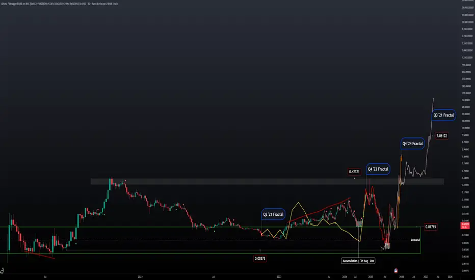
ALU | '21 Fractals | Price Projection Four different fractals with similar results. Q2 '21 price was in convergence and took off in July similarly to price action in '23 -'24. Except price was in divergence and stopped selling off in July and took off in November leaving the middle months for accumulation.
After the expansion phase of the market in '24 price action got tossed into the distribution phase and price was bound to fall to these lows today.
Looking at Q4 '23 Fractal it fits perfectly with what we saw early this year when price was distributing.
Regardless what the news and fundamentals where saying price was able to repeat the same fractal by using the lows of '21.
Q4 '24 Fractal is the most recent pattern that we can reference with todays price action to get a projected estimate.
Current price action has also stopped selling in July and has been accumulating since then
Would like to see price action close at ATHs going into the next year and into the next distribution phase.
Seller Strength Evident as Volume Peaks Fail to Propel Price HigAnalysis
Context – This 1D chart uses the ATAI Volume Pressure Analyzer to study the A→B→C structure over the last 11 trading sessions. Segment C→B captures the advance (blue), while B→A captures the subsequent decline (red). Each bar’s up‑ and down‑volume is measured on a lower timeframe to detect buying and selling pressure.
Volume ranking – Within this 11‑bar window, the indicator identifies the three largest buying (B1–B3) and selling (S1–S3) bars. Although the B1 bar shows the highest buying volume (~10.29 M units), its selling volume (~12.52 M) exceeds buying, resulting in a negative delta of ‑2.23 M. B2 is the only buyer bar with a positive delta (+1.87 M), while B3 again shows sellers in control (‑0.90 M). The seller bars S1–S3 all display net negative deltas, with S3 registering the heaviest selling (‑4.03 M). This pattern shows that peaks in buying volume are not producing higher closes and that sellers are consistently overwhelming buyers.
Segment behaviour – The C→B segment (the rally) totals approximately +28.9 M up‑volume versus +36.7 M down‑volume, a net deficit of about ‑7.74 M. The subsequent decline (B→A) is even more one‑sided: +26.9 M up‑volume versus +41.4 M down‑volume, yielding a ‑14.5 M delta. The slopes of the segment trend lines reinforce this narrative: the rise from C to B has a shallow positive slope (~ 5° on the upper line), whereas the decline from B to A has a steeper negative slope (‑12° on the upper line). Sellers are pushing the price lower more aggressively than buyers previously pushed it higher.
Price structure – Price currently trades near TRY 3.45,where resistance resides near the recent pivot highs around TRY 3.65 and TRY 3.73 (where B1 and S1 occur). As long as the price remains below these levels and buying peaks fail to translate into higher highs, the bearish bias remains. The red dashed line is not a fixed support; it dynamically connects the lows of the current C→A leg and updates with each new candle’s low. Its red colour confirms the bearish slope of this segment. As long as this guide remains red and slopes downward, the downtrend is intact. A meaningful sign of shifting momentum would be a flattening or reversal of this guide (e.g., changing colour) accompanied by a new B‑ranked bar that shows a positive delta.
Risk management – This analysis is provided for educational purposes and does not constitute investment advice. Always consider your own risk tolerance and trading plan before entering a position.

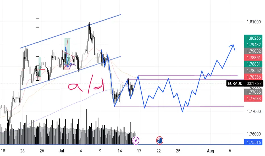
EURAUD – Incoming Upthrust? Accumulation or Distribution? Chart Context:
EURAUD recently completed a sharp markdown after a textbook rising channel break. What’s interesting now is that price has entered what looks like a potential box range between 1.7768 and 1.7885.
I'm anticipating a possible upthrust move into the 1.788x zone — and what follows will reveal the true intent.
Here’s the internal debate:
Are we looking at reaccumulation — smart money trapping shorts before driving higher in line with broader money flow?
Or is this a distribution — where the market builds a false sense of support before deeper downside?
🔍 What tips the scale for now is this:
>The overall money flow direction (via volume patterns + structure) has leaned bullish, so I’m favoring accumulation with a shakeout scenario.
Signs I’m watching:
✅ Absorption volume near the bottom of the range
✅ Higher lows inside the zone
✅ Fake breakout / upthrust into prior structure
❌ Failure to hold above 1.7855 could flip the bias short-term
📉 Expecting one more dip to test demand, followed by range tightening, and if buyers show up strong — the breakout can get explosive.
What’s your take?
Are we prepping for a markup or will this fakeout and roll over?
"I go long or short as close as I can to the danger point, and if the danger becomes real, I close out and take a small loss"
Mastering the ICT Power of 3 concept - How to use it in trading!The financial markets often appear chaotic and unpredictable, but behind the scenes, institutional players operate with clear strategies that shape price action. One such strategy is the ICT (Inner Circle Trader) "Power of 3" model, a framework used to understand and anticipate market cycles through three key phases: accumulation, manipulation, and distribution. This guide will break down each of these phases in detail, explaining how smart money operates and how retail traders can align themselves with the true direction of the market.
What will be discussed?
- The 3 phases
- Examples of the PO3
- How to trade the PO3
- Tips for trading the PO3
The 3 phases
Accumulation
The Accumulation Phase in the ICT "Power of 3" model refers to the initial stage of a market cycle where institutional or "smart money" participants quietly build their positions. During this time, price typically moves sideways within a tight range, often showing little to no clear direction. This is intentional. The market appears quiet or indecisive, which is designed to confuse retail traders and keep them out of alignment with the real intentions of the market's larger players.
In this phase, smart money is not looking to move the market dramatically. Instead, they are focused on accumulating long or short positions without drawing attention. They do this by keeping price contained within a consolidation zone. The idea is to gather enough liquidity, often from unsuspecting retail traders entering early breakout trades or trying to trade the range, before making a more aggressive move.
Manipulation
The Manipulation Phase in the ICT "Power of 3" model is the second stage that follows accumulation. This phase is where smart money deliberately moves the market in the opposite direction of their intended move to trigger retail stop losses, induce emotional decisions, and create liquidity.
After price has consolidated during accumulation, many retail traders are either already positioned or have orders waiting just outside the range, either stop losses from those trading the range or breakout orders from those anticipating a directional move. The manipulation phase exploits this positioning. Price will often break out of the accumulation range in one direction, appearing to confirm a new trend. This move is designed to look convincing, it might even come with a spike in volume or momentum to draw traders in.
However, this breakout is a false move. It doesn’t represent the true intention of smart money. Instead, it's meant to sweep liquidity, triggering stop losses above or below the range, and then reverse sharply. This stop run provides the liquidity needed for large players to finalize their positions at optimal prices. Once enough liquidity is collected, and retail traders are caught offside, the real move begins.
Distribution
The Distribution Phase in the ICT "Power of 3" model is the final stage of the cycle, following accumulation and manipulation. This is where the true intention of smart money is revealed, and the market makes a sustained, directional move, either bullish or bearish. Unlike the earlier phases, distribution is marked by clear price expansion, increased volatility, and decisive momentum.
After smart money has accumulated positions and shaken out retail traders through manipulation, they have the liquidity and positioning needed to drive the market in their desired direction. The distribution phase is where these positions are "distributed" into the broader market, meaning, institutions begin to offload their positions into the retail flow that is now chasing the move. Retail traders, seeing the strong trend, often jump in late, providing the liquidity for smart money to exit profitably.
This phase is typically what retail traders perceive as the real trend, and in a sense, it is. However, by the time the trend is obvious, smart money has already entered during accumulation and profited from the manipulation. What appears to be a breakout or trend continuation to most retail participants is actually the final leg of the smart money’s strategy. They are now unloading their positions while price continues to expand.
Examples of the Power of 3
How to trade the PO3?
Start by identifying a clear accumulation range. This typically happens during the Asian session or the early part of the London session. Price moves sideways, forming a consolidation zone. Your job here isn’t to trade, but to observe. Draw horizontal lines marking the high and low of the range. These become your key liquidity zones.
Next, anticipate the manipulation phase, which usually occurs during the London session or at the NY open. Price will often break out of the range, triggering stop losses above the high or below the low of the accumulation zone. This move is deceptive, it is not the real trend. Do not chase it. Instead, wait for signs of rejection, such as a sharp reversal after the liquidity grab, imbalance filling, or a shift in market structure on a lower timeframe (like a 1- or 5-minute chart).
Once manipulation has swept liquidity and price starts showing signs of reversing back inside the range or beyond, you now look for a confirmation of the true move, this begins the distribution phase. You enter in the direction opposite of the manipulation move, ideally once price breaks a structure level confirming that smart money has taken control.
For example, if price consolidates overnight, fakes a move to the downside (running sell stops), and then quickly reverses and breaks above a key swing high, that's your signal that the true move is likely up. Enter after the break and retest of structure, using a tight stop loss below the recent low. Your target should be based on liquidity pools, fair value gaps, or higher-timeframe imbalances.
The key to trading the Power of 3 is patience and precision. You're not trying to catch every move, but to wait for the market to complete its cycle of deception and then ride the clean expansion. Ideally, your entry comes just after manipulation, and you hold through the distribution/expansion phase, taking partials at key liquidity levels along the way.
Tips for trading the PO3
1. Learn price movements
Before you can effectively apply the ICT Power of 3 strategy, it’s crucial to have a deep understanding of how price behaves. This means being comfortable identifying market structure, recognizing trend direction, and interpreting candlestick dynamics. Since the Power of 3 is deeply rooted in how price moves in real time, a strong grasp of these basics will give you the confidence to read the market correctly as each phase develops.
2. Analyse multiple timeframes
Although the Power of 3 pattern shows up on lower timeframes, relying on just one can lead to misreads. You’ll gain a clearer picture when you align the short-term view with higher timeframe structure. For example, what appears to be accumulation on the 15-minute chart may simply be a retracement in a larger trend on the 1-hour or daily. By examining multiple timeframes together, you can better identify the true setup and avoid being tricked by noise.
3. Exercise patience
A key part of trading the Power of 3 is knowing when to act, and more importantly, when not to. It’s easy to get impatient during the accumulation or manipulation phases, but entering too early often leads to frustration or losses. True discipline comes from waiting for the expansion or distribution phase, when the market reveals its real direction. This is where the most favorable risk-to-reward setups occur.
Thanks for your support.
- Make sure to follow me so you don't miss out on the next analysis!
- Drop a like and leave a comment!

Ranging? Not Really. The Big Guys’ Plan Is Already Set…Ever wondered what the crowd is really doing behind the candles?
This video breaks down how to read Cumulative Volume Delta (CVD)—
from retail behavior to sentiment charts, and why the market doesn’t always follow logic.
✅ When price moves one way but the crowd trades the other...
✅ When sideways markets aren’t as neutral as they look...
✅ When emotions take over—and how to spot it in advance.
We’re lifting the hood. The engine’s running. Let’s see what drives it.

Bullish on BTC. Price Action suggesting upside. No explanation needed.
Simple ICT concepts in play.
Follow for more.
This idea is mine and it is not a financial advice.
It is a mere speculation educational post from me.
DYOR.

EUR/USD: PAT + VPA 10/02/2024Good afternoon,
Today, my focus will be on identifying long entries for a long position, as we appear to have reached a selling climax.
On the 15-minute time frame, a robust demand zone is evident between 1.0300 and 1.0400. The market has made a significant move towards 1.0300, leaving indications of early buying activity from "Market Makers." A notable reversal occurred on October 1st, followed by the formation of a bullish wedge (which is typically a bearish pattern) that pushed the market below the previous low. Currently, we are beginning to form a triangle on the 15-minute chart, which serves as a critical signal for a potential market reversal, particularly since it has not managed to fill the liquidity above it. This downward movement seems designed to eliminate the remaining sellers and early buyers. Additionally, my strategy, "High Clear," has materialized, suggesting that a liquidity sweep of the recent low was anticipated.
I am now monitoring the fourth leg of the triangle as it approaches the lower congestion line, preparing for a potential breakout with the fifth leg. It is important to note that if a sixth leg forms, it would indicate a continuation of the market trend.
I suspect that the market is attempting to prompt traders to shift to short positions, setting the stage for one final significant rally towards 1.1300. I anticipate that the market could reach this level in the coming weeks, unless we observe the formation of a six-legged triangle.
The Pip Assassin
FX:EURUSD TVC:DXY XETR:DAX

BTC Ideasintresting PA.
PA Struggling to break Supply.
Range forming. Some ex still didn't took 1st tap - could indicate as re-accumulate neither distribution. But decent break of range Low (63.500) - would confirm distribution and possible po3 play. Targeting 48k
In case of re-Accumulation and Supply fail - ATH

Is Bitcoin on a Distribution or Accumulation range?I made this analysis of Accumulation and Distribution ranges on Bitcoin.
On the current level we can clearly see its forming a range which can work as Distribution and go down at least a key level bellow as we can see on the horizontal lines.
Or it can make a spring bellow the range and push up to a new level above new all time highs.
The question is: We are now in a Distribution or Accumulation Range?
What are your opinions?

Solana - Wyckoff Mark Up ExampleSolana vs. Wyckoff Logic
SOLUSD example of mark up in the Wyckoff logic schematic. If unfamilar, there are market phases according to Wyckoff Logic:
Accumulation: The phase where the market stops falling and begins to form a base, suggesting that demand is starting to overcome supply. It is characterized by a selling climax, where the price falls sharply, and the volume is high, indicating panic selling. After the climax, there is typically a phase of sideways movement, with occasional tests of the lows. This phase is labeled as the cause, setting up for a new upward trend (effect).
Markup: After accumulation, the price starts to rise, signifying that the market is entering the markup phase. This phase is indicated by a rise in price away from the accumulation zone, often with increasing volume, which is interpreted as the start of a new uptrend.
Distribution: This is the phase where the market tops out and is characterized by a buying climax. Supply begins to overcome demand as the "smart money" starts to distribute their holdings to the market. The distribution phase is also labeled as the cause for the subsequent downtrend.
Markdown: Following distribution, the market enters the markdown phase where prices start to fall consistently. This phase is shown by a break of support levels with increasing volume, indicating a strong presence of selling pressure.
The image also depicts the concept of "Volume" with a histogram at the bottom. The volume bars are colored in red and blue, generally indicating selling and buying volume, respectively. The histogram helps traders identify moments of high or low volume, which can be a sign of the strength or weakness of a particular price movement.
Wyckoff's analysis technique is grounded in the study of price action, volume, and time, as they relate to supply and demand. It is a tool for understanding the market's structure and potentially predicting future price movements by identifying the actions of large institutional traders and investors.

GBPUSDAs a student in the financial markets, learning about the market is interesting and it's a long journey to begin with. GBPUSD having a accumulation, manipulation and now waiting for a distribution. Will GBPUSD make a move early next year along side with USA rate cuts? Let's see what year 2024 lead us to
I don't post much as I'm not a signal provider nor a financial advisor. But one thing is that learning how the market behaviour, reactions and structure, it's simply interesting to me. If you have any thoughts on GBPUSD, let me know down the comment area, let's discuss about it.
This will be my last post and trade of the year 2023 holding it till next year 2024. Wishing you guys out there trade safe and happy new 2024.

Swing Trading - Concept of Accumulation and Distribution Following stocks have been discussed in the video
1. HG Infra
2. NFL
3. SPIC
Accumulation - Is always found on downside and any breakout may give 8-14% returns in short trade
Distribution - Is always found on top from where the price may reverse to downside
This video is made only for educational purpose. Do your own study before taking any trades.

BTC Accumulation ZoneAs we see in the Long term every circle BTC have the :
Accumulation Zones
Distribution Zones
And Bear Zones
There is no reason for Panic you are already know that we arent in Alt Season.
Better to name it BTC Season right now.
So keep Calm and accumulate as much as you can

REN/USD Main trend. Accumulation 637. Distribution 637.Logarithm. Time frame 1 week. The main trend.
The psychology of accumulation and distribution zones.
The graph shows and describes the logic of work in the accumulation and distribution zones of large and small market participants (fuel). Coin as an example. It's always the same. But, always those who are “market fuel” are sure: "This time it will be different. But, no miracle happens. It's always the same. “Market fuel” changes cycle after cycle.
Most people's memories are short. Many people think they're special, or the timing is wrong... but it's always the same. In distribution, they willingly buy expensive. In the accumulation on the contrary, afraid, waiting lower, lower and so on...
Project and News
Ren is an open protocol that allows value to move between blockchains.
RIP-000-018: Financing Ren 2.0 and the Ren Foundation
Early last year, Alameda acquired Ren in partnership with Ren's previous management to provide long-term development funding.
Also, after the story with Alameda (scam, trial) in the network REN 1 will be shut down (waiting for the right moment according to the general market trend), the new network REN 2 will be launched. Read more on the project website itself (read between the lines).
ICO price 02 2018
ICO: 17200 REN = 1 ETH.
Now the price of ETH is about $ 1200, therefore, the price of the ICO in conversion to USD will be REN 0.069, which is slightly lower than the current price of 0.063
Linear graph
Secondary trend. Time Frame, 3 days.
The secondary trend is distinctly downward. A downward wedge is forming.
From the peak, the price decreased by -95% at the moment. This is very much, but if you consider the inadequate pumping of +11,000%, it is normal.
Think about it, the distribution has been 1.76 years. Many people got used to the “stable” price for such a long time and over time were no longer afraid to buy “cheap” because from the support of the distribution pumped by a significant % repeatedly. Also note that the accumulation and distribution over time of duration are identical.
I showed the maximum local pumping from the key support zones when the wedge is broken, i.e. the exit from the downtrend. Let me remind you that at the moment the trend has a pronounced downtrend.
You can work positional trading from the average buy/sell price of the medium/long term, or you can wait for the price to exit a downtrend, that is, to exit a wedge with significant buyer volume.
In order to understand further work, and the potential, figure out what manipulation REN1 - REN2 coin holders want to do.

US OIL Analysis The distribution has ended and the price has broken the re-accumulation area. We may get a redistribution and the price will fall to the accumulation area

How to Use the Accumulation/Distribution IndicatorLearning how to identify accumulation and distribution in an asset is an important skill to have for any trader. Luckily, there’s a handy tool we can use: the aptly-named Accumulation/Distribution indicator.
In this article, we’ll show you how this accumulation/distribution indicator works, where it’s best applied, and how you can combine it with other tools to boost your odds of success.
What Is the Accumulation/Distribution Indicator?
The accumulation/distribution indicator, also called the accumulation/distribution index, accumulation/distribution line, and abbreviated to A/D, is a cumulative indicator that uses price and volume data to measure the strength of an asset’s trend. It helps traders identify buying and selling pressure in the market and can show whether an asset is likely to continue trending or is due for a reversal. It was created by renowned trader Marc Chaikin, who also developed the famous Chaikin Money Flow indicator.
Accumulation vs Distribution
Accumulation occurs when buying pressure outweighs selling pressure, resulting in price appreciation. Conversely, distribution is where sellers have the upper hand over buyers, creating downward momentum. In practice, the plotted A/D line will move up when accumulation is present and down when distribution occurs.
Accumulation/Distribution Oscillator Formula and Components
The ADI seeks to quantify an asset's buying and selling pressure by considering its trading range and trading volume.
First, it calculates the Money Flow Multiplier (MFM) using the following formula:
MFM= ((Close−Low)−(High−Close)) / High−Low
This results in a reading between -1 and 1. When the price closes in the upper half of its high-low range, the MFM will be positive. If it closes in the lower half, then MFM will be negative. In other words, if buying pressure is strong, the MFM will rise, and vice versa.
Second, it generates the Money Flow Volume (MFV) with the following:
Money Flow Volume = MFM × Volume
For the first candle in a given chart, the MFV is the first A/D value. Since the indicator is cumulative, the MFV is added to the previous A/D value. In essence:
First Calculation = (ADI = MFV)
Subsequent Calculations = (ADI + MFV)
This then creates the A/D line. While it may seem unnecessary to know the formula, it can provide us with significant insight into how an accumulation/distribution rating is given. For example, a strong bullish trend may cause an asset to close high in its trading range, producing an MFM reading close to 1. If this is backed up by high volume, the A/D line will surge upward. However, if the volume is lacking, then the A/D may only increase slightly.
Thankfully, we don’t need to perform this calculation ourselves. With the free TickTrader platform we offer at FXOpen, you’ll find the accumulation/distribution indicator and dozens of other tools ready to help you navigate the markets.
How to Use the Accumulation Distribution Indicator
There are three popular ways to use the A/D indicator: identifying reversals, trend confirmation, and trading breakouts.
Identifying Reversals
One of the most effective uses of A/D is to spot potential reversals using divergences between the price and the A/D line.
A bullish divergence occurs when the price falls, making lower lows, while the A/D line trends upward, creating higher lows. Conversely, a bearish divergence can be seen when an asset makes new highs, but the A/D puts in lower highs.
It essentially shows us that while the price is moving in a specific direction, the underlying pressure supporting the move is waning. The example above demonstrates that fewer sellers are participating as the trend progresses lower; eventually, buyers take over and push the price much higher.
Trend Confirmation
A/D line can also be used to confirm the direction of a trend. In this context, traders monitor the alignment of the line with the price action.
In an uptrend, both the price and A/D should be rising. If the A/D moves in the same direction as the price, it confirms the strength of the uptrend and suggests that the buying pressure is likely to continue. As in the chart, traders could have used the A/D and price alignment to position themselves in the direction of the bull trend.
Similarly, during a downtrend, the price and the A/D should be falling. If the A/D is falling alongside the price, it indicates that the selling pressure is strong, and the downtrend is likely to persist.
Trading Breakouts
Lastly, A/D can help traders confirm breakouts beyond support/resistance levels. If there’s a critical level that a trader is watching to jump in on the breakout, a breakout beyond a similar level in the A/D indicator can signal the start of a new trend.
In the example, we see a strong resistance level, both in price and the accumulation distribution chart. As the move is confirmed by A/D, breaking out above both dashed lines, traders have confidence that the price is ready to move higher.
Integrating the Accumulation and Distribution Indicator with Other Tools
While the A/D indicator is a valuable tool on its own, it’s best to use it in combination with other indicators to help filter out false signals and improve the accuracy of your predictions. Let’s take a look at two indicators to integrate with A/D: moving averages and the Relative Strength Index (RSI).
Moving Averages
Moving averages are a popular tool used by many traders to determine the direction of a trend, especially when two moving averages cross over. As mentioned, the trajectory of the A/D line can show traders that a trend is supported by volume; similarly, a price sitting above or below a moving average can indicate a trend’s direction. Using the two together can provide an at-a-glance reading of a trend, which can be extremely useful for trend-following traders.
In this example, we’ve used the Exponential Moving Average (EMA) cross indicator in TickTrader, with two 20-period and 50-period EMAs. The fast EMA crosses above the slow EMA, showing that a potential bullish trend is forming. The price continues to stay well above the 50-period EMA as time progresses, demonstrating that there’s a strong bull trend.
We also have confirmation from the A/D line that the bullish momentum is backed up by supporting volume. Seeing this, traders can be confident that the trend will continue. When the EMAs cross over bearishly, as seen on the right-hand side, traders may start looking for the A/D line to confirm that a bearish trend has started and exit their position.
RSI
Similar to the A/D indicator, RSI can be used to both spot divergences and confirm trends. The divergences are the same as A/D; a lower low in a price with a higher low in the RSI indicates a potential bullish reversal, while a price making a higher high and a lower low in RSI is regarded as bearish. Meanwhile, an RSI reading above 50 is typically seen as bullish, while below is bearish.
Using the two indicators together can offer traders extra confluence that the market is headed in a particular direction. In the chart shown, we can see that the price is making a lower low. However, the Apple stock’s accumulation/distribution line shows a bullish divergence, as does the RSI.
Traders could have marked the most recent area of resistance (dashed line), and then waited for the price to break out above it before looking for an entry. This move was confirmed by the RSI moving above 50, showing that bullish momentum is truly entering the market and offering multiple factors of confluence.
What to Do Next
You now have a comprehensive understanding of the accumulation/distribution indicator, including its formulation, its three main uses, and how to combine it with other indicators for extra confirmation. Ready to put your newfound knowledge to the test? You can open an FXOpen account to apply what you’ve learned and hone your trading skills across a diverse range of markets, from forex and commodities to stocks and indices.
This article represents the opinion of the Companies operating under the FXOpen brand only. It is not to be construed as an offer, solicitation, or recommendation with respect to products and services provided by the Companies operating under the FXOpen brand, nor is it to be considered financial advice.

GBPUSDGBPUSD seems like it will not fall. A big consolidation is taking place in the daily time frame. In the intraday frame this could be a good trade to catch, a lot of positions already been accumulated in the demand area down.

ES PO3 AMD LEVELSES PO3 AMD LEVELS
monday 13th we enter distribution after taking accumulation low during manipulation

WC1302 GBPUSD Outlook: Still a bullJust Wyckoff and a couple of patterns to support my bias on GU.
In Wyckoff, whether it is a distribution or accumulation phase, it will still make that move up. (On the flip case, it will still make an AR)
Major news for the pound and dollar coming in tomorrow night!
It's amazing how we can rationalize our bias. Let's see what will happen tomorrow!

Swings: Accumulation vs. Distribution Notice the swing areas, and the volume indicator. Had the indicator been used for "trend strength" it would of sold off. Rather, use the Accumulation/Distribution to identify bullish or bearish swings...if the volume increases or decreases lower in the consolidation zones.

BULLISH into BEARISH ScenarioTSLA has momentum to move to 180 area. (This needs to happen before FOMC meeting)
I thought Tesla was finished here, but momentum is strong and puts are piling in, I think we may see a continued rally to 169,if we close above 167.55 on daily or weekly, Tesla could hit 180 by Tuesday, before selling off
Technical Bullish Patterns:
15min- Bullish pennant breakout - measured move to 170-175 (close below 154.5) invalidates (false break-out)
Daily: H&S Pattern measured move to 175-181 (close below )
Technical Bearishness:
1 hr - Bearish Divergence on RSI, MACD, STOCH
200 WMA: 167
currently oversold on BB bands
Bearish Catalysts:
-1/27 PCE Prices higher than expected
-1/31 employment cost index higher than expected
-1/31 Bad Tech earnings
-2/1-Fed Drops Market on Feb 1st (FOMC decision) **** I think Fed will tank the market
