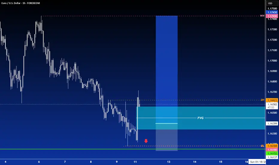
LONG ON EUR/USDEUR/USD has just given a CHOC (change of character) to the upside from is recent downtrend.
The dollar (DXY) is very bearish and I expect EUR/USD to simply retrace a little deeper into the FVG before it begins to rise.
looking to make 80-100 pips.
Candlestick Analysis

#USDJPY SHORTWe finally got the move that was supposed to happen Friday. Sundays sometimes a given and this was it for me.

ETH is gearing for a big move.Hello I cam TheCafeTrader!
Today we are taking a look at ETH.
Volatility and the dissapointed failed run Q3-Q4 of 2025 may have turned alot of you off to the crypto markets.
I am writing this to argue differently.
I think we may see the crypto markets break into ATH's 2026-2027.
Here are a couple factors to consider.
1 Support has been solid.
2 This is a great risk to reward price point.
3 The shape of the price action suggests Strength not Weakness.
This would be a 6-18 month hold. But I do think that we see ATH's.
The chart shows an entry off the top of demand, but with how aggressive this looks, I don't know if we will get that entry.
Because of this, I am going to enter 50% position size now, and then another 50% reach 3,000
Entry 3150, 3000
SL 2670
TP 1 4,684
TP 2 7,000 - 10,000
I hope you enjoyed reading, make sure to check out the other articles for 2026!
Happy Trading,
@thecafetrader

ARDX – Double Rising Window Hints Bullish ContinuationARDX – CURRENT PRICE : 6.06
The stock has broken above its long-term downtrend line accompanied by strong volume (look at red arrow). This breakout was confirmed by the formation of a Rising Window (1), signaling the end of the previous bearish phase.
Another Rising Window (2) appeared recently, again on high trading volume, reinforcing bullish sentiment and indicating the likelihood of a continuation in the uptrend. Take note also that the RSI has climbed into bullish territory (above 50), suggesting a shift in momentum towards buyers’ control and further room for upside before reaching overbought conditions.
ENTRY PRICE : 5.80 - 6.10
FIRST TARGET : 7.00
SECOND TARGET : 8.00
SUPPORT : 5.11 (bottom of the Rising Window area)

GOLD (XAUUSD): Confirmed BoS
Gold was very bullish on Friday, especially after the release
of the US fundamentals.
The market closed with a confirmed break of structure above
a strong intraday resistance.
Expect that the market will continue rising and reach 4540 level.
❤️Please, support my work with like, thank you!❤️
I am part of Trade Nation's Influencer program and receive a monthly fee for using their TradingView charts in my analysis.

XTZ swing building standby to long Smart money were active below 50 , you guys look to buy any good dips lower into / around possibly early 50s as support structure is seen and needs to continue to build possibly, and, if feb retests region again ?! . so if our low has formed and if price doesn't look back try to target 1.40 for its first swing leg.
Actually l'm aready long, alot lower down. BUT buying here is nuts, be patient and get your discounted price.

OVID Therapeutics (OVID) - Biotech with strong nervesOVID Therapeutics is a biotech company focused on developing treatments for rare neurological and genetic disorders.
On the monthly chart, OVID has broken above a long-term descending trendline and is currently retesting it from above. The key support zone sits at 1.45, while the latest close at 1.67 confirms structure preservation. Volume expanded on the breakout and faded during the pullback, indicating a healthy retest. Monthly MACD remains above zero and shows bullish divergence, while RSI holds above 50, confirming a shift in market phase. Volume profile suggests a potential magnet zone above current prices if support continues to hold.
Fundamentally, the company remains unprofitable, which is typical for a development-stage biotech. Q4 2025 EPS is expected at −0.11, revenues are minimal, but debt levels are manageable and cash reserves provide operational runway.
This is a higher-timeframe positioning idea, where the market begins to reassess the asset after a prolonged downtrend. Biotech is never comfortable, but this is how monthly reversals usually start.

BNB H1 HTF FVG Rejection and Pullback Continuation Setup📝 Description
On the H1 timeframe, CRYPTOCAP:BNB has pushed into a higher-timeframe H4/H1 Order Block and overlapping H1–30m FVGs, where price is now showing hesitation. The recent upside move appears corrective within a broader range, with price trading in premium and reacting to unmitigated sell-side areas.
________________________________________
📈 Signal / Analysis
Primary Bias: Bearish below HTF Order Block
Preferred Setup:
• Entry: 907.5 (H1 FVG)
• Stop Loss: Above 912
• TP1: 901.9
• TP2: 890.8
• TP3: 880.2
________________________________________
🎯 ICT & SMC Notes
• Price reacting inside HTF Order Block (H4/H1)
• Clear H1–30m FVG rejection zone overhead
• Below-price liquidity and unfilled FVGs remain intact
________________________________________
🧩 Summary
CRYPTOCAP:BNB is currently trading in premium HTF territory, where sellers are expected to defend. Failure to reclaim and hold above the H1 FVG increases the probability of a pullback toward the 890 and 880 liquidity zones. This setup favors patience on shorts rather than chasing upside.
________________________________________
🌍 Fundamental Notes / Sentiment
Overall crypto sentiment remains mixed, with majors showing corrective behavior rather than strong impulsive continuation. In the absence of a clear risk-on catalyst, rallies into HTF supply are more likely to attract distribution.
________________________________________
⚠️ Risk Disclosure
Trading involves substantial risk and may result in capital loss. This analysis is for educational purposes only and does not constitute financial advice. Always apply proper risk management, predefined stop-loss levels, and disciplined position sizing aligned with your trading plan.

AUDNZD: Bullish Wave Continues 🇦🇺🇳🇿
AUDNZD broke a significant daily resistance cluster this week.
It signifies a highly probable bullish trend continuation.
I will expect more growth at least to 1.172 level.
❤️Please, support my work with like, thank you!❤️
I am part of Trade Nation's Influencer program and receive a monthly fee for using their TradingView charts in my analysis.

Learn How to Identify Trend Reversal With Inducement. Smart Mone
Smart Money Concepts can be applied for the identification of trend reversal in Forex and Gold trading.
In this article, we will discuss how to apply basic SMC techniques: trap and inducement to identify early reversal signs. We will study the important theory and go through real market examples on XAUUSD chart.
Imagine that there is a strong historical resistance on a price chart.
Because the price reacted to that strongly in the past, many sellers will place selling orders on that in future, anticipating a similar reaction.
Placing short trades, their stop losses will lie above the resistance.
In case of a bullish violation of the underlined resistance,
sellers will be stopped out from their short trades and close their positions in loss.
After the violation of a resistance, according to the rules, it should turn into support . Many traders will place their buy orders there, anticipating a bullish continuation.
Bearish violation of such a support will stop out the buyers as well.
Such a price action will be called an inducement and a bullish trap.
With that, smart money grab the liquidity both from the buyers and from the sellers.
After that, with a high probability, the market will drop .
Bullish violation of one of the previous all-time-highs on Gold could easily be a bullish trap.
To confirm that, the price should simply break and close below a broken horizontal resistance.
That would confirm a local bearish reversal.
With a bullish trap and inducement, smart money are quietly placing HUGE SELLING ORDERS, making the retail traders close short trades in loss (buy their positions) and buy from the broken structure, providing them the liquidity.
The ability to recognize the traps will let you understand real intentions of smart money and trade with them.
❤️Please, support my work with like, thank you!❤️
I am part of Trade Nation's Influencer program and receive a monthly fee for using their TradingView charts in my analysis.

Smart Money Concepts SMC Detailed Learning Plan
If you want to learn Smart Money concepts, but you don't know what to start with, this article with help.
I will share with you 5-steps Smart Money Concepts learning plan. 5 important topics to study in SMC.
Topic 1:
Market Structure - the analysis of a behaviour of a price on a chart.
In the contest of Smart Money Concepts you should learn:
-SMC structure mapping
-Market trend identification, trend reversal & change
-SMC important events: BoS, CHoCH
Topic 2:
Liquidity Zones - learn to identify the areas on a price chart where liquidity concentrates.
Topic 3:
Imbalance - one of the most accurate signals of the presence of big players / smart money on the market.
Topic 4:
Order Block - the specific areas on a price chart where institutional traders / smart money are placing significant number of trading orders.
Top 5:
Top-Down Analysis - structured and consistent analysis of multiple time frames.
After you study Topic 1, 2, 3, 4, you should learn to apply these knowledge and techniques on multiple time frames, to make informed decisions, following long-term, mid-term, short-term analysis.
❤️Please, support my work with like, thank you!❤️
I am part of Trade Nation's Influencer program and receive a monthly fee for using their TradingView charts in my analysis.

Nifty Analysis EOD – January 9, 2026 – Friday🟢 Nifty Analysis EOD – January 9, 2026 – Friday 🔴
Back to Square One: 59 Days of Gains Vaporised.
🗞 Nifty Summary
The Nifty opened flat and initially sought support at the 25,860 ~ 25,840 zone. However, the recurring resistance at 25,920 ~ 25,930 proved fatal for the bulls, pushing the index back with extreme intensity.
The subsequent breakdown through the Initial Balance Low (IBL) at 25,818.35 triggered a steady slide through 25,740, eventually marking a day low at 25,623.00. A late 80-point recovery helped the index close at 25,683.30, resulting in a sharp loss of -193.55 (-0.75%).
This session marks a major structural milestone:
Nifty has returned to its November 11, 2025 closing level. The entire 632-point zone built over the last 42 sessions (59 days) has been neutralized. Technically, the market is back to “Square One,” with many stocks entering oversold territory.
🛡 5 Min Intraday Chart with Levels
🛡 Intraday Walk
The day was a masterclass in bearish dominance. After the failed attempt to reclaim the 25,930 resistance, the selling pressure became systematic. The breach of the 25,740 support was a high-conviction move that led to a vertical drop to 25,623.
While the 80-point recovery from the lows provided some intraday relief, the overall structure remains heavily skewed to the downside.
The market appears to be in a “wait-and-watch” mode, likely anticipating major news or global cues to arrest the fall.
📉 Daily Time Frame Chart with Intraday Levels
🕯 Daily Candle Breakdown
Open: 25,840.40
High: 25,940.60
Low: 25,623.00
Close: 25,683.30
Change: -193.55 (-0.75%)
🏗️ Structure Breakdown
Type: Bearish Candle.
Range (High–Low): ≈ 318 points → High intraday volatility/Expansion.
Body: ≈ 230 points → Reflects aggressive selling pressure and panic.
Upper Wick: ≈ 100 points — aggressive rejection from the 25,940 resistance.
Lower Wick: ≈ 60 points — some profit booking emerged at the extreme lows.
📚 Interpretation
The market opened near 25,840 and attempted an early spike, but was met with overwhelming supply. The long upper wick confirms that sellers used every bounce to add short positions. While the lower wick shows some demand at the 25,623 level, the recovery was insufficient to close the index above the opening price, confirming a state of distribution.
🕯 Candle Type
Bearish Continuation Candle with Volatility Expansion — Indicates sellers are in firm control; the trend remains weak despite the oversold readings.
🛡 5 Min Intraday Chart
⚔️ Gladiator Strategy Update
ATR: 189.85
IB Range: 122.25 → Medium
Market Structure: ImBalanced
Trade Highlights:
10:00 Long Trade: SL Hit (Bulls trapped at early resistance)
11:14 Short Trade: Target Hit (R:R 1:2.17) (IBL Breakout)
12:24 Short Trade: Target Hit (R:R 1:1.95) (Structural Support Breakout)
Trade Summary: After an initial trap for the long side, the strategy correctly pivoted to the bearish imbalance. The IBL breakout provided the first high-conviction short, followed by a successful secondary short as the 25,740 level crumbled.
🧱 Support & Resistance Levels
Resistance Zones:
Will discuss in Weekly Note.
Support Zones:
Will discuss in Weekly Note.
🧠 Final Thoughts
“The clock has been reset to November.”
Nifty has completed a full circle, returning to price levels seen nearly two months ago. With the index and several heavyweights in an oversold state, the technical potential for a bounce is high, but the price action lacks a reversal trigger.
I will wait for Monday’s opening tick to assess if the “Square One” level acts as a floor or a trap.
For now, I’m closing the terminal and spending some quality time with my family—I’ll let President Trump decide our fate this weekend; let’s see if he tweets us a “HUGE” recovery or if he’s just going to “fire” the bulls altogether. Time to relax and recharge!
✏️ Disclaimer
This is just my personal viewpoint. Always consult your financial advisor before taking any action.

GBPJPY: Bullish Continuation Ahead 🇬🇧🇯🇵
GBPJPY broke and closed above a resistance line of a
bullish flag pattern on a 4h time frame.
With a high probability, the price will continue rising and
reach 211.95 level soon.
❤️Please, support my work with like, thank you!❤️
I am part of Trade Nation's Influencer program and receive a monthly fee for using their TradingView charts in my analysis.

#GBPAUD ShortWe have NFP News today. Theres a chance this short happens before the NFP news. I don't trade Fridays but this looks like a simple easy trade so i thought i will share my idea

Steel cast can be breakout swing investment ideaThe trendline are self explainatory and the candle stick pattern already given small wick about the trendline. In todays bearish market, the full body candle gives an entry opportunity for Breakout.

USDCAD: Is That a Trap?! 🇺🇸🇨🇦
USDCAD may retrace from a key daily resistance.
I see a highly probable bullish trap on intraday time frames.
The pair may drop to 1.3835 level.
❤️Please, support my work with like, thank you!❤️
I am part of Trade Nation's Influencer program and receive a monthly fee for using their TradingView charts in my analysis.

EU sale inside of monthly consolidation, stick to short swingsThe internal range movements are the best return right now. Trying to target long runs in this internal range liquidity is very difficult right now.
Until we close outside the mother range (highlighted) on the monthly candles, it will continue to have this struggle as none of the larger traders are willing to risk huge in this range.
That will never stop us from trading 1-4H internal range orderblocks for small wins. As we see now the daily is giving good amount of days in each direction. 2026 already locked-in. It's easy 🙏🏾

USD/JPY(20260109)Today's AnalysisMarket News:
On Tuesday, both the Dow Jones Industrial Average and the Dow Jones Transportation Average hit record closing highs, marking the first buy signal from Dow Theory in over a year.
Technical strategists believe this confirms the bull market that began in late 2022 remains firmly established, even as some previously high-performing AI-related stocks have recently faced pressure.
The Dow Jones Industrial Average's last record closing high was on January 5th, while the Dow Jones Transportation Average's record high was even further back. Dow Jones market data shows that the index's last record closing high was on November 25th, 2024.
Technical Analysis:
Today's Buy/Sell Threshold:
156.79
Support and Resistance Levels:
157.40
157.17
157.02
156.55
156.41
156.18
Trading Strategy:
If the price breaks above 157.02, consider buying with a first target price of 157.1.
If the price breaks below 156.79, consider selling with a first target price of 156.55.

Demand drawing price down before reversal longWith the early December FVG filled and traded through, the Demand zone at the base of that price leg is now acting as a magnet drawing price deeper in discount pricing. Price will either continue dropping impulsively before reversing as shown in blue, or retrace back up to pick up more liquidity before reaching the demand zone and ultimately reversing as shown in purple...assuming market makers intend to continue long-term bullish market conditions.

NZDJPY: Bullish After Trap 🇳🇿🇯🇵
NZDJPY will likely bounce after a false violation
of the underlined intraday horizontal support.
Expect a pullback to 90.33 level.
❤️Please, support my work with like, thank you!❤️
I am part of Trade Nation's Influencer program and receive a monthly fee for using their TradingView charts in my analysis.

Nifty Analysis EOD – January 8, 2026 – Thursday🟢 Nifty Analysis EOD – January 8, 2026 – Thursday 🔴
Bears Rampage: 12-Session Gains Liquidated as Nifty Crashes 260 Points.
🗞 Nifty Summary
The Nifty opened with a 45-point Gap Down, and despite an initial attempt to fill the gap, the bearish intent was undeniable. Within minutes, the index breached 26,070 and the PDL, triggering a sustained cascade.
Bears confidently drove the index through the 25,930 ~ 25,920 zone, eventually testing the 25,890 support. After a three-hour period of sideways consolidation (12 PM – 3 PM), a final wave of selling broke the 25,890 floor to test the next support at 25,860.
Nifty concluded the session at 25,868.90, just 10 points above the day’s low. This massive 275-point expansion effectively wiped out 19 days (12 sessions) of accumulation, bringing the market back to its December 19th starting point.
🛡 5 Min Intraday Chart with Levels
🛡 Intraday Walk
The day was a masterclass in trend expansion. With the Gladiator range at 175.66 and the actual range hitting 275 points, the market moved into a clear “Imbalance” state.
The failed early gap-fill was the first warning; once the PDL and IB broke in unison at 10:10 AM, the floodgates opened. The three-hour pause between 12 PM and 3 PM acted merely as a distribution phase before the final breakdown to 25,860.
Sellers were in absolute control from start to finish, with almost no meaningful retracements.
📉 Daily Time Frame Chart with Intraday Levels
🕯 Daily Candle Breakdown
Open: 26,106.50
High: 26,133.20
Low: 25,858.45
Close: 25,876.85
Change: −263.90 (−1.01%)
🏗️ Structure Breakdown
Type: Strong Bearish Candle (Full Body).
Range (High–Low): ≈ 275 points → High intraday volatility/Expansion.
Body: ≈ 230 points → Reflects aggressive selling pressure and panic.
Upper Wick: ≈ 27 points → Failed early buying attempt near the open.
Lower Wick: ≈ 18 points → Almost no demand or absorption near the lows.
📚 Interpretation
This is a high-conviction Bearish Marubozu-Style candle. Closing near the absolute low of a 275-point range indicates strong distribution. By closing below the December 19th lows, the market has invalidated the entire holiday rally. The lack of a lower wick suggests that the sell-off was not a “stop-run” but actual portfolio liquidations.
🕯 Candle Type
Bearish Breakdown Candle — Signals powerful bearish momentum; continuation is likely unless a significant “V-shape” reversal occurs at the major 25,840 support.
🛡 5 Min Intraday Chart
⚔️ Gladiator Strategy Update
ATR: 175.66
IB Range: 83.35 → Medium
Market Structure: ImBalanced
Trade Highlights:
09:29 Short Trade: SL Hit (Early Volatility)
10:10 Short Trade: Target Hit (1:4.45) (PDL + IB Breakout)
Trade Summary: After an initial stop-loss during the volatile opening minutes, the strategy performed exceptionally well. The 10:10 AM signal provided a high-conviction entry at the confluence of the PDL and IBL. The sustained trend allowed for a massive 1:4.45 R:R win, capturing the meat of the 230-point body move.
🧱 Support & Resistance Levels
Resistance Zones:
25985
26030
26070
26104
Support Zones:
25860 ~ 25840 (Current Critical Support)
25800 (Psychological)
25740 ~ 25715 (Ultimate Support Zone)
🧠 Final Thoughts
“We are back to square one.”
The market is at a massive crossroads at the 25,840 ~ 25,860 support zone. After such a violent fall, we must prepare for two scenarios:
A ‘Dead Cat Bounce’ toward the 25,985 zone which will likely be sold into.
A bearish continuation that tests the ultimate support zone of 25,740 ~ 25,715.
I will strictly wait for the Initial Balance (IB) to form tomorrow before approaching the market, as today’s momentum might lead to a volatile opening gap.
✏️ Disclaimer
This is just my personal viewpoint. Always consult your financial advisor before taking any action.

Short_WiproHi traders,
Currently Wipro trading Resistance zone around 272 with multiple rejections.
Short the futures and Buy PE of 250 strike and exit the trade once reaches the target 🎯.
Note:- Only for educational purpose.
