GBPJPY: overheating signals — correction in focusGBPJPY remains highly sensitive to yield differentials and central bank rhetoric. The British pound is supported by the relatively hawkish stance of the Bank of England, but markets increasingly price in economic slowdown risks in the UK. At the same time, the Japanese yen stays weak due to the Bank of Japan’s accommodative policy, yet current cross levels appear stretched. Growing discussions about potential BoJ policy adjustments and rising global risk aversion increase the probability of a corrective pullback after an extended rally.
Technically, price remains in a strong uptrend but is trading near Fibonacci extension levels. A clear CCI divergence signals weakening momentum. The primary scenario points to a corrective move toward the 0.705–0.5 Fibonacci zones, where buy limit interest is expected. An alternative scenario allows for a final push higher followed by a sharp pullback. Trading from current levels requires caution and disciplined risk management.
Divergence

202601 PGEO break resist in Divergence modePGEO break resist trenline with MACD in Divergence mode, an early of reversal sign
www.tradingview.com

BTCUSD (15m) — Bullish RSI Divergence 📈 BTCUSD (15m) — Bullish RSI Divergence Signals Momentum Shift
Timeframe: 15m
Market: BTCUSD (Bitstamp)
Indicator: RSI
🧠 Idea Overview
BTC printed a clear bullish divergence on the 15-minute chart, suggesting selling pressure was weakening despite lower price lows. This divergence preceded a strong upside reaction, highlighting a potential local trend reversal / continuation higher.
🔍 What We’re Seeing
Price made a lower low (highlighted by the descending trendline on price)
RSI made a higher low (ascending trendline on RSI)
This creates a classic bullish divergence
RSI held above the extreme oversold region, signaling bear exhaustion rather than panic selling
At the same time, price reclaimed short-term structure and expanded upward with momentum, confirming the divergence.
✅ Confirmation Factors
RSI turned up and crossed back above its signal / mid-range
Strong bullish candles followed the divergence
Volume expanded on the move higher
No immediate acceptance below the prior low (failed breakdown)
This confirms the divergence was actionable, not just theoretical.
❌ Invalidation
This bullish thesis would have been invalidated if:
Price accepted below the prior swing low
RSI broke down and made a new lower low
The bounce failed to reclaim local structure
None of those occurred — instead, price accelerated upward.
🎯 Takeaway
Bullish divergences work best:
After a pullback in an overall bullish context
When paired with structure reclaim or momentum expansion
As early warning signals, not standalone entries
This setup was a good example of momentum shifting before price.
⚠️ Reminder
Divergences do not call exact bottoms — they highlight probability shifts. Always combine with structure, trend context, and risk management.

CVD and Open Interest DivergenceOpen Interest answers a simple but critical question: are traders committing new risk, or are they exiting existing positions? When price rises while Open Interest increases, new contracts are being added in the direction of the move. This confirms expansion and signals that the market is willing to fund higher prices. When price rises while Open Interest falls, positions are being closed into strength. That behavior reflects distribution rather than continuation. The same logic applies on the downside. Falling price with rising Open Interest signals aggressive short participation. Falling price with declining Open Interest signals profit-taking, not fresh selling pressure.
Cumulative Volume Delta adds context to this positioning data. It measures whether aggressive market orders are driving price or being absorbed by passive liquidity. When price prints higher highs but CVD fails to confirm, buying pressure is weakening despite higher prices. Participants are lifting offers with less urgency, and absorption is occurring. When price stalls or compresses while CVD continues to rise, it suggests that aggressive buyers are being absorbed by larger passive sellers. The move looks strong on price, but commitment is thinning.
These divergences become most meaningful when they appear at structurally relevant locations. Inside ranges, they frequently expose failed breakouts where price briefly escapes but participation does not follow. At highs and lows, they reveal exhaustion, where liquidity has been collected but no new initiative remains. During established trends, they help differentiate healthy continuation from late-stage rotation, where the trend persists visually but weakens internally.
The highest-quality environments occur when structure and participation align. A clean break of structure followed by expanding Open Interest and confirming CVD indicates that the market has accepted the new direction. Risk is being added, not removed, and aggressive flow supports price discovery. When one of these components is missing, vulnerability increases. Breaks without Open Interest expansion often fade. Moves with Open Interest but no CVD confirmation frequently stall or retrace.
Many traders struggle because they trade direction without measuring commitment. They react to candles instead of assessing whether the move is being funded. CVD and Open Interest shift the focus from where price moved to why it moved. This perspective reduces overtrading, filters false momentum, and clarifies when patience is required.
Used correctly, these tools are not predictive indicators. They do not call tops or bottoms. They expose when a market narrative is weakening before structure fully changes. That awareness improves timing, limits unnecessary exposure, and prevents chasing moves already sustained by trapped or exiting participants. In leveraged markets, understanding participation is not an edge. It is a requirement for survival.

Mastering MFI: The Money Flow Index as a Momentum, Volume...🔵 Mastering MFI: The Money Flow Index as a Momentum, Volume & Trend Framework
Difficulty: 🐳🐳🐳🐳🐋 (Advanced)
The Money Flow Index (MFI) is often overlooked, yet it combines price and volume into a single oscillator. This makes it one of the few indicators capable of revealing not just momentum — but participation and pressure behind price movement.
🔵 WHAT IS MFI AND WHY IT IS DIFFERENT
The Money Flow Index (MFI) was developed by Gene Quong and Avrum Soudack .
It is sometimes called the volume-weighted RSI because it blends momentum with volume.
Unlike RSI, which only measures price speed, MFI answers a deeper question:
Is money actually flowing into or out of the market?
MFI uses:
Typical price
Volume
Positive and negative money flow
This makes MFI especially useful for:
Detecting accumulation and distribution
Confirming trend strength
Spotting hidden divergence
Measuring volume pressure inside trends
🔵 WHY MOST TRADERS MISUSE MFI
Most traders use MFI like this:
MFI above 80 = sell
MFI below 20 = buy
This creates the same problem as RSI misuse:
Shorting strong trends
Buying weak trends
Ignoring money flow context
MFI is not an overbought/oversold oscillator by default.
It is a money flow and pressure indicator.
🔵 1. MFI AS MONEY FLOW (WHO IS BUYING AND SELLING)
At its core, MFI tracks whether volume is entering or exiting the market.
Rising MFI
Buyers are dominant
Volume supports price movement
Accumulation is occurring
Falling MFI
Sellers are dominant
Volume confirms distribution
Capital is leaving the market
Key insight:
Price can rise without MFI rising — this often signals weak participation.
🔵 2. MFI TREND REGIMES (TREND FOLLOWING WITH VOLUME)
Just like RSI, MFI forms regimes — but with volume confirmation.
Bullish MFI Regime
MFI holds above 50
Pullbacks stall around 40–50
Breaks above 60 show strong inflow
Bearish MFI Regime
MFI holds below 50
Rallies fail near 50–60
Breaks below 40 show strong outflow
Why this matters:
Trend continuation without money flow is fragile.
🔵 3. MFI DIVERGENCE (PRICE VS MONEY)
MFI divergence is more powerful than RSI divergence because it includes volume.
Bullish MFI Divergence
Price makes lower low
MFI makes higher low
Selling pressure is weakening
Bearish MFI Divergence
Price makes higher high
MFI makes lower high
Buying pressure is weakening
Hidden MFI Divergence (Trend Continuation)
Price makes higher low, MFI makes lower low
Price makes lower high, MFI makes higher high
🔵 4. MFI AS VOLUME PRESSURE INSIDE TRENDS
One of the most underrated uses of MFI is tracking pressure during pullbacks.
Healthy Trend Pullback
Price pulls back
MFI stays elevated
Volume does not flip aggressively
Weak Trend Pullback
Price pulls back
MFI collapses sharply
Volume exits the move
This helps separate correction from distribution.
🔵 5. MFI VS RSI (WHY THEY DIVERGE)
RSI and MFI often disagree — and that disagreement is information.
RSI rising + MFI flat/falling = price moving without volume
RSI flat + MFI rising = accumulation under the surface
RSI falling + MFI rising = absorption
Indicator disagreement often signals transitions.
🔵 6. MULTI-TIMEFRAME MFI ALIGNMENT
Professional rule:
Trade lower timeframe signals only when higher dominant timeframe MFI supports the direction.
HTF MFI rising = prioritize longs
HTF MFI falling = prioritize shorts
HTF MFI flat = expect range or traps
🔵 EXAMPLE TRADING FRAMEWORK
Bullish Setup Checklist
MFI above 50
Pullback holds 40–50 zone
Price forms higher low
MFI turns up before price
Bearish Setup Checklist
MFI below 50
Rally fails near 50–60
Price forms lower high
MFI turns down before price
🔵 COMMON MFI MISTAKES
Using MFI only as overbought/oversold
Ignoring volume context
Trading divergence against strong trend
Using MFI without structure confirmation
🔵 CONCLUSION
The Money Flow Index is far more than a simple oscillator.
It allows traders to:
Track real participation
Detect accumulation and distribution
Confirm trend strength with volume
Spot early momentum shifts
Filter false price moves
Price shows where the market moved.
MFI shows whether money agreed with that move.
How do you use MFI? Divergence, trend filtering, or volume pressure? Share your experience below.

When Indexes Stop Agreeing, Markets Start TalkingEver notice how markets can look strong… yet feel a little off?
That’s usually when indexes stop marching in sync — and right now, that’s exactly what’s happening.
Let’s break it down, no jargon overload, no crystal balls.
Four Indexes, Four Different Stories
Here’s the current lineup in US equity index futures:
S&P 500 (ES) → Pushing to fresh all-time highs
Dow Jones (YM) → Also holding above prior highs
NASDAQ 100 (NQ) → Lagging below its peak
Russell 2000 (RTY) → Still stuck under its highs
When all four move together, trends tend to behave.
When they don’t? Markets usually get… interesting.
Why This Disagreement Matters
The NASDAQ is packed with technology and AI-related names — the same group that carried much of the upside through 2025. Its failure to confirm new highs raises an eyebrow.
Meanwhile:
The Dow (YM) is strong, despite being less tech-heavy
Small caps (RTY) aren’t joining the party
Leadership is narrowing, not expanding
That’s not a signal by itself — but it is a clue.
Momentum Is Whispering (Not Shouting)
Momentum indicators aren’t screaming danger, but they are quietly tapping the mic:
NASDAQ shows a bearish divergence
Dow also shows a bearish divergence (yes, even while strong)
Russell goes a step further with a divergence and a momentum crossover
The S&P 500? Still holding up — but increasingly alone.
When momentum fades while price stays elevated, markets often shift from trending to fragile.
The Levels That Actually Matter
Here’s where structure comes in.
Two UFO (UnFilled Orders) support zones sit right below price:
NASDAQ (NQ): ~25,608
Dow (YM): ~48,127
Above these levels, structure is intact.
Below them? That’s when momentum warnings could start turning into price action.
Think of these zones as market tripwires — nothing happens until they’re crossed.
Condition-Based Thinking (No Guessing Required)
Instead of asking “Will the market drop?”, a better question is:
What would need to happen for risk to expand?
A simple framework:
NQ below support + YM below support
Weakest and strongest indexes failing together
Divergences resolving through price, not time
That’s when downside scenarios become more relevant — not before.
Quick Note on Contract Specs & Margin
All four index futures discussed are available in E-mini and Micro E-mini versions, moving tick-for-tick with the same underlying index.
At a glance:
Micro contracts = 1/10 the tick value of E-minis
Typical tick values:
ES / MES: $12.50 vs. $1.25
NQ / MNQ: $5.00 vs. $0.50
YM / MYM: $5.00 vs. $0.50
RTY / M2K: $5.00 vs. $0.50
Margin context (approximate):
ES / MES: $22,500 vs. $2,250
NQ / MNQ: $33,500 vs. $3,350
YM / MYM: $14,250 vs. $1,425
RTY / M2K: $9,500 vs. $950
Same market, same analysis — just different risk granularity. This becomes especially useful when markets are hovering near key structural levels.
The Big Takeaway
Markets don’t usually turn when everyone expects them to.
They turn when participation fades, leadership narrows, and structure starts cracking.
Right now:
Some indexes are strong
Others are lagging
Momentum is diverging
Key levels are close
No conclusions. No assumptions.
Just evidence — and levels worth paying attention to as 2026 approaches.
Want More Depth?
If you’d like to go deeper into the building blocks of trading, check out our From Mystery to Mastery trilogy, three cornerstone articles that complement this one:
🔗 From Mystery to Mastery: Trading Essentials
🔗 From Mystery to Mastery: Futures Explained
🔗 From Mystery to Mastery: Options Explained
When charting futures, the data provided could be delayed. Traders working with the ticker symbols discussed in this idea may prefer to use CME Group real-time data plan on TradingView: www.tradingview.com - This consideration is particularly important for shorter-term traders, whereas it may be less critical for those focused on longer-term trading strategies.
General Disclaimer:
The trade ideas presented herein are solely for illustrative purposes forming a part of a case study intended to demonstrate key principles in risk management within the context of the specific market scenarios discussed. These ideas are not to be interpreted as investment recommendations or financial advice. They do not endorse or promote any specific trading strategies, financial products, or services. The information provided is based on data believed to be reliable; however, its accuracy or completeness cannot be guaranteed. Trading in financial markets involves risks, including the potential loss of principal. Each individual should conduct their own research and consult with professional financial advisors before making any investment decisions. The author or publisher of this content bears no responsibility for any actions taken based on the information provided or for any resultant financial or other losses.

When Indexes Disagree: Evidence-Based Clues Heading Into 2026Market Context: Why Futures-Based Index Analysis Matters
When equity markets approach historical extremes, surface-level price action often hides important structural information. This is especially true when analyzing cash indices alone. Futures markets, by contrast, provide continuous pricing across all trading sessions, including the Globex (Extended Trading Hours) session, offering a more complete picture of participation, liquidity, and risk transfer.
By focusing on US equity index futures rather than cash indices, traders gain visibility into how markets behave outside regular trading hours — often where meaningful positioning occurs. This becomes particularly important when markets are near all-time highs and internal alignment begins to fracture.
In this analysis, attention is placed on the four most relevant US equity index futures:
E-mini S&P 500 Index Futures (ES)
E-mini NASDAQ 100 Index Futures (NQ)
E-mini Dow Jones Index Futures (YM)
E-mini Russell 2000 Index Futures (RTY)
Together, these markets represent large-cap growth, broad market exposure, industrial and value-oriented components, and small-cap participation. When these indexes move in harmony, trends tend to persist. When they diverge, conditions often become more fragile.
All-Time Highs in Focus: Who Is Leading and Who Is Lagging
A defining characteristic of the current environment is disagreement among indexes, despite elevated price levels.
The E-mini S&P 500 Index Futures (ES) has recently pushed to a new all-time high. This reflects ongoing strength in the broader market and confirms that headline risk appetite remains intact.
In contrast, the E-mini NASDAQ 100 Index Futures (NQ) has failed to confirm this strength. Despite previous leadership, NQ is currently trading below its all-time high. This matters because the NASDAQ is heavily weighted toward technology and growth-related stocks, including those linked to artificial intelligence (AI) — sectors that provided a significant portion of upside momentum throughout 2025.
Meanwhile, the E-mini Dow Jones Index Futures (YM) is trading above its prior all-time high. This is notable because the Dow has a more diversified sector composition and is less concentrated in high-growth technology names. Its relative strength suggests that current market resilience may be coming from areas outside of the technology complex.
Finally, the E-mini Russell 2000 Index Futures (RTY) remains below its all-time high. Small- and mid-cap stocks often act as a confirmation layer for broader economic participation. When large-cap indexes make new highs while small caps lag, it can signal uneven economic traction and rising internal imbalance.
This combination — ES and YM showing strength, while NQ and RTY lag — forms the foundation of the current intermarket tension.
Momentum Evidence: What MACD Is Revealing Across Indexes
Price alone rarely tells the full story near extremes. Momentum indicators, when used correctly, help evaluate the quality of participation behind price movement.
In this case, the MACD indicator reveals important divergences across multiple indexes.
The NQ is displaying a bearish momentum divergence, where price remains elevated but momentum fails to confirm. This suggests that upside participation is narrowing rather than expanding.
The YM — despite being one of the strongest indexes — is also showing a bearish divergence on MACD. This is particularly important because divergences forming in strong markets often precede broader shifts, not because price must reverse immediately, but because momentum strength is no longer accelerating.
The RTY presents the most advanced signal set. It is not only showing a bearish divergence, but also a MACD crossover, which can be interpreted as early-stage downside momentum attempting to assert itself.
The ES, while not currently exhibiting the same degree of momentum weakness, stands increasingly isolated. When leadership narrows to one index, risk becomes asymmetric rather than evenly distributed.
Structural Risk Zones: Interpreting UFO (UnFilled Orders) Support
Momentum divergences alone do not constitute actionable signals. They require structural confirmation.
This is where UFO support and resistance levels (UnFilled Orders) become relevant. UFO zones represent areas where liquidity previously failed to transact fully, often acting as structural support or resistance when revisited.
In the current structure, two UFO support zones stand out due to their proximity to price and their relevance to both the strongest and weakest markets:
NQ: UFO support ending near 25,608.25
YM: UFO support ending near 48,127
These levels are significant because they sit directly beneath current price action. As long as price remains above these zones, structure remains intact despite momentum warnings.
However, a violation of such UFO supports would represent a meaningful shift. It would indicate that buyers previously willing to defend these levels are no longer present, allowing momentum divergences to express themselves more fully.
Conditional Scenarios: What Would Confirm a Broader Risk Shift
Rather than anticipating outcomes, evidence-based analysis focuses on conditions.
From a structural standpoint, bearish scenarios would gain credibility if:
NQ trades below 25,608.25, violating its nearby UFO support
YM trades below 48,127, removing structural support from the strongest index
Weakness emerging simultaneously in both the weakest and strongest indexes would suggest that divergence is resolving through price rather than consolidation. In such a case, broader downside expansion could develop, potentially manifesting as a sharp corrective phase.
Importantly, this framework does not assume that such a move must occur. It simply defines what conditions would matter if they do.
Illustrative Trade Framework (Educational Example Only)
For traders studying downside scenarios, a hypothetical bearish framework could be structured as follows:
Trigger: Confirmed daily close below relevant UFO support
Risk Definition: Invalidation above reclaimed structure
Objective: Next lower structural liquidity zone
Reward-to-Risk: Favorable only if structure breaks decisively
This framework is illustrative and intended solely to demonstrate how structure, momentum, and confirmation can align. It does not imply expectations or outcomes.
E-mini vs. Micro E-mini Contracts
All four equity index futures discussed — ES, NQ, YM, and RTY — are available in both E-mini and Micro E-mini formats. Both versions track the same underlying index and move tick-for-tick together. The difference lies in how risk is expressed.
ES / MES Tick size: 0.25 index points = $12.50 (ES) | $1.25 (MES)
NQ / MNQ Tick size: 0.25 index points = $5.00 (NQ) | $0.50 (MNQ)
YM / MYM Tick size: 1 index point = $5.00 (YM) | $0.50 (MYM)
RTY / M2K Tick size: 0.10 index points = $5.00 (RTY) | $0.50 (M2K)
Across all four indexes, Micro E-mini contracts represent one-tenth of the tick value of their E-mini counterparts.
Margin requirements vary by broker and market conditions. From a structural perspective:
ES / MES required margin = ~$22,500 (ES) | ~$2,250 (MES)
NQ / MNQ required margin = ~$33,500 (NQ) | ~$3,350 (MNQ)
YM / MYM required margin = ~$14,250 (YM) | ~$1,425 (MYM)
RTY / M2K required margin = ~$9,500 (RTY) | ~$950 (M2K)
This difference allows traders to express the same market thesis with far greater precision, especially when working around tight structural levels or conditional triggers.
With momentum divergences developing and key structural zones nearby, position sizing flexibility becomes critical. Micro E-mini contracts make it possible to:
Scale exposure gradually
Reduce concentration risk
Align risk more closely with invalidation levels
The analysis remains identical across E-minis and Micros — only the risk calibration changes.
Risk Management Considerations
Divergences can persist longer than expected, especially in strong trends. Acting without confirmation often leads to premature positioning.
Key principles include:
Waiting for structural validation
Defining risk before engaging
Managing exposure across correlated instruments
Avoiding overconfidence near historical extremes
Markets rarely turn because of opinion. They turn when structure and participation change.
Final Takeaway: Evidence Over Assumptions
As 2025 comes to a close, US equity index futures present a market that is strong on the surface but fractured underneath. Leadership is narrowing, momentum is diverging, and structural levels are increasingly relevant.
Whether these signals resolve through consolidation or correction remains unknown. What matters is that the evidence is now visible — and futures markets provide the clarity needed to observe it.
Data Consideration
When charting futures, the data provided could be delayed. Traders working with the ticker symbols discussed in this idea may prefer to use CME Group real-time data plan on TradingView: www.tradingview.com - This consideration is particularly important for shorter-term traders, whereas it may be less critical for those focused on longer-term trading strategies.
General Disclaimer
The trade ideas presented herein are solely for illustrative purposes forming a part of a case study intended to demonstrate key principles in risk management within the context of the specific market scenarios discussed. These ideas are not to be interpreted as investment recommendations or financial advice. They do not endorse or promote any specific trading strategies, financial products, or services. The information provided is based on data believed to be reliable; however, its accuracy or completeness cannot be guaranteed. Trading in financial markets involves risks, including the potential loss of principal. Each individual should conduct their own research and consult with professional financial advisors before making any investment decisions. The author or publisher of this content bears no responsibility for any actions taken based on the information provided or for any resultant financial or other losses.

Bullish Divergence appearing on shorter tf.BTC Analysis
CMP 87846.93 (24-12-2025)
Bullish Divergence appearing on shorter tf.
The price may bounce towards 91000 - 91500.
However, monthly closing above 87000 may bring
some more positivity.
Immediate Resistance is around 91000 - 91500 &
then aorund 97700.
However, if 80000 is broken this time, we may
witness more selling pressure.

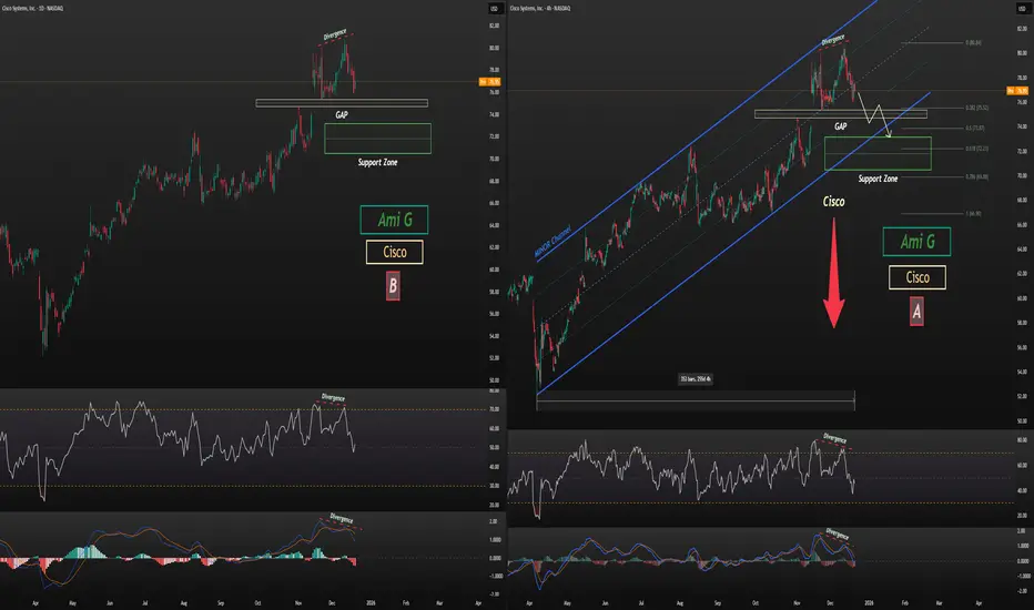
CSCO Correction TargetCisco (CSCO) Stock Analysis
As shown on the chart, Cisco is trading near the upper boundary of its 9-month channel. After forming two strong divergences on the 4H chart (Chart A) and the daily chart (Chart B)—confirmed by both MACD and RSI—the stock has entered a corrective phase.
Given the presence of a very strong gap marked on the chart, price is likely to correct at least toward the gap zone, and potentially extend further to the support zone, which may also align with the lower boundary of the 9-month channel.
Analysis will be updated.
Follow me on TradingView for more analyses and live stock trades.
NASDAQ:CSCO
IONX 4H - When the noise fades, volume takes controlIONX is transitioning from a sharp corrective phase into stabilization near the 22 to 23 zone. This move is not random selling but a clear sign of seller exhaustion. Price is holding a confluence area where Fibonacci 0.618 and 0.786 align with a prior accumulation zone. Volume tells the real story. Selling pressure is fading, while momentum indicators show bullish divergence. Sellers are losing control even as price remains near the lower range.
The current structure suggests stabilization rather than trend continuation to the downside. Ranges are tightening and demand reactions are becoming consistent. As long as price holds above 22 to 23, the recovery scenario stays intact. The first resistance zone sits near 29 to 30, where previous balance was formed. A confirmed breakout opens the path toward 38.04 and then 48.10.
IONX is what happens when emotions leave the chart and patience takes over.

Volume Do Not Predict Price! - It Explains It!Most traders look at volume the wrong way.✖️
They expect volume to tell them where price will go next.
But volume’s real job is much more important:
Volume explains why price moved the way it did.
If you learn to read volume correctly, price action becomes clearer, not noisier.
1️⃣ Price Up + Rising Volume = Commitment
When price moves higher and volume expands, it means buyers are committed, not just reacting.
This is not random buying.
This is participation.
📈Rising volume during an impulse confirms that the move is supported by real interest, not just thin liquidity.
Strong trends are built on expanding volume.
2️⃣ Price Up + Falling Volume = Warning
When price continues higher but volume dries up, something changes.
The move still exists... but conviction doesn’t.
This often signals:
- exhaustion
- a potential pause
- or an upcoming correction
That’s when professionals stop chasing and start managing risk.
3️⃣ Sideways Price + Rising Volume = Accumulation or Distribution
This is where most traders get confused:
Price isn’t moving much, but volume is increasing.
That’s not boredom.
That’s positioning.
Large players don’t chase price.
They build positions quietly while price looks “dead.”
Breakouts that follow these zones tend to be fast and decisive, because the work was already done.❗️
4️⃣ Breakouts Without Volume Are Suspect
A breakout candle looks exciting.
But without volume, it’s just a move, not a decision.
Low-volume breakouts often lead to:
- fakeouts
- traps
- fast reversals
🏹Volume doesn’t need to explode... but it needs to confirm participation.
💡The Big Picture
Volume is not a signal by itself. It’s context.
Price tells you what happened, while Volume tells you how serious that move really was.
✔️When price and volume agree, trades feel easy.
✖️When they disagree, something important is hiding underneath.
⚠️ Disclaimer: This is not financial advice. Always do your own research and manage risk properly.
📚 Stick to your trading plan regarding entries, risk, and management.
Good luck! 🍀
All Strategies Are Good; If Managed Properly!
~Richard Nasr

High Probability Setups: Divergence in Price and VolumePrice defines direction, but volume defines participation. High probability setups emerge when both align. When they separate, conditions change. Divergence between price and volume is one of the clearest tools for assessing whether a move is supported by real commitment or driven by diminishing participation.
In strong market conditions, impulsive price movements are accompanied by stable or increasing volume. This shows that traders are actively committing capital in the direction of the move. Pullbacks during these phases typically show reduced volume, confirming that counter-moves are corrective rather than a shift in control. This alignment between price expansion and volume participation supports continuation.
Divergence forms when price continues to extend while volume contracts. The market is still moving, but fewer participants are involved. This shift indicates that momentum is weakening beneath the surface. The move becomes more fragile, and continuation requires increasingly less resistance to fail. These conditions often develop before structural changes become visible on price alone.
The relevance of divergence increases at key locations. When price reaches major highs or lows, premium or discount zones, or obvious liquidity pools, declining volume signals absorption. Orders are being filled without follow-through. Late participants provide liquidity rather than fuel. This explains why many apparent breakouts stall or reverse shortly after forming.
Volume behaviour also clarifies breakout quality. Breaks that occur with low or declining volume often lack acceptance. Price may move beyond a level, but without participation the market struggles to sustain the new range. When price quickly re-enters the prior structure, divergence explains the failure before structural confirmation appears.
During consolidation phases, volume provides insight into preparation. Falling volume reflects compression and balance. Rising volume within a range reflects active engagement and positioning. Divergence during these phases often precedes resolution, especially when combined with liquidity interaction at range boundaries.
High probability setups form when divergence aligns with location and structure. Volume refines what price presents. It helps identify whether a move is being supported, absorbed, or exhausted. Reading this relationship consistently improves timing, reduces false entries, and keeps execution aligned with real market participation rather than surface-level movement.

Relative analysis of Bitcoin vs. Gold and Total CryptoOn the BINANCE:BTCUSDT / TVC:GOLD ratio chart, price attempted to re-enter the primary channel after the initial breakout, aiming to push back toward the channel’s upper boundary. However, despite (105) days of upward attempts, the ratio consistently struggled with the dynamic resistance area.
After the breakdown, price extended toward the lower boundary of the extended channel, where it showed a strong and precise reaction.
From here, the structure suggests a potential bullish corrective move toward the resistance zone, supported by:
bullish divergence between price and MACD,
clear weekly rejection candles,
and price interaction at the channel’s lower boundary.
This scenario is further reinforced by the Crypto Market Cap (excluding Bitcoin) CRYPTOCAP:TOTAL2 vs. Gold TVC:GOLD ratio. This chart has also reached the bottom of its (180-week) channel, formed a weekly bullish divergence, and has now returned back inside the channel.
As shown on the chart, the TOTAL crypto channel exhibits cleaner and more consistent reactions compared to the Bitcoin channel.
If our key level is broken, the bullish scenario becomes invalid, and price is likely to move toward the support zones. This analysis will be updated accordingly.
BINANCE:BTCUSDT
TVC:GOLD
CRYPTOCAP:TOTAL2

USD/CAD: Will the Great Divergence Break the Greenback?The financial world stands on the precipice of a defining moment for North American currency markets. The USD/CAD pair hovers near 1.3855, ticking nervously as traders count down to a rare double-header of central bank decisions. December 10, 2025, marks a pivotal divergence point where economic pathways between the United States and Canada split sharply. This is not merely a technical adjustment; it is a fundamental collision of monetary policy, geopolitical strategy, and industrial resilience. The outcome will likely dictate the Loonie’s trajectory for the coming year.
Macroeconomics: A Tale of Two Trajectories
The macroeconomic landscape reveals a stark contrast between the two nations. The Federal Reserve prepares to slash interest rates for the third consecutive time, targeting a range of 3.50%-3.75%. Markets price this move at nearly 88% probability. The US labor market displays clear signs of cooling, necessitating easier financing conditions to prevent a recession. Conversely, the Bank of Canada (BoC) stands firm. Canada’s economy defied expectations with a robust 2.6% annualized GDP growth in Q3, crushing earlier forecasts. This resilience compels the BoC to hold rates at 2.25% to prevent reigniting inflation, which remains sticky at 2.2%.
Geostrategy: The Fertilizer Chess Game
Beyond interest rates, a high-stakes geopolitical trade war complicates currency valuation. The US administration’s threat of severe tariffs on Canadian fertilizer imports paradoxically jeopardizes US food security. American farmers rely heavily on Canadian potash, importing over half of Canada’s production. Tariffs here act as a double-edged sword: they aim to punish Canada but simultaneously drive up input costs for the US agricultural sector. This strategic misstep weakens the US Dollar’s purchasing power domestically while forcing the administration to print subsidies, further diluting the currency.
Industry Trends: Agriculture Under Siege
The agricultural industry sits at the epicenter of this financial storm. The promise of $12 billion in aid to US farmers highlights the structural damage already inflicted by trade barriers. This subsidy model creates a vicious cycle of dependency rather than innovation. While Canadian fertilizer producers face tariff headwinds, their product remains essential, granting them significant pricing power. US farmers face a "margin squeeze" that ripples through the broader economy, softening the US economic outlook and diminishing the appeal of the Greenback relative to the resource-backed Loonie.
Management & Leadership: Powell vs. Macklem
Leadership styles at the central banks further amplify market volatility. Fed Chair Jerome Powell operates under intense political pressure and conflicting data, forcing a reactionary "data-dependent" approach. His leadership currently signals caution and retreat. In contrast, BoC Governor Tiff Macklem displays a steady hand, anchoring policy to tangible growth metrics like the recent 180.6K job surge. This stability in Canadian monetary leadership attracts foreign capital seeking predictable returns, creating a natural demand for the Canadian Dollar over the politically volatile USD.
Business Models: Supply Chain Resilience
The trade dispute forces companies to rethink business models. Canadian exporters are diversifying markets beyond the US, strengthening long-term resilience. Meanwhile, US importers face a supply chain crisis, unable to quickly source alternative fertilizer at competitive rates. This rigidity in the US supply chain exposes a critical weakness in the American business model for agriculture. Investors recognize this structural flaw, leading to capital flows that favor the adaptability of the Canadian export sector, thereby supporting the CAD against the USD.
Conclusion: The Loonie’s Rebellion
The confluence of diverging interest rates and self-inflicted US trade wounds creates a perfect storm for USD/CAD bears. The Federal Reserve’s dovish pivot contrasts sharply with the Bank of Canada’s confident hold, widening the yield spread in favor of Canadian assets. Combined with the strategic failure of fertilizer tariffs, fundamental drivers point toward a weaker US Dollar. Traders must watch the 1.3850 level closely; a break below likely signals the start of a prolonged downtrend for the pair. The divergence is real, and the Loonie is ready to rebel.

SMCI cools the servers while the market warms up expectationsSMCI continues to move inside an ascending channel and is currently trading in the buy zone between the 0.618 and 0.786 Fibonacci levels. Strong demand appears within this range and the ma200 adds structural support as a dynamic base. Weekly divergence indicates weakening selling pressure and increases the probability of a renewed upward cycle. As long as price holds above the ma200 and stays within the channel, the structure remains bullish with the next targets at 41.88 and later at 62.35.
Super Micro Computer remains one of the global leaders in artificial intelligence server infrastructure. As of December 4, trailing twelve month revenue stands near 14.9 billion dollars. Net income exceeds 850 million dollars and cash reserves remain above three billion dollars. The company expands production of liquid cooled systems and next generation platforms for advanced model training. Global demand for artificial intelligence compute capacity continues to strengthen revenue and support margins. Minimal debt levels provide stability during market volatility.
As long as price remains within the buy zone between the 0.618 and 0.786 levels and above the ma200, the bullish continuation scenario remains valid. A confirmed breakout opens the way toward 41.88 and later toward 62.35. Technical and fundamental signals currently align which increases the probability of a new upward wave.
Servers cool down slowly, but trends usually heat up faster, especially with charts like this.

AI Stocks Started Sneezing… and Indices May Have Caught a Chill?The NASDAQ (a.k.a. the AI theme park) just printed a much lower monthly low.
ES? It dipped… but only politely.
That mismatch matters. When tech acts tired, the broader market usually needs caffeine — or a correction.
The Indicators Are Whispering… and They Don’t Sound Bullish
The CCI is saying “lower highs,” while price is saying “higher highs.”
Classic divergence.
The MACD histogram is fading like holiday lights at 4 a.m.
Momentum? Not dead — just yawning.
Three Levels That Could Decide Whether Santa Shows Up
Think of December like a video game boss fight with three phases:
6,525.00 → First alarm bell. Break it and the mood changes.
6,239.50 → “Bear trap danger zone.” Plenty could happen here.
4,430.50 → The deep level nobody wants to talk about, but everyone should mark.
If ES finds its footing near 6,239.50, Santa still has a shot.
If not… well… Grinch season might come early.
ES & MES Contract Specs + Margins
E-mini S&P 500 Futures (ES)
Tick size: 0.25 index points = $12.50
Approx. margin (as of now): ~$22,400 per contract
Micro E-mini S&P 500 Futures (MES)
Tick size: 0.25 index points = $1.25
Approx. margin (as of now): ~$2,240 per contract
Margins vary by broker and can change with volatility, but these figures reflect current exchange-level requirements.
Risk Management: The Only Real Holiday Magic
ES and MES give traders the same view of the market but with different intensity levels.
December is emotional, fast, and occasionally rude — so size positions like someone who wants to enjoy the holidays, not stress through them.
Pick a zone → define the invalidation level → cap your dollar risk → choose ES or MES accordingly.
Simple. Calm. Holiday-friendly.
Final Thought
Santa hasn’t canceled the rally yet. But AI stocks aren’t exactly singing Christmas carols either.
If the tech giants recover, December could still sparkle.
If they don’t… the sleigh might need a repair shop.
Either way: chart levels > seasonal hope.
Trade safe — and maybe hide a cookie for the market, just in case.
Want More Depth?
If you’d like to go deeper into the building blocks of trading, check out our From Mystery to Mastery trilogy, three cornerstone articles that complement this one:
🔗 From Mystery to Mastery: Trading Essentials
🔗 From Mystery to Mastery: Futures Explained
🔗 From Mystery to Mastery: Options Explained
When charting futures, the data provided could be delayed. Traders working with the ticker symbols discussed in this idea may prefer to use CME Group real-time data plan on TradingView: www.tradingview.com - This consideration is particularly important for shorter-term traders, whereas it may be less critical for those focused on longer-term trading strategies.
General Disclaimer:
The trade ideas presented herein are solely for illustrative purposes forming a part of a case study intended to demonstrate key principles in risk management within the context of the specific market scenarios discussed. These ideas are not to be interpreted as investment recommendations or financial advice. They do not endorse or promote any specific trading strategies, financial products, or services. The information provided is based on data believed to be reliable; however, its accuracy or completeness cannot be guaranteed. Trading in financial markets involves risks, including the potential loss of principal. Each individual should conduct their own research and consult with professional financial advisors before making any investment decisions. The author or publisher of this content bears no responsibility for any actions taken based on the information provided or for any resultant financial or other losses.

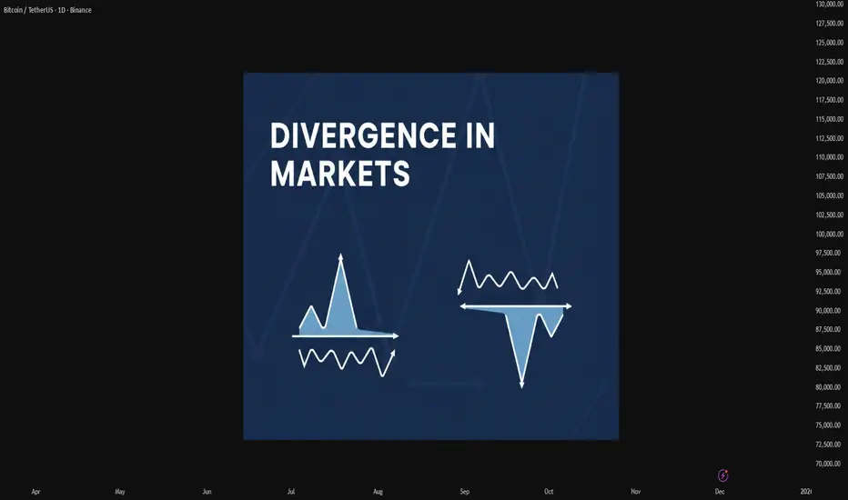
Mastering Divergence in Technical AnalysisIn technical analysis, a divergence (also called a “momentum divergence” or “price/indicator disagreement”) is one of the most powerful early warning signals available to traders. In simple terms, divergence occurs when price and a momentum indicator (such as RSI, MACD, or Awesome Oscillator etc.) move in opposite directions.
This disagreement often signals that the current trend is losing strength and that a pause, pullback, or full reversal may be approaching.
1. What Is Divergence?
Normally, in a healthy trend:
In an uptrend, price makes higher highs and momentum indicators also make higher highs.
In a downtrend, price makes lower lows and momentum indicators also make lower lows.
A divergence appears when this alignment breaks.
Typical example with RSI or MACD:
Price makes a higher high,
But the indicator makes a lower high.
This tells us that, although price has pushed to a new extreme, the underlying momentum is weaker. Smart money may be taking profits, and the late participants are driving the final leg of the move.
2. Types of Divergence
There are two main families of divergence:
Regular (classic) divergence – often associated with potential trend reversals.
Hidden divergence – often associated with trend continuation after a correction.
Within each family, we have bullish and bearish versions.
2.1 Regular Bullish Divergence – Potential Trend Reversal Up
This suggests that sellers are still pushing price to new lows, but momentum is no longer confirming the strength of this selling pressure. The downtrend is weakening and a bullish reversal may develop.
Context where it’s most powerful:
After a prolonged downtrend.
At or near a higher-timeframe support level (daily/weekly support, major demand zone, trendline, or Fibonacci confluence).
2.2 Regular Bearish Divergence – Potential Trend Reversal Down
This signals that buyers are still able to push price higher, but each new high is supported by less momentum. The uptrend is aging, and a bearish reversal or deeper correction becomes more likely.
Context where it’s most powerful:
After a strong, extended uptrend.
Around major resistance levels, supply zones, or upper trendlines.
2.3 Hidden Bullish Divergence – Trend Continuation Up
Here, price structure still shows an uptrend (higher lows), but the indicator has overshot to the downside. This often appears during pullbacks within an uptrend, suggesting that the correction is driven more by short-term emotion than by real structural weakness.
Interpretation:
Hidden bullish divergence indicates trend continuation. Bulls remain in control, and the pullback may provide an opportunity to join the uptrend at a better price.
2.4 Hidden Bearish Divergence – Trend Continuation Down
Price structure still favors the bears (lower highs), but the indicator has spiked higher, often due to a sharp counter-trend rally. This suggests that the bounce is corrective rather than the start of a new uptrend.
Interpretation:
Hidden bearish divergence favors continuation of the downtrend and often appears before the next impulsive bearish leg.
3. Which Indicators to Use?
Divergence can be spotted on many oscillators, but the most commonly used are:
RSI (Relative Strength Index) – very popular for spotting overbought/oversold zones and divergences.
MACD (and its histogram) – useful for trend and momentum, especially on higher timeframes.
Stochastic Oscillator – often used in range-bound environments.
Awesome Oscillator, CCI, etc. – alternative momentum tools, depending on your preference.
The concept is the same: price and indicator should generally confirm each other. If not, you have a divergence.
4. Timeframes and Reliability
Divergences can be found on all timeframes, but their reliability increases with higher timeframes:
On M5–M15, divergences are frequent but often short-lived. Better for scalpers.
On H1–H4, signals have more weight and can lead to multi-session moves.
On Daily/Weekly, divergences can mark major tops and bottoms, but they may take longer to play out.
A good practice is to:
Identify major divergences on higher timeframes (H4, Daily).
Refine entries on lower timeframes (M15, M30, H1) using structure and price action.
5. How to Trade Divergences (Practical Framework)
Divergence by itself is not a complete trading system. It is a signal of potential imbalance, which should be combined with:
Key levels (support, resistance, supply/demand zones).
Trend structure (higher highs/lows or lower highs/lows).
Price action confirmations (reversal candles, break of structure, etc.).
Risk management (position sizing, stop loss, invalidation level).
6. Common Mistakes When Using Divergences
- Trading every divergence blindly.
Not every divergence leads to a big reversal. Many will result in only minor pullbacks.
- Ignoring the trend.
Regular divergences against a strong trend can fail multiple times before a real top or bottom forms. Hidden divergences are often more reliable in trending markets.
- Forcing divergences where they don’t exist.
Only connect clear, obvious swing highs and lows on both price and indicator. If you have to “stretch” the lines, the signal is probably weak.
- No risk management.
A divergence is just a probability edge, not a guarantee. Always define invalidation and manage position size accordingly.
7. Best Practices
Combine divergence with market structure (trendlines, channels, higher highs/lows).
Use higher-timeframe context and drop to lower timeframes for refined entries.
Pay attention to confluence:
Divergence + key level + candlestick signal is stronger than any single factor.
Keep a trading journal of divergence setups, including screenshots from your charts. Over time, you will see which conditions work best for your style.
Divergences are not magic, but they are one of the cleanest ways to see when price and momentum disagree. Used correctly, they can:
Help you avoid entering late in a trend,
Alert you to potential reversals before they are obvious to the crowd, and
Provide high-probability continuation entries via hidden divergences within strong trends.
AI Stocks Weakness Could Spoil this Year’s Santa RallyAs December begins, traders worldwide are dusting off the same old question: Will we get a Santa Claus rally this year?
But 2025’s setup looks a little different. The market’s cheer seems to depend heavily on whether AI-related stocks can keep delivering miracles—and lately, the charts are suggesting they may be running out of steam.
When Tech Sneezes, the Market Catches a Cold
A quick look across U.S. equity futures shows a revealing pattern.
The E-mini NASDAQ 100 Futures (NQ), home to most AI and semiconductor giants, has posted a significantly lower monthly low compared to the prior month.
Meanwhile, the E-mini S&P 500 Futures (ES) declined much less, hinting at relative resilience, but also possible lagging weakness.
This divergence—NQ leading down while ES holds up—is a subtle warning. When the market’s growth engine (tech) loses traction, broader indices often follow with a delay. That’s the tension December traders are staring at: are we seeing the early signs of exhaustion before the holidays, or just a healthy pause?
Bearish Divergences Whisper “Caution”
The technicals are backing that cautious tone.
On the ES chart, the Commodity Channel Index (CCI) has been carving lower highs even as prices printed higher highs. This is a textbook bearish divergence, often an early sign that bullish momentum is fading.
The MACD histogram echoes the same message: momentum has been contracting through November despite new price highs, suggesting that underlying strength is eroding. Such divergences don’t predict direction on their own, but they do raise the probability of a short-term correction—or at least a choppy path into year-end.
The Price Map: Three Levels that Could Define December
Let’s outline the key technical zones traders are watching:
6,525.00: the prior monthly low—this is the first line of defense for the Santa Rally narrative. A break below this level would likely shift sentiment fast, especially if NQ continues under pressure.
6,239.50: the floor of a relevant UFO (UnFilled Orders) support zone. If ES dips below the prior low, this zone may become a “bear trap.” Many traders might short aggressively once 6,525.00 gives way, but those unfilled buy orders could absorb supply and trigger a sharp bounce. If the rally emerges from here, Santa might still make his visit.
4,430.50: a deeper UFO support cluster roughly 35% below current prices. If price were to cut through 6,239.50 and stay below it, the market would be entering a different regime altogether—likely accompanied by broken trendlines, volatility spikes, and a more defensive tone.
Reading Between the Lines: What the Divergence Means
Historically, the Santa Rally is powered by optimism, lighter volumes, and portfolio rebalancing. But this time, AI and semiconductor names—the champions of the current bull leg—are leading weakness.
That doesn’t mean doom; it means fragility.
The ES market may still rebound, but it’s doing so under reduced participation from the very sectors that drove prior gains.
Sizing the Trade Without Crossing the Line
For traders eyeing this setup through ES (E-mini S&P 500 futures) or MES (Micro E-mini S&P 500) futures, here’s a compliant, educational way to think about risk and position sizing:
Identify the Setup Zone: e.g., around 6,525.00 as potential demand, or below 6,239.50 as short-term breakdown.
Define Your Stop: the level where the technical picture is invalidated.
Set a Dollar Risk Limit: for instance, risking 1% of total account equity.
Derive Position Size: Divide your dollar risk by the price distance between entry and stop (converted into points). Then choose between the standard E-mini (ES) or Micro E-mini (MES) to match your risk tolerance and account size.
This framework lets traders adapt leverage responsibly—without needing the specific contract specs or margin figures, which vary by broker and time.
Risk Management: December Can Be a Trap
December is famous for emotional trading. The combination of holiday expectations, thinner liquidity, and year-end positioning can turn routine pullbacks into exaggerated moves.
That’s why focusing on risk before reward is critical.
The UFO support levels serve as reference zones where institutional activity might reappear, but they’re not guarantees. Managing stops, scaling out partial profits, and staying flexible matters more than trying to guess the market’s next headline.
ES and MES: Same Story, Different Scale
The Micro E-mini (MES) contract is a smaller version of the E-mini (ES), designed for traders who want the same price exposure but with lower notional size.
Both track the same index, tick for tick.
For traders exploring this December setup, the MES allows participation while controlling exposure more granularly—especially useful if volatility picks up and margin requirements shift.
Key Contracts Specs and Margins:
E-mini S&P 500 Futures (ES) with a point value = $50 per point.
Micro E-mini S&P 500 Futures (MES) with a point value = $5 per point.
As of the current date, the margin requirements for E-mini S&P 500 Futures and for the Micro E-mini S&P 500 Futures are approximately $22,400 and $2,240 per contract respectively.
Always verify the latest margin schedules and specifications directly with your broker or the exchange before entering trades, as those details update regularly and depend on market conditions.
Santa’s Setup: Scenarios to Watch
Scenario A — Santa Delivers: Price tests or slightly breaks the 6,525.00 low, finds support near 6,239.5, and rebounds into late December. Bearish divergences resolve sideways, and risk assets stabilize.
Scenario B — The Grinch Arrives: The 6,239.50 zone fails to hold, breaking trendline supports. The market slides toward 4,430.50, shaking off complacent longs and erasing part of the 2024-5 rally.
Both paths are technically valid. The difference will come from whether AI-heavy sectors regain strength—or confirm that this bull leg has indeed lost its engine.
Educational Takeaway
Divergences (CCI and MACD) highlight when momentum and price disagree—a sign of fatigue.
Intermarket analysis (ES vs. NQ) reveals where weakness may originate.
UFO levels identify potential institutional footprints—where traps or reversals often occur.
Discipline and risk control matter more than predicting whether Santa shows up.
Final Thought
Whether December brings gifts or grief may depend less on seasonal hope and more on how traders interpret these divergences.
If AI stocks can find footing again, the rally could revive. But if they keep sliding, this might be the year Santa takes a break.
When charting futures, the data provided could be delayed. Traders working with the ticker symbols discussed in this idea may prefer to use CME Group real-time data plan on TradingView: www.tradingview.com - This consideration is particularly important for shorter-term traders, whereas it may be less critical for those focused on longer-term trading strategies.
General Disclaimer:
The trade ideas presented herein are solely for illustrative purposes forming a part of a case study intended to demonstrate key principles in risk management within the context of the specific market scenarios discussed. These ideas are not to be interpreted as investment recommendations or financial advice. They do not endorse or promote any specific trading strategies, financial products, or services. The information provided is based on data believed to be reliable; however, its accuracy or completeness cannot be guaranteed. Trading in financial markets involves risks, including the potential loss of principal. Each individual should conduct their own research and consult with professional financial advisors before making any investment decisions. The author or publisher of this content bears no responsibility for any actions taken based on the information provided or for any resultant financial or other losses.

EVGO - Divergence bullishThe EVGO ticker was oversold a week ago. Now it is starting to recover with average volume.
Some indicators suggest that this stock will rise strongly in the near future:
- Divergence pattern.
- The recent major low on the chart is higher than the previous low.
- RSI shows a bullish signal.
- MACD also shows a bullish signal.
The current price is below all the MA20/50/200 lines.
It will likely need one more reason to break out soon.
The price closed on 11/28/2025: $3.24 (Entry).
Price target: $3.69 / $4.14 / $5.18
Stop loss: $3.08
IMO, amateur trader.
Good luck!

RSI Bearish DivergenceAs we can see, there is a hidden RSI Divergence.
A HIDDEN RSI Divergence occur when we see lower highs for the price, and higher highs for the RSI.
The reason it is considered hidden is because the indicator refers to a momentum continuation, while the price is actually achieving lower highs.
This is confirmed by the last bearish candle we see.
...Please note, this is a 2 Hours Chart...
If the price breaks above and RSI continued to make higher higher along with the price, it might not divert.
On another note:
-We can notice a STRONG RSI Divergence, starting from the last candle in 30 October.
The reason it is strong is because the we see a strong price hike, and the momentum is decreased.

Bearish Divergence on Weekly TF.Bearish Divergence on Weekly TF.
Resistance lies around 225 - 235
Currently moving in a Rectangular Channel.
Crossing 222 - 223 will trigger more positivity
towards 235 - 240 initially and then around 250-260.

RSI DivergenceHello fellas,
This is a very classic textbook RSI divergence scenario where we see that rising price tops with lower RSI tops.
It means that even though price increased, the momentum has decreased.
When you see rising price + decreasing momentum = it usually means buyers are exhausted.
Buyers exhausted = weak buying = strong selling = price down.
Thank you,
-not a buy or sell recommendation. just sharing my idea regarding a very classic RSI divergence pattern and how did it look like.
Don't over complicate, don't think of ideas out of place. If there is confusion, it means you don't know what's happening. If it is clear as day light, it means it is clear as day light.
The market is the market, you can't control it. However, you can control your actions and learn from yourself. Though preferably not the hard way.
Easy to learn new things, but 10x harder to unlearn wrong things.

BECO - PSX - 4H Technical AnalysisBECO on 4H time frame, is moving in a parallel channel making HHs and HLs. At the moment it seems as if it is going to make HL at 6.95 before going up again in the channel to make at HH. Therefore, ideally one can get in to Buying on seeing a 4H Green Candle closing after price would have already retraced to 6.93~6.97 zone. TP should then be 8.50 with SL 6.80.
On the other hand If price continues to go down below the parallel channel, as divergence on Volumes as well as on RSI is observed, then it may bounce at Fib level 38% or 50% or 61%. This will give even better opportunity for getting into the trade.
Since BECO's this bull run is phenomenal therefore, I expect that price will drop to Fib 50% level at least. Double bottom at Fib 50% will be a sign of trend going back up and hence ideal time to get in to buying this SCRIPT. Even Fib 60% can be possible.
