FinEco For Dummies | The Economic Eco-System Simplified🟢 Intro For Financial Economics & The Financial Eco-Sytem For Dummies
This little book is not about predictions or strategies.
It’s about understanding how financial markets connect, interact, and move together.
If you can read capital flows, risk appetite, and macro relationships,
markets stop feeling random and start making sense.
Financial markets are a system.
Money flows between assets based on risk, growth, inflation, and policy.
This book explains those relationships in simple terms,
so you can understand the environment before making decisions.
Most traders focus on charts.
Few understand the environment those charts live in.
This little book lays out a simple framework for reading market conditions,
capital rotation, and risk behavior, without strategies or hype.
This is a foundation, not a strategy.
A simple guide to how stocks, bonds, currencies, commodities, and crypto
fit together inside the global financial system.
Markets are not random.
They react to incentives, risk, and expectations.
This book helps you see those forces clearly.
🟢 1 - The Big Picture: Markets as a Flow System
Before charts, indicators, or trades, financial markets should be understood as a system of flows, not isolated instruments. Every market, stocks, bonds, currencies, commodities, crypto, etc is simply capital moving between buckets. Nothing trades in a vacuum. When money flows into one place, it must flow out of another.
-
➡️ The Core Idea
Markets are a constant process of:
- Allocation
- Re-allocation
- Risk assessment
Investors are always asking, consciously or not:
“Where do I want my money to park right now?”
The answer changes with:
- Economic expectations
- Central bank policy
- Inflation / deflation fears
- Financial stability
- Geopolitical stress
- Liquidity conditions
Price is just the result of those decisions.
Risk Is the Organizing Principle
At the highest level, all markets organize around risk.
Capital rotates between:
- Risk-on assets → growth, leverage, expansion
- Risk-off assets → safety, preservation, defense
This is not emotional.
It is structural.
Institutions manage:
- Mandates
- Drawdowns
- Volatility targets
- Capital requirements
They must rotate.
-
➡️ The Two Master Regimes
Most market behavior can be simplified into two regimes:
➡️ 1. Risk-On Environment
Characteristics:
- Optimism about growth
- Liquidity is abundant
- Credit flows easily
- Volatility is tolerated
Money prefers:
- Equities (especially growth)
- High beta sectors
- Small & mid caps
- Emerging markets
- Cyclical commodities
➡️ 2. Risk-Off Environment
Characteristics:
- Uncertainty or stress
- Liquidity tightens
- Credit risk rises
- Volatility is avoided
Money prefers:
- Government bonds
- Strong reserve currencies
- Defensive equities
- Gold
- Cash equivalents
Most of the time, markets live between these two, rotating, not flipping instantly.
➡️ Why This Matters for Trading
If you don’t know which regime you’re in, technical setups lose meaning.
A perfect long breakout:
- Works beautifully in risk-on
- Fails constantly in risk-off
A short breakdown:
- Accelerates in risk-off
- Gets absorbed in risk-on
Your job is not to predict the future.
Your job is to identify the current state.
-
🟢 2 - Capital Rotation: How Money Actually Moves
Markets do not rise or fall as one unified object.
They rotate.
Capital is constantly shifting between:
- Sectors
- Asset classes
- Regions
- Risk profiles
This rotation is not random. It follows incentives.
-
➡️ Rotation vs Direction
A common beginner mistake is thinking:
“The market is bullish or bearish.”
In reality, markets are often:
- Bullish somewhere
- Bearish somewhere else
While headlines say “stocks are flat,” money may be:
- Leaving defensives
- Entering growth
- Rotating from large caps into small caps
- Moving from bonds into equities
- Or the opposite
Understanding where money is going matters more than knowing the index direction.
-
➡️ Why Rotation Exists
Large institutions:
- Cannot move all at once
- Cannot hold everything
- Must rebalance constantly
They rotate because of:
- Changing growth expectations
- Interest rate shifts
- Inflation outlook
- Volatility targets
- Risk management rules
This creates waves, not straight lines.
-
➡️ The Economic Cycle (Simplified)
While real life is messy, capital often behaves as if it follows a loose cycle:
Early Expansion
- Rates low or falling
- Liquidity improving
- Confidence returning
Capital prefers:
- Small caps
- Cyclicals
- Growth sectors
- High beta assets
Mid-Cycle
- Growth strong
- Earnings expanding
- Rates stable or slowly rising
Capital prefers:
- Large caps
- Technology
- Industrials
- Consumer discretionary
Late Cycle
- Inflation concerns
- Rates restrictive
- Margins pressured
Capital rotates into:
- Energy
- Materials
- Value
- Financials (if yield curve allows)
Stress / Contraction
- Growth uncertainty
- Credit risk rising
- Liquidity tightening
Capital hides in:
- Defensives
- Bonds
- Gold
- Cash (Liquidity tightening)
This is not a checklist, it’s a lens.
-
➡️ Why Broad Sector ETFs Matter
Broad ETFs allow you to:
- Observe rotation in real time
- See what is being rewarded
- Identify what is being abandoned
They act as market thermometers.
A single stock can lie.
A sector rarely does.
-
➡️ Relative Strength Is the Tell
The most important question is not:
“Is this going up?”
But:
“Is this outperforming other places capital could go?”
Outperformance = demand
Underperformance = avoidance
This relative behavior often appears before major market pivots.
-
➡️ Setting the Stage
From here, we’ll start breaking the market into functional blocks:
- Broad indices
- Sector ETFs
- Bonds
- Currencies
- Hard assets
- Others
Each block tells a different part of the story.
-
🟢 3 - Broad Market Structure: Who Leads, Who Follows
Before zooming into sectors, it’s critical to understand the hierarchy of the equity market itself.
Not all stocks matter equally.
Not all indices send the same signal.
Markets have leaders and followers.
-
➡️ The US Equity Market as a Pyramid
At the top of the pyramid sit the largest, most liquid companies.
At the bottom sit smaller, more fragile, higher-risk firms.
Large Caps
- Highly liquid
- Globally owned
- Institutional core holdings
They represent:
- Stability
- Capital preservation with growth
- Confidence in the system
Mid Caps
- More domestic exposure
- More growth-sensitive
- Less balance-sheet protection
They represent:
- Expansion
- Risk tolerance
- Economic optimism
Small Caps
- Least liquid
- Most rate-sensitive
- Highly dependent on credit conditions
They represent:
- Risk appetite
- Liquidity abundance
- Speculation tolerance
-
➡️ Why Size Matters
When confidence rises:
- Capital flows down the pyramid
- Large → Mid → Small
When stress appears:
- Capital flows up the pyramid
- Small → Mid → Large → Cash
This movement often happens before headlines change.
➡️ Reading the Market Through Indices
Broad indices act as regime filters:
SPY (S&P 500)
Represents large-cap US equity exposure
- Dominated by mega-cap tech and financials
Strength here means:
- Core capital is comfortable staying invested
- The system is stable enough to hold risk
RSP (Equal-Weight S&P 500)
Removes mega-cap dominance
- Shows participation breadth
If SPY rises but RSP lags:
- Leadership is narrow
- Risk is concentrated
- The rally is fragile
If RSP leads:
- Participation is broad
- Confidence is healthy
- Moves are more sustainable
-
➡️ Breadth Is Not a Detail - It’s a Warning System
Strong markets:
- Many stocks participating
- Many sectors contributing
- Leadership rotates smoothly
Weak markets:
- Few leaders
- Defensive hiding
- Sudden rotation spikes
Breadth deterioration often appears long before price collapses.
-
➡️ Why This Matters for Everything Else
Equity leadership sets the tone for:
- Sector performance
- Currency flows
- Bond behavior
- Commodity demand
If equities are unhealthy internally, risk assets elsewhere struggle to hold gains.
-
➡️ Key Takeaway
Markets don’t break all at once.
They weaken from the inside out.
If you learn to read:
- Size
- Breadth
- Leadership
You stop reacting and start anticipating.
-
🟢 4 - Sector ETFs: Reading the Economy Through Capital
KRE — Regional Banks
US regional banks, credit-sensitive, domestic lending.
Best in: Early recovery, rate cuts, steepening yield curve.
Struggles in: Tight liquidity, stress, rising defaults.
ITB — Homebuilders
US residential construction and housing demand.
Best in: Falling rates, easing financial conditions.
Struggles in: Rising yields, affordability stress.
SMH — Semiconductors
Global chipmakers, cyclical growth, capex-driven.
Best in: Expansion, liquidity growth, tech-led cycles.
Struggles in: Hard slowdowns, demand shocks.
XME — Metals & Mining
Steel, miners, raw materials.
Best in: Reflation, infrastructure cycles, USD weakness.
Struggles in: Deflation, global slowdown.
XLRE — Real Estate
REITs, income and rate-sensitive assets.
Best in: Falling yields, stable growth.
Struggles in: Rising rates, credit stress.
XLY — Consumer Discretionary
Non-essential spending (retail, autos, leisure).
Best in: Strong consumer, expansion phases.
Struggles in: Recessions, confidence drops.
EBIZ — E-Commerce / Digital Consumption
Online retail and digital consumer platforms.
Best in: Growth + digital shift, USD weakness.
Struggles in: Consumer pullbacks, tightening liquidity.
XLK — Technology
Large-cap US tech, growth and duration exposure.
Best in: Liquidity expansion, falling rates.
Struggles in: Tight policy, rising real yields.
XLE — Energy
Oil & gas producers and services.
Best in: Reflation, supply constraints, USD weakness.
Struggles in: Demand destruction, growth shocks.
XLB — Materials
Chemicals, construction materials, inputs.
Best in: Early-cycle recovery, reflation.
Struggles in: Late-cycle slowdowns.
RSP — Equal-Weight S&P 500
Broad market without mega-cap dominance.
Best in: Healthy, broad-based expansions.
Struggles in: Narrow leadership, defensive markets.
SPY — S&P 500
US large-cap benchmark.
Best in: Most regimes, reflects overall risk appetite.
Struggles in: Systemic shocks.
XLI — Industrials
Manufacturing, transport, capital goods.
Best in: Expansion, infrastructure, global growth.
Struggles in: Recessions, trade slowdowns.
XLF — Financials
Banks, insurers, financial services.
Best in: Steep yield curve, economic growth.
Struggles in: Credit stress, inverted curves.
XLC — Communication Services
Media, telecom, platforms.
Best in: Growth environments, ad spending cycles.
Struggles in: Economic slowdowns.
IGV — Software
Enterprise software and digital services.
Best in: Liquidity expansion, productivity cycles.
Struggles in: Rate shocks, valuation compression.
XLV — Healthcare
Pharma, biotech, medical services.
Best in: Defensive regimes, late cycle.
Struggles in: High-risk-on rotations.
XLU — Utilities
Regulated utilities, income-focused.
Best in: Risk-off, falling yields.
Struggles in: Rising rates, strong growth cycles.
XLP — Consumer Staples
Essentials (food, household goods).
Best in: Defensive, late-cycle, risk-off.
Struggles in: Strong risk-on rotations.
Once you understand broad market structure, the next layer is sectors.
Sector ETFs are not just industries.
They are expressions of economic belief.
Each sector answers a different question:
- Growth or safety?
- Inflation or deflation?
- Rates up or rates down?
- Confidence or caution?
By watching sector behavior, you can see what investors are preparing for, not what they are reacting to.
-
➡️ Sectors as Economic Sensors
Sectors move differently because:
- They respond differently to rates
- They depend differently on credit
- They react differently to inflation and demand
This makes them ideal tools for:
- Identifying rotation
- Confirming or rejecting index moves
- Spotting regime changes early
➡️ 1. Risk-Oriented Sectors (Risk-On)
These sectors perform best when:
- Liquidity is abundant
- Growth expectations are rising
- Investors are willing to take risk
Technology - XLK / IGV / EBIZ
- Growth-driven
- Highly rate-sensitive
- Dependent on future earnings
Strength implies:
- Falling or stable rates
- Confidence in innovation and growth
- Risk-on environment
Weakness implies:
- Rising real yields
- Liquidity stress
- De-risking behavior
Consumer Discretionary - XLY
- Depends on consumer confidence
- Sensitive to employment and credit
Strength implies:
- Healthy consumers
- Economic expansion
- Optimism about income growth
Weakness implies:
- Caution
- Demand slowdown
- Household stress
➡️ Cyclical / Expansion Sectors
These sectors benefit from economic activity itself.
Industrials - XLI
- Linked to manufacturing and infrastructure
- Sensitive to growth and capex cycles
Strength implies:
- Expansion
- Business investment
- Trade and logistics activity
Materials - XLB / Metals & Mining - XME
- Sensitive to inflation and construction
- Linked to global demand
Strength implies:
- Rising inflation expectations
- Commodity demand
- Late-cycle or reflation themes
Energy - XLE
- Tied to inflation and geopolitics
- Sensitive to supply constraints
Strength implies:
- Inflation pressure
- Tight energy markets
- Often late-cycle behavior
-
➡️ 2. Defensive Sectors (Risk-Off)
These sectors attract capital when:
- Growth is uncertain
- Volatility rises
- Preservation matters more than return
Healthcare - XLV
- Inelastic demand
- Stable cash flows
Strength implies:
- Defensive rotation
- Risk reduction
- Uncertainty ahead
Consumer Staples - XLP
- Everyday necessities
- Low growth but high stability
Strength implies:
- Capital hiding
- Caution
- Late-cycle or stress environment
Utilities - XLU
- Yield-oriented
- Rate-sensitive
Strength implies:
- Demand for safety and income
- Falling rates or risk-off mood
-
➡️ Interest-Rate Sensitive Sectors
Some sectors are less about growth and more about rates.
Real Estate - XLRE
- Highly sensitive to interest rates
- Dependent on financing costs
Strength implies:
- Falling or stabilizing rates
- Yield-seeking behavior
Weakness implies:
- Rising rates
- Credit stress
Financials - XLF / KRE
- Banks reflect system health
- Credit creation and yield curve dependent
Strength implies:
- Healthy lending environment
- Confidence in the financial system
Weakness implies:
- Credit stress
- Yield curve pressure
- Systemic caution
-
➡️ Breadth and Rotation Inside Sectors
A healthy market:
- Multiple sectors leading
- Smooth rotation
- No single sector carrying the index
An unhealthy market:
- Narrow leadership
- Defensive outperformance
- Violent sector rotations
-
➡️ Key Takeaway
Sectors tell you why the market is moving.
Index price tells you that it moved.
Sector behavior tells you what investors believe.
-
➡️ Market Regime Cheat-Sheet
How to Read Sector ETFs in Context
🟢 Risk-On / Expansion
Liquidity flowing, growth rewarded
SMH — Semiconductors (cyclical tech leadership)
XLK — Technology (liquidity + duration)
IGV — Software (productivity, growth)
XLY — Consumer Discretionary (strong consumer)
EBIZ — E-Commerce (digital spending)
XLC — Communication Services (ads, platforms)
Macro backdrop:
- Falling or stable rates
- Easy financial conditions
- Weak or stable USD
- Strong equity breadth
-
🟡 Reflation / Early Cycle
Growth + inflation expectations rising
XLE — Energy (oil, supply constraints)
XME — Metals & Mining (raw materials)
XLB — Materials (inputs, construction)
XLI — Industrials (capex, infrastructure)
ITB — Homebuilders (rate relief + demand)
Macro backdrop:
- Inflation stabilizing or rising
- USD weakness
- Yield curve steepening
- Commodity strength
-
🔵 Broad & Healthy Market
Participation matters more than leaders
RSP — Equal-Weight S&P 500
SPY — Market benchmark
Macro backdrop:
- Balanced growth
- No extreme policy pressure
- Internal market strength
- Rotation instead of liquidation
-
🟠 Financial Sensitivity
Rates, credit, curve shape matter
XLF — Financials (steep curve, growth)
KRE — Regional Banks (credit health)
XLRE — Real Estate (rate sensitivity)
Macro backdrop:
Rate cuts help
Credit stability required
Stress shows early here
-
🔴 Defensive / Risk-Off
Capital preservation, not growth
XLV — Healthcare
XLP — Consumer Staples
XLU — Utilities
Macro backdrop:
- Tight liquidity
- Economic uncertainty
- Rising volatility
- Capital rotates, doesn’t disappear
How to Use This Cheat-Sheet:
- Leadership = regime signal
- Rotation ≠ crash
- Defensives leading = caution
- Cyclicals + tech leading = expansion
- Banks & housing weaken first in stress
-
🟢 5 - Bonds and Central Banks: The Gravity of Markets
If equities are the expression of confidence,
bonds are the constraint.
No market ignores bonds for long.
Interest rates determine:
- The cost of money
- The price of leverage
- The value of future cash flows
- The tolerance for risk
This makes bonds the gravitational force of financial markets.
-
➡️ Why Bonds Matter More Than Headlines
Stocks can stay irrational for a while.
Bonds can not.
Bond markets are dominated by:
- Institutions
- Governments
- Pension funds
- Central banks
They reflect:
- Inflation expectations
- Growth expectations
- Trust in policymakers
When bonds move, everything else eventually follows.
-
➡️ US Treasuries - The Global Benchmark
US Treasuries are the foundation of:
- Global pricing
- Risk-free rates
- Collateral systems
Rising yields mean:
- Tighter financial conditions
- Higher discount rates
- Pressure on growth assets
Falling yields mean:
- Easier conditions
- Support for risk-taking
- Relief for leveraged assets
-
➡️ Short-Term vs Long-Term Yields
The shape of the yield curve matters.
Rising short-term yields:
- Reflect central bank tightening
- Increase funding stress
- Pressure equities and credit
Rising long-term yields:
- Reflect inflation or growth expectations
- Hurt duration-sensitive assets
- Strengthen the currency
Falling long-term yields:
- Signal slowing growth or stress
- Support defensives and gold
-
➡️ The Federal Reserve - Liquidity Manager
The Fed does not control markets directly.
It controls liquidity conditions.
Through:
- Policy rates
- Balance sheet operations
- Forward guidance
The Fed influences:
- Risk appetite
- Credit creation
- Volatility tolerance
Markets often move in anticipation of Fed actions, not after them.
-
➡️ Japan: The Silent Anchor (BoJ & JGBs)
Japan plays a unique role in global markets.
- Ultra-low rates
- Yield curve control history
- Massive domestic savings
Japanese bonds (JGBs) act as:
- A funding benchmark
- A pressure valve for global yields
When Japanese yields rise:
- Global yields tend to follow
- Yen strengthens
- Risk assets feel pressure
This is why Japan matters even if you don’t trade it directly.
-
➡️ Fed vs BoJ - A Critical Relationship
When:
- US rates rise
- Japanese rates stay suppressed
Capital flows:
- Into USD
- Out of JPY
- Into risk assets funded by cheap yen
When that gap narrows:
- Carry trades unwind
- Volatility increases
- Risk assets struggle
-
➡️ Key Takeaway
Bonds tell you:
- How tight or loose the system is
- Whether risk-taking is rewarded or punished
- When markets are approaching stress
Ignore bonds, and everything else becomes noise.
-
🟢 6 - Currencies and FX Indexes: The Language of Capital Flows
Currencies are often misunderstood as “forex trades.”
In reality, currencies are statements of preference.
They show:
- Where capital feels safest
- Where returns are most attractive
- Which economies are trusted
- Which risks are being avoided
Currencies don’t move because of opinions.
They move because of flows.
-
➡️ Why Currencies Matter Even If You Don’t Trade FX
Every asset is priced in a currency.
That means:
- Stocks
- Bonds
- Commodities
- Crypto (later)
Are all influenced by currency strength and weakness.
If you ignore currencies, you miss:
- Hidden tailwinds
- Silent headwinds
- False breakouts caused by FX pressure
-
➡️ The US Dollar (DXY) - Global Liquidity Thermometer
The US dollar is:
- The world’s reserve currency
- The primary funding currency
- The denominator for global trade
A rising USD usually means:
- Tighter global liquidity
- Pressure on risk assets
- Stress for emerging markets
- Headwinds for commodities
A falling USD usually means:
- Easier financial conditions
- Support for equities
- Tailwinds for commodities and risk assets
The dollar is not “bullish” or “bearish.”
It is restrictive or permissive.
-
➡️ Safe-Haven Currencies - JPY and CHF
Some currencies strengthen not because of growth, but because of fear.
Japanese Yen (JPY)
- Historically used for funding
- Ultra-low rate environment
JPY strength implies:
- Risk-off behavior
- Carry trade unwinds
- Stress in global markets
JPY weakness implies:
- Risk-on
- Leverage expansion
- Yield chasing
Swiss Franc (CHF)
- Capital preservation currency
- Financial system trust play
CHF strength implies:
- Capital hiding
- Defensive positioning
- Systemic caution
Risk-Sensitive Currencies
Other currencies strengthen when:
- Growth is strong
- Commodities are in demand
- Risk appetite is healthy
These act as confirmation tools, not drivers.
Weakness here alongside strong equities is often a warning sign.
-
➡️ Currency Indexes as Regime Filters
Watching individual FX pairs can be noisy.
Indexes simplify the message.
Currency indexes help you:
- Identify broad strength or weakness
- Avoid pair-specific distortions
- See regime shifts early
If:
- USD strengthens
- JPY strengthens
- CHF strengthens
That combination rarely supports sustained risk-on behavior.
➡️ Currencies and Equity Behavior
Healthy risk environments usually show:
- Weak or stable USD
- Weak JPY
- Broad equity participation
Stress environments often show:
- Strong USD
- Strong JPY or CHF
- Narrow or defensive equity leadership
Currencies often lead equities, not the other way around.
➡️ Key Takeaway
Currencies are the nervous system of global markets.
They transmit:
- Stress
- Confidence
- Liquidity shifts
If you listen to them, markets stop surprising you.
-
➡️ Currency Regime Cheat-Sheet
*How to Read XY Indices in a Macro Context
-
USDX / DXY — US Dollar Index
Global reserve, liquidity gauge
Strong DXY → global liquidity tightens
Weak DXY → risk assets breathe
Strength signals:
- Risk-off
- Higher real yields
- Global stress
Weakness signals:
- Risk-on
- Commodity support
- EM + crypto tailwind
-
JXY — Japanese Yen Index
Carry trade & volatility trigger
Weak JPY → leverage, risk-taking
Strong JPY → carry unwind, stress
Watch for:
- USDJPY turning points
- BoJ policy shifts
- Global volatility spikes
Yen strength often precedes:
- Equity pullbacks
- Tech weakness
- Crypto drawdowns
-
CXY — Canadian Dollar Index
Commodity & energy proxy
Tracks oil, metals, global growth
Pro-cyclical currency
Strength signals:
- Risk-on
- Commodity demand
- Inflation expectations
Weakness signals:
- Growth slowdown
- Commodity pressure
-
EXY — Euro Index
Growth vs stability balance
Sensitive to global trade
Often moves opposite DXY
Strength signals:
- Global growth optimism
- Risk-on rotation
Weakness signals:
Fragmentation risk
- Banking stress
- Energy shocks
-
BXY — British Pound Index
High beta developed-market currency
Volatile, sentiment-driven
Sensitive to rates & growth
Strength signals:
- Risk-on
- Hawkish BoE expectations
Weakness signals:
- Risk-off
- Political or fiscal stress
-
AXY — Australian Dollar Index
China & global growth barometer
Closely tied to commodities & China
One of the best early growth signals
Strength signals:
- Expansion
- Commodity demand
- Risk-on
Weakness signals:
- China slowdown
- Risk aversion
-
NXY — New Zealand Dollar Index
Pure risk appetite signal
Thin liquidity, high beta
Amplifies global sentiment
Strength signals:
- Risk-on extremes
- Yield-seeking behavior
Weakness signals:
- Flight to safety
- Liquidity stress
-
➡️ How to Read *XYs Together
DXY + JXY rising → risk-off, deleveraging
DXY down + CXY / AXY up → reflation, commodities
JPY leading strength → early warning
AUD / CAD leading → growth confidence
Currencies move first.
Assets react later.
-
➡️ Key Takeaway
XY indices are not trades.
They are context engines.
If you know which currencies are gaining strength,
you know where capital is moving — and why.
Context first.
Positioning second.
-
🟢 7 - Gold and Hard Assets: Trust, Fear, and Real Value
Gold is not a growth asset.
It is not a risk asset.
It is not a productive asset.
Gold is a belief asset.
It reflects:
- Trust in money
- Confidence in institutions
- Fear of debasement
- Desire for permanence
➡️ Why Gold Exists in Modern Markets
Gold does not compete with stocks.
It competes with currencies and bonds.
Gold becomes attractive when:
- Real yields fall
- Currency purchasing power is questioned
- Financial stability is doubted
It is an alternative to:
- Paper promises
- Credit systems
- Central bank credibility
-
➡️ Gold vs Nominal Yields (Coupon rate on a bond)
A common mistake is watching gold against nominal rates.
Gold responds primarily to:
- Real yields (rates minus inflation)
- Currency strength, especially USD
Rising real yields:
- Pressure gold
- Favor cash and bonds
Falling real yields:
- Support gold
- Signal hidden stress or easing
Gold often rises before inflation becomes obvious.
- Gold and the US Dollar
- Gold and USD often move inversely.
Strong USD:
- Makes gold expensive globally
- Reduces gold demand
Weak USD:
- Supports gold
- Signals easier financial conditions
When gold rises despite a strong USD:
- That is a warning signal
- Stress or distrust is increasing
-
➡️ Gold as a Stress Barometer
Gold strength often appears when:
- Financials weaken
- Credit risk rises
- Volatility increases
- Central banks lose control narratives
Gold does not panic.
It prepares.
-
➡️ Hard Assets Beyond Gold
Other hard assets (commodities, metals) behave differently:
- They depend on demand
- They are growth-sensitive
- They can fall in deflationary stress
Gold is unique because:
- It does not depend on growth
- It does not default
- It does not dilute
-
➡️ Gold in a Healthy Market
In strong risk-on environments:
- Gold often lags
- Capital prefers productive assets
In unstable or late-cycle environments:
- Gold begins to lead
- Quietly at first
Gold strength during equity rallies is often a yellow flag.
-
➡️ Key Takeaway
Gold measures confidence in the system itself.
It does not chase returns.
It waits for doubt.
If gold starts outperforming while risk assets struggle, the market is telling you something important.
-
🟢 8 - Silver, Copper, and Oil: The Economy’s Lie Detectors
If gold measures trust,
Industrial commodities measure reality.
Silver, copper, and oil don’t care about narratives.
They respond to:
- Demand
- Production
- Energy use
- Industrial activity
They tell you whether the economy is actually functioning, not whether markets hope it is.
-
➡️ Silver - The Hybrid Asset
Silver sits between two worlds:
- Monetary metal
- Industrial commodity
Because of this, silver often behaves as:
- A leveraged version of gold when confidence is high
- An industrial proxy when growth is strong
Silver strength implies:
- Inflation expectations
- Manufacturing demand
- Liquidity abundance
Silver weakness implies:
- Industrial slowdown
- Deflationary pressure
- Liquidity stress
Silver usually:
- Lags gold in early stress
- Leads gold in reflation
Gold moves on fear.
Silver moves when fear meets demand.
-
➡️ Dr. Copper - The Doctor of the Economy
Copper is often called:
“The metal with a PhD in economics”
That’s because copper demand is tied directly to:
- Construction
- Infrastructure
- Manufacturing
- Electrification
Copper strength implies:
- Real economic activity
- Capital investment
- Expansionary conditions
Copper weakness implies:
- Demand destruction
- Growth slowdown
- Recession risk
Copper rarely lies.
If equities rally while copper falls, something is off.
-
➡️ Copper vs Equities
Healthy expansions usually show:
- Rising equities
- Rising copper
- Rising industrial demand
Danger zones appear when:
- Equities rise
- Copper falls
- Liquidity-driven rallies dominate
That divergence often precedes:
- Growth disappointments
- Equity corrections
- Risk repricing
-
➡️ Oil - The Lifeblood of the System
Oil is not just a commodity.
It is energy, and energy underpins everything.
Oil prices reflect:
- Global demand
- Transportation activity
- Industrial throughput
- Geopolitical stress
Rising oil can mean:
- Strong demand
- Inflation pressure
- Supply constraints
Falling oil can mean:
- Demand destruction
- Economic slowdown
- Deflationary forces
Context matters more than direction.
-
➡️ Oil and Inflation
Oil spikes often:
- Pressure consumers
- Hurt margins
- Force central bank responses
Sustained high oil prices:
- Act like a tax on growth
- Accelerate late-cycle dynamics
Oil collapses often:
- Signal recession
- Precede central bank easing
Putting Them Together
- Gold asks: Do you trust the system?
- Silver asks: Is inflation and demand building?
- Copper asks: Is the economy actually growing?
- Oil asks: Can the system afford this energy cost?
When all agree, markets trend smoothly.
When they diverge, volatility follows.
-
➡️ Key Takeaway
Commodities expose the difference between financial optimism and economic reality.
Equities can float on liquidity.
Commodities need demand.
If hard assets stop confirming financial markets, risk is being mispriced.
-
🟢 9 - Volatility and Options: Stress Beneath the Surface
Price tells you where markets go.
Volatility tells you how they feel about it.
The VIX and the options market are not predictors.
They are emotion and insurance markets.
They show:
- Fear
- Complacency
- Protection demand
- Risk tolerance
-
➡️ What the VIX Actually Is
The VIX measures:
- Expected volatility in the S&P 500
- Derived from option prices
- Forward-looking, not historical
Think of the VIX as:
- The price of fear
- The cost of insurance
High fear = expensive protection
Low fear = cheap protection
-
➡️ What High and Low VIX Mean
Low VIX
- Complacency
- Confidence
- Cheap leverage
- Risk-taking encouraged
This usually aligns with:
- Risk-on environments
- Strong equity trends
- Narrow pullbacks
But extremely low VIX can mean:
- Fragility
- Overconfidence
- Vulnerability to shocks
High VIX
- Fear
- Demand for protection
- Forced hedging
This usually aligns with:
- Risk-off environments
- Equity stress
- Violent price moves
But high VIX can also mean:
- Capitulation
- Opportunity
- Panic already priced in
-
➡️ Context matters.
Why VIX Is a Confirmation Tool, Not a Signal
The VIX should not be traded as a direction indicator.
Instead, it helps answer questions like:
- Is fear rising or falling?
- Is this move relaxed or stressed?
- Are investors hedging or chasing?
Examples:
- Rising equities + rising VIX = unhealthy
- Falling equities + falling VIX = complacent risk
- Falling equities + spiking VIX = stress or panic
-
➡️ Broad Options Market: Insurance Demand
Options markets reflect:
- Where traders fear losses
- Where institutions hedge exposure
- Where risk is concentrated
Heavy put demand implies:
- Protection seeking
- Defensive positioning
Heavy call demand implies:
- Speculation
- Momentum chasing
You don’t need details.
You just need to know which side is desperate.
-
➡️ Volatility and Market Regimes
Healthy markets usually show:
- Moderate or declining volatility
- Predictable rotations
- Orderly pullbacks
Unhealthy markets show:
- Volatility spikes
- Sudden regime shifts
- Failed breakouts
Volatility often changes first, price follows later.
-
➡️ Why This Belongs in the Foundation
VIX and options help you:
- Avoid false confidence
- Recognize fragile rallies
- Respect stressed markets
- Adjust expectations
They don’t tell you what to trade.
They tell you how careful to be.
-
➡️ Key Takeaway
Volatility measures psychology under pressure.
When price and volatility agree, trends persist.
When they diverge, caution is warranted.
Used simply, volatility adds clarity, not noise.
-
🟢 10 - Crypto: Liquidity, Speculation, and Confidence
Crypto is not a replacement for money.
It is not a hedge like gold.
It is not a stock.
Crypto is a reflection of liquidity, trust, and speculative appetite.
To understand crypto, you must stop asking:
“Is it valuable?”
And start asking:
“Why does capital flow here now?”
-
➡️ What Crypto Represents in the Financial Ecosystem
Crypto sits at the edge of the system.
It attracts capital when:
- Liquidity is abundant
- Trust in traditional systems weakens
- Speculation is rewarded
- Regulation feels distant
It loses capital when:
- Liquidity tightens
- Risk appetite falls
- Funding costs rise
- Fear replaces optimism
Crypto does not create liquidity.
It absorbs excess liquidity.
-
➡️ Crypto Is a Risk-On Asset
Despite its narratives, crypto behaves mostly as:
- High beta (volatile)
- Leverage-sensitive
- Confidence-dependent
Strong crypto markets usually align with:
- Weak or falling USD
- Easy financial conditions
- Tech leadership
- High risk tolerance
Weak crypto markets usually align with:
- Strong USD
- Rising yields
- Liquidity stress
- Risk aversion
Crypto exaggerates what markets already feel.
-
➡️ Bitcoin vs the Rest
Bitcoin often behaves differently from smaller crypto assets.
Bitcoin represents:
- The most liquid crypto asset
- A proxy for crypto confidence
- A store of belief, not value
Smaller crypto assets represent:
- Speculation
- Excess risk appetite
- Leverage
In stress:
- Bitcoin holds better
- Smaller assets collapse
This mirrors:
- Large caps vs small caps in equities
-
➡️ Crypto and Trust
Crypto rallies often coincide with:
- Distrust in institutions
- Banking stress
- Monetary uncertainty
- Policy confusion
But unlike gold:
- Crypto requires liquidity
- Crypto requires participation
- Crypto collapses without buyers
Gold survives fear.
Crypto needs belief and liquidity.
-
➡️ Crypto as a Timing Tool
Crypto often:
- Moves early in risk-on phases
- Peaks before broader markets
- Collapses faster in risk-off events
This makes crypto useful as:
- A sentiment amplifier
- A liquidity stress detector
Crypto rarely causes market turns.
It reveals them.
-
➡️ Why Crypto Should Be Side-eyed as Traditional Investor
Crypto helps answer:
- Are people willing to speculate?
- Is liquidity leaking out of the system?
- Is confidence rising or cracking?
Crypto is not the center of the system.
It is the canary at the edge.
-
➡️ Key Takeaway
Crypto measures belief under abundance.
When money is cheap and confidence is high, crypto thrives.
When money tightens or fear rises, crypto breaks first.
It is not a leader.
It is a mirror.
-
🟢 11 - High Impact News & The Weekly Economic Calendar
Financial markets don’t move randomly.
They move around expectations and those expectations are challenged by scheduled news.
High impact news is not about surprise headlines.
It’s about known events that can change how markets price the future.
-
➡️ What Is “High Impact” News?
High impact news is data or events that can:
- Shift central bank policy expectations
- Reprice interest rates
- Change currency flows
- Alter risk-on / risk-off behavior
Traders don’t trade the number itself.
They trade the difference between expectations and reality.
-
➡️ Why the Weekly Calendar Matters
The economic calendar tells you:
- When volatility risk is highest
- When trends can accelerate or break
- When fakeouts are more likely
Markets are often quiet before big releases
and violent after them.
Knowing the calendar helps you:
- Avoid bad timing
- Size risk correctly
- Understand sudden moves
-
➡️ Tier 1 - The Market Movers
These events can move everything at once.
Central Bank Rate Decisions (Fed, ECB, BoJ, etc.)
What they control:
- Interest rates
- Liquidity conditions
- Financial stability
Why they matter:
- Rates affect currencies
- Rates affect bonds
- Rates affect equity valuations
Markets react more to:
- Forward guidance
- Tone of communication
- Changes in wording
Rates don’t need to change for markets to move.
-
➡️ Non-Farm Payrolls (NFP)
What it measures:
- US job creation
- Labor market strength
Why it matters:
- Direct input for Fed policy
- Strong labor supports higher rates
Key components:
- Wage growth
- Participation rate
- Unemployment rate
Typical reactions:
- Strong NFP → USD up, yields up
- Weak NFP → USD down, yields down
Equities react based on what it means for rates, not jobs.
-
➡️ CPI / Inflation Data
What it measures:
- Price pressure in the economy
Why it matters:
- Determines rate direction
- Affects real yields
- Impacts purchasing power
Typical reactions:
- Hot CPI → bonds down, USD up, equities pressured
- Cool CPI → bonds up, USD down, equities supported
Inflation surprises ripple across all markets.
-
➡️ Tier 2 - Growth & Activity Signals
These shape the broader macro narrative.
➡️ PMI / ISM Data
What it measures:
- Business activity
- Economic momentum
Key level:
- Above 50 = expansion
- Below 50 = contraction
Implications:
- Strong PMI → cyclicals, commodities, equities benefit
- Weak PMI → defensives, bonds, safe havens benefit
-
➡️ Retail Sales
What it measures:
- Consumer demand
Why it matters:
- Consumption drives growth
- Confirms economic strength or slowdown
Strong sales support growth narratives
Weak sales raise recession risk.
-
➡️ GDP
What it measures:
- Overall economic output
Why it matters:
- Confirms trends already in motion
GDP rarely shocks markets.
Markets usually price it before it’s released.
➡️ Tier 3 - Context & Confirmation
These rarely move markets alone but add depth.
Includes:
- Housing data
- Consumer sentiment
- Trade balance
- Regional surveys
Useful for:
- Macro confirmation
- Long-term assessment
- Narrative validation
-
➡️ How Traders Actually Use High Impact News
Professionals focus on:
- Expectations vs outcomes
- Market reaction, not logic
- Yield and currency response first
They often:
- Reduce risk before events
- Wait for post-news structure
- Trade continuation, not the spike
-
➡️ Key Takeaways
High impact news:
- Sets volatility windows
- Tests market narratives
- Exposes weak positioning
The calendar doesn’t tell you what to trade.
It tells you when risk is highest.
If you know:
- What’s coming
- Why it matters
- Who it affects
You’re already ahead of most participants.
-
🟢 12 - Politics & Policy (For Dummies)
Politics matters to markets only when it affects:
- Growth
- Inflation
- Liquidity
- Confidence
Markets do not care about ideology.
They care about impact.
-
➡️ The Three Policy Buckets That Move Markets
1. Monetary Policy (Central Banks)
Handled by:
- Federal Reserve (US)
- ECB (Europe)
- BOJ (Japan)
- Others
Main tools:
- Interest rates
- Balance sheet size (QE / QT)
- Forward guidance
Typical market reactions:
- Rate cuts → risk-on, weaker currency, bonds up
- Rate hikes → risk-off, stronger currency, bonds down
- Dovish tone → equities up
- Hawkish tone → equities down
-
➡️ This is the most powerful policy lever.
2. Fiscal Policy (Governments)
Handled by:
- Governments
- Parliaments
- Treasuries
Includes:
- Government spending
- Tax cuts or hikes
- Stimulus packages
- Infrastructure plans
- Defense budgets
Typical market reactions:
- Stimulus → growth assets up, inflation expectations up
- Austerity → growth slows, defensive assets favored
- Large deficits → bond supply pressure, currency sensitivity
Fiscal policy works slower than monetary policy but lasts longer.
-
➡️ 3. Regulatory & Geopolitical Policy
Includes:
- Trade policy
- Sanctions
- Industrial policy
- Energy policy
- Tech regulation
Typical reactions:
- Protectionism → inflation risk, supply chain stress
- Deregulation → sector-specific rallies
- Geopolitical tension → commodities, defense, USD strength
- Stability → risk assets favored
Markets price uncertainty, not morality.
-
➡️ Key Takeaway
Politics matters only through:
- Rates
- Spending
- Rules
- Stability
Ignore the noise.
Track the economic consequences.
-
🟢 13 - Transmission Channels (Final)
Now you understand the engine.
This section explains where the effects show up.
-
➡️ Housing Markets
Sensitive to:
- Interest rates
- Credit availability
- Employment
Why it matters:
- Major household asset
- Wealth effect on consumption
- Banking system exposure
Typical signals:
- Falling housing → economic slowdown
- Rising housing → consumer confidence
-
➡️ Pensions & Long-Term Capital
Sensitive to:
- Bond yields
- Equity performance
- Demographics
Why it matters:
- Forces long-term asset allocation
- Drives demand for bonds and equities
- Creates slow, structural flows
Pensions don’t trade headlines.
They rebalance trends.
-
➡️ Government Debt
Sensitive to:
- Rates
- Inflation
- Confidence in institutions
Why it matters:
- Competes with private capital
- Influences currency credibility
- Affects future policy flexibility
Debt becomes a problem when:
- Growth < interest costs
- Confidence weakens
-
➡️ Trade & Global Capital Flows
Sensitive to:
- Currency strength
- Relative growth
- Yield differentials
Why it matters:
- Explains currency trends
- Explains sector winners
- Explains regional outperformance
Money flows where:
- Returns are higher
- Risk is perceived lower
-
➡️ Putting It All Together
Markets are not random.
They are a feedback system between:
- Policy
- Growth
- Inflation
- Risk appetite
- Capital flows
If you understand:
- Who controls liquidity
- Where growth is accelerating
- Which assets signal stress
You don’t need predictions.
You read the system!
The end.
Fundementals

PCE — What the market will see on Thursday (22 January 2026)Introduction
On Thursday, January 22, the Core Personal Consumption Expenditures (PCE) Price Index will be released in the United States. Ahead of the release, we decided to take a deeper dive into macroeconomic theory and revisit what PCE is and how its data influence financial markets.
The PCE (Personal Consumption Expenditures) Price Index is a comprehensive measure of inflation that tracks changes in prices for all goods and services consumed by households within the country, regardless of the source of funding. Its conceptual depth lies in the fact that it reflects the actual cost of consumption across the economy, not merely the out-of-pocket expenses of individual consumers.
The Federal Reserve views PCE as its primary gauge of inflationary pressure due to its deeper analytical structure and methodology, which is largely free from certain statistical distortions and explicitly accounts for behavioral aspects of consumer choice.
CPI vs. PCE
While CPI answers the question:
How much more expensive has life become for the average urban consumer?
PCE addresses a broader one:
How much more expensive has total final consumption in the economy become?
This makes PCE more macroeconomically representative. It includes not only household spending, but also expenditures by non-profit institutions serving households.
The core methodological difference between the two indices lies in how they treat consumer behavior.
CPI assumes relative rigidity in consumption habits:
its basket is updated with a lag
its calculation implies that households continue purchasing the same goods even as prices rise, simply paying the higher cost
PCE, by contrast, incorporates rational behavioral flexibility. The Fisher chain-weighted index used in its calculation reweights components on a quarterly basis, reflecting the natural shift in demand toward relatively more affordable substitutes. This substitution effect not only reduces the indicator’s volatility, but also aligns it more closely with real-world consumer spending dynamics, where price changes are a key driver of budget reallocation.
An important clarification regarding the relationship between CPI and PCE:
the two indicators are highly correlated
PCE typically prints slightly lower readings than CPI
this persistent gap is a structural result of methodological differences in how the indices are constructed
What to Focus on in the Release
When CPI data are released, the most reliable way to assess underlying inflation pressure is to focus on Core CPI.
The same logic applies to PCE.
The headline figure (Headline PCE) carries a significant risk of misinterpretation due to its elevated volatility, which can distort the perception of the underlying price trend. Core PCE, stripped of these destabilizing components, serves as a far more reliable compass, pointing to the deeper inflationary forces in the economy — precisely the forces that shape the long-term path of monetary policy.
With this framework in mind, we can move on to a more precise interpretation of the data.
When the report is released, greater emphasis should be placed on the monthly (m/m) Core PCE reading, as it is more sensitive to short-term changes in inflation. Even if inflation accelerates in the current month (a high MoM print), the year-over-year figure may continue to decline for several months due to base effects — comparisons against elevated readings from the prior year.
It is also important to pay close attention to revisions of the previous month’s data.
The market evaluates releases through the lens of trend, which is often just as important — if not more so — than a single data point.
For example, imagine that the current month’s Core PCE comes in exactly in line with consensus at 0.2%. At first glance, this looks benign. However, if the previous month’s figure is revised upward from 0.3% to 0.5%, the picture changes entirely. Such a revision would be inconsistent with the Fed’s 2% inflation target and would undermine the narrative of a smooth and sustained disinflationary trend.
Market Reaction
Market reaction to inflation data is fundamentally driven by expectations of future Federal Reserve actions. A sustained rise in inflation reinforces a hawkish scenario: the Fed is forced to maintain or tighten monetary policy, which leads to higher interest rates, a stronger dollar, rising Treasury yields, and downward pressure on equities.
Conversely, a consistent decline in inflation signals that the Fed’s measures are working and opens a dovish window for potential easing in the future. This implies the prospect of rate cuts, which typically acts as a catalyst for equity markets, while pushing Treasury yields lower and weakening the domestic currency.
However, accurate analysis is impossible without considering the broader macroeconomic context. For instance, if a prevailing trend has already been established by weak labor market data and a soft CPI report, even a neutral PCE release that comes in line with consensus is often interpreted as a confirmation of that trend. In such an environment, the absence of a negative surprise becomes a positive signal in itself, providing additional support for equities.
That said, the key element of analysis remains the probability of a fundamental surprise capable of breaking the existing trend built on earlier releases. Labor market data and CPI set the preliminary direction of expectations, but they do not carry finality. The PCE report, acting as a strategic “closing argument,” carries sufficient weight in the eyes of both the Fed and market participants to trigger a full reassessment of the priced-in scenario. A material deviation from consensus can do more than merely adjust expectations — it can invert the prevailing market logic altogether, leading to a regime shift across currency, bond, and equity markets.
Conclusion
Ultimately, market dynamics are a complex fusion of countless factors whose interactions often defy linear logic. This is precisely why outcomes so frequently diverge from even the most well-reasoned forecasts.
The only way—if not to tame, then at least to comprehend this force—is to develop your own analytical judgment. Critical thinking and the ability to construct an independent view of reality are the most valuable tools in a world with no guarantees and no ready-made solutions. Neither the forecasts of research desks nor the opinions of popular commentators can replace your personal ability to interpret data, weigh risks, and connect fragmented facts into a coherent hypothesis. This is the path from following noise to understanding signal.
Enjoy!

All Federal Employees To US PopulationI think it is important for people to full understand that the 172,000 job cuts from the Federal Government is more about showmanship than logic.
The federal gov employees as a % of the population has been falling for decades through the growth of the population and the economy.
This is the absolute best way to reduce gov. Debt, deficits, etc.. through growth, NOT cutting and causing a heart attack!
Slow mythological, calculated cuts if/when they are required are fine. chaotic, reactive, for the sake of showmanship is NOT!
This will not end well. There will be consequences, people have yet to realize and appreciate the severity of these actions.
These actions taken by the current administration will be felt in the markets.

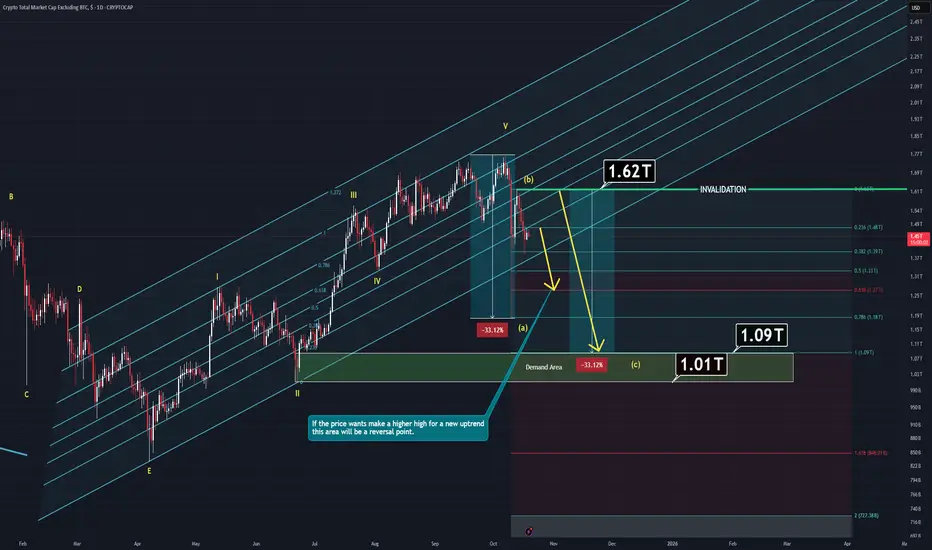
TOTAL 2 Analysis (1D)Total 2 has started its correction wave known as A-B-C but there are much to consider:
Main component of Total 2 is ETH and we'll need to dive into that so the chart would make sense.
-Companies like Bitmine keep buying ETH but they don't actually own it yet.
Specifically, Ethereum treasury companies collectively hold around 5.66 million ETH, equivalent to 4.68% of supply. Meanwhile, spot Ethereum ETFs hold roughly 6.81 million ETH, or 5.63% of the total.
If this companies would like to keep buying there are also two things to consider:
1- ETH price is still high despite the last crash. Any company would consider buying more if the price is lower than current.
2- ETH has unlimited max supply. It means, these companies will need way more than currently they have if they actually want to control it better which they do. Another thing to consider is, they actually don't have "that much". According to data we have, they only control around %5 at max. It means, ETH's price is not dependent on their favor, big wallets are.
Other things to consider:
ETF's:
After approvel of the SEC, these companies now can offer staked ETH ETF which also means price won't actually matter for the long term. These companies will be able to buy more ETH with the lower interest rates while prices are lower and cheaper. Lower interest rates means cheap liquidty which will trigger more buying events despite the price.
Also;
In the long term, these companies and ETF holders will be able to buy more thanks to staking mekanism. Staking will allow them to accummulate more ETH as a bonus.
When you add technical analysis into all of this, the chart actually makes sense.
Last crash mitigated closest demand zone. If the price wants to go higher it will at least has to make a higher high which means some of that wick's portion must be filled. And if that amount is not going to be enough, next demand zone will act as a magnet for the price.
Either way, waiting for invalidation line trigger or simply demand zone to react is going to be wiser action.
Thanks for reading.
ETHUSD ANALYLTICAL IDEA, FOR 30 SEP, 2025.After the quick fall below $4000, in value, the second in command on the coin market sharply went back to its original position and currently trades around $4100, but the overall direction is bullish as considered the altcoin season. But the question is, will it hold? Or continue pushing above or below well, for now, we can only sit tight on our hands, as my Bias remains bearish for the short term, and I look forward to taking sell trade positions as the price continues to push further in that direction.
As usual, my calls or analysis are based on what we see, the current Bias, and from a probability standpoint, meaning that this projection may be or may not be validated, so tread carefully, and as usual, this is not financial advice, trade responsibly.

USOIL: Sideways-to-lower in a tight bandThis is my previous analysis — feel free to take a look for reference.
1. Institutional Forecast Updates
IEA (Sep 15, 2025):
WTI targets $64.2/bbl for 2025 and $47.8/bb l for 2026
Brent targets $68/bbl for 2025 and $51/bb l for 2026
Goldman Sach (Jul 14, 2025):
WTI targets $63/bbl for H2 2025 and $52/bbl for 2026
Brent targets $64/bbl for H2 2025 and $56/bbl for 2026
J.P. Morgan (May 16, 2025):
Brent targets $64/bbl for H2 2025 and $56/bbl for 2026
www.rigzone.com
www.reuters.com www.jpmorgan.com
2. Key Drivers & Risks
📉 Supply
OPEC+ unwinding cuts of 2.2 mb/d (2024–2025), plus +137 kb/d starting October 2025.
Global supply reached 106.9 mb/d in Aug 2025; projected to rise by +2.7 mb/d to 105.8 mb/d in 2025.
U.S. output hit a record 13.2–13.4 mb/d (2024–2025)
Brazil, Guyana, and Canada are key contributors to non-OPEC+ growth.
U.S. shale breakeven costs: ~$62–68/bbl.
New offshore projects breakeven at ~$47/bbl.
OECD inventories in July 2025: 2,848 million barrels; 58.1 days of forward cover.
✳️ Demand
Global oil demand in 2024: ~103 mb/d (~193 EJ)
2025 demand growth of only +0.7 mb/d (weakest since 2009, excluding 2020).
OPEC projects demand growth of +1.3 mb/d in 2025 and +1.4 mb/d in 2026.
Consumption structure: transport accounts for ~two-thirds of oil demand; >90% of transport energy comes from oil.
Petrochemicals (naphtha, LPG) remain a key driver of incremental demand.
🛑 Politics & Geopolitics
Escalating Middle East tensions: growing risks in the Strait of Hormuz and Red Sea.
Kurdistan–Turkey pipeline (~0.23 mb/d) subject to recurring disruptions.
Venezuela: Chevron faces restrictions on U.S. exports.
OPEC+ often produces ~0.5 mb/d below quota due to capacity limits.
Long-term trend: EV adoption and emission policies structurally weaken demand growth.
✅ Overall View:
Overall, governments both want to bring oil prices down to support their economies and also tend to protect oil companies, since prices are currently low relative to many firms’ breakeven levels.
Prices are likely to edge gradually lower within a narrow range of $70–$50, and it is important to closely monitor factors that could trigger supply–demand shocks.
3. Technical Analysis
* Trend: assessed using at least three trend indicators, with market structure as the primary guide.
** Weak or Reversal Signals: Assessed based on one of our criteria for trend reversal signals.
*** Support/Resistance: Selected from multiple factors – static (Swing High, Swing Low, etc.), dynamic (EMA, MA, etc.), psychological (Fibonacci, RSI, etc.) – and determined based on the trader’s discretion.
**** Our advice takes into account all factors, including both fundamental and technical analysis. It is not intended as a profit target. We hope it can serve as a reference to help you trade more effectively. This advice is for informational purposes only and we assume no responsibility for any trading results based on it.
Please like and comment below to support our traders. Your reactions will motivate us to do more analysis in the future 🙏✨

GBP/USD – Macro Outlook & Why It’s a Top Pick This WeekMacro Fundamentals (ENDO):
The UK macro backdrop remains inflationary, with solid growth data and resilient employment figures, supporting further GBP strength. Conversely, the US shows increasing deflationary signals and a softer macro pulse.
COT Positioning:
Institutional positioning is highly supportive, with a 74% long bias and strong “flip percentile.” This shows that “smart money” is increasingly positioned for further GBP/USD upside.
Z-Score (Positioning Extremes):
There are no extreme positioning imbalances in Z-Score for GBP or USD, suggesting the trend can continue without risk of a mean-reversion squeeze.
EXO Signals (Risk/Reward, Bias, Interest Rate Outlook):
Risk/reward metrics and bias signals favor the long side. The current risk-on sentiment in global markets also acts as a tailwind for GBP.
FX Sentiment:
The broader sentiment is risk-on, supporting currencies like GBP that tend to outperform in such environments.
Summary & Trading Plan:
Bias: Long GBP/USD
Conviction: High (9.5/10, all key signals aligned)
Ideal Holding Period: 1–3 weeks, as long as risk-on sentiment persists. Exit immediately if risk-off conditions emerge.
Why This Pair?
Because GBP/USD is the rare case where macro, institutional positioning, and market sentiment all support the same direction. This reduces “crosswinds” and increases the probability of a clean swing move. Watch for sustained risk-on flows and monitor for any macro or sentiment shifts.

“XRP/USD - Adding a Second Position to Ride the Wave”4H Bias Holds Strong - 5M Entry Refinement
In continuation of my initial position on XRP/USD, I’ve added a second entry to compound on the 4H bullish bias move.
Key Observations:
1. 4H Structure: The price respected the order block within the IDM zone, confirming bullish intent.
2. Refined Entry: Top screenOn the 5M timeframe, after a sweep of SSL and a clear CHoCH, price retested the order block. I entered on the bullish reaction with TP levels set at 3.3974.
3. Bigger Picture (2H for Clarity): The engineered liquidity was swept cleanly, and momentum aligns with the continuation plan toward higher levels.
Both positions are running in sync, aiming for the same take-profit zone. I’ll monitor how price action develops overnight for potential adjustments or further refinement.
Let me know your thoughts—are you tracking XRP/USD, or are you focused on other pairs this week? Drop a comment below!
Bless Trading!

GOLD-XAUUSDXAUUSD Gold Analysis: The market is in the center zone, indicating potential for upward movement. Look for buying opportunities as the price approaches support levels. Once the market reaches a strong resistance, it could signal a sell setup. Stay cautious, plan your entry and exit carefully, and manage your risk effectively!

Crypto Frenzy: Elon Musk's Impact on Bitcoin and DogecoinCryptocurrencies are skyrocketing just 7 days before the presidential election, and many people are wondering why. The answer, which should come as no surprise, is of course, Elon Musk.The reason is a perfect storm of sorts. Musk’s increased prominence as he campaigns for Donald Trump, his recent comments about cryptocurrency, and his potential role in a Trump administration (should Trump win) are all driving up the price of Bitcoin as well as Dogecoin and a number of other meme coins.Dogecoin, a favorite of Musk’s, was up 9.7% on Tuesday. This comes after the tech billionaire said at a Trump political rally in Pennsylvania that he’s not “actively involved” in crypto: “I just like Dogecoin.”
The billionaire founder of Tesla and Space X and owner of X has a long history with Dogecoin, which he first promoted in 2021 on Saturday Night Live, causing the price to spike, only to plunge afterward. (The meme coin’s price has gone up and down based on Musk’s comments since.)Musk, who has been actively campaigning for the Republican nominee and raising money for Trump, has also said he would be heading the Department of Government Efficiency, dubbed DOGE, if the former president is elected. That has also contributed to the frenzy, leading to a more-than-20% gain in Dogecoin over the past seven days, and 33% over the month.
Meanwhile, Bitcoin, which is the largest cryptocurrency by total market capitalization, was up over 4.4% on Tuesday, seemingly swept up in the excitement. It’s now trading just short of its March record high.

Audjpy signalAfter the release of strong employment data from Australia, the AUD/JPY currency pair increased by more than 100 dollars. Considering the interest rate differential between the two countries and the lack of further rate hikes in Japan, the likelihood of the first scenario is higher. The second scenario is more likely if the market becomes risk off, leading to the rise of safe-haven currencies like the Japanese yen. In that case, we would expect to see a decline in the AUD/JPY pair down to the bottom of the triangle pattern.
Target for the first scenario (long trade): 101.425
Target for the second scenario (short trade): 99.705

Why Chinese Stocks may be risky for the time beingRecent moves by the Chinese Government - termed "Three Arrows", facilitated a decrease of interest rates among various other changes of policy made for loans, borrowing and payment etc. This cumulated action signalled to investor's that China was reopening its economy, thus leading to a huge surge in investment in Chinese Blue Chip stocks, and the entire stock market in the region, including the Hong Kong Market. However, as stocks surge in price with increasing volume, it must be noted that they have been over-bought - 20-30% growth on average before the policies are even put in place. For instance, stocks like the HK exchange itself HK:0388 experienced a doubling in price. This, along with the fact that ETFs of the Chinese markets in Singapore and Taiwan both received much more purchasing power than even the Chinese markets themselves, highlight a significant irrationality in the markets right now. Considering the correction in trends recently, it would not be advisable to purchase stocks in the Chinese markets right now.

$USNFP -U.S Non-Farm Payrolls (MoM)$YSNFP (AUGUST/2024)
US Economy Adds Fewer Jobs Than Expected
source: U.S. Bureau of Labor Statistics
- The US economy created 142K jobs in August, more than downwardly revised 89K in July but below market expectations of 160K.
Most job gains occurred in construction and health care while manufacturing employment declined.
Meanwhile, the jobless rate edged lower to 4.2% from 4.3% in July.

$EUIRYY -EU YoY (CPI) source: EUROSTAT
The inflation rate in the Euro Area declined to 2.9% year-on-year in October 2023,
reaching its lowest level since July 2021 and falling slightly below the market consensus of 3.1% .
Meanwhile,
The Core Rate, which filters out volatile food and energy prices,
also cooled to 4.2% in October;
marking its lowest point since July 2022.
However, both rates remained above the European Central Bank's target of 2%.
The energy cost tumbled by 11.1% (compared to -4.6% in September), and the rates of inflation eased for both food, alcohol, and tobacco (7.5% compared to 8.8%) and non-energy industrial goods (3.5% compared to 4.1%).
Services inflation remained relatively stable at 4.6%, compared to 4.7% in the previous month. On a monthly basis, consumer prices edged up 0.1% in October, after a 0.3% gain in September.

Gold : Buyers need weak data from USAFOREXCOM:XAUUSD
🌘Gold buyers trying with 2346 Support level which is in the past used as support and resistance level.
🟣Gold goes up past week because of GDP and Unemployment calims weak datas.
🔵The expectation todays JOLTs Job Openings from 8.488 decrease to 8.350 also
JOLTs Job Quits 3.329 decrease to 3.200.
🟡Decrease more than forcast Job Openings could effect to Consumer Confidence and Wage growth and Disposable Income.
🟢By the way Investors should consider to Quit job data because downtrend in Quit job
shows doubt in the labor market.
⚪Weaker conditions in the labor market may push FED to take less Hawkish stance on Intrest Rates.
🔶 Supoort levels: 2331 , 2321 💤Weak rsistance: 2339 🔷Resistance level: 2346

Basic Technical and COT Analysis on AUDUSD ShortAUDUSD Short Late/Re-entry
Price has come back down to the last swing low/base made before what was essentially a two week bull run. We have broken past this area and come back to retest it.
When price came back to retest this key zone, we saw it touch the 61.8% fib retracement level.
Non-Commercial traders, as can be seen through COT filings, are a majority short AUDUSD.
128,816 short positions are currently held by Non-Coms vs 49,640 longs.
Latest COT filings do show a slight increase in Net Positions (Longs-Shorts) compared to the previous. Possibly due to profit taking by Non-Commercials.
Commercial Traders, who are in most cases contrarian to price, are a majority long.
Commercials have 129,292 long positions open vs 39,515 shorts.
My original entry was around 0.65491 on the 21st of Feb close. My SL was at 0.66249, just above what was then the swing high, but have now moved to 0.66008, just above the latest swing high.

MATICUSDTHi guys
I consider the above scenario valid only under the condition of maintaining the support range of $0.6884.
Be careful, we have network upgrade for February 6.
What do you think?
MLong

CYCLONE GAINING MOMENTUMCyclone Protocol had learned some valuable lessons about tokenomics but overall this project has high potential. Privacy features when applied to the appropriate business environment and use case are in demand. Many investors steer away from them but look at Horizen, still growing in TVL and applying swift changes to maintain compliance.
Cyclone has a very low supply and this will also attract smart money, question is can it get the hype it needs to revisit its all time highs?
I believe so, and at the current price the risk is not high enough to deter me from buying into its potential. As we come down to test the 20 MA on the RSI, if the volume signals strength there will be opportunity for big gains.
$17.50 - 19.50 CYC buy zone
Target 618 Fib with high volatility on upswings
Low market cap and low supply provides excellent trading with high gains while supporting the resurrection of a great project that always delivers value to their community.
CLong

Gold Long to 2000Monthly resistance for gold is around 2050. I think in time, hopefully by month end gold will be back up at this area.
Following on from the news, Biden has sent $100m to Palistine as aid. This will effect the dollar price, and theoretically push gold further up.
We have seen strong bullish movement with gold, Powells speech yesterday has caused a nice rise too. Currently im basing most of my trades and strategy soley from news. I use OBs and FVG, but co ordinating this with fundementals, we can clearly suggest gold will not come down anytime soon. Especially as the war in Israel is current.

$TWTR -'X' FLEX- NYSE:TWTR (X) occurred on a Monthly Resistance Trendline being broken-out TA speaking.
Well, fundamentally didn't go as well.
The recent name change wiped out a lofty 4$Billon Dollars and more the
size of it on Brand Value.
It's a mix in between TA and Fundementals from here.
Still sitting on the sidelines aiming for TP1 and more long term.
Buying shares(investing) or longing derivatives from here is quite Risky.
The confirmation of Resistance Trendline Breakout alone can be enough for someone.
However, entry here requires at least a Stop Loss of 10% ;
and that's only the recent Higher Low from the current uptrend break-out Market Structure.
More confirmations ahead to the *D (CHoCH) awaiting how price will perform.
Looking for Entry aiming at TP levels at Wave C correction from impulse(breakout uptrend)
Patience is Wealth.
TRADE SAFE !
*** Note that this is not Financial Advice.
Please do your own research and consult your own Financial Advisor
before considering partaking on any trading activity based solely on this Idea.

$APPL -Buy Opportunities - Apple Inc. ($APPL) nearing Support Trendline of its Rising Channel.
Looking for long opportunities in the short-term,
remaining positive TA speaking until the upcoming Earnings Report.
Until 3rd of August positive momentum has captured $APPL ;
(may be interreupted from Feds upcoming week Rate Hikes Decision)
SL is adjustable from here, with the nearest point being the last
Higher Low market structure,
or the previous ATH depending on your risk apetite.
Until the next one;
trade smart
TRADE SAFE
*** Note that this is not Financial Advice !
Please do your own research and consult your own Financial Advisor
before considering partaking any trading activity based solely on this Idea

Has FUD ended?Sunrun has been sold heavily after the news about SVB. I think FUD affected SUNRUN heavily. The chart is showing that we are at the support. Summer is near as well. We may see a recovery from here. Targets would be 24 and 28. Then breaking the wedge would be hudge!
Disclaimer – WhaleGambit. Please be reminded – you alone are responsible for your trading – both gains and losses. There is a very high degree of risk involved in trading. The technical analysis , like all indicators, strategies, columns, articles and other features accessible on/though this site is for informational purposes only and should not be construed as investment advice by you. Your use of the technical analysis , as would also your use of all mentioned indicators, strategies, columns, articles and all other features, is entirely at your own risk and it is your sole responsibility to evaluate the accuracy, completeness and usefulness (including suitability) of the information. You should assess the risk of any trade with your financial adviser and make your own independent decision(s) regarding any tradable products which may be the subject matter of the technical analysis or any of the said indicators, strategies, columns, articles and all other features.

SPY Getting Ready To Break DownI have not posted in a while. My goal is to post weekly updates. I incorporate several indicators for my market sentiment model, including interest rates, EM capital flows, and gold.
All indicators are based on academic papers, most notably several by Wouter Keller.
Sentiment Model Indicators:
Interest Rates: Flipped defensive today
EM: Defensive since Feb 2nd
Gold: Defensive since Feb 2nd
We are now in a defensive regime. Financial conditions are showing signs of tightening, with HYG being the leading candidate. Markets are coming around to the idea that inflation will be higher for longer (CPI, employment, etc), and earnings compression will need to take place.
Technically, the SPY is forming a Wykoff distribution pattern. I am looking to take risk off before a breakdown lower to 380 over the next several weeks. A sustained rally above 418 will void the distribution pattern.
Comments are welcome!
