BTCUSD H4 | Potential Bearish ReversalBased on the H4 chart analysis, we can see that the price has rejected off our sell entry level at 94,989.50, which is a pullback resistance that is slightly above the 50% Fibonacci retracement.
Our stop loss is set at 97,969.25, which is a pullback resistance, that is slightly above the 127.2% Fibonacci extension.
Our take profit is set at 89,857.71, which is a pullback support that aligns with the 50% Fibonacci retracement.
High Risk Investment Warning
Stratos Markets Limited (
Harmonic Patterns

Stop!Loss|Market View: GBPUSD🙌 Stop!Loss team welcomes you❗️
In this post, we're going to talk about the near-term outlook for the GBPUSD currency pair☝️
Potential trade setup:
🔔Entry level: 1.35530
💰TP: 1.36974
⛔️SL: 1.34829
"Market View" - a brief analysis of trading instruments, covering the most important aspects of the FOREX market.
👇 In the comments 👇 you can type the trading instrument you'd like to analyze, and we'll talk about it in our next posts.
💬 Description: The US dollar is feeling pressure in early 2026, and against this backdrop, the GBPUSD pair is showing one of the most convincing contexts for potential buying. After the price has been pushed toward the resistance level of 1.35260, buyers are already showing a breakout, allowing for buying trades with a target of 1.37000. A particularly strong factor for potential short-term growth will be price accumulation today at current levels, just above the resistance level of 1.35260.
Thanks for your support 🚀
Profits for all ✅

ETHUSD H4 | Could We See A Reversal From Here?Based on the H4 chart analysis, we can see that the price has rejected off our sell entry level at 3,258.01, which is a pullback resistance that is slightly below the 78.6% Fibonacci retracement.
Our stop loss is set at 3,375.95, which is an overlap resistance.
Our take profit is set at 3,075.27, which is a pullback support that aligns with the 38.2% Fibonacci retracement.
High Risk Investment Warning
Stratos Markets Limited (

BCHUSD H1 | Bullish BounceThe price is falling towards our buy entry level at 621.76, which acts as a pullback support that is slightly below the 50% and the 38.2% Fibonacci retracement.
Our stop loss is set at 592.44, which is an overlap support.
Our take profit is set at 661.06, which is a swing high resistance.
High Risk Investment Warning
Stratos Markets Limited (

Trade Packet | LIVESTOCK FEEDS PLCNOT FINANCIAL ADVISORY
📘 TRADE PACKET — Livestock Feeds Plc (2H Chart)
Patterns: Converging Triangle + Ascending Triangle (Contracting)
Indicators: Ripster EMA Clouds (5–200) | Price: ₦6.65
🟩 BUY Zone
• ₦6.10 – ₦6.40
• Triangle base + EMA(89/180) confluence
• Entry near ₦6.25 offers best R:R with breakout potential
🟥 Stop‑Loss Zone
• ₦5.90
• Below triangle support and EMA(200)
• Protects against breakdown from apex compression
🟦 Exit / Take‑Profit Zone
• ₦7.20 – ₦7.60
• Upper triangle resistance + measured move extension
• Trail stop above ₦6.90 once price clears ₦7.10

xauusdThe price is currently hovering around the 4,470 ceiling. The market may stay there until the start of the New York session or slowly move towards our order.

NQ | January |15min chart Interested to watch price move through timeframes from the 15min to the higher daily and weekly levels unto the end of the month.
T.A explained -
BackSide (BS)
FrontSide (FS)
Inverse BS (Inv.BS)
Inverse FS (Inv.FS)
BS & FS levels are expected support when dashed lines, tested when dotted and resistance when solid lines.
The inverse is true for the Inv. BS Inv. FS levels, they are resistance as dashed lines, tested as dotted and support as solid lines.
Monthly timeframe is color pink
weekly grey
daily is red
4hr is orange
1hr is yellow
15min is blue
5min is green if they are shown.
strength favors the higher timeframe.
2x dotted levels are origin levels where trends have or will originate. When trends break, price will target the origin of the trend. its math, when the trend breaks, the vertex breaks too so the higher timeframe level/trend that breaks, the more volatility there could be as strength in the orders flow in to fuel the move.


Long idea CHFJPYEntry 197.729
Stoploss 197.398
TP-1 198.06
TP-2 198.391
Long idea with 1r and 2r. Entries on the chart please help yourself

XLM / USDC — Price–Time ShiftThis chart examines XLM through a price–time confluence framework, focusing on how price interacts with dynamic targets, trend structure, and momentum during a developing structural shift rather than attempting to forecast outcomes.
Structural Context:
Price spent an extended period within a descending channel, showing compression and limited upside follow-through.
A higher-low structure formed near the lower portion of the channel, signaling weakening downside pressure.
Recent candles show a decisive push away from compression, with price advancing toward the upper region of the broader structure.
Target Interaction:
Multiple upside targets have been reached sequentially, each confirmed through sustained interaction rather than brief wick touches.
Target hits occurred alongside expanding candle bodies, indicating participation rather than isolated volatility.
Current price is operating near a recently activated target zone, often a location where expansion pauses or transitions into digestion.
Trend & Baseline Behavior:
Price has reclaimed the rising median baseline after a prolonged period below it.
The baseline has turned upward, reflecting improving directional structure rather than reactive movement.
The broader channel remains intact, framing the move as structural recovery within a larger range.
Momentum Context:
Momentum expanded during the advance and has begun to moderate.
The projected cross highlights a potential momentum rotation window, commonly associated with consolidation or controlled pullbacks rather than immediate trend failure.
Momentum remains elevated relative to prior cycle lows, supporting the broader structural improvement.
Forward-Looking Context (Non-Predictive):
As long as price continues to respect the reclaimed baseline and prior target zones, the current structure remains constructive. Failure to hold reclaimed levels would shift focus back toward consolidation within the broader channel.
This chart is intended to visualize how price, time, and momentum interact during structural reversals, not to predict future price direction. All levels shown are dynamic reference zones that evolve with price.

PLTR — Price–Time Confluence & Corrective ContinuationThis chart analyzes PLTR through a price–time confluence framework, emphasizing how price interacts with dynamic targets, trend structure, and momentum during a corrective phase rather than attempting to forecast outcomes.
Structural Context:
Price previously advanced within a rising channel before losing upside momentum near the upper region of the structure.
A rollover developed, followed by a controlled decline characterized by lower highs and expanding downside candles.
Recent price action shows stabilization near the lower half of the channel rather than an impulsive breakdown.
Target Interaction:
Downside targets activated sequentially during the pullback and were reached through sustained interaction, not single-bar volatility.
The most recent target interaction occurred near current price, suggesting completion of the immediate corrective objective.
Price holding near recently validated targets often marks a decision zone between continuation and consolidation.
Trend & Baseline Behavior:
Price is currently trading below the median baseline, which has turned downward and is acting as dynamic resistance.
The slope of the baseline reflects contraction following prior expansion rather than a full structural reset.
The broader rising channel remains intact, framing the move as corrective within a larger structure.
Momentum Context:
Momentum compressed sharply during the decline, reaching lower-range conditions.
A projected cross highlights a potential momentum rotation window, commonly associated with stabilization or short-term consolidation.
Momentum remains below prior expansion highs, consistent with corrective behavior rather than renewed acceleration.
Forward-Looking Context (Non-Predictive):
As long as price remains contained within the broader channel, current behavior can be interpreted as structural digestion. Reclaiming the median baseline would indicate improving conditions, while continued rejection would keep focus on range development.
This chart is intended to visualize how price, time, and momentum interact during corrective phases, not to predict future price movement. All levels shown are dynamic reference zones that evolve with price.

TSLA — Price–Time Confluence & Corrective Phase ContextThis chart examines TSLA through a price–time confluence framework, focusing on how price interacts with dynamic targets, trend structure, and momentum during a corrective phase rather than attempting to forecast outcomes.
Structural Context:
Price previously advanced into the upper region of a rising channel before losing momentum.
A rollover developed near the channel’s upper boundary, followed by a series of lower highs and expanding downside candles.
Recent price action reflects a corrective phase rather than a single impulsive breakdown, with structure remaining contained within the broader channel.
Target Interaction:
Downside targets activated and were subsequently reached during the pullback, indicating orderly participation rather than isolated volatility.
The most recent interaction shows price stabilizing after completing prior targets, suggesting a pause in directional expansion.
Current price remains close to recently validated levels, an area where consolidation or rotation commonly occurs.
Trend & Baseline Behavior:
Price is currently trading below the median baseline, which has turned downward and is acting as dynamic resistance.
The slope of the baseline reflects contraction following prior expansion, not a full structural reset.
The larger ascending channel remains intact, framing the move as corrective within a broader structure.
Momentum Context:
Momentum compressed significantly during the decline, reaching lower-range conditions.
The projected cross highlights a potential momentum reset window, often associated with stabilization or short-term rotation rather than immediate continuation.
Momentum remains below prior expansion highs, consistent with corrective behavior.
Forward-Looking Context (Non-Predictive):
As long as price remains within the broader channel, the move can be viewed as structural digestion. Reclaiming the median baseline would signal improving conditions, while failure to stabilize would keep focus on continued range development.
This chart is intended to visualize how price, time, and momentum interact during corrective phases, not to predict future price direction. All levels shown are dynamic reference zones that evolve with price.

XRP / USDC — Price–Time Confluence and Target InteractionThis chart presents a price–time confluence view of XRP following a sustained downtrend and subsequent structural transition. The focus is on how price interacts with dynamically generated targets, trend structure, and momentum behavior rather than on fixed predictions.
Structural Context:
Price spent an extended period moving within a descending channel, with repeated failures to sustain upside momentum.
A clear inflection developed as price stabilized near the lower boundary and began forming higher lows.
The recent advance shows a decisive break from prior compression, with price accelerating away from the channel structure.
Target Interaction:
Multiple upside targets have been reached in sequence, each marked by confirmed interactions rather than single-candle spikes.
Target hits occurred alongside expanding candle bodies, suggesting participation rather than thin liquidity moves.
The current target zone sits above recent price action and remains technically active while structure is maintained.
Trend & Baseline Behavior:
Price has reclaimed and remained above its rising median baseline, which now acts as dynamic support.
The curvature of the baseline reflects increasing trend strength rather than a flat or reactive condition.
Momentum Context:
The momentum oscillator shows a completed expansion phase followed by a projected cooling period.
The projected cross highlights a potential reset window, which often accompanies consolidation or range development rather than immediate trend failure.
Momentum structure remains elevated relative to prior cycle lows, indicating structural improvement even during pullbacks.
Forward-Looking Context (Non-Predictive):
As long as price continues to respect the rising median and prior target zones, higher reference levels remain relevant. A loss of structure or failure to hold reclaimed levels would shift focus back toward consolidation or deeper retracement instead.
This chart is designed to visualize price behavior, target interaction, and time-based momentum relationships, not to forecast outcomes. All levels should be treated as dynamic reference zones that evolve with price.

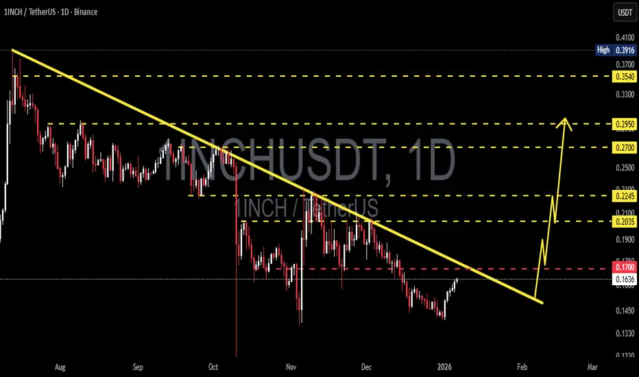
1INCH/USDT – Test Downtrend Resistance | Breakout or Rejection?1INCH/USDT remains in a medium to long-term downtrend, clearly characterized by a sequence of lower highs and lower lows since the previous peak. Price is currently experiencing a relief rally, moving upward toward a major descending trendline resistance that has historically capped bullish attempts.
This area represents a critical decision zone. Market participants are closely watching whether price will break the trendline or get rejected and continue the bearish structure.
---
Pattern Explanation
Descending Trendline (Bearish Market Structure)
The descending trendline has been respected multiple times, acting as a strong dynamic resistance.
Each previous touch of this trendline resulted in price rejection and continuation to the downside.
Price is now approaching the same trendline again, making this level technically significant.
Potential Bearish Continuation Structure
Overall structure still favors sellers unless a confirmed breakout occurs.
Failure to break above resistance may form a bearish continuation setup, leading to another impulsive drop.
---
Key Levels
Resistance Zones
0.1700 USDT – Minor resistance / reaction zone
0.2035 USDT – Key resistance & trendline breakout level
0.2245 USDT – Strong resistance / confirmation level
0.2700 – 0.2950 USDT – Upper supply zone
0.3540 USDT – Major resistance / previous range high
Support Zones
0.1635 USDT – Short-term support
0.1450 – 0.1330 USDT – Major demand zone
A breakdown below this zone would strengthen the bearish continuation scenario.
---
Bullish Scenario
Price breaks and closes above the descending trendline on the daily timeframe.
Strong confirmation occurs with a daily close above 0.2035 USDT.
This would invalidate the bearish structure and signal a potential trend reversal.
Bullish targets:
0.2245 USDT
0.2700 USDT
0.2950 USDT
Increasing volume during breakout would further support bullish momentum.
Bias: Trend reversal if breakout is confirmed.
---
Bearish Scenario
Price fails to break the trendline and shows rejection (bearish candle / long upper wick).
Rejection around 0.1700 – 0.2035 USDT confirms seller dominance.
Downside targets:
0.1635 USDT
0.1450 USDT
0.1330 USDT
A clean breakdown below support would confirm bearish continuation.
Bias: Bearish continuation if rejection occurs.
---
Conclusion
1INCH/USDT is currently trading at a major technical inflection point. The descending trendline acts as the key level determining the next major move.
Traders should wait for clear confirmation — either a breakout for bullish continuation or a rejection for bearish continuation.
This is a high-risk, high-impact zone, best traded with confirmation and proper risk management.
---
#1INCH #1INCHUSDT #CryptoAnalysis #TechnicalAnalysis #Altcoins #Downtrend #Trendline #SupportResistance #Breakout #Bearish #Bullish #PriceAction
GBP/USD – USD Weakness Lifts the PoundEntering the early trading sessions of 2026, GBP/USD is presenting an increasingly constructive picture as downside pressure from the USD begins to fade. After a highly volatile 2025, market attention is shifting toward the possibility that the Federal Reserve may maintain an accommodative stance amid signs of cooling in the U.S. economy. This macro backdrop is creating a favorable environment for counterpart currencies such as the British pound to recover.
From a technical perspective, the bullish structure in GBP/USD is becoming more clearly defined . On the H2 timeframe, price continues to form higher lows, while rebounding decisively from the 1.3530 support zone. This area has shown swift and confident buying interest, signaling that bulls remain committed to defending the current trend.
On the upside, 1.3600 stands out as a key psychological resistance . As long as price holds above the current support base and consolidates in an orderly manner, the probability of a gradual push toward this level remains high. A clean and sustained breakout above 1.3600 would likely open the door for further upside continuation in the sessions ahead.
Overall, GBP/USD is trading within a controlled and well-supported uptrend , backed by both a supportive macro narrative and a constructive technical structure. In this context, short-term pullbacks are more likely to act as continuation setups, reinforcing the broader bullish outlook rather than signaling a reversal.

M2 Liquidity vs Gold × VIX — Macro Stress & Liquidity GaugeThe formula reflects real U.S. dollar liquidity, normalized through gold as a long-term store-of-value anchor and multiplied by VIX — an indicator of market stress and expected volatility.
The indicator has been working for over 20 years and captures global market sentiment: periods when market participants are willing to take on risk, as well as phases of consolidation and heightened caution.
The green zone represents periods of fear and liquidity compression — precisely the conditions under which favorable opportunities for gradual position accumulation are formed.
The red zone reflects overheated market phases, when investors are already deeply positioned and the incentive grows to lock in profits, move to cash, or rotate capital into other asset classes (under current conditions — including crypto markets).
The yellow zone serves as a transitional decision-making phase.
When the indicator moves from the green zone toward the red zone, the yellow zone acts as an area for partial profit-taking, helping reduce risk ahead of potential market overheating.
When the indicator moves from the red zone toward the green zone, the yellow zone may serve as an area for re-entering or gradually rebuilding a position.
The yellow zone functions as a balancing range, allowing for position management and capital reallocation without attempting to precisely time market reversals.

HYPE/USDT - Reversal Zone or Bearish Continuation?HYPE/USDT on the 12-hour timeframe remains in a clear medium-term downtrend. Price continues to trade below a well-defined descending trendline, which has been respected since the peak around the 49–51 USDT area. This structure confirms that sellers are still in control.
However, recent price action shows a reaction from the lower demand zone, signaling a critical decision area where the market may either reverse or continue its bearish trend.
---
Pattern Explanation
The dominant patterns visible on the chart include:
Descending Trendline (Bearish Market Structure)
Price consistently forms lower highs and lower lows, confirming a bearish trend.
Compression / Potential Descending Triangle
Price is compressing toward the trendline, indicating decreasing volatility and an upcoming breakout or rejection.
Minor Base Formation
A short-term consolidation is forming near the 22–25 USDT zone, showing early defensive buying pressure.
This type of structure often precedes a strong impulsive move.
---
Key Levels
Resistance Zones:
27.70 USDT → Descending trendline & short-term supply
29.80 USDT → Major horizontal resistance
34.70 USDT → Previous breakdown area
41.10 USDT → Mid-range resistance
49.20 – 51.48 USDT → Major supply & previous high
Support Zones:
25.00 USDT → Short-term support
22.19 USDT → Major demand zone & cycle low
---
Bullish Scenario
Price breaks and closes above the descending trendline (around 27.70 USDT) on the 12H timeframe.
Bullish confirmation becomes stronger if supported by increasing volume.
Upside targets:
29.80 USDT
34.70 USDT
41.10 USDT (extension target if momentum accelerates)
A confirmed breakout would shift the structure from lower highs to higher highs, signaling a trend reversal.
---
Bearish Scenario
Price fails to break the trendline and gets rejected near the 27.70 USDT area.
This rejection would confirm bearish trend continuation.
Downside targets:
25.00 USDT
22.19 USDT (critical support)
A breakdown below 22.19 USDT with strong volume could trigger a deeper sell-off.
---
Conclusion
HYPE/USDT is currently trading at a major decision zone. The descending trendline remains the key level that will determine the next directional move.
Breakout = potential trend reversal
Rejection = bearish continuation
Patience and confirmation are essential before taking positions.
---
#HYPEUSDT #Hyperliquid #CryptoAnalysis #TechnicalAnalysis #DescendingTrendline #TrendReversal #BearishMarket #BullishBreakout #AltcoinTrading

ASTER/USDT – Potential Trend Reversal or Bearish Continuation?On the 12H timeframe, ASTER/USDT is still moving within a primary downtrend, clearly defined by a descending trendline acting as dynamic resistance. After a strong sell-off, price has formed a lower consolidation base and is now attempting a pullback toward the descending trendline.
Overall market structure remains bearish, although early signs of a short-term recovery are beginning to appear.
---
Pattern & Structure Explanation
Descending Trendline (Major Resistance):
The price has been rejected multiple times along this trendline, confirming strong seller dominance.
Base Formation / Small Rounded Bottom:
Price has created a higher low from the 0.65 – 0.69 zone, indicating weakening selling pressure.
Pullback Structure:
The current move is still a retracement, not a confirmed structural breakout.
Technically, price is trading within a decision zone between reversal and continuation.
---
Key Levels
Resistance Zones:
0.905
0.970
1.070
1.185
1.400 (major supply zone)
Support Zones:
0.780 (minor support / current price area)
0.690
0.654 (major low / invalidation level)
---
Bullish Scenario
The bullish scenario becomes valid if:
Price breaks and closes strongly above the descending trendline
Supported by increasing volume
Upside targets:
1. 0.905 – initial resistance
2. 0.970 – 1.070 – key supply-demand flip zone
3. 1.185 – mid-term resistance
4. 1.400 – optimistic target if momentum accelerates
Technical implication:
Trendline break = trend reversal confirmation
Market structure shifts from lower highs to higher highs
---
Bearish Scenario
The bearish scenario remains in play if:
Price fails to break the descending trendline
Strong rejection or bearish candle formation appears near resistance
Downside targets:
1. 0.780 – short-term support
2. 0.690 – demand zone
3. 0.654 – previous low (critical support)
If 0.654 breaks:
Downtrend continuation is confirmed
Bearish structure remains intact
Risk of printing a new lower low
---
Conclusion
ASTER/USDT is currently trading at a critical decision area.
The primary trend remains bearish, but reversal potential exists if a confirmed trendline breakout occurs.
Best approach:
Wait for confirmation
Breakout → follow bullish momentum
Rejection → anticipate bearish continuation
Structure and key levels should guide trading decisions.
---
#ASTER #ASTERUSDT #CryptoAnalysis #TechnicalAnalysis #Altcoin #Downtrend #Trendline #Breakout #SupportResistance #PriceAction #MarketStructure

gold shortlooking for shorts .
looks good on 1hr tf and 15m .
Let us see what is going to happen next

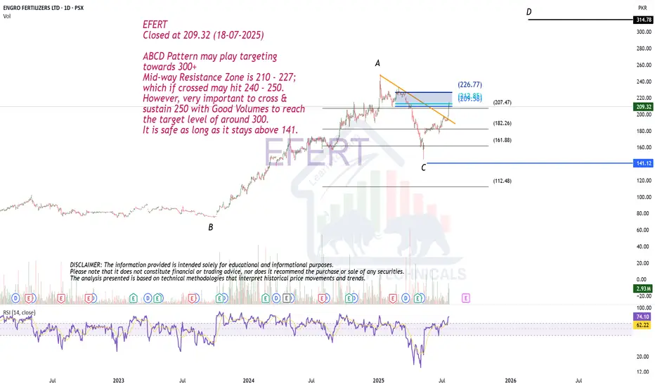
ABCD Pattern may play.EFERT
Closed at 209.32 (18-07-2025)
ABCD Pattern may play targeting
towards 300+
Mid-way Resistance Zone is 210 - 227;
which if crossed may hit 240 - 250.
However, very important to cross &
sustain 250 with Good Volumes to reach
the target level of around 300.
It is safe as long as it stays above 141.
SOL BTC - finally?? looks somewhat convincing @@SOL BTC - finally?? looks somewhat convincing @@
lets see. looking kinda good though.
SOL RAY ORCA maybe JUP?
lfg surprise alt run after pretty good smashing there.
gl

ETH looks stronger than BTCMarkets are gradually coming back to life after the holidays, and I’m increasingly leaning toward the view that Q1 could be positive for risk assets.
But if we compare what looks more attractive right now ETH looks stronger than BTC, in my opinion.
Briefly, why.
▪️ At the end of November, ETH formed a local bottom.
This is clearly visible on the chart: strong buy volume came in, selling pressure weakened, and open interest started to decline a classic sign of aggressive shorts being closed.
▪️ The structure changed after that.
We didn’t move into a new impulsive rally, but instead entered a prolonged range and that matters. This type of price action looks more like accumulation than distribution. Price is sold into, but quickly bought back.
▪️ A clear support zone has now formed around 2,800–2,900, and the market is reluctant to trade below it.
As long as this zone holds, long scenarios remain the priority rather than aggressive shorts.
▪️ The second half of December was “dead” for a reason.
U.S. investors were realizing losses for tax purposes toward year-end, so any upward move was quickly sold. This created an illusion of weakness, but in reality it was a temporary factor.
▪️ That pressure has now faded.
Participants who were on the sidelines are gradually returning to positions, adding incremental demand.
▪️ The key resistance zone above is 3,400–3,600.
Acceptance above this area would be a clear signal that the market is ready to move higher, and trend followers would likely step in.
On the macro side:
Upcoming labor market data and the Fed remain the key drivers. If the market gets confirmation of further policy easing, it would be a strong positive for ETH and risk assets overall.
Bottom line:
👉 ETH looks more attractive than BTC right now
👉 As long as support holds, pullbacks look constructive
👉 I don’t see panic the weakness appears more technical than fundamental
As always, this is my market view, not financial advice.

Silver Analysis
Daily candle closed above tha last 3 days, bulish signal. (purple line)
4h analysis shows the reaction on resistance area (blue) that sellers were not strong enough to bring the price to lower low, additionally this area is valid if we use Ichimoko indicator too, so if candle close above this area we can join buyers.
Stay tuned for our next updates.
