The Yield Curve: A Forex Trader’s Early Warning SystemTradingView added the Yield Curves tab (found at the bottom right of your chart) to their UI last Year and constantly improved upon it. At first glance, it looks like a tool just for bond traders. But even though I am not a bond trader (yet), I started wondering: Can we use this as an early indicator for Forex trading?
The short answer is YES . While Forex traders usually watch price action and news, bond yields often move before the news hits the screen. In this write-up, I will show you how to use this "hidden" signal to stay one step ahead of the market.
First things first: How to Recreate My Charts
If you want to track this yourself on TradingView, search for these two symbols:
- US10Y - US02Y: This shows the "Spread" the gap between long and short rates.
- FRED:DFF: This shows the actual daily interest rate set by the Federal Reserve.
By overlaying these, you can see exactly when the bond market (the Spread) moved before the Fed (the Rate).
The Basics: What is a Bond Yield? (The Seesaw Rule)
To understand the chart, you only need to know Bond prices and yields move like a seesaw.
- When traders buy bonds: The price goes up, and the yield goes down.
- When traders sell bonds: The price goes down, and the yield goes up.
Why do we care? Yields represent the "market's opinion" on interest rates. If yields are falling, the market is betting that the Fed will cut interest rates soon. If yields are rising, the market expects rates to stay high. Because interest rates drive currency value, the yield curve is the ultimate indicator of what "Smart Money" is doing before the news goes public.
The Simple Math (The "Seesaw")
Bond yields and bond prices move on a seesaw. When one goes up, the other must go down because the interest payment (the "coupon") is fixed.
Think of a bond as a fixed contract that never changes. If you own a bond that pays exactly $50 a year, that $50 is locked in.
- Scenario A: You buy a bond for $1,000 that pays $50 interest. Your yield is 5% ($50 / 1,000).
- Scenario B: (Low CPI): Suddenly, a low inflation (CPI) report comes out. Investors get excited because they think the Fed will cut interest rates soon. They rush to buy your bond. Because everyone wants it, the price of your bond rises to $1,100.
The Result: The bond still only pays that fixed $50. But because the new buyer paid $1,100 for it, their yield is now only 4.5% ($50 / 1,100).
Simple English: You are paying more money (higher price) to get the same fixed reward. Therefore, your percentage of profit (yield) goes down.
Summary so far:
Low CPI: The market anticipates lower interest rates in the future.
The Action: Traders rush to lock in today's higher rates by buying bonds.
The Result: Bond prices go up.
The Math: Higher price for the same interest = Lower Yield.
This is why you will see the US10Y yield drop on your TradingView chart the second a "cool" inflation report hits the news.
Setting the Scene: The "Early Indicator" Theory
In a healthy economy, a 10-year bond should pay more than a 2-year bond. Why? Because lending money for 10 years is riskier than lending it for 2 years. This is a "Normal" curve.
An Inverted Curve happens when the 2-year yield is higher than the 10-year yield. This is the market’s way of saying: "We think the Fed has pushed rates too high for the 'Now,' and they will be forced to cut them in the 'Future' to save the economy."
The Timeline: 2019 to Today (Context to the Chart Above)
1. Aug. 2019: Pre-Covid Jitters The spread touches 0. The US-China trade war was slowing global growth. The bond market warned of a slowdown months before the pandemic.
2. Mar. 2020: Pandemic Shock The Fed cuts rates to 0.1%. The spread spikes as the market expects a massive recovery.
3. Mar. 2021: The "Transitory" Trap Inflation starts rising. The Fed says it’s temporary and keeps rates at 0.1%, but the spread starts falling. The bond market knew the Fed was wrong and that rate hikes were coming.
4. Mar. 2022: The Pivot The Fed finally hikes rates. The "Cheap Money" era ends. The 2-year yield spikes to keep up with the Fed.
5. Jun. 2022: Inflation Spike (KEY EVENT) (9.1%) Inflation hits a 40-year high. This is the "Panic Point." Investors realize the Fed must hike aggressively to break inflation.
6. Jul. 2022: The Great Inversion The spread falls below 0. The market signals a recession is coming. For the first time since 2008, the market decided that the "Now" was more risky than the "Future.”
7. Jul. 2023: The Bottom (KEY EVENT) (Soft Landing Bet) The spread hits its lowest point (-1.08%). Inflation drops to 3%, but jobs stay strong. The market starts betting that we might avoid a crash. The spread begins to rise.
8. 2022–2024: The Long Wait The longest inversion in history (26 months). The economy was "immune" to high rates because of 3% mortgages and corporate cash.
9. Sep. 6, 2024: The Un-Inversion (KEY EVENT) (Soft Landing Confirmed) The Golden Signal. The curve turns positive. This wasn't because of a crash, but because inflation was defeated. The bond market confirmed the Soft Landing 12 days before the Fed’s first 0.50% cut.
10. Jan. 2026: Normalization We are here today. The spread is stable at +0.68%. The Fed rate is 3.50%. The curve is healthy again.
The Takeaway
The Rule: The bond market represents "Smart Money."
The Signal: A rising spread usually means the market expects rate cuts or economic strength.
For Forex: If the spread rises before the Fed cuts, it’s an early signal to look for Dollar weakness.
The next time you see the US10Y - US02Y line making a big move on your chart, don't wait for the Fed meeting. The bond market has already made its decision. If the spread is rising, the market is "pricing in" a weaker dollar or a rate cut. As Forex traders, that is our cue to look for setups.
Think of it this way: The spread is a "Confidence Meter."
Falling Spread: "We are worried the Fed is hiking too much."
Rising Spread: "We are excited the Fed is finally cutting rates to help the economy."
*** Congratulations for making it this far! Let me know in the comments if you use or plan to use these early indicators.
Inversion

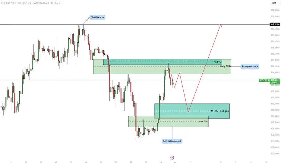
Bitcoin - Shortterm correction in the bullish trend!Introduction
The Bitcoin price action is currently moving within a structured range where both liquidity and fair value gaps (FVGs) are playing an important role in shaping potential market direction. By analyzing the chart, we can identify key areas of liquidity, resistance, and support that traders are likely to pay close attention to in the coming days. Understanding how price reacts around these zones will help anticipate whether bulls can maintain control or if bears will attempt to reclaim lost ground.
Upside liquidity
At the top of the range, we can see a clear liquidity area where price previously reversed. This liquidity pool represents buy-side liquidity, and the market could be drawn towards it as price seeks to sweep the highs. Liquidity is often targeted by the market before making a significant move in the opposite direction, which makes this area important to watch closely.
Resistance from the 4h and daily FVG
Before price can reach higher liquidity levels, it must contend with a strong resistance zone that overlaps with both the 4-hour and the daily fair value gap. This confluence strengthens the resistance, making it more likely that price will struggle to break through immediately. Traders will be watching for signs of rejection within this area, which could cause short-term pullbacks before any potential breakout.
4h FVG and CME gap support
On the downside, the 4-hour fair value gap aligns with the CME gap, providing a strong support level. This zone acts as an attractive area for price to retrace into before continuing higher. It is common for the market to return to such imbalances to fill inefficiencies, so a temporary dip into this support could serve as a healthy retracement before bulls attempt to push price further upward.
Bullish inversion
Another critical development is the inversion zone, where previous resistance has now flipped into support. This shift highlights that bulls are taking control of the market structure, strengthening the overall bullish outlook. As long as this inversion level holds, buyers are likely to defend it aggressively, reducing the probability of a deeper breakdown.
Final thoughts
Overall, the market remains in a bullish posture with upside liquidity acting as a magnet, but significant resistance awaits at the overlapping 4h and daily FVG. Short-term pullbacks into the 4h FVG and CME gap support are likely before the next major move upward. If the bullish inversion continues to hold, we could see a strong push towards the higher liquidity zones, potentially targeting levels beyond 117,000. The coming days will be crucial in determining whether bulls can maintain this control or if resistance proves too strong.
-------------------------
Thanks for your support. If you enjoyed this analysis, make sure to follow me so you don't miss the next one. And if you found it helpful, feel free to drop a like 👍 and leave a comment 💬, I’d love to hear your thoughts!
EURUSD - Bears are taking control!Introduction
This chart analysis of EUR/USD highlights key price action concepts such as liquidity grabs, fair value gaps, and inversions on the four-hour timeframe. By examining how the market has been moving recently, we can better understand where price may head next and how institutional activity could be shaping upcoming moves. The following sections break down the liquidity sweeps, the bearish and bullish setups, and the potential implications for future price direction.
Liquidity grab at the upside
The recent price movement shows a clear liquidity grab to the upside, where price aggressively pushed higher to take out resting buy stops above previous highs. This kind of move is typical of market makers and institutions seeking liquidity before reversing the price. Once those stops are cleared, the market often lacks the momentum to sustain higher levels, which can be a precursor to a reversal or deeper retracement.
Liquidity grab at the downside
After the upward liquidity sweep, the market also executed a downside liquidity grab. Price dipped lower to target sell-side liquidity, running stops beneath previous lows before showing signs of reacting. These moves are designed to trap both breakout traders and late sellers, creating the liquidity necessary for the next larger move. This back-and-forth price action emphasizes how the market often seeks liquidity in both directions before deciding on a sustained trend.
4h bearish FVG
A four-hour bearish Fair Value Gap (FVG) has formed, which acts as a strong area of imbalance where price is likely to return. This zone provides a potential entry point for institutional traders looking to short, as it represents inefficiency in the market that has yet to be filled. As long as price respects this area and reacts bearishly upon re-entry, it strengthens the case for continuation to the downside.
4h bullish inversion
At the same time, there is a four-hour bullish inversion level, where previous resistance has flipped into potential support. This area can act as a temporary base for price to consolidate or retrace before resuming its bearish trajectory. If the inversion holds, we might see short-term bullish reactions, but the broader market structure still favors sellers as long as the bearish FVG remains intact.
Final thoughts
Overall, the current EUR/USD setup suggests that the market is in the process of engineering liquidity on both sides before deciding its next major move. The upside and downside liquidity grabs confirm the presence of institutional activity, while the bearish FVG highlights a potential point of interest for further selling. The bullish inversion may offer temporary support, but the broader bias remains bearish until proven otherwise. Traders should watch how price reacts to the highlighted zones, as these areas are likely to provide the clearest signals for the next significant move.
-------------------------
Thanks for your support. If you enjoyed this analysis, make sure to follow me so you don't miss the next one. And if you found it helpful, feel free to drop a like 👍 and leave a comment 💬, I’d love to hear your thoughts!

Bitcoin - Heading lower after hitting resistance?Introduction
Looking at the current 4-hour Bitcoin chart, we can see that price action is moving into a crucial zone. After a strong upward move, Bitcoin has reached an area of resistance where multiple factors align, making it an important level to watch. The chart highlights fair value gaps (FVGs) both above and below, which are key points that could influence the next move. By analyzing these areas, we can form a clearer idea of the potential short-term trend and what traders might expect in the coming days.
Bearish 4h FVG resistance and liquidity grab
At the moment, price is testing a strong resistance level, which coincides with a 4-hour fair value gap. This area has already absorbed much of the short-side liquidity, meaning that stop losses from traders positioned against the uptrend have been triggered. This liquidity grab often signals exhaustion in the upward move and can serve as the starting point for a retracement. The resistance zone is proving to be difficult to break, and if the market fails to hold above it, we could see a shift in momentum toward the downside.
4h bullish FVG to hold
Just below the current price, there is a 4-hour bullish fair value gap that could act as support in the short term. If buyers step in and defend this area, it may temporarily stabilize the market and create a bounce. However, if this support fails to hold, it would open the path for further downside movement. The chart suggests that a break below this level would likely drive Bitcoin toward the next major target around the $112,000 region. This makes the bullish FVG a key decision point for the market.
Target for the short
If Bitcoin cannot sustain its position above the highlighted resistance zone, the downside target becomes more clear. The lower 4-hour fair value gap, sitting closer to $112,000, is marked as the target for the short. This is where price is likely to be drawn in order to rebalance inefficiencies left behind in the chart. Traders looking for bearish opportunities would see this as the logical area to aim for, as the market often gravitates toward unfilled gaps after liquidity grabs at the top.
Final thoughts
In conclusion, Bitcoin is currently at a critical point. The resistance area combined with the 4-hour FVG has absorbed liquidity, creating the possibility for a downward move. The short-term bullish FVG below is the level to watch, as a break here could confirm bearish continuation toward $112,000. On the other hand, if buyers manage to hold the current support, the structure may remain intact and prevent deeper downside. Overall, the chart suggests that the path of least resistance may now be lower, unless the market proves otherwise by breaking convincingly above resistance.
-------------------------
Thanks for your support. If you enjoyed this analysis, make sure to follow me so you don't miss the next one. And if you found it helpful, feel free to drop a like 👍 and leave a comment 💬, I’d love to hear your thoughts!

EURUSD - Bullish momentum for the week!Introduction
The EURUSD has been consolidating for a prolonged period, sweeping both upside and downside liquidity in the process. After the liquidity sweep to the downside, price reacted strongly by moving upwards, indicating a shift in market structure. The pair has since inverted the previously bearish 4-hour fair value gap, which now acts as a bullish reference point, and is currently holding within the 1-hour fair value gap. As long as price maintains this 1-hour FVG support, there remains a strong case for further upside movement.
Liquidity Sweep
The recent downside liquidity sweep was a significant turning point. By driving below key lows and collecting stop orders, EURUSD effectively cleared the market of weak positions. This was followed by a sharp rejection, represented by a wick, which signaled strong buying interest at these levels. Since then, the market has been climbing steadily, showing intent to challenge the higher liquidity levels resting above.
Inversion
Following the liquidity sweep, EURUSD inverted the bearish 4-hour fair value gap. What was previously an area of supply and resistance has now been reclaimed and transformed into a demand zone. This inversion is an important bullish signal because it indicates that sellers were absorbed and that buyers have successfully taken control. As long as this zone remains intact, the path of least resistance continues to lean upward.
1-Hour Bullish FVG
Currently, EURUSD is resting on a 1-hour bullish fair value gap. This area serves as an important support level, and as long as it holds, price is likely to use it as a springboard for further gains. The next targets lie at the upside, beginning with the first objective at the intermediate resistance level labeled “Target 1,” before ultimately pushing towards the liquidity area above. By reaching this zone, the market would sweep short-side liquidations and potentially trigger momentum-driven buying.
Target Area
The primary targets for this bullish move are the two significant highs above the current range. These highs represent zones where stop-loss orders are most likely accumulated. By driving into and above these levels, EURUSD will effectively complete a liquidity grab, providing bulls with a logical profit-taking zone before the market considers a possible retracement. Such a move would align with the general principle of markets seeking liquidity before establishing a new direction.
Final Thoughts
In summary, EURUSD is showing constructive price action following its downside liquidity sweep and subsequent bullish reversal. The inversion of the 4-hour FVG and the current defense of the 1-hour FVG are both encouraging signs for buyers. As long as the 1-hour fair value gap continues to act as a firm support, the probability of an upward continuation towards the liquidity area remains strong. However, traders should also remain mindful that once the liquidity above the highs is collected, a corrective move to the downside could develop. For now, the short-term bias stays bullish, with clearly defined targets on the upside.
-------------------------
Disclosure: I am part of Trade Nation's Influencer program and receive a monthly fee for using their TradingView charts in my analysis.
Thanks for your support. If you enjoyed this analysis, make sure to follow me so you don't miss the next one. And if you found it helpful, feel free to drop a like 👍 and leave a comment 💬, I’d love to hear your thoughts!

EURUSD - Is there more bearish momentum ahead?Introduction
Last Friday, the EURUSD experienced a sharp move to the upside following Jerome Powell’s speech, which fueled optimism and created strong bullish momentum. However, the market could not sustain this rally, and by yesterday all the gains were fully retraced. Price dropped back into the bullish inversion fair value gap (FVG), ultimately filling it entirely. While this retracement has cooled off the bullish pressure, it has also introduced some new dynamics into the market that traders should be aware of.
Liquidity sweep
During Friday’s impulsive rally, EURUSD swept liquidity above the recent highs and simultaneously filled all the bearish fair value gaps. This move, while initially strong, did not manage to establish a sustainable break above those highs. As a result, bearish momentum began to reappear, suggesting that the rally was more of a liquidity grab rather than the start of a prolonged bullish trend.
Bullish case scenario
The bullish scenario from here would require EURUSD to reclaim strength and invalidate the recently formed bearish 4-hour FVG. For this to happen, the pair would need a decisive 4-hour candle close above this zone, signaling renewed upside momentum. Should buyers manage to achieve this, the next logical target would be another attempt at the highs that were swept on Friday. A confirmed break above those levels would strengthen the bullish case and potentially open the path to higher price levels.
Bearish case scenario
On the other hand, the bearish scenario appears more probable if EURUSD faces rejection at the bearish 4-hour FVG. A failure to break above this area would confirm that the bearish momentum is still in play. If that occurs, price will likely seek liquidity by moving lower, potentially targeting the bullish 4-hour FVG that sits beneath the liquidity zone. This move would align with the broader bearish structure and reinforce the idea that the market remains under selling pressure despite Friday’s rally.
Final thoughts
In conclusion, EURUSD is currently at a critical juncture, with both bullish and bearish scenarios still on the table. The decisive factor will be how price reacts around the bearish 4-hour FVG. A strong close above could set the stage for a continuation to the upside, while rejection from this zone would likely lead to a liquidity grab to the downside and a revisit of lower fair value gaps. Traders should remain cautious and patient, waiting for clear confirmations before committing to a direction, as the market continues to balance between bullish hopes and bearish pressure.
-------------------------
Disclosure: I am part of Trade Nation's Influencer program and receive a monthly fee for using their TradingView charts in my analysis.
Thanks for your support. If you enjoyed this analysis, make sure to follow me so you don't miss the next one. And if you found it helpful, feel free to drop a like 👍 and leave a comment 💬, I’d love to hear your thoughts!

EURUSD - Bullish outlook heading into next week!Introduction
The EURUSD experienced a strong surge last Friday, largely driven by Jerome Powell’s speech, which added significant momentum to the market. This impulsive move to the upside successfully filled both the bearish 4-hour and 1-hour Fair Value Gaps (FVGs). The candle that formed was notably strong and bullish, and because of its size and strength, it is highly probable that we will see at least a 50% retracement of this candle before price continues to push higher. Such a retracement would allow the market to gather liquidity and prepare for another bullish leg.
Liquidity Sweep
Before this sharp rally, the EURUSD executed a liquidity sweep at the recent lows, clearing out stop losses and inducing sellers into the market. This is a classic move often seen before a strong reversal to the upside. Following this sweep, price accelerated with an aggressive bullish candle. My expectation now is for the market to retrace into this candle, ideally retracing deeply enough to provide a high-probability entry for continuation to the upside. This liquidity sweep sets the stage for a bullish scenario, as it suggests that smart money has already accumulated positions at discounted levels.
Resistance
As price surged higher, it tapped into a key area of resistance, which aligns with both the 1-hour and 4-hour FVGs. This confluence of timeframes strengthens the validity of the resistance zone and explains why price has reacted from this level. I anticipate that breaking through this resistance will require additional momentum, which may not occur immediately. Instead, we could see a short-term pullback or cooldown that allows the market to gather strength before attempting to push through this supply zone. This resistance area will therefore act as a decisive battleground for buyers and sellers.
Bullish Support
The strong bullish candle formed during the rally now serves as a new area of support. I expect price to respect the 50% retracement level of this candle, which lies around 1.166. This midpoint often acts as a significant level in technical analysis, and holding above it would confirm bullish continuation. As long as price remains above this zone, the momentum remains to the upside, and the probability of another move higher increases. This makes the retracement into this level a potential buying opportunity.
Inversion
Another important factor to consider is the inversion of the 4-hour FVG. On the previous drop, the EURUSD created a bearish 4-hour FVG, which initially acted as resistance. However, with the latest bullish impulse, this same zone has now flipped into an inversion FVG, transforming from a bearish area into a bullish support. This inversion highlights a significant shift in market structure and suggests that bulls are taking control of the price action. This level will be crucial to watch, as holding above it strengthens the case for further upside.
Final Thoughts
In summary, the EURUSD is showing strong bullish potential following the liquidity sweep and the aggressive rally sparked by Powell’s speech. While the market has reached a significant resistance area marked by the 1-hour and 4-hour FVGs, a retracement into the 50% level of the bullish candle would be healthy and provide a potential entry point for buyers. With the inversion of the previous bearish FVG into bullish support, the technical picture favors the upside as long as key support levels are respected. The coming sessions will reveal whether the market has the strength to break through resistance and continue its upward trajectory.

#Bitcoin $BTC Logarithmic Regression InversionMy timing was off on my original idea, but this seems to be playing mostly according to plan!
Original Idea:

US02Y/US10Y Uninversion & RecessionsThe dynamics of the US Treasury yield curve, particularly the spread between the 2-year and 10-year yields (US02Y/US10Y), have long been studied as potential indicators of economic health. One phenomenon that garners significant attention is the inversion and subsequent uninversion of this yield curve. Lets delve into what these terms mean, their historical significance concerning recessions, and how investors might interpret these signals.
What is the Yield Curve?
The yield curve is a graphical representation showing the relationship between interest rates and the maturity of US Treasury securities. Typically, longer-term bonds have higher yields than shorter-term ones due to the risks associated with time, such as inflation and uncertainty. This normal upward-sloping curve reflects investor expectations of a growing economy.
Yield Curve Inversion
An inverted yield curve occurs when short-term interest rates exceed long-term rates. Specifically, when the yield on the 2-year Treasury note surpasses that of the 10-year Treasury bond, it suggests that investors expect lower interest rates in the future, often due to anticipated economic slowdown or recession.
Historically, an inversion of the 2-year and 10-year yield curve has been a reliable predictor of upcoming recessions. Before the last several recessions, the yield curve inverted approximately 12 to 18 months prior.
An inversion indicates that investors are seeking the safety of long-term bonds, driving their prices up and yields down, due to concerns about future economic conditions.
Uninversion refers to the process where the inverted yield curve returns to a normal, upward-sloping shape. While an inversion is a warning sign, the uninversion phase can be even more critical.
In many cases, recessions have followed shortly after the uninversion of the yield curve. This occurs as the Federal Reserve may begin cutting short-term interest rates in response to economic weakness, causing short-term yields to drop below long-term yields again.
The uninversion can signal that monetary policy is shifting in response to economic stress, potentially validating the recessionary signals that the initial inversion suggested.
The uninversion of the US 2-year/10-year yield curve is a critical event that has historically preceded economic recessions. By understanding this phenomenon and considering it alongside other economic indicators, investors can make more informed decisions. It's important to approach such signals with a comprehensive analysis and a prudent investment strategy that aligns with individual financial goals and risk tolerance.

2yr Yield - FEDFUNDS "Inversion"Over the past ~25yr, we've seen 3 instances of 2yr Yield dropping below the FEDFUNDS rate set by the Federal Reserve.
All 3 instances coincide with Recessions.
On this chart, you see the Yield Differential (Yellow), the SPX (Candles), along with the time of said "Rate Cycle Inversions" (Blue Bar Counts Below Price).
As you can see, all 3 previous instances lead to significant corrections and/or volatility with notable downside.
Not since the 2008 "GFC" have we seen an "inversion" of this magnitude. While correlation is NOT causation...It can be a "warning light" signaling 'Danger Ahead'. It is certainly forewarning us that the probabilities of a recession/down-turn are gaining momentum.
Yes, people have been calling for Doom n Gloom, "Top is In", Recession imminent... for a couple years now. And I am not recommending you sell everything and hide under a rock. What I am recommending however, is that you reduce leverage if you have any, perhaps lock in some profits while you're "on top", and head into the coming days/weeks/months with eyes wide open, alert to potential quick corrections when this wild ride inevitably 'ends'.
Each instance resulted in the "recent lows" being violated. If history rhymes this time, that could mean low 3k's incoming for SPX. COULD. Can your portfolio/strategy/mindset handle that kind of volatility/drawdown? Just some food for thought.
As always, good luck, have fun, and practice solid risk management.
Thank you for your time and consideration.

Yield CurveThe 2/10 treasury yield spread is quickly flattening and an inversion could happen soon.
All of the previous yield curve inversions are associated with memorable market sell-offs and recessions.
I believe the ripple effect of the ongoing financial and economic sanctions against Russia will end up being the catalyst for the next meltdown.
The market conditions have been favorable to a disaster by many measurements for some time now.
Again, there are many unknown cross-currents beginning to work their way into the global economy. On top of that, the FED is raising interest rates in less than two weeks.

Capital Distribution by Time and Portfolio - CryptoHey traders,
In this post, I'll be sharing a simple capital distribution strategy that I use for my crypto portfolio. This strategy is designed to help you allocate your capital across different timeframes and asset types in order to maximize your potential returns while minimizing your risk.
Capital Distribution Strategy
Here's how I break down my capital:
40% - HOLD (Monthly chart): This capital is allocated to long-term investments that I believe have the potential to appreciate significantly over time ( BITSTAMP:BTCUSD mostly). I typically enter these positions based on a combination of fundamental and technical analysis.
30% - Long Term (Weekly chart): This capital is allocated to assets that I plan to hold for a period of 3 to 6 months. I typically enter these positions based on technical analysis and market sentiment.
20% - Spot (Daily chart): This capital is allocated to short-term trades that I plan to hold for 1 to 2 weeks. I typically enter these positions based on technical analysis and market momentum.
10% - Futures (1-4 hourly chart): This capital is allocated to leveraged trades that I plan to keep for up to 3 days. I use futures trading to amplify my potential returns, but I also recognize that it comes with increased risk. I typically enter these positions based on technical analysis and market volatility.
Choosing Entry Points
As you can see, the entry points for my different capital allocations vary depending on the timeframe and asset type. This is because the risk tolerance and potential rewards associated with each type of trading are different.
HOLD and Long Term : For these long-term investments, I take a more conservative approach and focus on fundamental analysis to identify projects with strong potential. I also use technical analysis to confirm my entry points and manage my risk.
Spot and Futures : For short-term trades, I rely more heavily on technical analysis to identify trading opportunities. I use a variety of indicators and chart patterns to spot potential entry and exit points.
Benefits of this Strategy
This capital distribution strategy has several benefits:
Diversification: It helps to diversify your portfolio across different timeframes and asset types, which can help to reduce your overall risk.
Flexibility: It allows you to adjust your capital allocation based on your market outlook and risk tolerance.
Potential for Growth: It has the potential to generate significant returns over time, as you can benefit from both long-term and short-term trading opportunities.
Disclaimer
Please remember that this is just a general strategy, and it may not be suitable for everyone. It's important to do your own research and understand the risks involved before making any trading decisions.
Additional Tips for New Traders
Start small: Don't risk more money than you can afford to lose.
Learn the basics: Take the time to learn about technical analysis and fundamental analysis.
Practice on a demo account: Before you start trading with real money, practice on a demo account to get a feel for the market.
Manage your risk: Use stop-loss orders and other risk management techniques to protect your capital.
Be patient: Trading is a marathon, not a sprint. Don't get discouraged if you don't see results immediately.
I hope this post has been helpful. If you have any questions, please feel free to leave a comment below.
Happy trading!

An important chart you aren't aware ofThe calculation of the US10Y - US02Y has commonly been used to measure the yield curve inversion. Historically, when the curve inverts and then inverts back, it has led to a significant recessionary period globally.
And I know this information might be hard to understand for attention-deficient people like zoomers, so I included some helpful meme labels for them to understand.

Lesser Long PositionKing W. Harbmayg's Journal Entry #
Lesser Position
1. Pair & Position:
USDJPY— 1:5 RR
Long—
according to the Harbmayg Schematic, the market has successfully:
a. aligned with the daily template,
b. printed confirmation structure,
c. printed the inversion candle
2. Performance: (1 out of 5)
Confidence— 4
Discipline— 4
Execution— 5

How to position for yield curve un-inversions!It has been some time since we delved into the intricate world of interest rates and their prospective trajectories. With the yield curve experiencing significant movement in recent weeks, it's high time we reassess our stance. Following a staggering 500 basis points increase, we now find ourselves potentially nearer to the end of the rate hike cycle than ever before. The recent hawkish pause announced in the last meeting has left market participants on tenterhooks, pondering the future course of action in the ongoing battle against inflation.
Given the downward trend in inflation and the possibility of at least one more rate hike, 'real' yields have ascended beyond the 0% level, as depicted in the chart above. Since the 2010s, real yields have consistently struggled to surpass the 1.2% level. However, the recent lower inflation prints place the 'real' yield at a new decade high of 1.25%. So, how does the yield curve inversion behave during periods of real yields? Interestingly, in three of the past four instances, the curve 'un-inverted' once real yields exceeded 0.
Of greater significance is the yield curve's response after the Fed cuts rates. Since 1989, this has been a key signal of the yield curve un-inversion. Given this event's proximity and the current 2Y-10Y yield curve, we contemplate the optimal strategy to capitalize on this likely un-inversion.
One approach is to examine all possible inversion combinations between the 2, 5, 10, and 30-year yields. All these combinations present an inverted curve, except for the 10Y-30Y segment.
Upon dissecting the analysis to focus solely on 2-year inversions, we observe the following:
The 2-year inversion is generally the steepest, with the 2Y-10Y ranking as the most inverted segment of the yield curve. All inversions anchored with the 2Y are at their all-time highs, plunging us into uncharted waters.
In contrast, the 5-year and 10-year yields exhibit more subdued movements. Their inversions have yet to reach all-time highs, and the overall range of movement is relatively restrained.
Therefore, to maximize returns on the un-inversion move, one could position to short either the most inverted section of the curve, the 2Y-10Y, or the 2Y-30Y, which typically experiences the largest movement upon un-inversion.
Handily, CME has the Micro Treasury Yield Futures, quoted in yield terms, which allows us to express this view in a straightforward manner allaying the complications with DV01 calculation. By creating a short yield spread position, we are not merely speculating on the direction of individual yields but rather on the relative movement between them. Trading the yield spread instead of just an outright position in a single part of the curve also protects us from parallel shifts in the yield curve, especially in volatile times like these. This strategy takes advantage of the yield curve dynamics, particularly the inversion trend we've been observing. We create the short yield spread position by taking a short position in the Micro 2-Yr Yield Futures and a long position in the Micro 10-Yr Yield Futures or Micro 30-Yr Yield Futures to express the curve un-inversion view, with 1 basis point move equal to 10 USD.
The charts above were generated using CME’s Real-Time data available on TradingView. Inspirante Trading Solutions is subscribed to both TradingView Premium and CME Real-time Market Data which allows us to identify trading set-ups in real-time and express our market opinions. If you have futures in your trading portfolio, you can check out on CME Group data plans available that suit your trading needs www.tradingview.com
Disclaimer:
The contents in this Idea are intended for information purpose only and do not constitute investment recommendation or advice. Nor are they used to promote any specific products or services. They serve as an integral part of a case study to demonstrate fundamental concepts in risk management under given market scenarios. A full version of the disclaimer is available in our profile description.
Reference:
www.cmegroup.com
www.cmegroup.com
www.cmegroup.com

4/10/2023 (Monday) SPY Analysis and Market Macro Deep DiveIn this Video I discuss The technical analysis of the SPY ETF which is a proxy the S&P500 that is often a tell on general market movements. I also discuss broader market Macros I have been watching including last week's and next weeks economic events. We also discuss some recession indicators, and other charts that show headwinds and tailwinds to equities.
In the Trading View App, You can use the links below and hit play, so you can see the action from the dates the charts were published. I will keep this going so we can follow outcomes to analysis.
Please Like and Subscribe , or on Trading View, Follow and Boost!
See you Next Monday for the next Market analysis!

3/27/2023 (Monday) SPY Analysis and Market Deep DiveMonday 3/27/2023 - In this Video I discuss The technical analysis of the SPY ETF which is a proxy the S&P500 that is often a tell on general market movements. I also discuss broader market Macros I have been watching including last week's and next weeks economic events. We also discuss some recession indicators, and other charts that show headwinds and tailwinds to equities.
In the Trading View App, You can use the links below and hit play, so you can see the action from the dates the charts were published. I will keep this going so we can follow outcomes to analysis!

03/20/2023 (Monday) SPY and Market Analysis and Deep Dive into cIn this Video I discuss The technical analysis of the SPY ETF which is a proxy the S&P500 that is often a tell on general market movements. I also discuss broader market Macros I have been watching including last week's and next weeks economic events. We also discuss some recession indicators, and other charts that show headwinds and tailwinds to equities.
You can use the links below and hit play to see the progression of these indicators from when I initially published them.
Please remember to like and subscribe in You Tube or Follow and Boost In Trading View. The feedback is very welcome also.

🔥 Bond Yield Curve Inversion Reaching -1%: Why It's ImportantAn inverted yield curve occurs when the yield on a 10-year Treasury bond falls below that of a 2-year Treasury bond. Normally, longer-term bonds have higher yields than shorter-term bonds. This is because investors demand a higher return for tying up their money for a longer period of time.
However, when short-term interest rates rise above long-term interest rates, it can indicate that investors believe the economy will weaken in the future. This is because investors are willing to accept lower yields on long-term bonds if they believe that interest rates will fall in the future as a result of weak economic growth. Essentially, they are willing to lock in a lower yield now, in the hopes that it will be higher in the future.
An inverted yield curve can lead to a number of problems. For example, it can make it more difficult for banks to make money. This is because banks borrow at short-term rates and lend at long-term rates. When the yield curve is inverted, the interest rates that banks earn on loans are lower than the interest rates they pay on deposits. This can squeeze bank profits and make them less willing to lend. And we all know, less money in the market means less potential (risky) investments.
An inverted yield curve can also be a sign of a potential recession. Historically, an inverted yield curve has preceded every recession in the United States since WW2. This is because an inverted yield curve can indicate that investors are pessimistic about the future of the economy. They may be selling off stocks and other assets, which can lead to a downturn in the stock market and a decline in consumer confidence.
In conclusion, an extremely inverted yield curve like now is a situation in which short-term interest rates on government bonds are higher than long-term interest rates. This can indicate potential economic problems, including a recession and difficulties for banks. While an inverted yield curve is not a guarantee of a recession, the probability of the current yield inversion suggesting a coming recession is very high.
It's going to be an interesting year.

2/27/2023 (Monday) SPY Analysis and Market Deep DiveMonday 2/27/2023 - In this Video I discuss The technical analysis of the SPY ETF which is a proxy the S&P500 that is often a tell on general market movements. I also discuss broader market Macros I have been watching including last week's and next weeks economic events. We also discuss some recession indicators, and other charts that show headwinds and tailwinds to equities.
In the Trading View App, You can use the links below and hit play, so you can see the action from the dates the charts were published. I will keep this going so we can follow outcomes to analysis!
SORRY I RAN OUT OF TIME, I ONLY HAD a minute to go and I would have had to start from scratch as TV tools dont edit. Sorry!

2/20/2023 (Monday) SPY Analysis and Market Deep DiveMonday 2/20/2023 - In this Video I discuss The technical analysis of the SPY ETF which is a proxy the S&P500 that is often a tell on general market movements. I also discuss broader market Macros I have been watching including last week's and next weeks economic events. We also discuss some recession indicators, and other charts that show headwinds and tailwinds to equities.
In the Trading View App, You can use the links below and hit play, so you can see the action from the dates the charts were published. I will keep this going so we can follow outcomes to analysis!

The yield curve has to un-invert eventually… right? (Part 2)This week, we thought it will be interesting to review the trade from last week given the reaction post-FOMC, as well as discuss an alternative way to set up this trade.
Firstly, let’s review the post-FOMC/employment data reaction.
- Nonfarm Payrolls surprised to the upside, as over half a million jobs were added way above the estimates of a sub 200K number.
- Unemployment rate continues to fall further, reaching a 53-year low of 3.4%
A clear re-pricing has occurred since last Friday’s better-than-expected jobs data and Wednesday’s Federal Reserve meeting. With markets now expecting 1 more rate hike in May, bringing the peak rate up from the 475 -500 bps range to the 500-525 bps range.
Keeping this in mind, we go back to our analysis last week to understand this situation and historical precedence.
While the time for a pause in rate hike seems to be pushed back, in the grand scheme of things, we think that this has only kept the window of opportunity for this trade open for longer and at a more attractive entry point now.
Without repeating ourselves too much, we encourage readers to take a look at our idea last week which explores the historical correlation between the peaking of yield curve inversion and the pause in Fed rate hikes.
Link to our last week’s idea:
This week, let’s tap into a different instrument. Here, we aim to take a short position on the 2Y-10Y yield differential by creating a portfolio of Treasury futures to express this view.
To do so, we would have to first select the 2 instruments, the 2-Yr Treasury futures is a straightforward choice for the short end. But for the 10-Yr leg, we have a choice of the '10-Yr Treasury Note Futures' vs the 'Ultra 10-Yr Treasury Note Futures'. Digging into the contract specification, the 'Ultra 10-Yr Treasury Note Futures' provide a better proxy for the true 10-year duration exposure as the delivery requirements are for Treasuries with maturities between 9year 5 months and 10 years. In comparison, the underlying of '10-Yr Treasury Note Futures' has a maturity between 6 year 6 months and 10 years.
With contract selection out of the way, the next step is to calculate the Dollar Neutral spread. This requires us to identify the DV01 of the front and back legs of the spread and try to match them. This is to ensure that the entire position remains as close to dollar neutral as possible, so we can get a 'purer' exposure to the yield difference between the front and back legs, and parallel moves are negated. CME publishes articles on this topic to explain the setting up of a DV01 spread clearer than we can explain. You can find them attached in the reference section below.
You can handily find the DV01 of the Cheapest To Deliver (CTD) securities on CME’s website.
In this case, we are looking at the 2Yr and Ultra 10Yr Treasury Futures to set up the trade. With the DV01 of the 2Yr at 34.04 and the DV01 of the Ultra 10Yr at 96.26.
The spread ratio can be calculated as 96.26/34.04 = 2.83. Rounding this to the nearest whole number, we would need 3 lots of2-Yr Treasury Future and 1 lot of Ultra 10-Yr Treasury Future, to keep the DV01 equal (neutral) for both legs of this portfolio.
Given our view of the 2Yr-10Yr yield spread turning lower, we want to short the yield spread. Yield and prices move inversely, hence, to short the yield spread, we long the Treasury Futures spread as it is quoted in price. We can long 3 ZTH3 Futures (2Y Treasury Future) and short 1 TNH3 futures (Ultra 10Y Treasury Future) to complete 1 set of the spread. However, since the 2-Yr Treasury Futures has a notional value of 200,000 while the Ultra 10Y Treasury Futures a notional of $100,000, the price ratio will be 6:1 when the position/leg ratio in the spread trade is 3:1. As such the current level would provide us with an entry point of roughly 494 with a minimal move in Ultra 10yrs representing 15.625 USD and that in 2Y representing 7.8125 USD.
While slightly more complex in setting up, this trade allows us another alternative to express the same view on the yield curve spread differential. Being able to execute the trade via different instruments allows you to pick the most liquid markets to trade or take advantage of mispricing in the markets.
The charts above were generated using CME’s Real-Time data available on TradingView. Inspirante Trading Solutions is subscribed to both TradingView Premium and CME Real-time Market Data which allows us to identify trading set-ups in real-time and express our market opinions. If you have futures in your trading portfolio, you can check out on CME Group data plans available that suit your trading needs www.tradingview.com
Disclaimer:
The contents in this Idea are intended for information purpose only and do not constitute investment recommendation or advice. Nor are they used to promote any specific products or services. They serve as an integral part of a case study to demonstrate fundamental concepts in risk management under given market scenarios. A full version of the disclaimer is available in our profile description.
Reference
www.cmegroup.com
www.cmegroup.com
www.cmegroup.com
www.cmegroup.com

US 10Year - 02Year - Yield Inversion (Posted 01FEB23)In this chart you can see how inverted we are and for how long on the 10-2year. I also have the 10-03mo chart that I will link to this also. This is a recession indicator. It will be interesting to follow this chart as the FOMC tries to bring the curve back under control. I will return frequently to run the "Play" and see how they do over the months!
