3 Volumes > 1 Up :: Volume Series Vol.2I am always excited about what the users here conjure up with Pine. I don't know if it's because of Pine’s new features, but little by little TV just keeps getting better and better.
What caught my attention is the Raindrop from Makit0. You can find the indicator, or let's better call it this charting instrument, when you search for "Raindrop" in the Indi menu.
I think it's really nice that the code is accessible free of charge and gives others the opportunity to improve and refine the code. Everything is not yet fully developed but the foundation stone has been laid. I'm not quite sure about the settings either, but for now I'm very happy with them.
Most likely use "simple" candles. Candles "earlier" were high-end in contrast to the "previously" known charting instruments. Point & Figure, Line-Chart and Bar-Charts are the veterans.
Meanwhile the financial market is more complex and today's trader has to process a lot of information that cannot be reconciled with a candle, for example.
Therefore, I am always looking for "things" that provide me with certain information quickly and efficiently and ideally combine different things so that a "step" or one or even better several things are omitted on the chart.
The raindrop as a charting instrument is still quite new. If you google you will find the origin 2018. There you will also find what you are looking for when it comes to the function or the construction behind it. It is basically nothing more than a tuned candle with a vertical volume profile and a session splitter. It also looks pretty chic and doesn't clutter the chart.
This is an interesting thing, especially in the daily timeframe , because with the daily you get a built-in, easy way to separate the ETH / Electronic Trading Hours / Overnight / Asia and Europe from the RTH / Real Trading Hours / Pit Session / US session.
Unfortunately, I still lack the setting for the indicator itself that you can further specify the time of the split. The Raindrop simply divides 24h in half ... So you get a rough breakdown instead of an exact one.
However, the current option is better than nothing and thus replaces the rough session indicator and the volume profile .
The less stuff there is on the chart, the more overview you have and the clearer the focus.
For example, if you have not paid attention to different sessions and volumes beforehand, you have an easy way of quickly taking this into account with one tool at a glance. It only takes a few seconds can provide a good source of objective data.
What you can do here primarily is to quickly and easily see at which price levels the most volume has arisen and how the focus (here on the example of the DailyTF) of the overnight and the US session is. You can easily see where there was very little volume and which zones are highly frequented and thus interesting for later price movements.
The raindrop is a mixture of traditional chart display, volume and equivolume. I have added a chart below in the comments in which you can see the only available equivolume tools from TV compared to Raindrop.
The definition of equivolume from the WWW:
"In the Equivolume Chart, the price is shown in the form of rectangular boxes. The height of the boxes represents the range between the highest and lowest prices. The width of the boxes shows the trading volume . The wider the box, the greater the trading volume in the period under consideration. "
It's kind of like a volume weighted candle.
The raindrop is a good tool to objectively display volume and sentiment. As with everything, there are certain "patterns" in the form of different raindrop types that I don't want to list here.
The left and right "mean" / "value area" / "price level with the most volume" of the raindrop is calculated using 2 anchored VWAPs.
In order to show the connection to the VWAP (2nd chart) and the volume profile with activated Developing Value Area (in the 3rd chart window) I have added the two lower windows.
Each of the tools listed has a meaningful use, but you don't always need everything and if necessary you can combine all 3 representations on a chart ...
The raindrop provides 4 parameters
- high
- Low
and the mean of the 2 split periods
We can see with all 3 charts that the information is the same and only the presentation varies.
I have no idea whether it will be of any use to me in the future, but I will now observe it continuously and learn from it.
Actually, I had no intention of creating a blog post, but if you ever make the effort to compare the Raindrop with the other tools, I can share it right away and save others the trouble.
The information of the raindrop is clearly confirmed for me and now it is up to me or the user whether and how one can / want / want to use it for daily trading.
I think I'll publish something about it here, but for now I'm done.
Have fun with it!
Mean

$IWM vs $QQQ tactical trade... assymtrical risk/reward 15:11st time $IWM is above relative 200 day MA (SPY) in 1 yr
Great setup using previous high as stop; 15:1 risk reward (aggressive) for end of year bounce

ETH prediction based on well-respected long term fib levelsI thought this recent move might be it, but it's not climactic enough. So continue being short but expect a retrace.
Based on long term fib level which is holding well, it'll either go down to around 320 from here, or retrace and then go back down to 320-ish. Hoping for the retrace from here, to offload at 390 to 415.
Reversion to the mean.


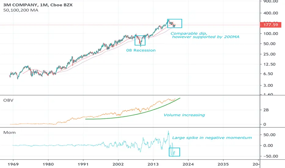
MMM DippyDip supported by the 200MA, may be forming H&S but I doubt it in these market conditions. Negative momentum has increased rapidly, expect a return to the mean. Volume of shorts and longs is steadily increasing.
US30 (Dow Jones Industrial Average)Mean reversion
Reason: Only possible scenario which can conjectured..
Chance of success: 65%
Entry & Risk management : to be updated
Target: highlighted on chart

WTC set to bounce off of the 50RSI is on the long term support since its been in an uptrend and price is right on the 50.
Stop loss could be based on RSI breakdown and retest that puts the uptrend in doubt.

Mean Reversion points based on OBV and RSI DivergenceJust looking back at a stock for a hindsight view on picking the best buy and sell times.
Note the OBV matches very well with the RSI, the short term trend reversal is confirmed with RSI bearish divergence and the retest of on the OBV downtrend line.

Back to the gapRSI bearish divergence.
Looking for a pullback back to the gap after the FOMO dies off and gives back.

Bull Flag Fractals: Signals price reverting to the mean.I love fractals. Here we have a micro bull flag embedded within a med. term flag embedded within a greater macro flag, wow. I called the recent btc price jump to 10k on my first video. I am calling this move to 11k. Price reverts to the mean and the mean is up not down - relatively speaking. Don't believe me, just watch.
These times are only estimates:
Target 1: by Nov 4
Target 2: by Nov 11th
Target 3: by 30th

HAIR - OverreactionThis looks like a nice technical setup for mean reversion coming straight out of an overreaction.
The volume by price range shows the 3 clear points with a lot of price memory. Most holders that haven't sold will feel they are owed money and be looking to relieve the tension of the loss at those points.

CHFJPY BUY TRADE SETUPPrice reversed from channel support and broke out of ascending trendline and resistance level.
Price has made a pullback and retests the broken levels that lined up with moving averages.
Considering that price has broken out of the counter trendline, the price has the potential to move higher towards the resistance zone from near the current level.
Thanks for reading!

AFL - Bull Put Spread - Weekly & Daily Chart SetupBack from Hols - Back to Trading - Back to Profit..!!!
Weekly (W) Chart, Post Earnings showing good Pullback towards Mid BB%.
W RSI is <10.
Looking for S/R around the 52 level.
Looking for Reversal to mean back higher.
Aiming for 52.50 /50 Put Credit Spread with 55 Calls for directional Bias higher.
Exp SEPT - As this is weekly Chart, looking to leave time to run well into Profit.
Exit around W RSI level 50/60.70 depending on levels and PA.
Good Luck - Watch your $$$ RISK.

Return to the mean sir?It's very uncommon for BTC to not revert to the mean and at least reset the RSI to the 50 level before continuing its trend upwards, this is a 3 day chart so be aware what I am showing could take a while to play out but its very probable.


AIONBTCAt the end of a major long term resistance / falling wedge / bull flag
Possible return to the mean of the downtrend channel
Could easily POP, set you sell order to catch it! =)


Bitcoin: Correlation between NVT and the All-Time Mean Today I want to look at the bigger picture to put in context the recent Bitcoin move.
In the weekly chart, we see that the bias is bearish. The lows at 3100 fail to qualify as a THE BOTTOM by any sort of crypto standard:
a) Lack of volume
b) Lack of strong bounce
c) Lack of institutional blueprint
d) NVT still optimistic
Now, I want to look it from the perspective of the All-Time historical Mean for Bitcoin.
The bottom would be more credible if it coincides with a test of this line, as happened in 2015.
I'm plotting Bitstamp and BNC series, and we can see there a huge void between the current price location and the place where the All-Time Mean sits.
At Bitstamp, Bitcoin consolidated above the All-Time mean during 8 months before confirming the bull trend.
At the BraveNewCoin series (which is the longest one available in Tradingview), we see that the $150 spike bounced from the All-Time Mean.
Therefore, this is a legit line to be taken into consideration to prove the bottoming. Most of the assets have a natural tendency to revisit this line along high time frame cycles (unless they are heavily manipulated).
Additionally, the NVT is sitting at a similar range level (80-100) than did at 2015 before crashing below 50 and signal the low.
Will bitcoin test the All-Time Mean during this cycle? Well, we don't know that for sure but certainly the chances are there.
Bitcoin has been unable to fulfill any solid bottoming criteria and this one looks like could be the missing one that could trigger heavy volume and flash crash action.


BTC Long Term Pitchfork TrendCurrently I am expecting a mean reversion, sub $5k feels almost certain upon viewing this chart. I have used a line chart instead of bars in order to keep this clean. But all 3 pivots to this pitchfork are anchored to significant wicks (you just can't see them).
If it is looking like price will hold above the mean I will look for a long term entry to hold for at least at least a decade.

BTC's Next Move C:Hopefully simple enough to understand, let me know if you have any questions
In the short term future I see 2 paths, normally it would only be one, but I've never seen the Bart Simpson pattern pump/dumps before which is why I made the second path because who knows?
Anyway, Stoch is low, MACD is looking to crossover soon, hopefully at this support.

$eth / $usd mean regression
Annotations on chart
should see continued growth against the dollar
Price always desires to return to the mean
Twitter: @AzorAhai06

$neo continued growthShould continue to see normal growth from $neo against the $usd
Twitter: @AzorAhai06
