DAX 40 - Not too late to the partyThe DAX 40 is already 6 daily candles into a major bullish breakout - but there is still time to participate
Setup
Bullish - record high / range breakout
Strong breakout from 8-month trading range
RSI in bullish overbought territory
Above 20/50/200 SMAs
Commentary
The former range resistance at 24500/600 is now support if the breakout is to hold. After 5 green days above the breakout level - it looks confirmed. Can now wait for a dip from overbought territory to join the new uptrend.
Strategy
Buy dip to 25k
Buy dip to 24500/600
But - as always - that’s just how the team and I are seeing things, what do you think?
Share your ideas OR send us a request!
Cheers,
Jasper
Disclaimer:
The communication does not constitute investment or trading advice, nor does it include any recommendations. Additionally, it does not serve as an offer or solicitation to engage in transactions involving financial instruments. WeTrade does not take responsibility for any actions taken based on the information provided, nor for any outcomes that may occur as a result of the actions taken.
Multiple Time Frame Analysis

Dow Jones Industrial Average H1 HTF FVG Support and Continuation📝 Description
CAPITALCOM:US30 is holding above a higher-timeframe H4/H1 demand zone after a corrective pullback from recent highs. Price respected the BPR and FVG support area and is now stabilizing, suggesting the move is corrective rather than a trend reversal.
________________________________________
📈 Signal / Analysis
Primary Bias: Bullish while price holds above the H1 BPR.
Preferred Setup:
• Entry: 49,130
• Stop Loss: Below 49,050
• TP1: 49,240
• TP2: 49,380
• TP3: 49,520 (HTF draw / higher liquidity)
________________________________________
🎯 ICT & SMC Notes
• Reaction from H4/H1 BPR confirms valid demand
• No bearish HTF BOS observed
• Upside liquidity above recent highs remains the primary draw
________________________________________
🧩 Summary
Dow Jones Industrial is consolidating above key HTF support after a controlled retracement. As long as price remains above the identified demand zone, the expectation favors continuation toward higher liquidity levels in line with the prevailing bullish bias.
________________________________________
🌍 Fundamental Notes / Sentiment
Overall risk sentiment remains supportive for equities, with no immediate macro catalyst signaling aggressive risk-off behavior. In this environment, pullbacks into HTF demand are more likely to resolve as continuation moves rather than deeper trend reversals.
________________________________________
⚠️ Risk Disclosure
Trading involves substantial risk and may result in capital loss. This analysis is for educational purposes only and does not constitute financial advice. Always apply proper risk management, predefined stop-loss levels, and disciplined position sizing aligned with your trading plan.

GBPUSD might go bearishI have explained everything in detail in the video. Including the scenarios in which the idea would not be valid anymore

XRPUSDT M30 HTF Liquidity Grab and Mean Reversion Pullback Setup📝 Description
CRYPTOCAP:XRP is trading after a sharp sell-off that swept prior sell-side liquidity, followed by stabilization above the local lows. Current price action shows compression and base-building behavior inside short-term PD arrays, suggesting the move is corrective rather than impulsive continuation to the downside.
________________________________________
📈 Signal / Analysis
Primary Bias: Bullish while price holds above the recent liquidity sweep low and the M30 demand base
Preferred Setup:
• Entry: 2.036
• Stop Loss: Below 2.032
• TP1: 2.043
• TP2: 2.067
• TP3: 2.102 (HTF draw / upper liquidity)
________________________________________
🎯 ICT & SMC Notes
• Clear sell-side liquidity sweep before stabilization
• No confirmed bearish BOS after the dump
• Upside targets align with unfilled FVGs and prior inefficiencies
________________________________________
🧩 Summary
CRYPTOCAP:XRP appears to be transitioning from a liquidity-driven sell-off into a corrective recovery phase. As long as price remains supported above the swept lows, the probability favors a controlled bullish push toward higher PD arrays.
________________________________________
🌍 Fundamental Notes / Sentiment
Market sentiment remains neutral with selective risk appetite in altcoins. In the absence of strong negative catalysts, liquidity sweeps are more likely to resolve into rebounds rather than sustained downside continuation.
________________________________________
⚠️ Risk Disclosure
Trading involves substantial risk and may result in capital loss. This analysis is for educational purposes only and does not constitute financial advice. Always apply proper risk management, predefined stop-loss levels, and disciplined position sizing aligned with your trading plan.

GBPUSD SHORT Market structure bearish on HTFs DH
Entry at Both Weekly and Daily AOi
Weekly Rejection at AOi
Daily Rejection at AOi
Previous Daily Structure Point
Around Psychological Level 1.34500
Touching EMA H4
H4 Candlestick rejection
TP: WHO KNOWS!
Entry 90%
REMEMBER : Trading is a Game Of Probability
: Manage Your Risk
: Be Patient
: Every Moment Is Unique
: Rinse, Wash, Repeat!
: Christ is King.

GBPUSD ____ SHORT TRADE IDEAHi Guys,
I'm expecting some bearish move after price displaced from a weekly orderblock and formed a shift in market structure.
My speculation is that we trade to the inversion fair value gap on the weekly chart.
Cheers,
Jabari

SILVER M30 Prior High Test and Momentum Exhaustion Setup📝 Description
TVC:SILVER has pushed back into the previous swing high, completing a full recovery from the prior corrective leg. While price has successfully reached this key resistance area, the move is increasingly corrective rather than impulsive. Momentum conditions suggest exhaustion near the highs rather than strong continuation.
________________________________________
📈 Signal / Analysis
Primary Bias: Bearish
Preferred Setup:
• Entry: 84.3
• Stop Loss: 85.15 (Invalidation on RSI(14) acceptance above the 70 level)
• TP1: 82.91
• TP2: 81.93
• TP3: 80.96 (HTF draw / lower liquidity)
The displayed targets represent the primary downside objectives. However, if RSI(14) breaks and holds above the 70 region, this setup becomes invalid, signaling renewed bullish strength instead of exhaustion.
________________________________________
🎯 ICT & SMC Notes
• Price has tagged prior high liquidity (BSL)
• Current leg shows signs of momentum loss near resistance
• No strong impulsive continuation after the high test
________________________________________
🧩 Summary
TVC:SILVER is trading at a critical inflection point. While price has reached the previous high, momentum conditions do not currently support strong continuation. As long as RSI remains below overbought acceptance, the expectation favors a corrective pullback toward lower PD arrays.
________________________________________
🌍 Fundamental Notes / Sentiment
Broader sentiment remains balanced, with no immediate macro catalyst forcing aggressive upside continuation. In such conditions, rallies into prior highs are more likely to resolve through consolidation or corrective pullbacks unless momentum and risk appetite expand decisively.
________________________________________
⚠️ Risk Disclosure
Trading involves substantial risk and may result in capital loss. This analysis is for educational purposes only and does not constitute financial advice. Always apply proper risk management, predefined stop-loss levels, and disciplined position sizing aligned with your trading plan.

MGC Context: NY Open Absorption & The 4,600 Line in the SandRelated Tickers: COMEX_MINI:MGCG2026, COMEX:GC1!, CAPITALCOM:DXY
Analysis
1. Market Context (Vertical Initiative vs. Extreme Absorption)
The auction is a textbook case of Vertical Initiative colliding with massive mechanical Absorption .
• The Structure: Gold hit a historic ATH of 4,612.7 today. Price is currently hugging 4,600 . This initiative is fueled by the Fed Independence Crisis after the DOJ served subpoenas to Chair Powell.
• The Behavior: Massive volume at highs indicates a "Transfer of Ownership" from BCOM index sellers to aggressive safe-haven buyers.
2. Inventory & Nuance (BCOM vs. The Fed Bid)
• Mechanical Flow: We are in the peak of BCOM rebalancing (Jan 9–15), which mechanically unloads ~$7 billion (2.4m oz) of gold.
• Absorption Signature: Holding 4,600 against this supply dump is a signal of extreme strength. A weak market would have flushed 2.5–3.0% by now.
• Inventory: Ultra-Long but absorbed. OTF buyers are providing liquidity for every ounce the index robots sell.
3. Fundamental Catalyst (The 24-Hour Outlook)
• Today (Monday): Watching 4,580–4,600 . Acceptance above 4,600 post-mid-day signals the safe-haven bid has exhausted the BCOM sellers.
• Tuesday (Jan 13): US CPI Data . A hot print could break the absorption and launch MGC toward 4,700 .
Plan & Execution
• Bias: Ultra-Bullish Initiative .
• The Play: Watch for a "Look Below and Fail" at 4,580 . If 4,600 holds into the close, target is 4,660 .
• Invalidation: A close below 4,518 implies BCOM selling has finally overwhelmed the buyers.
Talk to you for the next update.

XAU/USD 12 January 2026 Intraday AnalysisH4 Analysis:
-> Swing: Bullish.
-> Internal: Bullish.
Price has printed according to my analysis dated 05 January 2026 where I mentioned price will continue bearish, react at either discount of 50% internal EQ, or H4 supply zone before targeting weak internal high priced at 4,550.150
Price is currently trading within an internal low and fractal high.
CHoCH positioning is denoted with a blue horizontal dotted line
Intraday expectation:
Price to continue bearish, react at either discount of 50% internal EQ, or H4 supply zone before targeting weak internal high priced at 4601.695.
Alternative scenario: Price to continue bullish in order to reposition CHoCH closer to more recent price action.
Note:
The Federal Reserve’s renewed easing cycle, alongside a weaker U.S. dollar and persistent geopolitical tensions, continues to drive volatility in the gold market.
Traders should remain cautious and adjust risk management strategies to navigate sharp price swings.
Additionally, gold pricing is highly sensitive to U.S. policy under President Trump, where tariff measures, fiscal uncertainty, and shifting geopolitical strategy amplify market repricing risks and reinforce safe‑haven demand.
H4 Chart:
M15 Analysis:
-> Swing: Bullish.
-> Internal: Bullish.
Price did not print according to my analysis dated 05 January 2026 with price printing a bullish BOS.
Price is currently trading within a swing low and fractal high with CHoCH positioning denoted with a blue horizontal dotted line.
Intraday expectation:
Price to trade down to either M15 or H4 demand zone, or discount of 50% internal EQ before targeting weak internal low, priced at 4,610.695.
Alternative scenario: Price to continue bullish to reposition bearish CHoCH.
Note:
Gold continues to exhibit elevated volatility as markets digest the Federal Reserve’s ongoing dovish tilt and persistent global geopolitical tensions.
With uncertainty remaining a dominant theme across global risk assets, traders should prioritise disciplined risk management, as abrupt price swings and liquidity pockets may become increasingly common.
Furthermore, recent tariff announcements from President Trump, particularly those directed at China, have added another layer of instability to the macro landscape. These policy developments have the potential to intensify market turbulence, heighten risk‑off flows, and trigger sharp intraday reversals or whipsaw‑like behaviour in gold.
M15 Chart:

Sell-Side Bias Favored at Daily PremiumDAILY
4H
Price is currently trading into daily premium and interacting with buy-side liquidity near the recent highs.
While a 4H CHoCH has formed, the displacement occurred directly into prior supply without clear acceptance. Until the daily closes strong above the highs, upside continuation remains unproven.
Failure to hold above the broken high would increase the probability of this move resolving as a buy-side liquidity sweep, opening the door for downside rotation toward sell-side liquidity near 154.50.
Bias favors the sell scenario unless daily acceptance confirms otherwise.

DXY: seller priority, buys only locallyLet’s take a look at the U.S. Dollar Index (DXY), starting from the higher timeframes.
Hello traders and investors!
Higher timeframe (3-month)
On the 3-month chart, a broad sideways range has been forming since 2018.
In April 2022, price broke above the upper boundary of this range, but later that same year the seller pushed the index back into the range.
Another attempt to break higher followed, which resulted in the formation of the 106.952 level. In 2024–2025, this level was manipulated on strong volume — volume distribution shows that the main activity was concentrated above 106.952.
In 2025, the seller pressed through this manipulation and returned price below 99.099.
The target of the seller’s initiative on this timeframe is 89.2029.
It is also important to note that the last two 3-month buyer candles look weak: they produced no meaningful result, and price failed to even consolidate above 99.099.
Conclusion: on the higher timeframe, there are no grounds for buying — priority remains with selling.
Weekly timeframe
On the weekly chart, the seller’s initiative remains intact.
The upper boundary of this initiative is 101.513.
Special attention should be paid to the 100.043 level, where a de facto double top has formed. From a market logic perspective, the optimal scenario for short positions would be a move above this level, followed by manipulation, and only then a renewal of the local low at 95.804 and a possible continuation lower.
An additional area of interest for shorts on the weekly timeframe is 101.513, the upper boundary of the seller’s initiative.
Daily timeframe
On the daily chart, the market is in a range, while the active initiative remains with the seller.
The current target of this initiative is 96.767.
Previously, position accumulation took place near the upper boundary of the initiative, which is now being defended by the 98.952 level.
At the same time, the decline stalled at the 50% level of the trading range, after which price moved higher.
Sell scenario on the daily timeframe:
— seller defending 98.952
— target: 96.767
At the same time, an alternative short-term scenario should be considered.
Around the 50% level of the trading range, there was also prior accumulation, and we now see price breaking upward from this area. Therefore, local long positions are possible in the short term, with the goal of updating the local high at 100.04.
If price breaks above 98.952 and consolidates higher, the probability of reaching 100.04 becomes more relevant in the short term than a move toward the seller’s target at 96.767.
Profitable trades!
This analysis is based on the Initiative Analysis (IA) method.

MNQ Daily Analysis and Replay - Monday December 1 2025 - part 3Really funky and tricky day for me. 1-1 / -$8
As a learning, beginner day trader I go through the market replay predefining what I am looking for to enter a trade and walk through my thoughts as I experience the market action bar by bar throughout the entire day to see how I handle various events and assess my execution.
This is for me and others to learn if you desire.

MNQ Daily Analysis and Replay - Monday December 1 2025 - part 2As a learning, beginner day trader I go through the market replay predefining what I am looking for to enter a trade and walk through my thoughts as I experience the market action bar by bar throughout the entire day to see how I handle various events and assess my execution.
This is for me and others to learn if you desire.

MNQ Daily Analysis and Replay - Monday December 1 2025 - part 1As a learning, beginner day trader I go through the market replay predefining what I am looking for to enter a trade and walk through my thoughts as I experience the market action bar by bar throughout the entire day to see how I handle various events and assess my execution.
This is for me and others to learn if you desire.


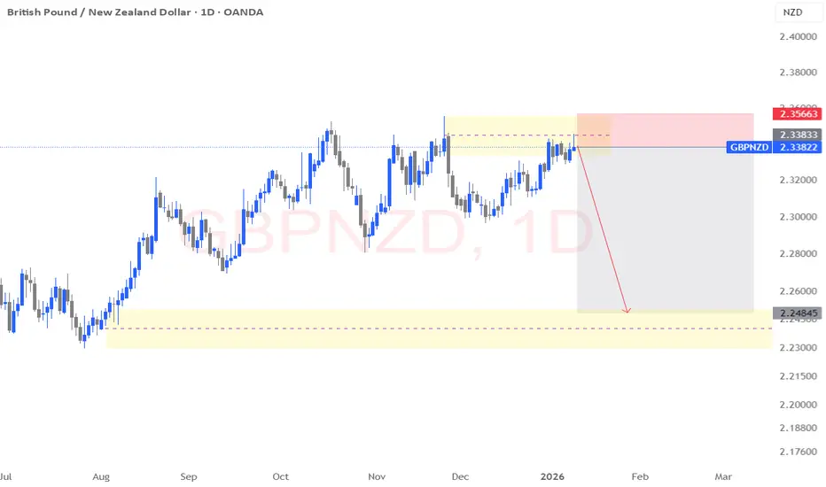
GBP/NZD – Daily Potential 900-Pip Short Setup GBP/NZD has been trading inside a broad daily range, repeatedly respecting both premium and discount extremes. Price is currently trading at the upper boundary of the range, inside a clear premium zone, where previous buying momentum has struggled to follow through.
This area represents:
Prior daily highs
Clear buy-side liquidity
Repeated failed continuation attempts
From a market-maker perspective, this is a high-probability area for distribution rather than expansion.
Liquidity Narrative
Buy-side liquidity above recent highs has either been partially or fully engineered
Price is now extended, with diminishing bullish displacement
Smart money typically seeks maximum short exposure at these levels
Once buy-side liquidity is absorbed, the natural next objective is a re-pricing into discount, targeting resting sell-side liquidity below.
SPX 0DTE trend/momentum following setup. Double and triple confirmation before taking 0DTE trades. I personally like 0DTE only. I know with my system on any trade 30%-35% is usually where the SELL signal appears and to size my positions accordingly. The BUY signals winners all varying but I tend to take some profit around 30%-35%.
I use a few different indicators to simultaneously confirm which direction to follow. In doing this, it avoids taking trades during froth or that end up immediately being rug pulled.
The indicators are:
1. Lux Algo- Smart Money Concepts. ( I only use the discount, premium, and equilibrium zones. As well as the weekly/monthly high and low enabled.)
2. Supertrend (set to my risk preferences)
3. Dynamic Swing Anchored VWAP- 200 day swing period and 30 day adaptive price tracking (Green line)
> The only periods this switched to a weekly sell was during 2001/2008
4. 200 SMA (White line)
*Using Heikin Ashi candles.
Those remain the same for all time frames and hey all need to correlate in order to enter a trade. Only then are trades solely in that direction placed. For instance:
If Supertrend and Dynamic Swing Anchored VWAP are a buy on the Weekly and 4-Hour charts, then it is CALLS ONLY and using the 5-minute chart to enter following the Supertrend signal. Above the 200SMA is even further confirmation.
If all of that were to stay the same but it was signaling to buy while in a PREMIUM zone, that cancels it out completely. Joy of missing out of the froth/rug pull. I take the time to mentally recharge. Wait for my system to align. That premium zone is usually spot on. While it might get extended on shorter time frames or sit there for a few weeks on the weekly chart, I have yet to see it be wrong. Following with a retrace back around the equilibrium zone or closest support.
It is helpful to see how overextended the market gets sometimes and while it might lag when encountering a median reversion play, it is pretty quick to confirm the trend/momentum and allow for a more calculated play. Adjusting position size slightly based on trend strength. It catches dip buys and rip sells upon confirmation.
Entries can be tweaked for longer expirations than 0DTE, but I choose not to hold anything over night.
Just thought I'd share going into the new year. Only thing I will be paying attention to is supply and demand. No more news at all. Shit is just aggravating and speculating leads to more losses for me than it does gains. Following trend/momentum + taking profit and cutting losses equals my account stability and growth.
Not financial advice- just some guy and his personal strategy.

Gold Context: Structural Resilience & The Inflation GauntletRelated Tickers: COMEX_MINI:MGCG2026, COMEX:GC1!, CAPITALCOM:DXY
Analysis
1. Market Context (Weekly Recap & Setup)
The second week of 2026 closed with a powerful display of Responsive Buying . After a healthy mid-week pullback, Gold (MGC) caught a bid and finished the week strong near 4518 .
• Structure: The Friday close created a solid base above previous value. We have successfully reclaimed the 4500 psychological level .
• The Nuance: Trading above 4500 shifts the auction to Initiative . The ATH is now the primary magnet.
2. Inventory & Nuance (Support Clusters)
• The 4500 Pivot: Line in the sand. Trade above confirms dip buyers are in control.
• Friday POC (4480): If 4500 fails, we test the Friday POC at 4480 . This is the "fairest price" from the Friday auction.
• GEX Profile: Sustained trade above 4500 could trigger a Gamma Squeeze toward 4550 .
3. Fundamental Catalyst (The Inflation Gauntlet)
The week of Jan 12–16 is packed with high-impact data.
• Tuesday, Jan 13: US CPI (20:30 WIB). Expect Headline 2.7%. High MoM = USD Tsunami.
• Wednesday, Jan 14: US PPI & Retail Sales . Weak sales = Gold rocket.
• Fed Speak: Multiple officials (Bostic, Kashkari, Williams) speaking. Clues for the Jan 28 meeting are critical.
Plan & Execution
• Bias: Bullish Initiative above 4500.
• Scenario A (ATH Run): Acceptance above 4500 targets 4550 and ATH.
• Scenario B (Rotation): Failure at 4500 targets 4480 . Look for Responsive Buying there.
• Invalidation: Sustained trade below 4420 kills the bull case for now.
Talk to you for the next update.

USDJPY current BiasAm still bearish on this pair based on my technicals. Today's Price Action swept yesterdays high and reacted lower. Price is retracing back to OB created after that sweep.
Manage risk well.

GBP/JPY Bullish Anticipating GBP/JPY to continue with bullish momentum, on Friday 1/9/2026 market closed with a bullish engulfing candle on the daily timeframe. Market also has resting liquidity sitting between the 212.000 -212.250 quarter points. Price could potentially retrace back down to the 211.250 QP and sweep the resting sell side liquidity before continue to push up for a new HH. Will be monitoring long entry between 211.408 - 211.323 where latest 1H order block sits.
Will await for LTF CHoCH to return bullish if there is a retrace to collect sell side liquidity at given buy zones.
This is not financial advice but just my analysis based on multi-timeframe market structure and confluences presented thus far and pending to be seen.

USDCAD: Where to look for short setupsHi traders and investors!
Daily timeframe.
The buyer has broken above the upper boundary of the daily sideways range. However, if we continue to follow the medium-term bearish scenario for USDCAD, with targets at 1.354 and then 1.34, formulated on the monthly timeframe (see the related post), the current structure still allows for seeking short positions.
Key sell zones, where both daily and monthly levels overlap:
1️⃣ Resistance zone 1.39248–1.39608
This is the first active zone on the daily timeframe where the seller may reassert control and form a sell setup.
2️⃣ Resistance zone 1.40148–1.40518
The second zone. Short setups are also possible here, provided there is a clear seller reaction and pattern formation.
3️⃣ Return into the daily sideways range:
The seller may prevent the buyer from developing the initiative, push the price back into the daily sideways range, and absorb the buyer candle that broke above the upper boundary.
In this case, the priority would still be to look for short positions. The daily range target at 1.373 would serve as the main reference.
At the same time, there is a high probability that the price may not reach this target, with the buyer potentially resuming activity around 1.3806 or near the 50% level of the trading range.
Scenario invalidation:
If the price firmly holds above the second range, serious questions arise about whether the seller is truly ready to push the price lower.
Profitable trades!
This analysis is based on the Initiative Analysis (IA) method.

Xauusd 12/1/26 analysisGoing bearish until we mitigate the 1H FVG before continuing the Bullish Trend

POLUSDT Relief Bounce vs Bearish ContinuationPOLUSDT remains in a well-defined falling channel, with overall structure still favoring downside continuation. Price is currently staging a relief rally, pushing into a crucial supply zone that will act as a major decision area. A clear rejection from this zone would align with the prevailing bearish structure and favor continuation toward the highlighted downside targets. Conversely, a successful break and acceptance above supply could invalidate the bearish channel and trigger a stronger upside rally.
Reaction at this level will be key in determining the next directional move.
