FARTCOIN RoadMap (1D)It seems the price is in an ABC correction, and we are now at the end of wave C.
The green zone is a suitable area for spot buying. We need to see whether the price will make a deeper pullback into the green zone or if it will break out from the red descending trendlines from here.
It appears that one bullish wave in the form of wave C is still remaining on the chart.
Keep in mind that this is a highly volatile memecoin, so you must control your risk and position size.
Since the target for this coin is a large one, the invalidation level is also far away. Therefore, you should pay special attention to the timeframe and risk management.
Let’s see what happens | this is our outlook on FARTCOIN.
For risk management, please don't forget stop loss and capital management
When we reach the first target, save some profit and then change the stop to entry
Comment if you have any questions
Thank You
Neo Wave

check the trendIt is expected that a trend change will form within the current support range and we will witness the start of an upward trend. If the index crosses the support range and trend line, a downward trend will form.

possibility of uptrendIt is expected that a trend change will form in the current resistance range and we will witness the beginning of the downward trend.
If the price breaks through the resistance range, the continuation of the upward trend to the specified resistance levels will be possible.

down trend It is expected that a trend change will form in the current support range and we will witness the beginning of the upward trend. If the price breaks through the support range, the continuation of the downward trend and correction will be likely.

check the trendConsidering the price behavior in the current resistance range, possible scenarios have been identified. If the price breaks through the resistance range, the upward trend is likely to continue.

correction It is expected that the price will correct to the specified support levels. Then there is a possibility of a trend change and the upward trend will continue.

possibility of uptrendIt is expected that the upward trend will end at the resistance level and we will witness the beginning of a downward trend. If the price crosses the resistance level, the upward trend will continue.

check the trendIt is expected that after some fluctuation and correction, a trend change will take place and we will witness the beginning of an upward trend. Then the price behavior at the resistance levels will determine the continuation of the movement trend.

possibility of uptrendGiven the behavior of the index in the current resistance area, possible scenarios have been identified. It is expected that after some fluctuation and correction, the continuation of the upward trend will take place.

check the trend It is expected that the upward trend will continue to advance to the specified resistance area. Then there is a possibility of a trend change. If the price breaks through the resistance area, the continuation of the trend is likely.

possibility of uptrend It is expected that the trend will change in the current support area and we will see the start of the upward trend. If the price breaks through the support area, the continuation of the correction is likely.

BItcoin Short Term Analysis (4H)As we had already identified Bitcoin’s support zone in previous analyses, this area is still valid.
To assess Bitcoin in the lower timeframes, there are two possible scenarios:
One is that it starts moving upward from the current prices, and the other is that it revisits the green zone once more, forms a double bottom, and then moves toward the red target.
A daily candle closing below the invalidation level will negate this analysis.
For risk management, please don't forget stop loss and capital management
When we reach the first target, save some profit and then change the stop to entry
Comment if you have any questions
Thank You

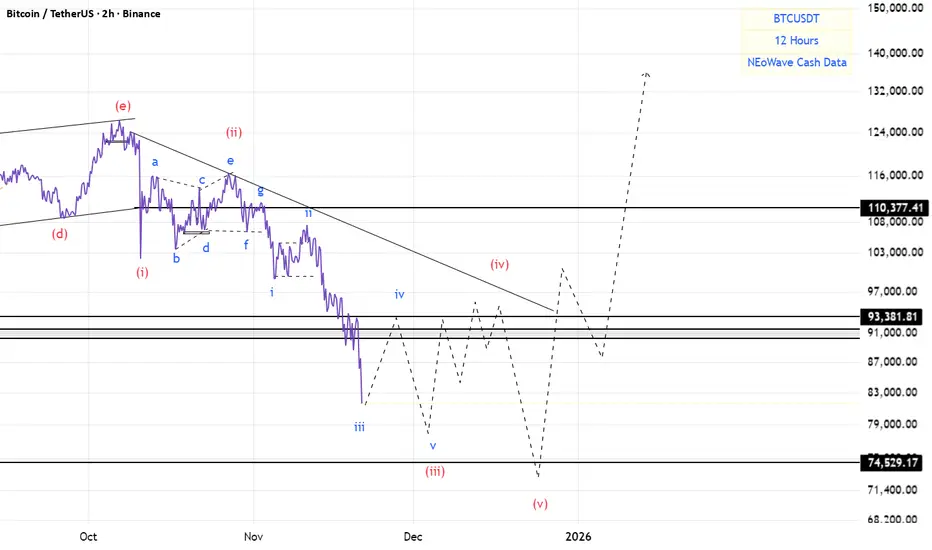
Short-term analysis of Bitcoin (12H)After the heavy drops | which we had already identified in previous analyses () | Bitcoin is now approaching a strong supportive order block.
From the point where we marked the red arrow, Bitcoin entered a bearish phase, and it is expected that wave C of this phase will complete around the green zone.
We will see whether the price reaches the green area or not.
The initial target for this bounce can be the 95K to 96K range.
For any reason, the closing of a daily candle below the invalidation level will break the structure and invalidate this upward correction
For risk management, please don't forget stop loss and capital management
When we reach the first target, save some profit and then change the stop to entry
Comment if you have any questions
Thank You

DOGE Analysis (1D)Dogecoin has entered the correction phase from the point we marked on the chart.
Based on the structure, an ABC pattern has been identified on the chart, and after wave C is completed, we expect retracement movements to the upside.
Wave C still needs more time to complete, and it is expected to finish between the two vertical time lines drawn on the chart.
Within the time lines and the green zone, one can consider buy/long positions.
As long as wave C has not finished, buying is not wise
For risk management, please don't forget stop loss and capital management
When we reach the first target, save some profit and then change the stop to entry
Comment if you have any questions
Thank You

USDT DOMINANCE Analysis | Altseason Or New Bearish Cycle (3D)Before anything else, pay close attention to the timeframe. This analysis is based on the 3-hour timeframe, and it naturally takes time to unfold.
From the point where we placed the red arrow on the chart, it seems that the correction of USDT dominance has begun. This correction is forming a Diametric pattern, and we are currently at the end of wave F.
From the red zone, we expect a rejection to the downside, because wave F ends in this area and we will enter wave G, which is a bearish wave. During this bearish wave, Bitcoin and altcoins will experience some degree of recovery.
However, based on NeoWave wave-counting principles, in the green zone either:
* The correction of USDT dominance will be completed and it will enter a mid-term bullish phase, leading Bitcoin and altcoins into another bearish cycle,
or
* Wave G of this USDT dominance pattern will extend, and instead of a new bullish phase, an X wave will form. In this scenario, USDT dominance will enter another downward cycle, which could trigger an altseason.
We have to see which scenario plays out!
What do you think?
Comment if you have any questions
Thank You

BTC/USDTI think wave A is complete. For wave B, I expect Bitcoin price to grow to the middle of the channel. It is not rational to take a short position on Bitcoin here.

USDT.DI think wave 1 of 3 is complete and I expect Tether dominance to fall for wave 2 of 3. The channel ceiling is an important resistance area and I expect a bounce from this level.

LITECOIN Analysis (4H)It appears that a double correction is forming on Litecoin and is nearing completion. Around the origin zone, we can look for long buy positions so that once this second corrective leg finishes, the price can enter a bullish phase.
The entry zone and targets are marked on the chart.
For risk management, please don't forget stop loss and capital management
When we reach the first target, save some profit and then change the stop to entry
Comment if you have any questions
Thank You

BTC(based on NEo wave)everything is ok with flat.
time of wave B is more than wave A and wave C is making a beautiful impulse wave.
bitcoin price under 74500$ is a bear trap!

USDT DOMINANCE Roadmap (1D)From the point where the green arrow is placed on the chart, it seems that a large-degree bullish pattern has started. Waves A and B of this pattern are complete, and we are now in wave C.
Wave A was a diametric, and wave B was a triangle. We are currently in wave a of C. After wave b of C completes, caution is needed because the movement of c of C will begin.
From the green zone, Tether dominance may turn bullish again toward the two red-line targets.
We will try to update this analysis periodically.
For risk management, please don't forget stop loss and capital management
When we reach the first target, save some profit and then change the stop to entry
Comment if you have any questions
Thank You

BTC(based on NEo wave)This branch has impulsive structure.
so why now there is an impulse wave here?
because this 5 waves are wave (c) of a flat.
when this 5 wave finished strong bullish wave will start.
downtrend Given the price behavior in the current support level, possible scenarios have been identified. A downward trend will be formed upon the breakdown of the support zone.

check the trend Given the support level broken, the downward trend will likely continue. Then, considering the price behavior in the next support level, possible scenarios have been identified.
