BTG RSI Divergence/Overbought/Oversold RedoFor fun! BTG Divergence Redo. Has examples of Bullish and Bearish Divergence using RSI Oscillator.
Search in ideas for "oscillator"

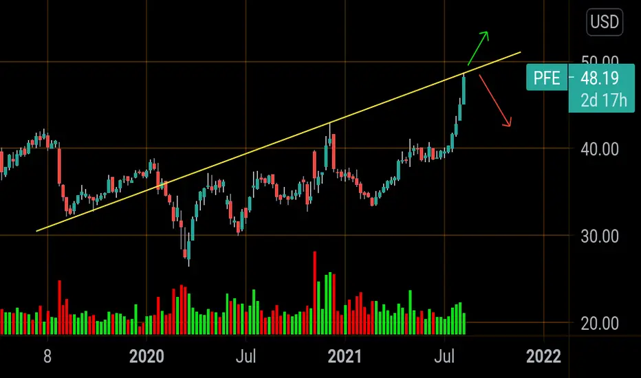
PFE overbought Made a ATH today but Bumped its head on weekly resistance at 48.57
its overbought on all oscillators.
With delta spreading there's a chance this could disregard technicals and keep rolling.
Stoploss at 49$.
1stTp 46$
2tp 43$
TP are fibonacci supports on daily
BULLISH DIVERGENCE + MOMEMTUM OSCILLATOR BOTTOMED (bullish) BTC Good morning fam,
Yurlo here 👍
Just want to start this post off by mentioning I'm a week sober today from tobacco and weed and feeling pretty proud. I've been trying to become sober for a few years now and I've achieved a small milestone. I can't wait to update you guys after being 1 month sober, and then a year!
Anyways. bullish divergence on the 3 hour timeframe and momentum oscillators are bottomed out which tells me a short squeeze is probable soon probably within a day or two at most. (by Friday)
BULLISH DIVVERGENCE:
Momentum oscillator = higher low
Price action = lower low
Patience is the name of the game 👍
Cheers fam 👍

Bitcoin Bullish DivergenceBullish Divergence on a series of oscillators.
Pulse formed on the LT Pulse.

Cover / USD - Regular bullish divergenceOn the above 1-day chart there is a 77% correction with oversold condition (an unusual opportunity during a bull market) that has now become an ‘incredible buy’ opportunity. Why bullish?
1) Regular bullish divergence between price action and the oscillators.
2) The weekly chart below, past resistance now support at the same time Stochastic RSI crosses up 20. Very bullish.
Target price: $3000

QNTUSD--Ascending Triangle (3d)Ascending Triangle with hidden bullish divergence on both oscillators.

ADA Eth oscillator ideaAs we all know, markets tend to be oscillators or trenders. In this case, ADAEth is an oscillator which goes between price bands.
IMO ada at $1.30 signified a local market top relative to ETH. Eth has a lot of fundamentals going for it soon - extra shard chains, POS, layer 2 updates etc. which will improve it's scalability and lower transaction fees.
ADA is still vapourware for the most part, although with potential with partnerships in Africa etc. Nevertheless, $300 billion market cap is fairly overvalued IMO at this stage. I would be going for a short here all the way back to support.

Bitcoin going to $22k ??Why so bearish? A few reasons - on the above 4-day chart following the overbought conditions (green columns) there is:
1) Regular Bearish divergence between price action and ALL oscillators. 1 of 3 can be ignored. 3 of 3 is alarm bells. This is a powerful signal a strong reversal is imminent.
2) RSI support breakout. Highlighted in ‘blue’ you can see two things:
a) RSI support was broken.
b) RSI came back up to test support and was rejected.
3) On the 2-week chart below, the last candle printed is considerably bearish. Not quite a gravestone DOJI (candle body too thick), but nonetheless, huge amounts of selling pressure.
Why $22k? Look left. Previous corrections from RSI @ 90+ resulted in price action finding support on the 0.618 golden ratio. Historically Bitcoin has a lot of respect for this Fibonacci ratio. Right now the 0.618 is at $21,700k.
2-week chart:

DOT the Perfect Token for Support and Resistance LoversPolkadot (DOT) has been increasing tremendously; the coin is currently up by 500% in less than three months. What is even better is that DOT’s pattern is actually predictable and one of the easiest for support and resistance traders.
Polkadot Pattern
The token has so far proved to follow Darvas’ box theory better than most other assets (including stocks). This means that the price moves within ranges defined by boxes with an upper limit (resistance) and a lower limit (support). In this case, Polkadot has been continually moving higher, and so the upper limits, once breached, became the new lower limits and a suitable entry point.
Indicators
Due to the fast pace at which the price has been advancing, trend-following indicators on the bigger timeframes have not performed very well. If you would like to use trend-following indicators, the 30 minutes timeframe or even lower may be more suitable for DOT.
If you would like to stick to the bigger timeframes, then Williams %R (displayed above) has been working well. Williams %R is an oscillator that identifies oversold and overbought zones. Williams %R is one of the fastest oscillators, meaning that it identifies overbought and oversold zones the quickest. If you look at the chart, it has identified oversold zones in some of the best places corresponding with the lower limits (support areas).

WazirX (WRX) / USD & BTCFollowing an oversold condition (orange column) and near 50% correction since mid-August, the WRZ token is now showing a rotation is on the horizon. That facts of the daily chart above:
1) Regular bullish divergence - Lower lows in price action coincide with higher highs in the oscillators.
2) Price action has retraced to the golden ratio (0.786)
3) Price action is below the major moving averages, oversold, perfect moment to go long.
4) Trend reversal – lower lows now replaced with higher lows.
Can price action fall further? Absolutely.
Is it probable? No. Probability of upside is now far greater than the risk of downside.
3-day chart – bullish engulfing candles
3-day Bitcoin pair – oversold
Bullish signals across multiple pairs is an excellent signal. Price action on the Bitcoin pair is on support following the lows of March with Bullish engulfing candles forming.

Fantom (FTM) vs BTC (and USD)3-day chart showing month long Bullish divergence between price action and the oscillators.
1-day BTC chart - Dragonfly + increasing volume.
3-day USD also showing divergence.

Therapeutics (Stock Price Oscillator)?Biotechnology is very important... however how far can things go up? And when will the market possibly change directions?
Comments and Questions:
These oscillators seem to suggest some changes around October of 2021?
The patterns seem to be fairly stable when the price doesn't oscillate (differently from a trend) much for example before February of 2018?
The Oscillator patterns are Divergent with the recent supper highs this past month??

DXY daily - normal scaleAs you can see, the price is stuck in a corner, and The price is supported by a rectangular supporting area.
A confirmed positive divergence is seen in the oversold rsi oscillator.
Resistance number 50 is broken in rsi
and we have golden cross in tenkan sen and kijun sen below the cloud
be wise!

Harmony / USD - Hidden Bullish divergenceFollowing a near 70% correction since mid-August and oversold condition (orange column), the above 2-day chart is now indicating a reversal in price action is very probable.
On the same chart above there is a clear as day Hidden bullish divergence between price action and the oscillators that follows a regular bullish divergence. I don’t know if a chart can be any more bullish! In addition volume is seen to be increasing alongside the divergence.
Money Flow Index support (bottom oscillator) suggests support can continue through until mid-June.
Finally on the weekly chart below:
1) Stochastic RSI is crossing up 20 = bullish
2) Several weekly candles indicating strong buying pressure as previous price action resistance becomes support.

VET/BTC Next cycle /begining bull phaseVET is in its four cycle as BTC oscillator. Pay attention to your own preferred indicators to find an entrance point. Next bullish peak about last week of January.

XMR vs USD Following a massive 320% rise since March there is now evidence to support a significant correction is very likely.
The facts:
1) The above 3-day clearly indicates a bearish divergence between price action and the oscillators.
2) Price action is constrained within a rising wedge = bearish.
3) RSI support becomes resistance (orange line) following the overbought condition (green column).
Can price action go higher? For sure - might touch $145
Is it probable we go higher? No. Risk reward is unacceptable.
Targets:
1st $96
2nd $75
3rd $57
10-day chart:
We can see MFI is very overbought (circled in black) @ a value of 91 - this is ridiculous.

Zoom Long?Potential move to the upside, should we see a break of structure within 3-5 fib timeframe - a consequential retest and then expansion into a new zone. Potential price action pattern is coinciding nicely with the support from multiple moving averages on the hourly and 30 minute timeframe - as well as strengthening oscillators.

Eth vs USD - Hidden bearish divergenceOn the daily chart there is a hidden bearish divergence (orange lines). HBD is defined as lower lows in price action with higher highs in the oscillators.
Additionally price action has entered the Gaussian strip following a bullish period, just as in March of this year. (orange circles)
The two targets on the daily chart I'm looking out for are:
1) $285
2) $210
I'm aware the 21-weekly EMA is higher but that does not mean price action cannot fall through as before in March during the week.

Grin vs BTC - uptrend follows bullish divergenceThe 1-day chart above tells us the price action resistance is now broken. Additionally there is good volume coming in following the almost 3-month long divergence between price action and the oscillators. Great moment to go long.
The divergence is slightly clearer here on the 3-day chart following 2 bullish engulfing candles.

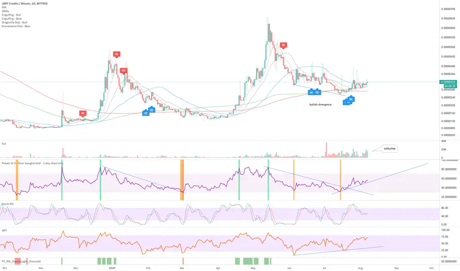
Library credits (LBC) vs BTC - Bullish divergenceNot exactly sure what this project is about.. however I do notice the volume pouring in, where money flows...
There's a lot to like about the daily chart, including:
1) Bullish divergence between price action and the oscillators.
2) Bullish divergence + the volume = go go go
3) Support on the 20-week
Volume on the weekly with price action support on the 20-week.
AMPL:BTC long opportunity at 78.6% Fib retracement level.@ 78.6% Fib retracement (~0.000179 BTC)
Green IchiCloud forming.
Higher low set.
Inverse head and shoulder formation emerging again (clearer on the 5min chart).
Have the sell pressure ended?
Buy on confirmation: When AMPL goes above green 50 SMA and holds.
---
PRISM Oscillators Set (Momentum/Acceleration Analysis)
pRSI STOCHS in an oversold state (green background)
pRSI entering Bullish phase again, piercing above its 30 VWMA; supported by hidden bullish divergence.
Snap-Osc (yellow) in the positive, pulling AJ-ribbon upwell into the positive, which in turn have pulled the momentum oscillator up back into the positive again.
Looking at the hourly chart:
Looking at the 3 hourly chart:

NEO Coin Formed Very Big Shark Pattern And Ready For Big MoveBig wedge:
On weekly chart priceline of Neo coin has formed a wedge and the support of this wedge is at 5.46 dollar. This is really very strong support that is not broken since December 2018. During the recent strong bearish move in the month of March 2020 we have seen that the price action has hit the spike upto $4 but could not break down the support. After placing the volume profile on the complete price action of this wedge as a result we can see that the traders interest is really very low below $6.8 and above $11.70. And the pint of control of volume profile is at $9.30. Therefore when the priceline moved in the area where the traders interest was weak it turned bullish and moved back into the zone where the traders are interested to trade.
Oscillators and indicators:
After hitting the support of this wedge the stochastic oscillator has given bull cross from the oversold zone and the moving average convergence divergence the MACD indicator was strong bearish but now it is turning bullish and if we see the directional movement then it can be exmaniced that the directional indicator 1+ is moving up to form a bull cross with the directional indicator 1- . Once this bull cross will be formed then the price action can turn more bullish to make an attempt to breakout the resistance of this wedge.
Ichimoku cloud:
If we see the ichimoku cloud on weekly chart then it can be observed that the bearish cloud is turned very weak at this time. Therefore it will be easy for the priceline to cross up the cloud. And once the pric line of Neo coin will be able to cross of the bearish cloud then it will be really a very big success for the Neo coin because the Neo coin could not cross up the bearish cloud on weekly chart since it is appeared in the history of this asset. The lagging span has entered in the priceline and once it will cross up the candlesticks then it will be another very strong bullish signal. The conversion line has touched the baseline and soon it will also form a complete bull cross then there will be strong chancess that the cloud will be turned bullish and the price action will cross up the ichimoku cloud. And after crossing up the cloud Neo coin can start a really very powerful bullish rally.
Very big bullish Shark pattern:
Now if we switch to the 2 week chart then it can be easily witness that the price range of NEO coin has completed a bullish shark harmonic patter. And after the completion of this pattern now the price range is moving in the potential reversal zone of this big bullish harmonic pattern. Potential reversal zone is also a buying area and the maximum extent of this potential reversal zone should be used as a stop loss. Now there are strong expectations that as per Fibonacci sequence of the priceline should move up from this area and enter in the Fibonacci projection of C to D leg from 0.382 to 0.786 Fibonacci projection.
The buying and sell zones start and end as below:
Buy between: $7.49 to $5.84
Sell between: $9.73 to $13.81
But if the price line will breakout the $13.81 barrier then it can turn really very strong bullish coz in that case it will also breakout the wedge resistance.
Final thoughts:
At this time all signals are turning bullish but soon they will be turned strong bullish because the Neo coin is already getting bounced from the support of wedge. But we should be careful about the stop loss and the support of the wedge or the potential reversal zone of Shark pattern should be used for this purpose.

GBPUSD Rallies Toward Overhead Resistance on H1The above charts refer to the GBPUSD. The left chart shows the daily time frame. Price is below the black 20-day SMA and the SMA is heading down. Moreover, the RSI is below 50, which is on the bearish side of the oscillator. The right chart shows the hourly time frame. Here, price is rallying with the EMAs in bullish mode and the RSI above 50. Overhead resistance is around the 1.2175 level (red shaded horizontal). This may be a target level for short sellers.
