Theory: 24,200 target in Globex session 12/17/25This is a theory based on speculation. Normally, we don't speculate but this is backed by technicals.
Trump addressing nation at 9 pm today. Keep that in mind.
All day, market's been dumping. We finished around -1.75% in the red. CME_MINI:NQ1!
Now hear me out. At MOC, we dumped 100 points and the low of day was literally the 3:59:59 pm candle. EST of course.
What happened after 4 pm? Pumped 110 points almost instantly:
Why did that happen? To cause a gap after market and then get dumped on during Globex.
Potentially: what caused the dip? Sure sure some news. But what caused EOD dip other than Market On Close Imbalance?
Potentially: someone knows what 9 pm will be about (Venezuela War?), "My fellow Americans, we're going to war". Something like that. Recall: GWB II & Iraq.
But why address the nation at 9 pm in Globex if it's not bearish? To cause as much dip as possible and let it settle overnight where buyers can buy the dip. That means people who dipped at 3:57-3:59 pm get in lower tomorrow at 9:30 AM.
What's my plan? Trade shorts in Globex tonight if I do trade.
So far the theory is theorying and Globex is dumping with tp below NYC close:
Will probably aim to buy dips low low 24ks tomorrow after market open. Remember the people who exited 3:59 will wanna get in lower. Otherwise it's not worth it for em.
Disclaimer: this is all speculation backed with some technicals. I usually don't trade this way. But if we're talking bearish, look at the 4hr inverse cup & handle & 25076 support break & close below the whole day's range.
Theory

HINOON📊 HINOON (PSX) – Daily & Weekly Technical Setup
HINOON has made a fresh all-time high and is now retracing to the 0.5 Fibonacci level, forming a textbook continuation setup for HHHL (Higher High, Higher Low) structure 📈
🔹 Daily & Weekly trend: Bullish
🔹 Retracement: 0.5 Fib – healthy pullback
🔹 Structure: Trend intact, continuation likely
🎯 Targets:
TP1 – as marked on the chart
TP2 – as marked on the chart
🛡️ Risk Management:
Strict stop-loss below invalidation
Maintain favorable risk-to-reward
🧩 Fundamental Verdict (Strong Support) 💊
HINOON is fundamentally a strong pharmaceutical company in Pakistan:
✅ Consistent growth in revenue & profit
✅ Attractive margins vs industry peers
✅ Solid dividend history
✅ Ongoing export expansion
📌 Conclusion:
Technical continuation + strong fundamentals = high-probability setup
➡ Trade with discipline, not emotions.

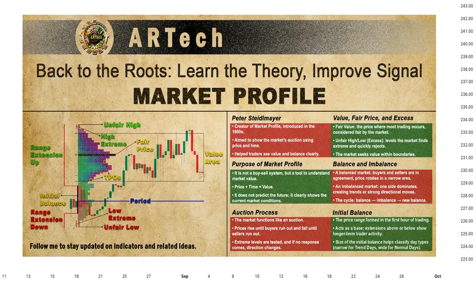
MARKET PROFILE🔸🔸🔸 1 - Back to the Roots: Learn the Theory, Improve Signal 🔸🔸🔸
Becoming a successful trader starts with building a strong foundation of knowledge. This foundation comes from time spent in the markets and real experience. While the basic idea is easy to understand, actually building this solid base takes effort and patience.
Trading experience, careful observation, focusing on what truly matters, and understanding basic technical principles are all key parts of this foundation. Patience and awareness also play a big role in making it stronger.
Without this foundation, it’s difficult to trade well over the long term. But when you have it, you can think more clearly, make better decisions, and trust your own judgment.
In today’s fast-paced markets, some traders try to skip this step, only to realize later how important it really is. The good news is, it’s never too late to start building this foundation—you just need to dedicate the time and be ready to put in the work.
If you grasp the lessons from these experiences, you’ll see that they apply directly to your own journey as a trader. Along the way, you might also discover fresh insights about how markets really work today.
🔸🔸🔸 2 - Peter Steidlmayer 🔸🔸🔸
Peter Steidlmayer is the creator of Market Profile, a powerful tool that traders today often use through Market Profile analysis. What makes his idea special is that it didn’t come only from books or classrooms — it was shaped by his life experiences growing up on a ranch in California.
From an early age, Peter learned important lessons about value and fairness from his father. On their family ranch, his father would only sell crops when the price was fair, aiming for a reasonable profit instead of chasing big gains. If prices were too low, he’d hold on to the grain rather than selling at a loss. When buying, whether groceries or used farm equipment, his father was careful not to overpay, always seeking a fair deal. This taught Peter that value is not just a price number — it’s a relationship between price, time, and need. Paying too much means time works against you; paying less means time is on your side.
Later in college, Peter took a statistics course where he learned about the bell curve—a way to find patterns in what might look like random data. This gave him the idea that market prices also have a “fair value” area, where most trading happens, and areas away from this center that create opportunities.
He combined this with the ideas of value investing from Graham and Dodd and the concept of the “minimum trend” by John Schultz, which measures the smallest meaningful price movements. By grouping these price movements, Peter saw that prices tend to cluster around a fair value zone, forming a bell curve shape. This became the foundation for Market Profile and later, Volume Profile.
🔸🔸🔸 3 - Market Profile 🔸🔸🔸
Before we dive into Market Profile, it’s important to understand Peter Steidlmayer’s journey and how he developed Market Profile.
Through his research and testing different systems, Peter noticed that although some methods worked at first, none gave consistent or reliable results over time. The most important insight he gained was that all these approaches tried to predict future market prices — something he came to believe is impossible.
Instead of guessing where prices might go, Peter focused on finding value , which he called fair value . The goal of Market Profile is not to provide buy or sell signals but to help traders find where the true value lies.
Market Profile is a tool, not a trading system. To use it effectively, you need to understand its core principles, not just memorize fixed rules. Unlike simple buy/sell systems that stop working when market conditions change, Market Profile helps you see those changes as they happen and adapt your strategy accordingly.
Remember, market decisions always require your own judgment. Market Profile cannot predict the future — no tool can — but it helps you understand what is happening right now, so you can make better trading decisions.
Before we move on to interpreting Market Profile, we will first look at three key steps that will help build a clear foundation
Market Profile Graph: How the profile is drawn and what it represents
Market Profile on TradingView: How you can access and use this tool on TradingView
Anatomy of a Market Profile: Explanation of the key components
Once we cover these basics, we’ll be ready to focus on interpreting Market Profile and applying it in trading decisions.
📌 3.1 - Market Profile Graph
If you understand the basic principles behind Market Profile, you will be able to recognize key patterns easily, without getting confused by changes in how they are displayed.
To make this clear, I will draw the Market Profile for the trading session between 9:00 and 15:00. This will help you see how time and price interact at different levels during that trading session.
3.1.1 - Understanding the Letters in a Market Profile Chart
In a Market Profile chart, each letter represents a 30-minute time period during the trading day. The sequence starts with the letter A for the first half-hour (9:00–9:30), then B for the next half-hour (9:30–10:00), and continues alphabetically until the market closes.
This way, the chart shows not only which prices were traded but also exactly when they were active during the day.
3.1.2 - A Period (9:00 – 9:30)
This price level is where we start placing the letter A to represent the first 30 minutes. The trading day opens at 2685, marked by an arrow on the left side of the profile. (Shape a).
Shortly after the open, the price rises to 2690 (Shape b), so we place the letter A at 2690. Then, the price falls to 2680 (Shape c), and we add the letter A down to that level as well.
Next, the price climbs again to 2690 before settling back to 2680 (Shape d), which becomes the final price of the first half-hour. We do not add another A where one already exists.
The closing price of this period, 2680, is marked with an arrow on the right side of the profile.
(Note: Price Movement Shape in the chart is drawn to illustrate how the price moved within this 30-minute period.)
3.1.3 - B Period (9:30 – 10:00)
The second half-hour opens at 2680, so we place the letter B—which represents this time period—at that price level. Since the first column already has the letter A, we place this B in the second column (Shape a).
Then, the price drops to 2670, and we add the letter B down to this level, always filling the leftmost empty column. This period closes at 2675 (Shape b).
The price falls further to 2665, which is where the second half-hour ends. The final price of this period, 2665, is marked with an arrow on the right side of the profile (Shape c).
(Note: Price Movement Shape in the chart is drawn to illustrate how the price moved within this 30-minute period.)
3.1.4 - Completing the Market Profile for the Day (10:00-15:00)
As the day progresses, we continue placing the letters in this way. During the third half-hour (10:00–10:30), the decline continues. The market moves between 2665 and 2620, closing this period at 2640.
If we assume the drawing process is now understood from these examples, we can move to the end of the day. Throughout the session, prices move between 2695 and 2620, closing the day at 2670. At this point, we have the complete Market Profile for the day.
When we compare this type of chart with a candlestick chart, we see that both show the same basic information. However, the purpose here is not to track the exact price movement, but to see the value area created during the day.
By focusing on the value area, we can see how price and time interact.
The more time the price spends at a certain level, the more trading volume builds there. The higher the volume, the more the market sees that price as value.
Price + Time = Value
📌 3.2 - Market Profile on TradingView
Before we explore the key components of a Market Profile chart, it’s important to know how to display it on TradingView. There are two main ways to do this—either by changing the chart type to TPO or by adding it through the Indicators menu.
1. Enable TPO View from Chart Type Menu
Click on the Candles button at the top of your chart.
Select Time Price Opportunity (TPO) from the list of chart types.
2. Add Market Profile via Indicators
Click the Indicators button on the toolbar.
Go to the Technicals section and scroll to Profiles.
Choose Time Price Opportunity or Session Time Price Opportunity depending on whether you want the profile for the whole chart or for individual sessions.
📌 3.3 - Anatomy of a Market Profile
Let’s first explore the main components of a Market Profile chart—TPOs, Initial Balance, Extremes, Range Extensions, Fair Value, Unfair High, Unfair Low, and Value Areas. In this section, we’ll not only define each of them but also show how they appear on the chart for better understanding.
Key Components of a Market Profile Chart
Visualizing Components on a TradingView TPO Chart
3.3.1 - Key Components of a Market Profile Chart
Detailed explanations of each element that forms the structure of a Market Profile.
TPOs (Time Price Opportunities)
Each letter on the Market Profile chart is called a TPO (Time Price Opportunity). A TPO represents a specific price traded during a specific time period, showing both when and at what level the market was active. The sequence begins with capital letters (A, B, C, …), and once these are used up, it continues with lowercase letters (a, b, c, …) to represent later time periods.
Initial Balance
The Initial Balance marks the price range established during the first two letter time periods, usually represented by the letters A and B. It shows where the market first found a trading range and is often indicated on the left side of the profile with a vertical line.
Note:
If the letter time period is set to 15 minutes, each letter represents 15 minutes of trading, so the Initial Balance covers only the first 30 minutes in Tradingview.
In TradingView, you can use the Initial Balance (IB) range feature to define the key price range at the start of the session. By default, it covers 2 letters (A and B), but if you prefer, you can adjust the range to 3, 4, 5, or more bars to suit your analysis.
Extremes
An extreme is the activity that occurs at the very top or bottom of a price range, represented by two or more single TPO prints standing alone. It forms when the market tests a price level, then quickly rejects it and moves away, showing that the opposite side (buyers or sellers) stepped in with strength.
Extremes appear when the market rejects prices at the top or bottom of the range, leaving behind either a buying tail(single prints at the bottom) or a selling tail (single prints at the top). Visually, the value area forms the main “body” of the profile, while extremes extend outward like “tails.”
Note:
An extreme cannot occur in the last time period of the day, since there is no following trade to confirm rejection.
Range Extension
A range extension happens when the price moves beyond the initial balance (A and B TPOs). This expansion happens because longer-term traders step in with enough volume to push prices higher or lower. An upside extension signals active buyers, while a downside extension signals active sellers. Range extensions help reveal the influence of longer-term participants and provide important context about the market’s directional bias.
Fair Value
In a Market Profile chart, the price level with the highest number of letters (TPOs) is called the fair value. This level often corresponds to the price with the highest traded volume. If the profile shows more than one fair value level, the one closest to the midpoint of the day’s trading range is selected.
Unfair High
The highest price level of a distribution where trading activity is low. It represents an “unfair” or advantageous selling area because prices moved too high for buyers to remain interested. This level often marks the top of the range.
Unfair Low
The lowest price level of a distribution where trading activity is low. It represents an “unfair” or advantageous buying area because prices moved too low for sellers to remain interested. This level often marks the bottom of the range.
Value Area
The price range where most trading activity occurs, usually about 70% of TPOs. It shows where the market accepts price as fair, with buyers and sellers actively rotating around this level. Prices above the value area are advantageous for the longer-term seller; prices below it are advantageous for the longer-term buyer. The calculation process is:
Start with the price level that has the highest volume.
If this alone doesn’t reach 70%, compare the total volume of the one price levels above with the one price levels below.
Add the larger of the one to your total.
Repeat this process until you reach about 70% of the day’s total volume.
3.3.2 - Visualizing Components on a TradingView TPO Chart
Demonstration of how these components look directly on TradingView using the TPO chart.
With the Expand Block feature, the Market Profile is shown as separate columns, where each letter is placed in its own block. This helps you clearly see which price levels were active in each 30-minute.
Shifting the letters into the empty left column serves a special purpose. Instead of focusing on the exact price movements, this view highlights the value area created during the session. It allows traders to see where the market spent the most time and built the strongest acceptance, rather than just tracking short-term fluctuations.
🔸🔸🔸 4 - Principles of Market Profile 🔸🔸🔸
Now that we have learned how to draw the profile and the key terms used, we can move on to how to read a Market Profile chart.
Market Profile is not a ready-made trading system—it is a tool designed to support your decision-making. To use it well, you need to understand the principles behind how it works. No matter how advanced a tool is, your trading decisions will always require your own judgment—Market Profile can’t replace that.
It also cannot predict the future—but then again, no one can. What it does do is give you a clear picture of the current market situation. By understanding what’s happening right now, you put yourself in a stronger position to make better, more informed decisions.
📌 4.1 - The Auction Framework
The Auction Framework explains how the market works like an auction, helping people buy and sell. When prices go up, more buyers are attracted, willing to pay higher prices. When prices go down, more sellers enter, ready to sell at lower prices.
The market moves like an auction in two main ways: first, it pushes prices higher until there are no more buyers willing to pay more. Then, it reverses and moves down until there are no more sellers willing to sell at lower prices.
In this way, the market constantly moves up and down, balancing buyers and sellers. When the upward movement ends, the downward movement begins, and this cycle keeps repeating.
Looking a bit closer, the market moves in one direction and “asks” the other side (buyers or sellers) to respond. When the opposite side responds enough to stop the current move, the market changes direction.
In short, the market is like a continuous auction, where prices rise and fall as buyers and sellers compete—until one side runs out of interest.
📌 4.2 - Negotiating Process
When the market moves in one direction, it creates boundaries for the price range. These boundaries are called the unfair low at the bottom and the unfair high at the top. They represent price levels where the market has gone too far — these are called excesses .
Once these limits are established, the market starts trading inside this range. It moves between the unfair low and unfair high to find a fair price , which we call value . In other words, the market negotiates within this range to settle on value.
If you pause the market at any moment, you will notice three important points:
Unfair low (the lowest excess)
Unfair high (the highest excess)
Value (somewhere in the middle)
These three points show how buyers and sellers negotiate prices in the market.
📌 4.3 - Time Frame
Markets are always shaped by two different forces: short-term traders and long-term traders. Both are active at the same time, but their goals are very different.
Short-term traders are focused on “fair price” for the day. When the market opens, price moves up and down as these traders search for a balance point where both buyers and sellers agree. If the open is inside the previous day’s range, short-term activity usually dominates. They don’t wait for the perfect deal—they just need a reasonable price to complete their trades quickly, like a business traveler who buys a ticket at the going rate without shopping around.
Long-term traders , on the other hand, are more strategic. They are not in a hurry to trade today. They wait for an advantageous price—something too high or too low compared to value. When they step in with enough volume, they can break the balance and extend the market range. This is how trends begin. You can think of them as a vacation traveler who has time to wait for the best discount fare.
Because long-term buyers see value at low prices and long-term sellers see value at high prices, they rarely meet in the middle. Instead, the market swings: rising to create opportunity for sellers, falling to create opportunity for buyers.
The result is a constant cycle: balance, imbalance, and back to balance. Day-to-day order flow is shaped by short-term traders, but big moves and directional trends come from long-term players. At the extremes—whether too high or too low—it’s always the long-term traders who take control.
📌 4.4 - Balance and Imbalanced
The market helps people buy and sell by moving repeatedly between states of imbalance and balance. This happens both within a single trading session and over longer-term trends.
When the market is balanced , buying and selling are roughly equal. This means the market has found an opposing force and is trading around a fair price where buyers and sellers agree.
When the market is imbalanced , either buying or selling dominates. The market moves up or down directionally, searching for the opposite reaction and a fair price to trade around.
In short:
A balanced market has found a fair price.
An imbalanced market is still looking for that fair price.
This is simply another way of stating the law of supply and demand: buyers want to buy, sellers want to sell, and the market is either in balance or trying to get there.
📌 4.5 - Day Timeframe Structure
The idea of day structure comes from how the market looks for a fair price where both buyers and sellers are willing to trade. If a price is unfair, trading will stop there, and the market will move until balance is found.
The first hour of trading sets the initial balance . This range is like the “base” of the day. A wide base is more stable, while a narrow base is weak and often leads to bigger moves later in the day. Just like the base of a lamp keeps it standing, a wide initial balance provides stability, while a narrow initial balance is easier to “knock over,” leading to bigger moves and range extensions.
When longer-term traders enter, they can break this balance. If they act small, the market moves only a little. If they act strong, the market can move far and leave signs, like tails on the profile. Tails show where longer-term traders rejected extreme prices.
By watching the initial balance and the activity of longer-term players, traders can recognize different day types . Each type gives clues about short-term trading opportunities and the market’s bigger direction.
The main balanced types are:
Normal Day
Neutral Day
The main imbalanced types are:
Normal Variation Day
Trend Day
4.5.1 - Normal Day
On a Normal Day , the market is in balance and longer-term traders have little influence. The Market Profile often looks like a classic bell curve , where most trading happens around a fair central price. At the extremes, prices are rejected—buyers stop above and sellers stop below—keeping the market balanced.
Key Characteristics:
The key sign of a Normal Day is the initial balance (first hour’s range), which usually makes up about 85% of the entire day’s range . In other words, the first hour often defines how the rest of the day will unfold.
If any range extension happens, it usually comes late in the session.
Dynamics:
In terms of volume, around 80% comes from short-term traders and only 20% from longer-term participants . Because long-term players are mostly inactive, the market doesn’t trend strongly and instead stays contained within the initial balance area.
4.5.2 - Neutral Day
A Neutral Day occurs when both long-term buyers and sellers are active, but neither side gains control. Their efforts cancel each other out, so price extends beyond the initial balance in both directions , then returns to balance.
Key Characteristics:
Range extensions above and below the initial balance.
Close near the middle of the day’s range.
Initial balance is moderate in size —not as wide as a Normal Day, not as narrow as a Trend Day.
Often shows symmetry : the upside and downside extensions are about equal.
In terms of volume, around 70% comes from short-term traders and only 30% from longer-term participants .
Dynamics:
Uncertainty dominates. Long-term traders test prices higher and lower, but without strong follow-through, their activity neutralizes. Short-term traders make up most of the volume, keeping the market contained. This indecision often leads to repeated neutral days , as neither side has enough conviction to drive a clear trend.
4.5.3 - Normal Variation Day
A Normal Variation Day happens when long-term traders play a more active role than on a Normal Day, usually making up 20–40% of the day’s activity.
Key Characteristics:
Their involvement leads to a clear day extension beyond the initial balance, often about twice the size of the first hour’s range.
The initial balance is not as wide as on a Normal Day, making it easier to break.
As the day develops, long-term traders enter with conviction and push price beyond the base (range extension).
Price may extend in one direction but eventually finds a new balance area.
Volume split: 60–80% short-term traders, 20–40% longer-term traders.
Dynamics:
Early trading looks balanced and controlled by short-term participants. Later, longer-term buyers or sellers step in more aggressively, causing the day’s range to expand. If the extension is small, their influence is limited.
4.5.4 - Trend Day
A Trend Day occurs when long-term traders dominate the market, pushing it strongly in one direction. Their influence creates maximum imbalance and range extension , often lasting from the open to the close.
Key Characteristics:
The close is usually near the day’s high or low (about 90–95% of the time).
Volume is split roughly 40% short-term traders and 60% long-term traders .
The profile shape is elongated and thin , unlike the balanced bell curve of a Normal Day.
Price moves in one-timeframe fashion : each period makes higher highs in an uptrend or lower lows in a downtrend, with little to no rotation.
Dynamics:
Trend Days often start with a narrow initial balance , quickly broken as long-term participants step in with strong conviction.
The move may be triggered by news, stop orders, or a strong shift in sentiment.
As the trend unfolds, new participants are drawn in, fueling continuous directional movement.
There are two types:
Standard Trend Day – one continuous directional move.
Double-Distribution Trend Day – an initial balance and pause, followed by a second strong directional push that creates a new distribution area.
📌 4.6 – Initiative and Responsive Activity
In Market Profile, it’s important to know whether longer-term traders are acting with initiative (pushing the market) or responding (reacting to prices that look too cheap or too expensive). You can figure this out by comparing the day’s action with the previous day’s value area.
Responsive Activity happens when traders behave in an expected way.
Buyers step in when prices drop below value (cheap).
Sellers step in when prices rise above value (expensive).
This behavior maintains balance and is typical in Normal or balanced days.
Example: price falls below yesterday’s value area → buyers enter → responsive buying.
Initiative Activity happens when traders behave in an unexpected way.
Buying takes place at or above value (where you’d normally expect selling).
Selling takes place at or below value (where you’d normally expect buying).
This shows strong conviction and usually drives imbalance or trend.
Example: price above yesterday’s value area continues to attract buyers → initiative buying.
Quick Rules (relative to the previous day’s value area):
Above value → Selling = responsive, Buying = initiative
Below value → Buying = responsive, Selling = initiative
Inside value → Both buying and selling are considered initiative , but weaker than outside activity.
Why it matters
Responsive action keeps the market balanced → often short-term focused.
Initiative action pushes the market to new areas of value → often starts trends.
In short, responsive moves are reactions to “fair or unfair” prices, while initiative moves show conviction to create new value levels.
🔸🔸🔸 5 - Strategy 🔸🔸🔸
Trading is never about finding a magic formula—it’s about reading the market and making decisions with context. Market Profile doesn’t give you fixed answers like “buy here, sell there.” Instead, it provides market-generated information that helps you recognize when conditions are shifting and when an opportunity has a higher probability of success.
Just like in teaching, if someone only looks for answers without understanding the reasoning, they miss the bigger lesson. In trading, the same is true: rules without context are dangerous. Market Profile teaches us how to think about the market, not just follow signals blindly.
That said, there are special situations in Market Profile where the structure itself points to a high-confidence setup. These are not guarantees, but they often create trades that “almost have to be taken,” provided the overall market context supports them.
Below are a few of the special strategies I’ll cover in detail. The goal is not to memorize fixed rules but to understand the logic behind them. By learning the reasoning, you’ll see why these setups matter and how to use them in practice with your Market Profile indicator.
3-1 Days
Neutral-Extreme Days
Spike
📌 5.1 - 3-1 Days
Among the special setups in Market Profile, the 3-1 Day is one of the most well-known. It signals a strong conviction from longer-term traders and often leads to reliable follow-through the next session.
Below is a practical, step-by-step guide you can follow when you spot a potential 3-1 Day. I give rules for identification, entry options (conservative → aggressive), stops, targets, trade management and failure signals. Keep it mechanical but always use judgement.
What is a 3-1 Day
A 3-1 Day occurs when three things line up in the same direction:
an initiative tail (single-print tail showing rejection at an extreme),
range extension beyond the Initial Balance, and
TPO distribution that favors the same direction.
When they align, longer-term players are showing conviction and follow-through is likely.
Step 1 - Identify & confirm the 3 signals
Confirm all three before trusting the set-up:
Initiative tail
• Look for single-print tail(s) at an extreme (top for selling tail, bottom for buying tail).
• The tail must be initiative, not just reactive — ideally it sits outside or within prior day value area and is followed by continued action in the same direction.
• A tail is valid only if price is rejected in at least one subsequent time period (i.e., it’s confirmed).
Range extension
• Price extends beyond the Initial Balance (A+B hour).
• The extension should be clear (not just a one-tick TPO). On many 3-1 examples extension is large and directional.
TPO count / profile bias
• The profile shows more TPOs on the extension side.
• TPOs favor the trend (more time/acceptance on the extension side).
Step 2 — Decide entry approaches
Conservative (recommended)
• Wait for the next day open to be within or better than the previous day’s value area (statistically highly probable after a 3-1).
• If next-day open confirms (opens in the trend direction or inside value but not against you), enter with a defined stop just beyond the tail/extreme.
• Advantage: extra confirmation, lower chance of false continuation.
Standard intraday (balanced)
• Enter after the tail + extension + TPO bias are visible and price pulls back to a logical support/resistance area:
• Buy: pullback into single-print area / inside single prints or into the upper edge of the prior value area.
• Sell: mirrored logic for downside.
• Place stop just beyond the tail extreme (a few ticks/pips beyond the single prints), or a tight structural stop below/above the retest.
Aggressive
• Enter as soon as price breaks out of the initial balance and shows range extension.
• Because this approach carries more risk of a false breakout, you should use the smallest position size and the tightest stop. If the breakout continues, you capture the move early and maximize reward. If it fails, your loss is limited because of the tight stop and small size.
📌 5.2 - Neutral-Extreme Day
A Neutral-Extreme Day starts as a neutral day (range extensions both above and below the Initial Balance) but closes near one extreme . That close signals a short-term “victor” among longer-term participants and gives a high-probability bias into the next session.
Neutral-Extreme Days are powerful because they combine both-sided testing (neutrality) with a clear winning side at the close. That winner often carries conviction into the next session — but always use proper stops and watch for early failure signs. Treat the setup as a probability edge, not a certainty.
Step 1 - Identify the Neutral-Extreme Day
Confirm the day was neutral : range extensions occurred both above and below the IB during the session.
Check the close : it is near the day’s high (neutral→high close) or near the day’s low (neutral→low close).
Note:
The close near an extreme indicates one side “won” the day and increased conviction.
Step 2 - Decide entry approaches
Conservative (recommended)
• Wait for the next days' open.
• If price of following days' opens
above the Neutral Day’s Value Area and the Neutral Day closed near the high => Long
below the Neutral Day’s Value Area and the Neutral Day closed near the low => Short
• Place stop just beyond the opposite edge of the previous day’s VA or slightly beyond today’s extreme.
Standard intraday (balanced)
• Wait for the next day’s first 30–90 minutes
• If price above the Neutral Day’s VA(or below the Neutral Day’s VA for short)
• Enter during the next day when early initiative activity confirms continuation
• Place stop just beyond the opposite edge of the Neutral day’s VA
Aggressive
• Enter at close of the Neutral-Extreme day, expecting continuation
• Use small size and a tight stop because overnight/new-session risk exists.
Example - 1
Example - 2
📌 5.3 - Spike
A spike is a fast, a few time periods move away from Value Area of trading session. Because it happens near the close, the market has not had time to “prove” the new levels (Price + Time = Value). The next session’s open and early activity tell you whether the spike will be accepted (continuation) or rejected (reversion).
1 - How to identify a spike
A spike starts with the period that breaks out of the day’s value area (the breakout period).
The spike range is from the breakout period’s extreme to the day’s extreme in the spike direction.
It is typically a quick, directional move in the last few time periods of the session.
2 - Acceptance vs Rejection - what to watch for next day
Because the move happened late, you must wait until the next trading day to judge follow-through. Early next-day activity shows whether value forms at the spike levels (acceptance) or not (rejection).
Accepted spike (continuation):
Next day opens beyond the spike (above a buying spike, below a selling spike), or
Next day opens inside the spike and then builds value there (TPOs/volume accumulate inside the spike).
Both cases mean the market accepts the new levels and continuation in the spike direction is likely.
Rejected spike (failure):
Next day opens opposite the spike (below a buying spike or above a selling spike) and moves away.
This indicates the probe failed and price will likely move back toward prior value.
3 - Spike Reference Points
Openings within the spike:
If next day opens inside the spike range → day is likely to balance around the spike.
Expect two-timeframe rotational trade (sideways activity) within or near the spike.
Treat the spike as a short-term new base : use the spike range (top-to-bottom of spike) as an estimate for that day’s range potential.
Openings outside the spike:
Open above a buying spike: very bullish - initiative buyers in control.
Trade idea: look to buy near the top of the spike (spike top becomes support).
Caution: if price later auctions back into the spike and breaks the spike top, the support may fail quickly.
Open below a selling spike: very bearish — initiative sellers in control.
Trade idea: look to short near the bottom of the spike (spike bottom becomes resistance).
Open above a selling spike (rejecting the spike): bullish day-timeframe signal, often leads to rotations supported by the spike top as support.
Open below a buying spike (rejecting the spike): bearish.
4 - Decide entry approaches
Conservative (recommended)
• Wait for next-day open and confirmation (open beyond spike or open inside then build value inside spike).
• Enter on a pullback toward the spike extreme (top for long, bottom for short).
• Place stop just beyond the opposite spike extreme.
Standard intraday (balanced)
• Enter at the open if it is above/below the spike in the spike direction.
• Use tight size and tight stop (higher risk / higher reward).
Aggressive
• Enter when early session shows initiative in spike direction (strong TPO/volume buildup).
• Stop under/above the spike extreme or an early structural swing.
🔸🔸🔸 6 - Conclusion 🔸🔸🔸
Becoming a proficient trader is much like designing with wood. At first, you study the fundamentals—understanding different types of wood, their strengths, how they react under load, and how joints transfer forces. Then you begin by following standard rules and templates, carefully measuring and cutting according to the book. Along the way, the tools you use—whether it’s a simple saw or advanced CNC machines—shape the quality of your work. Without the right tools, even solid knowledge can fall short. With practice, however, you learn not only how to apply the theory but also how to make the most of your tools, combining both into a process that feels natural and efficient. Eventually, you stop focusing on each detail step by step and instead feel how to create a structure that is both strong and elegant. Trading develops in the same way—starting from theory, moving through repetition, and finally reaching intuitive proficiency.
Success in trading is not about memorizing every pattern but about combining three essential elements: Theory + Your Judgment + Tools = Results . Theory provides the foundation, judgment comes from experience and self-awareness, and tools like TradingView allow you to test, visualize, and refine your edge. Together, these elements build the confidence to act decisively in live markets.
The strategies we explored—such as 3-1 Days, Neutral-Extreme Days, and Spikes —are valuable examples of how Market Profile structure can highlight high-probability opportunities. But now that you understand how profiles are built and the principles behind them, you are equipped to create and test your own strategies. Developing a personal approach not only strengthens your decision-making, it also raises your confidence level—one of the most important skills a trader can have.
In the end, Market Profile is not about rigid answers but about learning to think in market terms. Once theory and experience merge into intuition, opportunity becomes something you recognize instinctively—just as a fluent speaker understands meaning without translation. That is the essence of proficiency: not just knowing the rules, but mastering the ability to trade with clarity and conviction.
🔸🔸🔸 7 – Resources 🔸🔸🔸
If you’d like to deepen your knowledge of Market Profile and its applications, the following books are highly recommended:
A Six-Part Study Guide to Market Profile – CBOT
A clear and structured guide that introduces Market Profile theory step by step, making it accessible for both beginners and intermediate traders.
Steidlmayer on Markets: Trading with Market Profile – J. Peter Steidlmayer, Steven B. Hawkins
Written by the creator of Market Profile, this book lays out the foundational concepts and demonstrates how profiles reveal the auction process behind price movement.
Markets in Profile: Profiting from the Auction Process – James F. Dalton, Eric T. Jones, Robert B. Dalton
A modern exploration of how the auction process applies to today’s markets, combining Market Profile concepts with behavioral finance and practical strategy.
Mind Over Markets: Power Trading with Market Generated Information – James F. Dalton, Eric T. Jones, Robert B. Dalton
Considered a classic, this book provides a comprehensive framework for understanding and applying Market Profile. It bridges theory with practical trading insights, making it a must-read for serious traders.
Interesting correlation with Moon cycles and DXYwe got the 200ema and 50ema crossing at the moment. I got a really interesting theory about the moon cycles shown there.

High probable GBPUSD Trade for NFP [02/August/2024]We are expecting Bullish Move for FX:GBPUSD
Best NFP Trade for FX:GBPUSD
Today is : 02/August/2024

Exploring Auction Market Theory in Forex TradingAuction Market Theory (AMT) is a conceptual framework used to understand the dynamics of financial markets, viewing them as auctions where buyers and sellers interact to determine prices.
Although the AMT was initially developed to understand & analyse price action movements in the stock market, some of its core concepts can also be applied to any market, including forex.
Within the forex market, currency pairs are traded 24/5, with price driven by a multitude of factors such as economic data releases, geopolitical events, and market sentiment. Despite this complexity, AMT provides a framework for understanding market dynamics through the concepts of value, balance, and imbalances .
Value represents the equilibrium price at which buyers and sellers agree on the fair value of an asset. Market balance occurs when supply and demand are roughly equal, resulting in stable price ranges, while imbalances arise from deviations from this equilibrium due to shifts in market sentiment or unexpected events. These imbalances can create trading opportunities for astute traders who can identify them and act accordingly.
Lets now take a look into how this can be visually identified on a line chart using only price action.
Example 1
On the left, we can see an area of market balance. This is usually evident when the market is range bound as we can see in this case.
The midpoint of the range is the point of equilibrium. Value can be interpreted as the equilibrium price at which buyers and sellers agree on the fair value of a currency pair.
This equilibrium is constantly shifting as new information becomes available and market participants reassess their expectations.
When these expectations shift as a result of either economic data releases, geopolitical events, and/or market sentiment, price shifts away from the balanced price range and creates an imbalance within the market.
Identifying value areas are important because these can act as an area of future support/resistance for price. Notice how in this example, after price displaces from the balanced range, it later came back and found support near the fair value within that range.
Practical Application
One practical application of AMT in forex trading is through the analysis of price action and market profile. By observing how price behaves at different levels and how volume interacts with price movements, you can gain insights into market sentiment and potential areas of support and resistance.
For example, if a currency pair consistently fails to break above a certain resistance level despite multiple attempts, it may indicate strong selling pressure at that level, presenting an opportunity for short trades. Conversely, if a currency pair finds strong support at a particular price level, traders may look for buying opportunities as the market reverts to equilibrium.
To conclude, Auction Market Theory offers a valuable framework for understanding the dynamics of the forex market. By analysing price action, volume, and market profile through the lens of AMT, you can gain a deeper understanding of market sentiment and identify potential trading opportunities. While no theory can guarantee success in trading, incorporating Auction Market Theory into your analysis can help you make more informed trading decisions.
Please leave a comment if you've found this post helpful or if you have any questions.
Happy Trading

$ETH and $BTC Price Level in USD to achieve $ETHBTC ATHI'm going to put this straight forward simple.
BINANCE:ETHBTC , essentially representing the price ratio of Ethereum to Bitcoin, serves as a key indicator of market dynamics between these two leading cryptocurrencies.
Due to the recent Break Of Structure on this Chart, I was curious enough, at what prices are we looking at in USD, in order for the ATH to break.
Last ATH was on June 12th, 2017. Prices at that ATH were following:
ETH: $414.8
BTC: $2980
According to my beloved friends ChatGPT, he could give me many scenarious, at which the ATH at 0.15636 would have be broken. Regarding of the multiplier, you get a different answer, here few very possible for me at this stage of market.
Multiplier: 1.5
New Price of ETH: $3,766
New Price of BTC: $24,085
Multiplier: 1.7
New Price of ETH: $4,269
New Price of BTC: $27,302
Multiplier: 1.9
New Price of ETH: $4,771
New Price of BTC: $30,513
Multiplier: 2.0
New Price of ETH: $5,022
New Price of BTC: $32,118
Multiplier: 2.2
New Price of ETH: $5,524
New Price of BTC: $35,329
Multiplier: 2.4
New Price of ETH: $6,026
New Price of BTC: $38,539
This might be the biggest signal, showing Ethereum has a lot of potential in the upcoming Altcoin Season / Bullmarket.
Not trying to convince anyone, just speculating on some interesting numbers.
Feel free to come up with more different scenarious. 100k for BTC & 15k for ETH might also be possible :D

LINKUSDT............................................................................................

Confluence / Best Fit Theory I've always had a strategy of using horizontal support and resistances as well as finding a downwards and upwards trendline that can be duplicated and still hit multiple swing points amongst different timeframes. Think of it as angled supports/resistances.
After having all these lines on the chart you can quickly see how often the various crosses act as a magnet for the price, but the lines create too much "noise", so I decided to turn my lines into channels.
I then noticed the areas where the different zones crossed stuck out even easier and decided to mark them with circlesm
After all the rough marks I thought it'd be interesting to plot a rough line trying to stay near the middle of each "column" treating the circles as a magnet for price.
I'll update as time rolls on, but I think there's enough here to make this a pretty decent strategy!

FETUSDT Elliot Wawe theoryExcuse me!
An interesting picture has been drawing in front of me for days.
According to my theory and analysis, an elliot wave may be true for FETUSDT.
As part of this, we may now be in a correction.
I am attaching pictures of the details below.
First picture
$0.60 resistance
Second picture
Liquidation image
Third and fourth picture
Elliot wave in more detail on the hourly view.
R3ncso

ATOM is Recharging the Fuel for its flight to CosmosHey there!
So I've just seen an amazing analysis of BINANCE:ATOMUSDT by the "Swallow Crypto" trading team named SwallowPremium on TradingView (I'd give you the link but my rating doesn't give me a chance yet, so just look at the linked Idea) . Shout out to you guys!
And I've found some more nuances to it I'd like to share.
The guys suppose we might be right at the Liquidity grab zone right now, and go up from here, as we've got to the same zone where we've been in June within a quick spike down and I totally agree with them. However, looking on a bigger picture, June 22' zone seems a lot more interesting for the big guys to enter, having in consideration this green indicator that shows Big Buys. We're currently facing Medium buys already, so the Fuel is slowly recharging, but it's still hard to name this zone as the Gas Station.
I will update you when the Big Guys will come in, so you can just follow me to be updated.
My guess is that we've Just been welcomed in the Entrance zone that started on 7,1 but may go deeper all the way to ˜5,8 or even ˜5,5 and will be formed within the next month or two within the tip of almost 1 year old Descending Wedge and from there we'll make a good old breakout.
However, i don't consider ATOM to be a short speculation project, so getting in by now and DCA-ing within the dips sounds cool to me.
P.S. Zooming out to the on-cycle view and considering 2023 not to be a final bottom, theoretically we currently are in the wedge inside of the wedge. If so, we will break out to ˜14,5 and go down to the Nadir... To the zones where "crypto is dead" will return back. To sub $2 ATOM.. Oh man I wonder if it's just the fantasy of the trippy mind or is it Groening mode on full send mode.
What do You think?
👁️ A.I.Vision

DOW JONES US30 :BULLS DEFENDING THEIR ZONEThe Dow closed 540 points higher on Friday, while the S&P 500 and Nasdaq 100 were up 1.8% and 2.2%, respectively, boosted by a sharp rebound in regional banks and solid jobs report that tempered fears of a recession. PacWest and Western Alliance rebounded sharply by 81.7% and 49.3%, leading regional banks’ gains after JPMorgan upgraded Western Alliance, Zions Bancorp and Comerica in a note and stated the three banks appear “substantially mispriced” in part due to short-selling activity. Also, investors welcomed positive earnings from Apple, pushing its stock up 4.7%. On the data front, the US nonfarm payrolls and wage growth accelerated more than expected in April indicating that the US economy remains strong, challenging the expectation that the Federal Reserve rate-hike cycle would end. On a weekly basis, the Dow and S&P 500 lost 1.5% and 0.9%, while Nasdaq gained 0.1% and hit its 37-week high.
Technical
(1) 31500 and 32615 are the next possible buying zones where Bulls will attack the Bears. The Maket Bias is Bullish, but the momentum is slowing down....(profit taking)
Inceasing volume and higher momentum will bring back the DOW to 34597 (1) .
The volume has more powerfull shifts, meaning that more participants start to push DOW higher.
In case the Bulls hold this zone the next taget will be 35659 ( 2) and then 36968 (3)
FED´s Plan could send DOW 45099( Target1) probably in 2nd Quarter 2024
and to 54695 (Target2) in 2025-2026
(4) Profit Taking over the weekend could send DOW at the beginning of the next week to 32473.
(5) In case the Maket loses this zone the next retracement aea will be 31464
(6) Last Resort: Eveything below 31287 will be the last chance for the Bulls to defend their positions
30880
30332
29164
28651
SHORT SET-Up:
If the Market breaks this area ,then the Bears will aggessively take control over the market.
The pice will soar to around 24000 very fast ( See 7)
and losing that zone will bring Dow back to
22598
and then
20593 (See 8)

Crash Game TheoryI have done a lot of crash game theory on trading view in the past.
It's one of my passions about technical analysis.
Here are my working theories for structure and H&S retracement prior to 2021 QE.
--------
My first was the Power of 3, I don't know a single analyst that didn't predict something similar for 2022.
OCT 2021
Here I started my website and linked it in my ideas and the idea got removed.
FEB 2022
I'm not sure if you can see it, but I will repost it because it has a key weakness that resulted in big convexity to the upside for a period of weakness.
I plan to publish more about it. If you can't see it, let me know in the comments below.
I was a tad bit early on the following structure call, but the follow through was key to identifying bottoms I posted in the past months.
AUG 2022
I added a bit of Fibonacci time to the growing magnitude of structures forming that the shoulders mirror from QT recovery of the Covid pandemic.
SEP 2022
If you don't believe in H&S structure theory, The trump inflection line is a must read.
As a reminder. This is all Market Game Theory.
It's impossible to tell when or even if the market will crash again.

🎲 Elliott Wave Pattern: Combination 🌊●● Combination ( CMB ): "Double Three"
❗❗ Rules:
● A “double three” combination comprise two corrective patterns separated by one corrective patternin the opposite direction, labeled Ⓧ . The first corrective pattern is labeled Ⓦ , the second Ⓨ .
● A "double three" combination comprises (in order) a single zigzag and a flat, a flat and a single zigzag , a flat and a flat, a single zigzag and a triangle or a flat and a triangle .
● Wave Ⓧ appears as a zigzag or flat. (TWEWA)
● Wave Ⓧ always retraces at least 90 percent of wave Ⓦ .
● Combinations have a sideways look. With respect to waves Ⓦ and Ⓨ in a double three, only one of those waves in each type of combination appears as a single zigzag .
● Combinations can occur in the same wave positions as flats and triangles (except for the triangle subwave) but cannot occur in waves Ⓦ and Ⓨ .
❗ Guidelines:
● Wave Ⓧ is often 123.6-138.2% the Ⓦ wavelength, less often wave Ⓧ retraces 161.8% or more. Don't expect wave Ⓧ to be more than 261.8% of wave Ⓦ . (TWEWA)
● Wave Ⓧ is usually a single or multiple zigzag.
● When a zigzag or flat appears too small to be the entire wave with respect to the preceding wave (or, if it is to be wave ④ , the preceding wave ② ), a combination is likely.
☝ Notes:
● An expanding triangle has yet to be observed as a component of a combination.
__________________________
🔗References:
Elliott Wave Principal 2005
Trade Waves / Elliott Waves Analysis (TWEWA)
📚 Elliott Wave Guide & Ellott Wave Archive ⬇️⬇️

1-5 potential Potential 1-5 Elliot wave theory is playing out. Confirmation is the retest of previous support into resistance on wave 4 into 5.

Wave Auction Theory & WHY it worksSup, this is the 30th & the last post that concludes all the previous ones, and finally reveals the name how I've called all this - wave auction theory. Well, me as a creator of all this (or more like a mixer, a DJ lol) I think about it more as a theorem, but that's for nerds and geeks to work it out, me I just wanna flexx.
If you take a look at all existing market theories their main thing is they all attempt to divide market activity into parts. Patterns, El waves, Wyckoff market states, then what Steidlmayer created (I call it Interval Auction Theory, since he divided market activity in parts by days, weeks, months etc). The main problem with is all these concepts (maybe except the last one) dem are not well defined, and they apply on the fractal market something that the highest resolution of this fractal (raw tick chart) doesn't have.
Wave auction theory ain't superimposing any exogenous structures on the market, such as "crowd behaviors", nah, it doesn't guess and predicts anything, it derives the principles and structures from the sequences of fundamental particles of the market - ticks, and it can be used fully on this fundamental resolution. This is the most fundamental principle how you can divide market activity without any subjectivity: waves and levels. Btw, indirectly, we also gain the interval size information by choosing the right resolutions, while interval auction theory disregards sequence of events (read my post about market & volume profiles).
Why it all works
It's a lil bit recursive kind of thing, you need to read all the statements below multiple times in different order, then your brain will start making the whole picture out of it, and finally things will come together, you'll feel that "snap" in your head. It's the best I can do.
* Market is fractal => all the principles propagate through all the resolutions;
* Market is a feedback loop, market is ALL of us together, that famous "composite operator" that Wyckoff tried to explain to people around him, that composite operator is All of us - the collective;
* Each individual entity in the collective has different voting power = better you operate = better the market = more revenues & capital you have = more voting power you have;
* We all have all the same data => we can gain as much information as there is in the data;
* Data on every resolution has information where it is, it was, or it will be cheap or expensive, every1 gains it with different degree of precision, but essentially every1 gains the same info because it's the same market & same data;
* The only thing that works all the time in all the cases is being an operator (a market maker) aka you buy cheap and sell expensive;
* Market making happens on all the resolutions, be it 1 minute or 1 week chart, on the former it might be one dude with 100 shares, on 1W it might be 100k dudes with 100 shares, the collective is always there, even on yearly charts;
* More data & information you have, the more question of "what's going to happen in the future" transforms into the question of "what IS happening NOW";
* market works on the principle I call "GTC Naive" (good till cancel Naive forecast), meaning that "the stuff's gonna continue the same way UNTIL there's an event/evidence that'll change it";
We all make the future, how can we not know what we're making ourselves if we have the info and exogenous factors are not numerous and secondary at best, and the system itself is quazi-closed? Still gonna try to analyze log returns? xD
Everything is already decided, we've decided all of that ourselves having the same data & same info xdddd
All the prophecies are self fulfilling prophecies by definition lmao, they are consequences of sequences of choices made by every1 through all the timeline. While loosing precision we gain generality => are able to understand what IS happening NOW. Not even contra intuitive aye?
The good side point of all this is that now you can rewatch Matrix movies (all of dem) and finally understand the dialogs between Neo and The Oracle (the parts her telling him the choice is already made).
Coming back to the theme, I share all this because I think that markets are sadly unhealthy, there's ENORMOUS room for liquidity provision for centuries to come on Ks of assets. Better we gonna operate, more clients = more volume will come to the markets => better for all of us.
The last several things I wanna share:
1) You can approach designing an automated agent (a bot) by following principle, smth I call "sMATEs framework";
- s: selection of assets that will end up in your masterlist;
- M: management - choosing between the most potent timeframes & assets within the assets in masterlist;
- A: analytics, seeing what's happening on your chosen data, choosing the signal generation method aka strategy accordingly;
- T: trading, generation the actual signals based on the strategy chosen before;
- E: execution, processing & fine tuning the actual executions based on the signals;
-s: sizing: choosing the quantities based on equity control and what the market can give.
The two small Ss are the only levels where you need to use ML. Reinforced learning for sizing based on order book & equity chart of a given agent. Then you can use ML & AI to form the masterlist, based on what you want. Generally you're interested in action or as I say in MEAT (ain't no vegan bruh sorry).
2) Each market has its own main cycle set: set of properly chosen optimal resolutions & time frames & rolling window lengths (no, there's nothing to optimize there & no need in dynamic lengths). I think you can figure it out reading all the posts & studies I've posted lately.
I can give a hint: if you want to divide smth, you always try to divide it by 5 first. If you can't by 5, then by 4. If you can't by 4, then by 6. If you can't by 6, then by 3. If you even can't by 3, then by 7. And omg if you can't by 7, then in theory it's by 2, but not on our planet with our modern time system. Look at the 2 centuries of S&P chart in this post and see what I see.
3) If you a coward, or an overconfident prick, or a cheater, or a lier, or a snitch, you wont't succeed. You'll succeed if you're real & legit, in this case it's only a matter of time.
From there it seems like my path goes somewhere else, but this is the way, all good TV, was fun.
Remember, there's no noise, only the truth

BTC LongTrend established. BTC is in a corrective move A-B-C. Limit order buy to target price/take profits a 0.618. 3:1 r/r fits elliot wave with a complex correction / wave.

DASH May Have Found The Strong SupportDASH may have found the strong support, as we see it recovering within an impulsive five-wave cycle from Elliott wave perspective.
DASH with ticker DSHUSD is bouncing strongly and in an impulsive fashion away from the lows and it’s just about to break channel resistance line. It means that ending diagonal within wave 5 of (C) on a daily chart can be completed and bottom already in place, however, keep in mind that first bullish evidence is only above 69 region.
In the 4-hour chart we are tracking now a minimum three-wave (A)/(1)-(B)/(2)-(C)/(3) recovery that can send the price higher within wave (C) or maybe even wave (3), but ideally after a pullback in wave (B)/(2) which may show up as soon as it completes a five-wave rally within wave (A)/(1).
Happy trading!

Banknifty Elliott Wave AnalysisThe banknifty index is showing the same view like nifty pattern wave 4 is in progress now which will end at 41224-41121 price zone that is running flat correction and then wave 5 target is 43000 level

Gold longs.I believe Gold will continue higher taking out previous highs before we continue to bearish overall trend.

Finding your optimal performance 🏃♂️Most traders spend a good bit of time looking at charts.
Well here is a chart we traders should all take a look at.
The chart shown is the Yerkes-Dodson Law.
The Yerkes-Dodson law is a proposition that people perform best at intermediate levels of arousal, and that performance is lower at high or low levels of arousal.
The theory behind this is visually represented by the graphic in this idea.
No arousal levels or a bored/laidback approach to life will mean no stress but no real performance in what you are trying to achieve or do.
However when arousal and stress gets too high by pushing to hard, performance starts to decrease.
It's about finding the right balance to achieve an optimal performance.
A certain level of stress about what you are trying to achieve motivates you to study, learn or train in order to do your best.
A sportsperson has to get bumped up before an event as well as train hard, But getting to worked up and training to hard could cause a decrease in performance when it comes to the event.
Pushing not hard enough to pass an exam will lead to a fail as you haven't studied or don't care, But also pushing to hard could lead to a fail as you've let stress and anxiety take over forgetting everything you studied.
Moderate levels of arousal is best for overall performance.
This theory can be applied to your trading.
Take a non interested approach or bored approach and you performance in this area will be affected. Less potential profits etc.
Get to focused on your trading or trade to hard could lead to poor performance along with a load of stress in your life.
You as an individual will have to self reflect and determine where you fit on the curve in the idea graphic.
If you fell more success, achievement and happiness can be had, by all means crack on and go for it!
However, if you are getting to a point where you feel you might have reached your limit, it could well be time to dial it back a bit.
Don’t push to hard for it that you go down the opposite side of the curve.
This theory can be applied to every aspect in your life by using it to balance all aspects of your life will also help your trading as well as work, relationships and everything else we all go through day to day.
Thanks for taking time to read this.
Darren 🙌

DJT Is BullishDJT, a leading economic indicator, is breaking out of a long falling wedge pattern that targets the all-time high daily candle body closes. This is yet another piece of the puzzle suggesting a much better second half for this year. Bollinger bands squeezing so tight and multi-month divergences are also indicating that it won't be a small move.

Btc Reverserl Point based on 69% fall from Average Price of 69kHighest was 69k +
Fallen more than 64% till 12 June
Hope it bounce back to 40k after touching 22k
