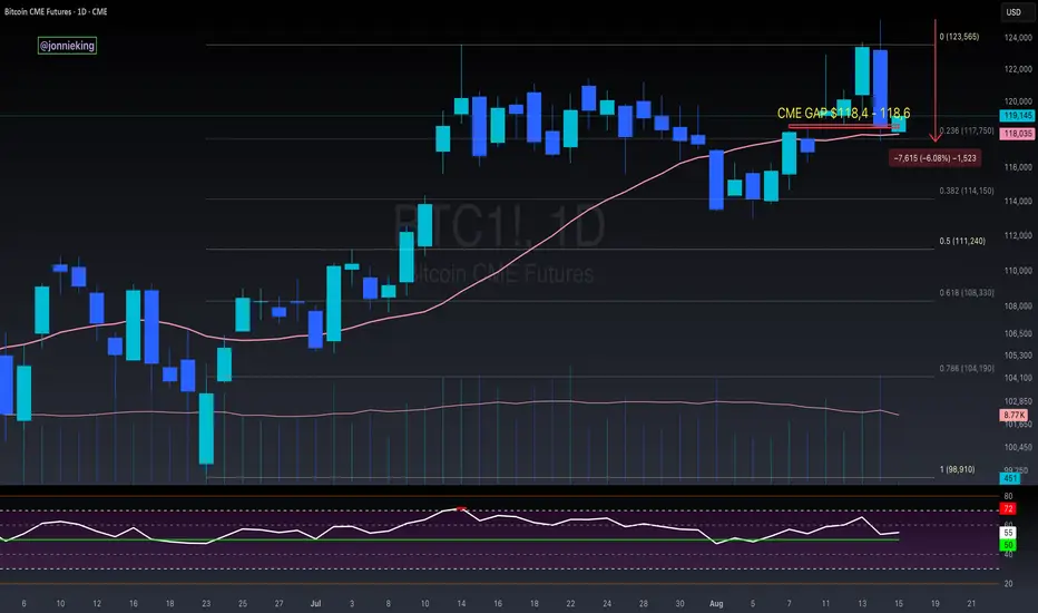
Decesion zone for bitcoinAbove our yellow box of liquidity is a bull market. Im forcasting a couple days in that zone maybe 3-10. But thats just based on past price action seen here, though it could be argued we blow past it. as far as bottoms go, i believe we have reached our low for the next couple weeks..
Volume

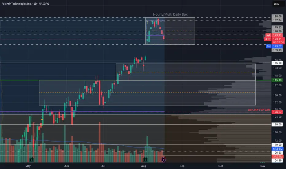
Palantir - The Box Calls The ShotsI recently posted a palatir chart with clean levels of where I'd look to DCA. While those dip-buy levels can easily be used to trade the name, I think it would also help to be mindful of the box ranges as we trade into them. As you'll see, Palantir loves to play with box as much as I do.
If you are familiar with how to trade box set-ups, you can take advantage immediately; otherwise, you may want to do some research on how to trade these.
~The Villain
NZD/USD: Strong Resistance Formed at 0.5947On NZD/USD, it's nice to see a strong resistance at 0.5947. This level is backed by three factors: a heavy volume cluster where sellers added shorts, a fair value gap showing aggressive selling, and a support-turned-resistance reaction from the past. Together, they make 0.5947 a high-probability short setup. A pullback to this level is likely to trigger renewed selling pressure.

EUR/USD Support @ 1.1611: Strong Buyer Zone with FVGOn EUR/USD, it's nice to see a key support at 1.1611 formed by a significant volume cluster. Buyers accumulated long positions here during a small rotation before pushing the price aggressively higher. The level is further strengthened by a fair value gap, confirming strong buyer activity. If price pulls back, this support is likely to be defended, making 1.1611 an important reaction zone.

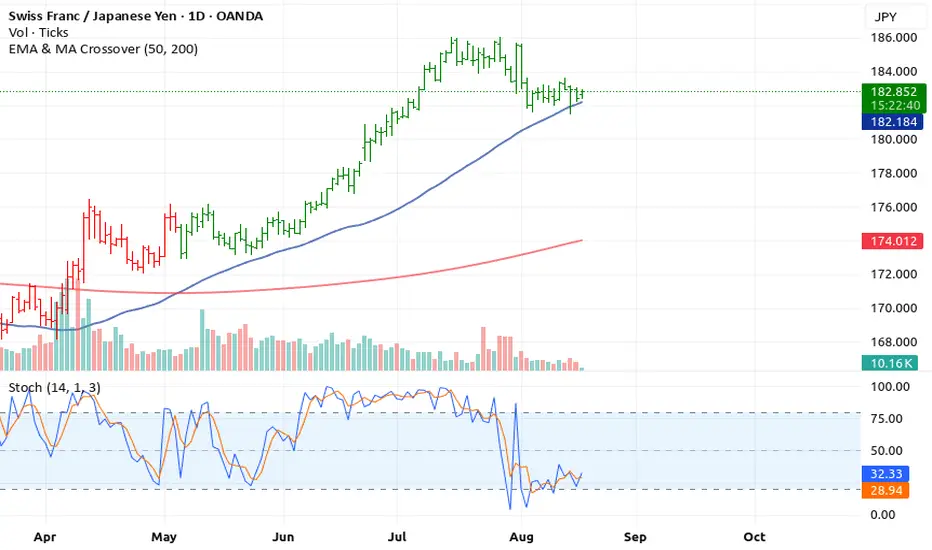
CHF/JPY – With 4 Bullish Momentum Indicators BuildingCHF/JPY – With 4 Bullish Momentum Indicators Building
Multiple indicators suggest that CHF/JPY is showing strong bullish potential across short and medium-term timeframes. Here’s the breakdown:
1. Positive Volume Confirmation
Trading volume has been rising on upward price moves, indicating that buyers are actively supporting the rally.
This shows that the uptrend is backed by strong participation, increasing the likelihood of continuation.
2. Balance of Power (BOP) Bullish
The Balance of Power (BOP) has turned positive, signaling that buyers are in control. A bullish BOP aligns with the increasing volume and confirms that upward momentum is strong.
3. EMA Crossover Signals Uptrend
The short-term EMA (50 EMA) has crossed above the long-term EMA (200 EMA), a classic bullish signal. This crossover confirms a shift in trend and suggests potential for further upside.
4. Stochastic Oscillator Supports Bullish Pullbacks
The Stochastic (14,1,3) shows that the pair has recovered from oversold levels and is now moving upward, confirming that bullish momentum is gaining strength. No bearish divergence is present.
⚡ Conclusion
All key indicators — positive volume, bullish BOP, EMA cross up, and Stochastic support — suggest that CHF/JPY is poised for a bullish move.
Traders may consider long positions, entering on pullbacks, or holding for trend continuation, while managing risk carefully.
Rocket boost this content to learn more
Disclaimer: This is technical analysis only and not financial advice. Always use a simulation trading account before trading with real money,
and make sure to learn proper risk management and profit-taking strategies to protect your capital.
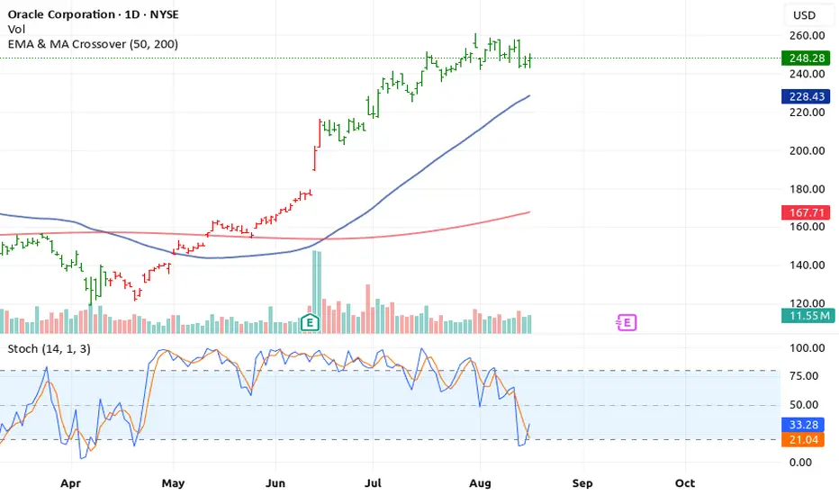
Oracle (ORCL) – 4 Bullish Signals Building UpOracle (ORCL) – 4 Bullish Signals Building Up
Technical indicators are showing that ORCL may be gearing up for a strong upward move. Multiple timeframes confirm buyers are in control. Here’s the breakdown:
1. Positive Volume Support
Recent sessions show increasing volume on upward moves, indicating that buyers are actively driving the price higher. Strong
volume confirms that the rally is supported and not a weak, unsustainable move.
2. Balance of Power (BOP) Turns Bullish
The Balance of Power (BOP) indicator has shifted into positive territory, showing that buyers have the upper hand. A bullish BOP
suggests strength and momentum in the hands of bulls, aligning with the volume trend.
3. EMA Crossover Confirms Uptrend
The short-term EMA (50 EMA) has crossed above the long-term EMA (200 EMA), a classic bullish signal. EMA crossovers often indicate a trend reversal or continuation of upward momentum.
4. Stochastic Oscillator Supports Bullish Momentum
The Stochastic oscillator shows oversold conditions that are reversing upward and is in alignment with price action. No bearish
divergence is present, confirming that the bullish momentum is healthy and sustainable.
⚡ Conclusion
All key indicators — positive volume, bullish BOP, EMA cross up, and Stochastic support — are pointing to a potential rally in
ORCL NYSE:ORCL . Traders may consider long positions, scaling in on pullbacks, or holding for trend continuation while managing risk.
Rocket boost this content to learn more
Disclaimer: This is technical analysis only and not financial advice. Always use a simulation
trading account before trading with real money, and take the time to learn risk management and profit-taking strategies to protect your capital.
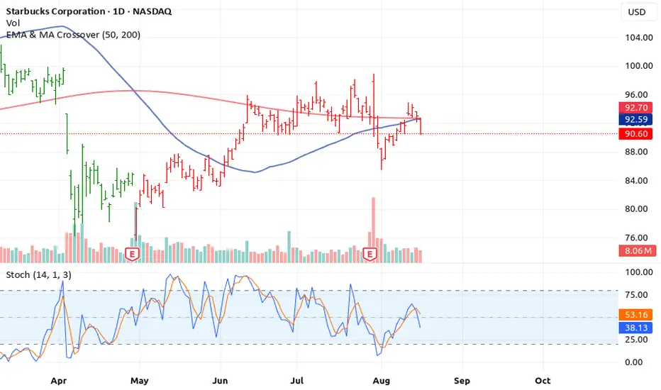
Starbucks (SBUX) – 4 Warning Signs Point to a Potential..Starbucks (SBUX) – 4 Warning Signs Point to a Potential Downturn
Traders and investors should be cautious on SBUX as multiple technical indicators are signaling a bearish outlook across different timeframes. Here’s a breakdown of the red flags:
1. Negative Volume Pressure
Recent trading sessions have shown a decline in volume on upward moves, while downward moves are backed by heavier
selling volume. This imbalance suggests that buyers are losing control, and the stock may be set for a further pullback.
2. Balance of Power (BOP) Turns Bearish
The Balance of Power (BOP) indicator, which measures buyer vs.
seller dominance, has flipped into negative territory. A bearish BOP indicates that sellers are gaining control over the market, confirming the negative volume trend.
3. EMA Crossover Signals Trend Weakness
The short-term EMA (e.g., 50 EMA) has started crossing below the
long-term EMA (e.g., 200 EMA), a classic signal of a downtrend formation. EMA crossovers are widely regarded as reliable indicators for trend direction.
4. Stochastic Divergence Confirms Bearish Momentum
Finally, the Stochastic oscillator is showing a bearish divergence, with price making higher highs while Stoch fails to confirm them.
This often precedes sharp reversals or pullbacks.
⚠️ Conclusion
All four indicators — negative volume, bearish BOP, EMA cross down, and Stochastic divergence — align to suggest that SBUX
may be heading toward a correction or short-term crash. Traders should consider tightening stops, reducing exposure, or exploring short positions in accordance with their risk strategy.
Also remember we are using the 50,200 EMA thats the rocket booster strategy
Rocket boost this content to learn more.
Disclaimer: This is technical analysis only and not financial advice. Always conduct your own research and consider your risk tolerance before making trading decisions.
Also use a simulation trading account before you trade with real money, learn risk management and profit taking strategies.
BTC CME: Volume is the storyThe key level is $110,000 (Value Area High). Breaking that could see price quickly at $97,500 (Point of Control).
If that level fails, a move toward the $90,000 gap and the major support at $84,000 is likely. The current volatility suggests a larger move is brewing.
Confluence:
@ Bearish divergence between price and Cumulative Delta on the Daily.
@ Unfilled CME and volume gaps below.
@ Seasonality: Watching for historical headwinds as the DXY tends to strengthen (from August onwards) while SPX and BTC enter their weakest period of the year (Aug/Sept).

Crude Oil Bearish and Bullish scenarios for the weekCrude Oil can go both directions this week depending on the price we hit in the start of the week.
Patience Patience Patience!!!!

Euro Bearish PredictionEuro Bearish Prediction.
Reversal point on multiple high volume nodes paired with previous month naked POC.
weekly and daily VA extensions.

NQ Bearish Setup after reaching Rejection levelNQ Bearish Setup after reaching Rejection level.
Expecting price to reach old VWAP level purge poor high and hit high volume to then retrace and potentially reverse to mitigate naked POCs.
SOL. 100% upside potential.If markets as a whole remains bullish, probability of this move is high. CRYPTOCAP:SOL price has been touching the middle of the channel with higher lows since May.

The weekly, D1 and H1 timeframes all currently favor the sellersHi traders and investors!
This analysis is based on the Initiative Analysis concept (IA).
Weekly timeframe
On the weekly timeframe, we see a buyer’s initiative, but at the same time, the seller absorbed a strong buyer candle — with the highest volume in recent months — and formed a seller zone (marked with a red rectangle). That’s a negative sign for long entries and a potential setup for short entries from the seller’s zone.
Below, the weekly chart shows three important levels: 3268, 3244, and 3201. I expect the price to move down toward 3244, where there is likely more liquidity (possibly with a touch of 3201). That’s where we can start looking for buy patterns.
Daily timeframe
On the daily timeframe, we have a sideways market and a seller’s initiative now, with a target at 3154. The buyer tried to start a move from the buyer zone (blue rectangle), but both candles had declining volume, and the second candle failed to close above the first one. That’s a negative sign for long entries.
Friday’s buyer candle also had low volume and showed no result — That’s a negative sign for long entries too.
With a seller’s initiative in place and no real buying signals, we’re focusing on short opportunities.
Hourly timeframe
On the 1H chart, the price has formed a sideways range with a buyer’s initiative. The lower boundary of this range is at 3331, where we saw price interaction on declining volume — a negative sign for long setups.
I expect price to interact with 3329, after which a buyer move is possible (unlikely, but possible). The target is 3358.
Wishing you profitable trades!

The 3 Step Rocket Booster "Once you master this strategy ..."When you watch this video i want you to think of the
the 3 step rocket booster strategy.
Once you master this strategy then it will
be easy for you understand the other indicators
and how they work.
This video is very very advanced and i dont expect you to understand
unless you are a trading expert.
But the point am trying to make to you
is that everything is connected.
Even understanding one strategy is better than
understanding not even one.
understanding one strategy is the building block.
So in this video am taking you through
the building blocks of trading.
My strategy is very advanced but i want to show you
that even in this advanced strategy
the Rocket booster strategy
is a building block.
So watch this video to learn more now.
Rocket boost this content to learn more.
Disclaimer:Trading is risky please learn risk management and profit taking strategies also feel
free to use a simulation trading account
before you trade with real money.

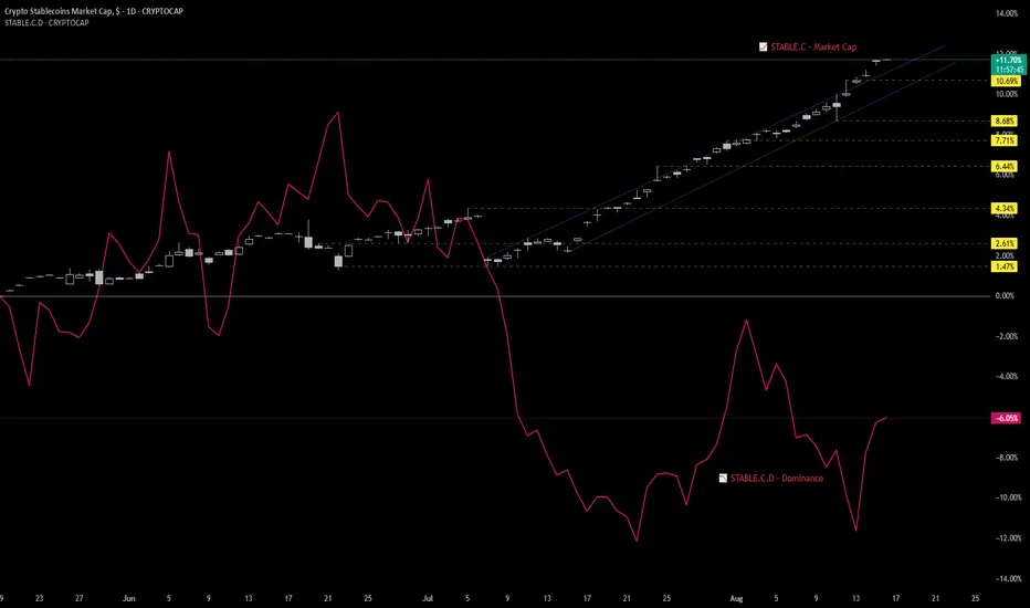
Stablecoins as the New Macro Liquidity ProxyFor years, macro liquidity in crypto was gauged through broad monetary metrics like M2 or Total Market Cap. But those days are fading.
With the rise of regulated stablecoins—and new TradingView tickers like CRYPTOCAP:STABLE.C (Stablecoin Market Cap) and CRYPTOCAP:STABLE.C.D (Stablecoin Dominance)—we now have real-time, on-chain liquidity metrics that better reflect how institutional and retail capital enters the crypto ecosystem.
🔑 Why These Tickers Matter
• STABLE.C = Capital injection.
→ Tracks aggregate growth of major stablecoins, serving as a proxy for dry powder entering the system.
• STABLE.C.D = Sentiment signal.
→ Measures stablecoin dominance relative to the crypto market.
→ Rising dominance = risk-off (capital parked).
→ Falling dominance = risk-on (capital deploying).
Together, they offer a macro lens on risk appetite and capital inflow , updated in real-time—something no traditional metric can match.
🔍 How We Use Them
These metrics are now integrated into our Crypto Macro Cockpit , where:
• Stablecoin cap growth signals liquidity expansion or contraction
• Dominance slope helps identify regime shifts (risk-on vs risk-off)
We're beginning to see consistent patterns:
➤ Surges in STABLE.C precede market rallies
➤ Spikes in STABLE.C.D often align with rotation tops or periods of caution
📎 Implication
Stablecoins are no longer just trading tools—they’re macro indicators.
If ETFs are the Trojan horse for institutional entry, stablecoins are the bloodstream.
As we transition into a new cycle, these tickers might become the most important charts you’re not watching.
💬 Would love to hear from others—are you using STABLE.C or STABLE.C.D in your analysis? What signals are you seeing?
BTCUSDT. Where to look for buys?Hi traders and investors!
This analysis is based on the Initiative Analysis concept (IA).
On the weekly timeframe, there was a sideways range (boundaries marked with black lines) that the buyer broke to the upside, but so far has been unable to extend the initiative further. Sellers are still defending the 123,000 level — we can see this from the volume that appears whenever price touches this zone.
On the weekly chart, there’s also the 114,723 level, where price interacted with a seller candle on declining volume. That’s not a bullish signal for looking at longs and suggests price may move lower. If 114,723 doesn’t hold, we could see a retest of the local low at 111,920.
On the daily timeframe, price has formed a sideways range (boundaries marked with black lines).
The current vector is with the sellers, with a target at 115,736.
We’ll be watching how price reacts at 115,736 and at 114,723 — and whether a strong buyer appears at these levels.
Wishing you profitable trades!

CELR : Sensitive areaHello friends🙌
✅Considering the decline we had, you can see that the price has been well supported in the support area drawn with Fibonacci and now it seems that it wants to go up to the specified ranges, which are also good and high-volume ranges, and these areas are like magnets for the price.
✅Don't forget risk and capital management.
🔥Follow us for more signals🔥
*Trade safely with us*
ETH: LIVE TRADEHello friends🙌
✅Given the good rise we had, we had a small correction that was a buying opportunity and there is another support area where we can buy the second step in case of further correction.
We have also specified targets for you, be careful and do not act emotionally and observe capital and risk management.
🔥Follow us for more signals🔥
*Trade safely with us*

$CMG Long Swing Trade Pros
-Major pullback from highs: -40% from ATH.
-Technical confluence at support: Top of 2020–2024 range, weekly 200MA, and weekly volume POC.
-Gap magnet above: July 22 gap to $50.76 (+21% from here) with intermediate target $45–47 (+8–9%).
-Strong fundamentals: YOY revenue and gross profit growth consistently +20–30%.
-Brand moat: Loyal customer base, pricing power, consistent product quality.
-Innovation: Ongoing AI & robotics investment in meal prep. Supports margin expansion over time.
-Post-split price appeal: Lower nominal price post 50:1 split may draw in retail on recovery.
Risks
-Valuation still stretched: P/E of 38 even after a large correction. Leaves room for further multiple compression.
-Macro headwinds: If consumer spending slows, fast-casual dining could see softer traffic.
-Gap risk to the downside: A decisive break below $40 could trigger selling toward $35–37.
-High expectations baked in: Growth slowdown could cause outsized downside.
Entry Zone: Current levels ($43–44)
Targets:
-TP1 (Conservative): $46–47 → +8–9%
-TP2 (Aggressive): $50–51 → +18–21% (gap-fill / daily POC target)
Stop Loss:
-$41–40 → Below key support confluence (old range top, weekly 200MA).
-Close below $40 = setup invalidated.
Timeframe:
-Swing trade → Expectation of move playing out over several weeks to a few months.
Notes:
-Trim partial position at TP1 to lock gains, let rest ride toward TP2.
-If price fails to reclaim $44 within the next few sessions, reassess — could indicate sellers still in control.
-P/E still high. Not a value play.

MINIMA - Technical Analysis. Are we entering a bull market?MINIMA - Technical Analysis. Are we entering a bull market?
Hello!
I am returning to an analysis of MINIMA. This market is remarkably interesting in both its structure and behavior. Today, I will review the latest structure and place it in the broader context, including the history observed on the Wrapped version. Unfortunately, TradingView does not allow overlaying two charts outside their native ranges, so I will refer to data from both Wrapped and MINIMA. Let’s begin.
I do not have formal education in this field. I am self-taught and place strong emphasis on Technical Analysis as the core of my decision-making process. While charts are difficult to read, I think they allow one to infer, to a meaningful extent, the hidden intentions of so-called “Smart Money.” The views below are strictly my own and may be incorrect. This publication does not constitute investment or educational advice as defined by any applicable regulations.
I will rely solely on Technical Analysis based on the Wyckoff methodology, VSA, and footprint analysis.
Background
As background, I use the WMINIMA chart supplemented by current MINIMA quotations. WMINIMA data show periods of distribution and accumulation on the higher timeframe. A key observation for me is the strong breakout around March 2024: price surged sharply and then printed a new, deeper low. The downtrend subsequently stalled at a higher low and transitioned into a range. On the charts, I mark accumulation/distribution structures relevant to the analysis.
Technical analysis and interpretation
For this study I created a composite view to capture the full history. The composite lacks full volume because WMINIMA does not provide it. For context, one of my archived screenshots shows the last visible candle at roughly 1.4 million in volume; based on bar height I estimate the highest volumes to be around 6 million.
pbs.twimg.com
I annotate events in line with Wyckoff. In Phase A of accumulation, I label the Selling Climax as “Seller’s Exhaustion,” as in my view the bar structure does not fully match a classic Climax Bar known from VSA; however, the message is the same - significant accumulation.
I first consider the highest-order, global structure marked in red. I observe rising volume on the advance that builds what I mark as an Upthrust. The next area of elevated volume begins around July 2024 - a demand response to declining price within the price zone that preceded the breakout. Both high-activity zones are in comparable price areas.
I then move to the current MINIMA chart.
On MINIMA, I see a local volume spike during the formation of the ATL (all-time low). I also note declining volume on the drop from a local top I labeled an Upthrust - this is a lower-order structure than the red one; I mark it in orange. Following this path leads to the area with the highest volume, which I interpret as Phase C of the orange structure. It is characterized by very high volumes(1W ~50kk to 6kk volume from 1W WMINIMA) and minimal spread. In my view, this indicates strong absorption by smart money - behavior consistent with “Bag Holding” in the Williams/VSA framework - similar to the candle that halted the decline at the ATL.
To validate this, I zoom in with a 1-month footprint. The 1-month view shows the last two candles with very large volumes. The three most recent candles all have negative delta, and delta represents a significant share of total volume. The buy/sell relation suggests aggressive, dominant selling. However, price does not fall despite repeated attempts to push it lower. I analyze where volume clusters within one standard deviation. The candles have lower wicks- particularly in June - suggesting a Shakeout. Given the negative delta and the price response, I conclude there is a lack of result relative to the effort: aggressive supply has been absorbed, with the largest market orders printing within a narrow price band.
In my interpretation, the orange structure is a lower-tier structure functioning as Phase C of the red, global accumulation. Considering the above, I judge it highly probable that these observations confirm ongoing accumulation. I place particular weight on the footprint: the activity occurred at the right place and time. The asset recorded the highest volumes in its history at what I think is Phase C of the global accumulation. Moreover, the market’s failure to decline under heavy selling reinforces this view.
At this stage, I consider the possibility of an accumulation spring that could push price once more lower - potentially below the ATL - taking out the structure; I justify this by the still elevated volumes. I also note prior resistance and consider that a potential shakeout low could terminate around 0.0138 USD. All in all, I think this market is worth monitoring. Confirmation of my thesis would be successful supply tests resolved in favor of the bulls, followed by development consistent with Wyckoff: Last Point of Support (LPS) leading to a Sign of Strength (SOS) and a Jump Across the Creek (JAC).
Thank you for reading. I wish you good health, effective analyses, and successful trades.
CatTheTrader

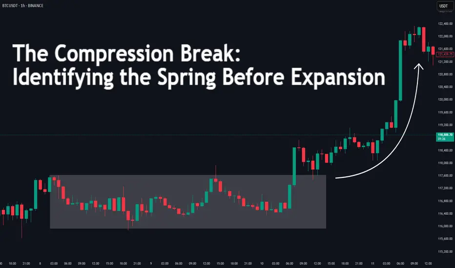
The Compression Break: Identifying the Spring Before ExpansionDifficulty: 🐳🐳🐳🐋 (Intermediate)
This article is for traders who want to recognize and trade explosive moves that form after periods of tight price compression. Perfect for those familiar with structure, volume, and volatility concepts.
🔵 INTRODUCTION
Price doesn’t move in a straight line — it breathes. It expands when there’s imbalance, and it compresses when the market is building energy. The most powerful moves often start with a compression phase — a tight, controlled price range — before a sudden breakout.
Learning to spot these “springs” before they snap can give you trades with excellent risk/reward ratios and clear invalidation points.
🔵 WHAT IS COMPRESSION?
Compression occurs when price volatility shrinks, and each swing becomes smaller than the last. It looks like price is being “squeezed” between converging support and resistance levels.
Common causes of compression:
Liquidity build-up before a major session open
Market waiting for a news release or key event
Institutional positioning before a drive
The tighter the range, the bigger the potential release.
🔵 WHY IT MATTERS
Compression is important because:
It reveals where the market is balanced and undecided
It creates a high-energy environment — a small push can trigger big moves
It offers tight stop-loss placement and clear breakout targets
Think of it like a coiled spring: the more it’s compressed, the more explosive the release.
🔵 HOW TO IDENTIFY COMPRESSION
1️⃣ Price Action Clues
Consecutive smaller candles with overlapping ranges
Lower highs + higher lows (triangle formation)
Reduced wick size in the final stages before breakout
2️⃣ Volume Clues
Declining volume during the squeeze
Sudden volume spike as breakout begins
3️⃣ Volatility Clues
ATR (Average True Range) dropping to local lows
Bollinger Bands narrowing (optional)
🔵 TRADING THE COMPRESSION BREAK
Step 1: Define the Box
Mark the high and low of the compression range. This will be your breakout reference.
Step 2: Wait for Volume Confirmation
Avoid jumping in on the first tick outside the box. Wait for a volume surge or strong close beyond the boundary.
Step 3: Trade in the Breakout Direction
Entry: After confirmed breakout close
Stop Loss: Inside the compression range
Target: Equal to the height of the compression box or previous swing high/low
🔵 EXAMPLE SCENARIO
Price compresses for more then 10 bars into a tight range
Volume steadily declines → ATR hits a local low
A big body bullish candle breaks above range high with 2× average volume
Entry at breakout close, stop inside range, target = box height projected upward or 1:2 RR
🔵 ADVANCED TIPS
Align with higher timeframe trend for higher probability
Watch for false breakouts (liquidity sweeps) before real move
Combine with order blocks or VWAP to refine entries
Use session timing — many compression breaks happen at market opens
🔵 CONCLUSION
Compression is the market’s way of loading a trade with potential energy. When you spot it, you’re seeing the buildup before the burst. Trade it with patience, volume confirmation, and proper structure, and it can become one of your highest-probability setups.
Have you traded compression breaks before? Share your best example in the comments!
Champions Trade at 3346
🎤 Gold Up Top, Dip Down Low – XAUMO’s Market Breakdown
🔐 Key Price Zones for XAUUSD
• POC (Point of Control): 3335.85 — crowd loves buying here
• VAH (Value Area High): 3339.90 — top zone where the sellers hang
• VAL (Value Area Low): 3333.30 — dip where the smart money loads up
• Heavy Seller Zone (Red Block): 3344.46 – 3347.00
• Liquidity Magnet (Big Block): 3345.50 – 3347.00
⸻
🧱 Support & Resistance, Street Style
Support:
• 3340: First line of defense
• 3335.85: Solid ground under our feet
• 3333.30: The last stash spot before a drop
• 3320: If we hit this… welcome to bear cave city
Resistance:
• 3346.50 – 3347.00: Heavy seller ambush
• 3352: Break this and we’re breaching the ceiling
• 3360: Price sings “I’m on top of the world” here
⸻
⏰ Market Sessions, Explained by the Hustlers
💮 Tokyo (7–8 AM Cairo Time):
• 5-day highs sat between 3343 – 3347
💮 Tokyo (8–9 AM):
• Lows ranged between 3326 – 3342
🗽 New York (8:30–9:30 PM Cairo Time):
• Highs: 3345 – 3352
• Lows: 3322 – 3340
⸻
💧 Tomorrow’s Liquidity Map
• Yellow Zone (Trap Zone): 3346.50 – 3347.50
→ Where sellers lay honey for eager buyers
• Green Zone (Takeoff Zone): Above 3352
→ If it breaks here, gold’s heading for orbit
• Red Zone (High Alert): 3344 – 3347
→ Sellers are lined up like a checkpoint – break it wrong, and it’s game over
⸻
⚔️ XAUMO’s Tactical Tips
(When to strike, hold, or dip)
• STRIKE: Clear breakout above 3352
• DEFEND: If price pulls back from 3346 – sell and bounce
• SCALP: If price is stuck mid-range
• SWING: Buy low (VAL) and sell high (VAH)
⸻
💣 The High-Stakes Trade (Street Market Style)
• Type: Sell Limit Order
• Entry: 3346.50
• Stop Loss: 3348.50
• Target 1: 3342.50
• Target 2: 3338.50
• Target 3: 3333.50
• Confidence Level: 86%
Why this trade? (Street Logic):
• Entering the red zone = bear trap
• Heavy sellers chilling at 3346
• Clear divergence on indicators
• Last few sessions broke but didn’t follow through = classic trap
⸻
🧱 Biggest Order Blocks (Per Timeframe)
• 15-Min Chart:
Sell Block: 3344.46 – 3347.00
Volume: ~24.8K contracts
Chance of revisit: 90% — market’s baiting again
• 1-Hour Chart:
Buy Block: 3330 – 3333
Volume: ~66K contracts
Chance of revisit: 65%
• 4-Hour Chart:
Sell Block: 3346 – 3352
Volume: ~125K contracts
Probability: 78% — some big fish wants out again
⸻
📣 Educational Post – As If XAUMO Was on Wall Street
🎺 Yo traders – today gold’s dancing up top and dipping low!
Price keeps teasing around 3346 and trapping folks, then zooming back to 3352.
Don’t jump in unless price tells you it’s ready – or you’ll get knocked out by the big dogs.
This ain’t a game – it’s chess, and you gotta move like a hustler.
💣 Remember:
🔶 Yellow = Trap
🟩 Green = Liftoff
🟥 Red = Run for cover
⚠️ Disclaimer: This analysis is for education only – not financial advice.
Trade only if you know the game. The market doesn’t forgive tourists.
⸻
👑 Want me to break it down Hamo Bika-style, like “Some are Up, Some are Down”?
Say the word — and I’ll fire it up street-level 💥
— From your boy, XAUMO, The People’s Analyst 🎤

$BTC Bearish Engulfing Candle AlertGOOD NEWS:
-CME Gap was completely filled.
-PA is still above the 20DMA.
BAD NEWS:
-Very concerning Bearish Engulfing candle on the Daily Close.
-Volume confirms the change in trend.
MY TAKE: I wouldn't be surprised to see the market rally into a low liquidity weekend and dump hard on Monday.