MC [PRO+]MC Pro+ Indicator Strategy
Blue Line (MC 1):
Long or Short Trend Indicator When price crosses this blue line level, the trend changes Acts as the primary trend direction signal.
Orange Line (MC 2) :
Works like a magnet, keeping price attracted to it When price is too far from this line, it pulls price back like a magnet (long scenario) Price tends to gravitate towards this level. When this orangheline starts moving downward (loses its strength), the trend may reverse We can start going short even if we're still above the blue line (which indicates long or short) Shows weakening bullish momentum.
RedLine (MC 3):
Ultra Bullish Scenario Used specifically for ultra bullish scenarios Confirms extremely strong upward momentum.
Support/Resistance Function: When any line breaks, it acts as support or resistance
Broken levels become important price zones
Choppy Market Signal: When price is very choppy and not moving much (consolidation) All 3 lines are very close together This signals a major explosive move coming either downward or upward Breakout direction confirmed when blue line is crossed.
This is a multi-timeframe momentum and trend-following system using moving averages as dynamic support/resistance and trend indicators.
Advance/Decline Line

لbsm15// This work is licensed under a Attribution-NonCommercial-ShareAlike 4.0 International (CC BY-NC-SA 4.0) creativecommons.org
// © LuxAlgo
//@version=5
indicator("لbsm15", overlay = true, max_lines_count = 500, max_boxes_count = 500, max_bars_back = 3000)
//------------------------------------------------------------------------------
//Settings
//-----------------------------------------------------------------------------{
liqGrp = 'Liquidity Detection'
liqLen = input.int (7, title = 'Detection Length', minval = 3, maxval = 13, inline = 'LIQ', group = liqGrp)
liqMar = 10 / input.float (6.9, 'Margin', minval = 4, maxval = 9, step = 0.1, inline = 'LIQ', group = liqGrp)
liqBuy = input.bool (true, 'Buyside Liquidity Zones, Margin', inline = 'Buyside', group = liqGrp)
marBuy = input.float(2.3, '', minval = 1.5, maxval = 10, step = .1, inline = 'Buyside', group = liqGrp)
cLIQ_B = input.color (color.new(#4caf50, 0), '', inline = 'Buyside', group = liqGrp)
liqSel = input.bool (true, 'Sellside Liquidity Zones, Margin', inline = 'Sellside', group = liqGrp)
marSel = input.float(2.3, '', minval = 1.5, maxval = 10, step = .1, inline = 'Sellside', group = liqGrp)
cLIQ_S = input.color (color.new(#f23645, 0), '', inline = 'Sellside', group = liqGrp)
lqVoid = input.bool (false, 'Liquidity Voids, Bullish', inline = 'void', group = liqGrp)
cLQV_B = input.color (color.new(#4caf50, 0), '', inline = 'void', group = liqGrp)
cLQV_S = input.color (color.new(#f23645, 0), 'Bearish', inline = 'void', group = liqGrp)
lqText = input.bool (false, 'Label', inline = 'void', group = liqGrp)
mode = input.string('Present', title = 'Mode', options = , inline = 'MOD', group = liqGrp)
visLiq = input.int (3, ' # Visible Levels', minval = 1, maxval = 50, inline = 'MOD', group = liqGrp)
//-----------------------------------------------------------------------------}
//General Calculations
//-----------------------------------------------------------------------------{
maxSize = 50
atr = ta.atr(10)
atr200 = ta.atr(200)
per = mode == 'Present' ? last_bar_index - bar_index <= 500 : true
//-----------------------------------------------------------------------------}
//User Defined Types
//-----------------------------------------------------------------------------{
// @type used to store pivot high/low data
//
// @field d (array) The array where the trend direction is to be maintained
// @field x (array) The array where the bar index value of pivot high/low is to be maintained
// @field y (array) The array where the price value of pivot high/low is to be maintained
type ZZ
int d
int x
float y
// @type bar properties with their values
//
// @field o (float) open price of the bar
// @field h (float) high price of the bar
// @field l (float) low price of the bar
// @field c (float) close price of the bar
// @field i (int) index of the bar
type bar
float o = open
float h = high
float l = low
float c = close
int i = bar_index
// @type liquidity object definition
//
// @field bx (box) box maitaing the liquity level margin extreme levels
// @field bxz (box) box maitaing the liquity zone margin extreme levels
// @field bxt (box) box maitaing the labels
// @field brZ (bool) mainains broken zone status
// @field brL (bool) mainains broken level status
// @field ln (line) maitaing the liquity level line
// @field lne (line) maitaing the liquity extended level line
type liq
box bx
box bxz
box bxt
bool brZ
bool brL
line ln
line lne
//-----------------------------------------------------------------------------}
//Variables
//-----------------------------------------------------------------------------{
var ZZ aZZ = ZZ.new(
array.new (maxSize, 0),
array.new (maxSize, 0),
array.new (maxSize, na)
)
bar b = bar.new()
var liq b_liq_B = array.new (1, liq.new(box(na), box(na), box(na), false, false, line(na), line(na)))
var liq b_liq_S = array.new (1, liq.new(box(na), box(na), box(na), false, false, line(na), line(na)))
var b_liq_V = array.new_box()
var int dir = na, var int x1 = na, var float y1 = na, var int x2 = na, var float y2 = na
//-----------------------------------------------------------------------------}
//Functions/methods
//-----------------------------------------------------------------------------{
// @function maintains arrays
// it prepends a `value` to the arrays and removes their oldest element at last position
// @param aZZ (UDT, array, array>) The UDT obejct of arrays
// @param _d (array) The array where the trend direction is maintained
// @param _x (array) The array where the bar index value of pivot high/low is maintained
// @param _y (array) The array where the price value of pivot high/low is maintained
//
// @returns none
method in_out(ZZ aZZ, int _d, int _x, float _y) =>
aZZ.d.unshift(_d), aZZ.x.unshift(_x), aZZ.y.unshift(_y), aZZ.d.pop(), aZZ.x.pop(), aZZ.y.pop()
// @function (build-in) sets the maximum number of bars that is available for historical reference
max_bars_back(time, 1000)
//-----------------------------------------------------------------------------}
//Calculations
//-----------------------------------------------------------------------------{
x2 := b.i - 1
ph = ta.pivothigh(liqLen, 1)
pl = ta.pivotlow (liqLen, 1)
if ph
dir := aZZ.d.get(0)
x1 := aZZ.x.get(0)
y1 := aZZ.y.get(0)
y2 := nz(b.h )
if dir < 1
aZZ.in_out(1, x2, y2)
else
if dir == 1 and ph > y1
aZZ.x.set(0, x2), aZZ.y.set(0, y2)
if per
count = 0
st_P = 0.
st_B = 0
minP = 0.
maxP = 10e6
for i = 0 to maxSize - 1
if aZZ.d.get(i) == 1
if aZZ.y.get(i) > ph + (atr / liqMar)
break
else
if aZZ.y.get(i) > ph - (atr / liqMar) and aZZ.y.get(i) < ph + (atr / liqMar)
count += 1
st_B := aZZ.x.get(i)
st_P := aZZ.y.get(i)
if aZZ.y.get(i) > minP
minP := aZZ.y.get(i)
if aZZ.y.get(i) < maxP
maxP := aZZ.y.get(i)
if count > 2
getB = b_liq_B.get(0)
if st_B == getB.bx.get_left()
getB.bx.set_top(math.avg(minP, maxP) + (atr / liqMar))
getB.bx.set_rightbottom(b.i + 10, math.avg(minP, maxP) - (atr / liqMar))
else
b_liq_B.unshift(
liq.new(
box.new(st_B, math.avg(minP, maxP) + (atr / liqMar), b.i + 10, math.avg(minP, maxP) - (atr / liqMar), bgcolor=color(na), border_color=color(na)),
box.new(na, na, na, na, bgcolor = color(na), border_color = color(na)),
box.new(st_B, st_P, b.i + 10, st_P, text = 'Buyside liquidity', text_size = size.tiny, text_halign = text.align_left, text_valign = text.align_bottom, text_color = color.new(cLIQ_B, 25), bgcolor = color(na), border_color = color(na)),
false,
false,
line.new(st_B , st_P, b.i - 1, st_P, color = color.new(cLIQ_B, 0)),
line.new(b.i - 1, st_P, na , st_P, color = color.new(cLIQ_B, 0), style = line.style_dotted))
)
alert('buyside liquidity level detected/updated for ' + syminfo.ticker)
if b_liq_B.size() > visLiq
getLast = b_liq_B.pop()
getLast.bx.delete()
getLast.bxz.delete()
getLast.bxt.delete()
getLast.ln.delete()
getLast.lne.delete()
if pl
dir := aZZ.d.get (0)
x1 := aZZ.x.get (0)
y1 := aZZ.y.get (0)
y2 := nz(b.l )
if dir > -1
aZZ.in_out(-1, x2, y2)
else
if dir == -1 and pl < y1
aZZ.x.set(0, x2), aZZ.y.set(0, y2)
if per
count = 0
st_P = 0.
st_B = 0
minP = 0.
maxP = 10e6
for i = 0 to maxSize - 1
if aZZ.d.get(i) == -1
if aZZ.y.get(i) < pl - (atr / liqMar)
break
else
if aZZ.y.get(i) > pl - (atr / liqMar) and aZZ.y.get(i) < pl + (atr / liqMar)
count += 1
st_B := aZZ.x.get(i)
st_P := aZZ.y.get(i)
if aZZ.y.get(i) > minP
minP := aZZ.y.get(i)
if aZZ.y.get(i) < maxP
maxP := aZZ.y.get(i)
if count > 2
getB = b_liq_S.get(0)
if st_B == getB.bx.get_left()
getB.bx.set_top(math.avg(minP, maxP) + (atr / liqMar))
getB.bx.set_rightbottom(b.i + 10, math.avg(minP, maxP) - (atr / liqMar))
else
b_liq_S.unshift(
liq.new(
box.new(st_B, math.avg(minP, maxP) + (atr / liqMar), b.i + 10, math.avg(minP, maxP) - (atr / liqMar), bgcolor=color(na), border_color=color(na)),
box.new(na, na, na, na, bgcolor=color(na), border_color=color(na)),
box.new(st_B, st_P, b.i + 10, st_P, text = 'Sellside liquidity', text_size = size.tiny, text_halign = text.align_left, text_valign = text.align_top, text_color = color.new(cLIQ_S, 25), bgcolor=color(na), border_color=color(na)),
false,
false,
line.new(st_B , st_P, b.i - 1, st_P, color = color.new(cLIQ_S, 0)),
line.new(b.i - 1, st_P, na , st_P, color = color.new(cLIQ_S, 0), style = line.style_dotted))
)
alert('sellside liquidity level detected/updated for ' + syminfo.ticker)
if b_liq_S.size() > visLiq
getLast = b_liq_S.pop()
getLast.bx.delete()
getLast.bxz.delete()
getLast.bxt.delete()
getLast.ln.delete()
getLast.lne.delete()
for i = 0 to b_liq_B.size() - 1
x = b_liq_B.get(i)
if not x.brL
x.lne.set_x2(b.i)
if b.h > x.bx.get_top()
x.brL := true
x.brZ := true
alert('buyside liquidity level breached for ' + syminfo.ticker)
x.bxz.set_lefttop(b.i - 1, math.min(x.ln.get_y1() + marBuy * (atr), b.h))
x.bxz.set_rightbottom(b.i + 1, x.ln.get_y1())
x.bxz.set_bgcolor(color.new(cLIQ_B, liqBuy ? 73 : 100))
else if x.brZ
if b.l > x.ln.get_y1() - marBuy * (atr) and b.h < x.ln.get_y1() + marBuy * (atr)
x.bxz.set_right(b.i + 1)
x.bxz.set_top(math.max(b.h, x.bxz.get_top()))
if liqBuy
x.lne.set_x2(b.i + 1)
else
x.brZ := false
for i = 0 to b_liq_S.size() - 1
x = b_liq_S.get(i)
if not x.brL
x.lne.set_x2(b.i)
if b.l < x.bx.get_bottom()
x.brL := true
x.brZ := true
alert('sellside liquidity level breached for ' + syminfo.ticker)
x.bxz.set_lefttop(b.i - 1, x.ln.get_y1())
x.bxz.set_rightbottom(b.i + 1, math.max(x.ln.get_y1() - marSel * (atr), b.l))
x.bxz.set_bgcolor(color.new(cLIQ_S, liqSel ? 73 : 100))
else if x.brZ
if b.l > x.ln.get_y1() - marSel * (atr) and b.h < x.ln.get_y1() + marSel * (atr)
x.bxz.set_rightbottom(b.i + 1, math.min(b.l, x.bxz.get_bottom()))
if liqSel
x.lne.set_x2(b.i + 1)
else
x.brZ := false
if lqVoid and per
bull = b.l - b.h > atr200 and b.l > b.h and b.c > b.h
bear = b.l - b.h > atr200 and b.h < b.l and b.c < b.l
if bull
l = 13
if bull
st = math.abs(b.l - b.l ) / l
for i = 0 to l - 1
array.push(b_liq_V, box.new(b.i - 2, b.l + i * st, b.i, b.l + (i + 1) * st, border_color = na, bgcolor = color.new(cLQV_B, 90) ))
else
st = math.abs(b.l - b.h ) / l
for i = 0 to l - 1
if lqText and i == 0
array.push(b_liq_V, box.new(b.i - 2, b.h + i * st, b.i, b.h + (i + 1) * st, text = 'Liquidity Void ', text_size = size.tiny, text_halign = text.align_right, text_valign = text.align_bottom, text_color = na, border_color = na, bgcolor = color.new(cLQV_B, 90) ))
else
array.push(b_liq_V, box.new(b.i - 2, b.h + i * st, b.i, b.h + (i + 1) * st, border_color = na, bgcolor = color.new(cLQV_B, 90) ))
if bear
l = 13
if bear
st = math.abs(b.h - b.h) / l
for i = 0 to l - 1
array.push(b_liq_V, box.new(b.i - 2, b.h + i * st, b.i, b.h + (i + 1) * st, border_color = na, bgcolor = color.new(cLQV_S, 90) ))
else
st = math.abs(b.l - b.h) / l
for i = 0 to l - 1
if lqText and i == l - 1
array.push(b_liq_V, box.new(b.i - 2, b.h + i * st, b.i, b.h + (i + 1) * st, text = 'Liquidity Void ', text_size = size.tiny, text_halign = text.align_right, text_valign = text.align_top, text_color = na, border_color = na, bgcolor = color.new(cLQV_S, 90) ))
else
array.push(b_liq_V, box.new(b.i - 2, b.h + i * st, b.i, b.h + (i + 1) * st, border_color = na, bgcolor = color.new(cLQV_S, 90) ))
if b_liq_V.size() > 0
qt = b_liq_V.size()
for bn = qt - 1 to 0
if bn < b_liq_V.size()
cb = b_liq_V.get(bn)
ba = math.avg(cb.get_bottom(), cb.get_top())
if math.sign(b.c - ba) != math.sign(b.c - ba) or math.sign(b.c - ba) != math.sign(b.l - ba) or math.sign(b.c - ba) != math.sign(b.h - ba)
b_liq_V.remove(bn)
else
cb.set_right(b.i + 1)
if b.i - cb.get_left() > 21
cb.set_text_color(color.new(color.gray, 25))
//-----------------------------------------------------------------------------}

MA200 Parallel ChannelDynamic MA100 Parallel Bands – Precision S/R Levels
This indicator builds a clean, parallel channel around the 100-period moving average using a fixed ±4 offset.
Because the offset mirrors the short-term MA1 fluctuations, the channel reveals highly accurate support and resistance zones that react instantly to market micro-structure.
Unlike Bollinger Bands—which expand with volatility—this tool stays perfectly parallel and trend-aligned, making breakouts and pullbacks incredibly easy to spot.
How it works:
Centerline: 100-period moving average (MA100)
Upper Band: MA100 + 4
Lower Band: MA100 – 4
MA1 used as a sensitivity reference for micro-trend behavior
Parallel structure ensures stable, predictable levels
Why it’s powerful:
The ±4 channel creates extremely precise S/R zones
Price respecting the lower band = dynamic support
Price rejecting the upper band = dynamic resistance
A clean break above or below the bands highlights strong momentum shifts
Perfect for intraday traders needing structure without noise
Perfect for:
Identifying high-probability bounce levels
Spotting early trend continuation
Confirming MA100 breakouts
Filtering weak signals and fake volatility spikes
If you want razor-sharp support & resistance levels that stay consistent across all timeframes, these MA100 parallel bands deliver exceptional clarity.
NinKa• Regression Length (200)
This value represents the reference period used to identify the trend.
A higher value captures broader market movements,
while a lower value makes the indicator respond more sensitively for short-term scalping.
• Normalization (100)
This parameter adjusts how smooth the indicator’s movements appear.
If the value is too low, you will see more noise.
If it is too high, the response becomes slower.
• Signal Line (100)
This line is the threshold for buy and sell signals.
When the indicator crosses above or below this level,
it is interpreted as a signal.
The current settings are optimized for observing stable market trends.
If you prefer more sensitivity for fast scalping entries,
you can reduce the Length value.
Feel free to adjust the parameters according to your trading style,
but using the default settings is perfectly fine as well.

STEVEN Ichimoku BUY & SELLIchimoku Cloud + Advanced Buy/Sell Signals
This indicator enhances the traditional Ichimoku Cloud system by adding highly refined BUY and SELL signals based on price–Tenkan interactions, cloud positioning, and multi-step validation rules. It is designed to help traders identify high-probability trend continuation entries while filtering out signals that occur near the Kumo, where market structure is typically uncertain.
✅ BUY Signal Logic
A BUY signal is triggered only when all of the following conditions are met:
Price is above the Kumo Cloud, confirming a bullish environment.
Tenkan (Conversion Line) is above the Kumo, reinforcing bullish momentum.
Price makes a bullish cross above the Tenkan within the last 6 bars.
The entry candle opens below the Tenkan and closes above it, ensuring a clean upside break.
The candle must NOT touch the Kumo.
If the candle touches the Kumo, the indicator waits for the next clean candle that closes above Tenkan without touching the Kumo, then triggers the BUY signal.
The BUY signal appears as a small green triangle below the price bar.
✅ SELL Signal Logic
A SELL signal is triggered under the mirror conditions:
Price is below the Kumo Cloud, confirming a bearish environment.
Tenkan is below the Kumo, supporting bearish momentum.
Price makes a bearish cross below the Tenkan within the last 6 bars.
The entry candle opens above the Tenkan and closes below it.
The candle must NOT touch the Kumo.
If the candle touches the Kumo, the indicator waits for the next clean candle that closes below Tenkan without touching the Kumo, then triggers the SELL signal.
The SELL signal appears as a small red triangle above the price bar.
🎯 Purpose of the Indicator
This version of Ichimoku aims to:
Filter weak signals near the Kumo (high-noise zones).
Identify clean pullback continuations within trending markets.
Provide easy-to-read visual markers and alert conditions for automated setups.
Improve decision-making by ensuring both price and Tenkan confirm trend strength before triggering entries.
🔔 Alerts Included
The indicator includes two built-in alerts:
BUY Signal – Ichimoku Long Entry
SELL Signal – Ichimoku Short Entry
These alerts can be used directly for automation, bot integration, or manual trading.
📌 Recommended Use
Best used in trending markets.
Works across timeframes (Scalp, Swing, Intraday, or Daily).
Ideal as a primary strategy or confirmation tool.

XAUUSD Multi-Timeframe Supertrend Alert v2**Indicator Overview: XAUUSD Multi-Timeframe Supertrend Alert v2**
**Core Components:**
1. **Multi-Timeframe Supertrend System**
- Two Supertrend indicators (ST1 & ST2) with customizable timeframes
- ST1 typically set to Daily, ST2 to Weekly as main trend
- Visualized with distinct colors and background fills
2. **Customizable SMA**
- Adjustable period and timeframe
- Plotted as blue line for additional trend reference
3. **Neutral Zone System**
- Creates a neutral line offset from ST1 by customizable tick distance
- Yellow dashed line that adjusts based on ST1 trend direction
- **Alert Conditions:**
- **Test Buy Zone**: Both ST1 & ST2 in uptrend AND price enters neutral zone above ST1
- **Test Sell Zone**: Both ST1 & ST2 in downtrend AND price enters neutral zone below ST1
4. **Distance Lines from ST2**
- Upper/lower lines at customizable tick distance from ST2
- Purple dashed lines with touch alerts
**Trading Signals:**
- **Bullish Signal**: Price above ST2 but below ST1 (potential buy)
- **Bearish Signal**: Price below ST2 but above ST1 (potential sell)
- **Neutral Zone Alerts**: Price enters defined zone when both trends align
- **Line Touch Alerts**: Price touches distance lines from ST2
**Alert System:**
- Limited to 3 consecutive alerts per signal type
- Visual markers (triangles, diamonds, circles)
- Background coloring for signal zones
- Separate alert conditions for each signal type
**Visual Features:**
- Candles colored green/red based on signals
- Clear trend visualization with colored backgrounds
- Real-time alert markers without information table clutter
This indicator provides multi-timeframe trend analysis with precise entry zone detection and comprehensive alert system for XAUUSD trading. SAM89 M15, ST1 (5:10) M5, ST2 ( 1,5:20) H1, Test Buy Sell 7000, Line 15000

Niveles Históricos + EMA 200 (zoom fijo) by flavexIndicador estrategia minimos y maximos diarios de 4 h. muestra ema 200 suavizada.

SOL Dashboard v6 — Investor / Swing / Scalp (VWAP, ATR, RS (SCP)
**SOL Dashboard v6 — Investor / Swing / Scalp (VWAP, ATR, RSI, BTC\Ð influence, noise-filters)**
**In short:** a universal indicator for SOLUSDT (Spot/Futures), combining three analysis horizons — Investor (D1), Swing (H1/H4), and Scalp (5m/3m/1m) — in a single script. It provides clean signals (arrows), a summary table of layer states, alerts, as well as a set of noise filters (VWAP/RSI/volume/EMA “gap”/candle body requirement/cooldown). Optional BTC/ETH trend influence filters are available. Suitable for both spot and futures.
---
### What the indicator does
**Investor (HTF, default D1):** market background. EMA(50/200) → defines long-term phase (BULL/BEAR/NEUTRAL).
**Swing (MTF, default H1):** medium-term direction. EMA(20/50) + weekly VWAP (option).
**Scalp (LTF, default 5m):** quick entries. EMA(9/21) → SCALP BUY/SELL arrows strictly at the crossover candle, plus filters.
---
### Visual elements
* EMA lines for each layer (toggled on/off).
* VWAP lines: daily (scalp filter) and weekly (swing filter).
* SCALP BUY / SCALP SELL arrows (optional).
* Table in the top-right corner: Investor/Swing/Scalp modes and hints (including BTC/ETH states if influence is enabled).
* (Optional) Debug label — shows which filter is blocking the signal (RSI/VWAP/GAP/BODY/VOL/AGREE/CD).
---
### Signals (arrow logic)
**Base trigger:** crossover(EMA Fast, EMA Slow) on bar close (default EMA9/21 for LTF).
Arrows appear only if confirmations are met:
1. EMA slope matches signal (both rising for BUY / both falling for SELL).
2. Candle closed on the “correct” side of both EMAs (above/below).
3. Noise filters (toggleable/configurable):
* VWAP (daily): BUY only above VWAP; SELL only below.
* RSI(14): BUY if RSI>50; SELL if RSI<50.
* EMA-Gap (%): minimum difference between Fast/Slow EMAs (avoids micro-crossovers in chop).
* Body ratio: minimum body-to-range ratio (filters out dojis/wicks).
* Volume filter: volume ≥ median over N bars (default 20).
* Cooldown: minimum bars between same-direction signals.
4. Trend agreement (optional): requires alignment with Swing and BTC/ETH Swing modes.
**Result:** an arrow appears at the crossover only if all active filters are satisfied.
---
### Alerts
* **SCALP BUY (filtered):** “ETH/SOL scalp BUY (cross-confirmed)”
* **SCALP SELL (filtered):** “ETH/SOL scalp SELL (cross-confirmed)”
* (Optional) EXIT signals (if included in your build): exit on opposite side of EMA25 or VWAP.
---
### BTC/ETH influence (optional)
* Toggleable trend filters:
* Script checks BTCUSDT and/or ETHUSDT Swing states (EMA20/50 on H1/H4).
* BUY only if BTC/ETH are in BULL and SOL(H1) is BULL.
* SELL only if all corresponding Swing modes are BEAR.
This increases accuracy in trending markets (can be disabled in chop if you want more entries).
---
### Recommended presets
**1) Conservative (cleaner, less noise):**
* LTF = 5m (or 3m); EMA 9/21
* VWAP daily: ON, RSI: ON
* minEmaGapPct: 0.12–0.14%
* minBodyRatio: 0.60–0.70
* cooldownBars: 7–10
* BTC/ETH agreement: ON
* confirmBars: 1 (or 0 in trends)
**2) Base (balanced):**
* LTF = 5m; EMA 9/21
* VWAP: ON, RSI: ON
* minEmaGapPct: 0.08–0.12%
* minBodyRatio: 0.55–0.65
* cooldownBars: 5–7
* BTC/ETH agreement: ON in trend / OFF in chop
* confirmBars: 0 (or 1 in chop)
**3) Aggressive (more entries):**
* LTF = 3m or 1m; EMA 7/14 (or 7/25 if enabled)
* VWAP: ON, RSI: ON
* minEmaGapPct: 0.06–0.08%
* minBodyRatio: 0.50
* cooldownBars: 3–5
* BTC/ETH agreement: OFF in chop
* confirmBars: 0 (or 1 if too many false signals)
---
### How to read the summary table
* **Investor (D1):** EMA50 vs EMA200 → BULL/BEAR/NEUTRAL.
* **Swing (H1/H4):** EMA20 vs EMA50 (+ W-VWAP) → trade direction.
* **Scalp (LTF):** EMA Fast vs EMA Slow → short-term phase.
* **BTC / ETH (Swing):** their states (if influence enabled).
👉 Alignment of Investor + Swing + Scalp in one direction = maximum trend strength.
👉 Disagreement = reduce position size / wait for confirmation.
---
### Practical application
* **Entries:** SCALP arrows in Swing direction (and optionally BTC/ETH) + above/below VWAP.
* **Stops:** recommended ATR(14, LTF) × 1.6–2.0 (or beyond EMA21/EMA25).
* **Targets:** at least 1.8–2.2 R, take 30–50% at +1R, leave remainder as trailing (EMA9/EMA25/VWAP).
* **Trend filter:** trade longs mainly when price > daily VWAP and Swing = BULL (and vice versa).
---
### Settings (key parameters)
* Independent TFs for Investor / Swing / Scalp.
* EMA Fast/Slow set separately for each layer.
* VWAP (Daily/Weekly) as toggleable filters.
* RSI filter (BUY >50 / SELL <50).
* Noise filters: EMA-Gap, Body ratio, Volume ≥ median, Cooldown.
* Trend agreement: BTC/ETH Swing + SOL Swing.
* Debug mode: shows which filter is blocking a signal.
---
### FAQ
**Why no arrows when “crossover is visible”?**
Because arrows are plotted on bar close only if all active filters (VWAP/RSI/GAP/BODY/VOL/AGREE/CD) are satisfied. Enable Debug to see which filter blocks the signal.
**When to enable BTC/ETH influence?**
In trending markets → ON (accuracy ↑). In chop, if you want more entries → OFF.
**Works on Spot/Futures?**
Yes. But remember: futures fees are charged on position notional, not margin — factor this into risk management.
---
### Disclaimer
This is a research tool. Not financial advice. Trading crypto assets and derivatives carries high risk (especially with leverage). Always use stop-losses and manage risk per trade.
---
\#SOL #SOLUSDT #Scalping #Swing #Investor #VWAP #EMA #RSI #ATR #Crypto #Futures #NoiseFilters #BTCInfluence #ETHInfluence #TrendFilter #TradingView

Weighted Sector ADD (sign-weighted)What it is
A true, cap-weighted advances/declines (ADD) proxy for the S&P 500 using sector ETFs. Each sector contributes +1 if it’s up on the bar, −1 if it’s down, 0 if flat. Those signals are then weighted by your sector weights (auto-normalized to 100%) and summed into a single breadth line. The result is a fast, low-noise read of how much of the S&P (by sector weight) is advancing vs. declining right now.
- Tracks participation, not price magnitude—perfect for spotting “broad vs. narrow” moves
- Heavily weighted sectors (e.g., Tech) matter proportionally more, reflecting real index impact
- Simple scale: ~−1 to +1 (all weight down → all weight up)
Chart Elements
- Green/Red Columns – “Weighted ADD”: Current bar’s weighted breadth (sign-based by default)
- Blue Line – “Weighted MA”: SMA of the weighted ADD (regime filter)
- Zero/Guide Lines (optional): 0.0, ±0.2 (mild), ±0.6 (strong)
- Labels (optional): Text markers at those guide levels
- Advancing Weight % (optional): Label showing ((ADD+1)/2)*100 → share of total sector weight advancing
How to Read (Quick Guide)
- +0.60 to +1.00 → Broad, one-sided risk-on (most sector weight advancing)
- +0.20 to +0.60 → Moderate, supportive breadth
- −0.20 to +0.20 → Mixed/choppy; rotation
- −0.60 to −1.00 → Broad, one-sided risk-off
- MA above/below zero → Simple regime indicator; zero-crosses could be potential alert triggers
- Divergence: Strong price move with a weak/flat ADD could potentially warn of narrow participation
Inputs & settings
Calculation
- Use returns instead of up/down sign?
OFF (default): true weighted participation (+1/−1/0)
ON: weighted sector returns (winsor-capped). Use if you want magnitude, not just direction
- Winsor cap (returns mode): Caps per-sector contribution in returns mode (e.g., 0.02 = ±2%)
- Smoothing MA length: SMA period for the blue “Weighted MA” line
- Source timeframe: Compute signals on another TF (e.g., “60”) but plot on your chart TF
Visibility
- Show Weighted ADD (bars): Toggle the green/red columns
- Show Weighted ADD MA: Toggle the blue SMA line
- Show Zero Line (0): Toggle the 0.0 reference line
- Show ±0.2 / ±0.6 guide lines: Toggle the helper levels
- Show guide labels: Draw small text labels at 0, ±0.2, ±0.6
- Guide label offset (bars left): Move labels left if they overlap the right edge values
- Show Advancing Weight % label: Toggle the % of sector weight currently advancing
Sector Symbols (ETF proxies)
- XLK, XLY, XLF, XLV, XLC, XLI, XLP, XLE, XLB, XLU, XLRE: Defaults to the SPDR sector ETFs. You can swap for alternative proxies if desired.
Sector Weights (auto-normalize)
- Weight inputs for each sector (e.g., Tech 0.30, Financials 0.13…). These auto-normalize to 1.0 so you can paste rough numbers; the script scales them.
- Keep weights fresh. GICS sector weights drift; update periodically (e.g., quarterly).
Alerts included
- “Weighted ADD crossed above 0”
- “Weighted ADD crossed below 0”
Version
v1.0 – Initial release (weighted sign-based ADD + SMA, zero/guide lines & labels, Adv % label, alerts).

Portfolio Average Line - XDDThis indicator is used to compare a ticker to different portfolios.
You can use up to 10 tickers in a portfolio, and have up to 6 portfolios at a time.
There are 2 averaging methods:
1. Checked Box: each tickers percentage is added up, then the average is displayed
2. Unchecked Box: each tickers price is added up, then the average is displayed
Good luck trading!

S&P 500 Weighted Advance Decline LineS&P 500 Weighted Advance Decline Line Indicator
Overview
This indicator creates a market cap weighted advance/decline line for the S&P 500 that tracks breadth based on actual index weights rather than treating all stocks equally. By weighting each stock's contribution according to its true S&P 500 impact, it provides more accurate market breadth analysis and better insights into underlying market strength and potential turning points.
Key Features
Market Cap Weighted: Each stock contributes based on its actual S&P 500 weight
Top 40 Stocks: Covers ~51% of the index with the largest companies
(limited by TradingView's 40 security call maximum for Premium accounts)
Real-Time Updates: Cumulative line shows long-term breadth trends
Visual Indicators: Background coloring, moving average option, and data table
Stock Coverage
Sector Breakdown:
Technology (29.8%) - Dominates the coverage as expected
Financials (5.8%) - Major banking and payment companies
Consumer/Retail (3.7%) - Consumer staples and retail giants
Healthcare (3.2%) - Pharma and healthcare services
Communication (1.97%) - Telecom and tech services
Energy (1.35%) - Oil and gas majors
Industrial (0.9%) - Aerospace and industrial equipment
Other Sectors (4.6%) - Miscellaneous including software and payments
Includes the 40 largest S&P 500 companies by weight, featuring:
Tech Leaders (29.8%): AAPL (7.0%), MSFT (6.5%), NVDA (4.5%), AMZN (3.5%), META (2.5%), GOOGL/GOOG (3.8%), AVGO (1.5%), ORCL (1.22%), AMD (0.51%), plus others
Financials (5.8%): BRK.B (1.8%), JPM (1.2%), V (1.0%), MA (0.8%), BAC (0.63%), WFC (0.46%)
Healthcare (3.2%): LLY (1.2%), UNH (1.2%), JNJ (1.1%), ABBV (0.8%), PG (0.9%)
Consumer/Retail (3.7%): WMT (0.8%), HD (0.8%), COST (0.7%), KO (0.6%), PEP (0.6%), NKE (0.4%)
Communication (1.97%): TMUS (0.47%), CSCO (0.47%), DIS (0.5%), CRM (0.5%)
Energy** (1.35%): XOM (0.8%), CVX (0.55%)
Industrial** (0.9%): GE (0.5%), BA (0.4%)
Other Sectors (4.6%): PLTR (0.65%), ADBE (0.6%), PYPL (0.3%), plus others
How to Interpret
Trend Signals
Rising A/D Line: Broad market strength, more weighted buying than selling
Falling A/D Line: Market weakness, more weighted selling pressure
Flat A/D Line: Balanced market conditions
Divergence Analysis
Bullish Divergence: S&P 500 makes new lows but A/D Line holds higher
Bearish Divergence: S&P 500 makes new highs but A/D Line fails to confirm
Confirmation
Strong trends occur when both price and A/D Line move in the same direction
Weak trends show when price moves but breadth doesn't follow
Settings
Lookback Period: Days for advance/decline comparison (default: 1)
Show Moving Average: Optional trend smoothing
MA Length: Moving average period (default: 20)
Limitations
Covers ~51% of S&P 500 (not complete market breadth)
Optimized for TradingView Premium accounts (40 security limit)
Heavy weighting toward mega-cap technology stocks
Dependent on real-time data quality
Intelligent Fear Indicator Pro+ v1.0 [EN] Intelligent Fear Pro+ — Make Your Decisions with Confidence
Turn candlesticks into clear, professionally filtered signals. The indicator combines pattern recognition with trend, volume, and volatility filters to deliver market signals that cut through the noise and highlight high-probability opportunities. It provides stronger confidence in every decision and shows only what matters on the chart for more accurate entries and exits, helping you pick the best trades across different timeframes.
Why You’ll Love It
High-quality signals: Confirms patterns with trend, volume, VWAP, ADX, and ATR.
Multi-timeframe confirmation: Smart filtering using higher-timeframe signals to reduce false alerts.
Instant alerts: Ready-to-use notifications so you never miss a move.
Practical design: Clean chart markers and a strong trend box to clarify current direction.
Flexible for any market: Works on forex, stocks, futures, and crypto — from scalping to swing trading.
What It Detects
Powerful patterns: Three White Soldiers / Three Black Crows, Five Soldiers / Five Crows, Cup & Handle, Engulfing, Morning Star, and Evening Star.
Professional filters: EMA trend, volume, VWAP, ADX (trend strength), ATR (true body momentum).
Optional VIX filter: Avoid trades during peak fear/volatility cycles.
How to Use It Quickly
Add it to your chart and adjust to your trading style.
Watch for pattern signals + confirmation from filters (trend/volume/VWAP).
Plan entries and exits with clear risk management.
⚠️ Important Note: This indicator is a decision-support tool, not investment advice. Always apply strict risk management.
Download Intelligent Fear Pro+ now and start seeing the market with greater clarity and speed.

NYSE Advancing Issues & Volume RatiosOverview
This comprehensive market breadth indicator tracks two essential NYSE ratios that provide deep insights into market sentiment and internal strength:
NYSE Advancing Issues Ratio
NYSE Advancing Volume Ratio
Dual Ratio Analysis
Issues Ratio: Measures the percentage of NYSE stocks advancing vs. total issues
Volume Ratio: Measures the percentage of NYSE volume flowing into advancing stocks
Both ratios displayed as easy-to-read percentages (0-100%)
Customizable Display Options
Toggle each ratio on/off independently
Choose from multiple moving average types (SMA, EMA, WMA)
Adjustable moving average periods
Custom color schemes for better visualization
Reference Levels
50% Line: Market neutral point (gray dashed)
10% Line: Extremely bearish breadth (red dotted)
90% Line: Extremely bullish breadth (green dotted)
Optional background highlighting for extreme readings
Smart Alerts
Cross above/below 50% (neutral) for both ratios
Extreme readings: Above 90% (strong bullish) and below 10% (strong bearish)
Real-time notifications for key market breadth shifts
📈 How to Interpret
Bullish Signals
Above 50%: More stocks/volume advancing than declining
Above 90%: Extremely strong market breadth (rare occurrence)
Divergence: Price making new highs while breadth weakens (potential warning)
Market Timing
Extreme readings (10%/90%) often coincide with market turning points
Breadth thrusts from extreme levels can signal powerful moves
Use with other technical indicators for enhanced timing

Static Square & Cube LevelsSquare & Cube Levels - Mathematical Price Support/Resistance
Description
This indicator plots horizontal lines at mathematically significant Square Numbers (1², 2², 3²...) and Cube Numbers (1³, 2³, 3³...) as static price levels on your chart. These mathematical levels often act as psychological support and resistance zones in financial markets.
Key Features
Square Levels: 1, 4, 9, 16, 25, 36, 49, 64, 81, 100...
Cube Levels: 1, 8, 27, 64, 125, 216, 343, 512...
Dual Configuration: Independent controls for squares and cubes
Customizable Colors: Different colors for square vs cube levels
Flexible Settings: Adjustable line width, style, and extension
Smart Labels: Clear identification of each level (e.g., "3² = 9", "4³ = 64")
Toggle Controls: Enable/disable squares or cubes independently
Use Cases
Support/Resistance Trading: Mathematical levels often act as psychological price barriers
Entry/Exit Points: Use levels for precise trade entries and profit targets
Price Analysis: Identify potential turning points at mathematically significant prices
Multi-Asset Trading: Works on any asset where these price levels are relevant
Settings
Square Levels: Max number (1-50), color, line width, labels on/off
Cube Levels: Max number (1-20), color, line width, labels on/off
Line Style: Solid, dashed, or dotted
Extension: None, left, right, or both directions
Best For
Stocks, forex pairs, and cryptocurrencies trading in ranges where these mathematical levels provide meaningful support/resistance zones. Particularly effective on assets with prices between $1-$1000 range.
Note: Cube numbers grow exponentially (1, 8, 27, 64, 125...), so adjust the maximum cube number based on your asset's price range for optimal visibility.
SD Bands Filtered Signals### SD Bands Filtered Signals: Reversion & Volatility Scanner
**Core Description:**
The SD Bands Filtered Signals is a tool developed to help traders identify more accurate buy and sell signals in sideways markets, or during periods of low price movement. It utilizes the principles of Standard Deviation (SD) and a Moving Average (MA), with a unique 'signal filtering' system added to reduce unnecessary noise.
**Key Features:**
* **SD Bands:** Creates upper and lower bands to define price volatility zones, providing a clear overview of market conditions.
* **Intelligent Reversal Signals:** Generates specially filtered Buy/Sell signals for a 'Reversion to the Mean' strategy. These signals appear only when the market has low volatility and the price touches the SD Bands.
* **Advanced Signal Filtering System:** Uses a **`Cooldown Bars`** variable to set a rest period between signals. This prevents repetitive arrows in the same zone, helping you find the best signal at the most suitable point.
* **Fully Customizable:** You can adjust the **`Length`**, **`Multiplier`**, **`Sideways Threshold`**, and **`Cooldown Bars`** to fit your trading style and asset of choice.
**How to Use:**
* **Buy Signal (Green Arrow Up):** Look for this signal when the market is sideways and the price moves down to touch the lower band (SD Low).
* **Sell Signal (Red Arrow Down):** Look for this signal when the market is sideways and the price moves up to touch the upper band (SD High).
* **Customization:** You can adjust the **`Cooldown Bars`** value to control the number of arrows. If you want more accurate but fewer signals, increase this value.
**Disclaimer:**
* This indicator is an **analytical tool only** and is not a 100% guarantee of profit.
* It should be used in conjunction with other forms of analysis, such as candlestick patterns, trading volume, and proper risk management.
ไทย
ชื่ออินดิเคเตอร์ "SD Bands Filtered Signals: Reversion & Volatility Scanner"
คำอธิบายหลัก:
อินดิเคเตอร์ SD Bands Filtered Signals เป็นเครื่องมือที่ถูกพัฒนาขึ้นเพื่อช่วยให้นักเทรดสามารถระบุสัญญาณซื้อ (Buy) และขาย (Sell) ที่แม่นยำขึ้นในตลาดแบบ Sideways หรือช่วงที่ราคาเคลื่อนที่ในกรอบแคบๆ โดยใช้หลักการของ Standard Deviation (SD) และ Moving Average (MA) และเพิ่มระบบ 'กรองสัญญาณ' ที่เป็นเอกลักษณ์เพื่อลดสัญญาณรบกวน (Noise) ที่ไม่จำเป็นออกไป
คุณสมบัติเด่น:
* SD Bands: สร้างเส้นขอบบนและล่างเพื่อระบุโซนความผันผวนของราคา ทำให้เห็นภาพรวมของตลาดได้ง่าย
* สัญญาณ Reversal อัจฉริยะ: สร้างสัญญาณ Buy/Sell ที่ถูกคัดกรองมาเป็นพิเศษสำหรับกลยุทธ์การกลับตัว (Reversion to the Mean) โดยจะปรากฏเฉพาะเมื่อตลาดมีความผันผวนต่ำและราคาแตะขอบของ SD Bands
* ระบบกรองสัญญาณขั้นสูง: ใช้ตัวแปร Cooldown Bars เพื่อกำหนดระยะเวลาพักสัญญาณ ทำให้ไม่เกิดลูกศรซ้ำๆ ในโซนเดียวกัน และช่วยให้คุณได้สัญญาณที่ดีที่สุดในจุดที่เหมาะสมที่สุด
* ปรับแต่งได้เต็มที่: คุณสามารถปรับค่า Length, Multiplier, Sideways Threshold และ Cooldown Bars เพื่อให้เข้ากับสไตล์การเทรดและคู่สินทรัพย์ที่คุณสนใจ
วิธีการใช้งาน:
* สัญญาณ Buy (ลูกศรสีเขียวขึ้น): มองหาสัญญาณนี้เมื่อตลาดอยู่ในช่วง Sideways และราคาวิ่งลงมาแตะเส้นขอบล่าง (SD Low)
* สัญญาณ Sell (ลูกศรสีแดงลง): มองหาสัญญาณนี้เมื่อตลาดอยู่ในช่วง Sideways และราคาวิ่งขึ้นไปแตะเส้นขอบบน (SD High)
* การปรับแต่ง: คุณสามารถปรับค่า Cooldown Bars เพื่อให้ได้จำนวนลูกศรที่ต้องการ หากต้องการสัญญาณที่แม่นยำขึ้นแต่จำนวนน้อยลง ให้เพิ่มค่านี้ให้สูงขึ้น
ข้อควรระวัง:
* อินดิเคเตอร์นี้เป็นเพียงเครื่องมือวิเคราะห์ ไม่ใช่สัญญาณที่การันตีผลกำไร 100%
* ควรใช้ประกอบกับการวิเคราะห์อื่นๆ เช่น รูปแบบแท่งเทียน, ปริมาณการซื้อขาย (Volume) และการจัดการความเสี่ยงที่เหมาะสม

Turtle Trading System + ATR Trailing StopIndicator Description: Turtle ATR Trailing Stop
The **Turtle ATR Trailing Stop** is a technical indicator designed to enhance the classic Turtle Trading System by incorporating a dynamic trailing stop based on the Average True Range (ATR). This indicator is ideal for traders seeking to manage risk and lock in profits on both long and short positions in trending markets.
Key Features:
- Turtle Trading Levels: Calculates the 20-day highest high and lowest low to identify potential breakout points, a core principle of the Turtle Trading System.
- ATR-Based Trailing Stop: Utilizes a trailing stop that adjusts dynamically based on a multiple of the ATR (default multiplier: 2.0), providing a volatility-adjusted exit mechanism.
- Position Flexibility: Supports both long and short positions, with the trailing stop positioned below the highest price for long trades and above the lowest price for short trades.
- Smooth Updates: The trailing stop updates on each bar, ensuring a more responsive adjustment to price movements, rather than only on new highs or lows.
- Reset Mechanism: Automatically resets the trailing stop when the price deviates significantly (configurable threshold, default 0.1%), adapting to major trend reversals.
- Alerts: Includes customizable alerts that trigger when the price reaches the trailing stop level, notifying traders of potential exit points.
- Debugging Tools: Features an on-chart debug table displaying ATR, Close, Highest Price, Lowest Price, Potential Stop, and Trailing Stop values for real-time analysis.
How It Works:
- For **Long Positions**: The trailing stop starts below the initial close price (minus 2*ATR) and moves up as the highest price increases, locking in profits while trailing at a fixed ATR distance.
- For **Short Positions**: The trailing stop starts above the initial close price (plus 2*ATR) and moves down as the lowest price decreases, protecting against upward price movements.
- The stop resets if the price falls (for long) or rises (for short) beyond the set threshold, ensuring adaptability to new market conditions.
Customization:
- Period Settings: Adjust the length for highs/lows (default 20) and ATR period (default 14).
- ATR Multiplier: Modify the distance of the trailing stop (default 2.0).
- Reset Threshold: Fine-tune the percentage at which the stop resets (default 0.1%).
- Position Type: Switch between "Long" and "Short" modes via input settings.
Usage:
Apply this indicator to any chart in TradingView, set your preferred parameters, and monitor the trailing stop line (yellow) alongside the Turtle highs (red) and lows (blue). Use the debug table to validate calculations and set alerts to stay informed of stop triggers.
This indicator combines the trend-following strength of the Turtle System with a flexible, ATR-based stop-loss strategy, making it a powerful tool for both manual and automated trading strategies.

AD Line of S&P SectorsAdvance-Decline Line of S&P 500 Sectors
This indicator tracks the breadth strength of the S&P 500 by combining an unweighted Advance-Decline (A/D) Line and a market-cap weighted A/D Histogram across all 11 major S&P sectors.
Key Features
Sector A/D Histogram: Measures sector breadth based on whether each sector advanced or declined, then weights it by its current estimated market cap share.
Unweighted A/D Line: Smooth average of sectors equally weighted, giving an alternative breadth view that’s less biased by large sectors.
Top Weighted Stocks Tracker: Tracks the daily percentage change of the top 10 highest-weighted S&P 500 stocks, scaled by their index weights, and overlays them as a background area plot.
Zero Crossovers: Histogram and line crossing zero can help highlight broadening strength or weakness.
Customizable Sector Weights: Sector weights can be adjusted in the settings. It is recommended to review and update these periodically to reflect changes in S&P sector allocations.
Repaint Option: Uses a user-selectable repaint mode for flexible bar update logic.
How to Use
Trend Confirmation: When the weighted histogram and unweighted line are above zero together, it indicates broad sector strength; below zero suggests broad weakness.
Neutral Zone: Values between +0.5 and -0.5 (or your custom thresholds) may imply a ranging market or slower movement.
Top Names Context: The top-weighted stocks area shows how much the index’s largest components are pulling the market up or down, relative to the broader sector breadth.
⚠️ Disclaimer
This script is for educational and informational purposes only and does not constitute financial advice. Always do your own research and consult with a qualified financial professional before making trading decisions. Use at your own risk.

Niveaux Dealers + Previous M W D📊 TradingView Script – Dealers Levels & Previous D/W/M
🔹 General Purpose:
This advanced script provides a clear view of key market levels used by professional traders for scalping, day trading, and technical analysis. It combines manual levels (Dealer) set by the user with automated levels based on the previous day, week, and month’s highs and lows.
⸻
🧩 1. Dealers Levels Module (Manual)
✅ Features:
• Displays 28 customizable levels, grouped into 4 categories:
• Maxima: Buyer Control, Max Day, Max Event, Max Extreme
• Minima: Seller Control, Min Day, Min Event, Min Extreme
• Call Resistance: 10 user-defined levels
• Pull Support: 10 user-defined levels
🎨 Customization:
• Each level’s value is manually entered
• Line color, style, and thickness can be customized
• Display includes transparent labels with a clean design
🔧 Options:
• Line extension configurable:
• To the left: from 1 to 499 bars
• To the right: from 1 to 100 bars
• Label display can be toggled on/off
⸻
🧩 2. Previous Daily / Weekly / Monthly Levels Module (Automatic)
✅ Features:
• Automatically detects and plots:
• Previous Daily High / Low
• Previous Weekly High / Low
• Previous Monthly High / Low
🎯 Technical Details:
• Accurate calculation based on closed periods
• Dynamically extended lines (past and future projection)
• Labels aligned with the right-hand extension of each line
🎨 Customization:
• Each level has configurable color, line style, and thickness
• Labels use rectangle style with transparent background
⸻
⚙ Global Script Settings:
• Toggle display of labels (✔/❌)
• Configurable left extension (1–499) and right extension (1–100)
• Settings panel organized into groups for clarity and ease of use
⸻
💡 Usefulness:
This script provides traders with a precise map of price reaction zones, combining fixed institutional zones (Dealer levels) with dynamic historical levels (D/W/M). It’s ideal for intraday strategies on indices (e.g., Nasdaq), crypto, or forex markets.

Special Candle SetupThe Special Candle Setup Indicator is designed to detect significant bearish and bullish candlestick patterns , helping traders identify potential trend shifts and key price action setups . This indicator recognizes 8 bearish patterns and 6 bullish patterns , derived from multi-candlestick formations observed across different markets, including crypto, indices, forex, and stocks.
How It Works
This indicator scans the market for specific candlestick structures that indicate potential reversals or trend continuations . It includes:
• Bearish Patterns (8 types) : Identifies candlestick structures that suggest potential downside movement.
• Bullish Patterns (6 types) : Detects formations indicating upward momentum.
• Reversal Signals : Additional patterns that highlight key turning points in price action.
• Key Level Marking : Automatically draws support and resistance levels based on detected setups.
• Expiry Signals (Optional) : Highlights patterns commonly seen on expiry days in the Indian market, but these patterns are universally applicable to other asset classes as well.
Key Features
✔ Comprehensive Candlestick Pattern Recognition – Detects 14 key bullish and bearish formations.
✔ Reversal & Trend Continuation Setups – Helps identify both potential reversals and momentum-based entries.
✔ Automated Key Level Marking – Plots dynamic blue lines for key support and resistance zones.
✔ Customizable Pattern Selection – Allows users to enable/disable specific pattern types.
✔ Non-Repainting Signals – Ensures stability by maintaining signal integrity over time.
Customization Options
• Enable/Disable Specific Patterns – Users can disable main patterns or reversal patterns based on their preference, allowing them to focus on a single type of setup if needed.
• Key Level Customization – The blue lines represent critical price levels, drawn automatically based on identified patterns. These act as reference points for potential breakouts or reversals.
• Optional Expiry Signals – Includes patterns commonly observed on expiry days, primarily for the Indian market, but they also appear in global markets like crypto, forex, and indices.
How to Use
• Trend Trading – Use bullish and bearish patterns to identify entry points within an existing trend.
• Reversal Trading – Focus on reversal signals near key levels for potential market turnarounds.
• Key Level Validation – Utilize the blue lines to confirm important price zones.
• Customization – Tailor the indicator to your strategy by selecting only the patterns that align with your trading style.
Why This Combination?
This indicator blends multiple candlestick formations, ensuring a well-rounded approach to market analysis. The integration of expiry signals, reversal structures, and key level plotting makes it adaptable for various asset classes, not just expiry-based trading.
Why It’s Worth Using?
Manually spotting multiple candlestick setups can be time-consuming and subjective. This indicator automates the process, providing structured insights into market movements with clearly defined signals and key level plotting, making it valuable for traders across different markets.
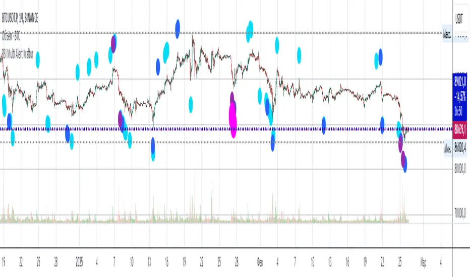
RSI Multi Alert KrafturRSI Multi Alert Kraftur
Description
The "RSI Multi-Level Signals" indicator is designed to help traders identify potential buy and sell opportunities based on RSI (Relative Strength Index) crossings of multiple customizable levels. Unlike traditional RSI indicators that focus on single overbought/oversold thresholds (e.g., 70/30), this script stands out by offering four distinct buy and sell levels for enhanced flexibility and precision. It plots signals directly on the price chart and provides real-time alerts when RSI crosses these levels, making it a powerful tool for spotting entry and exit points.
Key Features
Multi-Level RSI: Configurable buy levels (e.g., 30, 25, 20, 15) and sell levels (e.g., 70, 75, 80, 85) to capture varying degrees of overbought and oversold conditions.
Visual Signals: Buy signals are marked with circles below the bars, and sell signals above the bars, each color-coded for easy identification.
Real-Time Alerts: Generates alerts once per bar when RSI crosses a level, with a filter to prevent duplicate signals during oscillations.
Customizable: Adjustable RSI length, timeframe, and level colors to suit different trading strategies.
Recommended Usage
This indicator is best used as a scanning tool for finding entry points across multiple assets. Set up alerts for your entire watchlist of coins or stocks to detect when RSI crosses the configured levels in real time. It’s particularly effective in volatile markets or for traders employing multi-timeframe analysis. Combine it with other indicators (e.g., support/resistance or trend filters) to confirm signals and improve accuracy.
How to Use
Apply the indicator to your chart.
Customize the RSI length, timeframe, and signal levels to match your trading style.
Set up alerts for the indicator and apply them to your watchlist of assets.
Monitor the chart for buy (green) and sell (red) signals, or rely on alert notifications.
Perfect for scalpers, swing traders, or anyone looking to automate signal detection across a portfolio!
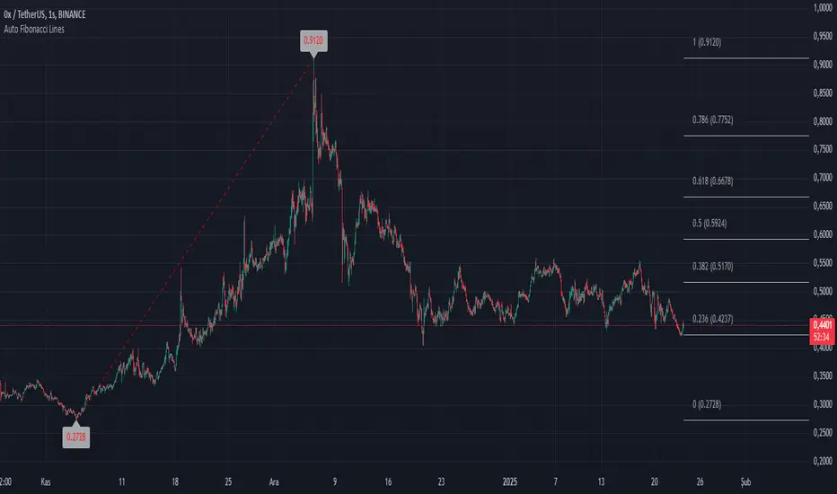
Auto Fibonacci LinesThis TradingView script is a modded version of the library called "VisibleChart" created by Pinecoder.
This version has the option for users to change the Fibonacci lines and price labels. This makes the script user-friendly.
Fibonacci extensions are a tool that traders can use to establish profit targets or estimate how far a price may travel after a retracement/pullback is finished. Extension levels are also possible areas where the price may reverse. This study automatically draws horizontal lines that are used to determine possible support and resistance levels.
It's designed to automatically plot Fibonacci retracement levels on chart, aiding in technical analysis for traders.
First, the highest and lowest bars on the chart are calculated. These values are used for Fibonacci extensions.
These values update as traders scroll or zoom their charts, this shows that it is a useful indicator that can dynamically calculate and draw visuals on visible bars only.
ADVDEC.US OSCILLATORThis Pine Script implements an ADVDEC.US Oscillator, which is an indicator designed to analyze the Advance-Decline index (ADVDEC.US) with multiple smoothing techniques and timeframes. Here's what the script does:
Symbol and Inputs:
- The script is based on the ADVDEC.US index, which measures the difference between advancing and declining stocks.
Users can adjust several settings:
- Lookback Period: Defines the number of periods over which the highest and lowest values of the ADVDEC.US index are calculated.
- Smoothing Period: Smooths the oscillator with a simple moving average (SMA) to reduce market noise.
- EMA Period: Applies an Exponential Moving Average (EMA) to the smoothed oscillator for further trend analysis.
- MTF Period: Allows for fetching data from a specified timeframe (default is 5 minutes).
Calculation:
- It calculates the highest and lowest values of the ADVDEC index over the defined lookback period.
- It normalizes the ADVDEC value into a percentage between 0 and 100, representing the position of the current value relative to the range over the lookback period.
- This raw oscillator is then smoothed with an SMA to reduce choppiness.
- Finally, an EMA is calculated on the smoothed oscillator to emphasize the trend direction.
Thresholds:
- Horizontal lines are plotted at key levels (70, 30, and 50) for visual reference, offering an "RSI-style" interpretation of the oscillator.
- The upper and lower thresholds can indicate overbought/oversold conditions, while the midline helps identify neutral levels.
Visualization:
- The smoothed oscillator is plotted in blue.
- The EMA of the smoothed oscillator is plotted in orange.
In summary, this indicator aims to visualize the relationship between advancing and declining stocks with added smoothing and trend-following elements, providing an easy-to-interpret oscillator that can be used for market analysis or decision-making.

GapAura: Dynamic Gap [AstroHub]GapAura is a powerful indicator designed to analyze and visualize price gaps on your charts. It focuses on the key levels created by gaps between the open of the current day and the close of the previous day. The indicator connects these gap levels with trend-like lines, allowing traders to easily identify significant price movements and potential turning points in the market.
GapCloud automatically differentiates between upward and downward gaps, helping traders visualize important support and resistance levels that emerge following these gaps. The lines representing these gaps behave like trend lines, providing clear and actionable insights for market analysis. Unlike traditional gap indicators, GapCloud offers a dynamic approach to gap visualization, making it easier for traders to assess the impact of price gaps on future market movement.
How to Use:
Gap Up: When the open of the current day is higher than the close of the previous day, GapCloud draws a line connecting these two levels. This visualizes the gap upward and helps identify the trend direction, as well as potential support zones.
Gap Down: When the open of the current day is lower than the close of the previous day, the indicator draws a line that connects these levels, showing a downward gap. This can highlight potential resistance levels.
The lines for each gap are connected to form continuous trend-like levels, giving traders a clear picture of market structure. These lines can also be used to identify areas of strong support or resistance, and potential turning points where the price may reverse or continue in the same direction.
What Makes This Indicator Unique:
GapCloud stands out by transforming gaps into trend-like lines, offering more than just a simple visualization of the gap itself. By connecting the open and close levels of the current and previous day, it allows traders to see how these price differences can act as significant support or resistance levels. These lines help traders spot market trends and potential reversals more clearly, giving them an edge in making more informed trading decisions.
The ability to visualize gaps as trend lines gives traders a unique advantage in understanding market behavior. Gaps are not just seen as isolated events; they are integrated into the overall market structure and can provide critical insights into the potential price direction.
In addition to this, GapCloud offers a high degree of customization. Users can adjust the thickness, style, and color of the gap lines to fit their trading preferences and style. This makes the indicator adaptable to various types of trading strategies, from short-term to long-term analysis.
Key Features:
Identifies and visualizes gaps between the open of the current day and the close of the previous day.
Converts gap levels into trend-like lines, providing clarity and actionable insights for traders.
Helps identify potential support and resistance levels based on gap locations.
Fully customizable settings, including line thickness, style, and color, to suit individual trading preferences.
Provides a dynamic approach to gap analysis, helping traders forecast market direction and potential reversals with greater accuracy.
GapCloud is an essential tool for any trader looking to enhance their market analysis. By visualizing price gaps as connected trend lines, it simplifies the process of identifying key levels and market structure, giving traders an edge in understanding price movements and making more informed decisions.
