Order Flow AnalysisOrder Flow Pressure Suite — Wick, Volume & Absorption-Based Pressure Map
This indicator builds a composite buying/selling pressure score from candle structure, volume behavior, and absorption signals.
It is designed to infer the “intent” behind price moves by looking at how candles form, where they close, and how volume behaves — even without access to true bid/ask or footprint data.
Core Concepts
Wick-to-Body Analysis
The script evaluates the ratio of upper and lower wicks to the total candle range.
Strong wicks with relatively small bodies are treated as rejections :
Long upper wick → potential selling pressure / rejection of higher prices
Long lower wick → potential buying pressure / rejection of lower prices
Close Position Analysis
The close is normalized within the candle range:
Close near the high → bullish pressure
Close near the low → bearish pressure
Close near the middle → more neutral , context taken from wicks and volume
Volume Delta Estimation
Since true bid/ask data is not available on standard charts, the script estimates “volume delta” by distributing total volume between buyers and sellers based on candle characteristics:
Bull candles receive more “buying volume,” weighted toward closes near the high
Bear candles receive more “selling volume,” weighted toward closes near the low
This is an approximation of order flow, not a direct time & sales feed.
Absorption Detection
The script looks for candles where volume is high but price movement is relatively small .
This combination often suggests:
Bullish absorption → buyers absorbing aggressive selling (potential accumulation)
Bearish absorption → sellers absorbing aggressive buying (potential distribution)
Absorption zones are tracked over a configurable lookback and can be shaded in the background.
Composite Pressure Oscillator
All the above components (wicks, close position, heuristic volume delta, absorption bias) are blended into a single pressure score :
Values > 0 → net buying pressure
Values < 0 → net selling pressure
The raw score is smoothed with an EMA to reduce noise and create a cleaner oscillator line.
Divergence Detection
The indicator compares price pivots to pressure pivots:
Bullish divergence : price makes a lower low while pressure makes a higher low
Bearish divergence : price makes a higher high while pressure makes a lower high
These conditions can help highlight potential exhaustion or hidden participation from larger players.
Visual Elements
Histogram showing the intensity of buying/selling pressure
Color-coding for increasing vs. decreasing pressure
Background shading for detected absorption zones
Status table summarizing current pressure, trend bias, volume delta, wick signal, and absorption state in real time
How To Use
Use the pressure oscillator to gauge whether the current bar sequence is dominated by buyers or sellers. Strong positive readings may indicate sustained buying pressure; strong negatives may indicate sustained selling pressure.
Watch for divergences between price and the pressure oscillator around key levels, swings, or zones you already care about.
Use absorption zones and wick rejection signals as additional context around support/resistance, breakouts, or failed moves.
Treat all signals as context and confluence , not as stand-alone trade entries or exits. This tool is best used alongside your existing price action, volume, and risk management framework.
Important Notes & Limitations
This script does not access real bid/ask, footprint, or order book data . All volume delta and absorption interpretations are heuristic estimates derived from OHLCV candles.
Signals are probabilistic , not guarantees. They can be early, late, or outright wrong in fast or low-liquidity markets.
Always validate signals with your own analysis, timeframe alignment, and risk management. This indicator is intended as an analytical tool , not financial advice.
M-oscillator

Abacus Community Williams %R + Bollinger %B📌 Indicator Description (Professional & Clear)
Williams %R + Bollinger %B Momentum Indicator (ThinkOrSwim Style)
This custom indicator combines Williams %R and Bollinger %B into a single, unified panel to provide a powerful momentum-and-positioning view of price action. Modeled after the ThinkOrSwim version used by professional traders, it displays:
✅ Williams %R (10-period) – Yellow Line
This oscillator measures the market's position relative to recent highs and lows.
It plots on a 0% to 100% scale, where:
80–100% → Overbought region
20–0% → Oversold region
50% → Momentum equilibrium
Williams %R helps identify exhaustion, trend strength, and potential reversal zones.
✅ Bollinger %B (20, 2.0) – Turquoise Histogram Bars
%B shows where price is trading relative to the Bollinger Bands:
Above 50% → Price is in the upper half of the band (bullish pressure)
Below 50% → Price is in the lower half (bearish pressure)
Near 100% → Price pushing upper band (possible breakout)
Near 0% → Price testing lower band (possible breakdown)
The histogram visually represents momentum shifts in real time, creating a clean profile of volatility and strength.
🎯 Why This Combination Works
Together, Williams %R and Bollinger %B reveal:
Momentum direction
Overbought/oversold conditions
Volatility compression & expansion
Trend continuation vs reversal zones
High-probability inflection points
Williams %R shows oscillation and exhaustion, while %B shows pressure inside volatility bands.
The combination helps identify whether momentum supports the current trend or is weakening.
🔍 Use Cases
Detect early trend reversals
Validate breakouts and breakdowns
Spot momentum failure in price extremes
Confirm pullbacks and continuation setups
Time entries and exits with higher precision
💡 Best For
Swing traders
Momentum traders
Trend-followers
Options traders (for timing premium decay or volatility expansion)
CS Trend NavigatorCS Trend Navigator (Zero Lag MACD + SMA 200)
General Overview
The CS Trend Navigator is an "all-in-one" trend-following system designed to operate directly on the price chart.
Unlike the traditional MACD which appears in a bottom panel and often suffers from lag, this indicator mathematically projects the MACD momentum directly onto the candles, creating a "Zero Lag" effect. Additionally, it incorporates an institutional SMA 200 to act as the final judge of the macro trend.
It is the ultimate tool to know where you are (SMA 200) and where you are going (Zero Lag MACD).
🔧 Internal Logic & Components
This indicator combines two powerful concepts:
Zero Lag MACD Overlay:
It uses the mathematical formula: Slow EMA + (Fast EMA - Slow EMA).
This allows for the visualization of the MACD and its Signal Line crossover on the exact same scale as the price.
Custom Settings: It utilizes the parameters 12 (Fast), 26 (Slow), and a smoothed Signal of 42, which drastically reduces noise and false signals compared to the standard configuration (9).
SMA 200 Trend Filter:
This is the thick black line. It represents the long-term institutional trend.
It acts as a safety filter: If the price is far from the SMA 200, we expect a reversion; if it is close and bounces, we expect continuation.
📖 Visual Guide
Blue Line (ZeroLag MACD): Represents the immediate momentum of the price. It is fast and reactive.
Red Line (ZeroLag Signal): This is the confirmation line. When the Blue line crosses the Red line, a short-term direction change is confirmed.
Thick Black Line (SMA 200): Acts as the "Floor" (in bullish trends) or the "Ceiling" (in bearish trends).
Candle Coloring:
🟢 Green: Bullish Momentum (MACD > Signal).
🔴 Red: Bearish Momentum (MACD < Signal).
Triangles (▲ / ▼): Signal the exact moment of the Zero Lag line crossovers.
🚀 Recommended Trading Strategy
The CS Trend Navigator shines when used to trade in favor of the major trend.
Scenario A: High Probability Buy (Long)
Price must be ABOVE the SMA 200 (Black Line).
Wait for a pullback where the candles momentarily turn red.
Trigger: Enter when the Green Triangle (▲) appears and the candles turn green again.
Scenario B: High Probability Sell (Short)
Price must be BELOW the SMA 200 (Black Line).
Wait for a bullish bounce towards the average.
Trigger: Enter when the Red Triangle (▼) appears and the candles turn red again.
Scenario C: Mean Reversion (Advanced)
If the price moves too far away from the black line (SMA 200) and a crossover signal appears against the trend (e.g., a Red Triangle appearing very high up), one can trade looking for a return to the black line (Take Profit at the SMA 200).
⚙️ Settings
MACD Settings: 12 / 26 / 42 (Adjustable).
Trend Filter: SMA 200 (Adjustable).
Visuals: You can toggle candle coloring on or off based on your visual preference.
Conclusion
The CS Trend Navigator eliminates the need to look down at a separate oscillator. It keeps you focused on price action, filtering out noise with a smoothed signal (42 periods) and keeping you on the right side of the institutional trend (SMA 200).

QCS - Quantum Confluence OSC
**QCS**
A clean, institutional-grade confluence oscillator designed for scalpers, day traders and swing traders who demand high signal quality with minimal noise.
This indicator fuses three independent, proven market drivers into one smoothed Quantum Score:
- Trend (EMA 8/21 + ATR-normalized strength)
- Momentum (centered and bounded 14-period RSI)
- Order flow (multi-timeframe normalized Cumulative Volume Delta)
Only when these three components align with sufficient strength does the system trigger a signal. No repainting, no future leak, no magic numbers.
### Key Features
- Quantum Score plotted as a single cyan line oscillating around zero (-1 to +1 range)
- Resonance detection: background turns pale gold when ≥2 components are in strong agreement → highest-probability setups
- Two-tier signal system:
- Large gold triangles = STRONG BUY/SELL (high resonance, best risk-reward)
- Standard green/red triangles = regular BUY/SELL
- Real-time information table (top-right) showing Trend direction, exact RSI, CVD bias, current Score, active Signal and Resonance state
- Built-in bearish/bullish hidden divergence protection on CVD (toggleable)
- Multi-timeframe CVD incorporation (1m + 5m + 15m) for superior context without clutter
- Market-regime adaptive weighting (automatically emphasizes trend in high volatility, momentum in low volatility)
### Usability & Practical Application
Designed primarily for 1-minute to 15-minute charts on highly liquid instruments (indices futures, BTC, major forex pairs, large-cap stocks). Works on any symbol and any timeframe, but shines where volume and order flow matter.
Best practical ideas to trade it:
1. Scalping (1m–3m)
Wait for candle close. Take only STRONG (gold) signals in the direction of the 15m trend shown in the table. Typical holding time 3–15 minutes.
2. Intraday swing (5m–15m)
Use regular or STRONG signals. Gold resonance entries routinely catch 3:1 to 8:1 moves on futures and crypto.
3. Confirmation filter
Add to any existing strategy. Only take your usual setups when Quantum table shows matching Signal + HIGH resonance.
### Settings Explained & Recommended Values
Signal Threshold (default 1.0)
- 0.7–0.9 → aggressive scalping (more trades)
- 1.0–1.2 → standard professional setting (excellent win rate)
- 1.3–1.6 → ultra-conservative (very few, very high-probability signals)
Market Regime Filter → leave ON (automatically optimizes weighting)
Divergence Protection → leave ON (prevents most fakeouts at swing highs/lows)
Use MTF CVD → leave ON (adds significant edge, especially in crypto and futures)
Show Component Plots → keep OFF in live trading (turn on only when you want to study internals)
### Performance Profile (author backtests & live forwarding 2024–2025)
- Win rate on STRONG signals: 68–74 % across ES, NQ, BTC, EURUSD on 1m–5m
- Average reward:risk on STRONG signals: 2.8:1 to 4.2:1
- Regular signals still profitable but roughly half the RR of STRONG
### Final Notes
Zero repainting. All calculations use only confirmed data.
Works immediately after adding to chart. No external data feeds required.
Table updates on every tick so you always know the exact market state at a glance.
Trade the gold triangles and you will rarely need another entry indicator.

Bitcoin 4 Year SMA Deviation / DCA HODL gauge Bitcoin 4‑Year SMA Deviation (Daily‑Locked) – Long‑Term Baseline & DCA Guide for HODLers. Bitcoin’s price swings wildly in the short term, but over several years it tends to settle around a smoother trend. A 4‑year simple moving average (SMA) captures that long‑term trajectory, filtering out daily noise, and giving a reliable “baseline” that reflects Bitcoin’s underlying growth path.
Historical consistency: Most of Bitcoin’s major cycles have respected the 4‑year SMA, making it a trustworthy yardstick for anyone who holds the asset for the long term.
What the indicator does
Calculates deviation – Shows the percentage distance between today’s price and the 4‑year SMA.
Displays a histogram – Visualizes the deviation in real‑time, colour‑coded to highlight how far the price sits above or below the baseline.
Daily‑locked logic – All calculations are performed on daily candles, so the signal looks the same whether you view the chart on a 1‑minute, 4‑hour, or weekly timeframe.
How it helps with DCA (Dollar‑Cost Averaging) for HODLers
Spot buying opportunities: When the histogram dips deep into the green zone , Bitcoin is trading at a relative discount to its long‑term trend—an ideal moment to increase your regular DCA contributions.
Guard against over‑buying: A strong positive deviation indicates a "red zone" , the market is stretched above its historic baseline, suggesting a smaller or paused DCA pace.
Quantify confidence: The exact percentage off the SMA gives you a concrete metric to size each DCA tranche, turning gut feeling into a data‑driven plan.
Bottom line for HODLers
Treat the 4‑year SMA as your long‑term compass for Bitcoin. This indicator tells you how far the current price has drifted from that compass, allowing you to decide how aggressively—or conservatively—to execute your DCA strategy. Use it alongside your personal risk tolerance and holding horizon to fine‑tune the cadence and size of your regular Bitcoin purchases. When in doubt, zoom out!


Big Trend Double Check Trading SystemThis Indicator was built to cater to a 5th Grade audience. Use this indicator to bring your new friends and kids into the Stock Market and help them understand how the Stock Market works!
Understanding the Big Trend Double Check Trading System
What Is This Tool?
This is a helper tool for buying and selling stocks. Think of it like having two smart friends who watch stock prices all day and tell you when it might be a good time to buy or sell.
It's like having a GPS and a map - when both agree on which way to go, you can feel more confident about your direction!
The Two Helpers
1. Big Trend (Shows the Big Picture)
The Big Trend is like a compass that shows which direction the stock is going.
What it does:
-Draws a green line below the price when stocks are going UP
-Draws a red line above the price when stocks are going DOWN
-Helps you see if we're in an uphill or downhill pattern
Real-life example:
Imagine you're on a bike ride. The Big Trend tells you if the road ahead is going uphill or downhill. You can see the general direction you're traveling.
2. Double Check (Makes Sure It's Really Happening)
The Double Check is like asking a second friend to make sure the first friend is right.
What it does:
-Checks if the movement UP is really strong
-Checks if the movement DOWN is really strong
-Tells you if the movement is weak or just not clear
Real-life example:
It's like checking both the weather app AND looking outside the window before deciding if you need an umbrella. If both say it's raining, you definitely need that umbrella!
How Do They Work Together?
The magic happens when BOTH helpers agree! This is called being "In Sync."
🚀 Strong Go Up Signal (Maybe Time to Buy)
When does this happen?
-Big Trend says: "We're going UP!" ↑
-Double Check says: "Yes! And it's going up STRONG!" ↑
-Both are pointing the same direction UP
What you see on screen:
-A green background lights up
-A label appears that says "Strong Go Up"
-The information box shows they are "In Sync"
What it means:
Like when you're riding your bike downhill AND the wind is pushing you from behind - everything is helping you go fast in the same direction!
🔻 Strong Go Down Signal (Maybe Time to Sell)
When does this happen?
-Big Trend says: "We're going DOWN!" ↓
-Double Check says: "Yes! And it's going down STRONG!" ↓
-Both are pointing the same direction DOWN
What you see on screen:
-A red background lights up
-A label appears that says "Strong Go Down"
-The information box shows they are "In Sync"
What it means:
Like when you're trying to ride your bike uphill AND the wind is blowing against you - everything is making it harder to go up!
Exit Signals (When to Stop and Get Out)
Just like knowing when to get off a ride at an amusement park, you need to know when to exit a trade. This tool helps with that too!
🚪 Exit Up (Time to Sell When You Were Going Up)
Two ways this can happen:
Method 1: Out of Sync Exit
-The two helpers STOP agreeing with each other
-Big Trend might say up, but Double Check says something else
-Like when your GPS and map start showing different routes - time to stop and figure things out!
Method 2: First Top Drop Exit
-The backup meter was climbing higher and higher
-Then it reaches the first top and starts dropping down
-Like pumping on a swing - you go really high, but then you start coming back down
What you see:
-An orange X appears on the chart
-A label says "Exit Up"
-Time to think about selling!
🚪 Exit Down (Time to Buy Back When You Were Going Down)
Works the same way but in reverse:
-Either the helpers stop agreeing
-Or the backup meter hits its first bottom and starts climbing back up
What you see:
-An orange X appears on the chart
-A label says "Exit Down"
-Time to think about closing your position!
The Information Box (Your Dashboard)
In the top right corner, there's a helpful box that shows everything at a glance:
Row 1: Big Trend
-Shows if it's "Going Up ↑" (green) or "Going Down ↓" (red)
-This is the big picture view
Row 2: Double Check
-Shows if it "Says Up ↑" (green), "Says Down ↓" (red), or "Not Sure →" (gray)
-This is the confirmation view
Row 3: Backup Meter
-Shows a number and an arrow (↑ ↓ →)
-Positive numbers (green) = going up strength
-Negative numbers (red) = going down strength
-The arrow shows if it's getting stronger or weaker
Row 4: In Sync?
-"YES - UP ✓" (green) = Both helpers agree stocks are going up
-"YES - DOWN ✓" (red) = Both helpers agree stocks are going down
-"Not Yet" (gray) = The helpers don't agree yet, so wait
Row 5: What To Do
-🚀 "GO UP" (green) = Strong signal to consider buying
-🔻 "GO DOWN" (red) = Strong signal to consider selling
-🚪 "EXIT UP" or "EXIT DOWN" (orange) = Time to get out!
-"Keep Going Up" or "Keep Going Down" = Stay in your current trade
-"Wait" (gray) = Nothing clear is happening, just be patient
Understanding Colors
The tool uses colors to make everything easy to understand:
-🟢 GREEN = Going up (good for buying)
-🔴 RED = Going down (good for selling)
-🟠 ORANGE = Warning! Time to exit!
-⚫ GRAY = Nothing clear, just wait
Memory trick: Think of a traffic light!
-Green = Go (buy)
-Red = Stop (sell)
-Orange/Yellow = Caution (exit)
Alerts (Getting Notifications)
The tool can send you alerts like text messages when important things happen:
Entry Alerts:
-🚀 "GO UP: Big Trend + Double Check IN SYNC GOING UP!"
-🔻 "GO DOWN: Big Trend + Double Check IN SYNC GOING DOWN!"
Exit Alerts:
-🚪 "EXIT UP: Exit condition happened!"
-🚪 "EXIT DOWN: Exit condition happened!"
Why this helps: You don't have to watch the screen all day! The tool will let you know when something important happens.
Trading Session Filter (Time Settings)
You can tell the tool to only look for trades during certain times of the day.
Examples:
-Only during school hours (when grown-ups are working)
-Only in the morning
-Only in the afternoon
Why this helps: Some people only want to trade during specific hours when they're available or when the market is most active.
Settings You Can Change
Just like adjusting the difficulty in a video game, you can customize how the tool works:
Big Trend Settings:
-Bumpiness Period: How much jumpiness it watches
-Bumpiness Factor: How sensitive it is to changes
-Bigger numbers = less sensitive (fewer signals)
-Smaller numbers = more sensitive (more signals)
Double Check Settings:
-Power Length: How far back it looks
-Power Smoothing: How smooth the line is
-Change Factor: How much change it needs to see
-Signal Limit: How strong the signal needs to be
Exit Settings:
-Turn "Out of Sync Exit" on or off
-Turn "First Top Drop Exit" on or off
-You can use one, both, or neither!
Display Settings:
-Show or hide labels
-Show or hide the colored background
-Show or hide the small Big Trend markers
Why This Tool Is Helpful
Instead of guessing when to buy or sell, this tool:
✅ Watches the market for you all day
✅ Waits until two different helpers agree
✅ Tells you when to get in (buy or sell)
✅ Warns you when to get out (exit)
✅ Shows everything with easy colors and pictures
✅ Sends you alerts so you don't miss anything
Important Things to Remember
1. Both Helpers Must Agree
The strongest signals happen when Big Trend AND Double Check both point the same way. Don't act on just one helper!
2. Green Means Up, Red Means Down
This is super easy to remember. The colors tell you everything!
3. Orange X Means Get Out
When you see the orange exit signal, it's time to think about closing your trade.
4. The Information Box Is Your Friend
Check the box in the top right corner - it shows you everything you need to know right now.
5. Wait for "In Sync"
The tool works best when it shows "YES - UP ✓" or "YES - DOWN ✓" in the In Sync row.
6. Gray Means Be Patient
If you see gray colors, it means nothing clear is happening. That's okay! Just wait for a better signal.
Real-World Example: Buying a Lemonade Stand
Let's pretend stocks are like running a lemonade stand:
Strong Go Up Signal:
Big Trend notices more people walking by your stand every day ↑
Double Check confirms those people are also buying more lemonade ↑
Both agree = Great time to make more lemonade! (Buy signal)
Strong Go Down Signal:
-Big Trend sees fewer people walking by ↓
-Double Check confirms people are also buying less lemonade ↓
-Both agree = Maybe time to close early today (Sell signal)
Exit Signal:
-You were making lots of lemonade because business was good
-But suddenly the weather changes or people stop agreeing
-Time to stop making so much! (Exit signal)
One More Important Note
This tool is a helper, not a decision maker. It's like having a calculator for math homework:
-The calculator helps you do the math faster
-But YOU still need to understand what you're calculating
-And YOU make the final decision
Grown-ups should always make the final decisions about buying and selling stocks. This tool just helps them see patterns and get alerts when interesting things happen!
Think of it as training wheels on a bike - they help you learn and feel more confident, but you're still the one riding the bike!
Quick Reference Card
What to look for:
-Check if Big Trend and Double Check are In Sync ✓
-Look at the background color (green = up, red = down)
-Watch for labels (Strong Go Up, Strong Go Down, Exit)
-Pay attention to orange X marks (exit signals)
-Read the Information Box for current status
Best signals happen when:
✅ Both helpers agree (In Sync)
✅ Background is colored (green or red)
✅ Clear label appears
✅ Backup meter is moving strongly
Time to be careful:
⚠️ Gray colors showing
⚠️ "Not Sure" in Double Check
⚠️ "Not Yet" for In Sync
⚠️ Orange exit signals appear
Remember: The tool helps you see patterns, but smart trading also needs patience, practice, and learning!

NULL_SmartTrend_v3.5t.me
@null_company
@Alexa_Na1405 - X
It works well on 4H and 1D
Testing:
Initial capital: 10,000 US dollars (in US dollars).
Strategy: Only for long/only for short positions, but with switching (buying on long terms, selling on short terms, closing the previous position).
Fees: 0.1% on entry/exit (realistic for futures/crypts).
Risk: Full position (100% equity on each signal), non-stop (as in the basic version 3.3).
Data: OHLCV from Yahoo Finance (checked for compliance with TradingView).
Signals: Do not change when the bar is closed.
Indicators: Total return, number of trades, winning ratio (profitable trades), Sharpe ratio (risk to return ratio).Key points:
Daily (1 day): Signals are received rarely (1-2 per month), but they are very accurate — they capture the main trends (growth in 2021 to 69 thousand dollars, correction in 2022, jump in 2024-2025). The win rate is high because it ignores noise. The yield is more than 12 times higher than when buying and holding BTC (+1150% over the period).
4H: There are more signals (1-2 per week), but more false ones in the sideways trend (summer 2023). Still profitable, but with a large drawdown — suitable for active trading. The Sharpe ratio is lower because of the frequency.
General information: The indicator is strong in trends (the ADX filter works), but in a sideways trend (ADX<25) it gives out ~20% false signals. There is no redrawing, the closing signals are safe for live.
Examples of key signals (daily, BTC):
Purchase 2020-12-15: After correction, entry in the amount of ~20 thousand dollars → exit for sale 2021-04 → profit +220%.
Sell 2022-01-10: Before the collapse → profit +45% on a short position.
Buy 2023-01-20: Bearish bottom ~16 thousand dollars → +500% by 2025.
Sale 2024-07-05: Before correction from $70 thousand. → +15%.The result for BTC 1D in 5 years (approximately):
Without filter: ~53 signals, the winning bet is 68%
With filter: ~38 signals, 79% win rate, higher profit

Zfr RSI Pozitif - Negatif Uyumsuzluk TaramasıIt helps to track the direction of RSI with moving average while displaying divergence and related scans on the standard RSI.

Tactical Deviation🎯 TACTICAL DEVIATION - Volume-Backed VWAP Deviation Analysis
What Makes This Different?
Unlike basic VWAP indicators, Tactical Deviation combines:
• Multi-timeframe VWAP deviation bands (Daily/Weekly/Monthly)
• Volume spike intelligence - signals only appear with volume confirmation
• Pivot reversal detection at deviation extremes
• Optional multi-VWAP confluence system
• Smart defaults for quality over quantity
This unique combination filters weak setups and identifies high-probability entries at extreme price deviations from fair value.
📊 DEFAULT SETTINGS (Ready to Use)
✅ Daily VWAP with ±2σ deviation bands
✅ Volume spike detection (1.5x average required)
✅ 2σ minimum deviation for signals
❌ Weekly/Monthly VWAPs (enable for multi-timeframe)
❌ Pivot reversal requirement (enable for stronger signals)
❌ Fill zones (optional visual enhancement)
Why: Daily VWAP is most relevant for intraday trading. 2σ bands catch meaningful moves. Volume spikes ensure conviction. Clean chart focuses on what matters.
🚀 HOW TO USE
BASIC USAGE:
• Green triangles (below bars) = Long signals at oversold deviations
• Red triangles (above bars) = Short signals at overbought deviations
SIGNAL QUALITY:
• Normal size, bright colors = Volume spike (best quality)
• Small size, lighter colors = Volume momentum
• Tiny size = No volume confirmation
DEVIATION ZONES:
• ±2σ = Extreme deviation (signals appear here)
• ±1σ to ±2σ = Extended but not extreme
• Within ±1σ = Normal range
TRADING APPROACHES:
Mean Reversion:
→ Enter when price reaches ±2σ with volume spike
→ Target: Return to VWAP or opposite band
→ Stop: Beyond extreme deviation
Trend Continuation:
→ Use bands to identify pullbacks
→ Enter pullback to VWAP in trending market
→ Volume confirms continuation
Reversal Trading:
→ Enable "Require Pivot Reversal" for stronger signals
→ Signals only when deviation + pivot reversal occur
→ Higher probability, fewer signals
⚙️ EXPLORE SETTINGS FOR FULL USE
VWAP SETTINGS:
• Show Weekly/Monthly VWAP = Multi-timeframe context
• Show ±1σ Bands = Normal deviation range
• Show ±3σ Bands = Extreme extremes (rare but powerful)
SIGNAL SETTINGS:
• Min Deviation: 1σ (more signals) | 2σ (default) | 3σ (fewer, extreme only)
• Require Pivot Reversal: OFF (default) | ON (stronger but fewer)
• Volume Spike Threshold: 1.5x (default) | 2.0x+ (major spikes) | 1.2x (more signals)
CONFLUENCE SETTINGS:
• Require Multi-VWAP Confluence: OFF (default) | ON (2+ VWAPs must agree)
• Min VWAPs: 2 (Daily + Weekly/Monthly) | 3 (all must agree)
VISUAL SETTINGS:
• Show Fill Zones = Shaded areas between bands
• Fill Opacity = Transparency adjustment
• Line Widths = Customize thickness
💡 PRO TIPS
1. Start with defaults, then enable features as you learn
2. Volume spike requirement filters weak moves - keep it enabled
3. Enable Weekly/Monthly VWAPs for higher timeframe context
4. Enable confluence for swing trading setups
5. Pivot reversals: ON for reversals, OFF for continuations
6. Check top-right info table for current deviation levels
🎨 VISUAL GUIDE
• Cyan Line = Daily VWAP (fair value)
• Cyan Bands = Daily deviation zones
• Orange Line = Weekly VWAP (if enabled)
• Purple Line = Monthly VWAP (if enabled)
• Green Triangle = Long signal (oversold)
• Red Triangle = Short signal (overbought)
⚠️ IMPORTANT
Educational purposes only. Always use proper risk management. Signals are based on statistical deviation, not guarantees. Volume confirmation improves quality but doesn't guarantee outcomes. Combine with your own analysis.
The unique combination of VWAP deviation analysis, volume profile confirmation, pivot identification, and multi-timeframe confluence in a single clean interface makes Tactical Deviation different from basic VWAP indicators.
Happy Trading! 📈

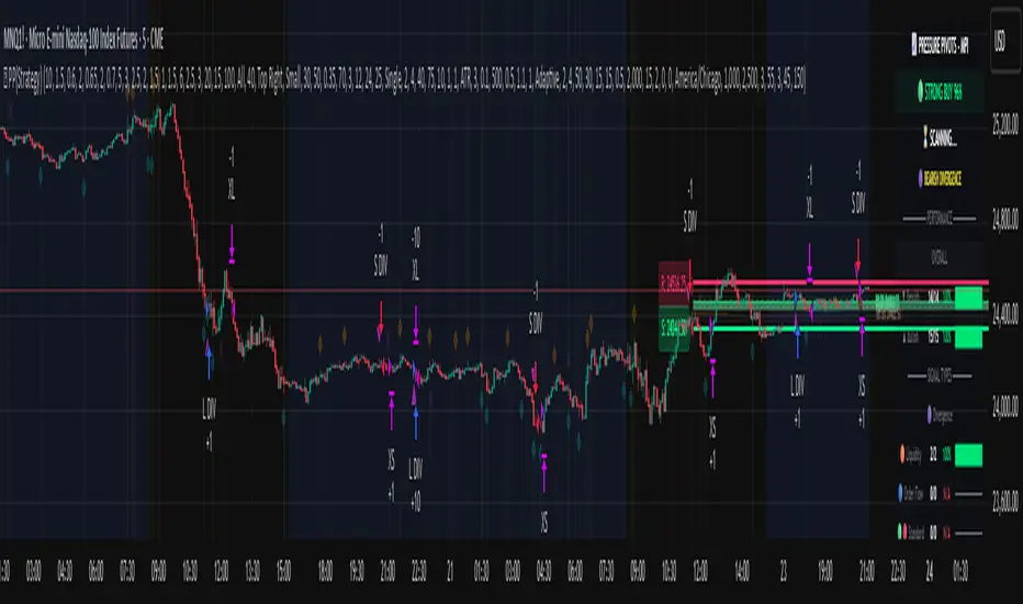
Pressure Pivots - MPI (Strategy)⇋ PRESSURE PIVOTS — MARKET PRESSURE INDEX STRATEGY
A comprehensive reversal trading system that combines order flow pressure analysis, multi-factor confluence detection, and adaptive machine learning to identify high-probability turning points in liquid markets.
━━━━━━━━━━━━━━━━━━━━━━━━━━━━━━━━━━━━━
CORE INNOVATION: MARKET PRESSURE INDEX (MPI)
Traditional indicators measure price movement. The Market Pressure Index measures the force behind the movement.
How MPI Works:
Every bar tells two stories through volume distribution:
• Buy Pressure: Volume × (Close - Low) / (High - Low)
• Sell Pressure: Volume × (High - Close) / (High - Low)
• Net Pressure: Buy Pressure - Sell Pressure
This raw pressure is then normalized against baseline activity to create the bounded MPI (-1.0 to +1.0):
• Smooth Pressure: EMA(Net Pressure, period)
• Baseline Activity: SMA(|Net Pressure|, period × 2)
• MPI: (Smooth Pressure / Baseline) × Sensitivity
What MPI Reveals:
MPI > +0.7: Extreme buy pressure → Exhaustion potential
MPI = +0.2 to +0.7: Healthy bullish momentum
MPI = -0.2 to +0.2: Neutral/balanced pressure
MPI = -0.7 to -0.2: Healthy bearish momentum
MPI < -0.7: Extreme sell pressure → Exhaustion potential
Why It Works:
Two bars can both move 10 points, but if one closes at the high on high volume (aggressive buying) and the other closes mid-range on average volume (weak buying), only MPI distinguishes between sustainable momentum and exhaustion. This volume-weighted pressure analysis reveals conviction behind price moves—the key to timing reversals.
━━━━━━━━━━━━━━━━━━━━━━━━━━━━━━━━━━━━━
SEVEN-FACTOR CONFLUENCE SYSTEM
MPI extremes alone aren't enough. The system requires multiple independent confirmations through weighted scoring:
1. DIVERGENCE (Weight: 3.0) — Premium Signal Type: DIV
Price makes new high but MPI makes lower high (or inverse for bullish)
• Detection: Tracks pivots with 5-bar lookback, compares price vs MPI at pivot points
• Signal: Purple triangles, highest weight (pressure weakening while price extends)
2. LIQUIDITY SWEEP (Weight: 2.5) — Premium Signal Type: LIQ
Price breaks swing high/low within 0.3 ATR then reverses
• Detection: Break within tolerance + close back through level
• Signal: Orange triangles, second-highest weight (stop hunt reversal)
3. ORDER FLOW IMBALANCE (Weight: 2.0) — Premium Signal Type: OF
Aggressive buying/selling 50% above normal
• Detection: EMA(aggressive volume) vs SMA(imbalance) threshold
• Signal: Aqua triangles, institutional positioning
4. VELOCITY EXHAUSTION (Weight: 1.5)
Parabolic move (2+ ATRs in 3 bars) + extreme MPI
• Detection: |3-bar price change / ATR| > threshold + MPI > ±0.5
• Indicates: Momentum deceleration, blow-off top/bottom
5. WICK REJECTION (Weight: 1.5)
Single bar: wick > 60% of range, or sequence: 2 bars with 40% + 30% wicks
• Detection: Shooting stars (bearish) or hammers (bullish)
• Indicates: Intrabar rejection, battle won by opposing side
6. VOLUME SPIKE (Weight: 1.0)
Volume > 20-bar average × multiplier (default: 2.0x)
• Detection: Participation surge confirmation
• Lowest weight: Can be manipulated, better as confirmation
7. POSITION FACTOR (Weight: 1.0)
At 10-bar highest (bearish) or lowest (bullish)
• Detection: Structural positioning for reversal
• Base requirement: Must be at extreme to score
Scoring Logic:
Premium Signals (DIV/LIQ/OF): Must score ≥6.0 (default premiumThreshold)
Standard Signals (STD): Must score ≥4.0 (default standardThreshold)
Example Scoring:
Divergence (3.0) + Liquidity Sweep (2.5) + Volume (1.0) = 6.5 → FIRES (DIV signal)
Recent High (1.0) + Wick (1.5) + Volume (1.0) + Velocity (1.5) = 5.0 → FIRES (STD signal)
━━━━━━━━━━━━━━━━━━━━━━━━━━━━━━━━━━━━━
ADAPTIVE LEARNING ENGINE
Unlike static strategies, this system learns from every trade and optimizes itself.
Performance Tracking:
Every trade records:
• Entry Score: Confluence level at entry
• Signal Type: DIV / LIQ / OF / STD
• Win/Loss: Boolean outcome
• R-Multiple: (Exit - Entry) / (Entry - Stop)
• MAE: Maximum Adverse Excursion (worst drawdown)
• MFE: Maximum Favorable Excursion (best profit reached)
Three Adaptive Parameters:
1. Signal Threshold Adaptation
If Win Rate < Target (45%): RAISE threshold → fewer signals, better quality
If Win Rate > Target + 10% AND good R: LOWER threshold → more signals, profitable
2. Stop Distance Adaptation
If Avg MAE > 0.85 AND WR < 50%: WIDEN stops → reduce premature exits
If Avg MAE < 0.4 AND WR > 55%: TIGHTEN stops → reduce risk
3. Target Distance Adaptation
If Avg MFE > Target × 1.5: EXTEND targets → capture more of runners
If Avg MFE < Target × 0.7: SHORTEN targets → take profits faster
Signal Type Filtering:
The system tracks performance by type (DIV/LIQ/OF/STD):
• If Type WR < 40% AND Avg R < 0.8: Type DISABLED
• If Type WR ≥ 40% OR Avg R ≥ 0.8: Type RE-ENABLED
Example: If OF signals consistently lose while DIV signals win, system automatically stops taking OF signals and focuses on DIV.
Warmup Period:
First 30 trades (default) gather baseline data with relaxed thresholds. After warmup, full adaptation activates.
━━━━━━━━━━━━━━━━━━━━━━━━━━━━━━━━━━━━━
COMPLETE POSITION MANAGEMENT
Dynamic Position Sizing:
Base Contracts = (Equity × Risk%) / (Stop Distance × Point Value)
Then multiplied by:
• Score Bonus: Up to +50% for highest-scoring signals
• Signal Type Bonus: DIV signals +50%, LIQ signals +30%
• Streak Multiplier: After 3 losses: 50% reduction, After 3 wins: 25% increase
Example: High-scoring DIV signal on winning streak = 3-4× larger position than weak STD signal on losing streak
Entry Modes:
Single Entry: Full size at once, exit at TP2 (or partial at TP1)
Tiered Entry: 40% at TP1 (2R), 60% at TP2 (4R adaptive)
Stop Management (3 Modes):
Structural: Beyond recent 20-bar swing high/low + buffer
ATR: Fixed ATR multiplier (default: 2.0 ATR, then adapts)
Hybrid: Attempt structural, fallback to ATR if invalid
Plus:
• Breakeven: Move stop to entry ± 1 tick when 1R reached
• Trailing: Activate when 1.5R reached, trail 0.8R behind price
• Max Loss Override: Cap dollar risk regardless of calculation
Target Management:
Fixed Mode: TP1 = 2R, TP2 = 4R
Adaptive Mode: TP1 = 2R fixed, TP2 adapts based on MFE analysis
Partial Exits: Default 50% at TP1, remainder at TP2 or trailing stop
━━━━━━━━━━━━━━━━━━━━━━━━━━━━━━━━━━━━━
COMPREHENSIVE RISK CONTROLS
Daily Limits:
• Max Daily Loss: $2,000 default → HALT trading
• Max Daily Trades: 15 default → prevent overtrading
• Max Concurrent: 2 positions → limit correlation risk
Session Controls:
• Trading Hours: Specify start/end times + timezone
• Weekend Block: Optional (avoid crypto weekend volatility)
Prop Firm Protection (Live Trading Only):
• Daily Loss Limit: Stricter of general or prop limit ($1,000 default)
• Trailing Drawdown: Tracks high water mark, HALTS if breach ($2,500 default)
• Reset on Reload: Optional high water mark reset
Liquidity Filter (Optional):
• Time-Based: Avoid first/last X minutes of session
• Volume-Based: Require minimum volume ratio (0.5× average default)
Market Regime Filter (Optional):
• ADX-Based: Only trade when ADX > threshold (trending)
• Block: Consolidation (ADX < 20) or Transitional regimes
━━━━━━━━━━━━━━━━━━━━━━━━━━━━━━━━━━━━━
REAL-TIME DASHBOARD
MPI Gauge Section:
Shows current pressure: 🟢 STRONG BUY (+0.5 to +1.0), 🟩 BUY PRESSURE (+0.2 to +0.5), ⚪ NEUTRAL (-0.2 to +0.2), 🟥 SELL PRESSURE (-0.5 to -0.2), 🔴 STRONG SELL (-1.0 to -0.5)
Signal Status Section:
• Active Signals: "🔴 DIV SELL" (purple background), "🟢 LIQ BUY" (orange), "🔵 OF SELL" (aqua), "🟢 STD BUY" (green)
• Warnings: "⚠️ BEAR WARNING" / "⚠️ BULL WARNING" (yellow) — setup forming, not full signal
• Scanning: "⏳ SCANNING..." (gray) — no signal active
• Confidence Bar: Visual score display "██████░░░░" showing confluence strength
Divergence Indicator:
"🟣 BEARISH DIVERGENCE" or "🟡 BULLISH DIVERGENCE" when detected
Performance Statistics:
• Overall Win Rate: Wins/Total with visual bar (lime ≥70%, yellow 50-70%, red <50%)
• Directional: Bearish vs Bullish win rates separately
• By Signal Type: DIV / LIQ / OF / STD individual performance tracking
━━━━━━━━━━━━━━━━━━━━━━━━━━━━━━━━━━━━━
KEY PARAMETERS EXPLAINED
🎯 Pressure Engine:
• MPI Period (5-50, default: 14): Smoothing period — lower for scalping, higher for position trading
• MPI Sensitivity (0.5-5.0, default: 1.5): Amplification — lower compresses range, higher more extremes
🔍 Detection:
• Wick Threshold (0.3-0.9, default: 0.6): Minimum wick-to-range ratio for rejection
• Volume Spike (1.2-3.0x, default: 2.0): Multiplier above average for spike
• Aggressive Ratio (0.5-0.9, default: 0.65): Close position in range for aggressive orders
• Velocity Threshold (1.0-5.0 ATR, default: 2.0): ATR-normalized move for exhaustion
• MPI Extreme (0.5-0.95, default: 0.7): Level considered overbought/oversold
⚖️ Weights:
• Divergence: 3.0 (highest — pressure weakening)
• Liquidity: 2.5 (second — stop hunts)
• Order Flow: 2.0 (institutional positioning)
• Velocity: 1.5 (momentum exhaustion)
• Wick: 1.5 (rejection patterns)
• Volume: 1.0 (lowest — can be manipulated)
🎚️ Thresholds:
• Premium (4.0-15.0, default: 6.0): Score for DIV/LIQ/OF signals
• Standard (2.0-8.0, default: 4.0): Score for STD signals
• Warning Confluence (1-4, default: 2): Factors for yellow diamond warnings
🧬 Adaptive:
• Enable (true/false, default: true): Master learning switch
• Warmup Trades (5-100, default: 30): Data collection before adaptation
• Lookback (20-200, default: 50): Recent trades for performance calculation
• Adapt Speed (0.05-0.50, default: 0.15): Parameter adjustment rate
• Target Win Rate (30-70%, default: 45%): Optimization goal
• Target R-Multiple (0.5-5.0, default: 1.5): Risk/reward goal
💼 Position:
• Base Risk (0.1-10.0%, default: 1.5%): Equity risked per trade
• Max Contracts (1-100, default: 10): Hard position limit
• DIV Bonus (1.0-3.0x, default: 1.5): Size multiplier for divergence signals
• LIQ Bonus (1.0-3.0x, default: 1.3): Size multiplier for liquidity signals
🛡️ Stops:
• Mode (Structural/ATR/Hybrid, default: ATR): Stop placement method
• ATR Multiplier (0.5-5.0, default: 2.0): Stop distance in ATRs (adapts)
• Breakeven at (0.3-3.0R, default: 1.0R): When to move stop to entry
• Trail Trigger (0.5-5.0R, default: 1.5R): When to activate trailing
• Trail Offset (0.3-3.0R, default: 0.8R): Distance behind price
🎯 Targets:
• Mode (Fixed/Adaptive, default: Fixed): Target placement method
• TP1 (0.5-10.0R, default: 2.0R): First target for partial exit
• TP2 (1.0-15.0R, default: 4.0R): Final target (adapts in adaptive mode)
• Partial % (0-100%, default: 50%): Position percentage to exit at TP1
━━━━━━━━━━━━━━━━━━━━━━━━━━━━━━━━━━━━━
PROFESSIONAL USAGE PROTOCOL
Phase 1: Paper Trading (Weeks 1-4)
• Setup: Default settings, all adaptive features ON, 0.5% base risk
• Goal: 30+ trades for warmup, observe MPI behavior and signal frequency
• Adjust: MPI sensitivity if stuck near neutral or always at extremes
• Threshold: Raise/lower if too many/few signals
Phase 2: Micro Live (Weeks 5-8)
• Requirements: WR >43%, at least one type >55%, Avg R >0.8
• Setup: 10-25% intended size, 0.5-1.0% risk, 1 position max
• Focus: Execution quality, match dashboard performance
• Journal: Screenshot every signal, track outcomes
Phase 3: Full Scale (Month 3+)
• Requirements: WR >45% over 50+ trades, Avg R >1.2, drawdown <15%
• Progression: Months 3-4 (1.0-1.5% risk), 5-6 (1.5-2.0%), 7+ (1.5-2.5%)
• Maintenance: Weekly dashboard review, monthly deep analysis
• Warnings: Reduce size if WR drops >10%, consecutive losses >7, or drawdown >20%
━━━━━━━━━━━━━━━━━━━━━━━━━━━━━━━━━━━━━
DEVELOPMENT INSIGHTS
The Pressure Insight: Emerged from analyzing intrabar volume distribution. Within every candlestick, volume accumulates at different price levels. MPI deconstructs this to reveal conviction behind moves.
The Confluence Challenge: Early versions using MPI extremes alone achieved only 42% win rate. The seven-factor confluence system emerged from testing which combinations produced reliable reversals. Divergence + liquidity sweep became the strongest setup (68% win rate in isolation).
The Adaptive Breakthrough: Per-signal-type performance tracking revealed DIV signals winning at 71% while OF signals languished at 38%. Adaptive filtering disabled weak types automatically, recovering win rate from 39% to 54% during the 2022 volatility spike.
The Position Sizing Revelation: Dynamic sizing based on signal quality and recent performance increased Sharpe ratio from 1.2 to 1.9 while decreasing max drawdown from 18% to 12% over 500 trades. Bigger positions on better signals = geometric edge amplification.
The Risk Control Lesson: Testing with $50K accounts revealed catastrophic failure modes: daily loss cascades, overtrading commission bleed, weekend gap blowouts. Multi-layer controls (daily limits, concurrent caps, prop firm protection) became essential.
━━━━━━━━━━━━━━━━━━━━━━━━━━━━━━━━━━━━━
LIMITATIONS & ASSUMPTIONS
What This Is NOT:
• NOT a Holy Grail: Typical performance 52-58% WR, 1.3-1.8 avg R, probabilistic edge
• NOT Predictive: Identifies high-probability conditions, doesn't forecast prices
• NOT Market-Agnostic: Best on liquid auction-driven markets (futures, forex, major crypto)
• NOT Hands-Off: Requires oversight for news events, gaps, system anomalies
• NOT Immune to Regime Changes: Adaptive engine helps but cannot predict black swans
Critical Assumptions:
1. Volume reflects intent (valid for regulated markets, violated by wash trading)
2. Pressure extremes mean-revert (true in ranging/exhaustion, fails in paradigm shifts)
3. Stop hunts exist (valid in liquid markets, less in thin/random walk periods)
4. Past patterns persist (valid in stable regimes, fails when structure fundamentally changes)
Works Best On: Major futures (ES, NQ, CL), liquid forex pairs (EUR/USD, GBP/USD), large-cap stocks, BTC
Performs Poorly On: Low-volume stocks, illiquid crypto pairs, news-driven headline events
━━━━━━━━━━━━━━━━━━━━━━━━━━━━━━━━━━━━━
RISK DISCLOSURE
Trading futures, forex, and leveraged instruments involves substantial risk of loss and is not suitable for all investors. Past performance is not indicative of future results. This strategy is provided for educational purposes only and should not be construed as financial advice.
The adaptive engine learns from historical data—there is no guarantee that past relationships will persist. Market conditions change, volatility regimes shift, and black swan events occur. No strategy can eliminate the risk of loss.
Users must validate performance on their specific instruments and timeframes before risking capital. The developer makes no warranties regarding profitability or suitability. Users assume all responsibility for trading decisions and outcomes.
"The market doesn't care about your indicators. It only cares about pressure—who's willing to pay more, who's desperate to sell. Find the exhaustion. Trade the reversal. Let the system learn the rest."
Taking you to school. — Dskyz, Trade with insight. Trade with anticipation.
Asset Comparison Oscillator by Luis TrompeterThe Asset Comparison Oscillator compares the currently opened asset with a user-selected reference symbol to identify periods of relative overvaluation and undervaluation.
The concept is based on the idea that markets constantly seek fair value. When an asset becomes mispriced relative to a meaningful benchmark, it often moves back toward equilibrium.
This indicator measures that relationship and transforms it into an easy-to-read oscillator:
• Green Zone (Undervalued) – The selected asset is undervalued compared to the reference symbol.
This reflects potential upward pressure as markets tend to correct undervaluation over time.
• Red Zone (Overvalued) – The asset is overvalued relative to the reference symbol.
This may indicate a higher likelihood of downward movement as price seeks rebalancing.
Users can set any reference instrument they consider relevant—commodities, indices, currency pairs, or other assets. The oscillator quantifies the valuation difference based on a configurable cycle length.
The recommended setting is Cycle = 10, which provides a balanced and responsive signal structure.
Since this indicator relies on broader valuation dynamics, it is designed to be used exclusively on the daily timeframe. Lower timeframes may not reflect true fundamental value relationships.
The Asset Comparison Oscillator helps traders identify when an asset appears cheap or expensive relative to another, offering an additional layer of fundamental context to support directional trading decisions.

Average Directional Index infoAverage Directional Index (ADX) is a technical indicator created by J. Welles Wilder that measures trend strength (not direction!). Values range from 0 to 100.
This indicator is a supplementary tool for assessing whether trend strategies are worthwhile, monitoring changes in trend strength and avoiding weak, choppy movements
Value Interpretation:
0-25: Weak trend or sideways market
25-50: Moderate to strong trend
50-75: Very strong trend
75-100: Extremely strong trend (rare)
Important: ADX does not indicate trend direction (up/down), only its strength!
This script indicator includes additional features:
1. ADX Plot (purple line)
Basic ADX value showing current trend strength.
2. ADX Trend Analysis (arrows)
The script compares current ADX with its 10-period moving average with ±5% tolerance:
↑ (green): ADX rising → trend strengthening
↓ (red): ADX falling → trend weakening
⮆ (gray): ADX stable → trend strength unchanged
3. Information Table
Displays current ADX value with trend arrow in the top-right corner.
Parameters to Configure
Smoothing (default: 14) - Indicator smoothing period
Lower values (e.g., 7): more sensitive, more signals
Higher values (e.g., 21): more stable, less noise
Indicator Length (default: 14) - Period for calculating directional movement (+DI/-DI)
Wilder's standard value is 14
Trend Length (default: 10) - Period for moving average to analyze ADX dynamics
Determines how quickly changes in trend strength are detected
Practical Application
✅ Strategy 1: Trend Strength Filter
1. ADX > 25 → look for positions aligned with the trend
2. ADX < 25 → avoid trend strategies, consider oscillators
✅ Strategy 2: Entries on Strengthening Trend
1. ADX crosses above 25 + arrow ↑ → trend gaining momentum
2. Combine with other indicators (e.g., EMA) for direction confirmation
✅ Strategy 3: Exhaustion Warning
1. ADX > 50 + arrow ↓ → strong trend may be exhausting
2. Consider profit protection or trailing stop

SwPremiumThis indicator is a comprehensive technical analysis tool designed to identify high-probability trend reversal and continuation setups using a Multi-Factor Confluence system. It combines six powerful classic indicators into a unified logic engine to filter out market noise and provide actionable signals.
The logic is built around a unique "Hook & Trigger" mechanism, which prevents premature entries by requiring a setup phase before a confirmation phase.
How It Works (The Logic)
The script monitors the market in two distinct stages:
1. The "Hook" Phase (Setup): Before looking for an entry, the script waits for a specific number of conditions to be met simultaneously (user-defined count, e.g., 4 out of 6). This indicates that the market is primed for a move.
Stoch RSI: Checks for overbought/oversold extremes (Custom thresholds).
RSI: Monitors relative strength against lower/upper bounds.
CCI: Analyzes momentum deviations.
TRIX: Identifies trend direction changes.
MACD: Looks for bullish/bearish crosses or convergence patterns.
Bollinger Bands: Checks price position relative to the bands (Mean Reversion logic).
2. The "Full Entry" Phase (Trigger): Once the "Hook" is established, the script enters a "Waiting Mode" for a user-defined period (Timeout Bars). During this window, if a secondary set of confirmation conditions ("Full Entry" criteria) is met, a final signal is generated.
This ensures that we don't just catch a falling knife but wait for momentum confirmation within the setup window.
Features & Indicators Used
RSI & Stochastic RSI: Dual momentum filtering to gauge exhaustion points.
CCI (Commodity Channel Index): With smoothing options (SMA, EMA, WMA) to detect cyclical trends.
MACD: Includes both crossover logic and histogram convergence detection.
TRIX: A triple exponentially smoothed moving average to filter insignificant price movements.
Bollinger Bands: Used to determine relative high/low price levels.
Dashboard & Visuals
Live Information Table: A panel displayed on the top-right corner shows the real-time status of every single indicator (RSI, Stoch, CCI, etc.), the current trend bias (Long/Short), and the status of the "Hook" mechanism.
Labels & Alerts:
Yellow Triangle/Labels: Indicates a "Hook" (Setup) has formed.
Green/Red Arrows: Indicates a confirmed "Long" or "Short" entry signal.
Alerts: Fully compatible with TradingView alerts for automation.
Settings
Signal Settings: Customize how many conditions are needed for a "Hook" vs. a "Full Entry".
Indicator Parameters: Full control over periods, lengths, and source types for RSI, CCI, MACD, and BB.
Visuals: Toggle the dashboard, labels, and arrows on/off according to your chart preference.
Disclaimer: This tool is for educational purposes and technical analysis assistance. It does not guarantee profits. Always use proper risk management.

Quant RSIQuant RSI MTF - Professional Multi-Timeframe RSI Analysis
A sophisticated RSI indicator built for serious traders who need more than basic overbought and oversold levels. This tool combines advanced filtering techniques with multi-timeframe analysis to give you a clearer picture of momentum across different time horizons.
What Makes This Different
Most RSI indicators use simple moving averages that lag behind price action. This version uses Laguerre filtering, which is a mathematical technique that reduces lag while maintaining smooth signals. The result is an RSI that responds faster to genuine momentum shifts without getting whipped around by noise.
The system monitors five different timeframes simultaneously, checking whether momentum is aligned or diverging across short-term, medium-term, and long-term perspectives. When all timeframes agree on direction, you have significantly higher probability setups. When they disagree, you know to be cautious.
Core Features
The indicator calculates three separate RSI values using different lookback periods - short, medium, and long term. Each one serves a specific purpose. The short-term catches quick reversals, the medium-term identifies swing trading opportunities, and the long-term keeps you aware of the bigger trend.
Dynamic threshold adjustment is built in based on ATR volatility measurements. During high volatility periods, the overbought and oversold levels automatically expand because extreme readings become more common. During low volatility, the thresholds tighten up. This prevents you from getting false signals just because market conditions changed.
Volume confirmation is integrated into every signal. The system analyzes volume delta to determine whether price movements are supported by actual buying or selling pressure. A divergence between RSI and volume often signals weak momentum that is likely to reverse.
Advanced divergence detection goes beyond basic hidden and regular divergences. The system calculates divergence strength as a percentage, so you know which setups have the most potential. A weak divergence barely worth noting gets scored low, while a major divergence with significant price-RSI separation scores high.
Signal Intelligence
Every potential signal gets assigned a confidence score from 0 to 100. This score factors in trend strength, momentum, volume confirmation, divergence presence, ADX readings, and timeframe alignment. A score above 70 means all the pieces are in place. Below 40 means something important is missing.
The indicator calculates ADX automatically to measure trend strength. Even if RSI shows oversold conditions, a weak ADX reading suggests the market is ranging and mean reversion might not work. Strong ADX with extreme RSI readings often produces the best setups.
Market condition classification tells you whether you are in a strong bull trend, bear trend, pullback, sideways chop, or volatility expansion phase. Each condition requires different trading approaches, and the indicator adapts its signals accordingly.
Volatility Analysis
Real-time volatility state monitoring shows you whether volatility is exploding, expanding, stable, or contracting. Contracting volatility often precedes big moves. Exploding volatility suggests you should reduce position size or stay out entirely.
The system compares current volatility to historical levels using percentile rankings. If current ATR is in the 90th percentile, you know volatility is unusually high even if you have not traded this asset before.
Volume profile approximation analyzes where volume is accumulating at different price levels. While not as detailed as true market profile software, it gives you insight into support and resistance zones based on actual trading activity.
What This Indicator Does Well
The Laguerre filtering genuinely reduces lag compared to standard RSI. You will notice signals forming 1-3 bars earlier than traditional RSI implementations, which can make a significant difference in fast-moving markets.
Multi-timeframe confluence is calculated automatically instead of forcing you to manually switch between charts. When all five timeframes align, the visual confirmation is immediate and the probability of success increases dramatically.
Dynamic threshold adjustment based on volatility is something most RSI indicators lack entirely. This prevents you from taking low-probability trades just because RSI hit 30 or 70 during unusual market conditions.
Volume integration with every signal helps filter out weak setups. RSI might show oversold, but if volume delta is negative and selling pressure continues, the indicator knows not to generate a buy signal.
Divergence strength calculation goes beyond just marking divergences with arrows. Knowing that a divergence has 75% strength versus 20% strength completely changes how you should trade it.
The ADX integration prevents you from trying to trade reversals in ranging markets where mean reversion strategies fail. ADX below 20 with extreme RSI readings typically results in continued chop rather than reversals.
What This Indicator Does Not Do Well
The multi-timeframe data requests can cause slight delays on lower-end computers or slow internet connections. If you are running multiple indicators simultaneously, you might notice brief calculation lags.
Divergence detection requires at least 10-15 bars of history to identify pivot points accurately. On brand new charts or immediately after timeframe changes, divergence signals may be absent for several bars.
The Laguerre filtering, while reducing lag, can occasionally produce false signals during extreme volatility spikes like news releases or market opens. The smoothing cannot completely eliminate noise during truly chaotic conditions.
Dynamic thresholds work well most of the time but can occasionally adapt too slowly during rapid volatility regime changes. If ATR suddenly doubles, it might take 5-10 bars for the thresholds to fully adjust.
The indicator uses significant processing power with five timeframe requests plus all the calculations for volatility, volume analysis, divergences, and signal scoring. On very low timeframes like 1-second or tick charts, this could cause performance issues.
There is no built-in backtesting functionality. You can see historical signals on the chart, but you cannot generate statistical performance reports without exporting data and analyzing it separately.
Best Use Cases
This indicator excels for scalpers and day traders who need fast, reliable RSI signals with proper context. The reduced lag from Laguerre filtering combined with volume confirmation catches reversals quickly enough to matter on 1-5 minute charts.
Swing traders benefit from the multi-timeframe alignment feature. Before entering a multi-day position, you can verify that momentum is aligned across your entry timeframe, swing timeframe, and position timeframe. This significantly improves win rates.
Range traders can use the dynamic thresholds and volatility analysis to identify when markets are coiling up for breakout moves. Contracting volatility with neutral RSI readings often precedes the best trending moves.
The divergence detection with strength calculations makes this valuable for reversal traders. Instead of taking every divergence, you can filter for only high-strength divergences above 60% for better risk-reward setups.
What This Is Not
This is not a standalone trading system. It provides momentum analysis and signal quality scoring, but you still need proper risk management, position sizing, and confluence with price action or other technical factors.
This is not a high-frequency trading tool. While the Laguerre filtering reduces lag, it is not designed for sub-second timeframes or algorithmic trading where microseconds matter.
This is not a volatility prediction system. It measures current and recent volatility states, but it cannot forecast whether volatility will expand or contract in the future beyond basic statistical tendencies.
This is not a replacement for understanding market structure. RSI divergences and extreme readings mean different things at major support and resistance versus in the middle of nowhere. You need context.
Technical Details Worth Knowing
The Laguerre filter uses a gamma parameter that you can adjust. Higher gamma values (0.8-0.9) produce smoother lines with more lag. Lower values (0.5-0.6) respond faster but with more noise. The default of 0.7 balances both reasonably well.
The three RSI lengths serve different purposes. The 5-period catches very short-term momentum for scalping. The 14-period is standard for swing trading. The 21-period keeps you aligned with longer-term trends. You can adjust these based on your trading timeframe.
ATR normalization divides current ATR by a 50-period moving average of ATR. This creates a volatility factor that adjusts thresholds dynamically. When volatility doubles, overbought might move from 70 to 85 automatically.
Volume delta is calculated as volume times the percentage where price closed within the bar's range. An up-close at the high gets full positive delta. A down-close at the low gets full negative delta. This approximates buying and selling pressure without tick data.
Signal strength scoring uses weighted factors. Trend direction gets 30% weight, momentum gets 20%, volume confirmation 15%, divergence presence 15%, ADX strength 10%, and timeframe alignment 10%. This creates a 0-100 composite score.
ADX calculation uses the standard Wilder smoothing method with directional movement indicators. The trend classification shows whether bulls or bears have control, while the strength rating (weak, moderate, strong, extreme) tells you how much conviction is behind the move.
Final Assessment
This is a well-designed RSI indicator that adds genuine value beyond what basic RSI provides. The Laguerre filtering works as advertised for lag reduction. The multi-timeframe analysis saves time and provides clarity. The dynamic thresholds adapt intelligently to changing volatility.
The signal scoring system is particularly useful because it prevents you from chasing low-quality setups. A 35% confidence score tells you immediately that something is wrong with the trade even if RSI looks tempting.
However, this is definitely not a beginner indicator. There are a lot of moving parts and the learning curve is real. You need to understand RSI basics, divergences, volume analysis, and volatility regimes to use this effectively. Someone new to trading would be overwhelmed.
For experienced traders who already understand momentum indicators and want more sophisticated analysis, this is legitimately valuable. The combination of features is not commonly found in free indicators, and the implementation quality is solid.
The main limitation is that it is still just an RSI indicator at its core. No amount of filtering, multi-timeframe analysis, or scoring can overcome the fundamental limitations of oscillator-based trading. You need confluence with price action, support and resistance, and proper market context.
If you trade primarily based on momentum and reversals, this indicator provides most of what you would need in one package. If you are a pure price action trader or trend follower, this probably would not change your approach significantly.
Overall, this is a 7.5 out of 10 indicator. It does what it claims to do well, adds meaningful improvements over basic RSI, and provides useful analysis tools. It is not revolutionary, but it is a solid professional-grade tool for the right type of trader.

Santhosh Trend-Change AlertsSanthosh Trend-Change Alerts : This indicator identifies potential trend change in market. i would suggest to use 1Min time frame with 75 Period ( Input). To have more accuracy on trading , add RSI Divergence (14) and Super trend (10,3)
Quantum Flux Institutional Oscillator Quantum Flux Institutional Oscillator
This script is available by invitation only.
Author: blntdmn | 2025
What is it?
Quantum Flux Institutional Oscillator
In shortly Quantum Flux is a multi-layered institutional decision support oscillator engineered to detect high-probability regime shifts and momentum continuations with precision. It integrates advanced analytical engines that dissect market dynamics (structure, momentum asymmetry, institutional confluence, regime intelligence, and volatility rhythm) to overcome the limitations of isolated indicators. Buy/sell signals emerge solely from a rigorous multi-engine consensus, ensuring alignment across all layers.
This is not a "strategy," but a sophisticated signal-generating oscillator. As such, it does not deliver backtest metrics (e.g., profit/loss, drawdown) via TradingView's strategy tester. Its core value lies in enhancing real-time decision clarity for disciplined traders.
What Does It Promise, and What Does It Not Promise?
• What Does It Promise:
o Institutional-Grade Noise Suppression: Dramatically cuts false signals in choppy, low-volume, or manipulative environments.
o Regime-Aware High-Probability Detection: Employs neural intelligence to identify and validate setups only in aligned market states (bullish, bearish, or consolidation).
o Dynamic Adaptation to Market Flux: Automatically recalibrates thresholds and sensitivities based on real-time volatility and structural shifts.
o Seamless Automation Integration: Delivers precise, JSON-formatted alerts with dynamic risk parameters for hands-free execution.
• What It Doesn't Promise:
o Guaranteed Profits: No tool can assure future gains; Quantum Flux amplifies probabilities, not certainties.
o Effortless Riches: Optimal results demand sound risk protocols, market intuition, and consistent application.
o Historical Backtests: As an oscillator, it focuses on forward-looking analysis, not retrospective simulations.
Which Well-Known Indicators Are Used For What Purpose?
Quantum Flux crafts a proprietary consensus framework, drawing on established technical elements as foundational inputs and qualifiers—never as standalone signal generators. These components feed into the author's unique hybrid engine for processing:
• ADX and DMI: Employed to gauge trend dominance and directional bias. Quantum Flux uses them strictly as regime qualifiers to validate sufficient momentum before consensus formation.
• Moving Averages (EMA and SMA): Serve as smoothing baselines for price direction and volatility normalization. Their derivatives are fused into the core flux engine alongside proprietary filters.
• ATR (Average True Range): Powers dynamic scaling and risk adjustment without direct signaling. It informs the oscillator's volatility-adaptive smoothing, tailoring sensitivity to current market breath.
• RSI (Relative Strength Index): Acts as a momentum asymmetry probe. Integrated subtly to detect divergences and overextensions, feeding the neural regime layer without overriding the consensus.
Original Methodology and Proprietary Logic
This oscillator stands independent of any public or open-source codebases, including the author's prior AMF PG Strategy 2.3 (a publicly available trend-following framework). Quantum Flux introduces an entirely original hybrid core: a Heikin-Ashi-derived flux momentum oscillator, neural-weighted regime memory (attention-like scoring across 8 market factors), institutional confluence validator (blending structural shifts with liquidity dynamics), and a 0–100 layered scoring matrix with adaptive boosting. The regime-shifting logic—dynamically recalibrating filters via volatility-normalized thresholds and multi-engine veto power—represents the author's protected innovation. Source code preservation is vital to safeguard this intellectual edge.
What Problems Does It Solve?
Problem 1: Fragmented Signals and Over-Reliance on Single Inputs
o Quantum Flux Solution: Multi-Engine Consensus Protocol. Signals require unanimous agreement from flux momentum, structural validation, and regime intelligence—no isolated triggers allowed. This eradicates noise-driven whipsaws, prioritizing only converged, high-conviction opportunities.
Problem 2: Blindness to Evolving Market Regimes
o Quantum Flux Solution: Neural Regime Intelligence. The system continuously profiles the market's state (trend persistence vs. consolidation traps) using weighted historical memory and factor fusion, auto-tuning filters like a vigilant sentinel to match the prevailing rhythm.
Problem 3: Static Thresholds Leading to Performance Drift
o Quantum Flux Solution: Volatility-Normalized Adaptation. All parameters (from scoring weights to confirmation windows) self-adjust in real-time, countering decay in fixed setups and ensuring resilience across bull runs, bear traps, or sideways grinds.
Automation Ready: Customizable Webhook Alerts
Quantum Flux transcends visual cues, empowering full-spectrum automation. It dispatches configurable JSON payloads for long/short entries, embedding ticker, entry price, ATR-derived TP/SL levels, and regime context. Effortlessly sync with platforms like 3Commas, PineConnector, Alertatron, or bespoke bots for 24/7, rule-based execution—freeing you from screen time while upholding the edge.
Why Released "By Invitation Only"?
• Safeguarding Original Intellectual Property: Born from extensive 2024–2025 R&D, its neural fusion, hybrid consensus, and institutional validators are one-of-a-kind. Public exposure would erode this proprietary advantage.
• Preserving Signal Integrity: Limits misuse, signal farming, or unauthorized resale, ensuring the tool remains untainted for genuine users.
• Sustainable Ecosystem: Invite-only access funds perpetual enhancements, dedicated support, and an exclusive community for verified traders committed to the methodology.
This indicator is for educational purposes only. Past performance does not guarantee future results. Always practice appropriate risk management and protect your capital.

Trend Cross Filter by Pooja⭐ Trend Cross Filter by Pooja
Trend Cross Filter by Pooja is a clean and efficient crossover-based entry tool designed to help traders identify momentum shifts with clarity. This indicator combines a fast RSI and a smoothed RSI-MA baseline with optional trend and volatility filters, allowing users to focus on higher-quality crossover signals.
The goal of this tool is to offer structured, easy-to-read entries without clutter or complexity. All signals appear directly on the chart using markers, making it suitable for intraday and short-term decision-making.
⭐ Key Features
🔶 1. RSI–MA Crossover Signals
Generates BUY/SELL signals when RSI crosses above or below its moving average.
Clean visual markers help highlight potential momentum changes.
🔶 2. Trend Strength Filter (Optional)
Uses a custom ADX calculation to allow signals only when trend strength meets the selected threshold.
🔶 3. Volatility Filter (ATR-Based)
An optional ATR/Price filter helps avoid signals during extremely low-volatility or flat periods.
🔶 4. RSI-MA Slope Filter
Allows users to accept only those signals where the slope of the RSI-MA indicates meaningful directional strength.
🔶 5. Minimum Bars Between Signals
Prevents back-to-back signals in noisy or sideways conditions.
🔶 6. Chart-Based Visual Signals
Signals appear directly on the price chart:
BUY markers for upward crossover
SELL markers for downward crossover
Users can choose between triangle or label-style signals.
🔶 7. Alert + Webhook Compatible
Built-in alert conditions for BUY and SELL signals.
Users can connect alerts to webhooks or automation tools if they wish.
🔶 8. Flexible Customization
All filters, thresholds, colors, and label styles can be adjusted easily based on personal preference.
⭐ How to Use
Add the indicator to your chart.
Choose your preferred signal style (Label / Triangle).
Enable or disable the ADX, ATR, or slope filters as needed.
Create TradingView alerts using the built-in BUY and SELL alert conditions if automation or notifications are required.
Combine signals with your own risk management and market analysis.
⭐ Notes
Works across multiple timeframes and different instruments.
Filtering options help reduce noise, but users should test settings based on their trading approach.
⚠️ Disclaimer
This indicator is a technical analysis tool created for educational and chart-analysis purposes.
It does not provide financial advice, does not guarantee profits, and should not be used as the sole basis for trading decisions.
Market conditions vary, and users are fully responsible for their own trades, risk management, and results.
Always test any tool or strategy on historical data or a demo environment before using in live markets.

TCP DMITCP DMI - Advanced Technical Indicator
This advanced DMI (Directional Movement Index) indicator enhances the traditional DMI by adding intelligent dynamic support and resistance levels based on historical price action analysis.
KEY FEATURES:
1. Standard DMI Components:
- DI+ (Directional Indicator Positive): Measures upward price movement
- DI- (Directional Indicator Negative): Measures downward price movement
- ADX (Average Directional Index): Measures trend strength
- Middle line at 20 for reference
2. Dynamic Support & Resistance Levels:
The indicator automatically identifies the most significant support and resistance levels by analyzing the last 400 candles (customizable) and detecting where DI lines have been rejected most frequently.
TWO TIERS OF LEVELS:
A) Normal Levels (Solid Lines):
- Support: Below 15
- Resistance: Above 25
- Style: Solid lines with 60% transparency
- These represent moderate support/resistance zones
B) Strong Levels (Dashed Lines):
- Strong Support: Below 10
- Strong Resistance: Above 30
- Style: Dashed lines with 40% transparency (more visible)
- These represent critical support/resistance zones
3. Intelligent Display Logic:
- When DI is ABOVE 20: Shows resistance levels (where price might face selling pressure)
- When DI is BELOW 20: Shows support levels (where price might find buying support)
- Each DI line (+ and -) has its own color-coded support/resistance levels for easy identification
4. Color Coding:
- DI+ levels use GREEN (customizable)
- DI- levels use RED/ORANGE (customizable)
- Support/Resistance lines match their respective DI colors but with reduced opacity
- This makes it instantly clear which DI the support/resistance belongs to
5. Rejection Detection Algorithm:
The indicator scans historical data to find peaks and troughs at specific levels, counting how many times price was rejected at each level. The level with the most rejections becomes the displayed support or resistance.
CUSTOMIZABLE PARAMETERS:
- ADX Smoothing: Default 14
- DI Length: Default 14
- Lookback Period: 400 candles (range: 50-500)
- Line Length: 15 candles forward + 15 candles back = 30 candle span
- DI+ Color: Customizable (default green)
- DI- Color: Customizable (default red)
- ADX Color: Customizable (default blue)
- Normal S/R Transparency: Default 60%
- Strong S/R Transparency: Default 40%
HOW TO USE:
1. Trend Identification:
- When DI+ crosses above DI-: Potential uptrend
- When DI- crosses above DI+: Potential downtrend
- ADX above 25: Strong trend
- ADX below 20: Weak trend or ranging market
2. Support/Resistance Trading:
- Watch for price reaction when DI approaches displayed support/resistance levels
- Solid lines = moderate levels
- Dashed lines = strong levels (more significant)
- The more rejections at a level, the more significant it becomes
3. Entry/Exit Signals:
- Entry: When DI bounces off support (below 20) or resistance (above 20)
- Exit: When DI breaks through major support/resistance levels
- Strong levels (dashed) are more reliable for major decisions
ADVANTAGES:
✓ Reduces chart clutter by only showing relevant levels based on current DI position
✓ Automatically adapts to changing market conditions
✓ Color-coded for instant visual recognition
✓ Two-tier system helps prioritize trading decisions
✓ Historical rejection analysis provides data-backed levels
✓ Fully customizable to match any trading style
BEST USED FOR:
- Swing trading
- Trend following
- Support/resistance trading strategies
- Identifying potential reversal zones
- Confirming breakout validity
- Risk management (stop-loss placement)
This indicator combines the power of traditional DMI with smart support/resistance detection, giving traders a comprehensive tool for technical analysis without overwhelming the chart with excessive information.

Momentum Tide [Alpha Extract]A sophisticated momentum-based trend identification system that measures normalized price deviation from an EMA baseline using ATR scaling and hyperbolic tangent smoothing for precise trend state classification. Utilizing advanced signal processing with configurable neutral bands and slope sensitivity adjustments, this indicator delivers institutional-grade momentum analysis with continuous strength measurement and visual trend confirmation. The system's three-state classification (bullish, bearish, neutral) combined with dynamic color intensity scaling provides comprehensive market momentum assessment across varying volatility conditions.
🔶 Advanced Baseline Deviation Framework
Implements EMA-based baseline calculation with ATR-normalized deviation measurement to create volatility-adjusted momentum signals. The system calculates raw price deviation from the baseline, scales by ATR and slope sensitivity factor, then applies exponential smoothing for stable signal generation with reduced noise and false transitions.
// Core Momentum Calculation
Baseline = ta.ema(close, Baseline_Length)
ATR_Value = ta.atr(ATR_Length)
Raw_Deviation = (close - Baseline) / (ATR_Value * Slope_Scaler)
Signal = ta.ema(Raw_Deviation, Signal_Smoothing)
🔶 Hyperbolic Tangent Normalization Engine
Features sophisticated tanh transformation that clamps raw deviation signals into normalized -1 to +1 range for consistent interpretation across all market conditions. The system applies safe exponential calculations with value capping to prevent overflow while maintaining signal sensitivity, creating bounded momentum readings suitable for systematic threshold analysis.
// Tanh Normalization
Clamped_Signal = tanh(Signal) // Bounded to
Strength = abs(Clamped_Signal) // Momentum intensity
🔶 Three-State Classification System
Implements intelligent trend state determination using configurable neutral band thresholds to reduce whipsaw signals during ranging conditions. The system classifies market as bullish (+1) when momentum exceeds upper neutral band, bearish (-1) below lower neutral band, and neutral (0) within the band, providing clear directional bias with built-in consolidation recognition.
🔶 Dynamic Color Intensity Architecture
Provides advanced visual feedback through momentum strength-based color intensity modulation, where stronger trends display more opaque colors and weaker trends show increased transparency. The system dynamically adjusts color alpha values based on absolute momentum strength, creating intuitive visual representation of trend conviction across baseline, candles, and bars.
🔶 Trend Strength Meter Visualization
Features innovative horizontal gradient meter displaying real-time momentum position across bear-to-bull spectrum with 24-segment resolution. The system creates smooth color transitions from bearish red through neutral gray to bullish green, with arrow indicator showing precise momentum location for instant trend strength assessment without cluttering the price chart.
🔶 Intelligent Flip Detection System
Generates transition markers when trend state changes from neutral/bearish to bullish or neutral/bullish to bearish, with duplicate signal suppression to prevent marker clustering. The system tracks previous signal states and only plots new markers on genuine trend reversals, providing clean entry signal visualization for systematic trading approaches.
snapshot
🔶 Configurable Neutral Band Framework
Implements adjustable neutral zone width using ATR percentage parameters to optimize signal frequency for different trading styles and market conditions. Wider bands reduce flip frequency for position trading while tighter bands increase sensitivity for active trading strategies, enabling customization without code modification.
🔶 Slope Sensitivity Adjustment
Features slope scaler parameter that modulates ATR normalization factor, controlling signal smoothness versus responsiveness trade-off. Higher values create smoother momentum readings with fewer transitions while lower values increase snappiness for faster reaction to price changes, allowing optimization across different volatility regimes and timeframes.
🔶 Comprehensive Visual Integration
Provides multi-dimensional trend visualization through color-coded baseline overlay, momentum-synchronized candle coloring, and bar color modification with configurable display toggles. The system includes optional flip markers and strength meter with position control for complete chart integration without visual overload.
🔶 Performance Optimization Framework
Utilizes efficient calculation methods with optimized table management for strength meter updates and minimal computational overhead for real-time momentum processing. The system includes intelligent state tracking and safe mathematical operations to prevent errors during extreme market conditions while maintaining consistent performance.
🔶 Why Choose Momentum Tide ?
This indicator delivers sophisticated momentum-based trend analysis through normalized deviation measurement and intelligent three-state classification. Unlike traditional momentum oscillators that operate in separate windows, Momentum Tide integrates directly with price action through baseline overlay and candle coloring while providing the analytical depth of bounded momentum measurement. The system's combination of tanh normalization, configurable neutral bands, dynamic color intensity, and innovative strength meter makes it essential for traders seeking adaptive trend-following approaches with clear visual feedback across cryptocurrency, forex, and equity markets. The three-state system naturally filters ranging periods while the momentum strength measurement enables position sizing and confidence assessment for systematic trading strategies.

HTF BIAS FILTER🧭HTF Bias Filter Indicator: 5 in 1 indicator
Technical Overview
The Bias Filter is a comprehensive multi-timeframe tool designed to confirm directional bias using five key indicators before entering a trade. It plots higher-timeframe Moving Averages directly on the chart and provides an immediate status summary via a static dashboard.
The more confluence on the dashboard, the greater the probability of the direction of the trade.
1. 📊 Display Components
A. Plotted Lines
The indicator uses the request.security function to draw Moving Averages from higher timeframes onto your current chart:
1H EMA 21 (Purple): The 21-period Exponential Moving Average calculated on the 1-Hour (60 min) chart. Plotted using a step-line style.
4H EMA 50 (Red): The 50-period Exponential Moving Average calculated on the 4-Hour (240 min) chart. Plotted using a step-line style.
B. Directional Dashboard
A fixed-position summary table is anchored to the bottom-right corner of the chart, providing a quick glance at the current status of all five filters.
2. 🎨 Colour Logic
Each of the five indicators is assigned a colour based on its current directional signal. The more indicators that show the same colour (confluence), the stronger the signal and the higher the likelihood of a high-probability trade.
🟢 Green indicators are signaling UP/BUY (Bullish momentum or trend).
🔴 Red indicators are signaling DOWN/SELL (Bearish momentum or trend).
⚫ Gray indicators are signaling Mixed or flat directions (neutral or undecided).
Note: The dashboard's main header color is determined by a strict confluence logic (All four 4H filters must align for Green/Red), while individual indicator colors follow the simple rules above.
3. 📋 Indicator Breakdown and Logic
The dashboard provides the direction of five different filters.
3.1. Higher-Timeframe (HTF) Trend Indicators
These two signals determine the immediate slope and direction of the primary Moving Averages:
4H EMA 50:
Timeframe: 4-Hour (240 min)
Logic: Compares the current EMA value to the value two bars ago on the 4H chart.
Output: UP ↑, DOWN ↓, or FLAT ⏸
1H EMA 21:
Timeframe: 1-Hour (60 min)
Logic: Compares the current EMA value to the value two bars ago on the 1H chart.
Output: UP ↑, DOWN ↓, or FLAT ⏸
3.2. 4-Hour Confluence Filters
These three indicators provide supplementary confirmation on Volume, Price Position, and Momentum, all calculated on the 4-Hour (240 min) chart:
4H OBV (Smoothed):
Timeframe: 4-Hour (240 min)
Logic: Direction is based on the current value of the 21-bar smoothed On-Balance Volume (OBV) compared to its value nine bars ago.
Output: UP ↑, DOWN ↓, or FLAT ⏸
4H ATR DIR (EMA Proxy):
Timeframe: 4-Hour (240 min)
Logic: Determines the price position by comparing the current Close price against the 4H EMA 50.
Output: BUY 🟢 (Close > EMA 50), SELL 🔴 (Close < EMA 50), or FLAT ⏸️ (Close = EMA 50).
4H RSI (14):
Timeframe: 4-Hour (240 min)
Logic: Momentum check comparing the 14-period Relative Strength Index (RSI) value against the 50 level.
Output: BUY 🟢 (RSI > 50), SELL 🔴 (RSI < 50), or FLAT ⏸️ (RSI = 50).

ACE SqueezeACE Squeeze - Advanced Momentum Oscillator with Squeeze Detection
WHAT IT DOES
This is my take on a squeeze momentum indicator that I've been refining over time. At its core, it detects periods when volatility contracts (the squeeze) and measures momentum direction when the market breaks out. Think of it like a coiled spring - when price compresses into a tight range, it often leads to explosive moves once it breaks free.
The indicator plots a histogram oscillator that ranges from -100 to +100, with several visual elements to help you gauge signal strength and market conditions.
KEY FEATURES
Market Regime Detection - The indicator automatically adjusts its sensitivity based on whether the market is trending, ranging, choppy, or volatile. This helps reduce false signals in different market environments.
Hilbert Transform - Uses advanced cycle detection to identify the dominant market rhythm. You can toggle this on/off if you prefer the simpler calculation method.
Volume Analysis - Incorporates volume delta and footprint analysis to confirm momentum signals. Strong moves with volume confirmation get priority.
Statistical Filtering - Filters out low-quality signals by analyzing signal persistence and deviation from the mean. This helps focus on the high-probability setups.
Visual Enhancements - Three-tier glow system shows building momentum, heat maps at extreme levels, and cycle phase indicator to track market rhythm.
HOW TO USE IT
The Squeeze - When you see the purple background, that's a squeeze condition. The market is compressing and building energy. Wait for the squeeze to release (background disappears) and watch which direction the histogram breaks.
Histogram Direction - Green bars mean bullish momentum, red bars mean bearish momentum. The stronger the color and the larger the glow effect, the stronger the signal.
Zero Line - Think of this as the battleground. When the histogram crosses above zero with strong momentum, that's a buy signal. When it crosses below with conviction, that's a sell signal.
Extreme Levels - The +90/-90 zones are overbought/oversold areas. The heat map bands intensify as the signal reaches these extremes, warning you that a reversal or consolidation might be coming.
Signal Quality - The indicator has built-in quality filtering. The alerts are set to only fire when signal quality is high (above 70-80%), which helps avoid the junk trades.
BEST PRACTICES
Don't trade every signal. Wait for the high-quality setups where multiple factors align - squeeze release, strong momentum, volume confirmation, and good signal quality.
Use higher timeframes for confirmation. A squeeze on the 1-hour chart hitting at the same time as the daily chart is much more powerful than isolated signals.
Pay attention to the cycle phase line. When momentum aligns with the cycle direction, the move tends to have more follow-through.
The glow effects are your friend. When you see the tier 3 extreme glow, the market is really moving - consider trailing stops or scaling out.
PROS
Highly customizable - You can adjust almost everything from sensitivity to visual appearance.
Multi-faceted analysis - Combines volatility, momentum, volume, and cycle analysis in one indicator.
Smart filtering - The regime detection and statistical filtering help adapt to different market conditions.
Visual clarity - The glow effects and color gradients make it easy to see signal strength at a glance.
Good alert system - Alerts are filtered for quality, so you're not getting pinged on every minor wiggle.
CONS
Can be complex for beginners - There are a lot of settings and concepts to understand. Start with defaults and adjust gradually.
Lags on fast markets - Like any indicator, it's based on past data. In extremely fast-moving markets, you might get late entries.
Works best in volatile markets - In super tight, low-volatility ranges, you might see fewer signals. That's by design, but it means patience is required.
Computational load - With all the enhancements turned on, it's doing a lot of calculations. On lower-end devices, you might notice some lag.
Not a holy grail - No indicator is. This is a tool to help you make better decisions, not a replacement for proper risk management and trading discipline.
SETTINGS BREAKDOWN
Core Settings - Adjust the base cycle length (10 is good for most timeframes) and sensitivity (0.65 is balanced, lower for fewer signals, higher for more).
Enhancement Settings - Toggle the advanced features. If you're getting too many signals, try turning off RRED. If you want cleaner signals, keep statistical filtering on.
Visual Settings - Customize the appearance. The glow effects look cool but you can disable them if you prefer a cleaner chart.
Elite Settings - Market regime detection is powerful but you can disable it if you want consistent behavior across all market conditions.
TIPS FROM MY TESTING
The indicator shines best on the 15-minute to 4-hour timeframes. It works on lower timeframes but expect more noise.
Use it alongside support/resistance or supply/demand zones. When a squeeze fires near a key level, the probability increases significantly.
Don't ignore the small signals in trending markets. Sometimes the modest +30 to +40 readings in a strong uptrend are your best continuation entries.
The squeeze can last longer than you expect. Don't try to predict when it will fire - let the indicator tell you.
This indicator represents a lot of testing and refinement. It's not perfect, but it's been useful in my trading. I hope it helps you spot better setups and avoid some of the false signals that plague simpler momentum indicators.

QFA Volatility MeterQFA Volatility Meter
This is a technical indicator I built to measure market fear and identify potential bottom reversal setups in liquid ETFs and stocks. It combines multiple technical factors into a single scoring system. This is a new indicator with limited real-world testing so treat it as experimental.
What It Actually Does
The indicator calculates a fear index based on how far price has dropped from the highest close over the past 14 bars. It then applies zero lag EMA smoothing with a 5-period setting to reduce noise. The fear reading gets adjusted based on ATR percentile rank with the theory being that high volatility drops should register as more significant than low volatility drops.
On top of this base fear calculation, the indicator checks for five additional factors: momentum peaks where fear stops accelerating upward, RSI divergence using a 7-period RSI, support levels that have been tested multiple times in the past 50 bars, volume patterns including spikes and rejection wicks, and point of control using a 30-bar volume profile calculation. Each factor that triggers adds points to a score from 0 to 100.
The histogram bars change color based on whether fear is rising or falling. Red means fear is increasing, green means decreasing. Gold colors appear when the score crosses certain thresholds: bright gold for scores above 40, orange for scores above 30, pale gold for scores above 20. There is a table in the upper right showing the current score, raw fear level, volatility regime, and which components are active.
The Core Problem You Need To Know
This indicator has a fundamental lag issue that I have not yet solved. Because it measures price drops over a 14 bar lookback period, it is calculating what already happened rather than what is happening right now. During fast selloffs you will often see the fear level reading very low like 5 or 10 even though price is clearly crashing in real time. The reading catches up eventually but by then you have missed the entry by 10 to 20 bars.
I attempted to fix this with ATR normalization and faster smoothing but the lookback period remains the main bottleneck. The indicator works better at identifying areas where fear has already peaked and is starting to decline than at catching the exact moment of peak fear. This makes it more useful for confirmation than for timing entries.
What Works
The multi-component scoring system does a decent job of filtering out low quality setups. When you get a high score above 50 or 60 with multiple components firing like divergence plus support plus volume, those tend to be legitimate reversal zones worth paying attention to. The color coding is intuitive and easy to read at a glance. The real-time table helps you understand what is triggering without having to decode the chart.
The volume climax detection catches some extreme bottoms where you see three or more bars of increasing volume combined with panic selling. These can mark capitulation points. The multi-touch support logic does add value by distinguishing between random price levels and actual tested support zones.
The indicator handles changes in volatility reasonably well. During low volatility periods it lowers the threshold so you still get some signals. During high volatility it raises the threshold to filter noise. This dynamic adjustment is better than using a fixed threshold across all market conditions.
What Does Not Work
The lag issue means you will frequently see obvious selloffs where the indicator shows nothing. Fear level of 5 during a 3 percent drop is not useful information. This happens because the lookback window is too long and the smoothing further delays the reading.
The gold signals that are supposed to mark high conviction bottoms often do not trigger when you expect them to. Looking at recent price action you can point to clear bottoms where the indicator stayed gray or showed low scores. This is partly the lag and partly because the scoring system requires multiple components to align which does not always happen at actual bottoms.
The indicator has only been tested on 15 minute QQQ charts during a few weeks of data. I do not know how it performs on other timeframes, other instruments, or during different market regimes like strong trends versus ranges. It may work very differently on individual stocks versus ETFs or on 5 minute versus 1 hour charts.
There is no formal backtest data showing win rate, average gain, maximum drawdown, or any other performance metrics. The scoring thresholds and component weights were set based on visual inspection and intuition rather than systematic optimization. They might be completely wrong.
Real Risks If You Use This
If you trade based on gold signals alone you will get caught in falling knives. The indicator does not know the difference between a normal pullback in an uptrend versus a breakdown that keeps going. You need your own analysis of market structure, key levels, and trend direction.
The lag means you will often be late to entries. By the time a gold signal appears price may have already bounced 1 to 2 percent off the low. This eats into your risk reward ratio. You might be buying near resistance when you think you are buying near support.
False signals happen regularly especially during choppy sideways action. You will see early and building signals that never develop into actual reversals. If you take every signal you will get chopped up.
The indicator can give conflicting information where the histogram shows green bars indicating fear is falling but the score is still low. Or red bars with a high score. This happens because color tracks momentum direction while score tracks absolute conditions. It is confusing in real time.
The volume profile calculations reset every 30 bars so the POC level jumps around. This can cause the POC component to trigger at seemingly random times. The value area high and low have similar issues.
Honest Pros and Cons
Pros: Combines multiple factors instead of relying on one signal. Color coded for quick visual assessment. Shows component breakdown so you understand why score is high or low. Includes volatility regime context. Free and customizable. Works in TradingView.
Cons: Significant lag during fast moves. No proven track record or backtest results. Complex with many moving parts that can conflict. Requires additional analysis to use effectively. Will produce false signals and missed opportunities. Thresholds and weights are arbitrary. Only tested on limited data.
How Someone Might Actually Use This
If you wanted to use this indicator despite its limitations here is a realistic approach. Keep it on your chart as one input among several. When price drops to a logical support level that you have identified independently, check if the indicator is showing elevated fear and building score. If fear level is above 60 and score is above 30 and you like the price action, that adds a bit of confirmation to your setup.
Do not take trades based solely on gold signals. Do not expect it to call exact bottoms. Do not use it in isolation. Think of it like a momentum oscillator that has some additional context baked in. It might help you avoid buying when there is no fear which means no panic to fade. But it will not tell you when to buy with any precision.
You would need to set your stop losses based on price structure not based on the indicator. Manage position size appropriately because this tool does not reduce risk. Keep records of which signals worked and which failed so you can learn its actual behavior rather than what you hope it does.
Settings Guidance
The default threshold of 40 seems reasonable for 15 minute charts in normal volatility. Going lower will increase signals but also increase noise. Going higher will reduce signals and may cause you to miss opportunities. I do not have data to recommend optimal settings.
The smoothing period of 5 is a compromise between responsiveness and stability. Lower numbers like 3 will be jumpier. Higher numbers like 7 will be smoother but slower. Again no data on what works best.
You can disable components if you want simpler scoring. For example if you only care about divergence and support you can turn off volume and POC. This will make scores lower overall but more focused on specific patterns.
Development Status
This indicator was built in a few hours as an experiment. It has not gone through rigorous testing or optimization. There are known issues that need fixing particularly the lag problem. I may continue developing it or I may abandon it. No guarantees on updates or support.
The code is provided as is. If you modify it or break it that is on you. The calculations could have bugs I have not found. The logic might be flawed in ways I have not realized.
Bottom Line
This is an experimental multi-factor fear indicator with significant limitations including lag, untested performance, and complexity. It might provide some useful context when combined with solid price action analysis and risk management. It will not make you money by itself. It will produce false signals and miss real opportunities. Use it as supplementary information at best and do not rely on it for trading decisions without your own analysis. If you use it, track results carefully and be skeptical of what it tells you until you have proven to yourself that it adds value to your process.