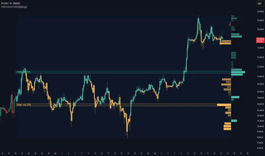
VWAP Volume Profile [BigBeluga]🔵 OVERVIEW
VWAP Volume Profile is an advanced hybrid of the VWAP and volume profile concepts. It visualizes how volume accumulates relative to VWAP movement—separating rising (+VWAP) and declining (−VWAP) activity into two mirrored horizontal profiles. It highlights the dominant price bins (POCs) where volume peaked during each directional phase, helping traders spot hidden accumulation or distribution zones.
🔵 CONCEPTS
VWAP-Driven Profiling: Unlike standard volume profiles, this tool segments volume based on VWAP movement—accumulating positive or negative volume depending on VWAP slope.
Dual-Sided Profiles: Profiles expand horizontally to the right of price. Separate bins show rising (+) and falling (−) VWAP volume.
Bin Logic: Volume is accumulated into defined horizontal bins based on VWAP’s position relative to price ranges.
Gradient Coloring: Volume bars are colored with a dynamic gradient to emphasize intensity and direction.
POC Highlighting: The highest-volume bin in each profile type (+/-) is marked with a transparent box and label.
Contextual VWAP Line: VWAP is plotted and dynamically colored (green = rising, orange = falling) for instant trend context.
Candle Overlay: Price candles are recolored to match the VWAP slope for full visual integration.
🔵 FEATURES
Dual-sided horizontal volume profiles based on VWAP slope.
Supports rising VWAP , falling VWAP , or both simultaneously.
Customizable number of bins and lookback period.
Dynamically colored VWAP line to show rising/falling bias.
POC detection and labeling with volume values for +VWAP and −VWAP.
Candlesticks are recolored to match VWAP bias for intuitive momentum tracking.
Optional background boxes with customizable styling.
Adaptive volume scaling to normalize bar length across markets.
🔵 HOW TO USE
Use POC zones to identify high-volume consolidation areas and potential support/resistance levels.
Watch for shifts in VWAP direction and observe how volume builds differently during uptrends and downtrends.
Use the gradient profile shape to detect accumulation (widening volume below price) or distribution (above price).
Use candle coloring for real-time confirmation of VWAP bias.
Adjust the profile period or bin count to fit your trading style (e.g., intraday scalping or swing trading).
🔵 CONCLUSION
VWAP Volume Profile merges two essential concepts—volume and VWAP—into a single, high-precision tool. By visualizing how volume behaves in relation to VWAP movement, it uncovers hidden dynamics often missed by traditional profiles. Perfect for intraday and swing traders who want a more nuanced read on market structure, trend strength, and volume flow.
Indicators and strategies
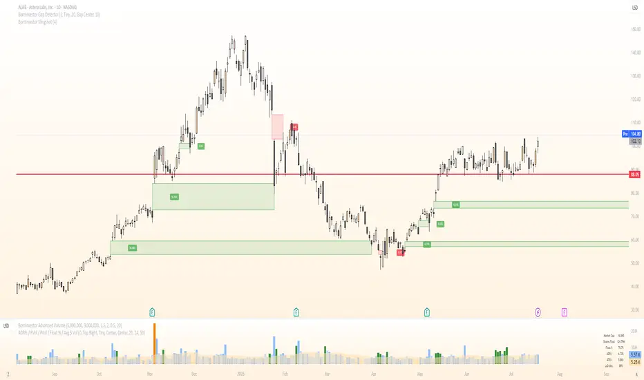
BornInvestor Gap Detector📈 BornInvestor Gap Detector
The BornInvestor Gap Detector is a powerful visual tool for identifying and analyzing price gaps on any chart. It automatically detects up and down gaps, highlights them with customizable boxes, and offers detailed labeling and alerting functionality.
🔍 Key Features:
Automatic Detection of bullish and bearish gaps based on customizable deviation settings.
Visual Highlighting of gaps using colored boxes with optional trail length limitation.
Gap Size Labels showing the percentage size of the gap, with the ability to display them only on the most recent N gaps.
Alerts for:
New gap appearance
Gap fully or partially closed
Price entering a gap zone (ideal for breakout/backfill strategies)
Customizable Colors for up/down gap borders and backgrounds.
Optional Message when no gaps are found on the current chart.
💡 Usefulness:
Gaps are an edge. They frequently act as support or resistance—especially on the first retest—when aligned with high-volume areas or other key price zones. Many strong stock moves begin with gaps, a concept central to strategies like Episodic Pivots.
This indicator helps you:
Identify gaps as potential entry zones on secondary setups
Quantify gaps via percentage size
Filter gaps based on size to suit your specific trading approach
Set alerts when price enters a gap or meets your custom criteria
CRS by TQCRS by TradeQUO
Comparative Relative Strength Indicator
What it does
Computes the percentage difference in performance between your current chart symbol (e.g. GC1!) and a chosen benchmark (e.g. ES1!, DXY, NQ1!).
Smooths that “CRS” line with a configurable moving average (SMA, EMA, WMA) — default length is 63 bars.
Key Plots
CRS (%) (aqua) — how your symbol has held up relative to the benchmark since the chart loaded.
CRS MA (%) (fuchsia) — smoothed trend of that relative strength.
How to Interpret
Trend-Following
Long when CRS crosses above its MA and is above 0 → your symbol is outperforming.
Short (or reverse) when CRS crosses below its MA and is below 0 → underperformance.
Regime Filter
CRS > 0 → Risk-On environment for your symbol vs. benchmark.
CRS < 0 → Risk-Off relative to the benchmark.
Divergence Signals
Bearish Divergence: Price makes a higher high, but CRS makes a lower high → potential sell-off incoming.
Bullish Divergence: Price makes a lower low, but CRS makes a higher low → look for rebound opportunity.
Pairs Trading
Outperformance: Long your symbol + Short benchmark when CRS > MA.
Underperformance: Short your symbol + Long benchmark when CRS < MA.
Why it matters
Reveals relative market leadership early, not just absolute price moves.
Helps you allocate risk dynamically, spot rotations and catch reversals before they show in price alone.

Mickey's EMAMickey’s EMA is a lightweight, overlay indicator that combines two Exponential Moving Averages (EMAs) with automatic entry, stop-loss and target visual signals—plus dynamic JSON alerts for seamless webhook integration. It’s designed for both day-traders and swing-traders who want clear, on-chart cues and fully-customizable risk parameters.
🔍 Overview
Dual EMAs (fast & slow) to capture trend changes.
Automated “BUY” / “SELL” markers at every EMA crossover.
Customizable Stop-Loss % and Target % levels, plotted as ❌ and 🎯 bubbles.
“SL Hit (Custom)” if the opposite EMA crossover occurs before price touches your stop level.
JSON-formatted alerts containing ticker, instrument type, timeframe, trend (“CE” for bullish, “PE” for bearish), and price—ready for webhooks.
⚙️ Inputs
| Setting | Default | Description |
| ------------------------ | ------- | ----------------------------------------------- |
| **Fast EMA Length** | 20 | Period for the faster EMA. |
| **Slow EMA Length** | 200 | Period for the slower EMA. |
| **Price Source** | Close | Data series to calculate EMAs on. |
| **Custom Stop Loss %** | 0.1% | Stop-loss level as a percentage of entry price. |
| **Target %** | 0.5% | Profit-target level as a percentage of entry. |
| **Show Entry/SL/Target** | ON | Toggle all entry, SL and target visuals. |
📊 What It Plots
Fast EMA (blue) & Slow EMA (white) overlayed on price.
BUY 🟢 label below bar when Fast EMA crosses above Slow EMA.
SELL 🔴 label above bar when Fast EMA crosses below Slow EMA.
❌ (Custom) bubble at entry price if an opposite EMA crossover occurs before price hits your custom stop-loss.
❌ bubble at the stop-loss price when price actually breaches the stop level.
🎯 bubble at target price when price first reaches your profit-target level.
🔔 Alerts & Webhooks
On-screen alert conditions “Mickey’s EMA → BUY” and “Mickey’s EMA → SELL” appear in the Create-Alert dialog.
Dynamic JSON payload sent via alert() when a crossover fires, e.g.:
{
"script": "AAPL",
"scriptType": "equity",
"instrumentType": "NASDAQ",
"timeframe": "5",
"trend": "CE",
"price": 174.25
}
Use these alerts to integrate with bots, chat systems, manual, or any webhook-driven workflow.
🚀 Why Use Mickey’s EMA?
Clarity & Precision: All signals appear exactly at the EMA or price-level of interest.
Custom Risk Management: Define your own stop-loss and target percentages.
Seamless Automation: Dynamic JSON alerts mean zero manual setup for webhooks.
Versatile: Equally effective on intraday charts or daily/weekly timeframes.
Add Mickey’s EMA to your TradingView chart today and get instant, aesthetically-pleasing guidance on trend entries, risk exits, and profit targets—all in one elegant overlay.

Weighted Multi-Mode Oscillator [BackQuant]Weighted Multi‑Mode Oscillator
1. What Is It?
The Weighted Multi‑Mode Oscillator (WMMO) is a next‑generation momentum tool that turns a dynamically‑weighted moving average into a 0‑100 bounded oscillator.
It lets you decide how each bar is weighted (by volume, volatility, momentum or a hybrid blend) and how the result is normalised (Percentile, Z‑Score or Min‑Max).
The outcome is a self‑adapting gauge that delivers crystal‑clear overbought / oversold zones, divergence clues and regime shifts on any market or timeframe.
2. How It Works
• Dynamic Weight Engine
▪ Volume – emphasises bars with exceptional participation.
▪ Volatility – inverse ATR weighting filters noisy spikes.
▪ Momentum – amplifies strong directional ROC bursts.
▪ Hybrid – equal‑weight blend of the three dimensions.
• Multi‑Mode Smoothing
Choose from 8 MA types (EMA, DEMA, HMA, LINREG, TEMA, RMA, SMA, WMA) plus a secondary smoothing factor to fine‑tune lag vs. responsiveness.
• Normalization Suite
▪ Percentile – rank vs. recent history (context aware).
▪ Z‑Score – standard deviations from mean (statistical extremes).
▪ Min‑Max – scale between rolling high/low (trend friendly).
3. Reading the Oscillator
Zone Default Level Interpretation
Bull > 80 Acceleration; momentum buyers in control
Neutral 20 – 80 Consolidation / no edge
Bear < 20 Exhaustion; sellers dominate
Gradient line/area automatically shades from bright green (strong bull) to deep red (strong bear).
Optional bar‑painting colours price bars the same way for rapid chart scanning.
4. Typical Use‑Cases
Trend Confirmation – Set Weight = Hybrid, Smoothing = EMA. Enter pullbacks only when WMMO > 50 and rising.
Mean Reversion – Weight = Volatility, reduce upper / lower bands to 70 / 30 and fade extremes.
Volume Pulse – Intraday futures: Weight = Volume to catch participation surges before breakout candles.
Divergence Spotting – Compare price highs/lows to WMMO peaks for early reversal clues.
5. Inputs & Styling
Calculation: Source, MA Length, MA Type, Smoothing
Weighting: Volume period & factor, Volatility length, Momentum period
Normalisation: Method, Look‑back, Upper / Lower thresholds
Display: Gradient fills, Threshold lines, Bar‑colouring toggle, Line width & colours
All thresholds, colours and fills are fully customisable inside the settings panel.
6. Built‑In Alerts
WMMO Long – oscillator crosses up through upper threshold.
WMMO Short – oscillator crosses down through lower threshold.
Attach them once and receive push / e‑mail notifications the moment momentum flips.
7. Best Practices
Percentile mode is self‑adaptive and works well across assets; Z‑Score excels in ranges; Min‑Max shines in persistent trends.
Very short MA lengths (< 10) may produce jitter; compensate with higher “Smoothing” or longer look‑backs.
Pair WMMO with structure‑based tools (S/R, trend lines) for higher‑probability trade confluence.
Disclaimer
This script is provided for educational purposes only. It is not financial advice. Always back‑test thoroughly and manage risk before trading live capital.

Micro Trend Start Signal (Up & Down)Micro Trend Start Signal is a lightweight trend-following indicator , complimenting the binary mac d . Trend trading made simple

Mesned BandThis indicator represents the second part of the 33-candle strategy, and its role was explained in the previous post.
==============================
هذا المؤشر يمثل الجزء الثاني من إستراتيجية الشمعة ٣٣ وتم شرح دوره ضمن المنشور السابق

[Teyo69] T1 Wyckoff Aggressive A/D Setup📘 Overview
The T1 Wyckoff Aggressive A/D Setup is a dual-mode indicator that detects bullish accumulations and bearish distributions using core principles from the Wyckoff Method. It identifies price/volume behavior during Selling/Buying Climaxes, ARs, SOS/SOW, and triggers based on trend structure.
🔍 Features
✅ Automatic detection of:
Automatic Rally (AR)
Automatic Reaction (AR)
Sign of Strength (SOS) or Sign of Weakness (SOW)
🧠 Trend-sensitive logic with linear regression slope filters
⚙️ Configurable options for Reversal vs Trend Following mode
🎯 Smart structure timing filters using barssince() logic
🔊 Volume spike and wide-range candle detection
📊 Visual cues for bullish (green) and bearish (red) backgrounds
🛠 How to Use
Reversal Mode
Triggers early signals after a Climax + AR
Ideal for catching turning points during consolidations
Trend Following Mode
Requires Climax, AR, and confirmation (SOS or SOW)
Waits for structure confirmation before signaling
Use this when you want higher probability trades
⚙️ Configuration
Volume MA Length - Determines baseline volume to detect spikes
Wick % of Candle - Filters candles with long tails for SC/BC
Close Near Threshold - Ensures candles close near high/low
Breakout Lookback - Sets structure breakout level
Structure Threshold - Controls timing window for setups
Signal Option - Switch between Reversal or Trend Following mode
⚠️ Limitations
Doesn't confirm macro structure like full Wyckoff phase labeling (A–E)
May repaint on lower timeframes during volatile candles
Works best when combined with visual range recognition and market context
🧠 Advanced Tips
Use in confluence with:
Volume Profile ranges
Trendlines and supply/demand areas
Ideal timeframes: 8H to 1D for crypto and forex markets
Combine this with LPS/UTAD patterns for refined entries
📝 Notes
SC/AR/SOS = Bullish
BC/AR/SOW = Bearish
Trend coloring adapts background (green = rising slope, red = falling slope)
🛡️ Disclaimer
This tool is a market structure guide, not financial advice. Past behavior does not guarantee future performance. Always use proper risk management.

Momentum_EMABand📢 Reposting this script as the previous version was shut down due to house rules. Follow for future updates.
The Momentum EMA Band V1 is a precision-engineered trading indicator designed for intraday traders and scalpers. This first version integrates three powerful technical tools — EMA Bands, Supertrend, and ADX — to help identify directional breakouts while filtering out noise and choppy conditions.
How the Indicator Works – Combined Logic
This script blends distinct but complementary tools into a single, visually intuitive system:
1️⃣ EMA Price Band – Dynamic Zone Visualization
Plots upper and lower EMA bands (default: 9-period) to form a dynamic price zone.
Green Band: Price > Upper Band → Bullish strength
Red Band: Price < Lower Band → Bearish pressure
Yellow Band: Price within Band → Neutral/consolidation zone
2️⃣ Supertrend Overlay – Reliable Trend Confirmation
Based on customizable ATR length and multiplier, Supertrend adds a directional filter.
Green Line = Uptrend
Red Line = Downtrend
3️⃣ ADX-Based No-Trade Zone – Choppy Market Filter
Manually calculated ADX (default: 14) highlights weak trend conditions.
ADX below threshold (default: 20) + Price within Band → Gray background, signaling low-momentum zones.
Optional gray triangle marker flags beginning of sideways market.
Why This Mashup & How the Indicators Work Together
This mashup creates a high-conviction, rules-based breakout system:
Supertrend defines the primary trend direction — ensuring trades are aligned with momentum.
EMA Band provides structure and timing — confirming breakouts with retest logic, reducing false entries.
ADX measures trend strength — filtering out sideways markets and enhancing trade quality.
Each component plays a specific role:
✅ Supertrend = Trend bias
✅ EMA Band = Breakout + Retest validation
✅ ADX = Momentum confirmation
Together, they form a multi-layered confirmation model that reduces noise, avoids premature entries, and improves trade accuracy.
💡 Practical Application
Momentum Breakouts: Enter when price breaks out of EMA Band with Supertrend confirmation
Avoid Whipsaws: Skip trades during gray-shaded low-momentum periods
Intraday Scalping Edge: Tailored for lower timeframes (5min–15min) where noise is frequent
⚠️ Important Disclaimer
This is Version 1 — expect future enhancements based on trader feedback.
This tool is for educational purposes only. No indicator guarantees profitability. Use with proper risk management and strategy validation.

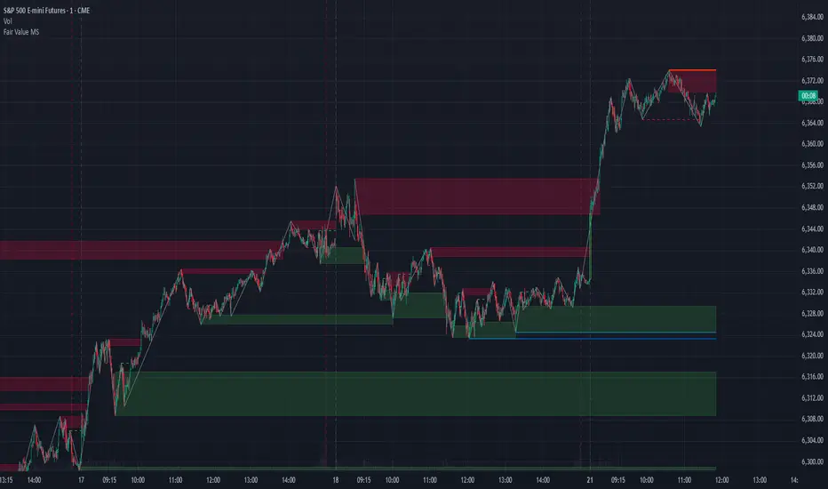
Fair Value MSThis indicator introduces rigid rules to familiar concepts to better capture and visualize Market Structure and Areas of Support and Resistance in a way that is both rule-based and reactive to market movements.
Typical "Market Structure" or "Zig-Zag" methods determine swing points based on fixed thresholds (length or percentage). While this does provide rigid structure, the results may be lagging or confusing due to the timing, since it is fixed to static parameters.
I believe the concept of Fair Value Gaps can solve this problem.
As you will notice, there are no length settings in this indicator.
> FVG Market Structure
Fair Value Gaps are a well known concept used to indicate directional intent, forming when price moves aggressively in one direction, leaving behind an imbalance between buyers and sellers. While the term FVG was popularized by ICT, the underlying concept predates them, known historically as imbalances, inefficiencies, or liquidity voids in institutional trading.
Note: For simplicity, in this indicator they'll be called FVGs.
By reading into this, we are able to clearly and rigidly define market structure simply by "looking" at the chart, using objective price events rather than subjective interpretation, or lengths.
By using FVGs to determine structure direction, the length, and speed of identification lies entirely on the market. If an FVG Down occurs immediately after a New Higher High forms, it is reasonable to assume there was a seller at that point, so the script would indicate a New Swing High.
The script is NOT stuck, waiting for a % retrace, or # bars to pass to identify it as such.
Sometimes the market is in a steady trend in a single direction and no FVGs form; therefore, no structure forms. -> Why would we try to impose structure on a clear trend?
Ultimately, the FVG Structure Method uses real reactions from the market to determine Market structure, and is not fixed to specific parameters.
As with other market structure indicators, "Market Structure Breaks" are still identifiable when price moves outside the most recent swing points.
These are helpful to indicate larger direction. In the following section you will see how these help us determine when we should start the search for an "Area of Interest (AOI)".
> Areas of Interest (AOIs)
"Area of Interest (AOI)" is a generalized term, and could refer to many types of zones you might recognize under different names. While the AOIs in this indicator are specialized in their own way, I have chosen to simply use the term "Area of Interest" because it’s more important to understand how they behave and why they exist than to focus on what they’re called.
The goal of an AOI is to point out reasonable areas where buyers or sellers may be staging, as is typical with support and resistance.
In order to reasonably identify these areas, we look for cause and effect relationships. When considering these relationships, it's easier to understand the placement of the points to define each zone.
(Buyer Examples)
Cause: Strong Buyers step in at Swing Low
Effect: Fair Value Gap Forms
Cause: Sustained Buying Pressure
Effect: Market Structure Breaks
In this example, The zone is drawn from the Swing Low, to the Bottom of the FVG closest to the swing point.
In theory, the participation at the swing point was strong and aggressive enough to create the FVG imbalance. Which then found acceptance and continued into a Market Structure Break. So with these AOIs, we are trying to locate the aggressive Buyers or Sellers which were positioned BEFORE the FVG.
These Zones are intended to act as areas to look for reactions from market participants, to judge where price may be going. When revisiting these zones, we look for a reaction or a break, to further provide us information to if the buyers or sellers are still there.
As seen in the screenshot above, The information we gain is not from the creation of these zones, but from the behavior we witness when these zones are revisited.
Technical Note: In this indicator, Market Structure Breaks are only considered when price closes outside the recent swing points. Wicks are not considered as confirmation, therefore are not used to detect structural breaks.
Inside each AOI you can optionally display a readout of the volume which accumulated during the time starting at the swing point and going until the closing bar of the FVG.
Note: We are counting volume until the closing bar of the FVG since the FVG is a 3 bar formation, and aggressive volume is required throughout to create the imbalance.
There are multiple FVGs that typically occur in a single direction, but we do not look to every single one to be indicative of structure, only the first FVG in the opposite direction of the previous direction (which is determined by previous FVGs)
You will probably notice, the AOIs do not form from the closest swing or FVG to the break, this is because we are targeting larger directional changes to draw these AOIs from.
Since they do not always happen perfectly every time, the AOI formation waits for an FVG to occur AND a Market structure break to happen. One without the other will result in no Zone displaying.
> Reflection Lines
While they may seem slightly redundant, Reflection Lines serve as reminders of previous support and resistance pivots. They are drawn at the same Pivots where and AOI is formed, and extend beyond the mitigation of the AOI.
These lines are often points of price to look for "Support Flips", a re-test pattern where price trades through previous support (or resistance) then returns to it and rejects, continuing into a larger move or trend.
Their namesake is based on the behavior of price, "reflecting" at these levels.
The Reflection lines are simple and change color based on price's location.
If price is above, we would typically look to a reflection line in with support in mind.
As a basic filter, these lines use an average price to determine their color, this way they will not change their color as frequently in choppy situations.
> Session Start/End Lines
For analysis purposes and trade review, it is helpful to analyze with context.
For that reason, I have implemented start and end session lines into the indicator, these are helpful when reviewing historical charts to not provide additional context.
By default, they are set to the NYSE Session, but can be changed to fit any needs.
These lines are not advanced, and simply draw a line as the chart passes the start and end of the sessions. It's very likely that you may need to adjust the session for your specific needs.
Note: The Timezone can be adjusted within the code if needed. By Default, the indicator uses "America/New_York" Timezone.
> Conclusion
If you’ve ever felt like your structure tools were confusing or lagging, drawing zones too late, or zones that simply don't make sense, this should feel like a breath of fresh air.
By removing arbitrary length settings and instead using FVGs to define structure and as a basis for AOIs, you're getting a more accurate look at what price is doing and where it's reacting from.
This indicator is rule-based, reactive, and aims to keep things logical without fluff or false confidence.
Enjoy!
Leon H4 Trend Reversal Strategy//@version=5
indicator("Leon H4 Trend Reversal Strategy", overlay=true)
// === H4 趋势判断 ===
h4_close = request.security(syminfo.tickerid, "240", close)
h4_ema50 = request.security(syminfo.tickerid, "240", ta.ema(close, 50))
trendUp = h4_close > h4_ema50
trendDown = h4_close < h4_ema50
// === FVG 检测(H4) ===
h4_high = request.security(syminfo.tickerid, "240", high)
h4_low = request.security(syminfo.tickerid, "240", low)
h4_high2 = request.security(syminfo.tickerid, "240", high )
h4_low2 = request.security(syminfo.tickerid, "240", low )
fvg_up = h4_low2 > h4_high
fvg_down = h4_high2 < h4_low
// === M15 吞没形态确认 ===
m15_open = request.security(syminfo.tickerid, "15", open)
m15_close = request.security(syminfo.tickerid, "15", close)
m15_open1 = request.security(syminfo.tickerid, "15", open )
m15_close1 = request.security(syminfo.tickerid, "15", close )
bullish_engulf = m15_close > m15_open and m15_open < m15_close1 and m15_open1 > m15_close1
bearish_engulf = m15_close < m15_open and m15_open > m15_close1 and m15_open1 < m15_close1
// === 多空信号逻辑 ===
longCondition = trendUp and fvg_down and bullish_engulf
shortCondition = trendDown and fvg_up and bearish_engulf
// === Entry / SL / TP 计算 ===
entry = close
long_sl = h4_low - 2
long_tp = entry + (entry - long_sl) * 2
short_sl = h4_high + 2
short_tp = entry - (short_sl - entry) * 2
// === 绘图 & alert ===
plotshape(longCondition, title="Long Entry", location=location.belowbar, color=color.green, style=shape.labelup, text="Long")
plotshape(shortCondition, title="Short Entry", location=location.abovebar, color=color.red, style=shape.labeldown, text="Short")
plot(longCondition ? long_sl : na, title="SL (Long)", color=color.red, style=plot.style_linebr, linewidth=1)
plot(longCondition ? long_tp : na, title="TP (Long)", color=color.green, style=plot.style_linebr, linewidth=1)
plot(shortCondition ? short_sl : na, title="SL (Short)", color=color.red, style=plot.style_linebr, linewidth=1)
plot(shortCondition ? short_tp : na, title="TP (Short)", color=color.green, style=plot.style_linebr, linewidth=1)
// === Alert 条件 ===
alertcondition(longCondition, title="Leon 多单提醒", message="📈 H4 趋势回调策略多单机会!")
alertcondition(shortCondition, title="Leon 空单提醒", message="📉 H4 趋势回调策略空单机会!")

Overheat Oscillator with DivergenceIndicator Description
The Overheat Oscillator with Divergence is an advanced technical indicator designed for the TradingView platform, assisting traders in identifying potential market reversal points by analyzing price momentum and volume, as well as detecting divergences. The indicator combines trend strength assessment with signal smoothing to provide clear indications of market overheat or oversold conditions. An optional divergence detection feature allows for the identification of discrepancies between price movement and the oscillator's value, which may signal upcoming trend changes.
The indicator is displayed in a separate panel below the price chart and offers visual cues through a color gradient, horizontal reference lines, and a dynamic market sentiment table. Users can customize numerous parameters, such as calculation periods, sentiment thresholds, line colors, and visualization styles, making the indicator a versatile tool for various trading strategies.
How the Indicator Works
The indicator is based on the following key components:
Oscillator Calculations
The indicator analyzes price candles, assigning a score based on their nature. A bullish candle (when the closing price is higher than the opening price) receives a score of +1.0, while a bearish candle (when the closing price is lower than the opening price) receives a score of -1.0. This scoring reflects the strength of price movement over a given period.
The score is modified by a volume multiplier (default: 2.0) if the candle's volume exceeds the volume's simple moving average (SMA, default: calculated over 20 candles). This ensures that candles with higher volume have a greater impact on the oscillator's value, better capturing significant market movements driven by increased trading activity. For example, a bullish candle with high volume may receive a score of +2.0 instead of +1.0, amplifying the bullish signal.
The scores are summed over a specified number of candles (default: 20), normalized to a 0–100 range, and then smoothed using a simple moving average (SMA, default: 5 periods) to reduce noise and improve signal clarity.
Color Gradient
The oscillator's values are visualized using a color gradient that changes based on the oscillator's level:
Green: Market cooldown (values below the Gradient Min threshold).
Yellow: Neutral sentiment (values between Gradient Min and Gradient Yellow).
Orange: Elevated activity (values between Gradient Yellow and Gradient Orange).
Red: Market overheat (values above Gradient Orange).
The color gradient is applied as the background in the oscillator panel, facilitating quick assessment of market sentiment.
Reference Levels
The indicator displays customizable horizontal lines for key thresholds (e.g., Overheat Threshold, Oversold Threshold, Gradient Min, Yellow, Orange, Max). These lines are visible only at the height of the last few oscillator candles, preventing chart clutter and helping users focus on current values.
Users can also define three custom horizontal lines with selectable styles (solid, dotted, dashed) and colors. These lines serve as auxiliary tools, e.g., for marking personal support/resistance levels, but do not affect the oscillator's signals or background colors.
Market Sentiment
The indicator displays sentiment labels in a table located in the top-right corner of the panel, dynamically updating based on the oscillator's value:
Cooled: Values below Gradient Yellow (default: 35).
Neutral: Values between Gradient Yellow and Gradient Orange (default: 60).
Excited: Values between Gradient Orange and Overheat Threshold (default: 70).
Overheated: Values above Overheat Threshold (default: 70).
The Overheat Threshold and Oversold Threshold are critical for displaying the "Overheated" and "Cooled" labels in the sentiment table, enabling users to quickly identify extreme market conditions. The labels update when key thresholds are crossed, and their colors match the oscillator's gradient.
Divergence Detection
The indicator offers optional detection of regular bullish and bearish divergences:
Bullish Divergence: Occurs when the price forms a lower low, but the oscillator forms a higher low, suggesting a weakening downtrend.
Bearish Divergence: Occurs when the price forms a higher high, but the oscillator forms a lower high, suggesting a weakening uptrend.
Divergences are marked on the chart with labels ("Bull" for bullish, "Bear" for bearish) and lines indicating pivot points. They are calculated with a delay equal to the Lookback Right setting (default: 5 candles), meaning signals appear after pivot confirmation in the specified lookback period. The indicator also generates alerts for users when a divergence is detected.
Indicator Settings
Main Settings (SETTINGS)
Period Length: Specifies the number of candles used for oscillator calculations (default: 20).
Volume SMA Period: The period for the volume's simple moving average (default: 20).
Volume Multiplier: Multiplier applied to candle scores when volume exceeds the average (default: 2.0).
SMA Length: The period for smoothing the oscillator with a simple moving average (default: 5).
Thresholds (THRESHOLDS)
Overheat Threshold: Level indicating market overheat (default: 70). This value determines when the sentiment table displays the "Overheated" label, signaling a potential peak in an uptrend.
Oversold Threshold: Level indicating market cooldown (default: 30). This value determines when the sentiment table displays the "Cooled" label, signaling a potential bottom in a downtrend.
Gradient Min (Green): Lower threshold for the green gradient (default: 20).
Gradient Yellow Threshold: Threshold for the yellow gradient (default: 35).
Gradient Orange Threshold: Threshold for the orange gradient (default: 60).
Gradient Max (Red): Upper threshold for the red gradient (default: 70).
Visualization (VISUALIZATION)
Signal Line Color: Color of the oscillator line (default: dark red, RGB(5, 0, 0)).
Show Reference Lines: Enables/disables the display of threshold lines (default: enabled).
Divergence Settings (DIVERGENCE SETTINGS)
Calculate Divergence: Enables/disables divergence detection (default: disabled).
Lookback Right: Number of candles back for pivot analysis (default: 5).
Lookback Left: Number of candles to the left for pivot analysis (default: 5).
Line Style (STYLE)
Custom Line 1, 2, 3 Value: Levels for custom horizontal lines (default: 70, 50, 30).
Custom Line 1, 2, 3 Color: Colors for custom lines (default: black, RGB(0, 0, 0)).
Custom Line 1, 2, 3 Style: Line styles (solid, dotted, dashed; default: dashed, dotted, dashed).
How to Use the Indicator
Adding to the Chart
Add the indicator to your TradingView chart by searching for "Overheat Oscillator with Divergence."
Configure the settings according to your trading strategy.
Signal Interpretation
Overheated: Values above the Overheat Threshold (default: 70) in the sentiment table may indicate a potential uptrend peak.
Cooled: Values below the Oversold Threshold (default: 30) in the sentiment table may suggest a potential downtrend bottom.
Divergences:
Bullish: Look for "Bull" labels on the chart, indicating potential upward reversals (calculated with a Lookback Right delay).
Bearish: Look for "Bear" labels, indicating potential downward reversals (calculated with a Lookback Right delay).
Customization
Experiment with settings such as period length, volume multiplier, or gradient thresholds to tailor the indicator to your trading style (e.g., scalping, medium-term trading).
Usage Examples
Scalping: Set a shorter period (e.g., Period Length = 10, SMA Length = 3) and monitor rapid sentiment changes and divergences on lower timeframes (e.g., 5-minute charts).
Medium-Term Trading: Use default settings or increase Period Length (e.g., 30) and SMA Length (e.g., 7) for more stable signals on hourly or daily charts.
Reversal Detection: Enable divergence detection and observe "Bull" or "Bear" labels in conjunction with overheat/cooled levels in the sentiment table.
Notes
The indicator performs best when used in conjunction with other technical analysis tools, such as support/resistance lines, moving averages, or Fibonacci levels.
Divergences may serve as early signals but do not always guarantee immediate trend reversals—confirmation with other indicators is recommended.
Test different settings on historical data to find the optimal configuration for your chosen market and timeframe.

Mesned 33 Candle IndicatorMesned 33 Candle Indicator
* This indicator is based on selecting candle number 33 as the start of a session and is for daily trading only.
* The high and low prices of candle number 33 are taken, and an upper line is drawn as resistance and a lower line as support. When the session is complete, which is 33 days, another candle appears, and a line remains connected to the highest price of the previous candles (the blue line). There is a feature in the settings that makes the line only connected between two sessions.
* There is the 33-day VWAP line, which is involved in formulating the buy decision.
* There is also the Band Support Indicator, which consists of band lines and a 33-day RSI line. It also plays a significant role in buying and selling signals.
* Momentum candles are colored blue. These candles reinforce buying power, especially if they break the resistance line of the 33-day candle.
** Buy signals:
1. Price breaks the high of the 33-day candle.
2. Price is above the VWAP indicator (the yellow line). 3. The Relative Strength Index (RSI) breaks the upper band of the support band.
****No buying without these three signals.
** Sell signals:
If the low of the 33 candle is broken.
Or
The upper band of the support band is broken by the RSI downward.
=======
*** The target table shown in the upper right corner calculates targets based on a mathematical calculation between two trading sessions... These targets are merely a tool to help the trader monitor the price.
((A trading session is the session that begins from the close of the 33 candle until the day another 33 candle appears.))
*** Important Note
Based on my observation of the price after the breakout, I noticed that the price touches the high of the previous session's candle if the high of the previous 33 candle is greater than the high of the current candle.
*** The indicator is valid for all markets on the daily frame only... You may see some variation in the start of the session for candle 33 from one market to another or within the same market. This is mainly due to a defect in the data and not in the indicator.
======================================================================
Mesned 33 Candle Indicator
* هذا المؤشر أساسه هو إختيار الشمعة رقم ٣٣ كبداية لجلسة وهو للتدوال اليومي فقط .
* يتم أخذ السعر الأعلى والسعر الأدنى للشمعة رقم ٣٣ ويتم رسم خط علوي كمقاومة وخط سفلي كدعم..عند إكتمال مدة الجلسة وهي ٣٣ يوم تظهر شمعة أخرى ويبقى خط متصل مع السعر الأعلى للشموع السابقة (الخط الأزرق)..وهناك خاصية في الاعدادت تجعل الخط متصل فقط بين جلستين.
*هناك خط الفيواب ذو الإعدادت ٣٣ يوم الذي يشترك في صياغة قرار الشراء.
*هناك أيضا مؤشر مسند باند الذي يتألف من ع خطوط باند وخط لمؤشر القوة النسبية بإعدادات ٣٣ يوم وهو أيضا له دور كبير في إشارات الشراء والبيع.
* شموع الزخم الملونة باللون الأزرق ، هذه الشموع تعزز من قوة الشراء وخاصة إذا أخترقت خط المقاومة للشمعة ٣٣ .
** إشارات الشراء:
١. إختراق السعر الأعلى للشمعة ٣٣ .
٢ . السعر فوق مؤشر الفيواب (الخط الأصفر).
٣ . إختراق مؤشر القوة النسبية في مؤشر مسند باند الخط العلوي للباند.
****لا شراء بدون إكتمال الإشارات الثلاثة هذه
** إشارات البيع:
إذا تم كسر السعر الادنى للشمعة ٣٣ .
أو
كسر الباند العلوي لمؤشر مسند باند بواسطة مؤشر القوة النسبية هبوطا.
========
*** جدول الأهداف الموضح في الركن العلوي الايمن يحسب الأهداف بناء على عملية حسابية بين جلستي تدوال...هذه الأهداف ليست إلا أداة تساعد المتدوال في مراقبة السعر.
(((المقصود بجلسة تدوال هي الجلسة التي تبدأ منذ إكتمال إغلاق الشمعة رقم ٣٣ حتى اليوم التي تظهر شمعة ٣٣ أخرى )))
*** ملاحظة مهمة
حسب مراقبتي للسعر بعد الإختراق لاحظت أن السعر يلامس السعر الأعلى لشمعة الجلسة الماضية إذا كان السعر الأعلى لشمعة ٣٣ الماضية أكبر من السعر الأعلى للشمعة الحالية.
*** المؤشر يصلح لجميع الأسواق على الفريم اليومي فقط...قد ترى بعض التباين في بدء الجلسة للشمعة ٣٣ من الى سوق اخر او في نفس السوق وهذا يعود أساسا لخلل في البينات وليس في المؤشر.

Clean ATR LevelsSimple 14D ATR +1 & -1 display from PM to Close.
The Clean ATR Levels indicator is a powerful Pine Script tool designed to provide traders with dynamic support and resistance levels based on the Average True Range (ATR) calculation. This indicator automatically draws horizontal lines that represent key price levels where significant market reactions are likely to occur, helping traders identify potential entry and exit points throughout the trading session.
The core functionality centers around calculating ATR levels using the most recent daily close as the reference point. The script draws two primary levels: an upper level at +100% ATR above the current close and a lower level at -100% ATR below the current close. These levels represent statistically significant price zones where the market has historically shown increased volatility and potential reversal patterns. Additionally, the indicator includes an optional previous close line that serves as a psychological reference point for intraday price action.
What sets this indicator apart is its intelligent session management and clean visual presentation. The lines are automatically redrawn at the start of each new trading day and are programmed to extend precisely until 4 PM EST market close, eliminating visual clutter on the chart. This session-aware approach ensures that traders are always working with the most relevant levels for the current trading day without having outdated lines extending unnecessarily into future sessions.
The indicator also features a comprehensive information table that displays real-time values for the ATR calculation, current close price, and both upper and lower ATR levels. This provides traders with exact numerical references without having to manually calculate these critical values. The script is highly customizable, allowing users to adjust the ATR period, line colors, widths, and choose whether to display the previous close reference line, making it adaptable to various trading styles and visual preferences.

LANZ Strategy 6.0🔷 LANZ Strategy 6.0 — One-Shot NY Candle Logic with Dynamic SL/TP, Multi-Account Lot Sizing and Visual Confirmation System
LANZ Strategy 6.0 is a high-precision, visually driven indicator that executes a single operation per day based on the 09:00 a.m. New York candle. Built for simplicity and accuracy, it calculates dynamic Stop Loss and Take Profit levels using the candle range, and adapts position sizing per account with pip-accurate risk control. All actions are visualized in real-time for full clarity.
📌 This is an indicator, not a strategy — It does not place trades automatically, but provides exact entry setups, SL/TP levels, risk-based lot size guidance, and optional alerts.
🧠 Core Logic & Features
🚀 Entry Signal (BUY Only)
A BUY setup is triggered only once per day, when:
The current candle is the 09:00–10:00 a.m. NY session candle
The candle is bullish (close > open)
This single candle is used to define the trade levels for the day, and the signal is only evaluated once. If bullish, a visual "BUY" label appears with SL/TP/EP levels calculated from the candle body or full range.
⚙️ Stop Loss and Take Profit
You can configure:
SL as a percentage of the candle’s range (from wick to wick), or use the wick extreme
RR ratio (e.g., 1:4) to dynamically calculate the TP based on SL
Each level is drawn as a line:
EP (Entry Price) at the candle’s close
SL below the low (or % of range)
TP above the entry at the selected RR
💰 Risk-Based Lot Size Calculation per Account
Manage up to 5 independent accounts simultaneously. Each account can have:
Its own capital
Its own risk percentage per trade
Lot size is calculated automatically for each based on:
Defined SL in pips
The pip value (auto-detected for Forex or manually defined for indices/gold)
📋 All lot sizes are displayed in a dedicated info panel, with their corresponding risk-adjusted values per account.
🖼️ Trade Visualization Panel
When a trade is active, a clean table is displayed in the top-right corner showing:
TP / SL / EP levels
Distance in pips for SL and TP
Lot size per account
Line visuals (style, color, thickness) are fully customizable.
🧪 Outcome Tracking (Real-Time Labels)
For each trade:
If SL is hit → a label shows “–1.00%” at the SL level
If TP is hit → a label shows “+X.XX%” at the TP level
If still open at 3:00 p.m. NY, the trade closes manually and the actual result (in %) is calculated and labeled on chart
🔔 Alerts You Can Trust
You'll get an alert when:
A BUY entry is confirmed
SL or TP is hit
Manual close is triggered at 15:00 NY
All alerts include the symbol, price, and result for immediate action or tracking.
🧭 Execution Flow Summary
Every day:
At 09:00 a.m. NY → Evaluate candle
If bullish:
Set EP, SL, TP
Calculate lot sizes
Plot lines + labels
Display dashboard panel
Monitor SL/TP hits
At 15:00 NY → Force close if needed
💡 Ideal For:
Traders who want a clean, single-shot entry system per day
Index or gold traders who operate with strict SL/TP logic
Anyone managing multiple accounts or fixed-capital models
Visual learners and disciplined execution fans
👨💻 Credits:
💡 Developed by: LANZ
🧠 Execution Model & Logic Design: LANZ
📅 Designed for: 1H timeframe, high-conviction NY-based entries
📈 Purpose: Clean decision-making, precision risk control, visual certainty

GreenyyP Leverage Vortex v6Function Summary of “GreenyyP Leverage Vortex v6”
General Settings
Input fields for long and short base prices
Configurable leverage factor
Adjustable line length and label offset
Toggles for chart labels and scale display
Separate switch to show/hide base-price lines
Individually Toggleable Levels
Each level can be turned on or off independently under the Long/Short groups:
L1, L2, L3 (percentage deviations from the entry price)
TP (Take Profit)
SL (Stop Loss)
Automatic Stop-Loss Correction
SL percentages are processed with math.abs()
Ensures SL lines always plot below (for Long) or above (for Short) the base price regardless of input sign
Drawing Logic
All lines and labels redraw every 10 bars to keep the chart clean
Previous labels are deleted before drawing new ones
Lines are drawn with a width of 2 for clear visibility
Base-Price Lines & Labeling
Optional solid lines for Long and Short base prices
White price labels for each base line
Percentage or short text labels (e.g. “L1: 5%”, “TP: 20%”, “SL: 5%”) with configurable transparency
With these features, you get fully customizable level-plotting, automatic SL handling, and clear visual cues directly on your chart.

Fractal Flow BandsFractal Flow Bands
A high-precision trend-following system combining HalfTrend logic with ALMA smoothing — built for clarity, speed, and smart alerts.
🔷 What is Fractal Flow Bands?
Fractal Flow Bands merges the best of both worlds:
HalfTrend for accurate trend detection
ALMA (Arnaud Legoux Moving Average) for smooth, low-lag confirmation
This unique synergy delivers clean, non-repainting Buy/Sell signals, filtering out market noise and keeping your chart crystal clear.
🔍 How It Works
Blue HalfTrend Line + Green ALMA Crossover → BUY
Red HalfTrend Line + Red ALMA Crossover → SELL
You get only ONE alert per trend change, eliminating spammy notifications. Perfect for swing traders, scalpers, and trend followers alike.
⚙️ Core Features
✅ Dual Confirmation Engine
ALMA must confirm HalfTrend — no single-line tricks here.
✅ One Alert per Trend Shift
Clean signals, no noise, no repeats.
✅ Visual Clarity
Color-coded trends. No channels, ribbons, or clutter.
✅ Customizable Settings
Tune HalfTrend amplitude and ALMA smoothness to your strategy.
🎯 Best For
Swing traders wanting confirmation before entries
Scalpers needing fast, accurate signal flow
Anyone who hates messy charts but loves sharp decisions
🛠 Settings Explained
Setting Description
HT Amplitude Controls HalfTrend sensitivity
ALMA Length / Offset / Sigma Adjusts the smoothness of ALMA
Source Choose price source (Close, Open, etc.)
Display Toggles Enable/disable arrows and ribbons
Colors Fully customizable trend color schemes
✅ Built-in Alerts — So you never miss a signal again.
⚡ Lag-free performance — Works on multiple timeframes.
📈 Real strategy-ready code — Not just another repainting overlay.

Smart Money Indicator - Swing > Structure Shift > FVG RetestThis is simply just an indicator design to executes trades by using some Smart money concepts, just some of it for confluences or confirmations.

Fundo MACD + EMAs D1 e Espelho
This indicator paints the chart background on the daily (D1) timeframe based on the relationship between the 50-period and 200-period Exponential Moving Averages (EMA) and the MACD (12,26,9) histogram color and sign.
Green background signals a bullish condition when the EMA 50 is above the EMA 200 and the MACD histogram is positive (above zero).
Red background signals a bearish condition when the EMA 50 is below the EMA 200 and the MACD histogram is negative (below zero).
The indicator also includes a mirror mode which reverses the background colors to highlight opposite conditions.
This tool helps traders quickly identify trend direction and momentum alignment, filtering out signals when EMA and MACD histogram disagree.
How to use:
Use on the daily timeframe for best results.
Green background suggests buying bias.
Red background suggests selling bias.
Mirror mode can be toggled for alternative visual perspectives.
Parameters:
EMA lengths: 50 and 200 (fixed)
MACD settings: Fast=12, Slow=26, Signal=9 (fixed)

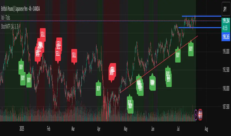
Stochastic Trend Signal with MTF FilterMulti-Timeframe Stochastic Trend Filter – Real Signals with Confirmation Candles
This script is a multi-timeframe Stochastic trend filter designed to help traders identify reliable BUY/SELL signals based on both momentum and higher-timeframe trend context.
It combines three key components:
Entry Signal Logic:
Entry is based on the Stochastic Oscillator (%K, 14,3), where overbought/oversold conditions are detected in the current chart's timeframe.
A green (bullish) candle following a red candle with %K below 20 can trigger a BUY signal.
A red (bearish) candle following a green candle with %K above 80 can trigger a SELL signal.
Trend Confirmation – Daily Filter:
The script uses Stochastic on the 1D (Daily) timeframe to determine whether short-term momentum aligns with a broader daily trend.
BUY signals are only allowed if the Daily %K is above 50.
SELL signals are only allowed if the Daily %K is below 50.
Long-Term Trend Filter – Weekly Stochastic:
A second filter uses Weekly %K:
BUY signals are suppressed if the Weekly trend is bearish (Weekly %K < 50) while Daily %K is bullish (> 50).
SELL signals are suppressed if the Weekly trend is bullish (Weekly %K > 50) while Daily %K is bearish (< 50).
🖼️ The chart background changes color to visually assist users:
Green background: bullish alignment on Daily and Weekly Stochastic.
Red background: bearish alignment.
Gray background: trend conflict (Daily and Weekly disagree).
✅ This script is ideal for swing traders or position traders who want to enter with confirmation while avoiding false signals during trend conflict zones.
🔔 Alerts are provided for BUY and SELL signals once all conditions are met.
How to use:
Apply on timeframe (4H recommended).
Add alerts for "BUY Alert" and "SELL Alert".
Use background color and plotted labels as entry filters.
Disclaimer: This is not financial advice. Always use proper risk management and test on demo accounts first.
Time-Based Market Structure – DEMO (TRAL 00 / 03 / 29)This is a simplified DEMO version of our advanced time-based levels indicator.
It highlights only three key algorithmic time anchors:
00, 03, and 29 — moments when price is likely to react due to internal logic derived from advanced temporal analysis (Hopiplaka-inspired).
These time levels are often associated with liquidity shifts and potential trend reversals, especially when price aligns with these anchors.
Ideal for both intraday and multi-timeframe traders looking to observe how time-based reactions influence price behavior.

High/Low mura visionDescription
High/Low mura vision plots static support and resistance lines based on the completed high and low values of the prior trading day, week and calendar month.
This script:
Anchors each level to the exact start and end bars of the completed period
Does not repaint or extend levels into the current period
Uses request.security() to retrieve only historical data (no lookahead)
This indicator was built to give traders clear, unambiguous reference points for breakout entries, pullback targets or confirmation of supply/demand zones without guessing where to draw manually.
How It Works
At the close of each daily candle, the script captures high and low via request.security() and draws flat lines spanning only that day’s bars.
Similarly, at the close of Friday’s weekly candle and the last bar of each calendar month, it draws the completed week’s and month’s high/low ranges.
All lines are deleted and redrawn only once per period completion, ensuring no forward painting or hidden repainting logic.
Key Features
No repaint: levels appear exactly once, immediately after the period closes
Period‑specific: lines confined to the bars of the prior day, week or month
Customizable: toggle each period on/off; choose independent colors, line styles (Solid, Dotted, Dashed) and width
Lightweight: minimal calculations for maximum performance on any timeframe
How to Use
Apply to any chart (M1 to MN).
In the Inputs panel, enable the levels you need: Yesterday, Last Week or Last Month.
Adjust High and Low line color, style and thickness to suit your chart layout.
Use these historic levels for support/resistance, breakout confirmation or confluence with other tools.
Inputs
Show Yesterday’s High: toggle yesterday’s high line
Show Yesterday’s Low: toggle yesterday’s low line
Show Last Week’s High: toggle last week’s high line
Show Last Week’s Low: toggle last week’s low line
Show Last Month’s High: toggle last month’s high line
Show Last Month’s Low: toggle last month’s low line
High Line Color / Low Line Color: choose colors for each set of lines
High Line Style / Low Line Style: select Solid, Dotted or Dashed
Line Width: adjust overall thickness
Disclaimer
This script is provided “as‐is” under the Public License. It is intended for educational and analytical purposes only and does not constitute trading or investment advice. Past performance does not guarantee future results. Always perform your own analysis and manage risk responsibly.

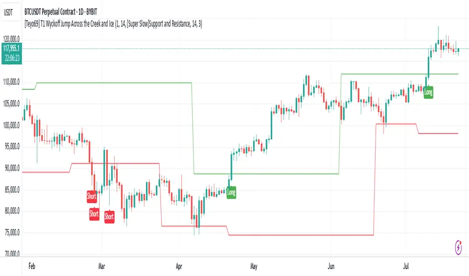
[Teyo69] T1 Wyckoff Jump Across the Creek and Ice📌 Overview
This indicator captures Wyckoff-style breakouts :
JAC (Jump Across the Creek) for bullish structure breakouts
JAI (Jump Across the Ice) for bearish breakdowns
It blends support/resistance logic, volume behavior, and slope/momentum from selected trend-following methods.
🧩 Features
Detects JAC (bullish breakout) and JAI (bearish breakdown) based on trend breakouts confirmed by volume.
Supports multiple trend logic modes:
📈 Super Trend
📉 EMA
🪨 Support & Resistance
📊 Linear Regression
Dynamically plots Creek (resistance) and Ice (support)
Incorporates volume spike and rising volume conditions for high-confidence signals
⚙️ How to Use
Select your preferred trend method from the dropdown.
Wait for:
A breakout in direction (up or down)
Rising volume and volume spike confirmation
Follow "Long" (JAC) or "Short" (JAI) labels for potential entries.
🎛️ Configuration
Indicator Leniency - Signal tolerance range after breakout
S&R Length - Pivot detection length for S/R method
Trend Method - Choose how trend is calculated
Volume SMA - Baseline for volume spike detection
Volume Length - Lookback for volume rising check
🧪 Signal Conditions
JAC Direction flips bullish + volume rising + spike
JAI Direction flips bearish + volume rising + spike
⚠️ Limitations
False signals possible during sideways/choppy markets.
Volume behavior depends on exchange feed accuracy.
S/R mode is slower but more stable; EMA & Linear Regression react faster but can whipsaw.
🔧 Advanced Tips
Use this with Wyckoff Accumulation/Distribution zones for better context.
Combine with RSI/OBV or higher timeframe trend filters.
Adjust leniency_lookback if signals feel too early/late.
If you're using Support and Resistance - Price action moves inside S & R it means that price is ranging.
📝 Notes
Volume conditions must confirm breakout, not just direction shift.
Built using native Pine Script switch and plotshape() for clarity.
"Creek" and "Ice" lines are color-coded trend / Support and Resistance zones.
DR OF ORB ( MEROOOO )this indicator marks the first 15 min candle of each session
if the market closed above the box go long with stop loss blow the box
and vice versa
