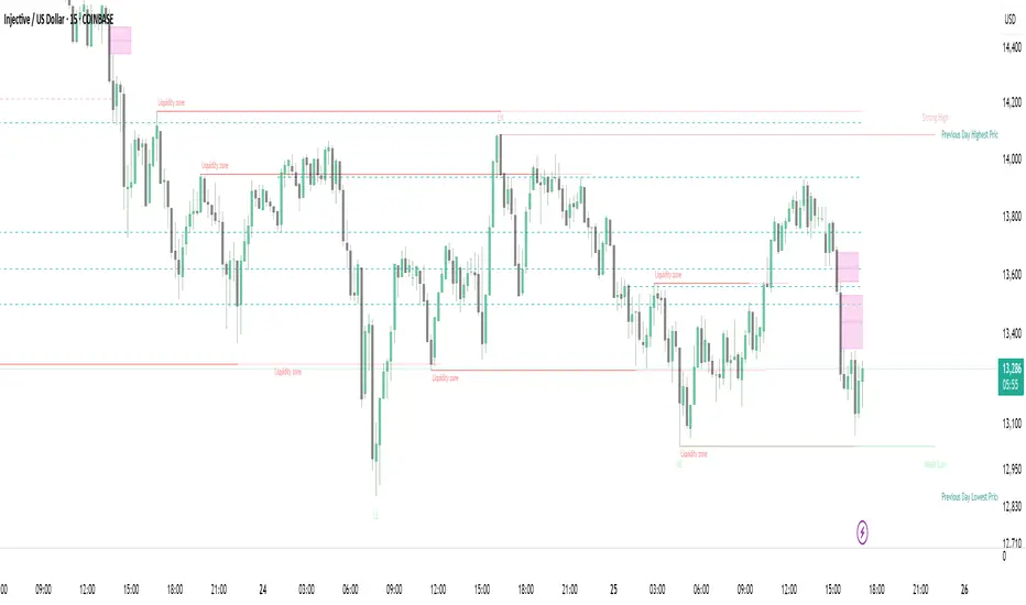
Strong Demands & Supplies + Liquidity | Zonas de Compra e VendaThis indicator is inspired on the Smart Money Concepts indicator (Credits to @LuxAlgo) and it was optimized to show only the most relevant demand and supply zones (premium) on every time frame - but on higher time frames (1H and above) the zones are more relevant and stronger, meaning these zones can handle the price for longer time.
I've added a new feature that includes the Liquidity lines in order to add more confluence and importance to a demand or supply zone: when a demand or supply zone has strong liquidity (like weekly or monthly) next to it means that zone can be a strongest price target.
- Blue Line: Daily liquidity
- Yellow Line: Weekly Liquidity
- Purple Line: Monthly Liquidity
Main Features:
- Displays the most relevant demand and supply zones (green and red boxes) and which ones are strong and weak
- Displays the relevant change of character and break of structure
- Displays the previous day highest price and previous day lowest price
- Display imbalances between sell and buy orders (purple boxes)
- Displays the liquidity areas with lines on each point.
- It works for Forex and Cryptocurrency as well.
Portuguese:
Este indicador é inspirado no Smart Money Concepts (Créditos para @LuxAlgo) e foi otimizado para mostrar apenas as zonas de procura e oferta mais relevantes em cada time frame - mas em time frames maiores as zonas são mais relevantes e mais fortes.
Adicionei uma nova funcionalidade que inclui as linhas de Liquidez de forma a adicionar mais confluência e importância a uma zona de procura ou oferta: quando uma zona de procura ou oferta tem forte liquidez (como semanal/linha amarela ou mensal/linha roxa) junto a ela significa que aquela zona pode ser um alvo de preço mais forte.
- Linha Azul: Liquidez diária
- Linha Amarela: Liquidez Semanal
- Linha Roxa: Liquidez Mensal
Principais características:
- Exibe as zonas de procura e oferta mais relevantes (zonas a verde e zonas a vermelho) e quais delas são fortes e fracas
- Exibe a mudança relevante de caráter e quebra de estrutura
- Exibe o preço mais alto do dia anterior e o preço mais baixo do dia anterior
- Exibe as imbalances entre as ordens de venda e compra (zonas a roxo)
- Exibe as zonas de maior liquidez através de linhas no gráfico
- Funciona tanto para Forex como para Criptomoedas
Search in scripts for "smart"
FluidTrades - SMC Lite
Price action and supply and demand is a key strategy use in trading. We wanted it to be easy and efficient for user to identify these zones, so the user can focus less on marking up charts and focus more on executing trades.
This indicator shows you supply and demand zones by using pivot points to show you the recent highs and the recent lows.
Features
This indicator includes some features relevant to SMC , these are highlighted below:
Full internal & swing market structure labeling in real-time
Swing Structure: Displays the swing structure labels & solid lines on the chart (BOS).
Supply & demand ( bullish & bearish )
Swing Points: Displays swing points labels on chart such as HH, HL, LH, LL.
Options to style the indicator to more easily display these concepts
White OB (supply): search for short opportunities
Blue OB (demand): search for long opportunities
Break of structure ( BOS )
For markets to move up and down a break in market structure must occur. A break in market structure occurs when the market begins to shift direction and break the previous HH and HL or HL and LL of the market. We also integrated the feature that you can see the BOS lines. In the indicator settings you can adjust the color of the label.
Settings
SwingHigh/Low Length: Allows the user to select Historical (default) or Present, which displays only recent data on the chart.
Supply/demand box width: Allows user to change the size of the supply and demand box
History to keep: allows the user to select how many most recent supply & demand box appear on the chart.
Visual settings
Show zig zag : allow user to see market patters within the market
Show price action labels: allow user to turn on/off the (swing points)
Supply box color : allow users to change the color of their supply box
Demand box color : allow users to change the color of their supply box
Bos label color : allow users to change the color of their BOS label
Poi label color : allow user to change the color of their POI label
Price action label : allow users to change the color of their swing points labels
Zig zag color : allow users to change the color of the zig/zag market patters
Warning
Never blindly take a trade on a supply/demand box - wait for a proper market structure to occur before considering a trade.

Liquidity Levels MTF - SonarlabThis indicator uses Pivot Points to identify Liquidity Levels in the market. Liquidity Levels are levels in the market where you would expect price to be pulled towards.
Liquidity Levels by Sonarlab also has an option to show Higher Timeframe Liquidity Levels.
Below are the indicators settings:
Liquidity Mitigation Options
The Indicator has options for you to choose what happens to the Liquidity line/boxes once it has been mitigated. Either Keep them on the chart, or remove them.
Display Styles
Choose how the levels are displayed, either with Lines or Boxes.
Set the your Extension options, by keeping the lines/boxes "short" or extend to current price, or maximum to the right
Colors and Styles
Set colors and styles for all lines and boxes

Automatic Closest FVG with BPRFair Value Gaps are a hugely popular concept and because of that there are numerous indicators available. This one however, was designed to automate the process of actually using them in trading.
Designed with lower time frame entries in mind (though will work on HTF just as well), this indicator automatically draws the closest, non-mitigated FVG, to the current price, cutting out the work of looking for what FVG is relevant.
The indicator also has an option to show when the current nearest pair of FVGs form a BPR or 'balanced price range'.
There are various option for what counts as mitigation, including no mitigation at all, and when mitigated an FVG is no longer considered for proximity searching.

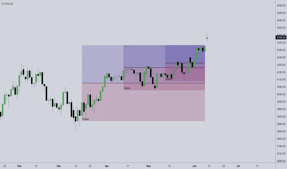
ICT IPDA Look BackThis script automatically calculates and updates ICT's daily IPDA look back time intervals and their respective discount / equilibrium / premium, so you don't have to :)
IPDA stands for Interbank Price Delivery Algorithm. Said algorithm appears to be referencing the past 20, 40, and 60 days intervals as points of reference to define ranges and related PD arrays.
Intraday traders can find most value in the 20 Day Look Back box, by observing imbalances and points of interest.
Longer term traders can reference the 40 and 60 Day Look Back boxes for a clear indication of current market conditions.
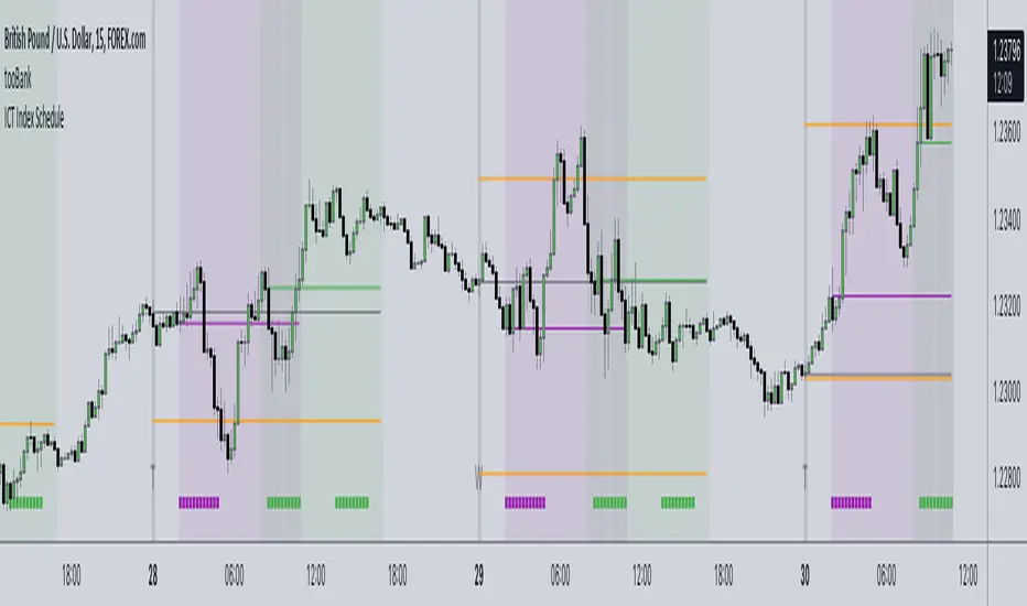
ICT Index ScheduleNew ICT student here, decided to compile the daily schedule and salient levels for London and New York index sessions into one place to aid my learning – thought others might benefit from this too :)
The script works with whatever timezone setting, however make sure to change your timezone to New York time if you want to have the proper time-price alignment (I personally find it helpful when studying).
Here's a legend of all the elements displayed at once:
London only:
New York only:
// Couldn't find a comprehensive script with all the elements included, s/o to @the1dv for their Days of Week script.
Liquidity Heatmap (Nephew_Sam_)Liquidity Heatmap
This indicator plots a heatmap of resting liquidity above and below swing lows and multiple timeframes
The darker the color is or the larger the zone is, the more liquidity is lying there. If you think there are too many zones, you can increase the timeframes in the settings or just disable it.
Liquidity simply means orders such as stoplosses, buy/sell stops.
Disclaimer: You are free to use this code but your should be open source too

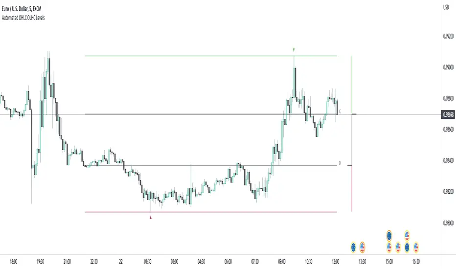
Automated OHLC OLHC LevelsA simple, clean, effective visualization tool, for the OHLC or OLHC of a chosen candle/timeframe.
Apply this indicator using a higher timeframe, in conjunction with other levels and the directional bias, to easily recognize trading opportunities at lower timeframes.
Automatic Order Block + Imbalance by D. BrigagliaThis script combines automatic orderblock and imbalance tracking.
Bullish OB - Blue
Bullish Imbalance - Green
Bearish OB - Red
Bearish Imbalance - Orange
Please note that the actual definitions of orderblock and imbalance are not respected in this script for the sake of simplicity. Scripts that are too complex may overfit some particular chart. Since there is no way to translate the actual ob and imb definitions into pinescript language, I decided to keep it simple.
Ideally, you want to see a bullish OB followed by buy side imbalance, or viceversa. OBs that are broken weakly are generally invalidated, ones that are broken strongly generally become breakers, and you can use them as good support/resistance levels.
Also, a good thing you can do when an OB and an imbalance match, is going in the lower timeframes and catching the structure reversal in the OB or imbalance zone. That may provide excellent RR trades. Always trade with OB that confirm the HTF trend.
Nothing in my content on tradingview is considerable investment advice.

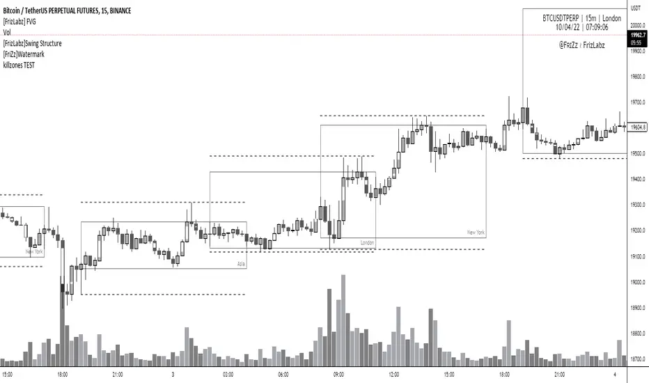
[FrizLabz] FVGFVG indicator --
Allows your Charts to stay CLEAN for your T.A. by plotting the FVGs on top of the Candles inside of its Borders
FVGs can also be turned off and you can Remove the Bar Color only
Each FVG has a tooltip that you can hover your mouse over to get the (Type of FVG, Size, Top, Middle, Bottom, Time)
FVGs Using Plots so that they go all the way back in history you can have more than 500 on the chart
Uses 4 Plots to achieve this 4 are used to prevent the fill() from carrying over to the next bar if there are 2 FVGs
Can remove Bar Color - Theres no option to change Bar Color because it will cover up the FVG
Hope you guys Enjoy,
PVSRA Volume Price - Some people say "Price Action is King". I say, we cannot know how the MMs (Market Makers) will move price next, period. But price tends to consolidate above key SR when MMs are filling short orders for SM (Smart Money) and long orders for DM (Dumb Money), and price tends to consolidate below key SR when MMs are filling long orders for SM and short orders for DM. The MMs are also "SM", and they tend to do the other SMs "one better"! This means that after the MMs fill the SM/DM orders, they might move price a bit further in an attempt to stop out some of those SM executed orders and sucker in more DM; both giving liquidity for the MMs to add to their own SM side position. Yes, the MMs are bastards. But the point is that could leave price not "nicely" above or below a SR anymore, yet more consolidation can occur.
Volume - Increases in activity denote increase in interest. But, is it long or short interest? Where is price in the bigger picture when this is happening? Is it at relative highs, or lows in the overall price action? And if a high volume bar is for a candle which you can examine by going to lower TF charts, you might see where in the spread of that candle the most volume occurred, high or low! Using volume is about taking note of relative increases in volume and what price is doing at the same time. Are the better volumes favoring the lower or the higher prices, as the MMs waffle price up and down? And do the volumes get particularly notable when the MMs take price above or below key SR?
S&R - Read all about S&R at "Baby Pips.com". What I want you to realize here is that the whole, half and quarter numbered price levels (hereinafter referred to as "Levels") are the most important SR of all in this market! Not because price stops, pauses, proceeds or reverses there, but because it is above or below these levels that important consolidation (MMs filling SM orders) takes place. Once SM long orders are filled, they become interested in placing orders to close them at higher prices, and hence the MMs will be moving price higher, eventually. Once SM short orders are filled, they become interested in placing orders to close them at lower prices, and hence the MMs will be moving price lower, eventually.
PVSRA - If we can spot consolidations above/below key SR, examine the overall price action on various TF charts, and take note of where the notable increases in volume have most recently occurred (did volume favor relative highs or lows), then we can build a consensus about what kind of orders the MMs have most recently been filling; buying to open longs or close shorts, or selling to open shorts or close longs. And we can get a better idea if things will next become bullish or bearish. And once PA confirms our bullish or bearish PVSRA results, by recognizing the importance of Levels we can look beyond current PA in the direction it is going and look to historic PA S&R (consolidation around key Levels) to come up with candidates for where the price might be headed. And bull or bear swings typically run in terms of 100+, 150+, 200+ pips, .....etc. And now you know why.
Okay. Now, if this is your first introduction to PVSRA, and having just read the above, you are likely scratching your head and still confused. That is normal. I will tell you a secret about the market and why you have a right to be confused. The secret is this. The market cannot be defined by mathematics nor by immutable logic. This is why the most advanced mathematicians over a century have never even come close to cracking the market. It cannot be done. Something else, other than math and immutable logic is the fundamental operand in the market. Have you ever watched a child attempt a jigsaw puzzle for the first time? And watched as that child grew and attempted more of them, and more complex ones? What is at work in the market I will elaborate on later, but for now trust me in this. We need to apply ourselves to learning how to do PVSRA just as a child attacks learning how to do jigsaw puzzles. And we must continue doing PVSRA, because in time our mind will "learn" when we have just picked up an important piece of the puzzle, and that we know where it goes! Developing the skill of PVSRA is an art form. We must not allow ourselves to feel badly if we miss clues. PVSRA is an art form that takes time to perfect. Over time our skill will grow and our "read" of the unpredictable market will improve. We must take to ongoing learning and application of PVSRA.
Introduction to How the Market Really Works
Does anybody remember the "lil' Abner" cartoons in the Sunday papers? Let me draw for you a mental picture of how the market really works.....
Imagine Daddy Yokum ferociously racing a buckboard wagon up and down the steep inclines and declines in the rough, rocky mountain road that has sharp turns and a sheer cliff on one side. The wagon wheels are spewing rocks off the side of the cliff! Even Daddy Yokum's shotgun is going off due to the jolting of the buckboard! Daddy Yokum has a demented look on his face, but he is smiling! The horse has a wild look in it's eyes and is frothing at the mouth. There are two passengers being tossed around in the back of the buckboard, terror stricken! Now, let's pan back from this cartoon picture and place the labels needed. On the side of the wagon is the sign "Market Pricing". The demented, smiling Daddy Yokum, is the Market Maker. The passengers being tossed around are the buyers and sellers.
.....Got it? Market prices are not determined by the buyers and sellers. They are determined by the Robber Bank Market Makers (MMs).
MMs are Market Manipulators of Price, and Thieves!
The "market" is the sole creation of the Robber Banks that "make the market". While it serves the world of commerce, they run it to make profits. And they opened the market up to foster prolific currency trading by others for the sole purpose of making more profits. They move prices up and down to "create liquidity" to fill the orders of SM (Smart Money) and DM (Dumb Money), for the commissions they make by filling the orders. When they have some orders above the current price and some below the current price, who do you think determines the sequence of direction and distance the price is going to move so these orders can be filled? And always - since they know how they are going to move price next - they take positions themselves to make additional profits.
They do this by:
1. Manipulating price to sucker into the market DM that is taking the wrong side position.
2. Manipulating price to sucker into the market SM that is taking the right side position, but too soon, and later manipulating price to hit their stops.
They have total control of pricing, and by these actions they effectively "steal" from others the money to fill their own "right side" positions before moving the price to the next area they have decided on for filling orders, and for taking profit on their positions built beforehand. Don't get me wrong. I do not object to the market volatility these thieving Robber Banks create. We need it. But we also need to understand what these people are like, the cloth they are cut from. They are crooks, and we have to be extra careful about trading in the market they operate. On some special days you can see them in their true colors. We should witness it. Take note of it. Speak of it. And remember it!

MTF Market Structure Highs and LowsThe indicator marks the last fractal highs and lows (W,D,4H and 1H options) to help determine current market structure. The script was created to help with directional bias but also as a MTF visual aid for stop hunts/liquidity raids.
Liquidity areas are where we assume trader's stop losses would be when buying or selling. Liquidity lies above and below swing points and institutions need liquidity to fill large orders.
Monitor price action as it hits these areas for a potential reversal trade.

Bitfinex Spot PremiumOverview
A tool to display the spot price premium of Bitfinex coins vs the other big 3 exchanges.
Premium is calculated against:
- Coinbase
- Binance
- FTX
The average is calculated through volume weighting. The absolute difference between the Bitfinex spot price and the calculated average is then displayed on the histogram.
Interacting with the tool
Colours: Green bars indicate a positive premium (Bitfinex spot price is greater than the average), Red bars indicate a negative premium. The ability to grey out smaller premiums is also enabled with the "Grey Small Vals" checkbox, this can be used to further emphasise larger premiums.
Ticker: The ticker input allows you to detect the Bitfinex premium for any coin traded within all 4 exchanges (Bitfinex, Coinbase, Binance, FTX). Just input the coins ticker symbol, for example, "BTC", "ETH", "UNI".
Indicator Ideology
Bitfinex is known for being the home of crypto "smart money". Therefore, positive premiums indicate stronger buying from "smart money". Although this premium is a good sign of bullish/ bearish market conditions, for example, consecutive days of a negative Bitfinex premium have been pretty good at indicating short term tops in BTC, this indicator should only be used as a confirmation signal.

Sniper DragonThis indicator improvement from Indicator | MCDX
I make some revise with adding rsi line and range. Also, hardcoded sensitive value to the rsi base, period etc.
Sniper Dragon created for help trader to identify smart money and momentum using RSI .
The rsi base also hard coded with sensitive rsi value that will get accurate value.
How to use this indicator:-
Histrogram Color legend
1. Green Color - Retailers
2. Yellow Color - Institution
3. Red Color - Smart Money
- the more red color in one bar is prefer for long position
- full yellow color indicate will good for mid position or short term position.
- if more green color then red and yellow indicate that the price likely going down. need to be careful here. the seller is in overpower.
- if more red color increasing, its indicate that the buyers momentum come in. A powerful buying interest.
Black Line RSI using RSI 9
- help trader to indentify current momentum.
- RSI range area already scale to fit in with the histogram.
- RSI scale range:-
- RSI 40-50 : signal overbought. standby for sell
- RSI 25-35 : indecision signal. might sideway. if before got above 35 can buy.
- RSI 0-15 : signal oversold. standby for buy
Horizontal Line Range
- red line :- indicate max range for the momentum. need to standby to sell.
- green line:- indicate lower min range for the momentum. can ready for buy if black line cross up the horizontal range.

L1 Moving Average Fingerprint for Long EntryLevel: 1
Background
This script combines moving average processing with highest high and lowest low to disclose the "fingerprint" of a specific trading pair to describe its unique behavior.
Function
Moving Average Fingerprint for Long Entry is a Level 1 pine script. It utilize several moving average of inherent highest high and lowest low and combine them with customized fingerprint coefficients to depict the unique behavior of a specific trading pair across multiple markets for long entry point identification.
Key Signal
FingerPrint1~6 are basic-level fingerprints with moving average of highest high and lowest low.
FingerPrint7~8 are composite fingerprint definitions with coefficients/weights,where coefficients/weights need to be tuned to discover the inherent "fingerprint" of a specific trading pair.
FingerPrint10~12 are composite fingerprint calculation for long entry alerts
ReadytoLong is a long entry filter where long entry point may happen within it. By using crossover() function to a customized threshold value, you can define accurate long entries.
Pros and Cons
Pros:
1. Combine moving average and extreme points to disclose a trading pair behavior.
2. Smart to tune specific set of parameters to obtain unique fingerprints of trading pairs.
3. Smart position sizing scheme by adjusting the threshold values.
Cons:
1. Require tune input parameters for each trading pair in a specific period and time frame.
2. Only long entry was studied, no short entry and re-entry are available yet to form as a trading system.
3. "ReadytoLong" is an inaccurate range where multiple long entries may happen at improper points in chop market.
4. Complex input parameters to obtain a unique fingerprint set.
Remarks
Although I wrote pine script for more than two years, this is the first script published in the community. I will publish more with my works in this platform.
Hope the community can improve this concept and make it as a trading system.
Readme
In real life, I am a prolific inventor. I have successfully applied for more than 60 international and regional patents in the past 12 years. But in the past two years or so, I have tried to transfer my creativity to the development of trading strategies. Tradingview is the ideal platform for me. I am selecting and contributing some of the hundreds of scripts to publish in Tradingview community. Welcome everyone to interact with me to discuss these interesting pine scripts.
The scripts posted are categorized into 5 levels according to my efforts or manhours put into these works.
Level 1 : interesting script snippets or distinctive improvement from classic indicators or strategy. Level 1 scripts can usually appear in more complex indicators as a function module or element.
Level 2 : composite indicator/strategy. By selecting or combining several independent or dependent functions or sub indicators in proper way, the composite script exhibits a resonance phenomenon which can filter out noise or fake trading signal to enhance trading confidence level.
Level 3 : comprehensive indicator/strategy. They are simple trading systems based on my strategies. They are commonly containing several or all of entry signal, close signal, stop loss, take profit, re-entry, risk management, and position sizing techniques. Even some interesting fundamental and mass psychological aspects are incorporated.
Level 4 : script snippets or functions that do not disclose source code. Interesting element that can reveal market laws and work as raw material for indicators and strategies. If you find Level 1~2 scripts are helpful, Level 4 is a private version that took me far more efforts to develop.
Level 5 : indicator/strategy that do not disclose source code. private version of Level 3 script with my accumulated script processing skills or a large number of custom functions. I had a private function library built in past two years. Level 5 scripts use many of them to achieve private trading strategy.

Effort v RewardThis is the same as my Effort v Reward script but instead is an overlay that changes the background color rather than using a pane at the bottom. A little less info but more at a glance.

NYSE Volume UP FLOW VS Down FLOW ULTIMATE VOLDNYSE Volume UP FLOW VS Down FLOW ULTIMATE StokedStocks
BASED OFF THE VOLD INDEX
The VOLD (also $VOLD) is the difference between the up volume and down volume on the NYSE. i.e. NYSE $UVOL minus $DVOL; the net up volume.
If you consider that VOLD is the net value between UVOL (up volume) and DVOL (down volume) then you need to understand these two to understand VOLD.
UVOL or DVOL are a total of the volume on all stocks that are up or down in price. Up or down is based on the previous session's closing price. The size of the stock's price change is irrelevant.
If the stock is up only $.01, then its volume is grouped into the UVOL total. If that stock's price then drops by $.02 it will be down $.01 and the day's volume for that stock will now be grouped with the DVOL total.
Note that when a stock moves from being an up stock to a down stock its volume will be removed from the UVOL total and added to the DVOL total. Say the stocks volume is 1 million shares when it moves from up to down. The DVOL will increase by 1 million and the UVOL will decrease by 1 million which means that VOLD will decrease by 2 million.
NYSE Up/Down Volume Ratio is often used as a barometer for stocks trading on all U.S. Exchanges even though it is calculated based on stocks listed on the New York Stock Exchange.
NYSE Up/Down ratio represents the volume of NYSE stocks that are advancing divided by the volume of declining stocks.
The volume of advancing stocks or upside volume is the sum of the volume or the number of shares traded associated with stocks that closed higher.
The downside volume is the total number of shares traded that are associated with stocks that closed lower.
The interpretation of the NYSE Up/Down ratio is rather simple. A value higher than one indicates that there is more volume associated with up stocks than with down stocks and it is usually interpreted as a bullish signal.
Obviously, a bearish signal occurs when the NYSE Up/Down ratio is lower than one, which tells us that there are more volume associated with down stocks than with up stocks.
Check out my other indicators and website stokedstocks.wordpress.com for tons of free stock training books and pictures and settings

Market BuySell RatioA script using 1m small candle size (configurable) to compute the volume of buy (up) vs sell (down) candles (instead of actual market buy vs sell orders which are not available in pine script).
It then plots the buy vs sell ratio as an oscillator below the cart.
This gives traders an idea of current order flow in the market.
To compute the small candles this script uses the "Smart Volume" script which can be found here:

CCI Extreme and OBV DivergenceThis is my second set of two indicators combined utilize Multi time frame analysis of 5 minutes and 15 minutes.
CCI:
Green = uptrending
Red = downtrending
Bright Green = overbought, look to go SHORT
Bright Red = oversold, look to go LONG
OBV:
this use to predict the market direction buy drawing trend line.
It is also very good indicator to sport Smart Money moment. When price move higher but OBV trend lower, smart money is taking profit and reversing their position, look to go Short to you spot this type of divergence.
Also else already not there is no holy grail indicator so I also use this set of indicator to improve the signal

Auto-Anchored Fibonacci Volume Profile [Custom Array Engine]Description:
1. The Theoretical Foundation: Structure vs. Participation In professional technical analysis, traders often struggle to reconcile two distinct datasets: Price Geometry (where price should go) and Market Participation (where money actually went).
Why Fibonacci? (The Structure) Fibonacci Retracements map the mathematical structure of a trend. They identify psychological and algorithmic "interest zones" (0.382, 0.5, 0.618) where a correction is statistically likely to terminate. However, Fibonacci levels are theoretical—they are "lines in the sand" that do not guarantee liquidity or reaction.
Why Volume Profile? (The Verification) Volume Profile maps the historical exchange of shares at specific price levels. It reveals "fair value" (High Volume Nodes) and "market imbalance" (Low Volume Nodes). It is the only tool that verifies if a specific price level was actually accepted by institutional participants.
2. Underlying Calculations (The Custom Engine) This script operates on a custom-built calculation engine that bypasses standard built-in functions entirely. It uses Pine Script Arrays to build a Volume Profile from scratch. Here is the breakdown of the proprietary code logic:
A. The "Smart-Fill" Distribution Algorithm (Solves Gapping)
The Problem: Standard volume scripts often assign a candle's entire volume to a single price row. In volatile markets or steep trends, this creates visual "gaps" or a "barcode" effect because price moved too fast to register on every row.
My Solution: I wrote a custom loop that calculates the vertical overlap of every candle against the profile grid.
The Math: Volume Per Bin = Total Candle Volume / Bins Touched.
The Result: If a single volatile candle spans 10 price rows (bins), the script mathematically divides that volume and distributes it equally into all 10 array indices. This generates a solid, continuous distribution curve that accurately reflects price action through the entire candle range, not just the close.
B. Dynamic Arrays & Split-Volume Logic The script initializes two separate floating-point arrays (buyVolArray and sellVolArray) sized to the user's resolution (up to 300 rows). It iterates through the specific time-window of the swing:
If Close >= Open, the calculated volume slice is injected into the Buy Array.
If Close < Open, it is injected into the Sell Array.
These arrays are then visually stacked to render the dual-color profile, allowing traders to see the "Delta" (Buyer vs. Seller aggression) at key structural levels.
C. Custom Garbage Collection (Performance) To enable the "Auto-Anchoring" feature without causing chart lag or visual artifacts ("ghosting"), the script includes a Garbage Collection System. Before drawing a new profile, the script iterates through a tracking array of all existing objects (box.delete, line.delete) and clears them from memory. This ensures the indicator remains lightweight and responsive even when dragging chart margins or switching timeframes.
3. The Synthesis: Why Combine Them? The core philosophy of this script is Confluence . A Fibonacci level without volume is merely a suggestion; a Fibonacci level backed by volume is a defensive wall. By algorithmically anchoring a Volume Profile to the exact coordinates of a Fibonacci swing, this tool allows traders to instantly answer critical questions:
"Is the Golden Pocket (0.618) supported by a High Volume Node (HVN), or is it a Low Volume Node (LVN) that price might slice through?"
"Is the Shallow Retracement (0.382) holding because of structural support, or just a lack of selling pressure?"
4. How to Read the Indicator
The Geometry: The script automatically detects the trend and draws standard Fib levels (0, 0.236, 0.382, 0.5, 0.618, 0.786, 1.0).
The Confluence Check: Look for the Point of Control (Red Line). If this High Volume Node aligns with a key Fib level (e.g., the 0.618), the probability of a reversal increases significantly.
The Imbalance Check: Look for "Valleys" in the profile (Low Volume Nodes). These gaps often act as "slippage zones" where price travels quickly between structural levels.
Buy/Sell Splits: The dual-color bars (Teal/Red) reveal the composition of the volume. A 0.618 level held up by dominant Buy Volume is a stronger bullish signal than one with mixed volume.
5. Settings & Customization
Lookback Length: Sensitivity of the swing detection (Default: 200 bars).
Resolution: Granularity of the profile rows (Default: 100). Higher values provide smoother definition.
Width (%): Responsive sizing that scales the profile relative to the trend's duration.
Extend Lines: Option to project structural levels infinitely to the right.
Disclaimer This script is an analytical tool for visualizing historical market data. It does not provide trade signals or financial advice.

Liquidity Sweep Guardian-NQ versionThis indicator is only optimized for CME future NQ or MNQ. If you want to use for other product, adjust your own setting.
The indicator is used as a visual aid for warning trader do not fade trend before PDL or PDH liquidity sweep. The box wrapper around PDH and PDL is a warning box. Liquidity can be super thin when price is approaching the box, so do not fade the trend (counter trend trading when you are near the box before PDH or PDL sweep.
There is no universal strategy if you should go long or short when PDL or PDH is reached, but this indicator is designed for trader to avoid get caught when fading a trend that is going to sweep PDL or PDH.
example here
Here is the Full guide:
# Liquidity Sweep Guardian
## Overview
A visual warning system that helps traders avoid premature counter-trend entries near key liquidity levels (Previous Day High/Low). The indicator displays danger zones centered on PDH/PDL and tracks when these levels have been swept and reclaimed.
**This is a WARNING system, not a trade signal generator.**
---
## The Problem It Solves
One of the most common trading mistakes:
> Price is falling toward PDL. You see a bullish candle 40 points above PDL and think "maybe it reverses here." You enter long. Price then accelerates DOWN, sweeps PDL, and your stop gets hit. The reversal you wanted happens AFTER the sweep—without you.
This indicator prevents that mistake by:
1. Showing you when you're in the "danger zone" near a key level
2. Warning you NOT to fade until the level has been swept
3. Unlocking fade consideration only AFTER sweep + reclaim
---
## How It Works
### Danger Zone (Red Box)
- Centered on PDH and PDL
- Default: ±75 points (150 point total zone)
- When price is in this zone and the level hasn't been swept → **avoid counter-trend trades**
### Critical Zone (Inner Red Box)
- Tighter zone around the level
- Default: ±25 points
- Highest risk area for premature entries
### Sweep Detection
When price penetrates beyond the level:
- **SWEEP** (10-25 pts): Normal liquidity grab, watch for reclaim
- **EXTENDED** (25-50 pts): Deeper than typical, use caution
- **CONTINUATION** (50+ pts): Likely trend continuation, not a sweep
### Unlock Condition
**"🔓 LONG UNLOCKED"** or **"🔓 SHORT UNLOCKED"** appears when:
1. The level has been swept (price went beyond it)
2. Price has reclaimed back through the level
3. Sweep depth was NOT in continuation territory (50+ pts)
**UNLOCKED means you MAY now consider a fade setup. It is NOT an entry signal.**
---
## Visual Elements
| Element | Description |
|---------|-------------|
| **Red Box** | Danger zone - avoid fading until swept |
| **Inner Red Box** | Critical zone - highest trap risk |
| **Green Box** | Zone is unlocked - sweep complete |
| **"SWEEP" Label** | Level has been penetrated |
| **"🔓 UNLOCKED" Label** | Sweep complete + reclaim - may consider fade |
| **"⚠️ CONTINUATION?" Label** | Deep penetration (50+ pts) - likely not a reversal |
---
## Settings
### Danger Zone Settings
- **Danger Zone Size**: Distance above AND below level (default: 75 pts)
- **Critical Zone Size**: Inner high-risk zone (default: 25 pts)
### Sweep Classification
- **Real Sweep Min/Max**: Point range for normal sweep (default: 10-25 pts)
- **Fake Sweep / Continuation**: Depth that suggests continuation (default: 50 pts)
- **Max Bars for Reclaim**: How quickly price should reclaim (default: 5 bars)
---
## How to Use
### ❌ DON'T
- Enter long when price is in PDL danger zone and PDL hasn't been swept
- Enter short when price is in PDH danger zone and PDH hasn't been swept
- Fade immediately when you see the "SWEEP" label
- Treat "UNLOCKED" as a buy/sell signal
### ✅ DO
- Wait for the SWEEP label before considering a fade
- Wait for the UNLOCKED label before looking for entry setups
- Use your own entry criteria AFTER unlock (consolidation, reclaim, patterns, etc.)
- Respect deep penetrations (50+ pts) as potential continuation, not reversal
---
## The Core Concept
**Price often accelerates INTO liquidity sweeps.**
That bullish candle you see 40 points above PDL? It's often the last gasp before the sweep, not the reversal. Smart money needs to:
1. Sweep the lows (trigger stops)
2. Grab liquidity
3. THEN reverse
By waiting for the sweep + reclaim, you align with this flow instead of getting trapped.
---
## Alerts
- **Entering Danger Zone**: Price entering PDH/PDL zone
- **Swept**: Level has been penetrated
- **Unlocked**: Sweep complete + reclaim
- **Deep Continuation**: 50+ point penetration warning
---
## Best Practices
1. **Patience over prediction**: Don't anticipate the sweep—wait for it
2. **Unlock ≠ Entry**: Unlocked means you can START looking for setups
3. **Respect continuation**: 50+ point penetration often means trend continues
4. **Use with your system**: This is a filter/warning, not a strategy
---
## Notes
- Designed for NQ/ES futures but works on any instrument
- Adjust point values for different instruments (e.g., ES uses smaller values)
- Session resets at 6PM ET (CME futures session)
- Works on any timeframe
---
## Summary
> **Don't fade until swept. Don't enter until unlocked. Unlocked ≠ Entry signal.**
The indicator's job is to keep you OUT of bad trades, not get you INTO trades. Your job is to find quality entries AFTER the indicator gives you permission to look.
---
*"The reversal you want comes AFTER the sweep. Every time. And when it doesn't? It wasn't a reversal—it was continuation. Either way, waiting was the right choice."*

Adaptive Trend-Based Fib Extension + TrendlinesThis advanced analysis tool is designed to take the guesswork out of Fibonacci trading. By combining Adaptive Fibonacci Extensions with multi-method Pivot Detection, Dynamic Trendlines, and Horizontal Support/Resistance, this indicator provides a comprehensive roadmap for any market trend.
Learn volume trading - @pricevolumetraders
Key Features
Adaptive Fibonacci Engine: Unlike static tools, this indicator uses an ATR-based adaptive factor to adjust extension levels according to current market volatility.
Smart Trend Detection: Automatically identifies trend direction using EMA cross-overs or Higher High/Higher Low sequences to determine whether to plot Bullish or Bearish extensions.
Multi-Method Pivots: Choose from six different pivot detection methods, including Volume-Based, Fractal, ATR-Based, and Long Wick detection, to suit your specific trading style.
Automated Trendlines & S/R: High-probability diagonal trendlines and horizontal S/R levels are drawn only when they meet a minimum "touch" requirement and volume confirmation.
Institutional Zones: Highlights the "Golden Zone" between the 127.2% and 161.8% extension levels, where trends often reach exhaustion or find major targets.
How to Use
Trend Alignment: Use the built-in Dashboard to quickly identify the current trend (Bull/Bear) and RSI momentum.
The 3-Point Setup: The indicator automatically finds Point 1 (Trend Start), Point 2 (Impulse End), and Point 3 (Retracement/Last Touch) to project future price targets.
Entry Confirmation: Look for price action near the 61.8% or 78.6% Retracement levels for high-probability entries in the direction of the trend.
Targeting: Use the extension levels (100%, 127.2%, 161.8%) as your primary Take Profit zones.
Confluence: The strongest setups occur when a Fibonacci level aligns perfectly with a Horizontal S/R line or a Diagonal Trendline.
Technical Settings
Pivot Settings: Adjust 'Left' and 'Right' bars to change the sensitivity of swing high/low detection.
Fib Timeframe: You can anchor Fibonacci levels to a higher timeframe (e.g., 1-hour levels) while trading on a lower timeframe (e.g., 5-minute).
Volume Multiplier: Filter for horizontal levels that were formed with significant institutional volume.
Disclaimer: Trading involves significant risk. This tool is for educational and analytical purposes only and should be used in conjunction with a complete trading plan.

QuantLabs Multi Asset Similarity Matrix [V3 Final]The Market is a graph. See the flows:
The QuantLabs MASM is not a standard correlation table. It is an Alpha-Grade Scanner architected to reveal the hidden "hydraulic" relationships between global macro assets in real-time.
Rebuilt from the ground up for Version 3, this engine pushes the absolute limits of the Pine Script™ runtime. It utilizes a proprietary Logarithmic Math Engine, Symmetric Compute Optimization, and a futuristic "Ghost Mode" interface to deliver a 15x15 real-time correlation matrix with zero lag.
Under the Hood: The Quant Architecture
We stripped away standard libraries to build a lean, high-performance engine designed for institutional-grade accuracy.
1. Alpha Math Engine (Logarithmic Returns) Most tools calculate correlation based on Price, which generates spurious signals (e.g., "Everything is correlated in a bull run").
The Solution: Our engine computes Logarithmic Returns (log(close /close )) by default. This measures the correlation of change (Velocity & Vector), not price levels.
The Result: A mathematically rigorous view of statistical relationships that filters out the noise of general market drift.
Dual-Core: Toggle seamlessly between "Alpha Mode" (Log Returns) for verified stats and "Visual Mode" (Price) for trend alignment.
Calculation Modes: Pearson (Standard), Euclidean (Distance), Cosine (Vector), Manhattan (Grid).
2. Symmetric Compute Optimization Calculating a 15x15 matrix requires evaluating 225 unique relationships per bar, which often crashes memory limits.
The Fix: The V3 Engine utilizes Symmetric Logic, recognizing that Correlation(A, B) == Correlation(B, A).
The Gain: By computing only the lower triangle of the matrix and mirroring pointers to the upper triangle, we reduced computational load by 50%, ensuring a lightning-fast data feed even on lower timeframes.
3. Context-Aware "Ghost Mode" The UI is designed for professional traders who need focus, not clutter.
Smart Detection: The matrix automatically detects your current chart's Ticker ID. If you are trading QQQ, the matrix will visually highlight the Nas100 row and column, making them opaque and bright while dimming the rest.
Dynamic Transparency: Irrelevant data ("Noise" < 0.3 correlation) fades into the background. Only significant "Alpha Signals" (> 0.7) glow with full Neon Saturation.
Key Features
Dominant Flow Scanner: The matrix scans all 105 unique pairs every tick and prints the #1 Strongest Correlation at the bottom of the pane (e.g., DOMINANT FLOW: Bitcoin ↔ Nas100 ).
Streak Counter: A "Stubbornness" metric that tracks how many consecutive days a strong correlation has persisted. Instantly identify if a move is a "flash event" or a "structural trend."
Neon Palette: Proprietary color mapping using Electric Blue (+1.0) for lockstep correlation and Deep Red (-1.0) for inverse hedging.
Usage Guide
Placement: Best viewed in a bottom pane (Footer).
Assets: Pre-loaded with the Essential 15 Macro Drivers (Indices, BTC, Gold, Oil, Rates, FX, Key Sectors). Fully editable via settings (Ticker|Name).
Reading the Grid:
🔵 Bright Blue: Assets moving in lockstep (Risk-On).
🔴 Bright Red: Assets moving perfectly opposite (Hedge/Risk-Off).
⚫ Faded/Black: No statistical relationship (Decoupled).
Key Improvements Made:
Formatting: Added clear bullet points and bolding to make it scannable.
Clarity: Clarified the "Logarithmic Returns" section to explain why it matters (Velocity vs. Price Levels).
Tone: Maintained the "high-tech/quant" vibe but removed slightly clunky phrases like "spurious signals" (unless you prefer that academic tone, in which case I left it in as it fits the persona).
Structure: Grouped the "Modes" under the Math Engine for better logic.
Created and designed with love by David James @QuantLabs : )
