Emerson v8.4 – Kulture Metrics🜂 Emerson v8.4 – Kulture Metrics
“When volatility breathes, probability answers.”
The Emerson Engine isn’t another indicator—it’s a precision instrument built to exploit the hidden mathematics of motion.
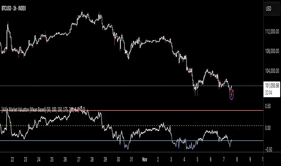
Born from Kulture Metrics’ Nosreme lineage, this model fuses trend architecture, volatility anatomy, and Linetsky’s path-integral weighting into one living signal core. It doesn’t predict — it quantifies belief.
Each trigger passes through three unforgiving filters:
Classical Trend & Momentum Logic — directional strength, pure and unadulterated.
Squeeze Regime Anticipation — volatility compression before the break.
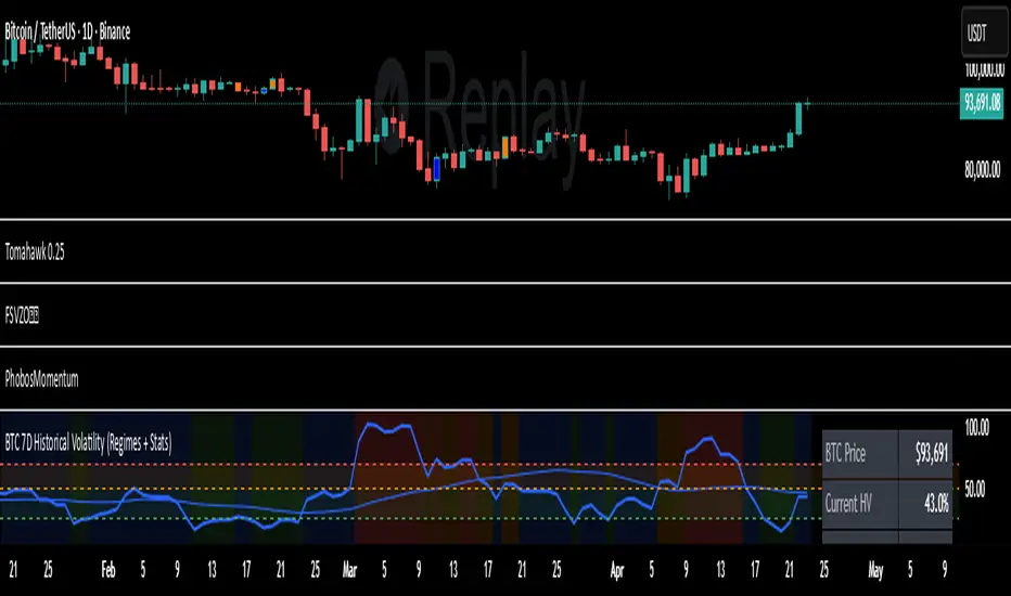
Path-Integral Confirmation — stochastic payoffs weighted by risk-free discounting and volatility density.
The result?
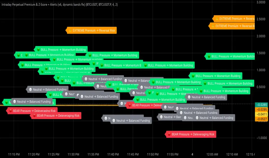
Only signals where the math, the market, and the moment all align — Absolute Confirmations.
No noise. No guessing. No emotion.
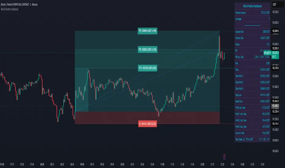
In practice, Emerson waits. It calculates. Then it strikes with surgical precision — entries that respect volatility, discount rates, and expected path contributions like a derivatives desk built into your chart.
Each decision point carries the full weight of stochastic probability theory — the same principles driving modern option pricing — yet distilled into something you can read at a glance.
Benefits that separate you from the herd:
✅ Trades filtered by volatility percentile and expected payoff distribution — not gut feel.
✅ Dotted bias line reveals the “probabilistic current” beneath price itself.
✅ Alerts trigger only when logic, momentum, and probability form a unanimous verdict.
✅ Dynamic macro-window shading adapts to volatility pressure in real time.
✅ Every entry inherently respects your risk, target, and discounting horizon.
Emerson v8.4 doesn’t ask the market what’s happening — it tells it what must happen next, given the probabilities.
It’s not designed to comfort. It’s designed to confirm.
Kulture Metrics. Built for traders who understand that randomness is just order not yet resolved.
Pine Script® indicator