Data TransformerIt is a data transformer. Is something TradingView lacks right now.
It is simple, it lets you transform the symbol of the chart into this options:
% change
change
QoQ change
QoQ change %
YoY change
YoY change %
Drawdawn %
Drawdawn
Cumulative
Statistics

Rolling Window Geometric Brownian Motion Projections📊 Rolling GBM Projections + EV & Adjustable Confidence Bands
Overview
The Rolling GBM Projections + EV & Adjustable Confidence Bands indicator provides traders with a robust, dynamic tool to model and project future price movements using Geometric Brownian Motion (GBM). By combining GBM-based simulations, expected value (EV) calculations, and customizable confidence bands, this indicator offers valuable insights for decision-making and risk management.
Key Features
Rolling GBM Projections: Simulate potential future price paths based on drift (μμ) and volatility (σσ).
Expected Value (EV) Line: Represents the average projection of simulated price paths.
Confidence Bands: Define ranges where the price is expected to remain, adjustable from 51% to 99%.
Simulation Lines: Visualize individual GBM paths for detailed analysis.
EV of EV Line: A smoothed trend of the EV, offering additional clarity on price dynamics.
Customizable Lookback Periods: Adjust the rolling lookback periods for drift and volatility calculations.
Mathematical Foundation
1. Geometric Brownian Motion (GBM)
GBM is a mathematical model used to simulate the random movement of asset prices, described by the following stochastic differential equation:
dSt=μStdt+σStdWt
dSt=μStdt+σStdWt
Where:
StSt: Price at time tt
μμ: Drift term (expected return)
σσ: Volatility (standard deviation of returns)
dWtdWt: Wiener process (standard Brownian motion)
2. Drift (μμ) and Volatility (σσ)
Drift (μμ): Represents the average logarithmic return of the asset. Calculated using a simple moving average (SMA) over a rolling lookback period.
μ=SMA(ln(St/St−1),Lookback Drift)
μ=SMA(ln(St/St−1),Lookback Drift)
Volatility (σσ): Measures the standard deviation of logarithmic returns over a rolling lookback period.
σ=STD(ln(St/St−1),Lookback Volatility)
σ=STD(ln(St/St−1),Lookback Volatility)
3. Price Simulation Using GBM
The GBM formula for simulating future prices is:
St+Δt=St×e(μ−12σ2)Δt+σϵΔt
St+Δt=St×e(μ−21σ2)Δt+σϵΔt
Where:
ϵϵ: Random variable from a standard normal distribution (N(0,1)N(0,1)).
4. Confidence Bands
Confidence bands are determined using the Z-score corresponding to a user-defined confidence percentage (CC):
Upper Band=EV+Z⋅σ
Upper Band=EV+Z⋅σ
Lower Band=EV−Z⋅σ
Lower Band=EV−Z⋅σ
The Z-score is computed using an inverse normal distribution function, approximating the relationship between confidence and standard deviations.
Methodology
Rolling Drift and Volatility:
Drift and volatility are calculated using logarithmic returns over user-defined rolling lookback periods (default: μ=20μ=20, σ=16σ=16).
Drift defines the overall directional tendency, while volatility determines the randomness and variability of price movements.
Simulations:
Multiple GBM paths (default: 30) are generated for a specified number of projection candles (default: 12).
Each path is influenced by the current drift and volatility, incorporating random shocks to simulate real-world price dynamics.
Expected Value (EV):
The EV is calculated as the average of all simulated paths for each projection step, offering a statistical mean of potential price outcomes.
Confidence Bands:
The upper and lower bounds of the confidence bands are derived using the Z-score corresponding to the selected confidence percentage (e.g., 68%, 95%).
EV of EV:
A running average of the EV values, providing a smoothed perspective of price trends over the projection horizon.
Indicator Functionality
User Inputs:
Drift Lookback (Bars): Define the number of bars for rolling drift calculation (default: 20).
Volatility Lookback (Bars): Define the number of bars for rolling volatility calculation (default: 16).
Projection Candles (Bars): Set the number of bars to project future prices (default: 12).
Number of Simulations: Specify the number of GBM paths to simulate (default: 30).
Confidence Percentage: Input the desired confidence level for bands (default: 68%, adjustable from 51% to 99%).
Visualization Components:
Simulation Lines (Blue): Display individual GBM paths to visualize potential price scenarios.
Expected Value (EV) Line (Orange): Highlight the mean projection of all simulated paths.
Confidence Bands (Green & Red): Show the upper and lower confidence limits.
EV of EV Line (Orange Dashed): Provide a smoothed trendline of the EV values.
Current Price (White): Overlay the real-time price for context.
Display Toggles:
Enable or disable components (e.g., simulation lines, EV line, confidence bands) based on preference.
Practical Applications
Risk Management:
Utilize confidence bands to set stop-loss levels and manage trade risk effectively.
Use narrower confidence intervals (e.g., 50%) for aggressive strategies or wider intervals (e.g., 95%) for conservative approaches.
Trend Analysis:
Observe the EV and EV of EV lines to identify overarching trends and potential reversals.
Scenario Planning:
Analyze simulation lines to explore potential outcomes under varying market conditions.
Statistical Insights:
Leverage confidence bands to understand the statistical likelihood of price movements.
How to Use
Add the Indicator:
Copy the script into the TradingView Pine Editor, save it, and apply it to your chart.
Customize Settings:
Adjust the lookback periods for drift and volatility.
Define the number of projection candles and simulations.
Set the confidence percentage to tailor the bands to your strategy.
Interpret the Visualization:
Use the EV and confidence bands to guide trade entry, exit, and position sizing decisions.
Combine with other indicators for a holistic trading strategy.
Disclaimer
This indicator is a mathematical and statistical tool. It does not guarantee future performance.
Use it in conjunction with other forms of analysis and always trade responsibly.
Happy Trading! 🚀

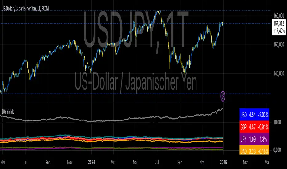
10-Year Yields Table for Major CurrenciesThe "10-Year Yields Table for Major Currencies" indicator provides a visual representation of the 10-year government bond yields for several major global economies, alongside their corresponding Rate of Change (ROC) values. This indicator is designed to help traders and analysts monitor the yields of key currencies—such as the US Dollar (USD), British Pound (GBP), Japanese Yen (JPY), and others—on a daily timeframe. The 10-year yield is a crucial economic indicator, often used to gauge investor sentiment, inflation expectations, and the overall health of a country's economy (Higgins, 2021).
Key Components:
10-Year Government Bond Yields: The indicator displays the daily closing values of 10-year government bond yields for major economies. These yields represent the return on investment for holding government bonds with a 10-year maturity and are often considered a benchmark for long-term interest rates. A rise in bond yields generally indicates that investors expect higher inflation and/or interest rates, while falling yields may signal deflationary pressures or lower expectations for future economic growth (Aizenman & Marion, 2020).
Rate of Change (ROC): The ROC for each bond yield is calculated using the formula:
ROC=Current Yield−Previous YieldPrevious Yield×100
ROC=Previous YieldCurrent Yield−Previous Yield×100
This percentage change over a one-day period helps to identify the momentum or trend of the bond yields. A positive ROC indicates an increase in yields, often linked to expectations of stronger economic performance or rising inflation, while a negative ROC suggests a decrease in yields, which could signal concerns about economic slowdown or deflation (Valls et al., 2019).
Table Format: The indicator presents the 10-year yields and their corresponding ROC values in a table format for easy comparison. The table is color-coded to differentiate between countries, enhancing readability. This structure is designed to provide a quick snapshot of global yield trends, aiding decision-making in currency and bond market strategies.
Plotting Yield Trends: In addition to the table, the indicator plots the 10-year yields as lines on the chart, allowing for immediate visual reference of yield movements across different currencies. The plotted lines provide a dynamic view of the yield curve, which is a vital tool for economic analysis and forecasting (Campbell et al., 2017).
Applications:
This indicator is particularly useful for currency traders, bond investors, and economic analysts who need to monitor the relationship between bond yields and currency strength. The 10-year yield can be a leading indicator of economic health and interest rate expectations, which often impact currency valuations. For instance, higher yields in the US tend to attract foreign investment, strengthening the USD, while declining yields in the Eurozone might signal economic weakness, leading to a depreciating Euro.
Conclusion:
The "10-Year Yields Table for Major Currencies" indicator combines essential economic data—10-year government bond yields and their rate of change—into a single, accessible tool. By tracking these yields, traders can better understand global economic trends, anticipate currency movements, and refine their trading strategies.
References:
Aizenman, J., & Marion, N. (2020). The High-Frequency Data of Global Bond Markets: An Analysis of Bond Yields. Journal of International Economics, 115, 26-45.
Campbell, J. Y., Lo, A. W., & MacKinlay, A. C. (2017). The Econometrics of Financial Markets. Princeton University Press.
Higgins, M. (2021). Macroeconomic Analysis: Bond Markets and Inflation. Harvard Business Review, 99(5), 45-60.
Valls, A., Ferreira, M., & Lopes, M. (2019). Understanding Yield Curves and Economic Indicators. Financial Markets Review, 32(4), 72-91.
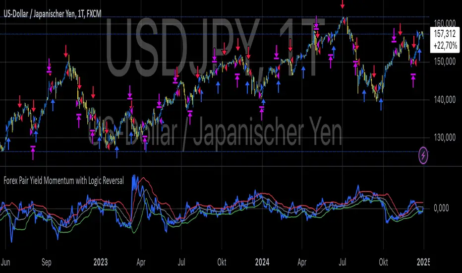
Forex Pair Yield Momentum This Pine Script strategy leverages yield differentials between the 2-year government bond yields of two countries to trade Forex pairs. Yield spreads are widely regarded as a fundamental driver of currency movements, as highlighted by international finance theories like the Interest Rate Parity (IRP), which suggests that currencies with higher yields tend to appreciate due to increased capital flows:
1. Dynamic Yield Spread Calculation:
• The strategy dynamically calculates the yield spread (yield_a - yield_b) for the chosen Forex pair.
• Example: For GBP/USD, the spread equals US 2Y Yield - UK 2Y Yield.
2. Momentum Analysis via Bollinger Bands:
• Yield momentum is computed as the difference between the current spread and its moving
Bollinger Bands are applied to identify extreme deviations:
• Long Entry: When momentum crosses below the lower band.
• Short Entry: When momentum crosses above the upper band.
3. Reversal Logic:
• An optional checkbox reverses the trading logic, allowing long trades at the upper band and short trades at the lower band, accommodating different market conditions.
4. Trade Management:
• Positions are held for a predefined number of bars (hold_periods), and each trade uses a fixed contract size of 100 with a starting capital of $20,000.
Theoretical Basis:
1. Yield Differentials and Currency Movements:
• Empirical studies, such as Clarida et al. (2009), confirm that interest rate differentials significantly impact exchange rate dynamics, especially in carry trade strategies .
• Higher-yields tend to appreciate against lower-yielding currencies due to speculative flows and demand for higher returns.
2. Bollinger Bands for Momentum:
• Bollinger Bands effectively capture deviations in yield momentum, identifying opportunities where price returns to equilibrium (mean reversion) or extends in trend-following scenarios (momentum breakout).
• As Bollinger (2001) emphasized, this tool adapts to market volatility by dynamically adjusting thresholds .
References:
1. Dornbusch, R. (1976). Expectations and Exchange Rate Dynamics. Journal of Political Economy.
2. Obstfeld, M., & Rogoff, K. (1996). Foundations of International Macroeconomics.
3. Clarida, R., Davis, J., & Pedersen, N. (2009). Currency Carry Trade Regimes. NBER.
4. Bollinger, J. (2001). Bollinger on Bollinger Bands.
5. Mendelsohn, L. B. (2006). Forex Trading Using Intermarket Analysis.
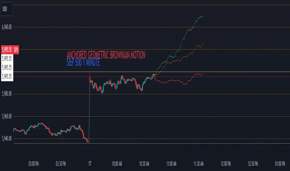
Anchored Geometric Brownian Motion Projections w/EVAnchored GBM (Geometric Brownian Motion) Projections + EV & Confidence Bands
Version: Pine Script v6
Overlay: Yes
Author:
Published On:
Overview
The Anchored GBM Projections + EV & Confidence Bands indicator leverages the Geometric Brownian Motion (GBM) model to project future price movements based on historical data. By simulating multiple potential future price paths, it provides traders with insights into possible price trajectories, their expected values, and confidence intervals. Additionally, it offers a "Mean of EV" (EV of EV) line, representing the running average of expected values across the projection period.
Key Features
Anchor Time Setup:
Define a specific point in time from which the projections commence.
By default, it uses the current bar's timestamp but can be customized.
Projection Parameters:
Projection Candles (Bars): Determines the number of future bars (time periods) to project.
Number of Simulations: Specifies how many GBM paths to simulate, ensuring statistical relevance via the Central Limit Theorem (CLT).
Display Toggles:
Simulation Lines: Visual representation of individual GBM simulation paths.
Expected Value (EV) Line: The average price across all simulations at each projection bar.
Upper & Lower Confidence Bands: 95% confidence intervals indicating potential price boundaries.
EV of EV Line: Running average of EV values, providing a smoothed central tendency across the projection period. Additionally, this line often acts as an indicator of trend direction.
Visualization:
Clear and distinguishable lines with customizable colors and styles.
Overlayed on the price chart for direct comparison with actual price movements.
Mathematical Foundation
Geometric Brownian Motion (GBM):
Definition: GBM is a continuous-time stochastic process used to model stock prices. It assumes that the logarithm of the stock price follows a Brownian motion with drift.
Equation:
S(t)=S0⋅e(μ−12σ2)t+σW(t)
S(t)=S0⋅e(μ−21σ2)t+σW(t) Where:
S(t)S(t) = Stock price at time tt
S0S0 = Initial stock price
μμ = Drift coefficient (average return)
σσ = Volatility coefficient (standard deviation of returns)
W(t)W(t) = Wiener process (standard Brownian motion)
Drift (μμ) and Volatility (σσ):
Drift (μμ) represents the expected return of the stock.
Volatility (σσ) measures the stock's price fluctuation intensity.
Central Limit Theorem (CLT):
Principle: With a sufficiently large number of independent simulations, the distribution of the sample mean (EV) approaches a normal distribution, regardless of the underlying distribution.
Application: Ensures that the EV and confidence bands are statistically reliable.
Expected Value (EV) and Confidence Bands:
EV: The mean price across all simulations at each projection bar.
Confidence Bands: Range within which the actual price is expected to lie with a specified probability (e.g., 95%).
EV of EV (Mean of Sample Means):
Definition: Represents the running average of EV values across the projection period, offering a smoothed central tendency.
Methodology
Anchor Time Setup:
The indicator starts projecting from a user-defined Anchor Time. If not customized, it defaults to the current bar's timestamp.
Purpose: Allows users to analyze projections from a specific historical point or the latest market data.
Calculating Drift and Volatility:
Returns Calculation: Computes the logarithmic returns from the Anchor Time to the current bar.
returns=ln(StSt−1)
returns=ln(St−1St)
Drift (μμ): Calculated as the simple moving average (SMA) of returns over the period since the Anchor Time.
Volatility (σσ): Determined using the standard deviation (stdev) of returns over the same period.
Simulation Generation:
Number of Simulations: The user defines how many GBM paths to simulate (e.g., 30).
Projection Candles: Determines the number of future bars to project (e.g., 12).
Process:
For each simulation:
Start from the current close price.
For each projection bar:
Generate a random number zz from a standard normal distribution.
Calculate the next price using the GBM formula:
St+1=St⋅e(μ−12σ2)+σz
St+1=St⋅e(μ−21σ2)+σz
Store the projected price in an array.
Expected Value (EV) and Confidence Bands Calculation:
EV Path: At each projection bar, compute the mean of all simulated prices.
Variance and Standard Deviation: Calculate the variance and standard deviation of simulated prices to determine the confidence intervals.
Confidence Bands: Using the standard normal z-score (1.96 for 95% confidence), establish upper and lower bounds:
Upper Band=EV+z⋅σEV
Upper Band=EV+z⋅σEV
Lower Band=EV−z⋅σEV
Lower Band=EV−z⋅σEV
EV of EV (Running Average of EV Values):
Calculation: For each projection bar, compute the average of all EV values up to that bar.
EV of EV =1j+1∑k=0jEV
EV of EV =j+11k=0∑jEV
Visualization: Plotted as a dynamic line reflecting the evolving average EV across the projection period.
Visualization Elements
Simulation Lines:
Appearance: Semi-transparent blue lines representing individual GBM simulation paths.
Purpose: Illustrate a range of possible future price trajectories based on current drift and volatility.
Expected Value (EV) Line:
Appearance: Solid orange line.
Purpose: Shows the average projected price at each future bar across all simulations.
Confidence Bands:
Upper Band: Dashed green line indicating the upper 95% confidence boundary.
Lower Band: Dashed red line indicating the lower 95% confidence boundary.
Purpose: Highlight the range within which the price is statistically expected to remain with 95% confidence.
EV of EV Line:
Appearance: Dashed purple line.
Purpose: Displays the running average of EV values, providing a smoothed trend of the central tendency across the projection period. As the mean of sample means it approximates the population mean (i.e. the trend since the anchor point.)
Current Price:
Appearance: Semi-transparent white line.
Purpose: Serves as a reference point for comparing actual price movements against projected paths.
Usage Instructions
Configuring User Inputs:
Anchor Time:
Set to a specific timestamp to start projections from a historical point or leave it as default to use the current bar's time.
Projection Candles (Bars):
Define the number of future bars to project (e.g., 12). Adjust based on your trading timeframe and analysis needs.
Number of Simulations:
Specify the number of GBM paths to simulate (e.g., 30). Higher numbers yield more accurate EV and confidence bands but may impact performance.
Display Toggles:
Show Simulation Lines: Toggle to display or hide individual GBM simulation paths.
Show Expected Value Line: Toggle to display or hide the EV path.
Show Upper Confidence Band: Toggle to display or hide the upper confidence boundary.
Show Lower Confidence Band: Toggle to display or hide the lower confidence boundary.
Show EV of EV Line: Toggle to display or hide the running average of EV values.
Managing TradingView's Object Limits:
Understanding Limits:
TradingView imposes a limit on the number of graphical objects (e.g., lines) that can be rendered. High values for projection candles and simulations can quickly consume these limits. TradingView appears to only allow a total of 55 candles to be projected, so if you want to see two complete lines, you would have to set the projection length to 27: since 27 * 2 = 54 and 54 < 55.
Optimizing Performance:
Use Toggles: Enable only the necessary visual elements. For instance, disable simulation lines and confidence bands when focusing on the EV and EV of EV lines. You can also use the maximum projection length of 55 with the lower limit confidence band as the only line, visualizing a long horizon for your risk.
Adjust Parameters: Lower the number of projection candles or simulations to stay within object limits without compromising essential insights.
Interpreting the Indicator:
Simulation Lines (Blue):
Represent individual potential future price paths based on GBM. A wider spread indicates higher volatility.
Expected Value (EV) Line (Goldenrod):
Shows the mean projected price at each future bar, providing a central trend.
Confidence Bands (Green & Red):
Indicate the statistical range (95% confidence) within which the price is expected to remain.
EV of EV Line (Dotted Line - Goldenrod):
Reflects the running average of EV values, offering a smoothed perspective of expected price trends over the projection period.
Current Price (White):
Serves as a benchmark for assessing how actual prices compare to projected paths.
Practical Applications
Risk Management:
Confidence Bands: Help in identifying potential support and resistance levels based on statistical confidence intervals.
EV Path: Assists in setting realistic target prices and stop-loss levels aligned with projected expectations.
Trend Analysis:
EV of EV Line: Offers a smoothed trendline, aiding in identifying overarching market directions amidst price volatility. Indicative of the population mean/overall trend of the data since your anchor point.
Scenario Planning:
Simulation Lines: Enable traders to visualize multiple potential outcomes, fostering better decision-making under uncertainty.
Performance Evaluation:
Comparing Actual vs. Projected Prices: Assess how actual price movements align with projected scenarios, refining trading strategies over time.
Mathematical and Statistical Insights
Simulation Integrity:
Independence: Each simulation path is generated independently, ensuring unbiased and diverse projections.
Randomness: Utilizes a Gaussian random number generator to introduce variability in diffusion terms, mimicking real market randomness.
Statistical Reliability:
Central Limit Theorem (CLT): By simulating a sufficient number of paths (e.g., 30), the sample mean (EV) converges to the population mean, ensuring reliable EV and confidence band calculations.
Variance Calculation: Accurate computation of variance from simulation data ensures precise confidence intervals.
Dynamic Projections:
Running Average (EV of EV): Provides a cumulative perspective, allowing traders to observe how the average expectation evolves as the projection progresses.
Customization and Enhancements
Adjustable Parameters:
Tailor the projection length and simulation count to match your trading style and analysis depth.
Visual Customization:
Modify line colors, styles, and transparency to enhance clarity and fit chart aesthetics.
Extended Statistical Metrics:
Future iterations can incorporate additional metrics like median projections, skewness, or alternative confidence intervals.
Dynamic Recalculation:
Implement logic to automatically update projections as new data becomes available, ensuring real-time relevance.
Performance Considerations
Object Count Management:
High simulation counts and extended projection periods can lead to a significant number of graphical objects, potentially slowing down chart performance.
Solution: Utilize display toggles effectively and optimize projection parameters to balance detail with performance.
Computational Efficiency:
The script employs efficient array handling and conditional plotting to minimize unnecessary computations and object creation.
Conclusion
The Anchored GBM Projections + EV & Confidence Bands indicator is a robust tool for traders seeking to forecast potential future price movements using statistical models. By integrating Geometric Brownian Motion simulations with expected value calculations and confidence intervals, it offers a comprehensive view of possible market scenarios. The addition of the "EV of EV" line further enhances analytical depth by providing a running average of expected values, aiding in trend identification and strategic decision-making.
Hope it helps!
Engulfing Candlestick StrategyEver wondered whether the Bullish or Bearish Engulfing pattern works or has statistical significance? This script is for you. It works across all markets and timeframes.
The Engulfing Candlestick Pattern is a widely used technical analysis pattern that traders use to predict potential price reversals. It consists of two candles: a small candle followed by a larger one that "engulfs" the previous candle. This pattern is considered bullish when it occurs in a downtrend (bullish engulfing) and bearish when it occurs in an uptrend (bearish engulfing).
Statistical Significance of the Engulfing Pattern:
While many traders rely on candlestick patterns for making decisions, research on the statistical significance of these patterns has produced mixed results. A study by Dimitrios K. Koutoupis and K. M. Koutoupis (2014), titled "Testing the Effectiveness of Candlestick Chart Patterns in Forex Markets," indicates that candlestick patterns, including the engulfing pattern, can provide some predictive power, but their success largely depends on the market conditions and timeframe used. The researchers concluded that while some candlestick patterns can be useful, traders must combine them with other indicators or market knowledge to improve their predictive accuracy.
Another study by Brock, Lakonishok, and LeBaron (1992), "Simple Technical Trading Rules and the Stochastic Properties of Stock Returns," explores the profitability of technical indicators, including candlestick patterns, and finds that simple trading rules, such as those based on moving averages or candlestick patterns, can occasionally outperform a random walk in certain market conditions.
However, Jorion (1997), in his work "The Risk of Speculation: The Case of Technical Analysis," warns that the reliability of candlestick patterns, including the engulfing patterns, can vary significantly across different markets and periods. Therefore, it's important to use these patterns as part of a broader trading strategy that includes other risk management techniques and technical indicators.
Application Across Markets:
This script applies to all markets (e.g., stocks, commodities, forex) and timeframes, making it a versatile tool for traders seeking to explore the statistical effectiveness of the bullish and bearish engulfing patterns in their own trading.
Conclusion:
This script allows you to backtest and visualize the effectiveness of the Bullish and Bearish Engulfing patterns across any market and timeframe. While the statistical significance of these patterns may vary, the script provides a clear framework for evaluating their performance in real-time trading conditions. Always remember to combine such patterns with other risk management strategies and indicators to enhance their predictive power.

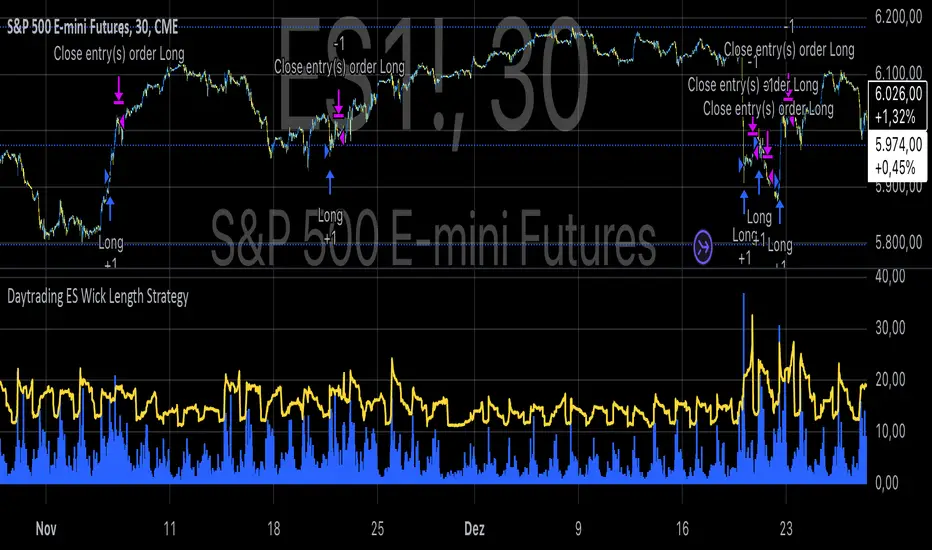
Daytrading ES Wick Length StrategyThis Pine Script strategy calculates the combined length of upper and lower wicks of candlesticks and uses a customizable moving average (MA) to identify potential long entry points. The strategy compares the total wick length to the MA with an added offset. If the wick length exceeds the offset-adjusted MA, the strategy enters a long position. The position is automatically closed after a user-defined holding period.
Key Features:
1. Calculates the sum of upper and lower wicks for each candlestick.
2. Offers four types of moving averages (SMA, EMA, WMA, VWMA) for analysis.
3. Allows the user to set a customizable MA length and an offset to shift the MA.
4. Automatically exits positions after a specified number of bars.
5. Visualizes the wick length as a histogram and the offset-adjusted MA as a line.
References:
• Candlestick wick analysis: Nison, S. (1991). Japanese Candlestick Charting Techniques.
• Moving averages: Brock, W., Lakonishok, J., & LeBaron, B. (1992). “Simple Technical Trading Rules and the Stochastic Properties of Stock Returns”. Journal of Finance.
This strategy is suitable for identifying candlesticks with significant volatility and long wicks, which can indicate potential trend reversals or continuations.
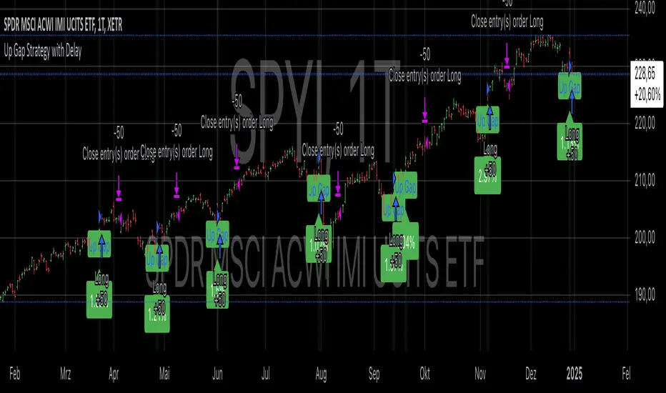
Up Gap Strategy with DelayThis strategy, titled “Up Gap Strategy with Delay,” is based on identifying up gaps in the price action of an asset. A gap is defined as the percentage difference between the current bar’s open price and the previous bar’s close price. The strategy triggers a long position if the gap exceeds a user-defined threshold and includes a delay period before entering the position. After entering, the position is held for a set number of periods before being closed.
Key Features:
1. Gap Threshold: The strategy defines an up gap when the gap size exceeds a specified threshold (in percentage terms). The gap threshold is an input parameter that allows customization based on the user’s preference.
2. Delay Period: After the gap occurs, the strategy waits for a delay period before initiating a long position. This delay can help mitigate any short-term volatility that might occur immediately after the gap.
3. Holding Period: Once the position is entered, it is held for a user-defined number of periods (holdingPeriods). This is to capture the potential post-gap trend continuation, as gaps often indicate strong directional momentum.
4. Gap Plotting: The strategy visually plots up gaps on the chart by placing a green label beneath the bar where the gap condition is met. Additionally, the background color turns green to highlight up-gap occurrences.
5. Exit Condition: The position is exited after the defined holding period. The strategy ensures that the position is closed after this time, regardless of whether the price is in profit or loss.
Scientific Background:
The gap theory has been widely studied in financial literature and is based on the premise that gaps in price often represent areas of significant support or resistance. According to research by Kaufman (2002), gaps in price action can be indicators of future price direction, particularly when they occur after a period of consolidation or a trend reversal. Moreover, Gaps and their Implications in Technical Analysis (Murphy, 1999) highlights that gaps can reflect imbalances between supply and demand, leading to high momentum and potential price continuation or reversal.
In trading strategies, utilizing gaps with specific conditions, such as delay and holding periods, can enhance the ability to capture significant price moves. The strategy’s delay period helps avoid potential market noise immediately after the gap, while the holding period seeks to capitalize on the price continuation that often follows gap formation.
This methodology aligns with momentum-based strategies, which rely on the persistence of trends in financial markets. Several studies, including Jegadeesh & Titman (1993), have documented the existence of momentum effects in stock prices, where past price movements can be predictive of future returns.
Conclusion:
This strategy incorporates gap detection and momentum principles, supported by empirical research in technical analysis, to attempt to capitalize on price movements following significant gaps. By waiting for a delay period and holding the position for a specified time, it aims to mitigate the risk associated with early volatility while maximizing the potential for sustained price moves.
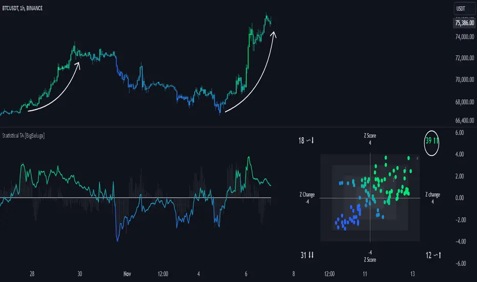
Statistical Trend Analysis (Scatterplot) [BigBeluga]Statistical Trend Analysis (Scatterplot) provides a unique perspective on market dynamics by combining the statistical concept of z-scores with scatterplot visualization to assess price momentum and potential trend shifts.
🧿 What is Z-Score?
Definition: A z-score is a statistical measure that quantifies how far a data point is from the mean, expressed in terms of standard deviations.
In this Indicator:
A high positive z-score indicates the price is significantly above the average.
A low negative z-score indicates the price is significantly below the average.
The indicator also calculates the rate of change of the z-score, helping identify momentum shifts in the market.
🧿 Key Features:
Scatterplot Visualization:
Displays data points of z-score and its change across four quadrants.
Quadrants help interpret market conditions:
Upper Right (Strong Bullish Momentum): Most data points here signal an ongoing uptrend.
Upper Left (Weakening Momentum): Data points here may indicate a potential market shift or ranging market.
Lower Left (Strong Bearish Momentum): Indicates a dominant downtrend.
Lower Right (Trend Shift to Bullish/Ranging): Suggests weakening bearish momentum or an emerging uptrend.
Color-Coded Candles:
Candles are dynamically colored based on the z-score, providing a visual cue about the price's deviation from the mean.
Z-Score Time Series:
A line plot of z-scores over time shows price deviation trends.
A gray histogram displays the rate of change of the z-score, highlighting momentum shifts.
🧿 Usage:
Use the scatterplot and quadrant gauges to understand the current market momentum and potential shifts.
Monitor the z-score line plot to identify overbought/oversold conditions.
Utilize the gray histogram to detect momentum reversals and trend strength.
This tool is ideal for traders who rely on statistical insights to confirm trends, detect potential reversals, and assess market momentum visually and quantitatively.
ROE BandROE Band shows the return on net profit from shareholders' equity and the formula for decomposition
ROE = ROA x CSL x CEL
ROE Band consists of 5 parts:
1. ROE (TTM) is the 12-month ROE calculation in "green"
2. Return on Equity (ROE) is the current quarterly net profit / the average of the beginning and ending periods of shareholders' equity in "yellow"
3. Return on Assets (ROA) is the current quarterly NOPAT (net profit before tax) / the average of the beginning and ending periods of total assets in "blue"
4. Capital structure leverage (CSL) is a financial measure that compares a company's debt to its total capital. It is calculated by taking the average of the beginning and ending periods of total assets / the average of the beginning and ending periods of shareholders' equity. The higher the CSL, the more deb, in. "red"
5. Common earnings leverage (CEL) is the proportion of net profit and NOPAT (net profit before tax), where a lower CEL means more tax, in "orange"
The "😱" emoji represents the value if it increases by more than or decreases by less than 20%, e.g.
- ROE(TTM), ROE, ROA, CEL is decreasing
- CSL is increasing
The "🔥" emoji represents the value if it increases by more than or decreases, e.g.
- ROE(TTM), ROE, ROA, CEL is increasing
- CSL is decreasing

RSI Trend [MacroGlide]The RSI Trend indicator is a versatile and intuitive tool designed for traders who want to enhance their market analysis with visual clarity. By combining Stochastic RSI with moving averages, this indicator offers a dynamic view of market momentum and trends. Whether you're a beginner or an experienced trader, this tool simplifies identifying key market conditions and trading opportunities.
Key Features:
• Stochastic RSI-Based Calculations: Incorporates Stochastic RSI to provide a nuanced view of overbought and oversold conditions, enhancing standard RSI analysis.
• Dynamic Moving Averages: Includes two customizable moving averages (MA1 and MA2) based on smoothed Stochastic RSI, offering flexibility to align with your trading strategy.
• Candle Color Coding: Automatically colors candles on the chart:
• Blue: When the faster moving average (MA2) is above the slower one (MA1), signaling bullish momentum.
• Orange: When the faster moving average is below the slower one, indicating bearish momentum.
• Integrated Scaling: The indicator dynamically adjusts with the chart's scale, ensuring seamless visualization regardless of zoom level.
How to Use:
• Add the Indicator: Apply the indicator to your chart from the TradingView library.
• Interpret Candle Colors: Use the color-coded candles to quickly identify bullish (blue) and bearish (orange) phases.
• Customize to Suit Your Needs: Adjust the lengths of the moving averages and the Stochastic RSI parameters to better fit your trading style and timeframe.
• Combine with Other Tools: Pair this indicator with trendlines, volume analysis, or support and resistance levels for a comprehensive trading approach.
Methodology:
The indicator utilizes Stochastic RSI, a derivative of the standard RSI, to measure momentum more precisely. By applying smoothing and calculating moving averages, the tool identifies shifts in market trends. These trends are visually represented through candle color changes, making it easy to spot transitions between bullish and bearish phases at a glance.
Originality and Usefulness:
What sets this indicator apart is its seamless integration of Stochastic RSI and moving averages with real-time candle coloring. The result is a visually intuitive tool that adapts dynamically to chart scaling, offering clarity without clutter.
Charts:
When applied, the indicator plots two moving averages alongside color-coded candles. The combination of visual cues and trend logic helps traders easily interpret market momentum and make informed decisions.
Enjoy the game!

Smooth RSI [MarktQuant]This indicator combines elements of the Relative Strength Index (RSI) and Rate of Change (RoC) to provide a smoother and potentially more insightful view of market momentum and price movement. The Smooth RSI calculates RSI values across four price points (high, open, low, close) to average them, offering a less volatile RSI signal. Additionally, it incorporates a Rate of Change for trend confirmation, enhancing the decision-making process for trade entries and exits.
Features:
Multi-RSI Calculation: RSI is computed for high, open, low, and close prices, then averaged to reduce noise.
Trend Confirmation with RoC: Uses the Rate of Change to validate the RSI signals, coloring bars based on the trend direction.
Visual Signals:
Bar colors change based on combined RSI and RoC signals.
Green for bullish signals (RSI above 50 and positive RoC).
Red for bearish signals (RSI below 50 and negative RoC).
Horizontal lines at 30, 50, and 70 to denote overbought, neutral, and oversold conditions.
Customizable Display:
Option to show/hide RSI plot or RoC plot for cleaner charts.
Candle plot overlay option to visualize current price action alongside the indicator.
Inputs:
RSI Length: Default 28. Adjusts the lookback period for RSI calculation.
RoC Length: Default 28. Sets the period for the Rate of Change calculation.
Plot Settings:
Show RSI - Toggle RSI plot visibility.
Show RoC - Toggle RoC plot visibility.
Usage:
Long signals are indicated when the average RSI is above 50 and the RoC is positive.
Short signals are suggested when the average RSI falls below 50 with a negative RoC.
The color coding helps visually confirm trends at a glance.
Notes:
This indicator is best used in conjunction with other analysis methods to confirm signals.
Adjust the length parameters based on your trading timeframe for optimal results.
Disclaimer:
This indicator does not guarantee trading success; use it as part of a comprehensive trading strategy. Always conduct your own analysis before making trading decisions.
Market Correlation AnalysisMarket Correlation Analysis is an indicator that measures the correlation of any two instruments.
To express price changes in a way that is comparable, this indicator uses a percentage of the ATR as a unit.
User Inputs:
Other Symbol - the symbol which we want to compare with the symbol of the main chart.
ATR for Price Movement Normalisation - I recommend high values to get the ATR more stable across time - if the ATR drastically changes, the indicator will register that as a price movement, because the unit in which price movements are measured itself changed by a lot. However, with higher values the ATR is stable and, in my opinion, more reliable than simply a percentage change of the current price.
Correlation Length - this is the number of bars for which the correlation coefficient will be calculated.
About The Indicator:
Market Correlation Analysis expresses the price changes of both instruments in question on the same histogram.
By default, the price changes that represent the instrument of the main chart are expressed with thinner bars of stronger colour, while the price changes that represent the other instrument are expressed with much thicker bars, which are of more pale colour.
The correlation coefficient is not expressed on the histogram, as it has a different scale. Therefore, it is only showed as a number.
I hope this indicator can make it easier to understand just how much two instruments have been similar to one another over a certain period of time. The possibility to see the correlation for any given time frame can give information that very specific to any trading style.

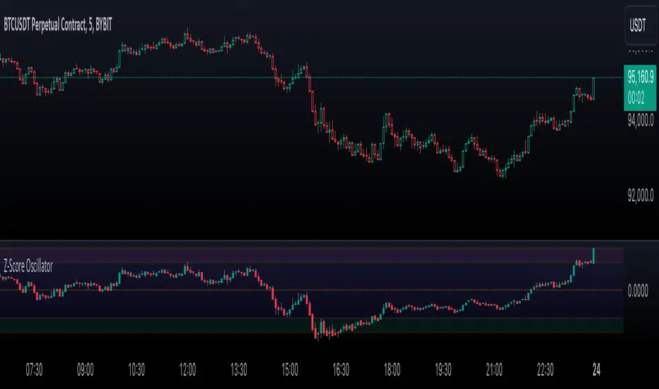
Enhanced Price Z-Score OscillatorThe Enhanced Price Z-Score Oscillator by tkarolak is a powerful tool that transforms raw price data into an easy-to-understand statistical visualization using Z-Score-derived candlesticks. Simply put, it shows how far prices stray from their average in terms of standard deviations (Z-Scores), helping traders identify when prices are unusually high (overbought) or unusually low (oversold).
The indicator’s default feature displays Z-Score Candlesticks, where each candle reflects the statistical “distance” of the open, high, low, and close prices from their average. This creates a visual map of market extremes and potential reversal points. For added flexibility, you can also switch to Z-Score line plots based on either Close prices or OHLC4 averages.
With clear threshold lines (±2σ and ±3σ) marking moderate and extreme price deviations, and color-coded zones to highlight overbought and oversold areas, the oscillator simplifies complex statistical concepts into actionable trading insights.
Temporary Help Services Jobs - Trend Allocation StrategyThis strategy is designed to capitalize on the economic trends represented by the Temporary Help Services (TEMPHELPS) index, which is published by the Federal Reserve Economic Data (FRED). Temporary Help Services Jobs are often regarded as a leading indicator of labor market conditions, as changes in temporary employment levels frequently precede broader employment trends.
Methodology:
Data Source: The strategy uses the FRED dataset TEMPHELPS for monthly data on temporary help services.
Trend Definition:
Uptrend: When the current month's value is greater than the previous month's value.
Downtrend: When the current month's value is less than the previous month's value.
Entry Condition: A long position is opened when an uptrend is detected, provided no position is currently held.
Exit Condition: The long position is closed when a downtrend is detected.
Scientific Basis:
The TEMPHELPS index serves as a leading economic indicator, as noted in studies analyzing labor market cyclicality (e.g., Katz & Krueger, 1999). Temporary employment is often considered a proxy for broader economic conditions, particularly in predicting recessions or recoveries. Incorporating this index into trading strategies allows for aligning trades with potential macroeconomic shifts, as suggested by research on employment trends and market performance (Autor, 2001; Valetta & Bengali, 2013).
Usage:
This strategy is best suited for long-term investors or macroeconomic trend followers who wish to leverage labor market signals for equity or futures trading. It operates exclusively on end-of-month data, ensuring minimal transaction costs and noise.

Option Time ValueThis TradingView script calculates and visualizes the time value of an option (Call or Put) based on its market price and intrinsic value. The time value represents the premium paid for the option above its intrinsic value, and it is a key metric for analyzing the cost of holding an option.
This script is suitable for traders analyzing options on indices or stocks, such as the NIFTY 50, and supports both Call and Put options. By dynamically extracting the strike price and option type from the input symbol, it adapts seamlessly to the selected instrument.
Key Features:
Dynamic Instrument Selection:
Users can input the underlying asset (e.g., NSE:NIFTY) and the specific option instrument (e.g., NSE:NIFTY250327C24000 for a Call or NSE:NIFTY250327P24000 for a Put).
Automatic Option Type Detection:
The script detects whether the option is a Call or a Put by parsing the input symbol for the characters "C" (Call) or "P" (Put).
Dynamic Strike Price Extraction:
The strike price is dynamically extracted from the input option symbol, eliminating the need for hardcoding and reducing user errors.
Key Metrics Plotted:
Time Value: The premium paid above the intrinsic value, plotted in blue.
Intrinsic Value: The calculated intrinsic value of the option, plotted in green.
Seamless Integration:
Designed for ease of use and integration into existing TradingView setups.
Automatically adjusts to the timeframe and pricing data of the selected instruments.
