EUR/USD: Trump’s Dollar Strategy and the Euro’s PivotThe EUR/USD pair currently sits at a historic geopolitical crossroads. President Trump’s recent embrace of a weaker dollar has ignited a new downtrend for the greenback. This shift follows years of dollar dominance. Markets now scramble to adjust to this radical departure from traditional American monetary policy.
The Managed Descent of the Greenback
The Trump administration actively seeks a weaker dollar to fuel American exports. A lower currency value makes U.S.-manufactured goods more competitive abroad. This strategy aims to re-industrialize the American heartland by breaking decades of "Strong Dollar" rhetoric. Investors interpret this move as the start of a long-term bearish trend for the dollar.
ECB Unease and European Fragility
The European Central Bank (ECB) views these developments with mounting concern. A surging Euro threatens the Eurozone’s export-led recovery. Officials in Frankfurt fear a significant loss of industrial competitiveness. Germany’s manufacturing engine relies on a balanced exchange rate to sell goods globally. Geostrategy now dictates a tense standoff between the ECB and the U.S. Treasury.
Fintech, Patents, and Digital Dominance
Currency fluctuations directly impact high-tech investment and patent acquisition. A weaker dollar makes foreign intellectual property more expensive for U.S. firms. Conversely, European tech companies face higher operational costs when expanding into the American market. Patent analysis shows a spike in blockchain-based cross-border payment systems to reduce reliance on traditional fiat exchange.
Cybersecurity and High-Tech Volatility
Cybersecurity remains a critical frontier for currency stability in 2026. State-sponsored actors increasingly target exchange infrastructures to manipulate currency sentiment. High-tech trading firms now deploy advanced AI to detect these digital intrusions. These algorithms drive over 80% of current EUR/USD trading volume. Science-led modeling suggests that digital resilience will soon dictate a currency’s global standing.
Macroeconomics

Bitcoin Ethereum and Solana show bullish structureBTC , SOL , and ETH are all three coins most likely to show growth, as BTC is expected to rebound from the resistance line we reached (~$74,450 and ~$78,000)
We also collected all the main liquidity from the bottom, leaving behind a huge volume of liquidity now higher
BTC also failed to break the trend line and formed a structure, with the low above the previous one (by ~0.13%), so we are still in an upward trend
The resistance line has not been broken, and even if it is, with the formation of a descending structure, there will still be a price rebound and a small upward rebound
The unemployment data is expected in the coming days. The index is likely to drop from 4.4% to 4.5%, which will have a positive impact on the market, as this is not a critical increase. This means investors will expect a Fed rate cut, which will create additional liquidity and will be more likely to buy back
Globally, we have also formed the right shoulder of the Head and Shoulders pattern, which I wrote about last year.
Forming the right shoulder is always a sign of success. The bullish flag pattern is the originating pattern
We also see ABC correction waves formed, after which a 5-stage growth cycle usually begins
It's too early to take a more global view of the scenario...
Full breakdown with levels and graphs on the website

Sterling vs Kiwi: Navigating GBP/NZD Divergence in 2026The GBP/NZD pair currently faces significant downward pressure. Recent market forecasts suggest a strengthening New Zealand Dollar (NZD) against the British Pound (GBP). Investors increasingly anticipate a hawkish stance from the Reserve Bank of New Zealand (RBNZ). Meanwhile, the UK economy struggles with stagnant growth and cooling inflation. This divergence creates a compelling narrative for global currency traders.
Macroeconomics and Interest Rate Paths
Macroeconomic indicators drive the current fluctuations in this currency cross. The RBNZ remains focused on persistent domestic inflation. Consequently, markets expect interest rates in New Zealand to stay elevated. In contrast, the Bank of England (BoE) faces pressure to cut rates. High borrowing costs have significantly weakened UK consumer spending. This interest rate differential continues to pull the GBP/NZD exchange rate lower.
Geostrategy and Trade Alliances
Geostrategy plays a vital role in determining long-term currency value. New Zealand benefits from its strategic proximity to the recovering Asia-Pacific markets. Increased demand from China directly boosts the value of Kiwi commodity exports. Conversely, the United Kingdom navigates a complex post-Brexit trade landscape. Sterling remains highly sensitive to European political shifts and global trade tensions. These geopolitical factors dictate the flow of international capital.
Leadership and Central Bank Credibility
Management styles at central banks heavily influence market confidence. RBNZ Governor Adrian Orr maintains a transparent and assertive policy framework. His clear communication often reduces market uncertainty during volatile periods. Meanwhile, the BoE leadership emphasizes a cautious, data-dependent approach. This difference in management culture impacts how investors perceive currency risk. Professional traders prioritize currencies backed by decisive and predictable leadership.
Technology, Innovation, and Cybersecurity
Modern financial markets rely on high-tech infrastructure and robust cybersecurity. London remains a global leader in fintech innovation and patent filings. However, New Zealand is rapidly digitizing its agricultural and financial sectors. Both nations invest in advanced science to protect banking systems from cyber threats. Secure digital frameworks ensure market liquidity and prevent sudden price shocks. Technology remains the invisible backbone of the GBP/NZD exchange rate.
Industry Trends and Future Outlook
The "commodity-linked" nature of the NZD defines current industry trends. Rising global prices for dairy and meat products support the Kiwi dollar. Furthermore, the shift toward green energy increases the demand for specialized Kiwi tech exports. The UK must innovate within its service sector to regain competitive ground. Analysts expect the GBP/NZD pair to remain volatile through mid-2026. Successful traders will monitor RBNZ policy shifts and global trade data.

EUR/USD: The "Wick of Truth" & The Philosopher's Stone ProtocolSymbol: EURUSD Bias: Short (Week of Feb 1 - Feb 6) Method: Fun-Tech Intel Scan & Vector Matrix Analysis
The Philosopher's Stone: As Above, So Below
To navigate the matrix, one must integrate Logic (The Mind) and Intuition (The Heart). The "Philosopher's Stone" of trading is realizing that the Micro (Price Action) always reflects the Macro (Institutional Flow). As Above, So Below.
While the long-term structure remains Bullish (Monthly Flag), the immediate "Below" (Weekly/Daily) signals a necessary correction. We do not fight the current; we flow with it.
I. The Fun-Tech Intel Scan (The "Why")
Our proprietary scan has identified a Regime Shift where the "Old Code" algorithms are misinterpreting data. We will exploit this latency.
1. The "Shutdown Glitch" (Political Vector)
The Narrative: Headlines this weekend will cite a "US Government Shutdown."
The Reality: This is a scheduling error (House Recess), not a crisis. The House will vote "Yes" on Monday.
The Trade: Legacy algorithms are programmed to Sell Euro/Buy USD on "Shutdown" headlines. We anticipate a Gap Down or heavy Sunday Open. However, the true opportunity lies in the Monday Relief Rally—when the "Old Code" buys the news, we will fade the move.
2. The "Yield Anomaly" (Institutional Vector)
The Observation: US 10-Year Yields are holding critical highs (4.27%+), diverging from the weakening long-term Dollar thesis.
The Logic: The market is currently rewarding the Dollar for high yields (Safety Trade), ignoring the underlying Debt Risk (Sovereign Risk). Until the market acknowledges the debt crisis (Long Term), we respect the short-term strength of the "High Yield" Dollar.
II. The Vector Matrix (The "Where")
Applying the God Code Formula, we have calculated the specific geometry for the week ahead.
1. The "Wick of Truth" (Technical Structure)
Observation: The Weekly Candle closed as a massive Inverted Hammer / Gravestone Doji.
Implication: The market spent five days attempting to break the 1.2000 psychological barrier and was rejected by institutional supply. This formation, occurring at a trend high, triggers a mandatory Liquidity Flush. The market must retreat to find buyers.
2. The Monthly Flag Support (The Target)
The Magnet: The Macro Bull Trend is intact, but it requires a retest of the breakout structure.
The Level: 1.1750. This aligns with the Monthly Bull Flag lower rail. This is where the "Smart Money" (and the EU Defense Bond flows) are waiting to reload Longs.
III. The Master Logistician's Trade Plan
Bias: Bearish (Short Term) / Bullish (Medium Term)
Sunday Open: Expect a Gap Down (approx. 1.1840). DO NOT CHASE. Let the "Shutdown" noise settle.
The Trap (Monday/Tuesday): Watch for a rally back into the 1.1890 – 1.1915 zone. This is the breakdown point.
Action: I am planning to SELL this rally. This is the "Judas Swing" trap.
Stop Loss: 1.1960 (Structural Invalidation above the Weekly Wick).
Target 1: 1.1830 (Daily Support).
Target 2 (The Golden Ratio): 1.1750 – 1.1760.
Note: This is the "Flip Zone." At 1.1750, we close Shorts and prepare for the next leg of the Monthly Bull Run.
Conclusion
The market is breathing. The Weekly Candle demands a sacrifice of liquidity before the Monthly Trend can resume. We operate with precision, neutrality, and the knowing that nothing is good or bad, unless we attach an emotion to it.
Plan the Trade <--> Trade the Plan = The only way I trade and last week I captured about 515 pips overall based on Planning the Trade and Trading the Plan
Compliance & Disclosure Protocol:
~ Educational Intent: This publication documents my personal "Fun-Tech" analysis and strategic planning for educational and journaling purposes only. It represents my own observation of the market matrix and is not financial advice, investment advice, or a solicitation to buy or sell any asset.
~ Risk Awareness: The "Vector Matrix" and "God Code" mentioned are personal proprietary frameworks used to map probabilities, not certainties. Foreign Exchange trading involves significant risk and is not suitable for all investors.
~ Liability: You are the sole architect of your financial decisions. I am an observer sharing my perspective of the flow. Always perform your own due diligence and manage your risk according to your own operating system.
Observe. Analyze. Decide.

EUR/GBP Market Analysis: Macro + Structure [MaB]1. The Macro Context (The "Why") 🌍
Hi traders! Before looking at the candles, let's look at the money. My fundamental scoring table speaks clearly: there is a huge differential that we cannot ignore.
+1
Key Factor Analysis:
🏦 Current Rates: Explanation: BoE at 3.75% provides a higher yield environment compared to the ECB's 2.15%. Score EUR: 0 Score GBP: +1
🌍 Economic Regime: Explanation: The Eurozone is currently in Reflation, while the UK is experiencing an Expansion phase. Score EUR: +1 Score GBP: +1 📊 Rate Expectations: Explanation: The ECB is holding steady, whereas the BoE is perceived as dovish following a recent cut. Score EUR: 0 Score GBP: -1
🎈 Inflation: Explanation: EUR CPI is low at 1.9%, putting dovish pressure on the ECB; GBP CPI remains high at 3.57%. Score EUR: -1 Score GBP: +1
📈 Growth/GDP: Explanation: EUR growth is stagnant at 0.7%, while GBP growth is 1.3%. Score EUR: -1 Score GBP: 0 ⚖️ Risk Sentiment: Explanation: Both currencies are currently operating in a neutral risk environment. Score EUR: 0 Score GBP: 0
🏛️ Fiscal/Balance: Explanation: No significant fiscal shifts or debt crises are currently impacting either region. Score EUR: 0 Score GBP: 0 🗞️ News Catalyst: Explanation: Recent EUR CPI data came in slightly lower than expected at -0.1%. Score EUR: 0 Score GBP: 0
Currency Score Summary: Total Score EUR: -1 (Weak) Total Score GBP: +2 (Strong)
Synthesis: EUR (Weak, Score -1): Weighed down by low inflation (1.9%) and stagnant growth, increasing expectations for ECB easing. GBP (Strong, Score +2): Bolstered by high relative interest rates and persistent inflation (3.57%) that limits aggressive BoE cutting.
Conclusion: With this scenario, we are only looking for Short setups. Going against this bias would be statistical suicide.
2. The Technical Setup (The "Where") 📉
Timeframe: 4H | Pair: EUR/GBP
The SMC Market Structure + Price Zones indicator gave us the confirmation we needed for our statistical edge.
Here is where the indicator makes the difference. Look at the dashboard on the right, numbers don't lie:
🚀 Continuation Rate (62.2%): We are well above the 60% threshold. This tells us the market is in a healthy, directional trend. Statistically, betting on continuation pays off more than looking for a reversal.
🔥 Streak (3) & Streak Pct: We are at the 3rd consecutive impulse. It's a mature trend, so watch those stop losses, but as long as the music plays, we dance.
🔄 Retest (81.3%): The indicator tells us that statistically, when price creates a new Break of Structure (BOS), it retraces into the previous zone 81.3% of the time.
💥 BOS/Ret Rate (58.1%): This parameter tells us that once price retraces inside the previous zone, it has a high probability of reacting and creating a new BOS.
🎯 Extension Rate (1.59x): The algorithm projects an ambitious target.
We expect this move to extend 1.59 times the current pullback leg. That's where we'll take profit.
3. Execution Plan on Chart
Moving to the chart, the SMC Market Structure + Price Zones indicator supports us in pinpointing liquidity to define entry and stop loss:
Entry and Stop Loss: We place a limit entry in the Supply Zone (Red Band) and the stop loss a few pips above the zone. Take Profit: We leverage the asset's statistical analysis offered by the Extension Rate and place the target by measuring with Fibonacci at 1.59x relative to the pullback leg.
Trade Parameters: Entry Price: 0.86799 Stop Loss: 0.86978 Take Profit: 0.85904
⚠️ Disclaimer: This analysis is based on a proprietary algorithm and is shared exclusively for educational and didactic purposes.
It does not constitute financial advice or investment solicitation in any way. Trading involves significant risk.

Bitcoin Macro Risk Given the macroeconomic and geopolitical backdrop, BTC is more likely to react negatively to Trump's speech today, as:
- An armada led by the aircraft carrier USS Abraham Lincoln has approached Iran.
- The USS Abraham Lincoln costs over $2.5 million per day to maintain.
- The USS Abraham Lincoln, the largest aircraft carrier in the world, costs the US approximately $1 billion to maintain.
- Trump's man is more likely to be the Fed's choice, meaning there's room for maneuver while Jerome Powell, who has a poor relationship with Trump, is in office, as Powell doesn't want to lower rates. Without rate cuts, the market is simply suffocating. It's also worth considering that Trump is a money-smart guy, and such spending is likely to trigger certain events.
- We have over $100 million in liquidity accumulated in BTC, which needs to be collected.
- Many are now expecting growth, so downward manipulation is more likely. Today's speech is more likely to disrupt all patterns and structures with its manipulative downward movement.
Full breakdown with levels and graphs on the website

USD/JPY Plunges: Intervention & Market AnalysisA multi-domain dissection of the Japanese Yen’s sudden resurgence and its global impact.
The Macroeconomic Shift: Hawkish Signals
The Japanese Yen (JPY) staged a dramatic recovery this week, surging 3.6% against the US Dollar in just two sessions. The catalyst was the Bank of Japan’s (BoJ) January 2026 policy meeting. While the BoJ held interest rates at 0.75%, the accompanying report was decidedly hawkish. The central bank raised inflation forecasts for fiscal 2026 and 2027, signaling a commitment to policy normalization. This shift creates a critical divergence: as the US Federal Reserve stabilizes, Japan is tightening, narrowing the interest rate differential that historically suppressed the yen.
Management and Leadership: A Break from Consensus
A significant cultural shift is occurring within Japan’s monetary leadership. The BoJ’s decision featured a rare 8-1 vote split, with one board member dissenting in favor of an immediate hike to 1.0%. This deviation from traditional Japanese corporate consensus culture signals a new era of aggressive policy debate. Furthermore, Prime Minister Sanae Takaichi has staked her political capital on stabilizing the currency, warning of "bold action" against abnormal movements. This alignment between political will and central bank policy empowers the Ministry of Finance to act decisively.
Geopolitics and Geostrategy: The Global Risk Matrix
Currency markets are reacting to a heightened geostrategic risk profile. The recent US escalation regarding Greenland and associated tariff threats have injected volatility into the Atlantic alliance, driving capital toward safe-haven assets. This follows earlier instability involving US-Venezuela relations. In times of acute geopolitical stress, the yen historically competes with the US Dollar and Swiss Franc as a refuge. The current "triple threat" of trade wars, military posturing, and monetary tightening is accelerating yen repatriation.
Technology and High-Frequency Trading
The mechanics of the recent move suggest algorithmic involvement. Reports indicate the Federal Reserve conducted "rate checks" inquiries into bank position sizes at the London close on Friday. In the world of high-frequency trading (HFT), this acts as a digital signal flare. Algorithms interpret these checks as a precursor to physical intervention, triggering cascading sell orders on USD/JPY. This highlights the cyber-sensitivity of modern FX markets, where regulatory signaling can execute market corrections faster than actual capital deployment.
Industry Trends and Patent Analysis
The volatility in USD/JPY critically impacts Japan’s high-tech export sector. Companies like Sony and Toyota rely on stable exchange rates to fund long-term R&D and patent filings. A rapidly strengthening yen squeezes repatriated profits, potentially forcing a contraction in innovation budgets. Patent analysis suggests that Japanese firms maintain a "defensive moat" of intellectual property; however, maintaining this advantage requires consistent capital flow. If the yen appreciates too rapidly, it risks eroding the profit margins that fuel Japan’s science and technology leadership.
Economics and Commodity Correlation
The currency shock has spilled over into commodity markets. Silver surged 6% to reach $110/oz, driven by the weaker dollar and the unwinding of the "carry trade." When the yen strengthens, global investors who borrowed cheaply in yen to buy assets like silver or stocks are forced to sell those assets to repay loans. This "unwind" creates a correlation where a stronger yen often leads to temporary liquidity shocks in other sectors, threatening the stability of equity markets like the Nikkei 225.
Future Outlook: The Intervention Cap
Goldman Sachs analysts argue that "intervention risk" now acts as a soft cap on USD/JPY upside. While the currency may technically warrant weakness based on fundamental fiscal risks, the threat of state action limits speculative shorting. Traders must now navigate a market where price discovery is driven not just by economics, but by the looming threat of coordinated government suppression.

Gold at $7,000? The Strategic Case for the Next Historic LeapGold has shattered the psychological glass ceiling. With spot prices piercing the $5,000 mark in January 2026, the yellow metal has entered uncharted territory. While UBS forecasts a consolidation around $5,000, a growing chorus of institutional voices now identifies a credible path to $7,000 per ounce. This trajectory is not merely speculative; it is the mathematical output of a fractured global order. The following analysis dissects the structural drivers propelling gold toward this new paradigm.
Geopolitics: The Chaos Premium
The "fear trade" has evolved into a permanent "chaos premium." Markets are pricing in the unpredictability of the U.S. administration, where foreign policy is increasingly used as a transactional lever. President Trump’s recent threats regarding Greenland’s status and tariffs on European allies have injected unprecedented volatility into the Atlantic alliance. Simultaneously, U.S. military maneuvers involving Venezuela and escalating tensions with Iran have dismantled the traditional assumption that U.S. assets are the ultimate safe haven. Investors are fleeing this geopolitical instability, utilizing gold not just as insurance, but as a non-sovereign store of value immune to sanctions or diplomatic seizure.
Geostrategy: The Sovereign Pivot
A quiet revolution is occurring in central bank vaults. The global monetary architecture is shifting away from a dollar-centric system, driven by the weaponization of finance. Central banks are aggressively diversifying reserves, with official purchases forecast to reach 950 tonnes in 2026. This is a strategic realignment, not a tactical trade. Nations like China and others in the Global South are systematically replacing U.S. Treasuries with gold to inoculate their economies against potential asset freezes. This "sovereign bid" creates a price floor, effectively removing massive quantities of bullion from the circulating supply and tightening the market structure.
Macroeconomics: The Debasement Trade
The most potent catalyst for $7,000 gold lies in the erosion of fiat currency credibility. The "debasement trade" is accelerating as investors confront the reality of U.S. fiscal sustainability. With national debt exceeding $324 trillion globally and U.S. deficits widening, the Federal Reserve faces immense pressure to monetize debt. Real yields are expected to remain subdued or negative, reducing the opportunity cost of holding non-yielding assets. As the Fed potentially moves toward a more dovish stance to support labor markets, the dollar’s purchasing power declines, mathematically necessitating a higher gold price to value the world’s outstanding liabilities.
Industry Trends & Technology: The Scarcity Engine
Physical constraints are colliding with algorithmic demand. Fibonacci extension models used by technical analysts now identify $7,040 as a major target zone, driven by momentum trading and high-frequency algorithms chasing the breakout. On the supply side, the industry faces a geological plateau. New major discoveries are rare, and ore grades are deteriorating, making extraction more expensive and technically challenging. This scarcity is compounded by a structural deficit in silver, which often leads gold in precious metal bull markets. The combination of finite supply and infinite monetary expansion creates a powerful engine for price appreciation.
Conclusion
The ascent to $7,000 is no longer a fringe theory but a plausible outcome of converging crises. Gold has transitioned from a cyclical commodity to a strategic necessity for preserving capital. As faith in political institutions wavers and the global debt burden swells, the market is actively repricing the world’s oldest form of money.

Trading the Fed: How Interest Rates Move BitcoinAs we approach the critical January 27-28 FOMC meeting, the crypto market is holding its breath. If you have been trading Bitcoin ( CRYPTOCAP:BTC ) through the volatility of 2025 and into early 2026, you’ve likely noticed a frustrating pattern: technical analysis works perfectly one day, and fails completely the next.
Why? Because in the current economic cycle, Price action is no longer just about Halving Cycles—it is about the Cost of Money.
Today, we are stripping away the noise to master the single most important correlation in modern finance: The Federal Reserve vs. Bitcoin.
1. The Mechanism: Why Rates dictate the Trend
Many retail traders view the Fed Funds Rate as just a boring number. But "Smart Money" (Institutions, Hedge Funds) views it as the "Risk-Free Hurdle."
Here is the simple logic institutional algorithms use:
The "Risk-Free" Choice: When the Fed raises interest rates, you can buy a US Treasury Bond and get a guaranteed, risk-free return (currently ~4% in short-term yields).
The "Risky" Choice: To justify buying a volatile asset like Bitcoin, the potential return must be significantly higher than that 4%.
The Cycle of Money:
Low Interest Rates (0-2%): Banks and Funds can borrow money for almost free. Since Bonds pay nothing (0%), they are forced to chase "Risk Assets" like Tech Stocks and Crypto to find profit.
Result: Bitcoin Moons (e.g., The 2020-2021 Bull Run).
High Interest Rates (3.5%+): Borrowing money is expensive. Why risk millions on Bitcoin when you can get a guaranteed 4% yield for doing nothing? Capital flows OUT of Crypto and INTO Bonds.
Result: Liquidity dries up, and Bitcoin chops or bleeds (e.g., The 2022 Crash).
2. Historical Context: Proof in the Charts
To understand where we are going in 2026, we have to look at the undeniable proof from the last 4 years.
2020 (The Expansion): The Fed cut rates to 0%. The Dollar Index (DXY) crashed. Bitcoin went from $3,000 to $69,000. This was "Easy Mode."
2022 (The Contraction): The Fed aggressively raised rates from 0% to 5%+. The Dollar soared. Bitcoin collapsed from $69,000 to $15,000. This was "Hard Mode."
The Lesson: You cannot have a sustained "Super Cycle" in crypto while the Fed is aggressively tightening or keeping rates restrictively high.
3. The Current Standoff (January 2026)
We are currently in a unique "limbo" phase.
The Fed Funds Rate is hovering in the 3.50% – 3.75% range. While this is lower than the 2023 peaks, it is still high enough to restrict the flow of fresh liquidity into the crypto market.
The Problem: Inflation has proven "sticky" around 3%.
The Result: The Fed refuses to cut rates aggressively. This leaves Bitcoin stuck in a choppy range below the $90k region (hypothetical). Until the "faucet" of cheap money is turned back on, Bitcoin is fighting an uphill battle.
4. The Indicator to Watch: DXY (U.S. Dollar Index)
If you are trading Bitcoin without looking at the DXY chart, you are trading blind. Bitcoin is priced in Dollars (BTC/USD). This creates a mathematical see-saw:
When the Dollar gets Stronger (DXY Up): It takes fewer dollars to buy 1 Bitcoin. Price goes Down.
When the Dollar gets Weaker (DXY Down): It takes more dollars to buy 1 Bitcoin. Price goes Up.
Your Trading Signal: During the FOMC meeting, keep the DXY chart open on the 15-minute timeframe.
If DXY spikes above 103.50: The market interprets the Fed as "Hawkish." Sell or Short.
If DXY drops below 102.00: The market sees "weakness." This is the green light for a Bitcoin rally.
5. Actionable Strategy: "Don't Fight the Fed"
We are currently in a "Trader's Market," not a "Holder's Market." The "Up Only" phase is paused until rates drop significantly.
The Q1 2026 Playbook:
Sit on Your Hands During the Speech: Volatility during Jerome Powell’s speech (2:30 PM ET) is high-frequency algorithm noise. It is designed to liquidate over-leveraged traders. Stay flat (in cash) until the daily candle closes.
Watch the 2-Year Treasury Yield ( TVC:US02Y ): This is the leading indicator. If the 2-Year yield starts dropping aggressively, it means the bond market "knows" cuts are coming. This is your signal to start accumulating Spot BTC.
Spot vs. Leverage: In a high-rate environment, funding rates on Perpetual Futures can eat your profits alive. Stick to Spot Bitcoin to avoid the "chop."
Conclusion
Bitcoin is technically bullish but macro-economically capped. The technology hasn't changed, but the monetary environment has.
Until the Fed signals a clear path to 3.0% or lower, we must respect the range.
Watch the DXY.
Watch the Yields.
And never fight the Fed.

[AUD/CAD] Market Analysis: Macro + Structure [MaB]1. The Macro Context (The "Why") 🌍 Hi traders! Before looking at the candles, let's look at the money. My fundamental scoring table speaks clearly: there is a significant differential here that we cannot ignore for the upcoming sessions.
Key Factor Analysis:
🏦 Rate Expectations: The RBA maintains a neutral but relatively high rate at 3.6%, offering a carry advantage. Conversely, the BOC is showing a dovish tilt following their October cut, despite the current pause. Score AUD: +1 Score CAD: -1
🎈 Inflation: Australian inflation remains sticky at 3.4% (above target), while Canadian inflation has cooled to 2.22%, approaching the Bank of Canada's comfort zone. Score AUD: +1 Score CAD: 0
📈 Growth/GDP: Australia is showing resilient growth at 2.3%, outpacing the Canadian GDP of 1.6%. Score AUD: 0 Score CAD: 0
🏭 PMI Data: Both regions show expansionary signals; Australia's weighted PMI is at 51.8, while Canada's Ivey PMI saw a strong jump to 51.9. Score AUD: +1 Score CAD: +1
⚖️ Risk Sentiment: The current market regime is neutral for both cyclical currencies. Score AUD: 0 Score CAD: 0
🗞️ News Catalyst: No major disruptive news for either pair, keeping the focus on structural data. Score AUD: 0 Score CAD: 0
Currency Score Summary: Total Score AUD: +3 (Strong) | Total Score CAD: 0 (Neutral)
Synthesis: With a net differential of +3 in favor of the Aussie, we are looking exclusively for LONG setups. The fundamental divergence suggests that any dip in AUD/CAD should be viewed as a buying opportunity.
2. The Technical Setup (The "Where") 📉 Timeframe: 4H Pair: AUD/CAD
The SMC Market Structure +Zones indicator has confirmed the bullish bias on the 4H chart. Looking at the dashboard, the statistical edge is clear:
🚀 Continuation Rate (67.7%): We are well above the 60% threshold. This indicates a high-probability trending environment where following the established structure is mathematically superior to picking tops.
🔥 Streak (1): We are currently on the first impulse of this sequence, meaning the move is fresh and likely has significant room to run.
🔄 Retest (41.1%): The indicator shows that price retraces into the previous zone only 41.1% of the time. This suggests we should look for entries at the top of the demand zone to avoid being left behind.
💥 BOS/Ret Rate (61.3%): Once price reaches our zone, there is a 61.3% probability of a successful reaction resulting in a new Break of Structure (BOS).
🎯 Extension Rate (1.85x): The algorithm projects an extension of 1.85 times the current pullback leg, giving us a very clear and ambitious target for our Take Profit.
3. Execution Plan on Chart Moving to the chart, the indicator supports us in pinpointing liquidity to define entry and stop loss:
Entry and Stop Loss: We are placing a limit entry at the top of the Demand Zone (Blue Band) . The stop loss is tucked safely below the structural low of the zone. Take Profit: We leverage the asset's statistical analysis offered by the Extension Rate and place the target at 1.85x relative to the pullback leg.
Trade Parameters: Entry Price: 0.93589 Stop Loss: 0.93350 Take Profit: 0.94903
⚠️ Disclaimer: This analysis is based on a proprietary algorithm and is shared exclusively for educational and didactic purposes. It does not constitute financial advice or investment solicitation in any way. Trading involves significant risk.

"Macro Maps" - Most Underrated TradingView ToolThis Tool is called "Macro Maps", and have never seen anyone cover this gem on yt or anywhere else. So thanks to Macro Maps, you can view multiple macroeconomic indicators such as interest rates, inflation, or unemployment on the world map without spending any time researching for each individual country. You just have to hover through each country and it will pop up the current, for example, interest rate of that specific country. In addition, it can even show third world countries which are really hard to find on Google through your own research. As such, as day traders, as investors, or as any participant in the financial markets, this map is very important as in seconds, you can find out the interest rate, the inflation rate, or the GDP, or even the unemployment rate of any country on the world map. Of course, there are some exceptions like maybe North Korea, as some countries are secluded. Lastly, what you can also do is compare the change in inflation and other metrics through time. So the map allows you to go from 2025 and compare those metrics, for example, to 1980s for all the countries on the world map. And that's very useful as it helps us not waste time searching for all these macroeconomic metrics.
Disclaimer:
This analysis is for informational and educational purposes only and does not constitute financial advice, investment recommendation, or an offer to buy or sell any securities. Asset prices, valuations, and performance metrics are subject to change and may be outdated. Always conduct your own due diligence and consult with a licensed financial advisor before making investment decisions. The information presented may contain inaccuracies and should not be solely relied upon for financial decisions. I am not a licensed financial advisor or professional trader. I am not personally liable for your own losses; this is not financial advice.

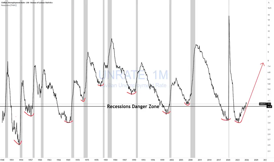
Unemployment Rate Danger Zone🚨 The Unemployment Inflection Point Investors Ignore
This chart isn’t about high unemployment.
It’s about the turn.
Across post-war history, U.S. recessions don’t start when unemployment is elevated. They start when unemployment:
• bottoms
• stops improving
• begins to rise from a low base
Those red markers indicate the same pattern has been repeating for over 70+ years.
Why the inflection matters
Unemployment is a lagging indicator — but its rate of change isn’t.
When unemployment turns up:
• Hiring freezes appear first
• margins compress next
• credit demand weakens
• earnings expectations lag reality
By the time job losses are obvious, markets have already repriced.
The current setup
Unemployment remains historically low — precisely when investors feel safest.
But the trend has turned.
That’s the danger zone.
Markets don’t break when conditions look bad.
They break when they stop getting better.
Investor takeaway
This isn’t a timing tool.
It’s a risk-regime signal.
Historically, this inflection has preceded:
• higher volatility
• weaker earnings
• tighter financial conditions
Low unemployment = low risk.
Watch the direction. Not the level.
If you enjoy the work:
👉 Drop a solid comment
Let’s push it to 6,000 and keep building a community grounded in raw truth, not hype.
EUR/USD: The Fiscal Dominance Breakout (Einstein Vector)Title: The "Einstein Vector" Protocol: Why the Dollar is Dying at 4.3% Yields
Author: Brian Armbruster, Principal Trader, Armbruster Capital
Date: January 22, 2026
Abstract:
While the mainstream financial media (Reuters, Bloomberg) focused on the "TACO" (Trump Always Chickens Out) narrative regarding Greenland tariffs, the structural reality of the market told a darker story. Using proprietary Fun-Tech Einstein Vector Analysis, Armbruster Capital correctly forecasted the EUR/USD gap open with 98.3% precision (1.7 pip variance) and identified the "Fiscal Dominance" divergence before institutional desks.
The Core Thesis: The global financial system has entered a new phase of "Interpretive Asymmetry."
The Old Rule: Strong GDP (4.4%) + High Yields (4.25%) = Strong Dollar.
The Einstein Reality: Strong GDP + High Yields + Record Gold ($4,900) = Sovereign Debt Rejection.
Key Vectors Identified (Sunday - Thursday):
The "Tokyo Walkout" (Liquidity Void): We identified that Asian central banks had ceased purchasing US Treasuries, creating a "Liquidity Void" that forced the Fed to act as the buyer of last resort. This explains why the Dollar fell despite US 10-Year Yields spiking to 4.3%.
The "Greenland" Distraction (The Magician's Hand): We correctly identified the "Greenland Tariff" threat as a geopolitical negotiation tactic (noise), not a trade policy (signal). The subsequent "walk-back" was predicted as a liquidity injection event, not a trend change.
The "Gold Signal" (The Truth): While equities celebrated the "TACO" relief rally, Gold hitting $4,900/oz confirmed that "Smart Money" is fleeing the Dollar system entirely. The correlation between Yields and the Dollar has inverted.
Conclusion:
The market is no longer trading on price; it is trading on Time and Solvency. The "Relief Rally" is a trap. The structural move is a devaluation of the US Dollar to manage the $38 Trillion debt load. EUR/USD targeting 1.1850+ is not speculation; it is mathematical necessity.

Profits Rising, Credit Failing = CRASH!The Private Sector Isn’t Leveraging for Growth — So Why Are You Buying?
This chart cuts straight to the engine of the bull run in the stock market.
The blue line represents commercial and industrial loans relative to the money supply — a proxy for productive private-sector credit creation.
When it rises, businesses borrow to expand.
When it falls, they don’t.
Right now, "They Don't" it’s falling.
What history shows
A rollover in business credit efficiency precedes every recession:
Not GDP.
Not jobs.
Not inflation.
Credit moves first.
The structural issue
Each recovery now requires:
More money
More leverage
For less productive growth
That’s the law of diminishing returns to credit — and the long-term trend is down.
Why 2020 didn’t fix this
The post-COVID spike was emergency borrowing, not expansion. Once it passed, credit efficiency collapsed to new lows and never recovered.
That’s the tell:
The private sector isn’t willing to leverage for growth.
Why policy can’t save it
The Fed can cut rates and add reserves.
It can’t create profitable opportunities.
When ROI falls, borrowing stops — regardless of policy.
Bottom line
Expansions don’t end when rates rise.
They end when businesses stop borrowing productively.
If the private sector won’t leverage for growth,
Ask yourself what you’re buying.
#FAFO GTFO & STFO!
If you enjoy the work:
👉 Drop a solid comment
Let’s push it to 6,000 and keep building a community grounded in raw truth, not hype.

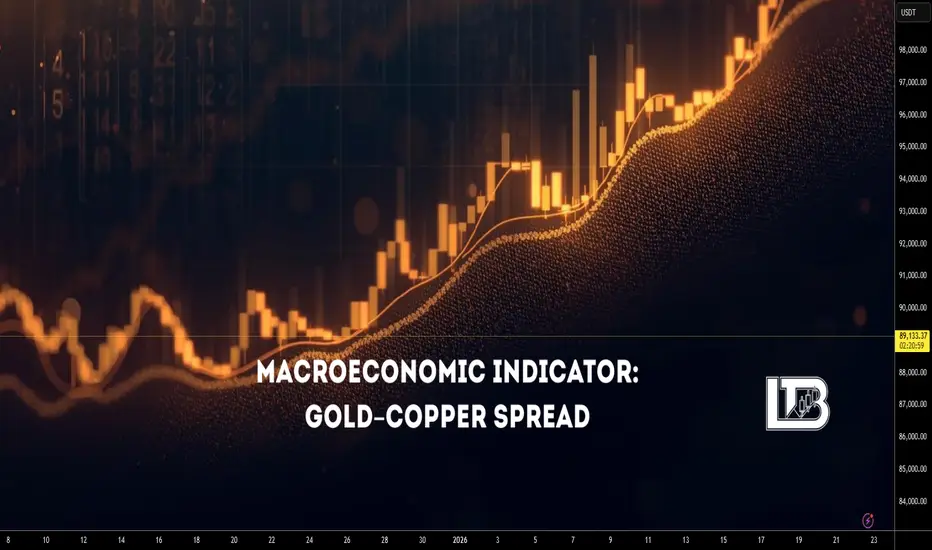
Macroeconomic Indicator: Gold-Copper SpreadMacroeconomic Indicator: Gold-to-Copper Spread
The Gold-to-Copper Spread (Gold-to-Copper Ratio) is the ratio between the price of gold and the price of copper, expressed by the formula:
Gold–Copper Ratio = Price of Gold / Price of Copper
This indicator shows how much the price of gold exceeds or lags behind the price of copper at a given point in time. It is often used to analyze market sentiment, assess economic stability, and identify investor preferences.
Gold
Gold is traditionally considered a safe-haven asset. Its price generally rises during periods of economic and financial uncertainty, when investors seek to preserve capital and reduce risk.
Additionally, gold may receive support in the following conditions:
weakening of the US dollar
rising inflation expectations
declining real interest rates
increasing geopolitical risks
growing demand from central banks
Copper
Copper is often called “the doctor of the economy” due to its high sensitivity to industrial production and economic growth. The price of copper typically rises during phases of economic expansion, when demand for commodities and risk assets increases.
The spread reflects only the relationship between the two assets and does not account for other factors such as exchange rates, geopolitics, or changes in monetary policy.
Copper may also rise under the following conditions:
supply deficits (strikes, logistical disruptions, declining production)
structural growth in demand (electric vehicles, energy transition, data centers)
monetary stimulus and growth in global liquidity
weakening of the US dollar
speculative phases in commodity markets
stimulus measures from China
Rising Gold/Copper Ratio
Typically signals:
increase in risk-off sentiment
deterioration in economic expectations
growing demand for safe-haven assets
expectations of recession or slowdown
intensification of geopolitical risks
decline in real interest rates
This is usually accompanied by weakness in equity markets, cyclical sectors, and industrial commodities.
Falling Gold/Copper Ratio
Typically indicates:
strengthening of risk-on sentiment
improving expectations for economic growth
growth in industrial activity
capital inflows into risk assets
the beginning or middle of an economic expansion
It often correlates with rising equity indices, industrial metals (in a “healthy” risk-on regime, copper should rise not alone but together with aluminum, nickel, and zinc), oil, industrial ETFs (XLI), equity indices, PMI, macro data, and bond yields.
The Spread Cannot Be Analyzed in Isolation
Key indicators without which this indicator should not be interpreted:
Real rates
DXY (US dollar)
S&P 500, Russell 2000, Industrial ETF (XLI), oil (WTI, Brent), aluminum, zinc, nickel, CRB Index / GSCI
China: real demand or illusion — declining or growing
Geopolitics
All these metrics can be found on TradingView. It is recommended to create a separate watchlist and monitor them there.
The Spread Is Falling
This means copper is stronger than gold. The base hypothesis is that the market is shifting into risk-on mode. We then verify this using other indicators.
1. Real Rates
Real rates are rising - gold is under pressure, the spread falls for a “healthy” reason.
This confirms that the market truly expects economic growth.
Real rates are falling, but the spread is still falling - copper is rising too aggressively.
This is not a macro growth signal, but rather a sign of copper supply deficit or speculative acceleration.
Conclusion:
If the spread falls while real yields are rising, this is a strong, clean risk-on signal.
If it falls while real yields are declining, distortions are already present.
2. DXY (US Dollar)
DXY is falling - supportive for commodities, copper’s strength looks logical.
This confirms a risk-on environment.
DXY is rising, but the spread is still falling - copper is rising despite currency pressure.
This is often a sign of a local copper deficit or an artificial squeeze.
Conclusion:
A falling spread with a weak dollar is a normal macro scenario.
A falling spread with a strong dollar is a reason to be cautious.
3. What Should Happen in Other Markets
If the decline in the spread reflects true risk-on, typically:
S&P 500 is rising
Russell 2000 is rising faster than S&P (increased risk appetite)
Industrial ETF (XLI) is in an uptrend
Oil (WTI, Brent) is strengthening
Aluminum, zinc, and nickel are rising together with copper
CRB / GSCI commodity indices are moving higher
Key point:
Copper should not rise alone. If you see copper rising, equities flat, oil weak, metals not confirming then this is almost always mean that not macro growth, but a local copper story (supply shock, squeeze, speculation).
4. China: Real Demand or Illusion
Copper is almost impossible to interpret without China.
China PMI rising + credit impulse rising + yuan strengthening
copper growth is fundamentally confirmed
a falling spread = healthy risk-on
China PMI falling + weak economy, but copper rising
this is not macro demand
it is either a supply deficit or speculative flows
Conclusion:
If China does not confirm copper’s move, the decline in the spread loses its macro meaning.
The Spread Is Rising
This means gold is stronger than copper. The base hypothesis is that the market is moving into defense (risk-off). But confirmation is still required.
1. Real Rates
Real rates are falling - gold rising is logical.
If equities and commodities weaken at the same time, this is true risk-off.
Real rates are rising, but gold is still rising - the driver is not monetary.
This is usually geopolitics or fear of systemic risks.
Conclusion:
Rising spread with falling real yields = classic macro risk-off.
Rising spread with rising real yields = the market is genuinely afraid.
2. DXY (US Dollar)
DXY is rising - pressure on commodities, support for gold - the rising spread looks logical.
DXY is falling, but the spread is still rising - gold is rising too strongly.
This is most often a sign of fear, geopolitics, or systemic hedging.
Conclusion:
Rising spread with a strong dollar = standard risk-off.
Rising spread with a weak dollar = a warning signal.
3. What Should Happen in Other Markets
If the rise in the spread reflects true risk-off, typically:
S&P 500 weakens or moves into correction
Russell 2000 falls faster than S&P
XLI (industrial sector) is under pressure
Oil weakens
Industrial metals fall
CRB / GSCI move lower
If instead gold is rising, equities are rising, oil is holding, commodities are not falling, then this is not classic risk-off. It means gold is rising for its own reasons (rates, geopolitics, hedging).
4. China (PMI)
Chinese data weakening + copper falling
the rise in the spread is fundamentally confirmed
the market truly expects a slowdown
Chinese data strong, but copper still weak
the issue is not demand, but other markets
the spread signal is distorted
Geopolitics in the Interpretation of the Gold/Copper Ratio and Markets
Geopolitics is a factor that breaks the normal macro logic of markets.
It is not directly linked to the economic cycle, but it sharply changes capital behavior.
If macro indicators reflect “slow” processes (rates, growth, inflation),
then geopolitics represents shock events that trigger fear, defensive positioning, risk aversion, increased demand for liquidity
That is why it is always considered separately from macroeconomics.
How Geopolitics Affects the Gold/Copper Spread
In most cases, geopolitics, strengthens demand for gold, weakly supports copper, therefore pushes the spread higher
But the key point is:
this is not because the economy is deteriorating,
but because investors are hedging against event risk.
That is why a geopolitically driven rise in the spread often is not confirmed by falling equities, is not accompanied by worsening PMI, does not coincide with changes in interest rates
Enjoy!
Velocity Of Money Rolling Over Again!The Real Interpretation
This chart is telling one story:
Money supply growth has massively outpaced real output for decades.
It lines up perfectly with:
Falling real productivity
Stagnant wages
Declining borrower quality
Rising debt-to-GDP
Asset inflation decoupling from fundamentals
The economy shifting from productive borrowing → consumption and asset speculation
You don't fix this with “policy choices.”
You fix it with real wealth creation, which requires creditworthy borrowers — not printing.
Forward-Looking View
Unless:
Productivity rises
Real output accelerates
Borrowers gain real income strength
Capital flows into productive sectors instead of financial games…this ratio won’t materially rise.
That means:
Every new dollar is buying less GDP
Long-term growth potential is fading
More money chasing fewer productive opportunities
More fragility in the credit system
It’s a classic late-cycle fiat symptom.
Here are questions to ask:
If “money creation” creates growth, why is GDP-per-dollar collapsing?
Why did 40 years of money expansion not produce proportional GDP?
If borrowers create loans, where are the new productive borrowers?
Why did QE cause asset inflation but no sustainable GDP boost?
If the system is “fine,” why does each new dollar buy less real output?
Perma Bulls, MMTers, Politicians etc.. can’t answer those without admitting the private-sector engine is weakening.
The less productive output per $ while the markets keep rising & rising will only produce less and less profit per share over time. No matter how much lipstick they put on that pig. Eventually, the economy & markets will CRASH! They always correct themselves in the end.
Perma Bulls have no exit strategy and will go down with the boat!
MMTers will want Gov to borrow and spend EVEN MORE! despite the empirical self-evident fact that print and play doesn't work!
Politicians will borrow and spend even more, claiming they will "STIMULATE THE ECONOMY"
I got all that from just one chart? NO! The entire spectrum of data.
Here is one
THANK YOU for getting me to 5,000 followers! 🙏🔥
Let’s keep climbing.
If you enjoy the work:
👉 Drop a solid comment
Let’s push it to 6,000 and keep building a community grounded in truth, not hype.

GDP Growth Illusion From Tariffs CAUTION!GDP Growth Can Rise When Imports Collapse
GDP is defined as:
GDP = C + I + G + (X − M)
Example:
C + I + G = 110
(X − M) = −10
GDP = 100
Now assume imports collapse while everything else stays the same:
C + I + G = 110 (unchanged)
(X − M) improves from −10 to −5
GDP = 105
That appears as a +5% GDP growth, despite no new production having occurred.
A drop in imports mechanically boosts GDP by improving (X − M). GDP rises on paper—even if the economy is actually weakening due to collapsing demand.
Translation:
GDP can look stronger because activity fell, not because value was created.
This important to understand bc it also influences the velocity of Money. Giving the illusion that it is increasing when it's not. See my previous post.
One more point I want to make for you.
👉GDP accounting does NOT force consumption (C) to fall when imports fall.
👉 But in the real economy, consumption of those specific goods can fall if tariffs remove availability or raise prices.
👉 Job loss created as a result will also drop (C); the effects are not noticeable at first in GDP.
🚨DON'T MAKE THE MISTAKE OF THINKING THIS IS REAL GROWTH AND GO OUT AND BET THE FARM TRADING/INVESTING!
This is not POLITICAL! This is COUNTING!
If you enjoy the work:
👉 Drop a solid comment
Let’s push it to 6,000 and keep building a community grounded in raw truth, not hype.

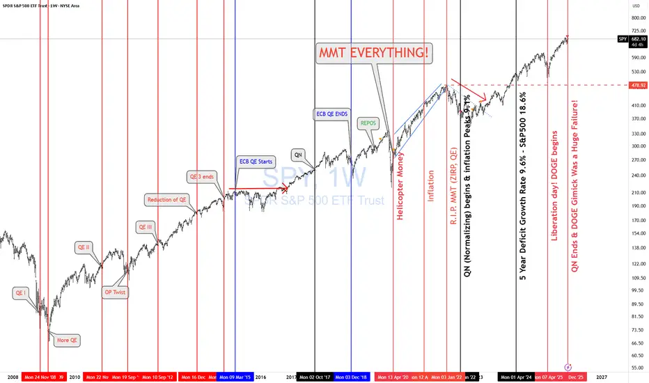
SPY & Macro HistoricalToday FED ended QN (Quantitative Normalizing NOT "T" = tightening. 1st, you normalize, then you tighten. Right??)
The Fed is continuing to let mortgage-backed securities roll off its balance sheet, while the U.S. Treasury increases T-bill issuance (cash-like instruments). That combination means more gov securities are hitting the market even as the Fed’s balance sheet stays roughly unchanged.
More Treasury supply + no Fed buying = higher yields and tighter liquidity. More MBS roll-off = higher mortgage rates and pressure on housing. Treasury bills soak up cash, while longer bonds suffer.
🔥 REALMACRO summary:
The Fed is doing this to:
Get out of the mortgage market.
Strengthen the Treasury bill market (the foundation of dollar liquidity).
Keep bank reserves “ample” without restarting QE.
This combo lets them tighten just enough to cool asset prices, without breaking the plumbing again like in 2019.
The success of this experiment will largely determine how long the Fed can avoid returning to QE. If liquidity tightens too far as the economy continues to weaken, they’ll be forced back into some form of balance sheet expansion sooner rather than later.
Lastly, let's check how right I was when I posted "MMT Everything."
As of April 2020, US debt was $ 24T. Today, it is $38T, representing a total increase of $14T in 5 years.
✅ CAGR ≈ 9.6% per year
✅ S&P 500 CAGR (Apr 2020 → Today): ~18.6% per year
Both are completely unsustainable growth rates.
I nailed that back in April 2020. Trump & MMT "print and play" will be the death of us! SIGH!
Lastly, the DOGE gimmick was a complete and total failure as expected. No reduction in deficit and no fraud found. Imagine that!
As I keep saying, " NEVER INVEST IN TOXIC PEOPLE! THEY WILL ALWAYS BURN YOU IN THE END!" It's not political it's a FACT!
THANK YOU for getting me to 5,000 followers! 🙏🔥
Let’s keep climbing.
If you enjoy the work:
👉 Drop a solid comment
Let’s push it to 6,000 and keep building a community grounded in truth, not hype.
SPX to Money Supply WARNING!If the charts aren’t showing bubble setups, I’m not going to invent them. I post what the data shows. So please don’t shoot the messenger when I say GTFO & STFO.
And just to keep the facts straight:
Brokerage, stock, and crypto accounts are not part of M2.
Why does M2 matter?
It’s the actual spendable money in the economy.
When M2 grows faster than real output (as it did in 2021), price pressure builds.
The economy runs on liquidity.
Retail, goods, services all of it requires money you can actually spend, not paper gains in a trading account.
When the S&P 500 disconnects massively from M2 — like during the dot-com bubble — revenue and profit growth can’t keep pace. Valuations expand purely on speculation, not on real, organic fundamentals. That’s how multiples stretch and bubbles form.
The problem? Most retail traders have no idea this is happening. They’re trading with their hair on fire, following cute social-media stories dressed up as “analysis,” using strategies that have never been tested in real markets.
And that’s exactly how bubbles are fed:
big players sell into retail euphoria, and retail ends up holding the bag of schitt!
Buy when stocks are cheap, not at all-time highs in euphoria land.
"Price is what you payt, VALUE is what you get!"
THANK YOU for getting me to 5,000 followers! 🙏🔥
Let’s keep climbing.
If you enjoy the work:
👉 Drop a solid comment
Let’s push it to 6,000 and keep building a community grounded in truth, not hype.

$XAU/USD - Gold's Q1 2026TVC:GOLD remains considerably Bullish until proven otherwise !
- Not only fundamentally speaking by Central Banks heavily accumulating it diversifying away from U.S Treasuries and a Weakening TVC:DXY Dollar ;
to plenty current Geo-Political Risks with unknown and uncertain future scenarios,
to worries of 'Sticky' Inflation and Interest Rates cuts.
This is an Structural Official World-Wide Demand !
Any Pullback seen on charts, will be just another excellent providing support floor to accumulate Gold while cheaper.
Leaving behind 2025 as one of its best performing years throughout history with an amazing rally ;
and entering 2026 on a strong note paired with other precious metals like TVC:SILVER
- TA speaking,
HH's and HL's continue printing, however, concerning for the time being is a bearish wedge pattern forming ,
flirting with the ceiling of 2025 Uprising Channel .
Bearish Wedge not yet confirmed having its measured move putting Gold's TA forecast to as low as 4.380$.
Other strong supports are there to be found as tests before 4.380$ is reached.
Conflicting Supports from PoC of last rally and EMA 50 aiming up and as well the prior week's Gap Break-Out which as not Filled yet.
Note that for the time being, Gold has found support on Previous ATH Level + 20EMA, leaving a Liquidity Wick Zone just below, increasing the probabilities of break-out gap being filled.
Aiming another Higher High creating a New All Time High;
its first test of resistance is the last ATH which can print a Double Top and down it goes to break the bearish wedge pattern confluencing with major news events of United States on 22 of January ;
Breaking ATH and above Uptrend Channel marked on white and Confirming it will Invalidate the Bearish Wedge Pattern.
Probabilities scream for a pullback, however is worth including the Gold's fundamental momentum and anything is to be expected.
NOTE THAT THIS IS NOT FINANCIAL ADVICE .
PLEASE DO YOUR OWN RESEARCH BEFORE PARTAKING ON ANY TRADING ACTIVITIES BASED SOLY ON THIS IDEA

PCE — What the market will see on Thursday (22 January 2026)Introduction
On Thursday, January 22, the Core Personal Consumption Expenditures (PCE) Price Index will be released in the United States. Ahead of the release, we decided to take a deeper dive into macroeconomic theory and revisit what PCE is and how its data influence financial markets.
The PCE (Personal Consumption Expenditures) Price Index is a comprehensive measure of inflation that tracks changes in prices for all goods and services consumed by households within the country, regardless of the source of funding. Its conceptual depth lies in the fact that it reflects the actual cost of consumption across the economy, not merely the out-of-pocket expenses of individual consumers.
The Federal Reserve views PCE as its primary gauge of inflationary pressure due to its deeper analytical structure and methodology, which is largely free from certain statistical distortions and explicitly accounts for behavioral aspects of consumer choice.
CPI vs. PCE
While CPI answers the question:
How much more expensive has life become for the average urban consumer?
PCE addresses a broader one:
How much more expensive has total final consumption in the economy become?
This makes PCE more macroeconomically representative. It includes not only household spending, but also expenditures by non-profit institutions serving households.
The core methodological difference between the two indices lies in how they treat consumer behavior.
CPI assumes relative rigidity in consumption habits:
its basket is updated with a lag
its calculation implies that households continue purchasing the same goods even as prices rise, simply paying the higher cost
PCE, by contrast, incorporates rational behavioral flexibility. The Fisher chain-weighted index used in its calculation reweights components on a quarterly basis, reflecting the natural shift in demand toward relatively more affordable substitutes. This substitution effect not only reduces the indicator’s volatility, but also aligns it more closely with real-world consumer spending dynamics, where price changes are a key driver of budget reallocation.
An important clarification regarding the relationship between CPI and PCE:
the two indicators are highly correlated
PCE typically prints slightly lower readings than CPI
this persistent gap is a structural result of methodological differences in how the indices are constructed
What to Focus on in the Release
When CPI data are released, the most reliable way to assess underlying inflation pressure is to focus on Core CPI.
The same logic applies to PCE.
The headline figure (Headline PCE) carries a significant risk of misinterpretation due to its elevated volatility, which can distort the perception of the underlying price trend. Core PCE, stripped of these destabilizing components, serves as a far more reliable compass, pointing to the deeper inflationary forces in the economy — precisely the forces that shape the long-term path of monetary policy.
With this framework in mind, we can move on to a more precise interpretation of the data.
When the report is released, greater emphasis should be placed on the monthly (m/m) Core PCE reading, as it is more sensitive to short-term changes in inflation. Even if inflation accelerates in the current month (a high MoM print), the year-over-year figure may continue to decline for several months due to base effects — comparisons against elevated readings from the prior year.
It is also important to pay close attention to revisions of the previous month’s data.
The market evaluates releases through the lens of trend, which is often just as important — if not more so — than a single data point.
For example, imagine that the current month’s Core PCE comes in exactly in line with consensus at 0.2%. At first glance, this looks benign. However, if the previous month’s figure is revised upward from 0.3% to 0.5%, the picture changes entirely. Such a revision would be inconsistent with the Fed’s 2% inflation target and would undermine the narrative of a smooth and sustained disinflationary trend.
Market Reaction
Market reaction to inflation data is fundamentally driven by expectations of future Federal Reserve actions. A sustained rise in inflation reinforces a hawkish scenario: the Fed is forced to maintain or tighten monetary policy, which leads to higher interest rates, a stronger dollar, rising Treasury yields, and downward pressure on equities.
Conversely, a consistent decline in inflation signals that the Fed’s measures are working and opens a dovish window for potential easing in the future. This implies the prospect of rate cuts, which typically acts as a catalyst for equity markets, while pushing Treasury yields lower and weakening the domestic currency.
However, accurate analysis is impossible without considering the broader macroeconomic context. For instance, if a prevailing trend has already been established by weak labor market data and a soft CPI report, even a neutral PCE release that comes in line with consensus is often interpreted as a confirmation of that trend. In such an environment, the absence of a negative surprise becomes a positive signal in itself, providing additional support for equities.
That said, the key element of analysis remains the probability of a fundamental surprise capable of breaking the existing trend built on earlier releases. Labor market data and CPI set the preliminary direction of expectations, but they do not carry finality. The PCE report, acting as a strategic “closing argument,” carries sufficient weight in the eyes of both the Fed and market participants to trigger a full reassessment of the priced-in scenario. A material deviation from consensus can do more than merely adjust expectations — it can invert the prevailing market logic altogether, leading to a regime shift across currency, bond, and equity markets.
Conclusion
Ultimately, market dynamics are a complex fusion of countless factors whose interactions often defy linear logic. This is precisely why outcomes so frequently diverge from even the most well-reasoned forecasts.
The only way—if not to tame, then at least to comprehend this force—is to develop your own analytical judgment. Critical thinking and the ability to construct an independent view of reality are the most valuable tools in a world with no guarantees and no ready-made solutions. Neither the forecasts of research desks nor the opinions of popular commentators can replace your personal ability to interpret data, weigh risks, and connect fragmented facts into a coherent hypothesis. This is the path from following noise to understanding signal.
Enjoy!

EUR/USD: The Greenland Gambit & Tariff ShockHedge Funds Retreat as Trump Weaponizes Trade Policy for Arctic Control
The Euro has entered a volatile corridor, driven by a sharp reversal in institutional positioning. Hedge funds and leveraged speculators have aggressively exited bullish Euro bets, flipping to net short positions for the first time since November. This pivot directly correlates with President Donald Trump’s ultimatum: impose punitive tariffs on European nations unless they facilitate the U.S. acquisition of Greenland.
Geopolitics & Geostrategy: The Arctic Pivot
The currency fluctuation is no longer just a monetary phenomenon; it is a geostrategic signal. Washington views Greenland not merely as territory, but as a critical security asset. Control over the island secures the GIUK Gap (Greenland-Iceland-UK), a naval choke point vital for monitoring Russian submarine activity in the North Atlantic.
Trump’s willingness to leverage transatlantic trade relationships highlights a shift in U.S. doctrine. The administration is prioritizing territorial expansion and resource security over traditional alliance stability. Investors are pricing in a scenario where the Euro becomes the primary casualty of this diplomatic coercion.
Science & High-Tech: The Rare Earth Race
Behind the political theater lies a cold scientific reality. Greenland holds some of the world’s largest undeveloped deposits of Rare Earth Elements (REEs) . These materials, neodymium, praseodymium, and dysprosium, are non-negotiable components for high-tech manufacturing, including F-35 fighter jets, electric vehicles, and quantum computing hardware.
The battle for Greenland is a proxy war for technological supremacy. China currently dominates the REE supply chain. By forcing the Greenland issue, the U.S. aims to break this monopoly. The Euro’s depreciation reflects the market’s realization that Europe holds the losing hand: it risks losing either its trade access to the U.S. or its sovereignty over strategic Arctic resources.
Macroeconomics: Growth Under Siege
The economic implications for the Eurozone are severe. Tariffs act as a direct tax on European growth, which is already fragile. Analysts warn that traders are underpricing the risk of a "rupture" in major currency pairs. A full-scale trade war would dismantle the nascent recovery in European manufacturing, specifically in the German automotive sector, which relies heavily on U.S. exports.
Strategists predict EUR/USD could test support at 1.1499 . This technical level represents a psychological floor; a breach here would invite algorithmic selling, accelerating the currency’s decline.
Market Dynamics: The Algorithmic Shift
Data from the Commodity Futures Trading Commission (CFTC) confirms a decisive sentiment shift. The flip to net short positioning indicates that smart money is front-running the potential escalation. Algorithms, programmed to react to "trade war" syntax in news wires, are driving intraday volatility. The Euro’s swing between losses and gains underscores a market struggling to price in a binary geopolitical outcome: a diplomatic deal or a trade conflict.
Conclusion
The EUR/USD pair is now a barometer for the breakdown of the post-WWII order. The drivers of this fluctuation extend far beyond interest rate differentials. They encompass Arctic security, the control of future-tech resources, and the weaponization of economic policy. Until the Greenland standoff resolves, volatility will remain the only certainty.

How To Make Macroeconomics Work For YouIntroduction
Trading around news releases is a powerful tool in financial markets.
The ability to identify the direction of the economy and understand market behavior is a skill that requires patience and extensive practice. In this post, we break down the theory behind trading macroeconomic releases and systematically explain how to form a structured view of the market.
Actual vs. Consensus
In almost any economic calendar, you will see a consensus / forecast column. To properly understand released macroeconomic data, it is not enough to simply look at the headline number. The key to interpretation lies in comparing the actual result with the consensus forecast.
This deviation — often referred to as a “surprise” — is the primary driver of volatility in financial markets.
The reason is that the market is a forward-discounting machine. By the time a report is released, asset prices already reflect the prevailing consensus expectations. The market has priced in a specific scenario. When the actual data comes in above or below those expectations, an immediate repricing occurs — the market reassesses future growth, inflation, and central bank policy paths, adjusting prices to reflect the new information.
Therefore, at the moment of the release, the market is not reacting to the number itself, but rather correcting a previously held — and potentially incorrect — expectation. It is this collective and instantaneous adjustment that creates the surge in volatility we observe around economic data releases.
Trend
Trend is the alpha and omega of analysis — the foundation upon which most trading systems are built. This principle fully applies to macroeconomics as well: to correctly interpret a single data release, one must clearly understand the trend in which the economy, or a specific sector, currently operates.
Yes, a trend on its own rarely generates the same explosive volatility as an unexpected deviation from consensus. However, its role is far more fundamental: the trend is what shapes the consensus itself. The dynamics of previous months define the baseline for analysts’ forecasts and market expectations.
Without accounting for the trend, an individual macro indicator becomes just a number in a vacuum. It may point to completely opposite scenarios depending on interpretation. Data must be evaluated in context and over time. A sector may be performing below its long-term averages, but consistent improvement over recent quarters can be a clear signal that central bank policy is having a positive effect. Conversely, a peak reading within a broader downtrend is far more likely to be a statistical anomaly than a genuine turning point.
Historical data serves as a compass for central banks. By understanding what is “normal” for a given sector, policymakers can interpret readings that break away from the trend not as noise, but as structural shifts — a “slowdown in growth” or a “fundamental change in trend.” This is the power of trend analysis: it separates signal from noise, transforming raw data into a coherent picture of the economic cycle.
Context
Accurately understanding the macroeconomic landscape and anticipating market reactions is only possible when data is viewed collectively, not in isolation. Financial markets are complex, interconnected systems, where developments in one sector inevitably ripple through others.
Labor market data directly shape inflation expectations. Central bank decisions and forward guidance impose structural constraints, defining not only the current phase of the cycle but also future conditions across the entire spectrum of assets.
Equally important is the global political and geo-economic backdrop. These forces either introduce a risk premium, increasing volatility, or reduce uncertainty, making outcomes more predictable.
Together, all of this forms the context — the interpretive framework in which numbers exist. Without it, even the most significant deviation from forecast is nothing more than a statistical outlier. Context turns fragmented data into a coherent narrative, allowing us to understand what is truly happening in the economy and where capital is flowing.
The ability to identify this context is the core skill that translates the language of macroeconomic statistics into the language of real market movements.
Federal Reserve Policy
We have reached the key element that determines the development of both individual sectors and the financial market as a whole. Central bank policy is the primary force that sets the rhythm of market movements. Most forecasts and trading strategies ultimately boil down to an attempt to anticipate the regulator’s next steps.
When analyzing a new set of data, the first question we ask is:
what does this mean for the Federal Reserve? What actions will the regulator take to stabilize conditions or support positive momentum?
To do this, the central bank has a set of fine-tuning tools at its disposal. By understanding how each of them works, one can form well-reasoned assumptions about the future direction of financial markets. The central bank’s toolkit includes:
• the policy interest rate
• the interest rate on reserves
• forward guidance
• balance sheet operations
• open market operations
• direct lending facilities
All of these are important, but the central role belongs to the policy rate — the Federal Funds Rate (FFR).
The policy rate is the central bank’s main interest rate. It defines the base cost of money in the financial system and serves as the primary benchmark for all other interest rates in the economy. By adjusting it, the central bank directly influences inflation and economic activity.
Accommodative stance (rate cuts):
The central bank lowers borrowing costs for businesses and households. This expands the money supply and stimulates demand, supporting economic growth, but it also creates inflation risks and may put downward pressure on the national currency.
Restrictive stance (rate hikes):
The central bank makes borrowing more expensive. This cools demand, slows economic activity, and restrains inflationary pressure. In such an environment, the cost of money in the economy rises, often leading to a strengthening of the national currency.
Thus, by monitoring the Fed’s rate decisions, we gain insight not only into the current diagnosis of the economy, but also a clear signal of the environment — accommodative or restrictive — in which all markets will operate in the near future.
Which Data Actually Move the Market?
Having mastered the basic principles of macro analysis, we move on to practice. Now, when looking at an economic calendar, we no longer see just a list of events — we understand their meaning and can anticipate market reactions. To do this, indicators must be grouped by the type of information they provide about the state of the economy.
1. Inflation Indicators
CPI (Consumer Price Index) and especially Core CPI are the primary measures of consumer inflation and directly influence central bank decisions.
2. Labor Market Data
• NFP (Nonfarm Payrolls) and the Unemployment Rate (UR) are key indicators of labor market health.
• AHE (Average Hourly Earnings) reflects wage-driven inflationary pressure.
• JOLTS (Job Openings, Quits) are leading indicators of labor demand and worker confidence.
• Jobless Claims provide a weekly “pulse check” of the labor market.
3. Consumer Demand Indicator
Retail Sales are the main barometer of consumers’ willingness to spend and a key component of GDP.
4. Leading Indicators
PMI (Purchasing Managers’ Index) from ISM and S&P Global is the most important monthly leading indicator, capturing sentiment and the pace of change in the real economy (manufacturing and services).
Beyond these indicators, there are many other important metrics (industrial production, consumer confidence, housing data). However, we focus on the primary market movers — the releases that generate the most volatility and most often reshape the market narrative. Understanding these four categories provides the key to decoding the majority of price movements driven by macroeconomic news.
Inflation Indicators (CPI and Core CPI)
These indices track changes in the cost of living. Imagine a basket that contains everything a typical household buys: food, gasoline, housing costs, clothing, and medical services.
The headline Consumer Price Index looks at this entire basket. However, prices for certain items — such as gasoline or vegetables — can swing sharply due to weather conditions or political decisions. These swings create a lot of noise and make it harder to see the underlying trend.
That is why analysts and central banks focus primarily on core inflation. It is the same index, but with the most volatile components — food and energy — removed. What remains are prices that move more slowly but persistently: rent, childcare, repair services, and healthcare.
If core inflation is rising, it means the foundation of everyday life is becoming more expensive. The cause is usually an overheated economy — when consumers have ample money and are willing to pay more, while businesses face rising costs, often driven by higher wages. This type of inflation is sticky and difficult to contain. That is precisely why central banks react to core inflation when deciding whether to raise interest rates.
If, on the other hand, only headline CPI rises due to a temporary spike in gasoline prices while core inflation remains stable, the central bank is unlikely to tighten policy — such moves are usually seen as transitory.
Labor Market Data (NFP, AHE, JOLTS, Jobless Claims)
The labor market is not a collection of isolated numbers, but a living system where some indicators lay the groundwork for others. To understand it, one must see the sequence and the cause-and-effect relationships.
The first warning signal usually comes from weekly jobless claims. When the number of people filing for unemployment benefits begins to rise consistently, it is a direct signal that companies are laying off workers more frequently. This is the earliest indication that, a few weeks later, the main monthly report may deliver unpleasant surprises: weak job growth or even outright job losses, followed by a rise in the unemployment rate.
However, the strength of the labor market is determined not only by the number of jobs, but also by their quality and the balance of power between employers and workers. This is where the JOLTS report on job openings and labor turnover becomes critical. When job openings are abundant and workers are quitting voluntarily in large numbers, it points to a unique situation: employees are confident enough to switch jobs in search of higher pay. This scenario almost inevitably leads to accelerated wage growth, which later shows up in the Average Hourly Earnings (AHE) data.
Wages are where the strongest link to central bank policy lies. Persistent wage growth acts as a powerful engine for inflation in the services sector. Therefore, when the Fed sees low unemployment combined with steadily rising wages, it has little choice but to keep interest rates high in order to cool the economy. Conversely, when job creation slows and wage growth begins to decelerate, it sends the regulator a long-awaited signal that labor-driven inflationary pressure is easing — opening the door to discussions about policy easing.
By closely monitoring weekly jobless claims and vacancy data, one can anticipate the likely outcome of the key monthly labor report and, with a high degree of confidence, predict how the central bank will react.
Consumer Demand Indicator (Retail Sales)
This is the most direct snapshot of household wallets. The index shows how much money consumers spent during the month on goods — in physical stores, online, at car dealerships, and at gas stations.
Its strength lies in its simplicity. It does not attempt to predict the future or measure sentiment — it simply records whether people are actually spending their money. And since household consumption is the main engine of the U.S. economy, this number is closely watched by everyone.
Retail Sales are highly sensitive to two factors: labor market conditions and Federal Reserve policy.
When jobs are plentiful and wages are rising (strong NFP and AHE), consumers spend with confidence — sales increase.
When the Fed raises rates, borrowing costs (including credit cards) rise, large purchases are postponed, and sales slow or decline.
As a result, Retail Sales often serve as the final confirmation — or refutation — of trends suggested by other data. Persistent growth in sales despite high interest rates tells the Fed that the economy remains too hot and that policy is not restrictive enough. A sudden drop, especially against the backdrop of an already weakening labor market, becomes a powerful argument for a pivot toward policy easing.
What to focus on in the data:
• The month-over-month change, with particular attention to the Control Group, which excludes the most volatile components (autos, gasoline, and building materials) and provides a cleaner view of core consumer activity.
Leading Indicator (PMI)
PMI is a leading indicator that captures turning points in the economic cycle.
It does not measure production volumes or revenues. Its purpose is to identify the moment when business activity is accelerating or beginning to contract. The index is based on surveys of executives who make daily decisions about purchasing, hiring, and investment. Their collective assessment of changes is one of the most sensitive barometers of demand dynamics.
The key is not the absolute level of the index, but its direction and internal components. A decline from 55 to 52 still signals expansion, but indicates a loss of momentum. A rise from 48 to 49 still reflects contraction, but points to a slowdown in the pace of decline.
For central banks, two PMI components are particularly critical:
• New Orders — the purest indicator of future demand. A decline here typically precedes reductions in production and investment.
• Prices Paid — a direct signal of inflationary pressure in supply chains and the services sector. Sustained increases in this component can prevent monetary policy easing, even if the headline index is slowing.
PMI functions as an early warning system. A sustained deterioration over several months often precedes slower GDP growth and weakening labor market data. Conversely, resilience at elevated levels — especially when price components are rising — serves as evidence for central banks that the economy is overheating and that a restrictive stance must be maintained.
Conclusion
You now have a solid theoretical foundation for interpreting news releases and the signals they send to the market. To truly understand this framework and apply it effectively in trading, consistent practice is essential. From my own experience, keeping a macro trading journal can be extremely helpful. Record how the market reacts under different conditions and gradually develop your own independent view of each situation.
Be especially cautious of market rumors — more often than not, such opinions are simply attempts to attract attention with sensational headlines rather than provide meaningful insight.
Enjoy!
