Fractal Session Theory - Traders with 3 years or more !Core Thesis
It’s a structured model of market behavior built on real, observable mechanics — but it behaves theoretical to anyone who hasn’t seen the same repeating patterns enough times.
The market repeats a complete cycle of accumulation→ manipulation → expansion → distribution inside every 24 hour day. Each global session forms a fractal leg of that cycle.
In short price will look random until price eventually moves where it needs to and with large
amount volume (energy) aka ticks/points/pips🤑
* I’ve identified the repeatable rhythm caused by time-based liquidity cycles.
* We’re aligning the execution to where and when volatility transfers between regions.
* I’ve documented it and proved it visually — not guessing.
pattern recognition, structure discipline, and statistical observation — the exact skillset that separates intuition from edge.
My strategy is really session-based, I see the market like a relay race : the Asia session sets the initial structure, kind of like the foundation or first swing. Then the London session picks it up, often creating that volatility and expansion, and finally New York comes in to finish the move or reverse it. You’re looking for these handoffs between sessions—like a baton —because each session is influenced by the one before.
So you’re entering trades based on how Asia sets the stage, and how London or NY will either run with it or flip it. It’s all about timing those transitions and understanding how each session plays its role.
Back test what's explained here👇
(TEXT FROM CHART EXAMPLE)
1) Usually start my trades in ASIA 7:45pm
using the previous session as a support /
resistance. also take note of the direction
finish by 12am
2) always measure your targets. here's an example of 200 pip move.
if you missed it wait for London or NY
3) if you measure the low & high of Asia.
you can see the 382 level, it will be idea for an entry point London or Pre NY or NY open.
What I’ve mapped is a real, recurring liquidity structure — not some imagined pattern.
Fractal

Tsogoo note: TS CISD MSS2025.12.19 homework
Tsogoo brother shared his homework. I simulate his lines to my chart.
Even so we're analyzing chart on 1h timeframe, we have to take consideration on the higher timeframe trends (W, D).

The Bill Williams Strategy ExplainedWe all know the market doesn’t always play nice, but the Bill Williams Fractal Indicator can help you read between the lines. If you're focused on fine-tuning your entries and exits, let’s break down how fractals can be a useful tool in your strategy.
What is the Bill Williams Fractal Indicator?
At its core, the Bill Williams Fractal Indicator is a technical analysis tool that identifies potential reversal points in the market. This indicator is based on the fractal definition by Bill Williams, who described fractals as price patterns that can be used to predict potential shifts in price direction.
In simple terms, a fractal pattern consists of five consecutive bars or candlesticks on a chart. The middle bar of this pattern represents a local peak or trough, while the two bars on either side of it are smaller. A bullish fractal occurs when the middle bar is a higher high than the surrounding bars, and a bearish fractal appears when the middle bar is a lower low.
Bill Williams Fractal Definition
The Bill Williams Fractal is defined by a sequence of five consecutive bars. The middle bar represents the peak (for bearish fractals) or trough (for bullish fractals), surrounded by smaller bars on both sides. When price breaks the high (for bearish fractals) or low (for bullish fractals) of this central bar, it signals a potential breakout.
How Does the Bill Williams Fractal Trading Strategy Work?
The Bill Williams Fractal Strategy is a proven approach in crypto trading. Whether you're a beginner or an experienced trader, using the fractal strategy can provide valuable insights into potential market reversals and breakouts. By combining the Bill Williams Fractal Indicator with effective risk management, you can improve your trading edge.
A common method is to use the 200 EMA to gauge the overall trend. If the price is below the 200 EMA, traders tend to focus on lower fractals and look for short opportunities, while if the price is above the 200 EMA, they focus on upper fractals and consider long trades. However, always remember to confirm the breakout of local levels for greater reliability in your trades.
Master the Bill Williams Fractal Strategy
The Bill Williams Fractal Strategy is a well-established method in crypto trading. Whether you're just starting out or you're an experienced trader, incorporating the fractal strategy can provide useful insights into potential market reversals and breakouts. By combining the Bill Williams Fractal Indicator with a solid risk management plan, you can enhance your trading approach.
That said, remember that no strategy guarantees success. Fractal trading isn't about predicting the market with absolute certainty — it's about managing your entries and exits with precision and maintaining discipline. Always make sure to think critically and adapt to market conditions. So, when you spot a Bill Williams Fractal on your chart, use it as a guide, but always trust your analysis and approach. Happy trading!

The Deeper Logic Behind Price Delivery (Nobody Talks About This)Most traders think some pairs are slow and others are fast.
But that belief is the reason they stay confused, lose trades, and can’t read delivery.
The truth is deeper, and once you see it, you can’t unsee it.
This is the real explanation behind timing, alignment, and phase delivery — the part nobody teaches.
Most traders think some markets “move fast” and other markets “move slow.”
That’s a surface-level observation. It sounds true, but it completely misses the deeper mechanics behind why price behaves the way it does.
The truth is this:
Markets don’t move fast or slow — markets move according to timing.
Every pair follows the same structural blueprint.
The only difference is where each pair is within its delivery cycle.
Price is always doing one of two things:
1. Delivering a continuation leg (impulsive, clean, fast movement)
2. Building the pullback leg (corrective, choppy, slower movement)
When a pair is fully aligned on the higher timeframe — when the trend, liquidity objectives, and structural breaks are all synchronized — the continuation phase will always look fast. It’s clean, directional, and decisive because the cycle is ready to deliver.
When a pair is still developing inducements, collecting liquidity, or forming the structure it needs for the next leg, it will naturally look slow or indecisive. Not because the pair is slow, but because the cycle is incomplete.
This is why one pair may be exploding while another is barely moving:
they’re simply in different phases of the same universal process.
Price is never random.
Price is never “lazy” or “weak.”
Price is simply obeying its timing.
Higher timeframes reveal that timing.
They show you:
• Whether continuation is ready
• Whether the pullback is still developing
• Whether liquidity has been engineered
• Whether the dominant leg is prepared to deliver
• Whether the cycle is aligned or still maturing
Lower timeframes only express what the higher timeframe already decided.
So the idea that “some pairs move fast and some move slow” is a misunderstanding. No pair is naturally fast or slow — every pair delivers exactly the same way, just not at the same time.
Fast movement = HTF alignment + continuation phase
Slow movement = HTF development + liquidity engineering phase
Once you understand timing, you stop comparing pairs by their speed and start reading them by their position in the cycle.
That’s when trading stops being guesswork and starts becoming recognition.
Because the deeper truth is simple:
Price isn’t unpredictable — traders are just unaware of what time it is.
-Do you view the market by timing or by “speed”?
Let me know — I read every comment.
#NAS100 #Education #SMC #MarketTiming #PriceAction #SmartMoney #Forex #Indices
Fractal Dimension VisualizedThere are plenty of times where fractals are mentioned across TA, from indicators like FRAMA, Williams Fractals, concepts like Elliott waves - all the way to my own way of breaking cycles through Fibonacci Channels. Pretty much most of them are about self-similar behavior of the market which is often invisible to unweponized eye.
In this piece I’m going to the core - fractal dimension . Don’t fixate on numbers! Instead, visualize the scaling process: how structures fills space as you zoom in and out.
Regular Dimensions
The most fundamental question is: How many copies (N) do we get with each magnification (R).
Line (1D): A line has only one length. If I magnify length by a factor R, the number of smaller copies that fit is N=R. (Double the length → 2 copies; in general N = R^1.)
Square (2D): Magnify side length by R: the big square splits into a grid of R x R old squares, so N=R^2.
Cube (3D): Magnify edge length by R: the big cube contains R x R x R small cubes, so N=R^3.
So in D dimensions, when you scale length by R, the count of self-similar copies is N = R^D
Hence, we can extract dimension: D = log N / log R
This is the similarity dimension formula when the object breaks into N exact copies, each scaled by 1/R in length.
Application to Fractals
Sierpinski Triangle
We actually start with a solid 2D equilateral triangle. Then we remove the central upside-down triangle to leave three smaller solid triangles. Now we repeat that step inside every remaining triangle, forever. As this process continues, any patch of solid area that survives will eventually be removed, so the total area shrinks toward zero while the number of pieces explodes. The limit is the Sierpiński triangle: not “just lines,” but a fractal set with no area and a non-integer dimension between 1 and 2
At each step you get N=3 copies, each scaled by 1/2 (so R=2).
D = log 3 / log 2 = 1.5850
How to work out D in practice
Identify the scaling length: by what factor R must you magnify so the large figure looks like a collage of smaller identical copies?
Count those copies N.
Plug into D = log N / log R.
This is highly important for perceiving scaling laws not just for self-similar shapes but also other patterns.
Personal Account vs Prop firm TradingHere’s where a lot of traders miss the point.
Prop firms sound good on paper — funded accounts, big leverage, short-term payout structure. That’s attractive to retail and newer traders. But let’s be honest — true SMC traders see deeper.
A prop firm is a classroom. A personal account is freedom.
⚖️ Prop Firms:
• Beginner-friendly, structured, and can help build discipline early.
• But they come with strict rules — max drawdown, time limits, no weekend holds, no high-impact news trading.
• These rules can kill genuine SMC plays, because Smart Money often holds setups that develop midweek and deliver through Friday.
• Some prop firms even close trades automatically during volatile pullbacks — meaning your well-timed institutional entry could be cut off early.
Prop firms test you on rule-following, not market mastery.
💼 Personal Accounts:
• You control risk, timing, trade management, and exposure — full freedom.
• You can hold trades through the weekend, manage partials your way, and let multi-day structures complete.
• You can size positions sustainably — not recklessly, but with intent — and manage equity growth over time.
• It demands mastery, discipline, and emotional control — but that’s the essence of becoming a true trader, not a funded participant.
“Prop firms build discipline. Personal accounts build legacy.”
🧭 My Take:
I respect prop firms — they have their place. But I’m a personal account believer.
Why? Because Smart Money Concepts require freedom to express trade ideas dynamically, without artificial restrictions.
A true SMC trader isn’t trying to pass a challenge — he’s trying to understand and move with the market.
Prop firms serve the student. Personal accounts serve the master.
✍️ Closing Statement
“The real education starts when you stop testing history and start studying live footprints.
Prop firms can train your discipline, but personal mastery is built when your decisions shape your own equity.
Trading is not about probabilities — it’s about reading precision, cause, and intent. That’s the Smart Money way.”

Top-Down Analysis Strategy: How I Open and Manage TradesLearn how I use top-down analysis from senior to junior timeframes to find high-probability entry points and confidently follow through on trades.
On the weekly chart, I identify point A and the presumed point B — this is my idea. Then, gradually shifting through the timeframes, I need to confirm this idea. I get confirmation when volume appears on the chart.
On the daily chart, I note the formation of a new trading range, which arises as a result of the interaction of the price with the key level. I determine the POI in the form of a daily FVG — my idea is confirmed, and the price is ready to move towards point B.
I also note the daily SNR as a potential zone of interest. If the price reacts to the SNR, it will mean that I am working in a strong trend. If the reaction occurs on the FVG, the movement simply continues along the trend.
If you are interested in the topic of working in ranges, write in the comments — I will definitely cover it.
As a result of the daily SNR test, the price confirms the presence of volume through the formation of a 4-hour True SNR. You can open a position from it with a limit order with a target beyond point B and fix the risk/profit ratio at 1:2.
If you found this article interesting and my method useful, I would appreciate your support — please like, share, and help promote this article so that it reaches more traders.

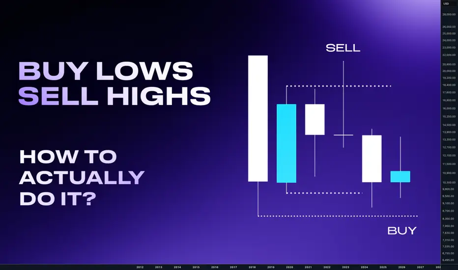
How to Buy low and Sell Highs - Advanced Market StructureHello traders, we al ever heard about buy low sell high is the most profitable approach.
Sounds easy and looks easy in hindsight, but it's a bit complicated to do it if you dont know this what Im going show you today about an advanced market structure. To understand why it is advanced we will first look to the basic market structure.
🟣 Basic Market Structure:
• Highs and Lows
• Used as a confluence, Not as the main basis for generating trading ideas.
• Enhancing perspective and view of the markets.
• Not significant but good to be aware of.
📍 Uptrend
Price is in bullish move and making higher highs and higher lows
📍 Downtrend
Price is in bearish move and making Lower lows and lower highs
When using basic market structure to analyze the markets. Traders missing the fact that market makers need liquidity for the next move. Liquidit is mostly below the lows and highs. And when the price dips there it can look like a break out, but it's not unless the price is coming from a higher timeframe key level.
🟣 Advanced Market Structure:
• More refined and accurate perspective.
• Advanced market structure takes into account the breaking and rejection of highs
and lows. (Liquidity)
• It also incorporates other methods to measure and gauge market order flow and
structure, which are based on practical concepts rather than just unrealistic theory.
📍 Uptrend
Price is in a bullish move and is consistently breaking abovehighs and rejecting below lows. (Sweeping liquidity) - heading to HTF liqudity
📍 Downtrend
Price is in a bearish move and is consistently breaking below lows and rejecting above highs.(Sweeping liquidity) - heading to HTF range liqudity
For higher probability of the setups these lows and highs should be occurring
in the Premium part of the structure for shorts and in the discount for the longs.
For this we are using dealing ranges which I have explained in this thread below.
🟣 Advanced Market Structure:
if we are looking to the markets structure with different lenses we are mapping short term H/L runs above / below them are intermediate H/L. This is where we want to be entering.
📍 Short term swings .
- STL (Short Term Low)
- STH (Short Term High)
These are swings where liquidity was not swept...
📍 Intermediate term swings.
- ITL (Intermediate Term Low)
- ITH (Intermediate Term High)
These are swing with Liquidity Sweep / Stop hunt its time for entries here.
🧪 Downtrend
short term highs are swept and intermediate highs are created. This is strong highs..
🧪 Uptrend
short therm lows are swept and intermediate lows are created. This is strong lows.
But how do we know that it's not a structure shift? How do we know that, it's just a false break and opportunity to buy low or sell high? Answer is simple - HTF BIAS
Hence we must always use at least two timeframes but with 3 Timeframes you will master precision.
🟣 Timeframes Sequence
Month - Bias, HTF Key Levels
Weekly / Daily - Bias alignments , Ranges
H4 - Intraday ranges
H1 / M15 / M5 - entries
Stop hunts mostly appears with a huge candle which can be done only by a market makers. This candle created the range on Weekly, Daily , H4... Once this range is manipulated in other words liquidity is taken by market makers. You drop lower timeframe and there you execute your entries in the HTF direction.
To learn more about liquidity check other this thread below
🧪In the uptrend you want be buying after stop hunts of short term lows
🧪In downtrend you want sell after stop hunt of short term highs
🎯Once the price make a stop hunt on the short term low or short term high, you need to see a confirmation in the change in order flow. In other words - Order Block or Supply / Demand to be created.
I have explained order block in this thread below
💊Here are recent trade examples of the stop hunt and range trades.
✅ EURUSD - Stop hunt of the range
✅ USDCHF - Stop hunt of the range
✅ GBPUSD - stop hunt of the range
“Adapt what is useful, reject what is useless, and add what is specifically your own.”
David Perk aka Dave FX Hunter ⚔
Weierstrass Function: Fractal Cycles🏛️ RESEARCH NOTES
In financial markets, asset prices move in broken waves, seemingly random patterns because they reflect the decentralized and often conflicting decisions of countless participants. No single force dictates this behavior; it emerges from the collective actions of millions acting on different information and expectations. Constantly shifting news and uncertainty cause prices to fluctuate like a stochastic process, similar to Brownian motion. These fluctuations stem from past events, current news, and future speculation often disconnected from fundamentals - and would stabilize only if all outcomes were perfectly known in advance.
Given that markets function as emergent systems in which order develops from iterative interaction cycles, I consider its raw geometry a necessary approach for advancing a more precise understanding of price dynamics as expressed in their behavior.
🇩🇪 The Weierstrass Function is a classic example of a "fractal curve", as it is continuous and is nowhere differentiable. This means it is infinitely jagged at every single point, so regardless the zoom, it never becomes smooth. Similarly, in markets, the large cycles contain medium cycles, which further scale down to nested micro-cycles.
f(x) = ∑(n=0)^∞ a^n * cos(b^n * π * x)
a^n → ensures higher-frequency components have smaller amplitude, keeping the series bounded.
b^n → scales the frequency, creating finer oscillations that nest inside larger cycles.
N (n_terms) → truncates the infinite sum to a practical number of terms.
Scale_factor → maps the abstract mathematical domain to the time axis of the price chart.
❖ Shapes of Fractal Cycles
With default parameters, the function reproduces the characteristic roughness it is known for.
At a frequency factor of 5, nested cycles are compressed along the time axis, while the frequency and magnitude of reversals increase. The resulting structure closely resembles Elliott wave patterns.
At a frequency factor of 9, composite cycles emerge at smaller scales. The steep angles cause movements to unfold as rapid but short-lived spikes.
At extreme values (e.g., frequency factor >1000), cycles overlap extensively, producing dense interference patterns with significant stretching and deformation.
❗️Each added term does not “react” to price. Instead, it generates a composite waveform in which multiple cycles are naturally nested. The resulting fractal wave is topologically organized, meaning it encodes trends of different scales in one structure without any bias toward trend-following.
The Weierstrass function is a generative fractal model that builds waves nested across multiple scales. It doesn’t react to market data but provides a topological view of trend structure, showing how cycles naturally scale and interlock instead of prescribing signals.

Learning#05 : Decoding Highs and Lows📚 Learning#05 : Decoding Highs and Lows
- A Trader’s Guide to Reading the Market - Simple Yet Important
If the market were a book, the trend would be its storyline — and as traders, our job is to read that story without skipping pages. Trading with the trend puts the odds in your favor because you’re flowing with the market’s natural momentum, not fighting it.
Whether it’s an uptrend, downtrend, or a sideways grind, spotting it early gives you a big edge in deciding when to enter, when to exit, and when to simply step aside.
One of the simplest yet most reliable ways to read that story?
👉 Story of Highs and Lows
Let’s break it down.
📚 Understanding Highs and Lows in Trading
In technical analysis, highs and lows are the market’s way of leaving breadcrumbs.
A high is a peak before the market pulls back.
A low is a trough before the market bounces.
Track these points over time and you start to see patterns that reveal the market’s mood — bullish, bearish, or indecisive.
This isn’t about guessing; it’s about observing price action as it is.
📌 The Four Key Building Blocks of Market Structure
1️⃣ Higher Highs (HH)
Each new high is higher than the one before.Paired with higher lows, this signals an uptrend. Buyers are in control, and demand is pushing price upward.
Example: Nifty rallies from 22,000 to 22,200, pulls back to 22,100, and then rallies to 22,350. That second high (22,350) is higher than the first, confirming bullish momentum.
2️⃣ Higher Lows (HL)
Each pullback low is higher than the last.This tells you that sellers tried to push the market down — but buyers stepped in sooner this time, showing strength.
HLs often precede trend continuation and give great spots for entering long positions with tight risk.
3️⃣ Lower Lows (LL)
Each new low is lower than the previous one.Paired with lower highs, this marks a downtrend. Selling pressure is in charge, and rallies are being sold into.
4️⃣ Lower Highs (LH)
Each bounce high is lower than the last.This shows weakening buying pressure and often leads to another push lower.
Think of it like climbing stairs vs. walking down a hill:
📌 HH + HL = Stairs up → Bull trend.
📌 LL + LH = Hill down → Bear trend.
📈 HH+HL : Bullish Setup :
📉 LL+LH : Bearish Setup :
📌 Why It Matters for Traders
Price action is the most honest information in the market — no lag, no magic, no guesswork.
HH/HL → Bulls in control → Look for long setups.
LL/LH → Bears in control → Look for short setups.
Spotting these patterns on the fly means you can align with the dominant side instead of fighting it.
🧩 Combining HH & LL With Other Tools
📏 Fibonacci Retracements
Once you’ve identified the trend:
In an uptrend, draw Fibonacci from the latest HL to HH for pullback buying zones.
In a downtrend, draw from the latest LH to LL to find shorting opportunities.
⛰️ Fractals for Clarity
Fractals help pinpoint swing highs and lows without guesswork. I personally track HH/HL/LL/LH on a 1-minute chart for intraday trading — this keeps me in sync with the micro-trend while avoiding sideways traps.
🔀 Trendlines & VWAP
Trendlines show the bigger path, VWAP confirms intraday balance. When HH or LL aligns with these, you’ve got high-confluence setups.
🥷 Kiran’s Approach
For intraday, I start by mapping the structure: HH, HL, LL, LH. This gives me the immediate trend bias and alerts me to potential reversals early. I track them on a 1-min chart, combine with Fibonacci and trendlines, and trail stops as the structure unfolds.
It’s simple, visual, and keeps me out of bad trades and warns me to stay out of a sideways market situation, too.
🔑 Key Takeaway
Market structure is like a language — HH, HL, LL, and LH are its alphabet. Once you learn to read it, you’ll never trade blind again.
💡 “Trade what you see, not what you think. The chart always whispers first — you just have to listen.”
Start marking highs and lows on your chart tomorrow. Watch the story unfold. Trade in sync, and you’ll notice your entries become sharper, your exits cleaner, and your confidence higher.
See you in the next one — and until then:
Keep it simple. Trade with structure. Trust the levels.
— Kiran Zatakia
when to change your session bias and Take profit, YM! Long1. This video demonstrate when you should change you bias for the session, sometimes before session price action quite confusing but when you add SMT and strength switch concept to you bias you will see true price intention where it will go.
2. Always take entry or profit one level to another level, price always go from one level to another level.
3. This video I try to demonstrate how to take profit when you have to level to target, always look for the correlated instruments to build bias

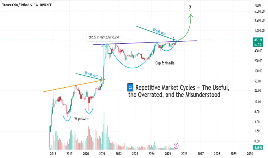
Cycles Don’t Lie — But Which One Speaks Here ?Markets love to repeat themselves.
But just because something repeats, doesn’t mean it’s predictable — or useful.
Let’s break down the main types of market cycles that traders talk about, and more importantly, let’s call out their flaws. No sugarcoating.
🔹 1. Time Cycles
These are based on the idea that price behaves in a similar way over specific time intervals — whether it’s 90 days, 4 years, or a custom Fibonacci count.
They show up in seasonal patterns, halving cycles (like Bitcoin), or through tools like Gann, Hurst, or even basic cycle lines.
The problem?
– The exact timing is rarely clean. A 120-day cycle might play out in 87 days next time.
– Flat, choppy markets will destroy any cycle-based setup.
– Different timeframes show different "cycles," so good luck aligning them.
– Most cycle tools are complicated and impractical for real-time decision making.
🔹 2. Psychological Cycles
The famous emotional rollercoaster: Hope → Euphoria → Fear → Panic → Capitulation → Depression → Optimism.
Every bull and bear market goes through these in some form — in theory.
The problem?
– It’s almost entirely subjective. Everyone sees a different phase.
– You usually recognize the cycle only after it’s over.
– Emotions aren’t equal across all assets — BTC retail emotions ≠ S&P500 institutional sentiment.
– There’s no precise tool to measure this. You’re mixing vibes with candles.
🔹 3. Structural Cycles (e.g. Wyckoff)
This one’s more about price behavior itself — accumulation, markup, distribution, markdown. The idea is that markets rotate through these four structural phases again and again.
The problem?
– Identifying where you are in the structure is hard in real time.
– Markets don’t always follow the Wyckoff textbook. Sometimes they just... go.
– It relies heavily on volume — and that doesn’t always align.
– Traders love to force a structure where there isn’t one. Confirmation bias, anyone?
🔹 4. Macro Cycles
Classic economic boom and bust: Expansion → Peak → Recession → Trough.
These cycles move slow but shape everything — interest rates, employment, growth, and eventually, risk assets.
The problem?
– They’re way too slow to help short-term traders.
– Good luck timing the top or bottom of the economy.
– Governments and central banks constantly interfere with natural cycles.
– Most macro data is lagging, so you’re reacting to history, not forecasting the future.
🔹 5. Liquidity / Volume Cycles
This idea tracks capital flow: when liquidity comes in, prices rise. When it dries up, risk assets fall. Simple, right?
The problem?
– Volume isn’t universal. Crypto volume =/= stock volume =/= forex volume.
– You can’t always track capital flow accurately, especially in OTC markets.
– Low volume doesn’t always mean weakness — sometimes it’s just summer.
– Volume data can be misleading, especially on shady exchanges.
🔹 6. Fractal Cycles
Markets repeat — at every level. 5-minute looks like the 4-hour, which looks like the daily. Elliott wave, harmonic patterns, whatever — the idea is that patterns echo across timeframes.
The problem?
– Pattern recognition can be wildly subjective.
– The market doesn’t always care about geometry. Sometimes it’s just noise.
– By the time a pattern is “confirmed,” you missed the move.
– Focusing too much on pattern symmetry makes you blind to macro/fundamentals.
So after breaking all that down, let’s finally get to the chart in front of us.
Let’s take a closer look and see which cycle has actually played out here — and more importantly, which one actually helped :
As you can see on the chart, before every breakout above the previous all-time high, the market tends to form some sort of bottoming structure or reversal pattern.
And once that structure completes, the actual breakout usually leads to a solid price pump.
But here’s the key question:
Which one of the cycles we talked about earlier does this actually follow?
If you ask me, a professional trader will always try to use every tool available — not because any single one gives you the answer, but because combining them gets you closer to what's likely to happen.
And that’s what separates a well-rounded trader from a one-dimensional one.
Why do I say “one-dimensional”?
Because if you insist on looking at the market through a single lens, you’re bound to make bad decisions. We’re not here to prove our personal theories — we’re here to profit from what actually happens in the market, not what we think should happen.
In the chart above, we actually see a mix of all the cycles we talked about.
But I’d love to hear from you as well — let’s brainstorm together.
What do you see here as a trader?
And what’s your take on this setup?
Bottom Line
Yes, markets repeat.
But repetition doesn’t equal reliability.
Every cycle has its use — and its blind spot.
Know the difference. Use what fits your style.
And don’t romanticize a model just because it looks clean on a chart from six months ago.
Learning#02 : Fractals⛰️ Learning#02 : Fractals
The Cleanest Clue on a Cluttered Chart
If you like clean charts and smart price behaviour, Fractals are one of those tools that give subtle but powerful signals. They’re not magic. They simply reflect what price is telling you—if you’re willing to listen.
Let’s unpack the concept and learn how to use Fractals like a pro.
🔍 What Is a Fractal in Trading?
In technical analysis, a Fractal is a five-candle pattern that marks a local top or bottom in price. It’s a pure price-action signal that doesn’t rely on lagging indicators.
There are two types of Fractals:
Bearish Fractal (Top): The 3rd candle has the highest high, surrounded by two lower highs on each side.
Bullish Fractal (Bottom): The 3rd candle has the lowest low, flanked by two higher lows on each side.
These formations are Price's way of saying: *"I tried to go further, but couldn't."
📊 What Do Fractals Indicate?
A shift in short-term control (bulls vs. bears)
Minor support or resistance zones
Useful markers for entries, exits, or trailing stop levels
They don't guarantee reversals but are excellent at highlighting where price momentum may pause, reverse, or build structure.
📈 How to Use Fractals – A Practical Guide
Let’s be clear: Fractals are not trade signals by themselves.
Instead, they work best when used in confluence with your strategy. Think of them as tools that:
Help confirm breakout levels
Refine pullback entries
Guide you in drawing cleaner trendlines, fib zones, and support/resistance levels
Assist in identifying swing highs and lows for Dow Theory-style trend analysis
🔗 Fractals + Strategy = Smart Trading
Whether you trade breakouts or mean reversion, Fractals help clarify:
Which highs or lows matter
Where to place stop losses with structure-based logic
How to trail SL as the trade progresses
They quietly organize your chart into readable, tradeable levels.
🚀 Practical Uses of Fractals
Fractals are the first tool I add to any chart—they instantly reveal structure and guide every step of my analysis.
1. Breakout Confirmation
Wait for a candle to close above a bullish fractal high or below a bearish fractal low.
Useful when the market is trending or forming structures like double bottoms/tops.
2. Pullback with Confirmation
Use the fractal zone as a short-term S/R level. If price returns and shows signs of rejection (like an inside bar, wick rejections, or low volume), consider entries based on confirmation.
Great in sideways or swing environments.
3. Trend Structure Validation
Fractals reveal clear pivot highs/lows, helping:
Confirm higher highs/higher lows
Mark structure for trendline drawing
Validate Fib levels or S/R zones
4. Trailing Stop Loss
Update your SL to trail behind the most recent opposite-side fractals.
In longs: SL below new bullish fractals
In shorts: SL above new bearish fractals
This lets you stay in the move while managing risk like a pro.
How it’s Look Like on Chart
snapshot
⚠️ Common Mistakes to Avoid
Trading every fractal blindly
Ignoring price context or trend
Relying on fractals in low-volume, choppy markets
📝 Final Thoughts
Fractals are like breadcrumbs left by price action. They quietly point to areas where the market faced resistance or found support. Alone, they’re not enough. But in the hands of a price-action trader, they’re incredibly useful.
Used alongside market structure, confirmation signals, and clean charting habits, Fractals become:
Trend identifiers
Entry enhancers
Stop loss trail markers
⭐ Bonus Tip
Next time you mark a level, Fibonacci or draw a trendline, check if a Fractal confirms it. You’ll be surprised how often it does.
Trade simple. Trade clean.
— Kiran Zatakia

Understanding SFP In Trading1. What is a Swing Failure Pattern (SFP)?
A Swing Failure Pattern (SFP) occurs when the price temporarily breaks a key swing high or low but fails to continue in that direction, leading to a sharp reversal.
This pattern is often driven by liquidity grabs, where price manipulates traders into taking positions before reversing against them.
An SFP typically consists of:
A false breakout beyond a previous swing high/low.
A sharp rejection back within the prior range.
A liquidity grab, triggering stop-loss orders and fueling a reversal.
SFPs provide powerful trade opportunities, signaling potential reversals and the exhaustion of trends.
2. Understanding Liquidity Grabs & Stop Hunts
The financial markets are structured around liquidity. Large institutions and algorithmic traders require liquidity to execute their large orders efficiently.
One way they achieve this is by triggering liquidity grabs and stop hunts.
Liquidity Grab:
Occurs when price moves beyond a key level (e.g., swing high/low), activating orders from breakout traders and stop-losses of trapped traders.
Smart money absorbs this liquidity before pushing the price in the opposite direction.
Stop Hunt:
A deliberate price movement designed to trigger stop-loss orders of retail traders before reversing.
Often seen near major support and resistance levels.
These events are crucial for understanding SFPs because they explain why false breakouts occur before significant reversals.
3. Why Smart Money Uses SFPs
Institutions, market makers, and algorithmic traders use SFPs to:
Fill large orders: By grabbing liquidity at key levels, they ensure they can enter large positions without causing excessive price slippage.
Manipulate retail traders: Many retail traders place stop-losses at obvious swing points. Smart money exploits this by pushing the price beyond these levels before reversing.
Create optimal trade entries: SFPs often align with high-probability reversal zones, allowing smart money to enter positions at better prices.
Understanding how institutions operate gives traders an edge in identifying manipulative moves before major price reversals.
4. Market Structure & SFPs
Market structure is built upon a series of swing highs and swing lows. Identifying these key points is crucial because they represent areas where liquidity accumulates and where price is likely to react.
Swing High (SH): A peak where price makes a temporary high before reversing downward.
Swing Low (SL): A trough where price makes a temporary low before reversing upward.
Types of Swing Points in Market Structure
Higher Highs (HH) & Higher Lows (HL) – Bullish Trend
Lower Highs (LH) & Lower Lows (LL) – Bearish Trend
Equal Highs & Equal Lows – Range-Bound Market
5. Liquidity Pools: Where Traders Get Trapped
Liquidity pools refer to areas where traders' stop-loss orders, pending orders, and breakout entries accumulate. Smart money uses these liquidity zones to execute large orders.
Common Liquidity Pool Zones:
Above swing highs: Retail traders place breakout buy orders and stop-losses here.
Below swing lows: Stop-losses of long positions and breakout sell orders accumulate.
Trendline & Range Liquidity:
Multiple touches of a trendline encourage traders to enter positions based on trendline support/resistance.
Smart money may engineer a fake breakout before reversing price.
6. Identifying Bullish SFPs
SFPs can occur in both bullish and bearish market conditions. The key is to identify when a liquidity grab has occurred and whether the rejection is strong enough to confirm a reversal.
Bullish SFP (Swing Low Failure in a Downtrend)
Price sweeps a key low, triggering stop-losses of long traders.
A strong rejection wick forms, pushing price back above the previous low.
A shift in order flow (bullish market structure) confirms a potential reversal.
Traders look for bullish confirmation, such as a higher low forming after the SFP.
Best bullish SFP setups occur:
At strong support levels
Below previous swing lows with high liquidity
After a liquidity grab with momentum confirmation
7. Identifying Bearish SFPs
Bearish SFP (Swing High Failure in an Uptrend)
Price takes out a key high, triggering stop-losses of short traders.
A sharp rejection forms, pushing the price back below the previous high.
A bearish shift in order flow confirms downside continuation.
Traders look for bearish confirmation, such as a lower high forming after the SFP.
Best bearish SFP setups occur:
At strong resistance levels
Above previous swing highs where liquidity is concentrated
With clear rejection wicks and momentum shift
8. How SFPs Signal Reversals
SFPs provide early warning signs of trend reversals because they expose areas where liquidity has been exhausted.
Once liquidity is taken and the price fails to continue in that direction, it often results in a strong reversal.
Key Signs of a Strong SFP Reversal
Long wick rejection (indicating absorption of liquidity).
Close back inside the previous range (invalidating the breakout).
Increased volume on the rejection candle (confirming institutional activity).
Break of short-term market structure (trend shifting).
Divergences with indicators (e.g., RSI divergence at the SFP).
9. Identifying High-Probability SFPs
One of the most critical aspects of a valid SFP is how the price reacts after a liquidity grab. The candle’s wick and close determine whether an SFP is strong or weak.
A. Wick Rejections & Candle Closes
Key Features of a Strong SFP Wick Rejection
Long wick beyond a key swing high/low (indicating a liquidity grab).
Candle closes back inside the previous range (invalidating the breakout).
Engulfing or pin bar-like structure (showing aggressive rejection).
Minimal body size relative to wick length (e.g., wick is 2–3x the body).
Bullish SFP (Swing Low Failure)
Price sweeps below a key low, triggering stop-losses of buyers.
A long wick forms below the low, but the candle closes back above the level.
This signals that smart money absorbed liquidity and rejected lower prices.
Best bullish SFPs occur at major support zones, previous swing lows, or untested demand areas.
Bearish SFP (Swing High Failure)
Price sweeps above a key high, triggering stop-losses of short sellers.
A long wick forms above the high, but the candle closes back inside the range.
This signals that smart money absorbed liquidity and rejected higher prices.
Best bearish SFPs occur at resistance levels, previous swing highs, or untested supply areas.
❌ Weak SFPs (Avoid These)
❌ Wick is too small, meaning the liquidity grab wasn’t significant.
❌ Candle closes above the swing high (for a bearish SFP) or below the swing low (for a bullish SFP).
❌ Lack of strong momentum after rejection.
B. Volume Confirmation in SFPs
Volume plays a crucial role in validating an SFP. Institutional traders execute large orders during liquidity grabs, which often results in spikes in trading volume.
How to Use Volume for SFP Confirmation
High volume on the rejection wick → Indicates smart money absorption.
Low volume on the breakout move → Suggests a lack of real buying/selling pressure.
Increasing volume after rejection → Confirms a strong reversal.
Spotting Fake SFPs Using Volume
If volume is high on the breakout but low on the rejection wick, the move may continue trending rather than reversing.
If volume remains low overall, it suggests weak market participation and a higher chance of chop or consolidation instead of a clean reversal.
Best tools for volume analysis:
Volume Profile (VPVR)
Relative Volume (RVOL)
Footprint Charts
10. Key Takeaways
SFPs are Liquidity Grabs – Price temporarily breaks a key high/low, triggers stop losses, and then reverses, signaling smart money absorption.
Wick Rejection & Close Matter – A strong SFP has a long wick beyond a swing point but closes back inside the range, invalidating the breakout.
Volume Confirms Validity – High volume on rejection wicks indicates smart money involvement, while low-volume breakouts often fail.
Higher Timeframes = Stronger SFPs – 1H, 4H, and Daily SFPs are more reliable than lower timeframe setups, reducing false signals.
Confluence Increases Probability – SFPs are most effective when aligned with order blocks, imbalances (FVGs), and major liquidity zones.
Optimal Entry Methods Vary – Aggressive entries capitalize on immediate rejection, while confirmation and retracement entries improve accuracy.
Proper Stop Loss Placement Prevents Fakeouts – Placing SL just beyond the rejection wick or using structure-based stops reduces premature exits.
Take Profit at Key Liquidity Levels – Secure profits at previous swing highs/lows, order blocks, or imbalance zones to maximize returns.

NASDAQ Bread and Butter & Turtle Soup Example XIIaight, so im gonna break down a trade i took on nasdaq today using a setup i picked out myself from the ict concepts. just my own flavor of it, ya know
before i knock out at night, i open up the charts real quick — just tryna see if there's any clean liquidity chillin’ nearby. if there aint, i shut it down and catch some solid sleep. but if there is... bingo baby
this basically means i might just wake up rich tomorrow, bro. on the daily, im seeing two strong green days back to back, and right above that boom some equal highs just sitting there, begging to get run. they are even cleaner on the 1h. bias locked in. im waking up tomorrow and hunting longs, simple as that.
i mark up the daily open first thing. if im lookin for longs, i wanna see some turtle soup under the open. if im hunting shorts, i need that setup above the open. thats just how i roll.
if there is a swing low, trend liquidity, or some equal lows carryin over from yesterday, im locked in on those levels for turtle soup. if not, im just chillin, waitin for price to build some fresh liquidity during the day and then snatch it.
in this setup, i got some leftover liquidity from yesterday plus a clean 4h fvg sittin there like a neon sign.
next, i check the time. liquidity grabs usually hit during one of the killzones depends on the pair, but im watchin asia, london, or new york sessions.
then i scope out if there is any news droppin around that time, especially stuff that could move the pair. no point in getting blindsided.
and yeah, i always peep correlated pairs too sometimes they snitch before your chart even says a word.
when all the stars and planets line up just right, that is when I drop down to the 15m and wait for a clean csd to show up. but here is the thing i dont jump in the second i see it. i wanna see price actually leave the liquidity zone.
yeah, it might lower my rr a bit, but the win rate goes way up. It keeps me outta those fake-ass turtle soups that look good at first but just wanna wreck your stop.
once im in the trade, i usually try to close out half the position the same day take profits where the chance of price reversing is damn near zero. then i let the other half ride toward my target liquidity. just lettin it breathe, do its thing.
thats it, peace out

Macromics Group: Market Trends Overview (June 2025)Global Economic Landscape: What Has Changed?
June 2025 marks significant shifts in the global economy. After several years of instability caused by the pandemic, inflation, and geopolitical tensions, markets are gradually stabilizing. However, new challenges are emerging: rising risks in Asia, digital transformation in Europe, and strategy shifts in the U.S.
China and India continue to show strong growth rates—5.8% and 6.5% respectively. Europe, by contrast, is lagging behind due to slow recovery and persistent inflation. The U.S. maintains a steady course driven by consumer spending and innovation, reporting 2.1% GDP growth.
Macromics Group continues to deliver in-depth analytics and strategies for clients seeking to understand and capitalize on these changes. We analyze trends across more than 120 industries, helping companies adapt and thrive.
Macroeconomics and Monetary Policy: A Shift Toward Stabilization
Financial regulators have begun cautiously lowering interest rates after the peaks of 2024. The U.S. Federal Reserve has dropped its rate to 4.5%, while the ECB has reduced its rate to 3.75%. This is made possible by a decline in inflation: 2.7% in the U.S. and 3.1% in the EU.
Meanwhile, developing nations like Turkey and Argentina are still grappling with high inflation. These countries risk falling behind the global recovery unless decisive steps are taken.
Overall, the global course is toward soft stabilization: interest rates remain high but steady. This creates favorable conditions for investment and long-term planning.
Financial Markets: From Caution to Moderate Optimism
Stock markets in June 2025 show mixed performance. U.S. indexes such as the S&P 500 and Nasdaq hit new highs, thanks to the booming tech sector. Stocks of companies involved in AI, quantum computing, and cybersecurity are particularly strong.
European markets are less active but relatively stable. Growth is limited by high costs, demographic issues, and the transition to ESG standards. In Russia and CIS countries, markets are under pressure due to sanctions, currency restrictions, and reduced investment.
On the currency front, the U.S. dollar and Chinese yuan dominate. The ruble is volatile, the euro is stable, and the yen is strengthening as a safe haven asset.
Technology: The Engine of New Markets
The main trend in 2025 is AI and automation. Companies are deploying neural networks in logistics, marketing, finance, and HR to cut costs and boost efficiency. Demand for AI professionals and developers is surging.
5G infrastructure has matured in most developed countries, unlocking new potential in IoT, telemedicine, and remote work. At the same time, quantum computing is advancing rapidly, with commercial solutions expected by 2026.
Macromics Group invests in next-generation analytical platforms, enabling clients to access real-time insights and forecast trends before they go mainstream.
Energy and Sustainability: ESG and the “Green” Shift
Energy markets have stabilized after the turbulence of 2024. Oil prices remain between $70–$85 per barrel—comfortable for both producers and consumers. Meanwhile, renewable energy—solar, wind, and hydrogen—is seeing record investment.
Corporations are increasingly reporting according to ESG standards. It’s not just a trend, but a new business reality. Investors demand transparency, consumers prefer socially responsible brands, and regulators impose mandatory reporting.
Macromics Group supports clients in transitioning to sustainable models by developing ESG strategies, assessing risks, and offering financial solutions.
Conclusion: Outlook for the Second Half of 2025
The first half of 2025 showed that markets are learning to operate in a new reality. The global economy is no longer chasing rapid growth, but adapting to volatility. Key focus areas are technology, sustainability, and smart resource management.
For businesses, this means quick adaptation, innovative thinking, and reliance on data-driven decisions. In this context, Macromics Group serves not just as an analyst but as a strategic partner.
Our recommendation: act proactively. In times of uncertainty, those who plan years ahead and use quality data will win.

Seeds in Chaos, Petals in Profit -A trader's guideSeeds in Chaos, Petals in Profit
A trader's guide to reading the market through nature's lens.
By: Masterolive
Intro:
This trader's guide is not another cookie-cutter trading system.
Instead, it focuses on building a long-term mindset and a way to read the market's chaos through nature's lens. This guide is grounded in real success but is not for the daily trader; it works for long-term swings using hourly price moves.
Over seven years of trading, I developed a unique way to view the market, which led to a practical trading mindset. The technique comes from simplifying the chart after experiencing endless combinations of indicators to no avail. It wasn't until I had to explain my concept to someone else that I found a way to use a garden analogy that fits the mindset well to see the market as a natural system: planting in chaos, thriving through storms.
Later, I read two books: "The Alchemy of Finance" by George Soros and "The Misbehavior of Markets" by Benoit Mandelbrot and Richard L. Hudson. Surprisingly, these two books validated my approach and inspired me to share it. Previously, I would tell no one because I thought it was silly.
The overall goal is to plant a garden, watch it grow, and understand how the weather affects the plants. This guide walks you through determining what flowers you want to plant and how to read the weather after you have made your choice.
It uses a garden and planting flowers as an analogy to choosing the right stocks and interpreting an EMA indicator to determine the market's direction. This guide also works well for Bitcoin.
This guide will help you understand how to read and interpret the chart. It will also give you accurate future context so you react less to the market moves and see the bigger picture: Plant while they panic.
This guide is not financial advice.
Part One - Planting.
Some traders focus on various companies based on technicals or fundamentals, some short-term and some long-term. Other traders will focus on a few stocks or diversify across many.
For this guide, we pick and diversify a sector with roles that thrive together. The industry can be broad or small, but we will use 10 assets, including nine stocks and Bitcoin, and explain how they correlate and grow into a weather-worthy garden.
In this garden, we will focus on Tech and Finance and explain how to plant and organize the garden. First, we must look back at the broadest picture in finance. We will choose a stock exchange and a crypto exchange in this garden. (1 and 2 out of 10 flowers)
Why an exchange? Simply put, traders will always look for stocks and crypto to buy. They will look for the best companies and the best opportunities. Therefore, stock exchanges will benefit from the revenue they generate. If a stock goes parabolic, the exchange still profits from that price move.
Choosing the exchange skips the hassle of finding companies in a haystack. The same is true for the crypto exchange. Our garden has two flowers: one stock exchange and one crypto exchange, representing those two sectors.
Next, what else can correlate with our garden from a zoomed-out view?
Let's choose a Bank and a payment processor. (3 and 4 out of 10 flowers)
Traders will need the bank to on and offramp their cash profits to and from the stock and crypto exchange. Meanwhile, they will need to process those electronic payments.
The bank and payment processors benefit from trading surges; if everyone piles in for a parabolic price move of a particular stock, the bank and payment processors benefit from the action, and the exchanges offering the stock get revenue from the surge.
Once again, this choice skips the need to hunt for specific stocks. It takes advantage of all stocks since traders need cash, banks, electronic payments, and exchanges to buy those company stocks or bitcoin.
Our garden now has Four flowers, a bank and payment processor, and two exchanges for this sector. The correlation? Exchanges, banks, and processors all thrive when traders move money.
The fifth is a pivot flower before we discuss the tech company sector. This pivot flower is a gambling company (5 out of 10).
How does this correlate? Some traders and other users gamble with their cash and profits; even in a recession or a depression, people will still gamble. Plus, users might take their gambling winnings and invest them in a stock or buy bitcoin. They need a bank, an exchange, and a payment method.
In this case, the flowers are self-reinforcing: gambling winnings or losses, stock booms or busts; it doesn't matter in the big picture because, once again, exchanges, banks, and processors all thrive when people move money. Our garden now has five flowers with a broad but strong correlation.
Now, on to the tech sector with the last five flowers.
You will hone in on specific tech roles at this point, but remember that your choices will be self-reinforcing.
If your choice booms, the exchange benefits, and you benefit again from the exchange stock. You will electronically transfer your profits to your bank, which you benefit from by owning the bank stock and payment processor. But if you're smart, you will skip the gambling and let the crowd roll the dice while you plant the profits.
We will focus on two more flowers (6 and 7 out of 10) for tech, so we need to find companies exposed to the popular and relevant tech we want. For tech company 1, you could expose yourself to AI, EVs, and ROBOTS. For tech company 2, Semiconductors (or graphics cards).
In this section of our garden, graphic cards and AI rely on one another, while EVs and robots use AI to operate. Eventually, people will buy or sell the robot and EV, and some may use the profits to buy stock (or Bitcoin), requiring a bank and payment processor.
Meanwhile, people use LLMs, log into their bank, or exchange daily on a computer that requires a graphics card.
Our garden now has seven flowers out of 10, 3 more to go!
We want to diversify (but stay correlated with our garden), so next, we will look at a real estate company or ETF—but not just any company or ETF, one that develops in tech hub areas. How does this correlate?
Robots, AI, EVs, and graphics cards all need workers to operate the companies; young talent will want to move to places where they can work in AI or Robotics or factory EV workers, so the real estate in those areas will be in high demand, so now we own the real estate for our Ai, EV, Robots, and graphic card workers.
As tech grows, real estate booms, driving more money through exchanges, banks, and processors.
We now have eight flowers in our weather-worthy garden.
For the 9th flower, we turn to a wildflower: none other than Bitcoin. Bitcoin is not just a crypto coin but a capital asset, a store of value for your currency when it debases.
People, especially tech workers, will buy, trade, and sell Bitcoin.
As people learn and turn to the asset, global capital will flow through Bitcoin as people around the world save their cash value,
whether it be from gambling winnings, selling a car, selling real estate, selling a stock, or simply putting part of their income from their tech job into it regularly. All of this requires Exchanges, Banks, and payment processors to move.
Bitcoin correlates with that, as exchanges profit off bitcoin, which you own stock in the exchange company. You still need a bank to land on and a payment processor to move the money electronically.
We now have nine flowers in our garden, and it's almost complete.
How can we diversify even more? We can use industrial metal for our last flower, but how does an industrial metal correlate with our tech and finance garden?
Copper is the metal that conducts electricity, and electricity is needed to move money, send Bitcoin, power a growing network of EV superchargers, and power the factories that produce EVs, graphics cards, robots, and more. Copper's the most vigorous root, tying every flower, from tech to finance, into a weather-worthy bed. Meanwhile, the crowds go for gold and sleep on copper.
That completes our garden with 10 flowers. It's a diversified flowerbed, but the flowers correlate in the big picture: Tech drives money movement, which benefits exchanges, banks, and processors; copper powers tech, which drives Bitcoin adoption.
Your goal is to find and build your garden. Think up different bigger pictures with other sectors and roles. Correlating these assets keeps the garden strong through chaos and self-reinforces one another.
To review, we have the following:
Stock exchange
Crypto Exchange
Bank
Payment processor
Gambling
Ai / EV / Robots
Semiconductors (Graphics cards)
Real estate
Bitcoin
Copper
Now that we have planted our garden, let's examine the weather and its meaning. We will learn to read the weather and see when storms are coming or clearing.
In part 2, you will set a simple EMA indicator, learn how to interpret the weather, and tend to the flowers in our garden.

Probabilistic RealmI remember taking the CMT exam, where one question referenced the Efficient Market Hypothesis (EMH), which asserts that price action is purely random. To avoid losing points, I had to select “random” as the correct answer, despite knowing that market behavior is far more structured than EMH suggests. Despite of passing I still won't ever agree that market is random.
Prices are neither random nor deterministic. Market fluctuations follow a chaotic structure, but chaos is not the same as randomness. Chaos operates within underlying patterns and scaling, whereas randomness lacks any order or predictability. Although chaos makes predictions difficult, keep in mind that the universe is not random— effects still follow causes in continuity . No matter how chaotic a system may seem, it always follows a trajectory toward a certain point.
For example, in Lorenz’s model of chaos, the trajectory formed a pattern resembling the wings of a butterfly. Understanding these patterns of chaos has practical applications. In the market, even a slight fluctuation can trigger irreversible changes, reinforcing the idea that we cannot rely on absolute forecasts— only probabilities .
The market is not necessarily a reflection of the economy; rather, it reflects participants’ feelings about the “economy.” The human emotional component drives the uncertainty and chaos, making it essential to visualize price dynamics exclusively through "systematic" lens.
Market Structure Is Self-Referential
Markets move in proportion to their own size, not in fixed amounts. Price is arbitrary, but percentage is universal – A $10 move on Bitcoin at $100 is not the same as a $10 move at $100,000. Percentage metrics reflects this natural scaling and allows comparability across assets and timeframes – A 50% swing in 2011 holds similar structural significance to a 50% swing in 2024, despite price differences. Using log scale is a must in unified fractal analysis.
Percentage swings quantify the intensity of collective emotions—fear, panic, euphoria—within market cycles. Since markets are driven by crowd psychology, percentage changes act as a unit of measurement for emotional extremes rather than just price fluctuations. After all it's the % that make people worry..
The magnitude of percentage swings encodes emotional energy, shaping the complexity of future market behavior. This means that larger past emotional extremes leave deeper imprints on market structure, influencing the trajectories future trends.
The inverse relationship between liquidity and psychology of masses partially explains the market’s fractured movements leading to reversals. In bullish trends, abundant liquidity fosters structured price behavior, allowing trends to develop smoothly. In contrast, during bearish conditions, fear-driven liquidity contraction disrupts market stability, resulting in erratic price swings. This dynamic highlights how shifting sentiment can amplify price distortions, causing reactions that are often disproportionate to fundamental changes.
PROBABILISTIC REALM
Rather than viewing fluctuations as a sequence of independent events, price action unfolds as a probabilistic wave shaped by market emotions. Each oscillation (outcome) is relative to historical complexity, revealing the deep interconnectedness of the entire chart that embodies the “2-Polar Gravity of Prices.”
Fibonacci numbers found in the Mandelbrot set emphasizes a concept of order in chaos. The golden ratio (Phi) acts as a universal constant, imposing order on what appears to be a chaotic. This maintains fractal coherence across all scales, proving that price movements do not follow arbitrary patterns but instead move relative to historic rhythm.
The reason why I occasionally have been referring to concepts from Quantum Mechanics because it best illustrates the wave of probability and probabilistic realm of chaos in general. Particularly the Schrodinger's wave equation that shows probability distributions. Key intersections in Fibonacci-based structures function as "quantum" nodes, areas of market confluence where probability densities increase. These intersections act as attractors or (and) repellers, influencing price movement based on liquidity and market sentiment. Similar to Probability Distribution in QM.
Intersections of Fibonacci channels reveal the superposition of real psychological levels, where collective market perception aligns with structural price dynamics. These points act as probabilistic zones where traders’ decisions converge, influencing reversals, breakouts, or trend continuations. Don’t expect an immediate reversal at a Fibonacci level—expect probability of reversal to increase with each crossing.
To prove that Efficient Market Hypothesis is wrong about prices being random, I'd go back to a very distant past from current times. For example, price fell 93% from 2011 ATH, reversed and established 2013 ATH.
Using a tool "Fibonacci Channels" to interconnect those 3 coordinates reveals that markets move within its fractal-based timing derived from direction.
If prices were random, this would have never happened.
The bottomline is that viewing current price relative to history is crucial because markets operate within a structured, evolving framework where proportions of past movements shape future probabilities. Price action is not isolated—it emerges from a continuous interaction between historical trends as phases of cycles, and liquidity shifts. By analyzing price within its full historical context , we can differentiate between temporary fluctuations and meaningful structural shifts justified by the fractal hierarchy. This approach helps identify whether price is expanding, contracting, or aligning with larger fractal cycles. Without referencing historical complexity, there is a risk misinterpreting patterns from regular TA, overreacting to short-term noise, and overlooking the deeper probabilistic structure that governs price behavior.

Fractal Phenomenon Proves Simulation Hypothesis?The humanity is accelerating towards the times when virtual worlds will get so realistic that their inhabitants gain consciousness without realizing they exist in a simulation. The idea that we might be living in a simulation was widely introduced in 2003 by philosopher Nick Bostrom. He argued that if the civilization can create realistic simulations, the probability that we are living in one is extremely high.
Modern games only render areas that the player is observing, much like how reality might function in a simulation. Similarly, texture of game environments update as soon as they are viewed, reinforcing the idea that observation determines what is rendered.
QUANTUM MECHANICS: The Ultimate Clue
Quantum Mechanics challenges our fundamental understanding of reality, revealing a universe that behaves more like a computational process than a physical construct. The wave function (Ψ) describes a probability distribution, defining where a particle might be found. However, upon measurement, the particle’s position collapses into a definite state, raising a paradox: why does the smooth evolution of the wave function lead to discrete outcomes? This behavior mirrors how digital simulations optimize resources by rendering only what is observed, suggesting that reality itself may function as an information-processing system.
The Born Rule reinforces this perspective by asserting that the probability of finding a particle at a given location is determined by the square of the wave function’s amplitude (|Ψ|²). This principle introduced probability into the very foundations of physics, replacing classical determinism with a probabilistic framework. Einstein famously resisted this notion, declaring, “God does not play dice,” yet Quantum Mechanics has since revealed that randomness and structure are not opposing forces but intertwined aspects of reality. If probability governs the fabric of our universe, it aligns with how simulations generate dynamic outcomes based on algorithmic rules rather than fixed physical laws.
One of the most striking paradoxes supporting the Simulation Hypothesis is Schrödinger’s Cat, which illustrates the conflict between quantum superposition and observation. In a sealed box, a cat is both alive and dead until an observer opens the box, collapsing the wave function into a single state. This suggests that reality does not exist in a definite form until it is observed—just as digital environments in a simulation are rendered only when needed.
Similarly, superposition demonstrates that a particle exists in multiple states until measured, while entanglement reveals that two particles can be instantaneously correlated across vast distances, defying classical locality. These phenomena hint at an underlying informational structure, much like a networked computational system where data is processed and linked instantaneously.
Hugh Everett’s Many-Worlds Interpretation (MWI) takes this concept further by suggesting that reality does not collapse into a single outcome but instead branches into parallel universes, where each possible event occurs. Rather than a singular, objective reality, MWI posits that we exist within a constantly expanding system of computational possibilities—much like a simulation running countless parallel computations. Sean Carroll supports this view, arguing that the wave function itself is the fundamental reality, and measurements merely reveal different branches of an underlying universal structure.
If our reality behaves like a quantum computational system—where probability governs outcomes, observation dictates existence, and parallel computations generate multiple possibilities—then the Simulation Hypothesis becomes a compelling explanation. The universe’s adherence to mathematical laws, discrete quantum states, and non-local interactions mirrors the behavior of an advanced simulation, where data is processed and rendered in real-time based on observational inputs. In this view, consciousness itself may act as the observer that dictates what is “rendered,” reinforcing the idea that we exist not in an independent, physical universe, but within a sophisticated computational framework indistinguishable from reality.
Fractals - Another Blueprint of the MATRIX?
Price movements wired by multi-cycles shaping market complexity. Long-term cycles define the broader trend, while short-term fluctuations create oscillations within that structure. Bitcoin’s movement influencing Altcoins exemplifies market entanglement—assets affecting each other, much like quantum particles. A single event in a correlated market can ripple across the entire system like in Butterfly effect. Just as a quantum particle exists in multiple states until observed, price action is a probability field—potential breakouts and breakdowns coexist until liquidity shifts. Before a definite major move, the market, like Schrödinger’s cat, remains both bullish and bearish until revealed by Fractal Hierarchy.
(Model using Weierstrass Function )
A full fractal cycle consists of multiple oscillations that repeat in a structured yet complex manner. These cycles reflect the inherent scale-invariance of market movements—where the same structural patterns appear.. By visualizing the full fractal cycle:
• We observe the relationship between micro-movements and macro-structures.
• We track the transformation of price behavior as the fractal unfolds across time.
• We avoid misleading interpretations that come from looking at an incomplete cycle, which may appear random or noisy
From Wave of Probability to Reality
1. Fractal Probability Waves – The market does not move in a straight line but rather follows a probabilistic fractal wave, where past structures influence future movements.
2. Emerging Reality – As the price action unfolds, these probability waves materialize, turning potential fractal paths into actual price trends.
3. Scaling Effect – The same cyclical behavior repeats at different scales (6H vs. 1W in this case), reinforcing the concept that price movements are self-similar and probabilistically driven.
If psychology of masses that shapes price dynamics is governed by mathematical sequences found in nature, it strongly supports the Simulation Hypothesis
Do you think we live in a simulation? Let’s discuss in comments!

$BTC Cheat Sheet They Don't Want You To See!THE CRYPTO CHEAT SHEET
After seeing this, don't let anyone tell you that trading the market is hard.
All you need is a 4-year mindset.
Sell in November (the latest) post-halving year, ie 2025
Buy in November the year after, ie 2026
It really is that simple.
CRYPTOCAP:BTC 👑

Reality & FibonacciParallels between Schrödinger’s wave function and Fibonacci ratios in financial markets
Just as the electron finds its position within the interference pattern, price respects Fibonacci levels due to their harmonic relationship with the market's fractal geometry.
Interference Pattern ⚖️ Fibonacci Ratios
In the double-slit experiment, particles including photons behave like a wave of probability, passing through slits and landing at specific points within the interference pattern . These points represent zones of higher probability where the electron is most likely to end up.
Interference Pattern (Schrodinger's Wave Function)
Similarly, Fractal-based Fibonacci ratios act as "nodes" or key zones where price is more likely to react.
Here’s the remarkable connection: the peaks and troughs of the interference pattern align with Fibonacci ratios, such as 0.236, 0.382, 0.618, 0.786. These ratios emerge naturally from the mathematics of the wave function, dividing the interference pattern into predictable zones. The ratios act as nodes of resonance, marking areas where probabilities are highest or lowest—mirroring how Fibonacci levels act in financial markets.
Application
In markets, price action often behaves like a wave of probabilities, oscillating between levels of support and resistance. Just as an electron in the interference pattern is more likely to land at specific points, price reacts at Fibonacci levels due to their harmonic relationship with the broader market structure.
This connection is why tools like Fibonacci retracements work so effectively:
Fibonacci ratios predict price levels just as they predict the high-probability zones in the wave function.
Timing: Market cycles follow wave-like behavior, with Fibonacci ratios dividing these cycles into phase zones.
Indicators used in illustrations:
Exponential Grid
Fibonacci Time Periods
Have you noticed Fibonacci ratios acting as critical levels in your trading? Share your insights in the comments below!

Natural Patterns & Fractal GeometryIn my previous research publication, I explored the parallels between the randomness and uncertainty of financial markets and Quantum Mechanics, highlighting how markets operate within a probabilistic framework where outcomes emerge from the interplay of countless variables.
At this point, It should be evident that Fractal Geometry complements Chaos Theory.
While CT explains the underlying unpredictability, FG reveals the hidden order within this chaos. This transition bridges the probabilistic nature of reality with their geometric foundations.
❖ WHAT ARE FRACTALS?
Fractals are self-replicating patterns that emerge in complex systems, offering structure and predictability amidst apparent randomness. They repeat across different scales, meaning smaller parts resemble the overall structure. By recognizing these regularities across different scales, whether in nature, technology, or markets, self-similarity provides insights into how systems function and evolve.
Self-Similarity is a fundamental characteristic of fractals, exemplified by structures like the Mandelbrot set, where infinite zooming continuously reveals smaller versions of the same intricate pattern. It's crucial because it reveals the hidden order within complexity, allowing us to understand and anticipate its behavior.
❖ Famous Fractals
List of some of the most iconic fractals, showcasing their unique properties and applications across various areas.
Mandelbrot Set
Generated by iterating a simple mathematical formula in the complex plane. This fractal is one of the most famous, known for its infinitely detailed, self-similar patterns.
The edges of the Mandelbrot set contain infinite complexity.
Zooming into the set reveals smaller versions of the same structure, showing exact self-similarity at different scales.
Models chaos and complexity in natural systems.
Used to describe turbulence, market behavior, and signal processing.
Julia Set
Closely related to the Mandelbrot set, the Julia set is another fractal generated using complex numbers and iterations. Its shape depends on the starting parameters.
It exhibits a diverse range of intricate, symmetrical patterns depending on the formula used.
Shares the same iterative principles as the Mandelbrot set but with more artistic variability.
Explored in graphics, simulations, and as an artistic representation of mathematical complexity.
Koch Snowflake
Constructed by repeatedly dividing the sides of an equilateral triangle into thirds and replacing the middle segment with another equilateral triangle pointing outward.
A classic example of exact self-similarity and infinite perimeter within a finite area.
Visualizes how fractals can create complex boundaries from simple recursive rules.
Models natural phenomena like snowflake growth and frost patterns.
Sierpinski Triangle
Created by recursively subdividing an equilateral triangle into smaller triangles and removing the central one at each iteration.
Shows perfect self-similarity; each iteration contains smaller versions of the overall triangle.
Highlights the balance between simplicity and complexity in fractal geometry.
Found in antenna design, artistic patterns, and simulations of resource distribution.
Sierpinski Carpet
A two-dimensional fractal formed by repeatedly subdividing a square into smaller squares and removing the central one in each iteration.
A visual example of how infinite complexity can arise from a simple recursive rule.
Used in image compression, spatial modeling, and graphics.
Barnsley Fern
A fractal resembling a fern leaf, created using an iterated function system (IFS) based on affine transformations.
Its patterns closely resemble real fern leaves, making it a prime example of fractals in nature.
Shows how simple rules can replicate complex biological structures.
Studied in biology and used in graphics for realistic plant modeling.
Dragon Curve
A fractal curve created by recursively replacing line segments with a specific geometric pattern.
Exhibits self-similarity and has a branching, winding appearance.
Visually similar to the natural branching of rivers or lightning paths.
Used in graphics, artistic designs, and modeling branching systems.
Fractal Tree
Represents tree-like branching structures generated through recursive algorithms or L-systems.
Mimics the structure of natural trees, with each branch splitting into smaller branches that resemble the whole.
Demonstrates the efficiency of fractal geometry in resource distribution, like water or nutrients in trees.
Found in nature, architecture, and computer graphics.
❖ FRACTALS IN NATURE
Before delving into their most relevant use cases, it's crucial to understand how fractals function in nature. Fractals are are the blueprint for how nature organizes itself efficiently and adaptively. By repeating similar patterns at different scales, fractals enable natural systems to optimize resource distribution, maintain balance, and adapt to external forces.
Tree Branching:
Trees grow in a hierarchical branching structure, where the trunk splits into large branches, then into smaller ones, and so on. Each smaller branch resembles the larger structure. The angles and lengths follow fractal scaling laws, optimizing the tree's ability to capture sunlight and distribute nutrients efficiently.
Rivers and Tributaries:
River systems follow a branching fractal pattern, where smaller streams (tributaries) feed into larger rivers. This structure optimizes water flow and drainage, adhering to fractal principles where the system's smaller parts mirror the larger layout.
Lightning Strikes:
The branching paths of a lightning bolt are determined by the path of least resistance in the surrounding air. These paths are fractal because each smaller branch mirrors the larger discharge pattern, creating self-similar jagged structures which ensures efficient distribution of resources (electrical energy) across space.
Snowflakes:
Snowflakes grow by adding water molecules to their crystal structure in a symmetrical, self-similar pattern. The fractal nature arises because the growth process repeats itself at different scales, producing intricate designs that look similar at all levels of magnification.
Blood Vessels and Lungs:
The vascular system and lungs are highly fractal, with large arteries branching into smaller capillaries and bronchi splitting into alveoli. This maximizes surface area for nutrient delivery and oxygen exchange while maintaining efficient flow.
❖ FRACTALS IN MARKETS
Fractal Geometry provides a unique way to understand the seemingly chaotic behavior of financial markets. While price movements may appear random, beneath this surface lies a structured order defined by self-similar patterns that repeat across different timeframes.
Fractals reveal how smaller trends often replicate the behavior of larger ones, reflecting the nonlinear dynamics of market behavior. These recurring structures allow to uncover the hidden proportions that influence market movements.
Mandelbrot’s work underscores the non-linear nature of financial markets, where patterns repeat across scales, and price respects proportionality over time.
Fractals in Market Behavior: Mandelbrot argued that markets are not random but exhibit fractal structures—self-similar patterns that repeat across scales.
Power Laws and Scaling: He demonstrated that market movements follow power laws, meaning extreme events (large price movements) occur more frequently than predicted by standard Gaussian models.
Turbulence in Price Action: Mandelbrot highlighted how market fluctuations are inherently turbulent and governed by fractal geometry, which explains the clustering of volatility.
🔹 @fract's Version of Fractal Analysis
I've always used non-generic Fibonacci ratios on a logarithmic scale to align with actual fractal-based time scaling. By measuring the critical points of a significant cycle from history, Fibonacci ratios uncover the probabilistic fabric of price levels and project potential targets.
The integration of distance-based percentage metrics ensures that these levels remain proportional across exponential growth cycles.
Unlike standard ratios, the modified Fibonacci Channel extends into repeating patterns, ensuring it captures the full scope of market dynamics across time and price.
For example, the ratios i prefer follow a repetitive progression:
0, 0.236, 0.382, 0.618, 0.786, 1, (starts repeating) 1.236 , 1.382, 1.618, 1.786, 2, 2.236, and so on.
This progression aligns with fractal time-based scaling, allowing the Fibonacci Channel to measure market cycles with exceptional precision. The repetitive nature of these ratios reflects the self-similar and proportional characteristics of fractal structures, which are inherently present in financial markets.
Key reasons for the tool’s surprising accuracy include:
Time-Based Scaling: By incorporating repeating ratios, the Fibonacci Channel adapts to the temporal dynamics of market trends, mapping critical price levels that align with the natural flow of time and price.
Fractal Precision: The repetitive sequence mirrors the proportionality found in fractal systems, enabling to decode the recurring structure of market movements.
Enhanced Predictability: These ratios identify probabilistic price levels and turning points with a level of detail that generic retracement tools cannot achieve.
By aligning Fibonacci ratios with both trend angles and fractal time-based scaling, the Fibonacci Channel becomes a powerful predictive tool. It uncovers not just price levels but also the temporal rhythm of market movements, offering a method to navigate the interplay between chaos and hidden order. This unique blend of fractal geometry and repetitive scaling underscores the tool’s utility in accurately predicting market behavior.

Quantum Mechanics & Market Behavior At this stage of my research, I would like to share the primary inspirations behind my style of analysis. As you've already noticed, I don’t create forecasts, as they are subjective and inherently disconnected from the objective nature of markets. Instead, I focus on predictions grounded in the captured dynamics of market behavior in order to actually get closer to its causality.
"QUANTUM MARKET"
In the unpredictable world of trading, price action often mirrors the strange principles of quantum mechanics. Concepts like wave function collapse, entanglement, chaos theory, the multiverse, and even the double-slit experiment provide a unique lens to understand why markets behave as they do—particularly when they defy the majority of forecasts and move in unexpected directions.
The Collapse of the Market Wave Function
In quantum mechanics, a particle exists in a state of possibilities described by its wave function until it is measured. When observed, the wave function "collapses" into one definite outcome. Similarly, in markets, price exists as a spectrum of probabilities, influenced by fundamental data, sentiment, and technical levels. These probabilities reflect the collective forecasts of traders, analysts, and institutions.
The "collapse" of the market wave function can be likened to the moments when price unexpectedly moves against the prevailing sentiment, proving the majority wrong. For instance, when experts predict a bullish breakout, only for the market to reverse sharply, it resembles the moment a quantum system resolves into a state that surprises its observers.
This metaphor highlights the fragile relationship between market expectations and actual outcomes. Just as the act of measurement influences a quantum system, the collective observation and positioning of traders directly impact market movements.
The Multiverse of Price Action
The Many-Worlds Interpretation (MWI) of quantum mechanics posits that every possible outcome of a quantum event occurs, creating branching universes for each scenario. This offers a useful metaphor for the multiverse of market possibilities, where price action simultaneously holds countless potential paths. Each decision by traders, institutions, and external forces influences which path the market ultimately "chooses," much like the branching of quantum states into separate realities.
When the market takes an unexpected turn, it can be thought of as moving into a "branch" of the multiverse that was previously considered improbable by the majority. For example:
A widely anticipated bullish breakout may fail, with the price collapsing into a bearish reversal. This outcome corresponds to a "parallel universe" of price action where the market follows a path contrary to the consensus. When they say market has its on path, chances are they're definitely referring to approach from Fractal Market Hypothesis.
The moment traders observe the market defy expectations, their reality shifts into this new "branch," leaving the discarded probabilities as theoretical relics.
While traders only experience one "reality" of the market—the observed price movement—the multiverse perspective reminds us that all potential outcomes coexist until resolved by market forces.
Chaos Theory: The Hidden Order Behind Market Behavior
Markets may appear chaotic, but their movements are not entirely random. Instead, they follow principles reminiscent of chaos theory, where complex systems display patterns that arise from underlying order.
In trading, this hidden order emerges from the entanglement of price action—the intricate relationship between buyers, sellers, sentiment, and external events. Counter-oscillations of opposing forces, such as bullish and bearish sentiment that has stake in patterns. When these forces reach a critical point, they can produce dramatic reversals or breakouts.
A fascinating aspect of this hidden order lies in the measurement of cycle intervals, which can decrypt the path and stops of price action. These intervals, often influenced by Fibonacci ratios, reflect the inherent chaos of the market while maintaining a surprising consistency. In chaotic systems, the ratios of results inherit the domestic chaos properties of the system itself. This means the measured intervals not only explain past behavior but also project future movements, where price has no option but to adhere to the golden ratio in its path, regardless of direction.
Tools like Fibonacci Channels on TradingView combine these ratios with the angle of the trend, revealing fractal-based timing measurements that highlight potential trend shifts. These tools demonstrate how price action, driven by the chaotic yet structured forces of the market, aligns with these self-similar patterns over time.
Entanglement and the Double-Slit Experiment in Markets
Einstein described quantum entanglement as "spooky action at a distance," where the state of one particle instantaneously influences another, no matter how far apart they are. Markets also mirror another iconic quantum experiment: the double-slit experiment, which demonstrates how particles behave as waves when unobserved but collapse into definitive points when measured.
In the double-slit experiment, an electron passes through two slits, existing as a wave of probabilities until observed. Without observation, it creates an interference pattern, suggesting it travels through both slits simultaneously. However, when measured, the electron collapses into a single state, taking a definitive path through one slit and landing at a specific spot on the detector.
Price action behaves in a strikingly similar way. Just as an electron "feels" it is being observed and alters its behavior, ongoing price action appears to respond to the collective observation of millions of traders. Despite this intense scrutiny, price action frequently surprises both bulls and bears, defying expectations as if reflecting the duality of probability and definitiveness.
When unobserved or in a state of uncertainty, markets exhibit wave-like behavior, oscillating between potential paths. Trends consolidate, creating a balance of opposing forces. However, as traders act on their observations—placing bets, setting stop losses, or predicting breakouts—price "collapses" into a definitive state, choosing a path that often defies the collective expectations of the market.
Logical Deductions
Understanding the market through the lens of quantum mechanics, chaos theory, and the multiverse offers valuable insights for traders:
Expect the Unexpected: Just as a quantum particle's state cannot be precisely predicted, markets are inherently probabilistic. Even the most widely expected outcomes can collapse under the weight of unforeseen variables or simply change of incentive during overheat volatility.
Beware of Herd Mentality: When the majority aligns behind a forecast, the market becomes entangled in their collective assumptions. This might create conditions for a dramatic reversal, much like how a quantum system shifts into an unanticipated state.
Recognize Counter-Oscillations: Price action is driven by the push and pull of opposing forces. Trends often mask the tension beneath, and understanding these dynamics can help traders anticipate critical turning points.
Measure Cycles with Ratios: Fibonacci-based tools, when combined with trend angles, reveal fractal rhythms and the frequency of reversals. These measurements help traders predict price shifts with greater accuracy.
Embrace the Multiverse: Just as the Many-Worlds Interpretation suggests all outcomes coexist until resolved, traders should recognize that multiple possibilities are always present in the market. Being prepared for alternative scenarios helps mitigate risk and improve decision-making.
General Interconnectedness:
Markets are a dynamic interplay of order and chaos, shaped by the entanglement of opposing forces and the constant tension between consensus and contrarian dynamics. The collapse of the wave function—those moments when price defies expert predictions—reminds us of the deep complexities underlying actual behavior of masses.
Through the lens of the multiverse, every market outcome can be seen as a branching reality, where the price action we observe is just one of many potential paths. By embracing this perspective, traders can better navigate the intricate dance of probabilities and entanglement, understanding that markets are not linear systems but ever-changing, interconnected realities. This mindset empowered me to thrive in the environment of duality, where adaptability and probabilistic thinking are the actual keys to understanding price mechanism in Financial Markets.
Disclaimer:
You don’t have to accept these observations as true. Always trust your own judgment and cultivate independent thinking. Personally, I find that the behavior of particles at the quantum scale is the closest phenomenon that mirrors the chaos of the market.
