Bitcoin FOMOThe technical levels I am watching in the near term are:
Upside Resistance:
104800
117,500
All Time High
Downside Support
87,700
84,100
Throughout this bull cycle, starting from the low in November 2022, following the January 2023 Ichimoku breakout that truly triggered the bull trend, and after the ETF launch my Bitcoin friends continue to ask if I am buying Bitcoin. My answer now, as it has been all year, is "no." They invariably come back with incredulousness, "but you're going to miss out!" And of course my favorite, "everyone gets Bitcoin at the price they deserve." I suppose that phrase should make me most deserving having bought my first at $20.
The thing I "know" about Bitcoin, based on its history, is that it always pulls back... bigly. That has been "less bigly" each cycle but the double edged sword of volatility is baked in still, only forgotten at the moment. To update that phrase about deserving price I have my own, "you will always be able to buy Bitcoin again at this price." It's the proper counter-FOMO mindset and borne out by history. If Bitcoin were to suddenly rocket to $200,000 and then retrace by 50% it would put it right back here at $96,000.
But I am told "I just dont understand Bitcoin." No, I do, very well I think. I understand Bitcoin itself intimately but more importantly markets broadly.
I understand markets and what makes them work; human emotion and cyclicality. Bitcoin Maximalists believe that Bitcoin is something different; that the rules do not apply. "There is nothing new under the sun." This is especially true of financial markets and Bitcoin is definitely one of those. By expanding my horizon across all the assets and tickers available to traders over the last 16 years I have seen countless tickers go on to make massive gains, capture the attention and frenzy of investors, and then... invariably... come back. Bitcoin is still priced by humans and this is what humans do. I've endured so many missed opportunities. Many that I felt strong pain about. But after so many exposures to negativity one develops a resilience. That's what those who focus exclusively on one thing fail to appreciate and put themselves at risk out of ignorance.
There are events and busted narratives that have happened this year that explain the stall in what many presumed was the guaranteed road to $1M. I find that these changes have gone largely ignored or at least not spoken of again. The taxpayer funded bailout, excuse me, the Strategic Bitcoin Reserve, is not happening. Microstrategy's shareholders finally forced Saylor to stop diluting shares back in August to buy Bitcoin. And an internal political war over the soul and future of Bitcoin's code has broken out. These are not death knells for Bitcoin themselves but they detract from the optimism. And optimism is the emotion that drives price higher.
What is my long term view? It remains the same now as it has all year; "they" must be tested. Every asset that creates a culture of passionate optimism around it invariably reverts at some point to abject despondency. That is the cycle of greed and fear. Though I read the consternations on social media there still remains hope. When all hope has been given up... then one should become interested. It doesn't matter if that comes following an all time high of $126k or $1000k. That point will come. I'll be fine either way.
Community ideas

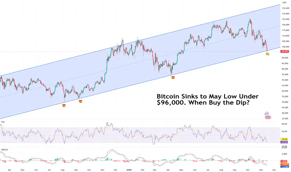
Bitcoin Sinks to May Low Under $96,000. When Buy the Dip?Because sometimes the dip just keeps on dipping.
Bitcoin BITSTAMP:BTCUSD can’t seem to catch a break. The flagship crypto slid below $96,000 on Friday, a level last seen in May, and traders aren’t exactly rushing to buy the dip.
The decline caps a tough few weeks for the OG coin, now lower by about 24% from its record high of $126,000 .
The selloff hasn’t been contained to just Bitcoin. The whole crypto market has been slammed.
Ethereum BITSTAMP:ETHUSD stumbled into the low $3,100s, while Solana COINBASE:SOLUSD fell to the mid-$140s. The entire digital asset space looks winded, and this time, the usual quick rebounders and sharpshooters are sitting on their hands.
What’s going on? In short — traders are nervous, the data floodgates are about to open, and the Federal Reserve isn’t giving anyone the all-clear just yet.
🧨 Buy Dip or Wait for Data?
The end of the US government shutdown should’ve been good news — until investors remembered what comes next.
All the pent-up economic reports that couldn’t be released during the freeze are about to hit the tape: jobs data, inflation numbers, and other key reads that could shape the Fed’s next move.
The bad news: December rate cut isn’t guaranteed. Markets had been leaning heavily on that expectation to justify the monthslong risk-on rally. Now, with the data torrents about to test that narrative, traders are hedging their bets — and Bitcoin’s getting caught in the crossfire.
If the upcoming reports show the economy is still running hot, the Fed might delay cuts. And higher-for-longer rates are basically kryptonite for speculative assets.
💀 Liquidations and Leverage: A Familiar Story
Bitcoin’s latest slump wasn’t just about macro nerves — it was also a good old-fashioned liquidation cascade.
As prices dipped under key technical levels, margin traders got squeezed out in a hurry. According to data from liquidation trackers, over $220 million in crypto positions were wiped out in just one hour. In the past 24 hours? North of $600 million gone.
In previous dips, you’d see traders rushing to scoop up discounted coins, confident that the bounce would follow. The hesitation this time speaks volumes: sentiment’s shifting, and traders are more cautious after months of euphoric rallies in both AI stocks and crypto.
🌡️ The Contagion Spreads
Crypto weakness isn’t isolated anymore — it’s part of a bigger story. Risk assets everywhere are under pressure. The AI trade is cooling, tech stocks are wobbling , and volatility is creeping back into markets that had gone eerily calm.
In short, when traders start treating crypto like a growth stock proxy, Bitcoin stops being a hedge and starts acting like the Nasdaq on leverage.
🪙 So… When to Buy the Dip?
That’s the million-satoshi question. Historically, deep Bitcoin drawdowns during otherwise healthy macro backdrops have rewarded patience. But this time, the setup’s trickier. The next few weeks should bring a barrage of data that could redefine everything from rate expectations to risk appetite.
What can you do now? Watch the data, respect the trend, and don’t fight momentum.
Notice how the long-term upside swing on the daily is still there. But as they say, past performance isn't an indication of future results.
The Fed’s next move, coming early December, will likely decide if this dip becomes a real buying opportunity.
Off to you : Are you looking to buy the dip or you’re waiting for the dip of the dip? Share your strategy in the comments!
Seeing What Price Alone Can’t Show: The Power of Volume ProfileElements of a Volume Profile
The Volume Profile is a powerful charting tool that shows how trading volume is distributed across different price levels.
While normal volume bars appear below the chart showing activity per candle, the Volume Profile appears horizontally on the price scale, showing where most buying and selling took place.
It helps traders understand which price levels attracted the most interest, and where the market might find support or resistance in the future.
Price and Volume Relationship
The core idea of a Volume Profile is that price levels with high volume indicate fair value zones, where both buyers and sellers agree on a price.
On the other hand, low-volume areas indicate rejection zones, where price moved quickly because there was little interest to trade there.
Value Area (VA)
This is one of the most important parts of the profile.
The Value Area represents the range of price where approximately 70% of total trading volume occurred during a selected period.
Value Area High (VAH): The upper boundary of the value area.
→ Above this level, price is considered expensive or overvalued.
Value Area Low (VAL): The lower boundary of the value area.
→ Below this level, price is considered cheap or undervalued.
When price sustains out of the value area, it often indicates that new momentum or trend activity is beginning.
Point of Control (POC)
The POC is the price level with the highest traded volume within the profile.
It represents the price where the market spent the most time and volume. The level often acts as a magnet for future price movements.
Traders watch this level closely as it often becomes a strong support or resistance zone.
High Volume Nodes (HVN)
These are thick areas on the Volume Profile, showing where the market traded heavily (less than POC)
They indicate acceptance zones that is, the price levels where many transactions happened because buyers and sellers agreed on value.
When price returns to an HVN, it often pauses or consolidates before choosing direction again
Low Volume Nodes (LVN)
These are thin or narrow areas on the profile where very little trading occurred.
They mark rejection zones that is, the areas where price moved quickly without much interest.
When price approaches an LVN, it often moves rapidly through it again, because there is less resistance.
Profile Shapes
The overall shape of the Volume Profile also tells a story about market behavior:
D-shaped Profile: Balanced market - fair value established (typical during consolidation).
P-shaped Profile: Short-covering rally - bullish bias
b-shaped Profile: Long liquidation - bearish bias
Double Distribution: Two separate areas of interest - potential trend continuation.
For more on Volume Profile shapes refer
Key Takeaways
The Volume Profile helps traders see where the market traded most heavily at each price level.
Key elements such as the Value Area, POC, High and Low Volume Nodes, and profile shape reveal how the market perceives value and interest.
Understanding these elements helps traders identify strong support/resistance zones, potential breakout areas, and market balance or imbalance situations.
Do you use Volume Profile in your trading? Share your thoughts in the comments below!

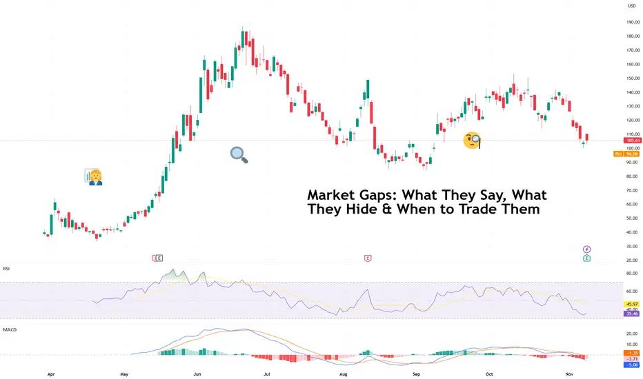
Market Gaps: What They Say, What They Hide & When to Trade ThemIt’s 9:30 a.m. You sip your coffee, glance at the chart, and there it is. Your stock has leapt several dollars higher (or lower), skipping right over the previous day’s closing price.
Welcome to the world of market gaps — those mysterious spaces between yesterday’s close and today’s open that make traders question both their strategy and their life choices.
A market gap isn’t a missing candle but the story of what happened while you were sleeping (or ignoring the news). It’s the sum of after-hours trades, global market sentiment, overnight earnings, and sometimes a rogue tweet.
The question is: should you trade them — or stay far, far away?
🌍 Why Gaps Happen
Gaps exist because markets never really sleep. When one exchange closes, another is already open somewhere else, digesting the same news through a different timezone. Add in pre-market trading, futures markets, and weekend surprises, and you get an ecosystem where prices constantly readjust (even when you can’t click “Buy”).
Most gaps fall into one of three categories:
Breakaway gaps – when new information changes everything (earnings beats, mergers, surprise rate cuts).
Runaway gaps – the “momentum monsters” that happen mid-trend when traders can’t get enough.
Exhaustion gaps – the final gasp before a reversal, when optimism or panic reaches peak saturation.
Understanding which one you’re looking at is half the battle. The other half? Not taking the bait too early.
💥 What Gaps Reveal (and Conceal)
We’re in the earnings season now so it’s pretty normal to spot a gap on the charts.
A gap higher often signals optimism: strong earnings, bullish guidance, or a macro tailwind. But it can also mean traders are front-running euphoria — piling in before the market can catch its breath.
Similarly, a gap lower screams heavy selling, but sometimes it’s just overreaction dressed as disaster. Take for example the recent showing from CoreWeave NASDAQ:CRWV . The neocloud beat on both top- and bottom-line expectations. And yet, the stock fell 8% in after-hours .
Typically, if prices hold above or below the gap for several hours or sessions, that’s confirmation that traders are validating the move. But if it’s filled quickly (the price retraces back to the previous close), it means the reaction faded faster than your New Year’s resolution.
🕳️ The Weekend Trap
Weekend gaps deserve their own warning label. Markets close Friday afternoon, and by Monday, the world’s had 48 hours to produce headlines, scandals, or White House drama.
If you hold high-risk positions over the weekend, you’re effectively saying, “I’m okay with the market repricing everything I own before I wake up Monday.” Sometimes that works — you wake up richer. Sometimes it doesn’t — and your stop-loss never had a chance.
Fast fact : Stop losses don’t work during a gap because the price jumps over your stop level — there’s no trading in between, so your order can only trigger at the next available price, often far worse than expected.
🧭 How (and When) to Trade Gaps
So how do pros handle them? Like most things in trading — with patience, context, and a healthy respect for traps.
Wait for confirmation . Don’t chase the open. See if volume supports the gap or if it’s just knee-jerk volatility.
Look left . Check past support/resistance levels — gaps tend to gravitate toward old battle zones.
Mind the news . If the gap is driven by an actual event (earnings, guidance, policy change), the odds of it holding improve. Make sure to stay on top of market-moving news .
Avoid FOMO . The first 15 minutes of trading are often chaos. Let the emotional traders clear out before you step in.
Remember the fill rule . When in doubt, assume gravity wins eventually — most gaps don’t stay open forever.
🔮 What Gaps Really Mean
Gaps are the market’s way of saying, “Something happened — pay attention.” They’re emotional, fast-moving, and occasionally misleading. But they also reveal where sentiment can truly shift — the moments when traders collectively decide that yesterday’s price was wrong.
Handled well, gaps can offer some of the cleanest trades on the chart. Handled poorly, they’re an expensive lesson in humility.
So the next time you wake up to a market that’s sprinted ahead, take a breath. The space between two candles isn’t a void. It’s a story. Read it before you react.
Off to you : How do you handle gaps? Share your approach to these market events in the comments!
When Arctic Storm Meets Government ShutdownNYMEX: Micro Henry Hub Natural Gas Futures ( NYMEX:MNG1! )
A “Perfect Storm” is brewing by weather catastrophe and man-made events.
On Thursday, November 6th, forecaster Atmospheric G2 said that it predicted colder than normal weather over the Eastern US for November 11-15. Driven by the expectations that record low temperatures will boost heating demand for natural gas, NYMEX Henry Hub natural gas futures ( AMEX:NG ) moved sharply higher.
The lead December contract (NGZ5) hit a daily high of $4.42 per MMBtu, up 18 cents (+5%) from the prior day. The contract settled at $4.357, up 12.5 cents or +2.95%. Total daily volume for all NG contract months reached 590,250 lots, an increase of 118,770 from the prior day. Total Open Interest was 1,556,062 contracts.
Then, just a day later, Atmospheric G2 put out another forecast. It said that warmer-than-normal temperatures are expected in the western two-thirds of the US for November 12-16 and are expected to remain above-normal for November 17-21. NGZ5 closed at $4.315 on Friday, down 0.96%. Another bearish factor came from Baker Hughes, which reported a 2.25-year high in the number of active US natural gas rigs.
On Sunday night, as the early winter blast begins to hit the ground, natural gas futures market opens for the week up 3.3% at $4.447. NGZ5 pulled back on Monday and is currently trading at $4.375. Shall we say, “Buy the rumor, Sell the fact”?
The news of a massive arctic storm moving the market is nothing new. During the past winter, on December 29, 2024, the Weather Co. and Atmospheric G2 released a weather forecast showing colder temperature in the East. When the futures market opened the next day, Henry Hub futures prices surged 20%, hitting a new 52-week high of $4.20. My write-up on January 6, 2025, explored how to trade the weather.
The Polar Vortex is expected to bring record amount of snow in the Great Lakes. Chicago and South Bend could see up to 12 inches of snow within 24 hours, due to the infamous “Lake Effect”. Florida and the Panhandle area could see temperature dropping from the 60s (Fahrenheit) to the mid-20s by Tuesday.
What stands out about this winter blast is its timing, happening very early in the season. Comparing to last winter, the first major snowstorm came in mid-January.
The winter storm threatens to bring air travel to a standstill. The impact will compound as the 40-day-long US government shutdown already reduced air flight capacity by 10%, causing massive cancellations and delays.
In the latest news, the US Senate may have reached a deal to end the government shutdown. Hopefully, it will happen in time ahead of Thanksgiving, the busiest travel season in the U.S.
The ideal instrument Trading the Weather
Natural gas is a leading energy source. The U.S. Energy Information Administration (EIA) estimates U.S. electricity production at 4.18 trillion kilowatt-hours in 2023.
• About 43.1% of the electricity was generated by natural gas.
• Nuclear power contributed to 18.6%, while coal had a 16.2% share.
• Renewables accounted for a 21.4% share, including 10.2% from Wind, 5.7% from Hydro, and 3.9% from Solar.
Electricity is hard to store, while its demand is highly unpredictable. Unforeseen changes in power demand could send shock waves into the market. In winter months, weather conditions have the biggest impact in natural gas demand.
In addition to power generation, the biggest natural gas usage is for heating homes, factories and commercial offices. According to the EIA data, 48% of US households use natural gas for space heating, water heating and cooking.
The heating consumption varies by season and by region, while the biggest contributing factor is temperature. As long-range weather forecasts are extremely difficult, natural gas prices are highly reactive to news of upcoming winter storms.
Heating Degree Day (HDD) is the number of days in a month where the average daily temperature is below 68 degrees Fahrenheit. Energy traders deploy HDD analysis and weather forecast models to predict temperature trends, electricity demand and subsequent natural gas use.
Trading with Micro Henry Hub Futures
Micro Henry Hub natural gas futures (MNG) offer smaller-sized versions of CME Group’s liquid benchmark Henry Hub futures (NG) contracts. The Micro futures have a contract size of 1,000 MMBtu, which is 1/10th of the standard contract.
The Micro contracts allow traders to control a large contract value with a small amount of capital to take advantage of significant margin offsets.
With Monday evening quote of 4.375, each December 2025 contract (MNGZ5) has a notional value of $4,375. Buying or selling one contract requires an initial margin of $367. The next lead contract, January 2026 (MNGF6), is currently quoting at 4.601, for a notional value of $4,601. The initial margin is $354.
Since hitting the 52-week low of $3.62, MNGZ5 has gone up 20%. Meanwhile, MNGF6 is down 25% from its 52-week high reached in March 2025.
As we have seen in the past, unpredictable weather events could send large shocks to natural gas prices. We have recognized the pattern of weather forecasts driving futures prices up, and then the prices trending back down in the midst of the storm. In my opinion, if we see another major winter storm coming in December, MNGF6 has the potential to move much higher.
With Micro Henry Hub contracts, traders could potentially realize sizable gains with a small capital requirement. For MNGF6, traders enjoy a built-in leverage of 13:1 (= 4601/354).
Hypothetically, if MNGF6 moves up 5% to $4.831 with lower temperature forecasts, the 0.23 price gain would translate into $230 for a long futures position, given the contract size at 1,000 MMBtu. Using the initial margin of $354 as a cost base, the trade would produce a theoretical return of 65.0% (=230/354).
The long futures position would lose money if natural gas prices moved lower. Traders could set up a stop loss to hedge the downside risk when entering the long futures order.
Happy Trading.
Disclaimers
*Trade ideas cited above are for illustration only, as an integral part of a case study to demonstrate the fundamental concepts in risk management under the market scenarios being discussed. They shall not be construed as investment recommendations or advice. Nor are they used to promote any specific products, or services.
CME Real-time Market Data help identify trading set-ups and express my market views. If you have futures in your trading portfolio, you can check out on CME Group data plans available that suit your trading needs www.tradingview.com

ASTS 4H: space internet or orbital dream?AST SpaceMobile (ASTS) is consolidating above the $61–69 zone, right near the 0.618 Fibonacci level of its last major rally. On the 4H chart, momentum shows early reversal signs: falling volume on pullbacks, stochastic turning up, and buyers defending local lows. The bullish setup holds as long as price stays above $61, with upside targets at $100 and $135 where the extension projection aligns.
Fundamentally , as of November 2025, ASTS stands out as one of the most promising yet capital-intensive players in the satellite telecom industry. The company completed deployment of its BlueWalker test constellation and is preparing for commercial rollout of direct-to-cell satellite connectivity. Successful phone-to-satellite calls using standard smartphones - validated with AT&T and Vodafone - mark a true technological milestone, positioning ASTS as a potential first-mover in global space-based mobile internet.
Revenue for the first nine months of 2025 reached roughly $55M, almost double last year’s level, but operating losses still exceed $300M due to high manufacturing and launch costs. The company holds about $180M in cash versus ~$260M in debt, continuing to rely on strategic partnerships and funding programs to maintain liquidity. The key upcoming catalyst is the commercial network activation in 2026 in cooperation with AT&T, Vodafone, and Rakuten, which could dramatically change valuation if successful.
With investor attention shifting back to space communications, competition with Starlink and Lynk Global is heating up, but ASTS’s advantage lies in using standard smartphones without extra hardware. Risks remain - high capital needs, launch delays, and dependency on partner timelines - yet the reward potential is extraordinary if execution holds.
Tactically, staying above $61 keeps the bullish structure alive with $100 and $135 as primary targets. A breakdown below $60 would negate the setup.
They’ve already connected phones to space - now let’s see if they can connect revenue to profit.

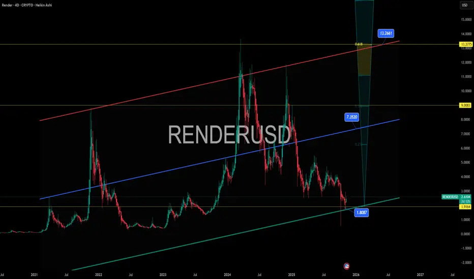
RENDER – Nvidia’s Favorite GPU Coin Testing Demand Zone RENDER – Nvidia’s Favorite GPU Coin Testing Demand Zone 🔍🎯
Render just kissed the $1.91–$2.00 demand zone — the base of the macro channel and a textbook long-term retest level.
This is not just any altcoin. Render powers the Las Vegas Virtual Dome and is the only crypto Nvidia has ever name-dropped — why? It uses thousands of AI GPUs. This is serious infrastructure-level tech.
Technically, we’ve got:
A macro bullish channel going back to 2021 📈
Touching the lower green trendline
Fib targets at $7.35 , $9.00 , and potentially $13.27 (0.618 golden zone) if this cycle ignites
The RSI and momentum indicators? Brutal lows. That’s how macro bottoms look.
If you believe in AI, decentralization, and GPU-based rendering — this is one of the most asymmetric plays out there right now.
Thought of the Day 💡
We keep chasing shiny altcoins when the real tech gems — the ones building AI infrastructure — are hiding in plain sight. Don’t sleep on conviction.
Disclaimer:
Disclaimer: Nothing I post is financial advice. It's perspective. I’ve mastered the art of prognosis, but you are the one behind the trigger. Always know your levels, and respect your risk.
One Love,
The FXPROFESSOR 💙
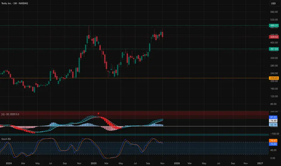
TSLA Setting Up for a Big Move This Week (Nov 10–14)Here’s the full multi-timeframe outlook for TSLA based on SMC structure, channels, BOS/CHoCH shifts, momentum, and the GEX map. Each section is separated so you can attach the matching chart under it.
1. Weekly Timeframe (1W)
Macro Structure
TSLA is still holding its bigger weekly breakout after clearing the long-term descending trendline. The pullback off 480 looks like a standard retest rather than a reversal.
Weekly demand at 368–402 hasn’t been touched, so the broader trend still favors the upside as long as price stays above that region. Weekly MACD momentum continues to rise while Stoch RSI cools off, signaling consolidation rather than weakness.
Weekly Trade View
As long as TSLA stays above 402, the weekly bias remains bullish with potential to retest 486 once shorter timeframes settle.
Weekly GEX View
Large positive GEX above 470–480 slows upside momentum.
Large negative GEX under 420 accelerates downside moves.
TSLA currently sits between these zones, so whichever side breaks gets momentum.
2. Daily Timeframe (1D)
Daily Trend
The daily chart just printed a downside CHoCH inside the ascending channel. That confirms short-term weakness even though the weekly remains bullish.
The key line is 411–415. Losing this level flips the daily fully bearish. Holding it keeps the pullback healthy.
Daily MACD is red and still heading down. Stoch RSI is oversold but hasn’t curled up yet, meaning momentum hasn’t turned.
Daily Trade View
Hold 411 → potential bounce into 438 then 455.
Break 411 → opens a move toward 392–368.
Daily GEX View
Multiple put walls at 421–425 and 400.
These usually act as magnets during pullbacks because of dealer hedging.
3. 1-Hour Timeframe (1H)
Short-Term Structure
TSLA remains in a descending channel on the 1H. The most recent BOS was bearish, and the CHoCH didn’t reclaim any major highs.
The short-term pivot is 439. If TSLA stays under that line, momentum stays bearish.
MACD is flattening and Stoch RSI is trying to curl, hinting at a potential early-week bounce.
1H Trade View
Below 439 → bearish continuation.
Above 439 → opens a move into 447–455.
If TSLA can’t reclaim 432–439 early, expect another test toward 425–421.
4. 15-Minute Timeframe (15M)
Intraday Structure
The 15M shows a clean descending channel. Bulls attempted a small CHoCH, but without an upside BOS, momentum is still controlled by sellers.
The main intraday battle is 432–438.
Break above → intraday reversal.
Reject → continuation lower.
MACD is trying to turn but hasn’t built momentum yet.
15M Trade View
Break above 437–438 → scalp long toward 445.
Reject 432–434 → scalp short toward 425 and 421.
5. GEX Map & Options Strategy
GEX Interpretation for the Week
Positive GEX sits above 455–480
Negative GEX increases under 425
Major put wall at 421.88
Call walls thin around 445–465
What that means:
Upside above 455 slows down
Downside below 430 sharpens
421 is a strong gravitational level
A clean break below 421 increases volatility rapidly
Options Strategy
If TSLA fails to reclaim 438:
Short-dated puts targeting 421 make sense.
If TSLA reclaims 439 and holds:
Short-dated calls into 445–455 are reasonable.
Avoid deep OTM calls above 470 because price tends to stall in strong positive GEX zones.
My Thought
TSLA is sitting at a major inflection point. The weekly chart still leans bullish, but the daily and intraday structure are showing short-term weakness. This entire week will revolve around how price reacts around 438.
Rejecting 438 favors continuation into 425 and 421.
Reclaiming 438 puts 447–455 back into play.
Keep the levels simple. Let 438 decide the direction for the week.
Disclaimer
This analysis is for educational purposes only and not financial advice. Always trade your own plan and manage your risk. If you want a breakdown for another ticker, just let me know.
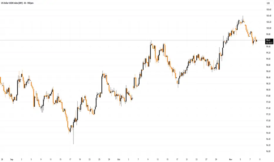
Dollar Index Pulls Back from a Key HighDollar Index Pulls Back from a Key High
As the Dollar Index (DXY) chart shows, the index is currently trading below its 5 November high, which formed after a false bullish breakout (marked by an arrow) above the 1 August peak — a scenario previously outlined in the post “The Dollar Index Near a Key High.”
According to Trading Economics, trader sentiment at the start of the week is being shaped by expectations of comments from ECB and Federal Reserve officials regarding the outlook for monetary policy.
A statement has already come from Reserve Bank of Australia Deputy Governor Andrew Hauser, who noted that financial conditions in the country are now close to a neutral rate — one that neither stimulates nor restrains economic growth. The Australian dollar strengthened following his remarks.
Technical Analysis of the DXY Chart
The previously drawn ascending channel remains relevant for the Dollar Index, with several important technical features:
→ The channel median has switched its role from support to resistance (as indicated by its colour change from blue to red).
→ The QL line, which divides the lower half of the channel into quarters, is currently acting as support for the DXY.
→ The index has fallen below the psychological level of 100 points.
It appears that the 3.7% rally in the Dollar Index since mid-September has attracted sellers, while late buyers may have been trapped near the top of the recent move.
Additional support may be found near 99.45, where a double-top pattern (A–B) previously formed. However, if this level is breached, the DXY could extend its decline towards the lower boundary of the channel.
This article represents the opinion of the Companies operating under the FXOpen brand only. It is not to be construed as an offer, solicitation, or recommendation with respect to products and services provided by the Companies operating under the FXOpen brand, nor is it to be considered financial advice.
US 500 - Has All the Good News Been Priced?After a volatile and nervy 5 days for US stock indices the week ended on a slightly more stable and positive footing.
In relation to the US 500 index this volatility saw it open on Monday November 3rd around 6885, trade down to a low of 6633 early on Friday November 7th, before rallying by over 1% late in the session to close the week at 6742. The driver for the rally was news that Democrats and Republican lawmakers had restarted negotiations to try and resolve what has become the longest US government shutdown in history.
This shutdown has been reported by Bloomberg to be costing the US economy around $15 billion per week in lost productivity and has stopped the release of key US economic data readings, leaving Federal Reserve (Fed) policymakers in the dark regarding the health of the US labour market (Non-farm Payrolls) and the direction of inflation (CPI/PPI/PCE). Two areas which are crucial in helping them decide whether they have room, or the need to cut interest rates again at their next meeting in December.
Perhaps unsurprisingly, after a jittery week where the lofty valuations of AI firms were called into question and weighed on the price of the US 500 index, traders may now be looking at whether a resolution to the shutdown, which would restart the economic data flow again ahead of the Fed’s next rate decision on December 10th could be possible, bringing with it a potentially much needed boost to flagging sentiment.
On Sunday, traders received the news that the Senate had moved closer to an agreement, an update which has helped the US 500 to register an early gain of 0.5% (6790 at 0700 GMT) to start this new trading week. However, even if the agreed bill is eventually passed by the Senate, it must be approved by the House of Representatives and signed by President Trump (Reuters), meaning there could be more volatility ahead for the US 500.
Technical Update: Conflicting Signals Within Weekly & Daily Perspectives
Since the October 30th all-time high at 6925, the US 500 index has slipped just over 4.2%, reflecting an unwind of potentially over-extended upside conditions.
Looking at the charts there appears to be conflicting technical signals between the weekly and daily perspectives at present, leaving the directional bias uncertain heading into the new week.
Upcoming sessions could offer clarity on whether the constructive themes emerging on the daily chart or the possibly negative developments evident in the weekly view may take control.
Weekly Chart – Potential Negative Outlook?:
Over the past three weeks, a possible Evening Star pattern has emerged on the weekly chart, a potentially negative development. Last week’s price weakness may have completed a sentiment shift, and if downside momentum builds, it could lead to further declines in the sessions ahead.
It remains to be seen whether this leads to further price weakness, but downside pressure may now build. If developed further, breaks below support at 6503, the October 2025 low could materialise, opening the door to a deeper phase of weakness toward 6214, a level equal to the August 2025 low, potentially even 6105, the 38.2% Fibonacci retracement of the April to October 2025 rally.
Daily Chart – Potential Positive Sentiment Shift?:
Following the recent sharp price decline, the daily chart presents a dilemma for traders, especially against the backdrop of a potentially negative weekly setup. Friday’s session initially extended recent downside moves but found support at 6647, the 38.2% Fibonacci retracement of the April to October rally. From there, fresh strength emerged, and the session closed near its opening level at the upper end of the day’s range.
Candlestick analysis suggests a potentially positive Dragonfly Doji has formed, hinting at an attempt to resume price strength. Confirmation is key, a positive candle on Monday, seen with a close above todays 6769 opening level, would offer weight to this pattern.
While not a guarantee of further upside, such activity might also see a close above resistance at 6779 (half the latest decline) a level at present being tested (0700 GMT), to potentially suggest a retest of 6925, the October 30th high.
Initially it is unclear whether the weekly or daily outlook will gain the upper hand in the US 500 index, but next week’s price action, especially the moves on Monday, could be important.
With the weekly chart hinting at a negative reversal risk and the daily chart showing signs of potential stabilisation, even possible positive risks, Monday’s candle direction may offer clues, and traders may be watching closely for evidence of the next directional themes.
The material provided here has not been prepared accordance with legal requirements designed to promote the independence of investment research and as such is considered to be a marketing communication. Whilst it is not subject to any prohibition on dealing ahead of the dissemination of investment research, we will not seek to take any advantage before providing it to our clients.
Pepperstone doesn’t represent that the material provided here is accurate, current or complete, and therefore shouldn’t be relied upon as such. The information, whether from a third party or not, isn’t to be considered as a recommendation; or an offer to buy or sell; or the solicitation of an offer to buy or sell any security, financial product or instrument; or to participate in any particular trading strategy. It does not take into account readers’ financial situation or investment objectives. We advise any readers of this content to seek their own advice. Without the approval of Pepperstone, reproduction or redistribution of this information isn’t permitted.

XAUUSD: Buyers Defend $4,040 — Targeting $4,140 ResistanceHello everyone, here is my breakdown of the current Gold setup.
Market Analysis
XAUUSD has recently confirmed a bullish structure after bouncing strongly from the $4,000–$4,040 Support Zone, an area that coincides with the ascending Trend Line visible on the chart.
This level has repeatedly acted as a Buyer Zone, where multiple fake breakouts occurred — signaling liquidity sweeps and failure of sellers to maintain downward momentum. Each test of this support has been followed by a sharp bullish reaction, confirming strong demand and accumulation activity in this zone.
Currently, Gold is showing a controlled recovery phase, moving above the $4,040 Support and gradually approaching the $4,120–$4,160 Resistance Zone, which also aligns with the Trend Line extension and previous consolidation area. This zone represents the next critical reaction level for price. A confirmed breakout above it could open the way toward further continuation, while a rejection may lead to a corrective pullback back toward the $4,040 support. The recent price behavior — including several fake breakouts followed by strong recoveries — suggests that large buyers remain active, defending the bullish structure. As long as price holds above $4,040, the overall sentiment stays constructive and favors a gradual continuation toward the upper resistance levels.
My Scenario & Strategy
As long as XAUUSD remains above the $4,000–$4,040 Support Zone, the bullish bias remains valid.The next upside objective is located around $4,140–$4,160, where sellers may reappear based on past reactions. I expect the market to potentially form a small pullback before resuming its move higher. A sustained breakout and close above $4,160 would confirm a continuation toward $4,200 and possibly higher in the medium term.
However, if Gold breaks below $4,000, this bullish setup becomes invalid, and the price may return toward deeper support levels near $3,960–$3,940 before any new buying interest develops.For now, the structure supports buying pullbacks while the price stays above key support.
That's the setup I'm tracking. Thank you for your attention, and always manage your risk.

EUR/USD Loses Momentum – Sellers Take Back Control!The market is beginning to show clear signs: the U.S. dollar is regaining strength , while EUR/USD faces strong correction pressure after a short-lived recovery. The latest news from the U.S. indicates that sentiment is shifting in favor of the greenback, as expectations for a government reopening and improving economic stability are boosting confidence in the USD.
On the 4H chart, EUR/USD remains in a long-term descending channel , with every pullback to resistance quickly rejected. Recently, price reacted to the upper boundary of the channel around 1.1580, forming a clear rejection signal.
If price fails to break above this zone, the bearish scenario will likely dominate, targeting the 1.1470 support area — a key confluence zone aligning with previous lows and the lower trendline. Sellers may look to add positions on minor retracements as the overall bearish structure remains intact.
In summary, with fundamentals supporting a stronger USD and technical patterns confirming a bearish setup , EUR/USD is expected to stay under downside pressure in the short term — unless a decisive breakout above 1.1580 occurs.

Improving My Win Loss Ratio In Forex TradingWell, Some good news, actually great news. The experiment worked and in this video I show how I am improving my win loss ratio in Forex trading.
From a disastrous Win Loss ratio using only SMC now with combining the classical school along with the Stochastic I have been nailing it for the past 20 days with 22 trades and 8.6% increase on my balance.
In many cases, especially with advantageous RRR, it is Ok to have the win loss ratio in favor of the Loss, as the RRR will compensate and the balance would increase, but in this case I have the win rate higher and the RRR if it was calculated is also higher.
I depend on opening multiple trades and closing them all at once once they hit an acceptable percentage. In the video I said I will close them around 2%, but to tell you the truth, even if it was 1% I would close because no business I know of would bring 1% profit in a day.
The concern now with this Forex Trading Plan is that it does not use Stop Loss nor Take Profit. I feel that I am hanging in the air, which is not a good feeling and this might get me inside an emotional imbalance in the long run.
Still, the test is going on to evaluate all that.

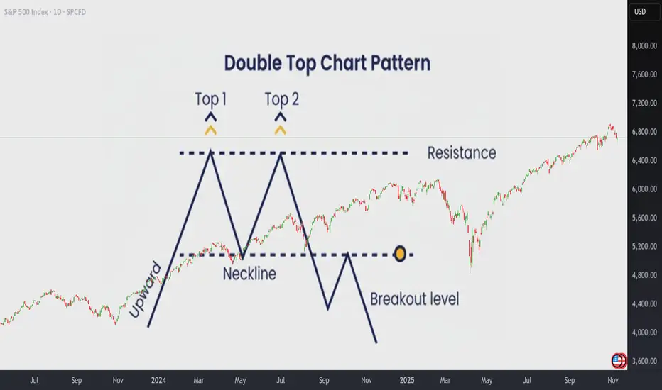
How to Trade the Double Top Pattern Like a ProHow to Trade the Double Top Pattern Like a Pro
The Double Top is one of the most reliable patterns in technical analysis. It often marks the beginning of a resistance zone and signals that bullish momentum is losing strength.
The first top is hard to anticipate, it’s usually just a continuation of the existing rally. But when the second top fails to break above the previous high, that’s when things get interesting . This failure creates a resistance level, and it’s the first warning sign that buyers may be running out of steam.
🔵 Why Do Double Tops Form?
There are usually two main reasons why a Double Top appears:
Profit-taking after a strong rally.Bulls start to lock in profits, causing the momentum to fade.
Lack of new buyers . Demand weakens, and bears begin to take control gradually.
Learning to tell which case you’re facing can help you decide whether it’s a great buying opportunity during a healthy pullback, or a signal to take profits, or even go short .
🧭 Step 1: How to Identify a Real Double Top
Before trading it, make sure it’s a true Double Top:
- Both peaks must form after a strong upward move . If the market was falling before, it’s not a classic pattern.
- The two tops should be at almost the same price level (no more than a 0.5% difference).
- The most important part is the neckline , the lowest point between the two tops.
That neckline defines whether the move is just a healthy pullback or the beginning of a new downtrend.
If the neckline doesn’t break, there is no Double Top yet.
The pattern is only confirmed after the neckline breaks downward.
💥 Step 2: Trading the Pattern
There are three main scenarios to understand:
1️⃣ A Confirmed Double Top (Breaks Down)
When the neckline breaks, the market often drops about 61.8% of the pattern’s height, with a probability above 70%.
A small pullback to retest the neckline is possible, but usually, the price won’t return to the previous highs.
A Double Top is spotted:
The neckline is broken:
A decline happens sharply:
2️⃣ A Fake Double Top (Break Fails)
If the price fails to break the neckline and instead makes new highs, it’s not a real Double Top.
This typically means we’re in a profit-taking phase, not a trend reversal.
In these cases, it’s often best to stay out, as the market tends to move sideways or show mixed signals.
A spotted double Top:
Fails to break down, instead breaks up:
The rally unfolds:
3️⃣ A Double Top Trap in a Strong Bull Market
Sometimes, a small break below the neckline triggers stops before the price explodes higher again.
These are common during powerful bull runs.
A spotted double Top:
The neckline is broken:
Inmediately the price reverse and break upwards.
The price rallies:
💲 Real Double Tops:
Theory is simportant, but let's go real!
A Double Top is now unfolding in Microsoft , and as you can see the neckline is almost there! Is this a signal? Wil a fake breakout occur? Are we witnesing the end of AI rally?
And some previous Double Tops:
❗ A final recommendation
Tradingview offers a great indicato r to Spot Double Top patterns easily.
Once you are in a chart, click on indicators and search Double Top Chart Pattern indicator. It's only for paid users and works fine!
Take a look how it spots the Double Top pattern and also gives you and idea of the posible target price!
Or the current one in NASDAQ:MSFT
In short:
Double Tops work roughly 70% of the time , but context matters.
They perform best in sideways or slowing markets, and are less reliable in strong rallies , where false breaks can easily trap traders.
Always confirm the neckline break, watch for volume, and never forget:
A pattern is just a probability, not a guarantee.
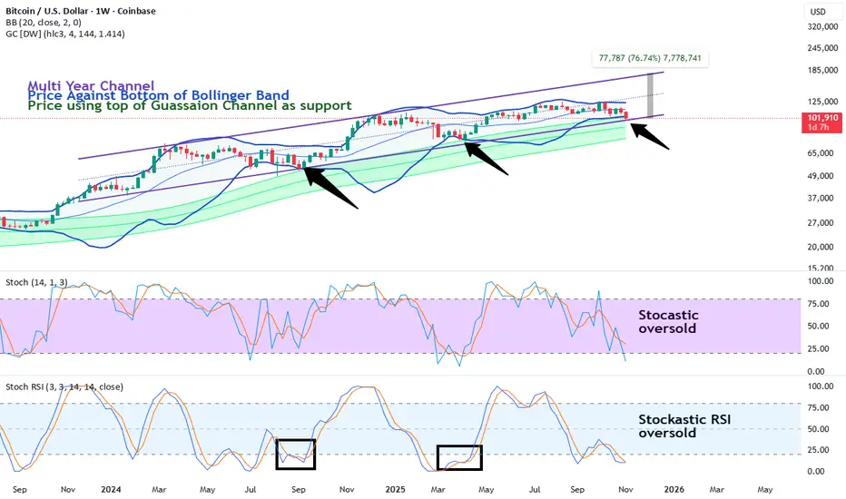
People Panic (again) as bitcoin returns to support (again)Bitcoin has been channeling up for about a year pretty consistently. The basic technical supports are still working. Price hits the weekly Bollinger band bottom, wicks through, builds structure and reverses to a new high. Price has also been bouncing off the top of the weekly gaussian channel. That's very optimistic as well.
So, these ideas main point is the "Trend is your friend until the end." What has really changed? Global liquidity is still going up. The various fiat currencies are being debased. Anti-fiat hedges like silver and gold are making all-time highs.
In a bull market you buy the dip and sell the rip. This is the dip. The rip is over 70% away at $175k. None of this means get reckless. We still have trendlines on lower time frames and lots of potential chop that can occur. There isn't a clear reversal pattern yet. BTC could make a inverted head and shoulders, a double bottom, all sorts of potential nonsense.
And lets be upfront, the channel could break down. Price could go from the top of the Gaussian channel to the bottom, etc. But so far my bias is continuation. Entries are going to be sought out on the daily and 3 day charts. Alts showed a lot of strength recently.
Others.d/bitcoin looks very bullish here at support. I expect it to chop up the next year quite well.
Others/eth has a double bottom.
Bitcoin is stabilized. Alts are basing out against bitcoin and eth. Finally. This is a great time to go long. Have a strategy. Layer a portfolio. All that stuff I can't actually advise you to do because I am not a financial advisor. I just share why I'm personally going long on crypto.
Gold at Its Golden SupportThe daily chart of GOLD shows that after a strong rally from around $3,200, the price has now pulled back toward the 50-day moving average (around $3,860) — a level that has repeatedly acted as a key support over the past several months, sparking multiple upward waves each time.
Short-Term Outlook (next few days to weeks):
In the short term, the $3,850–$3,880 zone is a crucial support area. If gold holds this level and closes above $4,050, a new bullish wave toward $4,250–$4,380 could begin.
However, a confirmed break below $3,850 could trigger a deeper correction toward $3,600 or even $3,400.
• Bullish short-term target: $4,250–$4,380
• Bullish stop loss: Below $3,840
• Bearish short-term target: $3,600–$3,400
• Bearish stop loss: Above $4,050
Long-Term Outlook (1–3 months):
The broader trend remains bullish — the 50-day moving average is sloping upward, and every pullback to this level has so far attracted buyers.
If the price manages to reclaim and sustain above $4,100, the next major target lies in the $4,400–$4,500 range, potentially marking new all-time highs.
Conversely, if gold loses support at $3,850 and consolidates below it, the trend could shift from bullish to neutral, with possible downside toward $3,400.
• Bullish long-term target: $4,400–$4,500
• Long-term stop loss: Below $3,850
In summary, $3,850 is the golden support zone — holding above it could ignite the next leg of the rally, while a breakdown below it might open the path for a deeper correction toward $3,600–$3,400.

Qqq.. No crying in the casinoPullback from summer channel top to channel bottom is underway and almost finished..
But go to your weekly and zoom out a decade
Logarithmic
Zoomed in
So yes, we are at the bottom of a 6month channel but we are still at the top of a 15year trendline and I don't think we last above here much longer..
Alright so I won't go into the sectors on this one , I'll just stick with Qqq and the next couple of weeks of price action to help with direction
Daily channel
Bottom of this channel is 609
Now here comes the actionable analysis
Strong fib support and price action at 607
1hour 200sma is at 612 and Fib resistance is at 613.. that will be your resistance
So 607-609 is support and 612-614 is resistance..
Don't overthink this..
Below 607 and 600 comes (50sma)..
I think a break below 607 may come next week.
So if you want to short either wait to see 606 or wait for a retest 0f 612-614. Shorting here near support is stupid and stressful.
If you want to scalp the dip, I'd buy and 608-607 with a stop below 606.50.. target is 612..
Strong long only comes above 620, the we will tag 626..
Now here's my opinion on how long I think this will go on and how deep we can dive.
I think 589 gap close is the target for this pullback here, but that only comes with a break of 600. I don't think we will cut straight through 600 either. Most likely a nice bounce comes there.
From 589 we should have a rally back to 610 minimum.
You want to know if we will get another high this year? Like I said earlier we are at the top of a 15yr trend which we've been grinding higher on A.I Deals/News.
If we don't break below 607 by late next week then I would consider this pullback over and done but 607 is key.
Good luck

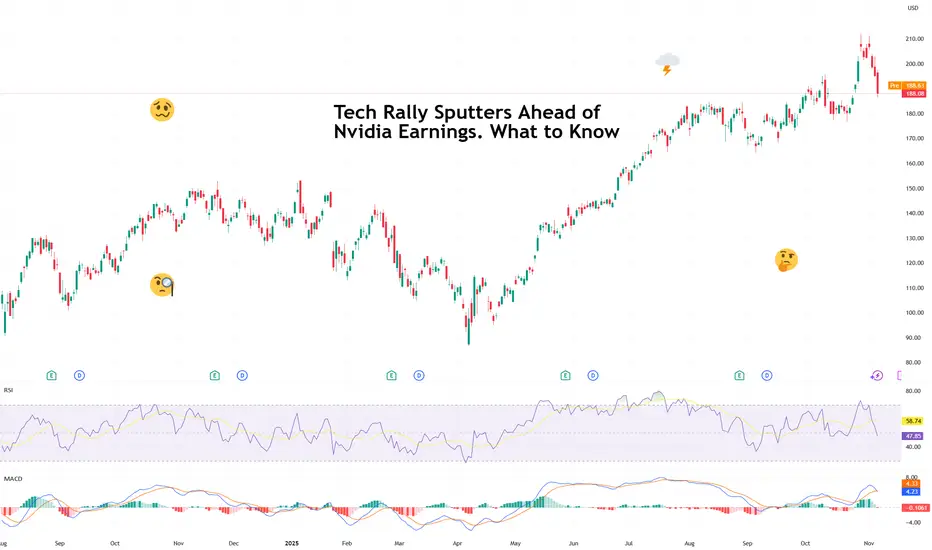
Tech Rally Sputters Ahead of Nvidia Earnings. What to KnowIs the powerful AI sector finally out of breath? With valuations that stretched, some investors fear if we all took it too far.
After months of seemingly unstoppable gains, the tech trade is finally showing signs of fatigue. Stocks are back in the red this week, with technology — the sector that’s carried the entire market on its silicon shoulders — leading the declines.
The S&P 500 SP:SPX , up more than 35% since its April lows and boasting 36 record closes this year, has been powered almost entirely by a handful of tech heavyweights.
The Magnificent Seven now make up nearly 40% of the index’s market value and roughly a third of its earnings.
But now, investors are wondering if the rally’s run too far, too fast. The question echoing across trading desks: Is AI finally out of breath?
💸 The Price of Perfection
It’s not that tech earnings have been bad — in fact, they’ve been stellar. Microsoft NASDAQ:MSFT , Amazon NASDAQ:AMZN , Meta NASDAQ:META , and Alphabet NASDAQ:GOOGL all beat expectations last week and promised even more AI spending next year. Translation: more orders for Nvidia’s chips, more data centers, more server farms, more everything.
But good news isn’t moving the needle right now. When valuations stretch this far, even “great” can start to look “meh.” Investors are realizing that the higher you climb, the thinner the air gets.
The entire AI complex — from semiconductors to cloud computing — now trades at multiples that assume not just perfection, but sustained, exponential perfection. And that’s a tough sell when rates are still relatively high, inflation is sticky, and the Fed remains data-deprived thanks to a looming government shutdown (now the longest in history).
🧠 Nvidia: The Market’s Favorite Crystal Ball
Which brings us to Nvidia NASDAQ:NVDA — the stock that can save the day. The chipmaker reports fiscal third-quarter earnings on November 19, and it’s shaping up to be a defining moment for the entire market.
Expectations are sky-high: analysts see earnings per share of $1.25, up from $0.81 a year ago , and revenue of $54.6 billion, a jaw-dropping 56% increase from last year’s $35 billion.
If Nvidia delivers (again), it could reignite the rally and remind investors why they fell in love with AI in the first place. But if there’s even a hint of deceleration — a cautious forecast, a whisper of supply constraints — the selloff could accelerate.
Simply put: as goes Nvidia, so goes the market. Fast fact: Nvidia washed out more than $450 billion from its valuation in just the last three days .
🔌 The Waiting Game
With two long weeks until Nvidia’s report, traders are stuck in a sort of limbo. Without a fresh catalyst, the market could decide to churn sideways — or drift lower — as profit-takers cash in on their massive gains.
The uncertainty isn’t helping either. A government shutdown delays key economic data, leaving the Fed flying in the dark just as investors are trying to gauge when rate cuts might actually arrive.
That means more guesswork, less conviction, and a good chance of exaggerated market swings.
So don’t be surprised if volatility ticks higher before Nvidia’s big reveal — the gem of the earnings calendar .
Off to you : How do you see the next two weeks unfolding? And, more importantly, are you bullish or bearish on Nvidia’s earnings report?
Nvidia: Acceleration Toward New Highs Nvidia gained strong upward momentum shortly after our last update, surging past the $196.45 mark, which had previously served as resistance. As a result, our prior short-term alternative scenario was triggered, and we have now adjusted the chart accordingly (with minor modifications). We now view the green wave as complete and believe that the joint top of green wave and beige wave III, as well as the low of wave IV, have already been established. The Target Zone we had initially set for the wave- low has therefore been removed. In our updated short-term alternative scenario, we still see a 30% probability of a new low for beige wave alt.IV below the $176.21 support level. In this case, however, price would likely rebound above the lower $145.50 level.

BITCOIN – LEVELS TO WATCHTraders,
We dumped. Now we are in a controlled recovery. The question is not only “are we going up” but “where will the market make its real decision.” Right now the chart is giving us two very clean checkpoints.
1. What happened
We lost the weekly open and sold off.
Spot was selling too, so the dump was real.
After the low, spot started buying again and price reclaimed above the big wick. That looks like a failed attempt lower.
Markets left a really weak low behind at ~99k. I am convinced we will sweep this low somewhere in the coming weeks.
Funding is negative while price is moving up. Shorts are still in the market. This is how squeezes start.
2. First decision zone: 107.300 to 108.000
This area is important because several things come together.
107.300 is a weak high. It stopped at a clean level without strong rejection. That often means liquidity is still sitting above it.
The AVWAP anchored from 7 April is there. Price is below it for the first time since that move. When price comes back into an AVWAP from below the market often reacts because old buyers meet new sellers.
We also have an LVN just below. That tells us the market did not trade much there before. Price likes to test that kind of gap.
So 107k to 108k is our first place to watch the data. If spot keeps pushing and perps do not start selling we can break it. If CVD stalls there it can be a take profit zone.
3. Accumulation and Distribution
On both the 1 hour and 4 hour spot charts the Accumulation/Distribution line tells an important story.
Price made a clear new low after the dump.
The A/D line did not make a new low. It actually started to turn up.
That is what traders call a bullish divergence. Price is still falling but the money flow is already improving.
In simple words. While candles were going down someone was quietly buying.
That means the bounce we see now is not just short covering or a random spike. It was prepared by real spot demand.
Futures can show a similar thing but spot is the cleaner signal because it is not influenced by funding, leverage or hedges.
When real buyers step in while shorts are still in the market it often creates the right conditions for a squeeze.
4. OBV check
On the 4h OBV you can see it popping up from the base after the dump. OBV going up while price is moving up means volume is supporting the move. This agrees with the spot A/D story. It is better when price and OBV move together than when price moves alone.
5. Scenario 1
Price pushes into 107k to 108k.
That sweep takes the weak high and tags the AVWAP.
If at that point spot CVD slows down or perps start to sell we can reject.
A rejection there can send price back into the mid zone and even lower towards 101k to 102k and in extension back to the HTF LVN near 98k.
This is the simple “first resistance holds” idea.
6. Scenario 2
This is the one I am leaning toward.
Price breaks and holds above 108k.
Shorts do not get their reaction.
Spot keeps supporting and funding stays negative to flat.
Then the market has room to go for the next real liquidity pool which is 117k to 118k.
7. Why 117k to 118k matters
On the liquidity heatmap there is clear resting liquidity higher up. Price often travels to those areas because that is where orders are.
The golden pocket of the previous move sits in this same zone. Many traders watch this fib area so reactions there are common.
Several AVWAP bands from earlier dates are meeting around 117k to 118k. When AVWAPs from different anchors cluster together it creates a stronger level because different groups of traders all care about that price.
Between the current price and that zone there are imbalances and LVNs. That means the market moved quickly there before and did not build volume. These thin areas often get filled on the next push.
8. How to read it in real time
Above 108k and spot CVD still rising means squeeze is on.
Above 108k and funding still negative means shorts are paying to stay wrong.
Lose 108k again after a sweep and see CVD roll over means scenario 1 is playing.
Price can just dump down without getting more liquidity. But looking unlikely based on the data right now.
So if Bitcoin can break and hold above 108k there is not much in the way until 117k to 118k.
Final view
We dumped on real flow.
We are recovering with spot support.
We have a clear first test at 107k to 108k.
Break and hold and the magnet becomes 117k to 118k because of liquidity, golden pocket, AVWAP confluence and imbalance.
TLDR;
Bitcoin sold off hard, but the data says the low was bought. Spot A/D started rising while price was still making new lows, funding turned negative and price reclaimed above the wick, which tells us real buyers stepped in while shorts stayed in their positions. Now price is climbing back toward 107k to 108k where a weak high and the April AVWAP are waiting, so that is the first place the market can decide if this recovery is just a bounce or the start of a squeeze. If buyers keep showing up there and we push through, the path above is thin and the next real pocket of liquidity, AVWAP confluence, imbalance and even the golden pocket of the earlier move all sit together around 117k to 118k. That is why this recovery matters. It is not just candles going up. It is positioning, spot flow and liquidity all lining up.
If you enjoy this type of analysis or find it helpful, leave a like or drop a comment. I don’t ask for anything in return — I share this to help traders understand what’s really happening behind the charts. It also helps me see if people actually read and value these breakdowns, so if it helped you, let me know below.

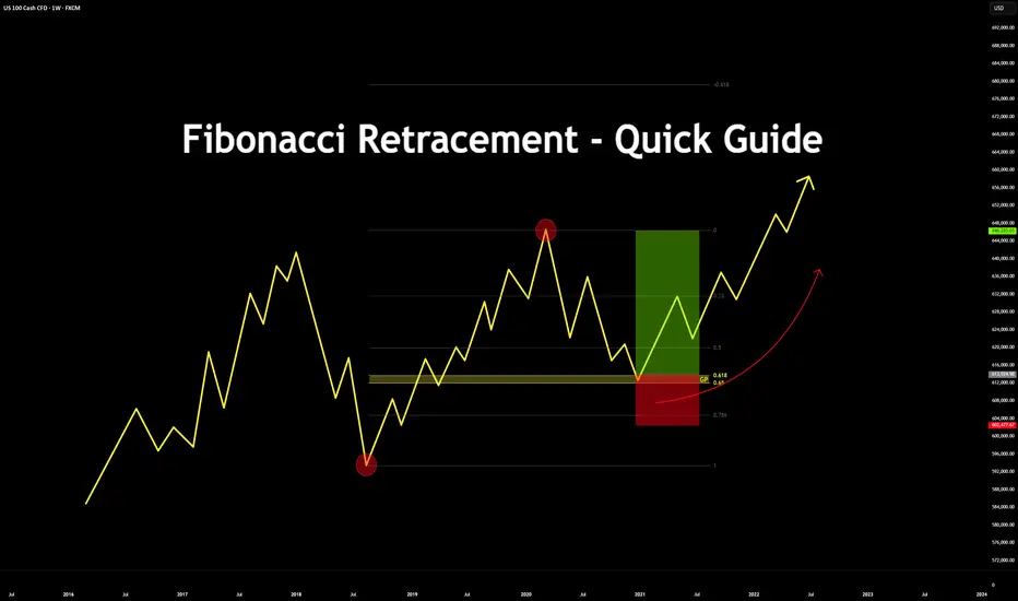
Fibonacci Retracement - Quick Guide in 5 StepsTrading the Fibonacci Retracement - Quick Guide in 5 Steps.
What is the Fibonacci tool?
The Fib Retracement Tool is a tool used widely across many charts. From crypto to stocks.
It assists in identifying the Golden Pocket, along with any potential Support and Resistance zones based on the sequence in Fibonacci.
Investors & Traders draw it from a previous high/low or low/high.
On a chart, each key level shows where price might pause or reverse during a pull back, before it continues the trend.
In this guide you will learn how to use the Fibonacci tool in 5 steps.
1. Configurations
Open up your Fib Retracement Tool's settings, apply the below configurations.
(You can change the color to your choice)
2. Identify High/Low's
Identify, recent highs and lows of your current chart/pair.
3. Applying Fib Retracement
Select your Fib Retracement tool. Place it on your chart starting from the swing low to the swing high.
4. Once completed
Highlight the Golden Pocket Field in the zone (0.65-0.618)
5. Review Entry
Price will eventually make it's way back down to the Golden Pocket to retest and reverse.
SL Placement would be on a previous low or key level, TP placement would be at a previous high or key level.
Bonus:
See the real time example below:
Please like, comment and follow if this guide was useful to you.
If you have any requests on analysis or tutorial requests, let me know and I'll be happy to make one!
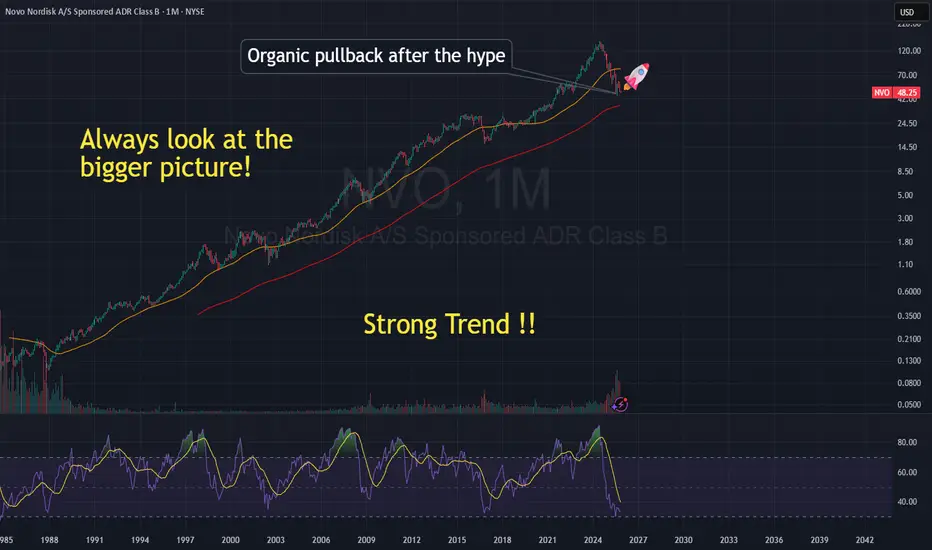
$NVO Last opportunity!🌱 Novo Nordisk: A Healthy Pullback in a Long-Term Growth Story
After years of remarkable growth, Novo Nordisk (NYSE: NVO) has seen its stock cool off — sliding from over 💲130 to around 💲49. At first glance, that might look alarming, but the reality is far more balanced. What we’re seeing is an organic correction after a period of exceptional hype, not a collapse of fundamentals.
💉 From Breakthrough Buzz to Market Reset
The rally through 2022–2023 was powered by massive excitement over Ozempic and Wegovy, Novo Nordisk’s revolutionary GLP-1 drugs transforming diabetes and weight-loss treatment.
As the world caught on, valuations skyrocketed — but eventually, markets needed to breathe. Profit-taking, competition from Eli Lilly’s Mounjaro, and normalization of expectations triggered the current pullback.
📈 The Bigger Picture
Zooming out tells a very different story — over the decades, Novo Nordisk’s stock has gained over 30,000% 🚀, riding steady innovation and strong global demand.
Even now, the long-term uptrend remains intact, with the stock retesting support around $45–$50, a level that previously served as a major base.
💡 A Discounted Opportunity?
For long-term investors, this phase could be an opportunity to accumulate a quality company at a discount.
Novo Nordisk continues to lead in metabolic treatments, maintain strong margins, and expand production — all pillars of sustainable growth.
While no one can predict the short-term, history suggests this pullback may simply be the market’s way of resetting before the next phase of growth.
🧠 Educational Takeaway
🔁 Strong fundamentals can lead to temporary overvaluation during hype cycles.
📉 Pullbacks are natural and healthy in long-term uptrends.
💎 Quality companies often reward patience when bought during corrections.
In short: Novo Nordisk’s story isn’t broken — it’s evolving. This dip may be less of a warning sign and more of a lesson in long-term investing discipline. 🌍📊
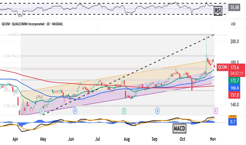
Qualcomm Rose 11% in One Day on AI Plans. What Its Chart SaysSemiconductor designer Qualcomm NASDAQ:QCOM , which is known for providing products to the consumer-electronics industry, rose more than 11% to a 15-month high in a single day last week when it announced a pivot into the world of artificial intelligence. Let's see what QCOM's chart and fundamentals say following the news and ahead of this week's earnings release.
Qualcomm's Fundamental Analysis
QCOM plans to release fiscal Q4 numbers after the market close on Wednesday, with Wall Street currently looking for $2.86 in adjusted earnings per share on roughly $10.75 billion of revenue.
That would represent a 6.3% annual gain in earnings from the $2.69 in adjusted EPS that QCOM reported in the same period last year. Revenue would likewise have risen some 5% from about $10.24 billion a year earlier.
In fact, 16 of the 26 sell-side analysts that I know of that cover this name have revised their earnings estimates higher since the quarter began, while only nine have lowered their projections. (One estimate remains unchanged.)
Of course, markets will also want to hear management's commentary on the shift to AI, which will put Qualcomm in head-to-head competition with likes of Nvidia NASDAQ:NVDA and Advanced Micro Devices NASDAQ:AMD .
Qualcomm's Technical Analysis
Now let's look at QCOM's chart going back some eight months and running through Friday afternoon:
Readers will see that Qualcomm rose 70.5% between hitting a 17-month intraday low of $120.80 on April 7 and a $205.95 session high on Oct. 27 following the AI announcement.
Still, QCOM has for the most part methodically traded during this whole period within the confines of the Raff Regression model that I created above (marked with orange and pink fields).
That said, the stock has come in some after its Oct. 27 blow-off top -- perhaps because Qualcomm's new AI-friendly chips won't be ready for a number of months.
As QCOM pulled back, it felt around for support close to the 38.2% Fibonacci-sequence retracement level of the stock's entire 2025 rally (marked with gray shading in the chart above).
That's the downside pivot here, but there's technical help for Qualcomm not far below the 38.2% Fib level.
QCOM's 21-day Exponential Moving Average (or "EMA," marked with a green line at $171.60) lies nearby. That's where we might find out if the swing crowd is on board with Qualcomm's recent upward move.
If not, Qualcomm's 50-day Simple Moving Average (or "SMA," denoted with a blue line) and its 200-day SMA (the red line) aren't far below the 21-day EMA.
Those are levels where the professional money managers might be, so there's plenty of possible support for QCOM indicated in the chart above.
All in, Qualcomm's upside pivot could be the stock's recent $205.95 high. Conversely, the stock's downside pivot could be that 38.2% Fib level.
As for the stock's secondary technical indicators, Qualcomm's Relative Strength Index (the gray line at the chart's top) is quite robust, yet not overbought technically.
Meanwhile, the stock's daily Moving Average Convergence Divergence indicator (or "MACD," denoted by black and gold lines and blue bars at the chart's bottom) is overtly bullish.
Within the MACD, the histogram of the 9-day EMA is well into positive territory, while the 12-day EMA rides above the 26-day EMA and both are above the zero-bound. Those are all bullish technical signals.
An Options Option
Options traders who want to go long on QCOM while getting paid to take on equity risk might utilize what's called a "bull-put spread."
This is constructed by selling one put and buying a second one with a lower strike, but the same expiration date. Here's an example:
-- Sell one QCOM $175 put with a Nov. 7 expiration date (i.e. after this week's earnings). This costs about $3.75.
-- Buy one QCOM Nov. 7 $165 put for roughly $1.30.
Net Credit: $2.45
Should Qualcomm -- which closed at $180.72 Monday -- never trade as low as $175 prior to the options' Nov. 7 expiration, the trader will simply pocket the $2.45 net credit.
And should the stock trade below $175 at expiration but not below $165, the trader would end up long 100 shares of QCOM at a $172.55.
But what if the shares take a serious beating between now and Nov. 7? Well, if QCOM drops below $165 at expiration, the trader in the example above would have lost $10 on the equity trade less the $2.45 net credit for the bull-put spread. That works out to a $7.55 net loss.
(Moomoo Technologies Inc. Markets Commentator Stephen "Sarge" Guilfoyle had no position in QCOM at the time of writing this column, but was long NVDA and AMD.)
This article discusses technical analysis, other approaches, including fundamental analysis, may offer very different views. The examples provided are for illustrative purposes only and are not intended to be reflective of the results you can expect to achieve. Specific security charts used are for illustrative purposes only and are not a recommendation, offer to sell, or a solicitation of an offer to buy any security. Past investment performance does not indicate or guarantee future success. Returns will vary, and all investments carry risks, including loss of principal. This content is also not a research report and is not intended to serve as the basis for any investment decision. The information contained in this article does not purport to be a complete description of the securities, markets, or developments referred to in this material. Moomoo and its affiliates make no representation or warranty as to the article's adequacy, completeness, accuracy or timeliness for any particular purpose of the above content. Furthermore, there is no guarantee that any statements, estimates, price targets, opinions or forecasts provided herein will prove to be correct.
Options trading is risky and not appropriate for everyone. Read the Options Disclosure Document ( j.moomoo.com ) before trading. Options are complex and you may quickly lose the entire investment. Supporting docs for any claims will be furnished upon request.
Options trading subject to eligibility requirements. Strategies available will depend on options level approved.
Maximum potential loss and profit for options are calculated based on the single leg or an entire multi-leg trade remaining intact until expiration with no option contracts being exercised or assigned. These figures do not account for a portion of a multi-leg strategy being changed or removed or the trader assuming a short or long position in the underlying stock at or before expiration. Therefore, it is possible to lose more than the theoretical max loss of a strategy.
Moomoo is a financial information and trading app offered by Moomoo Technologies Inc. In the U.S., investment products and services on Moomoo are offered by Moomoo Financial Inc., Member FINRA/SIPC.
TradingView is an independent third party not affiliated with Moomoo Financial Inc., Moomoo Technologies Inc., or its affiliates. Moomoo Financial Inc. and its affiliates do not endorse, represent or warrant the completeness and accuracy of the data and information available on the TradingView platform and are not responsible for any services provided by the third-party platform.