Your Playbook for Deep Corrections: Top Seven Things to KnowEvery trader hopes that whatever is happening with any pullback is healthy. “Just a healthy retreat, it’ll go back, it always does. R-r-right?”
While that’s true (obviously, markets had always shot up to records after deep losses), your job is to survive that lower leg and ideally come out stronger than before.
Because sometimes the market doesn’t correct immediately. It drops, turns around, drops some more and doesn’t ask you how you’re doing.
Where are we in the valuation cycle now? In the “Is this AI thing a bubble” talks.
With stocks stretched, AI valuations orbiting Saturn, and Nvidia NASDAQ:NVDA dictating the market’s fate, investors are starting to ask: What happens if this thing unwinds… fast?
A deep correction shakes your portfolio like nothing else, ultimately putting your strategy (and sanity) to a test. That's why you must know how to deal with correction ( if when it comes).
Here’s your playbook. Seven things every trader should know when markets get serious.
⚡️ 1. Know What’s Driving the Tempo
Right now, the tempo-setter isn't in the economic calendar (but good to keep an eye on it). It's not gold, the US dollar, oil prices, or consumer sentiment.
It’s Nvidia NASDAQ:NVDA
The stock has shot to stratospheric levels, climbing with such force that the entire market now reacts to its every earnings forecast, capex comment, and Jensen Huang metaphor about the "virtuous cycle of AI.”
When a single company starts steering the market’s mood, you know the stakes are high. Nvidia’s rise has been spectacular. Its potential fall could also be spectacular.
If there’s a crash in the current market, undoubtedly tech goes first, and AI-tied shares are poised to lead the plunge. Not because the companies are bad, but because valuations are sky-high, crowded, and pumped by shady-looking multi-billion-dollar deals.
🧨 2. Sky-High Valuations Fall the Hardest
AI has been the market’s darling. And like any hot market corner, the exit door gets crowded when the music stops.
These stocks work great in a liquidity-rich, momentum-heavy environment. But in a deep correction, they can drop first and fastest.
Why?
They’re relatively expensive.
They’re owned by institutions (by boatloads).
They’re deeply intertwined with leverage.
When selling starts, it spreads: chips, software, cloud. Really anything with “AI initiative” mentioned in the last five earnings calls.
If the correction deepens, correlations go to 1 , and “diversification” starts to feel like a theoretical concept.
🧺 3. Staples Can Survive. But Aren’t Safe.
What tends to hold up in a downturn?
Companies that produce things people buy every day.
Coca-Cola NYSE:KO , Procter & Gamble NYSE:PG , Walmart NYSE:WMT , Costco NASDAQ:COST . These are the boring giants who don’t need AI hype to sell toothpaste, detergent, and caffeine.
But here’s the catch.
When tech crashes, fund managers don’t just sell tech.
They sell everything with liquidity to buy the tech names they've been waiting to own at a discount.
That includes consumer staples. Even the defensive darlings can get dumped to fund someone’s impulsive “NVDA is finally cheap!” moment.
🧭 4. Corrections Have Phases. Know Which One You’re In.
Corrections tend to move in waves:
Denial: “This is just a dip.”
Realization: “This is not a dip.”
Capitulation: “Sell everything.”
Bargain hunting: “Wait… everything is on sale.”
Recovery: “We survived. Buy up!”
Don’t confuse early weakness with late-stage panic.
Ideally, you want to buy when everyone else is emotionally unavailable, not when they’re still debating if it’s a pullback or an opportunity.
📊 5. Liquidity Matters More Than Fundamentals
In a deep correction, fundamentals usually take a backseat.
Everything becomes about liquidity.
Who needs cash?
Who has margin calls?
Who needs to rotate?
Which institutions need to de-risk?
This is why great companies drop alongside mediocre ones.
Liquidity can trump logic.
Market structure can trump valuation.
And algos don’t care that you really like that stock long-term.
🧘♂️ 6. Your Mindset Is a Position Too
Corrections can provoke every trading impulse, especially if they're steep and you expect a quick rebound:
Revenge trades
Over-leveraged dip buying
Premature bottom-calling
The hardest thing during a deep correction isn’t predicting the bottom, but not losing your head (and cash) before the bottom arrives.
Pro traders work with a few rules that help them avoid emotional decision making:
Pre-set drawdown limits
Scaling entries
Non-negotiable stop-losses
Portfolio hedges
Cash as an asset
If you don’t have a playbook before the drop, you’ll be writing one during the drop.
🛒 7. Buy the Best, Not the Loudest
When markets crack, everything goes on sale, everyone knows that.
Before you go bargain hunting and deep discount shopping, prioritize:
Cash-generating giants
Companies with pricing power (and moat)
Firms selling essentials in whatever industry
Businesses that don’t rely on hype to survive
🧾 The Takeaway
A deep correction may not be the end of the world, but it could be the market’s way of redistributing opportunity.
Nvidia and the AI titans have been running the show. And they’ll likely lead any sharp selloff.
And yes, even your safe, boring consumer staples can get dragged into the downside.
But corrections create clarity. They separate narrative from value, hype from durability, and momentum from substance.
If you stay disciplined, patient, and unemotional, a correction becomes less of a threat and more of a roadmap, pointing you toward assets worth owning when the next bull run begins.
Off to you : What’s your take on the current market situation? Do you see a bubble in the works, ready to go pop? Or it’s all looking fine and dandy, no reason for caution?
Community ideas

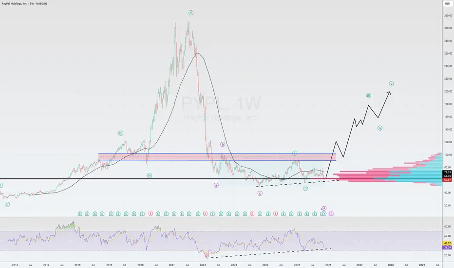
PYPL USPayPal is a rare combination of value and growth.
The company demonstrates strong fundamentals, is strategically focused on the future, and trades at record-low multiples. The combination of financial discipline, capital return, and AI innovation makes it an attractive asset for long-term investors.
The most recent quarter confirmed the resilience of PayPal's business model.
Revenue: $8.42 billion (+7% y-o-y).
Adjusted earnings per share: $1.34, exceeding analyst expectations by $0.14.
Total payment volume (TPV): $458 billion (+8% y-o-y), demonstrating the platform's scale and activity.
Free cash flow (FCF): $2.3 billion for the quarter, and the FCF margin increased 7 percentage points to 27%. This demonstrates high efficiency and the ability to generate cash.
Key Growth Drivers
Paypal isn't dependent on a single product, but is developing several promising areas.
Venmo: The main growth driver. Revenue accelerated to +14% year-on-year. The service is not only growing, but also becoming more profitable.
Buy Now, Pay Later (BNPL): Growing by more than 20% annually, in line with changing consumer behavior.
Upward Guidance: Management raised its adjusted EPS guidance for 2025 to $5.35-$5.39, implying growth of 15-16% year-on-year.
Partnership with OpenAI
This isn't just marketing, but a strategic bet on the future of commerce.
Bottom Line: PayPal is becoming the default payment infrastructure within ChatGPT. Users can instantly transition from searching for a product through an AI-powered conversation to paying with PayPal without leaving the chat.
Meaning:
For PayPal: A new, massive sales channel—"AI commerce" (agentic commerce)—is opening. The company is becoming a "commerce bus" between millions of its merchants and AI users.
For merchants: They automatically gain access to the ChatGPT storefront without the need for complex integration.
For OpenAI: ChatGPT is evolving from an assistant into a full-fledged commerce platform.
The company declared its first-ever dividend of $0.14 per share.
There is also a $6 billion annual buyback program. Shares have declined by 6.25% over the past year.
The "Dividend + Buyback" combination is a powerful signal that the company believes its shares are undervalued.
Historically low valuation
This is a key element of the investment thesis. The market completely ignores positive developments.
Multiples: PayPal trades at only ~12x expected 2026 earnings. This is lower than many less profitable fintech competitors (SoFi, Block).
The investor is paying a price that assumes a complete lack of future growth, while the company is showing double-digit profit growth, generating record cash flow, and building the business of the future.
From a technical analysis perspective , we are in the accumulation zone.
The price is near an uptrend line.
The RSI also signals divergence🌎
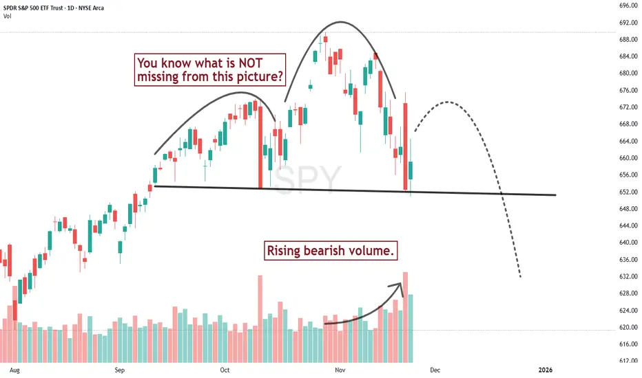
Oh what a difference a day makes!A couple days ago I thought there wasn't sufficient price pattern evidence to talk about a serious change in trend for the S&P 500, mostly because I didn't see the volume pattern confirming the downward slide of the recent high. But Thursday changed that. Redrawing the neckline, we get a chart that looks more like the textbooks drew it up.
Will the next swing high lead to a serious acceleration of downward trending prices? If so hold on tight, it could be a BIG drop.
Why This Time Is Not Different — BTC Could Still Drop >50%Bitcoin is moving into a phase where long-term cycles matter more than whatever the market narrative happens to be this week.
And if you look at those cycles, one thing becomes clear: BTC has never avoided a major drop after making a new ATH.
1. The timing keeps repeating — almost to the day
Every big drawdown in Bitcoin’s history has lasted almost exactly the same amount of time:
Cycle 1: 371 days
Cycle 2: 378 days
Cycle 3: 378 days again
That kind of symmetry doesn’t happen by accident.
It’s a pattern driven by liquidity, leverage, miner economics and investor behavior.
Right now, BINANCE:BTCUSDT is lining up with that same timing structure once more.
2. The size of corrections is falling… but still huge
Past drawdowns:
–83%
–77%
The market is more mature now — more liquidity, more derivatives depth, more institutional money — so the volatility is naturally lower.
But “lower volatility” in Bitcoin still means:
👉 –50% to –70% corrections
And a drop in that range would land BTC somewhere around $40k–$50k, which is consistent with the historical pattern.
3. Market maturity doesn’t erase Bitcoin’s cycles
Even with ETFs, institutional flows, and a stronger market structure, BTC still reacts to:
leverage resets
liquidity tightening
miner selling pressure
sentiment washouts
These things don’t disappear just because the market grows.
4. What the full cycle is pointing to
If the cycle keeps rhyming with the past:
Potential bottom: roughly late 2026, at the end of another ~370–380 day drawdown
Next peak: around 2028
Long-term target: $120k–$150k+
The rhythm remains the same:
big drop → long consolidation → explosive recovery.
Takeaway
This time isn’t different.
Even in a more “institutional” Bitcoin, the cycles still point to a >50% reset before the next major expansion.

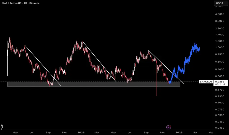
ENA: Bullish SetupThis chart displays ENA on a daily timeframe, with clear structure pointing to a favorable long entry. The current price action is trading within a major support zone, where previous trendline breaks have consistently marked the start of impulsive moves.
Historically, every time ENA breaks out above the descending trendline, the asset tends to retest the breakout level before accelerating higher.
A blue fractal shows past price evolution from October last year, highlighting the repeatable bullish pattern as price reverses trend, retests the breakout, and rallies to new highs.
As always, use prudent position sizing and stop-losses, particularly if support fails to hold.
This bullish setup is most likely to play out if the FED decides to cut interest rates in December.
It could serve as a strong macro catalyst to support the pattern shown here. Thus, watch for confirmation from the Fed policy easing may power the next leg up for ENA and similar assets.
Analysis for What’s Coming - AI Bubble Sentiment The US markets have been described as “on a rally” for quite some time. I would not agree if it is meant to describe the overall US market, but would agree if it refers specifically to AI or tech stocks. Why?
Among the four major US indices, the Russell—representing a much broader base of US-listed companies—continues to struggle to break above its high from last year, even though the others have far surpassed it. In fact, it has since corrected by 9.5% since its all-time high just last month.
After that, the other indices are also following suit only in the past few days, breaking below this uptrend that started in April.
Micro E-mini Russell 2000 Index
Ticker: M2K
Minimum fluctuation:
0.10 index points = $0.50
Disclaimer:
• What presented here is not a recommendation, please consult your licensed broker.
• Our mission is to create lateral thinking skills for every investor and trader, knowing when to take a calculated risk with market uncertainty and a bolder risk when opportunity arises.
CME Real-time Market Data help identify trading set-ups in real-time and express my market views. If you have futures in your trading portfolio, you can check out on CME Group data plans available that suit your trading needs www.tradingview.com

Nvidia Earnings Finally Ease Market Jitters. Are AI Bulls Back?It’s confirmed. This is Nvidia’s stock market and we all live in it.
Nvidia NASDAQ:NVDA reported yet another record-breaking quarter, instantly soothing market nerves after a week filled with talks of “AI bubble,” “valuation fever,” and “maybe Michael Burry is right again.” It was the cherry of the earnings season .
The chipmaking giant announced $57 billion in sales during the most recent quarter.
The figure is up 62% year-over-year and way above estimates. In other words, Nvidia didn’t just calm the market. It kicked the door open and shouted: “Get in losers, we’re going shopping.”
CEO Jensen Huang was even more enthusiastic, declaring that “AI is going everywhere, doing everything, all at once.” In classic Huang fashion, you could almost smell the leather jacket.
💽 Data Center Demand: Still Insatiable
Let’s cut to the headline number: $51.2 billion in data-center revenue. Analysts expected $49 billion. Nvidia delivered more.
The company’s new Blackwell GPUs, described by Huang as “off the charts” when it comes to demand, continue to fly off the production line the moment they’re made.
Quarterly net income hit a whopping $31.9 billion, up 65% from the year prior. At a time when most companies celebrate single-digit percentage growth, Nvidia is casually stacking double and triple digits.
📈 Markets Exhale, Futures Soar
The relief was immediate and widespread. You could say that Nvidia’s earnings are not just earnings anymore, but a macro signal.
Here’s what the picture looked like after the release:
CoreWeave NASDAQ:CRWV jumped 10%
Futures tied to the Nasdaq NASDAQ:IXIC climbed 2%
Every Magnificent Seven stock flashing green
Investors had been waiting for confirmation that the AI boom still had room. And Nvidia delivered enough reassurance to light up the entire tech complex.
“Okay. Maybe we don’t need to rotate into utilities just yet,” every tech bro, probably.
😬 The Stakes Were High. Really High.
The reaction, though, must be taken within the current context. Over the past few weeks, tech stocks were hit by deep selloffs as markets fretted over the same question: “Is AI too expensive?”
Between skyrocketing capital expenditures, absurdly ambitious data-center budgets, and the kind of spending plans that would make even sovereign wealth funds blush, investors wondered whether Big Tech was building an AI future or an AI money pit.
Even Michael Burry stepped in, revealing positions betting against Nvidia NASDAQ:NVDA and Palantir NASDAQ:PLTR . That move alone sent pockets of the market into a philosophical crisis.
After all, that’s the guy from “The Big Short” and he’s hedged against your favorite trade.
🤖 So… Are the Bulls Back?
Maybe. For now at least. But with conditions.
Nvidia’s stock more than doubled between April and late October, only to slide in recent weeks as bubble fears thickened. Year to date, the stock is still up about 30%.
Nvidia’s numbers prove that AI spending is still accelerating. But the broader question remains: Can companies actually turn those massive AI investments into profit?
Nvidia’s blowout quarter just reset the narrative:
AI demand is still real
Spending is justified
The cycle is still “virtuous,” in Huang’s words
After this earnings print, the bull case has something it desperately needed: momentum.
And momentum is a powerful thing, especially in a market that had started to doubt its favorite story.
Off to you : Do you still see room for growth in the AI space? Or is that rebound a short-term reflex? Share your views in the comments!

META now close to a critical trendlineMETA is approaching a significant technical region.
The trendline currently in focus originated on 31 October 2022, and it has remained relevant over time.
This same trendline was retested twice in April of this year, and price action is once again moving toward it after achieving a new all-time high.
At the moment, the asset is sitting at the Fibonacci 61.8% retracement level — a well-known zone where reversals often occur. Based on this structure, the asset may begin its upward move from the current region, or it may decline by an additional $10–$20 to retest the ascending trendline.
I have taken my initial positions in META during this pullback and may increase my exposure if price reaches the trendline.
Overall, my outlook remains bullish.
Trade responsibly.
Entry: RR is 1:3
Confidence: High

SOL — Deep Pullback Into Major SupportSOL has been in a steady freefall over the past weeks. On the higher timeframes the key support and resistance zones are very clearly defined. The $250 level acted as a big resistance area, with multiple rejections showing sellers were firmly in control up there.
On the downside, the $125 support zone has shown clear strength, with bulls defending this area and producing strong bounces each time price revisited it.
The swing low at $126 presents an attractive long opportunity, especially with the sell-side liquidity and the quarterly level at $124.54 sitting just below, adding further confluence. Additionally, the anchored VWAP from the $8 low lies around $114, aligning almost perfectly with the 0.886 Fibonacci retracement at $113.3, providing deeper support should price extend lower.
Long Entry Zones:
0.786 Fib: $129.13
0.886 Fib: $113.3
Why the 0.786–0.886 Zone Is a Major Reversal Area
The 0.786–0.886 Fib zone is one of the best spots to look for a reversal after a deep pullback. It’s where strong trends often take their final dip before bouncing.
Here’s why it works so well:
It’s the typical “deep correction” zone in strong trends.
Price usually sweeps sell-side liquidity here before reversing.
Many harmonic patterns use this exact area as their turning point.
It often lines up with anchored VWAPs or volume nodes, adding extra support.
It’s basically the capitulation zone where weak hands exit right before a bounce.
Overall, it’s a clean area with clear invalidation and great R:R → perfect for spotting high-probability reversal setups.
_________________________________
💬 If you found this helpful, drop a like and comment!
The Market is at 80°C. What Happens at 100°C?Greetings, everyone.
Today, I don't want to talk about the news. I want to talk about what truly matters: market structure. Many traders are currently looking for a news event to explain the current lull and predict Bitcoin's next move. They are looking in the wrong direction.
Remember this: the news is not the cause of a move. It's just a convenient explanation handed to you after the move has already happened. For me, the chart is primary. And right now, it's telling a story that most people are not going to like.
The Global Picture: An Economy of Bubbles and Boiling Water
We live in an era of bubbles. We had the dot-coms, the tulip mania, and now we are witnessing the AI bubble. Yes, AI is a game-changer, and I am actively integrating it into all my processes - it would be foolish to deny this trend. But that doesn't change the fact that the markets are overheated.
The entire global economy right now feels like water heated to 80 degrees Celsius. It’s not boiling yet, but the boiling point is near. Something is about to happen, and the steam is getting ready to burst out.
The Market's Pulse: Where the Crowd Goes Wrong
And what about the crowd? The crowd isn't in Bitcoin anymore. They are trapped in altcoins, having resigned themselves to being "forever waiters." They are praying for an altseason, not realizing that the brief 20-30% pump we saw - that was the altseason. It has already become a meme.
I see endless posts about liquidations on social media. The sentiment is desperate. Most have already lost their futures positions or will lose them soon. What reigns in the market right now isn't fear or greed, but rather a slow realization that the bear market never really left.
The Main Setup on the Chart: A Classic Liquidity Trap
Now for the most important part - what is happening on the Bitcoin chart?
As you can see, we are sitting on a critical trendline support. Everyone sees it. Novices and retail traders see this as a clear "buy the dip" signal. And that is part of the game.
A deliberate trap is being set:
Consolidation : The price is being intentionally held near the support line to create an illusion of strength and to accumulate buyers' positions.
Stacking Stop-Losses : Market makers know that the crowd places their stops just below this obvious line.
Execution : Once enough liquidity has been built up, a sharp breakdown will occur. This will trigger a cascade of stop-loss liquidations, which will only accelerate the fall.
I remain fully on the bearish side until we see a confident break of the all-time high. I view any bounce from the current levels as an opportunity for a better entry into a short position.
What's Next?
What is my advice to myself for the next 2-4 weeks? Wait.
The market is preparing for a great cleansing. A wave of delistings of junk projects and meme coins - which serve no one but the exchanges that use them for hype - is coming. After this cleanse, there will be incredible opportunities to buy at very attractive prices.
Now is the time for deep research into the projects you truly believe in. It's time to get your limit orders ready and wait for the market to come to your prices.
Thank you for your attention.
Regards,
Your EXCAVO.
XAUUSD Long: Buyers Eye Push Toward $4,100 ResistanceHello traders! XAUUSD is developing a clear technical structure after reacting multiple times to both the Supply and Demand zones, forming a well-defined pattern of price behavior. Recently, Gold rejected the Supply Line after creating a new Pivot Point near the $4,230 area — the same region where a previous strong rejection occurred. This confluence confirms that sellers remain active at the upper boundary of the market. Earlier, the market formed a Double Top pattern near the same Supply Zone, which triggered a strong bearish reversal. After the breakdown, price retested the $4,100 level several times, turning it into a meaningful local resistance. Multiple breakout attempts above this level failed, signaling strong selling pressure from the supply area.
Currently, XAUUSD is testing the Demand Line that has been respected consistently throughout the recent bullish leg. Each touch of this trendline resulted in a higher pivot point, confirming active buyers stepping into the market. This area aligns with the $4,000–$4,010 Demand Zone — a key support cluster where price has reacted with strong bullish impulses before.
My scenario as long as XAUUSD holds above the Demand Line and the $4,000–$4,010 support, the bullish structure remains valid. A rebound from this zone may initiate a fresh move toward the $4,100 Supply Zone (TP1), where the next important reaction is expected. A clean breakout above $4,100 would strengthen the bullish scenario and open the path toward $4,150–$4,170, aligning with the upper Supply Line. If Gold fails to hold above the Demand Zone, sellers may regain control and push the price lower toward the $3,960 support, signaling a deeper correction phase. For now, the market favors buying pullbacks near demand while monitoring price action closely around the $4,100 resistance. Manage your risk!

When Crypto Actually MovesCrypto trades around the clock, but the market doesn’t behave the same way at every hour. Volume, liquidity, and volatility cluster around predictable windows, and those windows shape how setups form and how price reacts. When you understand these shifts, you stop taking trades randomly and start aligning execution with the moments when the market truly moves.
Why Sessions Matter
Even though crypto never sleeps, human traders and institutional desks still operate in cycles. Liquidity providers adjust during business hours. Market makers re-balance at session opens. Macro news is released on a fixed schedule. These patterns create recurring volatility signatures.
Ignoring sessions means you treat every candle as equal. Understanding sessions means you add a layer of context that improves timing, risk control, and win rate.
Asia Session (00:00–06:00 UTC)
The Asia window tends to be slower and more range-bound.
Characteristics include:
– Moderate liquidity
– Clean consolidations
– Accumulation before Europe
– Fewer impulsive moves unless driven by news from Asia-Pacific regions
This period often sets the initial range of the day. Liquidity begins to cluster above highs and below lows, creating the conditions for later sweeps.
Europe Session (07:00–12:00 UTC)
Liquidity expands significantly as London opens. You often see the first engineered move of the day.
Key behaviors:
– Early sweeps of the Asia range
– Strong breakouts from overnight compression
– Directional push before New York volatility
This session frequently defines the directional bias into US hours. It’s a prime window for structured setups because market participation rises sharply.
US Session (13:00–20:00 UTC)
This is the most active window. The highest liquidity and most decisive moves occur here.
Typical features:
– Strong continuation or full reversal of the London move
– Reaction to economic news
– Trend acceleration during peak overlap hours
This is where major breakouts, deep liquidity hunts, and high-powered moves happen. If you trade momentum or breakout strategies, this session offers the cleanest conditions.
Weekend Behavior
Weekends operate on thin liquidity. Order books are lighter, market makers are less active, and volatility behaves differently.
Common outcomes:
– Sharp wicks that violate structure
– Sudden spikes without follow-through
– False breakouts with immediate reversals
Weekend moves often distort technicals. They can be useful for narrative-driven positions but carry higher risk for intraday traders.
How to Integrate Sessions Into Your Trading
Use sessions to filter when you participate and when you avoid noise.
Practical adjustments:
– Execute momentum setups during Europe or US hours.
– Treat Asia session as a range-building phase suitable for scouting zones.
– Avoid taking aggressive positions during weekend chop.
– Use session opens as key decision points for liquidity grabs.
When you layer session timing on top of structure, you refine entries and eliminate trades that lack the environment for follow-through.
The Strategic Advantage of Session Awareness
Session timing gives you clarity. You start anticipating where liquidity is likely to be engineered, where volume will enter, and when the market is likely to trend or stall.
This transforms your approach.
Instead of reacting to candles, you plan around expected volatility cycles.
Instead of forcing trades, you wait for session transitions that historically produce reliable movement.

Mastering RSI: A Complete Guide to Momentum🔵 Mastering RSI: A Complete Guide to Momentum, Regimes, Reversals & Professional Signals
Difficulty: 🐳🐳🐳🐳🐋 (Advanced)
This article goes far beyond the basic idea of “RSI = overbought/oversold.” If you want to truly master RSI as a momentum gauge, trend filter, reversal tool, and structure confirmation model, this guide is for you.
🔵 WHY MOST TRADERS MISUSE RSI
Most traders use RSI in the simplest way:
RSI above 70 = sell
RSI below 30 = buy
This leads to shorting strong trends and catching falling knives.
RSI is not a reversal button. RSI is a momentum translator.
To master RSI, you must understand:
Trend regimes
Momentum pressure
Acceleration and deceleration
Failure swings
Divergences
Trend vs range behavior
Multi-timeframe alignment
Structure confirmation
RSI shows the strength behind price, not just extremes.
🔵 1. RSI TREND REGIMES (CORE FOUNDATION)
RSI moves in predictable zones depending on the type of market environment.
Bullish RSI Regime
RSI holds between 40 and 80
Pullbacks bottom around 40–50
Breaks above 60 show trend acceleration
Bearish RSI Regime
RSI holds between 20 and 60
Pullback tops form around 50–60
Breaks below 40 confirm bearish dominance
These regimes tell you who controls the market before you even look at candles.
🔵 2. MOMENTUM PRESSURE (RSI AS A SPEEDOMETER)
RSI measures the speed and pressure of price movement.
Rising RSI with rising price = trend acceleration
Falling RSI with rising price = momentum weakening
Rising RSI with falling price = early strength
Falling RSI with falling price = continuation pressure
This is not divergence. It is momentum pressure, the earliest sign of trend shift.
🔵 3. FAILURE SWINGS (THE MOST RELIABLE RSI REVERSAL SIGNAL)
Failure swings are powerful because they show internal momentum breaking before price reacts.
Bullish Failure Swing
RSI makes a low
RSI rallies
RSI dips again but stays above previous low
RSI breaks the previous high
Bearish Failure Swing
RSI makes a high
RSI pulls back
RSI rallies but fails to break the previous high
RSI breaks the previous low
Failure swings often appear at trend tops and bottoms before candles reveal anything.
🔵 4. DIVERGENCES (REGULAR AND HIDDEN)
Regular Divergence: Reversal Clue
Bullish: price lower low, RSI higher low
Bearish: price higher high, RSI lower high
Hidden Divergence: Trend Continuation
Bullish hidden: price higher low, RSI lower low
Bearish hidden: price lower high, RSI higher high
Hidden divergence is more powerful than regular because it confirms trend continuation.
🔵 5. RANGE RSI VS TREND RSI
RSI behaves very differently in ranges versus trends.
Range Environment
RSI oscillates between 30 and 70
Reversals at extremes have high accuracy
RSI 50 is the equilibrium
Trend Environment
RSI stays above 50 in bullish trends
RSI stays below 50 in bearish trends
30 and 70 extremes lose meaning
Always identify environment first. RSI signals change depending on regime.
🔵 6. RSI AS A STRUCTURE FILTER
RSI combined with structure improves trade selection dramatically.
Price makes higher highs + RSI rising = healthy trend
Price makes higher highs + RSI flat = weak breakout
Price makes higher highs + RSI dropping = exhaustion
Support retest + RSI 40–50 = strong continuation potential
Most false breakouts are avoided simply by checking RSI pressure.
🔵 7. MULTI-TIMEFRAME RSI ALIGNMENT
Use higher timeframe RSI to validate lower timeframe setups.
HTF RSI bullish + LTF RSI pullback = high-quality entry
HTF RSI bearish + LTF RSI bounce = premium short area
HTF RSI crossing 50 = long-term regime shift
This is one of the most powerful RSI confluences.
🔵 EXAMPLE TRADING FRAMEWORK
Bullish Setup Checklist
RSI in bullish regime (above 50)
Pullback into 40–50 zone
Hidden bullish divergence or failure swing
Structure forms a higher low
Bearish Setup Checklist
RSI in bearish regime
Rejection from 50–60 zone
Hidden bearish divergence or failure swing
Structure forms a lower high
🔵 COMMON RSI MISTAKES
Trading RSI extremes without trend context
Ignoring RSI regimes
Entering on regular divergences in strong trends
Not using RSI midline (50) as a regime filter
Relying only on overbought/oversold signals
🔵 CONCLUSION
RSI is one of the most powerful indicators when used correctly. It provides a complete framework for:
Reading trend strength
Tracking momentum pressure
Identifying early reversals
Trading continuation setups
Filtering breakout strength
Aligning multi-timeframe bias
Master RSI, and you gain a clearer view of momentum than most traders ever experience.
How do you use RSI? Do you prefer divergences, trend zones, or failure swings? Share your approach below!

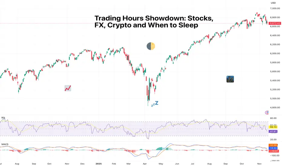
Trading Hours Showdown: Stocks, FX, Crypto and When to SleepSome markets close, some don’t, and some don’t care that you need rest.
If financial markets were people, they’d each have wildly different sleeping habits. Stocks tuck themselves in usually at 4 p.m. (that is, where they originate from), FX stays up all night but insists it’s “fine,” and crypto is that friend who messages you at 3 a.m. with a life-changing idea (and a 12% move for fun).
Understanding when each market is awake, liquid, and volatile is one of the most underrated skills a trader can have. It’s not just about timing entries; it’s about managing risk while you’re away from your devices.
Let’s break down the global sleep schedule and why your portfolio should care.
🌅 Stocks: The 9-to-5ers of the Financial World
US stocks like routine. They open at 9:30 a.m. ET, close at 4 p.m., and observe weekends and holidays like well-behaved citizens.
There’s also pre-market and after-hours trading, but liquidity dries up real fast and moves tend to be exaggerated.
Why it matters:
Limited hours = overnight gap risk
Most volume typically happens in the first and last 30 minutes
Big news after hours can cause violent opens the next day
Stops can’t protect you when price jumps over your level
Every trader eventually experiences the heartbreak of a perfect setup ruined by an overnight earnings surprise. Consider it a rite of passage.
🌍 Forex: The Market with No Bedtime
FX ( forex or foreign exchange) trades 24 hours a day, five days a week, rotating through global sessions:
Asia (Tokyo)
Europe (London)
US (New York)
That’s a 120-hour work week with no break. Think of it like a global relay race where someone is always awake and analyzing inflation differentials.
Why traders love it:
Continuous liquidity = fewer gaps
Beautiful macro-driven trends
Volatility waves follow session overlaps (London–NY especially)
But…
FX weekends could be silent killers. You’re unprotected from Friday close to Sunday open. That’s plenty of time for geopolitical headlines, surprise events, central bank drama, or a country deciding to unpeg its currency.
🔥 Crypto: The Market That Never Sleeps or Blinks
The cryptocurrency market trades 24/7/365. No days off, no weekends, no holidays, no rest. Just pure, unfiltered price action around the clock.
This sounds great until you realize you can never fully unplug. Bitcoin BITSTAMP:BTCUSD does not respect your circadian rhythm.
Why it’s unique:
No “overnight gaps” because it never closes
But liquidity gaps may appear during low-volume hours
Late-night moves can be extreme due to thin order books
Leverage unwinds can trigger liquidation cascades at 3 a.m.
Global retail participation exaggerates emotional spikes
Crypto doesn’t gap like stocks, but it drifts, snaps, and rips through levels and can make your stomach churn.
🧭 Liquidity: The Real Story Behind the Sleep Schedule
Across markets, the one concept that ties them all together is liquidity. That is, how deep the order book is and how efficiently your trades can execute.
Stocks
Thick liquidity during US hours
Thin, jumpy after-hours
Prone to large news-driven gaps
Forex
Deep liquidity almost 24 hours a day
Most volume during London–NY overlap
Macro news instantly reflected in price
Crypto
Liquidity pockets vary wildly
Exchanges differ in depth
Weekends and Asia-over-US crossovers can trigger whipsaws
😴 The Question of Sleep (And How Traders Manage It)
Traders eventually learn a few things about trading various asset classes.
If you:
Hate surprises → Avoid overnight stock positions
Love macro trends → FX is your playground
Enjoy volatility → Crypto keeps things interesting
Value sleep → Choose an asset class that aligns with your time zone and day trade it
Choosing a market to trade isn’t just about your strategy, but also about your lifestyle.
Volatility doesn’t just depend on the asset. It depends on when you’re watching.
Off to you : How do you deal with trading different assets in different time zones? Are you a niche player or a broader market maven? Share your comments below!
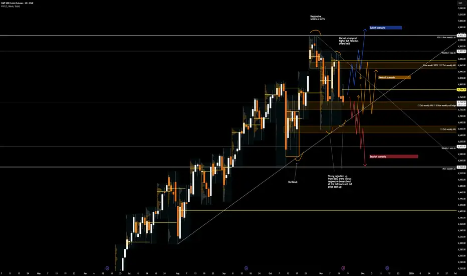
From Shutdown Relief to AI Anxiety — Two Narratives Driving ESMarket Theme
The week began on a strong footing, driven by a bullish Sunday reopen in ES after news broke that the 43-day government shutdown was set to end, following the Senate’s late-night support for a potential agreement on November 9th. This relief catalyst created early upside momentum, pushing the index toward all-time highs (ATHs).
However, the tone shifted mid-week. The rally lost steam as markets refocused on a growing concern: the sustainability of current Tech and AI valuations. Investors are becoming more sensitive to the possibility of overstretched AI-related capital expenditure and an emerging bubble narrative, especially with heavyweight earnings and forward-guidance looming. This led to a rotation out of high-beta tech and into safer or less-extended sectors.
On the macro front, Fed speakers adopted a more cautious—if not outright hawkish—tone, emphasizing that a December rate cut is far from assured. The recent government shutdown created a backlog in key economic data releases, leaving policymakers and traders alike without clear visibility into the true state of the economy. The lack of data has amplified uncertainty and reduced the market’s conviction around the timing of any potential policy easing.
In short:
The market is caught between two opposing forces:
The optimistic narrative (shutdown resolved, path to ATHs, resilience in U.S. growth), and
The risk narrative (valuation excess, policy uncertainty, narrowing breadth).
This push-pull dynamic has resulted in compression rather than continuation, with a heavy focus on clarity from upcoming data and major earnings.
What is the Market Doing?
Last week formed an inside week, with the entire range trading within the prior week’s range and settling close to the previous week’s close. This signals indecision and balance, as neither buyers nor sellers had the conviction to push the market into expansion.
Current price action shows the market compressing between:
6875 — previous week’s VPOC / 27 Oct weekly VAL
6740— 13 Oct weekly VAH / 10 Nov weekly volume ledge
These levels are well-defined and respected. The upward trendline continues to hold, with multiple strong rejections signaling responsive buyers stepping in to bid prices back up.
The battle is now between buyers attempting to defend 6740 area which is also confluent with the daily trendline support, and sellers leaning on the overhead resistance close to 6875.
What to Expect in the Coming Week
The key line in the sand (LIS) this week:
→ 6755.25 — Previous week's settlement
Bullish Scenario
If 6755 holds as support, expect buyers to attempt a push toward:
6874.50 — previous week's VPOC
6905.5— weekly 1-SD volatility high
Anticipate responsive sellers in this area.
However, if price breaks above 6874.50 with pace and volume and accepts above it, the path opens for a retest of the ATHs as momentum players and trapped shorts fuel continuation.
Bearish Scenario
If the market accepts below 6755 and fails to reclaim it on any pullback:
First downside target: 6660 — 13 Oct weekly VAL
If buyers fail to respond there, expect an acceleration lower from long liquidation toward:
6605— weekly 1-SD volatility low
6504 — previous month's low (deeper target)
This scenario strengthens if the trendline breaks and sellers begin stepping down aggressively.
Neutral / Compression Scenario
If the market remains trapped between 6875 and 6740 with no breakout supported by pace and volume:
Expect two-way rotational trade
Continued compression and balance within the well-defined range
A buildup of energy that may resolve later in the week with data, earnings or fundamental catalysts
Conclusion
As we start the new week, ES remains tightly coiled between well-defined levels, with the market waiting for clarity from data, earnings, and policy signals. Whether we break from compression or continue to balance, the key will be how buyers and sellers respond around 6755 and whether there are new fundamental catalysts.
As always, I’d love to hear your view on the markets and ES this week? — Drop it below — and give it a boost so more of the community can join the conversation.
Glossary Index for all technical terms used:
VAH (Value Area High)
VAL (Value Area Low)
VPOC (Volume Point of Control)
SD (Standard Deviation)
Support and resistance key guide (Volume, Trendlines, FVG, MA)Support and resistance key guide (Volume, Trendlines, FVG, MA)
1️⃣ Importance of Support and Resistance in Highly Volatile Crypto Markets
The cryptocurrency market operates 24/7/365, exhibiting far greater volatility than traditional financial markets. This volatility presents substantial profit opportunities, but it also triggers intense fear and greed among investors, creating significant psychological stress.
Support and resistance serve as key milestones in this chaos, signaling zones where price reactions are likely. Beyond mere technical analysis, they reflect the collective psychology of countless traders. Understanding them is essential for success in crypto trading.
2️⃣ The Nature of Support and Resistance and Their Psychological Basis
Support and resistance occur where buying and selling pressures strongly collide, slowing or halting price movement.
Support:
At this level, buyers see the asset as "cheap enough!" and stand ready, forming a psychological and physical barrier against further decline. Additionally, traders previously trapped in losing positions may sell at breakeven, adding resistance against further drops.
Resistance:
At this level, sellers perceive the asset as "expensive enough!" and offload positions, while traders previously trapped at highs may sell with a "better late than never" mindset, limiting upward movement.
※ Meaning of Support/Resistance Breakouts and “Fakeouts”:
When a support level is breached, existing buyers may panic and trigger stop-loss selling. Conversely, breaking resistance may prompt buyers to enter, accelerating the trend.
However, some breakouts can be “fakeouts,” designed to exploit trader psychology. Premature chasing of such moves should be avoided.
3️⃣ Key Support and Resistance Pattern Analysis
📈 Trendlines and Consolidation Zones: The Psychology Behind Market Order
Trendlines: Trendlines visually represent the shared expectation among traders that price will move in a certain direction. Touching an upward trendline triggers “buy at a bargain” psychology, while touching a downward trendline triggers “it can’t go higher” sentiment.
Consolidation Zones (Boxes): These are zones where buying and selling pressures balance each other. Traders plan trades around these zones, dominated by the “waiting for breakout” psychology to capture significant moves.
📈 FVG (Fair Value Gap): Market Inefficiency and Smart Money Footprints
FVGs occur when the market moves too rapidly through a price range, leaving a “price gap.” They often reflect sudden activity by smart money (institutions, whales).
Gap Filling:
Markets instinctively avoid leaving incomplete states (FVGs) unaddressed. When price re-enters an FVG zone, the players who drove the prior rapid move may close or re-enter positions, forming support/resistance. Beginners can treat FVGs as smart money footprints and follow their activity strategically.
📈 Moving Averages (MA): Collective Psychology and Trend Direction
Moving averages reflect the average price perceived by the market over a period. Being widely monitored, they act as psychological support/resistance levels.
Short-term MA (e.g., 50MA): Reflects short-term trader sentiment. Price below it can trigger “short-term trend broken?” anxiety, while above it fosters optimism.
Long-term MA (e.g., 200MA): Represents long-term trader psychology and trend direction. Price below 200MA creates fear of a long-term downtrend, while above inspires hope of a sustained uptrend. When acting as support/resistance, MAs carry strong psychological consensus as a widely observed benchmark.
📈 POC (Point Of Control) Volume Profile: Market Consensus and the Power of Volume
POC is the price level with the highest traded volume over a period. It indicates market agreement on price, with substantial volume concentrated there.
Price below POC: POC becomes strong resistance. Buyers trapped in losing positions may sell at breakeven, and sellers actively resist upward moves.
Price above POC: POC acts as strong support. Buyers believe “price won’t fall below this level,” and prior sellers may switch to buying.
POC represents the market’s “expected price” and the zone where loss-aversion psychology is strongest.
📈 Fibonacci: Natural Order and Human Expectation
Fibonacci retracements apply golden ratio mathematics to charts, reflecting the expectation that price will reverse at certain levels, forming support/resistance.
These levels are not coincidental; many traders plan trades around them, causing real market reactions.
Levels like 0.5 (50%) and 0.618 (61.8%) are psychologically significant, viewed by traders as buying or selling opportunities. Support/resistance forms through “herd psychology,” as many act in unison.
📈 CME Gap: Institutional Moves and Market Regression Instinct
CME gaps occur in Bitcoin futures dominated by institutional investors. They happen when the spot market moves over weekends while futures are closed, and the market tends to “fill the gap.”
Gap Filling: CME gaps represent periods without institutional activity, prompting the market to normalize these “abnormal” price zones.
Traders anticipate “the gap will eventually be filled,” making these zones potential strong support/resistance, reflecting future-oriented market psychology.
4️⃣ Managing Trading Psychology Using Support and Resistance
Even the best tools are ineffective without psychological discipline.
Confirmation bias and stop-loss discipline: Ignoring losses due to selective perception leads to ruin. When support breaks, acknowledge your prediction was wrong and act decisively to exit.
Overbought/oversold psychology and FOMO:
Avoid chasing price surges out of fear of missing out (“everyone else is profiting, why not me?”).
During crashes, resist panic selling at the bottom. Base trades on your rules derived from support and resistance.
Partial trading for risk management:
Avoid buying all at support or selling all at resistance at once. Splitting trades across multiple support/resistance levels provides psychological stability and reduces the impact of wrong predictions.
5️⃣ Comprehensive Strategy Formation and Practical Application Tips
Multi-level Support/Resistance Confluence: Overlapping zones (e.g., Fibonacci 0.618 + 200MA + POC + FVG bottom) create very strong support/resistance. These reflect collective trader agreement and can be traded with higher confidence.
Volume Analysis and Support/Resistance Strength: High volume at a zone confirms its significance. Reliable breakouts require strong volume, showing market participation and intent.
Develop Your Own Trading Plan: Don’t blindly follow all patterns. Choose indicators and methods that suit you to establish personal trading rules. Adhering to these rules maintains psychological stability and long-term success.
If you found this content helpful, please show your support with a Boost (🚀) and a comment (💬)! Your encouragement is a great motivation for us to create better analyses and content. You can also follow us to receive notifications about new posts.
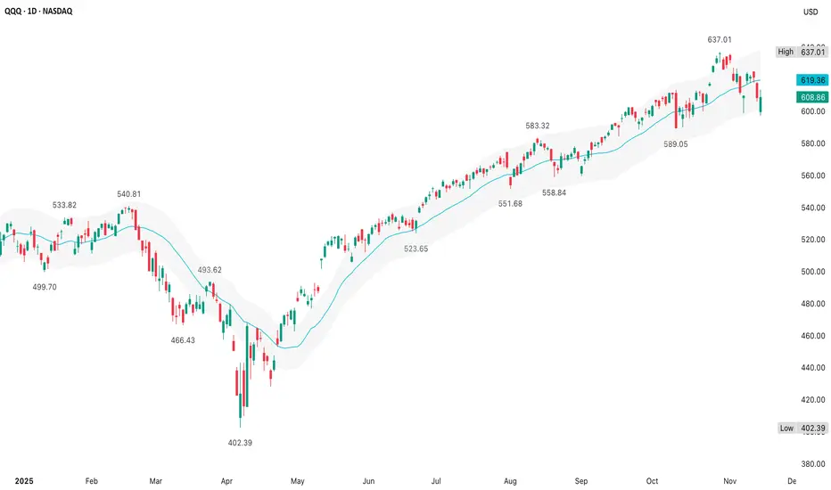
QQQ (14 November)The +/- 3% envelope with the 20d MA works well for mean-reversion strategies since it clearly shows inflection points where price may snap back toward the average
How far is price from its 20d MA & is price near extremes of the 3% bands?
Bollinger Bands adjust dynamically with volatility
Price rarely lives beyond ±3% of the 20d MA for long
Bias is short when the 20d MA is falling & price is above the upper band
Bias is long when the 20d MA is rising & price is below the lower band
After the April low at $402.39, the 20d MA's slope turned positive
In strong uptrends, price stays between the 20d MA & the upper band & occasionally tags the upper band (June to October)
In strong downtrends, price stays between the 20d MA & the lower band & occasionally tags the lower band
QQQ followed a solid trend from April to November's $637 high
This marked a high probability risk of mean-reversion
When QQQ hit the low around $588-$589, the 20d MA was still up around ~$610
So we see a mirror-image on the downside stretch where the upside pushed beyond +3% & then a downside break beyond −3%, which is the kind of behavior that occurs when a strong trend finally exhausts - then corrects hard
The move from ~$615-$637 was extended, so a good place to stop chasing longs
The move from ~$615-$588 was also extended, so a good place to stop chasing shorts & expect a bounce back toward the 20d MA, which is exactly what's happening when QQQ bounced back toward ~$615
However, the current bounce is weak & is stretched relative to the bounce (+3.5% above the 20d MA, then −3.5% below the 20d MA, then back toward the 20d MA) - it's a full snap from upper to lower band & now a mean-reversion toward the 20d MA
Either price reclaims the upper half of the channel & the trend resumes, or the 20d MA continues to rollover & any rallies the 20d MA/upper band are short entries which signals a trend change
The odds of another big push back to $637 without a reset are now lower & it's possible the trend now shifts from strong uptrend to corrective/trend down
Price rebounded from below the lower band back near the 20d MA, but rallies from the lower band back to the 20d MA are often short entries, not buy-the-dip opportunities
This lines up with a $620 fail thesis
Treat rallies back toward the 20d MA/upper band as suspect unless the 20d MA turns decisively higher again
If the 20d MA rolls over & price fails near $620, QQQ's near-term direction has changed from an uptrend to a downtrend
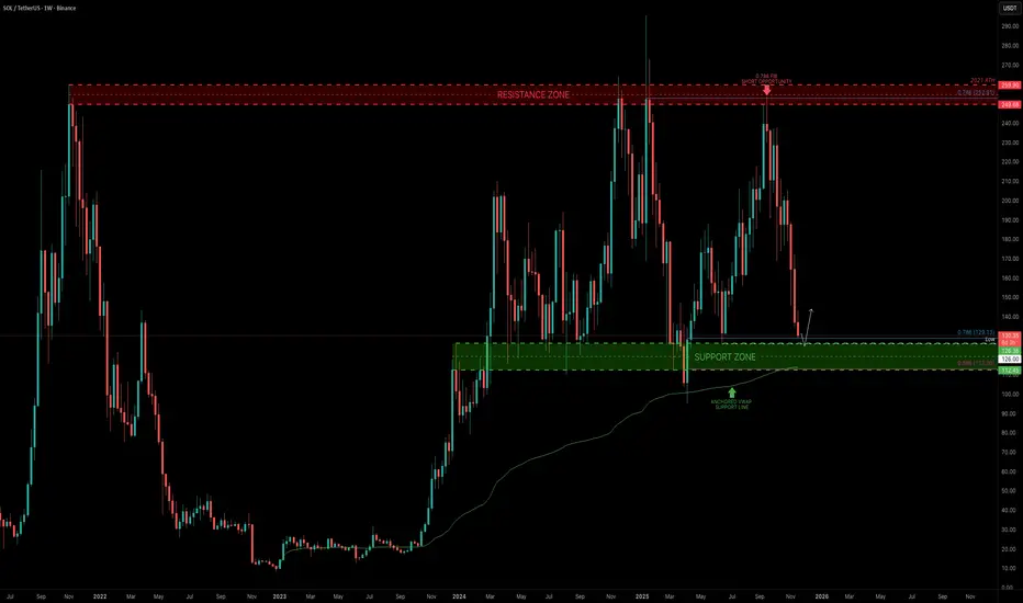
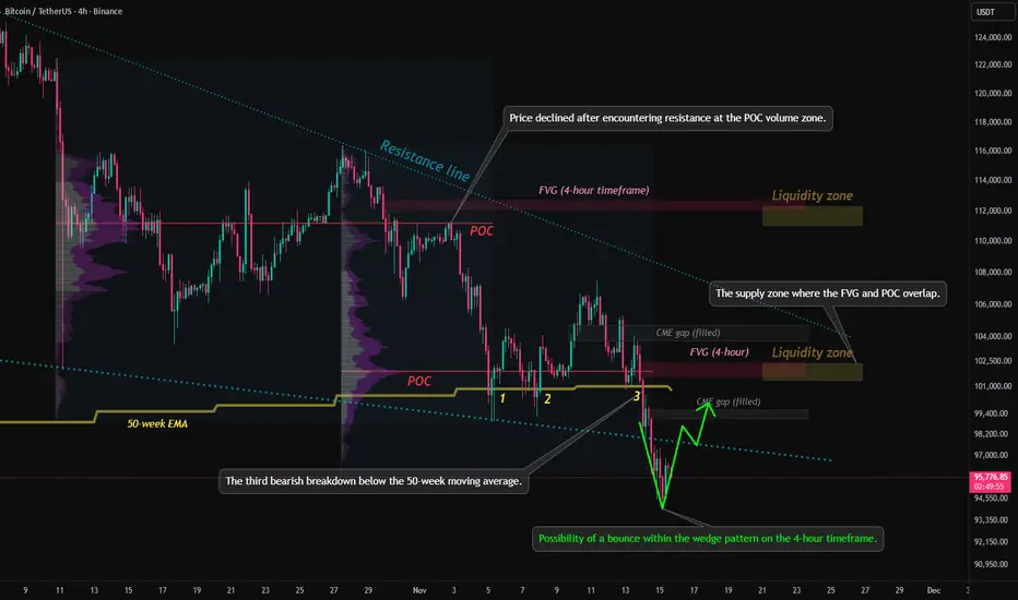
Technical analysis of bitcoin key levels and wedge chart pattern1. Trend Structure
The descending trendline (Resistance line) at the top of the chart remains valid.
The price has repeatedly faced rejection at this level, indicating that the medium-term downtrend is still intact.
2. Key Price Levels and Indicators
50-week EMA
The price has recently recorded its third downward break below the 50-week EMA.
From a traditional technical perspective, this is viewed as a signal that strengthens the possibility of a medium- to long-term bearish shift.
POC (Point of Control)
The mid-range POC is acting as a strong supply zone,
and recent rebound attempts have also failed to break above this level decisively.
3. Liquidity Zones
Two major liquidity zones are marked in the upper and mid sections of the chart.
Liquidity zone near 112k (upper zone)
A cluster of large liquidity pockets and liquidation points
If a short-term rebound occurs, this is the first upside target likely to be tested
Liquidity zone near 102k (mid zone)
Overlaps with the 4h FVG, making it a level closely watched by both buyers and sellers
4. FVG (Fair Value Gap)
Multiple FVGs are present on the 4-hour timeframe, with some already filled.
Unfilled FVGs have a high probability of being revisited as the market corrects in the future.
5. CME Gap
All weekday CME gaps have already been filled and may act as short-term resistance.
A weekend gap forms when Monday’s CME opening price starts above 95.4K.
6. Current Market Structure Interpretation
The price is currently attempting a rebound from the lower boundary of the downtrend.
However, several resistance layers overlap—POC, FVG zones, and trendline resistance—raising the likelihood of heavy selling pressure on any upward move.
In the short term, volatility consolidation is expected within the 96k–100k range.
7. Potential Formation of a Lower Wedge Pattern
The price has broken below the lower boundary of the wedge pattern, accompanied by rising volume.
A short-term rebound is likely, and if the price re-enters the wedge, further upside momentum may follow.
If the lower trendline is not reclaimed, the structure may shift into a range after a retest.
8. USDT.D Chart Analysis
The price has once again touched the upper boundary of a downtrend line that has persisted for over a year.
Downward pressure on the USDT dominance chart suggests potential upward momentum for Bitcoin.
Technically, this zone offers conditions supportive of a short-term rebound.
9. Summary
The medium-term trend remains bearish, with the ongoing breakdown below the 50-week EMA reinforcing a sustained bearish outlook.
A short-term bottoming attempt is visible, but dense supply overhead limits the strength of any rebound.
FVGs, POC, and liquidity zones overlap near the current price region, increasing the probability of heightened volatility.
If you found this content helpful, feel free to support with a boost (🚀) and a comment (💬).
Your encouragement helps drive better analysis and more valuable content.
Follow the page to receive notifications (🔔) for future posts.
Bitcoin FOMOThe technical levels I am watching in the near term are:
Upside Resistance:
104800
117,500
All Time High
Downside Support
87,700
84,100
Throughout this bull cycle, starting from the low in November 2022, following the January 2023 Ichimoku breakout that truly triggered the bull trend, and after the ETF launch my Bitcoin friends continue to ask if I am buying Bitcoin. My answer now, as it has been all year, is "no." They invariably come back with incredulousness, "but you're going to miss out!" And of course my favorite, "everyone gets Bitcoin at the price they deserve." I suppose that phrase should make me most deserving having bought my first at $20.
The thing I "know" about Bitcoin, based on its history, is that it always pulls back... bigly. That has been "less bigly" each cycle but the double edged sword of volatility is baked in still, only forgotten at the moment. To update that phrase about deserving price I have my own, "you will always be able to buy Bitcoin again at this price." It's the proper counter-FOMO mindset and borne out by history. If Bitcoin were to suddenly rocket to $200,000 and then retrace by 50% it would put it right back here at $96,000.
But I am told "I just dont understand Bitcoin." No, I do, very well I think. I understand Bitcoin itself intimately but more importantly markets broadly.
I understand markets and what makes them work; human emotion and cyclicality. Bitcoin Maximalists believe that Bitcoin is something different; that the rules do not apply. "There is nothing new under the sun." This is especially true of financial markets and Bitcoin is definitely one of those. By expanding my horizon across all the assets and tickers available to traders over the last 16 years I have seen countless tickers go on to make massive gains, capture the attention and frenzy of investors, and then... invariably... come back. Bitcoin is still priced by humans and this is what humans do. I've endured so many missed opportunities. Many that I felt strong pain about. But after so many exposures to negativity one develops a resilience. That's what those who focus exclusively on one thing fail to appreciate and put themselves at risk out of ignorance.
There are events and busted narratives that have happened this year that explain the stall in what many presumed was the guaranteed road to $1M. I find that these changes have gone largely ignored or at least not spoken of again. The taxpayer funded bailout, excuse me, the Strategic Bitcoin Reserve, is not happening. Microstrategy's shareholders finally forced Saylor to stop diluting shares back in August to buy Bitcoin. And an internal political war over the soul and future of Bitcoin's code has broken out. These are not death knells for Bitcoin themselves but they detract from the optimism. And optimism is the emotion that drives price higher.
What is my long term view? It remains the same now as it has all year; "they" must be tested. Every asset that creates a culture of passionate optimism around it invariably reverts at some point to abject despondency. That is the cycle of greed and fear. Though I read the consternations on social media there still remains hope. When all hope has been given up... then one should become interested. It doesn't matter if that comes following an all time high of $126k or $1000k. That point will come. I'll be fine either way.

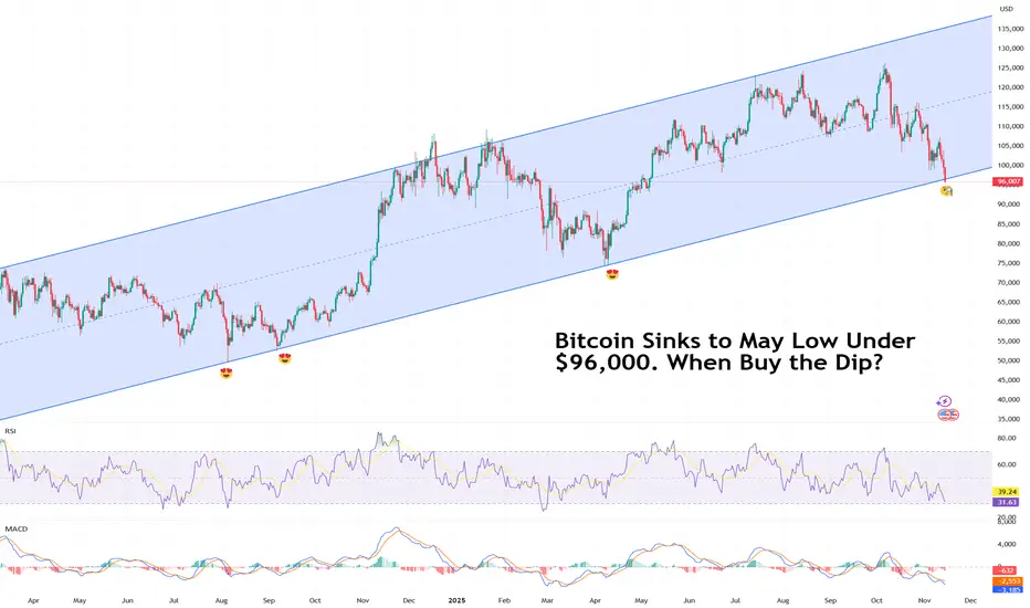
Bitcoin Sinks to May Low Under $96,000. When Buy the Dip?Because sometimes the dip just keeps on dipping.
Bitcoin BITSTAMP:BTCUSD can’t seem to catch a break. The flagship crypto slid below $96,000 on Friday, a level last seen in May, and traders aren’t exactly rushing to buy the dip.
The decline caps a tough few weeks for the OG coin, now lower by about 24% from its record high of $126,000 .
The selloff hasn’t been contained to just Bitcoin. The whole crypto market has been slammed.
Ethereum BITSTAMP:ETHUSD stumbled into the low $3,100s, while Solana COINBASE:SOLUSD fell to the mid-$140s. The entire digital asset space looks winded, and this time, the usual quick rebounders and sharpshooters are sitting on their hands.
What’s going on? In short — traders are nervous, the data floodgates are about to open, and the Federal Reserve isn’t giving anyone the all-clear just yet.
🧨 Buy Dip or Wait for Data?
The end of the US government shutdown should’ve been good news — until investors remembered what comes next.
All the pent-up economic reports that couldn’t be released during the freeze are about to hit the tape: jobs data, inflation numbers, and other key reads that could shape the Fed’s next move.
The bad news: December rate cut isn’t guaranteed. Markets had been leaning heavily on that expectation to justify the monthslong risk-on rally. Now, with the data torrents about to test that narrative, traders are hedging their bets — and Bitcoin’s getting caught in the crossfire.
If the upcoming reports show the economy is still running hot, the Fed might delay cuts. And higher-for-longer rates are basically kryptonite for speculative assets.
💀 Liquidations and Leverage: A Familiar Story
Bitcoin’s latest slump wasn’t just about macro nerves — it was also a good old-fashioned liquidation cascade.
As prices dipped under key technical levels, margin traders got squeezed out in a hurry. According to data from liquidation trackers, over $220 million in crypto positions were wiped out in just one hour. In the past 24 hours? North of $600 million gone.
In previous dips, you’d see traders rushing to scoop up discounted coins, confident that the bounce would follow. The hesitation this time speaks volumes: sentiment’s shifting, and traders are more cautious after months of euphoric rallies in both AI stocks and crypto.
🌡️ The Contagion Spreads
Crypto weakness isn’t isolated anymore — it’s part of a bigger story. Risk assets everywhere are under pressure. The AI trade is cooling, tech stocks are wobbling , and volatility is creeping back into markets that had gone eerily calm.
In short, when traders start treating crypto like a growth stock proxy, Bitcoin stops being a hedge and starts acting like the Nasdaq on leverage.
🪙 So… When to Buy the Dip?
That’s the million-satoshi question. Historically, deep Bitcoin drawdowns during otherwise healthy macro backdrops have rewarded patience. But this time, the setup’s trickier. The next few weeks should bring a barrage of data that could redefine everything from rate expectations to risk appetite.
What can you do now? Watch the data, respect the trend, and don’t fight momentum.
Notice how the long-term upside swing on the daily is still there. But as they say, past performance isn't an indication of future results.
The Fed’s next move, coming early December, will likely decide if this dip becomes a real buying opportunity.
Off to you : Are you looking to buy the dip or you’re waiting for the dip of the dip? Share your strategy in the comments!
Seeing What Price Alone Can’t Show: The Power of Volume ProfileElements of a Volume Profile
The Volume Profile is a powerful charting tool that shows how trading volume is distributed across different price levels.
While normal volume bars appear below the chart showing activity per candle, the Volume Profile appears horizontally on the price scale, showing where most buying and selling took place.
It helps traders understand which price levels attracted the most interest, and where the market might find support or resistance in the future.
Price and Volume Relationship
The core idea of a Volume Profile is that price levels with high volume indicate fair value zones, where both buyers and sellers agree on a price.
On the other hand, low-volume areas indicate rejection zones, where price moved quickly because there was little interest to trade there.
Value Area (VA)
This is one of the most important parts of the profile.
The Value Area represents the range of price where approximately 70% of total trading volume occurred during a selected period.
Value Area High (VAH): The upper boundary of the value area.
→ Above this level, price is considered expensive or overvalued.
Value Area Low (VAL): The lower boundary of the value area.
→ Below this level, price is considered cheap or undervalued.
When price sustains out of the value area, it often indicates that new momentum or trend activity is beginning.
Point of Control (POC)
The POC is the price level with the highest traded volume within the profile.
It represents the price where the market spent the most time and volume. The level often acts as a magnet for future price movements.
Traders watch this level closely as it often becomes a strong support or resistance zone.
High Volume Nodes (HVN)
These are thick areas on the Volume Profile, showing where the market traded heavily (less than POC)
They indicate acceptance zones that is, the price levels where many transactions happened because buyers and sellers agreed on value.
When price returns to an HVN, it often pauses or consolidates before choosing direction again
Low Volume Nodes (LVN)
These are thin or narrow areas on the profile where very little trading occurred.
They mark rejection zones that is, the areas where price moved quickly without much interest.
When price approaches an LVN, it often moves rapidly through it again, because there is less resistance.
Profile Shapes
The overall shape of the Volume Profile also tells a story about market behavior:
D-shaped Profile: Balanced market - fair value established (typical during consolidation).
P-shaped Profile: Short-covering rally - bullish bias
b-shaped Profile: Long liquidation - bearish bias
Double Distribution: Two separate areas of interest - potential trend continuation.
For more on Volume Profile shapes refer
Key Takeaways
The Volume Profile helps traders see where the market traded most heavily at each price level.
Key elements such as the Value Area, POC, High and Low Volume Nodes, and profile shape reveal how the market perceives value and interest.
Understanding these elements helps traders identify strong support/resistance zones, potential breakout areas, and market balance or imbalance situations.
Do you use Volume Profile in your trading? Share your thoughts in the comments below!

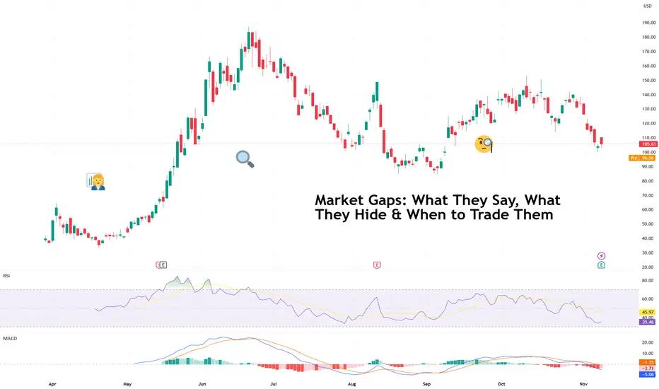
Market Gaps: What They Say, What They Hide & When to Trade ThemIt’s 9:30 a.m. You sip your coffee, glance at the chart, and there it is. Your stock has leapt several dollars higher (or lower), skipping right over the previous day’s closing price.
Welcome to the world of market gaps — those mysterious spaces between yesterday’s close and today’s open that make traders question both their strategy and their life choices.
A market gap isn’t a missing candle but the story of what happened while you were sleeping (or ignoring the news). It’s the sum of after-hours trades, global market sentiment, overnight earnings, and sometimes a rogue tweet.
The question is: should you trade them — or stay far, far away?
🌍 Why Gaps Happen
Gaps exist because markets never really sleep. When one exchange closes, another is already open somewhere else, digesting the same news through a different timezone. Add in pre-market trading, futures markets, and weekend surprises, and you get an ecosystem where prices constantly readjust (even when you can’t click “Buy”).
Most gaps fall into one of three categories:
Breakaway gaps – when new information changes everything (earnings beats, mergers, surprise rate cuts).
Runaway gaps – the “momentum monsters” that happen mid-trend when traders can’t get enough.
Exhaustion gaps – the final gasp before a reversal, when optimism or panic reaches peak saturation.
Understanding which one you’re looking at is half the battle. The other half? Not taking the bait too early.
💥 What Gaps Reveal (and Conceal)
We’re in the earnings season now so it’s pretty normal to spot a gap on the charts.
A gap higher often signals optimism: strong earnings, bullish guidance, or a macro tailwind. But it can also mean traders are front-running euphoria — piling in before the market can catch its breath.
Similarly, a gap lower screams heavy selling, but sometimes it’s just overreaction dressed as disaster. Take for example the recent showing from CoreWeave NASDAQ:CRWV . The neocloud beat on both top- and bottom-line expectations. And yet, the stock fell 8% in after-hours .
Typically, if prices hold above or below the gap for several hours or sessions, that’s confirmation that traders are validating the move. But if it’s filled quickly (the price retraces back to the previous close), it means the reaction faded faster than your New Year’s resolution.
🕳️ The Weekend Trap
Weekend gaps deserve their own warning label. Markets close Friday afternoon, and by Monday, the world’s had 48 hours to produce headlines, scandals, or White House drama.
If you hold high-risk positions over the weekend, you’re effectively saying, “I’m okay with the market repricing everything I own before I wake up Monday.” Sometimes that works — you wake up richer. Sometimes it doesn’t — and your stop-loss never had a chance.
Fast fact : Stop losses don’t work during a gap because the price jumps over your stop level — there’s no trading in between, so your order can only trigger at the next available price, often far worse than expected.
🧭 How (and When) to Trade Gaps
So how do pros handle them? Like most things in trading — with patience, context, and a healthy respect for traps.
Wait for confirmation . Don’t chase the open. See if volume supports the gap or if it’s just knee-jerk volatility.
Look left . Check past support/resistance levels — gaps tend to gravitate toward old battle zones.
Mind the news . If the gap is driven by an actual event (earnings, guidance, policy change), the odds of it holding improve. Make sure to stay on top of market-moving news .
Avoid FOMO . The first 15 minutes of trading are often chaos. Let the emotional traders clear out before you step in.
Remember the fill rule . When in doubt, assume gravity wins eventually — most gaps don’t stay open forever.
🔮 What Gaps Really Mean
Gaps are the market’s way of saying, “Something happened — pay attention.” They’re emotional, fast-moving, and occasionally misleading. But they also reveal where sentiment can truly shift — the moments when traders collectively decide that yesterday’s price was wrong.
Handled well, gaps can offer some of the cleanest trades on the chart. Handled poorly, they’re an expensive lesson in humility.
So the next time you wake up to a market that’s sprinted ahead, take a breath. The space between two candles isn’t a void. It’s a story. Read it before you react.
Off to you : How do you handle gaps? Share your approach to these market events in the comments!
When Arctic Storm Meets Government ShutdownNYMEX: Micro Henry Hub Natural Gas Futures ( NYMEX:MNG1! )
A “Perfect Storm” is brewing by weather catastrophe and man-made events.
On Thursday, November 6th, forecaster Atmospheric G2 said that it predicted colder than normal weather over the Eastern US for November 11-15. Driven by the expectations that record low temperatures will boost heating demand for natural gas, NYMEX Henry Hub natural gas futures ( AMEX:NG ) moved sharply higher.
The lead December contract (NGZ5) hit a daily high of $4.42 per MMBtu, up 18 cents (+5%) from the prior day. The contract settled at $4.357, up 12.5 cents or +2.95%. Total daily volume for all NG contract months reached 590,250 lots, an increase of 118,770 from the prior day. Total Open Interest was 1,556,062 contracts.
Then, just a day later, Atmospheric G2 put out another forecast. It said that warmer-than-normal temperatures are expected in the western two-thirds of the US for November 12-16 and are expected to remain above-normal for November 17-21. NGZ5 closed at $4.315 on Friday, down 0.96%. Another bearish factor came from Baker Hughes, which reported a 2.25-year high in the number of active US natural gas rigs.
On Sunday night, as the early winter blast begins to hit the ground, natural gas futures market opens for the week up 3.3% at $4.447. NGZ5 pulled back on Monday and is currently trading at $4.375. Shall we say, “Buy the rumor, Sell the fact”?
The news of a massive arctic storm moving the market is nothing new. During the past winter, on December 29, 2024, the Weather Co. and Atmospheric G2 released a weather forecast showing colder temperature in the East. When the futures market opened the next day, Henry Hub futures prices surged 20%, hitting a new 52-week high of $4.20. My write-up on January 6, 2025, explored how to trade the weather.
The Polar Vortex is expected to bring record amount of snow in the Great Lakes. Chicago and South Bend could see up to 12 inches of snow within 24 hours, due to the infamous “Lake Effect”. Florida and the Panhandle area could see temperature dropping from the 60s (Fahrenheit) to the mid-20s by Tuesday.
What stands out about this winter blast is its timing, happening very early in the season. Comparing to last winter, the first major snowstorm came in mid-January.
The winter storm threatens to bring air travel to a standstill. The impact will compound as the 40-day-long US government shutdown already reduced air flight capacity by 10%, causing massive cancellations and delays.
In the latest news, the US Senate may have reached a deal to end the government shutdown. Hopefully, it will happen in time ahead of Thanksgiving, the busiest travel season in the U.S.
The ideal instrument Trading the Weather
Natural gas is a leading energy source. The U.S. Energy Information Administration (EIA) estimates U.S. electricity production at 4.18 trillion kilowatt-hours in 2023.
• About 43.1% of the electricity was generated by natural gas.
• Nuclear power contributed to 18.6%, while coal had a 16.2% share.
• Renewables accounted for a 21.4% share, including 10.2% from Wind, 5.7% from Hydro, and 3.9% from Solar.
Electricity is hard to store, while its demand is highly unpredictable. Unforeseen changes in power demand could send shock waves into the market. In winter months, weather conditions have the biggest impact in natural gas demand.
In addition to power generation, the biggest natural gas usage is for heating homes, factories and commercial offices. According to the EIA data, 48% of US households use natural gas for space heating, water heating and cooking.
The heating consumption varies by season and by region, while the biggest contributing factor is temperature. As long-range weather forecasts are extremely difficult, natural gas prices are highly reactive to news of upcoming winter storms.
Heating Degree Day (HDD) is the number of days in a month where the average daily temperature is below 68 degrees Fahrenheit. Energy traders deploy HDD analysis and weather forecast models to predict temperature trends, electricity demand and subsequent natural gas use.
Trading with Micro Henry Hub Futures
Micro Henry Hub natural gas futures (MNG) offer smaller-sized versions of CME Group’s liquid benchmark Henry Hub futures (NG) contracts. The Micro futures have a contract size of 1,000 MMBtu, which is 1/10th of the standard contract.
The Micro contracts allow traders to control a large contract value with a small amount of capital to take advantage of significant margin offsets.
With Monday evening quote of 4.375, each December 2025 contract (MNGZ5) has a notional value of $4,375. Buying or selling one contract requires an initial margin of $367. The next lead contract, January 2026 (MNGF6), is currently quoting at 4.601, for a notional value of $4,601. The initial margin is $354.
Since hitting the 52-week low of $3.62, MNGZ5 has gone up 20%. Meanwhile, MNGF6 is down 25% from its 52-week high reached in March 2025.
As we have seen in the past, unpredictable weather events could send large shocks to natural gas prices. We have recognized the pattern of weather forecasts driving futures prices up, and then the prices trending back down in the midst of the storm. In my opinion, if we see another major winter storm coming in December, MNGF6 has the potential to move much higher.
With Micro Henry Hub contracts, traders could potentially realize sizable gains with a small capital requirement. For MNGF6, traders enjoy a built-in leverage of 13:1 (= 4601/354).
Hypothetically, if MNGF6 moves up 5% to $4.831 with lower temperature forecasts, the 0.23 price gain would translate into $230 for a long futures position, given the contract size at 1,000 MMBtu. Using the initial margin of $354 as a cost base, the trade would produce a theoretical return of 65.0% (=230/354).
The long futures position would lose money if natural gas prices moved lower. Traders could set up a stop loss to hedge the downside risk when entering the long futures order.
Happy Trading.
Disclaimers
*Trade ideas cited above are for illustration only, as an integral part of a case study to demonstrate the fundamental concepts in risk management under the market scenarios being discussed. They shall not be construed as investment recommendations or advice. Nor are they used to promote any specific products, or services.
CME Real-time Market Data help identify trading set-ups and express my market views. If you have futures in your trading portfolio, you can check out on CME Group data plans available that suit your trading needs www.tradingview.com
