long term bond yields still bear, but go toward bottomim in favor of smashind long term bond yield curve, and inverting the front years more for obvious reasons, namely boj inflation/interest rate planning for example. the bottom is obviously not here for TLT, but i would look towards these boxes in this order.
Inversion

Yield curve inversion, CPI, GDP and DOWHistorically, an inverted yield curve has been viewed as an indicator of a pending economic recession; hence the inversion of the yield curve might be perceived as a leading indicator.
Once the yield curve is inverted, it may be several months before we see GPD contracting; and it is not guaranteed that we will see a sharp drop in GDP.
First pane: You can see the development of GDP and the associated development of the Dow Jones Index (log-scale). The area below you shows the US 10-year/2-year yield (bubbles indicate a yield curve inversion). As you can see, it might be some time before we see a GDP contraction after the yield curve inverts.
The last area shows the core CPI that drove the Fed and expected higher dot plot medians in December. Nonetheless, recent data suggests that the core CPI may have peaked (to be confirmed).

There is no bottom in the stock without a bottom in the bond
My Dashboard on Tradingview
www.tradingview.com
where I am monitoring the entire bond market in the world with my magma indicator, country by country.
When investing for the long term I first look the bond market before leaping in the stocks.
There are few simple and important rules to follow in this market.
1. Higher Bond yields = Lower Bond Prices = Bottom in the bond market is more bottom
2. Short-mid term bond yields is closing to long-term yields (example 2-Years yield = 10-Years yield) = This means flattening = not good for long-term investment, stay alerting for your paper profits.
3. Short-mid term bond yields is greater than long-term yields (example 2-Years yield is greater than 10-Years yield) = This means inversion = not good, imminent fear of recession (remember: stock market does not perform well during recessions)
4. Short-mid-term bond yields is less than long-term yields (example 2-Years yield is less than 10-Years yield and going lower) = That's fine, economics sounds good for long-term investments
What I see now: United States, Canada, Brazil are countries with the most prolongated inversion areas (highlighted with red circles in the figure above).
5. More prolongated inversion = not good, even more.
Flattening areas (yellow circles) have to be carefully monitored.
Few examples currently are showing good news (green circles) : Japan long-term and mid-term yield curves are fine and in the good direction. Same as in Australia.

10yr -3m Inverted Yields VS. Stock market bottom recession Using a 10yr -3m Inverted Yields VS. Stock market bottom recession. June 2025 is when the market will start to improve if history repeats itself.

10yr-2yr Inversion VS Stock market bottomThe last two times of market recessions, Dotcom and the Great Recession both times the stock market did not hit bottom until 3yrs after the inversion happened.
Meaning we are only 129 days into this one. I would take advantage of this current rally and not get overly long on positions, but sell out of positions into strength.
The FED has made it clear there will be more pain ahead, and they will only strengthen their resolve next meeting.
Either way, a .50 basis or a .75 move is on the table stocks will not bottom until the inversion starts to un-invert, as proven in the past.

Buy 10 Sell 2 Year Rates (pairs trade)Small exchange
Buy 10 year & short 2 year and wait for yield curve to go back to a normal curve where 2 year yield is lower than the 10 year.

**Update** $BTC #Bitcoin Inversion Curve ✅ (1W Chart)This is an update on a previous chart, showing the logarithmic regression of $BTC. So far, it seems to actually be holding up pretty strongly with a strong holding of support around $17.5K as expected, were this theory to play out correctly. For anyone who's unfamiliar with my theory, it's that the slow regression of $BTC returns will actually invert, creating a rare "s-curve" formation. Plotting the regression curve, using both the exact highs and the exact lows, you can see that the curves will meet sometime in 2026. This shows that one of those regression curves will need to be broken in order to continue price movement. IMO, there are 2 options here. Either $BTC truly is a bubble and crashes down to nothing (not my belief), or the upper regression curve is broken. In the case of the upper regression curve being broken, this would possibly invert the curve and ~13 years of price suppression will be lifted. This could lead to an insanely strong, fast rally, far above the $100K milestone/dream every investor has these days. To plot this inversion, I have used the exact lows following the 2017-2018 blow-off-top, as this is when the majority of mainstream adoption seems to have occurred. As of today this "inversion-curve" has supported a new low of $17,592.78. A close below $18,400 would possibly invalidate this curve, however. I personally believe the overall theory to be correct, however the exact "inversion-curve" that could be charted out may be subjective.
*This is based off of my interpretation of chart data. This is not financial advice.*

⚠️⚠️ ✔️ OR ❌️ ? Is it the bottom for #bitcoin? ⚠️⚠️Building on my previous $BTC logarithmic regression chart, there has now been an almost perfect bounce off of the yellow, dotted, inversion-curve line. This coincides with daily, weekly and monthly RSI's being at extremely oversold levels with the 4hr RSI moving down into oversold territory. Personally, all my limit orders were hit perfectly so it seems I may have at least bought "A" bottom here. This abrupt price drop also has now created a broadening edge pattern, which typically will break to the upside when formed at the bottom of a downtrend. All of these confluences may just spell the final bottom price for $BTC in the short term and validate my "inversion-curve" theory. Of course this can still be invalidated by a close below the inversion-curve line. If that occurs, I would still believe an inversion could be possible, but over a much longer time period. In that scenario, my target range for a price bottom would be between $10,770 & $12,694.
#btcinversion #btcbottom
*These are my personal opinions, based on chat data. This is not financial advice.*

Historically LTC Surges, 100% of the time if this Pattern OccursSince the start of 2017, Litecoin's 50 Day SMA average has inverted upwards 12 times. The 12th time is occurring as we speak.
11/12 times this has Chart Pattern occurred, it has been followed to a rise of LTC against BTC. Will this be the 12th repeat?!?
Although this type of pattern recognition, is not my favourite sole type of analysis to use in entering a position. I believe this combined with my other reasoning in previous posts, is further confirmation that we will see the predicted rise in the next few days/weeks.
Hold the Line.

Historically LTC Surges, 100% of the time if this Pattern Occurs>>> LTCUSD note: Since the middle of 2018, Litecoin - USD 50 Day SMA average has inverted upwards 8 times. The 8th time is occurring as we speak
7/8 times this has Chart Pattern occurred, it has been followed to a rise of LTC against USD . Will this be the 8th repeat?!?
>>> LTCBTC note: Since the start of 2017, Litecoin - BTC 50 Day SMA average has inverted upwards 12 times. The 12th time is occurring as we speak.
11/12 times this has Chart Pattern occurred, it has been followed to a rise of LTC against BTC . Will this be the 12th repeat?!?
Although this type of pattern recognition, is not my favourite sole type of analysis to use in entering a position. I believe this combined with my other reasoning in previous posts, is further confirmation that we will see the predicted rise in the next few days/weeks.
Hold the Line.

2's 10's INVERSION - THE TRUTH😲 2's 10's INVERSIO N😲
A journalist's favourite recession indicator, the “2’s 10’s curve” inverted earlier this month… As the story goes, 𝙩𝙝𝙞𝙨 𝙡𝙚𝙖𝙙𝙨 𝙩𝙤 𝙖 𝙧𝙚𝙘𝙚𝙨𝙨𝙞𝙤𝙣 within 12-24months 😲
👉 But this time… it’s different 😅
Here’s the chart -> (FRED-FRED:T10Y2Y)
To clarify, I’m not saying there won’t be a recession, or NSDQ100 crash, in fact it’s a real possibility. But the 2’s 10’s chart is not a good indicator to rely on.
WHAT IS THE YEILD CURVE ⤴
The yield curve is just a curve plotted on a graph of the interest paid on debt.
The X-axis being the duration of the debt (e.g. a 2yr loan and 3yr loan etc.) and the Y-axis being the interest (e.g. 1%, 2%, 3% etc.).
2️⃣ - 2’s is shorthand for the 2 year US Treasury Note (a 2 year loan to the US gov.)
🔟 - 10’s is shorthand for the 10 year US Treasury Note.
🤔 HOW STRANGE
It’s an odd phenomenon that a shorter term loan could pay higher interest than a longer term loan - because why would someone want to lend money for a longer time at a lower interest rate 🤷
But this - otherwise accurate signal for a recession - is no longer credible as a market indicator.
Currently the yield curve is (heavily) distorted, with central banks around the world purchasing their own bonds (treasury notes). On top of that the FED has clearly stated they expect the funding rate to get to about 3% in 2023 - but expects a long term rate of 2.5%. So the FED is indicating intentional inversion.
It’s possible the yield curve could continue flattening or inverting, further fuelling these “recession imminent” articles. It's good to remember a small inversion is not a concern in this case.
There are clear signals of what will trigger a recession, I'll cover those in a future post. (remember to add me to a Watchlist to be notified)
HOW COULD YOU TRADE THIS
You could short the SHY and go long IEF or TLT to take advantage of the curve normalising over time.
In fact, from here, the IEF looks good even without the $SHY short position (saving fees and keeping capital free)

CHAOS AND OPPORTUNITY ARE CLOSE FRIENDSOne thing is certain, market uncertainty is here to stay. A bet to the contrary, IMHO, is a huge longshot.
Ukraine, Russia, China, Mid East, United States and Europe are all in .... re-arrangement ...
Yield Curve has again shown signs of 'flattening . inverting'.
What happens when the markets are uncertain?
Investors are willing to pay more money for options contracts.
I like the S&P to continue into a recess
I like the VIX to stay 'elevated' or 'increase'.
Speculative Play - I am interested in VIX Calls and SPY Puts on a 1 month expiry
Be smart.
Will

SHORT NZDJPYNZDJPY has shown lowering strength on the uptrend, which indicates good probability for temporary inversion. We will use to short the pair after breakout of 76.57 level.
The position will be managed with SL above yesterday highs and partial closing on 3 target levels
TP1: 79.15
TP2: 78.45
TP3: 77.81

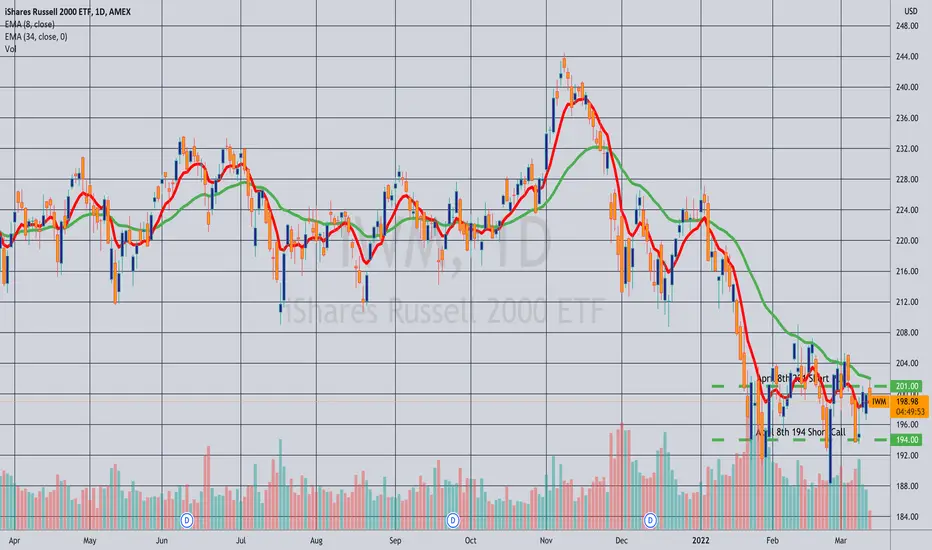
Closing: IWM April 8th 194C/201C Short Stranglefor an 18.11 debit.
Comments: Collected a total of 19.75 in credits with this little fella, which started out as a 201 short straddle that I inverted defensively. (See Post Below). Closing out here for a 1.64 ($164) profit.
short NZDJPYSell stop on NZDJPY at 78.50, after the head and shooulder formation, where we aim to an inversion of the trend.
SL: 79.13 above today highs
TP: 77.50

Bulls are really back on BTC?Good weekend everyone,
If you follow BTC with the Kijun Trend Indicator you have noticed a major breakout in the price in the last few days.
Yesterday the indicator confirmed the long signal after a few days of consolidation.
This could be an indication of a trend reversal, please monitor it and pay attention to the shadows.
Thanks for your attention, happy to support the TradingView community.

Bulls are really back on BTC?Good weekend everyone,
If you follow BTC with the Kijun Trend Indicator you noticed an important breakout of the price.
This can be already a long signal, but the indicator is waiting for additional confirmation of the trend inversion that can take at least two days.
Please monitor it and pay attention to the shadows.
Thanks for your attention, happy to support the TradingView community.

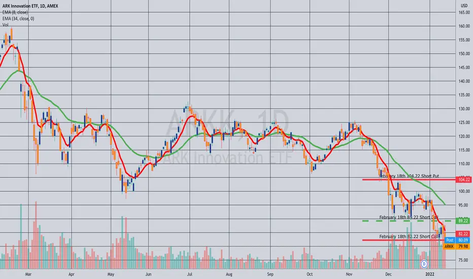
Rolled: ARKK February 18th 82.22C/104.22P to March 18th... 81.22C/103.22P for a 1.25 credit.
Comments: Rolling this out a touch early due to lack of extrinsic in the short put, which ostensibly increases assignment risk. I improved the short put by a strike, but kept the inversion the same -- a 22 wide for which I've collected 19.50 (See Post Below) plus 1.25 or 20.75, with my resulting cost basis in any stock I might be assigned via the short put 103.22 - 20.75 or 82.47 relative to where it closed today at 75.87. I prefer working these inversions to a point where either I can scratch them out or where taking assignment would be at "something close" (a relative term) to where the stock is currently trading. That way I'm not starting out working a covered call way under water such that selling calls against at or above my cost basis wouldn't be productive.
Naturally, there's a point where you ask yourself whether you've mitigated enough loss such that you can comfortably take the hit, free up the buying power for something more productive and then move on.

Another monumental momentNote: FEEVRWS is only meant to be a analysis and early warning system, and is in no way a substitute for your regular work. Please do your own due diligence and if needed, consult a trusted professional.
Before I get into this I urge everyone who sees this chart to back track to the .com bubble on this chart, then move up to 08, then check out pre lock downs.
With that out of the way, lets get into the FEEVR Analysis!
As mentioned above you should look at the historical data provided on this bonds chart. Today and over the weekend we saw the 30yr-20yr invert. This is bad for a number of reasons but mostly having to do with debt and inflation. as stated previously, the inversion marks the start of what can only be assumed as a flee from 'safe haven assets'. This is bad because bonds as a percent, tightening, has historically preluded some of the biggest economic and market wide black swans. Looking at the bond market it is repeating this trend and only seems to be starting which would make me assume through an educated guess that we are about 1 1/2 to 2yrs out from another major black swan, market altering event. Please, please, please be careful. We can time this and there is sure to be lots of money made during this time, just DONT be the last one to the exit.
I am currently working on a analysis on the Comms sector of the S&P. That will be out tomorrow. Ic alle dit, telecommunications is rocking and internet is failing. I have identified manipulation in this sector on RRG and now I am just trying to nail it down on the charts here for you all to see.
Happy monday everyone!

Rolled: ARKK February 18th 89.22 Short Call to 82.22... for a 2.51 credit.
Comments: More defense as this underlying continues to implode. Total credits collected of 16.99 (See Post Below) plus the 2.51 here equals 19.50. The resulting inversion is, unfortunately, 22 strikes wide -- 2.50 greater than the total of credits I've collected. This means that I won't be able to scratch it out during this cycle regardless of what happens with price, but will have to roll out for duration if I want to attempt to do that until I've collected more credits than the width of the inversion. Alternatively, I can consider taking the loss and moving on, but the best case loss scenario at the moment is a 2.50 loss (assuming price moves back between the strikes).
Avery clear signelHello!
I have been away for over a year now. I'm sorry for my absence. I have been working on a new business venture. I now have more time on my hands to produce charts again! With that said.
We are facing here a very clear inversion in bonds as the bond market sees buying and selling. Keep an eye on that as the market is pricing in a rate hike in my honest opinion.

Nearly doneThe dominance chart is one of my favourite charts because it pretty much dictates where all the alts are going. BTC has had an AMAZING run since last December, and now its time for alts and BTC to dip. The support level that is tapping and has yet to hit (should hit in the next couple of days or so) is the same of 2018, The second tap usually signal an inversion of the dominance trend, and makes alts bleed.
At the moment BTC has broken the 9 and 21 EMA lines is testing the 50 EMA on the daily time frame, and should be retesting the 200 EMA support on the 4h chart. If the dominance increases in confluence with the BTC dip, it will make last dip look like a walk in the park. Also September is usually a bad month for crypto.
In my opinion we should have one last pump and then we are done with the bulls until the next halving as markets should resume the dip for the next couple of years or so.
So my prediction is short term is Bullish for the next couple of day, long term Bearish.
