Chart Patterns ranked by reliability (1-8)Chart Patterns as a Strategy (Not a System)
In the world of technical analysis, chart patterns are often marketed as stand-alone trading systems. In reality, their real edge comes from probabilistic structure recognition, not prediction.
The key insight from my large-sample testing (10 years, 200,000+ patterns (Futures, FX)) is this:
Patterns don’t predict direction — they quantify structural bias once price has already revealed intent.
That distinction is what separates profitable traders from pattern collectors.
How These Patterns Were Tested (Why the Stats Matter)
All patterns discussed below were:
Only counted once fully completed
Required confirmed breaks of structure (trendline, neckline, or support/resistance)
Measured using objective projection rules, not discretionary targets
TP Rule: Full Head and Shoulder Height, using the Head distance and the right shoulder as the SL.
Full Height of triangles, and a full height for flags as well.
Twice the height of the Channel as TP, and Time TP for Channels, for half of the duration of the it.
Rectangles were Full Box Width as TP, and a time-based TP of 1/4 the Length.
It could be trailed further, but some such as Rectangle TP made great mean-reversion trade.
This removes hindsight bias — a major flaw in most pattern discussions.
Continuation Patterns (Trend Context Is Mandatory).
#8. Bull & Bear Flags (~67%) (Alt. Name: Cups, Volatility Contraction Pattern)
Occur after near-vertical impulse moves, typically the 50 EMA can filter the direction.
Represent temporary pauses, not reversals.
Best when:
Flag is tight
Forms near the extreme of the impulse
Volume contracts during consolidation
Professional takeaway:
Flags are trend health checks, not entries. If a flag fails, momentum is likely exhausted.
#7. Ascending & Descending Triangles (~73%)
Market compresses against a hard level
One side shows aggression, the other absorption
Breakout confirms institutional imbalance
Use them to answer:
“Is price being accumulated or distributed?”
#6. Ascending & Descending Channels (~73%) (Alt. Name: Cups & Handle)
Wide consolidations between parallel trendlines
Stronger than flags due to time + participation
Breakouts often lead to measured trend continuation
Key insight:
Channels are delayed continuation, not indecision.
Reversal Patterns (Confirmation Is Everything)
The Joker: Double Tops & Bottoms (75–79%)
Require structural failure
Completion only occurs after neckline break
Bottoms outperform tops statistically (markets rise faster than they fall)
⚠️ Common mistake:
Anticipating the second top/bottom instead of waiting for confirmation.
The Queen: Triple Tops & Bottoms (77–79%)
Stronger due to repeated rejection
Represent exhaustion of dominant participants
Interpretation:
The market tried three times — and failed.
The King: Rectangle Patterns (~78–80%)
Flat consolidation after a trend, more than 3 touches top and bottom.
Essentially failed reversal attempts.
Breakouts often trap traders positioned against the trend, it's best to enter on retest of breakout or earlier at the Bear-Bull Midline of the Box.
Critical lesson:
Most “double tops” fail — and turn into rectangles.
The Ace: Head & Shoulders (~83%)
Why it works so well:
Clear distribution → failure → confirmation
Captures institutional exit mechanics
Neckline break aligns with order-flow imbalance
Both regular and inverted versions are the most reliable classical patterns when properly confirmed.
⚠️ Common mistake: It's easy to mistake a Head and Shoulders with another pattern like a Double or Triple Bottom if it's neckline is not broken well.
The Trap Pattern: Pennants (~55%)
Despite being taught alongside flags:
Pennants break against trend too often
Over-compression increases randomness
Lack clear structural dominance, Pivot HL are spots where trader's should sell.
Professional rule:
If it looks too tight, it’s probably a coin flip.
It's better to target Equal High and Lows to the left as TP.
How Professionals Actually Use Chart Patterns
We don’t trade patterns — we trade what they imply.
Patterns help answer:
Is the market accepting or rejecting price?
Are participants trapped or in control?
Is this continuation, transition, or reversal?
They work best when combined with:
Market structure (HH/HL, LH/LL)
Time-of-day context
Volume or order-flow
Higher-timeframe bias
Final Truth About Pattern Accuracy
Pattern Type Role Best Use
Flags / Channels Continuation Trend validation
Triangles Pressure build Breakout bias
Double / Triple Reversal Failure detection
Rectangles Continuation Trap identification
Head & Shoulders Reversal Distribution confirmation
Pennants ❌ Avoid
S&P 500 Index
No trades
Market insights

Stocks Shake as Prosecutors Go After Fed Boss Powell. Now What?Wall Street went into the weekend riding record highs — and came back to something that felt more like a political thriller than a macro update.
US stock futures slipped after news broke that the Department of Justice has opened a criminal investigation into Federal Reserve Chair Jerome Powell, sharply escalating President Donald Trump’s long-running standoff with the central bank.
Early Monday morning, Dow DJ:DJI futures fell 200 points , while S&P 500 futures SP:SPX dropped 0.5% and Nasdaq NASDAQ:IXIC futures slid as much as 1% as traders trimmed risk and tried to digest a scenario that few had on their morning to-do list: the Fed chair facing potential indictment.
It’s not every Monday you wake up wondering whether the world’s most powerful central banker might be spending more time with lawyers than economists.
🎥 Powell Goes on Camera — and Draws a Line
In an unusual move for a Fed Chair, Powell took to video Sunday evening to confirm that federal prosecutors had issued grand jury subpoenas and were weighing criminal charges related to his June testimony before the Senate Banking Committee about the $2.5 billion renovation of the Fed’s headquarters.
Powell didn’t mince words. “This is not about the renovation,” he said.
“This is about whether the Fed will be able to continue to set interest rates based on evidence and economic conditions — or whether monetary policy will be directed by political pressure.” Powell’s term is set to expire in May.
🐴 Trump Enters, Stage Right
President Trump denied any involvement in the probe — but didn’t miss the chance to throw a few verbal jabs.
“I don’t know anything about it,” he told NBC News. “But he’s certainly not very good at the Fed, and he’s not very good at building buildings.”
This comes after months of Trump calling Powell a “stubborn mule” and a “major loser” for refusing to slash interest rates faster.
Markets are now left to navigate a delicate question: What happens when a sitting Fed chair is legally threatened by a White House that wants lower rates?
🏅 Gold Does What Gold Does Best
The answer, at least initially, was written in shiny metal.
Gold OANDA:XAUUSD surged to a record $4,600 per ounce in Asia, up as much as 2%, before settling slightly lower. Bullion tends to pop when central bank independence appears under threat, and this episode checks that box in bold red ink.
When traders worry that politics might start steering monetary policy, they reach for the oldest hedge in the book.
📈 Stocks Were at Record Highs
The irony here is that this political drama arrives at a time when markets have been in remarkably good shape.
The S&P 500 and Dow Jones both closed Friday at all-time highs, capping a winning week. The S&P gained more than 1%, while the Dow and Nasdaq posted even stronger gains.
Throughout 2025, markets largely ignored Trump’s attempts to jawbone the Fed as Powell cut rates three times anyway. Inflation stabilized. Growth held up. Investors shrugged and kept buying.
🧭 Why This Matters More Than One Man
If investors start to believe that US monetary policy could be influenced by political threats, the risk premium on everything from Treasuries to tech stocks shifts.
That’s why gold jumped. That’s why futures dipped. And that’s why forex markets are quietly paying attention with the US dollar on the defensive.
A politicized central bank is a different animal — and not one markets are used to feeding.
📊 Meanwhile, Earnings
Amid all the legal and political noise, something very normal is about to happen: earnings season kicks off this week.
JPMorgan NYSE:JPM , Bank of America NYSE:BA , Morgan Stanley NYSE:MS , and Goldman Sachs NYSE:GS are all set to report, offering the first hard look at consumer spending, deal flow, and trading activity for the past quarter.
Those results may do more to stabilize or unsettle markets than any headline. If the banks deliver solid numbers, investors may decide that politics is background noise — unless there’s a new escalation.
🧠 The Takeaway
Powell’s legal drama has introduced a new variable into an otherwise optimistic setup: strong earnings, falling inflation, and record-high stocks are joined by a political spectacle.
Whether this becomes a lasting shock or a brief tremor depends on how the story evolves. Traders right now are doing what they always do in moments like this: trimming risk, buying a little protection, and waiting for clarity.
Off to you : Where do you see this whole thing headed? Share your views in the comments!

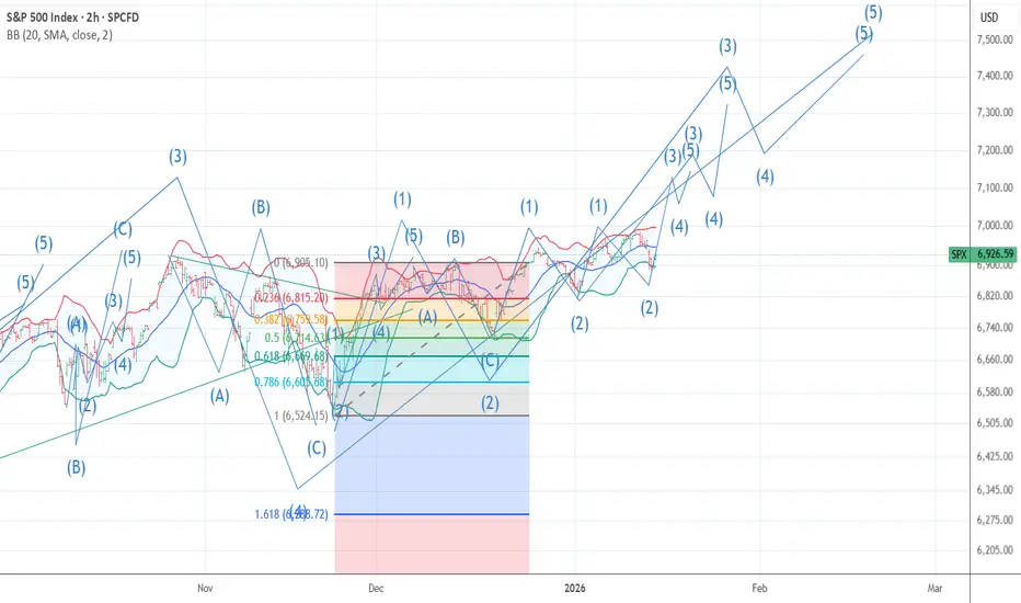
I am now 90 % short 6984 Wave 5 looks doneThe chart posted is the cash sp 500 I had hoped to see 7031 but as i have stated for a few weeks the high should be from 6954 to 7031 there is a great deal of math at 6984 I have labeled the rally as DONE best of trades WAVETIMER

Hellena | SPX500 (4H): LONG to resistance area of 7050.Colleagues, the upward movement is not yet complete and remains a priority, but there is one caveat. The completion of the medium-term wave “1” (blue) is quite difficult to predict, as the junior wave ‘3’ may turn out to be wave “5”, since the structure resembles an initial diagonal. However, this does not negate the plan to continue the upward movement, even if there is a deep correction.
At the moment, I expect the resistance area of 7050 to be reached, as I would prefer to give a forecast for the nearest levels now.
Manage your capital correctly and competently! Only enter trades based on reliable patterns!

THE BULLISH ALT WAVE COUNT FORM ONLY This is the Bullish alt wave count I am ONLY posting it And have major doubt But would be happening if we were to get above 7188 The reason I have little faith in this is a model I have back tested by to 1902 using the DJI it has 13 signals and it was 100 % I post the signal on X
SPX Short: We are at the PEAK! STOP above 7050!Over in this video analysis, I spent almost 20 minutes to talk about the wave structure, the Fibonacci relationships, the fractal relationships between different waves, how to short, and also warns about "What-if-I'm-wrong" scenario.
What I missed to mention in the video is that for now, we still do not have any extensions in our waves 5 (Cycle and Primary). NOT that there MUST be an extension, but it is something to keep it mind for the alternate count of a series of 1s and 2s, leading to a compounded wave 3.
Remember that the most important part of this video, which I mentioned at the end, is the ending diagonal invalidation price: 7049.65. A stop MUST be place above this price. For easier remembering, above 7050.
Good luck!

Rising Wedge Pattern S&P 500There is clear a Rising Wedge Pattern formed on S&P 500 4h chart .
There was even a retracement from all-time highs of 6979 back inside the wedge before the weekend.
My suggested SL is 7030-7050 and TP 6500-6550 for the short-to-mid term.
On a larger scale, there is also a huge channel that we are testing the top of right now:
Going all the way back to 2008..
It could easily end up like this:
So for longer term I can see 6100, 5500, 5000 and if recession hits than even 3500.
There has never been such a major Fed hiking and cutting cycle that did not eventually cause a recession. Also, the labor market is weaker than the headline numbers make it seem. Lots of massive downward revisions on NFP. Even the unemployment number is growing slowly, mostly because Labor Force Participation is dropping. If we account for that, then the real unemployment rate is more like 5.5%.
Here are some more examples of rising wedges going back to the pandemic:

S&P500 This tight squeeze can trigger a massive 2026 correction.The S&P500 (SPX) made a new All Time High (ATH) touching yet again the Higher Highs trend-line of last October (2025). This is the same chart we first published last week only this time on the 1D time-frame. The reason is that, with the 1D MA100 (green trend-line) rising fast, it creates a tight squeeze with this Higher Highs trend-line.
Whatever level breaks first, that will give the next long-term trend for 2026. The very same pattern in 2021 though, broke the 1D MA100 first, initiating essentially the 2022 Bear Cycle. A strong, long-term correction that only stopped when it found bottom on the 1W MA200 (orange trend-line).
As mentioned last week, the similarities are there. Massive 1W RSI Lower Highs Bearish Divergence against the price's actual Higher Highs, create the same squeeze. If the 1D MA100 breaks, the market may face the reality of triggering a new Bear Cycle for 2026.
If that's the case, the potential long-term Buy Zone will be within 5350 - 5050, which is the expected contact with the 1W MA200 and a projected -27.63% decline, if the 2026 Bear Cycle replicates exactly 2022. Also, when the 1W RSI gets Oversold (30.00 and lower), it is generally a solid level for long-term investors to start buying again. A Higher Lows trend-line as in October 2022, would be the ideal indication of a trend shift to bullish as this time it will be a Bullish Divergence (against market's Lower Lows).
---
** Please LIKE 👍, FOLLOW ✅, SHARE 🙌 and COMMENT ✍ if you enjoy this idea! Also share your ideas and charts in the comments section below! This is best way to keep it relevant, support us, keep the content here free and allow the idea to reach as many people as possible. **
---
💸💸💸💸💸💸
👇 👇 👇 👇 👇 👇

How to Keep Investing When Your Nerves Don’t Want ToWhy Drops Feel So Scary
When the market falls 5–10%, it’s big, visual, and immediate on your screen but your monthly deposit is small and invisible by comparison.
Your brain is wired with loss aversion: losing 1,000 feels worse than gaining 1,000 feels good, so red candles dominate your emotions.
Overweighting what just happened, and a short‑term dip can make your whole long‑term plan feel wrong even when nothing about your goals actually changed.
The Big Mistake: Pausing Contributions
When markets are volatile, many investors:
- Pause or reduce retirement contributions
- Move new money to cash “until things are clearer”
- Wait for a “better entry” that often never feels safe enough
Historically, this behavior is costly: missing just the early part of a recovery can significantly reduce long‑term wealth, especially over 20–30+ year horizons.
Studies on investor behavior show that people who repeatedly stop and start contributions often end up with smaller balances than those who simply stayed consistent.
📉 How Volatility Can Actually Help You
Sticking to a fixed monthly contribution means you’re automatically using dollar‑cost averaging (DCA).
That means:
- High prices → your fixed amount buys fewer shares
- Low prices → the same amount buys more shares
Over many years, this:
- Smooths out your entry price
- Often pulls your average cost closer to the lower prices you experienced in downturns
While DCA doesn’t guarantee profits, in a market that has a long‑term upward trend (like broad equity indexes historically), buying more during bad times has been a powerful way to accumulate more shares cheaply.
⏱️ Time in the Market > Timing the Market
Data across multiple periods shows:
- Staying invested through crashes and recoveries often beats trying to sidestep every big drop.
- Missing just a handful of strong “up” days often clustered near big “down” days can cut long‑term returns dramatically.
Because the largest positive days often show up during times of maximum fear, selling after a crash and waiting on the sidelines risks missing those sharp rebounds.
That’s why many professional and academic sources summarize it as: “time in the market matters more than timing the market” for long‑term investors.
✅ Simple Rules to Stay on Track
To stop market swings from hijacking your plan:
- Automate contributions into your investment accounts so decisions happen by default, not by emotion.
- Keep a diversified portfolio sized to your risk tolerance and time horizon, so you can ride out volatility without panicking.
Over decades, the biggest drivers of your outcome are:
- How much you contribute
- How long you stay invested
- How disciplined you are during scary periods not whether you guessed the next swing correctly.

S&P 500 to 7300 over the next 60 days** Short term outlook **
On the above daily chart:
1. Price action prints multiple higher lows.
2. An RSI resistance breakout has printed.
3. The last higher low print is followed with a confirmation of support on past resistance.
4. An inverse head and shoulder print confirms, with forecast to 7300
1st resistance test @ 7300, which should print inside the next 60 days.
Conclusions
Alright, here’s the idea in plain English (because the market doesn’t care about your feelings, and neither does my chart). The daily structure is doing that annoying but encouraging thing: higher lows stacking up like a queue of people pretending they’re “just browsing.” That’s usually bullish. And now we see RSI finally breaks its downtrend resistance, which is basically momentum saying, “Fine. I’ll get up. Happy now?” Additionally the most recent higher low didn’t just happen, it got confirmed by support holding where resistance used to be. Classic role reversal. Like your ex suddenly being “nice” once you’ve moved on.
Finally, let’s throw the inverse head & shoulders into the mix, the measured expected move puts the first serious resistance test around 7300.
Base case: Price grinds higher and tags ~7300 within the next ~60 days, with 7300 acting as the first meaningful “prove it” level. If this fails: If price loses the reclaimed support zone, well that'll be interesting.. this whole bullish setup becomes a lovely piece of modern art interesting to look at, useless for making money. For the real money makers, keep the inbox open.
Ww
============================================
Disclaimer
This is not financial advice. It’s a chart-based opinion, which is a fancy way of saying: a guess with drawings. Markets can and will do whatever they want because they’re powered by:
algorithms,
panic,
euphoria,
and people who think “stonks” is a strategy.
Past performance, chart patterns, RSI breakouts, and confident arrows pointing upward do not guarantee future results. They barely guarantee a good mood. If you trade this idea, you’re doing it at your own risk. Use position sizing, stops, and common sense (or at least rent some). I’m not responsible for losses, missed gains, emotional damage, or you shouting at your phone like it owes you money.

Still waiting for a correction in the S&P 500Still waiting for a correction in the S&P 500 from its peak, around 10% or so.
The correction pattern looks pretty similar to what we saw at the start of 2025, let's see how it plays out this time.
Target: $6250

Why Trading Support and Resistance is Like Holding Pocket AcesWhy Trading Support and Resistance is Like Holding Pocket Aces
In trading, like in life, the most powerful move you can make isn’t always action.
Often, the most powerful move is patience.
In trading, we often feel the pressure to be in the market constantly, FOMO hits hard and being in social networks seeing everyone winning in crypto, stocks, forex and so on does not help!
But listen, focus on your trading system, and forget about others.
When I started trading, I tried to catch every wave and every flicker of the candle. But the masters of this craft know a secret:
You don’t play every hand.
And what took me years to understand, could be just a 5 min read for you today. An absolute game changer.
The Poker of the Markets
Imagine you’re sitting at a high-stakes poker table. The amateur plays nearly every hand, fueled by the fear of missing out and a clear lack of strategy. He loses chips slowly, through a thousand small mistakes. And sometimes, a big mistake knocks him out completly.
But professionals sit. They watch. They fold. And they fold again.
They are waiting for those rare moments when the dealer slides them Pocket Aces. In the markets, those Aces are found at major Support and Resistance levels.
Why This is Your Unfair Advantage
When we trade near a significant support or resistance zone, we aren’t just guessing. We are operating at a point where the “story” of the market reaches a climax. Here is why this strategy gives you a massive advantage:
Skewed Risk/Reward: This is the magic of the setup. Because we are so close to a structural floor or ceiling, our Stop Loss can be incredibly tight. We risk a little to potentially capture a lot.
Probability is Your Friend: These levels represent areas where big institutions and historical memory collide. It’s a high-probability bounce zone.
Psychological Clarity : You know exactly where you are wrong. If the level breaks, the story has changed, and you exit without ego. You are not here to prove your predictive skills, you are here to make money and the first rule for that is SURVIVE.
When the Stars Align: High-Efficiency Examples
Let’s look at what happens when we have the discipline to wait for these key levels. When price touches a Great Support Zone, much like we saw in our recent analysis of BABA , the reaction is often swift and powerful.
The Dollar Tree ( NASDAQ:DLTR ) Example
NASDAQ:DLTR was hitting the same level for the 4th time and with massive volumes, which is always a way to see if there is interest for institutional players to buy at the current level.
Note how I used a tight stop loss, only 5% but in the post I explain multiple ideas, one of them was to hit a first TP for 50% of the position at just 5%, so the other 50% of the position was absolutely risk free.
The price hit the highest TP, at 40% but It continues to rally even today! Anyway, a 40% return in just few weeks is what I look for!
I don’t care if after that the market keeps rising or not, the job is done, money is in my account and I can move to the next opportunity.
Now I attach the image of what happened after posting my idea on Tradingview, so you can see the rally after the bounce in the support zone.
You can also check other examples for:
Unilever
TTD
LiteCoin
The Discipline of the “Fold”: When the Level Fails
Now, let’s be honest. Not every Pocket Ace wins the hand.
Sometimes, the support breaks. Sometimes, the resistance is shattered.
This is where the amateur becomes a victim and the professional becomes a survivor.
As an amateur, I analyzed everything and tried to avoid the “mistake” the next time, but it’s not a mistake, it’s just part of the game, every system has loser trades! And your ego needs to understand this.
As an example, I share you my idea in PG:
The support was quite good, a simple buy in the support was great but the bounce was lower than expected and the price quickly broke the support.
This is not a mistake.
This is not something to worry about.
It’s just part of the strategy, I’ve tested tons of supports and the success rates for this set up is near 60%. So, I will fail in the other 40%.
But note that I did a 40% return in DLTR while I did a tight Stop Loss in PG . So I not only have the chances in my favour, but the potential return of the winner trades is much bigger than the losers.
Your Next Step
Trading is not about being right 100% of the time . It’s about maximizing the wins when you are right and minimizing the losses when you are wrong.
By focusing only on major Support and Resistance, you are choosing to only play the good cards in a simple way.
It requires the patience of a monk and the precision of a sniper, but the reward is a trading career built on longevity and consistency.
👇 WANT MORE?
🚀 Hit the rocket, read my description and follow to see me again :)

SPX down and then?A new drawing is helping clarify where we are in the market. Either one more up after a small fall to break over 7k (likely), or the wedge breaks and we start heading down (less likely). Not sure which just yet but we'll see by next week I would think - good luck!

S&P 500 | CPI In Line, Earnings Pressure Drives VolatilityS&P 500 Dips Despite Steady December Inflation | JPMorgan Weighs on Sentiment
The S&P 500 slipped 0.2% on Tuesday, pressured by a 4.2% decline in JPMorgan shares, despite the bank reporting generally solid fourth-quarter results.
However, profits fell 7% and investment-banking fees declined, raising concerns that dealmaking activity—often a key risk-on signal for the economy—may be slowing.
On the macro side, December CPI came in at 2.7%, exactly in line with expectations. Core inflation, which excludes food and energy, also remained unchanged instead of ticking higher.
Normally, this stable inflation backdrop would support equities, as it gives the Federal Reserve more flexibility to cut rates without reigniting inflation fears.
Still, earnings sentiment outweighed the inflation data, with JPMorgan’s results overshadowing the otherwise supportive CPI print.
Technical Outlook
- Above 6918: The bullish structure remains intact
- A confirmed break below 6918 is required to shift momentum into a bearish trend, targeting 6877
- While trading above 6918–6944, bullish momentum is favored
- A corrective pullback toward 6918 remains possible from the 6943–6945 zone before continuation
Key Levels
Pivot Line: 6918
Resistance: 6995 – 7020
Support: 6900 – 6877 – 6820

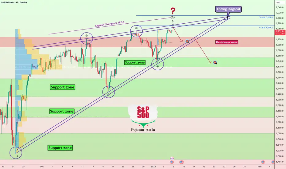
S&P500(SPX500) 4H: Bullish | Ending Diagonal in Play【1/8 S&P500 (SPX500) 4H Chart】
① Bias: Bullish
If it holds around 6892.15, expect further upside
② Main Count:
Flat correction (A-B-C) in progress from the 10/30 decline
Currently, from the 11/21 low, a double zigzag (w-x-y) is unfolding
Likely forming wave 5 of an ending diagonal in (y)'s c-wave
③ Key Levels:
Support: Around 6892.15 Resistance: Around 6961.93
④ Invalidation:
Invalidated on a daily close below 6885.94
⑤ Alternative:
Shift to Bearish if breaks below 6885.94
THINK SIMPLE
#SPX500 #SP500 #ElliottWave #StockMarket #TechnicalAnalysis #CFDTrading #Investing #Trading

How to Easily Use TradingView to Detect Market BubblesHow to Use TradingView to Detect Market Bubbles
TradingView offers incredible charts and a wealth of information in one spot. But there are millions of features that I am sure you do not know yet.
Today I am bringing you a functionality that is one of the most important tools available. It gives you a historical perspective to see if a market is truly overbought or oversold.
A realistic and objective way to know if we are paying too much for an index is to view its price in ounces of gold. If we are paying very few ounces it means it is worth selling our gold to move into the market. Conversely if we are paying too many ounces it is better to sell the index and move back into gold.
But how can we see an index price in ounces?
This is where TradingView truly shines.
First you must choose the index you want to analyze. In our case we will look at the $SP:SPX. To see the SPX in gold ounces you need to divide the SPX by XAUUSD. Yes you read that right. We are going to perform a mathematical division directly on our chart.
How to set it up:
Choose the index for your chart. As we said we are using the SPX.
1. Click the calculator icon that you can see on the right side.
2. A series of math operations will open. Select divide.
3. Now you have a formula like this: SPX / XAUUSD . Hit the enter key and you will get this chart:
Here you can see on the Y axis the number of ounces needed to buy the SPX index at any point in history.
There are extreme peaks in 1929 (The Great Depression), 1971 (Nixon Shock), and 2000 with the Dot Com bubble. These are historical moments. When this chart reaches such high levels it is a major cause for alarm . If we look closely we recently saw the SPX trading at Nixon Shock levels (2.5 ounces) and well above 1929 levels (1.5 ounces).
On the other hand we have lived through moments like the 1980s where the SPX could be bought for just 0.10 ounces of gold . That was an absolute bargain. In the following 20 years the index multiplied its value by 12.
I am sharing an analysis here to show visually when we are in overbought or oversold zones, quite basic, no rocket science.
Right now we are in a Fair Value zone in my opinion. However it looks like Gold might still have room to run until it hits the yellow zone. Because of this my preference for precious metals will stay above my preference for indices in 2026 just as it happened in 2025.
You can perform this same analysis with housing prices, different sectors, or different countries. I promise you it is totally addictive.
👇 WANT MORE?
🚀 Hit the rocket , read my profile and follow so we can find each other again :)

SPX500: Headline Risk Builds as Price Consolidates Near 6918SPX500 | Market Overview
S&P 500 futures came under pressure after reports that the U.S. Department of Justice launched a criminal investigation into Fed Chair Jerome Powell, escalating tensions and increasing market uncertainty.
The headline has injected risk-off volatility, keeping traders cautious around key technical levels.
TECHNICAL VIEW (SPX500)
The index is currently consolidating between 6918 and 6943, awaiting a clear breakout.
📉 Bearish Scenario (Preferred on Weakness)
Bearish volatility is favored if a 1H or 4H candle closes below 6918
Downside targets: 6877 - 6820 if selling pressure accelerates
📈 Bullish Scenario
Stability above 6943 would support bullish continuation
Upside targets: 6965 - 6990
Key Levels
Pivot Line: 6918
Support: 6900 – 6877 – 6814
Resistance: 6943 – 6965 – 6990

S&P 500 Makes New ATH — Is This a Fake Breakout?As I expected in the previous idea , the S&P 500 Index( FX:SPX500 ) reached its targets, with a risk-to-reward ratio of 1:67.
The S&P 500 has managed to set new all-time highs as we entered 2026. The question now is whether the S&P 500 will continue its bullish trend throughout 2026 or if we should anticipate a correction in the U.S. stock market.
It’s important to note that the S&P 500 is a key index for the markets, and its correlation with Bitcoin( BINANCE:BTCUSDT ) is quite high. Therefore, it’s always beneficial to keep an eye on the S&P 500 when analyzing the crypto market, especially Bitcoin.
Currently, the S&P 500 seems to be trading above the resistance zone($6,930_$6,892). However, considering the volume of this breakout, it doesn’t seem like a very convincing breakout.
From an Elliott Wave perspective, we might expect the main wave 5 of the S&P 500 to conclude with the help of an ending diagonal, and this wave 5 could complete near the upper lines of the ending diagonal.
I expect that the S&P 500 may decline at least to around $6,917, and if it breaks back below the resistance zone and the lower lines of the ending diagonal, we could see further declines to around $6,837 or even lower, leading to a downturn in the U.S. stock market.
Note: It’s worth noting that rising tensions in global affairs could also pose a risk to the S&P 500, potentially causing abrupt declines.
First Target: $6,917
Second Target: $6,837
Stop Loss(SL): $6,988
💡 Please respect each other's opinions and express agreement or disagreement politely.
📌S&P 500 Index Analyze (SPX500USD), 4-hour time frame.
🛑 Always set a Stop Loss(SL) for every position you open.
✅ This is just my idea; I’d love to see your thoughts too!
🔥 If you find it helpful, please BOOST this post and share it with your friends.
Hellena | SPX500 (4H): LONG to resistance area of 7010.Colleagues, I expect the upward movement in the medium-term wave “1” to continue.
The minor wave “3” should still be developing, and I expect a repeat update of the high of the higher-order wave “3” (6929.4).
I consider the 7010 area to be the nearest target. If we calculate using Fibonacci expansion, the target is higher, but I always play it safe and take the nearest targets.
Manage your capital correctly and competently! Only enter trades based on reliable patterns!

SPX 0DTE trend/momentum following setup. Double and triple confirmation before taking 0DTE trades. I personally like 0DTE only. I know with my system on any trade 30%-35% is usually where the SELL signal appears and to size my positions accordingly. The BUY signals winners all varying but I tend to take some profit around 30%-35%.
I use a few different indicators to simultaneously confirm which direction to follow. In doing this, it avoids taking trades during froth or that end up immediately being rug pulled.
The indicators are:
1. Lux Algo- Smart Money Concepts. ( I only use the discount, premium, and equilibrium zones. As well as the weekly/monthly high and low enabled.)
2. Supertrend (set to my risk preferences)
3. Dynamic Swing Anchored VWAP- 200 day swing period and 30 day adaptive price tracking (Green line)
> The only periods this switched to a weekly sell was during 2001/2008
4. 200 SMA (White line)
*Using Heikin Ashi candles.
Those remain the same for all time frames and hey all need to correlate in order to enter a trade. Only then are trades solely in that direction placed. For instance:
If Supertrend and Dynamic Swing Anchored VWAP are a buy on the Weekly and 4-Hour charts, then it is CALLS ONLY and using the 5-minute chart to enter following the Supertrend signal. Above the 200SMA is even further confirmation.
If all of that were to stay the same but it was signaling to buy while in a PREMIUM zone, that cancels it out completely. Joy of missing out of the froth/rug pull. I take the time to mentally recharge. Wait for my system to align. That premium zone is usually spot on. While it might get extended on shorter time frames or sit there for a few weeks on the weekly chart, I have yet to see it be wrong. Following with a retrace back around the equilibrium zone or closest support.
It is helpful to see how overextended the market gets sometimes and while it might lag when encountering a median reversion play, it is pretty quick to confirm the trend/momentum and allow for a more calculated play. Adjusting position size slightly based on trend strength. It catches dip buys and rip sells upon confirmation.
Entries can be tweaked for longer expirations than 0DTE, but I choose not to hold anything over night.
Just thought I'd share going into the new year. Only thing I will be paying attention to is supply and demand. No more news at all. Shit is just aggravating and speculating leads to more losses for me than it does gains. Following trend/momentum + taking profit and cutting losses equals my account stability and growth.
Not financial advice- just some guy and his personal strategy.

Us500 short Hopefully this happens by Tuesday.
If it doesn't break previous I believe it will drop to tp

S&P500 This is the level that confirms the Bear Cycle.The S&P500 (SPX) has reached a point where it could be on the verge of initiating a new Bear Cycle as the price action that led to the end of 2025 (mostly Q4) has been very similar with the one in late 2021 that kick-started the 2022 Bear Cycle.
What confirmed that Bear Cycle was the market closing a 1W candle below the 1D MA100 (red trend-line). This is extremely critical as it has already proven its role as a catalyst during the most recent short-term pull-back in November, where it held upon tested on the week of November 17 2025 and thus rebounded. This is exactly what took place in November 2021, with the index eventually closing a 1W candle below the 1D MA100 almost 2 months later on the week of January 17 2022. That confirmed the 2022 Bear Cycle as the sell-off was accelerated and in just 1 week, the market even hit the 1W MA50 (blue trend-line).
The structure between the two fractals is so far very similar, with a huge 1W RSI Bearish Divergence (Lower Highs against price's Higher Highs) leading the index towards a potential Top. If the price action continues to repeat that of 2022, then we are looking at the very real possibility of a -27.60% overall correction within roughly 12 months time, with the first potential Target being the 1W MA200 (orange trend-line) around 5350 and second the full -27.60% extension at 5050. Those two levels technically form the potential Buy Zone for the next Bull Cycle.
The metric though that cannot be ignored as far as long-term buying is concerned, is the 1W RSI, which has historically given optimal buy opportunities when it turned oversold (i.e. 30.00 or below). If this level is hit before any of the above two Targets, we will be turning into long-term buyers again regardless.
---
** Please LIKE 👍, FOLLOW ✅, SHARE 🙌 and COMMENT ✍ if you enjoy this idea! Also share your ideas and charts in the comments section below! This is best way to keep it relevant, support us, keep the content here free and allow the idea to reach as many people as possible. **
---
💸💸💸💸💸💸
👇 👇 👇 👇 👇 👇

S&P 500 Hits a Record – But Is Everything Really So Positive?S&P 500 Hits a Record – But Is Everything Really So Positive?
As the S&P 500 chart shows, the index touched 6,990 yesterday, marking an all-time high for the first time. The psychological 7,000 level is now within close reach. Optimism may be driven by the start of the earnings season, which could confirm continued growth in corporate profits.
But is the outlook entirely positive?
From a fundamental perspective, several factors could raise concerns:
→ News surrounding a criminal case involving Jerome Powell. This may be perceived as pressure on the Fed Chair and a threat to the central bank’s independence, potentially undermining the investment climate.
→ The upcoming release of CPI data (scheduled for today at 16:30 GMT+3). A scenario in which the figures point to rising inflation cannot be ruled out, which could trigger a sharp sell-off in equity markets.
→ Risks of the US becoming involved in new military conflicts.
From a technical standpoint, bearish signals are also emerging on the chart.
Technical analysis of the S&P 500
Price action in the S&P 500 is forming an ascending channel. However, it is worth noting the market’s reaction after reaching the upper boundary of this channel: on two occasions (as indicated by the arrows), the index has seen sharp pullbacks towards the median line. This behaviour suggests aggressive selling pressure. At the same time, the RSI indicator is showing bearish divergence.
The channel median has so far acted as solid support. Nevertheless, with bears successfully defending the psychological 7,000 level and the fundamental backdrop capable of delivering negative surprises, sharper declines in the S&P 500 cannot be ruled out.
In such a scenario, potential downside targets may include:
→ the 6,888 support level, where the red trendline was broken;
→ the lower boundary of the ascending channel.
This article represents the opinion of the Companies operating under the FXOpen brand only. It is not to be construed as an offer, solicitation, or recommendation with respect to products and services provided by the Companies operating under the FXOpen brand, nor is it to be considered financial advice.
