BTCUSD 4HR Indicator SetIndicators: 4hr time frame analysis
EMAs:
High Time Frame
-71 day EMA (426 point) blue thin 1
-81 day EMA (486) blue thin 2
-100 day EMA (600 point) blue thick
-150 day EMA (900 point) red thin
-200 day EMA (1200) red thick
Medium Time Frame
-14 day/2 week EMA (84 point) white dotted
-21 day/3 week EMA (126 point) yellow dotted
-28 day/4 week EMA (168 point) grey dotted
-50 day EMA (300 point) yellow thick
-64 day EMA (384 point) yellow thin
Low Time Frame
-1 day EMA (6 point) grey step line
-3 day EMA (18 point) light grey thin
-5 day EMA (30 point) light grey thin
-7 day/1 week EMA (42 point) grey thin
-10 day EMA (60 point) grey thin
Sigma Trend Bot Analysis (HullMA, close, 0, 21, 1, 0.7, 1D, HullMA, open, 0, 21, 1, 0.5)
-Deviation and Trend Tolerance Bands (Turquoise Bands, Turquoise Dots, White Step Line)
-buy/sell signal scalps to basis line (white step line)
-trend direction (bullish/bearish) with trend strength and weakness
-blue = strong bullish PA, light blue = weak bullish PA, red = strong bearish PA, pink = weak bearish PA)
-Heikin Ashi candle outline to show normal candle color(green(bullish), red(bearish))
-confirm on candle close (every 4hrs)
Ichimoku Cloud (20/60/120/30)
Kijun Sen- Dark Red
Tenken Sen- Light Blue
Lead Strand A
Lead Strand B
MA Duplicates (with color change)
red and green dots help to show low time frame support and resistance
red and green color change line is the high time frame momentum tracker (sometimes can be used as support and resistance)
Gainzy DIvs
low and normal time frame strength
red/green gainzy divs weak/low time frame
yellow/blue gainzy divs strong/normal time frame
SAR
white dots above and below price action to show overall current trend direction
enjoy.
Search in ideas for "INDICATORS"

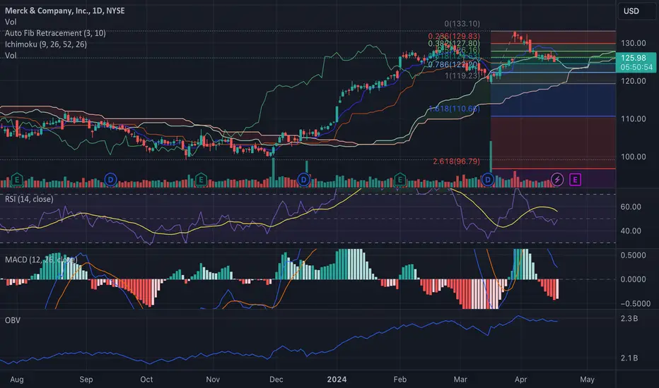
(MRK) - Navigating Through Market Signals and IndicatorsAbstract:
We perform a comprehensive technical analysis of Merck & Co., Inc. (NYSE: MRK) by dissecting its latest price movements, chart patterns, and technical indicators. This analysis is aimed at shedding light on the potential future price trajectory for MRK, integrating both traditional technical analysis tools and advanced indicators to inform speculative positions.
Price Action and Chart Patterns:
The recent price activity of MRK demonstrates a consolidation phase with a slight bearish inclination. The stock has been traversing within a narrow range following a significant uptrend, as evidenced by the series of higher highs and higher lows from November 2023 to February 2024. The latest candles are positioned within the Ichimoku cloud on the daily chart, which hints at a potential trend ambiguity in the short term. However, the presence of a 'doji' candle followed by a minor bullish candle may suggest an indecision in the market sentiment that precedes a possible trend reversal.
Ichimoku Cloud:
The Ichimoku Kinko Hyo, a pivotal component in our analysis, indicates a transition phase. With the price oscillating within the cloud (known as 'Kumo'), we are in a state of equilibrium, where the bullish and bearish forces are balanced. A decisive breakout above the cloud could signal a bullish continuation, while a drop below the cloud would align with a bearish forecast.
Fibonacci Retracement Levels:
Using the swing high at $133.10 and swing low at $110.65, we observe that the price recently retraced to and slightly surpassed the 0.236 level at $129.83 before recoiling. This behavior showcases the market's respect for Fibonacci retracement levels, often viewed as potential reversal zones.
Moving Averages:
The 50-day and 200-day Moving Averages (MAs) are trending upwards, confirming the general bullish bias in the medium to long term. The recent price action around the 50-day MA suggests this level as a dynamic support.
Volume and Volume-Based Indicators:
The On-Balance Volume (OBV) shows a steady rise, which typically indicates accumulative behavior and can be a precursor to a positive price breakout. This is in congruence with the increasing volume bars seen in recent trading sessions.
Relative Strength Index (RSI) and Moving Average Convergence Divergence (MACD):
The RSI hovers around the 50 mark, which is considered neutral territory, although it has descended from overbought conditions. The MACD line is about to cross above the signal line, and the histogram is moving upwards towards the zero line, both suggesting that upward momentum may be gaining traction.
Price Target Speculation:
Assuming the bullish scenario where the price breaks above the Ichimoku cloud, our speculative price targets are set at the Fibonacci levels of $133.10 (0 level) as the first target, and a breach above this level could lead the stock towards the all-time high at $139.00. Alternatively, a bearish downturn would initially aim for the support around the $122 level, coinciding with the 0.786 Fibonacci retracement and the top boundary of the cloud.
Earnings Report:
With the next earnings report due in 8 days, market participants should exercise caution as the release could significantly impact the stock's volatility.
Market Sentiment and Conclusion:
MRK's stock performance is at a crossroads, with technical indicators providing mixed signals. Investors should monitor the key levels indicated by the Ichimoku Cloud and Fibonacci retracements. While the upward momentum could be resurfacing, as suggested by the MACD and OBV, the forthcoming earnings report may serve as a catalyst for a definitive price direction. Prudent traders may consider setting tight stop-loss orders to mitigate risk in the face of potential earnings-induced volatility.
M15 Comparative Analysis : US Oil ↔ UK Oil (with 4 indicators)Here, a comparative analysis of US Oil (West Texas Intermediate)
and UK Oil (Brent) on a 15-minute chart (M15).
US Oil on the left and UK Oil on the right.
The four indicators are the main indicators used at ADX-BRIEFING.
- Top indicator (directly below price window): modified MACD
- 2nd indicator: modified ADX
- 3rd and 4th indicators: modified momentum indicators.
The modified MACD indicator (on both markets) has been in the BUY zone
since November 16, 2020 and is still in the BUY zone as of now.
The modified ADX indicator is in a downtrend and this means that right now,
we have a consolidation.
We are waiting for a turn-around on this indicator which would indicate
that we have a new significant move on the way.
As of now, this is a waiting period, when considering this higher 15-min time-frame.
Indicator #3 on both markets, is still in the BUY zone
and now is a risky time for a long-term short trade.
Indicator #4 is in the neutral zone between the BUY zone and the SELL zone.
Conclusion:
On the 15-minute time-frame, there is no clear signal for either a BUY trade or a SELL trade.
I will add, in the comments section, more detailed analysis, related to the time-frame we are actually using for trades.
François Normandeau
Institutional Research Director
ADX-BRIEFING
This post can also be found on:
www.adx-briefing.com

Potential bottom formation with bullish indicators.Order Type: Buy Stop
Entry Price: 0.8840 (to confirm breakout beyond immediate resistance and capture potential upwards momentum)
Take Profit: 0.8900
Stop Loss: 0.8800
Confidence Level: 74%
Justification:
Price Action: Potential bottom formation with bullish indicators.
Volume: Increased volume at lows suggesting accumulation.
Indicators: Bullish crossover on MACD and widening Bollinger Bands suggesting an impending bullish movement.
Support and Resistance: Entry above resistance ensures capturing upward breakout, with stop loss below immediate support for risk management.

Example of how to effectively use auxiliary indicatorsHello, traders.
If you "Follow", you can always get new information quickly.
Please also click "Boost".
Have a nice day today.
-------------------------------------
The StochRSI < 80, StochRSI > 20, OBV, -100, +100, RSI < 70, RSI > 30 indicators included in the HA-MS indicator are indicators that express the formulas of each basic indicator by modifying them.
These indicators can be intuitively confirmed by expressing each indicator on a price candle, and can be used as support and resistance points for detailed trading strategies.
-
(1M chart)
The most frequently referenced RSI indicators have been added to be drawn on price candles as RSI < 70, RSI > 30 indicators.
Therefore, if the price is maintained above the 3014.05 point, it can be interpreted that the RSI indicator is in the overbought zone.
Therefore, the 3014.05 point corresponds to the support and resistance zone.
-
The +100, -100 indicators are indicators that express the CCI indicator.
The CCI indicator interprets the -100 to +100 range as a sideways range based on the 0 point.
If it rises above +100, it is interpreted that it has escaped the sideways range and formed an upward trend.
If it falls below -100, it is interpreted that it has formed a downward trend.
Therefore, if it rises above the 3762.29 point, it should be interpreted that it is highly likely to form an upward trend.
Therefore, if it rises above the +100 indicator point, you can conduct a breakout trade.
-
If you understand the concept of the above indicators, I think you can create a trading strategy with just these indicators.
-
The HA-High indicator is formed at the 3321.30 point, so the most basic standard is the 3321.30 point.
Therefore, you should set the 3321.30 point as the standard and use the support and resistance points of the above indicators to create a trading strategy that suits you.
The trading strategy may vary depending on your investment period, investment amount, average purchase price, etc.
Even so, the HA-High and HA-Low indicators can be the standard for the chart, so you should consider the location of these indicators.
-
(1W chart)
It is currently continuing to rise within the rising channel.
Therefore, the key is whether it can rise along the rising channel.
-
The 3265.0 point and the 3321.30 point are the HA-High indicator points of the 1W and 1M charts.
Therefore, the area around the 3265.0-3321.30 section can be seen as the standard for trading.
Therefore, if it falls below the 3265.0-3321.30 section, it is highly likely that it will fall further.
However, the 3014.05 point is the RSI < 70 indicator point of the 1M chart, so if the price is maintained above 3014.05, it is likely that it will continue to rise in the long term.
Therefore, if it falls below the 3265.0-3321.30 section, it is necessary to check whether there is support in the 3014.05-3136.41 section.
-
(1D chart)
Currently, the HA-High indicator of the 1D chart is formed at 3787.59.
Therefore, in order for a full-scale uptrend to begin, the price must be maintained above 3787.59.
-
The +100 indicator is formed at 3523.09.
Therefore, in the short term, it is highly likely that an uptrend will be formed if it rises above 3523.09.
If not, the movement is likely to continue in the sideways section of the CCI indicator.
-
As above, you should look at the charts in order of 1M, 1W, and 1D charts, interpret them comprehensively, and create and modify your trading strategy by considering your average purchase price or investment period.
Again, among the indicators on this chart, the most basic indicators for trading are the HA-High and HA-Low indicators.
To find out the basic trend, you can check the movement of the MS-Signal indicator.
-
Have a good time.
Thank you.
--------------------------------------------------
- Big picture
The real uptrend is expected to start after rising above 29K.
The area expected to be touched in the next bull market is 81K-95K.
#BTCUSD 12M
1st: 44234.54
2nd: 61383.23
3rd: 89126.41
101875.70-106275.10 (overshooting)
4th: 13401.28
151166.97-157451.83 (overshooting)
5th: 178910.15
These are points where resistance is likely to occur in the future.
We need to check if these points can be broken upward.
We need to check the movement when this section is touched because I think a new trend can be created in the overshooting section.
#BTCUSD 1M
If the major uptrend continues until 2025, it is expected to start forming a pull back pattern after rising to around 57014.33.
1st: 43833.05
2nd: 32992.55
-----------------

Psychology Over Indicators: 1M USDT DisputeIt seems we’ve finally touched what can be considered the bottom. One last leg down may still be on the table — if some players decide to fully exit before positioning themselves for what comes next.
Let me briefly introduce myself. I’m Alex. I build crypto projects from the ground up — from token design to long-term fundamental development. That’s my core expertise. But today, I'm here for a different reason.
A close colleague of mine believes that trading success comes from mastering indicators. I believe otherwise. In my view, indicators are just tools — and knowing how to use them is more than enough. What truly drives performance over time is mindset: psychology, philosophy, and emotional clarity. Without those, no indicator will save you.
To prove this point, we’ve decided to make it real. We’re backing this disagreement with a 1,000,000 USDT trading challenge. Real capital. Real trades. Real psychology at play.
This TradingView account will serve as a public log — a transparent, immutable space to document every step of the process. No edits. No deletes. Just pure execution, reflection, and results.
If you're interested in the psychological dimension of trading — beyond the noise, beyond the charts — you're welcome to follow along. This isn’t about hype. It’s about proof.
Stay sharp,
Alex

4 Best Trend IndicatorsIdentifying market trends can be challenging, but there are tools that can help. One common question traders often grapple with is: What are the best trend indicators? This article aims to shed light on four of the top trend tools traders use.
For the best experience, head over to FXOpen’s free TickTrader platform. There, you’ll find each indicator ready for you to practise with.
Moving Averages
Moving Averages (MAs) are one of the best stock trend indicators. It's also widely used in other financial markets, including forex, commodities, and cryptocurrencies*. They smooth out price data to create a single flowing line, which makes it easier to identify the direction of the trend. Two popular types are the Simple Moving Average (SMA) and the Exponential Moving Average (EMA), the latter giving more weight to recent prices.
One classic trading strategy involving MAs is the "crossover." A crossover occurs when a short-term MA crosses above or below a long-term MA. When the short-term MA crosses above the long-term MA, it's generally seen as a bullish signal, indicating a potential uptrend. Conversely, a downward crossover of the short-term MA below the long-term MA is considered bearish, suggesting a possible downtrend.
Additionally, the position of the asset's price relative to the moving average line can provide insight. If the price exceeds the MA line, it often signifies an ongoing uptrend. Conversely, a price below the MA typically indicates a downtrend.
Average Directional Index (ADX)
The Average Directional Index (ADX) is a technical indicator used primarily for gauging the strength of a trend rather than its direction. One of the best indicators for trend trading, the ADX operates on a scale from 0 to 100. It can include a single ADX line or can consist of three lines: the ADX line itself, which measures trend strength, and the Positive Directional Indicator (+DI) and Negative Directional Indicator (-DI), which identify the direction (the DMI indicator on the TickTrader platform).
A reading above 25 on the ADX line is generally considered indicative of a strong trend, either upward or downward. A reading below 20 often suggests no clear trend and that the market is moving sideways. Traders usually combine the ADX with other trend-following indicators to establish the direction of the trend.
It's important to note that the ADX does not signal the beginning of a trend; rather, it confirms that a trend is actually in place and gauges its strength. This makes it an invaluable tool for traders looking to enter trades that align with strong existing trends.
Relative Strength Index (RSI)
The Relative Strength Index (RSI) is a momentum oscillator that ranges from 0 to 100 and is used to identify overbought or oversold conditions. However, it can also serve as a rudimentary trend indicator. The RSI calculates the ratio of upward moves to downward moves and normalises the calculation to provide a value that is expressed on a scale from 0 to 100.
Traditionally, values of 70 or above indicate an asset may be overbought, while values of 30 or below suggest it may be oversold. But when it comes to trend analysis, a value above 50 often implies that the asset is in an uptrend, whereas a value below 50 can indicate a downtrend.
RSI is particularly useful when confirming trends identified by other indicators. For example, an RSI above 50, along with a moving average crossover, would be a strong signal supporting an uptrend.
Bollinger Bands
Bollinger Bands are a tool often favoured by trend traders. They consist of three lines: a middle band, which is a simple moving average (SMA), and two outer bands that are standard deviations away from the middle band. This creates a channel within which asset prices typically move.
Although primarily known for measuring market volatility, Bollinger Bands can also serve as trend indicators. When prices hug the upper band, it's usually a sign that the asset is in an uptrend. Conversely, a downtrend is likely if prices gravitate toward the lower band.
The width between the bands can also signify trend strength. A widening gap indicates increasing volatility and the possible continuation of a current trend, whereas narrowing bands suggest decreasing volatility and potential trend reversal. When used in conjunction with other tools, like those listed here, Bollinger Bands can be one of the best trend forex indicators.
Final Thoughts
Understanding and employing the right trend indicators can be a game-changer for traders seeking to maximise their effectiveness. These four tools provide invaluable insights into market direction and strength and deserve a place in any trader’s toolkit.
To put them into practice, consider opening an FXOpen account. You’ll gain access to hundreds of exciting markets, competitive trading costs, and lightning execution speeds. Happy trading!
*At FXOpen UK and FXOpen AU, Cryptocurrency CFDs are only available for trading by those clients categorised as Professional clients under FCA Rules and Professional clients under ASIC Rules, respectively. They are not available for trading by Retail clients.
This article represents the opinion of the Companies operating under the FXOpen brand only. It is not to be construed as an offer, solicitation, or recommendation with respect to products and services provided by the Companies operating under the FXOpen brand, nor is it to be considered financial advice.

PUMP TRACKER vs Hash Ribbons: the best crypto indicator🔥Hi friends! In this idea we compare two famous indicators:
1️⃣ Pump Tracker daily indicator
2️⃣ Hash Ribbons indicator which is famous among the retail traders and some newbies at crypto trading
For the experiment we will take the amount of money that is available for every trader. We will use $1000 to compare profitability of 2 indicators.
📊 PUMP TRACKER
Pump Tracker is a daily Bitcoin indicator which give the signals to buy and sell crypto in time. This indicator use foundamental and technical data to give you the best entry point to open a long on spot or futures. I think it works better in a bear market than Hash Ribbons even in a bull market:) Image, what if BTC will start PUMP now? What the profit you can get? Here the stats per last 3 year.
🚩 Using $1,000 of the initial deposit you would have gotten $18,000. Using $10000 you would get $180000. It`s "just" 18x to your deposit per 2019-2021 bull and bear markets with -70-80% dumps(!). Wow!
📊 HASH RIBBONS
Hash Ribbons is a famous indicator which help some traders to find entry point to buy crypto. It`s use the change of the hash rate of BTC network in its calculations. When 2 MA are crossing it show the green or blue "BUY" signal. But a lot of traders don`t pay attention to statistic of this indicator.
If you were using this indicator with $1,000 you would get ..... $3,700 in 2.5 years.
🚩That means Hash Ribbons has made 3.7x in the same period. It's worth to add that you wouldn't have been able to use leveraged trading , as the maximum loss is more than 50% and your deposit would have simply been liquidated.
Yes, the main advantage of Pump Tracker is a possibility to open the trades with leverage up to x1 on Coin-M and x2 on margin or USDT-M Futures , which would give you x116 to your deposit per last 2,5 years. Here is a proven statistic👇
🚩 That is mean that you would get $116,000 from just $1000 initial deposit and $1,180,000 profit using $10,000 initial deposit.
📊 SUMMARY
I recommend you to use Hash Ribbons as additional indicator to understand the current market situation, crypto fundamental data.
As you can see, Pump Tracker is much profitable indicator not even for spot trading but also for leverage trading✅ and you can get much more profit for the same period of time.
🔥 Traders, check the links below the idea or DM to get more info about Pump Tracker indicator. Write in the comments if you found this idea useful and going to use this info in your trading strategy.
💻Friends, press the "boost"🚀 button, write comments and share with your friends - it will be the best THANK YOU.
P.S. Personally, I open an entry if the price shows it according to my strategy.
Always do your analysis before making a trade.

BTC Weekly Chart - MACD + Elder Force Index + RSIIn my analysis, I have used a logarithmic scale on the weekly BTC chart.
First of all, I want you to pay attention to 200 days of Moving Average Exponential it is very close to the current price of BTC at the $26976 level. With all the inflation rate that we got today 8.3% plus 50 basic points monthly raise will continue we can expect that price could test this 200 days EMA.
Also, we can see the fighting between bulls and bears for the $30000 level right now in real-time. In my opinion, it will be good to see a test and after that retest that will create a double bottom technical figure with a shape of W. Of course, bulls will try to defend this level as much as possible. It is a potential place for opening a long position.
Let's discuss the MACD, Elder Force Index and RSI indicators:
On the chart, you can see two ATH - the first one on 12 Apr 2021 ($64956) and the second one that was a little bit higher on 08 Nov 2021 ($68976), but the indicator shows us a bearish divergence that was an urgent call to start closing long position and think about short one. What's more, you can see on the diagram that it shows that the power of acceleration is dropping down and the same result occurred on the Elder Force Index - force was decreasing.
RSI was showing the same exact picture of bearish divergence as MACD. All three of them just powered each other which helps us to build a strong basis that soon will be BTC correction or even a bear trend.
Now is it time to speak about both corrections that happened on 17 May - 19 Jul 2021 and 17 Jan 2022 - 21 Feb 2022, there was bullish divergence on MACD and RSI, but not on the EFI that clearly has shown that we should be careful and watch out for the bull trap and it happens on the $48000 level.
Now the last downtrend movement has unveiled both bullish divergences on MACD and RSI.
At the present time, we have a bullish divergence on the Elder Force Index, but for me, it is not a leading indicator but more a tool that helps approve the other two indicators.
RSI shows us that it moves to the lower zone which indicates that BTC is oversold. I also depicted the Covid dropdown (09 Mar 2020) on the RSI it is on the 33.53 level, actually, at the current level and even deeper downside movement - 28.86 level (10 Dec 2018) when was the bottom of the bear market.
MACD's diagram indicates that two previous downtrend movements were more powerful where whales were selling their bags, otherwise, you can see that diagram became smaller and smaller each time, for me, it shows that price got pressure from the overall world economy and the U.S. itself, but not from the whales that still accumulate more BTC coins.
May the profit be with you!

All the indicators: Now this people is a Long!All the indicators are indicating a decision point forming. Fib levels are well respected, a squeeze is happening, also a potential cup and handle formation. You know what they say smart money comes early and leaves before the dip. I recommend checking out the 30 minute chart with the same indicators.

AMZN Short Position- Price below the 200 MA, confirming the general downtrend.
- Possible formation of descending triangle.
- Demand for the asset is weakening (see volume, RSI and OBV indicators).
When the price cuts below the 50 MA, the RSI is well below 50% and the OBV is red and well below the mid level, enter short. I prefer to enter my positions with confirmations of indicators, rather formations of patterns.
WARNING: THIS IS NOT A INVESTMENT ADVICE. I'M JUST POSTING MY IDEAS AND IT IS FOR EXCHANGE OPINIONS.

My method of analysis.Scalping by indicators.Forex TradingHello friends . I want to tell you in more detail about how the strategy works and what principle I work on .
The trading system consists of three indicators, in the screenshot I marked the indicators with the numbers 1.2.3.
Indicators help to see the moment of the price reversal and, therefore, the moment when it is best to open a position and, consequently, close it .
Learn more about each indicator :
1 . EMA Pro Trade (from the name, you can understand that the indicator is based on moving averages
and helps you see the direction of the trend, as well as when the price begins to turn around )
For example, when both blue lines cross the red ones from top to bottom, this is an indicator that the price is set for a reversal .
but at the same time, you need to look at the other two indicators as the main filters.
2. Stochastic Pro Binary (the indicator is based on stochastic and moving averages, I chose the optimal values for the indicator to give more accurate signals about the state of the price) in the screenshot it can be seen that there are upper and lower zones marked in red and green, respectively . A buy signal (opening a position in long) appears when 1. on the blue dotted line, the distance between the points decreases 2 .both lines (blue dotted and red solid ) are located behind the lower green border.
3 the blue dotted line intersects the red solid line outside the green area. It is necessary to close a position according to the strategy conditions when such a situation repeats, but already outside the red zone . There you already need to open a sell position (in short).
3. Binary Options Pro Trade 3 is also an auxiliary tool and shows very well the strength of the price and the moment when these forces end . How it works ; if you look at the screenshot then you will see green and red bars, the signal to enter a trade (opening a position, for example, to buy) is when the red bars went beyond the lower red zone, and then began to lose their strength, become shorter and return back to the middle yellow zone, changing their color to green . accordingly, the reverse situation will be a signal to sell . The main thing to understand is that for a reliable signal, you need to wait for the conditions on the indicators marked in the screenshot with the numbers 2 and 3 (the indicator under the number 1 serves for a clearer vision of the trend directions and understanding of what the market mood is ) The timeframe I recommend using 1 hour is what Forex is about . The strategy can also be used on binary options for at least 5 minutes.

Chart Analysis and Trading StrategyHello, traders.
If you "Follow", you can always get new information quickly.
Please click "Boost" as well.
Have a nice day today.
-------------------------------------
(Trend-related)
The M-Signals on the 1M, 1W, and 1D charts have converged and are showing an upward trend, and are currently showing signs of converging again.
Therefore, if it falls this time, the key issue is whether there is support near the M-Signal on the 1M chart.
Currently, the M-Signal indicator on the 1M chart is passing around 52K.
Before that, we need to check whether there is support near the M-Signal on the 1D and 1W charts, which are passing around 60K.
-
(Trading-related-1)
HA-Low, HA-High indicators are indicators created to conduct trading on the Heikin Ashi candle chart.
The creation of HA-Low means that a low point range has been formed.
Therefore, if it shows support near HA-Low, it is a time to buy.
If it falls below HA-Low, there is a high possibility that the low point will be renewed, so a step-down trend is likely to occur.
The creation of HA-High means that a high point range has been formed.
Therefore, if it shows resistance near HA-High, it is a time to sell.
If it rises above HA-High, there is a high possibility that a step-up trend will occur, so a step-down trend is likely to occur.
Therefore, you can receive a basic range to start trading.
-
(Trading-related-2)
In order to conduct a transaction, support and resistance points drawn on 1M, 1W, and 1D charts are required.
To do this, we used various indicators to display support and resistance points.
The support and resistance lines provided in this way indicate that the longer the horizontal line, the more faithfully it can perform its role as support and resistance.
The horizontal line displayed on the bottom chart among the three charts above is displayed by the BW indicator.
The BW indicator is an indicator that comprehensively evaluates the MACD, StochRSI, CCI, PVT, and suerTrend indicators.
Therefore, I think it is highly reliable.
-
(Trading-related-3)
The BW indicator mentioned near Trading-2 is actually an indicator included in the TS-BW DMI indicator.
This BW indicator is designed to draw a horizontal line on the price candle when it forms a horizontal line at the lowest point (0) or highest point (100).
Therefore, you can proceed with trading depending on whether there is support at this horizontal line.
If the BW indicator is created at the lowest point (0), it is likely to form a bottom section, and if it is created near the highest point (100), it is likely to form a high section.
At this time, you can check whether the StochRSI indicator is in the oversold or overbought section and the correlation between StochRSI and StochRSI EMA to gain time to respond to an uptrend or downtrend.
Since the BW line is currently created below the candle, it must fall below the BW line in order to turn into a downtrend.
Therefore, when it falls below the BW line, you need to check whether the StochRSI indicator has fallen in the overbought zone or is maintaining the state of StochRSI < StochRSI EMA.
If so, you need to determine that there is a higher possibility of a downtrend and create a response strategy.
-
(Trading-related-4)
The auxiliary indicators added this time are DMI and OBV.
However, it is not easy to check these two indicators separately.
When interpreting the two indicators, subjective thoughts are constantly added, leading to incorrect interpretations or taking a long time to interpret, making it difficult to respond quickly in real time.
Therefore, we have comprehensively presented the important interpretation methods of the DMI and OBV indicators.
If it rises from the 0 point, it means that the upward trend is strong, and if it falls, it means that the downward trend is strong.
Among them, the -2 ~ 2 section can be interpreted as forming a box section, that is, a sideways section.
Therefore, the newly added DMI+OBV can be considered as a method of interpreting the CCI indicator.
-----------------------------------------
Looking at the above, you may think that you can trade well, but when you actually trade, you may feel that it is not going well.
I think this is because you do not have a trading strategy that fits your investment style.
To create a trading strategy that fits you, you must have a concept of the three things above:
1. Investment period
2. Investment size
3. Trading method and profit realization method.
In other words, you start trading thinking that you will conduct day trading as the investment period, but as the trading time passes, the problem is that the investment period is gradually extended to the short term and beyond, not day trading.
In addition, you should distribute your investment funds according to your investment period, but if you do not do so, investing a lot of investment funds in one coin (token, stock) and creating an imbalance in your trading is also a problem.
The investment scale of scalping or day trading and the investment scale of the mid- to long-term are bound to be different, but by using the same concept, you will create a situation where you can no longer proceed with the transaction.
In other words, this refers to the phenomenon where you end up with 0 cash, which prevents you from proceeding with the transaction you intended and ends up proceeding with the wrong transaction.
To do this, you need to think about how to buy, sell, cut losses, etc. when trading and how to make a profit.
To do this, you need support and resistance points drawn on the 1M, 1W, and 1D charts.
Then, you use various auxiliary indicators or chart tools to check whether there is support at these support and resistance points and whether it is a time for trading.
The most commonly used ones are the price moving average, trend line, and Fibonacci ratio.
Since these indicators and chart tools are created after the price movement, they can all be considered lagging.
So, I would not say that auxiliary indicators such as RSI, StochRSI, MACD, CCI indicators are lagging indicators and therefore do not need to be used.
Ultimately, the decision to proceed with a trade is determined by how well it reflects your investment style.
Therefore, even if the chart analysis is interpreted in a completely different direction, you can reduce losses or even gain profits depending on your trading strategy.
Therefore, rather than investing a lot of time in chart analysis, you should figure out how it fits your investment style and think about how to reflect it in your trading.
So, rather than worrying about whether the current price will rise or fall, you should think about how to respond when you start trading at the support and resistance points drawn on the 1M, 1W, and 1D charts.
-
Have a nice time.
Thank you.
--------------------------------------------------
- Big picture
The real uptrend is expected to start after rising above 29K.
The area expected to be touched in the next bull market is 81K-95K.
#BTCUSD 12M
1st: 44234.54
2nd: 61383.23
3rd: 89126.41
101875.70-106275.10 (overshooting)
4th: 134018.28
151166.97-157451.83 (overshooting)
5th: 178910.15
These are points where resistance is likely to occur in the future.
We need to check if these points can be broken upward.
We need to check the movement when this section is touched because I think a new trend can be created in the overshooting section.
#BTCUSD 1M
If the major uptrend continues until 2025, it is expected to start forming a pull back pattern after rising to around 57014.33.
1st: 43833.05
2nd: 32992.55
-----------------

Description of MRHAB-T Indicators for Creating Trading StrategieHello?
Welcome, traders.
If you "follow", you can always get new information quickly.
Please also click "Like".
Have a good day.
-------------------------------------
We have prepared a time to give an overview of the MRHAB-T indicator.
This indicator is an indicator that can be used without restrictions if the public idea chart is shared.
(MRHAB-T indicator is an undisclosed indicator.)
Those who use TradingView for free have restrictions on sharing charts, and it is possible to share charts with one person in an expedient (?) way.
If you think the published idea chart is cluttered or difficult to see, share the chart and use the 'Hide all drawings' function.
What we can tell by looking at the chart are things like trends and points that act as support and resistance.
This will come naturally if you keep looking at the chart.
In particular, trends can be better seen by looking at what the chart looks like after it has been drawn.
However, you don't have to look to the past to make a trade.
You need to be able to predict what will happen in the future.
In order to know this, various analysis methods exist, and many analysis articles are coming out accordingly.
You think what you need to know through analysis is whether it will go up or down in the future, but you can actually trade with it.
You should be able to predict trends through analytics, identify key points in those trends, and create trading strategies to trade.
Studying charts analyzed by others is a waste of time to analyze again.
By reading the chart analyzed by others, that is, the analysis, you have fulfilled your role.
In order to make an analysis that suits you, you need to analyze it according to your standards in my chart.
If not, it will be difficult to create a trading strategy and there is a high possibility that the response to price volatility will be insufficient.
When you look at my charts and analyzes, what you will take with you are my indicators.
This is because these indicators were created to obtain more objective information more quickly while trading for many years.
1. The MRHAB-T indicator on the price chart has
- There are Heikin Ashi, MA-Signal, Bollinger Bands, MA where you can see the trend,
- OBV, -100, +100, RSI80, RSI20, High, Low, MACD-P indicators to indicate support and resistance points;
- There are HA-Low and HA-High indicators that indicate trends and points of support and resistance.
- In addition, there is a candle display according to the increase or decrease of the trading volume, and an oversold and overbought section of the RSI indicator.
2. As an auxiliary indicator
- OBV included in the trading volume indicator,
- Stoch RSI included in Long/Short-S indicator, overbought and overbought sections of RSI are displayed;
- When the CCI(9) indicator included in the CCI-C indicator rises above 100, the overbought section is displayed, and when the CCI (9) indicator falls below -100, the oversold section is displayed.
There are secondary indicators.
It is recommended to use all indicators, but at a minimum, it is recommended to use only the HA-Low and HA-High indicators, which indicate trend and support resistance in the MRHAB-T indicator.
(1M chart)
(1W chart)
(1D chart)
(1W chart showing only HA-Low and HA-High indicators)
Since the use of indicators is used to obtain objective information, it is necessary to understand and use the core interpretation method of the indicators used.
It is recommended to interpret too many interpretations of one indicator as a weighted core factor in the interpretation of the indicator because it leads to subjective judgment.
If you look at the charts shown above, you can see that most of the movement started at support and resistance points.
Thus, it can be seen that the support and resistance points are providing objective information.
You should look at the support and resistance points for at least 1-3 days to see if there is support or resistance.
Depending on the time period chart, the main chart that identifies support and resistance points is the 1D chart.
Therefore, even if the period unit chart you see is the 1h chart, you should check the support and resistance on the 1D chart.
Support and resistance confirmation on the 1h chart is a chart that is formed every hour, so it is used for very short trades and requires a quick response.
The indicators that indicate support and resistance points in the HRHAB-T indicator mean that the longer the horizontal line, the stronger the role of support and resistance.
So, if you have short and long horizons side by side, you can base your trading strategy on the longer horizon point.
We'll talk about secondary indicators later when we have time.

First hack at Charting analyzing Indicators: SPY ShortShowing volume decreasing over time and ceiling of 280. Showing resistance bottom at 276 consistently. Once it breaks through there, next expected resistance is 269. After that, resistance at the 200 Moving Average followed by the .5 Fib Retracement. Still looks like a potential upside from big picture but will continue to squeeze into a Bear flag. Once it breaks the 276 Level, I would expect a big drop.
I am new to this and working through the charts and indicators. Appreciate any feedback.
AMEX:SPY

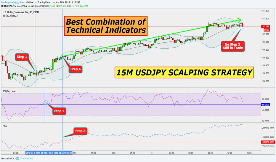
BEST COMBINATION OF TECHNICAL INDICATORS15M USDJPY SCALPING STRATEGY
Best Strategy Multiple Indicators
RSI Momentum Indicator - The Relative Strength Index is a momentum indicator and a leading indicator at the same time. We use the RSI indicator to identify possible overbought and oversold conditions in the market.
OBV – Volume Indicator - The OBV indicator is based on the idea that both the volume and the price activity are equally important. In this regard, the OBV combines both price and volume to show you the total amount of funds going in and out of the market. The main idea behind the On Balance Volume indicator is that the market price will follow where the volume flow is going.
Bollinger Bands – Trend Following Indicator - The Bollinger bands is the best trend following indicator that measures the volatility of any given market. It’s also the third indicator of our best strategy multiple indicators.
Buying and selling based on the Bollinger bands can be a very effective trading strategy especially if used in combination with other technical indicators.
Note* This strategy can be used on any time frame so go ahead and apply it to your preferred time frame.
Step #1: Price needs to Break and Close above the middle Bollinger Band
So the first trade confirmation we need is for the price to break and close above the middle Bollinger band. Once this trade condition is verified, we can check the other indicators for adding more confluence to our trade signal.
Step #2: Wait for the RSI indicator to trade above the 50 level if it doesn’t already.
During this step, we seek to find an agreement between what the Bollinger Bends is saying and the RSI own price reading. So, the breakout can be confirmed if the momentum is behind the move.
Usually, a RSI reading above the 50 level is considered as a positive momentum while a RSI reading below the 50 level is considered negative momentum.
Note* Not all the time you’ll see the RSI breaking above the 50 level at the same time as price breaks above the middle BB. Sometimes, we need to wait longer for the bullish momentum to show up.
Step #3: Wait for the OBV indicator to rise. Buy at the market once you see volume confirming the price.
Step #3: Wait for the OBV indicator to rise. Buy at the market once you see volume confirming the price.
Last trade condition before pulling the trigger is again easy to understand. We want to trade on the side with the smart money. In this regard, we look for evidence that the trade we want to take as real buying power behind it.
We can notice that the real volume only showed up later. It’s important to have patience and wait for the exact trade conditions to be satisfied before getting into a long trade.
Step #4: Hide your Protective Stop Loss below the lower Bollinger Band
Knowing where to place your protective stop loss is as important as knowing when to enter the market.
The logical place to hide your protective stop loss is below the lower Bollinger band. A break below the lower BB will invalidate our trade idea, and we want to minimize our losses.
Step #5: Take Profit when the price breaks below the lower BB
Our take profit strategy only looks at one indicator to signal us a possible exit zone. If we wait for confirmation from multiple indicators then we might as well give back some of our profits.
In this regard, the best way to take profits is when we see the price reversing. A break below the lower Bollinger Band is a good signal for a possible reversal, so we want to cash out our profits.
Note** the above was an example of a BUY trade using multiple technical indicators. Use the same rules for a SELL trade – but in reverse.
Daily Leading Indicators looking to turnaround PReviouslyly posted about the Bearish outlook for the Weekly :Leading Indicators... now it appears that Monday is giving the Daily Leading Indicators a new outlook.
A possible Bullish turnaround...
Breakdowns and Breakouts observed.

Use of Various Technical indicators. (Educational Post)Nifty again after making a new high ended in negative today. Main reason for nifty ending in negative can be attributed to channel top resistance. RSI (Relative strength Index) reached over heated zone and peaked above 80 showing the market was overheated, this was the second reason of Nifty ended in red of Friday after a fantastic weak. RSI of monthly and weekly and daily candles also shows that Nifty is in the overbought zone. This can continue for a while or Nifty can dive next week or in the coming time searching for it's supports for the purpose of correction or consolidation. On hourly chart as seen above RSI Peak is near 81 with supports near 57 and 47 range. Currently the RSI is at 64.67.
Bollinger Band is also suggesting temporary market peak near 26336 and strong support near 26092 and 25866.
MACD is also signaling towards consolidation and correction as the coveted blue line seen in the chart is dipping below red line. Histograms sine wave is going towards negative zone with some strength in it's stride.
50 hours EMA or the mother line is near 25909 and 200 hours EMA or the father line is near 25345.
Parallel channel indicates top near 26336. Mid channel support near 25866 and channel bottom support is near 25595.
Trend line support is near 26148 and trend top seems to be near 26437.
Supports and resistances drawn based on recent peaks and valleys are as under:
Supports at: 26148, 26037, 25866 and 25595.
Resistances at: 26277 (All time high resistance)
In the above chart and data we have used the combination of Supports and Resistances, Trend lines, EMA, MACD, RSI, Parallel Channel, Bollinger Bands. You must have seen that various Technical indicators many a times indicate same or similar levels. Thus instead of trying to master many indicators, if you can focus on a few and master them, you will be more often correct. As Bruce Lee has famously said and I quote him, "I am not afraid of someone who knows 10000 kicks, I am afraid of the one who has practised 1 kick 10,000 times."
It is also said in Sanskrit 'Sarva Deva Namaskaram, Keshavam Prati gacchati'. Pray to any of the divine forces but they ultimately end up at the feet of the supreme God head. Nasiruddin Shah had also said in a movie (Kabhi Haan Kabhi Na) "Idhar se jao, udhar se jao, ultimately sab rasta God ke pass jata hai." Deducing from it many indicators often yield same results. Master 2 or 3 of them and they will make you a great analyst.
Conclusion: Learn, unlearn, relearn and master a few indicators rather than trying to know many indicators. They will help you create generational wealth. To know more about these indicators and how to use them and to understand Techno-Funda investment, read my book: The Happy Candles Way to Wealth creation available on Amazon in Paperback or Kindle version.
The information regarding Nifty in this article is for the purpose of education and to show how various indicators often give same or similar result.
To know more about when to book profit? Where to place a stop loss or what is trailing stop loss you are recommended to read my book: The Happy Candles Way to Wealth creation which is available on Amazon in paperback or kindle version. You can also comment below or send a message to us.
Disclaimer:
The above information is provided for educational purpose, analysis and paper trading only. Please don't treat this as a buy or sell recommendation for the stock. We do not guarantee any success in highly volatile market or otherwise. Stock market investment is subject to market risks which include global and regional risks. We will not be responsible for any Profit or loss that may occur due to any financial decision taken based on any data provided in this message.

Unboxing Profits: A Modern Twist on Darvas's Strategy with VWMAIn the mid-20th century, Nicolas Darvas turned a modest investment into millions, all while traveling the world as a professional dancer. His secret? The Darvas Box Theory—a trading method that identifies stocks exhibiting strong upward momentum confirmed by increasing volume. Fast forward to today's digital trading world, and we find that Darvas's principles are still relevant, but they're now supercharged with advanced indicators like the Volume Weighted Moving Average (VWMA).
Reviving a Classic with Modern Tools
Our "Darvas Box Strategy with Visual Signals" leverages the simplicity of Darvas's boxes and pairs it with the insights of a VWMA. This strategy script for TradingView is designed to illuminate clear buy and sell signals on your chart, providing you with a compelling visual cue that marries price action with volume.
The Anatomy of the Strategy
At its core, the strategy is built on two primary components:
Darvas Boxes:
These are virtual 'boxes' that capture the 'high' and 'low' of a stock within a specified period. As per Darvas's original concept, a new box is formed when the stock hits a new high. The top and bottom of these boxes serve as the resistance and support levels.
VWMA:
The VWMA provides more than just an average price level—it integrates volume into the mix, offering a weighted average price based on the amount of activity. This gives traders a sense of whether the price movement is supported by the market's conviction.
Bringing the Strategy to Life
Using the script, traders can set their preferred 'Length' for the Darvas Boxes and 'VWMA Length' to tune the strategy to their trading style. The strategy plots:
VWMA Line: A smooth purple line that trails the price, adjusting with the volume flow.
Darvas Boxes: Visualized by green circles for the tops (resistance) and red circles for the bottoms (support).
Signal Flares for Entry and Exit
What sets this script apart is its ability to provide distinct 'Buy' and 'Sell' signals:
Buy: When the price ascends past the bottom of a Darvas Box and stands above the VWMA, it's an indication of potential upward momentum.
Sell: Conversely, a dip below the top or bottom of the box suggests a possible change in tide, prompting an exit signal.
Custom Alerts for Timely Execution
Recognizing the right moment to enter or exit a trade is crucial. Therefore, our strategy includes built-in alert conditions, ready to notify you of emerging opportunities as they happen.
In Summary
This Darvas Box Strategy with Visual Signals is more than just a nod to a bygone era of trading—it's a dynamic tool that integrates historical wisdom with contemporary analysis, aimed at helping modern traders navigate the markets with greater clarity and confidence.
Remember, while this strategy offers a strong foundation, it's vital to engage it within a broader trading system that accounts for your risk tolerance and market conditions. May your trades be as graceful and deliberate as a dancer's steps, much like Nicolas Darvas himself.

Bullish Breakout on BTCUSD as Indicators Align FavorablyBTCUSD has recently exhibited a series of strong bullish signals across various technical indicators and chart patterns, aligning with favorable market sentiment. The daily timeframe on the Coinbase exchange presents a compelling case for potential upside targets, assuming the market sustains its current momentum.
Chart Patterns & Price Action:
A decisive break above the Ichimoku cloud hints at a shift from bearish to bullish market sentiment. The Tenkan-sen and Kijun-sen lines are trending upwards, indicating a positive short-term outlook. The recent candlesticks are forming higher highs and higher lows, a classic sign of an uptrend.
Furthermore, the price has broken above the psychological resistance at $68,709.1, marked by the 0.382 Fibonacci extension level. This breakout, if sustained, can extend towards the next significant Fib extension levels at 0.5 ($70,009.96) and 0.618 ($71,309.56).
Volume & Volatility:
The trading volume during this breakout phase is robust at 6.92K BTC, albeit slightly lower than the 30-day average volume of 17.92K BTC. However, the increase in volume accompanying the price rise validates the bullish momentum. The Average True Range (ATR) indicates a rise in volatility which may increase trading opportunities.
Momentum Indicators:
The Relative Strength Index (RSI) shows a reading of 60.78, which is firmly in bullish territory without being overextended into the overbought region (>70). The Stochastic oscillator is signaling strong momentum, with a value of 96.64 indicating the possibility of overbought conditions in the short term, yet not diverging from the bullish price action.
Trend & Divergence Indicators:
The Moving Average Convergence Divergence (MACD) is trending above the signal line but still below zero. While this suggests bullish momentum is building, a crossover into positive territory would confirm increased bullish sentiment.
Conclusion & Price Speculation:
Given the current technical landscape, BTCUSD shows a strong case for continued upward movement. Initial price targets are set at the Fibonacci extension levels of 0.5 and 0.618, with interim resistance potentially at $70,000 and $71,300 respectively. Should the bullish fervor persist, the psychological barrier of $72,000 could be tested.
Risk Considerations:
This analysis considers prevailing market conditions and chart patterns. Traders should be aware of potential retracements, and a move back below the Ichimoku cloud could invalidate this bullish outlook. Risk management strategies should be employed to mitigate potential downside exposure.
Final Thoughts:
The convergence of bullish indicators and positive market sentiment provides a strong basis for speculation in the BTCUSD market. Traders should monitor volume and price action closely for signs of continuation or reversal.

GBPAUD BUY - 4 Hour ChartVANTAGE:GBPAUD
GBPAUD has been trending bullish for a while. Other long term charts are also bullish
On the 4hr chart, we saw all of our indicators pointing in the right direction, and the price continued bullish, so we entered a BUY.

📜 Solana - Optimal Buying Zone Confirmed: 3-Step confirmation Consider entering a long-term position as the current chart indicates a favorable buying zone. This area aligns with three key indicators - the volume profile's control point, the intersection of the TrendShift indicator's middle line with price, and the Mastercycle indicator engaging with the strong support at the 0 line. This convergence suggests a promising opportunity for potential price growth.

Short Dollar Index at Strong Resistance
The US dollar index, technical analysis compared against the seven other major FX currencies(AUD, CAD, JPY, CHF, GBP, EUR, and NZD), is at a strong resistance level, with RSI momentum levels close to being overbought.
Fundamentally and based on the analysis of various economic indicators, the US dollar appears to be leaning towards an inflationary bias, but some conflicting signals suggest potential deflationary pressures. Key points include:
Leading Indicators: PMI and Services PMI indicate a growing economy, potentially leading to inflation. However, momentum is slowing down, which could temper the inflationary outlook.
Money Indicators: M2 is historically low and bouncing higher, coupled with the decreasing interest rates (IRs) and real interest rates (Real IRs) velocity, indicating a possible shift towards looser monetary policy and an inflationary bias.
Inflation Measures: While CPI inflation is now close to average levels, the Core CPI is heading toward normality and decreasing, suggesting some downward pressure on inflation. PPI (Producers Inflation) has shown signs of bouncing higher, indicating potential inflationary tendencies.
Employment: Employment trends point to medium to low inflation expectations, as employment change is within YoY% average levels.
Considering these factors, the ultimate currency bias leans slightly towards an inflationary outlook for the US dollar. However, the mixed nature of the signals suggests a need for continued monitoring of economic indicators and policies to accurately assess the currency's direction.
