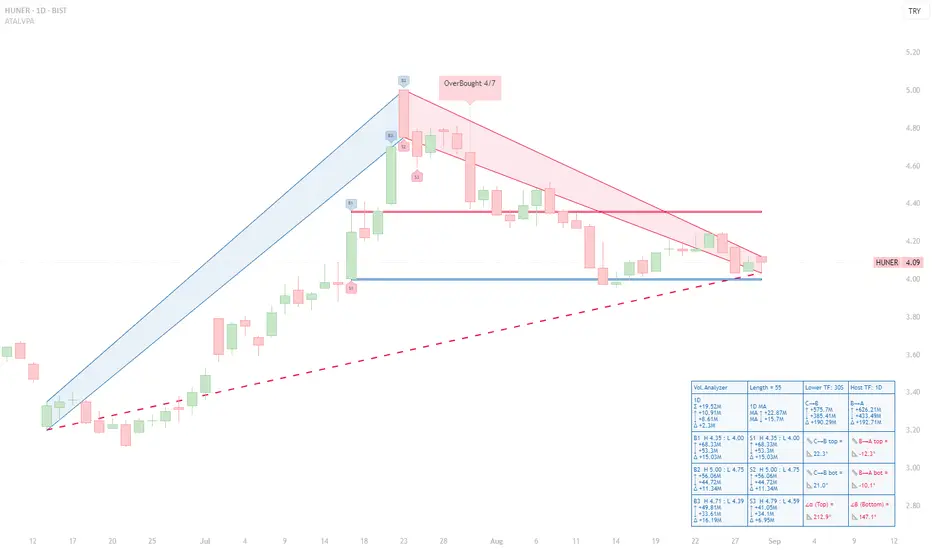
HUNER (1D) — Seller Bias After OB Cluster; Descending BA SlopesHUNER (1D) — Seller Bias After OB Cluster; Descending BA Slopes, 4.00 Support Under Test
Executive read (VPA, 55-bar window)
◉ OB/OS: An OverBought 4/7 tag printed at the apex; no confirmed OS on the right edge. That OB cluster preceded the entire red B→A leg and frames the current risk.
◉ Ranked volume peaks (Top-3):
- B1 (H 4.35/L 4.00) ↑ 68.33M, ↓ 53.3M, Δ +15.03M.
- B2 (H 5.00/L 4.75) ↑ 56.06M, ↓ 44.72M, Δ +11.34M.
- B3 (H 4.71/L 4.39) ↑ 49.81M, ↓ 33.61M, Δ +16.19M.
- S3 (H 4.79/L 4.59) ↑ 41.05M, ↓ 34.1M, Δ +6.95M.
Takeaway: Buying peaks were heavy, but subsequent price action failed to sustain higher highs; sellers have since controlled the B→A leg.
◉ Segment diagnostics:
- C→B advance: top/bottom slopes +22.3° / +21.0° → mature but constructive.
- B→A decline: top/bottom slopes –12.3° / –10.1° → persistent downside pressure.
- Orientation at B: α 212.9° (red) / β 147.1° (red) confirm the bearish state of the current swing geometry.
◉ Levels & structure:
- Support: the S1 low ≈ 4.00 is the active horizontal shelf repeatedly defended.
- Resistance: 4.35 (B1/S1 pivot), 4.71–4.79 (B3/S3 band), then 5.00 (B2). The descending B→A trendline caps bounces before these levels.
Actionable interpretation (educational):
Bias stays bearish-to-neutral while price trades beneath the B→A upper line and below 4.35. A credible shift would require (i) a fresh B-ranked bar with positive Δ near the right edge, and (ii) a close back above the B→A top. Failure to reclaim 4.35 after bounces leaves 4.00 vulnerable; a daily close below 4.00 would validate extension into the S-zones. Conversely, an OS print near 4.00 coupled with flattening BA slopes would set up a tactical mean-reversion toward 4.35 → 4.71/4.79.
Trendtrading
XAU/USD Intraday Plan | Support & Resistance to WatchGold rallied strongly yesterday, reaching into the $3,422 resistance zone, but failed to hold above and has since pulled back to around $3,409. Price is consolidating just above the $3,406 level, with short-term momentum still supported by the 50MA (pink) and 200MA (green) trending higher.
For the bullish case to continue, gold needs a decisive break and hold above $3,422, which would open the way toward $3,445. If price remains capped, we may see a deeper correction, first into $3,386, then $3,363, and potentially retesting the First Support Zone ($3,347–$3,328).
📌Key Levels to Watch
Resistance:
$3,422
$3,445
Support:
$3,406
$3,386
$3,363
$3,347
$3,328
🔎 Fundamental Focus – Friday, Aug 29
Today brings key U.S. data including Core PCE Price Index, Personal Income & Spending, Chicago PMI, and UoM Consumer Sentiment. These reports will give fresh signals on inflation and growth.
⚠️ It’s also the last trading day of August — expect higher volatility. Manage exposure carefully heading into the weekend.

GBPAUD → The correction is nearing completion...FX:GBPAUD is set to end the correction formed within the global bullish trend. A false breakdown of the liquidity zone is forming...
GBPAUD on D1 is testing a strong support zone, which gives traders hope for a possible recovery. Locally, the chart shows signs of the correction ending...
After correcting to 1/2 of the range, GBPAUD is forming a false breakdown of the order block and breaking the bearish structure, confirming the end of the correction. Consolidation above 2.076 could trigger a recovery within the bullish trend.
Resistance levels: 2.086, 2.0978
Support levels: 2.076, 2.0715
Despite breaking through the resistance of the local correction, the market must confirm the bullish sentiment. Consolidation of the price above 2.076 will confirm this nuance, and consolidation above the key support may influence further growth.
Best regards, R. Linda!

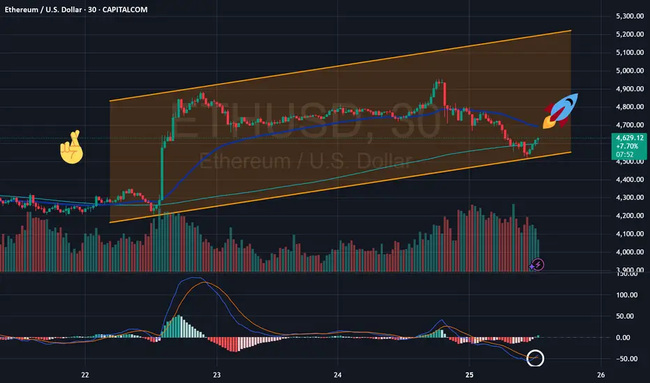
Ethereum Overtakes Bitcoin + new bullish MACD signal COINBASE:ETHUSD
ETH-based funds saw $2.87 billion of inflows in just one week — that’s 77% of all crypto ETF investments. Since the start of the year, cumulative inflows have reached $11 billion, bringing Ethereum’s share of assets under management to 29%. For comparison, Bitcoin’s share stands at just 11.6%.
This redistribution highlights a clear shift in institutional focus. While BTC was once the primary allocation tool, Ethereum is now taking the spotlight. Record inflows confirm that ETH is no longer just an alternative but a first-tier investment asset.
📊 Bullish Signal from MACD
At the same time, the MACD indicator is flashing a bullish signal for ETH. The histogram shows momentum turning positive, which often precedes strong upward moves.
⚙️ How MACD Works
MACD (Moving Average Convergence Divergence) tracks the relationship between two moving averages of price. When the MACD line crosses above the signal line, it suggests bullish momentum; when it falls below, it indicates bearish pressure. This makes MACD one of the most popular tools to confirm market trends.
What is your thoughts on Ether?
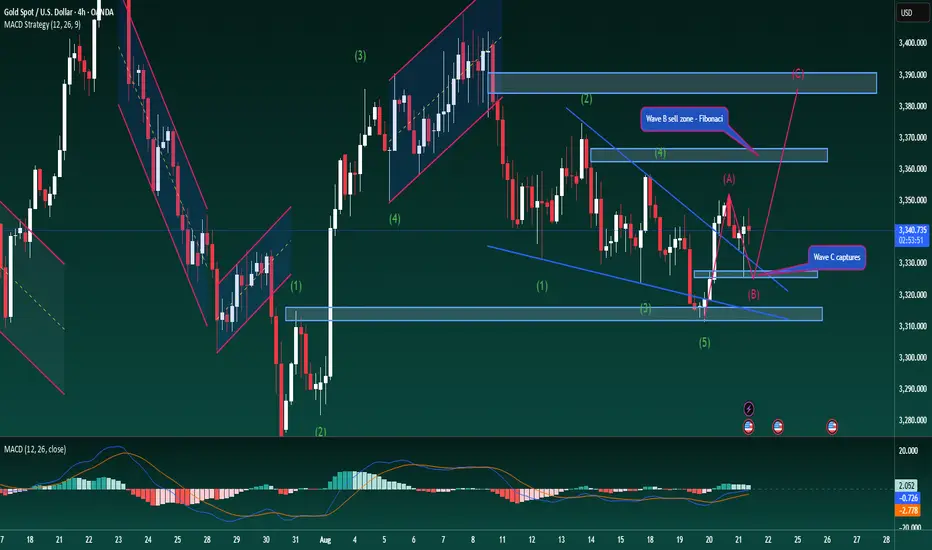
Gold – Elliott Wave “C” Begins (US Session Update)Gold – Elliott Wave “C” Begins (US Session Update)
Gold has reacted perfectly in line with Wave B, clearing the liquidity from yesterday’s H4 bullish candle and then surging strongly. The condition to look further towards Wave C – the final leg in the Elliott structure – is a decisive break above 3352. If confirmed, the long-term bullish outlook strengthens, with the next targets around 337x and potentially 3394.
News of a trade agreement between the EU and the US added strong momentum, helping to complete the corrective Wave B with impressive buying pressure.
For today’s US session, if you are still holding previous buy positions, it is worth keeping them. If not, the 3336–3340 zone provides a reasonable area to consider new long entries, with expectations that Wave C could extend towards 337x.
Always remember to place a tight stop-loss below the 3330 support area to manage risk effectively.
Wishing you success with this scenario – feel free to share your views in the comments below.
#XAUUSD #Gold #TechnicalAnalysis #PriceAction #ElliottWave #Fibonacci #Forex #Trading
USDCHF bullish view
OANDA:USDCHF Before this one, analysis on UC is be man.cl, sharing again and still having bullish expectations.
Bullish push we are have, price is make short revers till zone (0.80250), currently price in zone, from which expecting new bullish push
SUP zone: 0.80400
RES zone: 0.81300, 0.81600

XAUUSD Gold Trading Strategy August 15, 2025:
Spot gold prices edged down from intraday highs in Asia on August 14, 2025, approaching the $3,330/ounce area. Earlier, the US Dollar Index weakened to a two-week low of 97.839, along with falling US Treasury yields, pushing gold prices back up.
Fundamental news: The market is now pricing in a 97% chance of the US Federal Reserve cutting interest rates in September, with an increasing likelihood of one or even two more rate cuts before the end of the year. Lower borrowing costs and falling yields tend to support gold as the metal does not pay interest.
Technical analysis: After breaking out of the rising channel yesterday, gold prices have approached the old bottom of $3,330, and there is a high possibility of forming a bullish flag pattern on the H1 chart. However, this model needs a lot of time to create enough strength. We will mainly trade in the current bullish flag model.
Important price zones today: 3325 - 3330 and 3355 - 3360.
Today's trading trend: BUY hold.
Recommended orders:
Plan 1: BUY XAUUSD zone 3325 - 3327
SL 3322
TP 3330 - 3340 - 3350 - 3360 - OPEN.
Plan 2: SELL XAUUSD zone 3358 - 3360
SL 3363
TP 3355 - 3345 - 3335 - 3325.
Wish you a safe, successful and profitable weekend trading day.🌟🌟🌟🌟🌟

14.08 2025Yesterday my plan was clear if we make a little correction then I will open a long position to the ATH or if we go above ATH then I will open short position. And now it is a time to short market and my plan is clear and I'm gonna short market to 118,100 I see there a potential reverse zone if we grab liquidity from there.

USDCHF still bullish expectations
OANDA:USDCHF bullish push we are have, price is make short revers till zone, currently its on sup zone, from which expecting new bullish push.
SUP zone: 0.80400
RES zone: 0.82000, 0.82500

EURGBP higher bearish for expect
OANDA:EURGBP trend line breaked, DESCENDING TRIANGL also breaked, +after BOE event from last week here having higher bearish expectations
SUP zone: 0.86700
RES zone: 0.85900, 0.85600

How the PCCE + False Breakout Detector Performed in BTCChart: BTC/USDT (15m – BINANCE)
Tool Used: PCCE + False Breakout Detector
Type: Educational – How to interpret breakout and trap detection.
🟢 What the Indicator Does:
The PCCE + False Breakout Detector blends two core functions:
1. Price Coil Compression & Expansion (PCCE): Finds tight volatility compression zones and signals when price bursts out with strength (Burst↑ or Burst↓).
2. False Breakout Detection: Flags bull and bear traps when breakout moves fail to hold beyond recent swing levels.
This pairing gives a setup phase (compression), a confirmation phase (burst), and a risk filter (trap detection).
✅ Recent Performance Highlights:
📈 Early Session:
• Several Burst↑ and Burst↓ signals emerged during small compression ranges.
• A Burst↑ around 06:00 marked the start of a steady climb, confirming breakout alignment with volume/trend filters.
📉 Mid Session:
• A Burst↓ appeared, but price quickly reversed upward.
• The reversal was flagged as a bear trap (green ❌), warning traders of a failed breakdown.
📈 Late Session Rally:
• Around 15:00, a compression zone formed before a strong upward move.
• The breakout printed a Burst↑ and continued into a multi-hundred-dollar rally.
• Shortly after, a bull trap (red ❌) was flagged at the top — price stalled and pulled back within minutes.
🔍 Interpretation:
• Burst↑/↓ = Entry cues from high-probability volatility expansions.
• ❌ markers = Real-time warnings that a breakout may fail, helping avoid false momentum plays.
• Combined Effect : Captures early move potential while filtering risky breakouts.
⸻
📚 How to Apply in Trading:
1. Mark coil zones and prepare for potential expansion.
2. Confirm breakouts with Burst signals and, optionally, trend/volume filters.
3. Heed trap markers — they often precede reversals or consolidation.
4. Pair with higher-timeframe analysis for trend bias.
HBPCHF CONS LONGi see comsolidation on GBPCHF weekly chart. W touched the lower band before multiple times. Big idea is that we will see the price go from lower to upper band.
On Daily time frame we can notice that we have trendline brake and change of a short term trend.
Mora agresive traders adn enter now with lower risk. But Best enteri will be at first retracement on daily.

GBPCAD: Could we see price continue to the downside?Price on GBPCAD looks quite interesting at the moment, this latest moves continues the narrative of a downtrend.
As it is following a downtrend, each touch has served as a catalyst for a directional move. The most recent interaction is particularly interesting, because it's hovering here for some time now, and this could be a clue that we can use.
What may follow is subtle but telling: compression at trendline, low-volume candles suggesting exhaustion, all aligning for more potential release downward.
My target would be toward 1.8100 where we have a clear support zone. Momentum has respected structure and if this move plays out, I don't think it will be a breakout, but a continuation of a narrative that’s already been happening. This is what makes the setup so compelling. It’s not new, it’s the a "story being told".
Though a scenario for more upside is possible and can happen just as much. Still, I would take the side for more downside taken into account all above.

Nifty 50's Elliott Wave Analysis & Price ProjectionHey, so let's take a look at this chart of the Nifty 50. where the market might be heading. Just a heads-up, this is all for learning, not for making actual financial decisions. Think of it more like a potential roadmap than a guaranteed outcome.
From what I can see, the chart is laying out a classic five-wave pattern.
* Wave 1: The first big push up was in the latter half of 2022 into early 2023. It was the start of the uptrend.
* Wave 2: After that, the market pulled back a bit—a healthy correction, really—in the middle of 2023. It didn't drop below the starting point of the first wave, which is exactly what you'd expect.
* Wave 3: This was the huge run-up that we saw from mid-2023 all the way into early 2024. That's typically the strongest and longest part of the move. The chart marks it with a "(b)" which suggests it's part of a bigger picture, but for now, we can see it as the big third wave.
* Wave 4: Now, we're in the middle of a correction, a kind of zigzag, that started after that massive run-up. The chart shows it finding a bottom around mid-2025. It's like the market is taking a breather before the final push.
* Wave 5: And this is where it gets interesting. The chart is forecasting the final leg up, starting from this mid-2025 low. It's suggesting we could see a big rally, with the Nifty potentially hitting targets around 28,000 and even above 30,000 by late 2026 or 2027.
Basically, the chart is saying we've gone up, corrected, gone up big, and now we're in a smaller correction, getting ready for one last big move to the upside.
Again, this is just one way of looking at the market. No one has a crystal ball, and a ton of other things—like news, company earnings, and what's happening around the world—could change this forecast completely. So, always do your own homework and talk to a pro before you invest your hard-earned money.
This forecast report is for educational purposes only and should not be considered financial advice. Market analysis, especially projections based on technical indicators like Elliott Wave theory, is speculative and does not guarantee future results. Always conduct your own research and consult with a financial professional before making any investment decisions.

NZDCAD higher bullish for expect
OANDA:NZDCAD price in PA, its make bounce on bottom line of PA, here after todays events expecting higher bullish continuation.
SUP zone: 0.81500
RES zone: 0.82600, 0.82850

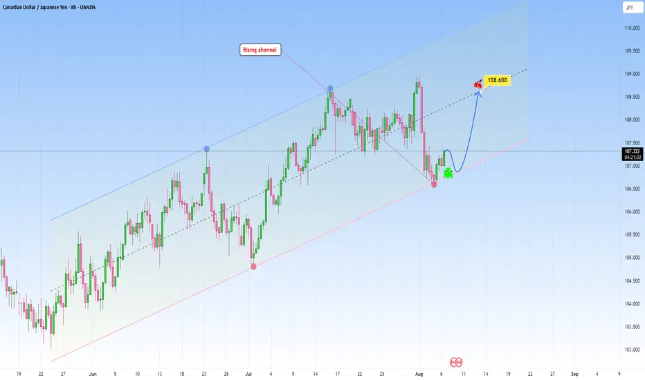
CADJPY: Moving in a clear rising channelCADJPY is currently respecting a well-defined rising channel structure, with price reacting cleanly to both the upper and lower bounds of the channel.
After a sharp correction, price has once again tapped the lower trendline support, a level that has triggered bullish reversals, and is now showing early bullish signs.
This bounce suggests the market is preparing for another leg up, with 108.600 marked as a key target near the midline of the channel, which often acts as dynamic resistance in trending conditions.
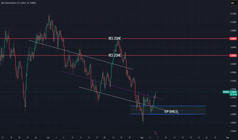
NZDUSD bullish view for this week
OANDA:NZDUSD structure based analysis, price in PA bouncing on bottom line, here bullish expectations for this week.
SUP zone: 0.59000
RES zone: 0.60200, 0.60600
CADJPY still bearish to expect
OANDA:CADJPY strong bearish fall in week behind us, for next week still having bearish expectations.
SUP zone: 108.000
RES zone: 105.900, 105.500

THE RESULTTHE RESULT
Follow for more Simple And accurate swing analysis on Indices, Currency, Commodities.

EURUSDEURUSD needs a correction down or a break above resistance, retest and another push up this week.
Disclosure: We are part of Trade Nations Influencer Program and receive a monthly fee for using their TradingView charts in our analysis.
Corrective Dip or New Downtrend on the S&P 500 Futures?🟣 1. Impulses vs. Corrections – The Classical View
When price trends, it doesn't move in a straight line. Instead, it alternates between directional movements called impulses and counter-directional pauses or retracements known as corrections. Most analysts define an impulse as a sharp, dominant move in the direction of the trend—typically accompanied by rising volume and momentum indicators. Corrections, on the other hand, tend to be slower, overlapping, and often occur with declining volume.
Common methods to identify impulses vs. corrections include:
Swing structure: Higher highs and higher lows suggest impulse; overlapping lows suggest correction.
Fibonacci retracements: Corrections often retrace up to 61.8% of a prior impulse.
Moving averages: Price above a rising MA is often viewed as impulse territory.
Volume analysis and oscillators such as RSI or MACD are used to confirm price behavior.
Despite the abundance of methods, the distinction between impulses and corrections often remains subjective. That’s where the Directional Movement Index (DMI) provides an objective lens—especially when paired with price action.
🟣 2. Rethinking Impulses with the DMI Indicator
The Directional Movement Index (DMI), developed by J. Welles Wilder, offers a quantitative way to assess the strength and direction of price movement. It breaks down market activity into three components:
+DMI (Positive Directional Movement Index): Measures the strength of upward movements.
−DMI (Negative Directional Movement Index): Measures the strength of downward movements.
ADX (Average Directional Index): Quantifies overall trend strength but is optional in this discussion.
The key to applying DMI lies in the crossover between +DMI and -DMI:
When +DMI > -DMI, upward price moves dominate—suggesting bullish impulses.
When −DMI > +DMI, downward moves dominate—suggesting bearish impulses.
Calculation is based on a comparison of successive highs and lows over a specific lookback period—commonly set to 14 or 20 periods.
While EMAs track trend direction and momentum, DMI helps dissect who’s in control. This makes it a powerful filter when evaluating whether a breakdown or breakout is likely to become an impulsive trend—or just another correction in disguise.
🟣 3. Case Study – Two Breakdowns, Two Outcomes
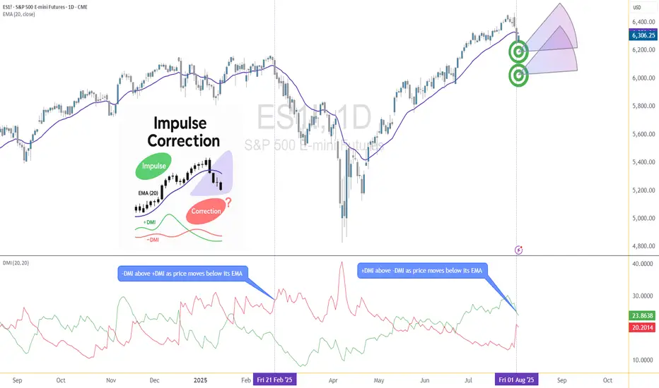
Let’s apply this logic to two recent moments on the E-mini S&P 500 Futures (ES) daily chart.
🔹 Feb 21, 2025 Breakdown
Price broke sharply below the 20-period EMA. At first glance, this looked like a potential trend reversal. The DMI confirmed this suspicion: −DMI surged above +DMI, signaling downside impulses were in control. The market followed through with a clear downtrend, confirming the move was not just a pullback—it was a shift in market structure.
🔹 Aug 1, 2025 Breakdown
A similar sharp break below the 20 EMA just occurred again. However, this time +DMI remains above −DMI, despite the bearish price action. This divergence tells a different story: the breakdown may not be impulsive in nature. Instead, it's likely a corrective dip within a broader uptrend, where buyers are still the dominant force.
This is a textbook example of how a moving average crossover without DMI confirmation can mislead traders. By combining these tools, we’re able to make more informed decisions about whether price action is signaling a true shift—or just a pause.
🟣 4. CME Product Specs – ES vs. MES
Traders can express directional views on the S&P 500 using two primary CME futures contracts: the E-mini S&P 500 Futures (ES) and the Micro E-mini S&P 500 Futures (MES). Both track the same underlying index but differ in size, capital requirement, and tick value.
✅ E-mini S&P 500 Futures (ES)
Symbol: ES
Contract Size: $50 x S&P 500 Index
Tick Size: 0.25 index points
Tick Value: $12.50
Initial Margin: Approximately $21,000 (varies by broker and through time)
Market Hours: Nearly 24/6
✅ Micro E-mini S&P 500 Futures (MES)
Symbol: MES
Contract Size: $5 x S&P 500 Index
Tick Size: 0.25 index points
Tick Value: $1.25
Initial Margin: Approximately $2,100 (varies by broker and through time)
The Micro contract provides access to the same market structure, liquidity, and price movement as the E-mini, but with a fraction of the exposure—making it ideal for smaller accounts or more precise position sizing.
🟣 5. Risk Management Matters
Understanding whether a market move is impulsive or corrective isn’t just academic—it’s the difference between positioning with the dominant flow or fighting it. Traders often get trapped by sharp moves that appear trend-defining but are simply noise or temporary pullbacks.
Using tools like DMI to confirm whether directional strength supports price action provides a layer of risk filtration. It prevents overreaction to every EMA crossover or sudden price drop.
Stop-loss orders become vital in both impulsive and corrective conditions. In impulsive environments, stops help lock in profits while protecting from reversals. In corrective phases, they act as circuit breakers against breakouts that fail.
Moreover, knowing the product you're trading is critical:
A single ES contract controls ~$320,000 of notional value.
An MES contract controls ~$32,000.
This disparity means poor sizing on ES can magnify errors, while proper sizing on MES can offer flexibility to test, scale, and hedge with tighter capital control.
Whether you're reacting to price or preparing for continuation, risk management is the only constant. It’s what turns analysis into disciplined execution.
When charting futures, the data provided could be delayed. Traders working with the ticker symbols discussed in this idea may prefer to use CME Group real-time data plan on TradingView: www.tradingview.com - This consideration is particularly important for shorter-term traders, whereas it may be less critical for those focused on longer-term trading strategies.
General Disclaimer:
The trade ideas presented herein are solely for illustrative purposes forming a part of a case study intended to demonstrate key principles in risk management within the context of the specific market scenarios discussed. These ideas are not to be interpreted as investment recommendations or financial advice. They do not endorse or promote any specific trading strategies, financial products, or services. The information provided is based on data believed to be reliable; however, its accuracy or completeness cannot be guaranteed. Trading in financial markets involves risks, including the potential loss of principal. Each individual should conduct their own research and consult with professional financial advisors before making any investment decisions. The author or publisher of this content bears no responsibility for any actions taken based on the information provided or for any resultant financial or other losses.
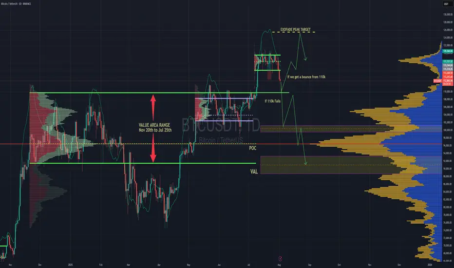
BTC Forecast For August & September. The Only Roadmap You Need !This is one is so obvious, its a no brainer , and would likely be very easy to trade as long as you follow this road map i have provided.
The Value Area High at 110k price range is most important upcoming battle line between bull vs bear. If bulls fail to get a strong bounce from 110k and we close at least 2 daily candles below it. Then it would mean bears have full control and the implication of that is that since we would at that point be closing back inside an established Value Area range, formed between Nov 20th to Jul 25th, then it would mean the probability of price selling all the way down to re-test the VAL (value area low) at $91.6k would instantly become very very high.
After re-testing $91.6k we'll watch and see what happens.
It'll either hold after grabbing some liquidity below and stay in the Value Area Range until further notice Or we lose it and the sell off continues. Bear market will be in full swing if that happens and you can bet a ton of weak hands will start to exit due to max pain & cascading long liquidations. Fear index will be back in the red at that point as capitulation starts to set in. Alot of new alts and meme coins will be completely obliterated.
Bullish Continuation Scenario
If bulls get a strong bounce from 110k and don't close back inside the Value Area Range below, then we could continue up to a make a new ATH for a classic trend pullback continuation trade. Once we get back above 115.4k, the dream of a new ATH will become much more realistic. There is an UFA(Unfinished Auction) at 120.8k which is only visible to traders using the market profile or footprint chart. This make poor high and needs to be taking out at some point.
For the Price target to the upside, we would be using the peak formation line of the ExoFade indicator.
CADJPY - Downside to continueSellers has taken control with a massive push down, wait for bearish continuation to form to confirm another sell opportunity.
Good Luck
