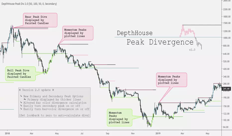
DepthHouse - Peak DivergenceDepthHouse - Peak Divergence indicator uses the same linear regression calculation as my Peak Momentum Oscillator to help determine and plot peak momentum points.
These peak levels are then plotted by either red or green lines above or below the candle.
Red lines represent a peak in bear momentum while green represents peaks in bull momentum.
These levels are then used to determine momentum divergence in the displayed market.
If divergence is present the bars colors will change represent either bull or bear div.
Important Notes:
If the price crosses a peak line and the bar color does not change; it means momentum has increased/decreased with the price and the divergence has been canceled.
If divergence is present, and then the following candle is not colored then momentum has increased to cancel the previously present divergence.
By default, the look-back period is set to zero , which automatically calculates the distance for the peak levels to look-back. However this number can be set to whatever look-back period you would like.
At time of release this indicator is in its early stages. So please leave feedback on how it can be improved!
Overlay
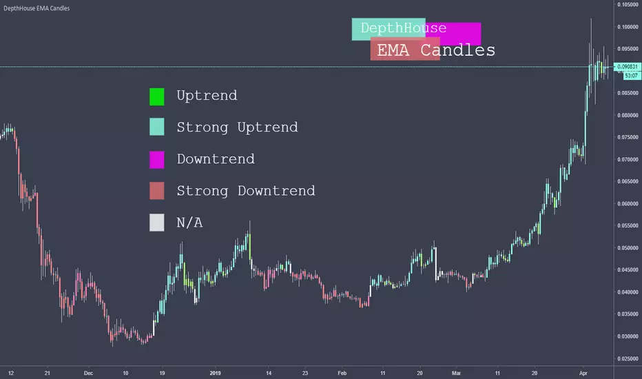
DepthHouse Exponential CandlesThis EMA Candles indicator use the price movement between two user selected Exponential Moving Averages to help determine the current trend.
As of release, there are 5 possible bar color outputs, all of which are shown in the legend above.
The Five Electable Color Outputs:
Uptrend; Strong Uptrend; Downtrend; Strong Downtrend; n/a
I hope you all enjoy!
Please leave your suggestions in the comments below!
ATRMSRATRMSR
MTF ATR Horizontal S/R deviations
MTF ATR trailing stops
MTF ATR High/low
Will be updated soon.
V.01

UMMLMurray math with options to calculate wicks for readjusting of "Frame" ,mtf support to select desired period lines without switching time frames, Fractal and mtf fractal support ,option to keep just extreme deviations, UMML expands and contracts differently than similar scripts in volatile periods and are easily configurable by users for size,style and reactivity of lines
previous version hosted in link below
The Grid
indicator isnt finished yet as smoothening for line expansion and contractions is still being worked on alongside function to average the lines for short-median-long tf in MTF grid mode
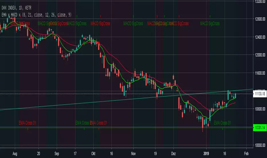
EMA Cross + MACD Signal Cross overlay Einfacher EMA-Cross Indikator mit Indikation der Crosses auf EMA-Linie und am Chart-Bottom +
MACD-Cross wird default an: location.top angezeigt zusätzlich zeigt die Hintergrundfarbe an ob der MACD über (grün) oder unter (rot) seinem Signal liegt.

Historical Point and Figure BoxesThis indicator plots the last filled/completed Point and Figure block, overlaid onto any regular candles chart, for every historical candle.
The Pine security(pointfigure(...)...) function inappropriately associates the timestamps of both the "open" (start of column) and "close" (end of column) with the time at which the terminal reversal took place, which leads to invalid overlays when plotted over top of regular candles charts, regardless of barmerge.lookahead_on/off. This script solves that problem and plots each brick at the time it was confirmed.
V24: Released.

Enhanced Donchian Channel OverlayThis is my first public release of an indicator, free for all to use. There will be a multitude of indicators significantly more complex in the future, still under testing. It's simple purpose is to track highest high in red and lowest low in lime over a specified period of 5 preceding bars by default. The upper and lower banding have independent adjustable period settings. The banding line widths are also adjustable. A smoothable mean line is displayed in olive color and may be disabled by altering the line width to zero. I also included a yellow close line capability disabled by default by it's line width. I presume most people use candles but an occasional few may wish to see a close line plot too. Please provide any feedback/requests as you wish.

Responsive Comparison Line by SymbolThis script allows you to specify a security to overlay on your chart when viewing a certain symbol. The line will only show on that symbol, change symbols and it will disappear. I found that adding more than 4 lines will slow load time significantly, however if you can code it to be faster please let me know!
All credit to @gyromatical, a good samaritan.

Ichimoku DoubleTF overlay
Hello guys, this code allow to overlay a second ichimoku over the first one loaded on the used time-frame.
It's simple.
Choose your preferred Time-frame.
Set the Time-frame for the second Ichimoku in the settings menu .
Now you can see two Ichimoku clouds based on two different time-frame.
It can be very usefull and more ordered of a multi-windows layout.
On second Ichimoku the Chikou-span is omitted 'cause i think that is useless and cumbersome.
To help to reading the graph i set two labels to identify the "2nds" tenkan and kijun.
Tell me if this script was useful and remember to follow me and adding a like.
Available combinations:
DAILY: WEEKLY AND MONTLY
4H: WEEKLY, DAILY
1H: WEEKLY, DAILY, 4H
30m: DAILY, 4H, 1H
15m: DAILY, 4H, 1H, 30m
5m: DAILY, 4H, 1H, 30m, 15m
3m: 1H, 30m, 15m
1m: 1H, 30m, 15m,5m,3min
Thanks, bhutano
*****************************************************************************************************
Ciao ragazzi, questo codice permette di sovrapporre un secondo Ichimoku a quello del time-frame utilizzato.
Scegliete il vostro time-frame preferito.
Impostate il time-frame del secondo Ichimoku dalle impostazioni dello script .
Adesso vedrete due Nuvole Ichimoku basati su due time-frame diversi.
Può essere davvero utile e più ordinato di un layout multi-window.
Sul secondo Ichimoku la Chickou è stata omessa perchè penso che sia inutile e ingombrante.
Per aiutare la lettura del grafico ho impostato due etichette per identificare le seconde tenkan e kijun.
Ditemi se questo script vi è stato utile e ricordatevi di seguirmi e aggiungere un mi piace.
Combinazioni possibili:
DAILY: WEEKLY AND MONTLY
4H: WEEKLY, DAILY
1H: WEEKLY, DAILY, 4H
30m: DAILY, 4H, 1H
15m: DAILY, 4H, 1H, 30m
5m: DAILY, 4H, 1H, 30m, 15m
3m: 1H, 30m, 15m
1m: 1H, 30m, 15m,5m,3min
Grazie, bhutano

Seven Simple Moving AveragesBy default, this script overlays seven simple moving averages (5, 10, 20, 50, 100, 150, 200) and allows you to customize the SMA values as you wish. If a candle closes at or above a moving average, the plot for that SMA is colored green for that candle otherwise it's red.


RIZ - Alpha Cross - Updated Version & For Students OnlyThis is the updated version of the RIZ - Alpha Cross indicator/overlay.
it is ONLY available to Riz International Stock Trading Mentoring Students.
You can check out our website to see what we offer:
rizinternational.com
Thanks,
Riz

Impulse Volume Emiliano Mesa OscillatorThe impulse volume overlay, is the 1st part of my 2 part volume impulse indicator. The indicator has the sole purpose of measurearing a signifcant increase in the volume of either sellers or buyers and with the the help of a signal line suggest when there is an impulse in any of them.
How it works:
Yellow == No impulse... Market will most probably follow the trend
Red == Market has a seller increase
Lime == Market has a buyer increase
I DO NOT TAKE RESPONSABLITY FOR LOSSES. USE INDICATOR UNDER YOUR OWN RISK

Impulse Volume Emiliano Mesa OverlayThe impulse volume overlay, is the 2nd part of my 2 part volume impulse indicator. The indicator has the sole purpose of measurearing a signifcant increase in the volume of either sellers or buyers and with the the help of several EMA lines giving perfect entries. Results are very promising even in FOREX market... For now it has only been tested in 5 min charts.
How it works:
1) Check either if the price is in a down or up trend. So if the price is under both 100 and 200 EMA its down, and viceversa
2) If you have a down trend, wait for the overlay indicator to highlight the bars green, when the highlight stops enter a selling position, it is suggested you calculate your stop loss with the ATR. If the trend was going up, do the same with the red highlight.
3) Exit position when you feel like it, furthermore a trailing stop is suggested in order to maximize profit.
I DO NOT TAKE ANY RESPONSABILITY FOR LOSSES. USE INDICATOR UNDER YOUR OWN RISK.
Better Volume - a separate, non-overlaid volume indicatorHey guys
Coming at you again with a very simple script for displaying volume that is not overlaid on the price chart. This volume is in a separate indicator window for when you don't want the volume to get in your way. Bonus: default colors are color matched to default volume indicator (can be changed in the "Style" tab under settings). Includes the moving average as well, with the option to hide it if desired
Inspired by @tradedevils

RSI Overbought/Oversold OverlayDo you love RSI Overbought/Oversold signals, but want more space on the screen for the actual price chart? "RSI Overbought/Oversold Overlay" to the rescue! This indicator highlights the chart's background color green when the RSI goes overbought and red when the RSI goes oversold. You can set the RSI length, overbought level, and oversold level in the format box.
Obviously, this is not the indicator to use if you're looking for things like RSI divergence, but if you're only interested in when RSI reaches the extremes of the range, this can save you some screen real estate.

Mendy's Impulse SystemThis is an adaptation of Elder's Impulse System.
In Elder's Impulse System, he makes use of a MACD and an Exponential Moving Average (EMA) as censors in his buy or sell decisions. If both the direction of the MACD-Histogram and the EMA's slopes are upward, the censor gives him the permission to buy. If both of their directions are downward, the censor gives a permission to sell. If one is sloping upward and the other downward, the censor gives a blue signal, and depending on context, either a buy or sell signal, or better yet a hold signal.
First, this new indicator takes the idea a step further by using the Arnaud Legoux Moving Average (ALMA) in lieu of an Exponential Moving Average in the computation of the MACD line. The ALMA was designed to be more responsive to changes in price, so the idea here is that the responsiveness will give more reliable buy or sell signals vs. the usual MACD.
Next, in Elder's original Impulse System, he makes use of the direction of the EMA (usually 13-period) to complement the MACD indicator he's using. In the new indicator, instead of using one EMA, two EMAs are used, one fast and another slow. The slow and fast EMAs are usually used to indicate the trend of the security being traded: a fast EMA above the slow EMA indicates an uptrend, while the reverse shows a downtrend. That being said, what replaces the function of Elder's EMA is not the fast and slow EMA, but the difference between the two: A positive value indicates an uptrend, while a negative value indicates a downtrend.
Third, the color signals generated by this new indicator does not make use of the value of ALMACD-Histogram and the EMA Difference. Rather, it uses the Rate of Change of both the value of the ALMACD-H and the EMA Difference compared to their previous day values. This decision stems from my issues with charting, because when you look at a chart spanning a large period of time, some periods have big price swings that causes the indicators of that period to have big values. Those big values then causes the chart to auto-adjust values, which makes the rest of the values within the indicator shrink. You can be fooled into thinking that a positive MACD-H signal has no momentum because it looks little compared to the huge histogram a few periods before that.
Therefore, my solution to that is to track the change of these values instead. By tracking the Rate of Change of these values, you can see if the indicator is losing momentum. When the Rate of Change shows a negative value, it means that the indicator is sloping downward, and if it shows a positive value, then it means the indicator is sloping upward. In this context, this indicator can be considered an oscillator as well. A positive consequence of this is that when the value of the Rate of Change crosses the zero line, it indicates the earliest point in which you can enter a buy/sell position. Following Elder's idea of indicator seasons, crossing the zero line indicates either the start of Spring or the start of Autumn.
All in all, this new indicator generates three colors, similar to Elder's Impulse System: Red, Blue, Green. The indicator will return a Red color when both the ALMACD-Histogram and EMA Difference's Rate of Change is negative. The indicator will return a Blue color if one of them is sloping downward and the other upward. The indicator will return a Green color if both the ALMACD-H and EMA DIfference's Rate of Change is positive.
Finally, this indicator will overlay the color signals over the bars/candles, as well as show you the ALMACD-Histogram and EMA Difference.
I hope you find this indicator useful. Happy trading.
Special thanks to Samuel16 for his code on Elder's Impulse System, and Sclark39 for his code on Arnaud Legoux MACD.

RSI / STOCH RSI OVERLAY by BluephantomI found that I was always using the RSI and Stoch RSI in combination with each other and I started to merge them.
But I found that it was getting annoying having to merge them every time I opened them up on the screen
I also used a horizontal line at 50 to show the mid point as many traders do but again it was something I had to add every time I opened up the indicator again.
So I created this script that overlayed the Stoch RSI and RSI and added a half way line at 50.
Please note that the default lengths are at (10) instead of (14). This is just my personal preference for Bitcoin/Crypto trading. You can change these settings and "Save As Default" to whatever works for you.

TEMA/hullMA Ribbon with Bollinger BandsDesigned for shorted time frames.
Bollinger bands based off of TEMA as source.
Ribbon based off TEMA and hullMA divergence.
RMA used to signal Bollinger bands.
Ribbon:
pinch -> reversal
blue -> sign of possible uptrend
red -> sign of possible downtrend
Bollinger bands background:
blue -> sign of continuing uptrend
red -> sign of continuing downtrend
