CycleWave BTC/USD H1# CycleWave BITSTAMP:BTCUSD H1 Time Reversal Prediction
## Technical Description
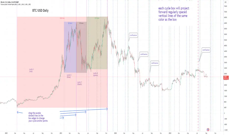
This indicator displays pre-calculated cycle data for Bitcoin on the H1 timeframe. Unlike traditional indicators that calculate cycles in real-time, this one uses carefully pre-analyzed cycle data that I manually input after conducting detailed spectral analysis offline. The indicator itself serves as a visualization tool that presents these pre-calculated cycles and provides statistical information about their performance.
## Core Features
* Displays a color-coded line representing manually identified market cycles
* Shows forward projection up to 32 hours ahead (dotted section)
* Uses color to indicate predicted trend direction (green = up, red = down)
* Includes an information panel with statistical data and timing estimates
* Pre-calculated specifically for BTC/USD on the H1 timeframe
## Data Source Methodology
The cycle data displayed by this indicator comes from:
1. Offline spectral analysis using specialized software
2. Manual identification of dominant market cycles
3. Careful filtering to select the most significant 4-6 cycles
4. Expert combination and weighting of cycles based on historical performance
5. Regular updates when market conditions change or cycles need recalibration
The indicator itself doesn't perform these calculations - it simply visualizes the pre-analyzed data and provides performance statistics.
## How To Use
1. The main colored line shows the projected cycle movement:
- Green sections indicate expected upward movement
- Red sections indicate expected downward movement
2. The dotted continuation shows the future projection
3. The information panel provides:
- Current trend direction
- Cycle completion percentage
- Hours until expected trend change
- Expected trend change timestamp
- Correlation quality (statistical measure of past accuracy)
## Practical Application
This indicator is particularly useful for:
* Timing entries and exits around predicted turning points
* Planning ahead for potential reversals
* Confirming signals from other technical indicators
* Understanding the current position within the cycle
## Customization Options
* Time Shift: Fine-tune the cycle alignment (+/- 24 hours)
* Invert Cycle: Reverse the cycle direction when needed
* Visualization settings: Adjust line width, dots width, and colors
* Information display: Toggle the statistical information panel
## Limitations
* Shows potential reversal TIMES, not exact price levels
* Periodically requires updates as market cycles evolve
* Performance may vary during highly volatile periods
* Past correlation does not guarantee future accuracy
The data behind this indicator is manually updated based on ongoing cycle analysis to maintain accuracy with changing market conditions.
Search in scripts for "Cycle"
Cycle-Period Adaptive, Linear Regression Slope Oscillator [Loxx]Cycle-Period Adaptive, Linear Regression Slope Oscillator is an osciallator that solves for the Linear Regression slope and turns it into an oscillator. This is a very simple calculation and uses one of Ehler's first implementations of his cycle period calculations. The output slope value is smoothed after calculation and before being drawn. This is a sort of momentum indicator and has a rich history with Forex traders around the world.
What is the Cycle Period?
The spectral content of the data are measured in a bank of contiguous filters as described in "Measuring Cycle Periods" in the March 2008 issue of Stocks & Commodities Magazine. The filter having the strongest output is selected as the current dominant cycle period. The cycle period is measured as the number of bars contained in one full cycle period.
What is Linear Regression?
In statistics, linear regression is a linear approach for modeling the relationship between a scalar response and one or more explanatory variables. The case of one explanatory variable is called simple linear regression; for more than one, the process is called multiple linear regression.
Included:
Bar coloring
2 signal types
Alerts
Loxx's Expanded Source Types
Loxx's Moving Averages
Cycle Theory + Frequency TheoryCycle Theory attempts to predict, through volatility, support/resistance points where the market may reach/reverse a trend. This theory's calculation is based on a reference candle that the user chooses, usually the first candle of the day/week's session. From this point on, if the level is broken upwards or downwards, the 1st Cycle begins with the same distance between the high/low or open/close of the reference candle. From the 2nd Cycle onwards, the size becomes the sum of all the last cycles formed, and so on.
Frequency Theory is similar, but its levels always have the same size as the high/low or open/close of the reference candle.
CyclesTime based indicator attempting to show changes in a cycle based on the different time elapsed between new highs and new lows in a given time period. Useful when combined with elliott wave price structure. A drop above/below 0 suggests a wave 4 whilst new highs/lows of the indicator suggest whether a bullish or bearish trend is in place. You can change the time cycle as you like. Any Q's please post, i'll be happy to answer them. (If I can)
Cycles: 4x dual inputs: Swing / Time Cycles projected forward//Purpose/Premise:
To project forward vertical 'cycle' lines based on user-input anchor points, and to search for confluence.
The idea being that if several well-anchored cycles agree (i.e. we see multiple bunched vertical line confluence in the future), then this may add support to an already existing trade idea, or may indicate an increased likelihood of a shift in direction.
//Usage & notes:
~In the above chart I've anchored to obvious swing lows and swing highs in Btc/Usd from 2020-2022. You could also use fixed time-based cycles from a favored start anchor point. Bars per cycle are printed at the top of each cycle box if your're interested in time cycles. I.e. for 1, 2, 3 month cycles: for BTC you could use 30, 60, 90 bars on daily; for S&P you could use 20, 40, 60 bars on daily.
~On first loading the indicator you will be asked select 'start date', and 'end date' for each of 4 sessions (8x clicks on chart). After this you can easily reset points by clicking the indicator display line three dots>> reset points. Or you can simply drag the vertical box edges (purple lines) to change your cycle anchor points.
~Be sure the start anchor point is before the end anchor point or box/lines won't appear.
~When you drop down to low timeframes you might get bar_index error due to history available: you need then to click the three dots on indicator display line >> reset points >> 8x clicks on the chart.
~Vertical projected lines will match the color of the cycle box they origninate from.
~Lines will project into the future as far as is allowed by tradingview (500 bars max)
//Inputs:
~Time start and end dates for each cycle (change these as described above, or input manually)
~Show/hide each cycle (default is show all 4)
~Formatting options: color of forward projected lines, line width, line style, line / box / text color.
~Box transparancy: Set to 100 to make boxes invisible & declutter the chart. Set to 0 for maximum opacity. Default is 80.
thanks to @Sathyamurthie for his ideas on cycle confluence which caused me to write this.
SATAN Cycle BitcoinWith this indicator I want to dismantle the Pi Cycle Bitcoin indicator since the community thinks that it has a mathematical basis based on the Pi number, nothing is further from reality, the indicator uses averages which, divided, result in the Pi number but in the code uses some multipliers to adjust the crossing of averages and I demonstrate it with this indicator in which if you add the averages you get the number 666, is the demon behind the Bitcoin cycles? NO, it is only an adjustment of averages and multipliers. With this I only intend to alert the community that the indicator is 0% reliable.
CycleSync | QuantEdgeBIntroducing CycleSync by QuantEdgeB
Overview
CycleSync is a powerful valuation and cycle-tracking system designed to provide insights into asset price behavior across different phases of market cycles. It integrates on-chain data, price-based indicators, and risk-adjusted metrics to offer a comprehensive valuation model that helps traders and investors identify accumulation, distribution, and momentum shifts.
This system is ideal for those who want data-driven confirmation of market tops and bottoms, leveraging a blend of statistical measures, trend-following techniques, and historical on-chain valuations.
_____
Key Features
1. Multi-Factor Valuation Framework
Incorporates a blend of on-chain, momentum, and price-based indicators to assess market cycles in real-time. Helps determine if an asset is overvalued, fairly valued, or undervalued over long term horizon.
2.Market Cycle Recognition
Tracks key macro and micro cycle shifts, identifying trends such as accumulation, expansion, distribution, and contraction phases.
3.Dynamic Valuation
CycleSync employs Z-score standardization and adaptive rescaling to continuously refine overbought and oversold thresholds based on evolving market conditions. Unlike static valuation models, which rely on fixed levels, CycleSync dynamically recalibrates these boundaries by analyzing historical price distributions and deviations from the mean.
4.Comprehensive Dashboard
Presents cycle indicators and valuation scores in a structured table format.
Displays color-coded overbought and oversold signals for quick interpretation.
_____
How It Works
1.On-Chain & Price-Based Data Collection
Gathers key market cycle indicators like MVRV, NUPL, SOPR, CVDD, VWAP, Pi-Cycle, RSI, and Risk Ratios to assess historical valuation.
2.Standardization & Rescaling
Each metric is normalized using either Z-score calculations or high-low rescaling, ensuring fair contribution across different data sources. By applying statistical normalization techniques, the system ensures that extreme valuations are detected relative to the asset's own historical behavior rather than arbitrary thresholds.
3.Valuation Score & Interpretation
🔹 CycleSync Score Ranges
- 📉 Strongly Oversold (-2 and below) → Market is extremely undervalued; potential reversal.
- 📉 Moderately Oversold (-1.5 to -2) → Discounted market conditions, buying interest may emerge.
- 📉 Slightly Oversold (-0.5 to -1.5) → Possible accumulation phase.
- ⚖ Fair Value (-0.5 to +0.5) → Market trading at equilibrium.
- 📈 Slightly Overbought (+0.5 to +1.5) → Initial signs of market strength.
- 📈 Moderately Overbought (+1.5 to +2) → Market heating up, caution warranted, selling interest may emerge.
- 📈 Strongly Overbought (+2 and above) → Extreme valuation, increased risk of correction.
This classification helps traders gauge overall market sentiment and make better allocation decisions.
Note : Past valuations and buy/sell signals generated by CycleSync do not guarantee future performance. Market conditions can change, and proper risk management should always be applied.
____
Use Cases
✅ Crypto Traders & Long-Term Investors
Identify potential major market tops and bottoms using on-chain and price-based cycle indicators.Confirm long-term accumulation or distribution phases with CycleSync’s multi-cycle tracking.
✅ Macro Trend Followers
Detect macro bull and bear cycle shifts by integrating valuation metrics with trend-following strategies.
✅ Mean Reversion & Rotational Traders
Exploit valuation mean reversion strategies when assets enter extreme overvaluation or undervaluation zones. Rotate capital efficiently between risk-on and risk-off assets based on CycleSync’s valuation models.
✅ Risk Management & Portfolio Allocation
Adjust portfolio exposure by scaling in/out of positions based on historical valuation insights.
Use CycleSync’s Risk Ratios & CVDD metrics to refine entry and exit strategies.
_____
📊 Optimized for Bitcoin , Yet "Universally" Adaptable 🔄
CycleSync is primarily optimized for Bitcoin , leveraging their extensive on-chain and market data to provide robust long-term valuation insights. However, the system remains flexible and can be applied to other assets 📉📈—provided they have sufficient historical price data to support reliable statistical calculations.
Since CycleSync incorporates volume-based metrics, it is essential that the selected chart's ticker provides accurate volume data to function properly. For assets with limited history, results may be less reliable, as long-term valuation models depend on deep market data for precision.
_____
Conclusion
CycleSync is a powerful full-cycle valuation system designed to provide deep market insights 📊 by blending on-chain metrics, statistical rescaling, and technical analysis. Whether you're tracking Bitcoin or other assets with sufficient historical data, this tool offers a structured framework for identifying overbought/oversold conditions, potential cycle tops/bottoms, and long-term market positioning.
With its dynamic adaptability, intuitive scaling mechanisms, and multi-metric integration ⚡, CycleSync empowers traders and investors to make more informed, data-driven decisions 📈. While no valuation model is infallible, combining CycleSync with broader market context and risk management strategies enhances its effectiveness.
🔹 Who Should Use Sentival?
✅ Swing Traders & Long-Term Investors looking for structured valuation metrics.
✅ Quantitative & Systematic Traders incorporating multi-factor models.
✅ Portfolio Managers optimizing exposure to different market regimes.
✅ Use CycleSync as a guiding framework—not a standalone signal— and gain a clearer perspective on the ever-evolving market cycles!
🔹 Disclaimer: Past performance is not indicative of future results. No trading strategy can guarantee success in financial markets.
🔹 Strategic Advice: Always backtest, optimize, and align parameters with your trading objectives and risk tolerance before live trading.
Cycles MasterCycles Master Indicator
The "Cycles Master" indicator is a powerful tool designed to reveal cyclical patterns within market trends. It operates with precision, allowing users to adjust cycle lines to the top of prices using the "Multiplication" parameter.
Multiplication: Aligning Cycle Lines
The "Multiplication" parameter serves a crucial role in aligning cycle lines with the upper extremes of price action. Increasing this value adjusts the cycles upward, offering a clearer view of cyclical patterns in relation to price peaks.
MA Length: Cycle Frequency
Meanwhile, the "MA Length" parameter determines the frequency of cycles displayed on the chart. A shorter length leads to more frequent cycles, capturing shorter-term market fluctuations. In contrast, a longer length smooths out cycles, revealing longer-term trends.
Interpreting the Indicator:
Each line represents a unique cyclical variation derived from the chosen moving average type and its parameters.
The alignment of these cycles with price peaks assists in spotting potential trend reversals or shifts in market momentum.
Usage Recommendations:
Adjust the "Multiplication" value to precisely align cycle lines with price peaks, aiding in accurate identification of cyclic patterns in relation to market highs.
Tailor the "MA Length" parameter to capture cycles of varying frequencies, catering to short-term fluctuations or longer-term trends.
Complement this indicator with additional analysis tools for a comprehensive market assessment.
Gradient Vertical Box: Cycle Line Colors
Located at the middle right of the chart, the gradient vertical box showcases varying colors that correspond to the cycle lines displayed. The colors portray the intensity and diversity of the cycles observed within the market.
Within this gradient vertical box, the top of the gradient is marked with an "H," symbolizing the Highs of cycles, while the bottom displays an "L," signifying the Lows of cycles. This arrangement provides a clear visual reference for interpreting the cycle lines.
Risk Advisory:
While the indicator assists in market analysis, it should be used alongside other indicators or analysis methods.
It does not guarantee specific market outcomes; hence, traders should practice caution and employ proper risk management strategies.
Cycle Oscillator V2 [OmegaTools]Introducing the "Cycle Oscillator" by OmegaTools, an innovative addition to your TradingView analysis toolkit. This script is designed to offer a unique approach to understanding market cycles without the need for volume data, making it versatile across various market conditions and asset classes.
Key Features:
- Cycle Length Customization: Tailor the cycle length from 10 to 200 bars to fit the specific rhythm of the market you're analyzing, ensuring relevance and precision.
- Smoothness Adjustment: Fine-tune the oscillator's smoothness to capture the essence of market movements with options ranging from 1 to 20.
- Aesthetic Flexibility: Choose your preferred colors for the oscillator's upward and downward movements, personalizing your chart to your liking.
- Historical Mode: Toggle the historical mode to either focus on real-time analysis or review past cycle data for backtesting and study.
- Candle Color Modes: Enhance your visual analysis with optional candle coloring based on trend, signals, or extensions, providing immediate insight into market conditions.
Usage Guide:
1. Setting Up: Easily adjust the cycle length and smoothness to match the market's current volatility and your trading style.
2. Understanding Market Cycles: The oscillator plots the average deviation from three distinct moving averages, offering a clear view of potential market turns or continuations.
3. Identifying Overbought/Oversold Conditions: Utilize the upper and lower bounds to recognize extreme market conditions, guiding your entry and exit decisions.
4. Visual Enhancements: Customize the visual aspects, including colors and candle coloring, to make your analysis both effective and aesthetically pleasing.
5. Anticipating Market Movements: The script provides forward-looking lines to suggest potential future highs or lows, aiding in predictive analysis.
Designed with both novice and experienced traders in mind, the "Cycle Oscillator" is a testament to OmegaTools' commitment to providing high-quality, innovative trading tools. Whether you're looking to refine your trading strategy or seeking new analytical perspectives, this script offers a comprehensive solution to navigating the ebbs and flows of the financial markets.
Join the community of traders enhancing their TradingView experience with the "Cycle Oscillator" by OmegaTools. Start exploring deeper market insights and unlock new trading opportunities today.
Cycle Swing MomentumAdaptive Ultra-Smooth Momentum indicator
The Cycle-Swing-Indicator "CSI" provides an optimized "momentum" oscillator based on the current dominant cycle by looking at the swing of the dominant cycle instead of the raw source momentum. Offering the following improvements:
Smoothness
Zero delay
Sharpness at turning points
Robust and adaptable to market conditions
Accurate deviation detection
The following common problems with standard indicators are solved by this indicator:
First, normal indicators introduce a lot of false signals due to their noisy signal line. Second, to compensate for the noise, one would normally try to add some smoothing. But this only results in adding more delay to the indicator, which makes it almost useless. Third, standard indicators require a length adjustment to derive reliable signals. However, you never know how to set the right length.
All three problems described above are solved by the developed adaptive cyclic algorithm.
The above chart shows current Bitcoin 4h data from the last days as of writing with the proposed signal reading for this indicator. The standard momentum indicator is included for comparison.
HOW TO USE
The indicator works without any parameter and can be applied to any chart and any time-frame. It will adapt automatically to the Dominant Cycle and use the dominant cycle of the source data to derive the ultra smooth momentum curve. Adaptive upper/lower bands are included and highlight areas with extreme readings. Automatic divergence detection can be turned off/on.
HOW TO READ
The indicator can be used like any oscillator. In addition, it provides adaptive high and low bands.
* Look for turns above the upper/lower bands
* Look for divergences between source and signals line
Further reading/Original source:
The indicator uses the dominant cycle to optimize signal, smoothing and cyclic memory. To get more in-depth information on the Cycle Swing Indicator, please read Chapter 10 "Cycle Swing Indicator: Trading the swing of the dominant cycle" of the book "Decoding the Hidden Market Rhythm, Part 1" available at your favorite book store.
Related ideas:
Please also check the cyclic RSI indicator which also uses cyclic information to improve the signal.
Cycles AnalysisI strongly believe in cycles, so I wanted to create something that would give a visual representation of bull/bear markets and give a prediction based on the previous data. It's up to you how to decide what is a bull/bear cycle. There is no single rule for all assets because 20% drop in SP500 starts a bear market in traditional markets, while 35% drop for Bitcoin is a Tuesday. You have two options on how to decide when markets turn: either by a % change (traditional definition) or if there is no new high/low after X days. A softer version to show periods of no new highs/lows is to use the Stagnation option. Stagnation periods hava the same logic as the cycle change by X days: if there is no new high/low then we treat this period as a stagnation. The difference is that stagnation periods do not change cycle directions and do not participate in calculations.
The script also draws a possible "predictions" zone where the current cycle might end up. There is no magic here, it just takes previous cycles' size to draw the possible boundaries. If you decide to use percentiles then the box area will be taken from the percentiles calculations, otherwise it will come from the full data. "x" in the predictions zone represents a target mean (average) value, "o" represents a target median value.
A few things to keep in mind:
- this script is not supposed to be used in trading. It was created for analysis. It repaints. And when I say "it repaints" - it might like repaint the last 6 months of data if a new low comes and we are in a stagnation period (aka not a financial advice).
- it doesn't work with replays as it does calculations only once on the last candle.
- you need at least 3 periods to be able to calculate percentiles. And after this it will remove at least 1 period on each side. Which means that 90 percentile will not be a real 90 percentile until you have enough periods for it to be (20 in this specific case).
- it assumes that a year = 360 days, and a month = 30 days. So the duration presentation might not be exact, until you move to the day level.
- I had macro analysis in mind when I created the script, but nothing stops you from using it in a 1m time frame for BTC. Just change the time duration presentation.
- the last period is not finished, so it doesn't participate in calculations.
Cycle OscillatorThe Cycle Oscillator is a tool developed to help traders analyze market cycles thanks to a simplified version of the Hurst theory and the easy visualization provided by the detrended cycle.
This indicator has two functions:
- The first one is the plotting of a line that oscillates above and below the zero line, which can be used to find the cycle direction and momentum
- The second feature is the next-cycle bottom forecaster, useful for estimating the timing of the future pivot low based on the pivot low of the oscillator.
This last feature shows graphically the period in which the next low will probably happen, using as a calculation method the timing of the previous indicator's lows.
Additionally, the user can choose to modify the cycle length to analyze bigger or smaller price movements.
This indicator can be greatly used in combination with other Cycle Indicators to gain more confluence in the plotted time areas.
Cycle IndicatorThe Cycle Indicator is a tool developed to help traders analyze market cycles thanks to a simplified version of the Hurst theory.
This indicator has two functions:
- The first one is the plotting of a line that can be used to find the cycle direction and momentum
- The second feature is the next-cycle bottom forecaster, useful for estimating the timing of the future pivot low.
This last feature shows graphically the period in which the next low will probably happen, using as a calculation method the timing of the previous lows.
Additionally, the user can choose to extend this time zone or to limit them to the range between the last pivot high and low.
CYCLE BY RiotWolftradingDescription of the "CYCLE" Indicator
The "CYCLE" indicator is a custom Pine Script v5 script for TradingView that visualizes cyclic patterns in price action, dividing the trading day into specific sessions and 90-minute quarters (Q1-Q4). It is designed to identify and display market phases (Accumulation, Manipulation, Distribution, and Continuation/Reversal) along with key support and resistance levels within those sessions. Additionally, it allows customization of boxes, lines, labels, and colors to suit user preferences.
Main Features
Cycle Phases:
Accumulation (1900-0100): Represents the phase where large operators accumulate positions.
Manipulation (0100-0700): Identifies potential manipulative moves to mislead retail traders.
Distribution (0700-1300): The phase where large operators distribute their positions.
Continuation/Reversal (1300-1900): Indicates whether the price continues the trend or reverses.
90-Minute Quarters (Q1-Q4):
Divides each 6-hour cycle (360 minutes) into four 90-minute quarters (Q1: 00:00-01:30, Q2: 01:30-03:00, Q3: 03:00-04:30, Q4: 04:30-06:00 UTC).
Each quarter is displayed with a colored box (Q1: light purple, Q2: light blue, Q3: light gray, Q4: light pink) and labels (defaulted to black).
Support and Resistance Visualization:
Draws boxes or lines (based on settings) showing the high and low levels of each session.
Optionally displays accumulated volume at the highs and lows within the boxes.
Daily Lines and Last 3 Boxes:
How to Use the Indicator
Step 1: Add the Indicator to TradingView
Open TradingView and select the chart where you want to apply the indicator (e.g., UMG9OOR on a 5-minute timeframe, as shown in the screenshot).
Go to the Pine Editor (at the bottom of the TradingView interface).
Copy and paste the provided code.
Click Compile and then Add to Chart.
Step 2: Configure the Indicator
Click on the indicator name on the chart ("CYCLE") and select Settings (or double-click the name).
Adjust the options based on your needs:
Cycle Phases: Enable/disable phases (Accumulation, Manipulation, Distribution, Continuation/Reversal) and adjust their time slots if needed.
90-Minute Quarters: Enable/disable quarters (Q1-Q4).
Step 3: Interpret the Indicator
Identify Cycle Phases:
Observe the red boxes indicating the phases (Accumulation, Manipulation, etc.).
The high and low levels within each phase are potential support/resistance zones.
If volume is enabled, pay attention to the accumulated volume at highs and lows, as it may indicate the strength of those levels.
Use the 90-Minute Quarters (Q1-Q4):
The colored boxes (Q1-Q4) divide the day into 90-minute segments.
Each quarter shows the price range (high and low) during that period.
Use these boxes to identify price patterns within each quarter, such as breakouts or consolidations.
The labels (Q1, Q2, etc.) help you track time and anticipate potential moves in the next quarter.
Analyze Support and Resistance:
The high and low levels of each phase/quarter act as support and resistance.
Daily lines (if enabled) show key levels from the previous day, useful for planning entries/exits.
The "last 3 boxes below price" (if enabled) highlight potential support levels the price might target.
Avoid Manipulation:
During the Manipulation phase (0100-0700), be cautious of sharp moves or false breakouts.
Use the high/low levels of this phase to identify potential traps (as explained in your first question about manipulation candles).
Step 4: Trading Strategy
Entries and Exits:
Support/Resistance: Use the high/low levels of phases and quarters to set entry or exit points.
For example, if the price bounces off a Q1 support level, consider a buy.
Breakouts: If the price breaks a high/low of a quarter (e.g., Q2), wait for confirmation to enter in the direction of the breakout.
Volume: If accumulated volume is high near a key level, that level may be more significant.
Risk Management:
Place stop-loss orders below lows (for buys) or above highs (for sells) identified by the indicator.
Avoid trading during the Manipulation phase unless you have a specific strategy to handle false breakouts.
Time Context:
Use the quarters (Q1-Q4) to plan your trades based on time. For example, if Q3 is typically volatile in your market, prepare for larger moves between 03:00-04:30 UTC.
Step 5: Adjustments and Testing
Test on Different Timeframes: The indicator is set for a 5-minute timeframe (as in the screenshot), but you can test it on other timeframes (e.g., 1-minute, 15-minute) by adjusting the time slots if needed.
Adjust Colors and Styles: If the default colors are not visible on your chart, change them for better clarity.
---
📌 1. **Accumulation: Strong Institutional Activity**
- During the **accumulation phase, we see **high volume: 82.773K, which suggests strong buying interest**, likely from institutional players.
- This sets the base for the following upward move in price.
---
📌 2. **Manipulation: False Breakout with Lower Volume**
- Later, there's a manipulation phase where price breaks above previous highs, but the volume (71.814K) is **lower than during accumulation**.
- This implies that buyers are not as aggressive as before—no real demandbehind the breakout.
- It’s likely a bull trap, where smart money is selling into the breakout to exit their positions.
---
### 📌 3. Distribution: Weakness and Lack of Demand
- The market enters a distribution phase, and volume drops even further (only 7.914K).
- Price struggles to go higher, and you start seeing rejections at the top.
- This shows that demand is drying up, and smart money is offloading positions**—not accumulating anymore.
---
### 💡 Why Take the Short Here?
- Volume is not increasing with new highs—showing weak demand**.
- The manipulation volume is weaker than the accumulation volume, confirming the breakout was likely false.
- Structure starts to break down (Q levels falling), which confirms weakness.
- This creates a high-probability short setup:
- **Entry:** after confirmation of distribution and structural breakdown.
- **Stop loss:** above the manipulation high.
- **Target:** down toward previous lows or value zones.
---
### ✅ Conclusion
Since the manipulation volume failed to exceed the accumulation volume, the breakout lacked real strength. Combined with decreasing volume in the distribution phase, this indicates fading demand and supply taking control—which justifies entering a short position.
Optimized Future Time Cycles V2Time Cycle-Based Indicator Overview
This script utilizes Time Cycles to visually display the periodic fluctuations of the past and future, helping to predict key market turning points and trend shifts.
The indicator is fully customizable and marks periodic vertical lines and labels on the chart based on a specified reference date.
1. Key Features
Time Cycle Settings
Displays various user-defined time cycles (e.g., 9 days, 17 days, 26 days) visually on the chart.
Each cycle is distinguished by unique colors and labels for clear identification.
Allows users to set a reference date, from which past and future cycles are calculated.
Past and Future Cycle Visualization
Future Cycles:
Predicts potential points of market fluctuations or trend changes in the future.
Vertical lines represent future turning points based on the defined time cycles.
Past Cycles:
Displays how cyclical patterns manifested in historical market data.
Helps identify recurring patterns and similar historical market conditions.
Customizable Visuals
Adjust line styles (solid, dashed, etc.) and label spacing for a cleaner chart, even with multiple cycles displayed.
Separately toggle the visibility of past and future cycles for a more tailored analysis experience.
2. How to Use and Interpret the Indicator
Setting the Reference Date
The reference date is crucial for this indicator and works best when set to significant market events or turning points.
Both past and future cycles are calculated based on the reference date, and overlapping cycles may indicate periods of high volatility or strong trend shifts.
Cycle Analysis
Interpretation by Cycle Duration:
Short-term Cycles (9, 17 days): Useful for predicting quick market fluctuations.
Mid- to Long-term Cycles (26, 52, 200 days): Ideal for identifying major trend changes.
Overlapping Cycles:
When multiple cycles converge, significant turning points or strong market movements are likely.
Importance of Past Cycles
Past cycles are invaluable for identifying repetitive patterns in the market.
For example, analyzing strong turning points from past cycles can help anticipate similar scenarios in the future.
3. Tips for Using the Indicator
Optimize Line Styles:
When displaying both past and future cycles, charts may become cluttered. Adjusting line styles or colors can help maintain visual clarity.
Short-term vs. Long-term Cycles:
Short-term Cycles: Best suited for strategies like scalping or day trading.
Long-term Cycles: Useful for capturing major trend shifts or identifying macroeconomic changes.
Recommended Combination with Other Indicators:
Combine the Time Cycle indicator with moving averages, wave indicators, RSI, or Bollinger Bands for better results.
The time cycle identifies the timing of turning points, while tools like moving averages or RSI provide insights into trend direction during these critical moments.
4. Conclusion
This Time Cycle indicator visualizes past and future periodic fluctuations, enabling effective predictions of market trends and turning points.
The reference date and overlapping cycles are essential for pinpointing critical turning points.
The newly added past cycle visualization feature enhances the ability to recognize recurring patterns and leverage historical data for more accurate predictions.
시간 주기(Time Cycle) 기반 지표 소개
이 스크립트는 **시간 주기(Time Cycle)**를 활용해 과거와 미래의 주기적 변동을 시각적으로 보여주어, 시장의 추세 변화 시점과 변곡점을 예측하는 데 도움을 줍니다.
지표는 사용자 정의가 가능하며, 설정된 기준 날짜를 기반으로 주기적인 수직선과 레이블을 차트에 표시합니다.
1. 주요 기능
시간 주기 설정
사용자가 설정한 다양한 시간 주기(예: 9일, 17일, 26일 등)를 시각적으로 표시.
각 주기는 고유한 색상과 레이블로 구분되어 명확하게 차트에 나타납니다.
**기준 날짜(reference date)**를 설정하여, 해당 날짜를 기준으로 과거와 미래의 주기를 계산합니다.
미래와 과거 주기 표시
미래 주기:
미래의 시장 변동 시점이나 추세 변화 가능성이 높은 지점을 예측할 수 있습니다.
설정된 시간 주기에 따라 미래 변곡점을 차트에 수직선으로 나타냅니다.
과거 주기:
과거 시장에서 주기적 변동이 어떻게 나타났는지 확인 가능합니다.
이를 통해 반복되는 패턴이나 과거와 유사한 시장 상황을 파악할 수 있습니다.
시각적 사용자 설정
수직선 스타일(실선, 점선 등)과 레이블 간격을 조정하여, 복잡한 차트에서도 깔끔하게 정보를 확인할 수 있습니다.
과거와 미래의 주기 표시를 개별적으로 조정 가능하여 사용자 맞춤형 분석이 가능합니다.
2. 지표 사용 및 해석 방법
기준 날짜 설정
**기준 날짜(reference date)**는 시장에서 중요한 변동이 있었던 날을 기준으로 설정하는 것이 가장 효과적입니다.
기준 날짜를 기반으로 과거와 미래 주기가 계산되며, 주기가 겹치는 시점에서 강한 변동성이 나타날 가능성이 높습니다.
주기 분석
주기별 해석:
단기 주기 (9일, 17일): 빠른 변동성을 예측.
중·장기 주기 (26일, 52일, 200일): 큰 추세 변화를 예측.
주기가 겹치는 시점은 중요한 변곡점이 될 가능성이 크며, 추세 전환의 신호로 볼 수 있습니다.
과거 주기의 중요성
과거 주기는 시장의 반복 패턴을 찾는 데 유용합니다.
예를 들어, 과거 주기에서 강한 변곡점이 나타났던 시점을 분석하면, 미래에도 유사한 상황이 발생할 가능성을 예측할 수 있습니다.
3. 지표 활용 팁
수직선 스타일 최적화:
과거와 미래 주기를 모두 표시하면 차트가 복잡해질 수 있으므로, 선 스타일이나 색상을 조정하여 시각적으로 덜 혼란스럽게 설정하세요.
단기 vs. 장기 주기:
단기 주기는 스캘핑과 같은 빠른 매매 전략에 유용하며,
장기 주기는 대세 추세 변화를 포착하는 데 유리합니다.
결합 사용 추천:
시간 주기(Time Cycle) 지표는 이평선 파동 지표 또는 RSI, 볼린저 밴드와 함께 사용하면 더욱 효과적입니다.
시간 주기는 변곡점의 시점을 알려주고, 이평선 파동이나 RSI는 그 시점에서의 추세 방향성을 보완해 줍니다.
4. 결론
이 시간 주기(Time Cycle) 지표는 과거와 미래의 주기적 변동을 시각화하여, 시장의 추세 변화와 변곡점을 효과적으로 예측할 수 있습니다.
특히, 기준 날짜 설정과 주기적 겹침은 중요한 변곡점을 파악하는 핵심입니다.
새롭게 추가된 과거 주기 표시 기능은 반복 패턴을 확인하고 과거 데이터를 바탕으로 더 정교한 예측을 가능하게 합니다.
Optimized Future Time CyclesThis script is based on time cycles and visually displays the cyclical fluctuations of the past and future, helping to predict trend reversal points and market turning points. Below, I will explain the main functions of this indicator and how to interpret it.
1. Main Features of the Indicator
Time Cycle Settings:
Users can set different time cycles (e.g., 9 days, 17 days, 26 days), and each cycle is visually distinguished by colors and labels.
A specific date is set as the reference date, from which the cycles are calculated. The cycles appear as vertical lines on the chart, both in the past and future, allowing you to spot trend reversals.
Future and Past Cycles:
Future cycles help predict when trend changes will occur in the future. Based on the set cycles, you can anticipate turning points in market trends.
Past cycles allow you to examine historical cycles, providing insights into past market movements, which can serve as a basis for predicting future patterns. This helps identify similar patterns from the past that might repeat.
2. How to Use and Interpret the Indicator
Reference Date Setting:
The reference date is a crucial factor in this indicator. For example, if you set the reference date as an important market turning point in the past, you can obtain a more accurate analysis.
If the reference date is too recent, multiple cycles may overlap on the chart, but this is a normal phenomenon. In this case, it is recommended to set the reference date further back in time for a clearer chart.
Cycle Analysis:
Each cycle represents cyclical market volatility. Shorter cycles like 9-day, 17-day, and 26-day cycles represent different timeframes' volatility. When multiple cycles overlap, this could indicate a significant trend reversal.
Pay attention to points where cycles overlap, as these could signal stronger trend changes.
Importance of Future Cycles:
It’s especially important to pay attention to future cycles as they provide insights into potential trend reversals. Future cycles can indicate likely points of trend reversal, helping you prepare in advance.
3. Additional Considerations
Vertical Line and Label Spacing:
Since multiple cycles are displayed on the chart simultaneously, you can customize the spacing of the vertical lines and labels. If the chart becomes too crowded, you can adjust the line style (solid, dotted, etc.) to reduce visual clutter.
Short-Term vs. Long-Term Cycles:
Short-term cycles (e.g., 9-day cycles) are useful for predicting short-term volatility, while long-term cycles (e.g., 200-day cycles) help predict larger trend changes. You can combine short and long cycles for deeper analysis.
4. Recommended Combination: With Moving Average Wave Indicator
This time cycle indicator works well in combination with the Moving Average Wave Indicator. While the time cycle indicator identifies timing for trend changes, the Moving Average Wave Indicator visually shows the direction of the trend. When used together, they offer precise entry and exit points for trades.
Time Cycles indicate when a trend change might occur, and Moving Average Waves show the direction of that trend at those specific points. Combining both helps you identify strong buy/sell signals.
5. Conclusion
This indicator uses time cycles to help you predict past and future market volatility. The reference date plays a critical role, and when multiple cycles overlap, you can expect strong trend reversals. Focusing on future cycles and combining this with the Moving Average Wave Indicator allows you to grasp both the timing and direction of trend changes, making this a powerful tool for market analysis.
"It is recommended to combine it with the Ichimoku Wave Oscillator with Custom MA indicator."
이 스크립트는 **시간 주기(Time Cycle)**에 기반한 지표로, 과거 및 미래의 주기적 변동을 시각적으로 보여주어 추세 변화의 시점과 시장 변곡점을 예측하는 데 도움을 줍니다. 이 지표의 주요 기능과 해석 방법을 중심으로 자세히 설명드리겠습니다.
1. 지표의 주요 기능
시간 주기 설정:
각기 다른 시간 주기(9일, 17일, 26일 등)를 사용자가 설정할 수 있으며, 각 주기는 색상과 레이블로 시각적으로 구분됩니다.
특정 날짜를 **기준 날짜(reference date)**로 설정하여 그 날짜부터 주기들이 계산됩니다. 기준 날짜를 기반으로 과거와 미래의 주기가 차트에 수직선과 함께 나타나며, 이를 통해 추세의 변곡점을 확인할 수 있습니다.
미래 주기 및 과거 주기:
미래 주기는 미래의 추세 변화 시점을 예측하는 데 도움이 됩니다. 각 주기가 설정된 기준에 따라 추세 변곡점이 언제 도래할지 미리 알 수 있습니다.
과거 주기는 과거 시장에서의 주기적 변동을 확인하여, 앞으로의 시장 움직임을 예측하는 데 참고할 수 있습니다. 이를 통해 과거와 유사한 패턴을 포착할 수 있습니다.
2. 지표 사용 및 해석 방법
기준 날짜 설정:
이 지표의 기준 날짜는 매우 중요한 요소입니다. 예를 들어, 시장에서 중요한 변동이 있었던 날짜를 기준으로 설정하면 더 정확한 분석이 가능합니다.
기준 날짜가 너무 최근일 경우, 여러 주기들이 차트 상에서 겹칠 수 있는데 이는 정상적인 현상입니다. 이 경우, 기준 날짜를 더 과거로 설정하면 차트가 좀 더 깔끔하게 보일 수 있습니다.
주기 분석:
각 주기는 시장 변동성의 주기적 패턴을 나타냅니다. 9일, 17일, 26일 등의 주기는 각기 다른 시간대의 변동성을 나타내며, 주기가 겹칠 때 추세 전환 시점이 강하게 나타날 수 있습니다.
주기가 겹치는 시점에서 변동이 강해질 가능성이 있으며, 이때는 추세 변화에 주목할 필요가 있습니다.
미래 주기의 중요성:
특히 미래 주기를 확인하는 것이 중요한데, 미래에 어떤 시점에서 변곡점이 나타날지 예측하는 데 사용할 수 있기 때문입니다. 미래 주기는 추세 전환 가능성이 높은 시점을 알려줄 수 있으므로, 미리 준비하고 대응할 수 있게 도와줍니다.
3. 추가적으로 고려할 사항
수직선과 레이블 간격:
여러 주기들이 한꺼번에 차트에 표시되기 때문에, 수직선이나 레이블 간의 간격을 커스터마이징할 수 있습니다. 특히, 차트가 혼잡할 경우 선 스타일(실선, 점선 등)을 조정하여 시각적으로 덜 복잡하게 설정할 수 있습니다.
단기 vs. 장기 주기:
**단기 주기(예: 9일)**는 빠른 변동성을 예측하는 데 유리하며, **장기 주기(예: 200일)**는 더 큰 추세 변화를 예측하는 데 도움이 됩니다. 두 주기 간의 상호작용을 고려하여 분석의 깊이를 더할 수 있습니다.
4. 결합 사용 추천: 이평선 파동 지표와 함께
이 시간 주기 지표는 이평선 파동 지표와 결합하여 사용할 때 추세의 방향성과 변곡점을 동시에 분석하는 데 매우 유용합니다.
시간 주기는 추세 변곡점의 시점을 알려주고, 이평선 파동은 그 시점에서의 추세 방향성을 시각적으로 나타내므로, 두 지표를 함께 사용하면 정확한 매매 타이밍을 잡는 데 큰 도움이 됩니다.
5. 결론
이 지표는 **시간 주기(Time Cycle)**를 활용하여 과거 및 미래의 시장 변동성을 예측할 수 있도록 도와줍니다. 특히, 기준 날짜 설정이 매우 중요하며, 여러 주기가 겹치는 시점에서는 강한 추세 전환을 예상할 수 있습니다. 미래 주기를 중점적으로 분석하고, 이평선 파동 지표와 결합하여 사용하면 추세 변화의 방향성과 시점을 동시에 잡아낼 수 있어 매우 유용합니다. "Ichimoku Wave Oscillator with Custom MA 지표와 결합해서 사용하면 좋습니다."
Momentum Cycle Oscillator (MCO)1. Concept and Inspiration
The Momentum Cycle Oscillator (MCO) is a unique indicator designed to combine volatility and momentum into a unified tool for identifying market cycles. Traditional indicators often isolate either momentum (e.g., RSI) or volatility (e.g., Bollinger Bands), but the MCO bridges the gap by synthesizing these dimensions into one oscillating signal. By measuring price acceleration (momentum) and range consistency (volatility), the MCO aims to detect when a price cycle is shifting from contraction to expansion or vice versa, signaling potential trend reversals or continuations. Its zero-centered design provides a clear demarcation between bullish and bearish cycles.
2. Mathematical Structure
The MCO is built on two foundational components: the volatility factor and the momentum factor. The volatility factor quantifies the price range over a defined period, highlighting market consistency and expansion. Meanwhile, the momentum factor assesses the rate of change in smoothed closing prices, revealing directional acceleration. These two factors are multiplied to create the raw MCO value, which is further smoothed to reduce noise and improve readability. The resulting oscillator fluctuates around zero, with positive values indicating upward cycles and negative values signaling downward cycles.
3. Practical Applications
The MCO excels in identifying cycle turning points, where the market transitions from a bearish phase to a bullish phase or vice versa. Traders can use the zero line as a reference: a crossover from below to above zero suggests a potential buy signal, while a crossover from above to below zero indicates a sell signal. The MCO’s unique blend of volatility and momentum also helps detect shifts in trend strength, making it valuable in both trending and ranging markets. Its histogram visualization further aids traders by emphasizing the magnitude and direction of market momentum.
4. Innovative Features
What sets the MCO apart is its ability to adapt dynamically to market conditions. By fusing two dimensions of market behavior—volatility and momentum—it provides a holistic view of price action. Unlike traditional indicators that rely heavily on recursion (e.g., EMA), the MCO’s straightforward calculation reduces lag, ensuring timely signals. Furthermore, its use of normalized components allows it to function effectively across diverse assets and timeframes without extensive parameter tuning. This makes it particularly versatile for both intraday traders and long-term investors.
5. Limitations and Potential
While the MCO is robust, it is not immune to challenges. In highly choppy or low-volume markets, the indicator may generate false signals, as volatility and momentum can be erratic. Additionally, its performance depends on proper parameter calibration, with periods requiring adjustment to align with the asset’s behavior. However, its creative approach to combining volatility and momentum offers immense potential for refinement and customization. With proper backtesting and optimization, the MCO could become a staple tool for traders seeking a comprehensive yet simple way to interpret market cycles.
Hosoda Time Cycles (Forward + Backward)Hosoda Time Cycles
Market Timing Projection Tool
The Hosoda Time Cycles indicator is inspired by the legendary Japanese trader Ichimoku Hosoda, who emphasized the power of time in forecasting market behavior. This tool visualizes forward and backward time cycles based on significant price pivots, enabling traders to anticipate potential trend shifts, consolidations, or continuations with high precision.
Key Features:
Forward & Backward Cycles: Projects future and past time intervals based on selected pivots to reveal cyclical patterns.
Manual & Auto Pivot Selection: Choose between automatic detection or manually selected swing highs/lows.
Cycle Ratios: Includes traditional Hosoda counts such as 9, 17, 26, 33, 42, and 65 — key numbers in Ichimoku time theory.
Multi-Timeframe Utility: Effective across intraday, swing, and long-term charts.
Minimalist Overlay: Clean design to avoid clutter while providing powerful cycle insights.
Customizable Visuals: Adjustable line styles, colors, and cycle projection lengths for clarity and personalization.
Ideal For:
Traders focused on time-based confluence, cycle forecasting, and market rhythm detection, especially those who blend price action with Japanese trading techniques.
Adaptive Momentum Cycle Oscillator (AMCO)1. Concept and Foundation
The Adaptive Momentum Cycle Oscillator (AMCO) is an advanced indicator designed to dynamically adjust to varying market conditions while identifying price cycles and trends. It combines momentum and volatility into a single, oscillating signal that helps traders detect turning points in price movements. By incorporating adaptive periods and trend filtering, AMCO ensures relevance across different asset classes and timeframes. This innovation bridges the gap between traditional oscillators and trending indicators, providing a comprehensive tool for both cycle identification and trend confirmation.
2. Dynamic Adaptation to Market Conditions
A standout feature of AMCO is its ability to adapt its sensitivity based on market volatility. Using the ATR (Average True Range) as a measure of current volatility, AMCO adjusts its calculation periods dynamically. During periods of high volatility, it extends its lookback periods to smooth out noise and avoid false signals. Conversely, in low-volatility environments, it shortens its periods to remain responsive to smaller price fluctuations. This adaptability ensures that AMCO remains effective and reliable in both trending and ranging markets.
3. Trend Awareness and Directional Weighting
AMCO integrates a trend filter based on a long-term moving average, such as SMA(200), to align its signals with the broader market direction. This filter ensures that buy signals are prioritized during uptrends and sell signals during downtrends, reducing counter-trend trades. Additionally, a directional weighting mechanism amplifies momentum signals that align with the prevailing trend. This dual-layer approach significantly enhances the accuracy of signals, making AMCO especially useful in markets with clear directional bias.
4. Normalized Visualization for Clarity
The AMCO includes a normalized histogram that provides a clear visual representation of momentum strength relative to recent volatility. By dividing the raw AMCO value by the ATR, the histogram ensures consistency across assets with varying price ranges and volatility levels. Positive bars indicate bullish momentum, while negative bars signify bearish momentum. This intuitive visualization makes it easier for traders to interpret market dynamics and act on actionable signals, regardless of asset type or timeframe.
5. Practical and Actionable Signals
AMCO generates practical signals based on zero-line crossovers, allowing traders to easily identify shifts between bullish and bearish cycles. Positive values above the zero line suggest upward momentum, signaling potential buying opportunities, while negative values below the zero line indicate downward momentum, signaling potential sell opportunities. By combining adaptive behavior, trend filtering, and momentum-strength normalization, AMCO offers traders a robust framework for navigating complex markets with confidence. Its versatility makes it suitable for scalping, swing trading, and even longer-term investing.
Solar Cycle (SOLAR)SOLAR: SOLAR CYCLE
🔍 OVERVIEW AND PURPOSE
The Solar Cycle indicator is an astronomical calculator that provides precise values representing the seasonal position of the Sun throughout the year. This indicator maps the Sun's position in the ecliptic to a normalized value ranging from -1.0 (winter solstice) through 0.0 (equinoxes) to +1.0 (summer solstice), creating a continuous cycle that represents the seasonal progression throughout the year.
The implementation uses high-precision astronomical formulas that include orbital elements and perturbation terms to accurately calculate the Sun's position. By converting chart timestamps to Julian dates and applying standard astronomical algorithms, this indicator achieves significantly greater accuracy than simplified seasonal approximations. This makes it valuable for traders exploring seasonal patterns, agricultural commodities trading, and natural cycle-based trading strategies.
🧩 CORE CONCEPTS
Seasonal cycle integration: Maps the annual solar cycle (365.242 days) to a continuous wave
Continuous phase representation: Provides a normalized -1.0 to +1.0 value
Astronomical precision: Uses perturbation terms and high-precision constants for accurate solar position
Key points detection: Identifies solstices (±1.0) and equinoxes (0.0) automatically
The Solar Cycle indicator differs from traditional seasonal analysis tools by incorporating precise astronomical calculations rather than using simple calendar-based approximations. This approach allows traders to identify exact seasonal turning points and transitions with high accuracy.
⚙️ COMMON SETTINGS AND PARAMETERS
Pro Tip: While the indicator itself doesn't have adjustable parameters, it's most effective when used on higher timeframes (daily or weekly charts) to visualize seasonal patterns. Consider combining it with commodity price data to analyze seasonal correlations.
🧮 CALCULATION AND MATHEMATICAL FOUNDATION
Simplified explanation:
The Solar Cycle indicator calculates the Sun's ecliptic longitude and transforms it into a sine wave that peaks at the summer solstice and troughs at the winter solstice, with equinoxes at the zero crossings.
Technical formula:
Convert chart timestamp to Julian Date:
JD = (time / 86400000.0) + 2440587.5
Calculate Time T in Julian centuries since J2000.0:
T = (JD - 2451545.0) / 36525.0
Calculate the Sun's mean longitude (L0) and mean anomaly (M), including perturbation terms:
L0 = (280.46646 + 36000.76983T + 0.0003032T²) % 360
M = (357.52911 + 35999.05029T - 0.0001537T² - 0.00000025T³) % 360
Calculate the equation of center (C):
C = (1.914602 - 0.004817T - 0.000014*T²)sin(M) +
(0.019993 - 0.000101T)sin(2M) +
0.000289sin(3M)
Calculate the Sun's true longitude and convert to seasonal value:
λ = L0 + C
seasonal = sin(λ)
🔍 Technical Note: The implementation includes terms for the equation of center to account for the Earth's elliptical orbit. This provides more accurate timing of solstices and equinoxes compared to simple harmonic approximations.
📈 INTERPRETATION DETAILS
The Solar Cycle indicator provides several analytical perspectives:
Summer Solstice (+1.0): Maximum solar elevation, longest day
Winter Solstice (-1.0): Minimum solar elevation, shortest day
Vernal Equinox (0.0 crossing up): Day and night equal length, spring begins
Autumnal Equinox (0.0 crossing down): Day and night equal length, autumn begins
Transition rates: Steepest near equinoxes, flattest near solstices
Cycle alignment: Market cycles that align with seasonal patterns may show stronger trends
Confirmation points: Solstices and equinoxes often mark important seasonal turning points
⚠️ LIMITATIONS AND CONSIDERATIONS
Geographic relevance: Solar cycle timing is most relevant for temperate latitudes
Market specificity: Seasonal effects vary significantly across different markets
Timeframe compatibility: Most effective for longer-term analysis (weekly/monthly)
Complementary tool: Should be used alongside price action and other indicators
Lead/lag effects: Market reactions to seasonal changes may precede or follow astronomical events
Statistical significance: Seasonal patterns should be verified across multiple years
Global markets: Consider opposite seasonality in Southern Hemisphere markets
📚 REFERENCES
Meeus, J. (1998). Astronomical Algorithms (2nd ed.). Willmann-Bell.
Hirshleifer, D., & Shumway, T. (2003). Good day sunshine: Stock returns and the weather. Journal of Finance, 58(3), 1009-1032.
Hong, H., & Yu, J. (2009). Gone fishin': Seasonality in trading activity and asset prices. Journal of Financial Markets, 12(4), 672-702.
Bouman, S., & Jacobsen, B. (2002). The Halloween indicator, 'Sell in May and go away': Another puzzle. American Economic Review, 92(5), 1618-1635.
USA President Elections Year Highlighted CycleUSA President year highlighted , years separated by white vertical lines, horizontal white line is yearly open. Can be used to analyze yearly performance related to 4 year cycle.
Bitcoin Halving Cycle ProfitThe Bitcoin Halving Cycle Profit indicator, developed by Kevin Svenson , unveils a consistent and predetermined profit-taking cycle triggered by each Bitcoin halving event. This indicator streamlines the analysis of halving occurrences, providing explicit signals for both profit-taking and Dollar-Cost Averaging strategies.
Following each Bitcoin halving event, a fixed number of weeks consistently mark the period of maximum profitability for profit-taking:
🔄 Halving Cycle Profit Timeline Explained:
• 40 Weeks (Post-Halving) = Start of the optimal profit-taking zone.
• 80 Weeks (Post-Halving) = "Last Call" for profit-taking before the onset of a bear market.
• 125 Weeks (Post-Halving) = The optimal timeframe to begin Dollar-Cost Averaging.
(Bitcoin Weekly Chart using Halving Cycle Profit)
One standout feature of this indicator is its inherent clarity and comprehensive labeling. This quality makes it exceptionally easy to discern the locations of key factors and turning points, enhancing your understanding of the market dynamics it highlights.
(Bitcoin Daily Chart using Halving Cycle Profit)
🚀 This indicator doesn't limit its effectiveness to just Bitcoin; it seamlessly integrates with top blue-chip altcoins like Ethereum and most household names in the crypto industry.
( Ethereum Weekly Chart using Halving Cycle Profit)
🛠️ Customizable display options are availible. Users have the flexibility to toggle/adjust labels, lines, and color fills according to their preferences.
📑 In summary, the Bitcoin Halving Cycle Profit indicator is a versatile and user-friendly tool, offering clarity and customization for traders navigating both Bitcoin and top altcoins.
⚠️ It's important to note that while the Bitcoin Halving Cycle Profit indicator provides historical insights, past performance does not guarantee future results. Timing profitability in the cryptocurrency market involves inherent risks, and this indicator should not be construed as financial advice. Users are encouraged to exercise caution, conduct thorough research, and make informed decisions based on their individual risk tolerance and financial goals.
Z-Scored Pi Cycle Top & BottomThis indicator calculates the Z-score of the Pi Cycle Top & Bottom indicator to identify potential market cycle tops and bottoms. It uses the relationship between two EMAs (111 and 350) to assess the price action and applies a Z-score to determine how far the current value deviates from the mean, providing a normalized measure of overbought and oversold conditions.
Summary:
The Z-Scored Pi Cycle Top & Bottom indicator is designed to help traders identify significant market cycle extremes by applying a Z-score to the Pi Cycle Top & Bottom ratio (EMA 111/EMA 350). This normalized score ranges between -2.99 and 2.99, with values near the extremes suggesting potential market tops or bottoms. Green shading indicates a positive Z-score (potential top), while red shading indicates a negative Z-score (potential bottom).
Use this indicator to gauge where the market stands relative to historical tops and bottoms, allowing for more informed decision-making in both bull and bear markets. The indicator also displays the absolute value of the Z-score in the label, helping traders easily visualize how far the current market is from historical extremes.
**I did not come up with or create this indicator I have just z scored it and made it easier for myself to use.***
PROWIN STUDY BITCOIN DOMINANCE CYCLE**Title: PROWIN STUDY BITCOIN DOMINANCE CYCLE**
**Overview:**
This TradingView script analyzes the relationship between Bitcoin dominance and Bitcoin price movements, as well as the performance of altcoins. It categorizes market conditions into different scenarios based on the movements of Bitcoin dominance and Bitcoin price, and plots the Exponential Moving Average (EMA) of the altcoins index.
**Key Components:**
1. **Bitcoin Dominance:**
- `dominanceBTC`: Fetches the Bitcoin dominance from the "CRYPTOCAP:BTC.D" symbol for the current timeframe.
2. **Bitcoin Price:**
- `priceBTC`: Uses the closing price of Bitcoin from the current chart (assumed to be BTC/USD).
3. **Altcoins Index:**
- `altcoinsIndex`: Fetches the total market cap of altcoins (excluding Bitcoin) from the "CRYPTOCAP:TOTAL2" symbol.
4. **EMA of Altcoins:**
- `emaAltcoins`: Calculates the 20-period Exponential Moving Average (EMA) of the altcoins index.
**Conditions:**
1. **Bitcoin Dominance and Price Up:**
- `dominanceBTC_up`: Bitcoin dominance crosses above its 20-period Simple Moving Average (SMA).
- `priceBTC_up`: Bitcoin price crosses above its 20-period SMA.
2. **Bitcoin Dominance Up and Price Down:**
- `priceBTC_down`: Bitcoin price crosses below its 20-period SMA.
3. **Bitcoin Dominance Up and Price Sideways:**
- `priceBTC_lateral`: Bitcoin price change is less than 5% of its 10-period average change.
4. **Altseason:**
- `altseason_condition`: Bitcoin dominance crosses below its 20-period SMA while Bitcoin price crosses above its 20-period SMA.
5. **Dump:**
- `dump_altcoins_condition`: Bitcoin dominance crosses below its 20-period SMA while Bitcoin price crosses below its 20-period SMA.
6. **Altcoins Up:**
- `altcoins_up_condition`: Bitcoin dominance crosses below its 20-period SMA while Bitcoin price moves sideways.
**Current Condition:**
- Determines the current market condition based on the above scenarios and stores it in the `currentCondition` variable.
**Plotting:**
- Plots the EMA of the altcoins index on the chart in green with a linewidth of 2.
- Displays the current market condition in a table at the top-right of the chart, with appropriate background and text colors.
**Background Color:**
- Sets a semi-transparent blue background color for the chart.
This script helps traders visualize and understand the market dynamics between Bitcoin dominance, Bitcoin price, and altcoin performance, providing insights into different market cycles and potential trading opportunities.