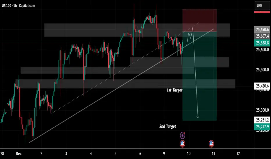
US100 Price Update – Clean & Clear ExplanationUS100 is moving within a broad ascending channel, defined by a long-term diagonal support line that has guided the market’s bullish momentum since late November. Multiple interaction points along this trendline show it has historically acted as a reliable dynamic support zone.
Several shaded horizontal regions highlight key supply and demand zones. These zones reflect areas of repeated institutional activity where price has previously paused, consolidated, or reversed. The upper shaded region represents a resistance cluster where bullish momentum has struggled to sustain continuation, resulting in repeated rejections and wicks to the upside.
The most recent price movement shows the index pushing upward into this resistance band once again, followed by signs of exhaustion. A projected schematic drawn on the chart suggests a potential final liquidity grab—where price may sweep the highs near resistance before reversing. The marked red zone indicates the anticipated rejection area, implying traders may be monitoring this region for a potential bearish shift.
Below, two targets are outlined:
1st Target: Positioned near a mid-range demand zone, aligning with a previous consolidation block. This zone represents the first probable area where price may stabilize or react after a breakdown from the trendline.
2nd Target: A deeper level aligned with a broader structural demand zone. This region marks a significant liquidity pool and a potential magnet for price if bearish momentum continues.
The downward arrow illustrates the conceptual path of a scenario where the ascending trendline is broken decisively, potentially triggering a momentum-driven decline toward these target levels. This depiction emphasizes the importance of trendline integrity and the reaction at the overhead supply zone.
Overall, the chart presents a clean confluence-based structure combining trendline dynamics, supply-demand mapping, and liquidity behaviour—offering a well-organized visualization of a possible medium-term market reversal scenario within a prevailing upward trend.
If You find it helpful please like and comments for this post and share thanks.
Trade ideas
NAS 100Am bullish until the target high is swept. I'll drop any lowertimeframe buys when I spot one.

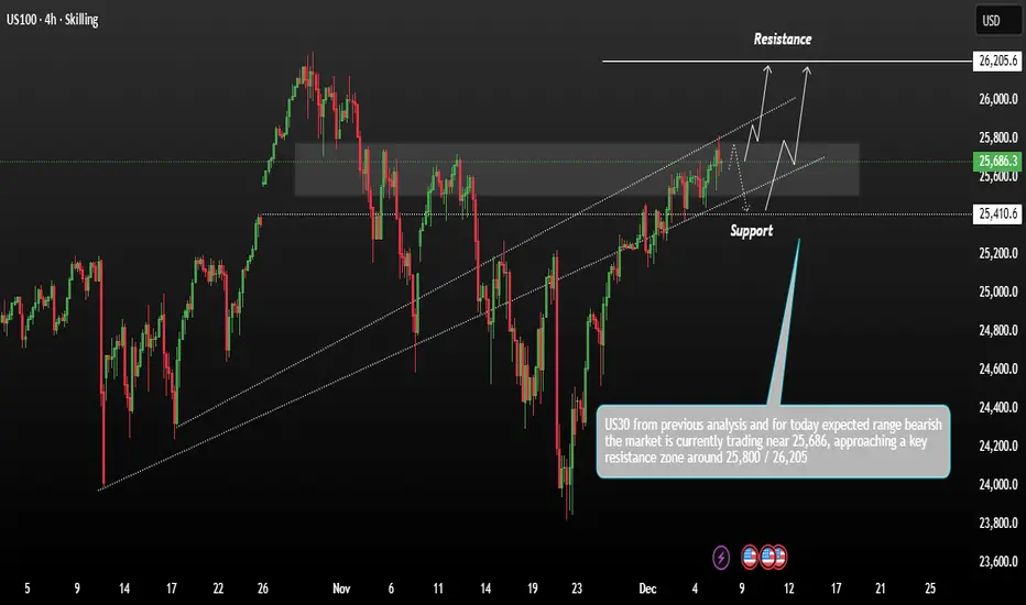
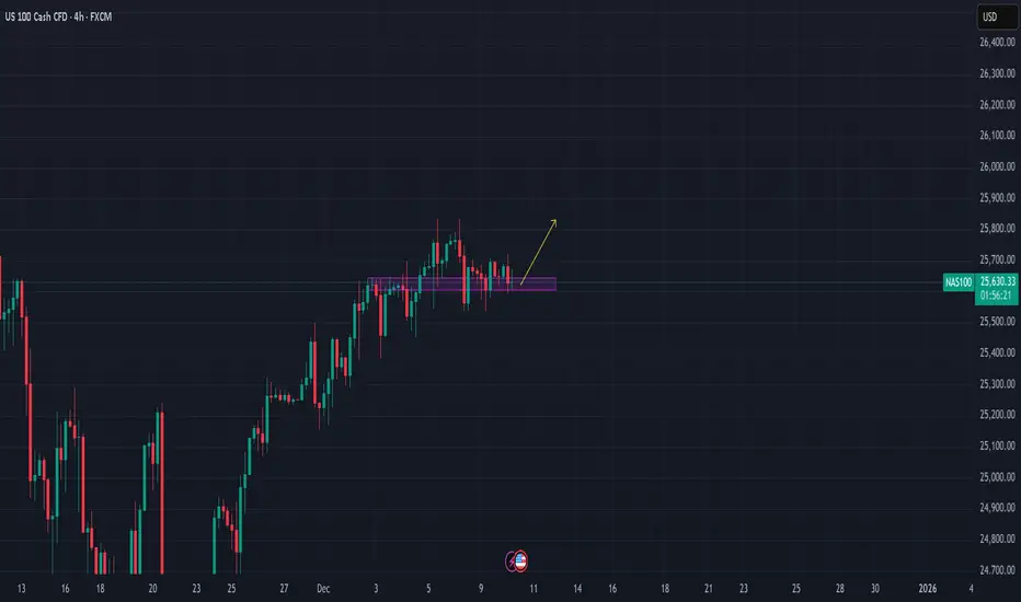
USNAS100 Consolidation Positive Holds Strong range momentumUS100 shows price action moving within a rising channel after recovering from previous lows. The market is currently trading near 25,686, approaching a key resistance zone around 25,800 – 26,205. This area has been marked as the upper boundary where price may face rejection or potentially break out.
Technically US Stocks closed out the trading week with slight gains on Friday as the latest flurry of economic data kept elevated expectation for federal reserve interest rate cut next week intact,
Remember if Price could hold above support and continue upward along the upper channel, targeting the major resistance at 26,205 Price may dip back into the support zone before attempting another move upward.
You may find more details in the chart,
Trade wisely best of luck buddies.
Ps; Support with like and comments for better analysis thanks for supporting.
Major correctionI'm targetting a drop to 11 000 around Aug to Dec next year and back to more reasonable valuations than currently. This would also arrive at the very long term lower trend line on the log chart. The area around 11 000 looks to me like it need retesting. And it would need to be in this sort of time frame, before we run out of time to get back to such levels on this lower log trend line.
Ok possible, but far fetched, so it still needs a reason.
So why should that happen?
A confluence of factors:
- I believe inflation will stay elevated for some time and even potentially resurge. Trumps tariffs are not helping with disruptions and inefficiency on supply chains.
- I think its unavoidable that AI will destroy jobs. Long term it will balance out, as it always does. But in the interim this will be faster than the labour market can adapt. So a lot of job losses
- Due to the inflation backdrop, the fed's hands will be tied, regarding dropping rates. So they wont be able to rescue markets on this occasion with their Ponzi scheme. THAT will be a big problem. Or if that's not the case, the job losses may still be too much anyway, for their fiddling to prevent.
My only reservation with this analysis, is that the jobs losses may be a bit slower to start showing up, than the this time frame will allow. If so, then it may not make it as far down as11 000, due to missing the window of opportunity to reach this level before it becomes below the lower log trend line. Although if it gets near, i cant believe it will not target it. If it misses by this date, its still possible to break the trend line to reach this area, if conditions became bad enough. But that would be quite extreme. But maybe it will be so.
The final factor is contracting money supply. This could cause the above scenario alone anyway. As ballooning supply is mostly how we got where we are. But certainly if combined with any of the others, it could be nasty. So be very vigilant on this.
Note, that the chart posted is a monthly chart. So this is a longer term view. So dont expect this to happen imminently or on a particular day/week/month. But keep an eye out for the signs.
Lastly, potential labels for the 3 up waves of an elliot wave. The first and third are similar in terms of % gain. Less do in terms of time duration, but still more similar to each other than compared to the middle wave. Elliot waves are extremely discretional however and vary according to time frame. So much variation in delineation is possible. And it could still continue for some time. Mentioned more as a possible point of interest than a useful tool.

Market Hunter: NASDAQ-NAS100 Sell OpportunityMy friends, Good morning!☀️
For US100-NAS100, I will open a SELL position between 24,988 and 25,243, targeting 23,843.📊
My friends, I share these analyses thanks to every single like I receive from you.
Your likes increase my motivation and make me want to support you in this way.🙏
I sincerely thank all my friends who support me with their likes.❤️

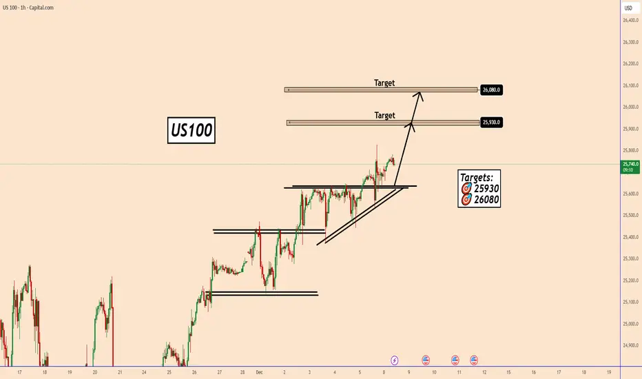
US100: Nasdaq 100 Maintains Bullish Structure Into Fed WeekUS100: Nasdaq 100 Maintains Bullish Structure Into Fed Week
US100 remains in a bullish structure for now. The price has broken out of the triangle pattern, signaling an increase in bullish momentum.
With market optimism still high regarding a potential FED rate cut, the probability of further upside remains elevated.
However, with the FOMC meeting approaching, volatility is expected to rise significantly. This makes short-term targets more reasonable, as market behavior can shift quickly once speculation around the news intensifies.
Short-Term Targets:
🎯 25,930
🎯 26,080
You may find more details in the chart!
Thank you and Good Luck!
❤️PS: Please support with a like or comment if you find this analysis useful for your trading day❤️
USNAS100 | Momentum Builds Above Key PivotUSNAS100 – Technical Overview
USNAS100 is showing signs of stability above the pivot line at 25730.
As long as the price holds above this level, bullish momentum is expected to continue toward 25880 and 25980, with potential extension toward 26200.
However, a 1H or 4H candle close below 25730 will activate bearish momentum, opening the way toward 25570 and 25430, with deeper downside possible into 25210 if selling pressure increases.
Key Levels
Pivot Line: 25730
Resistance: 25880 · 25980 · 26200
Support: 25570 · 25430 · 25210

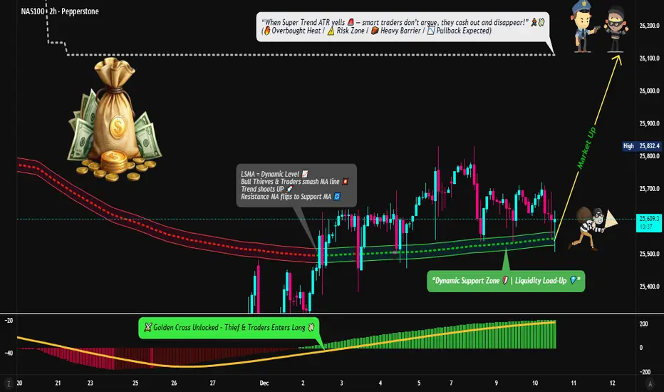
NASDAQ100 Strong Bullish Momentum — Clean Entry & Exit Blueprint⚡ THIEF STRATEGY ALERT: Golden Cross Breakout Setup
📈 TRADE PLAN OVERVIEW
Asset: NAS100 (NASDAQ 100 Index)
Timeframe: Day/Swing Trade
Market Bias: 🟢 BULLISH (Moving Average Breakout + MACD Golden Cross Confirmed)
Strategy Type: Layered Entry Approach (Multi-Level Limit Orders)
🎯 ENTRY STRATEGY - "THIEF LAYERING METHOD"
Multiple Limit Order Entry Points (Build Position Gradually):
📍 Layer 1: 25,400 (First Entry)
📍 Layer 2: 25,500 (Second Entry)
📍 Layer 3: 25,600 (Third Entry)
💡 Pro Tip: Adjust layer levels based on your capital allocation & risk tolerance. This pyramiding approach reduces average entry cost and limits downside risk.
Why This Method? The layered entry reduces emotional trading, averages down your entry price, and ensures you're not all-in on one level.
🛑 STOP LOSS - "THIEF OG PROTECTION"
Suggested SL Level: 25,200
⚠️ IMPORTANT DISCLAIMER: This is a reference level only. Adjust your stop loss based on:
Your personal risk tolerance
Account size & position sizing
Technical support levels on your timeframe
🔴 Remember: Risk management is YOUR responsibility. Set stops that protect YOUR capital.
🎁 PROFIT TARGET - "POLICE BARRICADE RESISTANCE"
Primary Target: 26,100
📊 Technical Confluence:
SUPERTREND ATR Line = Strong Dynamic Resistance
Overbought Zone Alert = Potential Reversal Risk
Resistance Trap = Take profits before reversal occurs
⚠️ CRITICAL NOTE: Partial profit-taking recommended. Don't be greedy at target levels—accumulate gains gradually:
🟢 Take 30-40% profit at 26,100
🟢 Move SL to breakeven, trail remaining position
🟢 Exit second half on additional resistance or SUPERTREND reversal
💰 YOUR DECISION: Profit targets are YOUR choice. Trade at your own risk and manage your exit strategy.
🔗 CORRELATED PAIRS TO WATCH (Risk/Opportunity Indicators)
1. SPY (S&P 500 ETF) - USD Strong Correlation (0.95)
Key Point: Leads or confirms NAS100 moves
Watch For: If SPY breaks below key support, NAS100 pullback likely
Action: Use SPY strength to confirm NASDAQ100 breakout validity
2. QQQ (NASDAQ 100 ETF) - Perfect Mirror (1.0 Correlation)
Key Point: Direct tracker of your asset
Watch For: Volume spikes, divergence patterns
Action: Cross-reference QQQ volume with NAS100—lack of volume = weak breakout
3. DXY (US Dollar Index) - Inverse Correlation (-0.75)
Key Point: Strong dollar = tech selloff risk
Watch For: DXY rejection at key levels
Action: If DXY rallies hard, NAS100 bullish bias weakens—be cautious
4. TLT (20-Year Treasury ETF) - Indirect Inverse (-0.60)
Key Point: Rising rates pressure growth stocks (NASDAQ)
Watch For: TLT breakdown = rate hike concerns = tech pressure
Action: Monitor TLT support; if breaks, expect NAS100 resistance
5. GLD (Gold ETF) - Risk-On Indicator (0.40)
Key Point: Flight-to-safety alternative
Watch For: Sharp gold strength = risk-off environment forming
Action: Gold spike with NAS100 move down = sell signal confirmation
6. VIX (Volatility Index) - Fear Gauge (-0.80)
Key Point: Rising VIX kills bullish momentum
Watch For: VIX above 20 = caution on long positions
Action: If VIX spikes during entry, wait for stabilization before scaling in
✅ CHECKLIST BEFORE ENTRY
Moving Average crossover confirmed (golden cross visible)
MACD histogram turned positive
Price closed above key moving average
Volume supporting the move
Correlated pairs (QQQ/SPY) confirming bullish setup
DXY not in strong uptrend (tech-unfriendly)
VIX stable or declining
🎯 TRADE MANAGEMENT RULES (THIEF OG STYLE)
Scale In: Use limit orders—don't chase price
Protect Profits: Move stop to breakeven after first target hit
Trail Stops: Let winners run while protecting gains
Take Partials: Secure profits incrementally—greed kills traders
Monitor Correlations: Watch correlated pairs for early warning signals
Respect Risk: NEVER risk more than 2% per trade
⚠️ RISK DISCLAIMER
This is an Educational Guide Only for trading strategy examples.
🔴 NOT Financial Advice: I am not a financial advisor, and this does NOT constitute investment advice.
🔴 Your Responsibility: All entry, exit, and stop-loss decisions are YOUR choice and YOUR responsibility.
🔴 Past Performance ≠ Future Results: Market conditions change; strategies may fail.
🔴 Risk Capital Only: Trade only with money you can afford to lose completely.
Trade at your own risk. Always do your own research (DYOR).
💪 THIEF OG'S MINDSET
Dear Ladies & Gentlemen (Thief OG's),
Success in trading isn't about following someone else's exact setup—it's about understanding the WHY behind each decision, adapting to YOUR risk tolerance, and executing with DISCIPLINE.
This guide provides the framework. You provide the execution. Make your profits, protect your capital, and trade smart. 🎯
Now go earn those tendies, OG's! 💰📈
Last Updated: December 2025
Strategy Type: Day/Swing Trade | Timeframe: 4H-Daily
Nasdaq - The final blow-off top!⚰️Nasdaq ( TVC:NDQ ) can rally a final +25%:
🔎Analysis summary:
Just this month, we witnessed quite some volatility on the Nasdaq with a correction of about -10%. However, bulls immediately stepped in and clearly pushed price higher. Since there is still bullish pressure, a final blow-off top rally in the near future is quite likely.
📝Levels to watch:
$25,000 and $30,000
SwingTraderPhil
SwingTrading.Simplified. | Investing.Simplified. | #LONGTERMVISION

NASDAQ SHORT VERY BEARISHTri-star doji printed, a rare and strong reversal pattern - extremely bearish.

Learn or perish Market need some liquidity in the event that we are going up and there is a lot of it down there

Nasdaq December Rally starting?Institutionals have been leaving some traces of what its about to happen. Are we ready to surf the wave?
What if it doesn't wave and it was all a bear trap?
Stay tuned!

Break and retestnice little break and retest before open, and if it goes good and staable set sl closer, close off some size and ride the wave.
ps.
Iv been gone from trading for a while, iv spent 9 years learning, I got profitable after 3 years. I got so good that everytime i deposited i consistanly won, 1k, 600, 5k and so on. but one day i stopped and lost interest, but now im back and ready to take on 2026 with a iron bid. Follow for the come back of the kid who made it out of the garage.
Another bad day for price action in the Nasdaq
BAD DAY TO TRADE
Nasdaq is very choppy today just as it has been for the entire year. London session already dealt with very high FOMC push so if it went more Bearish on the day I wouldn't be surprised. However the price action for December has been absolutely abysmal. Pre-Market stocks are looking overall Bearish as of 1 Hour before open however that doesn't mean much with how many reversals have been happening lately. London session also broke sellside liquidity but not buyside so that could mean a bullish break of structure but FOMC messed up liquidity bad and it is still recovering so I am overall neutral on the day.
Nasdaq 100 Chart Analysis After the Fed DecisionNasdaq 100 Chart Analysis After the Fed Decision
The Nasdaq 100 index showed sharp volatility yesterday following the interest rate announcement. The market action can be interpreted as follows:
→ First, the FOMC decision was released: as expected, the Federal Funds Rate was cut from 4.00% to 3.75% (a bullish catalyst), which pushed the index up towards point A.
→ However, half an hour later Jerome Powell’s press conference began, and his tone was noticeably hawkish (a bearish catalyst). The Fed Chair signalled that the rate-cutting cycle has been paused because inflation remains elevated and additional labour-market data is needed. As a result, the index fell sharply from point A to the low at point B.
Meanwhile, Donald Trump criticised the Fed’s decision, arguing that rates should be cut far more aggressively. This adds to uncertainty, especially given expectations that Powell will leave his post in May 2026.
Bearish pressure on the tech index intensified further after Oracle’s earnings release — see yesterday’s post for details. The results disappointed investors, fuelling renewed talk of an AI bubble, and ORCL shares plunged around 11% in after-hours trading.
Technical Analysis of the Nasdaq 100 Chart
Looking at recent price action in the Nasdaq 100, the index appears to be forming a bearish Rounding Top pattern:
→ The peak at point A resembles a bull trap, as the price only slightly exceeded the December highs before reversing — in SMC terms, a sign of a bearish liquidity grab.
→ The price then broke support from several recent sessions around 25,570 after forming a large bearish candle (marked by the arrow). This indicates strong selling pressure (a market imbalance) and the area may now act as resistance.
It is possible that bulls will attempt to recover some of yesterday’s losses today. However, if any rebound stalls near this resistance zone, the Nasdaq 100 may continue to drift lower along a rounding downward trajectory.
This article represents the opinion of the Companies operating under the FXOpen brand only. It is not to be construed as an offer, solicitation, or recommendation with respect to products and services provided by the Companies operating under the FXOpen brand, nor is it to be considered financial advice.

NASDAQ formed its 1st 4H Golden Cross in 7 months!Nasdaq (NDX) completed last Friday its first 4H Golden Cross formation in more than 7 months (since May 01). This is taking place while the index is inside a Channel Up, making a V-shaped recovery from the November 21 Low.
The last time all the above conditions were fulfilled was exactly during the May Golden Cross. With the 4H MA200 (orange trend-line) as its Support, the index eventually hit its previous All Time High (ATH).
As we've entered the Fed week, we can finally see this move to the ATH Resistance, so our short-term Target on Nasdaq remains 26200.
---
** Please LIKE 👍, FOLLOW ✅, SHARE 🙌 and COMMENT ✍ if you enjoy this idea! Also share your ideas and charts in the comments section below! This is best way to keep it relevant, support us, keep the content here free and allow the idea to reach as many people as possible. **
---
💸💸💸💸💸💸
👇 👇 👇 👇 👇 👇

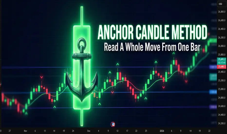
Anchor Candle MethodAnchor Candle Method: How To Read A Whole Move From One Bar
Many traders drown in lines, zones, patterns. One simple technique helps simplify the picture: working around a single “anchor candle", the reference candle of the pulse.
The idea is simple: the market often builds further movement around one dominant candle. If you mark up its levels correctly, a ready-made framework appears for reading the trend, pullbacks and false breakouts.
What is an anchor candle
Anchor candle is a wide range candle that starts or refreshes an impulse. It does at least one of these:
Breaks an important high or low
Starts a strong move after a tight range
Flips local structure from “choppy” to “trending”
Typical traits:
Range clearly larger than nearby candles
Close near one edge of the range (top in an up impulse, bottom in a down impulse)
Comes after compression, range or slow grind
You do not need a perfect definition in points or percent. Anchor candle is mostly a visual tool. The goal is to find the candle around which the rest of the move “organizes” itself.
How to find it on the chart
Step-by-step routine for one instrument and timeframe:
Mark the current short-term trend on higher timeframe (for example 1H if you trade 5–15M).
Drop to the working timeframe.
Find the last strong impulse in the direction of that trend.
Inside this impulse look for the widest candle that clearly stands out.
Check that it did something “important”: broke a range, cleared a local high/low, or started the leg.
If nothing stands out, skip. The method works best on clean impulses, not on flat, overlapping price.
Key levels inside one anchor candle
Once the candle is chosen, mark four levels:
High of the candle
Low of the candle
50% of the range (midline)
Close of the candle
Each level has a function.
High
For a bullish anchor, the high acts like a “ceiling” where late buyers often get trapped. When price trades above and then falls back inside, it often marks a failed breakout or liquidity grab.
Low
For a bullish anchor, the low works as structural invalidation. Deep close under the low tells that the original impulse was absorbed.
Midline (50%)
Midline splits “control”. For a bullish anchor:
Holding above 50% keeps control with buyers
Consistent closes below 50% shows that sellers start to dominate inside the same candle
Close
Close shows which side won the battle inside that bar. If later price keeps reacting near that close, it confirms that the market “remembers” this candle.
Basic trading scenarios around a bullish anchor
Assume an uptrend and a bullish anchor candle.
1. Trend continuation from the upper half
Pattern:
After the anchor candle, price pulls back into its upper half
Pullback holds above the midline
Volume or volatility dries up on the pullback, then fresh buying appears
Idea: buyers defend control above 50%. Entries often come:
On rejection from the midline
On break of a small local high inside the upper half
Stops usually go under the low of the anchor or under the last local swing inside it, depending on risk tolerance.
2. Failed breakout and reversal from the high
Pattern:
Price trades above the high of the anchor
Quickly falls back inside the range
Subsequent candles close inside or below the midline
This often reveals exhausted buyers. For counter-trend or early reversal trades, traders:
Wait for a clear close back inside the candle
Use the high of the anchor as invalidation for short setups
3. Full loss of control below the low
When price not only enters the lower half, but closes below the low and stays there, the market sends a clear message: the impulse is broken.
Traders use this in two ways:
Exit remaining longs that depended on this impulse
Start to plan shorts on retests of the low from below, now as resistance
Bearish anchor: same logic upside-down
For a bearish anchor candle in a downtrend:
Low becomes “trap” level for late sellers
High becomes invalidation
Upper half of the candle is “shorting zone”
Close and midline still help to judge who controls the bar
The structure is mirrored, the reading logic stays the same.
Practical routine you can repeat every day
A compact checklist many traders follow:
Define higher-timeframe bias
On working timeframe, find the latest clear impulse in that direction
Pick the anchor candle that represents this impulse
Mark high, low, midline, close
Note where price trades relative to these levels
Decide: trend continuation, failed breakout, or broken structure
This method does not remove uncertainty. It just compresses market noise into a small set of reference points.
Common mistakes with anchor candles
Choosing every bigger-than-average candle as anchor, even inside messy ranges
Ignoring higher timeframe bias and trading every signal both ways
Forcing trades on each touch of an anchor level without context
Keeping the same anchor for days when the market already formed a new impulse
Anchor candles age. Fresh impulses usually provide better structure than old ones.
A note about indicators
Many traders prefer to mark such candles and levels by hand, others rely on indicators that highlight wide range bars and draw levels automatically. Manual reading trains the eye, while automated tools often save time when many charts and timeframes are under review at once.
USNAS100 | Bearish Bias Dominates Below Key LevelsUSNAS100 – Technical Overview
USNAS100 edged higher ahead of the JOLTS job openings report, the final major labor indicator before the Federal Reserve decides on interest rates tomorrow.
Markets are pricing an 89% probability of a 25 bps rate cut, suggesting strong expectations for policy easing.
USNAS100 holds a bearish bias for today, with momentum remaining weak as long as the price stays below 25730.
A 1H close below 25570 will confirm continuation of the bearish trend toward 25430, with deeper downside possible.
However, if the market closes a 1H candle above 25840, bullish momentum will return, opening the way toward 25985 and 26170.
Key Levels
Pivot Line: 25690
Support: 25570 · 25430 · 25210
Resistance: 25830 · 25980 · 26170

USNAS100 | Correction Toward 25835 Before Bearish ContinuationUSNAS100 – Technical Overview
USNAS100 is expected to make a corrective move toward 25710–25835, where the market may find short-term resistance before resuming the broader bearish trend.
A continuation of downside momentum requires a confirmed break of key support.
Technical Analysis
The index is likely to retrace upward toward 25710 and 25835.
This zone is expected to act as a reaction area before sellers regain control.
A 1H close below 25430 will confirm bearish continuation, targeting:
→ 25430
→ 25210
If the price breaks above 25835, the structure shifts bullish, opening the path toward 25985 and higher upside potential.
Pivot Line: 25700
Support: 25430 · 25210
Resistance: 25830 · 25985

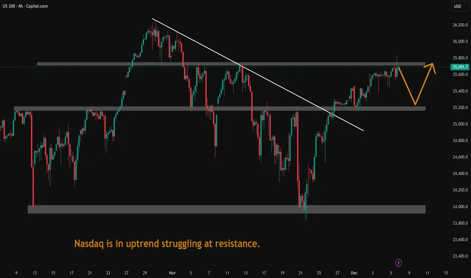
Nasdaq is in uptrend struggling at resistance.Nasdaq is in uptrend struggling at resistance. It may retace next week.
Tech bubble burst?The Head and Shoulders (H&S) pattern is a classic reversal formation, typically found after a mature uptrend. It represents a gradual loss of buying pressure and a transition toward a potential downward move.
The H&S pattern often signals the exhaustion of bullish momentum, a shift in control toward sellers, and the possible beginning of a deeper reversal (sell-off).

NASDAQ Santa Rally already underway.Nasdaq (NDX) has made a strong V-shaped recovery on its 1D MA100, as projected on our previous analysis and is extending the uptrend above the 4H MA200 (orange trend-line).
The rally may need a relief pull-back towards its 4H MA50 (blue trend-line) but technically, the seasonal end-of-the-year 'Santa Rally' is already underway.
V-shaped recovery and Inverse Head and Shoulders patterns typically target their 2.0 Fibonacci extensions. That is currently at 26600.
---
** Please LIKE 👍, FOLLOW ✅, SHARE 🙌 and COMMENT ✍ if you enjoy this idea! Also share your ideas and charts in the comments section below! This is best way to keep it relevant, support us, keep the content here free and allow the idea to reach as many people as possible. **
---
💸💸💸💸💸💸
👇 👇 👇 👇 👇 👇

US NAS 100DO YOU KNOW WHATS BEHIND THIS OR OTHER IDEAS?? in bio..
Preferably suitable for scalping and accurate as long as you watch carefully the price action with the drawn areas.
With your likes and comments, you give me enough energy to provide the best analysis on an ongoing basis.
And if you needed any analysis that was not on the page, you can ask me with a comment or a personal message.
Enjoy Trading ;)
