Keeping It Simple - Incorporating VWAP (Monthly)In this video, we will be looking at the 'Core' of the Heiken Ashi McGinley Dynamic trading strategy (it needs an official name - it's coming...!), PLUS how to incorporate the Money Flow Index (MFI) into the strategy, PLUS how to incorporate VWAP (Yearly) to help with analysis, PLUS how to incorporate the VWAP (Monthly) to get a better idea of what a given market is doing.
In the last video, using 'Bar Replay,' we went back in time to a random bar and applied the core strategy using HA candles and a (5) period McGinley Dynamic Average. We added the VWAP (Yearly) to see if it can help our analysis in determining whether or not we should be Short/Long.
***CORE STRATEGY***: We will always trade AT or NEAR the average. We will BUY if the price closes ABOVE the average and SELL if the price closes BELOW the average.
In this video, we apply the VWAP (Monthly) and find a ranging market determined by a flat-lining VWAP (Monthly). We also look at the Higher Timeframe and see that there is very clear BEARISH divergence - leading us to be a little bit skeptical on how long to hold our LONG trades.
We go on to take a LONG trade while the price is BELOW the VWAP (Monthly) using our Core strategy timing, and it winds up being a monster trade while keeping in mind that the Bearish divergence on the Higher Timeframe chart could mean that our LONG trade may have a short expiration date.
In the next video, we will look at incorporating Volume Profiles to give us more information on what a given market might do next!
See you in the next video!
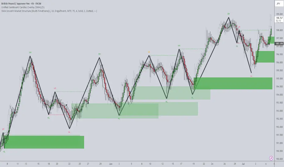
Moving Averages

Keeping It Simple - Managing/Adding to the PositionIn this video, we will be looking at the 'Core' of the Heiken Ashi McGinley Dynamic trading strategy (it needs an official name - it's coming...!), PLUS how to incorporate the Money Flow Index (MFI) into the strategy, PLUS how to incorporate VWAP (Yearly) to help with analysis. Using the core strategy, we will learn how to manage the Open Position as well as look at opportunities to ADD to the existing position.
In the last video, using 'Bar Replay,' we went back in time to a random bar and applied the core strategy using HA candles and a (5) period McGinley Dynamic Average. We added the VWAP (Yearly) to see if it can help our analysis in determining whether or not we should be Short/Long.
***CORE STRATEGY***: We will always trade AT or NEAR the average. We will BUY if the price closes ABOVE the average and SELL if the price closes BELOW the average.
In this video, we closed out the Open position for a big win, which covered for our previous losses and even moved us into profit territory. We will close out the big winner for a nice gain and even add another Short position based on the Core strategy to add to our wins.
We go on to take other trades which wound up being losers, so we're probably back to breakeven, but that's trading! We are going to stick with the Core strategy and use our supplemental tools to keep our losses small and gains big so that we can turn a profit in the market. That's how trading is done, right?!
In the next video, we will look at taking more trades using all of our tools so far and even incorporate VWAP (Monthly) to see if that can help us even more in our analysis.
See you in the next video!

Keeping It Simple - Incorporating VWAP (Yearly)In this video, we will be looking at the 'Core' of the Heiken Ashi McGinley Dynamic trading strategy (it needs an official name - it's coming...!), PLUS how to incorporate the Money Flow Index (MFI) into the strategy, PLUS how to incorporate VWAP (Yearly) to help with analysis.
In the last video, using 'Bar Replay,' we went back in time to a random bar and applied the core strategy using HA candles and a (5) period McGinley Dynamic Average. In this video, we will now add the VWAP (Yearly) to see if it can help our analysis in whether or not we should be Short/Long.
***CORE STRATEGY***: We will always trade AT or NEAR the average. We will BUY if the price closes ABOVE the average and SELL if the price closes BELOW the average.
In this video, we looked at how to identify BULLISH/BEARISH Divergence using price and the MFI, and we took another trade and got STOPPED OUT AGAIN!!! After incorporating the VWAP (Yearly), we saw that the price was trading OUTSIDE of (3) Standard Deviations on the VWAP (Yearly), making it prime time for a SHORT trade. We engaged the SHORT trade following our Core strategy, and it has so far made up for all of our losing trades so far!
So far, we are down (4) trades with an OPEN WINNER. As we add more components to the strategy, will we gain a better understanding of the true market direction and where it might be headed so that we can make up for our losses?
In the next video, we will look at managing our OPEN WINNER and how to possibly even ADD to our position for a bigger overall gain...
See you in the next video!

Keeping It Simple - Incorporating the Money Flow Index (MFI)In this video, we will be looking at the 'Core' of the Heiken Ashi McGinley Dynamic trading strategy (it needs an official name - it's coming...!) PLUS how to incorporate the Money Flow Index (MFI) into the strategy.
In the last video, using 'Bar Replay,' we went back in time to a random bar and applied ONLY the core strategy using HA candles and a (5) period McGinley Dynamic Average.
***CORE STRATEGY***: We will always trade AT or NEAR the average. We will BUY if the price closes ABOVE the average and SELL if the price closes BELOW the average.
In this video, we looked at how to identify BULLISH/BEARISH Divergence using price and the MFI, and we took another trade and got STOPPED OUT AGAIN!!!
So far, we are down (3) trades. As we add more components to the strategy, will we gain a better understanding of the true market direction and where it might be headed so that we can make up for our losses?
We will find out in the next video!
See you there!

Keeping It Simple - Trading the Core!In this video, we will be looking at the 'Core' of the Heiken Ashi McGinley Dynamic trading strategy (it needs an official name - it's coming...!)
Using 'Bar Replay,' we will go back in time to a random bar and apply JUST the core strategy using HA candles and a (5) period McGinley Dynamic Average.
We will always trade AT or NEAR the average. We will BUY if the price closes ABOVE the average and SELL if the price closes BELOW the average.
In this video, we took the trade and got STOPPED OUT!!! In the next video, we will ADD another component of the strategy to see how THAT component might have helped us make a better decision before pulling the trigger...
See you in the next video!

A+ Setup Consolidation Breakout StrategyConsolidation Breakout Strategy (Summary)
In this strategy, the first step is to identify a clear consolidation zone and mark it with a box to define the trading range visually. Once price is ranging, we wait patiently for a valid breakout or breakdown with a strong candle close outside the range.
If you want additional confirmation before entering a trade, it’s important to recognize candlestick patterns. Understanding patterns such as Doji, Bullish/Bearish Engulfing, Hammer, Shooting Star, Morning Star, Evening Star, and others will significantly increase the accuracy of your execution.
After the breakout, we do not enter immediately. Instead, we wait for a retest of the breakout level. The retest candle becomes our Point of Interest (POI) and serves as the execution entry, ensuring the trade aligns with both price action and candlestick confirmation.
Stop-Loss Options
Two stop-loss methods can be used:
1. Aggressive Stop Loss
• Placed below the low of the retest candle (for buys) or above the high (for sells).
• Provides better risk-to-reward, but has a higher chance of being stopped out, especially on lower timeframes.
2. Conservative Stop Loss
• Placed on the opposite side of the consolidation zone.
• Offers more protection against fake breakouts and is more suitable for consistent and prop-firm style trading.
Take-Profit Methods
Primary TP — Price Projection (Measured Move)
• Measure the full height of the consolidation range.
• Project the same distance from the breakout point in the direction of the move.
• This projected level is used as the main target, as shown on the chart.
This method is especially useful when price is trading in new territory or near all-time highs, where no clear resistance is present.
Trailing Stop for Trend Continuation
Since price does not move in a straight line and often forms new micro-ranges during trends, a trailing stop approach is used to capture extended moves:
• After price creates a new consolidation, move the stop loss below the most recent range low (for buys) or above the range high (for sells).
• Continue trailing the stop behind each new structure until stopped out.
This is a trend-following management method designed to maximize reward-to-risk and allow winners to run.
Alternative Trailing Methods
Traders may also trail stops using indicators such as:
• 21 SMA, or
• SuperTrend
In this case, the stop loss is trailed below (for buys) or above (for sells) the indicator as long as trend conditions remain valid.
Future Use of the Range Zone
The original consolidation zone is extended to the right because it often acts as a future support or resistance area. As shown on the chart, price later returned to the range, respected it as support, and continued higher — confirming the importance of these zones.
Performance Expectation
When all rules are followed correctly — proper consolidation, confirmed breakout, retest entry, and disciplined risk management — the realistic win rate for this setup is approximately 50% to 65%, with positive expectancy due to favorable risk-to-reward ratios.
⸻
This Consolidation Breakout Strategy is just one of my A+ setups. There are many more high-probability strategies I use and will be sharing soon.
Cabeero

The Ultimate Guide to Moving AveragesYo, crypto fam! 😎
Moving averages are a bit like your car’s rear-view mirror — they won’t tell you what’s about to happen, but they’re great at showing you where you’ve been. Whether you’re a seasoned pro or just starting out, understanding how MAs work can give you the edge in identifying trends and making smarter trades. But like anything in trading, they come with their nuances. Let’s dive into the core of moving averages: lag, trend, and perception .
The Lag of Moving Averages
First things first — moving averages lag. Simple as that. They’re lagging indicators by design because they’re built on past price data. A moving average doesn’t predict where price is going; it just smooths out historical moves so the trend is easier to read.
Whether you’re using a simple moving average (SMA) or an exponential moving average (EMA), both are doing price smoothing — cutting through noise, not forecasting the future. The difference is speed. An SMA averages a fixed set of past prices, which makes it slower when the market snaps or flips fast. An EMA gives more weight to recent candles, so it reacts quicker — but it still lags behind real-time price action.
Moving Averages and Trends
Moving averages are trend indicators, plain and simple. They help you see where the market is actually heading by filtering out the noise and focusing on the bigger move. If price is holding above the moving average, you’re dealing with an uptrend. If it’s stuck below, that’s a downtrend. 📊
But here’s the catch: how well moving averages work depends a lot on market conditions. In clean, trending markets, moving averages trend like champs. They help you stay in trades longer and often act as dynamic support or resistance while price pulls back and pushes higher or lower. In sideways or choppy markets, though, they start to betray you — price keeps slicing through the MA, crossovers pile up, and false signals show up fast.
Moving Averages and Perception
When it comes to moving averages perception, it’s all about how you read them. Because they smooth out price, they make the market’s direction look cleaner and more obvious. But don’t get fooled — price smoothing always comes with a trade-off. The smoother the line, the later it reacts. ⏳
That’s why moving average calculation actually matters. How much weight is given to past prices decides how fast the MA responds to new moves. Heavier smoothing means fewer fake-outs, but more delay. Less smoothing means quicker signals — and more noise.
How to Use Moving Averages Effectively?
Now that you get the lag, the trend, and the perception, let’s talk about how traders actually use moving averages in real trading.
Use MAs with other indicators: A single MA is fine, but it’s way more useful when it’s backed up by something else. Pair moving averages with RSI, MACD, or volume to filter bad signals. If price is holding above an SMA and RSI is showing bullish momentum, that setup already looks a lot cleaner than an MA signal on its own.
Choose the right type of MA: SMA vs EMA usually comes down to market speed and personal style. EMAs fit fast, volatile markets like crypto because they react quicker to price. SMAs move slower, which makes them better for cleaner, more established trends where you want stability, not speed.
Adjust the timeframe: The MA length you use changes everything. Short-period MAs (like 5 or 10) react fast and suit scalping or day trading. Longer ones (50 or 200) smooth things out and give you the bigger trend picture. There’s no “best” setting — you dial it in based on how you trade and how much noise you’re willing to deal with.
The Takeaway
Moving averages are a solid analytical tool, but like any indicator, they’re not magic. They help point out the trend, cut through market noise, and give context to momentum — but they’re still lagging and always based on past price action. That’s why MAs work best as part of a bigger setup, not as standalone signals. Traders who backed them up with RSI, MACD, or volume usually caught the warning signs early. Those who didn’t… paid for it.
Remember, this is just an analysis tool, not a recommendation. Always consider your own strategy and risk tolerance.

SMC MA Structure Meets Volume: Timed Pullbacks & MitigationThis is a follow-up to my previous idea
“Samurai Vector Trading: AI-Powered Bias Mitigation System” .
This idea presents a two-layer market structure framework ,
combining moving-average-based structure with volume-based reaction zones .
Rather than producing entry signals, the goal is to
reduce directional bias and clarify where meaningful price interaction is likely to occur .
Layer 1: MA-Based Structure (Timed Pullback & Double Touch)
The first layer focuses on
market structure expressed through moving averages .
20 SMA and 75 SMA define the higher-timeframe directional bias
After their crossover, attention is placed on timed pullbacks
A key condition is a
simultaneous touch of 5 SMA and 20 SMA by the candle (including wicks)
When this condition is met, the candle body is highlighted in white.
These white candles tend to appear:
Not consecutively, but
Clustered horizontally around similar price levels
Over periods of consolidation lasting days rather than minutes
This behavior often reflects structural compression ,
where price repeatedly tests the same mean area while volume accumulates.
Layer 2: Volume-Based Reaction Zones (Conceptual)
The second layer introduces a volume-driven perspective.
Significant volume spikes are observed
From these events, horizontal reaction zones can be inferred
using volatility (ATR) as a reference
These zones are not intended to predict direction .
Instead, they help visualize where the market has shown commitment
and may respond again in the future.
Validation with Public Tools
To keep this framework transparent and reproducible,
it is intentionally aligned with widely available tools:
TradingView’s built-in Volume Profile
Standard Volume indicator
Public scripts such as:
Samurai Volume Spike Detector
Small Body + High Volume candle labeling
Notably, white candle clusters often align with:
Volume Profile POC levels
Prominent “icicle-shaped” volume protrusions
This correspondence frequently reveals a
two-legged mitigation structure ,
where price resolves accumulation in stages rather than a single directional move.
How This Is Intended to Be Used
This is not a trading system .
There are:
No entry rules
No exit rules
No performance claims
Instead, this framework helps answer three structural questions:
Where is price structurally pausing?
Where has volume shown intent?
Are these two perspectives aligned?
Execution can then be handled separately,
using the trader’s own trigger logic and risk management.
Note:
A 200 SMA is shown on the chart as a higher-level structural reference.
It is not part of the current indicator logic and is included for contextual reading only.
Closing Thoughts
Market structure is often discussed abstractly in SMC concepts.
This idea attempts to ground those concepts
using familiar tools: moving averages, volume, and volatility .
By separating structure from execution ,
the chart becomes quieter —
and the decision-making process clearer.
This idea is for educational and analytical purposes only.
It does not provide trading signals or investment advice.

How I Use SMA Angle + Pullbacks for High-Probability EntriesIn today’s video I reveal a powerful strategy using my SMA Angle Alert Indicator combined with precision pullback entries.
This setup helps filter fake breakouts, avoid chop, and only take trades when momentum AND price structure align.
👉 SMA Angle + Pullback Entry Indicator
www.tradingview.com
➡️ Core Concept:
Use the SMA Angle to confirm trend direction + strength, then wait for a pullback into value before entering.
This creates high-probability continuation trades that work beautifully on MES, ES, NQ, MGC, and Forex pairs.
📌 What You’ll Learn in This Video
How the SMA Angle detects trend strength
The exact pullback entry trigger I use
How to avoid chop and false breakouts
How to time entries with precision (no guessing)
My personal tips for SL/TP placement
Live chart examples
How to add alerts for automated entries
💡 Why This Works
Most traders enter too late.
This strategy forces you to:
✔ Identify strong trend
✔ Wait for a clean pullback
✔ Enter when momentum returns
✔ Avoid over-trading
✔ Catch the meat of the move—not the noise
This video is for educational purposes only and is not financial advice. Trading futures, Forex, and derivatives involves substantial risk and may not be suitable for all investors. Always trade with money you can afford to lose. Past performance is not indicative of future results. You are responsible for your own trading decisions.

Trading Future - 1-Minute TimeframeTrading Future - 1-Minute Timeframe CME_MINI:MES1! CME_MINI:ES1! CME_MINI:M2K1!
RSI Low (Reversal) Entry Strategy
Spot ENTRY
Trend completed - Succeed !
Entry Criteria
✔ RSI Low alert
✔ RSI crosses above MA
✔ Price crosses above SMA9
✔ Price pullback holds SMA9
✔ Optional: Price above SMA20 for stronger confirmation
Exit Criteria
❌ Price closes below SMA9
❌ Price falls below HMA-Low (secondary exit)
❌ Price hits target below HMA-High line
Indicators Setup:
1. HMA Low/High – Length 15
Entry: Price crosses above HMA-Low and stays inside the HMA channel.
Exit: Price falls below SMA 9 OR price goes below HMA-Low line (secondary exit).
2. SMA 9 (Blue)
Entry: Price pulls back to SMA9 but does not fall under it.
Exit: Price falls under SMA9.
3. SMA 20 (Red)
Confirmation trend line.
Entry Confirmation: Price crosses above SMA20.
4. SMA 70 (Teal)
Higher-timeframe trend bias.
5. RSI (14) – Low/High 30/70
Reversal signal at RSI Low.
RSI extreme lows highlight with BG color.
6. MACD Histogram (12/26/9)
Trend confirmation: Histogram cross above 0 = momentum shift upward.
Trading Steps:
1. Identify the RSI Low (Alert)
RSI prints a lowest point and background highlights in the extreme zone.
2. RSI Crosses Above Its MA (Yellow)
RSI breaks above its MA = early upward momentum.
At the same time:
Price crosses above SMA 9 (blue).
3. Entry Trigger
Wait for a price pullback to SMA9,
BUT price must not break below SMA9.
If SMA9 holds support → Enter long.
4. Stop Loss Rules
Primary Stop Loss: Price closes below SMA 9 (blue).
Secondary Stop Loss: Price dips just under HMA-Low = early trend failure.
5. Position Hold Conditions (Confirmation)
Hold the trade ONLY IF:
Price stays above SMA 9.
MACD Histogram crosses above 0
→ Trend shifts from negative to positive, confirming upward movement.
6. Ride the Trend
Let price continue inside HMA channel.
Wait for trend to complete (usually when RSI approaches 70 or MACD weakens).
7. Profit Taking (Exit Rules)
Option A: HMA-High line target
Set take-profit just below HMA-High line.
Option B: SMA9 Breakdown
Exit when price falls below SMA 9 (blue).

How to Trade with Bollinger Bands in TradingViewBollinger Bands are a volatility indicator that helps traders identify market extremes, trend strength, and potential breakout setups by measuring how far price moves away from its average.
What You’ll Learn:
• Understanding Bollinger Bands as a volatility-based trading tool built around a moving average
• How the middle band represents the 20-period simple moving average (SMA)
• How the upper and lower bands are calculated as two standard deviations above and below that SMA
• Why expanding bands signal rising volatility — and tightening bands signal market compression
• Recognizing overbought and oversold conditions when price touches or moves beyond the upper or lower bands
• Why these signals aren’t automatic buy or sell triggers, and how to confirm them with other tools like RSI or MACD
• Identifying the “Bollinger Band squeeze,” a setup that often precedes major breakouts
• Spotting potential mean-reversion trades when price closes back inside the bands after moving outside
• How to add Bollinger Bands on TradingView via the Indicators menu
• Understanding the default settings (20, 2) and how adjusting the period or deviation affects sensitivity
• Practical examples using the E-mini S&P 500 futures chart
• Applying Bollinger Bands across daily, weekly, and intraday timeframes for volatility analysis and signal confirmation
This tutorial is designed for futures traders, swing traders, and technical analysts who want to integrate volatility dynamics into their trading approach.
The methods discussed may help you identify breakout conditions, trend continuation signals, and potential reversal zones across multiple markets and timeframes.
Learn more about futures trading with TradingView:
optimusfutures.com
Disclaimer
There is a substantial risk of loss in futures trading. Past performance is not indicative of future results. Please trade only with risk capital. We are not responsible for any third-party links, comments, or content shared on TradingView. Any opinions, links, or messages posted by users on TradingView do not represent our views or recommendations. Please exercise your own judgment and due diligence when engaging with any external content or user commentary.
This video represents the opinion of Optimus Futures and is intended for educational purposes only.
Chart interpretations are presented solely to illustrate objective technical concepts and should not be viewed as predictive of future market behavior. In our opinion, charts are analytical tools — not forecasting instruments.

Rapid ORB ProLive trade using our advanced indicator. This is free for everyone to use in trading view. We are working with guidelines and different ways to enter trade with out indicator. This will make everyone profitable.

The Swing Strategy, I been usingZone‑to‑Zone Trading
1.1 Drawing the Zones
What is a zone?
A price area (not a single line) where the market repeatedly reacts: flips from support→resistance (S/R) or resistance→support (R/S), stalls, or coils.
Priority by timeframe:
Monthly ≥ Weekly ≥ Daily ≥ Hourly. Higher‑timeframe zones carry more weight.
How to mark zones
Start on monthly, and highlight obvious S/R bands.
Drill down to weekly, refine, or add.
Drill down to daily, refine, or add.
Drill down to hourly for tactical entries.
Clues for a quality zone
Prior breakout level that later flips to S/R on retest and consolidates before resolution.
Clear historical reaction clusters (wicks, bodies, or gaps).
Visible “sensitivity” (multiple rejections/holds in the same area).
1.2 Trading the Zones
Entry: Wait for local consolidation near a zone, then take the breakout.
Stops:
Conservative: Below the box low (consolidation floor).
Tight: Mid‑box (accept higher stop‑out rate, better R).
Filter:
Longs only above 50 SMA, shorts only below 50 SMA (trend filter).
1.3 Range vs. Exact Level
Treat zones as bands, not one price tick. I would take the pivot close to the opening of the first red candle if it's a bullish pivot.
At times a single line is acceptable (e.g., clean, repeated close‑basis pivot), but default to ranges.
2) Box System
2.1 Market Phases
Sideways (consolidation) → build energy (boxes form between zones).
Trending → series of HH/HL (up) or LH/LL (down).
2.2 Trend Structure
Trends breathe via consolidation → expansion → consolidation.
Breakouts can:
Go with no retest
Retest the boundary and go
Brief incursion back into box, then full resolve
The first inner zone inside the box is critical: if a new uptrend is valid, the price shouldn’t revisit below it.
Stops: below that first inner zone.
Note: Zone‑to‑Zone shines in non‑trendy markets (FX, many dividend names).
2.3 Types of Boxes
MA roles (fractal):
9 SMA → short‑term momentum
50 SMA → intermediate momentum
21 SMA → the inflection between 9 and 50; often reacts first
2.3.1 Base Box
Both the 9 & 50 SMA flatten for an extended period.
Highest stored energy; breakouts can start major trends.
2.3.2 50 SMA Box
Sideways price, 9 SMA flat, 50 SMA rising/falling into price as dynamic S/R.
Breakout after the 50 SMA reaches the box.
2.3.3 9 SMA Box
Shorter coil (≈ 3–4 candles).
9 SMA catches up; breakout follows.
Shortest consolidation; quicker moves.
2.3.4 9 vs 50 Comparison
9 SMA trend: 2× HH/HL supported by 9. Parabolic (≈20% of cases): each candle’s low should not undercut the prior candle’s low.
9 SMA box: brief sideways until 9 SMA “tags” price → quick reaction.
50 SMA boxes: longer coil; 50 “arrives,” 9 often flat.
Base box: 50 is inside & flat; price crossed above/below multiple times.
2.4 System Objectives Checklist
Trend-following or mean-reversion?
Entry conditions?
Exit logic?
System expectancy?
Risk model?
Entries
Box breakout (bullish): Prefer consolidation at the top‑right of the box before break → higher probability.
Zone‑to‑Zone: Look for a lower‑TF coil at a higher‑TF zone → break of coil for entry.
Profit & Exits
Next zone target; or
Exit when an uptrend fails to make an HL (i.e., breaks prior swing low).
Stops
Box breakout: Below the first inner zone or box low.
Zone‑to‑Zone: Based on the lower‑TF coil used for entry.
Position Size = 4% per trade or less.
2.5 Trading the Boxes
Four box archetypes: 9 SMA, 21 SMA, 50 SMA, and Base.
Base Box
More false starts; longest runs when it goes.
Prefer equity or bull‑put spreads; ride while price > 50 SMA.
50 SMA Box
The first 50‑box after a base is the most reliable.
Daily 50‑box usually follows 3–4 weeks of coil; expect ≈1.5–2 weeks of trend leg.
Tactics: Stock and swing options (expiry ≈ coil length or slightly more).
9 SMA Boxes
Breakout leg ≈2–3 days, then another coil.
Tactics: Scalps with 1–1.5 weeks to expiry; 1–2 OTM strikes.
Quick Summary
Base: most power, least timing precision.
50: first after base = best reliability; second is weaker.
9: short, sharp, tactical.
2.6 Overall Market Environment
If indices trend up above the latest daily zone, 8/10 breakouts can succeed.
If indices chop under the latest daily zone, expect ≈5/10 to work.
Compare QQQ vs. SPY strength to gauge risk‑on/off.
Rules of thumb
Upside bias: Index above the latest daily zone (or proxy 9 SMA if approximating).
Scalping bias: Above the latest hourly zone.
2.7 Box System & Long‑Term Investing (LTI)
Markets are fractal; weekly = daily = hourly in pattern, not speed.
Trend rule: in an uptrend, price should not break prior swing low (mirror for downtrend).
Trailing stop logic
Uptrend: trail to recent swing low once confirmed.
Downtrend: trail to recent swing high.
MA benchmarks:
Hard breaks of 9 SMA → likely consolidation.
50 SMA for longer bias.
Caveat: large‑cap growth rarely trends cleanly down (index dependency & fund flows).
2.8 Watchlist Creation
Three steps
Scan sectors for consolidations (boxes).
Check relative strength vs. SPY (e.g., XLK/SPY).
Review the top 10–20 holdings.
Tiers
A‑List: Box about to break + high options liquidity.
B‑List: Box about to break but low options liquidity.
C‑List: Boxes are still developing.
2.9 Role of the 21 SMA
Acts as the inflection between 9 and 50.
The highest failed‑break probability occurs at 21 boxes.
After a 9‑trend ends, watch 21 for the reaction:
Back to recent highs and breaks, or
Failed break; or
Reject at 9 after 21 reactions.
2.10 SPX Intraday Scalp Pattern
Don’t chase the open; wait 1–2 hours for the market to form an intraday box (2–3 h coil).
Enter as the range breaks: you benefit from direction and rising IV (“double whammy”).
2.11 SQUEEZE Pro Indicator (SQZPRO)
Concept: A squeeze occurs when Bollinger Bands compress inside the Keltner Channels (BB inside KC) → energy building.
Dot codes (suggested):
Green: No squeeze
Black: Mild squeeze (BB within 2 ATR KC)
Red: Tight squeeze (BB within 1.5 ATR KC)
Yellow: Very tight (best odds for expansion)
Heuristic: The tighter the compression, the stronger the potential release.
2.12 Backtesting & Strategy Creation
Use TradingView Replay. Segment by regime (bull, bear, or chop).
Test entries, exits, and risk variants.
Purpose: build statistical confidence to keep your “monkey brain” from hijacking.
2.13 QQQ vs SPY for Intraday
SPY: S&P 500 (market‑cap weighted, broader economy).
QQQ: NASDAQ‑100 ex‑financials (tech‑heavy, risk‑on).
Scenarios
Bullish clean: QQQ > SPY, and both above hourly 9.
Bearish clean: QQQ < SPY, and both below hourly 9.
Chop, green day: Market up but QQQ < SPY → grindy.
Chop, red day: Market down and SPY < QQQ → grindy.
Read strength: Compare % change vs prior close.
2.14 Gaps: What & Why
Markets aren’t 24/7; exogenous events (earnings, geopolitics) reset expectations → open ≠ prior close.
How to trade gaps
Treat the gap range as support (gap‑up) or resistance (gap‑down); draw a gap box.
Unfilled gaps are potent S/R. Above, a bullish gap favors continuation until filled.
If the gap is huge, rely on historic zones to seed new levels within.
2.15 Scalps vs Swings
Scalps: minutes–hours; TF ≤ 1h.
Swings: days–weeks; TF ≥ 1h (prefer daily baseline).
Drill down one TF for refined entries; manage to the anchor TF.
Expiration (rules of thumb)
Stocks (scalps): Mon/Tue → same‑week; Wed/Thu/Fri → next‑week.
Indices (scalps): 1–2 DTE, 1–2 OTM.
Swings: Expiry ≥ consolidation length (often 1–1.5× coil duration).
2.16 Which Timeframe Should You Trade?
Real Trading Hours, 1-2 HR → Day trading & scalps (≤1h TF).
After Hours, 1–2 hr → Swings (≥1 hr, ideally daily).
Less than 1 HR → Multi‑week swings or LTI (weekly charts).
How to Trade with MACD in TradingViewMaster the MACD indicator using TradingView’s charting tools in this comprehensive tutorial from Optimus Futures.
The Moving Average Convergence Divergence (MACD) is a momentum and trend-following indicator that helps traders identify shifts in market direction and momentum strength. It measures the relationship between two exponential moving averages (EMAs) to reveal when momentum may be building or fading.
What You’ll Learn:
Understanding MACD as a tool that tracks the convergence and divergence of moving averages
How the MACD line is calculated as the difference between the 12-period and 26-period EMAs
How the Signal line acts as a 9-period EMA of the MACD line and serves as a trigger for potential buy or sell signals
How the Histogram visualizes the distance between the MACD line and Signal line to show momentum strength
Recognizing bullish and bearish crossovers between the MACD and Signal lines
How to interpret the Zero Line as a momentum baseline — above zero suggests an uptrend, below zero suggests a downtrend
Identifying bullish and bearish divergences between MACD and price to anticipate potential reversals
Why crossovers and divergences should be confirmed with price action and trend structure, not used in isolation
How to add MACD to a TradingView chart via the Indicators menu
Understanding the default settings (12, 26, 9) and how adjusting them changes responsiveness
Practical examples on the E-mini S&P 500 futures chart to illustrate MACD signals in real market conditions
Applying MACD across multiple timeframes — daily, weekly, or intraday — for higher-confidence confirmations
This tutorial will benefit futures traders, swing traders, and technical analysts who want to incorporate MACD into their trading process.
The concepts covered may help you identify trend changes, momentum shifts, and potential entry or exit points across different markets and timeframes.
Learn more about futures trading with TradingView:
optimusfutures.com
Disclaimer
There is a substantial risk of loss in futures trading. Past performance is not indicative of future results. Please trade only with risk capital. We are not responsible for any third-party links, comments, or content shared on TradingView. Any opinions, links, or messages posted by users on TradingView do not represent our views or recommendations. Please exercise your own judgment and due diligence when engaging with any external content or user commentary.
This video represents the opinion of Optimus Futures and is intended for educational purposes only.
Chart interpretations are presented solely to illustrate objective technical concepts and should not be viewed as predictive of future market behavior. In our opinion, charts are analytical tools — not forecasting instruments.

Profitable Gold XAUUSD Indicator Trading Strategy Explained
To profitably trade a massive bullish rally on Gold , you don't need a complicated system.
In this article, I will teach you an easy indicator strategy for trend-following trading XAUUSD.
It is based on 2 default technical indicators that are available on any trading platform: Mt4, Mt5, TradingView, etc.
You will get a complete trading plan:
exact entry signal,
smart stop loss placement,
trade management rules.
The first indicator that you will need to trade this strategy is Moving Average.
We will use a combination of 2 Moving Averages: Exponential Moving Average EMA with 20 length and a Simple Moving Average SMA with 9 length.
Our entry signal will be a crossover of 2 MA's on a 4H time frame.
SMA and EMA should meet first.
SMA should break through EMA to the upside to confirm a bullish signal.
With a high probability, Gold price will rise significantly then.
The main nuance of this strategy is to wait for a confirmed crossover and avoid the traps.
Patiently wait for a touch of 2 moving averages first.
After that, you will need to wait for a close of one more 4H candle to make sure that SMA stays above EMA.
You can see that though 2 Moving Averages met, SMA failed to break through EMA.
That is how a valid buy signal looks: SMA stays above EMA after a close of the next 4H candle.
After you identified a valid crossover, it is your signal to open BUY trade on Gold .
Your entry should be exactly after a close of a 4H candle.
Stop loss will be based on another popular free indicator - Average True Range ATR with default 14 length settings.
Your safe stop loss should be 2 ATR from the entry.
In our example, ATR is 145 pips.
2 ATR will be 190 pips.
That will be our stop loss.
With this trading strategy, we will not use a fixed Take Profit TP and use trailing stop loss instead.
It will help us to catch extended bullish waves on Gold.
Once the market starts rising, updating the highs, trail your stop loss based on EMA and keep it 1 ATR below that.
Make sure that you move your stop loss only when EMA and Gold price are rising . Once Gold price or EMA start moving in sideways or go down, do not lower your stop loss.
Using this strategy consistently, you will be able to catch significant bullish waves.
In Autumn trading season of 2025, this strategy provided, 3100+ pips entry signal.
What I like about this strategy is that being very simple, you can easily backtest that and measure its objective trading performance.
Easy entry, confirmation, and trade management rules make this strategy appropriate for beginners in Gold trading and will help to not miss a current extraordinary trend.
❤️Please, support my work with like, thank you!❤️
I am part of Trade Nation's Influencer program and receive a monthly fee for using their TradingView charts in my analysis.
Is the Bitcoin market bearish?📊 Bitcoin Market Psychology Analysis
Market psychology analysis is one of the most fascinating and practical approaches to understanding Bitcoin's current position! 🎯
🎭 Market Psychology Cycle Phases:
1. Hope Phase 🟦
Likely the current point for many assets
· 📈 Description: After a panic-driven crash, the market stabilizes and consolidates within a relatively stable range
· 💰 Price hasn't returned to previous lows and shows occasional small positive breakouts
· 😌 Sentiment: Fatigue from the downturn, but quiet hope for gradual improvement
· 👴 Experienced investors accumulate while newcomers remain cautious
· 📊 Indicator: Moderate trading volume typically
2. Optimism & Belief Phase 🟩
· 🚀 Description: Price begins breaking key resistance levels
· 📰 Media gradually starts paying attention again
· 😨 Sentiment: FOMO (Fear Of Missing Out) among experienced investors
· 😞 Regret over selling at the bottom
· 📈 Indicator: Beginning of increasing trading volume
3. Greed & Euphoria Phase 🟨
· 📈 Description: Full-blown bullish phase - price rises consistently and rapidly
· 🗞️ Positive news dominates everywhere
· 👥 Friends and acquaintances talk about massive profits
· 💭 Sentiment: Belief that "this time it's different" and "price only goes up"
· 💸 Greed for more profits and borrowing to buy
· 📊 Indicator: Very high trading volume and positive media coverage
4. Denial Phase 🟧 - Danger Point!
· 📉 Description: Price falls from the peak
· 🤦 Many investors consider this just a "temporary correction"
· 🔮 Expect a return to the peak
· ❌ Sentiment: Strong denial
· 🛒 Buying during the decline hoping for recovery
· 📊 Indicator: Trading volume remains high
5. Fear, Panic & Capitulation Phase 🟥
· 🚨 Description: Sharp and rapid decline
· 📉 Price experiences consecutive breakdowns
· 😱 Sentiment: Intense fear, panic selling
· 💔 Acceptance of heavy losses - absolute despair
· 📊 Indicator: Very high selling volume
6. Apathy & Depression Phase ⬜
· 😴 Description: Market remains stagnant with low volatility for extended periods
· 💤 Prices are low and boring
· 🚫 Sentiment: Complete disinterest in the market
· 👋 Most people have accepted defeat and exited the market
· ☠️ Talk of "Bitcoin's death" resurfaces
· 📊 Indicator: Very low trading volume and minimal media attention
---
💡 Golden Insight:
Understanding these phases can help you make the best trading decisions! ✨
---
📌 Market Psychology + Technical Analysis = Trading Success 🚀
---
💬 Let's Interact!
I'd love to hear your thoughts! 👇
· 🤔 Which phase do you think we're currently in?
· 📊 What's your market outlook for the coming months?
· 💭 Share your technical analysis perspective
· 🎯 Have you used market psychology in your trading strategy?
· 📉 What indicators do you find most reliable?
· 💡 Any successful trades based on market sentiment?
· 🔮 Where do you see Bitcoin in the next 6 months?
Let's learn from each other! Share your comments and analysis below 👇
Your experience and insights are valuable - let's build our trading knowledge together! 🌟
Feel free to ask any questions or share your trading experiences! 💪

Moving Average IndicatorSnapshot of the signals provided by moving averages and the different types that can be used.

How to Use Moving Averages in TradingViewMaster moving averages using TradingView's charting tools in this comprehensive tutorial from Optimus Futures.
Moving averages are among the most versatile technical analysis tools available, helping traders analyze trends, identify overbought/oversold conditions, and create tradeable support and resistance levels.
What You'll Learn:
Understanding moving averages: lagging indicators with multiple applications
Simple moving average basics: calculating price averages over set periods
Key configuration choices: lookback periods, price inputs, and timeframes
How to select optimal lookback periods (like 200-day) for different trading styles
Using different price inputs: close, open, high, or low prices
Applying moving averages across all timeframes from daily to 5-minute charts
Analyzing price relative to moving averages for trend identification
Using 50-day and 200-day moving averages for trend analysis on E-Mini S&P 500
Mean reversion trading: how price tends to return to moving averages
Trend direction analysis using moving average slopes
Famous crossover signals: "Death Cross" and "Golden Cross" explained
Trading moving averages as dynamic support and resistance levels
Advanced moving average types: weighted and exponential moving averages
Applying moving averages to other indicators like MACD and Stochastics
Balancing sensitivity vs. noise when choosing periods
This tutorial may benefit futures traders, swing traders, and technical analysts who want to incorporate moving averages into their trading strategies.
The concepts covered could help you identify trend direction, potential reversal points, and dynamic trading levels across multiple timeframes.
Learn more about futures trading with TradingView:
optimusfutures.com
Disclaimer:
There is a substantial risk of loss in futures trading. Past performance is not indicative of future results. Please trade only with risk capital. We are not responsible for any third-party links, comments, or content shared on TradingView. Any opinions, links, or messages posted by users on TradingView do not represent our views or recommendations. Please exercise your own judgment and due diligence when engaging with any external content or user commentary.
This video represents the opinion of Optimus Futures and is intended for educational purposes only. Chart interpretations are presented solely to illustrate objective technical concepts and should not be viewed as predictive of future market behavior. In our opinion, charts are analytical tools—not forecasting

Super Trend Strategies: Mastering Breakouts & RetracementsSuper Trend Unleashed: Mastering Breakouts & Retracements
Hey, fellow traders! Ever wished for a straightforward tool to cut through market noise and identify trends with precision? ✨ Meet the Super Trend indicator – a dynamic, trend-following marvel designed to simplify your trading decisions and highlight high-probability entry points. Understanding this indicator can significantly enhance your market analysis.
Understanding the Super Trend: Your Trend Compass 🧭
At its core, the Super Trend isn’t just another line on your chart; it's a powerful derivative of the Average True Range (ATR) and a multiplier factor. 🧠 The ATR measures market volatility, helping the Super Trend dynamically adjust its distance from the price, ensuring it stays relevant across varying market conditions.
The indicator paints a vibrant line directly on your price chart, switching between green (bullish 🟢) and red (bearish 🔴) to signal the prevailing trend direction.
Interpreting the Signals – The Color Code:
Green Line (Below Price): When the Super Trend line turns green and positions itself below the price candles, it signals an established uptrend. This often suggests a favorable environment for long positions, acting as a dynamic support level. 📈
Red Line (Above Price): Conversely, when the line shifts to red and appears above the price candles, it indicates a downtrend is in play. This typically implies caution for longs or potential shorting opportunities, serving as dynamic resistance. 📉
The Flip 🔄: The real magic happens when the color flips! A change from red to green often serves as a potential buy signal, while a green to red flip can indicate a sell signal.
Mastering Super Trend Strategies: Insights from the BTCUSDT Daily Chart
Let's dissect the BTCUSDT Daily chart to understand Four powerful strategies utilizing the Super Trend indicator:
Strategy 1: The Breakout Blast-Off 🚀
Our BTCUSDT Daily chart beautifully illustrates a classic Super Trend application: The Breakout Trade. Observe the initial period where price consolidated below a clear resistance level, marked as the "Breakout" line. 🚧 This horizontal line represented a significant ceiling that price struggled to surmount.
A powerful surge saw BTC breaking decisively above this resistance. Crucially, at the exact moment of this breakout, the Super Trend line simultaneously flipped from red to a vibrant green and moved to position itself below the price. 🟣 This confluence of strong price action (a clean breakout) and the Super Trend signal (a bullish flip) provides robust confirmation for a long entry. Initiating a trade at this point capitalizes on the momentum generated by the breakout and the confirmed initiation of a new upward trend. It's an aggressive yet calculated entry, based on prior price action providing the foundation.
Same way there was a shorting opportunity using this Breakout Strategy as shown in the chart.
Strategy 2: The Retracement Rebound 🎯
Even after a significant upward move, markets rarely ascend in a straight line. They often retrace or pull back to 'refuel' before continuing their journey. The Super Trend indicator is exceptional at identifying these high-probability pullback opportunities, offering a more conservative entry point. 🌊
Observe how, after the initial breakout and subsequent rally, the BTCUSDT price pulls back towards the active green Super Trend line. This line effectively acts as dynamic support during an uptrend. The key here is patience and confirmation: wait for a confirmation candle (like the strong green candle highlighted within the second purple circle 🟣) that clearly closes above the Super Trend or shows strong rejection from it. This 'bounce' off the Super Trend, coupled with the indicator remaining green (signaling the underlying uptrend is still intact), provides an ideal opportunity to initiate or add to a long position, riding the continuation of the prevailing trend. This strategy minimizes risk by waiting for the market to prove its intent to continue upwards from a key support level.
Strategy 3 Confluence Power: How Price Action & Super Trend Confirm Uptrends! 🤝
Let's turn our attention to the BTCUSDT Daily chart to dissect a powerful entry strategy where price action and the Super Trend align perfectly.
1.Initial Downtrend/Consolidation: Observe the left side of the chart. Initially, the Super Trend is red 🔴, indicating a bearish phase or period of consolidation. Price action might be characterized by lower lows or range-bound movement.
2.The First Hint of a Shift (L to HL): The market begins to show signs of life. After establishing a clear 'L' (Low), the price then forms a 'HL' (Higher Low). This is a crucial early signal from price action – buyers are now defending a higher level than before.
3.The Super Trend Flip: Simultaneously, or very shortly after the price establishes this first Higher Low, the Super Trend indicator performs its critical flip, transitioning from red to vibrant green 🟢. This tells us that the underlying trend, as calculated by the indicator, is potentially shifting.
4.The Confluence Point: Price Action + Super Trend Green Entry! 🚀
The sweet spot, highlighted by the yellow box and arrow labeled "Price action + SuperTrend Green" 🌟, occurs precisely when the price breaks above the previous swing high to establish a new Higher High (HH), and the Super Trend is firmly established as green 🟢.
Why is this a high-conviction entry? It's not just an indicator giving a buy signal; it's the market structure itself confirming a shift in momentum. The sequence of HHs and HLs unequivocally demonstrates that buyers are in control and are pushing prices higher. The green Super Trend acts as a powerful validating filter, confirming the strength and sustainability of this newfound bullish trend. 🤝
The Power of Validation: Initiating a trade at this point capitalizes on a dual confirmation: the market is telling you it's going up through its price structure, and the Super Trend is validating this intent by aligning its trend signal. This significantly reduces the likelihood of false breakouts or whipsaws.
Riding the Trend: Post-Entry Confirmation ✅
Following this confirmed entry, we observe a sustained upward movement in BTCUSDT. The Super Trend line continues to trail below the price, maintaining its green hue 🟢. This serves as a dynamic support level, and as long as the price remains above it, the uptrend is considered intact.
Strategy 4: 4. The Art of Omission: Recognizing False Signals with Super Trend & Price Action. 🛑
In trading, knowing when not to trade is often as crucial as knowing when to enter. While indicators like the Super Trend are invaluable for identifying trends, a common pitfall is to blindly follow every signal. Today, we delve into a critical lesson: how discerning price action can help you avoid "green light, no go" scenarios, saving you from frustrating whipsaws and preserving your precious capital. 💰
1. Super Trend Turns Green: Around mid-May, the Super Trend flipped confidently to green 🟢, typically signaling a long entry. Price did rally initially.
2. Critical Price Action Test: Horizontal Resistance 🚧
As price rose, it hit a significant horizontal resistance around 72,000. Price rallied to this resistance, pulled back, and then tried again, but failed to make a decisive breakout above the previous peak. This formed a double top pattern or a clear ranging environment beneath the resistance.
3. The Disconnect: Green Super Trend vs. Unconfirmed Price Action ⚠️
Crucially, throughout this period, the Super Trend remained green 🟢. However, price action showed a clear lack of conviction to break out and establish new Higher Highs. The market was "chopping" or ranging, not trending.
4. The Verdict: "This Trade Can Be Avoided." 🛑
Despite the green Super Trend, the absence of a clear breakout or sustained bullish price action meant this trade should be avoided. Entering a long position here would be buying into resistance in a non-trending market, often leading to:
o Whipsaws: Repeated stop-loss hits.
o False Breakouts: Brief moves that quickly reverse.
o Trend Reversals: As seen, the lack of conviction eventually led to a downtrend, flipping the Super Trend back to red.
The Power of Confluence 🧘♀️
This example highlights why confluence is vital. Super Trend gives directional hints, but price action provides the ultimate confirmation (or denial) of that trend's strength.
Same for Shorting as well, use power of confluence:
Setting Up Your Super Trend on TradingView: A Quick Guide 🛠️
in.tradingview.com
Adding the Super Trend to your TradingView chart is simple:
1.Click on the 'Indicators' button at the top of your chart. 🔍
2.In the search bar, type 'Super Trend'. ⌨️
3.Select the official 'SuperTrend' by ‘Tradingview’ ✨
4.The indicator will appear on your chart, typically with default settings (Factor: 3, Period: 10).
Customizing for Peak Performance ⚙️
While the default settings are a great starting point, the beauty of Super Trend lies in its adaptability. You can adjust its sensitivity to better suit your trading style and the asset's volatility:
Factor (Multiplier): This adjusts how far the Super Trend line is from the price. A lower factor (e.g., 2) makes it more sensitive, resulting in more frequent flips and potentially earlier signals but also more false signals (whipsaws). A higher factor (e.g., 4 or 5) makes it smoother and less sensitive, leading to fewer signals but potentially confirming trends later.
Period (ATR Length): This determines the number of periods used for the Average True Range calculation. A longer period (e.g., 14 or 20) considers more data, resulting in a smoother ATR and less frequent signals. A shorter period (e.g., 7) makes it more responsive to recent price action.
Experiment to find what complements your trading style and the specific market conditions! 🧪
Important Considerations & Pro-Tips for Success ✅
Not a Standalone Indicator: Super Trend excels when used in conjunction with other analytical tools. Combine it with traditional support/resistance zones, volume analysis, candlestick patterns, or other indicators like RSI or MACD for higher probability trades. 🤝
Volatility Matters: In highly volatile markets, the Super Trend might produce more whipsaws. Be mindful of the market conditions and consider adjusting the settings or confirming with other indicators. 🌪️
Dynamic Stop-Loss Placement: The Super Trend line itself can often serve as an excellent dynamic stop-loss. If the price closes on the opposite side of the line after your entry, it could signal a trend reversal and a good point to exit. 🛑
Multi-Timeframe Analysis: Always check the Super Trend on higher timeframes (e.g., Weekly or Daily if trading H4) to confirm the overarching trend before taking trades on lower timeframes. This ensures you're trading in harmony with the dominant market direction. ⏱️
Conclusion: Your Ally in Trend Trading 💰📈
The Super Trend is an indispensable tool for traders looking to identify and ride market trends effectively. Whether you're catching explosive breakouts or entering patiently on retracements, its clear visual signals can provide invaluable clarity. Master its nuances, combine it with sound risk management, and you'll have a powerful ally in your trading arsenal! Happy trading!
I truly believe this easy Super Trend strategy tutorial can be a game-changer for many traders seeking clarity 💡 and profitability 💰. If you've found value in these insights, please hit the Like button on this idea 👍 and boost its visibility by sharing it with your fellow traders 🚀 (or even leaving a supportive comment! 💬). Your engagement ensures this accessible knowledge reaches and empowers more of our community 🤝. Let's build a stronger 💪, smarter 🧠 trading community together!
Disclaimer:
The information provided in this chart is for educational and informational purposes only and should not be considered as investment advice. Trading and investing involve substantial risk and are not suitable for every investor. You should carefully consider your financial situation and consult with a financial advisor before making any investment decisions. The creator of this chart does not guarantee any specific outcome or profit and is not responsible for any losses incurred as a result of using this information. Past performance is not indicative of future results. Use this information at your own risk. This chart has been created for my own improvement in Trading and Investment Analysis. Please do your own analysis before any investments.
The Empirical Validity of Technical Indicators and StrategiesThis article critically examines the empirical evidence concerning the effectiveness of technical indicators and trading strategies. While traditional finance theory, notably the Efficient Market Hypothesis (EMH), has long argued that technical analysis should be futile, a large body of academic research both historical and contemporary presents a more nuanced view. We explore key findings, address methodological limitations, assess institutional use cases, and discuss the impact of transaction costs, market efficiency, and adaptive behavior in financial markets.
1. Introduction
Technical analysis (TA) remains one of the most controversial subjects in financial economics. Defined as the study of past market prices and volumes to forecast future price movements, TA is used by a wide spectrum of market participants, from individual retail traders to institutional investors. According to the EMH (Fama, 1970), asset prices reflect all available information, and hence, any predictable pattern should be arbitraged away instantly. Nonetheless, technical analysis remains in widespread use, and empirical evidence suggests that it may offer predictive value under certain conditions.
2. Early Empirical Evidence
The foundational work by Brock, Lakonishok, and LeBaron (1992) demonstrated that simple trading rules such as moving average crossovers could yield statistically significant profits using historical DJIA data spanning from 1897 to 1986. Importantly, the authors employed bootstrapping methods to validate their findings against the null of no serial correlation, thus countering the argument of data mining.
Gencay (1998) employed non-linear models to analyze the forecasting power of technical rules and confirmed that short-term predictive signals exist, particularly in high-frequency data. However, these early works often omitted transaction costs, thus overestimating potential returns.
3. Momentum and Mean Reversion Strategies
Momentum strategies, as formalized by Jegadeesh and Titman (1993), have shown persistent profitability across time and geographies. Their approach—buying stocks that have outperformed in the past 3–12 months and shorting underperformers—challenges the EMH by exploiting behavioral biases and investor herding. Rouwenhorst (1998) confirmed that momentum exists even in emerging markets, suggesting a global phenomenon.
Conversely, mean reversion strategies, including RSI-based systems and Bollinger Bands, often exploit temporary price dislocations. Short-horizon contrarian strategies have been analyzed by Chan et al. (1996), but their profitability is inconsistent and highly sensitive to costs, timing, and liquidity.
4. Institutional Use of Technical Analysis
Contrary to the belief that TA is primarily a retail tool, it is also utilized—though selectively—by institutional investors:
Hedge Funds: Many quantitative hedge funds incorporate technical indicators within multi-factor models or machine learning algorithms. According to research by Neely et al. (2014), trend-following strategies remain a staple among CTAs (Commodity Trading Advisors), particularly in futures markets. These strategies often rely on moving averages, breakout signals, and momentum filters.
Market Makers: Although market makers are primarily driven by order flow and arbitrage opportunities, they may use TA to model liquidity zones and anticipate stop-hunting behavior. Order book analytics and technical levels (e.g., pivot points, Fibonacci retracements) can inform automated liquidity provision.
Pension Funds and Asset Managers: While these institutions rarely rely on TA alone, they may use it as part of tactical asset allocation. For instance, TA may serve as a signal overlay in timing equity exposure or in identifying risk-off regimes. According to a CFA Institute survey (2016), over 20% of institutional investors incorporate some form of technical analysis in their decision-making process.
5. Adaptive Markets and Conditional Validity
Lo (2004) introduced the Adaptive Markets Hypothesis (AMH), arguing that market efficiency is not a binary state but evolves with the learning behavior of market participants. In this framework, technical strategies may work intermittently, depending on the ecological dynamics of the market. Neely, Weller, and Ulrich (2009) found technical rules in the FX market to be periodically profitable, especially during central bank interventions or volatility spikes—conditions under which behavioral biases and structural inefficiencies tend to rise.
More recent studies (e.g., Moskowitz et al., 2012; Baltas & Kosowski, 2020) show that momentum and trend-following strategies continue to deliver long-term Sharpe ratios above 1 in diversified portfolios, particularly when combined with risk-adjusted scaling techniques.
6. The Role of Transaction Costs
Transaction costs represent a critical variable that substantially alters the net profitability of technical strategies. These include:
Explicit Costs: Commissions, fees, and spreads.
Implicit Costs: Market impact, slippage, and opportunity cost.
While early studies often neglected these elements, modern research integrates them through realistic backtesting frameworks. For example, De Prado (2018) emphasizes that naive backtesting without cost modeling and slippage assumptions leads to a high incidence of false positives.
Baltas and Kosowski (2020) show that even after accounting for bid-ask spreads and market impact models, trend-following strategies remain profitable, particularly in futures and FX markets where costs are lower. Conversely, high-frequency mean-reversion strategies often become unprofitable once these frictions are accounted for.
The impact of transaction costs also differs by asset class:
Equities: Higher costs due to wider spreads, especially in small caps.
Futures: Lower costs and higher leverage make them more suitable for technical strategies.
FX: Extremely low spreads, but high competition and adverse selection risks.
7. Meta-Analyses and Recent Surveys
Park and Irwin’s (2007) meta-analysis of 95 studies found that 56% reported significant profitability from technical analysis. However, profitability rates dropped when transaction costs were included. More recent work by Han, Yang, and Zhou (2021) extended this review with data up to 2020 and found that profitability was regime-dependent: TA performed better in volatile or trending environments and worse in stable, low-volatility markets.
Other contributions include behavioral explanations. Barberis and Thaler (2003) suggest that TA may capture collective investor behavior, such as overreaction and underreaction, thereby acting as a proxy for sentiment.
8. Limitations and Challenges
Several methodological issues plague empirical research in technical analysis:
Overfitting: Using too many parameters increases the likelihood of in-sample success but out-of-sample failure.
Survivorship Bias: Excluding delisted or bankrupt stocks leads to inflated backtest performance.
Look-Ahead Bias: Using information not available at the time of trade leads to unrealistic results.
Robust strategy development now mandates walk-forward testing, Monte Carlo simulations, and realistic assumptions on order execution. The growing field of machine learning in finance has heightened these risks, as complex models are more prone to fitting noise rather than signal (Bailey et al., 2014).
9. Conclusion
Technical analysis occupies a contested but persistent role in finance. The empirical evidence is mixed but suggests that technical strategies can be profitable under certain market conditions and when costs are minimized. Institutional investors have increasingly integrated TA within quantitative and hybrid frameworks, reflecting its conditional usefulness.
While TA does not provide a universal arbitrage opportunity, it can serve as a valuable tool when applied adaptively, with sound risk management and rigorous testing. Its success ultimately depends on context, execution discipline, and integration within a broader investment philosophy.
References
Bailey, D. H., Borwein, J. M., Lopez de Prado, M., & Zhu, Q. J. (2014). "The Probability of Backtest Overfitting." *Journal of Computational Finance*, 20(4), 39–69.
Baltas, N., & Kosowski, R. (2020). "Trend-Following, Risk-Parity and the Influence of Correlations." *Journal of Financial Economics*, 138(2), 349–368.
Barberis, N., & Thaler, R. (2003). "A Survey of Behavioral Finance." *Handbook of the Economics of Finance*, 1, 1053–1128.
Brock, W., Lakonishok, J., & LeBaron, B. (1992). "Simple Technical Trading Rules and the Stochastic Properties of Stock Returns." Journal of Finance, 47(5), 1731–1764.
Chan, L. K. C., Jegadeesh, N., & Lakonishok, J. (1996). "Momentum Strategies." Journal of Finance, 51(5), 1681–1713.
De Prado, M. L. (2018). Advances in Financial Machine Learning, Wiley.
Fama, E. F. (1970). "Efficient Capital Markets: A Review of Theory and Empirical Work." Journal of Finance, 25(2), 383–417.
Gencay, R. (1998). "The Predictability of Security Returns with Simple Technical Trading Rules." Journal of Empirical Finance, 5(4), 347–359.
Han, Y., Yang, K., & Zhou, G. (2021). "Technical Analysis in the Era of Big Data." *Review of Financial Studies*, 34(9), 4354–4397.
Jegadeesh, N., & Titman, S. (1993). "Returns to Buying Winners and Selling Losers: Implications for Stock Market Efficiency." *Journal of Finance*, 48(1), 65–91.
Lo, A. W. (2004). "The Adaptive Markets Hypothesis: Market Efficiency from an Evolutionary Perspective." *Journal of Portfolio Management*, 30(5), 15–29.
Moskowitz, T. J., Ooi, Y. H., & Pedersen, L. H. (2012). "Time Series Momentum." *Journal of Financial Economics*, 104(2), 228–250.
Neely, C. J., Weller, P. A., & Ulrich, J. M. (2009). "The Adaptive Markets Hypothesis: Evidence from the Foreign Exchange Market." *Journal of Financial and Quantitative Analysis*, 44(2), 467–488.
Neely, C. J., Rapach, D. E., Tu, J., & Zhou, G. (2014). "Forecasting the Equity Risk Premium: The Role of Technical Indicators." *Management Science*, 60(7), 1772–1791.
Park, C. H., & Irwin, S. H. (2007). "What Do We Know About the Profitability of Technical Analysis?" *Journal of Economic Surveys*, 21(4), 786–826.
Rouwenhorst, K. G. (1998). "International Momentum Strategies." *Journal of Finance*, 53(1), 267–284.
Zhu, Y., & Zhou, G. (2009). "Technical Analysis: An Asset Allocation Perspective on the Use of Moving Averages." *Journal of Financial Economics*, 92(3), 519–544.
Timeframes: Why They’re Fundamentally Flawed (And What To Do)When analyzing price action, timeframes serve as a convenient lens through which traders attempt to make sense of the market. They help us categorize price movement — bullish , bearish , ranging , trending , and so on — within a structured framework. But here’s the reality: candlesticks themselves aren’t real . Much like clocks or calendars, they’re simply man-made constructs — tools we've invented to measure and scale something intangible: time . I know that might sound a bit abstract, but stay with me.
While traders commonly rely on standard timeframes like the Daily, 4H, 1H, 15M , etc., it’s important to recognize that price doesn’t conform to these rigid intervals. The market moves continuously, and the “spaces between” those timeframes — like a 27-minute or 3-hour chart — are just as real . These non-standard timeframes often offer better clarity depending on the speed and rhythm of the market at any given moment.
This begs the question: How do we keep up with this ever-shifting pace? Do we constantly toggle between similar timeframes to recalibrate our analysis? Do we measure volatility? Amplitude? Period length? There’s no clear consensus, which leads to inefficiency — and in trading, inefficiency costs.
In my view, the solution lies in blending multiple nearby timeframes into a single, adaptive framework . We need a representation of price action that adjusts automatically with the speed of the market. And the answer is surprisingly simple — literally . It’s called the Simple Moving Average (SMA) .
Think an SMA is just a line representing past highs, lows, or closes? It’s much more than that. When used creatively, the SMA becomes a dynamic lens that filters noise, reveals trend clarity, and smooths out irregularities in price behavior. Rather than relying on a single metric, we can combine multiple SMA variations — highs, lows, opens, closes — into one composite view of the market . This gives us a continuously adjusting snapshot of average price action.
Once we adopt this approach, everything starts to click.
• Engulfing patterns become more reliable
• Liquidity sweeps occur less frequently
• Supply and demand zones become more precise
• Market structure begins to make consistent sense
With SMA-based price action , our strategies don’t just become clearer — they become smarter .
Want to See It in Action?
If you’re interested in applying this concept to your own trading strategy, check out my TradingView profile: The_Forex_Steward . There, you’ll find the SMA Price Action indicator used in the examples shown, as well as tools that apply this methodology to:
• Supply and Demand
• Market Structure
• Market Balance Levels
• Velocity & Momentum
• And more to come!
If you found this idea helpful, be sure to follow the page. I’ll be releasing more exclusive indicators and trading concepts soon — so stay tuned!
Sharing the advanced Bollinger Bands strategyHere are the Bollinger Band trading tips: *
📌 If you break above the upper band and then drop back down through it, confirm a short signal!
📌 If you drop below the lower band and then move back up through it, confirm a long signal!
📌 If you continue to drop below the middle band, add to your short position; if you break above the middle band, add to your long position!
Pretty straightforward, right? This means you won’t be waiting for the middle band to signal before acting; you’ll be ahead of the game, capturing market turning points!
Let’s break it down with some examples:
1. When Bitcoin breaks above the upper Bollinger Band, it looks strong, but quickly drops back below:
➡️ That’s a “bull trap”—time to go short!
2. If Bitcoin crashes below the lower band and then pops back up:
➡️ Bears are running out of steam—time to go long and grab that rebound!
3. If the price keeps moving above the middle band:
➡️ Add to your long or short positions to ride the trend without being greedy or hesitant.
Why is this method powerful?
It combines “edge recognition + trend confirmation” for double protection:
1. Edge Recognition—spot the turning point and act early.
2. Trend Confirmation—wait for the middle band breakout and then confidently add positions!
You won’t be reacting after the fact; you’ll be ahead of the curve, increasing your positions in the trend’s middle and locking in profits at the end. This is the rhythm of professional traders and the core logic of systematic profits!
Who is this method for?
- You want precise entry and exit points.
- You’re tired of “chasing highs and cutting losses.”
- You want a clear, executable trading system.
- You want to go from “I see the chart but don’t act” to “I see the signal and take action.”
Follow for more. Make sure to like this if you found it useful.

Golden Cross vs. Death Cross: What Do They Really Tell Us?Hello, traders! 🤝🏻
It’s hard to scroll through a crypto newsfeed without spotting a headline screaming about a “Golden Cross” forming on Bitcoin or warning of an ominous “Death Cross” approaching. But what do these classic MA signals can really mean? Are they as prophetic as they sound, or is there more nuance to the story? Let’s break it down.
📈 The Basics: What Are Golden and Death Crosses?
At their core, both patterns are simple moving average crossovers. They occur when two moving averages — typically the 50-day and the 200-day — cross paths on a chart.
Golden Cross: When the 50-day MA crosses above the 200-day MA, signaling a potential shift from a bearish phase to a bullish trend. It's often seen as a sign of renewed strength and a long-term uptrend.
Death Cross: When the 50-day MA crosses below the 200-day MA, suggesting a possible transition from bullish to bearish, hinting at extended downside pressure.
📊 Why They Work (and When They Don't)
In theory, the idea is simple: The 50-day MA represents shorter-term sentiment, while the 200-day MA captures longer-term momentum. When short-term price action overtakes long-term averages, it’s seen as a bullish signal (golden cross). When it drops below, it’s bearish (death cross).
This highlights a key point: moving average crossover signals are inherently delayed. They’re based on historical data, so they can’t predict future price moves in real time.
🔹 October 2020: Golden Cross
On the weekly BTC/USDT chart, we can clearly see a Golden Cross forming in October 2020. The 50-week MA (short-term) crossed above the 200-week MA (long-term), marking the start of Bitcoin's explosive rally from around $11,000 to its then all-time high above $60,000 in 2021. This signal aligned with growing institutional interest and the post-halving narrative, reinforcing the bull case.
🔹 June 2021: Death Cross
Just months after Bitcoin’s peak, a Death Cross emerged around June 2021, near the $35,000 mark. However, this was more of a lagging signal: by the time it appeared, the sharp pullback from $60K+ had already taken place. Interestingly, the market stabilized not long after, with a recovery above $50K later that year, showing that Death Cross signals aren’t always the end of the story.
🔹 Mid-2022: Another Death Cross
In mid-2022, BTC formed another Death Cross during its prolonged bear market. This one aligned better with the broader trend, as price continued to slide towards $15,000, reflecting macro pressures like tightening monetary policies and the collapse of major players in the crypto space.
🔹 Early 2024: Golden Cross Comeback
The most recent Golden Cross appeared in early 2024, signaling renewed bullish momentum. This crossover preceded a significant rally, pushing Bitcoin above $100,000 by mid-2025, as seen in your chart. While macro factors (like ETF approvals or regulatory clarity) also played a role, this MA signal coincided with a notable shift in sentiment.
⚙️ Golden Cross ≠ Guaranteed Rally, Death Cross ≠ Doom
While these MA crossovers are clean and appealing, they’re not foolproof. Their lagging nature means they often confirm trends rather than predict them. For example, in June 2021, the Death Cross appeared after much of the selling pressure had already played out. Conversely, in October 2020 and early 2024, the Golden Crosses aligned with genuine upward shifts.
🔍 Why Care About These Signals?
Because they help us contextualize market sentiment. The golden cross and death cross reflect collective trader psychology — optimism and fear. But to truly understand them, we need to combine them with volume, market structure, and macro narratives.
So, are golden crosses and death crosses reliable signals, or just eye-catching headlines?
Your chart tells us both stories: sometimes they work, sometimes they mislead. What’s your take? Do you use these MA signals in your trading, or do you prefer other methods? Let’s discuss below!
