📚#e04 : A Journey Of Inversion ♋ Bond Masters💰Of Us All ⚖️💫An Education🎓
Series Continuation
Prior Episodes Found
In The Content Below
❔ What Are Bonds
Bonds Are The Foundation
Of A Debt Based Monetary
System
Bonds Define The Cost Of
Money Over Time
Put Simply Bonds Are
Future Dollars
Read That Again🔂
US Treasury Bonds Are
Future US Dollars Deliverable
At A Specified Time
In The Future I.e
30 Years Henceforth
By Purchasing A
US Treasury Bond
You Enter Into A
Legal Contract With
The Treasury Wherein
You Will Receive
The Principle Or
"Face Value" Of The
Bond Plus The Rate
Of Interest Specified
At The Time Of Purchase
❔ A Traders Role
To Make Money I Hear You Say
Well Yes Of Course
But What Exactly As Bond Traders
Are We Getting Paid For ?
To Provide A Service
Our Collective Actions
Expressed Through The
Trading Of Bond Instruments
Determine The Cost Of Money
Yes This Is True
Bet You Didn't Know That
Regardless Of Your Trading
Size We Are All Interacting
With The Free Market
Our Role Is To Correctly
Price The Cost Of Money
When We Trade Bonds
Profitably
Our Roles Are Fulfilled
❔ Why Else Ultra Bonds
Low Operation Costs
Only Pay Spread Fee
Regardless Of Trade Size
As Futures Contracts
Zero Overnight
Cost To Carry
Operation Costs Will
Kill A Trader Over Time
Same As Any Business
d-MR96nBa
nvrBrkagn
ℹ️ CME Group Official
Ultra Bond Trader Site
www.cmegroup.com
Starblazers 🌠
Dreamscapers 🧙🏼♂️
Rebellion 🧗🏻♀️
Join Me On A Journey Of Mastery
Utilising The Instruments
Symbolising Our Servitude
Slaves Will Topple Masters
Behold.. The
Ultra Bond Future 🗽
US 30 Year Yields📊
📚#e03 :
📚#e02 :
📚#e01 :
CBOT:UB1!
TVC:US30Y
Moving Averages

Trading StrategyDoesn't matter which coin I used, KAVA was picked at random for back testing. The 7, 30, and 100 are used for trend analysis. When both the RSI and MFI are in confluence with support, that is the entry trigger. When above the 7, 30, 100 ride the trend and only exit when bear div on 4hr is apparent, MFI RSI in confluence at overbought, price drops below the 30. Once below the 100, the 100 becomes resistance and the exit trigger. I had one loss when back testing this method. Since these are lagging indicators (especially on the daily) use the 4hr for entry while looking for candle reversal signals at support. 8 trades here = less stress, bigger rewards, less risk. SL should be placed below support at -5%. No leverage, just spot, slow and steady wins the race.

How To Trade Ascending Triangle Using A Buy Limit Order (CADJPY)Price closed above horizontal support resistance level. Set Buy Limit Order. Set entry at horizontal level.
Note: Trend is up; Horizontal Level has 4 touches. EMA 10 EMA 20 has a positive slope.

How To Trade Yen Pair With Ascending Triangle (CADJPY)Price closed above 90.334. Now, wait for a price action signal at 90.334.
First price action signal is engulfing candlestick. Enter at 90.505.
Second price action signal is engulfing candlestick. Enter at 90.538. Set Take Profit at 91.185. Set Stop Loss at 90.312. The Reward:Risk Ratio is 2.86.
Note: The EMA 10, EMA 20, and Trend Line have a positive slope. The higher low touches the Horizontal Support, EMA 10 Support, EMA 20 Support, and Trend Line Support.

Moving Average Convergence Divergence Indicator Visual EducationHello Traders,
Today I wanted to go over one of my favorite as well as one of the most widely used tools in trading, the Moving Average Convergence Divergence (MACD) indicator.
This moving average indicator was created invented in 1979 by Gerald Appel responsible for the MACD line and Signal line and later added to this was the histogram, developed by Thomas Aspray in 1986.
Now that you know who created the MACD indicator lets discuss the components of the indicator. The MACD indicator consists of 4 main components, the Signal line , the MACD line , the histogram and the zero line of the histogram often referred to as the baseline.
Below are the calculations of the different components to help you better understand what makes up this indicator.
MACD Indicator Components and Calculations (White Labelling)
Signal Line
Red colored smooth line
The signal line is simply an exponential (weighted) moving average (EMA) based on the prior 26 days closing price.
As with any EMA the formula looks like this: EMA = Closing price x 26 + EMA (previous day) x (1-26)
MACD Line
Blue colored rigid line
The MACD line, similarly to the Signal Line is also an EMA based on the prior 12 day closing price.
Also, similarly to the signal line it uses a similar equation to display the line which is: EMA = Closing price x 12 + EMA (previous day) x (1-12)
Histogram
Green and Red vertical bars charted around a horizontal axis known as the baseline.
The histogram is determined by subtracting the signal line from the MACD line. This is easier to interpret than looking at the two lines alone,
since it is sometimes difficult to tell if one curve is steeper than the other. The histogram is positive when MACD is higher than its nine-day EMA, and negative when it is lower. This oscillator is
definitely a nice touch to the indicator as a whole and my personal favorite indication for divergence which I will teach you more about in part 2 of this series.
Histogram Zero line Aka "Baseline"
This is the line in the center of the histogram oscillator that is also referred to as the baseline. This line is important as you will see later when I explain the signals this indicator creates. This line is calculated by the MACD Line and the Signal line crossing. Which is another way for you to see that the lines are crossing both bullish and bearish crosses.
The calculations behind each part of the indicator is not really information that you need to remember as @TradingView has put a nice suite of house tools for you to use that
calculate this for you but, I find that the more you know the better you are able to understand these charts and who knows, maybe someday this will help you crate your own
indicator using the pine script editor they also make available to us for free. Also, if you understand the math it helps you when editing the settings to adjust indicators better
per the asset you are trading.
MACD Indicator Signals (Yellow and Teal Labelling)
Now lets go over the signals that this indicator produces help with the way you can utilize this indicator to help you trade. A key note to remember is that the MACD indicator is a Moving average
indicator and is best used in a trending market. You can identify a trending market by looking for price action that is heading in one solid direction up or down. Tending markets are usually noted by “higher highs”
and “higher lows” in an uptrend and “lower highs” and “lower lows” in a downtrend . This indicator is best used to help you determine trend reversals. There are also 3 major signal components to this indicator but, in this first series we are only going to discuss 2 as it is important to understand this indicator before moving onto the next step and applying the more advanced features. These 3 major components are MACD line crossing over the Signal line and both signal line and MACD lines crossing over the zero line on the histogram .
MACD Cross (Yellow)
The top MACD line (red rigid line) crossing down over the Signal line (Blue smooth line) is a bearish signal and generally indicates a sell signal letting you know that the price action has potentially came to the end of an uptrend. Again, this is used mainly in trending markets and can be very helpful to assisting in taking profit in a long position or starting a new short position.
In contrast to the bearish MACD cross , you can also see on the bottom of the chart that there is an indication of a bullish cross of the MACD line (Red rigid line) over the Signal line (Blue smooth line). This would be a good indication the the downtrend has ended and it may be a good time to start a long position or close a short position.
The Histogram Zero line cross (Teal)
There are 2 signals you can get from this but the one that matters in my opinion the most is the signal line. So for the sake of explanation I have shown them both together as both bearish and bullish signals on the chart. Now that you know about the signal line and the MACD line it should be easy to identify when these two lines are crossing the zero line of the histogram that we have also discussed. As shown in the chart you can see that the bullish cross is showing the two lines coming from below the Zero Line and crossing above which would be a bullish signal and you would be looking for a buy, potential start of or continuation of an uptrend. On the contrary, if these lines crossed from above the Zero line below then this would be a bearish sell signal and you would be looking to open a short position, be looking for a reversal of an uptrend or continuation of a downtrend.
Now here are some key takeaways and tips you will want to always follow when using this or any other indicator.
#1: Make sure you know the type of market you are trading by analyzing the market structure. Is it trending and creating higher highs and higher lows, lower highs and lower lows? Or is it ranging in almost a rectangular box?
#2: KNOW YOUR INDICATOR and the best market it is used in, again, the MACD Indicator is best used in a trending market!
#3: This is probably the most important of the 3, It is a must that you learn everything about each indicator you are using and to never use ONE indicator/Oscillator for signals stand alone by itself. Trading just like anything else in life is a numbers game and the better statistics you have, the better outcome you will receive.
Congratulations Traders! You now know the basics of the MACD Indicator!!! I hope you will come back for part two and three of this series that I will be releasing after the new year to help some of the new traders entering this ever expanding community here on TradingVeiw!
Part 2: MACD and RSI Divergences Visual Education Release 01/01/2022
Part 3: Falling wedges and Fibs Release 01/02/2022
I hope you had a green year and look forward to learning and trading with all of you winners next year!
Happy New Years,
Savvy

The power of the VWAP!As day traders we use the VWAP lots in our trading and have even created custom versions of it which help us manage our trades.
In this video I go over exactly what happened to US30 / Down Jones at the Frankfurt open and the New York open, and by using the VWAP today we could have taken advantage of these moves, both up and down!
Do you use the VWAP? Let us know in the comments below!
Also attached to this video are other educaitonal videos you might find value in!

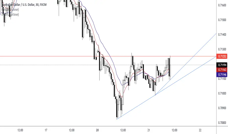
How To Trade The Ascending Triangle Before The BreakoutHow I Trade The Ascending Triangle
Engulfing Candle (Price Action Signal)
First Entry at 0.71194
Candlestick Closed Above Level
Second Entry at 0.71273
Retest Candlestick and Rejection Candlestick at 0.71295
Third Entry
Moving Average ChannelA lot of traders like myself, like to visualize the moving averages on their chart and incorporate them in their trading strategies. But what is extremely common in doing this, is traders being under the assumption that a moving average is the exact price in which we see supply and demand in the market.
In this video, I clearly outline how to add a channel around your moving averages, to give you an idea of where we may see a change in supply and demand. Having clarity in an area can help traders understand the moving average better than just a thin line.
If you do use moving averages in your trading strategies, I recommend trying this little trick to improve your success rate and understand breakouts better.
- Jordon

Weekly Line Chart DivergencesHello traders,
I am not a financial advisor. I am not telling you to trade any asset. I am simply sharing my ideas on how to use tools to implement my own investment strategy.
Here is a zoomed-out look you can use to come up with some of your own ideas on where the $SPX may go and how to manage your risk. Most of my core strategies are developed on the indices so I will have to implement them on individual tickers unless the comments are interesting.
This is a lagging indicator and should put me on the side of the trade that is *probably* likely to continue. By probably, I mean you need to do your own research and look at what the markets want to go and develop your own tools to work with the data.
Orientation:
Line Chart of ticker on weekly time frame
RSI using 12 periods (or weeks, in this case)
Signals can be marked using a vertical line or time-based axis marker . In this case, I am using 3 colors of lines, explained by the "Monday Action" legend. We will dive into more detail later on.
I also have EMA using ohlc4 on periods (or weeks) 10, 25, 50, 100, 200.
Now to the good stuff:
Divergences have been around for quite some time. Research about the RSI (Relative Strength Index) and it's roots
It is much easier to see something that is larger, than smaller, thus we look at weekly time frames
One can use volume, closing price and RSI to help manage one's risk
Narrowing a decision to 3 choices can help alleviate indecision
So for this application of the RSI and divergence, one can use a simple line chart on a weekly time frame (this chart is based on the closing price from what I can tell, but I was unable to confirm that with the Help Center. I was able to confirm by checking yesterday's close with current reading - it will be different after this post as the weekly close will come in today (writing before market close Friday morning)).
We can start at the March 2020 rally. We can see the March 23rd, 2020 weekly close paint a divergence
on the RSI. One can see the price close at a higher high when compared to March, 16th, 2020. The RSI values remain relatively flat: 17.95 to 18.04.
Find entry
One might conclude this is a time to buy. Because of the magnitude of the move DOWN, the move up was also shorted. One would have to employ the use of other tools in order to find entry in the following week. (Use the white anchored notes to see the explanations of thought process).
Find an entry in the next week. One can place orders on the weekend in "shotgun fashion" perhaps placing 50% order above current price and 50% below, or whatever method suits you.
Hedge Risk
The next yellow line is 08/24 - 31/2020.
The close indicates indecision in the market. Since this is the first divergence I would simply hedge the FANTASTIC long during the March 2020 buy. This can help to be determined from YELLOW vs RED using the 10 period moving-average of volume.
Use options or other means to protect one's long investments
Sell of Heavy Hedge
The next divergence is JAN 2021. This is the second one so I would probably sell at this point.
I would use my other tools to figure out what to do. Heavy hedging can be using derivatives or shorting your long positions.
Timing
A simple way to use this strategy might be to use the color's GREEN, YELLOW, RED, just like traffic lights. There will be deviations, and variations to the method, but if you back-test this you will probably find this works generally well.
Monday Action
Now I used the words Monday Action simply because that was the next possible day to make a decision. I can make my decision probably anytime within Friday if I feel comfortable with it. I can also place actions for Monday on the weekend.
Bottom Line
This week's close is very important. If we follow the green, yellow, red method from above, this very well can be a RED. It can also be another YELLOW. Volume is indicating something big, but we will see!

My Love For 200 Moving averageOne of my most used indicators is the moving average. I personally believe that hypothetically, moving average "alone" is sufficient enough to build a profitable trading strategy. I hope to implement this thought in the coming years.
In the chart, we can see the 200 WMA for the 1H, 2H, and 1D moving average. I'm particularly fascinated by how price is respecting the WMA as support and resistance. I think this is worth taking a deep dive into.
What do you think?

EMA 10 EMA 20 Pin Bar (Rejection Candlestick) StrategyEntry is 4013.39
Exit at 4065.64
Reward:Risk is 2.6R
Reward = 5225 USD
Risk = 2009 USD
Strategy is to enter at closing price of a pin bar (rejection candlestick) when the pin bar wick intersects the EMA 10 and EMA 20 in an uptrend.

Trade Pull Backs To The Trend Line And MeanEnter at 161.89
Exit at 170.29
Stop Loss at 159.00
EMA 10 Close Price: 162.57
EMA 20 Close Price: 161.01
Close Price: 161.89
Trend Line Price: 159.00

Trade using EMA, Pin Bars, Trend Lines, Higher Highs Higher LowsPin Bar Is Present On The H2, H3, and H4 Chart. This is a strong indication of a bull market. When this chart pattern occurs, look to enter long positions.
Trend: Up
Level: EMA 10 Level, EMA 20 Level, Horizontal Level
Signal: Pin Bar
Trade with multiple factors in your favor. In a bull market, look for pin bars, rejection candlesticks, EMA 10 above EMA 20, up trend, and higher highs higher lows.

Trade Using Exponential Moving Average and Trend LineHigher Lows Are Represented By Diagonal Trend Line
Lower Highs Are Represented By Diagonal Trend Line
After Price Closes Above Diagonal Resistance Line (Lower Highs), Enter A Long Position. Enter using the closing price of breakout candle. Enter a second long position when price forms a rejection candlestick wick in the EMA 10 EMA 20 Area. Enter using the closing price of rejection candlestick.
H2, H3, H4 Chart. EMA 10 is above EMA 20 in these chart timeframes. EMA 10 Above EMA 20 on multiple timeframes is a good indicator that the market is bullish.

How to use swing highs & swing lows to trade |wait for the closePrice closed below the diagonal level. Now, wait for the retest.
The retest occurred. Now, enter a market execution order. Set target to previous swing low. Set 2nd target to parallel channel level.

My Strategy Works On All Markets and All Time FramesPrice closed above EMA 20, EMA 10, Horizontal Support Resistance, and Trend Line. A pin bar formed on the retest and the pin bar candlestick wick protruded through the support levels. The support levels are EMA 20, EMA 10, Horizontal Support Resistance, and Trend Line.
In this example, there are three higher lows moving into a diagonal resistance level and a horizontal resistance level. Price broke through those two levels and retested those levels with a pin bar. After the break and close above the horizontal and diagonal level; those levels became support.
Entry is the closing price of the pin bar. Target price is the previous swing high.

CoRA Ribbons - Two ideas how to use themSince CoRA Waves and Ribbons could help you to identify the trend better and more reliably, this indicator provides a good baseline for your strategy.
The indicator " CoRA Ribbon - Multiple Compound Ratio Weighted Moving Averages " (#revision: lv21) was used in the following screenshots. Information and details on CoRA waves can be found in the description of the indicator.
Let yourself be inspired. Let's start.
These are just two of the many possibilities. I look forward to any further suggestion or idea. Comments and additional screenshots are always welcome.
Even if CoRA Waves lag less than other moving averages, note, as with all other strategies, that one indicator alone is usually not sufficient. Usually further analyzes and the like are required. Therefore, understand the two examples for what they are: A hint that it is worth taking a look and perhaps one or the other known moving average can be exchanged very well with a CoRA Wave or a CoRA Ribbon - in order to get faster entry points.

How To Set Stop Losses And Take Profits using EMA StrategyWait for price to break and close below a level. In this example, price closed below support level and turned resistance. Next, wait for price to retest level as new resistance. The retest in this example formed a candlestick that created a wick which protruded through Horizontal Resistance Level, EMA 20 Resistance Level, and Diagonal Trend Resistance Level.
For short trade opportunity, set stop loss above EMA 20 Price Level and Rejection Candlestick High Price. Set take profit at previous swing low.

How To Enter A Pullback In A Trend
Enter when these confluence factors are present. There is a Trend, Level, and Signal.
Trend:
Up
Confluence Factors at the Support Resistance Level:
Close Price 96.31
EMA 10 Close Price 96.24
50% Fibonacci Retracement Price 96.15
Horizontal Support Price 95.99
EMA 20 Close Price 95.31
Signal:
Rejection Candlestick

McGinley Dynamic IndicatorMcGinley Dynamic Indicator:
It was invented by John R. McGinley.
It would automatically adjust itself in relation to the speed of the market.
This future can be very helpful as it is sometimes difficult to choose the right period for the MA.
It also helps to account for the gap that often exists between prices and moving average lines.
Can't be used as a single indicator and we need to combine this with other indicators or another McGinley indicator.
Price actions respect moving averages because so many traders use them in their strategies.
Because of the formula, the Dynamic Line speeds up in down markets and moves more slowly in uptrends. One wants to be quick to sell in a down market, yet ride an up-market as long as possible.

A Deep Dive Into Moving AveragesMoving averages are inherent in the world of technical analysis and are present in the core calculations of many technical indicators. In this post, we take a deep dive into 3 types of moving averages used every day by traders: the Simple Moving Average (SMA), Exponential Moving Average (EMA) and the Weighted Moving Average (WMA).
The topics covered below can have practical applications while others are solely informative.
1. Introduction
Moving averages are trend indicators commonly used to smooth the closing prices by removing or attenuating certain variations and are able to estimate underlying trends. Their usage can be recorded as early as 1829 by John Finlaison for smoothing mortality rates (1).
In technical analysis moving averages are often essential for traders and can be found in every technical analysis software. However, they are not specific to this field as they often appear in Time Series Analysis and Digital Signal Processing (DSP).
Moving averages possess a single user setting that generally determines the degree of smoothness. This setting is often referred to as the moving average "length", "period" or less commonly "window size".
2. Curiosities About The Simple Moving Average
The Simple Moving Average abbreviated to "SMA", also known as the "Arithmetic Moving Average" or "Moving/Rolling Mean/Average" is certainly the most well-known moving average due to its simplicity and numerous applications in other domains. The SMA with period length is commonly calculated as follows:
SMA = (SUM C )/length, for i = 0 to length-1
= (C + C + ... + C )/length
Here all the weights w would be equal to 1/length (which is why we often state that a SMA has uniform weights).
2.1 Relationship With The Momentum Oscillator
Changes in a simple moving average with period length are equal to a momentum oscillator of the same period divided by length , that is:
SMA - SMA = (C - C )/length
This can be explained from the calculations of the changes in a Simple Moving Average:
change(SMA ) = SMA - SMA
= (C + C + ... + C )/length - (C + C + ... + C )/length
= (C - C )/length
The closing prices with the same lag cancel each other out, leaving only C(t) and C(t-length) divided by length in the final calculation.
As such you could tell whether a moving average of period length is rising or declining by simply comparing the current closing price to the closing price length bars ago. If the current closing price is higher; then the moving average is rising, else it is declining.
This relationship allows us to efficiently compute the SMA, allowing us to obtain a computation time independent of the moving average period which is very important for real-time high-frequency applications of the SMA.
2.2 Lag Of The SMA
Lag is defined as the effect moving averages have to return past price variations instead of new ones. For most moving averages this amount of lag can be quantified as the weighted sum between the moving average weights w(i) and the time lag associated with them. Higher weights given to more recent values would return a moving average with less lag.
All the weights of a simple moving average are equal to 1/length . The lag of a Simple Moving Average is thus given by:
Lag = SUM(1/length × i), for i = 1 to length-1
= 1/length + 1/length × 2 + ... + 1/length × (length-1)
= (length-1)/2
As such, the lag (in bars) of a Simple Moving Average is equal to its period minus 1, divided by 2.
Offsetting an SMA Lag bars in the past allows us to have it centered with the price.
2.3 Cascaded SMA's
Using an SMA as input for another SMA would return a smoother output; this process is known as cascading. In the case of the Simple Moving Average, cascading many SMAs of the same period would converge toward a Gaussian function.
The Irwin–Hall Probability Density Function can describe the result of cascading multiple SMAs using an impulse as input.
3. Curiosities About The Exponential Moving Average
The Exponential Moving Average; abbreviated as "EMA", also known as an "Exponentially Weighted Moving Average" or "Exponential Average" is a recursive moving average. That is, it uses a previous output for its computation.
This moving average is slightly more reactive than the Simple Moving Average due to its lower degree of filtering.
An EMA of period length is calculated as follows:
EMA = a × C + (1-a) × EMA
or:
EMA = EMA + a × (C - EMA )
with smoothing constant a = 2/(length+1) .
3.1 Traders Prefer The EMA Over The SMA
The trading community seems to have developed a preference for the EMA over the SMA. This might be explained by the superior reactivity of the EMA over the SMA.
The EMA is also more commonly used in the creation of technical indicators, sometimes for its superior reactivity, its computational efficiency, or sometimes simply by preference.
Several studies attempted to indicate which moving average (between the EMA and SMA) provided better performances. The conclusion can vary depending on the markets and methodology used. Dzikevičius & Šaranda found superior results of the EMA over the SMA (2), while Predipbhai found better results from an EMA-based MACD over an SMA-based one (3).
3.2 The EMA Helps Avoiding Division By Zero
In scenarios where we are required to perform a division with a moving average applied to a denominator, the EMA can help to avoid division by 0 as long as the smoothing factor is lower than 1 (EMA period superior to 1)
For a < 1, the EMA has an exponentially decaying infinite impulse response. The impulse response converges towards 0 but never reaches it.
This can be useful if we want to obtain the ratio between the average upward variations and average downward variations. In the event where there is a significant number of upward variations, an SMA of the downward variations might eventually be equal to 0; the EMA prevents this.
3.3 The EMA Has The Same Lag As An SMA
We previously mentioned that the EMA is more reactive than the SMA, but quantifying the lag of an EMA from the weighted sum between the EMA weights and their associated lag gives the same results as the lag of an SMA.
The weights of an EMA can be obtained from its impulse response, which is described as:
h = a × (1-a)^n, n ∈
The lag is then calculated as follows:
Lag = SUM i × (a × (1-a)^i), for i = 0 to infinity
= (1 - a)/a
= (1 - 2/(length+1))/(2/(length+1))
= 2/(length+1)
4. Curiosities About The Weighted Moving Average
The Weighted Moving Average; abbreviated as "WMA", also known as a Linearly Weighted Moving Average (LWMA), is the most reactive moving average when compared to the SMA and EMA. The WMA uses linearly decaying weights for its calculations, giving higher weights to more recent prices.
The WMA can be calculated as follows:
WMA = (SUM (length-i) × C )/(length*(length+1)/2), for i = 0 to length-1
4.1 Relationship With The SMA
It's interesting to observe how certain moving averages are related to each other. In the case of the WMA and SMA, the change of a WMA of period length can be given by the difference between the price and an SMA offset by 1 bar, divided by (length+1)/2 .
This equality is described as follows:
change(WMA ) = (1 - SMA )/((length+1)/2)
This also shows that the changes in a WMA with a period length-1 can indicate if the price is above or below an SMA of period length .
Like with the SMA, this relationship allows the calculation of the WMA efficiently allowing us to obtain a computation time independent of the moving average period.
4.2 Relationship With The Linear Regression
It can seem extremely surprising, but it is indeed possible to compute a simple Linear Regression of the price using linear combinations between a WMA and an SMA (under certain conditions).
The first point of a simple Linear Regression with coordinates (X1,Y1) fitted through the most recent length price observations can be obtained as follows:
X1 = t - length + 1
Y1 = 4 × WMA - 3 × SMA
While the last point with coordinates (X2,Y2) is given by:
X2 = t
Y2 = 3 × WMA - 2 × SMA
The periods of the WMA and SMA are both equal to length . Drawing a line using the above coordinates would return the simple Linear Regression fitted to the most recent length price observations. The slope of the linear regression is equal to:
m = ((3 × WMA - 2 × SMA ) - (4 × SMA - 3 × WMA ))/(length-1)
= 6*(WMA - SMA )/(length-1)
References
(1) Hoem, J. M. (1984). A contribution to the statistical theory of linear graduation. Insurance: Mathematics and Economics, 3(1), 1-17.
(2) Dzikevičius, A., & Šaranda, S. (2010). EMA Versus SMA usage to forecast stock markets: the case of S&P 500 and OMX Baltic Benchmark. Business: Theory and Practice, 11(3), 248-255.
(3) Predipbhai, N. P. (2013). Comparison between exponential moving average based MACD with simple moving average based MACD of technical analysis. International Journal of Scientific Research, 2(12), 189-197.

Education Excerpt: SMA, LWMA, GMA, TMA, EMAWe decided to publish second part of the paper on moving averages. The first part detailed Simple Moving Average. In the second part we decided to present: linearly weighted moving average (LWMA), geometric moving average (GMA), triangular moving average (TMA) and exponentially smoothed moving average (EMA).
The first part can be read by clicking on chart below:
Possible uses of the moving average
• Identification of trends
• Identification of price extremes
• Identification of support and resistance levels
• Identification of signals
Identification of trend
The moving average can be used as simple tool to determine prevailing trend. Simplest way to determine current trend using moving average is to compare current value of security to current value of moving average. If value of moving average is below price of the security, then trend is considered to be upward. Contrary to that when value of moving average is above price of the security then trend is considered to be downward. Another method of determining trend is to use two same moving averages but with different length (different number of hours or days, etc.). These two moving averages would be then plotted on graph as two simple lines occasionally crossing. Trend would be considered upward when shorter moving average would be above longer moving average. Opposite to that, if shorter moving average would be below longer moving average then trend would be regarded to be down.
Illustration 1.01
Picture above depicts daily chart of XAUUSD. It is observable that price continued to rise most of the time when it was above 10-day SMA. It is also observable that when price dropped below 10-day SMA then it continued to decline further.
Identification of price extremes
Analyst can find another utilization of moving average in finding the price extremes. This is possible due to natural tendency of price to move back towards its moving average after it deviated too far from it.
Illustration 1.02
Graph above depicts General Motors on daily time frame. It is visible that when price deviated too far from its 10-day SMA then retracement followed. However, it is not a rule that price will retrace full length back to moving average once it deviated too far from it.
Identification of support and resistance levels
Another possible use of moving averages lies in using them as specific support and resistance levels. In rising markets price has tendency to correct towards moving average before continuing to rise further. Similarly, in declining markets price tends to suddenly increase towards moving average and then drop and continue lower.
Identification of signals
Generally, when moving average with lower period interval crosses above moving average with longer period interval it is considered bullish signal. On the other hand, when moving average with longer period interval crosses above moving average with lower period interval it is considered bearish signal. These crossovers can serve as specific buy and sell signals in markets that are trending.
Illustration 1.03
Picture above shows same graph of General motors as is depicted in Illustration 1.02. However, instead of one 10-day SMA this graph also includes 20-day SMA. It is easily identifiable where these two moving averages cross each other and by doing so generate specific buy and sell signals. However, we have to note that in non-trending markets this method lacks utility since moving averages tend to produce a lot of false signals.
The Linearly Weighted Moving Average (LWMA)
The Linearly Weighted Moving Average (LWMA) is very similar to the Simple Moving Average (SMA) we introduced in our previous education excerpt. But while SMA gives each time period involved in the calculation same weight LWMA differentiates between the weight linked to each time interval. Normally, 10-day SMA calculation would be conducted by summing up each value per time period and then dividing this result by total number of time intervals (which would be 10 in this particular example). In this calculation each time period (each day) would have 10% weight. However, as mentioned before, LWMA gives each time interval different weight. This unequal redistribution of weight can be achieved in two simple steps. In the first step analyst multiplies each day's value and sums up resulting values together. Then in the second step analyst divides resulting value (from the first step) by the sum of all multipliers. For example, in 10-day LWMA first day's value would be multiplied by 10. Then second day's value would be multiplied by 9; and third day's value would be multiplied by 8 (continuing up to 10 days where last day's value would be multiplied by 1). Resulting value for each time interval would be then summed up and divided by 55 (multipliers: 10+9+8+7+6+5+4+3+2+1 = 55). This simple change in formula would result in giving 10th (most recent day) day in the calculation twice the weight of 5th day and ten times the weight of the 1st day. Calculation of 10-day LWMA for 11th day would then involve weighting data from 2nd day up to 11th day while dropping the 1st day's value from data set being used in the calculation. Assigning different weight to each time interval helps to give more relevance to the most recent days as opposed to giving less importance to days before that.
Formula
LWMA = / summation of W
P = price for the period
n = period
W = the assigned weight to each period (highest weight goes first and then it linearly declines)
Illustration 1.04
Chart above depicts two different moving averages. First is 10-day SMA (blue) and second is 10-day LWMA (yellow). While these two moving averages have same length they are different in shape. This is because of unequal redistribution of weight. This allows LWMA to act in advance of SMA.
Geometric Moving Average (GMA)
The Geometric Moving Average (GMA) is another form of moving average. But rather than using price in its calculation GMA uses percentage changes between the previous time period and the current time period. This type of moving average distributes weight equally as SMA. In addition to that it suffers from lag. When SMA and GMA (with same length) are plotted on same graph they are not different in shape or dimensions. Therefore they would overlay each other.
The Triangular Moving Average (TMA)
The Triangular Moving Average (TMA) is another type of moving average that is different from previous types of moving averages in that it is double smoothed. Its calculation begins with taking SMA with predetermined number of bars. After that these results are being used to take SMA of former SMA. However, length of second SMA is only half of that used in calculation of original SMA. For example, 20-day SMA would be smoothed through calculation of 10-day SMA that would use data from 20-day SMA. The result can be then plotted on graph and it is depicted as smoothed line. TMA represents the trend better since it is double smoothed, however, at cost of sensitivity to trend changes. When TMA and SMA (with same length) are plotted on same graph they are different in shape and dimensions.
Illustration 1.05
Picture above shows daily graph of PEP. Three moving averages are depicted: SMA, LWMA, TMA. They all observe same 10-days, however, each acts differently.
The Exponentially Smoothed Moving Average (EMA)
The Exponentially Smoothed Moving Average (EMA) is type of moving average that weights importance on the most recent data. Decrease in weight from one time interval (one day) to another is exponential; and unlike SMA and LWMA exponential moving average has ability to use information outside the length of the moving average. Result from calculation of EMA can be then plotted on graph similarly like result from SMA, LWMA or any other moving average. EMA is considered to be more responsive to trend changes and it can be used when analyst is concerned with effect of lag (which is stronger in SMA and LWMA).
Formula
EMA = Pricet x k + SMAy x (1-k)
t = today
k (multiplier) = 2/(number of days in period +1)
SMA = simple moving average of closing price
y = yesterday
Illustration 1.06
Picture above depicts daily graph of Raytheon. It also depicts 10-day SMA and 20-day EMA. It is visible that many fake signals took place once market started to trade sideways.
Disclaimer: This content is purely educational.

How To Trade Support Resistance Levels with Price Action Signal Wait for a Price Action Signal to form at the following support resistance levels.
EMA 10 Level
EMA 20 Level
Fibonacci Level
Horizontal Level
Set Target at the next support resistance level. Set Stop Loss Below EMA 20 Price and Low Price of Price Action Signal Candlestick. Enter at close price of Price Action Candlestick.
Engulfing Candlestick at Support Resistance Levels
