How Intermarket Signals Could Help to Avoid Major CrashesThree Crashes, One Pattern
I've been testing whether intermarket analysis can help avoid major drawdowns when selling weekly puts. Here's what the data shows across three very different market crashes:
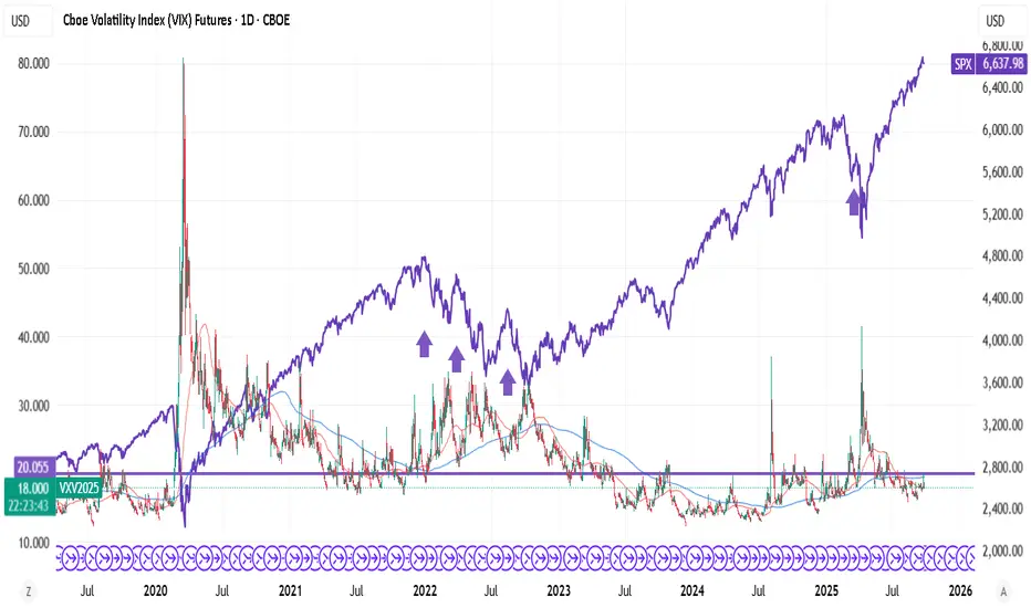
COVID Crash (Feb-Mar 2020)
Drop: -914.75 points (-22.87%)
Duration: 29 bars, 41 days
Signal: BEAR fired in mid-February, BEFORE the crash
The macro composite dropped sharply as bonds rallied (flight to safety), credit weakened, and VIX exploded. The signal went red weeks before the worst of the selling.
2022 Bear Market (Jan-Jul 2022)
Drop: -837.25 points (-15.25%)
Duration: 137 bars, 199 days
Signal: BEAR fired in early January, stayed red through most of the decline
This was a slow grind lower as the Fed tightened. The indicator stayed in BEAR mode for most of the year, keeping me flat during the worst of it. Notice how the red background covers almost the entire decline.
April 2025 Tariff Crash
Drop: -770.25 points (-13.35%)
Duration: 6 bars, 10 days
Signal: BEAR fired in late March, BEFORE the drop
The fastest of the three crashes - just 10 days. But the macro signals still deteriorated first. Credit (JNK) weakened, volatility spiked, and the composite crossed below its signal line before price collapsed.
The Pattern
Three different causes (pandemic, Fed tightening, tariffs). Three different timeframes (41 days, 199 days, 10 days). But in each case, the macro signals deteriorated BEFORE equities fell hard.
The Core Idea
Markets don't move in isolation. Before major equity drawdowns, stress often appears first in:
TLT (Bonds) - Flight to safety begins
JNK (Credit) - High-yield weakens as credit risk gets priced
DXY (Dollar) - Strengthens as risk-off flows accelerate
VIX (Volatility) - Fear builds in the options market
The indicator normalizes each market using z-scores (standard deviations from 1-year average), then combines them:
Macro Score = (TLT + JNK) - (DXY + VIX)
When this composite trends down and crosses its signal line, conditions favor caution. When it trends up and crosses above, conditions favor risk.
Why This Matters for Put Sellers
Selling weekly puts has attractive math: 90%+ win rate, consistent premium. But the losses when they come are brutal (600% stop loss). One bad week can erase months of gains.
The question isn't IF a crash will happen. It's whether you're holding short puts when it does.
My 5-year backtest on ES 7DTE puts - using TastyTrades backtester:
Without Macro Filter:
357 trades | 96.1% win rate
Total P/L: +$63,492
Max Drawdown: 10.30%
Profit Factor: 2.90
With Macro Filter:
200 trades | 96.0% win rate
Total P/L: +$33,636
Max Drawdown: 2.91%
Profit Factor: 3.51
Key finding: 72% reduction in maximum drawdown.
Yes, fewer trades means less total profit. But avoiding the tail risk changes everything about position sizing and sleep quality.
Current Status: A Challenging Environment
Right now (January 2026), we're in a consolidation range. The macro score is hovering near flat, and with the 7-day EMA setting, signals are flipping almost weekly.
This is exactly the environment where the indicator struggles:
Range-bound price action
No clear macro trend
Frequent signal changes (whipsaws)
Difficult to follow systematically
I'm being transparent about this because it's real. The indicator seems to work well for catching major regime shifts but generates noise during consolidation phases.
Work in Progress
This is not a finished system. It's a research framework I'm actively developing. Areas I'm exploring:
Signal method variations - The indicator offers 7 different methods (EMA Cross, Slope, Momentum, Multi-Confirm, etc.). Some may handle consolidation better.
Longer smoothing periods - The current 7-day EMA is responsive but whipsaw-prone. Testing longer periods for range markets.
Regime detection - Adding logic to identify trending vs ranging environments and adjust sensitivity.
Combining with price filters - Using EMA20 or other price-based filters as secondary confirmation.
The goal is to reduce false signals during consolidation while maintaining the ability to catch major turns.
What It Catches vs. What It Doesn't
Works well for:
Major regime shifts with clear macro deterioration
Gradual credit/bond stress building over days or weeks
Events like COVID, 2022 bear market, April 2025 tariff crash
Struggles with:
Range-bound, choppy markets (like now)
Overnight gaps from surprise news
Idiosyncratic moves unrelated to macro
Short-term whipsaws in flat macro environments
How I'm Using It (Current Approach)
1. Check the indicator before opening new put positions
2. Clear RISK-ON (green, rising): Full position size
3. Clear RISK-OFF (red, falling): No new positions or reduce exposition
The "flat/choppy" category is new - I'm adding nuance rather than treating it as binary. When macro is unclear, I'd rather miss premium than get caught in a whipsaw.
The Honest Tradeoff
What you give up:
Fewer trades = less total premium
False signals in consolidation
Missed rallies when flat
Requires discipline to follow
What you gain:
Avoided COVID crash: -22.87%
Avoided 2022 bear: -15.25%
Avoided April 2025: -13.35%
Significantly better risk-adjusted returns
Ability to size up when conditions are clearly favorable
For me, avoiding those three crashes was worth the whipsaws in between. Your risk tolerance may differ.
Try It Yourself
I've published the indicator with multiple signal methods so you can test what works for your approach:
EMA Cross (what I use) - Classic crossover
Slope - Simple trend direction
Momentum - Rate of change threshold
Multi-Confirm - Requires 4+ methods to agree (more conservative)
Indicator in related ideas below.
What's Next
I'll continue refining this approach and will share updates as I find improvements. Specific things I'm testing:
Longer EMA periods for the signal line
Adding a "flat zone" where macro is inconclusive
Combining macro with price structure (above/below key MAs)
Different parameter sets for trending vs ranging markets
If you have ideas or are working on something similar, drop a comment. This is open research, not a black box.
Final Thought
Three crashes. Three different causes. Three times the macro signals warned before price collapsed.
Is it perfect? No - the current consolidation proves that. But when the big moves come, they tend to show up in credit, bonds, and volatility first.
I'd rather deal with some whipsaws during flat markets than be holding short puts when the next -15% hits.
---
What macro signals do you watch? How do you handle range-bound environments? Let me know in the comments.
VIX CBOE Volatility Index

VIX FUT trending above 20 - high probability SPX crash indicatorVIX never trends above 20. You lose money buying VIX FUT above 20.
In nutshell, VIX FUT supporting at 20 is a guaranteed crash - for low risk positions.
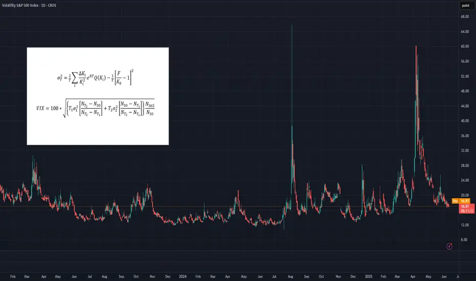
Trading the VIXOften dubbed the "fear index," the VIX gauges SPX options' implied volatility, typically rising during equity market declines and vice versa. It quantifies investor anxiety, demand for hedging, and market stress, crucial for traders and risk managers seeking to measure turbulence.
The VIX calculates a constant 30-day implied volatility using SPX options expiring over the next two months. Unlike simple weighted averages of equity indices, its methodology is more complex, involving implied variance calculation for the two nearest monthly expirations across all strikes. For detailed formulas, refer to the introductory chart or visit the CBOE’s official VIX Index page.
While the VIX Index itself isn’t tradable, exposure can be gained through VIX futures or exchange-traded products (ETPs) like VXX, UVXY, and SVXY. However, these instruments come with their own unique risks, pricing behaviors, and structural nuances, which can make directional VIX trading considerably more complex than it might initially appear.
What You Need to Know About Implied Volatilities
• In calm or uptrending markets, the volatility curve typically slopes upward (contango), indicating higher implied volatility with longer maturities.
• In declining or turbulent markets, the curve can invert, sloping downward (backwardation), as shorter-term implied volatilities rise sharply.
• This pattern can be observed, comparing VIX9D, VIX, and VIX3M against the SPX. In stable markets: VIX9D < VIX < VIX3M. In stressed markets, this relationship may reverse. The VIX9D and VIX3M are the 9-day respectively 3-month equivalent to the 30-day VIX.
What You Need to Know About VIX Futures
• When the volatility spot curve is in contango, the VIX futures curve will also slope upward.
• In backwardation, the futures curve slopes downward, reflecting heightened short-term volatility and short-term volatility spikes.
• While in contango, VIX futures "roll down the curve," meaning that—independent of changes in volatility—futures tend to decline in value over time.
• In backwardation, the opposite occurs: futures "roll up the curve," potentially rising in value over time even without volatility changes.
• VIX futures’ responsiveness to VIX Index movements – the beta of VIX futures against the VIX index - declines with longer expirations; front-month futures may react to 70-80% of VIX changes, compared to 40-60% for third or fourth-month futures.
Key Consequences for Traders
• Directional trading of VIX futures can be strongly influenced by the shape of the futures curve.
• Contango in low-VIX environments creates strong headwinds for long VIX futures positions, caused by the “roll-down-effect”.
• Conversely, backwardation in high-VIX environments creates headwinds for short positions.
• These effects are more pronounced in front-month contracts, making timing (entry and exit) for directional trades critical.
• There's a trade-off in directional strategies: front-month futures offer greater exposure to VIX movements but suffer more from negative roll effects.
How to Trade VIX Futures
• Due to these structural challenges, directional VIX futures trading is difficult and requires precision.
• A more effective approach is to trade changes in the shape of the futures curve using calendar spreads (e.g., long VX1, short VX2). This reduces the impact of roll effects on individual contracts.
• In low-VIX, contango conditions, a rising VIX typically leads to VX1 increasing faster than VX2, widening the VX1–VX2 spread—an opportunity for spread trading.
• While VX1 may initially suffer more from roll-down than VX2, this can reverse as the VIX rises and VX1 begins to “roll up,” especially when VIX > VX1 but VX1 < VX2.
• The opposite dynamic applies in high-VIX, backwardation environments.
• More broadly, changes in the shape of the futures curve across the first 6–8 months can be profitably traded using calendar spreads. Roll-effects and the declining beta-curve can also be efficiently traded.
How to capture the Roll-Down-Effect
One of the more popular VIX-trading strategies involves capturing the roll-down effect,, while the curve is in contango. It is a positive carry strategy that is best applied during calm or uptrending market conditions. Here’s a straightforward set of guidelines to implement the Roll-Down-Carry trade:
• Entry Condition: Initiate during calm market conditions, ideally when VIX9D-index is below VIX-index (though not guaranteed).
• Choosing Futures: Use VX1 and VX2 for calendar spreads if VX1 has more than 8-10 trading days left; otherwise, consider VX2 and VX3.
• Spread Analysis: Short VX1 and long VX2 if VX1–VIX spread is larger than VX2–VX1; otherwise, VX2 and VX3 may be suitable.
• Contango Effect: VX1’s roll-down effect typically outweighs VX2’s during contango.
• Relative Beta: VX1 shows higher reactivity to VIX changes compared to VX2, mimicking a slight short position on VIX.
• Exit Strategy: Use spread values, take-profit (TP), and stop-loss (SL); consider exiting if VIX9D crosses over VIX.
________________________________________
Conclusion
Directional trading of the VIX Index—typically through futures—demands precise timing and a good understanding of the volatility curve. This is because curve dynamics such as contango and backwardation can create significant headwinds or tailwinds, often working against a trader’s position regardless of the VIX’s actual movement. As a result, purely directional trades are not only difficult to time but also structurally disadvantaged in many market environments.
A more strategic and sustainable approach is to trade calendar spreads, which involves taking offsetting positions in VIX futures of different maturities. This method helps neutralize the impact of the curve's overall slope and focuses instead on relative changes between expirations. While it doesn’t eliminate all risk, calendar spread trading significantly reduces the drag from roll effects and still offers numerous opportunities to profit from shifts in market sentiment, volatility expectations, and changes in the shape of the futures curve.
What else can be done with VIX instruments
VIX indices across different maturities (VIX9D, VIX, VIX3M), along with VIX futures, offer valuable insights and potential entry signals for trading SPX or SPX options. In Part 2 of the Trading the VIX series, we’ll explore how to use these tools—along with VIX-based ETPs—for structured trading strategies.
THE SKEWED GAMES. UNDERSTANDING CBOE SKEW INDEX (SKEW)The CBOE Skew Index (SKEW, or "BLACK SWAN" Index) is a financial metric developed by the Chicago Board Options Exchange (CBOE) to measure the perceived tail risk in the S&P 500 over a 30-day horizon.
Tail risk refers to the probability of extreme market movements, such as significant declines or "black swan" events, which are rare but have severe consequences.
Here's a detailed explanation of its role and implications in financial markets:
Key Features of the CBOE:SKEW Index
Measurement of Tail Risk. The SKEW Index quantifies the likelihood of returns that deviate two or more standard deviations from the mean. It focuses on outlier events, unlike the VIX (Volatility Index), which measures implied volatility around at-the-money (ATM) options.
Implied Volatility Skew. The index is derived from the pricing of out-of-the-money (OTM) S&P 500 options. It reflects the market's demand for protection against downside risks, which leads to higher implied volatility for OTM puts compared to calls.
Range and Interpretation
The SKEW Index typically ranges from 100 to 150.
A value near 100 suggests a normal distribution of returns with low perceived tail risk.
Higher values (e.g., above 130) indicate increased concern about potential extreme negative events, with heightened demand for protective options.
How It Works
The SKEW Index is calculated using a portfolio of OTM options on the S&P 500. The methodology involves measuring the slope of implied volatility across different strike prices, capturing how much more expensive OTM puts are relative to calls. This steepness reflects market participants' expectations of asymmetric risks, particularly on the downside.
To make a picture clear, we just simply use 125-Day SMA of SKEW Index. Since multi year high has occurred, market turbulence come as usual.
Practical Implications
Market Sentiment.
A rising SKEW Index signals growing fear of extreme downside risks. For example, during periods of economic uncertainty or geopolitical tensions, investors may hedge portfolios more aggressively, driving up the index.
Conversely, lower readings suggest calm market conditions with balanced expectations for future returns.
Portfolio Management
Investors use the SKEW Index as a barometer for hedging costs. High SKEW levels indicate that protecting against tail risks has become more expensive (and probably active).
It also helps traders assess whether market pricing aligns with their own risk expectations.
Historical Context
Historically, spikes in the SKEW Index have preceded major market downturns or volatility events, such as the "Flash Crash" in 2010, Bear market in early 2000s (dot com collapse), WFC in 2007-09, market falls in late 2018 and in 2022.
Complement to VIX
While both indices measure risk, they address different aspects: VIX captures overall market volatility, while SKEW focuses on asymmetry and extreme event probabilities.
Limitations
In summary, the CBOE Skew Index provides valuable insights into market participants' perception of tail risks and their willingness to pay for protection against extreme events. It complements other volatility measures like the VIX and serves as a critical tool for risk management and market analysis.

How to read the VIX properly
This video explains the VIX indicator, how I use it to guide my trading decisions, and my perspective on the market. You can download the TradingView indicator for free, as it is open-source. Additionally, I'll provide a link to my Thinkorswim version in the YouTube video description. The VIX is an excellent tool for market guidance, based on options trading activity 30 days out on the S&P 500. It indicates market fear when it rises due to increased options buying and selling. Thank you for watching! If you have any questions or comments, feel free to share them—I enjoy discussing these topics. No indicator is perfect, but I use this one daily to gauge the market.

The VIX: A Measure of Market FearThe VIX, or Volatility Index, is a measure of the expected volatility of the S&P 500 index over the next 30 days. It is calculated using the prices of options on the S&P 500 index. A higher VIX indicates that market participants are expecting more volatility in the future, while a lower VIX indicates that they are expecting less volatility.
The VIX is an important tool for investors because it can help them understand how risky the stock market is. A high VIX indicates that the market is expected to be volatile, which means that there is a greater chance of large price swings. This can make investing more risky, but it can also create opportunities for profit.
The VIX is also correlated with the S&P 500 index. This means that the VIX tends to move in the opposite direction of the S&P 500. When the S&P 500 falls, the VIX tends to rise, and when the S&P 500 rises, the VIX tends to fall. This correlation is not perfect, but it is strong enough to be useful for investors.
The VIX can be used in a variety of ways by investors. Some investors use the VIX to assess the risk of their portfolios. Others use the VIX to trade volatility, either by buying or selling VIX futures contracts. Still others use the VIX to hedge against risk in other assets.
The VIX is a complex and volatile asset, but it can be a valuable tool for investors who understand how to use it.
Here are some additional things to keep in mind about the VIX:
The VIX is not a direct measure of the volatility of the stock market. It is a measure of the expected volatility, which means that it is based on the opinions of market participants.
The VIX can be affected by a variety of factors, including economic news, political events, and natural disasters.
The VIX is not always accurate. It can sometimes overshoot or undershoot the actual volatility of the stock market.
Despite its limitations, the VIX is a valuable tool for investors. It can help investors understand the risk of the stock market and make informed investment decisions.
I hope this post is helpful.
This analysis represents my thoughts at the date it is posted.
This analysis does not represent professional and/or financial advice.
You alone assume the sole responsibility of evaluating the merits and risks associated with the use of any information or other content found on this profile before making any decisions based on such information.

Using $VIX to measure Volatility in $SPY I'm sure many of you already know TVC:VIX (Volatility Index of the S&P 500) correlates to AMEX:SPY (the S&P 500 micro index). For those who don't and those who do, this is my up to date VIX chart. Please comment what you think! But the general idea is that...
When TVC:VIX goes up, AMEX:SPY goes down
When TVC:VIX goes down, AMEX:SPY goes up
This is just one of the many comparisons I take into account when trying to gain a sense of market structure. Never use just one indication or signal to determine a trade. I also like to look at AMEX:SPY vs TVC:DXY (US Dollar). The general idea is that...
When TVC:DXY goes up, AMEX:SPY / stocks go down
When TVC:DXY goes down, AMEX:SPY / stocks go up
Again, its important to have multiple things indicating the SAME signal offering high conviction trade ideas. And these "ideas" should be thought of in a way of PROBABILITIES not PREDICTIONS with a predetermined set stop-loss and profit target.
Pay attention to market events and released data, especially the TIME those data reports come out. I honestly look at AMEX:SPY and TVC:VIX multiple times throughout the week, I do not have them side-by-side during my active trading as they don't perfectly mirror each other on any time frame. It's meant more for a larger timeframe (1H or higher) outlook and trying to gain a broader sense of sentiment in the market.
On that note..
Happy Trading !!
- E
TVC:VIX AMEX:SPY TVC:DXY

Guide to VVIX/VIX Ratio Regimes and Corresponding Investment StrMarket volatility and its expected future changes, as indicated by the VVIX/VIX ratio, can greatly impact investment decision-making. The following guide provides insights into different regimes of this ratio, their implications on market conditions, potential sector rotations, and additional investment strategies that investors might consider.
High Ratio (High VVIX, Low VIX):
In this regime, apparent calmness belies underlying uncertainty about future volatility. This suggests a potential underestimation of future risks.
Sector Rotation: A strategic shift towards defensive sectors—Consumer Staples, Utilities, and Healthcare—can help. These sectors are often resilient during uncertain times due to consistent demand for their services and products.
Options Strategies: Look at strategies like long straddles or long strangles. These profit when the underlying security experiences a significant price move, regardless of the direction.
Risk Parity: Adjust your portfolio by distributing risk evenly across different asset classes rather than allocating based on expected returns.
Bond Laddering: This involves buying bonds that mature at different times. It provides regular income and reduces the risk of being locked into a low-interest-rate environment.
Low Ratio (Low VVIX, High VIX):
In this regime, high current market volatility is expected to continue, signaling turbulent times ahead.
Sector Rotation: Defensive sectors, including Utilities and Consumer Staples, provide stability during turbulent times. For those with high risk tolerance and a long-term perspective, cyclical sectors like Technology, Consumer Discretionary, or Industrials could present buying opportunities.
Volatility Trading: Consider securities that are designed to track volatility, such as VIX futures, options, or volatility-focused ETFs and ETNs.
Dollar-Cost Averaging: This strategy involves investing a fixed dollar amount in a particular investment on a regular schedule, regardless of the asset's price. Over time, this can result in a lower average cost per share.
Distressed Assets: Market turbulence often results in some assets being undervalued or "distressed." Savvy investors may find bargains in this space.
Stable or Mid-Range Ratio:
A moderate level of expected market volatility signals a stable market environment.
Sector Rotation: Investors might consider cyclical sectors—Technology, Industrials, and Consumer Discretionary—that are likely to benefit from economic growth.
Buy and Hold: This strategy involves buying stocks or other assets and holding them for a long period. It is based on the belief that in the long term, financial markets provide a good rate of return despite periods of volatility.
Growth Investing: This strategy involves investing in companies expected to grow at an above-average rate compared to other companies.
Momentum Trading: This involves buying securities trending up and selling those trending down. Stability can enhance the predictability of these trends.
Understanding the nuances of the VVIX/VIX ratio and its implications on market conditions can help investors align their strategies with market volatility regimes. Whether rotating sectors or applying different investment strategies, it's important to remember that all strategies carry risk and must align with individual investment goals, risk tolerance, and market outlooks. As always, it's important to consider a variety of market indicators and economic factors before making investment decisions. This guide serves as a stepping stone towards informed investment decision-making during different market volatility regimes.

VIX/VIX3M: Tricks for Reading the VIX Part IIPRIMARY CHART: S&P 500 (SPX) with VIX/VIX3M ratio in subgraph on a weekly time frame
Tricks for Reading the VIX Part I
SquishTrade's original 2022 article on VIX entitled "Tricks for Reading the VIX" covered the basic concepts of the CBOE's Volatility Index (VIX) to aid in understanding and interpreting VIX and its behavior relative to the S&P 500 ( SP:SPX ). It also explained generally how VIX values are derived, reviewed a few historical examples, and identified the historical mean (20 VIX) as well as some outliers.
Furthermore, the original piece delved into the usual inverse relationship between VIX and SPX. But in its later sections, it explained how divergences from this usual inverse relationship between VIX and SPX may distinguish lasting market bottoms from interim trading lows. If interested, the following link provides the original article on VIX.
A couple of points from this original article on VIX may be beneficial to readers who are less familiar with VIX. VIX is a measure of implied volatility for SPX derived from the pricing of a wide range of options prices with approximately 30 days to expiration. Specifically, only SPX options with more than 23 days and less than 37 days to expiration are included. CBOE introduced the VIX in 1993 to measure the options market's expectation of implied volatility from at-the-money SPX index options (where strikes of the options are at or very close to where the underlying index price is trading). But ten years later (2003), CBOE updated the VIX formula to track not only at-the-money options, but a wide range of SPX options focusing now on out-of-the-money strikes.
CBOE's website contains a helpful FAQ on VIX here . A relevant excerpt with more detail on how VIX is calculated is available in a footnote (FN 1) at the end of this post.
The last two concepts for this introduction are important. SPX implied volatility, which is what VIX is intended to measure, and realized volatility should be distinguished as they are not the same. And VIX index values tend toward mean-reversion in the long term rather than trending action. But trends within VIX can nevertheless be identified within the broader context of its mean-reverting character. SPY_Master has an excellent chart covering a recent VIX trend shown as Supplementary Chart A:
Supplementary Chart A
VIX/VIX3M: Tricks for Reading the VIX Part II
In this sequel to the original post, SquishTrade will cover the VIX/VIX3M ratio. To understand this ratio, it is important to understand basic concepts about VIX, its interpretation, and its inverse relationship as well as excepts to that relationship, which topics are covered in the prior article or elsewhere on trustworthy financial websites including CBOE's.
VIX3M Basics
Furthermore, VIX3M is vital to understanding the VIX/VIX3M ratio. VIX3M is essentially a 3-month forward implied volatility index for SPX. CBOE's brief description of VIX3M index follows:
"The Cboe 3-Month Volatility IndexSM (VIX3M) is designed to be a constant measure of 3-month implied volatility of the S&P 500® (SPX) Index options. (On September 18, 2017 the ticker symbol for the Cboe 3-Month Volatility Index was changed from “VXV” to “VIX3M”).The VIX3M Index has tended to be less volatile than the Cboe Volatility Index® (VIX®), which measures one-month implied volatility. Using the VIX3M and VIX indexes together provides useful insight into the term structure of S&P 500 (SPX) option implied volatility."
The term-structure of implied volatility (IV) means the relationship, or comparison, between different implied-volatility measures based on different terms (time periods) for measuring implied volatility such as a one-month period, three-month period, six-month period, or one-year period. Term structure can be also understood by remembering that this term is used to describe the yield curve, varying interest rates on risk-free government bonds (same type of security) with different maturities ranging from short term to long term.
In short, the ratio of VIX/VIX3M allows insight into the shorter end of the IV term structure by allowing investors and traders to see both the 30-day (one-month) and the 90-day (three-month) outlook for expected volatility for SPX based on its index options premiums.
VIX and VIX3M Comparison
VIX3M and VIX can be distinguished based on the time frame as discussed in the prior paragraphs. One is a constant measure of approximately 30-day IV for SPX, and the other is a constant measure of approximately 3-month IV for SPX.
VIX3M tends to have higher values than VIX. This is because VIX3M considers longer-dated option prices than VIX considers. The exception occurs at significant SPX lows, including interm trading lows both in bull-market retracements and in bear markets, and in more lasting bear-market lows.
VIX tends to be more volatile than VIX3M. This is true even though VIX3M tends to have slightly higher values.
The final point of comparison between VIX and VIX3M is that two indices are highly correlated as one might expect. This can be seen from placing them both on a chart together. Try placing them both on a chart together in TradingView, which may help some visualize and remember the close relationship between VIX and VIX3M by working with the symbols themselves. It's relatively easy to do in a couple steps. Load a chart of VIX. Then click the plus symbol next to the ticker symbol on the left upper corner of the TradingView chart screen, ad then add VIX3M to the chart. Be sure to click "New Price Scale" option when selecting VIX3M as the new symbol to be compared.
VIX/VIX3M Ratio Interpretation
The Primary Chart above shows the VIX/VIX3M ratio over the past six years of market history. This ratio is included in the subgraph below the SPX price chart. This chart uses a weekly time frame to ensure the data can be viewed over several years with ease. Notice how peaks in this ratio correlate to some extent with lows in SPX.
Interestingly, peaks were higher in the left half of the chart between 2018 and 2020. Peaks in the current bear market have been lower relative to prior peaks in this ratio. Many peaks have been labeled on the Primary Chart for ease of reference.
As discussed, VIX3M tends to have higher values than VIX. This is because VIX3M considers longer-dated option prices than VIX considers. To understand the VIX/VIX3M ratio, it helps to focus on the exception to the general rule that VIX3M tends to have higher values than VIX. The exception occurs typically when an SPX selloff causes a spike higher in VIX relative to VIX3M.
Why does VIX spike higher on a relative basis, causing the ratio to rise above 1.00 / 1.10? When short-term panic occurs in markets around trading lows (or final lows as well), VIX outperforms VIX3M because VIX focuses on 30-day IV and VIX3M focuses on 90-day IV (longer-term on the IV term structure). This causes the term structure to invert briefly when VIX rises above VIX3M (which is the same as VIX3M trading at a discount to VIX).
When VIX spikes above VIX3M even briefly, it shows that the market expects IV farther out on the term structure at three months to be lower than current implied volatility levels. In plain English, this means the market expects volatility to fall in several months relative to current 30-day forward levels (based on SPX options prices 23 to 37 days until expiration). And when the IV term structure normalizes as it always does after an inversion, meaning that short-term vol is lower than longer-term vol generally, this means that VIX has to fall relative to VIX3M. And remember that when VIX falls, SPX rises given the usual inverse relationship between the two. Don't forget that exceptions to this usual inverse relationship occur when VIX and SPX move in tandem, and such aberrations in the normal VIX-SPX relationship are crucial to notice as discussed in the original 2022 article on VIX.
Finally, here is a chart showing a close-up view of the bear market starting in January 2022 with VIX/VIX3M shown simultaneously. The highs in this ratio were lower than prior highs at market lows over the prior decade or two. Highs have been approximately 1.05 to 1.11. Does this mean vol sellers are more opportunistic and effective? Or does it mean that we haven't seen a capitulatory low? Either way, it helps to see the current bear market levels. Enjoy!
Supplementary Chart B
Please see footnote 2 (FN 2) for this section on interpreting VIX/VIX3M.
FOOTNOTES
FN 1
Note that the formula is complicated and most likely accessible only to those still in higher-level math concentrations in their education, or those working continuously in a math field. The rest of us who have seen a few years pass since our math education must rely on the detailed verbal explanation of the formula. The formula, moreover, is unnecessary to reading and interpreting VIX values, trends, and mean reversion.
CBOE's FAQ on VIX, linked above, contains the following helpful and detailed information about how the VIX Index is calculated:
"Cboe Options Exchange® (Cboe Options®) calculates the VIX Index using standard SPX options and weekly SPX options that are listed for trading on Cboe Options. Standard SPX options expire on the third Friday of each month and weekly SPX options expire on all other Fridays. Only SPX options with Friday expirations are used to calculate the VIX Index.* Only SPX options with more than 23 days and less than 37 days to the Friday SPX expiration are used to calculate the VIX Index. These SPX options are then weighted to yield a constant maturity 30-day measure of the expected volatility of the S&P 500 Index.
Cboe Options lists SPX options that expire on days other than Fridays. Non-Friday SPX expirations are not used to calculate the VIX Index.
Intraday VIX Index values are based on snapshots of SPX option bid/ask quotes every 15 seconds and are intended to provide an indication of the fair market price of expected volatility at particular points in time. As such, these VIX Index values are often referred to as "indicative" or "spot" values. Cboe Options currently calculates VIX Index spot values between 3:15 a.m. ET and 9:15 a.m. ET (Cboe GTH session), and between 9:30 a.m. ET and 4:15 p.m. ET (Cboe RTH session) according to the VIX Index formula that is set forth in the White Paper."
FN 2
The source for some of the key concepts in this section was a January 2018 article on CBOE's website blog on the VIX / Trader Talk, and the article referenced was "Vol 411 Follow Up: More on the VIX3M / VIX Ratio." This article appears to no longer be available.
________________________________________
Author's Comment: Thank you for reviewing this post and considering its charts and analysis. The author welcomes comments, discussion and debate (respectfully presented) in the comment section. Shared charts are especially helpful to support any opposing or alternative view. This article is intended to present an unbiased, technical view of the security or tradable risk asset discussed.
Please note further that this technical-analysis viewpoint is short-term in nature. This is not a trade recommendation but a technical-analysis overview and commentary with levels to watch for the near term. This technical-analysis viewpoint could change at a moment's notice should price move beyond a level of invalidation. Further, proper risk-management techniques are vital to trading success. And countertrend or mean-reversion trading, e.g., trading a rally in a bear market, is lower probability and is tricky and challenging even for the most experienced traders.
DISCLAIMER: This post contains commentary published solely for educational and informational purposes. This post's content (and any content available through links in this post) and its views do not constitute financial advice or an investment or trading recommendation, and they do not account for readers' personal financial circumstances, or their investing or trading objectives, time frame, and risk tolerance. Readers should perform their own due diligence, and consult a qualified financial adviser or other investment / financial professional before entering any trade, investment or other transaction.
Thank you for reading. If this post added clarity or prompted additional thoughts on the technicals of SPY, please comment below!

Celebrating 50 Years of Equity Options TradingAmid serious pushback, Chicago Board of Options Exchange (CBOE) went live on 26th April 1973. Options are now a standard tool for portfolio risk management. Not so, back then. They were seen as gambling instruments for reckless speculators.
Shortly after CBOE launch, Fischer Black, Myron Scholes, and Robert Merton provided a mathematical model for computing options prices.
This Nobel Prize winning model allowed options to be priced theoretically for the first time. It was a key driver in making options markets sophisticated, more efficient and much larger.
The Black Scholes Merton model ("BSM") forms the fundamental basis of options pricing. It allows traders to compute a theoretical price to options based on the underlying asset’s expected volatility.
Expected volatility is referred to as implied volatility (IV). Why implied? Because it is the volatility implied from an options price given other parameters from the BSM model.
COMPREHENDING BSM & BLACK76
Options have existed since the 17th Century. Option were limited to speculation and gambling in the absence of a sound and suitable pricing model such as BSM.
BSM offers a mathematically sound framework to compute theoretical price of European options using five inputs:
1. Underlying Asset Price
2. Implied Volatility (IV) of the Underlying Asset
3. Interest rates
4. Exercise (Strike) Price of the option
5. Time to expiry
A variant of the BSM for pricing options on futures, bond options, and swaptions is the Black Model (also known as Black76) which forms the basis of pricing options on commodity futures.
BSM is far from perfect. For starters, it makes unrealistic assumptions. Such as that stock prices follow a log-normal distribution and are continuous. That future volatility is known and remains constant. BSM assumes no transaction costs or taxes, no dividends from the stocks, and a constant risk-free rate.
Even though these assumptions are impractical, the BSM provides a useful approximation. In fact, the model is so commonly used that options prices are often quoted as IV. On the assumption that given IV, options price can be computed using BSM.
Actual options prices vary from theoretical ones based on supply-demand dynamics and with reality being different from the assumptions baked into BSM.
For instance, actual prices for the same expiry and at different strike prices have been observed to have different IV. Primarily given a higher likelihood of a downside plunge relative to upside rally. This difference in IVs across different strikes is referred to as volatility skew.
OPTIONS IN SUMMARY
Options involve two parties whereby one party acquires a right to buy or sell a pre-agreed fixed quantity of a stock/commodity at a pre-agreed price (the strike or the exercise price) at or before a pre-agreed future date (Expiry Date).
One party acquires the right (Option Buyer or Option Holder) and the other party takes on the obligation (Option Seller).
In consideration for granting the right, the Option Seller collects a premium (Option Price) from the Option Buyer.
To ensure that the Seller keeps up their promise to trade, such Sellers are required to post margins with the Clearing House.
Once buyers pay premium upfront, they are not required to post any additional margins with the Clearing House.
Where the Option Holder secures a right to buy, it is known as a Call Option. However, if the Option Holder acquires the right to sell, such an option is referred to as Put Option.
Where the Option Holder can exercise their right at or before any time before expiry, such Options are referred to as American Options.
Options that can be exercised only at expiry are referred to as European Options. While exercising is permitted at expiry, these European options positions can be closed out before expiry by selling out a long position or by buying back a short position.
Premiums for European options are typically lower than premiums compared to American options.
COMPREHENDING WALLSTREET’S FEAR GUAGE, FADING VIX, AND VIX1D
The CBOE Volatility Index (famously referred to as VIX and is also knows as fear gauge) is a real time index measuring the implied volatility of the S&P 500 for the next 30 days based on SPX Index options prices for options expiring in 23 to 37 days.
There are a range of financial products based on the VIX index allowing investors to hedge volatility risk in their portfolios.
In recent months, VIX has been fading into insignificance. Despite huge price moves in the S&P 500, VIX has remained staid. Why such inertia? Primarily because options markets have started to shift towards shorter expiries. Zero-Days-To-Expiry (0DTE) options now account for more than 40% of overall S&P options market volumes.
These very short-dated options allow traders to express views around specific events such as monetary policy meetings and economic releases. Their popularity has increased dramatically over the past few years, with volumes today nearly 4x that of 2020.
To account for this shift in market behaviour, the CBOE has launched the VIX1D i.e., the One-Day VIX. This index tracks the expected volatility over the upcoming day as determined by zero-day options prices.
More on Options Greeks and Risk Management using Options in a future paper.
DISCLAIMER
This case study is for educational purposes only and does not constitute investment recommendations or advice. Nor are they used to promote any specific products, or services.
Trading or investment ideas cited here are for illustration only, as an integral part of a case study to demonstrate the fundamental concepts in risk management or trading under the market scenarios being discussed. Please read the FULL DISCLAIMER the link to which is provided in our profile description.

Tricks for Reading the VIXUnderstanding VIX Generally
VIX measures the pricing of at-the-money options on the S&P 500 SP:SPX FOREXCOM:SPXUSD where such options have about 30 days until expiration. Higher VIX readings mean that demand for at-the-money options on SPX has risen through hedging or bearish positioning (usually both)—meaning that fear and uncertainty has arisen along with expectations of greater price movement (price declines) and volatility.
In essence VIX tends to jump during major sell-offs in the S&P 500 and other global equity indices, and it also tends to fall back during long, gradual rallies. Its historic average is about 20. The average of all VIX closing numbers is about 19.4.
Further, a VIX reading at 27–28 is at the upper end of one standard deviation from its mean. At the height of the 2008 recession, VIX peaked around 89.5 (intraday) and closed just above 80 several times. In March 2020 amid the Covid-19 pandemic, it surged to about 82.
During the dot-com market from 1997-2000, the VIX held above its historical average (above 20) even though equity markets continued to drive higher for years. This was not a typical period for the relationship between VIX and markets with above average VIX readings coinciding with higher S&P 500 returns (33.1% in 1997, 28.3% in 1998, 20.9% in 1999).
Understanding VIX Readings
In General, High VIX Readings Help Spot Trading Lows or Lasting Market Bottoms
VIX helps spot market bottoms. Some market experts assert that VIX is a measure of stress in the system, a measure of worry and fear as defined by various formulas derived from SPX puts and calls. Readings above 40 on the VIX tend to signal pure panic and indicate either an interim low (e.g., a temporary trading low followed by a bear rally) or a final bottom for a bear market or correction.
The VIX measures implied volatility from a basket of at-the-money front-month SPX options. Ordinarily, VIX and SPX are supposed to head in opposite directions , meaning VIX climbs (or remains elevated) as SPX falls, and VIX falls (or remains low) as SPX rises. At least some other global indices that correlate to some extent with SPX would typically head in the same direction as SPX, but since VIX is derived from SPX derivatives (options), SPX will be discussed primarily.
So the ordinary relationship between VIX and SPX is inverse as shown in the example on the main chart above for the 2000-2002 bear market. Lower SPX lows often coincide with even higher VIX highs.
In the chart below, note how the VIX and SPX held to their usual inverse relationship during the 1998 SPX correction, which involving a decline of about -22% from the pre-correction high. As the market fell, the VIX continued to rise. Each SPX interim low was marked by a higher VIX high. Importantly, each VIX high was a "lower high" relative to the final VIX high that coincided with the final SPX low on October 8, 1998.
Supplementary Chart 1: SPX 1998 Correction Shows Usual Relationship between VIX and SPX
Divergences from the Usual Inverse Relationship between VIX and SPX May Distinguish Lasting Market Bottoms from Temporary Trading Lows
But divergences from the usual inverse relationship between VIX and SPX can sometimes appear, and they may signal a lasting market bottom as distinguished from a temporary trading low . In particular, VIX will start to diverge from the usual pattern of higher VIX highs that coincide with lower VIX lows, meaning that SPX will make a new low but VIX will make a lower high rather than a new and higher high. This can be a helpful trick to understanding how VIX behaves at some major bear market bottoms and corrections.
The primary chart above shows an excellent example from the 2000-2002 bear market. Consider the penultimate interim SPX low in July 2002. The highest VIX close of the entire bear market printed at 48.46 the day before this major interim low on July 24, 2002. (On the actual day of this interim low, VIX fell slightly to close at 39.86).
Corrections also sometimes show this divergence from the usual SPX-VIX relationship. The chart below shows the 1990 correction in SPX where this equity market fell about -20%. Note the divergence between the major interim low in August 1990 and the final correction low in September 1990.
Supplementary Chart 2: SPX 1990 Correction Shows Divergence from the Usual Inverse Relationship between VIX and SPX
Although not shown in an additional chart, the bear market of 2008-2009 following the Great Financial Crisis contains another useful case study. During this bear market, the VIX peaked with closing highs above 80 in October 2008 and an intraday high of 89.53 on October 24, 2008. These were the highest VIX readings of the entire bear market occurring months before the final bear-market low. A VIX divergence appeared at the final bear-market low—VIX made a lower high of 49.33 and an intraday high of 51.90 on March 6, 2009. This is similar to the VIX divergence that was seen in the final stages of the 2000-2002 bear market (shown in the chart above).
Broader Application of VIX-SPX Divergences
This phenomenon of VIX and SPX diverging from their usual inverse relationship also may be stated more broadly as follows: when the VIX moves in tandem with the S&P 500, it’s a usually a sign that the trend may reverse . This occurs whenever VIX and SPX fall together or whenever they rise together.
When the VIX and the S&P are both going down in tandem, this could present a good long-term buy signal especially when combined with other technical or fundamental evidence of a bottom.
Furthermore this divergence from the usual inverse relationship can appear at market peaks as well. For example, when the market rallies higher, but the VIX remains elevated (it rises, does not decline significantly, and holds support), this indicates the rally could soon fail. A rally with elevated VIX shows persistently higher implied volatility / fear—increased demand for 30-day options based on expected volatility / demand for option hedges as downside insurance. This could be a sign the rally is fleeting.

Mastering the VIX on TradingViewThe VIX, also known as the CBOE Volatility Index, is a widely-used financial instrument used to measure market volatility and investor sentiment. In this article, we will explore how to use the VIX on TradingView to improve your trading strategies.
Before we dive into how to use the VIX, let's first understand what it is and how it works. The VIX is based on the S&P 500 index options, and measures the implied volatility of those options over the next 30 days. Essentially, the VIX provides a gauge of how much the market is expected to move over the next month.
Now, let's discuss how to use the VIX on TradingView. To begin, open up the TradingView platform and search for the VIX symbol, which is typically denoted as VIX. Once you have located the VIX, add it to your watchlist and open up the chart.
On the chart, you will notice that the VIX moves inversely to the S&P 500. When the S&P 500 goes down, the VIX goes up, indicating that market volatility is increasing. Conversely, when the S&P 500 goes up, the VIX goes down, indicating that market volatility is decreasing.
So how can we use the VIX to improve our trading strategies? One strategy is to use the VIX as a hedging tool. For example, if you have a portfolio of stocks and are concerned about a potential market downturn, you could buy the VIX to protect yourself against losses. This is because the VIX tends to increase in value when the market is experiencing volatility.
Another way to use the VIX is as a contrarian indicator. When the VIX is at a very low level, it may indicate that investors are overly complacent and that the market may be due for a correction. On the other hand, when the VIX is at a very high level, it may indicate that investors are overly fearful and that the market may be due for a rebound.
In conclusion, the VIX is a powerful tool that can be used to measure market volatility and investor sentiment. By understanding how the VIX works and using it in conjunction with other technical indicators, you can improve your trading strategies and better navigate the unpredictable world of finance. Remember, always do your own research and consult with a financial advisor before making any investment decisions.

Avoiding Risk by tracking VIX, the bull bus might be too crowdedFuture prices are unknowable and unpredictable. But measuring current conditions and valuations are informative. Tracking vix volatility and using it to make better decisions in my experience has been helpful.
Warning: Avoid buying options are generally costly. Options are a form of borrowing money to use leverage provided by an option seller.

How To Spot Economical Cycles Top Using [DXY- SPX and VIX]
Hi Everyone
In this video I want to share an overview of the importance of economic cycles for traders and investors and how we can use Trading View charts
with no indicators to figure out key economic signals on the following charts:
DXY tops for the end of previous bear markets
VIX normal ranges vs Bear cycles ranges
The Dow Jones Industrial average is another key chart with SPY charts because everyone has a 401K retirement account these days and people are use to the headlines of the Dow Jones Industrial Average new highs and new lows to shift emotionally between despair and exuberance. It's not unusual for people to throw in the towel just as the market begins to rise in the next economic cycle.
As a student of the markets, you need to know when it's time to load up on bargain priced assets and ride the next cycle up and when it is time to slowly sell or fade into the tops of the markets and avoid the downturns.
Are we in a normal healthy correction 10-20% or are we heading toward the Great Depression type 50% correction from the top? These charts will help you answer the question.
Mastering the market and economic cycles is the key to becoming wealthy in all asset classes - Stocks, Real Estate, and Cryptos
Hope it helps...
@Marc

Thoughts on the current environmentThese are my comments from some conversations I had and I hope you like it :)
It is a weird environment overall, as the market is pretty cheap, the derivatives markets are fairly well balance, on chain data & stablecoins paint a bullish picture for crypto... but in terms of TA and the overall psychology of the market, getting to anywhere between 20-28k & 1300-1700 at some point in 2022 is quite likely. I just have no idea when.
In late Jan around 37.5k and 2600 I turned bullish in the short term as the market showed strength, it was very cheap and sentiment was really bearish. We are at a fairly similar situation now, only that we did have the pump up to 46k. To me that was always the key point we'd have to retest and as that was hit, the next one is 24k. The same way we perfectly filled the 32-33k CME gap and bottomed, we are going for that one too. In the short term however I see similar dynamics as people are scared, the market is cheap and we are bouncing at support. The price action of both crypto and stocks is telling me that yesterday's bottom was at 'do or die' level which means we've either bottomed now or if we go below that we'd go much lower. Who knows, maybe it's just temporary relief and we could go up by another 3-7% before reversing lower.
In terms of the macro picture I think it is very unclear but also pretty clear. The global economy is turning into shit and tensions are rising. People aren't happy, be that inflation or mandates. To me unfortunately we will soon be reliving the period of 194x. Same way 1929 =2008, 1936-1938 = 2020-2022. Poor financial conditions have lead to the rise of authoritarianism, with governments scrambling to gain as much power, while people lose faith in them. There is too much debt and everyone is in a whole that is very hard to get out of. People are losing their minds and tensions then start to manifest internally and externally. Unfortunately history repeats itself and that's what we as traders/investors are doing, we need to learn from it as human beings are the same now as they were 10, 100, 1000, 10000 years ago. Nothing new under the sun.
Like Su Zhu said in a tweet the other day twitter.com . This is one of the best tweets I've ever read and I truly mean it. So if that's the period we are in, what do we do? What could come next?
Bond yields will go down in one way or another, while inflation stays high. For now we are at a point that bond yields are rising and have some room, until they come crashing down. The Fed will be forced to cut and to support the government. The Gov + Fed will have to do a lot of printing that will be met with very little resistance by the public. We'll be united against a common threat. And to be honest this is usually the only way out of this debt hole. Unfortunately a war and insane amount of currency debasement is the only politically viable way to reduce debt and do a reset. I hate the people who want to push for the 'great reset', but a reset is coming. It's a natural cycle, these always happen and they are usually not nice. But it's like the phoenix rising from its ashes. A rebirth.
Now when I say bond yields will have to go down, I think it will be a combination of the Fed trying to keep them low, but also people chasing the safest and most liquid instruments. Most people in such a period won't want to take risks. Low bond yields = not many opportunities anyways. So then we have high inflation + no opportunities + disruptions + tensions + less freedom and so on. So of course we are in the right market. If the physical world is suffering and there could be wars here and there (I have no idea at what scale), then the digital one should be booming. With sanctions and accounts getting frozen, while governments do insane amounts of QE, this is the place to be. Make no mistake, they will come after us to some extend at some point, but as long as we try to preserve some privacy and keep our coins/tokens in our wallets, we might be safe and able to go to locations that we can protect our wealth. Now the issue is, how do we get there? How do interest rates go down again and the bull market resume? Well to be honest I currently feel like we are somewhere in Q4 2019 - Q1 2020 or Q3-Q4 2018. We are close to having a last major leg down, before a major leg up. One catalyst (rate hikes, higher inflation, war), I don't know what... that will lead to the final shakeout which will trigger a huge monetary & fiscal response. This fractal I've mentioned on my previous ideas is what I still expect. twitter.com
This is great, but I completely disagree with one part: 'it is unwise to assume that Central banks will respond with more stimulus if inflation is rising'. At the current environment I am a disinflationist, but at the end of the day I know they will have to print. In the past it was banks that printed, but since 2008 banks aren't creating much money... The worse things get, they more risk averse they become. Now we are in a situation that is nowhere near like 1987, but more like 1940s and it something Lyn Alden has been talking about for quite some time. There are big differences from then to now of course, but the setup in terms of Governments - Central Banks - Banks is very similar.
What people need to understand is that we are getting inflation mostly not because because of issues on the supply side, not so much by Fed & Gov actions. These issues could become worse, in an environment where banks aren't lending, there is too much debt, too much uncertainty, overvalued stock markets, ESG mandates and so on. The yield curve flattening so much is a sign that the Fed might not even be able to raise rates more than a couple of times, and that in 2023 they might be forced to cut.
Think of it like this... Prices are going up and people aren't making enough money to keep up with inflation. The way things are going they won't be making much, so they need someone to give them money. Who are they going to ask for that money? The government. If prices are going up, they will demand more, something that could create an inflationary spiral. Except if, maybe, by creating a CBDC to control everything they will be able to control inflation. They want full control of the banking system and where people spend their money. For example if there is a shortage of milk, they might be like OK with your account you can only buy 1 litre / week. The majority of people think that vaccine passports are about reducing the spread and that them being used as a gateway for a CBDC is a conspiracy theory. Well in my country they already created an app called government wallet that can contain your ID + vaccine certificate. Wouldn't it be nice connect your bank cards + accounts in there and route all transactions through the government directly? It's been extremely clear that that's the goal. It is their belief, and it is possible, that by having total control over the monetary system they will control inflation.
But at this stage, they will be forced to do something. Let's no forget they always printed/borrowed for wars. And let's no forget that in the case of a war, they won't care about inflation. They will shut down the debate about inflation as they have a bigger goal. Markets crashing + Russia going for Ukraine & China for Taiwan, and they will be nah, we'll raise interest rates. Let's not forget that they can't let markets crash completely. The eurodollar & US bond markets are screaming loud and clear : you raise rates a few times at best and then you go back to cutting. So if they have to save markets again and can't fight inflation, then it's time for Universal Basic Income as this is the last time they will only save markets and not ordinary folks. At the end of the day, the situation with passive investing and the whole structure of the system in general has gone too far. They can't do anything to fix it, and they most certainly aren't capable of fixing it. Replacing the old system with a new one won't be easy and there will many shocks along the way, but I have no doubt that crypto and commodities are the best place to be in this environment. End of rand😝

VIX StructureVIX structure is a great indicator to plan upcoming Volatility events.
I created this chart to identify entry points for future events that may cause volatility in market indexes.
When VIX6M-VIX9D is above 6 you can find better lower premiums on PUTs to enter a position for a future event.
During the peak IV of the event I cash in.
Before the event I look for cheap UVXY Puts at the end of an event when IV comes down, but VIX price is still higher than normal.
I then use those puts for a carry trade of UVXY shares.
As UVXY declines as its designed to do, I roll the puts either vertical or diagonal to cover the cost (UVXY going down + Margin Cost) of the carry trade.
When the event occurs sell the UVXY shares at the top, and sell the puts when VIX comes back down but IV is still high.
Not Financial Advice. Just a 007 trade journal.

The theory of averageOften while trading markets we use various indicators like SMA, EMA, MACD that are based on the thoery that market trends to follow averages everything else remaining constant. Using the same concept and applying it to vix that it would trade in its normal range we have plotted two horizontal lines on vix. This lines gave us the idea when the market moved beyond averages due to extraordinary situations. It can be seen applying the same average points to Index chart that it has acted as a turning point for the given trend . An interesting observation in the given study is that the vix after a sudden market drop has started declining giving us an indication that bears are losing steam. Same can be used to any index you wish to trade to gain meaningful insights.

VIX always best predictorIt is necessary and mandatory to configure alarms in VIX in order to identify best trading opportunities. Analyzing the VIX we realize that we are in a very overweighted buying zone.
- Red lines: time to sell.
- Green lines: time to buy.
For example today is time for selling most items of our portafolio or at least to configure trailing stop at 1%, then we wil have to wait patiently until next buying opportunity.
Remember what Warren Buffett said... "The stock market is a device for transferring money from the impatient to the patient."

How Central Banks Are Stealing Your MoneySince the merger between the Fed and the Treasury (kidding, kind of), I've had so many conversations with individuals outside of the financial industry who struggle to fully grasp how central banks are stealing their money. Today, I'm going to share a short and simple post which I hope will help explain the direct effect of "money printing," on the working class. Let's jump right into it.
When interest rates remain low for an extended period of time (historically), risk assets become more prone to rampant speculation (lucky for those holding assets outside of cash), leading to massive distortions in the underlying fundamentals of those assets, and historical valuation deviations from the mean (which is mathematically unsustainable). The rapidily rising prices of both assets, and goods & services, which is not being stimulated by an actual increase in the velocity of money, but rather from central banks artificially flooding the monetary system with liquidity (while interest rates are near zero), contributes to a lower standard of living for those holding cash as their primary asset.
For example:
If you have $100 in your bank account, and perhaps this is your only asset, then the central bank increases the money supply by 25%, what they've just done is increase the denominator which underpins the value of that $100.
Here's a simple logical demonstration:
100/100 = 1 (baseline purchasing power.)
100/125 = 0.80 (a 25% increase in the money supply in this example, as a result of central bank money printing, results in a 20% loss in purchasing power.)
In essence, in this hypothetical situation, you've just lost 20% of your purchasing power. With CPI in the US running at 5.4% YoY vs the Fed's 2% "target," we're currently looking at an inflation rate almost triple the Fed's goal. The US10Y yield trades at 1.25% while CPI is 5.4%, and the Fed continues to print $1.44 Trillion on an annualized basis, with no end in sight. Welcome to the wonderfully horrific world of Modern Monetary Theory (MMT). Anyone looking for a hedge?

Is your money worth reading "maybe´s"Hello Trenders,
Been thinking a lot to or to not publish this signal. Many of you expect a deep on global level, therefore I here show you some mathematic forecast.
This may not be the end of the world, yet it is far worse than the most downbeat forecasts. The evidence to support this outlook is in plain
sight. Some sixth-grade math is a good place to begin the analysis. Make 2019 economic output 100 (the actual figure is $22 trillion; “100” is
100 percent of that number; a convenient way to measure ups and downs). Assume output drops 20 percent over the second and third
quarters of 2020 (many estimates project larger drops; 20 percent is a plausible if conservative estimate). A 20 percent drop for six months
equals a 10 percent drop for the full year, assuming the first and fourth quarters are flat on net. A 10 percent drop from 100 = 90 (or $2.2
trillion of lost output).
Since 1948, U.S. annual real growth in GDP has never exceeded 10 percent. Since 1984, real growth has never exceeded 5 percent. The
highest-growth years since the end of World War II were 8.7 percent in 1950, 8 percent in 1951, and 7.2 percent in 1984. An assumption
that real growth will occur in 2021 at a 6 percent annual rate is a generous if unrealistic assumption. Such growth would qualify as a Vshaped recovery.
If our new base is 90 (compared with 100 in 2019) and we increase output by 6 percent in 2021, this brings total output to 95.4. If we
enter 2022 with the new base of 95.4 and increase that base by 4 percent (so, 95.4 × 1.04), we come to 99.2 in total output by the end of
2022. Here’s the problem. Using 100 as a baseline for 2019 output, and assuming 6 percent real growth in 2021 and 4 percent in 2022 (rates
of growth that have not happened on an annual basis since 1984), the economy does not get back to 2019 output levels. The hard truth is
that 99.2 < 100.
Source : The new great depression (2021).
What about if we really have a second wave harder then the first with mutatied covid?
I want to add, is not my intention to spread panic or "maybe´s" but the study got my attention.
Even the legends will have trouble surviving if this happen.
So how can a trader survive in this case condition by trading as only source of income???
Perhaps agricultural commodities will always perform....

VIX the perfect predictorHere's another example of VIX's effectiveness as a market forecaster, for more information you can review the related idea.
Please leave comments.
Thank you,
Israel

VIX always the best forecaster of the stock market!Hi friends!
As we all know, each market crash is accompanied by an increase in its volatility. Here's an example of how a low VIX perfectly predicted today's correction.
Therefore, it is always advisable to have the VIX on our watch list to be able to do a preventive monitoring of the market. When we see low volatility, we must close positions or be very cautious.
Please give me your like, your comments and follow me, you can see my other ideas.
Good luck!!!

MMT: The Beginning of the End for Fiat?Let's begin by introducing Modern Monetary Theory (MMT), which is a contrarian view to the orthodox macroeconomic theory's of the past, such as the Autrian School of Economic Theory. The theory suggests, inter alia, that soveriegn nations which maintain a monopoly on their currency, can essentially use that monopoly to fund government spending, without the need of raising taxes, of even having a productive, functional economy (initially). The main attraction here is that a government cannot be forced to default on debt, denominated in it's own currency, because it can simply print it's way out of debt. Alan Greenspan, former Fed Chair, famously said, "The United States can pay any debt it has because we can always print money to do that. So there is zero probability of default." What we've seen in the past 12 months is a shining example of MMT, a well coordinated effort to monetize government spending across global markets, which has dwarfed any traditional effort to revive the actual labour market, or real economy (GDP). Heck, if you can simply print GDP, then why have taxes, or a labour market for that matter?
MMT has it's shortfalls, and here's why we could looking at the beginning of the end for fiat currency. Although central banks across the globe are coordinating a fiat debasement scheme, which would see citizens in many countries become poorer as a result, there's essentially a proportionate loss in the standard of living benchmark across the fiat spectrum, because all of the major central banks are printing in sync. However, the fact that the bottom half (50%) of households, hold essentially no assets, means MMT is a direct tax on those households. The more money the government "prints," the less value the fiat currency has. Hence, stock prices, real estate, commodities, good and services, and everything you can trade in fiat, appears to be rising in value. But, it's not. It's rising when priced in fiat.
The incredible demand for an alternative solution to this seeming wealth extraction mechanism called MMT, is the idea of a digitally finite crypto "currency" such as Bitcoin. Now, I'm not necessarily saying Bitcoin is defensible as an alternative to fiat. But, I'm saying it's a much better store of value. Having said that, crypto faces many hurdles over the years, including pressure from quantum computing - rendering traditional encryption technology moot, as well as power grid concerns pertaining to access, and the list goes on.
The goal of MMT isn't to make everyone poor, and that has to be said. It's a powerful tool which aims to achieve maximum employment, while curbing inflation (fiat debasement), by eventually gathering more taxes from the wealthy, to offset rapidly rising prices. However, what we've seen over the past 12 months, is nothing short of extraordinary. The top 20 wealthiest people in the world saw their wealth increase by an average of over 30% from pre pandemic levels. Main Street on the other hand, has been encouraged to borrow more, and spend more, synthetically increasing the velocity of money, and hence the prices of essentially everything priced in fiat. The issue here is the velocity of money can't rise organically because the system is bloated with historic debt levels. If interest rates were to ever rise, for any reason, variable lines of credit, including mortgages, would become next to impossible to service.
The Bank of Canada recently admitted to "printing," $3 Billion per week, which was a figure they released just 2 days after the Trudeau Administration released their spending budget for the next year, of you guess it, $3 Billion per week. Coincidence? No. This is perfectly in line with MMT, and the direction central banks all across the globe have signaled they're taking monetary policy. Now, I'm not opposed to the evolution of monetary policy, and I'm also not saying MMT is all bad. But, inherently, it doesn't address real economic productivity, and it aggressively extracts wealth from the bottom 50% of households (no assets). The shortfall in production, which is being replaced by printing GDP, is likely going to lead to a stagflationary environment in the near futures, and economic hardship for the most financially vulnerable. We will see higher taxes on the wealthy in an attempt to control inflation, but the Fed has admitted it can't see any inflation. They're still trying to get inflation to 2%, while the price of Lumber just rose 500% in a year.
Don't take my word for it, in today's economic data release we saw personal income rise by a whopping 20% YoY. When you dig a bit deeper, you'll see that more than a third (33.8%) of total US household income, came directly from the US government. Now, if that isn't printing GDP, and going full-throttle on MMT, I don't know what is, my friends. Trade accordingly.
