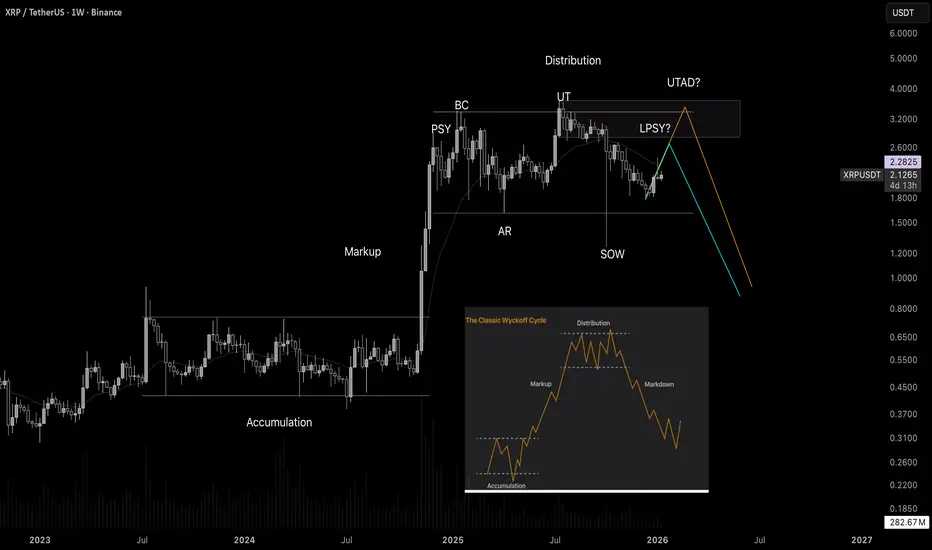
The XRP chart is like from a textbook! Wyckoff tutorialWelcome! When finance professionals are watching, you can expect solid analytics and real education.
Today we’re going to break down Wyckoff market cycles using the XRP chart in real time.
Wyckoff cycles are not just theory - they are an established concept that works in all markets. This is a model of price behavior based on the actions of large players ("smart money"). It shows how professionals accumulate positions, drive the market, and distribute assets, creating repeating phases of growth and decline.
Any market moves cyclically. Wyckoff identified two major cycles:
Bull market cycle (Accumulation → Markup → Distribution → Markdown)
Bear market cycle (the mirror reflection of the first)
Each cycle consists of four phases:
-Accumulation
-Markup (Growth)
-Distributio
-Markdown (Decline)
Phase 1. Accumulation
This is the phase when "smart money" buys the asset in large volumes while trying not to push the price too high. Conditions are created where regular market participants do not want to buy the asset, and may even sell it near market lows. Usually during this period there is bad news, lack of confidence, etc. Large players quietly buy up all this negativity.
Phase 2. Markup (Growth)
An impulsive upward movement begins - a trend that everyone notices when it is already too late. The crowd starts to wake up and enters the market at high prices.
Phase 3. Distribution
The price again enters a trading range, but now major participants sell their positions to retail traders who come in euphoric after the rise. Usually, the news is excellent here, everyone expects further growth, there is general euphoria, people load into the asset to the maximum while large players quietly unload their positions.
Phase 4. Markdown (Decline)
Professionals have sold everything they wanted, and now the market goes down almost without resistance. Retail - back to the factory.
Wyckoff
The Wyckoff Trading MethodThe Wyckoff Trading Method
The Wyckoff Method is a classical approach to market analysis designed to help traders understand trend development, market cycles, and potential reversals. Despite being developed over a century ago, it remains highly relevant in modern financial markets and is widely used across stocks, forex, and cryptocurrencies.
What Is the Wyckoff Method?
The Wyckoff Method is a form of technical analysis created in the early 20th century by Richard D. Wyckoff, a pioneering trader and market analyst. The core idea behind this method is that price movements are governed by supply and demand, and that large institutional participants (often referred to as “composite operators”) leave identifiable footprints on the chart.
Wyckoff believed that by studying price, volume, and time, traders could anticipate future price behavior rather than react to it.
Core Principles of the Wyckoff Method
The Wyckoff methodology is built around several foundational concepts:
1. Supply and Demand
Price rises when demand exceeds supply and falls when supply exceeds demand. Observing how price responds to changes in volume helps traders identify who is in control of the market.
2. Market Structure and Phases
Markets move in recurring cycles, typically broken down into:
- Accumulation
- Markup
- Distribution
- Markdown
Recognizing these phases allows traders to align with institutional activity rather than trade against it.
3. Price and Volume Relationship
Volume acts as a confirmation tool. Strong price movement with weak volume often signals exhaustion, while strong volume supports trend continuation.
4. Liquidity and Institutional Behavior
The method emphasizes how large players accumulate or distribute positions over time, often through range-bound price action designed to absorb liquidity.
The Market Cycle
The Wyckoff Market Cycle
The Wyckoff methodology describes market behavior as a repeating four-phase cycle driven by supply and demand. These phases help traders understand where the market is in its process, rather than simply reacting to price movements.
Accumulation Phase
Accumulation typically appears as a range-bound market after a decline. During this phase, large institutional participants quietly build long positions while price remains relatively stable. To most traders, the market appears directionless, but in reality, buying is taking place without pushing price higher. The true intent of the market is concealed until accumulation is complete.
Markup Phase
Once sufficient long positions have been accumulated, institutions begin to drive price higher. This phase is characterized by a clear uptrend as increased demand attracts additional buyers. Breakouts from accumulation ranges often trigger momentum traders and breakout strategies, reinforcing the trend. Markups may include re-accumulation phases, where price pauses and consolidates before continuing higher.
Distribution Phase
Distribution occurs after an extended advance, when upward momentum begins to slow. During this phase, large players gradually offload long positions and build short exposure. Price often moves sideways in a range, giving the illusion of stability, while smart money exits positions. This phase prepares the market for the next directional move lower.
Markdown Phase
The markdown is the declining phase that follows distribution. Selling pressure overwhelms demand, leading to a sustained downtrend. As price falls, traders are encouraged to enter short positions, further accelerating the move. Similar to markups, markdowns may include redistribution phases, where price consolidates before continuing lower.
Why the Wyckoff Model Works
Large financial institutions must execute trades of significant size, which requires liquidity. Liquidity is often found around stop losses, breakout levels, equal highs and lows, and key support or resistance zones. By intentionally pushing price into these areas, institutions can fill large orders efficiently without excessive slippage. This interaction between liquidity and market psychology forms the foundation of the Wyckoff model across all asset classes.
Core Principles of the Wyckoff Method
A key concept in Wyckoff theory is the Composite Man, a symbolic representation of institutional or “smart money” participants. Traders are encouraged to analyze price action as if a single, highly informed entity is controlling the market. The Composite Man accumulates or distributes positions strategically before allowing price to trend.
The Law of Supply and Demand explains that price rises when demand exceeds supply and falls when supply exceeds demand. The Law of Cause and Effect states that the size and duration of accumulation or distribution determine the magnitude of the subsequent price move, with higher-timeframe structures producing larger effects. The Law of Effort versus Result compares volume (effort) with price movement (result), highlighting potential trend continuation or exhaustion when these two factors diverge.
Wyckoff Schematics
Wyckoff schematics visually represent accumulation and distribution structures. Although these patterns may appear complex at first, they are mirror images of each other, with accumulation and distribution sharing identical phases and logic—only inverted. Studying these schematics helps traders recognize institutional behavior and align their trades with the dominant market process.
Type 1 Schematics
Accumulations
Phase A: Stopping the Downtrend
Phase A marks the transition from a markdown to the beginning of accumulation, where selling pressure starts to weaken.
- Preliminary Support (PS): After a prolonged decline, initial buying emerges and temporarily halts the downtrend. Volume increases as early demand appears, signaling that selling pressure is no longer dominant.
- Selling Climax (SC): Panic selling accelerates as long positions are stopped out and breakout traders enter short positions. At this point, the Composite Man absorbs this excess supply. The SC often leaves long lower wicks, reflecting strong buying interest.
- Automatic Rally (AR): Once selling pressure is exhausted, price rebounds quickly as shorts cover and new buyers step in. The high of the AR establishes the first resistance boundary of the accumulation range.
- Secondary Test (ST): Price revisits the SC area to test remaining supply. This test may form equal or slightly higher/lower lows, usually with reduced volume, confirming that selling pressure has diminished.
Phase B: Building the Cause
Phase B is where accumulation develops over time. The Composite Man continues to build long positions while price fluctuates within a range.
- Sign of Strength in Phase B (SOS(b)): In some cases, price rallies above the AR, creating a higher high within the range. This move suggests improving demand but still remains below preliminary resistance.
- Secondary Test in Phase B (ST(b)): A sharp decline follows, designed to trigger stop losses below prior lows and attract breakout sellers. This “liquidation” move provides the liquidity institutions need to continue accumulating, forming the underlying cause for the next trend.
Phase C: The Final Shakeout
Phase C is the critical phase that distinguishes accumulation from continuation lower.
- Spring: Price makes a final push below established support, sweeping remaining stop losses and trapping late sellers. This move briefly violates the range before quickly reversing.
- Test: After the Spring, price retests the area to confirm that supply has been fully absorbed. These tests typically form higher lows and occur on lower volume, signaling reduced selling interest.
Phase D: Transition to Markup
Phase D confirms that accumulation is complete and the market is ready to trend higher.
- Last Point of Support (LPS): Following the test and a rally, price pulls back shallowly, forming a higher low. This pullback reflects strong demand and is often the final opportunity before markup.
- Sign of Strength (SOS): Price breaks above the accumulation range with expanding volume, confirming bullish control. After this breakout, the market enters the markup phase, where the effect of prior accumulation is realized through sustained upward movement.
Distributions
Phase A: Stopping the Uptrend
Phase A marks the transition from an uptrend into distribution, where demand begins to weaken and supply quietly enters the market.
- Preliminary Supply (PSY): After a sustained advance, large operators start unloading positions, causing the first noticeable pause or pullback in price.
- Buying Climax (BC): Buying pressure reaches an extreme as late buyers enter aggressively, often accompanied by very high volume. This is where smart money sells into strength.
- Automatic Rally (AR): Once buying is exhausted, price pulls back sharply as demand fades. The AR typically forms below the BC and defines the first support boundary of the distribution range.
- Secondary Test (ST): Price revisits the BC area to test remaining demand, usually failing to make a new high. Volume is generally lower, indicating reduced buying interest and building liquidity for later phases.
Phase B: Building the Distribution
Phase B is where the Composite Man continues distributing positions while price fluctuates within a range.
- Sign of Weakness in Phase B (SOW(b)): A decline below the AR signals that supply is beginning to dominate. This move does not always appear, but when it does, it establishes a second support boundary.
- Upthrust (UT): Price briefly breaks above resistance to trigger buy stops and attract breakout buyers. This false breakout allows institutions to sell into increased demand and build short exposure.
Phase C: The Final Liquidity Grab
Phase C completes the distribution process by targeting remaining demand.
- Upthrust After Distribution (UTAD): Similar to a Spring in accumulation, UTAD is the final false breakout above resistance. It is designed to capture the last wave of liquidity before the true bearish move begins.
- Test: Price often revisits the UTAD area to confirm that demand has been fully absorbed. These tests typically occur on lower volume, signaling weakening bullish participation.
Phase D: Transition to Markdown
Phase D confirms that distribution is complete and bearish control is established.
- Last Point of Supply (LPSY): After price begins to decline, weak rallies attempt to test demand. These rallies are shallow and usually represent the final bullish reactions before the markdown.
- Sign of Weakness (SOW): Price breaks decisively below the range, confirming a bearish structure. Additional LPSYs may form, but this phase marks the final transition into the markdown.
Type 2 Schematics
Type 2 Wyckoff schematics contain the same structural components as Type 1, but without a Spring (in accumulation) or a UTAD (in distribution). In these cases, the market does not perform a final liquidity sweep before trending.
A Type 2 schematic can be identified by observing a direct transition into trend confirmation:
- In accumulation, price forms a Secondary Test (ST) and possibly an ST(b), then proceeds directly into a Sign of Strength (SOS) followed by markup.
- In distribution, price forms an ST or Upthrust (UT), then transitions directly into a Sign of Weakness (SOW) followed by markdown.
If markup or markdown begins without a Spring or UTAD, the structure should be classified as Type 2. Importantly, Type 2 schematics are traded using the same principles and execution logic as Type 1 structures.
The Five-Step Wyckoff Trading Strategy
Richard D. Wyckoff proposed a structured five-step approach to applying his methodology in real market conditions. This framework helps traders align with market structure and institutional intent.
1. Determine the Market Trend
Identify whether the broader market environment is bullish or bearish. Trading in alignment with the dominant trend increases probability.
2. Select a Suitable Market
Choose an asset or trading pair that clearly reflects the identified market trend and shows strong structural clarity.
3. Identify Accumulation or Distribution
Focus on assets that are currently forming a Wyckoff accumulation or distribution structure rather than those already trending.
4. Assess Readiness for a Move
Analyze the current Wyckoff phase and volume behavior. Events such as a Spring, UTAD, SOS, or SOW help confirm whether the market is prepared for markup or markdown.
5. Execute the Entry
Entries are commonly taken on Tests, Last Points of Support (LPS), or Last Points of Supply (LPSY), where risk can be controlled and structure is clear.
Does the Wyckoff Method Still Work?
- Despite being developed nearly a century ago, the Wyckoff Method remains highly relevant in modern markets. Its core principles supply and demand, market structure, volume analysis, and liquidity behavior are universal and apply across forex, stocks, commodities, and cryptocurrencies.
- When combined with complementary tools such as support and resistance, indicators, or pattern analysis, Wyckoff can form the foundation of a robust and disciplined trading approach. Its enduring value lies in teaching traders how markets move, not just where price is going.
Educational Disclaimer
This material is provided for educational purposes only. It reflects a general interpretation of the Wyckoff methodology and should not be considered financial advice, investment recommendations, or an offer to trade. Traders should always conduct their own analysis and manage risk responsibly.

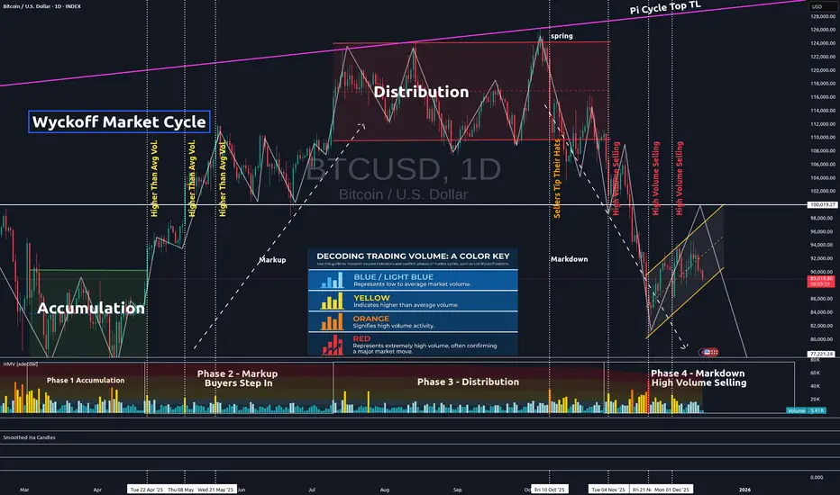
Confirming Chart Patterns With VolumeIn the chart above, one can clearly recognize the Wyckoff Market Cycle pattern. The pattern's legitimacy can be confirmed by volume. The volume is represented in the lower portion of the chart.
Low to average volume candles are blue. Average volume is indicated by light blue candles. Yellow candles represent higher than average volume. Orange is high volume. And red represents extremely high volume.
You will see each phase of the Wyckoff Market Cycle pattern confirmed by this volume on our current Bitcoin chart.
First, the market enters the accumulation phase. Market volume is fairly high, as seen in the accumulation quadrant in the lower left on the chart. However, it is important to note that there is an equal distribution of high-volume selling days as there are high-volume buying days. Thus, price tends to trend sideways within the channel until the true buying power comes into action.
Next, the buyers step in and take the price higher. This is generally indicated by a high-volume day when the price breaks above the accumulation channel. When buyers step in, most of the yellow and orange volume candles are, in fact, buyers in the markup phase. You can verify this is true by lining these higher-than-average volume candles up with the green price candles on the Bitcoin chart. This indicates the markup phase has begun and is underway.
Then, we come to the distribution phase on our chart. Notice the volume in that 3rd quadrant, the distribution quadrant. It is mostly average volume. Institutional sellers are attempting to carefully exit quietly. But you can also see that near the end of the distribution phase, sellers are starting to step in, tipping their hats and indicating that the distribution phase is about to end.
Finally, sellers take back full control, dropping us from the distribution channel altogether. High volume selling confirms this move and the pattern. The final quadrant in the bottom right proves that mostly sellers have control, as the majority of higher volume candles (yellow, orange, and red) are credited to the sellers.
Our Wyckoff Market Cycle pattern is now confirmed, and further selling can be expected until volume is once again taken back by the buyers. One will need to see clearly that high-volume candles are in line with green price candles. In this chart, that is not yet the case. Thus, more selling should be expected until it is clearly evident that buyer command control once again.
Hope you found this brief educational write-up informative and helpful, as volume can often be utilized in many uncertain pattern formations to find pattern legitimacy and confirmation.
✌️Stew
Where traders tend to failAfter 25 years playing this game, it is incredible to see the same issues today for new traders as there have always been.
In a nutshell, OVERCOMPLICATION!!!
New traders will often go looking for as much information as possible, adding instruments, screens, indicators, timeframes, news feeds. Anything looking for an edge.
Go back over 100 years and Charles Dow - yes, the same Dow behind the #DJI (The industrial average) laid down a very simple framework for understanding the markets.
I have written several posts here on @TradingView about Dow Theory here's one of them.
Inside this post, you will see this image.
For some of you familiar with either Elliott Wave principles or Wyckoff Techniques, you might recognise some elements of an image like this.
Both Richard Wyckoff and Ralph Elliott were onto something. But over the years these techniques have been "added to" creating hybrids and then assumptions are often made. Complex is key... Or so they think.
When you try and trade an Elliott wave cycle on a 5-minute chart on some instrument that has not been fully adopted by institutional players, you are asking for trouble.
Psychology is more important in trading than, quite possibly 99.9% of other aspects of trading. So whilst people tend to add to the technical analysis part of trading, they often ignore the psychology controlling the market.
I am not talking about psychology in terms of simple risk management and high probability moves. I am talking about the piece of the psychology studies that controls the masses.
Sentiment is one thing, the psychology that drives sentiment is where the failing and struggling traders simply ignore.
I wrote a post - trying to add some humour. Here's a Simpson's post.
=========================================
Let me give you an example;
People tend to use simple off the shelf indicators; now when millions use the same tools. Why is it that 90% + of traders still lose money?
Here is a snapshot of the MACD and RSI side by side.
Now look closely at the price action. What additional info are you getting from these lagging indicators (rhetorical question).
.
Let's look at this in a simple way; no indicators, clean chart, Dow Theory in focus.
When price moves up you will often see accumulation, then as price reaches it's next area of interest and starts to pullback (oversimplified) you will see, even on smaller timeframes as this is not always obvious on the same timeframe. a distribution pattern.
Overall, the price action has created a simple Elliott Wave move from a zero point, up to one and pushing down for a two.
Where this gets interesting, and simple...
Is the psychology behind it, The momentum up is often created by early buyers (yes, state the obvious) these buyers have been accumulating. Then, as retail jumps in because RSI says so. The price pulls back. This is often deep into the zone it just left, retail often using small timeframes and tight stops - 5 pips, 10 pips. So you often see a PB of 11 pips (example) and you get that feeling of "why does it always hit my stop and then go in my desired direction"?
The momentum from taking these stops, then goes on to create an impulsive 2-3 move in EW terms. This is stops becoming opposing orders. Thus creating momentum to break the high of the 1 move. New stops from shorts get triggered and momentum traders enter positions. All of which fuels a larger rally.
Now, when you break this down. You can draw ranges and operate inside these ranges to know the general bias. And just like that, you are on the right side of the market more often than not.
Here's a more detailed post on this aspect.
To give an example here:
The larger swing creates a range. An obvious high and low as marked in this image.
Then as the move inside happens; Think Dow Theory;
The market is giving a very clear clue. We just took out a fresh high and the market is seeking liquidity.
That internal move will have a fractal move inside; let's call that a trigger move.
Keep in mind, the larger trend does not change it's directional bias until it breaks the old low or the fresh high.
Now, although the price does not have to. The price can pull all the way back to the low and not change the larger trend.
Once you get to grips with this, you will stop trying to predict the market and instead work with price action.
Less, really, is more!
Have a great weekend!!!
Disclaimer
This idea does not constitute as financial advice. It is for educational purposes only, our principal trader has over 25 years' experience in stocks, ETF's, and Forex. Hence each trade setup might have different hold times, entry or exit conditions, and will vary from the post/idea shared here. You can use the information from this post to make your own trading plan for the instrument discussed. Trading carries a risk; a high percentage of retail traders lose money. Please keep this in mind when entering any trade. Stay safe.

Simple Psychology Tips Using Volume for Better TradingMany newer traders assume that when someone says "psychology" in trading, they are referring to mindset.
It is also widely believed that trading is about the BEST entries.
Now, think of it this way. It is not about winning trades, it is actually about managing losses well to allow you to take the winners over and over again. You might think that a 3 to 1 risk-to-reward strategy is boring, you might have gone all in on your favourite crypto project. But what makes the difference between gambling and trading is actually very, very simple. So simple, in fact, many overlook it or simply ignore it.
Most seek a silver bullet - high win rates and perfectly timed entries, then they overleverage and move stops on the one "good trade" they are seeking to make.
Whilst doing this, they tend to overload the 6 monitors they have purchased to trade with a thousand indicators, which they don't really need.
The candlesticks tell a story, volume supports that story. When you learn any technique from Elliott Waves to Wyckoff, they all have a dependence on volume - even if the correlation is not apparent.
Look at this first image.
Price had moved down since the vertical line, the AD line also moved down - sell-off, in full swing. But then volume starts to shift before the AD line starts to increase.
Now, look at what happens next...
As we move forward and the new vertical line shows where volume spiked, the AD line starts to decrease as the price continues to rise.
This is enough of a story to start your analysis.
We then get a move with a lower high formed.
As this plays out, the sell-side volume rises, creating momentum for the short position.
Look a little closer and you will see, that the volume on the move up just before the drop was also decreasing. Making a divergence to price.
You might feel that the market is against you, or that the big players are single-handedly seeking your stops. But the truth is, the psychology in moves such as this one shown is where most retail traders either have greed that markets will only go up for ever or the fear that they are missing out on a market that only goes up forever.
It is that herd mentality that generates the liquidity for the professionals.
Losing 1% on a trade, is part of the process, risking 80%> on a single move will make you paper rich for about 10 minutes before the real losses set in.
This is where the psychology and the basic techniques such as risk management and understanding what candlesticks and volume bars are telling you, will make a world of difference to your results.
A/D line and volume are free on @TradingView and to be fair you don't need to overcomplicate it more than that!
Stay safe, have a great weekend all!!!
Disclaimer
This idea does not constitute as financial advice. It is for educational purposes only, our principal trader has over 25 years' experience in stocks, ETF's, and Forex. Hence each trade setup might have different hold times, entry or exit conditions, and will vary from the post/idea shared here. You can use the information from this post to make your own trading plan for the instrument discussed. Trading carries a risk; a high percentage of retail traders lose money. Please keep this in mind when entering any trade. Stay safe.
Predicting Bitcoin's Cycle Using the Elliott Wave Theory, Part 3Hello Traders. With the new year upon us, I think sufficient time has passed for the charts to develop from our previous #Bitcoin analysis. Having accurately forecasted the macro trends for each pivot within a reasonable margin of error, I believe we're approaching another pivotal moment this year, aligning with our previous predictions. Please take this post with a grain of salt, and more importantly, please use it to add confluence to your personal theories.
In this post, we will be diving deeper into the Elliott Wave Theory by also integrating the Wyckoff Market Cycle Theory.
By combining the two theories, the chart below represents our current position within the final leg for what could be giving us signs of a possible reversal (again, within margin of error depending on how far wave 5 extends):
Wyckoff believed that markets move in cycles, which arguably has a direct correlation to the Elliott Wave 5-wave/3-wave cycle. Wyckoff introduced a four-stage market cycle , attributing it to the actions of institutional players who strategically influence price movements to capitalize on the behavior of uninformed traders. Simply put, the theory gives us a further understanding of 'cause and effect' within the markets.
In my view, the Wyckoff cycle also does a fantastic job of representing market psychology. And if intertwined correctly with the Elliott Wave Theory, price action tends to follow patterns in similar ways. The Elliott Wave Theory and Wyckoff Theory often overlap in their application and interpretation of market behavior, but they approach the market from different perspectives. Both theories aim to understand and predict market movements based on the behavior of market participants and price cycles, making them complementary in many ways.
Commonalities Between the Elliott Wave Theory and Wyckoff Theory:
Market Cycles
- Wyckoff Theory identifies a four-stage market cycle: Accumulation, Markup, Distribution, and Markdown. The Elliott Wave Theory also emphasizes cyclic behavior through a fractal structure of impulsive and corrective waves within broader market cycles.
- Both theories suggest that price movements are not random but follow identifiable patterns driven by market psychology.
Psychological Basis
- Wyckoff focuses on the interaction between "big players" (institutional traders) and "uninformed traders," highlighting group psychology and how institutional actions exploit public sentiment.
- Elliott Wave focuses on the crowd psychology behind price movements, suggesting that mass investor sentiment drives waves in predictable patterns.
**Both theories reflect the influence of human behavior and emotions on market prices.**
Application Across Timeframes
- Both theories are applicable across multiple timeframes, from intraday trading to long-term investments. This flexibility allows traders to use them in conjunction for deeper market analysis.
Identification of Trends and Reversals
- In Wyckoff Theory, phases like Markup and Markdown align with Elliott Wave's impulsive trends, while Accumulation and Distribution phases can correspond to corrective wave patterns.
- Both approaches aim to identify key turning points in the market, helping traders anticipate trends and reversals.
-----
The Four Stages of the Market Cycle According to Wyckoff
Accumulation Phase
This is a sideways range where institutional traders accumulate positions quietly to avoid driving prices higher. During this phase, the asset remains out of the public spotlight, and uninformed traders are largely unaware of the activity. On a price chart, the phase appears as a range-bound movement between areas of support and resistance.
Markup Phase
Following the accumulation phase, the market enters a classic uptrend. As prices rise, uninformed traders begin to notice and join in, further fueling the rally. Institutional players may take partial profits or continue holding for greater gains. Short sellers caught off guard are forced to cover their positions, adding additional buying pressure and driving prices to new highs.
Distribution Phase
After the uptrend loses momentum, the market transitions into a sideways range, marking the distribution phase. Institutional players use this period to offload their holdings, while uninformed traders, still expecting higher prices, continue to buy. Some institutional traders may also initiate short positions during this phase to benefit from the subsequent price decline. On the price chart, this phase appears as a reversal of the uptrend into a sideways range.
Markdown Phase
The markdown phase is characterized by a downtrend following the distribution phase. Institutional traders add to their short positions, while uninformed traders, recognizing the decline too late, sell in panic, creating further downward pressure. The market eventually reaches new lows as selling accelerates.
The Model of Group Psychology
After the markdown phase, the cycle often repeats, moving from accumulation to markup, distribution, and markdown again. The Wyckoff cycle offers a simplified perspective on market behavior, focusing on the psychological dynamics between two groups: institutional traders (the "big players") and uninformed traders (the "small players"). It highlights how the mistakes and emotional reactions of uninformed traders often benefit institutional players.
The Wyckoff cycle provides valuable insights into market behavior but is not without limitations:
Limitations of the Wyckoff Trading Cycle
Difficulty in Identifying Phases
Distinguishing between accumulation and distribution phases can be challenging. What appears to be an accumulation phase might turn into a distribution phase, with the market unexpectedly breaking lower.
Timing Challenges
Entering trades during accumulation or distribution phases is difficult due to the lack of clear stop-loss levels. Placing stops around support and resistance often leads to being trapped.
Complexity in Trading Trends
Trading the markup and markdown phases requires skill, as they are filled with complex price action patterns. Modern markets often experience frequent trend reversals, complicating trade execution.
Irregular Cycles
The market does not always follow the textbook sequence of accumulation, markup, distribution, and markdown. Variations such as accumulation followed by markdown or other combinations are possible.
Despite its limitations, the Wyckoff cycle remains a useful framework for understanding market behavior. It is best combined with other strategies, such as price action and market dynamics, to enhance its practical applicability. While modern markets may reduce the cycle's predictive reliability, it still serves as a powerful tool for traders who know how to apply it effectively.
Proper Application of the Elliott Wave Theory and Wyckoff Overlap (in Practice):
Trend Identification:
The Markup Phase in Wyckoff often aligns with Elliott's Impulse Waves (1, 3, and 5), while the Markdown Phase aligns with corrective waves or bearish impulses.
Sideways Markets:
Wyckoff’s Accumulation and Distribution phases correspond to Elliott’s Corrective Waves (A-B-C) or sideways consolidations (Flats and Triangles).
Volume Confirmation:
Traders can use Wyckoff’s volume analysis to validate Elliott Wave patterns, especially in identifying wave 3's (typically accompanied by high volume) and wave 5's (often showing declining volume).
Timing and Execution:
Wyckoff’s emphasis on identifying support/resistance levels and trading ranges can help refine the entry and exit points suggested by the Elliott Wave Theory.
Combining the Two:
Many traders find value in combining these theories:
- Use Wyckoff to identify key price levels and market phases (e.g., when accumulation or distribution is occurring).
- Use Elliott Wave to determine the broader trend structure and anticipate the next moves within those levels.
- By integrating Wyckoff’s volume-driven approach with Elliott’s fractal patterns, traders can gain a comprehensive view of the market and improve their ability to time trades effectively.
----
By integrating the concepts from both theories and the outlined schematics, we can now take a closer look at how Bitcoin is behaving through the lens of these frameworks.
As observed, Bitcoin appears to be nearing the completion of the potential 5th wave we've been discussing over the past year. In my view, a bear market (or at least a significant correction) may be approaching. While timing is uncertain due to the unlikely nature of extensions, we can use insights from both Wyckoff and Elliott Wave theories to gauge our current position. I believe we are likely in the Distribution phase, which aligns with the 5th wave.
The 5th wave can extend as much as it wants, but it won't change the overall conclusion of the cycle. We still anticipate the cyclical behavior that Bitcoin has shown in the past. While past price action isn't necessarily a predictor of future movements, it often follows a similar pattern.

Understanding Wyckoff Reaccumulation: A Comprehensive Guide## Introduction to Wyckoff Theory
Richard Wyckoff developed his methodology in the early 20th century, creating a systematic approach to market analysis that remains relevant today. His method is based on the principle that market movements are primarily driven by large institutional investors, whom he called "composite operators."
## The Concept of Reaccumulation
Reaccumulation is a sideways price pattern that occurs during an ongoing uptrend. Unlike basic accumulation, which occurs at market bottoms, reaccumulation represents a pause in an existing upward trend where institutional investors reload their positions before continuing higher.
### Key Characteristics of Reaccumulation
1. **Prior Uptrend**: Reaccumulation always follows a significant price advance
2. **Trading Range**: Price enters a sideways consolidation period
3. **Volume Analysis**: Typically shows declining volume during the range
4. **Price Structure**: Forms a series of higher lows and lower highs within the range
## Phases of Reaccumulation
### Phase A - Preliminary Support (PS)
- Marks the initial support level where the uptrend first pauses
- Often accompanied by increased volume
- Creates the trading range's support level
### Phase B - Secondary Test (ST)
- Price tests the trading range's support
- Usually shows decreasing volume
- May form several tests of support with springs or upthrusts
### Phase C - Last Point of Support (LPS)
- Final test of support before markup
- Often shows diminishing volume
- Can include a spring below support
### Phase D - Sign of Strength (SOS)
- Strong price move up on increased volume
- Breaks above local resistance levels
- Confirms the reaccumulation structure
### Phase E - Last Point of Supply (LPSY)
- Final pullback before sustained markup
- Generally shows lower volume than SOS
- Creates higher low compared to LPS
## Identifying Reaccumulation vs. Distribution
Understanding whether a trading range is reaccumulation or distribution is crucial for traders. Key differences include:
### Reaccumulation Characteristics:
- Forms after an uptrend
- Shows stronger support than resistance
- Springs more common than upthrusts
- Volume increases on upward price moves
### Distribution Characteristics:
- Forms after an uptrend
- Shows stronger resistance than support
- Upthrusts more common than springs
- Volume increases on downward price moves
## Volume Analysis in Reaccumulation
Volume plays a crucial role in confirming reaccumulation patterns:
- Decreasing volume during consolidation
- Higher volume on tests of support
- Strongest volume on breakouts above resistance
- Low volume on pullbacks after breakout
## Trading Reaccumulation Patterns
### Entry Strategies:
1. **Spring Entry**: Enter after a spring below support with volume confirmation
2. **SOS Entry**: Enter on the break above resistance with increasing volume
3. **LPSY Entry**: Enter on the last pullback before markup
### Stop Loss Placement:
- Below the spring low
- Below the last point of support
- Below the trading range support
### Target Setting:
- Measure the height of the trading range
- Project this distance from the breakout point
- Consider previous resistance levels
## Case Study Analysis
Examining the provided chart, we can identify several key Wyckoff elements:
- Initial trading range establishment after uptrend
- Multiple tests of support with declining volume
- Formation of higher lows within the range
- Strong volume on breakout moves
- Successful continuation of the uptrend
## Common Mistakes to Avoid
1. Misidentifying the larger trend context
2. Ignoring volume confirmation
3. Taking premature positions before pattern completion
4. Missing important support/resistance levels
5. Failing to consider market context
## Conclusion
Wyckoff reaccumulation patterns provide valuable insights into institutional behavior during uptrends. By understanding these patterns, traders can better position themselves to profit from continuation moves while managing risk effectively. Remember that successful trading requires patience, practice, and proper integration of multiple technical analysis tools alongside Wyckoff methodology.
Remember: All technical analysis methods, including Wyckoff theory, should be used as part of a comprehensive trading strategy that includes proper risk management and consideration of multiple timeframes and market contexts.

Increase the difficulty level on yourself. Often, traders like to make things a lot harder for themselves than they need to. Everyone is seeking a silver bullet, truth is "less is actually more".
Dow Theory is actually the Grandfather of technical analysis.
If you have never heard of this, or even if you have and brushed over it, you are missing out.
Some people will say things like "it's over 100 years old it can't work in today's market"
Yet, humans have changed very little in those last 100+ years. Sentiment driven by fear and greed is where the secret is hidden.
Let me explain by saying Dow theory has 6 "rules" (tenets).
1) Market Moves in Trends Markets have three types of movements: primary trends (long-term trends that last for years), secondary trends (medium-term trends that retrace parts of the primary trend), and minor trends (short-term trends that are typically noise).
You will notice I used the weekly for the larger and the daily for the second.
When I journal my trade setups; I simply use a traffic light system red lines size 4 for primary, then orange line 3 for secondary and green size 2 for the trigger phase. In addition to that, I mark the trends with 3 boxes and arrows pointing up down or sideways.
The second rule;
Each trend has three phases:
Accumulation Phase. In this phase, informed investors start buying or selling, counter to the general market opinion.
Public Participation Phase, more investors notice the trend after it is already underway, and media coverage expands, driving the trend further. (Wyckoff called this a mark-up or mark-down phase)
Excess Phase (or Distribution): At this point, speculation is rampant and detached from actual value, leading informed investors to prepare an exit.
This is where a lot of Wyckoff, Elliott and other tools such as Smart money concepts all overlap.
Then, the 3rd rule.
The market reflects all available information, such as economic conditions and sentiment. Therefore, movement in the market averages considers and reflects this information. (in simple terms, discount the news).
4) For a trend to be validated, different market averages must confirm each other. For example, the trend in the Dow Jones Industrial Average should be confirmed by the Dow Jones Transportation Average. If one index moves to a new high or low, the other should follow suit to confirm the trend.
(I like this one less, but in some instances it can make the next move very obvious.)
Rule 5) The trend is your friend, until the end. Until you see a clear change in the direction, a market shift. The trend is still in play. This one, I feel most just can't comprehend.
As you can see below, I have marked up the extreme high and low, I know both my primary and secondary trends are down. So now, I can use my EW bias or start looking for a Wyckoff schematic. (if I believe we are about to see a shift in the trend.)
You can start to look for information for areas of interest, look into volume and volume profiles.
The last rule. Confirming the trend volume expanding in the direction of the primary trend. For an uptrend, volume should increase as prices rise and decrease during corrections. In a downtrend, volume should increase as prices fall.
In this example, the Fibonacci levels line up, the volume is slowing, the EW count makes some sense and zoomed out you can see a shift.
Now, with all of this info - we could look at "areas of interest"
We are in a demand zone on the higher time frame.
At this stage, there is no trade entry, but if we were to view a change in the character we could simply take a trade as a pullback on the primary trend down.
Something like this;
You see, all you are doing is following the trend and taking a look at other tools, auction areas, fib extensions, an EW bias, and hints of a Wyckoff schematic. But under the hood, the 3 trend principle is a simple-to-follow process.
Disclaimer
This idea does not constitute as financial advice. It is for educational purposes only, our principle trader has over 20 years' experience in stocks, ETF's, and Forex. Hence each trade setup might have different hold times, entry or exit conditions, and will vary from the post/idea shared here. You can use the information from this post to make your own trading plan for the instrument discussed. Trading carries a risk; a high percentage of retail traders lose money. Please keep this in mind when entering any trade. Stay safe.

Bitcoin’s Rounded Top [Wyckoff Distribution]: 5 Phases to KnowHello, Trading Community!
Today, we dive into the fascinating world of the Wyckoff Distribution model as it applies to Bitcoin's current market structure. Please remember that this article is purely for educational purposes and is not intended as trading advice.
While we explore potential scenarios, including the possibility of Bitcoin heading down to $30,000 or even $25,000, these claims are speculative and should be considered hypothetical.
The Wyckoff Distribution Model: A Roadmap for Market Tops
The Wyckoff Distribution model offers a comprehensive framework for understanding how major market players distribute their holdings before a significant downturn. It is divided into several phases:
Phase A: The market begins to show preliminary signs of selling pressure after an extended uptrend. This is the first hint that the balance of power is shifting from buyers to sellers.
Phase B: The market enters a consolidation phase, moving sideways as large investors gradually distribute their positions.
Phase C: A deceptive breakout, known as the Upthrust After Distribution (UTAD), occurs here, often trapping unsuspecting retail traders.
Phase D: The onset of a decline, marked by clear Signs of Weakness (SOW), indicates that the distribution phase is nearing its end.
Phase E: The final phase, where the market confirms the distribution and continues to fall, marking the completion of the process.
Breaking Down Bitcoin's Key Price Points
Let's take a closer look at the crucial price points that have defined Bitcoin's current structure within the Wyckoff Distribution model:
Buying Climax (BC) - $73,660
This is the pinnacle of buying activity, where demand reaches its peak before supply starts to dominate. For Bitcoin, this level marked the highest point in the current cycle before a significant sell-off began.
Automatic Reaction (AR) - $60,795
Following the Buying Climax, the market experienced an Automatic Reaction—a sharp drop as sellers stepped in. This level is critical as it signifies the start of the distribution process.
Upthrust (UT) - $71,180
The Upthrust represents a rally that tests the resistance near the Buying Climax. However, it fails to sustain those levels, hinting that the market's upward momentum is weakening.
Upthrust After Distribution (UTAD) - $71,680
The UTAD often serves as a bull trap, where the price makes a final push above the resistance only to quickly reverse. This move confirms that distribution is taking place.
Sign of Weakness (SOW) - $54,344
After the UTAD, the market drops significantly, signaling a clear Sign of Weakness. This level demonstrates that sellers are gaining control, pushing the price to new lows.
Last Point of Supply 1 (LPSY 1) - $70,040
The first Last Point of Supply (LPSY 1) is a weaker rally that fails to reach previous highs. This is a key indicator that the market's bullish momentum is fading, and distribution is nearing completion.
Last Point of Supply 2 (LPSY 2) - $65,105
Currently, Bitcoin is in Phase E, at the LPSY 2 point. This level is crucial as it typically marks the final confirmation of distribution before a sustained downtrend.
Navigating Phase E: The Final Act of Distribution
As Bitcoin navigates through Phase E, the LPSY 2 level becomes a focal point. This phase is characterized by further price declines as the market confirms the distribution. Here’s what to watch for:
Lower Highs and Lower Lows: Expect the price to continue forming lower highs and lower lows, reinforcing the bearish trend.
Volume Patterns: During this phase, volume analysis becomes critical. Look for decreasing volume on upswings and increasing volume on downswings, which confirms the presence of distribution.
Final Thoughts
The Wyckoff Distribution model provides a structured way to understand how markets transition from bullish to bearish trends. With Bitcoin currently exhibiting a Rounded Top structure and sitting at LPSY 2 in Phase E, the evidence suggests that we may be on the cusp of further declines. By staying vigilant and analyzing key price levels and volume patterns, traders can better position themselves to navigate this challenging market environment.
In this complex market phase, understanding the underlying forces at play can be the difference between protecting your capital and being caught off guard by the next big move.
Stay tuned for more!

Less is more...If you don't know me, I have been a trader a very long time. Nearly 25 years to be exact.
Over the years, I have spent a lot of time studying a wide array of techniques, tools, patterns and market sentiment. Lucky enough, the markets have also been very kind to me.
I've been fortunate enough to have two trading books published by large traditional publishing companies. So it's safe to say, I live and breathe trading.
I am going to do a series of posts here covering a couple of key educational topics - starting with Elliott Wave theory.
When it comes to Elliott Wave theory, there seems to be a love hate relationship for many people. Some get it, some see it as not relevant. To be honest, both are correct.
Now before you jump on the high horse "it doesn't work for crypto" - let me start by saying, this is not a lesson on how to use Elliott Theory. I covered that in these posts below;
And step two;
In terms of using Elliott, it's not as simple as trying to figure out each and every move. (this is often why, it does not work.) Instead the benefit of Elliott, is to accept it as a bias tool that aids in understanding the current market sentiment.
We often see posts online about things like the Wall Street cheat sheet. I also covered this in another post here on @TradingView
Where the theory has any real value, is simply to obtain a bias. The market is always searching for liquidity. In order to obtain liquidity, the market needs to attract players for the game.
Now, you have probably entered a trade and felt almost immediately that the market has pushed against you, it's out to get you and the brokers are playing 1 vs 1 against you.
This is where sentiment really comes in.
As a retail trader you have likely been exposed to tools such as RSI, MACD or even dabbled with Elliott and Wyckoff. But the reason the market does, what the market does, is not to get you as an individual, instead it's there to collect liquidity from a crowd.
Elliott wave theory isn't a technical tool, it's a sentiment tool.
So instead of trying to guess every internal and nested swing, you can make an awful lot of money by simply giving a directional bias.
I wrote an article in 2021 here -
About the emotions, I used the Simpsons to get the point across. The general idea is to understand where liquidity is likely to be and use that to make informed trading decisions.
If you have any specific questions, even topics you would like covered, leave a comment below. I'll add to this in another post as part of this series.
Stay safe and wish you all the best.
Disclaimer
This idea does not constitute as financial advice. It is for educational purposes only, our principle trader has over 20 years’ experience in stocks, ETF’s, and Forex. Hence each trade setup might have different hold times, entry or exit conditions, and will vary from the post/idea shared here. You can use the information from this post to make your own trading plan for the instrument discussed. Trading carries a risk; a high percentage of retail traders lose money. Please keep this in mind when entering any trade. Stay safe.

UPl | Wyckoff Events & Phases Explained Wyckoff developed a price action market theory which is still a leading principle in today's trading practice.
The Wyckoff method states that the price cycle of a traded instrument consists of 4 stages – Accumulation, Markup, Distribution, and MarkDown.
👉TEXTBOOK EXAMPLE Accumulation Schematic: Wyckoff Events and Phases👈
Price Action Analysis
And this is the accumulation stage -
1) PS— Preliminary Support, where substantial buying begins to provide pronounced support after a continued down-move.
- Volume increases and price spread widens, signaling that the down-move may be approaching its end.
2) SC—Selling Climax, the point at which widening spread and selling pressure usually in high point and heavy or panicky selling by the public is being absorbed by larger professional interests at or near a bottom.
- Often price will close well off the low in an SC, reflecting the buying by these large interests.
3) AR—Automatic Rally, which occurs because intense selling pressure has greatly decline.
- A wave of buying easily pushes prices up.
- The high of this rally will help define the upper boundary of an accumulation.
4) ST—Secondary Test, in which price revisits the area of the SC to test the supply/demand.
- If a bottom is to be confirmed, volume and price spread should be decline as the market approaches support in the area of the SC.
- It is common to have multiple STs after an SC.
5) SOS—Sign Of Strength, a price advance on increasing spread and relatively higher volume.
6) LPS—Last Point Of Support, the low point of a reaction or pullback after an SOS.
7) BU/LPS- Backing up to an LPS means a pullback to support that was formerly resistant, on diminished spread and volume.
All the phases of accumulation stage-
Phase A:
Phase A marks the stopping of the prior downtrend.
-- Up to this point, supply has been dominant.
-- The approaching cutback of supply is evidenced in preliminary support (PS) and a selling climax (SC).
-- A successful secondary test (ST) in the area of the SC will show less selling than previously and a narrowing of spread and decreased volume, generally stopping at or above the same price level as the SC.
-- If the ST goes lower than that of the SC, one can anticipate either new lows or prolonged consolidation.
-- Horizontal lines may be drawn to help focus attention on market behavior, as seen in the two Accumulation Schematics above.
Phase B:
-- Phase B serves the function of “building a cause” for a new uptrend
-- In Phase B, institutions and large professional interests are accumulating relatively low-priced inventory in anticipation of the next markup.
--There are usually multiple STs during Phase B'
-- Institutional buying and selling impart the characteristic up-and-down price action of the trading range.
--Early on in Phase B, the price swings tend to be wide and accompanied by high volume.
Phase C:
-- It is in Phase C that the stock price goes through a final test of the remaining supply.
-- this marks the beginning of a new uptrend, trapping the late sellers (bears).
-- It indicates that the stock is likely to be ready to move up, so this is a good time to initiate at least a partial long position.
-- The appearance of an SOS shortly after a spring or shakeout validates the analysis.
Phase D:
--During Phase D, the price will move at least to the top
--LPSs in this phase are generally excellent places to initiate or add to profitable long positions.
Phase E:
--large operators can occur at any point in Phase E.
--These are sometimes called “stepping stones” on the way to even higher price targets.
--------------------------------------------------
Regards,
Revive Traders
------------------------------------------------
Guys check out the related POST as well, it went FANTASTIC !
🙏FOLLOW for more !
👍LIKE if U find it useful !
✍COMMENT your views & feedback !

Solana - Wyckoff Mark Up ExampleSolana vs. Wyckoff Logic
SOLUSD example of mark up in the Wyckoff logic schematic. If unfamilar, there are market phases according to Wyckoff Logic:
Accumulation: The phase where the market stops falling and begins to form a base, suggesting that demand is starting to overcome supply. It is characterized by a selling climax, where the price falls sharply, and the volume is high, indicating panic selling. After the climax, there is typically a phase of sideways movement, with occasional tests of the lows. This phase is labeled as the cause, setting up for a new upward trend (effect).
Markup: After accumulation, the price starts to rise, signifying that the market is entering the markup phase. This phase is indicated by a rise in price away from the accumulation zone, often with increasing volume, which is interpreted as the start of a new uptrend.
Distribution: This is the phase where the market tops out and is characterized by a buying climax. Supply begins to overcome demand as the "smart money" starts to distribute their holdings to the market. The distribution phase is also labeled as the cause for the subsequent downtrend.
Markdown: Following distribution, the market enters the markdown phase where prices start to fall consistently. This phase is shown by a break of support levels with increasing volume, indicating a strong presence of selling pressure.
The image also depicts the concept of "Volume" with a histogram at the bottom. The volume bars are colored in red and blue, generally indicating selling and buying volume, respectively. The histogram helps traders identify moments of high or low volume, which can be a sign of the strength or weakness of a particular price movement.
Wyckoff's analysis technique is grounded in the study of price action, volume, and time, as they relate to supply and demand. It is a tool for understanding the market's structure and potentially predicting future price movements by identifying the actions of large institutional traders and investors.

HOW TO: Lesson 5 - The Importance of ConfluenceLesson 5 - The Importance of Confluence
This video explains what is confluence in trading, identifies confluence structural elements and provides guidance on how to put all the pieces of the puzzle together to increase trading success rate.

Wyckoff simplified + entries & exitsI'm going to explain Wyckoff to you in a simplified manner and show you how you can use it for entries & exits.
What is Wyckoff?
Large market orders by huge entities come in gradually. If the market only consisted of buying and selling, it would be too easy to make money as it would be too predictable. So instead, orders are injected into the market via an accumulation process (i.e. Wyckoff schematic)
Basically, the big players of the market try to take out the retail traders’ stoplosses by injecting orders into the market (to move price toward the stoplosses and hit them). They inject these orders gradually (to avoid being predictable and to trick the retail traders).
Basic Wyckoff schematic
This is a bearish Wyckoff schematic:
Let’s break this down.
BC - This stands for Buying Climax. The Buying Climax marks the end of buying and is confirmed by an Automatic Rally.
AR - This stands for Automatic Rally. This is when price goes in the opposite direction of the climax. In this case, the AR was to the downside. This confirms that it is the end of buying because it shoots straight down (indicating strong selling pressure). This confirms the Buying Climax by going into the Discount level (bottom 25%) and by being bigger than all the other downward pullbacks which happened before.
Test - Price goes close to the Climax point and re-tests it. Then, traders take sells because they think that because of the AR, price would go down. The traders think that price went up for the last time and will finally go down. Because of their sell orders, price falls a little.
Purge - The big players try to take out the traders’ sell orders by moving price up to the Climax point. They push price a little higher than the Climax point to take out all the stoplosses.
RTO - This stands for Return to Origin. Because of the purge, traders think that price broke structure to the upside. So, they buy which makes price form the RTO. They’re trying to make price revisit the Climax point. Then, price moves lower and they get stopped out again.
SOW - This stands for Sign of Weakness. When structure breaks to the downside after the RTO, this shows that selling pressure is coming in.
LPS - Last Point of Support. This is the consolidation which must happen before price breaks out of the consolidation to convince you that price is bearish and no longer bullish.
Here is how a bullish Wyckoff structure looks like:
Let me explain this once more so that you understand it.
The main trend was a down trend on the left side of the chart. Then, price had a strong bull move up (the AR) which means that there were buy trades (i.e. Automatic Rally). That confirms that there was a Selling Climax (i.e. SC) and that it’s the end of selling (because if it wasn't the end of selling, the AR wouldn't go so high)
After that, price came down to re-test the Selling Climax zone (which is called the Test). Then, traders took a buy because they thought that because of the AR, price would be going up.
Then the big players pushed price down a little lower than the Selling Climax to hit the buy orders' stoplosses which forms the Purge.
After that, because the Purge happened, it made traders think that price broke structure to the downside which led them to sell. Then, price went down because of those sell orders (forming the RTO) and rejected from the Selling Climax (price went up).
Price rejected from that level because there were buy orders from the big players which made price go up. Since price went up, those sell trades got taken out. Because price went up, it formed an SOS (i.e. Sign of Strength). It means that the selling pressure had weakened, and the buying pressure had strengthened.
Finally, price formed a consolidation (i.e. LPS) which tricked traders again into thinking that price will go down. The traders sold and the big players pushed prices up to hit their stoplosses one last time.
This is a basic Wyckoff pattern in a nutshell.
You’ll be more likely to predict the Wyckoff pattern in its later stages when some parts of it have formed. The earlier it is, the riskier it’ll be.
Advanced Wyckoff schematic
Let’s talk about the 2nd variation of the Wyckoff pattern. This is the same as the basic Wyckoff schematic except that the Test will go beyond the BC/SC. It will look like a purge, but it won’t be. It will be a fake purge. Then, after the Test, the actual Purge will happen.
This is to trick most of the Smart Money Concept traders into thinking that the purge has already happened and that price will form an RTO and go lower (in case of a bearish schematic). The traders will then sell. The big players will then push price up to break the Test and form the actual Purge. All the traders will get wiped out because price has hit their stoplosses.
In case of a bullish schematic, the traders will think that the purge has already happened and that price will form an RTO and go higher. They’ll buy. The big players will then push price down to form the actual Purge and take out the buy orders.
Here is how it looks like:
Structures
Before I explain how you can use this to trade, let’s first understand market structures. There are 2 types of market structures which I’ll be talking about: Support & Resistance and Supply & Demand.
There’s also 1 more thing to understand: ranges. A range is the area between the latest swing high and swing low.
👉 Supply & Demand Structure
This is when price forms a new range by forming a new high or a new low. Then, it comes back into the old range.
When price comes back into the range, it finds more buy orders to push it up again.
When price comes back into the range, it finds more sell orders to push it down again.
👉 Support & Resistance Structure
This is the same thing as the Supply and Demand structure except that price will not come back into the range but instead bounce off of the highs/lows.
Let’s see how we can use structures with Wyckoff to take entries and exits. We’re first going to use the Supply & Demand structure. Then, we’ll see how we can use the Support & Resistance structure.
Supply & Demand Entry
We’re going to take entries using the Supply & Demand structure. This strategy uses 2 timeframes to take entries (Macro & Micro). We’re going to look at a buy example. For a sell, simply use the opposite logic.
The main idea is to trade with the trend. So, first go to a higher timeframe and find a Supply & Demand structure. Then, look for when price forms a new low/high. We can see that, in this case, price formed the first lower low.
Now, we know that because this is a Supply & Demand structure, price will go back up into the range. So, to take advantage of this up move, we can take a buy.
We first have to know where to buy. So, go down to a lower timeframe. Then, look for a bullish Wyckoff schematic. Look for the Selling Climax (i.e. SC). This means that it is the end of the downtrend. Then, wait for price to form the AR, Test, Purge and RTO. You can buy when the RTO or LPS happens.
You can exit when you see a bearish schematic. This bearish schematic has to reach the Premium level. First, find the Premium level by going back to the higher timeframe and taking the upper 25% of the down leg. Then wait for price to form a bearish schematic and reach that premium level.
The Premium level will be reached when price forms a Purge (during a bearish schematic). We can see (in the picture below) that during the bearish schematic, price did Purge and break into the Premium level. Exit your buy here.
There’s also another way you can take a trade (look at the picture below). You can sell during the bearish schematic. Sell when you see the RTO or LPS (during the bearish schematic). You can exit at the Purge of the next bullish schematic.
It is more preferable to sell than to buy, in this case, because the larger trend on the higher timeframe is a bearish Supply & Demand structure. So, price is going down on the larger trend. When you trade with the trend, the probability of your trade giving profits is higher.
This was in case of a sell. If the larger trend was bullish, a buy would’ve been taken at the RTO or LPS of a bullish schematic. Then it can be exited at the Purge of the next bearish schematic.
Support & Resistance Entry
To trade a Support & Resistance structure, we do the exact same things we did for the Supply and Demand structure. The only difference is that instead of looking for a Purge near the upper 25%/bottom 25%, look for it where price will react (near the red line).
After you’ve found it, you can enter your trade when the RTO, SOW or LPS comes.
This is in case of a buy. For a sell, use the opposite logic.
Like I’ve said before, you can also take a sell to trade with the trend on the higher timeframe. You can sell during the bearish schematic. Sell when you see the RTO or LPS (during the bearish schematic). You can exit at the Purge of the next bullish schematic.
If the larger trend was bullish, a buy would’ve been taken at the RTO or LPS of a bullish schematic. Then it can be exited at the Purge of the next bearish schematic.
I hope you found this useful!

Wyckoff Accumulation & DistributionThe Wyckoff Method, pioneered by Richard Wyckoff, a prominent figure in the early 1900s stock market, remains a powerful technical analysis-based trading approach. This article delves into the intricacies of the Wyckoff Accumulation and Distribution phases, fundamental to this method.
Who was Richard Wyckoff?
Richard Wyckoff, a highly successful American stock market investor of his time, stands as a pioneer in technical analysis. He transitioned from accumulating personal wealth to addressing what he perceived as market injustices, devising the Wyckoff Method to empower traders against market manipulation. Through various platforms like his own Magazine of Wall Street and Stock Market Technique, Wyckoff disseminated his insights.
The Wyckoff Method:
Wyckoff proposed that markets undergo distinct phases: Accumulation and Distribution. These phases guide traders on when to accumulate or distribute their positions, forming the core of the method.
The Wyckoff Accumulation Phase:
This phase materializes as a sideways, range-bound period subsequent to a prolonged downtrend. During this stage, significant players seek to establish positions without causing dramatic price drops. The accumulation phase comprises six integral components, each serving a vital role:
Preliminary Support (PS): As signs of the downtrend ending emerge, high volume and wider spreads surface. Buyers initiate interest, suggesting the end of selling dominance.
Selling Climax (SC): Characterized by intense selling pressure and panic selling, this phase represents a sharp price decline. Often, price closes well above the lowest point.
Automatic Rally (AR): Late sellers experience a reversal, driven by short sellers covering positions. This phase sets the upper range limit for subsequent consolidation.
Secondary Test (ST): Controlled retesting of lows with minimal volume increase indicates potential reversal.
Spring: A deceptive move resembling a downtrend resumption, designed to deceive and shakeout participants.
Last Point of Support, Back Up, and Sign of Strength (LPS, BU, SOS): Clear shifts in price action mark the transition into the range's start. A rapid, one-sided move signifies buyer control, often following the spring.
Wyckoff Distribution Cycle:
Following Accumulation, the Wyckoff Distribution phase unfolds. This cycle consists of five phases:
Preliminary Supply (PSY): Dominant traders initiate selling after a notable price rise, leading to increased trading volume.
Buying Climax (BC): Retail traders enter positions, driving further price increase. Dominant traders capitalize on premium prices to sell.
Automatic Reaction (AR): The end of the BC phase brings a price drop due to decreased buying. High supply causes a decline to the AR level.
Secondary Test (ST): Price retests the BC range, assessing supply and demand balance.
Sign of Weakness, Last Point of Supply, Upthrust After Distribution (SOW, LPSY, UTAD): SOW signals price weakness, LPSY tests support, and UTAD might occur near cycle's end, pushing the upper boundary.
Wyckoff Reaccumulation and Redistribution Cycles:
Reaccumulation occurs during uptrends, as dominant traders accumulate shares during price pauses. Redistribution, during downtrends, begins with sharp price rallies as short sellers capitalize.
Dominant traders strategically enter positions during these rallies.
Wyckoff's Foundational Concepts:
Law of Supply and Demand:
Prices rise when demand is high and supply is low. Prices fall when supply is high and demand is low. Balanced supply and demand lead to stable prices.
Law of Cause and Effect:
Price changes are driven by specific underlying factors. Price rises result from accumulation phases, while drops arise from distribution phases.
Law of Effort vs. Result:
Trading volume should match price movement. Deviations signal potential shifts in market sentiment or upcoming opportunities.
The Wyckoff Method is relevant to all markets, including cryptocurrencies like Bitcoin, where supply and demand play a crucial role in influencing price movements.

KPR Mill Limited - Reaccumulation Review► Phase of reaccumulation begins with a buying climax, wherein the previous rally takes a halt.
► Then a drop is seen which goes to the automatic reaction where other buyers jump in as they see value in the stock.
► After AR, a secondary test happens where another round of selling happens.
► AR and ST define the range of the reaccumulation. Note- at this point we are still not clear whether this is a distribution of reaccumulation.
► Then a spring occurs (optional). This is where weak hands are thrown away from the reaccumulation.
► In between support and resistance, creek occurs where price moves in neither direction doing time-pass here and there.
► Once the resistance is broken, we see big volumes at the LPS - last point of support. This is where we can confirm it is a reaccumulation phase.
This material shows schematics of reaccumulation phase and is only for educational purposes. Please consider taking professional advise from your financial advisor before entering any positions.
Please like and share if you find the material useful.

HOW TO: Lesson 2 - Learn from the Master's Wyckoff and WeisThis video explains the Change in Behavior concepts as well as Effort vs. Result and how Speed Index is filling the gap of quantifying these concepts.
Enjoy!
PS. I am really sorry about the mouse I had some windows 11 issue during recording.

Us30 x Wyckoff 1:28 UnderstandingI hope i informed and broke down some concepts to all in they journey with forex & wyckoff.

Learn To Read and Trade Any Market - Video SeriesThis is the first video explaining what "Learn to Read and Trade Any Market" video series will include.
Enjoy!

[Viking Pattern] Whales' Favorite Trap#Viking #Whipsaw #bulltrap #beartrap
Recent financial market seems to be distinctively perplexing and bizarre, often leaving us traders in a state of confusion. Ultimately, our job as traders is to structure market fluctuations, which occur with certain probabilities, into trends and Price Actions based on time and price. The so-called scam moves and abnormal trends that have been frequently observed recently also tend to have patterns and can be somewhat formalized. Today, I would like to introduce a pattern that I have deducted and modeled based on insights of recent data. Those of you who have been trading a lot recently will probably be quite familiar.
Interpreted from the perspective of Wyckoff Theory and the Master Pattern, this model ultimately intends to derive Price Action by distinguishing Accumulation and Distribution Phases in terms of horizontal Volume Profile. To systematize this pattern, various technical elements such as LVP (Low Volume Peak), HVP (High Volume Peak), Fibonacci Extension & Projection, Time Fibonacci Extension, trend lines, and parallel channels were utilized. Let me briefly explain features of the periodic phases that compose this model.
1. First and foremost, a significant volume structure forms in the horizontal level as various patterns including triangles (Ascending, Descending, Symmetric triangles, and Wedge, etc.), parallel channels, and diamonds, etc. It would consist of upper and lower bounds derived as either horizontal line (LVP) or sloped line (Trend line). Make sure to clearly mark these lines to later spot the meaningful breakout.
2. A strong breakout through upper or lower LVP (horizontal line) will take place, leaving the volume structure as consolidation zone or sideway channel above or below. Now the market has entered a distribution phase where the direction of a market trend clearly shows. We can target this level with Fibonacci Projection and Extension tools, but I find it quite risky entering against the trend, which would be a counter-trend strategy. In this study, the extension and projection levels utilized are 1, 1.13, 1.272, 1.414, and 1.618.
3. The impulsive momentum, whether bullish or bearish, eventually loses strength at some point forming a significant high or low. After, a new volume structure is generated again at a different level above or below the first structure. If this new structure shapes as relatively rounded or forms potential trend-reversal pattern, such as Cup with Handle, Adam and Eve, or Head and Shoulders, the probability of Viking pattern increases. Typically, the range of the second volume structure tends to be shorter than the first structure both vertically(pricewise) and horizontally(timewise).
4. Another breakout of the second consolidation, with the direction towards the first volume structure appears. According to the textbook, the confluence area where the LVP (which has been SR Flipped) and the trendline of the first volume structure overlap, is most likely to show retest support or rejection. However, if the price breaks through this very spot, which is defined as a POR (Point of Recognition) in this theory, a further impulsive trend is highly likely to follow. The essential part of this model is to spot potential PORs and apply trading setups using this very price momentum.
5. Fibonacci time zone extension tool were applied based on the periodic range of the first volume structure. Most of the time, the horizontal range of the first structure is longer than the length starting from the first breakout to the POR (Second breakout). In other words, if the second volume structure extends the previous one, the probability of occurrence decreases. The periodic extension levels used for targeting POR in this model are 1.13, 1.272, 1.414, 1.618, and 1.818.
Here are some examples from various commodities and timeframes.
- Bitcoin
- Tesla
- Microsoft
- DXY (US Dollar Index)
- ECOPRO 4hr
Further studies and reviews of this model are to be updated later.
Your subscription, comments and likes are huge motivation for me. Thank you.

Wycoff Method Wyckoff is a method of technical analysis that was developed by Richard Wyckoff in the early 20th century. This method is based on the study of price action, market structure, and the interplay of supply and demand forces in the market.
The Wyckoff method is commonly used by traders and investors to identify trends, reversals, and key levels of support and resistance in the market. It involves the use of various chart patterns, such as the Wyckoff Spring and Upthrust, to identify potential buying or selling opportunities.
One of the key principles of the Wyckoff method is the concept of accumulation and distribution. According to this principle, the market tends to move in cycles of accumulation and distribution, where smart money accumulates positions during periods of accumulation and distributes them during periods of distribution.
Another important aspect of the Wyckoff method is the use of volume analysis. Richard Wyckoff believed that volume was a key indicator of market activity and that changes in volume could be used to identify potential changes in market direction.
Overall, the Wyckoff method is a comprehensive approach to technical analysis that incorporates a range of different tools and techniques to help traders and investors make informed trading decisions. It is a useful tool for anyone looking to develop a deeper understanding of the market and to identify profitable trading opportunities.

Uncovering Wyckoff Accumulation Secret PatternWyckoff Accumulation & Distribution is a trading strategy that was developed by Richard Wyckoff in the early 1900s. It is based on the premise that markets move in cycles and that traders may recognize and use these cycles.
In accumulation phase Wyckoff strategy involves identifying a Trading Range where buyers are accumulating shares of a stock before it moves higher. This allows traders to enter into positions at lower prices and benefit from the eventual price increase. Wyckoff Accumulation is an effective way for traders and investors to gain on market movements and make profits from their trades.
The Wyckoff Trading Ranges feature a chart pattern called Descending Wedge. This pattern involves two trendlines, one falling and one rising, which converge to form a wedge shape.
This pattern indicates that the price of an asset is likely to break out in the direction of the falling trendline.
In my understanding, "Continuous Weakness" means a shift away from selling towards buying. Sellers fail to hold the pressure, so buyers take the lead leading in D,E: MARKUP phases.
Kind regards
Artem Shevelev
Please check out my older Education Ideas
Consider put like and follow my page for more updates)

How Wyckoff & Elliot Wave Theory applied togetherMaybe this near "full-stack" technical analysis using Wyckoff and Elliot Theory along with relevant indicators such as Moving Average and Cumulative Volume Delta (CVD) will puzzled some of the traders who used to have a simpler analysis on the market. But to those who curious this is something that is really interesting to know. The chart above is showing us how the two theories can be complementary to each other.
Lets analyze the chart above of BTC/USD in 4h timeframe from left to right comprehensively based on the Wyckoff phases of the 2nd accumulation model.
Phase A:
During the early November of 2022, BTC was under heavy sell-off after Binance dumping hard on FTX where the price crossunder 200 EMA and 100 SMA. The waterfall crash of BTC was printing a 5-wave of zigzag wave. We can see that the lowest point of wave 3 shows the highest selling volume in a single 4h HA candle and also act as Preliminary Support (PS) where then I put the 1st support line there. The sell-off continue to form the last zigzag wave where we can see multiple high selling volume bars and made a very deep negative cumulative volume delta in which it represents as Selling Climax (SC) in Wyckoff. A massive buying then occurred which immediately push the price back up to the wave 4 of zigzag wave area, which in Wyckoff we can name it as Automatic Rally (AR). By using these to extreme high of AR and low of SC we can draw a rectangle to have a better view on the consolidation area. After the dramatic push and pull of price, the market volume gradually decreasing followed by price having a contracting highs and lows, forming a classic contracting triangle, where we can see some of the lows are respecting the 2nd support line.
Phase B:
The end of contracting triangle followed by another zigzag wave of smaller degree, where it breaks the 2nd support line and creating the second lowest low which we can name it as Secondary Test (ST) that the selling volume is much smaller hence also creating a shallower negative CVD. Price then go up back to the 2nd support line and able to reach back to 100 SMA although still not able to candle close it on the first attempt but eventually able to close it on the second attempt. Price then going on a small rally creating an ascending channel of 5-wave leading diagonal and able to close above the 1st support line, the 200 EMA and even able to make a higher high. But the volume is still not enough to make a change of character breakout.
Phase C:
The mini rally is identified as the 1st wave of primary impulsive wave, so the reactionary move where the price breaking down the ascending channel, the 1st support line, 200 EMA and 100 SMA and going back down to the 2nd support line can be identified as wave 2. Most of phase C volume going under the Volume Mean Level, it is the lowest volume of all of the phases. Combination of multiple minor corrective waves creating a WXY wave and we can see the 2nd support line is holding the price quite well where it represents as Last Point of Support (LPS).
Phase D:
The volume and price gradually moving up and able to close above 100 SMA and 200 EMA, then going higher to 1st support line with higher volume to a point of Show of Strength (SOS) where a change of character breakout is formed and also breaking out from the box or the whole Trending Range. Phase D is the perfect time to make an entry. The identifying of the first two waves of an impulsive move also creating a high confidence that we are entering the wave 3 or we can also call it as the money wave.
Phase E:
Just enjoy the rally
This whole chart actually representing a very textbook Wyckoff Theory of the 2nd Accumulation Model and we can also see in this chart the transition between corrective wave and motive wave of Elliot Wave Theory. In Phase A and the early Phase B, the corrective wave is on its end, where the rest of the Phase B to E we can see how the scaffoldings of early structure of an impulsive move is constructed. making a consolidating of accumulation before going a strong trending move. Wyckoff explains this transition of corrective wave to a motive wave in a beautiful way and surely we can also use it on the transition of motive wave to a corrective wave using the distribution model. This is just one variation where we can use Elliot and Wyckoff hand in hand in order to have a much better technical analysis on the market and maybe this combined analysis that I made on the above chart could be the best scenario to apply for both theories.
Hopefully this helps to educate for anyone of you who read this post, thank you
