Learn to Read The Candlesticks Like Pro
Candlesticks give you an instant snapshot of whether a market’s price movement was positive or negative, and to what degree. The timeframe represented in a candlestick can vary widely.
Green candles show prices going up, so the open is at the bottom of the body and the close is at the top. Red candles show prices declining, so the open is at the top of the body and close is at the bottom.
Each candle consists of the body and the wicks. The body of the candle tells you what the open and close prices were during the candle’s time frame.
The lines stretching from the top and bottom of the body are the wicks. These represent the highest and lowest prices the asset hit during the trading frame.
What do candlesticks tell us?
Candlesticks can reveal much more than just price movement over time. Experienced traders look for patterns in order to gauge market sentiment and to make predictions about where the market might be headed next. Here are some of the kinds of things they’re looking for:
A long wick on the bottom of a candle, for instance, might mean that traders are buying into an asset as prices fall, which may be a good indicator that the asset is on its way up.
A long wick at the top of a candle, however, could suggest that traders are looking to take profits — signaling a large potential sell-off in the near future.
If the body occupies almost all of the candle, with very short wicks (or no visible wicks) on either side, that might indicate a strongly bullish sentiment (on a green candle) or strongly bearish sentiment (on a red candle).
Understanding what candlesticks might mean in the context of a particular asset or within certain market conditions is one element of a trading strategy called technical analysis — by which investors attempt to use past price movements to identify trends and potential future opportunities.
Please, like this post and subscribe to our tradingview page!👍
Candlestick Analysis

GUIDE TO JAPANESE CANDLESHello everyone!
Today we will discuss JAPANESE CANDLES!
Let's try to understand what they mean and how to use this information in your trading.
LET'S GO!
Bullish and Bearish PIN BAR
A bullish pin bar is a candle with a long shadow, the body of which is located at the top of the candle.
Such a candle was formed under the pressure of sellers who were able to push the price down, after which buyers turned on, who pushed the price above the opening and were able to gain a foothold there.
This strength of buyers signals to us that sellers are losing dominance in the market and a trend reversal is possible soon.
A bearish pin bar has a mirror structure relative to a bullish pin bar.
Buyers can't keep the price high, and sellers take up the trend.
At these points, we can expect the early completion of the previous impulse and a possible trend change.
Bullish and bearish harami
Bullish harami consists of two candles: the first is a long full-bodied candle, the second is small with a small body.
After a strong downward impulse (the first candle), a sharp reversal begins (the second candle).
At the same time, the second candle often opens with a gep.
The momentum of the first candle is the last spurt of the market, after which buyers take over the market.
The gap in the opening of the second candle and the closing of the first confirms the strength of buyers.
Bear harami has a similar structure, but a mirror movement.
The last impulse of buyers, was replaced by the gep of sellers.
This sign indicates a possible reversal.
Bottom and top tweezers
These Japanese candles are characterized by two long full-bodied candles.
After the first strong impulse, there is a sharp reversal in the opposite direction.
This reversal has a huge force, as it is able not only to turn the price against the main trend, but will immediately gain a foothold low.
This figure is called tweezers, as the price pierces the level and abruptly returns back.
A very strong signal for a reversal.
Conclusion
These patterns are very popular and useful.
The ability to use them correctly in trading can bring significant profits.
These patterns help to determine the price reversal, which contributes to a better entry into the position.
Traders, if you liked this idea or if you have your own opinion about it, write in the comments. I will be glad 👩💻

Trade Ascending Parallel Channel With 3 Points + Pivot PointTrade Ascending Parallel Channel With 3 Points + Pivot Point Indicator
Connect your three points using the parallel channel. First, connect two points which are your higher lows. Next, connect the third point which is the swing high. The swing high is the higher high.
In this example, a pin bar formed at the higher low. Pin Bar wick touches pivot point level and channel support level. Volume Indicator is "green" and pin bar is "white." Conditions are great to enter the market at pin bar closing price.

Stochastic + RSI + MACD zero cross strategy from backtest on SPYStrategy
1. Stochastic cross at 50 level
2. RSI cross at 50 level
3. MACD cross at 0 level
4. Engulfing Candlestick?
5. Level 2 Tape sentiment balance (Optional)
Technical Analysis
It's a simple technical analysis setup strategy for bullish or bearish trading setup in both bullish and bearish sentiment scenarios. All levels in the indicators are at standard default settings.
Step One:
Look at the Stochastic indicator cross at 50 level and a cross over the signal line. This will be the first check and we want the cross to occur at the 50 level.
Step Two:
Check the RSI and need a cross at 50 level. This is the second confirmation.
Step Three:
Check the MACD cross and it's best to wait for the cross to happen at the zero line. This has a lower instances from occurring but it helps to avoid fake-outs that MACD is prone to showing.
Step Four:
Look for an engulfing candlestick pattern in the chart for a final confirmation.
Step Five (Optional):
If you have access to Level II quotes and the Time&Sales, watch for a momentum into the Ask side for a bullish sentiment or the Bid side for a bearish sentiment. Also you'll need to be familiar with tape reading on the volume and speed for better entry or exit.

ENGULFING CANDLE - Powerful Price Reversal
Engulfing candlestick pattern is the most popular candlestick pattern. Engulfing candlestick is formed when it completely engulfs the previous candle.
There are two types of engulfing candlestick patterns.
Bullish Engulfing Pattern
Bearish Engulfing Pattern
For a perfect engulfing candlestick, no part of the first candle can exceed the shadow (or wick) of the second candle. This entails that the low and high of the second candle entirely covers the first. But the major emphasis is on the body of the candle.
The bullish candle gives the best signal when it appears below a downtrend and shows a rise in buying pressure. The pattern mostly causes a reversal of a current trend. It’s due to more buyers entering the market and driving prices further up. The pattern involves two candles, with the second green candle completely engulfing the previous red candle with no regard to the length of the tail shadows.
The bullish candlestick tells traders that buyers are in total control of the market, following a previous bearish run. It is often seen as a signal to buy and take advantage of the market reversal.
A bearish engulfing chart pattern is a technical pattern that indicates lower prices to come. It consists of a high (green) candle followed by a large down (red) candle that engulfs the smaller up candle. The pattern is necessary because it signals that sellers have overtaken the buyers. These sellers are aggressively driving the price downwards, more than buyers can push up.
A bearish pattern indicates that the market will soon enter a downtrend, following a past increase in prices. The pattern signals that the market has been taken over by bears and could push the prices even further down. It is often seen as a sign to enter a short position in the market.

Trading with Candlesticks Harmony - Above 80% Win RateIn this video I discuss how to use simple wave-analysis and how to use candlesticks harmony in 5 or 15 minutes time-frames to trade with success. This sterategy even works on 1 minute time-frames for some forms of countable harmonies...
---
Gerald Mann was born Mr. Peiman Ghasemi on February 16, 1988. He got deported from Turkey to Iran where he is exit banned now. Alongside trading, he is also wishing to gain the freedom to leave the country. On the other side the silence of the related governmental departments of the U.S. is obvious. There is no answer.

Retail vs. Smart Money - Truth vs. Manipulation tutorial - *SMT*
SMT= Smart Money Theory. Look at the related idea for a previous tutorial on this. This will be a continuation of that tutorial, how we're taught to trade is manipulation tactics by the institutions, and how to realize whats actually happening.
When I first started, I started to learn how to trade under a an MLM company called iMarkets Live. Some instructors were good and were starting to catch on to what was happening to price action. Others just marked levels,. or tried to use way too many jndicators to find a trade. I ended up losing a lot of money that year because there was no cohesion. I find myself asking "why?" a lot. And if this "Trade the trend is supposed to work so well, why was I getting screwed so bad everytime I went to trade off that trend line. Until I fdinally found the one person who dug deep into the charts and found the truth and I've never seen any other trade get more accurate while trading live.
1. Price is manipulated on every chart. That is their commodity to protect and they'll go down in flames protecting their commodity. Whether that commodity is currency or stocks, there's someone or groups that own enough to control the chart. And that algorithm re-starts everydsay at midnight NY Time. Just before the London session starts
2. The charts above represent what a smart Money Technical Analyst would create for his chart, the second is the retail theory, how your "Taught" to think what tedhnical analysis is supposed to be. Fore example, you would normally out a trendline going down atop the downtrend, and when the price breaks that down trend then you'll told wait for the "Retest" of the price to hit that trend line. But sometimes it doesn't and you've missed your opportunity at a breakaway right? No, you just followed the wrong path on how to read price action. And could've caught that breakaway knowingt that it's not "retesting" the top trendline, instead it's finding the last price that the institutions sold off hard to try and make the retail traders sell as well. Evidently they were successful because the institution then come in and buy it up and a huge discount. And they buy up so much at the start of the run, it breaks the structures previous swing high In fact they probabloy are still holding a short position near that swing high so aftyer it breaks the high and closes above it, it retraces slightly back to the price area of the the previous high. Why? So they can then breakeven on the trade of holding that short while also capitalizing on the long they are taking because of how much of a discount they were able to buy up.
Lets take the current chart for example. When you see the price formation of a low / high / lower low, The last bullish candle in the high formation is now Resistance that will turn Support. I have the Low / High / Lower Low Color Coordinated with it's Breaker Blocks Border or just "Breaker."
As you can see it, each time it breaks the previous structures high (Where I write Break of structure with a line at the top of previous DAILY body that was broke and closed abnove, thje price then slighjtly retreats, back into that High candle's price range, doesn't close below it and then makes another large move to the upside. Its retreating down to a place where they could still be hold a short from the previous quarter (yes, you read that right, they have deep pockets, they can be in the red forever and ity weon't matter, they;'ll manipulate it until they get what's theirs, this is why Larry Williams has 90 day lookbacks in his analysis)
Here's the scary part. Now that you have read that and it seems so obvious and your going "Why was I taught to think about it like this?" (See Next Chart)
I was taught to think of analysis this way, I'm sure you have at one point. When the trendline breaks then we should see a retest and more bullish trend / channel. However, after it breaks the trendline, it didn't retest, neither is it really following the "Channel" it created. It's inside the channel but Following the trend as you would like to see, correct? even if we look a little closer on the 4 hour it looks further off
Why is it not doing exactly as we were taught it should? Because we were taught wrong. Price doesn't know if it's following a channel, it doersn't know if it's creating a Triangle, it doesn't know if it's making a flag.
What does it remember? Price levels. Therefore, the way we were taught was wrong and the correct way to look at support and resistance is actually an area within a price range. Why? As mentioned before, it's the institutions ,manipulating the charts to retreat back to an are to where it may have been holding a short and is now looking to break even while cranking up the long earnings. This is all by design. Now look at the chart again with how I just explained it, look for the break of structure, check for the close above the previous swing high close, then see where the price falls to, check to see if it is within a high of a previous swing high candle. If it breaks lower and closes lower, then we have 1 of 2 things
1) Price could have run into a Bearish Breaker (Where you have a High / Low / Higher High and the Low of that formation is a breaker that reject the price and we could see the price start to retrace lower. or
2) Also Look to see if the Break of structure that was broken has a string of balanced bullish candles to form one large Breaker. If so, the price may look like it is lower than what it should, but still within the breraker. i.e. CURRENT PRICE (see chart)
We have a large breaker if you consider the two balanced bullish candles on the far left. If the are balanced, they act as one candle (Meaning their wicks touch, there's no fair value gap) See Chart -
So I see this as still being within the Bullish vain, and we'll have to see if it's going to keep reaching for the break of structure.
Why is it going tio the break of Structure? That is where the Liquidity is sitting by the retail user and the institutions want to take that liquidity for their own pockets. Howevever, We'll Save Liquidity for Next "Smart Money Knowledge Tutorial"
If you have any questions please shoot them below. I'll do my best to answer. If it doesn't make sense to you and you see a flaw in my analysis, a flaw in my reasoning as to why it would be manipulated, please let me know.
Personally, I like having an answer as to why price does what it does, which is why I am behind the Smart Money theory of Manipulation. It makes way more sense than the previous explanation of "It just breaks trend and will continue in that direction." ..... where I feel "This is the area price was before on a short and the institutions need to break even after blowing past it making profit up to that point"
I hope I was able to break this "Smart Money" theory down a bit further and was able to help make sense of thewe things.l This was inspired by a meme I had seen on LinkedIn of the price running up pasty the break of structure and there's a trendline on top of the rear down slope and the price retests and starts moving up. The meme was based off this with a person almost in tears of joy.
My point? Don't see the price action as a result above. Understand it as this
I went to write my explanation that was a different interpretation and by the time I finished I couldn't find the Meme again. So I felt it was my calling to continue writing a major Smart Money Analysis points that many people need to see and hear.
If you enjoy these explainations of Smart Money, please let me know and I'll continue on a series of these with a point behind each one.
Thank you!
- Bodies X Wix
OANDA:GBPUSD
FX:GBPUSD
CAPITALCOM:GBPUSD

Learn to Read Candlestick Strength | Trading Basics
Hey traders,
In this educational article, we will discuss how to objectively measure the market momentum with candlesticks.
Please, note that the concepts that will be covered in this article can be applied on any time frame, however, higher is the time frame, more trustworthy are the candles.
Also, remember, that each individual candle is assessed in relation to other candles on the chart.
There are three types of candles depending on its direction:
🟢Bullish candle
Such a candle has a closing price higher than the opening price.
🔴Bearish candle
Such a candle has a closing price lower than the opening price.
🟡Neutral candle
Such a candle has equal or close to equal opening and closing price.
There are three categories of the strength of the candle.
Please, note, the measurement of the strength of the candle is applicable only to bullish/bearish candles.
Neutral candle has no strength by definition. It signifies the absolute equilibrium between buyers and sellers.
1️⃣Strong candle
Strong bullish candle signifies strong buying volumes and dominance of buyers without sellers resistance.
Strong bearish candle means significant selling volumes and high bearish pressure without buyers resistance.
Usually, a strong bullish/bearish candle has a relatively big body and tiny wicks.
2️⃣Medium candle
Medium bullish candle signifies a dominance of buyers with a rising resistance of sellers.
Medium bearish candle means a prevailing strength of sellers with a growing pressure of bulls.
Usually, a medium bullish/bearish candle has its range (based on a wick) 2 times bigger than the body of the candle.
3️⃣Weak candle
Weak bullish candle signifies the exhaustion of buyers and a substantial resistance of sellers.
Weak bearish candle signifies the exhaustion of sellers and a considerable bullish pressure.
Usually, such a candle has a relatively small body and a big wick.
Knowing how to read the strength of the candlestick, one can quite accurately spot the initiate of new waves, market reversals and consolidations. Watch how the price acts, follow the candlesticks and try to spot the change of momentum by yourself.
❤️If you have any questions, please, ask me in the comment section.
Please, support my work with like, thank you!❤️

Learn How Candlesticks Are Formed
A candlestick chart reflects a given time period and provides information on the price's open, high, low, and close during that time. Each candlestick symbolizes a different period.
Here are the main 4 elements of a candlestick:
Body
The body is the major component of a candlestick, and it's easy to spot because it's usually large and colored.
Within the interval, the body informs you of the opening and closing prices of the market. The open will be below on a green candle. The reverse is true for a red candle. The market declined during the time, thus the open is the top of the body and the close refers to the bottom of a candle.
Wick
The wick is the line that extends from the top to the bottom of the body of a candlestick.
The upper wick emerges from the body's top and indicates the greatest price achieved throughout the time. The lower wick commonly referred to as the tail, is at the body's bottom, marking the lowest price.
Open Price
The initial price exchanged during the development of a new candle is represented as the open price. If the price begins to rise, the candle will become green and the candle will turn red if the price falls.
Close Price
The closing price is the most recent price exchanged during the trading phase. In most charting systems, if the closing price is lower than the open price, the candle will turn red by default. The candle will be green if the close price is higher than the open price.
High Price
The highest price exchanged throughout the time is shown by the upper wick or top shadow. Its absence indicates that the price at which the asset opened or closed is the highest traded price.
Low Price
The lowest price exchanged throughout the time is shown by the lower wick or low shadow. When there is no such lower wick or shadow, this indicates that the price at which the asset opened or closed is the lowest traded price.
Hey traders, let me know what subject do you want to dive in in the next post?

The Best Pull Backs To Trade (Part One)Price pulled back to pivot point level 0.67. Price retraced 50%. Pin Bar candlestick formed at 50% retracement. Open Price and Close Price is "near" 50% retracement level as well at the pivot point level. Candlestick wick protrudes through the pivot point level and retracement level.
This is an ideal condition to enter a trade position using pivot point indicator, fibonacci retracement tool, and pin bar candlestick.

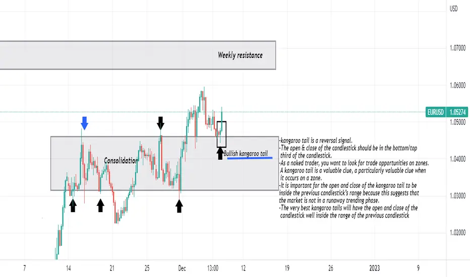
Kangaroo tails-kangaroo tail is a reversal signal.
-The open & close of the candlestick should be in the bottom/top
third of the candlestick.
-As a naked trader, you want to look for trade opportunities on zones.
A kangaroo tail is a valuable clue, a particularly valuable clue when
it occurs on a zone.
-It is important for the open and close of the kangaroo tail to be
inside the previous candlestick’s range because this suggests that
the market is not in a runaway trending phase.
-The very best kangaroo tails will have the open and close of the
candlestick well inside the range of the previous candlestick
The Power of PRICE ACTIONHello traders and future traders!! I know there is a point in the trading journey where you have so much information that it gets confusing, and you try to apply everything that you have read, but price action strategies shows us how simple are the markets and how easily we can interpret one without using tons of indicators, but just the price movement. Here are the 3 main advantages when it comes to price action trading and the reasons why this type of analysis is so powerful in many trading strategies.
If you see any other advantages, but also disadvantages, leave a comment and let's discuss!

The Last Kiss trade. Eurusd The first step of the last-kiss trade is to identify the consolidation zone. One way to visualize a consolidation zone is to draw a box on the chart.
This box will contain the choppy movements of the directionless market. This box should encompass the market movement during the choppy,
drifting-market phase. It should be obvious that the market is stuck between both of the zones. Typically, there will be several touches on either side of the zones.
The last-kiss trade is based on the retouch principle. The market will often come back to a significant zone once the market has expanded beyond the zone, and the last-kiss trade is designed to take advantage of this typical market behavior. The reason for waiting for the
market to come back to the consolidation box is to confirm that the market will, indeed, respect the boundaries that were formed by the consolidation box. In this way, the trader will jump on the trade only when the market comes back to kiss a consolidation box.
Once the market returns to the edge of the consolidation box, it must print a strong candle in the direction of the breakout. Therefore, if the breakout is a bullish breakout (up), then the retouch candlestick must be a strong bullish candlestick. A buy stop is placed above the high of this
bullish candlestick.

THE ENGULFING CANDLE LIQUIDITY EntrySo let's learn something about engulfing candles entries. An engulfing candle is usually a momentum candle and in most cases signifies reversal and at times trend continuation. Now what you do is plot your fib on the engulfing candle from wick to wick and mark the 40-50% retracement area which becomes a potential supply liquidity zone to sell from a bearish engulfing and a demand liquidity zone to buy from a bullish engulfing. In short 90%+ of the time price will retrace back to these zones before continuing and can thus provide clean and safe entries with reduced drawdown, lower risk and a good risk to return. Try it

Asian Range | Liquidity Trap | FVG & London OpenHey folks I hope you're all good and making some good untraditional profits 😉
Here is a model that you will find few days every trading week!
{Terms used in this Idea}
Asian Range:
a time span from 19:00 to 00:00 NY Time that forms every day except for Mondays.. Usually price taking of Asian Range's high or low means liquidity is taken and price "could" reverse short-term if that agrees with our daily bias..
London Open:
Time span from 02:00 to 05:00 NY Time when the market is very acrive. Price usually forms high or low of day during London Open..
FVG:
Fair value gab is a gab that forms between two candles separated by a third candle forming the gab (blue-shaded boxes on chart)
If you found that useful give it a ♥️LIKE♥️
💙Thank You💙
Glad to hear from you in comments✍️

♻️UNDERSTANDING THE BULLISH ENGULFING CANDLE PATTERN♻️
☑️WHAT IS A BULLISH ENGULFING CANDLE?
The bullish engulfing candle appears at the bottom of a downtrend and indicates a surge in buying pressure. The bullish engulfing pattern often triggers a reversal in trend as more buyers enter the market to drive prices up further. The pattern involves two candles with the second candle completely engulfing the body of the previous red candle.
☑️HOW TO SPOT A BULLISH ENGULFING PATTERN AND WHAT DOES IT MEAN?
▪️Characteristics of a bullish engulfing pattern:
• Strong green candle that ‘engulfs’ the prior red candle body (disregard the wicks)
• Occurs at the bottom of a downward trend
• Stronger signals are provided when the red candle is a doji, or when subsequent candles close above the high of the bullish candle.
▪️What does it tell traders?
• Trend reversal to the upside (bullish reversal)
• Selling pressure losing momentum at this key level.
▪️Advantages of trading with the bullish engulfing candle:
• Easy to identify
• Attractive entry levels can be obtained after receiving confirmation of the bullish reversal.
☑️KNOW THE DIFFERENCE BETWEEN A BULLISH AND A BEARISH ENGULFING PATTERN
Engulfing patterns can be bullish and bearish. The bearish engulfing pattern is essentially the opposite of the bullish engulfing pattern discussed above. Instead of appearing in a downtrend, it appears at the top of an uptrend and presents traders with a signal to go short. It is characterized by a green candle being engulfed by a larger red candle.
☑️CONCLUSION
A Bullish Engulfing Candle becomes an excellent tool for the trader, once he masters how to use it properly!
✅Thank you for reading! Please, like and comment if you liked the article☺️
Do you like this post? Do you want more articles like that?

Tug of War Among Central BanksThere is a tug of war situation among the central banks to hike interest rates. What is the bad and the good that will come out from this?
i. Last week of October, European Central Bank officials announced another massive 75 basis point hike, increasing interest rates at the fastest pace in the history of the euro currency.
ii. This week, the Federal Reserve is expected to increase rates by 75 basis points for the fourth time in a row.
iii. The Bank of England could join the club on Thursday.
Content:
. The Interest Rate race has just started, why?
. The impact on different currencies
. It may not be all bad news, why?
With higher interest rates, it attracts investors to buy its currency, in this case the USD.
Currency is always a pair, when USD strengthens, the other side weakens.
When a currency gets weaker, it is very bad news for inflation because they will have to pay more on their imports.
Therefore in order to counter inflation, one of the best measures is to hike rate
Expect more volatility in the currencies market, meaning currencies will take its turn to move.
And if you are a trader, you should welcome volatility. Because with volatility, there are opportunities.
GBP Futures
0.0001 = $6.25
0.001 = $62.50
0.01 = $625
0.1 = $6,250
1.1000 to 1.2000 = $6,250
Disclaimer:
• What presented here is not a recommendation, please consult your licensed broker.
• Our mission is to create lateral thinking skills for every investor and trader, knowing when to take a calculated risk with market uncertainty and a bolder risk when opportunity arises.
CME Real-time Market Data help identify trading set-ups in real-time and express my market views. If you have futures in your trading portfolio, you can check out on CME Group data plans available that suit your trading needs www.tradingview.com

The 3 TYPES OF CHART YOU MUST KNOW | Trading Basics
Hey traders,
In this educational video, we will discuss 3 different chart types:
range bar chart,
line chart
candlestick chart.
I will explain to you the difference between them and will teach you why they are important.
❤️Please, support this video with like and comment!❤️

Candlestick Analysis - A Classic Way Of Using Candlesticks
An overview of Candlesticks
A candle represents the changes in price over an interval of time, such as 1 day or 1 minute. The main body of the candle illustrates the opening price at the start of the time interval and the price when the market closed at the end of the interval. The head and tail represent the highest and lowest prices during the interval.
If the price closed at a price above the opening price, then the candle is referred to as a 'bullish' candle and if the price closed below the opening price, then the candle is referred to as a 'bearish' candle.
The length of the shadows shows how much the price has moved up and down with respect to a candlestick within a specific duration.
The size of the candlestick body shows the difference between the opening and closing price and it tells us a lot about the strength of buyers or sellers.
Below, the most important characteristics of the analysis of the candlestick body are listed.
A long candlestick body, that leads to quickly rising prices, indicates more buying interest and a strong price move.
If the size of the candlestick bodies increases over a period, then the price trend accelerates and a trend is intensified.
When the size of the bodies shrinks, this can mean that a prevailing trend comes to an end, owing to an increasingly balanced strength ratio between the buyers and the sellers.
Candlestick bodies that remain constant confirm a stable trend.
If the market suddenly shifts from long rising candlesticks to long falling candlesticks, it indicates a sudden change in trend and highlights strong market forces.

Friday's Asian Range Concept Study in CryptoICT's guide to Friday's Asian Range Concept in relation to a normal Monday's Trading. The accuracy is quite astounding. At exactly 5x the Asian Range of Friday in confluence to any Price Area of Interest and Monday's Daily Bias. It makes price prediction almost quite effortless.

A Beginner's Guide to Candlestick Charts
A candlestick chart is a type of financial chart that graphically represents the price moves of an asset for a given timeframe. As the name suggests, it’s made up of candlesticks, each representing the same amount of time. The candlesticks can represent virtually any period, from seconds to years.
While candlestick charts could be used to analyze any other types of data, they are mostly employed to facilitate the analysis of financial markets. Used correctly, they’re tools that can help traders gauge the probability of outcomes in the price movement. They can be useful as they enable traders and investors to form their own ideas based on their analysis of the market.
The following price points are needed to create each candlestick:
Open — The first recorded trading price of the asset within that particular timeframe.
High — The highest recorded trading price of the asset within that particular timeframe.
Low — The lowest recorded trading price of the asset within that particular timeframe.
Close — The last recorded trading price of the asset within that particular timeframe.
Collectively, this data set is often referred to as the OHLC values. The relationship between the open, high, low, and close determines how the candlestick looks.
The distance between the open and close is referred to as the body, while the distance between the body and the high/low is referred to as the wick or shadow. The distance between the high and low of the candle is called the range of the candlestick.
Being able to read candlestick charts is vital to almost any investment style, learn different candlestick patterns and you will be surprised how accurate they are.

Pinbar Forex Trading SystemPinbar Forex Trading System — a popular strategy for entering and exiting positions that is based on the particular candlestick pattern and the following price action. The Pinbar (also known as "Pin-bar" or "Pin bar") pattern was first introduced by Martin Pring in his Pring on Price Patterns.
Features
-Conservative strategy offers low-risk high-yield opportunities.
-No-loss rate is pretty high if break-even is applied.
-Rare occurrence.
-Timing is critical.
-Support/resistance is difficult to formalize.
Strategy Set-Up
Any currency pair and timeframe should work, but longer-term timeframes (such as H4, D1 and W1) should work better.
Pattern consists of three bars: the left eye, nose and right eye. The left eye should be a bar up for the bearish Pinbar pattern or a bar down for bullish pattern. Nose bar should open and close inside left eye, but its high (or low, for the bullish set-up) should protrude much farther than left eye's high (or low). Both nose bar's open and close should be located in the bottom (top, for the bullish set-up) 1/4 of the bar. The right eye is where the trading happens.
An additional condition for the good pattern set-up is the strong support/resistance level formed either behind the eyes or near the point of the nose. The stronger are the support/resistance levels you incorporate into this pattern, the more accurate it will be.
Entry Conditions
Aggressive entry option is to enter a position when in the right eye price retreats behind the left eye's close level.
Conservative entry point is below (above for bullish set-up) the nose bar.
Exit Conditions
Conservative stop-loss can be set behind the nearest support/resistance level behind the eyes. A less conservative approach would be to set stop-loss to immediately behind the nose bar point (in this case, your reward/risk ratio may suffer).
Conservative take-profit can be set immediately after the left eye low (high for the bullish set-up). Aggressive take-profit level may be placed farther — to the next strong support (resistance for bullish positions) level.

Engulfing candlestick:Education!!!What is a pattern of engulfing candlesticks?
On a price chart, engulfing candlestick patterns consist of two bars.They are used to signal a market turn around.The second candlestick will be much larger than the first, covering or "engulfing" the entire length of the bar before it.
