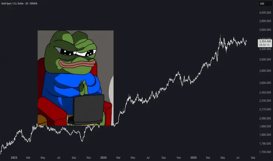
Cable & Fibre!So, generally I'm happy with the way the market is going. Though a little bit uncertain about how high it wants to go before it resumes its downward spiral, things are going good so far.
Looking at Cable, on an hourly chart, we see that between 06:00 am and 08:00 am (New York Time), there is FVG formed and to its left, there is a breaker. This a perfect setup for me, but I will wait to see if price actually wants to go above the 1.3477 level to reach for the 4H as well as 1H FVG.
I've put a sell limit on the fibre at 1.1635, but I will remove it for now, 'till I have confirmed whether price will go above 1.1698 level, to go into the 4H FVG, the mid-point thereof. I have a sell limit there with a stop loss at .1745.
Community ideas

RBA Cut by 25bp: Where From Here?The Reserve Bank of Australia (RBA) finally delivered the 25bp cut I anticipated in July. I take a quick look at how they have updated the economic forecasts that matter, and how Aussie markets reacted.
Matt Simpson, Market Analyst at City Index and Forex.com

AMP Futures - Heikin Ashi meets bar Replay!In this idea we will demonstrate how to access the NEW Heikin Ashi bar replay feature in Tradingview.


Bitcoin, Ethereum Breakout: 401(k) funds & the next "Altseason"Bitcoin is up 10% in August, driven by strong ETF inflows and a game-changing executive order allowing 401(k) retirement funds to invest in cryptocurrencies, potentially bringing trillions of dollars into the sector.
Technically, Bitcoin and Ethereum are breaking out toward multi-year highs, with BTC leading and ETH close behind—setting the stage for a possible "altseason" if these levels hold and capital rotates into altcoins.
This content is not directed to residents of the EU or UK. Any opinions, news, research, analyses, prices or other information contained on this website is provided as general market commentary and does not constitute investment advice. ThinkMarkets will not accept liability for any loss or damage including, without limitation, to any loss of profit which may arise directly or indirectly from use of or reliance on such information.

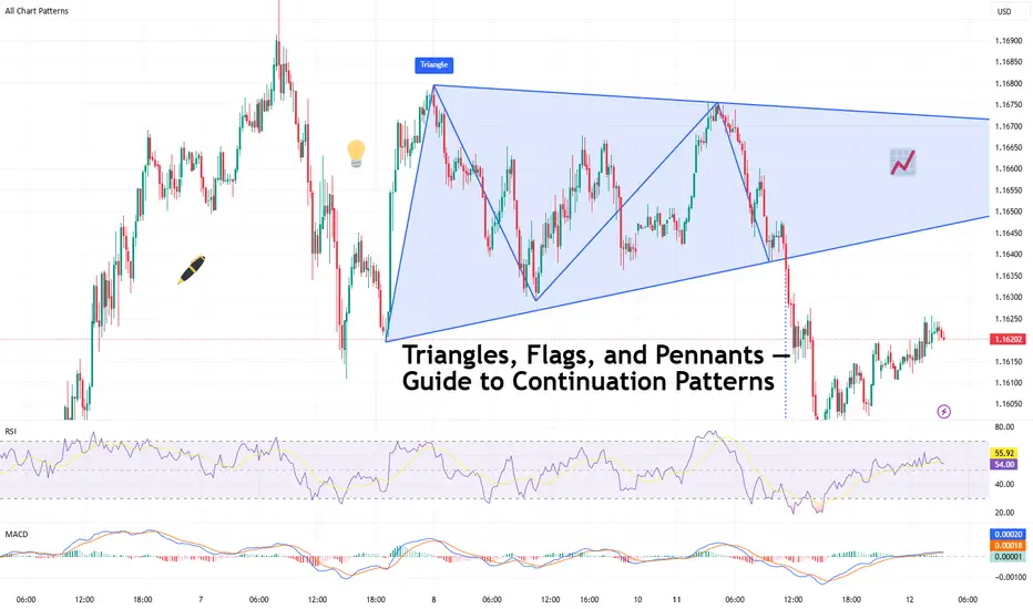
Triangles, Flags, and Pennants — Guide to Continuation PatternsChart patterns can be mysterious — until they’re not. Let’s break down the technical trio that tells you when a trend’s just taking a breather before it flexes again.
So your chart’s been pumping higher for weeks, and then… nothing. Price starts scribbling sideways. Cue panic? Maybe. But more likely, you’re staring at a continuation pattern.
Triangles, flags, and pennants are the subtle “hold my beer before I try to pull a move” signals of technical analysis. They show up when markets pause — not reverse. That pause could mean your trend is catching its breath, not dying in a ditch.
In other words: don’t close your longs just because things go quiet. Sometimes the market is just stretching before it sprints again.
⚠️ Symmetrical, Ascending, Descending
Let’s talk triangles, the Swiss Army knife of consolidation. These shapes come in three stylish varieties:
● Symmetrical triangle: Higher lows, lower highs. Traders call this the indecision pattern, but don’t get it twisted — it may just be winding up for a breakout. Wanna see how these look in practice? Dive into our community’s symmetrical triangle ideas .
● Ascending triangle: Flat top, rising bottom. Buyers are aggressive, their patience is running out. Resistance looks like it’s begging to be broken. Check the ascending triangle ideas for your viewing consideration.
● Descending triangle: Flat bottom, falling top. This one’s more bearish than your boomer uncle who knows zero about Bitcoin BITSTAMP:BTCUSD , and yes — it’s often a precursor to a breakdown. Follow the descending triangle ideas and make sure you DYOR.
Key tip : Wait for the breakout. Don’t front-run triangles unless you like volatility surprises and emotional damage.
🚩 Flags: Fast Moves, Tight Consolidations
Flags form after a sharp price move — the “flagpole” — followed by a tight, slightly sloping channel that moves against the prevailing trend. They’re short-term patterns that act like pit stops during a race.
● In a bull flag, price rallies sharply, then consolidates lower in a downward-sloping rectangle. If price breaks above the upper boundary, the uptrend is likely to resume. Jump straight into the bullish flag ideas .
● In a bear flag, price crashes, then drifts higher or sideways, forming an upward-sloping consolidation. A breakdown below the lower support hints at a continuation lower. What goes up must go down — bearish flag ideas for thought.
Flags are prized for their reliability and tight risk-to-reward setups. The breakout is typically swift, and traders often use the length of the flagpole as a projected target.
🎏 Meet the Pennant: The Flag’s Cousin
Pennants are like mini-triangles that form after a strong price move, usually in high-volume conditions. Unlike regular triangles, they’re smaller and more compressed — a tight consolidation in the shape of a tiny symmetrical triangle.
What makes a pennant different from a flag? The structure. While flags are rectangular, pennants are more pointed — a converging pattern rather than parallel lines.
Pennants are often seen in high-momentum environments, and when price breaks out of the consolidation zone, it often does so with force. Get some pennant ideas straight from our community.
🧐 How to Actually Trade These Patterns
Spotting a continuation pattern is one thing. Trading it with discipline is another.
Here’s a basic checklist:
● Identify the trend. Continuation patterns only work when there’s a clear preceding move. If the chart is a sideways mess, maybe skip it.
● Draw your levels. Use trendlines or horizontal support/resistance to outline the pattern. Keep it clean — if you’re forcing a pattern, it probably isn’t there.
● Wait for the breakout. Don’t jump in too early. Let the price confirm your bias. Breakouts are more credible with a volume spike.
● Set your stop wisely. Most traders place stops just outside the opposite side of the pattern — below the lower trendline in an uptrend, or above the upper trendline in a downtrend.
● Target projection. Many use the height of the pattern or the flagpole to estimate a target price, though market conditions should influence your approach.
🤔 So, What Could Go Wrong?
Glad you asked. Plenty.
● Fakeouts: Just because it looks like a breakout doesn’t mean it’s real. Wait for confirmation — volume, a close outside the pattern, or your favorite indicator giving the green light.
● Shaky patterns: Not every triangle-looking pattern is a triangle. Sometimes it’s just noise. Don’t make up patterns. The market doesn’t care about your geometry.
● Overleveraging: Continuation patterns look reliable, but no pattern is bulletproof. Position sizing still matters. Don’t bet the farm because a pennant gave you butterflies.
💡 Pro Tips from the Chart Trenches
● Set alerts on trendline breaks so you’re not glued to the screen like a caffeinated hawk.
● Use pattern recognition tools if you’re a newer trader — but verify manually. No software is a crystal ball.
● Trade continuation patterns in the direction of the trend. Countertrend flags are usually bear traps in disguise.
📌 One Last Thing: Pattern ≠ Prediction
Chart patterns don’t tell the future. They tell a story about buyer and seller behavior. Continuation patterns? They’re just the market saying, “Yeah, we’re still into this trend. Just grabbing some break first.”
Use them as one part of a system. Combine them with momentum indicators, volume, or good ol’ fashioned risk management.
Because in the end, it’s not about how many triangles you find — it’s about how many fakeouts you avoid.
Off to you : Spotted any textbook triangles or sneaky flags this week? Or caught a pennant fakeout that wrecked your stop loss?
Drop your best (or worst) continuation pattern story below. You never know who might learn something from your chart scars.
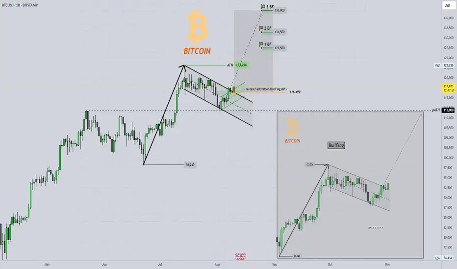
BITCOIN Bullflag and new all-time high ?!BULL FLAG and new all-time high 👀⏰
📇BTC daily-chart (BITSTAMP) and 💡everything important in the chart !
Bitcoin has broken out of its sideways consolidation and has recently successfully tested this channel (bull flag), thereby activating a potential bull flag.
The resulting targets (see example) are based on the low of approximately $98,240 and the sharp rise to the current all-time high of $123,236.
See the flags at the top with the corresponding price-targets 🏁 👀
💥Rising blue diagonal line for the previous support
💥From an indicator perspective, a possible bullish cross is imminent in the MACD-Indicator and bearish momentum may continue to decline ...
💥Finally, the bull flag (textbook) as an example of a chart pattern.
🔥Please also take a look at my last idea, as there are certain similarities based on this...
🎯 If you like this idea, please leave me a 🚀 and follow for updates 🔥⏰
Furthermore, any criticism is welcome as well as any suggestions etc. - You're also very welcome to share this idea.
I wish you a pleasant Sunday and a good start to the week & successful trading decisions 💪
M_a_d_d_e_n ✌
NOTE: The above information represents my idea and is not an investment/trading recommendation! Without any guarantee & exclusion of liability!
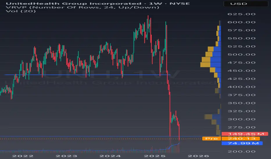
UnitedHealth: Deeply oversold but worth a closer lookUnitedHealth (UNH) is the largest private healthcare company in America. Eight million Medicare Advantage members. Optum’s network reaches tens of millions more. It has the data, the reach, and the pricing power. At today’s valuation, it’s worth adding to your watchlist. Forward P/E at 11× versus a five-year average of 14×. Price-to-sales at 0.6×. RSI at levels not seen in decades. Oversold. Under-owned.
Mispriced? Potentially. We must make it very clear that there could be more downside. But upside is also worth considering.
The AI angle is real. UNH’s health data trove is unmatched. AI can strip billions in waste, automating claims, flagging fraud, predicting costly illnesses before they happen. This isn’t science fiction. It’s execution. Done right, it builds margins and widens the moat. Few can play at this scale. UNH can.
Healthcare as a sector trades 20-30% cheaper than the S&P 500. Aging demographics and chronic care demand are long-term tailwinds. A re-rating here could be swift and brutal for anyone short.
Now, the problems. Medical costs are spiking. Medicare Advantage margins are squeezed. Guidance was pulled, and that spooked the market. Leadership turnover added uncertainty.
These are real headwinds. But they’re fixable.
Premium hikes are already being set for 2026. Stephen Hemsley, the architect of UNH’s prior growth, is back. He’s cutting, reviewing, and bringing in outside talent.
Price implications? The market is pricing in permanent damage. That’s why you can buy a market leader at a crisis multiple. If margins recover and AI efficiencies kick in, this stock doesn’t just bounce, it re-rates. The gap from 11× to 14× earnings on UNH’s scale is tens of billions in market cap.
The bear pit is noisy. The bull case is quiet. But it’s there, and it’s strong. Stop losses are important to manage more downside risk.
The forecasts provided herein are intended for informational purposes only and should not be construed as guarantees of future performance. This is an example only to enhance a consumer's understanding of the strategy being described above and is not to be taken as Blueberry Markets providing personal advice.

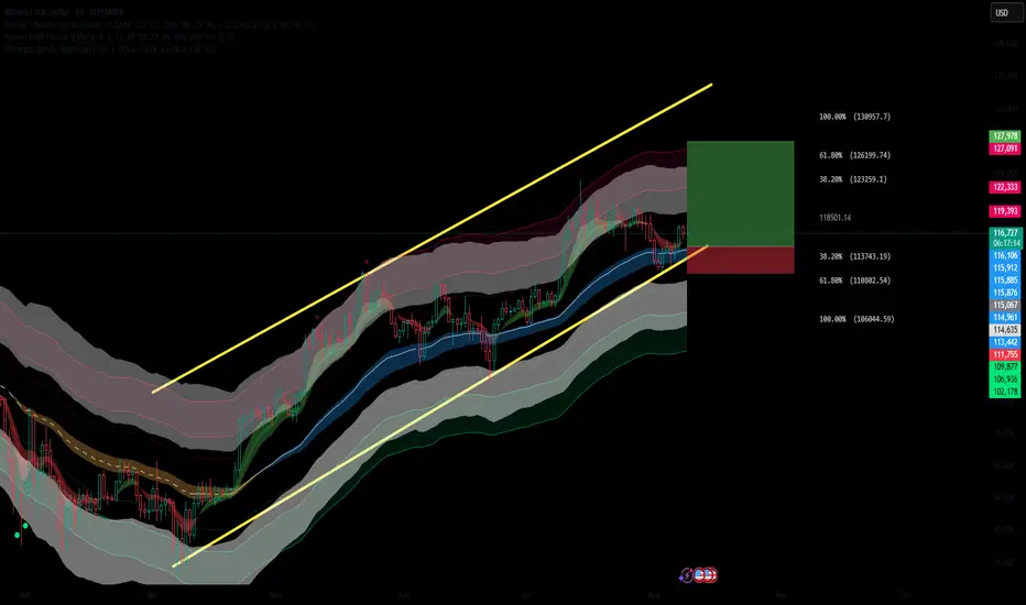
BTC Holding Strong: Fibonacci Levels Point to $130KBITSTAMP:BTCUSD is holding above a key dynamic support zone at the lower boundary of its ascending channel, with current price action signaling a potential continuation to the upside. This long setup is supported by multiple bullish confluences.
✅ Bullish Confluences:
Fibonacci Retracement Support: Price respected the 38.2%–61.8% Fib retracement zone between $113,769 and $110,828, confirming a strong demand area.
Trend Structure: Clear higher low formation on the daily chart, maintaining the bullish channel pattern.
EMA Cloud Support: Price remains above the multi-band EMA cloud, showing sustained bullish pressure and trend bias.
Channel Support: Bounce from the ascending channel’s lower trendline, keeping structure intact.
Bullish Candlestick Formation: Daily candle holding above key support with buying pressure evident.
Ideal entry would be between 113k and 114500.
🎯 Fibonacci-Based Targets:
TP1 – $123,285 (38.2%): Initial resistance and reaction zone.
TP2 – $126,225 (61.8%): Mid-extension target, aligns with prior swing high zone.
TP3 – $130,983 (100%): Full measured move to the channel top.
SL: Placed just below the 61.8% retracement (~$110,800), protecting against a breakdown of the bullish structure.
BITCOIN DAILY/4HR THE daily trendline and 4hr trendline break out will be watched for forward guidance.
if we break the top layer resistance we buy and target 123k current all time and high and factor the possibility of 135-130k-128k zone for next sell.
And our sell will be on break of steep ascending trendline acting as dynamic support and we will watch 114k and 111.78k zone and further downslide wiill be 90k-100k zone.
zone by zone layer by layer.
the structure of the market is clear ,it will never lie.
trading is 100% probability and you need the mindset of a hunter, dont buy because others are buying.
your risk to reward ratio should be your trade reason.
GOODLUCK

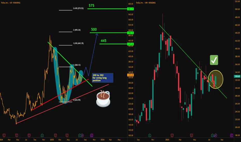
Tesla Roadmap: From $300 Zone to $575Hello traders, here’s my latest analysis on Tesla (TSLA) based on the weekly and daily timeframes. On the weekly chart, I have drawn a downtrend line starting from December 2024, and the recent price action shows a breakout above this line on a weekly close. This breakout is a promising sign that an uptrend may be developing in the medium term.
On the daily chart, we can see a cup & handle pattern forming, which is a bullish continuation structure. However, the daily downtrend drawn from the December 2024 highs remains unbroken, so I will need to see a weekly close above the $332 resistance level to confirm a swing long setup.
My preferred positioning zone for longs is between $300 and $350, using a multi-entry approach to average into the trade. My upside targets are $366, $445, $500, and finally $575. These levels align with inverse Fibonacci projections, with “safety 1” at $360 and “0” at $227, pointing toward the 161, 200, and 261 extensions as key objectives.
For stop-loss placement, patient traders who are willing to hold through volatility may consider a weekly close below $265 as their invalidation point. For faster or more short-term oriented traders, a weekly close below $300 could be used as a tighter stop level. Although I believe it is unlikely for price to drop this far, even if it does, I expect strong buying interest and a potential rebound from the $265 support zone.
Risk management remains crucial for this setup. I recommend not risking more than 10% of your capital, scaling in over multiple entries, and always confirming with your own strategy before committing to the trade. Position sizing and discipline will be key to managing volatility and protecting capital.
NASDAQ:TSLA
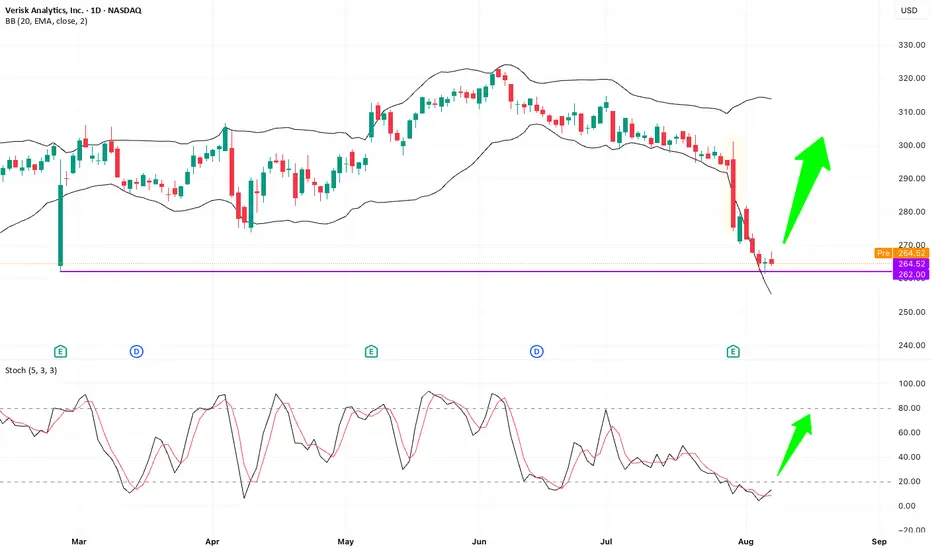
VRSK – Bullish Pin Bar at Key Support after Earnings Flush?NASDAQ: VRSK delivered good quarterly results, yet price action showed a sharp flush-down bar breaking below the lower Bollinger Band. Recently, price retested the key previous low level at $262, triggered some small stop-losses, and closed back at $262 with a bullish small pin bar. Double bottom setup on VRSK.
Key factors supporting this level:
1. Flush-down move likely to stop out weak holders.
2. Break below lower Bollinger Band, indicating short-term oversold condition.
3. Stochastic oversold and attempting a bullish cross.
4. Bullish pin bar closing back above support.
EUR/CAD – 93% Traders Are SHORT! Bearish Reversal Brewing?The EUR/CAD pair is currently in a bullish trend, but multiple technical and sentiment signals are pointing toward a possible trend reversal.
🔍 Key Observations:
Trend: Bullish (but losing momentum)
Bearish Divergence: Price making higher highs while RSI indicators show lower highs.
Pattern: Rising Wedge – a classic bearish reversal formation.
Harmonic Analysis: AB=CD pattern is approaching the potential reversal zone (PRZ).
EMA Insight: Price candles have moved across the 20 EMA and 50 EMA, signaling weakening bullish momentum.
Sentiment (Myfxbook.com): 93% of traders are currently short on EUR/CAD — strong crowd bias toward the downside.
📌 Trade Setup:
Bias: Bearish
Strategy: Sell Stop at breakout of previous Higher Low (HL)
Entry Price (EP): Sell Stop @ 1.59755
Stop Loss (SL): 1.60626
Take Profit 1 (TP1): 1.58884 (R:R = 1:1)
Take Profit 2 (TP2): 1.58013 (R:R = 1:2)
Lot Size: 0.15
Risk: $200 | Potential Reward: $200–$300
💡 Trade Execution Plan:
We will enter only after HL breakout confirmation to avoid false moves. This setup aligns Rising Wedge pattern, Bearish Divergence, EMA cross weakness, Harmonic PRZ zone, and bearish sentiment — a powerful confluence for a potential downside move.
📊 Technical Summary:
Combining price action, chart patterns, harmonics, momentum, and trader sentiment gives this short setup high probability.
📢 Your Turn:
What’s your take on this trade? Will the market follow the 93% bearish sentiment, or could this be a trap?
💬 Drop your analysis in the comments, let’s discuss!
👍 Like, 🔁 Share, and Follow for more trade setups & technical breakdowns.
#EURCAD #Forex #ForexTrading #BearishReversal #PriceAction #HarmonicPatterns #TechnicalAnalysis #EMA #Divergence #TradingView #ChartPatterns #SwingTrading #ForexSetups #ABCDPattern #PriceActionTrading #ForexSignals #RisingWedge #1HRTimeFrame #ForexLife #DayTrading #MarketSentiment #Myfxbook

Support & Resistance – Quick Guide In 5 StepsSupport and resistance are key concepts in technical analysis that help traders identify where price is likely to react.
Support acts like a floor — a level where buying interest is strong enough to prevent further declines.
Resistance acts like a ceiling — a level where selling pressure can stop price from rising.
These zones often lead to bounces, reversals, or breakouts, and are used to plan entries, exits, and stop-losses.
How to Identify them:
1. Assess the chart.
2. Identify Swing Points: Look for repeated highs/lows and label them. (Flags)
3. Multiple touches: Highlight the zones with multiple touches. 2+ Touches are stronger.
4. Define: Clearly define the zones. Above is resistance, below is support.
5. Entry: When price makes it way down to support, wait for the reversal. Upon reversal enter on the low time confirmation. Ensure price has failed to break below the support.
Then set TP to the previous High/Resistance zone.
Tips:
Always treat S&R as zones, not exact lines.
Combine with trend, candlestick patterns, or volume for better confluences.
Avoid trading into strong S/R — wait for breaks or retests.

BILL - 6-10 R:R short-term trade opportunity Here is a multi-time frame analysis and trade idea on BILL. The algorithms are indicating a potential short-term reversal and with a few of our confluences and confirmations, we are able to set up a solid trade.
I left out the weekly view because it's not as relevant for this short-term trade idea - but needless to say, we are in a strong downtrend.
As you'll see on the Daily (left chart), we are respecting a tapered white selling algorithm on the buy-side and potentially proving it on the sell-side today. If this is the case, we have the opportunity to take the trade from the bottom of white to at minimum the top of the stronger teal selling channel.
- Trade 1 is offering a 6 R:R (to the top of teal)
- Trade 2 is offering a 10 R:R (to the top of white)
Keep in mind that if we do break out of teal and prove white on the daily time frame, this would be a very bullish indication and potentially leave us for a breakout trade beyond toward the top of the weekly selling channel.
The major confluence that makes this trade viable is the HTF demand zone (indicated by the green box) that we have just tapped into. While the perfect entry would be on a white hold which we had at today's low of $40.60, for further confirmation, we are waiting for a break and 15 Minute close above the demand zone. We will then enter the position and have a tight stop below our white algorithm and low of day.
If you like this type of analysis and trade ideas, let me know in the comments! I typically post longer-form analysis videos which offer more information and give you the ability to find trades on your own. However, I am happy to offer ideas like these when a good opportunity arises
Happy Trading :)

Tesla Stock Gains After Musk Gets $30 Billion Award — What Now?Tesla board is hoping that the pile of shares would be enough to pin down the CEO and lock down his focus. But challenges are there. Here’s one — $30 billion might not be enough to keep Musk around.
💰 $30 Billion Retention Bonus
Tesla stock NASDAQ:TSLA is up about 4% since the start of the week after the board of directors handed Elon Musk a gift-wrapped, legally-contingent $30 billion stock package .
What’s inside? A cool 96 million shares — nearly enough to buy a small country or, at the very least, keep Musk’s wandering focus in the Tesla lane.
In a letter to shareholders, the board didn’t mince words: “We are confident that this award will incentivize Elon to remain at Tesla. Retaining Elon is more important than ever.” Translation: “Please don’t leave, here’s money.”
This isn’t just about stock awards or executive compensation. It’s about bringing back lost focus and whether the most famous CEO on the planet can be convinced to stop juggling a handful of companies and pay full attention (ok, more attention) to the one that’s public, highly volatile, and still kinda trying to figure out self-driving and robotaxis .
🎢 If the Stock Could Talk
The market’s response? Pretty bullish. Traders seem to like the idea of Musk staying inside the Tesla factory gates — or at least not moonlighting in so many side quests.
After all, Elon’s presence — erratic tweets, spontaneous product reveals, and all — is a core part of Tesla’s brand value. The stock has often behaved more like a crypto coin than a traditional automaker.
Musk already owns over 400 million shares, around 13% of Tesla, worth roughly $125 billion. But he’s gunning for more: his long-stated ambition is 25% voting control (equal to $250 billion in shares based on the current $1 trillion market valuation. This new package edges him closer to that goal. If he can’t own a country, a quarter of Tesla might do.
⚖️ A Legal Complication Worth $56 Billion
There’s one tiny footnote here: if Elon wins back his 2018 $56 billion pay package — the one struck down by a Delaware court — he might have to forfeit this new batch.
So yes, Tesla may have just given the richest man in the world a “Plan B” golden parachute. Or a “Plan A” depending on how Delaware judges are feeling when they decide on it.
🤖 AI, Robots, and Attention Deficits
Let’s not forget what lit the fire under this latest move. Back in January, Elon posted on X that he was “uncomfortable growing Tesla to be a leader in AI & robotics” without more control. It was a public shakedown — and apparently it worked.
Tesla’s ambitious AI goals — full self-driving software, Optimus the humanoid robot, and a suite of other sci-fi-sounding visions and promises — are largely tied to Musk’s personal involvement. Investors know that without him, these projects could end up shelved… or sold to xAI, his other pet project and owner of X (former Twitter).
🧮 The Math of Mega-Pay
Tesla says the accounting value of the package — after subtracting what Musk would have to pay to exercise the options and adjusting for restrictions — sits at about $23.7 billion. That's about the GDP of Malta and only slightly smaller than the SEC’s collective headache every time Musk tweets.
In return, Musk has to stick around for five years — or at least not officially leave. The board hopes that’s enough to keep him engaged. But the question is: How much is enough to counteract everything else going on?
The man’s worth $350 billion to $400 billion (depending on volatility) and if he wants to build Martian houses or dig tunnels under Paris, a few billion dollars aren’t going to make a difference.
🔀 A Shifting CEO, A Shaky Business?
It’s not just about Elon’s attention span. Tesla’s business hasn’t exactly been smooth sailing. The EV market is more crowded than ever. Sales are dropping in Europe. Tariff threats are buzzing in the background.
On top of that, it’s the earnings season and the Earnings calendar is hot to the touch. In recent quarters, Elon’s perceived absence from the factories have coincided with slumping revenue and nervous investors.
Add in the fact that Elon just exited the Trump administration after a brief stint and dramatic fallout — yes, that happened — and Tesla investors are understandably hoping for a little more focus in the months ahead. Not to mention his new Washington gig — his “America party” political party .
🚗 Is Tesla Still a Growth Story?
Tesla is still the largest EV maker in the US, but the shine has worn off a bit. The Cybertruck’s still not mainstream, Model 3s are getting old, and margins are being squeezed by global competition and pricing wars.
If Musk is serious about staying and building, this could be Tesla’s opportunity to pivot — from hype-driven volatility to sustained, AI-powered growth. But if not, well... there’s SpaceX. Or xAI. Or Neuralink. Or The Boring Company. Or the next startup he tweets into existence.
Off to you : Do you feel like Tesla is paying Elon to stay interested — or rewarding him for prior (and future?) performance. And is that the way to buy loyalty and dedication? Share your thoughts in the comments!

The Platinum BulletOver the years, I have posted a lot of educational content here on TradingView. Everything from Elliot waves to Wyckoff, psychology to Gann.
I have been lucky as a trader, 25 years doing this you pick up a thing or two. But above everything else, what you realise is that trading is a mindset game and not a technical one.
Many new traders try their luck. They are either experts in another field or simply successful in something else, or they come to the trading arena seeking wealth.
Both tend to get humbled quickly.
It is common for many new traders to put so much emphasis on the strategy, they overlook the psychology. You see, a strategy might work for someone, but you can't get it to work for you. This could simply be the time on the charts you lack, the timeframe or the instrument you are trading. The account balance or the fact you are not used to seeing 3-4 losses in a row.
When it comes to trading, less really is more!
Here's a simple one for you.
Take the mechanical range post I posted.
Now look at this;
On the larger timeframes we can see clearly the ranges and the supply/demand.
Then dropping down to the daily.
This is where, the technical aspect becomes less important and the psychology behind the move shows it's hand.
I have added volume and the AD line just to show how obvious this can be.
What do you see? Well as the price goes up, the volume goes down, we know we took liquidity to the upside.
So, if nothing else you would anticipate a pullback phase.
Then you get the clarity. Price drops and then pushes back, yet fails to make a new high. Almost like the volume told you it was about to happen.
Where did it pull back to?
Adding a simple volume profile too, from the swing high to the swing low. You can see the majority of the sell off (PoC) happened at a specific price point. Price pulled back to exactly that region before dropping.
The drop caused a local change in character and immediately took out the swing low - the last swing low of the leg up. (the real change in the trend).
There is obviously more to cover than this, but that is for another post.
Once you learn the way markets capitalise on the fear, the greed, the herd mindset, sentiment of the retail crowd. You can use the sentiment analysis in your favour.
You don't need 6 screens, fancy indicators, there is no silver bullet or 100% win rate strategies. And no a bot won't make you a Billionaire overnight.
If it was that easy, we would have no doctors, lawyers or firefighters; they would all be professional Bot traders.
Simplify your approach, put emphasis on the proper mindset, psychology and risk management and you will do alright!
Stay safe in the markets!
Some other recent posts;
Disclaimer
This idea does not constitute as financial advice. It is for educational purposes only, our principal trader has over 25 years' experience in stocks, ETF's, and Forex. Hence each trade setup might have different hold times, entry or exit conditions, and will vary from the post/idea shared here. You can use the information from this post to make your own trading plan for the instrument discussed. Trading carries a risk; a high percentage of retail traders lose money. Please keep this in mind when entering any trade. Stay safe.

Boeing Wave Analysis – 5 August 2025- Boeing reversed from the support zone
- Likely to rise to resistance level 230.00
Boeing recently reversed up from the support zone between the pivotal support level of 217.50 (former top of wave 1 from June) and the lower daily Bollinger Band.
This support zone was further strengthened by the 50% Fibonacci correction of the upward impulse i from June.
Given the clear daily uptrend, Boeing can be expected to rise to the next resistance level 230.00 – the breakout of which can lead to further gains toward 240.00.
Why Litecoin is my #1 pick right nowObserving the price action between the two vertical blue lines (the '20 to '21 bull cycle), and comparing to the trend based fib extension levels on the left, we have a blueprint for the fib levels that LTCUSD responds to. At the .236 fib, a 24% pullback. At the .382 a 36% pullback. At the .5 a 38% pullback. Then the market got super heated and it blew past the .618 and had another 38% pullback before the final push up to $413, followed by a 75% "correction".
I'm using those fib levels for my sell/buyback zones in the current bull cycle:
- The first one is at $131, but I think LTC may blow past this one since it's so close to where LTC is breaking out of the trendline and the crypto market just had a retrace.
- The second level is at $188.
- Third level at $234.
- The final level I'm aiming for is the golden trend line at around $400.
- Based on breaking out of the long descending wedge on the LTC:BTC chart, it's possible for LTCUSD to have a huge blow-off top and hit upwards of $600.
Looking at the LTC:BTC pair, (see my last post), Litecoin has a huge potential in the current bull cycle. In the '20-'21 cycle it didnt breakout against bitcoin until the end of the bull run and that breakout wasn't major. LTC:BTC is currently breaking out of a long-term trendline with significant volume.
We'll see. But one thing is for sure, LTC held up well against BTC during the recent drop from $119k to $112k, and now it's pumping steadily. Lookin' good.
What do you think?
The Illusion of ControlThere comes a point in every trader’s journey when you do everything right, and it still goes wrong.
You plan the trade meticulously, plot the levels, define your risk, wait patiently for the setup, and enter with the kind of discipline that would make any textbook proud. You follow your rules. You trust your process. And yet, the market does what it does!
It breaks through your stop as if your risk management was never there. Sometimes it gaps hard against you, leaving no room to act. Sometimes it simply meanders sideways, wearing down your conviction until, exhausted and uncertain, you exit - only to watch the market finally rally the moment you’re out.
This experience is frustrating and discouraging. Yet, for those with enough experience, it's a familiar scenario.
It's not just about losing money, though that definitely stings. This kind of hit really messes with your confidence, throws off your game, and makes you feel disconnected from your work. Before you know it, those sneaky little doubts creep in: Did I miss something? Could I have stopped this? Am I just not good enough at this yet?
So you go back to the charts, really digging into every detail. You watch replays, try out new filters, and pile on more indicators, scrutinizing the trade from every possible angle. You tell yourself this super careful process makes you better, a crucial part of being a professional. But if you're real with yourself, it's more than just getting better. Underneath all this striving for improvement is often a deeper reason: you really want to be in control.
We often discuss risk management, patience, and emotional discipline, yet we seldom acknowledge our deep-seated desire to control the market. We invest countless hours in learning, testing, and refining, expecting our efforts to yield tangible results. When the market doesn't respond as we anticipate, it's disheartening. This is because, at our core, we not only aspire to be skilled traders but also crave the belief that we are truly in command.
The market just does its thing, plain and simple. It doesn't care how much work you put in or how carefully you prepare. It's not about rewarding effort; it just moves. Trying to find a reason for every little change is pointless, like trying to argue with the ocean. You can't outsmart randomness; you can only learn to coexist with it.
The best traders do prepare with care. They’re thoughtful, meticulous, and dedicated. But many cross a subtle line, often unknowingly - the line where preparation morphs into obsession, where working harder becomes an emotional shield, and where we start to believe that if we can just control every input, we can guarantee the output.
This is where it all becomes dangerous. Not financially, necessarily, but psychologically. When your self-worth becomes intertwined with your performance, every loss starts to feel personal. Every drawdown feels like an indictment. You tell yourself you’re striving for excellence, but what you’re really chasing is certainty; and in a domain governed by uncertainty, that’s a recipe for chronic frustration.
The truth is, trading isn't about being right all the time, or even most of the time. The real skill is staying cool when you mess up and not freaking out when things go sideways. You don't have to be perfect; you just need to handle the unknown without needing to control it. You won't pick up this tough lesson from courses, forums, or even tons of practice, unless you're truly reflecting on what you're doing. You learn it by watching winning trades go bad, by handling losses without freaking out, and by being able to stay cool when things get uncomfortable.
You know that annoying feeling we sometimes get? It's usually just fear, popping up as worries about messing things up, looking foolish, or not being quite good enough. When you're trading, these fears can seriously mess with your mind. You might jump into trades too quickly, fiddle with your stop-loss, settle for smaller gains, or just abandon your whole strategy when things get tough. We might try to convince ourselves we're being clever, but typically, we're just trying to escape feeling uncomfortable.
Trying too hard to control the market often hurts your edge. Trading systems usually don't fail because of math errors; they fail because traders don't have the patience to stick with them through tough times and let them do their job.
Every trader eventually faces a fundamental, liberating truth: you are not in control. Once you accept this, you can stop trying to control the uncontrollable and instead concentrate on what you can manage: your risk, routine, discipline, and behavior.
Detaching from the outcome isn't about indifference or a lack of concern; it's about embracing trust. Trust in your preparation. Trust in your edge. Trust in the law of large numbers — that over time, if you execute consistently, the results will follow. Not perfectly, not smoothly, but faithfully.
You build trust over time, often without even realizing it. It's about sticking to your plan even when things aren't going your way, taking losses in stride, and not messing with something that's working, just because it hasn't paid off yet.
Over time, your trading approach transforms. You no longer dwell on every loss or micromanage winning trades. The urge to constantly adjust your system after a bad week/month subsides. Your perspective broadens; you begin to think in terms of years, not just days. This shift cultivates a deeper, process-driven confidence, untethered from mere numbers. You stop striving for absolute control, and in doing so, discover a sense of peace.
True mastery isn't about dominating the market, but rather relinquishing the illusion that you ever could.
Turning Stock Declines Into Your Best Trading OpportunityTurning Stock Declines Into Your Best Trading Opportunity
When stocks fall dramatically, many investors panic. But what if those drops were actually the set-up for some of the most lucrative opportunities?
In this article, you’ll discover why sharp declines can set the stage for outsized gains, how the mathematics of recovery works, and how to use classic technical patterns to identify the ideal entry points. And the most important, how to do it easily on Tradingview!
The Power of Recovery: Why a Drop = Big Upside
Every percentage drop in a stock’s price requires a much larger percentage gain to return to its previous high. Recognizing this simple truth can turn “market fear” into “trader’s opportunity.”
Here’s exactly what a stock would need to climb, after various drops, to reclaim old highs:
| Drop (%) | Required Gain to Recover (%) |
|----------|-----------------------------|
| 10 | 11.1 |
| 20 | 25.0 |
| 30 | 42.9 |
| 40 | 66.7 |
| 50 | 100.0 |
| 60 | 150.0 |
| 70 | 233.3 |
If a top-quality stock drops 50%, it needs to go up 100% just to get back, so smart entries after steep drops can double your money on a bounce.
When These Pullbacks Are Opportunity: The Case of Market Leaders
Stocks like Eli Lilly, UNH, Novo Nordisk, ASML, AMD, or Lululemon are examples of quality growth companies that sometimes undergo sharp, hype-driven sell-offs.
Recent history shows:
- Eli Lilly, UNH or Novo Nordisk : Leaders in innovative health solutions, frequently see pullbacks despite strong demand in their sectors.
💊 NYSE:LLY (Down up to 30%)
Most analysts are highly bullish on Eli Lilly , with most giving it a "Strong Buy" rating. The 12-month consensus price target ranges between $956 and $1,016 , suggesting a 25–32% upside from current levels . Optimism is driven by strong momentum in its obesity and diabetes drug pipeline, especially GLP-1 treatments like orforglipron. Risks include high valuation and dependence on future drug approvals.
Technically speaking, Eli Lilly is currently trading within a channel , also known as a flag pattern when it forms during a bull trend. There are two common ways to trade this setup:
You can either wait for the price to drop to the bottom of the channel for a lower-risk entry, or wait for an upside breakout to join the rally at its strongest point.
Both approaches are considered low-risk, high-reward trades. However, entering a position right now is not ideal , as there is still room for the price to decline before a potential breakout in this premium stock.
💊 NYSE:UNH (Down up to 60%)
The Analysts are generally positive on UnitedHealth Group , despite recent challenges like CEO changes and regulatory concerns. Most believe the company has strong fundamentals and expect it to recover over time. The average 12-month price target ranges from $380 to $400, which suggests a potential upside of over 60% from current levels . While a few firms have lowered their outlook, the majority still recommend buying the stock.
Technically speaking , the price dropped after breaking below its support zone (red).
It briefly paused in a first support area (blue), where some optimistic buyers stepped in, but eventually continued down to a more important zone.
The green area marks the main trading zone from before COVID , with high volume and strong interest, this is where many institutional investors are likely to see value and start buying this premium stock again .
Interestingly, analysts’ average price targets are below the previous support, suggesting a possible pullback to that area. If this happens, it could mean a 60% to 90% rally for UNH from current levels (though some further decline within the green zone is still possible and as we saw at the start, even more profits!).
💊 NYSE:NVO (Down up to 70%)
Analysts have a cautious but constructive outlook on Novo Nordisk, with an average 12‑month price target of around $80.
While some firms maintain buy ratings, many have recently lowered their views amid mounting competition from Eli Lilly and concerns over copycat semaglutide products depressing growth. A few stronger bulls still point to the long-term potential in obesity and diabetes markets as reasons for future upside. Others see significant headwinds, noting falling demand for legacy drugs and disappointing trial outcomes such as CagriSema setbacks. Overall, most analysts expect a recovery from current levels.
Technically speaking , the price dropped after breaking below a Head and Shoulders pattern , which led to a sharp decline in Novo Nordisk's stock.
The price has now reached a key previous support zone, where the Volume Profile (VRVP) shows significant activity, this often suggests institutional investors may start buying again, viewing the current levels as a bargain. While it's wise to be cautious ahead of tomorrow’s earnings report, the overall downside risk appears limited, given the company’s strong cash flow and solid product pipeline.
That said, investor expectations around obesity and diabetes treatments are no longer as optimistic as they were a few years ago, which could weigh on future growth. Still, from a technical and fundamental standpoint, this area may offer an attractive entry point to sell at $80 for a 70% profit!
Other well-known stocks that could present an amazing opportunity soon include NASDAQ:LULU , EURONEXT:ASML , NYSE:MRK , NASDAQ:PEP , SPOT NYSE:SPOT or $NYSE:PFE. Right now, I don’t see strong patterns in these charts , but they’re approaching interesting buy zones. I’ll be keeping a close eye on them, just in case a setup starts to form.
These tickers, as of August 2025, stand well below consensus price targets, so a recovery from current levels toward analyst consensus highs could deliver powerful returns.
⚠️ An example of previous opportunities
I like to understand the past before trying to predict the future , so it’s fair to show some previous examples of stocks that were "on sale."
The first example is NASDAQ:META
A well-known premium stock that experienced a massive crash during 2021 and 2022 due to the failure of its metaverse strategy. The stock lost more than 75% of its value , a truly astonishing drop. During this period, a falling wedge pattern formed on the chart , indicating that bearish sentiment was fading. After confirming the pattern, the stock went on to rally more than 700% , yes, you read that right, a 700% rally followed.
Later, another crisis, this time triggered by Trump, hit the stock, causing a sharp 35% drop in just a few weeks. Eventually, the price reached a strong buy zone (high VRVP and previous important supports), and in the weeks that followed, we’ve seen a 63% rally that is still unfolding.
During 2025 , we’ve also seen
NASDAQ:NVDA fall 35%, only to come back with a 110% rally .
NASDAQ:MSFT dropped 25% and then delivered an impressive 60% gain afterward.
NYSE:ORCL lost 40% in just a few months, and now we’re seeing a massive rally, up 120% , even outperforming NVDA. Simply amazing.
🚀 Finally, some previous published ideas based on the same principle:
⭐ Buying COINBASE:XRPUSD after a large decline (Yes, the methodology also work for other assets!)
⭐ Buying NASDAQ:DLTR at the bottom, after a 65% decline to enjoy a (for now) 90% rally.
⭐ Buying AMEX:GROY after doing two Double Bottoms and breaking the resistances for a 25% rally.
You can find more Ideas on my profile, always based on Chart patterns with low risk and high returns profile .
⏳ Entry Timing: Rely On Technical Patterns, Not Indicators
The key to entering these stocks efficiently isn’t about moving averages, RSI, or fundamentals. It’s about reading price action, volumes and technical chart patterns that reflect buyer behavior and sentiment shift.
Some famous examples:
- Double Bottom : Two clear lows near the same support zone, signaling sellers are losing strength and buyers may take control. The breakout above the intermediate high is usually a decisive signal of a trend reversal. I have published multiple ideas with double bottoms recently.
- Hammer Candle at Support : After a strong decline, a single candle with a short body and a long lower wick near a known support. This shows aggressive intraday buying, hinting that the sell-off momentum is vanishing.
- High Volume at Support: While volume isn’t a classic “indicator,” a surge in transactions as price holds support often marks institutional buying, confirming higher conviction in a potential bottom. Also the VRVP lateral indicator is a great help to know price levels with masive volume.
Spotting these technical structures on stocks deeply “on sale” lets you step in with a skewed risk/reward: your downside is defined (below support), your upside is open (toward recovery), and your edge comes from patient pattern recognition, not luck.
The TradingView screener is a great tool for finding “on-sale” stocks by filtering based on % Change. Pro Tip : The % Change is set to 1-day by default, but you can adjust it to show up to 1 month using the blue dropdown at the top.
After that, you have pattern recognition indicators like double bottoms or the VRVP for volume zones which are both AMAZING.
🔍 Visualize the Opportunity
Here’s your roadmap :
1. Scan for sharp declines in leading names, ideally those with price objectives far above current prices.
2. Strong technical pattern (double bottom, hammer on support, high-volume reversal days).
3. Wait for confirmation of pattern completion with renewed bullish price action or buy in the support, that is risky, but gives a unique risk reweard ratio when it works!
4. Act decisively when patterns confirm, your entry is efficient, your risk controlled, and your recovery math is in your favor.
> Remember : Technical patterns are your best ally for timing entries during periods of panic-driven price drops. Used well, they help you capture robust returns with clear risk management, making market sell-offs a trader’s opportunity, not a threat.
It seems that this August is a good month to start practicing finding bargains.
💬 Does this post helped you?
🚀 Hit the rocket if this helped you spot the opportunity and follow for more clean, educational Chart Patterns trade ideas!
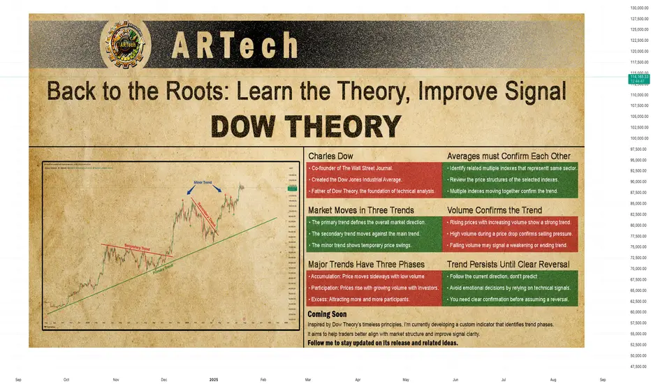
DOW THEORYBack to the Roots: Learn the Theory, Improve Signal
Charles Dow
Before we explore Dow Theory, let’s take a moment to understand who Charles Dow was — and why his ideas still matter today.
Charles Dow wasn’t a financial expert. He was a journalist with a sharp eye for market behavior. In the late 1800s, he began to write about how prices move, how trends form, and what they might mean. His goal was simple: to bring structure and logic to the chaotic world of stock prices.
More importantly, he believed that markets move in trends , and that these trends reflect the collective psychology of all investors. This basic idea became the starting point of technical analysis .
Dow created one of the first stock indexes, which helped investors see the bigger picture instead of focusing only on individual stocks. He also promoted transparency in financial data — long before it was required by law.
In 1889, Dow co-founded The Wall Street Journal, a newspaper that became the voice of financial markets. Through its pages, he published his observations on price behavior, setting the foundation for what would later be known as Dow Theory .
Dow Theory
At the heart of Dow Theory lies a simple but powerful idea:
The market discounts everything.
This means that all known information — earnings reports, interest rates, economic events, political changes, and even future expectations — is already reflected in the price. Price is not random. It is the result of collective investor behavior based on all available knowledge.
Charles Dow didn’t write this exact sentence, but his work clearly reflected this belief. He trusted that by analyzing price movements alone, one could understand the overall direction of the market — because price already includes all the important signals.
Dow and later analysts outlined a set of guiding principles. These are now known as the Six Core Principles of Dow Theory , and they continue to serve as a foundation for modern technical analysis.
The market discounts everything
The market moves in three trends
Major trends have three phases
Averages must confirm each other
Volume confirms the trend
A trend stays in place until it clearly reverses
🔸🔸🔸 The Market Moves in Three Trends 🔸🔸🔸
According to Dow Theory, market movements are not random. Prices move in three different dimensions and time frames: the primary trend , the secondary trend , and the minor (short-term) trend. These three types of movement often occur at the same time. It is very important for an investor to distinguish between them.
The primary trend shows the general direction of the market and can last for months or even years. It’s the major upward or downward movement.
The secondary trend refers to corrections or pullbacks that move in the opposite direction of the primary trend.
The minor trend typically consists of daily or weekly fluctuations and is often considered market “noise.” These short-term movements can occur in the same or opposite direction of the primary trend and may last from a few hours to two or three weeks.
Dow Theory emphasizes that understanding this three-layered structure can protect investors from many mistakes. The theory not only classifies trends but also offers valuable lessons about investor behavior.
It especially highlights the importance of three key principles:
Don’t go against the main trend
Short-term moves can easily confuse traders. Trading against the primary trend often leads to losses. That is why it is crucial to identify the main trend and follow it.
Diversify your exposure
In Dow’s time, technology wasn’t as advanced as it is today, but he still followed multiple indexes (like industrials and transport) to reduce risk. The same principle applies today: investors shouldn’t rely on a single asset — diversification remains a critical part of managing risk.
Define your holding period before entering a trade
Each type of trend comes with a different time expectation. The holding period you choose will play a key role in shaping your trading strategy and aligning it with your financial goals. Instead of debating how long each type of trend should last, it’s more important to define your intended holding period before entering a position.
Your answer to the question “Which holding period suits me?” reflects not only your trading style and lifestyle, but also determines which chart timeframes and indicator timeframes you should use.
🔸🔸🔸 Major Trends Have Three Phases 🔸🔸🔸
According to Dow Theory, major (primary) trends consist of three phases. This structure reflects how investor psychology changes over time and how those emotions are reflected in price action. Regardless of whether the trend is bullish or bearish, each major trend includes these three stages:
Accumulation Phase
The first stage of a bull market often looks like a small bounce during a bear trend. Most people still feel negative about the market. They are afraid to buy again after losing money. Trading volume is low, and prices move in a narrow range. The market stops making new lows, but investors are still unsure. Many have left the market or are very careful now. The price action becomes slow and sideways. It feels boring. But during this quiet time, smart investors slowly start buying. This is how a new trend begins — silently and with doubt.
However, there is no clear signal that a bull market has started. Buying now carries two big risks. First, the market may still go lower. Second, even if a bull trend is coming, no one knows when it will start. How long can you wait while the market does nothing? Holding positions in a flat market has costs — financial, emotional, and missed opportunities elsewhere. That’s why this phase is difficult for most traders to handle.
Public Participation Phase
The market begins to recover, and the broader investor base starts to notice positive changes. News improves, technical indicators give bullish signals. Prices rise, and trading volume increases. This is usually the strongest part of the trend. At this stage, more disciplined and research-driven investors — who follow the market closely — start buying in. They see confirmation in both price action and economic data. Their confidence supports the trend, and momentum grows. The market attracts more attention. Confidence replaces fear. Many investors who stayed out during the earlier phase now feel safer to enter.
Joining the market during this phase is important. The trend is already underway, but there’s still room to grow. Risk is lower than in the early phase, and potential rewards are still high. For many investors, this is the best time to take a position.
Excess Phase
The market enters a phase of excessive optimism. Prices have been rising for a long time, attracting more and more participants. However, during this stage, institutional investors and professional traders who entered earlier begin to gradually take profits.
Although prices remain high, momentum weakens, and the rate of increase slows down. Looking at the volume profile, prices may reach new highs but often without volume support. Technical indicators frequently show bearish divergences. These conditions generate early technical signals that the primary trend may be coming to an end.
🔸🔸🔸 Averages must Confirm Each Other 🔸🔸🔸
According to Dow Theory, a market trend is considered valid only when different indexes move in the same direction. The term “average” here refers to an index or the general direction of a price series. This principle is used to assess whether a price movement is supported by broad market participation.
A single index reaching a new high or low is not enough. For a real and sustainable trend to be confirmed, related indexes are expected to show similar movement and generate signals in the same direction. If this confirmation is missing, the current move may be considered weak or temporary.
How to Analyze It:
Identify related indexes
Choose multiple indexes that represent the same market, sector, or economic domain.
Compare trend direction
Review the price structures of the selected indexes. Are they all showing similar patterns? Did the new highs or lows form around the same time?
Look for confirmation
If multiple indexes form new structures in the same direction (e.g., all make new highs in an uptrend), this increases the validity of the trend.If only one index is moving while others are not participating, confirmation is lacking.
Be cautious without confirmation
When confirmation is missing, trading strategies should be more conservative, or additional signals should be awaited before taking action.
🔸🔸🔸 Volume Confirms the Trend 🔸🔸🔸
According to Dow Theory, the validity of a market trend depends not only on price movement but also on trading volume. For a trend to be considered strong and sustainable, price action should be supported by volume.
Why Is Volume Important?
In a rising market, increasing volume is expected. This indicates growing investor interest and broader participation in the trend.
In a falling market, if the decline happens with high volume, it suggests serious selling pressure and strengthens the trend.
Declining volume may signal a loss of momentum and suggest that the current trend is weakening or nearing its end.
How to Analyze It:
Observe the relationship between price and volume:
Price rising + volume increasing → Strong trend
Price rising + volume decreasing → Lack of confirmation; caution is advised
Check volume during breakouts:
If resistance or highs are broken with strong volume → Reliable signal
If breakouts happen on low volume → May indicate a false move (fakeout)
🔸🔸🔸 A Trend Persists Until a Clear Reversal Occurs 🔸🔸🔸
This core principle of Dow Theory is at the heart of all trend-following strategies.
It states that once a price begins moving in a certain direction, the trend is assumed to continue — until there is clear and technically confirmed evidence that it has ended.
Why Is This Principle Important?
Follow, don’t predict
Instead of guessing what the market will do next, traders stay with the current direction.
Reduces emotional decisions
Trades are based on technical signals, not assumptions like “the price is too high, it must fall.”
A weak trend is not the same as a reversal
Not every pullback means the trend is over. You need clear confirmation before assuming a reversal — such as a breakdown, volume shift, momentum loss, or structural change.
How to Apply It
First, identify the trend direction clearly, and trade in that direction.
Pullbacks are seen as normal movements within the trend — not as reversals.
Even when signs of a reversal appear, wait for confirmation before acting.
Confirmation signals may include:
Failure to form new highs or lows
A break of previous support or resistance
Sudden drop in volume or volume rising in the opposite direction
Weakness or divergence in momentum indicators
Strategic Benefit
This principle is especially useful in trend-following strategies. It helps avoid premature exits and allows traders to stay in profitable trends longer. By focusing on technical confirmation instead of speculation or panic, it encourages disciplined and systematic decision-making.
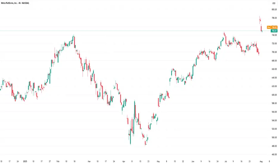
Meta Platforms (META) Shares DeclineMeta Platforms (META) Shares Decline
Shares of the US tech giant Meta Platforms (META) hit a record high last week, climbing above $780 following the release of a strong earnings report:
→ Earnings per share (EPS) came in at $7.14, significantly exceeding the forecast of $5.88.
→ The company also outperformed expectations on key metrics related to advertising growth.
→ Additionally, the media has highlighted the growing importance of AI technology to Meta’s business.
However, shortly after reaching an all-time high, META shares began to show bearish momentum.
Technical Analysis of the META Chart
On the four-hour chart, the following signals are visible:
→ A bearish engulfing pattern formed on Thursday;
→ A bearish gap appeared at Friday’s market open, followed by a continuation of the downward move.
This represents a notable pullback from the historical peak — potentially indicating that the initial bullish reaction to the earnings report has faded. The share price decline suggests a correction from overbought territory, as confirmed by the RSI indicator.
The $740 level appears to be a key support zone — previously acting as major resistance before the breakout. Bulls could also find support from the median line and the lower boundary of the ascending channel that has been developing since mid-May.
Given this context, a scenario in which bulls attempt to resume the uptrend within the ascending channel cannot be ruled out, especially considering the company’s strong fundamentals and the presence of multiple technical support levels.
This article represents the opinion of the Companies operating under the FXOpen brand only. It is not to be construed as an offer, solicitation, or recommendation with respect to products and services provided by the Companies operating under the FXOpen brand, nor is it to be considered financial advice.