Dollar Tree Surges on Strong Sales, Buybacks & UptrendDollar Tree (NASDAQ: DLTR) heads into the final stretch of 2025 with renewed momentum, supported by strong execution across pricing, merchandising, and store expansion. The company delivered a solid quarter, posting 9.4% net sales growth to $4.7 billion, driven by 4.2% same-store sales growth. Although store traffic dipped slightly, higher average ticket and a record-breaking Halloween season pushed revenue higher, highlighting the success of Dollar Tree’s multi-price strategy, now spanning 85% of its assortment at $2 or less. Gross margin expanded to 35.8%, while adjusted EPS reached $1.21, reinforcing early evidence that the shift toward diversified pricing is strengthening profitability.
Operationally, Dollar Tree is laying the groundwork for sustained growth. Year-to-date, the retailer has opened 106 new stores and converted 646 locations to its 3.0 multi-price format. Revenue is up 11% YTD to $13.9B, same-store sales have grown 5.4%, and cash flow from operations stands at $958.5M. Shareholder returns also remain robust: Dollar Tree has repurchased $1.5 billion in stock this year, with an additional $176 million bought shortly after quarter end, leaving $2 billion still authorized.
Looking ahead, management forecasts 4%–6% Q4 same-store sales growth and expects adjusted EPS of $2.40–$2.60, while raising full-year EPS guidance to $5.60–$5.80 on projected net sales of $19.35–$19.45B. The outlook reflects confidence in product mix improvements, pricing flexibility, and tariff-mitigation strategies heading into peak retail season.
Technical Outlook
The chart shows DLTR pressing into a long-term descending trendline acting as major overhead resistance. Price is currently around $115–$116, nearing this dynamic ceiling. A rejection could trigger a pullback toward the $105 zone, while a breakout above the trendline could open a bullish leg toward $150–$170. RSI is elevated, signaling potential near-term cooling before a decisive move.
Fundamental Analysis

How to properly seize gold trading opportunities?Gold Technical Analysis: Gold rebounded yesterday, finding support near the 5-day moving average, but as expected, it encountered resistance around 4230 and retreated to around 4195. Weaker-than-expected ADP non-farm payroll data caused another rebound to around 4241, but the price subsequently retreated again to around 4195. The daily chart ultimately closed with a bearish doji candlestick with an upper shadow. Reviewing yesterday's price action, although there was a rebound, it failed to break Tuesday's high, indicating market apprehension about Tuesday's bearish candlestick. The positive ADP data only pushed the high to around 4241, suggesting a weakening of bullish momentum. A short-term technical correction is possible. Based on the daily chart structure, the key support level to watch today is the 10-day moving average around 4180-4170, while the resistance level to watch is around 4230-4240.
Returning to the hourly chart, gold is currently trending upwards within a range. During the US session, consider a buy-on-dips strategy around the 4180-4170 area. If the previous high of 4230-4240 resistance fails to hold, then consider shorting. Plan your trade, trade your plan. There are no gods in this world; it's just about seeing one step ahead. When you've considered everything that might happen, victory is assured. In summary, today's gold trading strategy is to primarily buy on dips and secondarily sell on rallies. The key resistance level to watch in the short term is around 4230-4240, and the key support level is around 4180-4165. Please keep up with the pace.

FireHoseReel | Aster DEEP ReSearch: EP5 - Inside ASTER Economy🔥 Welcome To FireHoseReel !
Let's dive into Aster Deep ReSearch EP 5 - Inside the ASTER Token Economy
🪙 Token Launch & Hype
In September 2025, ASTER officially launched and instantly grabbed headlines. Within just days, its price surged over +2000%, reaching nearly $1.90, pushing Aster’s market cap beyond $3 billion. This explosive move was fueled by a powerful combo of marketing hype, backing from CZ, and a uniquely structured community rewards model.
🎁 Aster allocated over 50% of total supply to airdrops, liquidity incentives, and referrals — creating one of the widest token distributions in DeFi. Just 24 hours after launch, more than 330K new wallets were activated on the platform.
🧬 ASTER Token Utility – Not Just Governance
ASTER isn't just a passive governance token. Its utility spans multiple layers across the Aster ecosystem:
🗳 Governance: Token holders can vote on key protocol decisions and platform upgrades.
💸 Fee Discounts & Premium Access (future): Holding ASTER may unlock lower trading fees or access to Pro features, similar to Binance’s BNB model.
🎯 Liquidity Incentives: ASTER powers LP rewards, referral programs, and ecosystem growth incentives.
💰 Staking & Margin Collateral: Users can stake ASTER to earn ~5–7% APY and simultaneously use up to 80% of staked value as margin in Aster Pro.
🔥 Aster also introduced a token-burning mechanism (approx. 5–7% annually) to control inflation and support long-term price stability.
⚠️ Challenges Ahead
While the generous airdrop strategy helped bootstrap adoption, it also introduces inflation risk and potential sell pressure if demand doesn't scale.
Aster’s long-term success depends on deep integration of ASTER within trading, governance, and infrastructure — especially as it rolls out its own Layer-1 chain (Aster Chain) with native utilities tied to the token.

GOLD → Retest of consolidation support on uptrend FX:XAUUSD is trading in a sideways range around $4,200, awaiting new labor market data to determine the Fed's policy trajectory after December's rate cut.
Weak US data (a 32K decline in ADP employment and a slight increase in ISM services to 52.6) did not change market expectations. The probability of a 25 bp Fed rate cut on December 11 is around 90%. Attention has shifted to the trajectory of policy easing in early 2026. Key factors will be data on unemployment claims and sentiment on Wall Street.
The fundamental background is relatively positive, and the dollar has entered a correction phase due to expectations of lower rates, which may support the gold price...
Resistance levels: 4238, 4262
Support levels: 4185, 4175
Gold is testing the support levels of the key trading range. If the bulls keep the price above 4185 and form a bullish reversal pattern, then in the short and medium term, we can expect growth to intermediate highs.
Best regards, R. Linda!

ETHEREUM → The emergence of a positive driver?BINANCE:ETHUSDT is soaring amid a news rally and testing resistance at 3230. The daily increase was almost 20%. If growth is expected, then after a slight correction...
Fundamental background: the market reacted to rumors of the replacement of the Fed chairman with Kevin Hassett, who is more “dovish” and loyal to cryptocurrencies. The market broke the local structure and updated the interim maximum from 3070 to 3230. A false breakout of resistance is forming relative to the key resistance level, and the market is entering a correction/stagnation phase.
Bitcoin, the main driver of the cryptocurrency market, faced strong resistance at 95K. The global market trend is downward, and a change in trend will require time and more confirmation...
There is a struggle for resistance in the market, and several scenarios are possible: consolidation and a breakout of resistance, or growth after correction...
Resistance levels: 3230, 3370
Support levels: 3172 (local), 3057
High probability: a false breakout of 3230 will trigger a correction to 3050 (before the news). If the bulls keep the price above 3050, growth may continue as part of the change in the fundamental background.
BUT! If buyers keep the price without correction, then the focus will be on 3230. Consolidation above this level could trigger growth to 3370 - 3620.
Best regards, R. Linda!

Recent Gold Market Dynamics, Analysis, and Strategies!Gold rebounded yesterday, finding support around the 5-day moving average, but as expected, it encountered resistance near 4230 and retreated to around 4195. Influenced by the anticipated ADP non-farm payroll data, the price rebounded again to around 4241, but subsequently retreated back to around 4195. The daily chart ultimately closed with a bearish doji candlestick with an upper shadow. Reviewing yesterday's price action, although there was a rebound, it failed to break Tuesday's high, indicating market apprehension about Tuesday's bearish candlestick. Even the positive ADP data only pushed the high to around 4241, suggesting a weakening of bullish momentum. A technical correction is possible in the short term. Based on the daily chart structure, the key support level to watch today is the 10-day moving average around 4170, while the resistance level to watch remains around 4230-4240. Based on the hourly chart, gold may trade sideways today. There is short-term trendline resistance above, which coincides with the upper limit of the range around 4230-4240. Therefore, the 4230-4240 area can be considered a key resistance level today. On the downside, pay attention to the short-term support area around 4180-4170. If the intraday structure shifts downward, there is still a possibility of going back to around 4150.
In terms of trading strategy, gold is expected to remain range-bound today, maintaining a strategy of buying low and selling high within the 4240-4170 range. Avoid overly extended directional expectations; first observe the range, then look for a breakout. Watch for resistance around 4230-4240; a rebound failing to break this level would be a good entry point for short-term short positions. On the downside, watch for support around 4180-4170; a pullback and stabilization would present an opportunity to buy on dips.
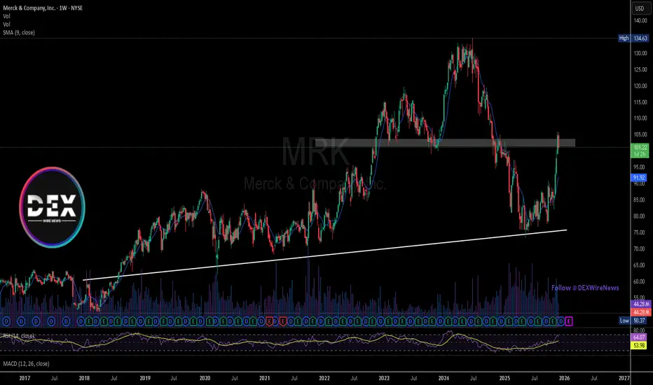
Merck & Co.(NYSE: $MRK): FDA Approvals & Key Rejection Zone TestMerck & Co. (NYSE: NYSE:MRK ) traded lower at $101.53 after receiving conditional FDA approval for two new cattle antiparasitic treatments—Exzolt Cattle-CA1 and Dectomax-CA1. The approvals target rising cases of New World screwworm larvae and fever ticks, two livestock threats that the FDA says could drive hundreds of millions in economic losses. The muted stock reaction reflects broader market caution rather than concern over Merck’s fundamentals.
Exzolt Cattle-CA1 is a pour-on solution designed to disrupt parasite growth, while Dectomax-CA1 uses the same active ingredient as fully approved Dectomax, allowing regulators to clear the drug without new safety or manufacturing submissions. The updated formula offers 21 days of reinfestation protection and maintains the same 35-day withdrawal period for treated cattle. The FDA highlighted the urgency of getting these solutions to producers as livestock risks rise heading into 2026.
Despite the regulatory win, Merck continues to underperform major indices. The stock is up just 5% YTD versus the S&P 500’s 16.57%, and the three-year return of 0.91% trails the index’s 68.38%. Still, Merck’s animal health segment remains an important revenue pillar and positions the company competitively as agricultural threats increase.
Technical Analysis
The weekly chart shows NYSE:MRK rallying strongly from long-term trendline support near $72–$75, reclaiming the $95 level and tapping into a major supply/rejection zone around $102. Price reacted sharply from that area, confirming it as resistance. A clean breakout above $102 could open a path toward $134, where the next structural high sits. If sellers remain active, support lies at $95, with deeper structure at $72.
Dollar General | DG | Long at $90.00Dollar General NYSE:DG took a massive hit this morning after revising their future earnings guidance. The economy is showing many signs of a recession, and this is a clear warning. From a technical analysis perspective, it has retouched my "crash" simple moving average and may dip further into the $80's in the near-term. But, like many overall strong companies that suddenly plummet, I view this as a future opportunity given the strength of NYSE:DG as a business (holistically). Dollar General is the only grocery and home goods store around in many rural locations. So, while there is doom and gloom in the near-term, Dollar General is in a personal buy zone at $90.00. I view this as a starter position, though, with the potential for future declines/opportunities for additional share accumulation in the near-term.
Target #1 = $100.00
Target #2 = $122.00
Target #3 = $200.00+ (very-long term outlook...)

$GLXY Galaxy Digital Inc. Earnings and Technical AnalysisQ3 Earnings Report Overview
On Tuesday, October 21, 2025 at 7:46 AM ET, Galaxy Digital Inc. (GLXY) released its third quarter earnings report for the period ended September 2025. The company announced earnings of $1.12 per share on revenue totaling $29.22 billion. This performance significantly surpassed the consensus estimates, which had projected earnings of $0.38 per share on revenue of $14.69 billion. Overall, Galaxy Digital Inc. exceeded expectations by 194.74%.
Company Background
Galaxy Digital Inc. is recognized as a global leader in digital assets and data center infrastructure. The company delivers innovative solutions aimed at accelerating advancements in finance and artificial intelligence.
Market Reaction and Technical Analysis
Despite reporting strong earnings and revenue figures, Galaxy Digital Inc.’s stock price declined by over 45% following the announcement. This unexpected reaction highlights the challenge of predicting investor sentiment based solely on earnings results. Recently, however, buyer interest has returned, as indicated by a rounded bottom formation on the stock chart. The stock broke above a previous resistance level and has also reclaimed the 20-day Exponential Moving Average (EMA).
Investment Approach
In response to these technical developments, a 1/4 size position was initiated with a stop set just below the previous day's low. The plan is to increase the position once the stock demonstrates a clear higher low and remains above the key resistance level.
Important Considerations
Readers are encouraged to conduct their own analysis and adhere to personal trading strategies. All investments carry inherent risk, and informed decision-making is crucial when allocating capital in financial markets.

Bank of Montreal Earnings Beat & U.S. Turnaround Gains TractionBank of Montreal (NYSE: NYSE:BMO ) reported a strong fourth quarter, supported by improving credit performance in its U.S. division and disciplined execution on its long-term growth strategy. Profit rose to $2.3 billion, helped by a sharp decline in provisions for bad loans as the bank continues to repair last year’s weakened U.S. loan book. Provisions for impaired loans in the U.S. business fell to $209M, down from $446M a year earlier, showing meaningful progress in stabilizing asset quality.
Chief risk officer Piyush Agrawal noted that watchlist formations continue to decline, positioning the bank for lower impaired balances over time. Alongside the credit improvement, BMO has hired more than 100 commercial bankers and private advisers in the United States to expand its loan pipeline. The bank also sold 138 underperforming U.S. branches while planning to open 150 new locations in higher-growth regions over the next five years.
These moves follow BMO’s US$16.3B Bank of the West acquisition, which significantly increased its U.S. footprint. The turnaround is starting to show: U.S. operations earned $807M, up from $281M last year. Capital markets also surged, contributing $521M, more than double last year’s $251M.
Adjusted EPS rose to $3.28, ahead of estimates, and revenue reached $9.34B, up from $8.96B. The bank raised its quarterly dividend to $1.67 per share, reflecting confidence in its medium-term goal of lifting ROE to 15%.
TECHNICALS
The weekly chart shows NYSE:BMO trading just above a key breakout zone around $123–$125, which previously acted as multi-year resistance. Holding above this level keeps momentum bullish and opens a path toward $131–$135 highs. Support sits at $110, with deeper structure support near $85 if macro conditions weaken. MA trend remains positive.

Sentiment-driven swings as Ethereum awaits FusakaSentiment-driven swings as Ethereum awaits Fusaka
Technical Analysis
1. After a few months of downtrend, ETHUSD rebounded significantly after finding support around the 61.8% Fibonacci retracement level near 2700.
2. Although price has formed higher swings, it is still too early to call a bullish reversal, as the bearish EMA stack continues to signal a bearish momentum, and the price has been in a downtrend for an extended period.
3. Price still has chance to pull back, a break below the support at 2700 would open the way toward the next support around 2110, near the 78.6% Fibonacci retracement.
4. Alternatively, if the downtrend has already ended, ETHUSD may consolidate sideways for a while.
Fundamental Analysis
5. High leverage in the market triggers cascading liquidations during sell-offs. Leverage conditions in the derivatives market amplify short-term volatility for ETH, rather than altering the long-term trend, although this has caused severe price swings at the moment. Consequently, the current price movement is due to market sentiment rather than fundamentals.
6. Currently, the market expects a Fed rate cut, driving fund flow into risky assets, including tech stocks and crypto, which also support the price.
7. Ethereum’s next major milestone is the Fusaka Upgrade, which aims to enhance network capabilities, increase the block gas limit, and lower costs for Layer 2 solutions. This marks the second major hard fork of the year, following Pectra. Several studies suggest that major upgrades are often followed by price appreciation in the subsequent period, after short-term volatility surrounding the upgrade date.
8. Therefore, amidst this lack of significant catalysts, prices may remain volatile for some time while awaiting the next crypto cycle to drive momentum.
Analysis by: Krisada Yoonaisil, Financial Markets Strategist at Exness

GJ Potential SellsWhen/If price closes below the horizontal line, sell to target. Price bounced off the horizontal line but buyers got exhausted and price fell below the line. Now price retraced back up to test out the highs, so if price closes back below the line..I will be selling to target.

Meme-Stock Darling GameStop Is -25% YTD. What Its Chart ShowsOne-time meme-stock darling GameStop NYSE:GME has fallen more than 25% year to date and trails the S&P 500 SP:SPX in almost every time period from one month to five years. What does GME's chart and fundamental analysis say as the video-game/collectibles retailer prepares to report earnings next week?
Let's take a look:
GameStop's Fundamental Analysis
GME will go to the tape with the firm's fiscal Q3 results after the close of business next Tuesday.
The company isn't well covered by analysts, but the one estimate that I can find calls for $0.20 in adjusted earnings per share on roughly $987.3 million of revenue.
Numbers like that would compare very well to the same period a year ago, with adjusted EPS up 233.3% from the $0.06 that GME reported in fiscal Q3 2024 and revenues some 15% higher from the year-ago quarter's $860.3 million.
The firm is also coming off a strong fiscal Q2, where it easily beat expectations for both earnings and revenue.
GameStop's Technical Analysis
Now let's take a look at GME's chart going back some seven months and running through Tuesday afternoon:
What we have here is a falling-wedge pattern of bullish reversal, as marked with the two blue, heavy diagonal lines that take up almost the entire chart.
Now, this matters, as an ascending triangle -- marked above with thinner blue lines, and which this chart comes close to actually showing -- would be a pattern of bearish continuance.
GameStop rebounded off of the falling wedge's lower trendline in late November and is currently trying to retake its 50-day Simple Moving Average (or "SMA," marked with a curvy blue line in the tan-shaded area's center). Doing that could get some professional money behind the stock.
That's key, as the shares have recently taken and held their 21-day Exponential Moving Average (or "EMA," denoted by the curvy green line above). Taking and holding the 21-day EMA implies some support from the swing crowd.
One could see the 50-day SMA as GameStop's current upside pivot, but my feeling is that the 200-day SMA (the red line above) will matter much, much more.
Yes, the 200-day line is usually seen as more important than the 50-day one -- but in this case, that red line is running almost concurrently with the falling wedge's upper trendline.
Meanwhile, GME's other technical indicators are showing signs of improvement as well.
For instance, readers will see that the stock's Relative Strength Index (or "RSI," marked with a gray line at the chart's top) has quickly gone from technically oversold to neutral to much better than neutral in less than two weeks.
And look at GME's Moving Average Convergence Divergence indicator, marked with black and gold lines and blue bars at the chart's bottom.
The 12-day EMA (the black line) and 26-day EMA (the gold line) are both running below the zero-bound, but the 12-day line has crossed over the 26-day one. That's a subtle technical positive.
More overtly, the histogram of the 9-day EMA the (blue bars) has already moved above zero, which is a short-term bullish technical signal.
An Options Option
Some options investors looking to take advantage of this moderately bullish set-up while not using much capital might set a three-part options trade, called a "combination" in this situation.
This would involve selling a lower put, buying a call and selling a higher call -- with all three expiring on the same day but having different strike prices. Here's an example:
-- Purchase one GME call at a $24.50 strike price -- the falling wedge's upper trendline -- and a Dec. 12 expiration (i.e., after Tuesday's earnings). This would cost about $0.70 at recent prices.
-- Sell one GME Dec. 12 $27 call for roughly $0.32 at recent levels.
-- Sell one GME Dec. 12 $20 put, which was trading at about $0.22 as I wrote this.
Net Debit: $0.16.
In this case, the trader wants to get long the shares, but only if GME breaks out of the falling-wedge pattern.
To do so inexpensively, the trader buys a call with a strike price equal to the pattern's upper trendline. But to reduce costs, the trader also sells a put with the $27 strike, turning this portion of the set-up into a simple bull-call spread.
Additionally, the trader sells a put with a strike price that's at the falling wedge's lower trendline to further lower costs (because he or she is OK with actually buying the shares at a discount if this put is exercised).
Best case, the trader's theoretical maximum gain is $2.50 on a set up that only cost $0.16 -- a $2.34 net profit.
Worst case, the trader ends up long 100 GME shares at a $20.16 net basis at a time when the shares are trading below $20.
(Moomoo Technologies Inc. Markets Commentator Stephen "Sarge" Guilfoyle had no position in GME at the time of writing this column.)
This article discusses technical analysis, other approaches, including fundamental analysis, may offer very different views. The examples provided are for illustrative purposes only and are not intended to be reflective of the results you can expect to achieve. Specific security charts used are for illustrative purposes only and are not a recommendation, offer to sell, or a solicitation of an offer to buy any security. Past investment performance does not indicate or guarantee future success. Returns will vary, and all investments carry risks, including loss of principal. This content is also not a research report and is not intended to serve as the basis for any investment decision. The information contained in this article does not purport to be a complete description of the securities, markets, or developments referred to in this material. Moomoo and its affiliates make no representation or warranty as to the article's adequacy, completeness, accuracy or timeliness for any particular purpose of the above content. Furthermore, there is no guarantee that any statements, estimates, price targets, opinions or forecasts provided herein will prove to be correct.
Options trading is risky and not appropriate for everyone. Read the Options Disclosure Document ( j.moomoo.com ) before trading. Options are complex and you may quickly lose the entire investment. Supporting docs for any claims will be furnished upon request.
Options trading subject to eligibility requirements. Strategies available will depend on options level approved.
Maximum potential loss and profit for options are calculated based on the single leg or an entire multi-leg trade remaining intact until expiration with no option contracts being exercised or assigned. These figures do not account for a portion of a multi-leg strategy being changed or removed or the trader assuming a short or long position in the underlying stock at or before expiration. Therefore, it is possible to lose more than the theoretical max loss of a strategy.
Moomoo is a financial information and trading app offered by Moomoo Technologies Inc. In the U.S., investment products and services on Moomoo are offered by Moomoo Financial Inc., Member FINRA/SIPC.
TradingView is an independent third party not affiliated with Moomoo Financial Inc., Moomoo Technologies Inc., or its affiliates. Moomoo Financial Inc. and its affiliates do not endorse, represent or warrant the completeness and accuracy of the data and information available on the TradingView platform and are not responsible for any services provided by the third-party platform.

LRN – Short-Term Bounce Idea (3–5% Profit)
LRN dropped sharply from $156 → $60 mainly due to enrollment issues, not weak fundamentals. The company is strong and experienced, so this type of panic sell-off often creates fast bounce opportunities.
🔍 Why a Bounce Makes Sense
• 📉 Extremely oversold indicators
• 🧨 Panic-driven drop (likely overreaction)
• 🏢 Solid fundamentals remain intact
• 📊 Volume spike = sellers exhausted
🎯 Strategy
Short-term only. Targeting 3–5% quick profit as the stock stabilizes and reacts from oversold levels.
📈 Long Term
LRN may also be suitable for a long-term hold once enrollments recover.
XAUUSD H1 BULLISH REVERSAL SETUP Bias: Short-term Bullish as long as support holds Key Levels to Watch Support Zone: (Use your chart’s demand level — price is currently reacting from a bullish zone) Resistance Zone: (Your chart’s previous swing high / supply) Buying Idea If Gold stays above the support zone and shows bullish confirmation (H1 bullish candle / rejection wick), you can look for buy setups. Possible Targets: TP1: Nearest H1 resistance TP2: Previous swing high TP3: Fresh supply zone on the H1 chart Selling Idea If Gold breaks below the support zone with strong bearish momentum, a short-term drop is possible. Possible Targets: TP1: Nearest minor support TP2: Previous H1 low TP3: Strong demand zone below


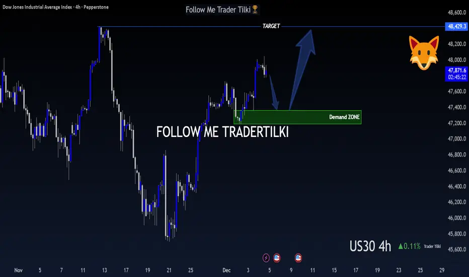
US30 (DOW JONES) – 4-Hour Timeframe Tradertilki AnalysisMy friends,
I have analyzed US30 on the 4-hour timeframe.
My friends, if US30 reaches the levels between 47,361 and 47,192, I will open a buy position.
My target will be the 48,429 level.
My friends, I share these analyses thanks to each like I receive from you.
Your likes increase my motivation and encourage me to support you in this way.🙏
Thank you to all my friends who support me with their likes.❤️
The DXY has room to reboundThe DXY has room to rebound from the 98.848 level after the decline in new unemployment claims.
A stronger labor reading signals fewer layoffs and a resilient U.S. economy, reducing the likelihood of near-term Fed rate cuts.
Sticky rate expectations and stronger yield support typically lift the dollar, giving the DXY a bullish bias from current levels.

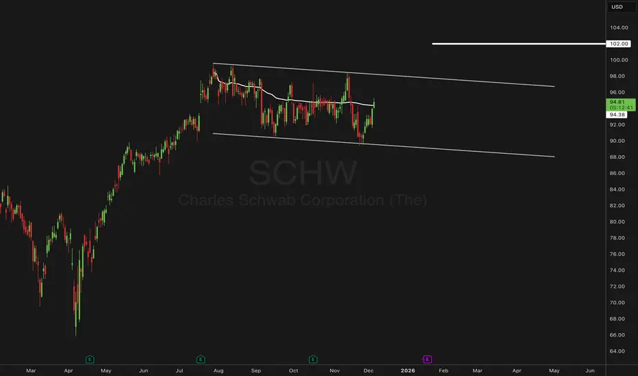
SCHW | Bull-Flag Structure & AVWAP Break with a 102 TargetSCHW has been trading inside a broad bull-flag channel since late summer. This week’s price action broke above the anchored VWAP, a level that has repeatedly acted as a mean-reversion barrier during this consolidation. The breakout shifts focus toward the upper boundary of the flag and the next area of interest near $102.
The $102 zone represents just over a 7% move from breakout levels. This is important because this sits inside the 75th percentile of the stock’s historical return distribution. In other words, it’s a move that is historically frequent enough to be statistically reasonable while still offering meaningful extension. It also remains comfortably within SCHW’s typical monthly standard deviation (~11%), keeping the scenario aligned with the stock’s normal volatility profile.
Scenarios:
If price holds above the anchored VWAP → momentum could extend toward the flag’s upper rail and the 102 zone.
If price slips back below VWAP → the pattern may revert into further range-bound behavior within the existing flag.
$102 is the key upside zone—a statistically reasonable extension and the next decision point if the bull-flag breakout holds.
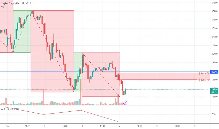
03-2025-12-04-SYK-Downtrend-Short-8.5SYK:
Short Position with Downtrend
Scorecard: 8.5
S: 366.92
E: 365.97
T: 362.69
Shares:105.26
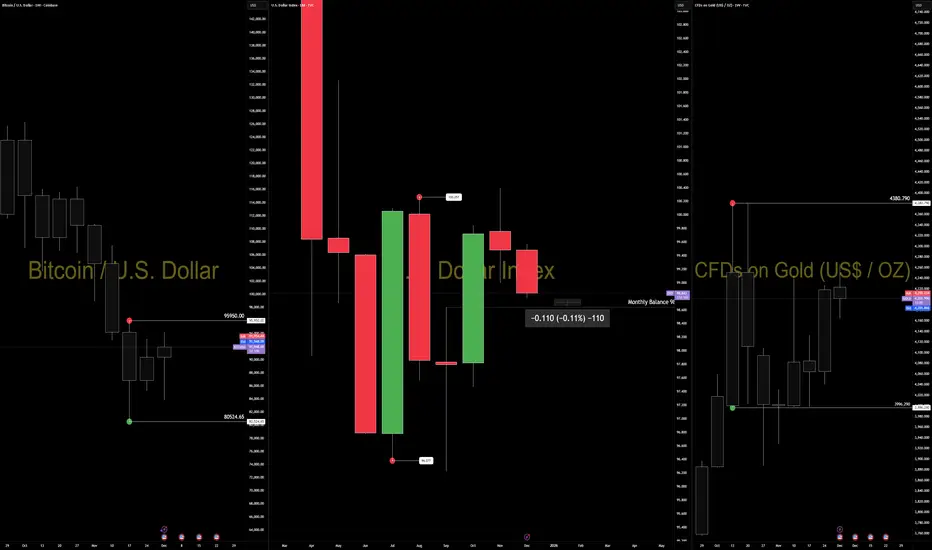
The Dollar Is Compressing Into 98.635 — Macro Pressure Meets StrThe dollar has been under steady macro pressure all week.
Rate cut expectations, softer yields, and liquidity repricing have weakened the USD across the board.
We’ve seen the same conditions lift EURUSD, gold, and BTC — not because those markets react to DXY levels, but because they respond to the same macro drivers.
That is the correct interpretation.
Now the structural question is simple:
DXY is sitting less than 0.11% above monthly balance and pressing into 98.635 — the level algorithms historically defend.
This is the inflection.
If 98.635 holds:
USD stabilizes, stretched rotations cool, and we likely see counterflow in EUR, gold, and BTC.
If 98.635 breaks:
Macro pressure accelerates, and the next leg of dollar weakness opens with far more momentum.
The key distinction:
FA explains the pressure.
TA defines the resolution.
Cross-asset strength today isn’t randomness.
It’s macro conditions expressed differently across instruments while USD approaches the structural point where the next phase becomes obvious.
Watch 98.635.
Structure will answer what fundamentals only set up.
— CORE5DAN
Institutional Logic. Modern Technology. Real Freedom.
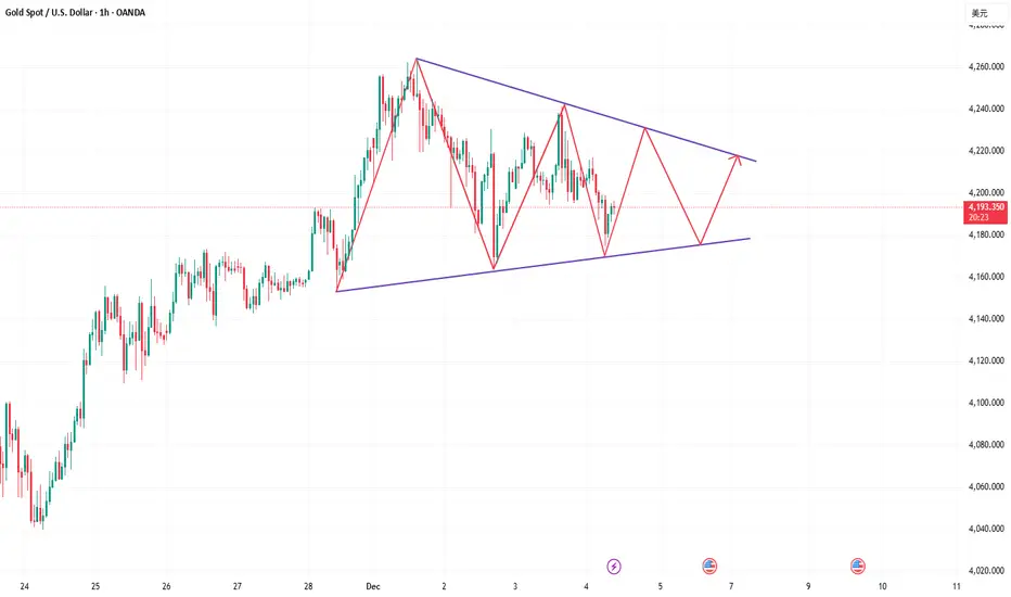
Perfectly captured the intraday gold price trend!Gold Technical Analysis: Gold's volatility today was smaller than expected. It opened near 4200, rebounded, weakened and pulled back after approaching 4230, then rebounded again near 4194. The overall range was less than $50. Recent gold price movements have been volatile, mainly due to the approaching Fed rate cut, market volatility from economic data and official speeches, leading to poor continuity in gold's price action. However, any significant pullbacks have been followed by rapid rebounds. Furthermore, the rising expectation of a rate cut continues to provide support for gold. Therefore, we have been sharing a buy-on-dips strategy recently, and today's opportunities for both long and short positions were accurately captured. Those who are currently out of the market can continue to enter long positions on pullbacks.
On the hourly chart, gold's current trend is one of upward oscillation. During the US session, consider a buy-on-dips strategy around 4200-4180. If the previous high of 4250-4260 resistance fails to hold, then consider shorting. Plan your trade, trade your plan. There are no gods in this world; it's just a matter of seeing one step ahead. In summary, today's gold trading strategy is to primarily buy on dips and secondarily sell on rallies. The key resistance level to watch in the short term is around 4250-4260, and the key support level is around 4200-4180. Please keep up with the pace.

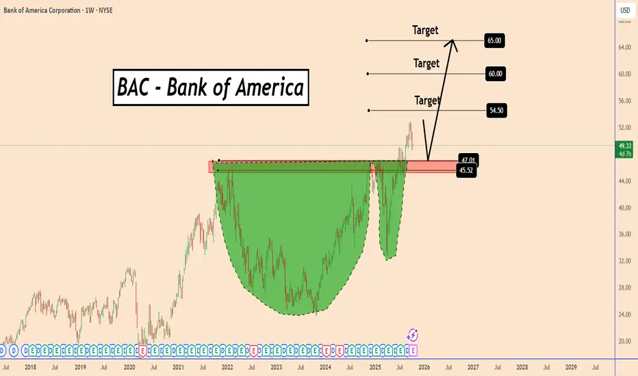
BAC Completed a Cup and Handle Model - Get Ready for a BounceBAC Completed a Cup and Handle Model - Get Ready for a Bounce
The cup and handle pattern is a bullish continuation pattern.
The BAC weekly chart displays a large, rounded bottom that formed over several years, indicating long-term accumulation.
After breaking above the key resistance around $45.50–$47.00, the price pulled back to retest this zone, which is now acting as strong support.
BAC broke out in a solid way the top created on December 2021 thus indicating for signs of a stronger bullish momentum.
As long as the BAC price stays above this area, the trend remains bullish, with potential upside targets near $54.50, $60, and $65.
Support zone: $45.50 – $47.00
Targets:
$54.50
$60.00
$65.00
You may find more details in the chart!
Thank you and Good Luck!
❤️PS: Please support with a like or comment if you find this analysis useful for your trading day❤️