Mastering chart patterns - How to use them in trading!Chart patterns are visual formations created by the price movements of a financial asset—like a stock, currency, or cryptocurrency, on a price chart. Traders use these patterns in technical analysis to predict future market direction based on historical behavior. The main chart patterns are the reversal and continuation patterns.
-------------------------------
What will we discuss?
- Bullish reversal patterns
- Bearish reversal patterns
- Bullish continuation patterns
- Bearish continuation patterns
-------------------------------
Bullish reversal patterns:
Double bottom
A double bottom in trading is a bullish reversal pattern that signals the potential end of a downtrend and the beginning of an uptrend. It forms when the price of an asset falls to a low, bounces back up, then drops again to roughly the same low before rising once more. This creates a "W" shape on the chart.
How to trade it:
Before entering a trade, wait for the price to break back above the neckline with strong volume, as this indicates a potential bullish reversal. Once the breakout is confirmed, look for an entry on the pullback to the neckline.
Inverted head and shoulders
An inverted head and shoulders is a bullish reversal pattern that typically forms after a downtrend and signals a possible shift to an uptrend.
It consists of three parts:
* The left shoulder, where the price makes a low and then bounces.
* The head, which is a deeper low followed by another bounce.
* The right shoulder, a higher low similar in level to the left shoulder.
How to trade it:
Before entering a trade, wait for the price to break above the neckline with strong volume, as this confirms the pattern and signals a potential upward move. After the breakout, it's important to wait for a retest of the neckline to look for an entry. Traders typically place a stop-loss just below the right shoulder to manage risk.
Falling wedge
A falling wedge is a bullish chart pattern that often signals a potential reversal or continuation of an uptrend, depending on where it forms in a price trend.
It appears when the price is moving lower but within a narrowing range, creating two downward-sloping, converging trendlines. Both the highs and lows are falling, but the lower highs are coming down faster than the lower lows, which shows that selling pressure is losing strength over time.
How to trade it:
Wait for the falling wedge to break above the downward trendline and for the price to reclaim the most recent lower high. A breakout alone isn’t always reliable, sometimes the price moves briefly above the trendline without making a higher high, resulting in a fake-out. To confirm the move, wait for a clear higher high and then look to enter on the retracement that follows.
-------------------------------
Bearish reversal patterns
Double top
A double top is a bearish reversal pattern that signals a potential shift from an uptrend to a downtrend.
It forms when the price reaches a high, pulls back, then rallies again to the same or similar high but fails to break above it. This creates an "M" shape on the chart. The neckline is the support level at the low point between the two peaks. When the price breaks below this neckline with strong volume, it confirms the pattern and suggests that selling pressure is taking over.
How to trade it:
Before entering a trade, wait for the price to break below the neckline with strong volume, as this indicates a potential bearish reversal. Once the breakout is confirmed, look for an entry on the pullback to the neckline.
Head and shoulders
A head and shoulders is a bearish reversal pattern that typically forms after an uptrend and signals a potential shift to a downtrend.
It consists of three peaks:
* The left shoulder, where the price rises and then falls.
* The head, which is a higher peak followed by another decline.
* The right shoulder, a lower high that is roughly equal in height to the left shoulder.
How to trade it:
Before entering a trade, wait for the price to break below the neckline with strong volume, as this confirms the pattern and signals a potential downside move, After the breakout, it’s important to wait for a retest of the neckline to look for an entry. Traders typically place a stop-loss just above the right shoulder to manage risk
Rising wedge
A rising wedge is a bearish chart pattern that often signals a potential reversal or continuation of an downtrend, depending on where it forms in a price trend.
It appears when the price is moving higher but within a narrowing range, creating two upward-sloping, converging trendlines. Both the highs and lows are rising, but the highs are increasing at a faster rate than the lows. This suggests that buying pressure is weakening over time, and the market may be preparing for a downturn.
How to trade it:
Wait for the rising wedge to break below the upsloping trendline and for the price to reclaim the most recent high low. A breakout alone isn’t always reliable, sometimes the price moves briefly below the trendline without making a lower low, resulting in a fake-out. To confirm the move, wait for a clear lower low and then look to enter on the retracement that follows.
-------------------------------
Bullish continuation patterns
Bullflag
A bull flag is a continuation pattern that signals the potential for a price to continue moving upward after a brief consolidation or pullback.
It forms when the price experiences a strong upward move (the flagpole), followed by a period of consolidation or a slight downward movement (the flag). The flag typically slopes downward or moves sideways, and the consolidation phase usually occurs within two parallel trendlines, creating a rectangle or slight downward channel.
How to trade it?
Before entering a position, wait for the price to break above the downsloping trendline and establish a higher high. If the price doesn’t make a higher high, it could be a fake-out. Once a higher high is confirmed, look for an entry on the retracement. The target is typically the length of the flagpole projected upward from the breakout point.
Bullish pennant
A bullish pennant is a continuation pattern that indicates the potential for a price to continue its upward trend after a brief consolidation. It forms when a strong upward move (the flagpole) is followed by a period of consolidation, where the price moves within converging trendlines, creating a small symmetrical triangle or pennant shape. The consolidation typically shows lower highs and higher lows, and the pattern suggests that the market is taking a "breather" before continuing its upward momentum.
How to trade it?
Before entering a position, wait for the price to break above the downsloping trendline and establish a higher high. If the price doesn’t make a higher high, it could be a fake-out. Once a higher high is confirmed, look for an entry on the retracement. The target is typically the length of the flagpole projected upward form the breakout point.
Ascending triangle
An ascending triangle is a bullish continuation pattern that typically forms during an uptrend, signaling that the price is likely to continue moving higher.
It is characterized by a horizontal resistance line at the top, formed by a series of peaks at roughly the same price level, and an ascending support line at the bottom, formed by higher lows. This creates a triangle shape, where the price is gradually compressing between the horizontal resistance and the rising support.
How to trade it?
Before entering a position, wait for the price to break above the horizontal resistance level with strong volume. Once the breakout occurs, look for an entry on the retracement back to this area.
-------------------------------
Bearish continuation patterns
Bearflag
A bear flag is a bearish continuation pattern that suggests the price is likely to continue moving downward after a brief consolidation or upward pullback.
It forms when there is a strong downward move (the flagpole), followed by a period of consolidation or slight upward movement (the flag). The flag typically slopes upward or moves sideways, and the consolidation occurs within two parallel trendlines, creating a rectangular or upward-sloping channel. This pattern shows that, despite the short-term pullback, the overall downtrend remains intact.
How to trade it?
Before entering a position, wait for the price to break below the upsloping trendline and establish a lower low. If the price doesn’t make a lower low, it could be a fake-out. Once a lower low is confirmed, look for an entry on the retracement. The target is typically the length of the flagpole projected downward for the breakout point.
Bearish pennant
A bearish pennant is a bearish continuation pattern that signals a potential continuation of a downtrend after a brief consolidation.
It forms when there is a strong downward move (the flagpole), followed by a period of consolidation where the price moves within converging trendlines, creating a small symmetrical triangle or pennant shape. The consolidation typically shows lower highs and higher lows, indicating that the price is taking a pause before continuing its downward movement.
How to trade it?
Before entering a position, wait for the price to break below the upsloping trendline and establish a lower low. If the price doesn’t make a lower low, it could be a fake-out. Once a lower low is confirmed, look for an entry on the retracement. The target is typically the length of the flagpole projected downward for the breakout point.
Descending triangle
A descending triangle is a bearish continuation pattern that typically forms during a downtrend, indicating that the price is likely to continue moving lower after a period of consolidation.
The pattern is characterized by a horizontal support line at the bottom, formed by a series of lows at approximately the same price level, and a descending resistance line at the top, formed by a series of lower highs. The price contracts between these two trendlines, creating a triangle shape with a downward-sloping upper boundary and a flat lower boundary.
How to trade it?
Before entering a position, wait for the price to break below the horizontal support level with strong volume. Once the breakout occurs, look for an entry on the retracement back to this area.
-------------------------------
Thanks for your support.
- Make sure to follow me so you don't miss out on the next analysis!
- Drop a like and leave a comment!
Community ideas

Don't Miss Out! Mastering Elliot Waves : 3 Essential PrinciplesHello friends!
Welcome to RK_Chaarts !!
Let's dive into the ruling principles of Elliot Waves that we cannot violate. There are three key principles:
1. Wave 2 will never Retrace more than 100% of wave 1
2. Wave 3 will never be the shortest among the three impulses (1, 3, and 5).
3. Wave 4 will never enter the territory of wave 1 (except in diagonals or triangles, where wave 4 can overlap with wave 1).
In this post, we'll explore how to apply these principles to analyze and solve the puzzle of a complete chart. We'll use a live example from the chart of SAMVARDHNA MOTHERSON, which is a tough and technically challenging chart. However, using Elliot Wave principles, we'll attempt to solve it.
Please note that this post is for educational purposes only and should not be considered as trading advice. We'll discuss potential scenarios, alternative possibilities, and "what-if" situations.
I hope you find this post helpful and informative. It's a comprehensive explanation in Hindi, and I'm confident that you'll gain valuable insights from it.
Happy learning!
I am not Sebi registered analyst.
My studies are for educational purpose only.
Please Consult your financial advisor before trading or investing.
I am not responsible for any kinds of your profits and your losses.
Most investors treat trading as a hobby because they have a full-time job doing something else.
However, If you treat trading like a business, it will pay you like a business.
If you treat like a hobby, hobbies don't pay, they cost you...!
Hope this post is helpful to community
Thanks
RK💕
Disclaimer and Risk Warning.
The analysis and discussion provided on in.tradingview.com is intended for educational purposes only and should not be relied upon for trading decisions. RK_Chaarts is not an investment adviser and the information provided here should not be taken as professional investment advice. Before buying or selling any investments, securities, or precious metals, it is recommended that you conduct your own due diligence. RK_Chaarts does not share in your profits and will not take responsibility for any losses you may incur. So Please Consult your financial advisor before trading or investing.

ONDO/USDT Technical Analysis – 4H TimeframeThe price is trading within an ascending channel and currently testing support. A bullish divergence on the MACD suggests a potential upward move in the near term.

Learn KEY PRINCIPLES of Technical Analysis in Gold Forex Trading
In the today's article, we will discuss the absolute basics of trading - 3 key principles of technical analysis in Forex & Gold Trading.
1️⃣History Repeats
History tends to repeat itself in the Forex market.
Certain trends are cyclical and may reemerge in a predictable manner, certain key levels are respected again and again over time.
Take a look at the example:
Silver perfectly respected a historical horizontal resistance in 2011 that was respected in 1980 already. Moreover, the price action before and after the tests of the underlined zone were absolutely identical.
2️⃣Priced In
All relevant information about a currency pair: economical and political events, rumors, and facts; is already reflected in a price.
When the FED increased the rate 26th of July by 25 bp, EURUSD bounced instead of falling. Before the rate hike, the market was going down on EXPECTATIONS of a rate hike. The release of the news was already price in.
3️⃣Pattern DO Work
Some specific price models can be applied for predicting the future price movements.
Technicians strongly believe that certain formations - being applied and interpreted properly, can give the edge on the market.
Depending on the trading style, different categories of patterns exist: harmonic patterns, price action patterns, wave patterns, candlestick patterns...
Above, I have listed various price action patterns that are applied by many traders and investors as the main tool for analyzing the financial markets.
If you believe in these 3 principles, you are an inborn technician!
Study technical analysis and learn to apply these principles to make money in trading.
b]❤️Please, support my work with like, thank you!❤️
I am part of Trade Nation's Influencer program and receive a monthly fee for using their TradingView charts in my analysis.

Unlock Trading Success with Multi-Timeframe MasteryIn trading, particularly in the Forex market, a well-defined strategy is crucial for consistent profitability. One of the most effective techniques used by successful traders is multi-timeframe (MTF) analysis. By examining price action across different timeframes (e.g., daily, 4-hour, 1-hour), traders gain a clearer understanding of market structure, trend direction, and optimal entry/exit points. This article explores how MTF analysis works, its benefits, and practical steps to implement it in your trading.
🔍1. Analyzing a Pair Across Multiple Timeframes for Clearer Trend Direction
The foundation of MTF analysis lies in identifying the major and minor trends. By analyzing at least two timeframes, traders can align their strategies with the broader market direction while fine-tuning entries on shorter timeframes.
⚡The High Wave Cycle (HWC) Approach
To begin, determine your High Wave Cycle (HWC), which depends on your trading strategy and timeframe. For instance:
If you trade on the daily timeframe, your HWC might be the monthly chart.
If you trade on the 1-hour timeframe, your HWC could be the weekly chart.
The HWC helps you identify the major trend. For example, on the daily chart, you might analyze the trend using Dow Theory, pinpoint key support and resistance levels, and identify trendlines or patterns. This gives you a clear picture of the market’s broader direction.
Once the HWC is defined, give it significant weight when analyzing lower timeframes for trade setups. For instance, if the daily chart (HWC) shows a downtrend, you’d prioritize bearish setups on the 1-hour chart, even if a minor uptrend appears.
Example: SOLUSDT Trade Setup
Consider a scenario where the 1-hour chart shows a strong uptrend. The price breaks a key resistance level and a descending trendline, suggesting a potential long position.
However, checking the daily chart..
(HWC) reveals a clear downtrend. According to Dow Theory, a major trend reversal requires a confirmed break above the previous high (e.g., $150). Since this hasn’t occurred, the market remains bearish.
In this case, MTF analysis guides your strategy:
Reduce position size to lower risk, as you’re trading against the major trend.
Take profits early, as the price could reverse at any moment.
Avoid overtrading by limiting the number of positions until the trend change is confirmed.
This approach ensures your trades are aligned with the bigger picture, minimizing losses from false signals.
🎯2. Spotting Entries and Exits by Confirming Trends Across Timeframes
MTF analysis not only enhances risk management but also improves the precision of your entries and exits. By confirming signals across timeframes, you can filter out noise and focus on high-probability trades.
Example: Bitcoin (May 15, 2021)
Let’s rewind to May 15, 2021, during Bitcoin’s post-bull run correction. On the daily chart (HWC), the price formed lower highs and lows, breaking a key support level, signaling a bearish trend and a potential exit for long positions. This indicates that spot traders should sell, and swing traders on lower timeframes should focus exclusively on short positions.
On the 1-hour chart, you might spot a minor pullback, tempting a long trade. However, MTF analysis reminds you to align with the daily downtrend, so you’d only consider short setups. This disciplined approach prevents you from trading against the major trend, improving your win rate.
📊The Medium Wave Cycle (MWC) for Added Clarity
Between the HWC and lower timeframes lies the Medium Wave Cycle (MWC), which provides an intermediate perspective. For example, if your HWC is the daily chart, the MWC might be the 4-hour chart. The MWC helps confirm the major trend’s strength or detect early signs of reversals before zooming into lower timeframes for entries. By checking the MWC, you can filter out noise and ensure your trades align with both the major and intermediate trends.
💡Conclusion
Multi-timeframe analysis is a game-changer for traders seeking consistency and precision. By combining the major trend from your HWC, the intermediate perspective from your MWC, and minor trends on lower timeframes, you can make informed decisions, manage risk effectively, and time your trades with confidence.
Start by defining your HWC and MWC, analyzing the major trend, and aligning your entries and exits with multiple timeframes. Pick a pair, test this strategy on a demo account, and share your results in the comments below! With practice, MTF analysis will give you a tactical edge in navigating the markets.
🤍 btw im Skeptic :) & If you found this article helpful, don’t forget to like, share, and follow for more insights and trading strategies! <3

SPY/QQQ Plan Your Trade Update : Behind The Scenes ResearchI want to say thank you to all of you and to share with you all the work/resources/servers/and other data I maintain to help me identify where and how the markets will present opportunities to all of us.
This video shows you a bit of the behind-the-scenes work I do and some of my proprietary modeling systems.
I'm not sharing this with you to try to win you over or to tell you I do more than anyone else in terms of research. I'm sure there are many others who go much further than I do in terms of trying to dissect the markets and the opportunities available.
But I do believe I deliver very unique research, which is a one-of-a-kind solution for traders.
Again, I'm not 100% accurate (I wish I were).
But I am trying to share some of the decision-making solutions I use to understand where the markets are likely to move over the next 2- 4+ months and how traders can profit from my research.
Remember, you are only seeing about 10% of my total research, tools, modeling systems, and capabilities in these Plan Your Trade videos.
I want to thank all of you who continue to value my work. It is not easy. It takes money, time, and resources to continue to monitor all of these systems/algos.
The end result, I believe, is one of the most unique future/current modeling system resources you can find anywhere.
Again, thank you for making my research a success. I promise to do more and improve my tools over the next 12+ months for everyone to find better profits.
Get some.
#trading #research #investing #tradingalgos #tradingsignals #cycles #fibonacci #elliotwave #modelingsystems #stocks #bitcoin #btcusd #cryptos #spy #gold #nq #investing #trading #spytrading #spymarket #tradingmarket #stockmarket #silver

The Golden Grain: Trading Corn in Global Markets🟡 1. Introduction
Corn isn’t just something you eat off the cob at a summer barbecue — it’s one of the most widely traded agricultural commodities in the world. Behind every kernel lies a powerful story of food security, global trade, biofuels, and speculative capital.
Whether you’re a farmer managing risk, a trader chasing macro trends, or simply curious about how weather affects global prices, corn futures sit at the crossroads of agriculture and finance. In this article, we’ll explore what makes corn a global economic driver, how it behaves as a futures product, and what traders need to know to approach the corn market intelligently.
🌎 2. Where Corn Grows: Global Powerhouses
Corn is cultivated on every continent except Antarctica, but a handful of countries dominate production and exports.
United States – By far the largest producer and exporter. The “Corn Belt” — spanning Iowa, Illinois, Indiana, Nebraska, and parts of Ohio and Missouri — produces the majority of U.S. corn. U.S. exports also set global benchmarks for pricing.
Brazil & Argentina – These two South American powerhouses are crucial to the global corn supply, especially during the Northern Hemisphere’s off-season.
China – Though a top producer, China consumes most of its own supply and has become a key importer during deficit years.
Corn is typically planted in the U.S. between late April and early June and harvested from September through November. In Brazil, two crops per year are common — including the important safrinha (second crop), harvested mid-year.
Understanding where and when corn is grown is vital. Weather disruptions in any of these regions can ripple through the futures market within hours — or even minutes.
💹 3. Corn as a Futures Market Power Player
Corn is one of the most liquid agricultural futures markets in the world, traded primarily on the CME Group’s CBOT (Chicago Board of Trade). It attracts a diverse set of participants:
Producers and Commercials: Farmers, ethanol refiners, and food manufacturers use corn futures to hedge price risk.
Speculators and Funds: Hedge funds and retail traders speculate on corn price direction, volatility, and seasonal patterns.
Arbitrageurs and Spreads: Traders bet on relative price differences between contracts (e.g., old crop vs. new crop spreads).
The deep liquidity and relatively low tick size make corn accessible, but its price is highly sensitive to weather, government reports (like WASDE), and international trade policies.
🏗️ 4. CME Group Corn Futures: What You Can Trade
The CME Group offers both standard and micro-sized contracts for corn. Here’s a quick overview:
o Standard Corn
Ticker: ZC
Size = 5,000 bushels
Tick = 0.0025 = $12.50
Margin = ~$1,050
o Micro Corn
Ticker: XC
Size = 1,000 bushels
Tick = 0.0050 = $2.50
Margin = ~$105
⚠️ Always confirm margin requirements with your broker. They change with market volatility and exchange updates.
The availability of micro corn contracts has opened the door for smaller traders to manage risk or test strategies without over-leveraging.
📊 5. Historical Price Behavior & Seasonality
Corn is deeply seasonal — and so is its price action.
During planting season (April–May), traders watch weekly USDA crop progress reports and early weather forecasts like hawks. A wet spring can delay planting, leading to tighter supply expectations and early price spikes.
Then comes pollination (July) — the most critical stage. This is when heatwaves or drought can do serious damage to yield potential. If temperatures are unusually high or rainfall is scarce during this window, markets often react with urgency, bidding up futures prices in anticipation of reduced output.
By harvest (September–November), prices often stabilize — especially if production matches expectations. But early frost, wind storms, or excessive rain during harvest can still trigger sharp volatility.
Many experienced traders overlay weather models, soil moisture maps, and historical USDA data to anticipate season-driven price shifts.
Even international factors play a role. For example, when Brazil’s safrinha crop suffers a drought, global corn supply tightens — impacting CME prices even though the crop is thousands of miles away.
🧠 6. What Every New Trader Should Know
If you’re new to corn trading, here are some key principles:
Watch the Weather: It’s not optional. Daily forecasts, drought monitors, and precipitation anomalies can move markets. NOAA, Open-Meteo, and private ag weather services are your friends.
Know the Reports: The WASDE report (World Agricultural Supply and Demand Estimates), USDA Crop Progress, and Prospective Plantings reports can shake up pricing more than you might expect — even if changes seem small.
Mind the Time of Year: Seasonality affects liquidity, volatility, and trader behavior. March–August tends to be the most active period.
Understand Global Demand: The U.S. exports a huge portion of its crop — with China, Mexico, and Japan as major buyers. A tariff tweak or surprise Chinese cancellation can cause wild price swings.
🛠️ Good corn trading is 50% strategy, 50% meteorology.
🧭 This article is part of a broader educational series exploring the relationship between agricultural commodities and weather patterns. In the upcoming pieces, we’ll dive deeper into how temperature and precipitation affect corn, wheat, and soybeans — with real data, charts, and trading insights.
📅 Watch for the next release: “Breadbasket Basics: Trading Wheat Futures.”
When charting futures, the data provided could be delayed. Traders working with the ticker symbols discussed in this idea may prefer to use CME Group real-time data plan on TradingView: www.tradingview.com - This consideration is particularly important for shorter-term traders, whereas it may be less critical for those focused on longer-term trading strategies.
General Disclaimer:
The trade ideas presented herein are solely for illustrative purposes forming a part of a case study intended to demonstrate key principles in risk management within the context of the specific market scenarios discussed. These ideas are not to be interpreted as investment recommendations or financial advice. They do not endorse or promote any specific trading strategies, financial products, or services. The information provided is based on data believed to be reliable; however, its accuracy or completeness cannot be guaranteed. Trading in financial markets involves risks, including the potential loss of principal. Each individual should conduct their own research and consult with professional financial advisors before making any investment decisions. The author or publisher of this content bears no responsibility for any actions taken based on the information provided or for any resultant financial or other losses.

Understanding Moving Averages In TradingToday, we dive into a comprehensive guide on Moving Averages (MAs) — one of the most fundamental yet powerful tools in technical analysis. Whether you're a seasoned trader or just starting out, understanding how MAs work can help you better interpret market trends, identify potential entry and exit points, and smooth out price data for clearer decision-making.
In this article, we’ll break down the different types of moving averages, how they’re calculated, when to use them, and common strategies that incorporate them into successful trading plans.
1️⃣ 1. What are Moving Averages?
Moving averages (MAs) are statistical calculations used in technical analysis to smooth out price data and identify trends over a specific period. They help traders filter out short-term fluctuations and focus on the overall direction of an asset's price.
2️⃣ 2. Importance
Moving averages (MAs) play a crucial role in technical analysis by helping traders identify trends, reduce noise, and make informed trading decisions. Here’s why they are important:
Trend Identification: MAs help traders determine the overall direction of the market.
Dynamic Support & Resistance: Traders watch key MAs (e.g., 50-day and 200-day) to anticipate price reactions.
Trading Signals & Crossovers: Detects potential changes in trend direction.
Golden Cross (Bullish): When a short-term MA (e.g., 50-day) crosses above a long-term MA (e.g., 200-day), signaling a potential uptrend.
Death Cross (Bearish): When a short-term MA crosses below a long-term MA, indicating a possible downtrend.
Momentum Confirmation: A steeply rising MA suggests strong bullish momentum, while a declining MA signals bearish strength.
3️⃣ 3. Moving Averages Types
Simple Moving Average (SMA): Calculates the simple average of past prices.
Exponential Moving Average (EMA): Prioritizes recent prices for faster response.
Weighted Moving Average (WMA): Prioritizes recent prices for faster response.
Hull Moving Average (HMA): Smooths trends while reducing lag effectively.
Smoothed Moving Average (SMMA): Averages data with less sensitivity to noise.
Triangular Moving Average (TMA): Applies a double smoothing to price data.
Adaptive Moving Average (AMA): Adapts dynamically to changing market trends.
Kaufman Adaptive Moving Average (KAMA): Adjusts speed based on volatility and noise.
Double Exponential Moving Average (DEMA): Uses dual EMAs to reduce lag in trends.
Triple Exponential Moving Average (TEMA): Enhances trend detection with triple EMAs.
Arnaud Legoux Moving Average (ALMA): Minimizes lag while improving price smoothness.
Variable Moving Average (VMA): Adjusts its value based on market conditions.
Volume-Weighted Moving Average (VWMA): Weights price data according to trading volume
Jurik Moving Average (JMA): A highly smooth and responsive MA that reduces lag and noise.
Fractal Adaptive Moving Average (FRAMA): Adapts to market fractal geometry, adjusting speed based on volatility.
Zero Lag Exponential Moving Average (ZLAMA): A variation of EMA that eliminates lag by compensating for past price movements.
4️⃣ 4. Calculations
Moving averages are fundamental tools in technical analysis, helping to smooth price data and highlight trends. However, not all moving averages are created equal—each type is calculated differently, affecting how it responds to market movement.
In this section, we’ll focus on the formulas behind a few of the most relevant and widely used types: the Simple Moving Average (SMA), Exponential Moving Average (EMA), and Weighted Moving Average (WMA).
a. Simple Moving Average (SMA)
The Simple Moving Average (SMA) calculates the average price of an asset over a specified period.
Lag: High (delayed response to price changes)
Best for: Identifying long-term trends and support/resistance
SMA = P1 + P2... + ... + Pn / n
Where:
P1 + P2... + ... + Pn: are the prices (usually closing prices) of the last n periods.
n: is the number of periods on average.
It gives an equal weight to all prices in the period.
ta.sma(close, length)
b. Exponential Moving Average (EMA)
The Weighted Moving Average (WMA) assigns higher weights to more recent prices, reducing lag and increasing responsiveness compared to SMA.
Lag: Lower than SMA but higher than EMA
Best for: Short-term trading strategies
EMA = (Pt × α) + EMAy × (1 − α)
Where:
Pt: Current price (usually the closing price)
EMAy: Previous period’s EMA
α (alpha): Smoothing factor = 2 / (n + 1)
n: Number of periods in the EMA
It gives more weight to recent prices, reducing the lag compared to SMA.
ema = ta.ema(close, length)
c. Weighted Moving Average (WMA)
The Weighted Moving Average (WMA) assigns higher weights to more recent prices, reducing lag and increasing responsiveness compared to SMA.
Lag: Lower than SMA but higher than EMA
Best for: Short-term trading strategies
WMA = (P1 × w1 + P2 × w2 + ... + Pn × wn) / (w1 + w2 + ... + wn)
Where:
P1...Pn: Prices (usually closing) over the last n periods
w1...wn: Weights assigned to each period (most recent gets the highest weight)
n: Number of periods
It reacts faster than SMA but smoother than EMA due to its linear weighting.
wma = ta.wma(close, length)
While there are many variations of moving averages available, the formulas covered here—SMA, EMA, and WMA—represent the most essential and commonly applied in both trading platforms and manual analysis.
Understanding how these are calculated gives deeper insight into their strengths, limitations, and the types of signals they provide.
5️⃣ 5. Choosing the Right MA
Choosing the Right Moving Average for Your Trading Style
Choosing the right moving average (MA) depends on your trading style, time horizon, and goals. Different types of MAs have varying levels of sensitivity to price movements, so the choice should align with your trading strategy.
Here’s how you can choose the best moving average based on your trading approach:
Short-Term Traders (Day Traders, Scalpers)
Exponential Moving Average (EMA): The EMA reacts faster to price changes, which is crucial for short-term traders who need to enter and exit positions quickly.
Simple Moving Average (SMA): While less sensitive than the EMA, shorter-term SMAs (like the 5 or 10-period) can still be useful for spotting very quick trend changes.
Hull Moving Average (HMA): Offers a good balance between smoothness and responsiveness, reducing lag while staying sensitive to price changes.
Medium-Term Traders (Swing Traders)
Simple Moving Average (SMA): Longer SMAs (like the 50-period or 100-period) are effective in identifying the general trend over a few days or weeks.
Exponential Moving Average (EMA): The 20-period or 50-period EMA can work well for medium-term traders, providing a smoother trend signal while still responding to changes.
Smoothed Moving Average (SMMA): The SMMA gives a smoother trend and reduces the noise, which is ideal for swing traders who look for stable trends over a couple of weeks.
Long-Term Traders (Position Traders, Investors)
Simple Moving Average (SMA): Longer SMAs like the 100-period or 200-period SMA are perfect for long-term traders and investors. These averages provide a clear indication of the long-term trend and act as reliable support and resistance levels.
Triangular Moving Average (TMA): TMA smooths out price movements even more and is useful for capturing long-term trends. It's slower, but highly effective for those trading in longer time frames.
Trend-Following Traders
Exponential Moving Average (EMA): As trend-following traders rely on capturing long trends, EMAs with longer periods (50, 100, 200) are a solid choice, providing smoother signals with less noise.
Hull Moving Average (HMA): The HMA reduces lag, making it a great choice for trend-following traders who want to react quickly to changes while staying in the trend.
6️⃣ 6. How To Use Moving Averages
Moving averages (MAs) are one of the most widely used tools in technical analysis due to their simplicity and effectiveness in identifying trends, smoothing price data, and signaling potential market reversals. They are used by traders to help spot entry and exit points, determine the direction of the market, and define dynamic support and resistance levels.
Here’s a deeper dive into how moving averages are used in trading:
Identifying Trends
Uptrend: When the price is consistently above the moving average, it indicates a bullish trend. The longer the period of the moving average, the smoother it becomes, showing the overall direction of the market.
Downtrend: Conversely, when the price is consistently below the moving average, it indicates a bearish trend.
Sideways/Consolidation Market: When the price hovers around the moving average without a clear direction, the market is often in a consolidation phase.
Support and Resistance Levels
Support Levels: When the price is above a moving average and then pulls back to touch it, the moving average often acts as a support level. Traders anticipate the price to bounce off the moving average and resume its uptrend.
Resistance Levels: When the price is below a moving average and then rallies back to it, the moving average often acts as a resistance level. This resistance can lead to a reversal or consolidation as the price struggles to break above the MA.
7️⃣ 7. Golden Cross & Death Cross
One of the most well-known signals involving moving averages is the crossover of short-term and long-term moving averages. These crossovers are used to signal potential trend changes and provide traders with entry and exit signals.
Golden Cross: Occurs when a short-term moving average crosses above a long-term moving average.
Death Cross: Occurs when a short-term moving average crosses below a long-term moving average.
Golden Cross
This is considered a bullish signal, indicating that an uptrend may be starting or strengthening.
When it happens: A common example of a Golden Cross is when the 50-day moving average crosses above the 200-day moving average. The short-term trend is gaining strength and could signal the beginning of a sustained uptrend.
Why it works: The Golden Cross indicates that recent prices are moving higher and that momentum is accelerating. It suggests that buying pressure is overpowering selling pressure.
Death Cross
This is considered a bearish signal, indicating that a downtrend may be imminent or already in place.
When it happens: A typical example of a Death Cross is when the 50-day moving average crosses below the 200-day moving average, signaling that the short-term trend is weakening and a bearish shift may be in play.
Why it works: The Death Cross shows that short-term price movements are declining relative to longer-term trends, and it indicates increasing selling pressure.
8️⃣ 8. MA Strategies
Trend Following
The trend following strategy focuses on identifying and capitalizing on strong price movements in one direction.
Trend Identification: Moving averages are used to identify whether the market is trending up or down. The most common trend-following strategy is to buy when the price is above a key moving average and sell when it’s below.
Trend Confirmation: Once the trend is identified using MAs, traders can enter trades that align with the trend. The idea is to "ride the wave" of the trend as long as possible until there is evidence of a reversal or loss of momentum.
MA Crossover
Moving average crossovers are one of the most popular and widely used strategies in technical analysis. Crossovers occur when a short-term moving average crosses over a longer-term moving average, signaling potential trend changes.
Short-Term Crossovers: These are typically faster and more sensitive, which can help traders spot quicker market changes. Short-term crossovers tend to generate more signals, but they can also lead to more false signals in choppy or sideways markets. (9 EMA & 21 EMA Strategy)
Long-Term Crossovers: These are slower and less frequent but tend to produce more reliable trend signals. Long-term crossovers filter out market noise and provide a clearer view of the overall market direction. (The 50/200-Day Moving Average Strategy)
Mean Reversion
Mean reversion is based on the idea that prices tend to return to their average over time.
How to Identify Overextended Prices
Overbought and Oversold Conditions: When the price is significantly above or below a moving average, it may be overextended. In such cases, traders expect the price to revert to the moving average.
Using MAs as a Benchmark: Traders can use longer-term MAs, like the 50-day or 200-day moving averages, to identify overextended conditions. If the price moves significantly above or below the moving average, it is often seen as an opportunity for mean reversion trades.
Trading Moving Average Pullbacks
Pullbacks: A pullback is when the price moves against the prevailing trend, temporarily retracing toward the moving average before resuming its original trend.
Buying Pullbacks in Uptrends: In an uptrend, traders look to buy when the price pulls back to a moving average like the 50-day or 200-day MA, assuming the trend will continue.
Selling Pullbacks in Downtrends: In a downtrend, traders look for selling opportunities when the price temporarily rallies back to a moving average, anticipating a return to the downtrend.
9️⃣ 9. Key Takeaways
Moving Averages (MAs) smooth price data, helping identify trends, entry, and exit points.
Trend Following Strategies use MAs to align trades with the market’s direction (uptrend, downtrend).
Support & Resistance: MAs act as dynamic levels where prices may reverse or consolidate.
Crossovers:
- Golden Cross (50/200-day crossover) signals a bullish trend.
- Death Cross (50/200-day crossover) signals a bearish trend.
- Short-Term Crossovers (9/21 EMA) provide faster signals for active traders.
Mean Reversion Strategy: Prices often revert to their moving average after being overextended.
Pullback Trading: Enter trades when prices pull back to key MAs during trends.
Combining Indicators:
- RSI confirms MAs’ buy or sell signals.
- MACD crossover strengthens trend direction confirmation.
- Bollinger Bands help assess volatility, confirming price targets and trends.
Timeframe Selection: Short-term traders use quicker MAs (e.g., 9 EMA), while long-term traders prefer slower MAs (e.g., 200-day SMA).
Best MA Settings: For trend-following, use 50/200-day MAs; for short-term, use 9/21 EMAs.
Stay sharp, stay ahead, and let’s make those moves. Until next time, happy trading!

How to Place Different Types of Futures Orders on TradingViewThis tutorial video walks you through how to place basic futures orders on tradingview including market, limit, and stop orders.
We also discuss bracket orders, modifying orders, and cancelling orders, as well time of order effect.
There is a substantial risk of loss in futures trading. Past performance is not indicative of future results. Please trade only with risk capital.

This daily pattern can change your view on price!Dear Community,
How many patterns do you know?
<5?
<20?
>20?
How many of them actually work with GREAT accuracy?
Patterns are something that we often use in trying to predict the markets….BUT I dear to say pattern alone won’t work?
THE PATTERN NEED A FRAMEWORK!
let’s discuss this “pattern” highlighted on your screen.
Why is the candle after that “doji “ higher?
Often you try to “call tops” in the market place.
And after seeing this “doji”…. WE SELL RIGHT?
if the maker is going up why do we try and call a top?
Why do we try and not “follow the trend?”
On your daily chart examine this.
IF THE MARKET IF BULLISH AND I SEE A DOJI!
Study the candle that formed just after. YOU WILL BE AMAZED BY THE FINDINGS 😃.
No I will not share the stats. If an “homework” for your own development. Let’s discuss this further in the comments below.

Trading Without Goals Is Just Gambling With StructureA lot of traders talk about discipline. But few realize that discipline has to be anchored to something. It doesn’t work in a vacuum. Without a clear reason to stay focused, most people eventually fall back into overtrading, revenge trading, or breaking their own rules.
That “something” is your personal set of financial goals.
If you’re trading without a list of well-defined, written goals—short term and long term—you’re not building a system. You’re improvising. And over time, the market will punish improvisation.
Goals Create the Structure That Risk Management Lives In
It’s common to hear that risk management is the key to long-term success in Forex. That’s true. But risk management doesn’t exist in isolation. You can’t determine how much to risk per trade if you don’t know what you’re aiming for in the big picture.
When your trading plan is connected to real financial targets—like building a retirement fund, generating side income, or compounding over years, you stop treating each trade like a lottery ticket.
Your lot size changes. Your trade frequency changes. Your psychology changes.
Clarity Reduces Emotion
One of the biggest causes of emotional trading is uncertainty. When you’re not clear on where you're going or why you’re even in a trade, the smallest loss can shake your confidence. A win might tempt you to increase your size. A string of losses might tempt you to change systems or walk away completely.
But when you’re trading with a purpose, decisions become less reactive. You have a framework to evaluate whether something aligns with your objectives.
And that makes it easier to say no to setups that don’t fit, or to walk away from the screen when nothing’s there.
Write Your Goals Down—In Detail
If your goals aren’t written, they don’t exist.
And “make money” is not a goal. It’s a wish.
Good goals are specific, time-based, and measurable. For example:
Grow a $1,000 account to $1,500 over 6 months by risking 1% per trade
Extract 4% per month on average while maintaining a max drawdown of 10%
Build a track record of 100 trades with full journal documentation and risk control
Once written, these goals form the backbone of your trading plan. They influence your risk-per-trade, your system choice, and how often you trade.
They also give you a benchmark. You’ll know if you’re making progress or just going in circles.
Final Thought: Know What You’re Playing For
Too many traders operate without direction. They chase results, compare themselves to others, and burn out. It doesn’t have to be this way.
Start with the end in mind. Know why you’re trading. Set real goals. And let those goals drive your decisions, your risk management, and your daily focus.
Discipline becomes easier when you have something worth being disciplined for.
I have been for 2.5 years on Demo, and will not move from there until I achieve the targets that I have set. Achieving those targets on Demo does mean I will achieve them on live trading. On the other hand, not achieving them on a Demo account mean that the only thing I will be able to achieve on a live account is blow the account away.

The VWAP Blueprint: Your Gateway to Smart Money MovesVWAP: Volume Weighted Average Price
What is VWAP?
VWAP stands for Volume Weighted Average Price. It’s a trading benchmark that gives the
average price an asset has traded at throughout the day, weighted by volume. This makes it
more accurate than a simple moving average, especially for intraday analysis.
Unlike regular moving averages that treat every price equally, VWAP emphasizes price levels
where heavier trading occurred, providing a realistic snapshot of the true average market price institutions and algorithms are interacting with.
The VWAP Bounce + Rejection Entry Strategy helps you enter trades at optimal zones of value
using the Volume-Weighted Average Price (VWAP). This dynamic line acts as a magnet for
price and often becomes a bounce zone when volume aligns.
Instead of guessing support or resistance levels, this strategy lets you use VWAP as a real-
time value guide, waiting for price to pull into it, show rejection, and bounce away with
momentum.
How VWAP Works
The VWAP is calculated cumulatively from the market open:
VWAP = (Cumulative Price × Volume) / Cumulative Volume
With each tick or candle:
Multiply the price by volume.
Add it to the previous cumulative total.
Divide by the total volume so far.
This means VWAP resets daily and builds throughout the session, offering real-time insight
Into what traders are willing to pay based on volume-weighted interest.
Why VWAP Matters
When price pulls back into VWAP and bounces with rejection, it signals that traders are
defending value. Smart money often uses VWAP as a tool for entries or exits. When you align
with that behavior and combine it with a clean rejection candle, you get a high-probability
trade setup that’s based on logic and flow, not emotion.
1. Institutional Benchmark
Institutions and smart money often aim to buy below VWAP (to secure a better-than-average
price) and sell above VWAP. So the line often acts as a magnet or barrier where decisions
cluster.
2. Intraday Bias Gauge
Price above VWAP: Buyers dominate; bullish bias.
Price below VWAP: Sellers control; bearish bias.
3. Support/Resistance & Mean Reversion
VWAP behaves like a dynamic equilibrium level. Price frequently:
Pulls back to VWAP during trends
Here's a clear down trend 50 and 200 ma cross over. Await a pull back to trend or ma for continuation.
Reverts to VWAP in consolidations
Finds support/resistance at or around VWAP
How to Use VWAP in Trading
1. Trend Confirmation
Use VWAP as a bias filter: if price is cleanly above, favor longs if below, favor shorts.
Combine it with higher highs/lows (or lower highs/lows) to validate trend strength.
2. Entry Opportunities
In an uptrend: look for pullbacks to VWAP as a buy zone
In a downtrend: look for retests of VWAP as a short opportunity.
3. Mean Reversion Strategy
If price is far extended from VWAP, and volume shows divergence or exhaustion, consider
fading the move with a target toward VWAP (especially in range-bound sessions).
4. Anchored VWAP
You can anchor VWAP to specific candles, like a major high, low, or news release, to gauge
value zones within a custom context.
Best Timeframes for VWAP
Intraday trading (1min to 15min): Ideal for scalpers and day traders.
VWAP resets daily it’s not designed for swing trading unless you're using anchored VWAP.
Pro Tips
Don’t use VWAP in isolation pair it with:
Market structure (HH/LL, BOS/CHoCH)
Volume spikes or divergence
Liquidity zones (order blocks, FVGs, imbalance)
Session opens (London/NY open confluence)
Use VWAP for confluence with other tools, not as a single trigger.
VWAP is more than just a line it's a window into the heartbeat of the market. It shows where
real money is positioned and whether you’re trading with or against that flow.
Used with structure and context, VWAP becomes a weapon for precision entries, smart risk, and clean execution.
Vwap entry types
1. VWAP Bounce (Mean Reversion Entry)
Best for: Range-bound or early in the session.
Entry: Price pulls back to VWAP and shows signs of rejection (e.g., pin bar, engulfing candle).
Confirmation: Look for confluence with support/resistance, order blocks, or volume spikes.
Stop: Below the recent swing low (if long).
Target: Prior high or key level.
2. VWAP Break and Retest (Trend Continuation)
Best for: Trending markets.
Entry: Price breaks above VWAP with momentum and retests it from the other side.
Confirmation: Lower time frame bullish structure, bullish candle on retest.
Stop: Below VWAP or structure low.
Target: pivot levels or structure high, fib levels.
3. VWAP Reclaim (Reversal Entry)
Best for: Capturing a shift in momentum.
Entry: Price moves below VWAP, then reclaims it (closes back above with strength).
Confirmation: Break of market structure + volume surge
Stop: Below reclaim candle.
Target: Range high or key fib levels.
4. VWAP Confluence with Other Indicators
Combine with:
Moving Averages: e.g., 9, 50 and 200 SMA OR EMA
Fibonacci retracement levels
Order blocks / Liquidity zones
Pivot points
Use VWAP as a dynamic support/resistance level and enter when multiple signals align.
Vwap examples

Goldfinch makes a beautiful Wyckoff patternThis a small diagram to help with identifying Wyckoff patterns.
GFI made a pretty one that is very easy to see.
PSY - Preliminary Supply
BC - Buying Climax
AR - Automatic Response
ST - Secondary Test

How to Trade Liquidity Sweeps Using PDH/PDL Levels (Smart Money This guide shows how to use the **Liquidity Sweep Detector – PDH/PDL Levels** script, now live on my profile.
**What It Does:**
- Accurately plots the previous day's high and low on intraday charts (15m, 1H)
- Detects when price *sweeps* above or below those levels (potential liquidity grabs)
- Visually marks sweeps with a dashed line and alerts you in real time
- Optional table to show current sweep status (can be toggled off)
**How I Use It:**
- Wait for a sweep above PDH or below PDL
- Look for rejection candles or structure shift afterward (e.g., CHoCH or BOS)
- Combine with session timing (e.g., London/NY) for confluence
**Pro Tip:**
Set alerts to catch sweeps even when you're away from the screen. Just click "Add Alert" and use:
- `PDH Sweep Triggered`
- `PDL Sweep Triggered`
This is part of how I approach Smart Money trading — combining market structure with real liquidity events.
Script is open and free to use — find it on my profile:
**Liquidity Sweep Detector – PDH/PDL Levels**

Crypto Phases Explained: From Bitcoin Season to Full-On FOMO !Hello Traders 🐺
I hope you're doing well. In this idea, I want to dive into the different phases of the crypto market, because I feel like many new traders — and even some semi-pros — still don’t fully grasp this fundamental concept. So make sure to read this until the end and feel free to ask your questions in the comments below!
🔹 PHASE 1 – Bitcoin Season
This is where it all begins.
You can guess from the name: BTC starts outperforming almost every altcoin, especially ETH. In this phase, Bitcoin’s price often grows rapidly while most alts lag behind. As BTC's market cap rises, Bitcoin Dominance (BTC.D) also increases — and this is clearly visible on the chart.
In the current market, BTC.D is rising toward a key resistance level, suggesting we are still in late Phase 1, but possibly approaching a shift.
🔹 PHASE 2 – Ethereum Season
Why ETH and not the rest of the altcoins?
Because when smart money rotates out of BTC, the first stop is usually Ethereum, the second-largest asset by market cap. ETH is also the backbone of many other projects, so it makes sense that it leads the altcoin wave.
When ETH starts to outperform BTC, that’s your sign: Phase 2 has begun.
🔹 PHASES 3 & 4 – Altcoin Season
This is the fun part. 🤑
In Phase 3, we typically see larger cap altcoins (top 100 projects) begin to surge and hit new all-time highs. Then comes Phase 4, the final leg of the bull cycle — full-on FOMO. Even low-cap coins start doing 20x or more, and yes, many small investors suddenly feel rich.
🔎 So… how do we know what phase we’re in?
Excellent question. But a tricky one.
As mentioned, BTC.D is showing signs of weakness near a long-term resistance trendline. That could mean BTC is topping short-term, and ETH might soon start to take the lead. To confirm that, just watch the ETH/BTC chart closely.
For deeper confirmation, add these charts to your watchlist:
OTHERS/BTC
TOTAL2
TOTAL3
They help you see when capital starts flowing into mid and low-cap alts — and help you track the sunrise… and the sunset. 🌅
Final Note:
If you’re still confused during market volatility, don’t worry. Trading is a long and tough journey — and patience is key. Learn from your mistakes, stay disciplined, and always remember:
🐺 Discipline is rarely enjoyable, but almost always profitable. 🐺
Stay sharp,
🐺 KIU_COIN 🐺

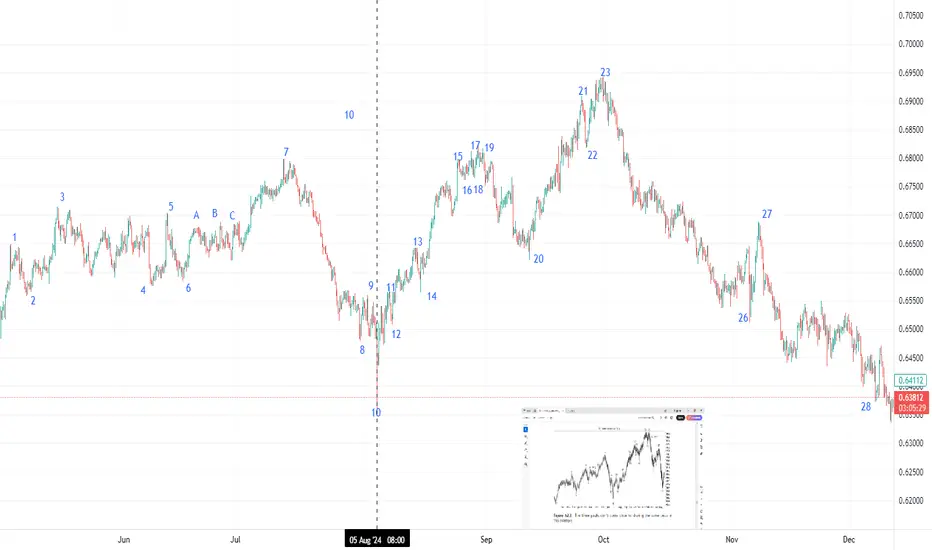
Three Peaks and Domed House
Identification Guidelines
Points Discussion
1, 2 This is the base. It may or may not appear and has no significance.
3, 5, 7 These points form the three peaks pattern. It’s not a triple top where price
needs to peak near the same price. The shape of the peaks may be flat or
pointed. The time between peak 3 and 7 is about 8 months.
4, 6, 8 These are valleys between peaks 3, 5, and 7. The drop to the valley floor
can be considerable (that is, the retrace of the move up from 2 to 3 can
be large).
8, 9, 10 This is the separating decline. Price drops in at least two selling waves (7 to 8
and 9 to 10). The word least suggests there can be multiple selling waves,
so be flexible. The separating decline divides the three peaks from the
domed house, making both look squarish.
10 Valley 10 is always lower than 4 or 6 and often lower than both.
11–14 Price bottoms at 10 and then recovers to form at least two valleys that test
the low at 10. The peaks and valleys here should look symmetrical, not
irregular.
14–23 or 27 The time from turn 14 to 23 should be 7 months and 8-to-10 days, but
the measure from 14 can include peak 27. In other words, be flexible
and don’t exclude a pattern because the duration is incorrect. If price
at 12 or 14 fails to test the low at 10 (or 12 or 14 are absent), then
try using valley 4 or 6 in the 7-month calculation to better predict the
domed house peak.
15 Price rises quickly and steeply to peak 15, forming the left wall of the
first story.
15–20 Look for price to form five waves here, 15–16, 16–17, and so on, ending
at 19–20. Price bounces between peaks and valleys, forming the firstfloor
roof.
20–21 This is the second story’s left wall. It’s the move up to 21 from 20.
21–25 This is the dome of the house. Price forms another set of peaks and valleys,
trying to move to a new high but failing.
25–27 Price drops from 25 and forms a wave 26–27, which may mirror the roof
from 15–20. Point 27, if tall enough, may be the right shoulder of a headand-
shoulders top formed by the move from 21–25.
27–28 Price drops all the way back to the level of point 10 (or close to it). The drop
may be a straight-line run down or it may have several retraces, but price
will eventually make it to the price of 10 (in theory).
Thomas_N_Bulkowski_Encyclopedia_of_Chart_Patterns_John_Wiley_&_Sons
What Is Dollar-Cost Averaging (DCA) in Investing and Trading?What Is Dollar-Cost Averaging (DCA) in Investing and Trading?
Dollar-cost averaging (DCA) is a popular strategy used by investors and traders to manage market fluctuations and build positions over time. Instead of trying to time the market, DCA focuses on consistent, regular investments regardless of price movements. This article answers “What is DCA?”, its advantages and limitations, and how it can be applied in both investing and trading.
What Is Dollar-Cost Averaging (DCA)?
So what is DCA investing? Dollar-cost averaging (DCA) is a strategy that involves consistently investing a fixed sum at regular intervals, regardless of the asset’s current price. This approach helps distribute the cost of purchases over time, potentially reducing the impact of short-term price fluctuations. Instead of trying to time the market perfectly—a challenging task even for experienced traders—a dollar-cost averaging strategy focuses on regular contributions to average the cost of assets.
This method offers a straightforward, disciplined strategy for both long-term investors and traders who wish to build or adjust positions gradually. By spreading out purchases, a DCA strategy may help mitigate the effects of market volatility. For example, during a period of market decline, the fixed investment buys more units at a lower cost, which could result in higher returns when prices recover. Conversely, during a sustained rise, the investor buys fewer units, which helps avoid overexposure. For example, if you invest $50 every week and the market is rising, you will buy fewer stocks, but when the market is moving down, you will buy more with the same amount.
What does DCA mean for market participants? DCA is particularly useful in uncertain economic environments where price swings are common. It provides a systematic approach to entering the market, removing the need to make snap decisions based on short-term market movements, and fostering a steady accumulation of assets over time.
How Does DCA Work?
DCA investing operates by establishing a regular schedule for investing a set amount of money into a chosen asset, regardless of its current market price. Instead of waiting for a particular price or market condition, funds are allocated at consistent intervals—be it weekly, monthly, or quarterly. Over time, this means buying more units when prices are lower and fewer units when prices are higher, resulting in an average purchase price that can be lower than if the investment was made in one lump sum.
Consider an investor using DCA. They commit £100 every month to buy company shares. In the first month, the share price is £20, so they purchase 5 shares. The next month, the price drops to £10, allowing them to buy 10 shares with the same £100. In the third month, the price rises to £25, and they purchase 4 shares.
Over three months, the investor has spent £300 and acquired 19 shares in total. To calculate the average cost per share, divide £300 by 19, which equals approximately £15.79 per share. This average is lower than the highest price paid and reflects the effect of buying more shares when prices are low and fewer when prices are high.
DCA also simplifies the process of entering the market. By adhering to a set timetable, investors bypass the need for constant market analysis, making it particularly appealing for those who prefer a more hands-off strategy. This systematic approach can be applied not only to traditional investments like shares and funds but also to other assets that traders and investors engage with.
DCA in Trading
DCA isn't just for long-term investors; traders can also employ it to navigate the ups and downs of fast-moving markets. By spreading out their entries or exits, traders may potentially lower the average cost of a position or build on a winning trend, all while managing their exposure to volatile moves.
Lowering the Average Price
For traders facing a position that's moving against them, DCA offers a way to adjust the average entry cost. By allocating additional funds, the average price of the position may be reduced. This approach can create a potential opportunity to exit with better returns if the market reverses. However, it is important to note that this method also increases exposure, and additional entities might compound losses if the trend continues.
Adding to a Winner
Conversely, traders may apply DCA to increase their positions when an asset shows strength. By gradually adding to an effective trade, the overall exposure is built in a controlled manner, potentially capturing further movement without committing all capital at once. This method is particularly popular in markets where momentum builds slowly, allowing traders to gradually take advantage of the sustained trend.
Applications Across Markets
Using DCA in stocks can help manage entries during periods of volatility, especially when market sentiment shifts rapidly. Forex traders often use similar techniques to adjust positions in response to fluctuating currency pairs, while the high volatility seen in crypto* markets makes DCA an appealing strategy for building positions gradually.
When using DCA in trading, a disciplined approach is essential. Whether lowering the average cost in a losing position or building on an effective trade, traders should carefully consider the additional risk that comes with increased exposure.
Advantages of Dollar-Cost Averaging
Dollar-cost averaging offers a range of advantages that make it an attractive strategy for both investors and traders, especially when navigating uncertain markets.
Mitigating Market Volatility
By investing a fixed amount at regular intervals, DCA spreads out exposure over time. This approach can reduce the impact of sudden market swings. Instead of being affected by a one-off high price, the average cost is spread across different market conditions. This may help stabilise entry points and smooth out short-term volatility.
Disciplined Investment Approach
DCA promotes a structured investment routine. With regular contributions, there is less temptation to try timing the market. This disciplined approach might be particularly useful when markets are highly volatile or ahead of news and economic events. It encourages systematic investing, reducing the likelihood of making impulsive decisions driven by market noise.
Accessibility for All Traders
DCA does not require intricate market analysis or deep expertise in market timing. Its straightforward nature makes it appealing to both newcomers and seasoned traders looking for a simpler method to build positions over time. By providing a clear framework, DCA allows traders to focus on long-term goals without the pressure of constant market monitoring.
Limitations of Dollar-Cost Averaging
While dollar-cost averaging offers a structured approach to investing and trading, there are some limitations to consider.
Potential Opportunity Cost
Spreading out investments means funds are gradually deployed over time. In a market that is consistent, waiting to invest might lead to missed returns compared to committing all funds upfront. This method can reduce the impact of volatility but might underperform during extended trends.
Continued Exposure to Market Trends
Investors remain exposed to the market throughout the investment period. If the market experiences a prolonged trend, regular investments will accumulate at better prices, but overall returns may still suffer. This approach does not eliminate market risk and requires a long-term perspective to potentially see a turnaround.
Dependence on Consistency
The effectiveness of dollar-cost averaging relies heavily on maintaining a consistent investment schedule. Any interruption or inconsistency can dilute the intended advantages of the strategy. It also assumes that investors are able to commit regular funds, which may not be feasible in all financial situations.
Comparing DCA to Lump-Sum Investing
Comparing DCA to lump-sum investing offers insights into different approaches to managing market exposure and returns.
Risk Exposure
Lump-sum investing involves placing all available funds into an asset at once. This method can yield higher returns if the market moves in their favour, but it also exposes the investor to immediate risk if the market moves against them. In contrast, risk is spread over time through a dollar-cost average, meaning regular investments reduce the likelihood of entering the market at a high point and potentially lowering the overall average cost.
Market Conditions
The performance of each approach can vary depending on market trends. In steady trends, lump-sum investing may capture more returns since all funds are deployed early. However, in volatile or declining conditions, DCA could mitigate the effects of short-term fluctuations by smoothing out entry prices over time.
Flexibility and Commitment
Lump-sum investing requires confidence and a readiness to commit all funds immediately. DCA, on the other hand, offers a more measured entry into the market. This method is popular among those who prefer a systematic approach and might not have a large sum available at one time.
The Bottom Line
Understanding the dollar-cost averaging definition can help investors and traders potentially manage market volatility and reduce emotional decision-making. While it has its limitations, DCA can be an effective strategy for building positions over time.
FAQ
What Is an Example of Dollar-Cost Averaging?
Imagine investing £100 into a stock every month, regardless of its price. In January, the stock costs £20, so you buy five shares. In February, the price drops to £10, allowing you to buy 10 shares. In March, the price rises to £25, and you buy four shares. Over three months, you’ve invested £300 and purchased 19 shares, averaging out your cost per share to £15.79.
Is There the Best Dollar-Cost Averaging Strategy?
The most effective DCA strategy depends on individual goals. A consistent, long-term approach with regular investments—whether weekly or monthly—may help smooth out market volatility. Focusing on diversified assets could also reduce risk exposure.
What Is the Daily DCA Strategy?
This strategy involves investing a fixed amount every day through DCA, meaning it may help minimise the impact of short-term price fluctuations in volatile markets. However, it requires careful planning due to frequent transactions and potential fees.
Does Dollar-Cost Averaging Work With Stocks?
Yes, DCA is commonly used with stocks. It may help manage the effects of market volatility, allowing investors to build positions over time without worrying about short-term price swings.
What Does DCA Mean in Stocks?
DCA, or dollar-cost averaging, in stocks, means regularly investing a fixed amount, regardless of price, to average out the cost per share over time and manage market volatility. A similar answer is true for “What does DCA mean in crypto*?”, except it would involve a regular fixed investment in a particular cryptocurrency*.
How to Calculate DCA in Crypto* Investing?
There is a simple formula to calculate DCA, meaning in crypto*, an investor would just divide the total amount invested by the total number of units purchased. This provides the average cost per unit over time, regardless of price fluctuations.
*Important: At FXOpen UK, Cryptocurrency trading via CFDs is only available to our Professional clients. They are not available for trading by Retail clients. To find out more information about how this may affect you, please get in touch with our team.
This article represents the opinion of the Companies operating under the FXOpen brand only. It is not to be construed as an offer, solicitation, or recommendation with respect to products and services provided by the Companies operating under the FXOpen brand, nor is it to be considered financial advice.

Why I Hesitate on Long Wick Candles (and How I Trade Through It)In today’s live trading review, I highlight one of the key challenges I face when trading the ES:
I don’t always feel confident executing during long wick days.
So how do I deal with that? Simple: reduce risk and stick to the framework.
Watch as I walk you through this session, break down the setup, and share how you can identify and study your own trading weaknesses — so you can grow stronger, one trade at a time.
#OneCandlestickAtATime #LiveTrading #ESFutures #TradingPsychology

Mastering Stop Losses: How Not to Trigger Them at the Worst TimeThere are few things more humiliating in trading than setting a stop loss… only to have the market tag it by a hair’s breadth before rocketing in the direction you knew it was going to go.
Oftentimes (hopefully not too often), stop losses are the financial equivalent of slipping on a banana peel you placed yourself.
But stop losses aren't the enemy. Their placement, however, could be.
If you’ve ever rage-quit your chart after being wicked out by a fakeout, this one’s for you. Let’s talk about how to master stop losses — without feeling like the market is personally out to get you.
😬 The Necessary Evil: Why Stop Losses Exist
First, let's acknowledge the elephant in the room: stop losses sometimes sting. They're like smoke alarms. Annoying when they chirp over burnt toast, lifesaving when there’s an actual fire.
The purpose of a stop loss isn’t to predict exactly when you’re wrong — it’s to limit how wrong you can be. It's the difference between losing a quick battle and losing the whole war.
Trading without a stop loss is like walking a tightrope without a net — all fine until it’s not.
🤔 The Amateur Mistake: "Where Should I Put My Stop?"
A lot of traders approach stop-loss placement like they're picking lottery numbers: random, emotional, hopeful.
"I’ll just slap it 10 pips below my entry. Seems safe."
But the market doesn’t care about your preferred round numbers. It cares about liquidity, volatility, and structure, regardless if it's the forex market , the crypto space , or the biggest stock gainers out there.
Good stop-loss placement is about logic, not luck. It's about asking:
Where is my trade idea invalidated?
Where does the market prove me wrong?
If you're placing stops based on how much you're "willing to lose" rather than where your setup breaks down, you’re setting yourself up to be triggered — emotionally and financially.
💪 The Art of "Strategic Suffering"
Good stops hurt a little when they’re hit. That’s how you know they were placed properly.
Stops shouldn't be so tight they get hit on routine noise, but they also shouldn't be so far away that you need therapy if it fails. Think of it as strategic suffering: you’re accepting controlled pain now to avoid catastrophic pain later.
Legendary trader Paul Tudor Jones famously said: “The most important rule of trading is to play great defense, not great offense.”
🤓 Where Smart Traders Place Their Stops
Want to know where smart money hides their stops? It's not random. It’s calculated.
Below key swing lows for long trades (how much below depends on the risk-reward ratio they’ve chosen to pursue)
Above key swing highs for shorts (how much above is, again, tied to the risk-reward ratio)
Outside of obvious support/resistance zones (also, risk-reward plays a role)
In other words: start thinking like the market. Where would a big player have to exit because the structure is truly broken? That’s where you want your stop.
👀 Avoiding the Stop-Hunter’s Trap
Is stop-hunting real? Oh yes. And no, it’s not personal. You're just very readable if you park your stops in obvious, lazy places.
The market loves liquidity. Price often pokes below swing lows or above highs because that’s where the money is. Stops create liquidity pockets that big players exploit to enter their trades at better prices.
So how do you avoid becoming easy prey?
Give stops a little breathing room past obvious levels.
Use volatility measures like ATR to set dynamic buffers.
Respect structure, not just random dollar/pip amounts.
A good stop is hidden in plain sight but protected by logic, not hope.
⚖️ Sizing Smarter: Risk per Trade Matters More Than Stop Distance (What’s Risk-Reward Ratio?)
Here’s where many traders mess up: they think tighter stops are always better. Wrong. Your stop distance and your position size are a package deal. If your trade idea requires a wider stop to be valid, your position size should shrink accordingly.
Trying to cram your usual size into a wide stop setup is how small losses turn into account-threatening disasters.
Hedge fund pioneer George Soros once said: “It’s not whether you’re right or wrong that's important, but how much you make when you're right and how much you lose when you're wrong.”
Master your sizing relative to your stop, and you master your survival. In other words, the risk-reward ratio should be playing a key role in placing your stop losses.
🥤 Mental Stops vs Hard Stops: Pick Your Poison
Some traders swear by mental stops: “I'll get out when it hits this level.” Others use hard stops: set-and-forget protective orders baked into the system.
Both have pros and cons:
Mental stops allow flexibility but risk emotional sabotage.
Hard stops guarantee protection but can trigger on sudden, hollow wicks.
Pro tip? Use hard stops if you’re new or undisciplined. You don’t want to be the guy saying “I’ll close it soon...” while watching your unrealized loss grow a second head.
🤯 Stop-Loss Psychology: It’s You, Not the Market
If you find yourself constantly blaming “stop-hunting whales” or “market manipulation” every time you get tagged out... maybe it’s not them. Maybe it's your stop placement.
Discipline in trading isn’t just about clicking buttons at the right time. It’s about planning for the tough times—and sticking to your plan even when it feels bad.
❤️ Final Thought: Love Your Stops (Or at Least Respect Them)
Stop losses aren't your enemy. They're your overprotective friends. Sometimes they’ll throw you out of a trade you "knew" would come back. But more often, they’ll save you from very dangerous outcomes.
Mastering stop losses isn't about never getting stopped out. It’s about getting stopped out properly — with dignity, with minimal damage, and with your account intact.
In trading, pain is inevitable. Wipeouts are optional.
Your move: How do you manage your stops — and have you ever been wicked out so badly you considered quitting trading? Drop your best (or worst) stop-loss stories below.

Candlestick Patterns + Trend and Momentum: A Perfect CombinationCandlestick patterns provide valuable insights into price action, showing potential reversals, continuations, or market indecision. However, to significantly improve their effectiveness, combining candlestick analysis with trend and momentum indicators is essential. Here’s how you can use these combinations to trade with more confidence and accuracy.
1. Why Candlestick Patterns Matter
Candlestick patterns visually represent traders’ psychology through price movements, including four key prices: Open, Close, High, and Low. Some of the most common and useful patterns include:
Doji: Indicates market indecision and potential reversals.
Hammer & Hanging Man: Signals possible trend reversals at support or resistance.
Engulfing Pattern: Often marks the beginning of a significant reversal.
Morning/Evening Star: Combination patterns that strongly suggest a trend reversal.
2. Adding Trend and Momentum Indicators
Candlestick patterns alone might lead to false signals or confusion. By pairing them with other technical tools, such as moving averages, RSI (Relative Strength Index), or MACD (Moving Average Convergence Divergence), you gain crucial context to confirm the reliability of the patterns.
Here’s how:
Trend Alignment:
Using moving averages, such as the 20 or 50-period EMA, helps confirm whether a bullish candlestick pattern appears in an uptrend (strengthening the signal) or countertrend (potentially weaker signal).
Momentum Confirmation:
Oscillators like the RSI or MACD can confirm the underlying momentum behind a candlestick pattern. For instance, a bullish engulfing pattern becomes more reliable if it coincides with RSI moving upward from oversold territory or MACD showing a bullish crossover.
Volume Analysis:
Higher volume on the candle that forms the pattern typically confirms increased market interest and strengthens the validity of the signal.
3. Practical Example: Bullish Engulfing + RSI
Imagine you spot a bullish engulfing pattern forming at a clear support level after a downtrend:
Step 1: Identify the Pattern: Confirm the bullish engulfing visually.
Step 2: Check RSI: Ensure RSI is below 30 or rising, signaling oversold conditions and potential bullish momentum.
4. Why This Approach Works
Enhanced Accuracy: Combining candlestick signals with trend and momentum indicators increases signal reliability.
Improved Risk Management: Clearer signals mean more confident entries and better-defined stop-loss levels.
Reduces False Signals: Multiple confirmations reduce the risk of false breakouts or reversals.
5. Final Tips
Always look for multiple confirmations (trend, momentum, volume) before making trade decisions based solely on candlestick patterns.
Be patient—waiting for full confirmation can help avoid premature trades.
Regularly backtest and practice recognizing these combined signals to strengthen your trading strategy.

AMP Futures - % (LTP) Calculation for Renko, Kagi, and PnF chartIn this idea we will demonstrate how to apply LTP calculation for Renko, Kagi, and Point & Figure chart types.

Your ULTIMATE Guide For Time Frames in Gold, Forex Trading
If you just started trading, you are probably wondering what time frames to trade. In the today's post, I will reveal the difference between mainstream time frames like daily, 4h, 1h, 15m.
Firstly, you should know that the selection of a time frame primarily depends on your goals in trading. If you are interested in swing trading strategies, of course, you should concentrate on higher time frames analysis while for scalping the main focus should be on lower time frames.
Daily time frame shows a bigger picture.
It can be applied for the analysis of a price action for the last weeks, months, and even years.
It reveals the historical key levels that can be relevant for swing traders, day traders and scalpers.
The patterns that are formed on a daily time frame may predict long-term movements.
In the picture above, you can see how the daily time frame can show the price action for the last years, months and weeks.
In contrast, hourly time frame reflects intra week & intraday perspectives.
The patterns and key levels that are spotted there, will be important for day traders and scalpers.
The setups that are spotted on an hourly time frame, will be useful for predicting the intraday moves and occasionally the moves within a trading week.
Take a look at the 2 charts above, the hourly time frame perfectly shows the market moves within a week and within a single day.
4H time frame is somewhere in between. For both swing trader and day trader, it may provide some useful confirmations.
4H t.f shows intra week and week to week perspectives.
Above, you can see how nicely 4H time frame shows the price action on EURUSD within a week and for the last several weeks.
15 minutes time frame is a scalping time frame.
The setups and levels that are spotted there can be used to predict the market moves within hours or within a trading session.
Check the charts above: 15 minutes time frame shows both the price action within a London session and the price action for the last couple of hours.
It is also critical to mention, that lower is the time frame, lower is the accuracy of the patterns and lower is the strength of key levels that are identified there. It makes higher time frame analysis more simple and reliable.
The thing is that higher is the time frame, more important it is for the market participants.
While lower time frames can help to predict short term moves, higher time frames are aimed for predicting long-term trends.
❤️Please, support my work with like, thank you!❤️
I am part of Trade Nation's Influencer program and receive a monthly fee for using their TradingView charts in my analysis.

Ultimate Guide to Master ICT KillzonesWhy Timing Matters Just as Much as Price
Smart Money Concepts (SMC) and ICT methodologies are built on the idea that markets are manipulated by large players with precision. While most traders obsess over price levels, entry models, and liquidity zones, many fail to realize that none of those matter if they happen at the wrong time. Time is not an afterthought, it's a core part of the edge.
Price can show you where the move might happen, but time shows you when smart money is most likely to act. That window of action is what ICT calls the killzone.
What Are Killzones?
Killzones are specific time periods in the trading day when smart money typically executes large moves. These sessions have predictable volatility and institutional order flow. They are not just random hours, they coincide with major session opens and overlaps.
The most relevant killzones are:
London Killzone (LKO), 2 AM to 5 AM EST
New York Killzone (NYKO), 7 AM to 10 AM EST
New York Lunch/Dead Zone, 11:30 AM to 1 PM EST (low probability, often reversal traps)
Each killzone offers unique opportunities depending on how liquidity has been engineered prior. ICT-style setups are most reliable when they form within, or directly in anticipation of, these windows.
The Trap Before the Real Move
Smart money loves to trap retail traders. This trap usually happens just before or early in a killzone. For example, if price takes out a key high at 2:30 AM EST (London open), many retail traders see a breakout. But those in tune with SMC see it as a classic liquidity raid, bait before the reversal.
Once that external liquidity is taken, smart money shows its hand with displacement, a sudden, aggressive move in the opposite direction. This typically forms a clean imbalance (Fair Value Gap) or a breaker block. That’s your cue.
If the price returns to that level within the killzone, that’s the optimal entry window.
Confluence is King: Time, Liquidity, and Structure
The most reliable SMC setups happen when:
Liquidity is swept early into a killzone
Displacement confirms the real direction during the killzone
Entry happens via return to an FVG or OB created within that same session
The setup might still look right if it forms outside these windows, but without proper timing, it’s often just noise or engineered liquidity to trap impatient traders.
Real-World Example: NY Killzone Short
NY, At 8:30 AM EST, price runs above the Asian highs, sweeping liquidity
Displacement, Sharp bearish move breaks structure to the downside at 8:45 AM
Entry, Price retraces into the 5M FVG at 9:10 AM
Result, Clean reversal into a nice profit trageting liquidity, all within the NY session
Outside of this killzone structure, the same setup likely would have chopped or failed.
Common Mistakes Traders Make With Time
Chasing price outside of killzones, Setup might look good, but volume is thin and no follow-through comes
Assuming all killzones are equal, London setups are often cleaner in structure, while NY has more manipulation around news
Forcing trades in NY lunch, Midday reversals do happen, but they’re lower probability. If you're not already in a position by 11 AM EST, it's often best to wait for the next day
The Discipline Edge
Most traders overtrade not because they lack setups, but because they don’t filter based on time. By only trading when price interacts with your levels during active killzones, you immediately reduce the number of bad trades and increase your focus on meaningful opportunities.
Good setups are rare. Good setups in the right timing window are even rarer. That’s where consistency comes from.
Final Thoughts
Time is not optional. In SMC and ICT, it’s not enough to have the level, you need the timing. Killzones are your filter, your edge, and your context for every trade.
Once you understand how time and price move together, and stop treating every moment on the chart equally, your trading will start to reflect the true flow of smart money.
Wait for time, wait for price, then strike.
___________________________________
Thanks for your support!
If you found this guide helpful or learned something new, drop a like 👍 and leave a comment, I’d love to hear your thoughts! 🚀
Make sure to follow me for more price action insights, free indicators, and trading strategies. Let’s grow and trade smarter together! 📈

The Golden Code: Unlocking the Markets with Fibonacci Sequence “Mathematics is the language in which God has written the universe.” – Galileo Galilei
If this is true, then the Fibonacci sequence is the poetry of that language, especially in trading.
📚 What is Fibonacci? Why Should Traders Care?
Fibonacci is more than just a sequence of numbers — it’s a universal law of growth and proportion. From galaxies to sunflowers, and now to the charts on your TradingView screen, Fibonacci is everywhere.
In trading, Fibonacci retracement levels are used to identify potential reversal zones, where price is likely to bounce or stall, making it one of the most powerful tools in a trader’s arsenal.
But few truly understand its depth, and fewer still use it intelligently.
Let’s dive into the power of the Fibonacci sequence, how it influences retracements, and how you can use it to your trading advantage, whether you’re a scalper, swing trader, or position trader.
🧠 The Fibonacci Sequence: Where It All Begins
The Fibonacci sequence is a series of numbers where each number is the sum of the two preceding ones:
0, 1, 1, 2, 3, 5, 8, 13, 21, 34, 55, 89, ...
Some Math somebody? Take your seats and calculators away! 😂😂
📉 Fibonacci Retracement Levels & How They're Calculated
These levels are percentages based on relationships between Fibonacci numbers.
✅ 0.236 (23.6%)
Divide a number by the one three places ahead:
Example: 13 ÷ 55 = 0.236
Another: 21 ÷ 89 = 0.236
✅ 0.382 (38.2%)
Divide a number by the one two places ahead:
Example: 21 ÷ 55 = 0.382
Another: 34 ÷ 89 = 0.382
✅ 0.500 (50.0%)
Not directly from Fibonacci, but commonly used due to psychological midpoint in markets.
✅ 0.618 (61.8%) – The Golden Ratio
Divide a number by the next number:
Example: 34 ÷ 55 = 0.618
Another: 55 ÷ 89 = 0.618
This is the famous Golden Ratio, which appears in nature, art, and financial markets.
✅ 0.786 (78.6%)
Derived from the square root of 0.618:
√0.618 = 0.786
📈 Fibonacci Extension Levels & How They're Calculated
Extensions project price targets beyond the retracement.
✅ 1.000 (100%)
A full projection of the original move.
✅ 1.272 (127.2%)
Square root of 1.618:
√1.618 = 1.272
✅ 1.618 (161.8%) – The Golden Extension
Divide a number by the previous one:
Example: 55 ÷ 34 = 1.618
Another: 89 ÷ 55 = 1.618
✅ 2.000 (200%)
A full double of the original move.
✅ 2.618 (261.8%)
1.618 + 1.000 = 2.618
This creates ratios that are found in nature, architecture, music, and, yes, price movements.
🔍 Fibonacci Retracement: Mapping Pullbacks with Precision
When price moves impulsively in one direction, it often retraces a portion of that move before continuing in the same direction.
Fibonacci retracement is used to map this pullback.
Here’s how traders use it:
Identify a clear impulsive move (either bullish or bearish).
Plot the Fibonacci retracement tool from swing low to swing high (for bullish moves), or from swing high to swing low (for bearish moves).
Watch how price reacts around key levels:
38.2% = Shallow pullback
50% = Midpoint (psychological)
61.8% = Golden Zone
78.6% = Deep retracement (but still valid)
🔥 Pro Tip: Most institutional traders love the 61.8% retracement, often placing hidden liquidity and traps around that area.
🔄 Fibonacci Extensions: Predicting Take-Profit Zones
Once price retraces and continues its trend, Fibonacci extensions help identify possible target zones:
Common extension levels:
1.272
1.618 → Golden Target
2.000
2.618
For example:
After a bullish retracement to 61.8%, price often rallies to 1.272 or 1.618 extensions, making these ideal profit-taking zones.
🔄 Real-Life Market Behavior: Fibonacci in Price Action
Let’s take a real example:
🟨 Example: XAU/USD Bearish Retracement
Impulsive rally from $2,832.99 to $2,930.77.
Price pulls back to $2,880 – exactly at the 50% Fibonacci retracement.
Followed by a strong continuation to the upside.
Price reach for the 127.20% and beyond to 161.80% Fibonacci extension of the original rally before pausing for some times — textbook Fibonacci behavior.
💡 This isn’t magic. It’s structure, order, and smart money playing on the same field.
🧬 Fibonacci + Confluence = Confirmation
Fibonacci works best when combined with other tools:
Support/Resistance
Order Blocks
Imbalances
Trendlines
Candlestick Patterns
✅ A 61.8% retracement + bullish order block + bullish engulfing = a high-probability long setup.
✅ A 78.6% retracement + unfilled imbalance = possible stop-hunt trap or liquidity grab.
🧠 Fibonacci Psychology: Why It Works
Fibonacci works because it reflects natural human behavior:
Fear and greed create overextensions and pullbacks.
Traders place stops and entries near these key ratios, causing self-fulfilling reactions.
Algorithms and institutional models often base trade entries on Fibonacci confluences.
💥 Common Mistakes Traders Make
❌ Using Fibonacci on every small swing – noise, not signal
❌ Forcing the retracement tool to “fit” your bias
❌ Ignoring higher time frame structure
❌ Using Fibonacci alone without confluence
Remember: Fibonacci is a guide, not a guarantee.
📈 How to Trade with Fibonacci (Step-by-Step)
First, identify market structure (trending or ranging).
Second, mark swing high and swing low.
Third, plot retracement tool accordingly.
Fourth, look for confluence zones:
38.2%, 50%, 61.8%...
Price action signals (e.g., pin bars, engulfing)
Institutional concepts (order blocks, imbalances)
Enter with confirmation, not just based on levels.
Set stop loss below/above structure or 78.6% line.
Target extension levels or previous high/low.
🌀 Fibonacci in Different Trading Styles
Scalpers
Use Fibonacci on 1min–5min timeframes to catch micro pullbacks and entries.
Swing Traders
Use Fib retracements from daily or 4H structure to plot entries and targets.
Position Traders
Use weekly/monthly Fibonacci zones for macro views and long-term targets.
🧠 Final Thoughts: Fibonacci Is Structure, Not Sorcery
The Fibonacci sequence is a map of order in a chaotic world. In trading, it helps bring discipline, clarity, and precision.
It’s not about being right every time, it’s about stacking probabilities in your favor.
🧭 Ready to Master Fibonacci?
If you’ve read this far, drop your thoughts in the comments and share your favorite Fibonacci setup!
Let’s build a community of traders who use mathematics and structure, not hope and guesswork.
Follow for more educational breakdowns, trading insights, and strategy walkthroughs — posted weekly.
