BAJAJCONNSE:BAJAJCON
Sharing an Idea, Can be of a benefit for you!
Price is coming out of a long Slumber.
One should wait for a good close above the mentioned trendline.
Patterntrading

(AAV) Fast Bounce Setup | Price:$11.28 →Target:$11.84(+ 5 %)💎 The Sleeping Giant of the Montney: Advantage Energy’s Bold Leap 🏔️🔋
Imagine a company that doesn’t just pull energy from the earth but is pioneering the technology to "clean" it as well. 🌍✨ Founded in the heart of Calgary, Advantage Energy is a dual-threat powerhouse in the prolific Montney formation. 🏗️❤️ While their core business pumps out record production, their subsidiary Entropy Inc. is revolutionizing Carbon Capture and Storage (CCS). They are proving that the future of fossils is clean, efficient, and highly profitable! 💎🔥
📉 Technical Setup: The "Quick Strike" Plan 🎯
We are tracking a classic support bounce within a long-term ascending trend channel. 🎢✅ Here is the tactical play for the short term:
🚩 Entry Point: $11.28. This level aligns with a recent technical support zone where buyers have historically stepped in. 🛡️📉
🏁 Exit Target: $11.84 (A clean +5% gain). 💰🎯 This target sits just below major overhead resistance, offering a high-probability "quick strike" for swing traders. ⚡📈
🔭 The Long-Term Vision: $15.00+ and Beyond? 🚀
While we take our profits at 5% for the short term, the "Big Picture" suggests this giant is just getting started. 🏔️💎
Production Surge: With the Progress Gas Plant set to commission in Q2 2026, production is expected to jump to 90,000 boe/d by the second half of the year. 📈🌊
Revenue Growth: Analysts forecast a massive 159% EPS growth for the coming year as high-margin liquids production ramps up. 💰🚀
Analyst Consensus: While we target $11.84 for a swing, professional analysts have a 12-month average price target of $14.14 – $15.15, with some "blue sky" estimates reaching as high as $21.00. 🎯✨
🏗️ Strategic Projects: The 2026 Catalyst 🕒
Entropy Glacier Phase 2: On track for commercial operations in Q2 2026, aiming to capture 160,000 tonnes of CO
2
annually. 🌪️❄️
The Shareholder Engine: Once debt targets are met, Advantage plans to funnel 100% of free cash flow into share buybacks, which could drive a 14% increase in production per share. 🔄🎁
What’s your strategy? 🧐 Are you taking the quick 5% profit at $11.84, or are you holding for the $15.00+ long-term transformation? Let me know in the comments! 👇💬

(DOTL) Fast Bounce Setup | Price:$ 11.67 → Target:$14 (+ 20 %)🚨 D2L (DTOL.TO): Whale Trap + RSI Oversold + The "Spring" Setup 🐋⚡
Ticker: TSX:DTOL Outlook: Bullish 🟢 Target: $14.00 🎯
1. The "Whale Trap" Signal 🕵️♂️ Yesterday, a massive 87,000 share block printed "Below Bid" at $11.10.
The Trap: Retail panic-sold seeing the red print. 🩸
The Reality: Smart money absorbed nearly $1M of stock in one second. The price instantly snapped back to $11.27.
Verdict: $11.10 is the new institutional floor. 🧱
2. RSI is Screaming "Oversold" 📉➡️📈 The Relative Strength Index (RSI) has dropped into deep oversold territory.
The Pattern: Historically, every time D2L’s RSI hits these lows, the stock acts like a stretched rubber band and snaps back violently.
The Signal: Sellers are exhausted. The elastic is pulled back. We are ready for the release. 🏹
3. The "$12 Springboard" (Year 3) 🧬 History is repeating on the yearly chart. This level is a loaded spring:
2024: Bounced from ~$12 ➡️ $20 🚀
2025: Bounced from ~$12 ➡️ $20 🚀
2026: We are back at the load zone. Load the Spring.
4. Sector Weakness vs. Strong Fundamentals 💎 The Education sector is weak and volume is low (boring), BUT D2L is getting stronger:
Wins: Recently stole Western University & NAIT from competitors. 🇨🇦
Value: Trading at ~3x Sales vs. Instructure (Canvas) buyout at ~7x.
Trade: Buy the "Boredom" to sell the "Euphoria."
📉 Trade Plan:
Entry: Under $12.00 (Deep Value Zone)
Stop Loss: Close below $10.80 (Invalidates the Whale floor) 🛑
Target: $14.00 (Gap Fill & Resistance) 💰
Summary: The Whale print at $11.10 was the clue. The RSI is the trigger. Don't let the low volume fool you—the move is loading. 🌊🚤
Not financial advice. Do your own DD!

(AFN) Long-Term Setup | Price: $ 23→ Target: Around $ 40📈🔭 Long-Term Forecast – AFN
⏳ This is a long-term outlook for AFN, which is currently trading near its lowest price levels since 2010 🕰️.
🔻 Price History & Pullback
📉 The stock declined from approximately $60 ➝ $20, representing around -66 % drop 🔻.
⚠️ This decline coincided with two consecutive years of revenue stagnation (2024–2025), showing .
💼 Fundamental Growth (Long-Term View)
🚀 Revenue expanded from $137M in 2007➝ $1.4B,in 2024 representing a +922% total increase over the long run 📊.
⛔ However, in 2024–2025 🕰️, revenue fell ~8–10% 🔻, leading to a bearish market reaction 📉.
🔮 Forward forecasts point to a return to +10–12% growth 📈, offsetting prior losses and supporting a bullish long-term outlook 🐂📊.
🧱 Major Long-Term Support Zone
📅 On the monthly timeframe, the $15 – $20 range represents a strong historical support zone 🛡️.
⏱️ This zone has held for 15+ years (0% breakdown rate), reinforcing its structural importance.
📊 Volume Profile Confirmation
🔵 The highest historical traded volume (100% peak volume node) is concentrated in this price range.
✅ This suggests maximum historical participation, confirming the area as a high-probability pullback zone.
📉➡️📈 Momentum & RSI Shift
📍 Monthly RSI reached ~30 (oversold) and has now started turning upward ⤴️.
⚡ This transition often precedes a positive momentum shift (%) after extended consolidation.
🔄 Cyclical Behavior & Seasonality
🔁 AFN historically forms major peaks every 1–4 years.
📆 Seasonality shows January–March frequently deliver 3 consecutive positive months, often producing double-digit % gains 📈📈📈.
🎯 Price Targets (2026)
🎯 Base target: $35 – $45 → +75% to +125% upside from $20
🚀 Extended target: $60 (previous high) → +200% upside, possible by late 2026, assuming forecasted growth resumes.
✅🧠 Conclusion
⭐ This setup represents a high-quality long-term opportunity, supported by:
✔️ –66.7% historical correction already priced in
✔️ 0% growth period fully absorbed by the market
✔️ Around 1000 % long-term revenue expansion
✔️ Oversold momentum + heavy volume accumulation
⏱️ At current levels, the risk-to-reward strongly favors long-term positioning (%) 💎📈

(RGCO)Fast Bounce Setup | Price:$ 20.80→ Target:$21.84(+ 5 %)📊🚀 RGCO – Demand Zone Bounce Setup 🚀📊
RGCO continues to look solid from a fundamental and technical perspective 👀💡.
💰📈 Fundamentals
The company has strong fundamentals, and revenue forecasts are growing, providing a positive outlook for the coming periods 🌱📊.
📉🔄 RSI Signal (Daily)
On the daily chart, RSI is showing a reversal from the oversold zone ⤴️📉. RSI divergence is also present, which often signals a potential pullback and bounce ⚡📊.
📐🧲 Price Action Insight
Historically, this stock tends to pull back and react strongly at these levels 🕰️✅. From a price action perspective, the current area is a clear demand zone, where buyers have previously stepped in 🧱📍.
🎯📍 Expectation
Price is currently around 20.8 💵. If this support level holds, a ~5% upside move 📈🎯 is possible in the short term.
⚠️📌 Reminder
This is a support-based pullback setup, not a breakdown scenario.

Fast Bounce Setup | Price: 53.98 $ → Target: 56.67 $ (+5%)📈 Stock: MDLZ – Mondelez International 🍫🏭
🟢 Entry: 53.98 ⚡
🎯 Exit / Target: +5% → ~56.67 💰📈
🧱 Technical Support Strength
Price is holding a strong demand zone 🧱🟢
Repeated buyer reactions = solid support ✅✅
High-confidence base 🔒📉
📊 Weekly RSI Reset
RSI is deeply oversold, signaling potential rebound.
🔽⚡📈Momentum reset = fuel reload ⛽🔥
Often leads to next bullish push 🚀📈
📍 Pivot + Structure Confluence
Both Weekly & Dayly pivot support + prior structure 🎯
Confluence = higher bounce probability 📈💥
Bullish reaction favored 🟢❌
📉➡️📈 Short-Term Outlook
🚀 Expected move: ~5% upside
🔄 Mean reversion in progress
⚖️ Risk / reward favors longs 👍
📆 Mid / Long-Term Outlook
✔️ Higher-timeframe trend intact 📈
✔️ Healthy pullback, not a breakdown 🔄
✔️ Swing & position friendly 🟢📊
💼📊 Fundamental Strength
📈 Consistent revenue & earnings growth
💰 Strong cash flow & defensive business model 🛡️
🌍 Global brand power + pricing strength 🍫🏆
🔮 High expected future growth based on analyst forecasts 🚀
Fundamentals + technicals = high-conviction setup 💎
✅ Final Summary
🧱 Strong support
📊 RSI reset
🎯 Pivot confluence
💼 Solid fundamentals
🔮 Growth outlook strong
➡️ Entry: 54.03 ⚡
➡️ Target: 56.67$ 💰🚀
➡️ Bias: Bullish continuation 📈🔥

(AAV)Fast Bounce Setup | Price:$ 11.11→ Target:$11.66(+ 5 %)⚡📊 AAV – Pullback at Trendline with Strong Fundamentals 📊⚡
AAV continues to look interesting both fundamentally and technically 👀📈.
📰💰 Fundamental Outlook
Revenue forecasts remain very positive for the coming years 🚀, and the company maintains solid fundamentals, providing a strong long-term backdrop 🧱✅.
📉📊 Momentum Check (RSI)
On the daily timeframe, RSI recently pulled back from the oversold area, moving from around 34 to 39 over the past week 🔄📈. This signals improving momentum after a cooldown phase.
📐📍 Price Action Perspective
From a price action angle, the $11 zone is acting as a key pullback area 🧲. Price has once again touched the ascending trendline, showing respect for structure 📈✍️.
✅📉 Technical Confirmation
This pullback is supported by RSI confirmation on the daily chart, increasing the probability of a potential bounce from this zone ⚡🎯.
⚠️📌 Note
This looks like a technical pullback within structure, not a breakdown.

(AAPL)Fast Bounce Setup | Price:$ 260.92→ Target:$274(+ 5 %)AAPL is showing signs of a short-term pullback after a strong upside move 🚀. Price is currently testing the EMA 100, which is acting as a major resistance level on the daily timeframe 🧱⚠️.
🕯️🕯️🕯️ Candle Confirmation
Three or more candles have already confirmed rejection near this EMA zone ❌📉, strengthening the pullback scenario.
📊⚙️ Momentum Check (RSI)
On the daily chart, RSI previously dropped to around 26 😮💨 and has now bounced back to 31 🔄. This behavior usually confirms a healthy pullback, not a trend reversal ✅.
📰✨ Fundamentals in the Background
Positive news remains supportive:
📦⬆️ ~10% increase in iPhone 17 shipment demand
🤖🤝 Reported AI partnership with Google for iPhone 18
Despite the good news 🌞, price is still respecting technical resistance — suggesting much of this optimism may already be priced in 📌.
🎯📍 Short-Term Expectation
After this pullback completes ⏳, a short-term move toward the 274 area 🎯📈 is possible.
⚠️🔍 Reminder
This is a pullback within the trend, not a bearish trend change 🐂➡️🐂.

(QLYS)Fast Bounce Setup | Price:$133.36 → Target:$140 (+ 5 %) 🚀📊 QLYS — Short-Term Trade Setup (Daily) 📊🚀
💰 Entry: 133.36 (Current Price)
🎯 Target: 140.03 (+5%)
📈 Bias: Bullish continuation
💼 Fundamentals
✅ Strong & consistent EPS growth
📊 EPS trend: 3.72 → 6.13 → higher forward estimates
🔁 High-margin recurring SaaS revenue
🏦 Strong institutional-quality business
📌 Fundamentals continue to support higher prices
🧠 Behavioral Pattern
🔄 QLYS often pulls back → bases → pushes higher
📉 RSI reset after prior advance
🧲 Buyers historically step in near demand zones
📌 Current behavior matches previous continuation structures
📉➡️📈 Technical Structure
📍 Price sitting near key demand / value area
📊 RSI ~38–40 → historical bounce zone
📐 Rising structure still intact
📉 Selling pressure fading, not expanding
🚧 Key Resistance Zone — VERY IMPORTANT
🔴 $136 = Major resistance level
⚠️ Heavy supply previously appeared in this zone
🧱 Expect strong reaction / battle near this level
✨ Bullish scenario:
➡️ Clean break above $136 could open the path toward $140+
➡️ Demolishing this level likely triggers momentum continuation
⚡ Day Trading / Zone (Lower Timeframes)
🎯 $136 area = ideal scalp zone
⏱️ Best suited for 1–5 minute timeframe
📉📈 Potential sub-0.5% moves on rejection or breakout attempts
🧠 Excellent for quick reaction-based trading

Short-term head&shoulder in VOLTAS Head&Shoulders pattern (bearish bias) in Voltas 15min.
This gives a downside target of 1441 from the breakdown of neckline.
Aggressive entry can be taken for 1500PE near the CMP as there is liquidity zone here which can push prices down. In this kind of entry the risk is more as there are chances that pattern is not completed and it will break the high of head, invalidating this pattern and making new high for the day.
Safer entry is on completion of pattern and break of neckline at around 1475.
It is always advised to finish the pattern first

Daily Analysis: Nifty 6th Jan 2026The candles are under process of head and shoulder pattern (bearish). The right shoulder is still to be formed and it is projected to 26200-26250 as resistance for this shoulder.
All major levels are mentioned in the video, so watch the entire video.

Busted Chart Patterns...What They Are?Hello traders,
Ever saw that textbook double bottom with all rules applied? Price broke the swing high and stayed above, clear entry, stop loss and tp targets. All of a sudden, price reverts and continues the move downwards. But why? its a double bottom for god's sake!! Every guru said its a guaranteed trade.
This was not a double bottom. This was "busted double bottom". So what is a busted pattern?
--------------------------------------------------------------------------
🔍 What defines a busted chart pattern?
A pattern is considered "busted" when all of the following occur:
1️⃣ Typical price breakout
Price closes above resistance or below support, or outside a pattern boundary (e.g., triangle trendline).
2️⃣ Limited follow-through
Price travels no more than ~10-15% in the breakout direction.
3️⃣ Failure & reversal
Volume and momentum stalls and price reverses
4️⃣ Invalidation close
Bearish breakout → price closes back above the top of the pattern
Bullish breakout → price closes back below the lowest low of the pattern
--------------------------------------------------------------------------
🔄 Can a single pattern bust more than once?
Yes.
Patterns can experience: Single (most common), double or triple bust.
Price could oscillate for days, weeks or months, repeatedly failing in both directions. Usually that is a clear sign of distribution, accumulation, or liquidity sweeping.
--------------------------------------------------------------------------
🧩 How this fits modern price action?
Busted patterns often align with:
- Liquidity grabs
- False breakouts
- Stop-hunt behavior
--------------------------------------------------------------------------
🛠️ How to capitalize on this in our trading?
If the normal pattern momentum is fading, wait for failure confirmation
- Use the reclaimed level as invalidation
- Expect expansion in the opposite direction
- Risk is often cleaner than chasing breakouts
--------------------------------------------------------------------------
📌 Examples
Busted Head & Shoulders
Busted Double Top
--------------------------------------------------------------------------
Patterns fail not because they are “wrong.” But because our mindset becomes one-sided.
Educational content only. Always manage risk and do your own analysis.
This knowledge and concepts are adapted from Thomas Bulkowski’s chart pattern research
If you find value in this content, please support the effort with a like & a comment

NATIONALUM : Initiated a trade with 1% riskInitiated a swing entry in the scrip. Price had broken its all-time high a few weeks ago with a clean volume expansion, which offered an early entry. However, broader market conditions were not supportive then, so the trade was skipped.
Post breakout, the stock pulled back and found support around the 20 EMA, followed by a rally. The subsequent retracement was smaller, clearly indicating weakening seller pressure. Now, price has once again broken above ATH with volume, and this time the overall market setup also appears favourable, aligning well with the stock’s structure.
Entered the trade with 1% risk, keeping the stop loss below the larger basing structure. The stop is relatively wide by design, as the intent is to stay positioned conservatively and avoid getting shaken out in the current environment.
Fundamentally, the stock remains in a healthy spot. EPS and sales have been improving over the past few quarters. The slight dip seen in the June quarter is visible across many stocks and doesn’t appear to be company-specific. Recent trends suggest a gradual pickup.
A well-aligned structure + volume + market context swing setup with defined risk and open upside. 🎯
#SniperTraders #SwingTrading #Breakout #PriceAction #ATH #IndianStocks
📢📢📢
If my perspective changes or if I gather additional fundamental data that influences my views, I will provide updates accordingly.
Thank you for following along with this journey, and I remain committed to sharing insights and updates as my trading strategy evolves. As always, please feel free to reach out with any questions or comments.
Other posts related to this particular position and scrip, if any, will be attached underneath. Do check those out too.
Disclaimer : The analysis shared here is for informational purposes only and should not be considered as financial advice. Trading in all markets carries inherent risks, and past performance is not indicative of future results. It’s essential to conduct your own research and assess your risk tolerance before making any investment decisions. The views expressed in this analysis are solely mine. It’s important to note that I am not a SEBI registered analyst, so the analysis provided does not constitute formal investment advice under SEBI regulations.

BPCL Weekly Chart — Classic Cup & Handle Breakout SetupThis study showcases a textbook Cup and Handle formation — a bullish continuation pattern that reflects long-term accumulation followed by a breakout-ready consolidation.
Pattern Anatomy:
Cup: A rounded base formed over several months, signaling gradual recovery and buyer buildup.
Handle: A shallow pullback in a downward-sloping channel, indicating controlled profit booking before breakout.
Neckline: Resistance zone connecting the highs before and after the cup, now acting as breakout trigger.
Targets:
🎯 Target 1: Based on neckline breakout projection
🎯 Target 2: Extended move aligned with weekly momentum
🧠 Strategic Insight
This setup reflects institutional accumulation, with breakout confirmation supported by volume expansion and volatility uptick. Traders can use pullbacks to the neckline as re-entry zones, with stop-loss below the handle base.

Fast Bounce Setup | Price: 536.00 → Target: 562.08 (+5%)Fundamentals 💼
MSCI maintains strong recurring revenue and solid margins. Earnings forecasts show steady growth, supporting a short-term bounce.
Repeated Behaviour 🔍
MSCI often rebounds 5–20% after clean corrections or oversold conditions.
Today’s setup mirrors previous quick-recovery cycles ⚡📈.
Volume & Price Action 📉➡️📈
Selling pressure is fading while accumulation volume is rising.
Price is sitting exactly on a historical rebound zone, where MSCI has shown multiple fast pops.
Entry: 536.00
Target: 562.08
Profit: +5% expected 💰🚀
Disclaimer:
Not financial advice. For educational purposes only.

Fast Bounce Setup | Price: 63.33 → Target: 66.49 (+5%)Fundamentals 📊
HALO continues to show strong revenue and profit forecasts, with steady growth expectations.
The fundamental outlook remains supportive for short-term upside.
Repeated Behavior 🔍
This stock has a repeated pattern of delivering at least a 5% bounce from similar oversold or congested zones.
The current structure matches previous cycles.
Price Action 📉➡️📈
Price action at this level is reacting to a resistance zone, which historically leads to a quick 5% reaction move before continuation or pullback.

Gold Is Compressing Under ATH — Macro Is Still on Its SideHello Guys
Gold on H1 remains in a bullish consolidation just below the previous high around 4,380, with price rotating cleanly inside a well-defined range. This structure reflects strength, not exhaustion: pullbacks are shallow, higher lows continue to form, and sellers have failed to generate acceptance below the support zone. Price behavior suggests absorption, where supply is being gradually consumed while the market builds energy for expansion rather than reversing.
From a macro perspective, this consolidation aligns with a supportive backdrop for Gold. Expectations around U.S. monetary policy remain tilted toward easing rather than renewed tightening, keeping real yields capped and limiting USD upside. At the same time, persistent geopolitical and macro uncertainty continues to underpin demand for safe-haven assets. These conditions reduce the probability of a deep corrective sell-off and favor sideways-to-higher price action instead.
As long as Gold holds above the support zone and continues to accept value below ATH, the broader bias remains bullish. A clean acceptance above 4,380 would signal alignment between technical structure and macro conditions, opening the door for a push toward a new ATH. Until that breakout occurs, this remains a patience phase consolidation is the setup, not the signal.
What do you think about OANDA:XAUUSD ?

Accumulation Isn’t Safety — It’s a SetupETH/USD – H4 MARKET ANALYSIS
1. Market Structure
Ethereum remains in a broader bearish structure on H4.
Price has been forming a series of distribution → breakdown → re-accumulation cycles, each one occurring at lower price levels, confirming that sellers are still controlling the higher timeframe trend.
Each accumulation zone visible on the chart represents temporary absorption, not trend reversal. After each range, price fails to expand higher and instead continues to break down toward lower demand.
The most recent accumulation zone is forming below previous structure, which is a bearish characteristic.
2. Accumulation Behavior Insight
These repeated accumulation zones show:
- Sideways compression after impulsive moves
- Liquidity building before continuation
- Lack of strong bullish expansion after ranges
This confirms that:
Accumulation here is bearish continuation, not bullish accumulation.
The market is loading liquidity before the next downside expansion.
3. Key Technical Zones
- Current Accumulation Zone: ~2,900 – 3,000
- Major Support / Liquidity Target: ~2,720
- Invalidation Zone: Strong acceptance above the previous accumulation highs
As long as price remains capped below prior range highs, downside risk remains dominant.
4. Scenario Outlook
🔽 Primary Scenario – Bearish Continuation (High Probability)
Expected flow:
- Price continues to range inside the current accumulation zone
- Sellers absorb buy-side liquidity
- Breakdown below range lows
- Expansion toward the major demand zone near 2,720
This follows the exact same behavior seen in previous cycles on the chart.
⚠️ Alternative Scenario – Structure Shift
Only valid if:
- Price breaks above the accumulation range
- Holds and accepts above previous highs
- Builds a higher high & higher low structure
- Until that happens, any upside move is corrective only.
5. Trading Perspective
Bias: Sell rallies / wait for breakdown confirmation
Avoid longing inside accumulation without confirmation
Best opportunities come after range failure
Patience is key market is compressing before expansion
Summary
Ethereum on H4 is not accumulating for reversal it is compressing for continuation.
Repeated accumulation zones at lower levels confirm that the market is preparing for another downside leg.
As long as price stays below prior structure highs, the roadmap remains clear:
Range → Liquidity Build → Breakdown → Expansion Lower
👉 What do you think — will ETH hold this accumulation, or is another flush coming?

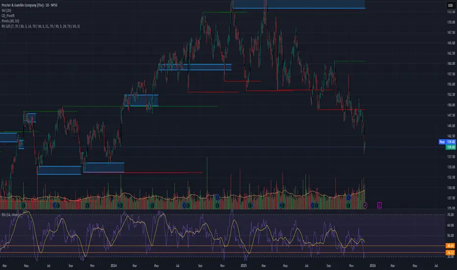
Fast Bounce Setup | Price: 139.78. → Target: 146.76 (+5%) 🌱 New Setup Forming on PG
⚡ Oversold Signal Triggered — Bounce Just Starting
📉 Strong fundamentals + behavioral dip pattern
📈 Watching for the first 3–5% move
#BehaviorBasedTrading 🔥 #LavinSignals 🚀
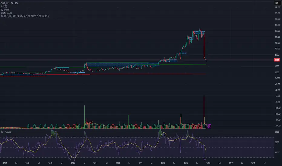
Fast Reversal Setup | Price: 62.68 → Target: 65.81 (+5%)
After the recent lawsuit-related news, LRN dropped sharply from $155 → $62 and is now deep in the oversold area 📉🔥
Volume Signal 📊
This week’s traded volume is higher than anything since its IPO, which often marks a reversal zone.
Repeated Patterns 🔍
Across the daily, weekly, and monthly intervals, the stock is showing its typical reversal pattern, matching previous bounce cycles.
Entry: 62.68
Target: 65.81
Profit: +5% 💰⚡
Crude Oil at Key Short-Term Reversal ZoneCrude Oil – 15 Min Short-Term View
Crude Oil is currently taking support in the 5100–5130 zone and is trading near the lower band of a falling channel.
Reversal Scenario:
If the support holds, a short-term reversal towards 5180–5190 is possible.
Breakdown Scenario:
A decisive break below the support may lead to a move towards the major support zone at 4900–5000.

Crude Oil Pattern Formation: Breakout or BreakdownCrude Oil – 1 Hour Timeframe Analysis
Crude Oil is currently trading within a well-defined parallel channel between 5130–5150.
Price action is forming a symmetrical triangle pattern, with a key support zone near 5180–5200.
Breakdown Scenario:
If the price breaks below the pattern support, Crude Oil may first test the 5130–5150 support zone. A sustained breakdown could extend the downside move towards 5050–5030.
Upside Scenario:
If the support zone holds and price sustains above the pattern, an upside move towards 5300–5330 can be expected.
Thank You !!

Running out of fuel? Short CVNA────────────────────────
WAVE 1 (40 → 270)
────────────────────────
Why it passes:
• Strong, impulsive advance
• Establishes a clear directional trend
• No overlapping or corrective structure at the start
Supporting evidence:
• Large extension from the base (~40 → 270)
• Clean upward structure with expanding volume
• Fits the behavior of a Wave 1 inside a larger uptrend
• Breaks major resistance from prior range with force
────────────────────────
WAVE 2 (270 → 147)
────────────────────────
Why it passes:
• Deep retracement but does NOT violate Wave 1 origin (40)
• Retraces more than 50% (common for Wave 2)
• Corrective structure (choppy, overlapping) consistent with EW rules
Supporting evidence:
• Pullback is proportional to the size of Wave 1
• Structure is slow and corrective, not impulsive
• Creates the setup for a powerful Wave 3
• Price remains well above the Wave 1 start → rule preserved
────────────────────────
WAVE 3 (147 → 410)
────────────────────────
Why it passes:
• Wave 3 must NOT be the shortest impulse → here it is the longest
• Must break above the Wave 1 peak → rises well beyond 270
• Must be impulsive → strong directional movement without major overlap
Supporting evidence:
• Largest price expansion of all waves
• Clean, powerful impulse characteristic of a Wave 3
• Strong upward momentum across indicators
• Represents the “longest and strongest” leg in the sequence
• Excellent symmetry relative to Wave 1
────────────────────────
WAVE 4 (410 → ~350)
────────────────────────
Why it passes:
• Does NOT overlap Wave 1 top at 270 (major rule)
• Shallow retracement after an extended Wave 3
• Alternates behavior with Wave 2 (EW guideline: alternation)
Supporting evidence:
• Correction is sideways/choppy rather than deep (opposite of Wave 2)
• Retracement is measured and controlled
• Simple corrective structure typical of Wave 4
• Stays safely above 270 → non-overlap rule intact
────────────────────────
WAVE 5 (350 → 470+)
(Currently in progress or topping now)
────────────────────────
Why it passes:
• Moves beyond Wave 3 peak (410) → required
• Exhibits typical Wave 5 characteristics: exhaustion, wedge, divergence
• Completes a clean 5-wave internal structure
Supporting evidence:
• Parabolic blowoff rally into wedge resistance
• RSI + MFI bearish divergence — classic Wave 5 termination signal
• Bollinger band overextension
• Volume declining on the final push
• Price action becomes vertical and unstable → end of trend behavior
Summary - EW is valid
The structure passes ALL primary Elliott Wave rules:
• Wave 2 does not break Wave 1 origin
• Wave 3 is not the shortest and exceeds Wave 1’s high
• Wave 4 does not overlap Wave 1
• Wave 5 extends beyond Wave 3
• Waves alternate corrections (deep Wave 2, shallow Wave 4)
• Momentum and divergence support a Wave 5 top
Where do we go from here-
Wave A TBD usually retraces 23.6%–38.2% of the full impulse.
Targets:
A1 (shallow): 380–400
• Minor reaction low
• Retest of Wave 4 pivot
A2 (common): 350–360
• Strong support
• Matches prior Wave 4 zone (very common target)
• First major liquidity pocket
A3 (deep A wave): 320–330
• Tests the mid-level between W3 peak and W4 low
• Strong support cluster
