Technical Indicators & Market Breadth📈 Technical Indicators & Market Breadth
1️⃣ Moving Averages:
% Stocks Above 10MA: 51.5% ✅ (Improving)
% Stocks Above 20MA: 29.1% 🔻 (Weak)
% Stocks Above 50MA: 13.8% ❌ (Very Weak)
% Stocks Above 200MA: 16.0% ❌ (Bearish)
2️⃣ Advance-Decline Data:
Advancers: 3.6%
Decliners: 6.7%
Breadth: -3 (Negative)
3️⃣ Momentum Indicators:
Market Breadth improving slightly
NNH (New 52-Week Highs - New 52-Week Lows): -0.41, still in negative territory
Volume Breadth remains weak
📉 Summary & Trading Outlook
✅ Short-term improvement seen with more stocks reclaiming 10MA
❌ But weak breadth & downtrend persist in mid-term
🚨 Risk remains high – Cautious approach needed
Search in ideas for "INDICATORS"

Imagine Using These Top 3 Indicators To Trade BetterThe stock market is going to be on fire today
because of the jobs numbers that are coming
out in the economic report
Lets look at google NASDAQ:GOOGL
this stock is in the same boat as amazon, and
Nvidia
At this price, they have touched the bottom
you can see this by using the MACD
indicator
Now this strategy
called The Rocket Booster Strategy
is based on long-term
momentum now even though
its simple do not let it fool you
this is a very powerful strategy which is priceless
and I am teaching it to you for free..
its crazy that am even showing you this for free
But that's okay the fact that this is an awesome community
thanks to Tradingview and its platform
I feel like teaching this strategy
is my way of learning more
and giving back to this awesome community of
traders from around the world.
Remember the 3 indicators:
-50 EMA
-200 EMA
-MACD
If you want to learn more about how these indicators
working together check out the resources below
To learn more rocket boost this content
Thank you for reading.
Disclaimer: Trading is risky please learn risk management
and profit-taking strategies
also feel free to use a simulation trading tool
before you trade with real money.

BNB/USDT Poised for Breakout: Key Levels and Indicators to WatchCRYPTOCAP:BNB BNB/USDT Poised for Breakout: Key Levels and Indicators to Watch
Analysis:
Price Action Strategy:
Support and Resistance Levels:
The chart shows significant support at 687.75 and resistance around 701.04.
Candlestick Patterns:
Recent candlesticks indicate consolidation near the resistance level, suggesting a potential breakout.
Smart Money Concepts (SMC):
Change of Character (CHoCH):
The CHoCH level is marked, indicating a potential shift in market structure from bearish to bullish.
Order Blocks:
The chart shows potential order blocks around the 687.75 support level, which could act as a demand zone.
ICT Strategy:
Fibonacci Retracement:
Key Fibonacci levels are marked, with the 0.618 level at 696.39 and the 0.5 level at 701.33, indicating potential retracement targets.
Indicators:
Volume: Increased volume near the resistance level suggests strong buying interest.
RSI: The RSI is at 55.32, indicating a neutral to slightly bullish momentum.
MACD: The MACD shows a potential bullish crossover, supporting the bullish bias.
Buy Strategy:
Entry: Above the resistance level at 701.04, confirming a breakout.
Take Profit (TP):
TP1: 705.73 (0.382 Fibonacci level)
TP2: 720.00 (psychological level)
Stop Loss (SL): Below the support level at 687.75
Sell Strategy:
Entry: Below the support level at 687.75, confirming a breakdown.
Take Profit (TP):
TP1: 680.00 (recent low)
TP2: 660.00 (next support level)
Stop Loss (SL): Above the resistance level at 701.04
Buy:
entry: 701.04
tp1: 705.73
tp2: 720.00
sl: 687.75
Disclaimer: This analysis is for educational purposes only and should not be considered financial advice. Always do your own research before making any trading decisions.
I hope this analysis helps with your trading decisions! If you have more charts to analyze or need further insights, feel free to share.
Follow @Alexgoldhunter for more strategic ideas and minds

Cardano (ADA) Poised for Breakout: Key Levels and Indicators BINANCE:ADAUSDT Cardano (ADA) Poised for Breakout: Key Levels and Indicators to Watch
Analysis:
Price Action Strategy:
Support and Resistance Levels:
The chart shows key support at approximately 0.85177 (1.618 Fibonacci level) and resistance at 0.90723 (0.5 Fibonacci level).
Trend Analysis:
The price is currently in a consolidation phase after a downtrend, with potential for a breakout above the 0.90723 resistance level.
Volume Analysis:
There is a noticeable increase in volume, indicating potential buying interest.
Smart Money Concepts (SMC):
Break of Structure (BOS):
A BOS is identified at the 0.90723 level, suggesting a potential shift in market structure.
Change of Character (CHOCH):
A CHOCH is observed, indicating a possible reversal from the previous downtrend.
Fair Value Gap (FVG):
An FVG is present around the 0.90723 level, which could act as a magnet for price.
ICT Strategy:
Order Blocks:
Multiple order blocks are identified, with a significant one around the 0.85177 level, indicating strong institutional interest.
Equal Highs:
The chart shows equal highs around the 0.90723 level, suggesting liquidity above this level.
Strong Low:
A strong low is identified, providing a potential support level for a bullish move.
Indicators:
RSI:
The RSI is currently at 65.50, indicating bullish momentum but approaching overbought territory.
MACD:
The MACD shows a bullish crossover, supporting the potential for upward movement.
Buy Signal:
entry: 0.906
tp1: 0.950
tp2: 1.000
sl: 0.875
Follow @Alexgoldhunter for more strategic ideas and minds

DEFI has been hot again, how do things look on the COMP chart?Lets take a look at what the charts and indicators have to say.
Structure and Price Action:
**Symmetrical Triangle Formation**:
The chart shows a clear symmetrical triangle, indicating a period of consolidation following a sharp upward movement. Symmetrical triangles are neutral patterns but typically resolve in the direction of the preceding trend, which is bullish in this case.
**Downward Red Trendline**:
The descending resistance line has formed, creating consistent lower highs. This indicates selling pressure at each attempt to move higher.
**Ascending Support Line**:
The upward green support line is holding, forming the triangle's lower boundary. This support has been tested multiple times and remains a key level.
**Consolidation Zone**:
Price is currently trading in a narrowing range, respecting both the upward and downward trendlines, signaling indecision and a pending breakout.
Support and Resistance:
**Immediate Resistance**: $110–$115 (aligned with the descending red trendline and near-term resistance).
**Key Support Levels**:
$100: Critical psychological and structural support.
Below $100: Next key support around $90 (aligned with the green order block zone).
Indicators:
Moving Averages (EMA 20/50/100/200):
Price is attempting to reclaim the **EMA 20** (~$107), which suggests cautious short-term bullish momentum.
The **EMA 50** (~$108) is acting as resistance, which needs to be cleared for further upside.
Long-term support sits at the **EMA 100/200** (~$106.5 and $85), providing structural strength if the price falls lower.
Money Flow Index (MFI):
MFI is at **34.94**, indicating the market is approaching oversold levels. This suggests the potential for a rebound if buyers step in.
Stochastic RSI:
The Stochastic RSI has turned upward from **oversold territory** and is crossing upward. This signals possible short-term bullish momentum.
However, a failure to reclaim resistance could result in a false signal and continued downward movement.
Volume:
Recent volume during the triangle consolidation remains **low**, reflecting indecision among market participants.
A breakout with strong volume will confirm the next directional move.
Pattern Analysis:
The **symmetrical triangle** pattern suggests a major move is imminent.
Given the strong preceding uptrend, the pattern leans slightly bullish. However, failure to hold support at $100 could shift momentum downward.
Probabilistic Outlook:
Bullish Breakout (Primary Scenario):
If price breaks above $110 (descending trendline resistance), it will signal a continuation of the prior uptrend.
Key upside targets:
**First Target**: $115–$120
**Second Target**: $125–$130 (previous highs)
Bearish Breakdown (Alternate Scenario):
If price breaks below $100, it invalidates the ascending support line and signals a bearish reversal.
Key downside targets:
**First Target**: $90 (order block zone)
**Second Target**: $85–$80 (EMA 200 zone and additional order block).
Key Signals to Watch:
A breakout above the descending red trendline (~$110) = **Bullish confirmation**.
A breakdown below $100 = **Bearish confirmation**.
Volume spike during the breakout or breakdown will validate the move.
Conclusion:
The chart shows **neutral consolidation** within a symmetrical triangle. The slight bullish bias comes from the prior strong uptrend, but a breakdown below $100 would shift momentum bearish. A breakout above $110 with volume will confirm bullish continuation, while a break below $100 will target further downside. Monitor price action closely around these key levels.

Several indicators suggest that the NASDAQ 100 (NAS100) may faceSeveral indicators suggest that the NASDAQ 100 (NAS100) may face a downturn in the near future:
Technical Indicators:
• Rising Wedge Pattern: The NAS100 has formed a rising wedge pattern, typically considered a bearish signal indicating a potential price decline.
• Overbought Conditions: The Relative Strength Index (RSI) shows overbought levels, suggesting that the index may be due for a correction.
Economic Data:
• Manufacturing Sector Contraction: The ISM Manufacturing PMI rose to 48.4 in November but remains below the 50 threshold, indicating ongoing contraction in the manufacturing sector.
• Slowing GDP Growth: The U.S. economy grew at an annual rate of 2.8% in the third quarter, down from previous quarters, reflecting a slowdown that could impact corporate earnings.
Federal Reserve Policies:
• Interest Rate Outlook: Federal Reserve officials have signaled caution regarding future interest rate cuts, which may affect investor sentiment and equity valuations.
Market Sentiment:
• Tech Stock Volatility: Recent declines in major tech stocks, including Nvidia and Microsoft, have led to broader market pullbacks, indicating potential vulnerability in the NASDAQ 100.
• Strengthening U.S. Dollar: A stronger dollar can negatively impact multinational companies’ earnings, many of which are components of the NASDAQ 100.
Considering these factors, there is a potential for the NASDAQ 100 to experience a decline in the near term. However, market conditions can change rapidly, and it’s advisable to monitor real-time data and news updates for the most accurate information.

Powerful Indicators---- XRPXRP again. In our report last week, we mentioned that XRP is in the bullish trend and pull back to the wavy area, and the bulls will increase. Unsurprisingly, XRP started to rebound just after we published the idea. Once again, XRP hit the upper rail of the wavy zone and bulls strengthened again.
When you use the TSB indicator, it will give a BUY or SELL signal, which means that the token has entered a bullish or bearish trend. The three rails in the wavy area are important support or resistance levels, depending on the direction of your position. You can add positions at these prices and reduce costs.
What’s more
At the daily level, the TSB indicator also gives a BUY signal, which means that XRP has turned into a bullish trend at both the daily level and the 4h level. Use our indicators to earn profits at any level.
Introduction to indicators:
Trend Sentinel Barrier (TSB) is a trend indicator, using AI algorithm to calculate the cumulative trading volume of bulls and bears, identify trend direction and opportunities, and calculate short-term average cost in combination with changes of turnover ratio in multi-period trends, so as to grasp the profit from the trend more effectively without being cheated.
KDMM (KD Momentum Matrix) is not only a momentum indicator, but also a short-term indicator. It divides the movement of the candle into long and short term trends, as well as bullish and bearish momentum. It identifies the points where the bullish and bearish momentum increases and weakens, and effectively capture profits.
Disclaimer: Nothing in the script constitutes investment advice. The script objectively expounded the market situation and should not be construed as an offer to sell or an invitation to buy any cryptocurrencies.
Any decisions made based on the information contained in the script are your sole responsibility. Any investments made or to be made shall be with your independent analyses based on your financial situation and objectives.

ALEPH Bullish Momentum Indicators & Potential Price TrajectoriesThe ALEPHUSD pair has displayed a notable surge in bullish momentum as evidenced by the recent price action and corroborated by a suite of technical indicators. The latest four-hour candlestick showcases a decisive upward movement, punctuating a potential shift in market sentiment. This analysis will break down the interplay of various technical components and suggest strategic price levels for potential entry and exit points.
Price Action Analysis:
The last observed candlestick on the four-hour chart indicates a significant bullish engulfing pattern, a reversal setup, which may suggest a continued upward price trajectory. The closing price has surpassed previous resistance levels, tentatively converting them into support zones, indicative of a possible change in the control from bears to bulls.
Ichimoku Cloud Interpretation:
The recent price action has breached the Ichimoku cloud, transitioning from a bearish to a bullish market posture. This is reinforced by the price positioning above both the Base Line (Kijun-sen) and the Conversion Line (Tenkan-sen), suggesting a strong uptrend. The Lagging Span (Chikou Span) is above the price from 26 periods ago, further confirming the bullish sentiment.
Fibonacci Retracement Levels:
The Fibonacci retracement tool, anchored from a recent swing high to swing low, shows that the price has exceeded the crucial 0.618 retracement level, which often acts as a stern resistance. This breach can be construed as a signal for the continuation of the bullish trend, with the next significant Fibonacci extension levels serving as prospective price targets.
Volume and Volatility:
An expansion in volume accompanies the price hike, lending credence to the breakout's sustainability. Volatility, as inferred from the widening Bollinger Bands, suggests heightened market activity that could propagate the current price direction.
Oscillator Insights:
RSI (Relative Strength Index): The RSI is currently in the overbought territory, suggesting caution as the market may be due for a temporary pullback or consolidation before continuing its upward momentum.
Stochastic Oscillator: Similarly, the Stochastic indicator is signaling overbought conditions, reinforcing the message of the RSI.
MACD (Moving Average Convergence Divergence): The MACD line has crossed above the signal line and is expanding, indicative of mounting bullish pressure.
Price Prediction and Trading Strategy:
Considering the confluence of indicators, we forecast a bullish continuation with a short-term price target of $0.30, aligning with the psychological resistance and the next Fibonacci extension level. Traders might consider a buying position on minor pullbacks towards the $0.26 support level, with a tight stop-loss order slightly below the recent swing low at $0.255 to manage risk.
For those already holding positions, adjusting stop-loss levels to just below the newly formed support level could help lock in profits while still allowing room for the price to oscillate. A break above the $0.30 level could open the path towards $0.32, whereas any reversal in trend should prompt a reassessment of the bullish outlook.
Investors should be cognizant of potential external shocks or shifts in broader market sentiment, as cryptocurrencies are notoriously volatile and sensitive to such factors. A prudent approach would involve a staggered entry strategy to mitigate risk and capitalize on potential price corrections.
Final Thoughts:
The ALEPHUSD pair exhibits robust bullish signals across multiple technical dimensions. While the current indicators advocate for an optimistic price trajectory, traders are advised to employ sound risk management practices and stay attuned to market dynamics. The defined trade setup highlights strategic considerations for entering and exiting the market, always subject to personal due diligence and risk appetite.

Confluence of Technical Indicators Suggests Bullish On NZDJPYThis analysis highlights a potential bullish opportunity emerging from the convergence of three significant technical indicators:
Broken and Retested Resistance: The price level at ~91.148, which previously acted as resistance, has been decisively broken and subsequently retested. This retest transformed the resistance level into a crucial support zone, suggesting buying pressure at this level.
Supportive Weekly Trend Line: The price is currently approaching a supportive weekly trend line. This line, formed by connecting swing lows on the weekly chart, often acts as a significant support level. The proximity of the price to this trend line indicates potential buying interest, as market participants might anticipate a bounce from the trend line.
Potential Monthly Pivot Point Break: While not confirmed yet, a break above the monthly pivot point could add further bullish confirmation. Pivot points are often used by traders to identify potential support and resistance levels.
Confluence of Technicals:
The confluence of these three technical indicators strengthens the bullish case. This suggests that the price may encounter significant support at this level, potentially leading to a bullish reversal.
It is important to remember that this analysis is for informational purposes only and should not be considered as trading advice. Always conduct your own research and due diligence before making any trading decisions.

Investment Perspective: Customers Bancorp - Time to BuyInvestment Perspective: Customers Bancorp (NYSE:CUBI) - Time to Buy
Customers Bancorp (NYSE:CUBI), a bank based in West Reading, Pennsylvania, shows promising signs that make it an attractive candidate for investment. Based on data from the third quarter of 2023 and recent news, there are several key aspects that make CUBI interesting for investors:
1. Improvement in Financial Indicators: In the third quarter of 2023, the company reported a net income of $83 million, which amounts to $2.58 per share. This was accompanied by an increase in net interest margin to 3.7% and a growth in deposits by $244.9 million.
2. Positive Dynamics in the Sector: Customers Bancorp demonstrated an increase in net interest income to $200 million, a result of the impact of the variable rate both in the loan portfolio and in the securities portfolio. This distinguishes it from many other regional banks, where the "bottom" is expected to be reached only in the next quarter or in the first quarter of 2024.
3. Stability and Security: In terms of insured deposits relative to total deposits, Customers Bancorp is in the top quartile with a ratio of 78%. Additionally, the bank ranks second among its peers in terms of available liquidity to unsecured deposits, which is 239%.
4. Capital and Risk Management: The third quarter of 2023 saw a significant improvement in capital indicators compared to the previous quarter. In particular, the CET1 ratio improved by 100 basis points, and its further increase to 11.50% is planned in subsequent quarters.
5. Strategic Initiatives: The bank employs advanced approaches in managing its portfolio and attracting deposits, making it a unique hybrid bank. This highlights their ability to adapt and evolve in accordance with changing market conditions.
Of course, as with any investment, there are risks. For example, the situation with CUBI and cryptocurrencies, despite assurances from management about the absence of direct risk, requires careful consideration. It is also necessary to consider that CUBI has not yet been tested in crisis conditions.

🔥 Bitcoin Bull-Market Here? These Indicators Say YES! 🚀In this analysis I want to take a look at three lesser known long-term indicators. Since we're looking over a long period, I found the monthly chart to offer the most clarity.
Keep in mind that these indicators signal long-term (>2 years) changes in trend. We can still experience short-term dumps, whilst the long-term trend is bullish.
Indicator 1: Chaikin Oscillator
Chaikin Oscillator is a technical analysis tool used to measure the accumulation and distribution of moving average convergence-divergence (MACD).
Every time that this line crosses 0 from below, bullish price action follows. Note that this indicator needed two crosses in 2012 and 2020 before the "real" bull-run began. Since this indicator crossed the zero back in March this year and retested the 0 last month, I'm more confident that we might only need 1 cross this time.
Indicator 2: Stochastic Momentum Index - SMI
The Stochastic Oscillator and the Stochastic Momentum Index (SMI) are both tools used to indicate momentum and are often used by financial traders to understand psychological undercurrents and their relation to price movements.
Note that every time the SMI crosses the 40 line from below (and becomes green), Bitcoin starts a bull-market and huge moves follow.
Indicator 3: True Strength Index - TSI
The true strength index is a momentum oscillator used to provide trade signals based on overbought/oversold levels, crossovers, and divergence.
The blue (fast) line has crossed the red (slow) line for the third time in Bitcoin's history. A bull-market followed every time before.
Has the bull-market started?
According to these indicators, yes. I'm fairly confident that Bitcoin is currently at the start of a 2-3 year bullish period. Keep in mind that we can still get times of bearish price action during these years, as we always had.
On the other hand, there's a looming recession in the USA. Recessions are always bad for stocks, and therefore likely bad for crypto as well. There's a probability that crypto will be harmed less by the recession since stock-crypto correlation is currently very low, but that could easily change in the future.
All in all, there are risks, but I'm fairly certain we're now at the start of a new long-term bullish trend.
Share your views in the comments 🙏

Key Technical Indicators Signal Downside Potential for S&P 500The market has recently exhibited a series of bearish indications, suggesting potential further downside for the SPX:
Price Action: The market gapped down after September 20th and hasn't recovered those levels.
Short-Term Moving Averages: The 50-day moving average recently crossed below the 21-day, indicating a potential short-term downtrend. Moreover, the price struggled to move back above the 50-day level.
Diverging Moving Averages: While the 21 and 50-day averages tilt downward, the longer 150 and 200-day averages remain bullish, suggesting a potential trend shift.
Critical Level Breach: The SPX closed below its 200-day SMA, a traditionally bearish signal.
Key Bearish Indicators:
TRIN: Indicates more volume with declining stocks.
TICK: Levels between -1000 to -1300 signal a bearish sentiment, hinting at institutional selling.
VIX: A 66% rise in the past week reflects increasing market uncertainty.
Prediction: Given these indicators, it seems probable that the SPX might not rebound off its 200-day SMA in the short term. There's potential for it to breach significant support levels, including S2 and the 1 Year anchored VWAP.

let the indicators help you I like a 20 - 30 day chart overview, this gives me a good understanding of any new trends.
Sometimes my choice of direction of trends need to be balanced and confirmed with basic indicators.
I like overviews with indicators.
Do they match the idea?
Will my projected path follow previous long and short term trendlines and indicator support and resistant points?
Please give my your thoughts?
My friends call me Art

4hr_& a look @using ETH/BTC Dominance & other "PURE" indicators://i started using the crypto market it self as my indicators. its all i use anymore (besides a sneak peak at some other indicators here and there) THis is it and all u need in this market. Maybe through in some DeFi market cap and dominance charts among other quick looks but for a day in day out indicator u really cant beat this if you can give your self time to really watch this market and its alien tides of money pushing and pulling through the narrow exit and on ramps at a fire hose pace.
ETH dominance combined with BTC dominance is really the bread and butter. build your own indicator and learn to watch this market, the correlation between these indicators and your favorite alts. or even fav block chain and how she interacts all as one eco system.
_
://the first arrow teals us that eth dominance (fat green line) trumps
btc dominance (fat gold yellow line) or possible uptrend/money entering the market. with ALT coins (purple skinny line), eth (green skinny line) and then btc (burnt orange) following
this eth load up as money enters the market
we then see, alts/eth/btc, level off and show signs of a down trend. at the same time u can see ETh dominance spike (but this time BTC dominance has a sharper correlation) as ETH/ALTs/BTC
ie the crypto market downtrends and money leaves the market.
the reason we see the ETH dom spike is due to the limited number of on and off ramps into this crypto eco system. So to enter, esp in larger amounts, you need to pass through the "ETHERUM
Gate/Road/Whatever" that and most alts are on the ETHERUM block chain or ETH alts.
It is worth mentioning that we have watched alts bleed into other block chains in significant liquidity so it may be worth watching these other metrics,
esp in a pure up trend or down trend ie stable or more consistent market conditions. Like if you day trade esp alts. I also use a DeFi market cap and dominance indicator lines in addition
n to what you see now... but again thats more when im playing the ALT market etc like i just mentioned above
Happy 4th to my fellow US homies out there. HGM 0Ut_ s33bel0w
set buy orders for stink bids BTC 19500 n down to 16000ish with heavy orders in that 1800s to maybe hi 1700s but this is a more wait n see as it happens situation (same or eth)
set buy orders for stink bids ETH 965 n down to 6500 ish but concentrate at 900s to 800s here and for me and mine WILL BE our heaviest position.
I would use 30% of available funds for initial btc n eth positions and cost average in or buy heavy once uptrend confirmed with maybe a small feeler in an alt or two maybe 3 but i mean small and more a place holder.

4hr_& a look @using ETH/BTC Dominance & other "PURE" indicators://i started using the crypto market it self as my indicators. its all i use anymore (besides a sneak peak at some other indicators here and there) THis is it and all u need in this market. Maybe through in some DeFi market cap and dominance charts among other quick looks but for a day in day out indicator u really cant beat this if you can give your self time to really watch this market and its alien tides of money pushing and pulling through the narrow exit and on ramps at a fire hose pace.
ETH dominance combined with BTC dominance is really the bread and butter. build your own indicator and learn to watch this market, the correlation between these indicators and your favorite alts. or even fav block chain and how she interacts all as one eco system.
_
://the first arrow teals us that eth dominance (fat green line) trumps
btc dominance (fat gold yellow line) or possible uptrend/money entering the market. with ALT coins (purple skinny line), eth (green skinny line) and then btc (burnt orange) following
this eth load up as money enters the market
we then see, alts/eth/btc, level off and show signs of a down trend. at the same time u can see ETh dominance spike (but this time BTC dominance has a sharper correlation) as ETH/ALTs/BTC
ie the crypto market downtrends and money leaves the market.
the reason we see the ETH dom spike is due to the limited number of on and off ramps into this crypto eco system. So to enter, esp in larger amounts, you need to pass through the "ETHERUM
Gate/Road/Whatever" that and most alts are on the ETHERUM block chain or ETH alts.
It is worth mentioning that we have watched alts bleed into other block chains in significant liquidity so it may be worth watching these other metrics,
esp in a pure up trend or down trend ie stable or more consistent market conditions. Like if you day trade esp alts. I also use a DeFi market cap and dominance indicator lines in addition
n to what you see now... but again thats more when im playing the ALT market etc like i just mentioned above
Happy 4th to my fellow US homies out there. HGM 0Ut_
set buy orders for stink bids BTC 19500 n down to 16000ish with heavy orders in that 1800s to maybe hi 1700s but this is a more wait n see as it happens situation (same or eth)
set buy orders for stink bids ETH 965 n down to 6500 ish but concentrate at 900s to 800s here and for me and mine WILL BE our heaviest position.
I would use 30% of available funds for initial btc n eth positions and cost average in or buy heavy once uptrend confirmed with maybe a small feeler in an alt or two maybe 3 but i mean small and more a place holder.

BTCUSD -> All Indicators you NEED to check BITCOIN is BEARISH!Hello BITCOIN traders. Here I have a chart with all indicators we need to check that the bears are taking the control of the trend. Analyzing Weekly time frame and all other indicators but 365 MA daily are in weekly time frame.
Starting from the top to the bottom:
ADX and DI: ADX is used to quantify trend strength. ADX calculations are based on a moving average of price range expansion over a given period of time. When the +DMI (Light blue) is above the -DMI (Red), prices are moving up, and ADX (Dark blue)measures the strength of the uptrend. When the -DMI is above the +DMI, prices are moving down, and ADX measures the strength of the downtrend. In the chart we have the -DMI above the +DMI, exactly what happened in the previous bear cycles.
Log MACD: Moving average convergence divergence (MACD) is a trend-following momentum indicator that shows the relationship between two moving averages of a security’s price. The MACD is calculated by subtracting the 26-period exponential moving average (EMA) from the 12-period EMA. Log MACD in this case is the difference between Log of Moving Avarages. If you pay attention, LMACD touched the top at a resistance level and started dumping. In previous bear cycles, once we crossed the 0 in the indicator, we turned to a bear cycle. As happening now.
RSI: The relative strength index (RSI) is a momentum indicator used in technical analysis that measures the magnitude of recent price changes to evaluate overbought or oversold conditions in the price of a stock or other asset. Last time the weekly RSI accumulated below the 50 level of the indicator, we started a bear cycle.
Elders Force Index: Dr. Alexander Elder is one of the contributors to a newer generation of technical indicators. His force index is an oscillator that measures the force, or power, of bulls behind particular market rallies and of bears behind every decline.
The three key components of the force index are the direction of price change, the extent of the price change, and the trading volume. When the force index is used in conjunction with a moving average, the resulting figure can accurately measure significant changes in the power of bulls and bears. In this way, Elder has taken an extremely useful solitary indicator, the moving average, and combined it with his force index for even greater predictive success. If you pay attention, the EFI diverged and we need a bear market to start converging again.
From the chart:
Gaussian Channel: Gaussian filters, as Ehlers explains it, are simply exponential moving averages applied multiple times. Every time we touch the top of Gaussian channel, we are in bear market. We make a final bounce up, but later we dump to the bottom of the channel and even below.
365 MA daily : The black line on the chart shows that every time we touch the 365 MA daily we eventually cross below it and we are in a bear cycle.
Conclusion: a final bounce up is probable, though is not a guarantee. Last bear cycles before hitting the bear market, we made a last bull trap. So, before really dumping to lower levels, 20k and even below, we can make a final bounce up.
If you like this content, do not forget to smash that LIKE BUTTON. Cheers.

Buying Zones on FB, AMZN, APPL, NFLX, MSFT AND GOOG
Hello everyone, this time I analyze the main American technology companies NASDAQ: MSFT , NASDAQ: AMZN , NASDAQ: AAPL , NASDAQ: NFLX , NASDAQ: MSFT and NASDAQ: GOOG , based on our indicators.
We will learn some small tricks to correctly interpret these indicators, and also to program alerts in TradingView so as not to miss any of the calls to buy that EP PRISM gives us in this case.
The video is a bit long but I recommend patience, I think it's worth it. Sorry for not being more enjoyable!
If you like this idea, please click "like", you can follow me for more trading ideas.
Below you have more information on how to get these indicators, you can ask me for a free trial month.
Remember that these are not investment advice, only educational ideas on trading. Do your own analysis, and do not stop training!

Probing the Indicator Rabbit Hole. Bullish Divergence.This is a stock trend trading strategy that is heavily reliant on indicators. I was seeing if I could use this same strategy for futures, and surprising no one, it does translate.
You need at least 2 of the indicators to be giving you exactly what you want, and the other indicators to be at least not working aggressively against you.
This is a super crisp example, literally everything came out right. That's why I chose this example. Not an accident. If you really want to test the metal of this strategy, by all means, don't let me stop you.
The ending conclusion, if you've got your head right should be the following : "If I had been able to notice everything going on here I could have had a lot of confidence using a high probability order placement."

Is it Altseason? BTC Dominance hits several technical indicatorsAs you can see on this BTC Dominance weekly chart I have several indicators that are shown that are the indicators required to show the way forward into altseason.
Where the yellow down arrow is currently BTC dominance is hitting resistance shown by the lime green horizontal line at 73.03
The purple trendline shows where BTC dominance acts as support and now resistance
The small blue trendline shows where BTC dominance broke out above this resistance line
The red trendlines show where BTC dominance changed from altseason to usdt and acts as a major resistance line
The orange horizontal line is where BTC dominance should end up at the end of this bull cycle
The light blue horizontal line shows the next level of resistance should BTC dominance breakout above the current resistance levels
On the LMACD we can see the importance of the pink horizontal line at 0.03 and should BTC dominance go above this level altseason will be on hold yet again
On the RSI we can se the importance of the yellow line at 77
On the below charts for a few major altcoins we can see where they match up with what this chart is showing us in that BTC dominance should drop against this resistance level and flow into the alts as they are all setting up for parabolic moves. If BTC dominance goes above this major resistance shown on the chart, altseason will remain on ice, but that seems unlikely in my opinion.
LTC and ETH already making positive moves.
ETC chart: about to break above all EMA and MA indicators. $9.40 major resistance if break through. LMACD shows bullish divergence and could go parabolic if gets over 0
BCH chart: broke above 0.618 fib level. Broke above all EMA's and MA's. LMACD is now over 0
ADA chart: broke above yellow line major support/resistance level. Broke above all EMA's and MA's. LMACD is now over 0
Happy trading legends!
HTBB
Donations via TradingView coins will enable me to post more of my analysis with more information. Thanks in advance if you are a legend who donates.

EUR/NZD lagging indicators confirms ABCD patternEUR/NZD lagging indicators confirms ABCD pattern, minor trend spikes through rising channel – One touch binaries to trade and long hedge:
Chart pattern formed- Rising channel (on daily plotting) and ABCD pattern with conflation points at high 1 at 1.7274, low 1 at 1.3881, high 2 1.8555 and low 2 at 1.4534 levels (on monthly plotting).
ABCD bullish pattern helps in recognizing the higher probability opportunities to buy, or go "long."
The short-term trend recently tests the channel resistance at 1.7409 levels and shown the failure swings, as a result, the price dropped back a bit and tests support hovering at 7DMAs.
Consequently, price bounces above DMAs are seen today, one could observe rallies are backed by both leading and lagging indicators.
RSI, so far, has been converging upwards along with the price rallies after sensing strength at 47 levels. Historically, it has shown the strength at the same levels.
On a broader perspective, the major trend forms ABCD pattern that evidecnes upswings, the current price spikes above EMAs with bullish crossover, the sustenance above will extend rallies.
Both leading & lagging indicators substantiate this bullish environment (refer monthly chart).
7EMA crosses over 21EMA levels which is bullish EMA crossover that indicates the uptrend extension further which is in line with the above stated bullish chart pattern.
Additionally, MACD has also shown bullish crossover which is again a substantiation to prolong the prevailing uptrend (refer monthly plotting).
Trade tips:
Contemplating above bullish environment coupled by the momentum oscillators, it is wise to initiate longs in one touch binary call options strategy by giving more space to the upper strikes upto 1.7308, the strategy is likely to fetch leveraged yields as long as underlying spot FX keeps flying northward on or before the binary expiry duration.
Alternatively, as the major trend continues to inch higher, we advocate bidding longs in the futures contracts of mid-month tenors to mitigate upside risks.
Currency Strength Index: FxWirePro's hourly EUR spot index is displaying shy above 131 levels (highly bullish), while hourly NZD spot index was inching higher towards -9 (neutral) while articulating (at 09:04 GMT).

Support/Resistance Levels based on earnings day priceGet the script from
These levels are based on price around earnings day. I have implemented support for 2 calculation modes:
Mode 1: Level = (low of 1 day prior to earnings + high of 1 day after earnings) / 2.0
Mode 2: Level = (hl2 of 1 day prior to earnings + hl2 of 1 day after earnings + close from earnings day) / 3.0
Chart above shows "Mode 1". Mode can be changed via options page.
This indicator was requested by user @mika2k1ff. I learnt more about this idea from @DanV and @TimWest (Thanks guys :)). BTW, TimWest has an indicators package, "Key Hidden Levels", that has this and more.
Do let me know how you use this, I am very intrigued by the potential this idea shows. Thanks.
For a complete list of my indicators:
- GDoc: docs.google.com
- Chart:

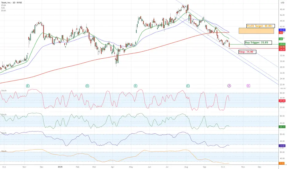
TOST Oversold HPS multiple Indicators setting upToast Inc. is a cloud-based platform providing restaurant management software, including POS systems, payments, and operations tools. It's a growth stock in fintech/SaaS, benefiting from restaurant digitization but volatile with economic sensitivity to hospitality spending.
Recent Performance & Fundamentals:
Current Price: $34.98 (as of Oct 10, 2025 close, down 5.10% on the day with 6.88% intraday fluctuation).
Market Cap: $18.8B.
52-Week Range: ~$20–$60 (trading mid-range after YTD volatility).
Key Metrics: Trailing P/E 92.64, EPS (TTM) $0.39 (up 223% YoY on strong growth). Forward P/E 29.85; Q3 earnings due Nov 6.
News/Outlook: Recent survey highlights industry adoption, but shares dipped on broader market rotation; EPS growth and revenue ramps support 2025 optimism.
Buy, Hold, or Sell?
Strong Buy. Analyst consensus is Overweight/Buy (29 ratings), with average price target $50.30 (~44% upside from here), high $60, low $36. Ideal entry on dip for growth portfolios, but watch consumer spending.
Technical Areas to Watch:
Short-term bearish/oversold (overall Sell signal), potential rebound setup. Key levels:
Support: $34.00 (recent low; break eyes $30 psychological).
Resistance: $36.00 (prior close; clear for $40 50-day MA).
Key Indicators:
RSI (14): 30.41 (oversold—watch bounce >40).
MACD: -0.29 (bearish, but divergence possible).
MAs: Below 200-day ~$39.91 (Sell); volume up on dip.