VIX is Plotting Something 8/31/2020VIX at the daily view.
The VIX is kind of like my crazy ex-girlfriend. Why do I say that? The VIX looked like it was calming down for a while. However, the VIX was quietly making lower highs as if it was secretly plotting for the ES' demise. By the time you realize what the VIX was planning, it's too late... just like my crazy ex-girlfriend.
In all seriousness, the VIX is making lower highs for the past four trading days in a row. The spike down was the algorithms doing their morning test. There was a bullish divergence on the daily RSI and on the VVIX. It looks like they're finally playing out.
The VVIX suggests that volatility hasn't gone away at all since it kept closing above 105. The VIX closed another day above the RSI resistance. This is primarily due to the tech hype. There are so many calls by small traders for big tech that it is aggravating the VIX. It seems that the VIX is recognizing that.
My original projection had the VIX spiking around September 10th (+/- 1 day). However, this ramp up is throwing a wrench in that projection. Then again, the ES was also 5 points away from my last historical resistance. If that resistance actually holds, then we might actually see volatility sooner than I originally thought.
I would definitely welcome that event and shamelessly buy that bigger dip.
Search in ideas for "PLOT"

First ever time plotting S/R levels on the montHLY GBPUSDThis is my first time plotting key levels on the monthly timeframe of GBP/USD.

Fed’s dot plot is the catalyst for EURUSDThe week ahead the market will bring a key set of important eurozone macro data releases including FOMC meeting followed by a Press Conference.
The combination of weaker dollar last week, dovish ECB message the other week and growing pessimism in pricing on this week’s FOMC meeting makes the single currency weakness on hold.
Data studies suggest that the eurozone growth set to remain weak as the economic fundamentals are weak and the outlooks remain dull. Moreover, recent ECB dovish tone should cap the incoming rallies at crucial resistance levels.
EURUSD rose slightly further on Monday, traders awaiting the FOMC meeting later this week. Recent recovery helped the single currency closed higher for six days out of seven trading sessions but the EURSUD failed to breach 50, and 100MAs spread between 1.1360-1.1365 levels.
Weaker dollar and buying in G10 currencies pushed the single currency to almost 50.0% reaction of 1.1570-1.1175 fall. We believe weakness in the weekly price action is looking evidently, bears attitude at this stage appear to be in no mood to give up their strength; moreover, the 1year descending trendline is still active on the weekly chart. We see the bullish signal on the daily time frame along with the weaker dollar are the only factors healing the single currency since a week.
Key support levels find at 1.1300, 1.1230 and 1.1170. The flip side, resistance levels to watch out are 1.1370 and 1.1420/1.1440.
In case of an ultra-dovish FOMC meeting could push the price further higher to 1.1500/1.1530 if 1.1440 taken out.
www.keytomarkets.com

$HCC - possible rebound and further grown on Elliott PlottingI'm just learning Elliott Wave Principals so I'm not 100% sure the forward-plotting is accurate, especially on time-frame.

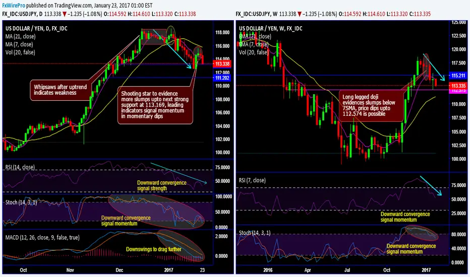
USD/JPY forms shooting star on daily and doji on weekly plottingUSD/JPY forms shooting star on daily and doji on weekly plotting, breaks below 7-DMA and SMAs to signal more slumps:
You could observe USDJPY bears extend Friday’s price drops after shooting star placed at 114.863 levels (Refer daily charts).
To begin 2017 USDJPY dropped vigorously from the highs of 118.608 levels to the current 113.610 levels, the flurry of bearish streaks occurred especially after Whipsaws in the uptrend that indicates weakness on Fed’s minutes that includes gradual hiking hints.
The current prices have dipped well above DMAs on daily charts, for now, don't expect the sharp rallies nor a steep slump as it is likely to test support at 113.169 levels, and it is better to go short upon breach below these levels that favors bears.
On weekly terms, long legged doji has been formed at 116.942 levels, consequently, the price dips have gone below 7SMAs.
RSI signals the strength in selling interests as it converges to the consistent downswings, while Stochastic has been indecisive but momentum in selling sentiments has been absolutely in bears favour.
Same is the case with leading oscillators on weekly terms to confirm the intensified selling momentum as both RSI and stochastic have been converging to the prevailing price downswings.
While daily MACD has signaled the downtrend likely to extend.
Trading tips:
Well, as a result of above technical reasoning, on speculative grounds we advise tunnel spreads which are binary versions of the debit put spreads.
This strategy is likely to fetch leveraged yields than spot FX and certain yields keeping upper strikes at 114.592 and lower strikes at 112.958 levels.
Alternatively, we advocate shorting futures contract of near-month expiries on hedging grounds that safeguards FX exposures from the potential risks of plummeting up to 111.416 levels.
Writers in a futures contract are expected to maintain margins in order to open and maintain a short futures position.
T10Y2Y 3M chart: Plotted US recessions since 1980US recessions since 1980 plotted on the T10Y2Y 3M chart.
Orange circles indicate value on the curve and the Stoch RSI value at the start of the first month and year of recession.
Red vertical bars are length of recessions.
Orange vertical lines on the Stoch RSI are the first month and year of the start of the recession.
Good luck traders.

COPY1: Whales Accumulation (Deceptive PLOT)Deceptive plot; why? becasue TA was colored BEARISH which then led some to believe BITCOIN was headed to a huge CRASH below $7K.
View yellow oval; reads to me low volume. Every time there's low volume. We have BULL MOMENTUM.
Average volume has had some of us wondering yet low volume IS WHALE KING.
Stochastic looking SEXY

WHTE PLOT CANDLESTICK CONFIRMATIONHad to dip to see my FIRST WHITE PLOT CANDLESTICK. I was wondering, where is one of my best BULLISH CONFIRMATIONS ever going to appear which has now. Works best on a 1 DAY TF. Depends.
This white candlestick represents momentum to the upside.

Looks cleaner when plotted on the daily.Looks cleaner when plotted on the daily. Love a BTC pair
Although that said, I will also post what Inverse head and shoulders pattern we are looking at here....

EW Plot Guesses for QQQ Made some Elliot Wave plot guesses for bull and bear cases, using fibs and volume profile.
White boxes are year-long volume gaps that want to be filled. Red boxes are volume shelves (POC) that act as resistance/support, or get gapped past to the next volume hole.
The upper white box isn't as wide, because the volume hole isn't as deep as the others. Tho the difference with the others means nothing.
Please excuse all the fibs, the levels are: 0,.382, .5, .618, 1, 1.382, 1.5, 1.618, 2, 2.118, 2.618, 3.618, 4.236.

Xauusd plotIn an hour frame, you notice that gold is positive, but in a week’s frame, a signal to sell, a component of more selling pressure, the strongest chasm level of $ 1,780 less than it increases the possibility of selling, and a downtrend also did not break in the RSI indicator He did not breach the 50 level in the week, this will be more decline in the coming days, as well as there is a trick by the US government with a Congress about building permits and improving living conditions that reduce inflation, as he stated that Congress does not approve of this decision, but in fact there is a plot

FB Log PlotAnd A log plot, Yes targets are insane but these are serious and the fib ratios that work for long term forecasting.

Non Log PlotWill do Another plot that's log which will be much larger targets, As for now hard to know exactly what we're dealing with though.

JNK/TLT and BTC plotI was watching a video by "Game of Trades" dated August 31, 2021. He went over a JNK/TLT chart. I HIGHLY recommend it! It was the first time I had ever seen this chart. The shape at the end caught my eye. I thought, hmm. That looks a bit like the BTC (BLX) correction pattern.
So I first drew a JNK/TLT chart then put the black tendency line at the JNK/TLT tops. Then I added BTC to the chart. Then I added the curved historical tendency lines to the BTC chart. Plus I added a blue 4 year cycle theory linear line to the BTC chart. I'm not a 4 year market cycle theory person, but I included it for those who are.
Black line (on BTC) - historical curved tendency line
Blue line (on BTC) - 4 year market cycle theory line
I added vertical solid lines on the JNK/TLT chart at ratio highs and lows and drew them up into the BTC chart. Vertical dotted lines indicate other significant pivot points in the JNK/TLT ratio chart.
JNK = SPDR Bloomberg Barclays High Yield BOND ETF
TLT = ISHARES 20+ Treasury Bond ETH
Vertical solid red lines - Ratio at a low
Vertical solid green lines - Ratio at a high
The idea is when the market is taking on risk, the JNK/TLT ratio goes up. When the market is decreasing risk seeking safety, the ratio goes down. And the chart is a plot of this ratio.
As I mentioned above, on the BTC (BLX) chart I put the black historical curved tendency lines. Plus I put the blue linear (4 year market cycle theory) line for those who believe in this. Why? I think the JNK/TLT line offers another way to help determine that the top is in for BTC. So, no matter what theory you hold to, you can test it as the market matures. Nobody wants to get caught wrong footed stubbornly holding to a target price (including myself) based on theories and tendency beliefs, whichever they may be.
**CONCLUSIONS**
**1)** BTC up/down tendency seems to trend with the JNK/TLT ratio. This makes sense. If a market is taking on risk, well that is good for crypto.
**2)** The JNK/TLT ratio tops, bottoms, and pivots sometimes correlate with the BTC chart, but only sometimes. There were some bullseyes at times.
**3)** The tendency line of the JNK/TLT ratio tops may offer another crypto top indicator. So keep an eye simultaneously to whatever belief you have for your BTC target price. If the JNK/TLT ratio touches the tendency line - watch out.

Lets start to plot XCH - Chia is interesting project & its Official pool is finally alive.
Lets start to plot and farm on our free disk space to earn with POST ( Proof Of Space & Time) instead of classic
graphic cards POW (Proof Of Work) e.g. BTC/ETH which is less egological compared form long term perspective with XCH
DYOR
www.chia.net
pool.space
ChaChain
-------------
Disclaimer:
I´m not registered or licensed in any jurisdiction whatsoever to provide investing advice or anything of an advisory or consultancy nature, and therefore I´m unqualified to give investment recommendations. Always do your own research and consult with a licensed investment professional before investing. This communication is never to be used as the basis of making investment decisions, and it is for entertainment purposes only.
KEYWORDS
R:R, money management, risk, reward, technique, style, trading, bitcoin , bitcointrading, profitable trading, profittrading, profit trading, secret, divergence, bull divergence, bear divergence, divergencetrading, divergence trading, trading strategy, how to trade bitcoin , bitcoin trades, bitcoin trading, make profit, take profit, trading strategy, trading technique, successful, successful trader, successful technique, successful strategy, successful secret, how to trade, trend analysis, technical analysis , indicators, rsi , relative strenght index, let it rain, successful life, easy strategy, easy trading, easy technique, make money, crypto investing, investing, crypto, cryptocurrency, cryptocurrencies, mentoring, money, chartart, beyond technical analysis


$TNX Direction & Dot-Plot summaryTechnical Analysis
Technically speaking, 1.6% had been a very important level, as we tested 6 times, before continuing higher.
Now the 10sma which has been working very well year-to-date, is lining up with the 1.6% level.
I expect some selling to reach the 10sma at 1.6%, for a bounce to 2%.
Dot Plot Summary
7/18 FOMC officials are predicting higher short-term interest rates by the end of 2023, as compared to 5/17 at the December meeting (i.e., a growing percentage who see an earlier start for rate hikes). Notably, four officials now expect a rate hike at some point next year.

The FOMC’s SEP dot plots did not leave a lasting affect on USD..The FOMC’s SEP dot plots did not leave a lasting affect on the Greenback or provide sustained relief for US Treasuries as the global debt sell-off resumed and intensified to the extent that even the short end of the curves retreated sharply. Accordingly, initial post-Fed losses on dovish takeaways were erased and almost reversed in certain cases as the index staged a relatively impressive recovery from 91.300 to 91.899 at best in response to the 10 year yield topping 1.75% and long bond breaching 2.5%. As has been the case of late, data was largely brushed aside even though IJC counts disappointed again in stark contrast to the Philly Fed survey that blitzed consensus in headline terms and was embellished by strong sub-components. However, a collapse in crude prices has taken some of the heat off bonds and tempered reflation fervour amidst rising inflation expectations.

VET Long term play, plotted on the weekly timeframeCup & Handle Formation on the weekly.I plotted the price % from last low to top and that worked to roughly 700%.I cloned that move and this flush with the 461.8% Fib. On successful breakout the target sits at the 0.073 zone.


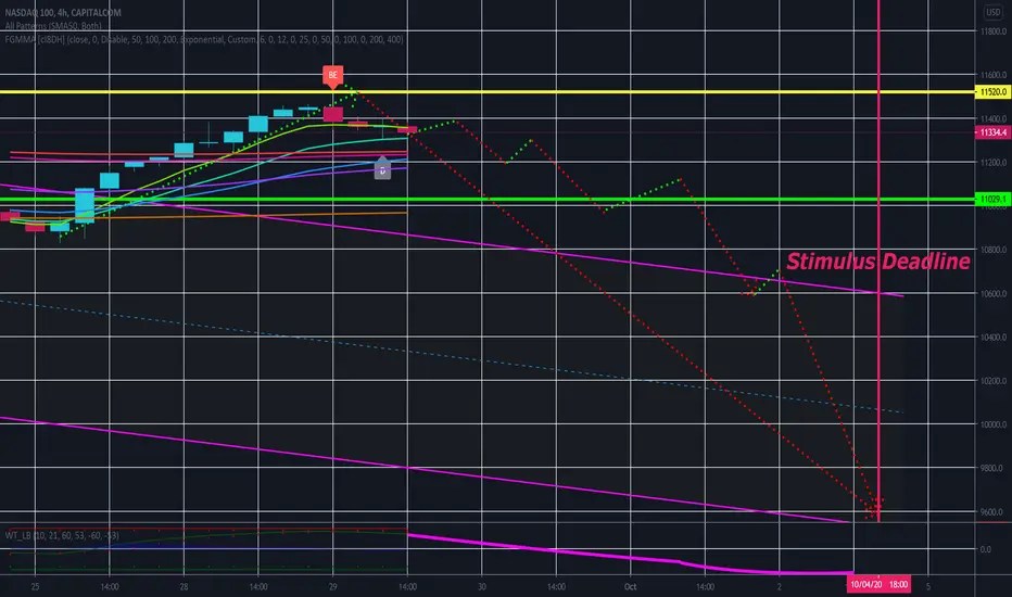
No Stimulus NASDAQ PlotThis is an update to the Island Gap post. I attempted to plot a path to meet my target. I used a rough timeline of events and hypothetical sentiments in the week ahead. Should the house fail to pass a much lower stimulus bill by Friday, I expect a limit down event this week, or early next. These things are very hard to predict, so take it with a grain of salt; but October is notorious for being bearish even without such circumstances.
BUY after the price breaks out from plotted resistance level.This is 4h chart of CARDANO (ADA) and i have plotted a trend line along with a resistance level. Price had went very bearish. This has made 5th consistent high which is less that the earlier high. Price will try to break out. If the price goes above $0.08 WITH VOLUME, then price may go Bullish, otherwise if the prices tests this level and goes down then the price will go very Bearish. Remember one thing, always buy or sell after the price breaks out the support or resistance level. Wait for the price action, act accordingly.

BTC, I have plotted future expected pattern. Long term support at 6332 nearby which is very strong.
There're total of 3 patterns plotted on the chart as per the following:
1) Major Triangle (breakout if flag pattern is strong)
2) Minor Triangle pattern
3) Expected flag pattern in future
Ifyou prefer my work, you can share your love to hit LIKE
