Bitcoin price action is already at the 2017 market topThe $20k calling is not going away. Maybe, who knows, am not a fortune teller, just a guy who loves studying data. A number of folks are quick to remind me price action should fall to the previous market high. Folks, price action is already at the past market high.
On the above 3-day chart price action is shown divided by the M2 money supply. In order words, all the money printing the FED has done between December 2017 and present day is taken into account with BTC price action.
The cool thing here is we can see the 3-day death cross has already confirmed on the M2 ratio chart but not yet the dollar chart as RSI prints on strong support (purple circles) - look left!
Keep calm and carry on.
Ww
Search in ideas for "RATIO CHART"

The thing about AAPL....Video covers AAPL and various ratio charts against it. QQQ/SPY at the end says we may be in for a tech bounce soon.

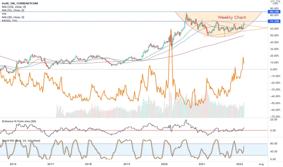
Gold ... Intermediate Term Bottom ??With today's US CPI numbers out of the way and a modest degree of stabilization in equity markets, Gold appears to have made a short term bottom.
This is the third touch of a six month trendline.
We add to this a bullish harmonic Gartley pattern which appears to have formed. (This includes a solid AB=CD subset.)
We need IMHO another ingredient. A weaker $USD which I measure by the DXY index.
Not only do we need this in ]absolute but also in Gold relative terms
For illustration I have included as an insert a Gold/DXY ratio chart on the same 4 hour time frame as the base chart.
With these conditions in play we look for a stabilizing and then an appreciating Gold price from here.
This is educational not investment advice.
Do your own due diligence while watching the bigger picture and review world events as they evolve around you.
This can be a fast and volatile market.
Good Luck and thanks for reading.
Hopefully you found it this useful.
S.

James Bonds vs I SpySpy vs Bond ratio chart. An uptrend means that bonds are outperforming spy.
Monthly bull divergences, monthly PPO about to cross bullish, Slow Stochastic over 21 for the first time in 2 years. This is a generational opportunity for bonds. Chances are good that the economy tanks mid-year and Powell and the other geniuses at the FED rethink the rate hike strategy, so bonds will continue to rally vs SPY. 60/40 portfolio may become 10/90 by next year.

The Meltdown on Mr. Softee ($MSFT)$MSFT likely to 215 by early summer. Sounds crazy, but I think it's possible. Ratio chart msft/qqq is supremely bearish.

$LINKBTC Ratio Chart - Looks bullishThis weekly log chart is looking very good to me and adds fuel to the $LINK chart I posted this week. I think a major move is coming in LINK. Looking forward to watching this play out.

NVDA due for a reboundLooking at NVDA's monthly chart together with its PE ratio chart, I think the stock is due for a rebound really soon, maybe next week.
The red circle in the bottom 1/3 of the chart indicated the current PE and a line of where it might rebound.

Nasdaq vs Silver Daily Ratio ChartGoing forward...
Number of days where silver out performs Nasdaq will be than the number of days Nasdaq out performs silver.

Bitcoin's road map until 2030 (measured in gold).Bitcoin's road map until 2030 (measured in gold).
7 month rate of change just broke down.
Remember, this is a ratio chart. Both can go up or down at same time, it's just one will out perform the other.

Correlation between the MOVE index and GoldNorthstarbadcharts.com, I would love to see a ratio chart comparing the MOVE index to Gold.
It sure looks like there is a positive correlation there.
XOP Energy Exploration + Production Outperformance to ContinueXOP is the ETF for the energy sector's oil and gas exploration and production sector. Despite the market indices (US) experiencing a high degree of volatility and technical damage, the energy sector has outperformed all other sectors in in 2022 (and late last year).
A cup with handle has formed, which is a bullish consolidation pattern made famous by legendary investor William O'Neil. Investors attempt to identify such patterns as signals that a higher move may be possible so long as a breakout past the pivot (the high of the handle on the cup) occurs and does not fail subsequently.
Other experts call it a volatility contraction pattern (VCP)—because when volatility contracts, it tends to then be followed by an increase in volatility, usually in the direction of the trend. The only caveat is that markets can sometimes derail breakouts from VCPs (cups with handles or other consolidation patterns).
Note how the trend in XOP is quite well defined going back to July 2021. XOP has respected the uptrend line across the lows (see the parallel channel above) And the price has been making higher highs and lower lows consistently since then. And momentum in the short-term is increasing, though I suspect all stocks may be dragged down to some extent by some of the market's downdrafts similar to what occurred in January 2022.
Recently, I started a small position using a vertical option spread to trade this to the upside into mid-March. I am keeping the position small until a better entry appears. I would add to the position at the 21-day EMA if it holds as support on any pullbacks.
In short, XOP appears to be a strong part of the leading sector in the US right now. While the markets may continue to experience volatile declines, it's worth watching XOP hold its trendline and MAs steady. It may be worth taking a bullish perspective on any pullbacks to the mean (the 21-day EMA, the 34-day EMA, et cetera).
Lastly, XOP's relative strength vs the S&P 500 and the Nasdaq is quite impressive. (An easy way to view relative strength is to do a ratio chart, called a "spread chart" by TradingView, by typing in the symbol XOP/SPX or XOP/NDX.)
DISCLAIMER: This content is for informational and educational purposes only. This should not be construed as financial advice or an investment recommendation. This content is not a substitute for advice from a licensed financial advisor or investment professional. Please do not trade options, stocks or other securities without understanding risk, position sizing, and the nature of the security product being traded. And please do your own research.

30 year yield vs 10 year yield ratio chartGold not crumbling down makes me think it's expecting a HUGE bounce for the 30 year vs 10 year yield ratio.
Fuel reservoir is FULL and ready for take off!
#xauusd #xagusd #inflation #markets #nasdaq #fomc

US 10 year yields vs US 30 year yields Ratio ChartGold approaching a "yield-spread" defined bottom.
Let's see if gold can move a head of top rail hit.

Gold vs Silver Ratio 2008-2011 vs nowZoom in on daily gold vs silver ratio chart.
Heaven's or hell's door an inch apart.
Getting scary tight.

If Litecoin Will Outperform BTC, Will BCH Outperform LTC?I noticed a lot of twitter talk on the LTCBTC ratio chart about to breakout. A very nice looking chart pattern. My question is if LTC is about to outperform BTC, why not BCH outperform LTC? It seems to be forming a similar pattern to LTCBTC. They are both highly correlated cryptocurrencies as well. Both LTC and BCH seem to have fundamental catalysts that could push them higher. Mimble wimble upgrade for LTC, and the SmartBCH sidechain for BCH. Will be interesting to watch how it plays out. Please comment. Thanks!

HUI vs Gold monthly ratio chartIf gold is cheap vs US equities...
Then miners are even cheaper vs US equities.
Beautiful +9 year base for miners vs gold exemplifies the risk vs reward profile of miners.
Don't say I didn't show you this!

Growth vs Value - Potential Double Top with Inverse TrampolineThe growth/value ratio showed an inverse trampoline as
it retested a prior peak (possible double top). The daily
is shown as well to illustrate a further inverse trampoline
in concert with the weekly. My plan doesnt allow for
showing an intraday ratio chart, otherwise the hourly
would be shown as an even earlier entry was likely afforded.
Hope this provides some insights.

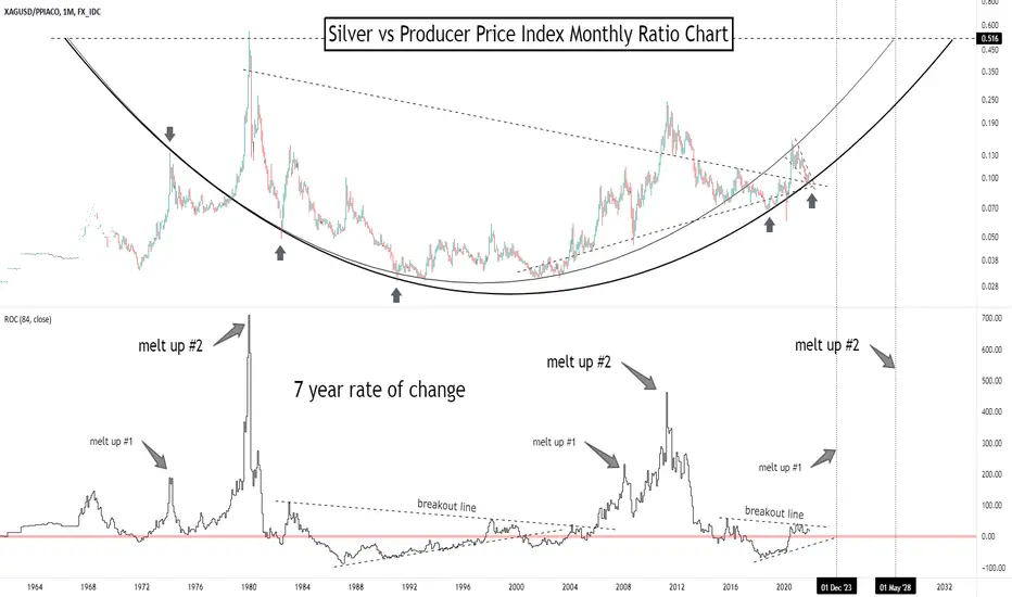
Silver vs Producer Price Index Monthly Ratio ChartDon't say I didn't warn you the setup was there early for silver...
Arc defined channel should lead silver to much higher price points.
I'm waiting for two parabolic melt-ups for silver before calling it over.
3rd greatest buy signal for gold still active from April 2020...Gold vs Producer Price Index Monthly Ratio Chart.
If you aren't sure why I labeled this as the 3rd greatest entry for gold...
Only 2 previous times the 7 year rate of change crossed from below zero, each time yielding HUGE moves.
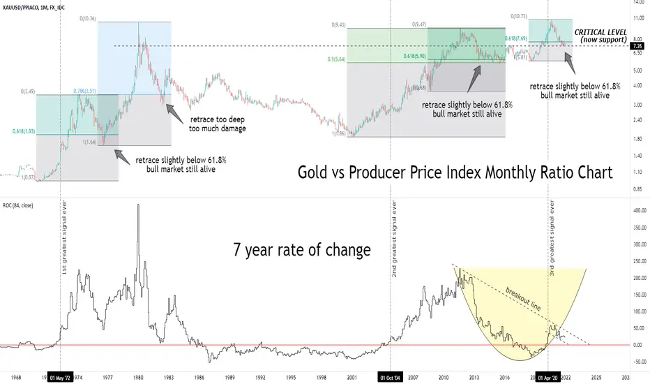
Chart Patterns Tutorial Technical AnalysisThis video is an overview of Fibonacci golden ratio chart patterns for those who are new to trading, crowd psychology, and/or for those who aren't sure what any of this means.
I am particularly fascinated by the fact that certain world events and media FUD are aired in accordance with certain fibonacci zones, which is contributing to an in-depth exploration of the hive-mind hypothesis beyond what could merely be trading reaction to support/resistance zones without macro global influence involvement.
I hope to eventually chart a time frame of media events and compare how they line up within the various golden ratio zones.

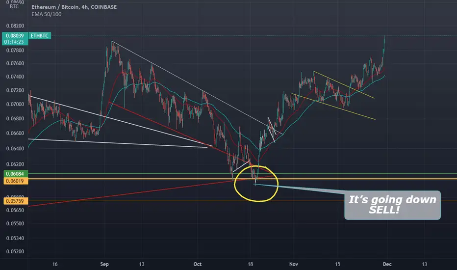
IF THERE IS JUST ONE SINGULAR CHART TO FOLLOW THIS IS ITETH/BTC RATIO Chart looking like its about to take off!!
Golden Ratio Natural BitcoinNot gonna lie - the fact that Bitcoin is teaching us that God is really just a fractal - as well as everything else in existence - and our actions and psychological behaviors are somehow pre-programmed and made manifest in golden ratio chart trading patterns is well...is something.
Chaos in order... How we will behave in the future is dependent on our free-will. Err I mean dependent on the fibonacci sequences.

Gold vs Silver Daily Ratio ChartGold vs Silver Ratio's daily chart trying to stay up...
Will it lose it's grip?
